#the linework is really nice as well
Explore tagged Tumblr posts
Note
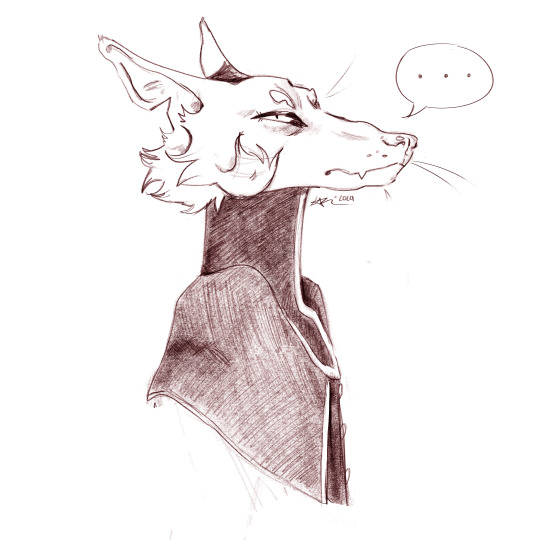
i was testing some new clip studio pens and i drew ur doggy
.
#sorry for late post I'm going through my inbox and queuing asks I missed#this one is from june I think?#I really like his expression here#vague disdain or just too little sleep#you captured his characteristic squint well#thank you for taking the time to draw him!#again sorry for leaving these asks sitting there for months I'm not doing it on purpose I just get overwhelmed easily#gift art#butchprophet#Machete#own characters#the linework is really nice as well#especially up close#natural looking pencil texture if you ask me
728 notes
·
View notes
Text
methinks i will make a new kind of commission section cuz colored sketches are actually really fucking fun, not finished with it rn but wow. my depth and shading has gotten better, if not adapted to my style.
#i have THAT goin for me!!!!!!!! i admit ive been in a sour mood and im not in the best mindset but. this is nice#i feel accomplished... my art rlly has taken a turn for the better#well objectively#i loved my style back then even when i wasnt good#i say good but i dont think me or anyone for that matters ever been BAD at art its just a learning thing yk#whatever that means but idk theres merit in the growth#i like how it is rn .. proud of myself#ofc i still wanna emphasize and improve my linework but do think me pathing off into color-heavy artwork has been REALLY good for me for#not getting like#bored#now coloring is fun!!!!!! its not something im afraid of anymore
5 notes
·
View notes
Text
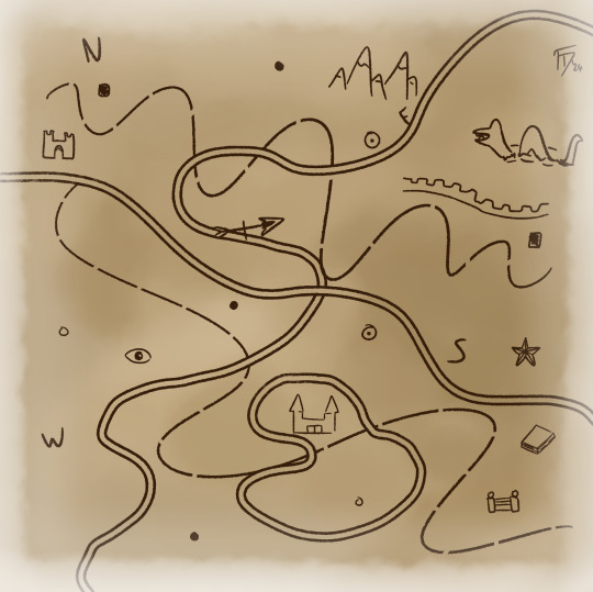
Day 131 - Map Madness
"...how the hell should I make this look??"
#miscellaneous#abstract#year 4#art#I was once making a map (a second map.. rather) for my brother's in-planning D&D campaign but development just kinda stopped for a while#But he recently asked me to try and get it going again so I'm having a look at it again and...I honestly have no idea how I did it before X#Like the first time I made a map was full of experimenting and figuring out what style I liked and it came out cohesive and well enough#But I wanted to try and improve it (and he had also asked for coloured terrain to better depict the general climate of each area)#But trying to find a way to make the linework feel clear.. crisp.. and yet not so thin that it feels like it just disappears or make the ma#feel muddy? It's difficult since I also have to make sure it's a large enough scale to fit everything in comfortably#Unironically this piece kinda helped with one piece of the puzzle (...two now as of writing these tags XD)#I keep using black/grey lines (and I think I used some vaguely brown lines before) but this kind of coffee brown looks nicer#(And going for flatter-style symbols instead of detail iconography is one thing that made the last map look really nice)#(I just gotta find that sweet spot of detail and simple~)
0 notes
Text
severance comic process write up (unasked for)

i finished season 1 of severance jan 24 and maybe by then NL had already begun his apple tv tirades. so maybe that's why i thought of the get it twisted speech? dont remember exactly but i was like wait......... this kinda fits...... and basically the images were forming in my head and i had to get them out. this is the best kind of inspiration to have. when it feels like you are afflicted with a life-threatening disease and the only cure is to draw pictures
i decided i wanted square panels and a black and white color scheme pretty early on. i wanted the pacing to feel kind of fast, so one line per page (basically i was trying to match the monologue). black and white also made sense because 1) i didn't want this to take 2 years like my last comic 2) fits theme of the show and the monologue rapidly whipping back and forth 3) i thought maybe i'd riso print this in the beginning and 1 color would be cheapest/easiest
the sketching phase was really smooth. it was like the images were in my mind already and just needed to be brought to life. my motivation was strong as well (i thought it was really funny and if no one liked it at least i really really liked it).

^ my sketches. most compositions made it to final without major edits. i did cut almost all of the last 8 because i didn't feel like I needed the moment to be dragged out so much AND i was getting pretty tired by that point lol.
one page i'm glad i changed was the ms casey one. the reason i changed it at first was because i thought it was too similar to the irving/burt one. and then i ended up really liking the new composition.
as i moved to final, i had a couple of inspirations in mind. i'm a huge fan of sophia foster-dimino's work, and in particular her sex fantasy comics


^ books/zines i looked at for inspiration. second image is a spread from sex fantasy #4.
i also was inspired by jennifer xiao's comics and how chootalks and nogoodwithcat handle linework and value


i was inspired by jennifer's pop up ads comic for this page. i like the humor in her work and wanted to bring an element of that into my comic.


i love these drawings by choo that showcase these eerie tableaus of desserts/cakes/hammers/etc! i was trying to evoke the same vibe with the two "get it twisted" pages with the stack of waffles.
also, just tons and tons of references taken from the show and stock images.

i pretty much just worked for two weeks straight until i finished. what unemployment does to a motherfucker. even though it's fanart and the words aren't mine, it's a pretty personal comic. i got suddenly laid off last fall which has made me feel all sorts of feelings, and then starting up my job search this year has been grueling. it kinda blows my mind that anyone expects you to love your job. i love my cat. i love the people important to me. i love moving my body and eating good food and listening to music and being out in nature. i love the color green. i dont love my fucking JOB lmfao!!!!!!!!!!!!!!!!!!!!!!!!!!!!!!! are you freaking CRAZY???????? literally do NOT get it twisted. but also please hire me. <- this dichotomy has been making me nuts
anyway. the reception to my comic has been mind blowing. people have said some insanely nice things. i also really appreciate anyone who's read and enjoyed the comic without knowledge of severance or northernlion LMAO honestly amazed and in disbelief.... ty so much..... it really means a lot!!!!!!!!!!
okay i ran out of things to say for now byeeeeeeeeeeee
320 notes
·
View notes
Text
AYO⁉️⁉️⁉️⁉️⁉️⁉️


AYOOO?!?!!!⁉️⁉️⁉️⁉️⁉️⁉️⁉️⁉️ THIS RIPS SO HARD!!!!!!!! LET'ẞ FUCKING GOOOOOOOOOOOOOOOOOOOOOOOOOOOOOOOOOO
Der Meister (The Master)

》 Und was soll ich dich lehren? Das Müllern - oder auch alles andere? 《
'And what am I to teach you? How to grind grain, or the rest as well?'
#otfried preußler#the master#ravens#corvids#GOING INSANE GOING ABSOLUTELY INSANE GOING INSANE ASYLUM GOING BALLISTIC GOING MAD GOUNG ABSOLUTELY FUCKING BONKERS!!!!!!!!#THIS LITERALLY RIPS SO FUCKING HARD HELLO??????!!!!!??!?!.!#THIS SLAPTS SO MUCH . FUCKING PHENOMENAL. SUBERB#OUUURGGGHHHHHHGGAGGGGGGGRRRRRRHHHHHHHHH#Your linework is so good and precise it's fucking AMAZING. It starts out thick and and simple and then#(talking about the clothing) when we get to the focus of the drawing (the head) it gets super detailed OUGH I ADORE IT#the clothing has it's folds on just the right spots; you can really see how it stretches over hos body in a very natural way WOUGH. SO GOOD#the buttons shine and the cool light reflects on the black clothing; but especially the hat; made out of leather... NICE TOUCH#That FACE is literally SOOOOOOO DETAILED AND WELL DONE WHOIGHHHH THW WRINKLES; THE LITTLE BUMBS#THW EXPRESSION. AND THAT GREY HAIR!!!!!!#IT'S SO GORGEOUSLY RENDERED. EVERY STRAND DONE WITH SUCH CARE#WOOIIUUHGGGHHHH#God the face kinda spooks me ; you know? especially the eyes cause they look exactly like the one's from an OC of mine#who's also a Master Magician of The Dark and MAN what a spook#(the character is from my main so I will not be talking about him further here)#god but again. that face... human anatomy on point. AND THOSE RAVENS!!! THE WAY THW COOL LIGHT REFLECTS SO BEAUTIFULLY ON THEIR FEATHERS#and the texture is EXACTLY like on raven feathers 😳 you looked at reference pics didn't you. and the light reflecting on their eyes...#Their form is also very realistic. Also nice Odin reference =) 12 ravens I spot... nice nice nice#god this is such a beautifully ominous drawing WELL DONE.#also black eye; black arts; ahahahhaa ties neatly together
58 notes
·
View notes
Text
Hello hellooooooo! We recently had a banner contest in the discord server, and I wanted to show y'all the awesome entries that didn't win. They're all really cool in their own ways, so I wanted to give them each a lil moment.

(by @/jestie)
Love the focus on xyx!! He reminds me almost of what I'd think teenage him would look like. Very chill, sporty, and out with friends on a beautiful spring day. The linework in this feels really soft as well -- especially on those hat details. AND THERE'S CAT!! CAT!!!
All other submissions under the cut!
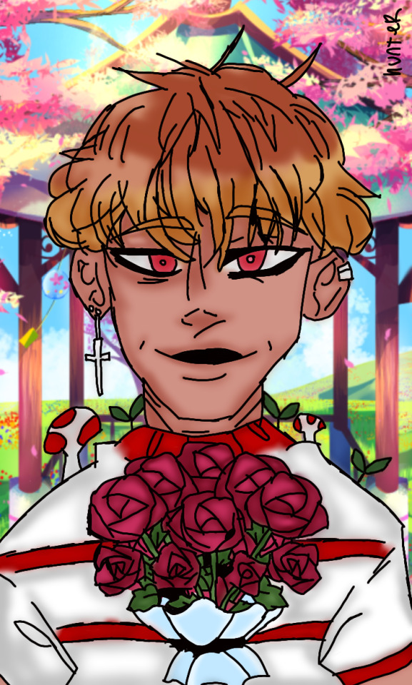
(by @/hunddenseje)
I like the details in the flowers a lot for this one. The way people draw roses and how they choose those inner patterns is always neat. And the little plants and mushrooms on his shoulders are fun!! They go well with that striped shirt pattern!!!
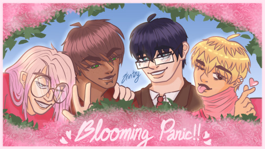
(by @/stintsy)
The way this artist circled the boys with that pink rosy pattern will stick in my brain for a while. It's v pretty, and it's like they opened a bush and found us in there for some reason. "Hello! Happy Spring!" Thanks boys please close it back up!!! It's my cry hour in the bush!!!!
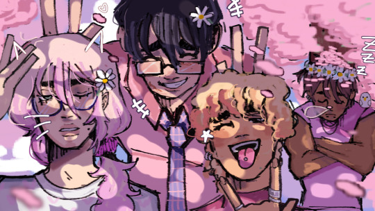
(by @/emmascient)
This person's artstyle is so unique and full of life. The little spots of light coming through the trees just adds to whole thing, too. And I really like seeing fanart of owl with textured hair!!! Also check out xyx's fucking biceps holy fucking sh-
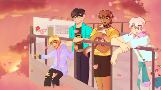
(by @/.mewo.)
Just a bunch of bros on their lunch break bayBEEEEEEEEEE!!! I like the detail of toast's coat tied around their waist and the fucking anti-societyboy shirt quest is wearing LMFAO. Also cat is ADORABLE in this. God. More cat art. Always need more cat art!!

(by @/c1nnadoll)
Every time nightowl is drawn in a croptop, two months is added to my life. I just know it's true. God bless that cute ass flower crown and the perfect little peace sign. Man looks so stable and happy. I hope he had a nice day after this picture!!!
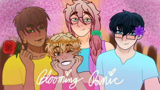
(by @/fluffydeer21)
Toast and Quest look so content and cute with their flowers. And there's another neat rose with a lil interior pattern! Held, of course, by this artist's fave LI. Xyx looks pretty good with gold jewelry, I cannot lie. I have no idea why I made them green in game. LMFAO
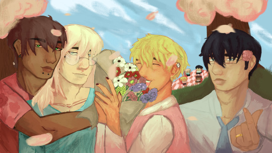
(by @/noneivly)
I like how this feels like a painting. Like those brush strokes and even the palette choice just look like something you'd see hung on a wall? It's really cool. Also the little detail of the chibi picnic boys in the background makes me giggle. Small!!!!! So fucking small!!!
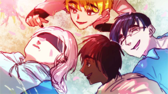
(by @/kiki_221)
The energy in this is excellent. You can almost hear them laughing together at Toast's expense (deserved I'm sure). I'd like to imagine they're all relaxing at a park after a big lunch. I hope they got to discuss all the good things that happened to them this week.
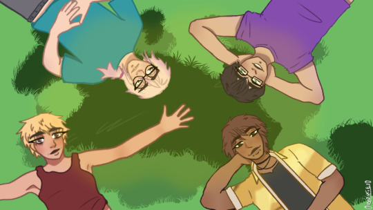
(by @/01noxxie10)
Another excellent chillin in the grass pic! Purple actually looks really good on Quest. I don't think I've ever drawn him in that color before? So this image made me think about that a LOT. Also look at fuckin chill ass xyx. Calm beautiful motherfucker. Fuck you!!! Fuck you!!!
--------------
There's two more images, but those are the discord banner winner and the one I chose for my twitter! If you want to see those excellent drawings, check out my twitter here or join the discord server here!
Thank you everyone for all the submissions! I treasure them deeply!!
318 notes
·
View notes
Text
📢 LADIES, GENTS, IN AND OUT BETWEENS I PRESENT TO YOU....
🎉 ✨ THE WINNERS OF THE DTIYS 2024!!! ✨ 🎉
🥉 3rd Place Winner (chibi art prize!): @stainy-doodles

I REALLY loved how u made Lamb look much more sadistic here with the tilted head and the even sadder Narinder. And the Crown details just rlly added to the spooky of it all, especially with it floating above their head rather than sitting on top of it! I ALSO LOVE THE TEXTURE U gave to their coat!! It rlly compliments the "semi-realism" this piece gave me at first glance and - therefore - helped it look much spookier Great job!! <3
🥈 2nd Place Winner (headshot art prize!): @7squidgy7

I cannot express how much I absolutely ADORE ur linework here dude, its fucking amazing The way u relied mostly on it to show where the light is coming from and also to texturize the piece itself is just ARGH!!!!!!!! Its giving me Tim Burton or Don't Starve vibes with how much this one lacks saturation in colors and I fucking LOVE THAT. Great fucking job I hope I can make smtng like that someday with my own lines 😭
🥇 1st Place Winner (halfbody art prize!): @therekinperson

JUST WHAT THE FUCK MAN HUH????????????? WHAT THE SHIT LIKEIHASNJDKASKDMASDAS Omfg IM IN LOVE with how dramatic this one looks, the movement of the clothes, hair and everything + THE FUCKING SNOW ON THEM just rlly adds to the feeling of "what have I done" the Lamb is giving me here As u said urself, u imagined them as going insane while doing this and Im proud for you to say that u fucking did it. I just love everything about this its giving me "screenshot of a great movie" vibes KEEP GOING CRAZY ON WHAT U DO its makes a nice difference in how much ur art impacts ppl. Well done! <3
✨ Congratulations to all winners! Make sure to DM me in order to receive ur prize ✨
As for everyone else who joined, srsly, tysm for participating I loved seeing everyone's renditions of my piece. This was my first DTIYS Ive ever hosted so it makes me rlly happy to see so many ppl were interested in taking part in it! 💜
For whoever who wasnt able to finish ur version in time, Id still love to see it and rb for all to perceive as well! And those who just wanna draw it for funs later on, I wont mind at all! In both cases, do not hesitate to @ me <3
📢 TYSM TO ALL WHO JOINED!! SEE YALL NEXT TIME 💜
#skyartworkz dtiys#skyartworkzdtiys#dtiys winners#dtiys#artists on tumblr#artistsontumblr#art#skyartworkzzz#I wish I could do an honorable mentions in this post but itd be so long sobs#JUST KNO I GENUINELY APPRECIATE AND LOVE EVERY PIECE YALL;;;;;;;;;
79 notes
·
View notes
Text

I GOT THE ARTBOOK!!!! Well one of them that is-found an ok-priced copy of the Deluxe Edition sealed and since I really needed references to the backgrounds (as this game is heavily transforming my artstyle so I want to study the colors/linework) I decided it was worth it. Plus while I play on PC I've been wanting a travel copy for my switch anyway.


The paperback and the hardcover aren't one to one, that's what I was having trouble finding out prior. Figured it'd be missing content but wasn't 100% sure as to what. From what I can tell the paperback has no early designs for the lamb, bishops, ect, and seems to just be mainly neatly displayed pages of the in-game final assets. Would've liked the extras and am still hunting for the hardcover but hey, I needed the assets primarily anyway. I am especially happy about the enemies page and the sigils-nice to now not need to load up the game or comb through screenshots to see what's what.
(Also sidenote this is REALLY nice paper-both the box and the book. Both have this kinda velvety? type paper feel which is really nice)
(Extra sidenote if any mutuals ever need a specific reference and wanna ask if my book has it feel free to message! I'm happy to check)
100 notes
·
View notes
Text
Gwen stumbles in, covered with a coat, eyes red and head down. Celia notices that she basically runs off to the bathrooms to sniffle. She decides to follow.
"Hey," Celia says. "is everything alright?"
"It's not," Gwen says, fighting back sobs. "Leave me alone."
"Are you sure you don't want to talk about what happened?" Celia asks, definitely like a concerned coworker and not someone trying to investigate the Horrors for personal reasons.
"It's--" Gwen swallows, losing the fight against her own tears. "It's this--tattoo!"
Gwen rolls up her sleeve, and in the dim bathroom light Celia reads an inscription:
LIVE
LAUGH
LOVE
Celia chokes.
"You're laughing!" Gwen says, definitely crying.
"No, no!" Celia says. "I think it, well. I mean it's really clean linework. I think it looks nice?"
"NO ONE UNDERSTANDS," Gwen sobs, and then rushes out the door, accidentally running into a pillar on the way.
#the magnus protocol#gwen bouchard#celia riply#tmagp#gwen bullying#brought to you by me and a friend bullying gwen on discord
110 notes
·
View notes
Note
Your comics are so well done !! I adore the compositions, the linework and colors :D The way you approach compositions is so fun like the panels tripping over each other when Raph stumbles or the way the panel is shaped like the tunnel they’re walking through. I really look forward to seeing more of your work both in this fanwork and any future comics you work on :]
I have fun with the page layouts, composition, and panel boxes ((o(^∇^)o))
TBH one of my favourite pastimes is staring at comics made by more seasoned professional comic artists; it's so interesting to see how they layout their pages and all the fun ways the panel boxes themselves can be used as an addition to the art rather than just what contains it.
Stopping myself before I start rambling. It's so nice knowing there are folks who enjoy and notice things like that!!! Haha thank you!!
#asks#art related asks#will be thinking about this ask for 100 years#i am a nerd about comics as a medium#aaaa another cool thing is the way panels & page layout varies across artists and comic types#long scroll webcomic vs 4 panel vs newspaper strip vs european vs manga vs american vs non bordered sequential image storytelling#*explodes*#every artist puts the puzzle pieces together in different ways#and some forgo them completely#comics are so cool
89 notes
·
View notes
Text
Erm,,,ig i’ll ask
I feel like hiding here and pretend that im typing in the tags would help but. Is it normal to feel like a rut in writing? I never like to ask or talk abt this things cause I do have a sort of pride and worry ppl will doubt my skills. Idk smth like that. Lately I’ve been feeling this writer’s rut with my au’s story. Where things feel very spotty, yknow when you rub your eyes hard you start to see spots? Well that’s how I see my au story, where it’s clear on what I want in certain parts but it’s a haze in other areas.
I feel like im overthinking and over complicating things in my story. Rn where its at in the comic is fine. I guess the issue I have is that it feels like there’s so mich going on. Like do I want to go on this path? Will it be easier if I try another way? I feel like I haven’t explored certain things that I want to explore. I feel like I haven’t pushed much the horror elements of my story enough. But I worry it will be too edgy. I feel like im adding too much symbolism and details where there shouldn’t be. But I also love adding symbolism even in the smallest details. Idk this chapter really cracked my little head, aside from feeling frustrated that the linework doesn’t look good cause im still figuring out the pen pressure to my liking. I love the story I wrote for that chapter and im still pretty proud of it, I guess it just feels like im taking too long to work on when I just want to finish it and share with you all.
Anyways I guess this is entering in vent territory but I would like some advice to figure this out. I guess that’s the issue of being an overly critical person that you become your biggest critic. But I love criticizing things!! I love being critical!! I love engaging in discussions on how things could work better!! But also im a very scared and paranoid person nfkajfksnkfb i mean no harm. Ik this story will not be a 10/10 story I at least want it to be cohesive. I at least want people to enjoy it. Ik this story for me mostly but I feel lost!! Idk what to do!! But I also feel so selfish in asking its weird like i dont want to this to be all abt me. I just want to figure out smth that I feel a little lost on.
Strangely enough I love doing art critiques in class. I love hearing what ppl have to say eventho 90% of the time its just ppl standing there awkwardly cause ppl are afraid to say anything. But I enjoy it! But it’s also a double edged sword, cause art class you are free to critique cause ur learning but here?? This is my personal stuff for my own enjoyment, how would I handle that? Ig advice on how to improve would work than straight up criticizing my work. But also ik that I might get an anon or two with this post and I always get scared getting an ask when it’s related to criticism. Im sorry but I get scared!! Im spooked!! Idk if its cause in the past it was very much a russian roulette of an anon being nice or anon being fucking mean. Like dating back to when I was teen. Did you guys know that some of my artwork that I did when I was 16 ended up in kiwifarms?? My scariest tumblr moment…..
Anyways I realized I went off the rails on what I was originally asking for..
29 notes
·
View notes
Note
How long does it take for you to finish drawing?
I'm an artist (beginner) and i unconsciously set unrealistic goals for myself and need a reminder of how long it takes to complete a drawing, Thanks.
Hi! In the context you presented it in, that is a really interesting question, so I'll try to approach it thoroughly. I hope I won't make you roll your eyes too much.
Where to start, where to start... I guess the first thing I should say is that there is a difference between time I spend preforming the action of <drawing>, and the time I spent <working> on a particular piece. The first would be counted in hours, the second one - days. I'm a big believer in slowing things down, and giving things time - going through options, gathering research and references, taking breaks every 1h of sitting and drawing - and seeing things through until I achieve the goal I set at the beginning of the process.
The goals are usually different each time: "quick design", "character exploration", "analysis of an artist's linework and experimenting with the knowledge gained", "creating an aesthetically pleasing image", and so on and so forth. Of course I don't write these down like it's a school assignment, but knowing in the back of my head what I'm actually doing helps me manage my expectations. I also enjoy being conscious of why I create - when I was younger regardless of what I was doing I had the thought "AND IT MUST LOOK GOOD AND PRESENTABLE! BECAUSE PEOPLE WILL LOOK!" ...and I think that obsession is the cancer of creative process.
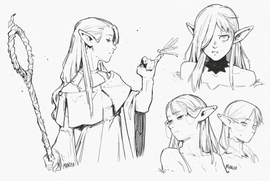
Since the goals for each picture are different, the time I'll spent on achieving each one will be different as well, because the "satisfactory results" lay in different places. For example, the Marcile sketchpage was created in one afternoon, and took approximately 3 hours. The goal was to play around with a brush that has no opacity forcing my lines to be more decisive. I did that and so it is "finished". There's nothing else I want from it.
On the other hand, the cover of Asterism took about 10 days to create, the goal of which was to make "an aesthetically pleasing cover picture taking colour inspiration from the works of (specific list of artists)". I took my time designing it so that it looks aesthetically pleasing, made sure the anatomy is "correct" (a nebulous statement when it comes to stylised humans), took my time masking, and picking colours, and shading. I wanted it to "look good" to my own eyes so if something was not working I would go back, change it, alter it, move it around... that's the wonderful thing about personal art, you can take as long as you like making something satisfactory.
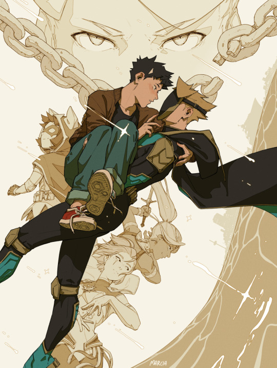
The funny thing is, with what the Asterism cover actually is (a cellshaded image), it could have been done probably in 4 days by the me 4 years ago. But that person was willing to sit 8-10 hours a day to draw with no breaks, she had little social life, and treated herself as a little circus seal performing tricks so that people clap around her, and the clapping was soooo nice because it meant that people remembered her and she mattered. And it worked for her! For long 10 years! Until her arm gave out, and the reality of never being able to draw again became more tangible than ever, and it's been following her like a fog ever since for the past 4 years. The me today works about 4 hours a day and every hour I take about a 30 minute break. I also don't post half the stuff I draw. There is also another aspect that dictates the speed of creating and that is familiarity with the subject matter. The less you know something, the fast you'll draw it! But as you get to know the intricacies of the process, and see all the building blocks, it will start taking *longer* because you will start accounting for every block. But then you'll eventually get familiar with the blocks and so the time spent on a picture will go down again! The cool yet overwhelming thing about art is that, there are always hundreds of building blocks. Form, composition, ambient occlusion, saturation, hue, light balance, line form...... and those are just the *some* of the generalised *categories*. And each category will have it's own subsection of building blocks! And then those blocks will interact with each other to create completely new area of expertise! This is crazy! Marcille sketch page took me only 3 hours to create because I am already quite familiar with linework - I have drawn 3-4 comicbooks worth of linework. This also means I am familiar with believable anatomy, more or less, which got utilised in the Asterism cover - the main bulk of linework got created during a 3h livestream. So.... what's the answer.... "It's all relative" is so unsatisfactory and probably not what you looked for. But you can draw something in 3 days and kill your body over it. Or you can become an expert in a field and dish the same picture out effortlessly in 8 hours. You can also split that 8h block over multiple days bringing you back up to 3 days. You could even add a whole day of visual research which might make your picture only marginally better. And even if we calculate it in terms of raw working time, pen-to-paper, like a self-inflicted capitalist tumor, that time can fluctuate still due to personal visual library and knowledge base. If I asked Tom Fox how long it takes for him to create his sketch pages his answer would probably be downward of 30 minutes. Yet I need whole 3 hours to create something *less* anatomically correct than him. And so here we are at the end of this perhaps unnecessary essay. And all we learned is this: it depends. Dry, not nuanced tl;dr, my personal timings: single sketch - 30mins; single linework pic 1-2h; Cellshaded illust - 16h; Rendered illust: 20-25h.
111 notes
·
View notes
Note
Haihaiiii!! Congrats on 100+ followers!! 🥳🥳🧡🫶
No requests but I just wanted to tell you that I really love your art color scheme, the way u paint (it's soft and clean at the same time AAAA) and your Deuce! ♠️

Idk how or what u saw on ur Yuusona to say that they are cringe or ugly, cause they are def aren't that 🫵
Have a good day!!!! ✨✨✨💗


WHAT THE HELLLLLLL 😭😭😭😭😭😭 THIS IS GORGEOUS WHAT??? HAHAAHASSHEIWSM MY JAWS DROPPED TO THE FLOOR, 😭 MY. MY YMFRISR FANART??? THIS IS SENSUAL THIS IS HUH?? PAUSE EVERYONE LOOK, WHAT, IM FREAAAKING OUT BRO? THANK YOUU, OH MY GOD. THIS IS BESUTIFUL WAKING UP TO THIS MASTERPIECE OH MY GOD.
THE WAY YOU DREW THEIR FACE?? 🥹🥹 THE SMIRRKK THE WAY THE HAIR FLOWWSS, ITS SO NICE!?..?
THE LITTLE SQUIGGLY BLUSH TOO?? OH MY FODDD
IM GOOBLING THIS UP, IM JUMPING UP IN DOWN BRO I CAN NOT COMPHREND MY HAPPINESS?
YOUR LINEWORK IS TO DIE FOR, ITS SO FLOWY AND COMPLIMENTS THE COLOR WELLLL!!
RAHHHHHHHHHH WHAT THIS IS BEAUTIFULLLLL
😭🫶❤️💝❤️ THANK YOU FOR THE COMPLIMENT, MY ART IS HONESTLY WACK, BUT YOUR COMMENT IS SO SWEETTT,!!
YOU PR ART IS AMAZING BPDK, I CAN’T BELIEVE ANYONE WOULD DRAW ME ANYTHING DUDE, IM BLESSEDD🥹
I TAKE PRIDE IN TRYING TO DRAW DEUCE WELL, BUT SERIOUSLY, 😭😭😭😭 WHO IS RHISSS?? YOU DREW THEM SO WELL??
NO REQUESTS I KNOW, BUT I TRIED DRAWING LEONA FFOR YOU 😭

THANK YOU THANK YOUU AHSSHSUWN 😭😭😭❤️❤️❤️❤️🫶 -♠️
#IM BAWLING BRO ????#NO NUMBERS OR WORDS CAN EXPLAIN OR DESCRIBE MY EMOTIONS DUDE#SORRY GUYS I HAD FO PAUSE DOR FHIS.#THANK YOU FOR GIFT 💝 EVEN IF IM JUST SOME DUDE??? 😭😭😭#😭😭 IM GOING BACK TO FINISH REQUESTS SORRY ITS TSKING SO LONG?? 😭
22 notes
·
View notes
Note
Pteri or grarrl review when you have the time? Whichever out of the two you most feel like doing
(I can do both in two parts, but for right now I'll do the Pteri.)


The Pteri is one of several bird Neopets, but surprisingly all of the other birds are specific, distinct species (penguin, owl, etc.), making the Pteri surprisingly unique for just being a normal songbird. Another thing that's unique is that the Pteri has a long non-feathered tail, almost like a Zafara; a very unique addition for a bird and one that gives it a lot more flavor than it would have otherwise.
In terms of design, the Pteri uses a simple three-color palette; base color on top, creamy accents on the underbelly and inside wing, and a complimentary shade of yellow for the beak and feet. The eyes also have these unique fire-y markings to them that accent the underbelly. My only real issue with the design is that the two head feathers don't share the same shape as any of the other feathers, and look both too long and too thin to be read as just fluff. Otherwise, it's a solid design.

The Pteri hasn't changed much through conversion, outside of gaining more distinct chest fluff and slightly longer, fuller wings. I like the overall rounded shape of the original a bit more, but I also really like the 3/4s few the converted is in; having it be front-facing in the older artwork makes the details of the design harder to see. (Also, a moment of appreciation that they just subtly cupped the converted Pteri's wing instead of trying to give it hands or something. Hissi, take notes.)
Favorite Colours:


Faerie: The Faerie Pteri is simply beautiful, and everyone knows it. Instead of having butterfly wings tacked onto it, it instead runs with the bird idea by adding extra feathers to the tail, kind of like a mini peacock, and also adding more to the head and wings. It uses a gorgeous yellow as its primary color and accents it with white, orange, red, and purple, with the colors radiating outward in layers. The design also compliments the natural eye markings with additional markings around the entire eye as well as on the head and tail, and adds some lovely eye spots on the tail as well.
The converted version technically follows the same design as the original, minus the additional eye markings, but honestly the UC/styled pose shows off the markings better and has more flow to boot, making it far superior by default.


Darigan: Unlike Faerie, the converted Darigan Pteri doesn't look that great. The design is technically accurate to the original, but trying to make those features work on the default body shape just isn't happening, and a lot of detail got lost in the shading and highlights in the process.
However, the UC/styled version is really cool. It's one of the few tan Darigan pets that I don't wish were purple, with black accents for the finest feathers and red eyes for contrast. The long feathers and more raptor-like body shape really work well, and the talons on the hind feet are accented by the beak and various spikes. I also appreciate the subtle spotting.

Valentine: Not as fancy as the other two, but the Valentine's Pteri is quite nice; a mostly pink body with a subtle white gradient that transitions into heart markings. Like most good Valentine pets, it subtly integrates hearts into areas like the chest feathers, head feathers, and eye markings, and doesn't feel overly cluttered. I do think that the tail should've also been a heart, and something about the face reads as faintly sunburned to me, but it's still a nice color overall.

BONUS: The mutant Pteri is one of those mutants that's just a little too busy to be one of my all-time favs, but I do like it a lot. The cockatrice-esq body shape is super distinct and looks appropriately mutant-ish, and the teal, yellow, and red palette works great; not to mention the actual art quality is really good as well, with some lovely shading and linework. I do feel like the details should've been trimmed back—lose the long arm fingers, lose the red things on the tail (maybe just keep the final cream segment red instead), drop the patterning, maybe even make the wing feathers cream to break up the design a bit. Still, pretty good overall.
#the neopets servers aren't loading any images right now hopefully everything shows up right#neopets#neotag#pteri#neopet reviews
27 notes
·
View notes
Note
I couldn't help but notice you color your line art sometimes. Do you have any tips on colored line art?
hiii there! thank you for asking!!
just a heads up that i'm notoriously bad at "teaching", and i'm assuming an amount of general knowledge of art programs + layer modes!
i actually don't often "colour" my lineart, at least not in the way a lot of other folks do! i'm used to working as streamlined as possible and developed quick-fire workarounds for most steps during my time in webcomics!
i also have multiple lineart styles! a more textured one with thin lines which i typically use for more polished pieces, and a soft-brush sketch style (inspired by my pal @moonverc3x's lovely lines) that i generally use for less detailed works, though i sometimes get carried away 😅💦
my textured lines don't lend themselves well to those nice and thoughtful coloured lines most folks do. but here's a quick breakdown of my techniques using the soft-brush style!
lines and flats 1) make lineart + flat colour it. my lines are never at 100% opacity, so already some of the colour shows through them anyway! 2) set the lines to multiply mode. because my lines are typically in a colour and not black, this usually works well enough for me, as you can see in the second image! i frequently just call it done here!


hand coloured lines a) if i do want to take the time to colour the lines individually- often things like metals, especially warm golds, require this added detail to really help them pop- i'd just lock the layer opacity and pick a colour that suited and apply where needed. this is fairly standard! b) a second version of the same technique, with higher contrast/more saturation to suit my tastes and a little extra finessing (especially around the eyes). this is very much a "to taste and time/energy" thing! sometimes at this stage i'll add high contrast slaps of colour such as bright purple or blue


my overlay-lines technique a) the second technique that i use is actually very fast and usually gives an okay-enough look. it's what i use for high-speed professional webcomic work (with my textured lines) to give the illusion of individually coloured lines for basically zero effort. so starting with the base lines set to multiply, as seen in (2), then, b) duplicate both the lines and the colours (with shading, if you have it). clip the colours to the duplicated lineart layer, ostensibly "colouring" the copied lines the exact same colour as the colours. set this duplicated layer to overlay, and adjust opacity as needed


you can kinda see that the overlay lines method is not as specific in colour as the hand-picked ones above, and it will suffer from overlap based on where your flats come to underneath the lines. but i find it helps especially when you have high contrast light colours in the work (ie starstruck's face mask) as the lighter colours brighten up the linework in those places significantly.
for highly polished works i would come back and still pick out areas to finesse individually. there's ultimately no quick substitute for spending more time on your work!
there's about a thousand and one other combinations of these effects you can do, such as using the duplicated lines on multiply instead, or further painting over the top, etc etc. but duplicating the colour layer and clipping it to the lineart is one of the techniques i developed that sped up my work process most significantly over the years!
#starflungs process tag#my art#starstruck dee#asks#i don't typically talk about my method because it's pretty sloppy and i really am just not good at teaching!#been told it repeatedly over the years so you get what you get sorry! 😅💦#fwiw i'm working in paint tool sai. most programs should have these kinds of features and layer modes.#if yours doesn't i'm sorry but i don't know how to help!#starstruck is also a somewhat biased example for this sort of thing due to the fact she's quite monochromatic in colour#if you put pink lineart on her she looks good because she's basically just pink all over. when you have high contrast designs-#it's harder to make these quick techniques work and you have to spend a bit more time fiddling around at the end to fix edges.#anyhow! hope this helps some folks!! lmk if it helps you out!
17 notes
·
View notes
Note
Hey!!
I have recently been going through a rough patch with my art. I am not enjoying or liking how I do linework and shading, and in order to remedy that, I'm collecting works from artists I like that I can study/re-imagine.
Your linework and composition is stunning 😍 and I am currently working on a reinterpretation of one of your pieces. This is the most fun I've had with a piece in a while. Beautiful work !! 👏 👏👏
....Er, I've been away from social media for quite a while, and even before that, I was behind on messages... I'm so sorry for my late responses to asks. I wanna say I appreciate ppl taking the time to send them, really :") thanks for the patience LOL
I'll try to condense this - respond to multiple in a single post. So I don't take up too much space in people's feeds.
so first of all @laurikarauchscat I'm sorry to hear you're in a rough patch, and I think your method of overcoming it is on the right track. At least, it's definitely something I do and it really helps me xD Most notably with all the Caspar David Friedrich-inspired pieces. As long as you give credit to the artists you're reinterpreting from (and asking is polite too, if they're an alive artist :D so yes thank you for asking) it seems perfectly fine to me to do so. Good luck and hope it goes well, I'm interested to see c:
More asks under the cut!
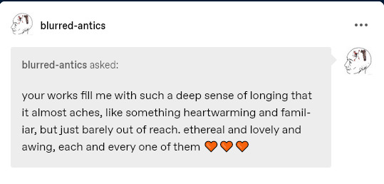
@blurred-antics thank you so much for the words ;b; it's validating to hear, since they're definitely emotions I have in mind while drawing lately. I lost both my parents in the last 2 years, and I've dumped a lot of feelings of grief/longing into my pieces since then, including ones that might seem rather cheerful and perfectly peaceful at a glance. I'm happy others can feel the bit of conflict under the surface-- I don't necessarily mind if my art comes across straightforward, since when throwing art into the public it must be accepted that everyone will interpret it how they want, but it does feel nice to know that some people sense the extra bits. Thank you again!
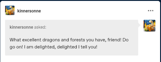
@kinnersonne thank you very much!! Definitely my favorite subjects at the moment c: You're very sweet.
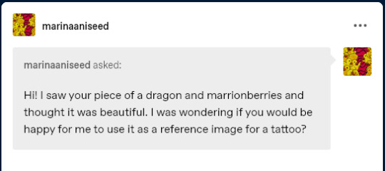
@marinaaniseed I'm starting to get to ... quite old ones, and I worry this was a time-sensitive question :"D I'm very sorry if I'm too late.
First of all, thank you for asking! I'm honored people like my art enough they'd want it tattooed, it's pretty mind-blowing to me. I've actually had several people ask to use my art for tattoos the last few months and I think overall, I'm pretty okay with it. if you'd like to express support for my art for using it, then you're welcome to buy a print from my shop. It's not required, but it's very appreciated <3 Hope whatever you end up going for (whether my art or not in the end) goes well ^^
@wandersoffdoodling Aw, thank you T.T I'm happy they resonate with you! It's kind of my dream to finish some zines and some bigger projects in this sketchbook/journal art style. So that's very motivating to hear. Thanks again c:
@eldathe once again I apologize for how late I am to respond to questions that were intended to be very quick exchanges lol. First of all, thank you! :") I'm sure this is no longer relevant for how old this ask is, but in case you/(or anyone reading this) would still want to use it as a blog pfp or anywhere, yes, feel free, as long as there's credit somewhere visible! Thank you for asking <3
@starrforge thank you kindly, yours is great too :")
@herebesherlocks Aww thank you so much :") I'm honored it evokes that feeling.
@the-halcyon-effect 100 years later: thank you that's a huge honor to hear :"))))
29 notes
·
View notes