#the android dark matter
Explore tagged Tumblr posts
Text
#data#murderbot#breq#k2so#robot#cameron phillips#the android#t850 terminator#baymax#c3po#star trek#tng#the murderbot diaries#ancillary justice#rogue one#terminator: the sarah connor chronicles#t:tscc#dark matter#terminator#big hero 6#star wars#polls#terapsina rambles#i decided my spaceship poll needed a partner poll#also someone take this away from me#lost in space
946 notes
·
View notes
Text
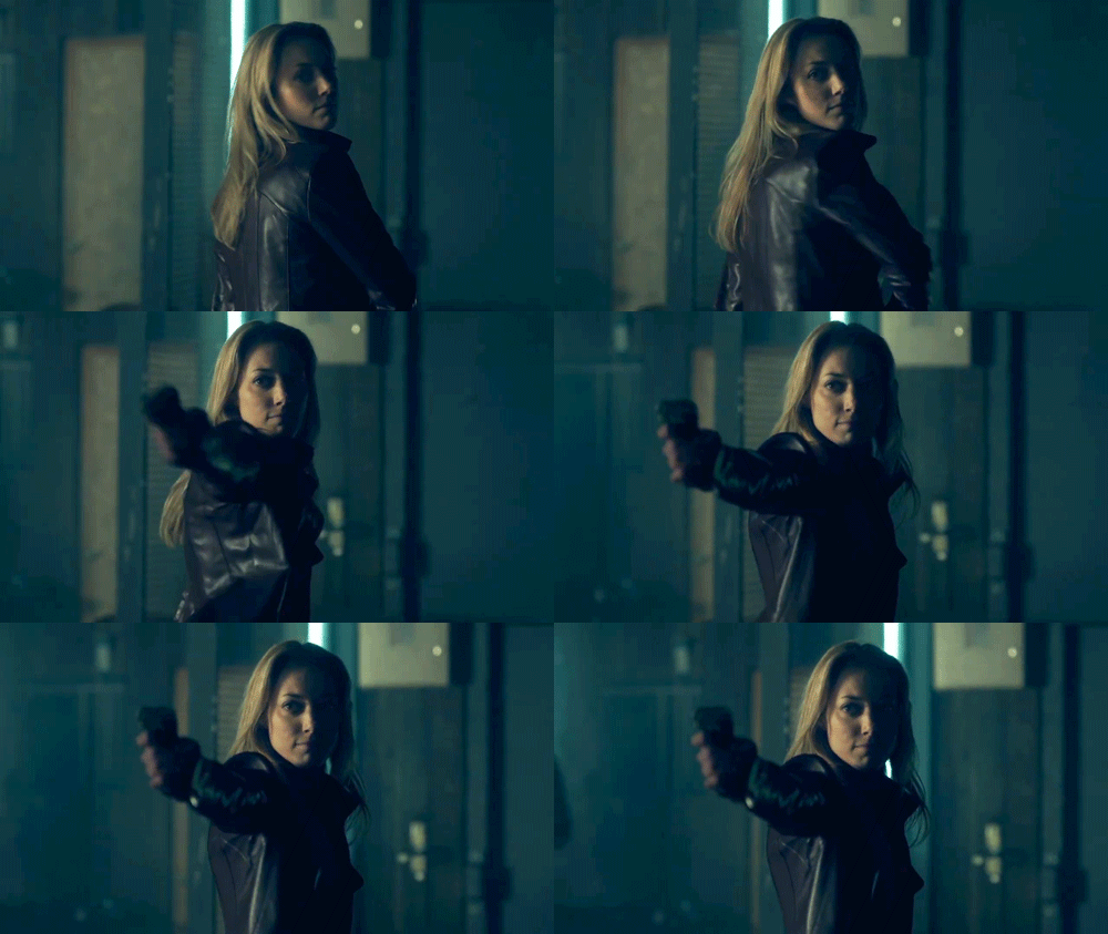
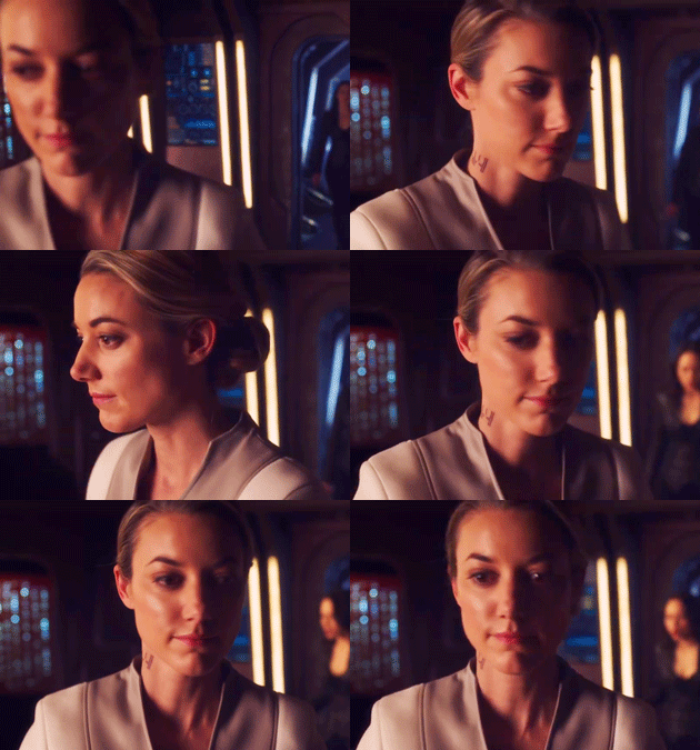

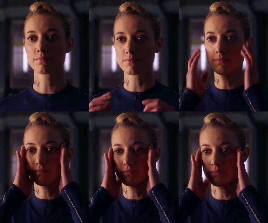
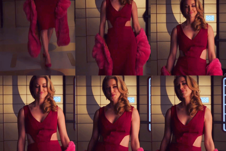
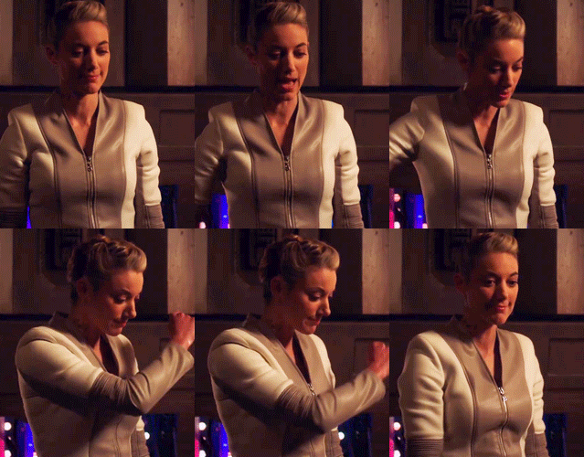


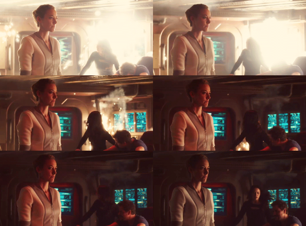
Zoie Palmer as the Android // SyFy's Dark Matter (2015)
#dark matter#dark matter syfy#gifset#rourke og#dark matter android#character set#flashing lights#zoie palmer#syfysource#dailytvwomen#massive props to her- the intense full-body physical acting she does in basically Every Shot is truly incredible#and must have been absolutely exhausting to maintain for the entire show#zoie palmer i love you so much
19 notes
·
View notes
Text

#a.b.e.l#divine machinery#archangel#automated#behavioral#ecosystem#learning#divine#machinery#ai#artificial intelligence#angels#angel#robot#android#CERN#higgs boson#dark matter#technology#sentient ai#it speaks
18 notes
·
View notes
Text
cant stop thinking about 5 'forcing'the whole crew to have weekly movie nights, roping in The Android by insisting its crew bonding time. The bregrudging agreement. The fond smiles at 5 excited to be watching her favourite films with her family.
Thr first week 5 isnt sure if they will do it again, they are 4 films deep and everyone has fallen asleep on the sofas apart from her and The Android. But next week arrives, and without talking about it the crew all make their way to the room, laden with snacks, drinks, 6 with a big blanket. And quietly they all sit down, organising the space and getting the film ready. A few minutes later 5 walks in to the whole crew chatting together, talking about their theories for how the next film will go, 3 and The Android trying all the snacks in turn, some clearly bought in the week between the last film night for this occasion.
In the middle of the chaos, a spot has been left for 5, in the middle of them all. 6 smiling and pulling the blanket for her to be able to sit down, then placing it back over her legs as he leans to grab a snack himself.
2 leans into The Android, disrupting the food comparing to let her know the film can start. And it does. And the next film, and the next.
#dark matter syfy#dark matter#dark matter the android#dark matter two#dark matter tv show#dark matter five#dark matter six#dark matter four#dark matter three
9 notes
·
View notes
Text


Women of Dark Matter
7 notes
·
View notes
Text
i should’ve suspected i was autistic considering how strongly i relate to android characters in media. commander data, you are forever my kindred spirit, my one and only 💛
#star trek#autism#autistic#star trek tng#ramblings#also android from dark matter#seven of nine#etc etc
29 notes
·
View notes
Text


Canon Sapphic Characters Tournament Round One (Bracket 4)
#vagrant queen#elida al-feyr#elida al feyr#adriyan rae#two#portia lin#dark matter#dark matter syfy#canon sapphic characters tournament#tumblr bracket#tumblr poll#sapphic#wlw#lesbian#bisexual#elida x amae#two x the android#two x nyx
26 notes
·
View notes
Text
Working on some edits for my Dark Matter supernatural au. Can’t decide if I should post each character separate or do them all together in one post. I’ve already done a shapeshifter!One edit. Thoughts?
#dark matter#dark matter syfy#I like the idea of just a dash of the supernatural in this setting#imagine you wake up on a ship with no memory but also you have no idea what you are#basically the crisis with two but now everyone has it#two and android will be unchanged from their norm
4 notes
·
View notes
Text
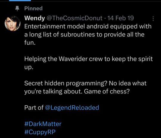
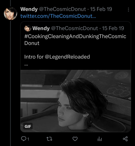
😅😅😅 I miss Dark Matter

#syfy dark matter#dark matter#wendy the android#dunking the cosmic donut#raza#dark matter series#dark matter tv#dark matter tv show#dark matter syfy
2 notes
·
View notes
Text
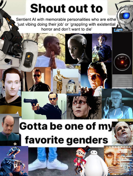
Don't forget my android queen

10K notes
·
View notes
Text


some more of the android for you this fine Monday (unless it's not monday in your timezone, in which case... sucks to suck)
9 notes
·
View notes
Text


0 notes
Text
Obviously like the dark matter fandom is so small that I can hit the end of the main tag after 15-30 minutes of scrolling, but I think like as a fandom we should commit to calling the pre amnesia android by the name Suki to help distinguish between her and The Android.
Also in other news I found out after checking out a dvd set of the series from my local library that apparently the studio who did this also did Lost Girl?
1 note
·
View note
Text
been thinking about this some more. i find it very funny that people are, somewhat predictably, trying to score more points in the notes.
for those people, here's a more specific map, as well as examples for each section:


there's a game which automatically conscripts you into play when you create a tumblr account, and its scoring rubric looks like this
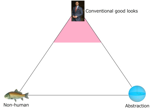
and if too many of the things you want to have sex with are in the pink zone of this triangle you score low.
you have probably seen this game played without realizing it. whenever somebody says "hear me out" they are looking to score more points.
#reply#examples used:#ciciero#warcraft orc#pyramid head#a werewolf#scar the lion#marvin the paranoid android#two doberman#pitcher plants#the moon#allied mastercomputer#map of dark matter#yuki onna#sandy cheeks#bigweld#master viper#glad0s#dolphin#cucumbers#piraten#the stock market
33K notes
·
View notes
Text
The other day I had a nightmare about summer and everyone was very niceys to me in the dream and helped as best as they could but it has kinda bummed me out like yeah, I already know it's gonna be bad, I'm preparing but. gwah. why can't I just be normal and have the sun make me happy y'know. gwahhhh. Don't borrow grief from the future yadayada I know but it still sucks!!!!
#my family made sure my room was as cool and dark as it could be and I stayed in bed because I was ill and my blankets were somehow#really nice and cold in the dream. despite it being super depressing I think it's the most I've been loved in a dream#or real life for that matter aha!#weird combination of mean and nice to me brain huh#okay I need to sleep now goodnight#Android.txt#Android Dream Journals
0 notes
Text
Reasons Discord's New Mobile Layout Update is Bad
The reply function is redundant, as most people are used to just holding down and tapping the reply option at the top. If they're going to change it, they shouldn't have gotten rid of the member list for this functionally bad option. It also doesnt line up with any other platform in terms of swipe direction.
The member list is gone from easy viewing
It doesnt auto open your last group chat/DM making multiple simultaneous conversations far more difficult and longer
It's already broken my app once (Locked all channels including other servers' to one channel. I could not access anything except that and my DMs.)
You can not see images that have been pinned in the pins tab.
The search function was fine before. Where did your before, during and after date search go??
All of Discord's individuality is disappearing.
Getting used to a mobile format actually impedes usage of the desktop format and likely discourages people from multiplatforming discord because theyre so used to the "intuitiveness" of the new "tailored for mobile" experience
There is no way to CHANGE IT BACK. This is like Tumblr rolling out Tumblr Live without any Disable button At All.
Why are they marketing midnight mode as Something fucking ENTIRELY new??? It has always been a feature on Android as the AMOLED theme???????
DARK MODE IS NO LONGER LOW CONTRAST AND DISCORD IS DEVOLVING INTO AN ACCESSIBILITY NIGHTMARE
Disable swipe-to-reply by activating full-screen Launchpad in Advanced Settings
Discord’s new layout is apparently permanent. Keep sending feedback and rating it one star on all appstores; if you get redirected to the advice article, double tap gove feedback.
If you, too, dislike the theme, head to settings (you can double tap your account picture) and go to Appearance, scroll to New Layout and Send Feedback.
Overall, what they've done is disorientate every single current user on discord, and you cannot avoid it unless you've not updated to the latest discord because this is not an update. It is a feature that has already been on the latest update and is being slowly rolled out, like Tumblr Polls.
Good Luck, and may we send as much feedback as possible and have them make it optional or at the least, revert it. I've already sent in at least seven complaints to discord, commented on their instagram post about the layout and I'm about one star review it on google play and app store.
This isnt just the appearance and vibes being off like the new (ish) app icon, this is a matter of functionality.
11K notes
·
View notes