#the aesthetic is mainly art nouveau !
Explore tagged Tumblr posts
Text
Hi all!! For those of you who don’t know me, My name is Ella Griffin, I’m a 24 year old trans woman based in south florida. For the last four years, I’ve been working on a super special project that I’m beyond thrilled to share with you all: my debut novel, The White Liar. As a big fan of fantasy books, I’ve felt for a long time that there’s a serious lack of authentic trans representation in the genre. For years, I yearned for even just one iconic transfem hero in a high fantasy setting. The White Liar is my attempt to fill that gap in the literary canon.
As a bit of background, I am a massive fan of hard fantasy books with an epic scope and in-depth magic systems; such as Brandon Sanderson’s Cosmere books or Ursula Le Guin’s Earthsea series. I’m also a big fan of gothic literature and character-driven classics like Victor Hugo’s Les Miserables and Anna Karenina, all of which have played an influence on this book. The White Liar’s setting is heavily inspired by celtic folklore, mythology and history with a feminist twist.
It’s a world where fae creatures range from tiny glowing insectoids to massive flying mounts and even humanoid beings. Yet, even the tiniest of these has the potential to unlock unfathomable magical potential through the art of Serimancy! Serimancy, the primary magic system of the book, gives users the ability to transmute or ‘spin’ the silk made by fae creatures into supernatural strength, telekinetic threads, and twelve other distinctive powers. Think Rumplestiltskin spinning straw into gold, but more vaporwave.
Without giving too much away, the book features a diverse cast of characters from all different backgrounds, including transfem, transmasc, nonbinary, aspec and disabled characters, although those aspects don’t always define their motives or character arcs. Mainly, The White Liar is a book about the nature of truth and identity; the ways in which our environment affects how we perceive those things, and the friction that creates with our own perception.
I would also characterize the book as a gaslamp fantasy like the Mistborn series or the video game Lies of P, with a baroque/art nouveau-meets-Bridgerton 19th century aesthetic. I’m a 100% independent author with a summary $0 budget publishing through kindle direct, and flat broke, so I would highly appreciate any and all support with this project, be it word of mouth or otherwise. The cover art is a digital painting created entirely by me and is canon to the book!
Thank you so, so much for giving me your time and attention. This book is my love letter to the queer community and I truly hope someone somewhere finds it hopeful or inspiring like I’ve found with the works that inspire me.
The White Liar is available now on E-book here:
#mine#The White Liar#indie author#indie fantasy#trans author#lgbt fantasy#gaslamp fantasy#art nouveau
86 notes
·
View notes
Text
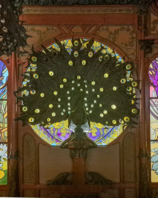
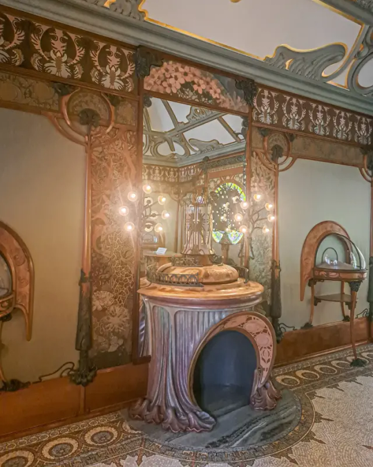


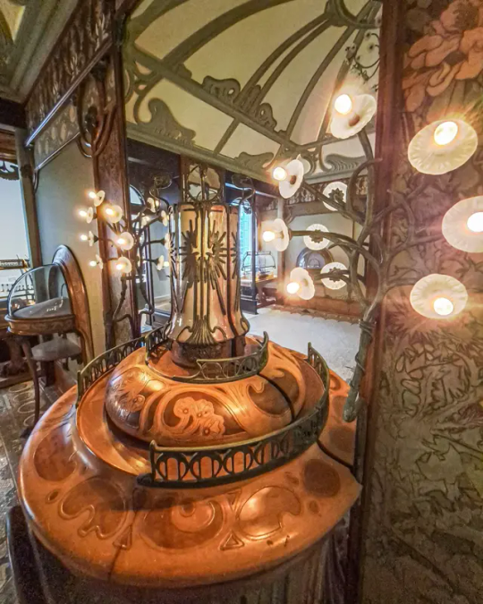

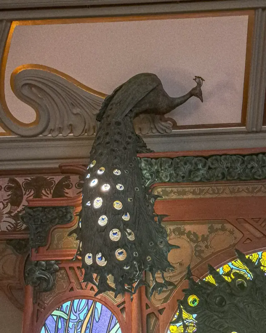


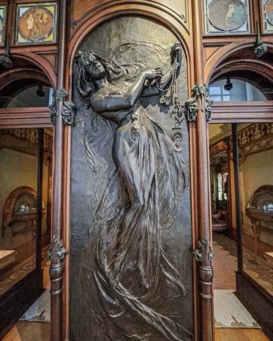
The most famous art nouveau style shop interior must be the shop of Nicholas Fouquet
L
Because of the particularly remarkable decorations of the Fouquet jewelry store, reconstituted and presented within the collections of the Carnavalet museum, you are immediately immersed in the Art Nouveau style, born in Belgium and further developed in France (and later also other distinct european regions), which will dominate the architecture, the decorative arts then the plastic arts (paintings, sculpture) until the First World War. A style characterized by curved and elegant lines; floral, plant or animal motifs inspired by nature; slender and idealized female silhouettes with extra long, flowing and evanescent hair. A style that will also put color back at the heart of arts and architecture.
To create the decorations for his jewelry store, presented here at the Carnavalet museum, Georges Fouquet (1862-1957) called on the Czech Alfons Mucha (1860-1939), an essential and emblematic illustrator of Art Nouveau from the end of the 19th century . Mucha was born on July 24, 1860 in Moravia, a region today partly encompassed by Czechia. After passing through Prague, Vienna and Munich, he arrived in Paris in 1887 to study art. At the same time, he gradually became known by producing magazines, illustrating catalogs or creating sublime advertising posters. His portraits of the famous actress Sarah Bernhardt, like those of many women in a vaporous and typically Art Nouveau style, made him famous. So much so that he was officially rewarded for his talents at the Paris Universal Exhibition in 1900, notably thanks to a collection of jewelry that he designed.
This is how, in 1901, Georges Fouquet invited Mucha to design the decor for his new jewelry store located at 6 rue Royale, between Place de la Concorde and La Madeleine. The artist created a modern and functional boutique (Art Nouveau is in fact a quest for both aesthetics and functionality), designed as a work of art in its own right. Mosaics, furniture, display cases, stained glass windows, lighting, door handles... everything in the decorations and volumes is of naturalistic inspiration, with a lot of curves, plant and floral motifs, or even animal motifs (the bronze peacocks behind and in the (counter tops are beautiful). A central figure in Mucha's work, the elegant woman is present here too, but mainly in front of the store or in small touches inside. Dreamlike, magical and almost phantasmagorical, the powerful settings imagined by Alfons Mucha will surprise, fascinate and seduce his contemporaries. Dismantled in 1923, most of the shop's decor was given to the Carnavalet museum by Georges Fouquet in 1941. But only in the 1980's the shop interior was reconstructed in the museum.
#europe#historic buildings#historical#architectural history#art history#history#paris france#paris 2024#paris#art nouveau#artnouveau#modernismo#jugendstil#stile liberty#alphonse mucha#shop window#shop interior#histoire#historical interior#museum#musee#museecarnavalet#france#peacock#interior#colorful#lighting#beautiful#travel memories#citytrip
43 notes
·
View notes
Text
Top 5 painters/artists
5. Sandro Botticelli: Mainly because The Birth of Venus awoke something within me at age 6.

4. Alphonse Mucha: Yeah, I’m basic. Art Nouveau is pretty and a great source of inspiration.

I just think they’re neat.
3. José Guadalupe Posada: You know this guy, he made La Catrina!

(Yeah, that’s from him, he wasn’t the first one to draw funky Mexican skeletons, but he made the most representative one. This is why I find it so odd whenever I see someone claiming that painting your face as a Catrina is “cultural appropriation” since it has nothing to do with our “ancient traditions”). He made his lithographies for newspapers and popular publications. His art is a showcase of Mexican daily life during the Turn of the century.

(This is from an article about an “scandalous” ball held by gay men, half of them in drag, a very influential event in Mexican LGBT history.) Also, more funky skeletons:


2.Remedios Varo: A Spanish surrealist painter who later migrated to Mexico. Her paintings are full of symbolism and they have an overall cool aesthetic.


1.Francisco de Goya: You know…


All his art is very expressive. The themes of his paintings go from the Spanish Royal family to the Spanish daily life and the Horrors of War.


My favorites are the Caprichos. They can be pretty scary. Here, have some monsters and witches.


17 notes
·
View notes
Photo
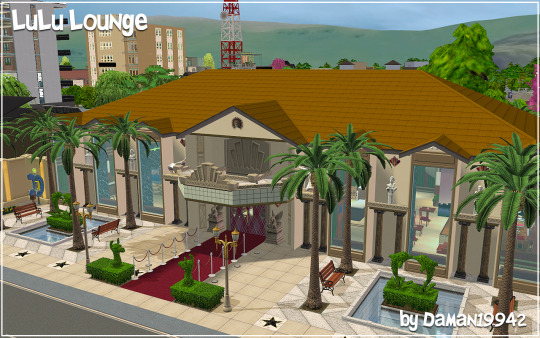


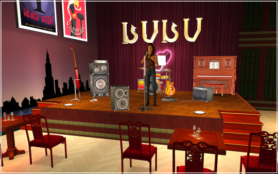
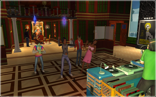
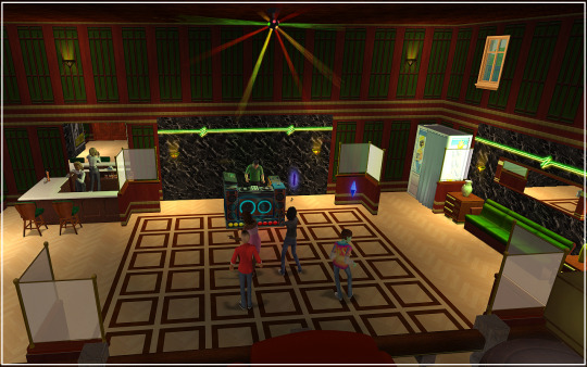


LuLu Lounge Maxis Remodel
Inspired by Studio Town’s very own 82 Sunrise Boulevard (aka Fairchild Film Studios), I bring you my latest Maxis Remodel...LuLu Lounge! I first teased this back in September but I never quite happy with the interior (it is a huge footprint) so I kept trying different ideas and tweaking things. Nonetheless, I finally have declared it “done” and ready to share!
As usual, I did make some architectural changes. The whole building has been extended by one tile, mainly so I could dress up the entrance with two-story doors and a new marquee. The original description said LuLu Lounge offers velvet couches and ambient music, but as I leaned into the Studio Town aesthetic, I wanted something more “old Hollywood.” That meant lots of wood and a little art nouveau styling. The second floor is accessible but largely decorative, but there is a small office above the bathrooms if you want to run it as a business. Everything has been tested in a copy. The uploaded file has never been played.
There is some CC included in the file, which is outlined below. Because this makeover was inspired by Studio Town, downloading the 1t2 conversions is vital to the lot appearing as shown. Please note that Argon’s seasonal topiares are bundled, so you’ll be getting the set of 5 (Egg, Skyscraper, Pyramid, Llama, and Dolphin). Thank you to the CC creators!
CC Included (Exterior wall) Sims1 SS Movie 1 and Movie 2 by simthing TS1 Superstar Studio Fence by Crisps&Kerosene TS1 Iron Fence and Gate by grinder (Topiaries) Surplus Llama Lawn Ornament and The Poetic Porpoise Topiary by MaxoidMonkey, updated for Seasons by Argon Neukem Systems “Repertoire” Jazz Speaker by Zeroth
CC Shown But Not Included NL Wall Curtain Texture Default by HugeLunatic
CC Not Included But Suggested Formal Sign by Simlogical Sims 2 Store Deco Collection by shastakiss
Download: SFS | MTS
Let me know if you run into any issues!
#ts2#the sims 2#sims2cc#sims 2 lots#sims 2 downtown#sims 2 download#maxis makeover#maxis remodel#The Sims Superstar#1t2
114 notes
·
View notes
Note
"Last Exile is not steampunk but dieselpunk"
(paraphrasing from a user on another platform)
i understand the origin of your misconception, user on another platform that will not be named and i'm pedantic, sad and vocal enough about this to wall of text you
last exile isn't dieselpunk, its not even steampunk; its post-steampunk
youtube
1) it doesn't look like dieselpunk, actually
proto-art deco (eg not art-deco actually) steampunk is not automatically dieselpunk
you're looking at this and thinking, "oh it must be 1950's america" because you're mis-seeing art-deco where it isn't
art-deco's entire visual language is appropriation expressed through geometric rules of the fauvism and ballets russes
but airships!
i get you're pulling from the interbellum period because "zepplin" but the culture and politics is all very 16th/17th century prussia, switzerland, austria, etc -- to say "airship = dieselpunk" means every final fantasy game with an airship is dieselpunk which is blatantly untrue.
there's a convergent evolution of media here and you're projecting a lens that only really came into existence as a reaction to the popularity of steampunk circa 2010 and last exile aired in like 2003 predating all of that during the second resurgence of steampunk in the early 2000's following its origins in i think 1987?
but characters/design!
likewise the look of the characters and artstyle is all art nouveau based which isn't expressed anywhere in dieselpunk
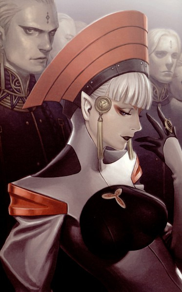
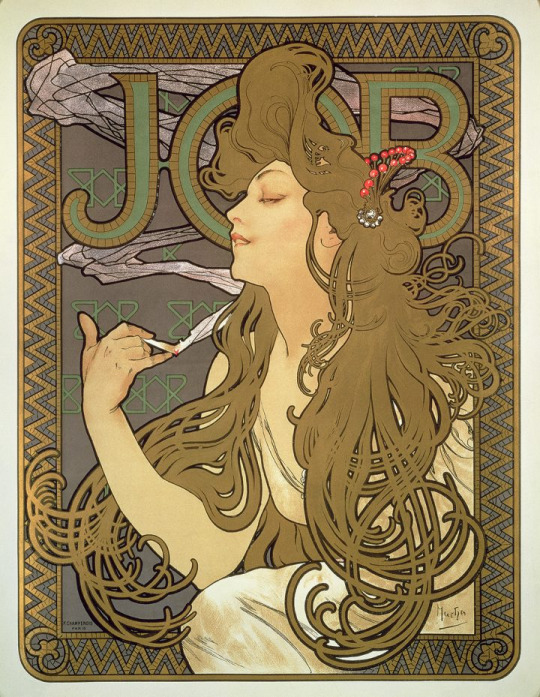
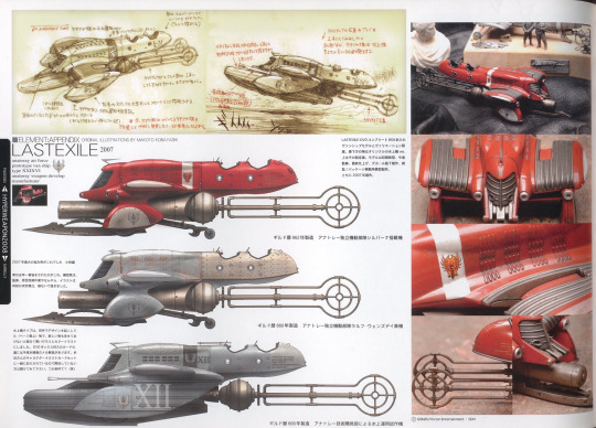
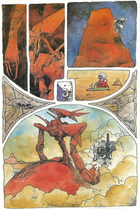
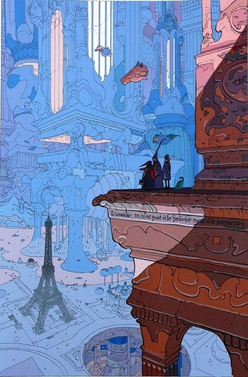
this is owed to Range Murata being influenced a lot by art nouveau and makoto kobayashi being very influenced by the work of french comic artist mobius (jean giraud) who in turn is influenced by fauvism and zenas winsor mccay
2) it doesn't act like dieselpunk, actually
if you want to go by structural definitions and not aesthetic definitions: the setting literally runs on doing things to water to boil it in a special way that makes things float
the dominant politics of the setting to begin with is all 1600's/1700's european continent, until it expands into territorialization (a metamodernist idea you don't see anywhere in dieselpunk)
there is not a corporate structure anywhere in sight (the legal formalist frameworks of modern governence and post-modern lenses do not exist yet), and the modern definition of a scientist also doesn't exist in last exile outside of the guild's researchers who themselves are more preist-like in their approach and culture
3) it is not concerned with dieselpunk's themes
dieselpunk is likewise primarily concerned with explorations of totalitarianism through a lens of scifi, fantasy and noir usually contexturalized as post-classic-conservative into the beginnings of a very very early proto-neoliberalism vs "the other" which is nebulously defined as either nazis, communism or nazi communism (as seen in everything from The Rocketeer to The Grand Dark) -- which usually come as a modernist "well at least we're not like those guys, go team!"
none of that is anywhere in last exile
the irony usually is that dieselpunk is never actually punk; dieselpunk is almost never anti-fascist, anti-industrialist (not to be confused with anti-industrial), anti-militarist (read: mil industrial project) or anti-brutalist and usually endorses all of those things as the norm
last exile takes VERY big swings at all of these things, which is mainly concerned with exploring how cultures stabilize under the influence of other cultures foreign policies and how the territorialized nations are deliberately held back for the interests of the invader (in this case the guild) who then pit the territorialized nations against eachother in a zero-sum strategy of containment -- which is honestly taking shots at every single one of those points and is squarely aimed at highlighting the issues with the kind of technocratic fascism which arose in italy and russia circa the 1920's upon those 17th/18th century european cultures
4) its very concerned with steampunk's themes, albiet from a stanndpoint of technocracy, not theologism or old-world vs new world
steampunk's dominant concept in classic literature or formative literature is that of exposing corruption or the realization of corruption from within -- forgoing the brutalist war-focused ideas in dieselpunk and the unrecoverable corruption of cyberpunk for actionable rebellions against larger entities, typically by interdicting their quest for something fantastical…
in this case rather than a company, empire, nation, king or government it is instead a technocratic territorializer who has instilled false religions and false cultural constructs as a means to control containerized nations in its own interests…
which is… literally… the story…
4 notes
·
View notes
Note
Thoughts on Sontag's The Aesthetics of Silence?
A great essay: the kind of performance—impeccably well-read, meticulously thought through—that gets lost in the discussions of Sontag as icon or celebrity. Also a master class in how to describe, critique, evaluate, and contextualize without ever seeming to debunk, to exert a blatant will-to-power over the works under scrutiny—
To describe silence as a rhetorical term is, of course, far from condemning this rhetoric as fraudulent or in bad faith. The truth of myths is never a literal truth. The myths of contemporary art can be evaluated only in terms of the diversity and fruitfulness of their application.
—a decorum or tact totally lost among today's smug sociological and historicist academic critics. I am broadly unsympathetic to the art she discusses—Duchamp, Cage, Stein, etc.—but she brings alive its impetus and urgency, makes me see it anew for the spiritual ambition it represents. Speaking of decorum and tact, this is my favorite observation in this essay every line of which is quotable; it bears on the discussion of humor on here earlier:
But viewed as a spiritual project, a vehicle of aspirations toward an absolute, what any work of art supplies is a specific model for meta social or meta-ethical tact, a standard of decorum. Each art-work indicates the unity of certain preferences about what can and cannot be said (or represented). At the same time that it may make a tacit proposal for upsetting previously consecrated rulings on what can be said (or represented), it issues its own set of limits.
And the end of the essay, early as it comes in her oeuvre, belonging to the late 1960s, where she rounds upon irony as a strategy of silence, and implicitly upon the project of silence as the dissolution of consciousness—
From Socrates forward, there are countless witnesses to the value of irony for the private individual: as a complex, serious method of seeking and holding one's truth, and as a method of saving one's sanity. But as irony becomes the good taste of what is, after all, an essentially collective activity—the making of art—it may prove less serviceable. One need not speak as categorically as Nietzsche, who thought the spread of irony throughout a culture always signified the floodtide of decadence and the approaching end of that culture's vitality and powers. In the post-political, electronically connected cosmopolis in which all serious modern artists have taken out premature citizenship, certain organic connections between culture and "thinking" (and art is certainly now, mainly, a form of thinking) may have been broken, so that Nietzsche's diagnosis no longer applies. Still, there remains a question as to how far the resources of irony can be stretched. It seems unlikely that the possibilities of continually undermining one's assumptions can go on unfolding indefinitely into the future, without being eventually checked by despair or by a laugh that leaves one without any breath at all.
—contains the seed of her later move toward humanistic rather than revolutionary politics and the "Romantic realist" novel instead of the nouveau roman.
2 notes
·
View notes
Text
For #FroggyFriday:
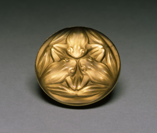
Frog trio in amber colored glass by René Lalique (French, 1860-1945), d. 1 3/4 in. (4.4 cm); likely originally a button or stickpin, a guilded brass mount was later added to make it a brooch. Walters Art Museum
Lalique was one of the finest jewelers of the Art Nouveau period, but his movement into mainly glassworks was concurrent with the rise of Art Deco; this piece from 1911 is a good example of this transitional period in design.
Here is an even earlier example:
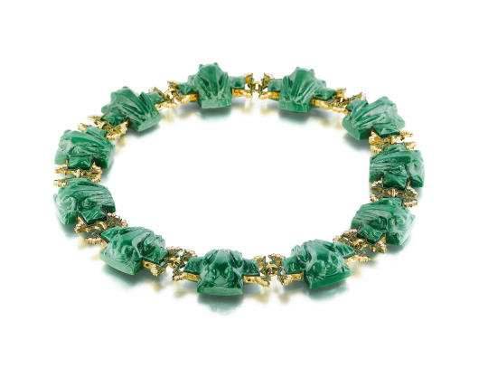

Frog necklace by Lalique, c. 1902-3, 18k gold, diamond, enamel, and glass. Private collection.
Although this fabulous frog necklace is still from within the Art Nouveau period, these chunky square frogs seem like precursors to the later Art Deco aesthetic, as well as Lalique's own shift from jewelry to art glass. As noted in the 2008 exhibition catalog for Artistic Luxury: Fabergé, Tiffany, Lalique, "Lalique's final designs in jewelry incorporated glass as the major element in repeating patterns of abstracted forms such as frogs" (p. 46; Lalique's frog necklace is cat.152, photo on p. 49).
BTW, that whole catalog is full of photos of amazing pieces, with lots of animal motifs! #BookRecommendation:

#Rene Lalique#Lalique#Art Nouveau#Art Deco#20th century art#1900s#1910s#decorative arts#jewelry#art glass#glassworks#button#brooch#necklace#metalwork#exhibition catalog#frog#frogs#Froggy Friday#animals in art
36 notes
·
View notes
Note
I love the way you use color in your art!!! Could you talk a little bit about the aesthetic choices you make wrt color and why? Your style is so distinctive, I’m curious if that through-line between your work is just a personal preference or part of something larger in your work?
first of all, thank you so much!!
i love talking about color so this post might be kinda hefty
gonna talk specifically about how my art's been in the past three years - the subjects and styles i use have changed quite a bit lately.
i love a lot of classical art and early century works (mainly art nouveau - think mucha, privat-livemont) and a lot of color work i do comes from that. recently i've gotten into baroque/rococo which has some fascinating colors to work with and kind of... tweak as a digital artist with Every Color available to me. most of the characters i draw are some form of historical (jazz age, 18th century, 19th century cowboy stuff) and taking inspo from the art of those times i think really lends something to the work i do


my favorite 19th-20th century art relies on a lot of warm jewel tones. i try to capture some sense of nostalgia
for my landscape work - i'm a hiker and always have been, i Love The Woods. i grew up in appalachia and then moved to colorado, and without any sort of changes or tweaks, the colors of nature are SO vibrant.


these are based on photographs and just Looked Like That. i also enjoy taking colors from my landscape work and using it for other things - it's already in nature, so the palettes just naturally complement each other


and sometimes i just like to go off the walls. even still, these colors are based off Shit I Saw - first one is from when i was walking in my neighborhood at dusk and took some photos of an abandoned laundromat. second is when i was in the mountains when there were wildfires in the distance and the whole sky turned gray and pink and the sun was bright red. last one from seeing the utah desert right before the sun sets
so tl;dr all of the colors i use draw inspiration from Something I Saw once; the time i an artemisia gentileschi painting in person. some cool clouds during a really cool hike. some neon lights from a bar making the snow look bright pink. there's a lot of merit in really paying to what's around you, and i think it helps convey the sort of nostalgia or familiarity i try to present, even if the subject itself isn't familiar at all
ANYWAY that was probably more than u wanted but i have many thoughts
7 notes
·
View notes
Text
Hi guys, still haven't done a blog yet (very indecisive!)
I'm still thinking about doing a blog about designy things that I like but I'm not sure if I should start on Instagram (as in on stories) or straight on a blog hosting website.
I've just tried to edit my existing website (from uni) and everything just kept crashing for some reason.. so maybe this is a sign to start afresh?
Also, I don't want to JUST talk about children's books but other things as well that I enjoy...
Anyhoo, I have been doing a lot of research bit recently, mainly about what I want to talk about, eg sketch booking, art nouveau, graphic novels etc. I have also been building up a 'junk journal' of flyers and leaflets that I find aesthetically interesting (moreorless like an archive) Just wish I could share this more with other people.
Also, the drawings I've been doing recently also have somewhat of a journal aspect to them. So currently I'm drawing things that I've seen online in shops like clothes and home accessories.. and then doing little notes about them. Like I'm being really analytical but at the same time I'm very interested in it.. almost like I'm documenting things I like!?
Again maybe I should share this with other people; but my main issue is that I've always had an issue with the Instagram algorithm and so whenever I post something that is art related (as in MY art) nothing gets shown to anyone??
Just trying to figure it all out.. so bear with me as I may or may not do a 'dump post' of things I've been loving recently (brace yourselves guys, it's gonna be wild!)
0 notes
Text
For those who wanted examples of that Bolivian architecture, there it is!
Though... I appear to have struck a bit of a nerve, and not entirely unwarrantedly given I am nowhere near a specialist in architecture, I just kinda casually dislike Gehry's buildings and did not expect this post to blow up like it did.
Like, I mainly picked that one for the irony of it, but I just broadly in general find (Again, from a laypersons' outsider perspective) Gehry's stuff alienating and unpleasant, and not in a fun way. To compare it, it is to postmodern architecture what the grotesque alienating city from The King And The Mockingbird is to Neoclassical; if anyone's seen that film (they should, it's great BTW).
Like, in terms of buildings with wild curves and wacky flourishes I personally prefer them to look more akin to vintage doo-wop or art nouveau or stuff like an IRL equivalent of Barry Jackson's backgrounds from Cool World or a Naoto Ohshima landscape, colorful and wildly baroque instead of trying to cram modernist steel-and-glass into that style for the sake of A Statement.
The reason I contrasted with Bolivia is that like, from what I know (IE, saw on Wikipedia when digging), Gehry's part of the "deconstructivist" movement in architecture, which is meant to deconstruct the capitalist aesthetics of modernism, but has ended up as a status symbol that cities vie for in the capitalist world.
Which seems to be a common fail-state in the avant-guarde, if I may say. Like, when conceptual art such as readymades like Fountain asked "What is art, really?" and the rich who fund gallery art unanimously responded "Anything we can justify using as a tax shelter, NEXT!" and the rest of that art world kinda just went along with it.
So you have a lot of miserable art that was meant to be deliberately warped and not-the-fun-kind of grotesque to stick it to the man; stripped of that purpose of sticking it to the man, and all you're left with is something that is purposefully unpleasant as a bauble for the rich instead of places you actively want to live in.
But, again, I am not as familiar with the deeper discourse on this as one might want, so I may as well tag in @biomechanicalmush, specifically because they're an artist I deeply respect who mentioned the ignorance of my perspective
So I'm super curious to hear their views on what they like about Gehry's work given that (At least in my view) their artstyle feels like the opposite of Gehry's to me.
Tho I may as well also tag in @pumpkinsouppe, who said they hate Gehry specifically because of their own background in understanding that work, and I'm curious what they have to say too.
You ever think about how in Socialist Bolivia they get these gorgeous Neo Andean buildings with these beautiful bright colors and bold forms, meanwhile in the capitalist world we get Frank Gehry, who's buildings appear hostile to human life and sanity and generally look like if skyscrapers had tumors and they tried to make those tumors into real buildings; and who's attempt at a "brain health center" would probably turn you into the fucking Joker if you went there?
...I'm actually not joking about that last one, look at it:

It's like if they gentrified a fucking Psychonauts level...
2K notes
·
View notes
Text


Dadaism
Topics of Interest
Art Nouveau
Feminine
Organic
Elegant
Art Deco
Symmetry
Geometric
Simplicity
Dadaism
Random
Absurd
Humor
I selected Dadaism because it is outside of my comfort zone and I know the least about it, I also found the social-political connections fascinating.
Keywords
Humor
Freedom
Spontaneity
Random
Absurd
Dadaism pokes fun and breaks the boundaries of art. It breaks social norms and makes important statements abstractly. It is known for being random, irrational, and absurd to shock the audience. A significant feature of Dadaism is collage. It takes very separate and contrasting imagery and combines them into one piece that isn’t necessarily cohesive.
Hannah Hoch is a German Dada artist. Her work appealed to me because she is a pioneer of Dadaism. She became associated with the Berlin Dada group which was male-dominated. Her work was highly regarded despite her male colleagues not taking her seriously. She made political collages from fashion magazines, illustrated journals, photographs, and more. She mainly makes work comments on gender and identity. She represents the rebellious, absurd art that Dada artists mirror today.
Dadaism was at peak popularity from 1916 to 1924. The movement began after the First World War when artists began to express their disagreement with the war. At the time, The cabaret was a place where radical artists would meet. Their art was a protest against the war which inspired even more experimental, aggressive, and political works.
I wanted to approach Dadaism through a collage of illustrations and photos. Since Dadaism is associated with political issues I wanted to create something meaningful to me. Hannah Hoch was a big inspiration for my creative direction. I knew I wanted to talk about feminism and challenge social norms as the movement has always done. I decided to create an artwork challenging the stigma surrounding menstruation. To do this, I combined feminine girls and objects as well as sanitary products. In some way, I wanted to romanticize periods which goes against what women are taught by society. I struggled with creating randomness, as I found I was being too structured at first to accurately represent Dadaism.
I wanted to create a piece that felt cohesive and aesthetic despite its randomness. I knew I wanted to use the social stigma against periods to evoke a reaction from viewers. The randomness and unrealistic imagery in my artwork add to that message. It is also a humours approach to a serious topic that greatly affects anyone with a period.
1 note
·
View note
Text
Why Modern Stained Glass Is a Beautiful Choice in Colorado Springs
New Post has been published on https://coloradospringsstainedglass.com/2023/09/14/modern-stained-glass-beautiful-choice/
Why Modern Stained Glass Is a Beautiful Choice in Colorado Springs
Modern stained glass offers a stunning way to bring art and beauty into contemporary homes. With its origins dating back centuries, stained glass has evolved to encompass countless styles from traditional to abstract. Here in Colorado Springs, the popularity of modern stained glass continues to grow as homeowners discover its ability to add unique flair. From leaded glass to beveled designs, the possibilities are endless.
In this blog, we will explore the rich history and evolution of stained glass along with current trends. We’ll also detail the many clever applications for incorporating modern stained glass in Colorado Springs homes. And we’ll provide guidance on customization options, maintenance, costs, and working with a local studio. Read on to learn why stained glass is an excellent choice to elevate your home’s style and value.
A Brief History of Stained Glass
While many people associate stained glass with medieval cathedrals, its origins date back much further. As early as the 7th century BCE, ancient Romans and Greeks used colored glass to create mosaic-like decor. By the 10th century CE, stained glass adorned churches and basilicas across Europe. Artisans shaped glass and lead into breathtaking windows depicting religious imagery and events. Dubbed the “Poor Man’s Bible,” these vivid scenes illustrated stories for largely illiterate populations.
Stained glass evolved from the Renaissance period’s figural themes to the abstract and geometric forms of the Art Nouveau and Arts and Crafts movements. Frank Lloyd Wright often incorporated prairie-style themed glass into his structures. These nature-inspired designs continue to influence modern stained glass today. The medium expanded beyond religious contexts into more secular settings like private residences and civic buildings.
While early stained glass could be prohibitively expensive, modern glass manufacturing innovations made it more economically accessible. Contemporary artists have pushed the medium in new creative directions with inventive techniques and avant-garde designs. Once relegated mainly to windows, stained glass now appears in everything from room dividers to tabletop art.
Popular Modern Styles of Stained Glass
Beyond classic medieval motifs, contemporary stained glass encompasses an array of styles:
– Leaded glass – Pieces of colored glass separated by lead cames creating crisscross patterns
– Art deco – Bold geometric shapes like zigzags, chevrons and sunbursts
– Prairie – Frank Lloyd Wright inspired, earthy tones and prairie-style motifs
– Abstract – Non-representational designs focused on color, texture and form
– Contemporary – Sleek, creative styles incorporating current trends like metallics
– Minimalist – Clean lines and simple shapes create an airy, modern aesthetic
– Beveled glass – Multiple glass bevels refract light for jewel-toned sparkle
– Picture window panels – Stained glass artwork sandwiched between two pieces of glass
The evolution of stained glass allows for unlimited design options to match any aesthetic.
Modern Stained Glass Trends
Several stained glass trends resonate with Colorado Springs homeowners:
– Colorless glass – Provides privacy without obscuring light. Choices like leaded, beveled, and diamond glass sparkle beautifully.
– Minimalist styles – Clean lines and simple shapes for an airy, modern look.
– Large-scale installations – Bold stained glass walls, dividers and ceilings make a dramatic statement.
Stained Glass Applications in Contemporary Homes
Stained glass offers versatility to enhance any space when thoughtfully incorporated:
– Windows – Traditional and modern styles illuminate rooms with artful light.
– Doors – Welcome guests with a vibrant focal point in an entryway.
– Transoms – Unify design above interior/exterior doors.
– Sidelights – Flank doors with coordinated lit glass.
– Room dividers – Define spaces with partitions boasting light transmission.
– Wall art – Install colorful abstract pieces or subtle textured glass.
– Kitchens – Kitchen stained glass windows provide an eye-catching twist.
– Bathrooms – Obscure glass ensures privacy near windows and in showers.
– Bedrooms – Soften morning light and add peaceful ambience.
– Ceilings – Skylights and hanging panels make unique lighting statements.
The options for stained glass features are virtually endless to enhance any home’s style.
Benefits of Modern Stained Glass
Beyond beauty, stained glass offers additional perks:
– Natural light diffusion – Allows light to permeate while diffusing harsh rays.
– Privacy with style – Glass can obscure views without sacrificing light.
– Unique aesthetics – Custom art glass immediately enhances decor.
– Higher home value – Stained glass is an exotic detail that appeals to buyers.
– Timeless appeal – While trends come and go, stained glass remains classic.
– Curb appeal – Distinctive windows or entryways create great first impressions.
– Artistic expression – Make a unique statement with custom stained glass.
– Illumination – Catch, reflect, and refract light in eye-catching ways.
– Versatility – Use in traditional or modern settings, any room, large or small applications.
– Durability – Stained glass properly maintained can last decades or centuries.
Customization Options
One of the best facets of stained glass is the inherent customization. Bespoke art glass tailored specifically to your home’s architecture and interior elevates the entire space.
Some customization considerations include:
– Design – Work with our artisans to create a one-of-a-kind look by rendering your vision or concept pieces.
– Color palette – Selecting hues to complement your color scheme ensures cohesion.
– Size – Thoughtfully measure openings and walls to determine perfect proportions.
– Style – Match existing aesthetics like modern, traditional, coastal, etc.
– Space – Consider the room’s purpose and traffic flow when planning stained glass placement.
– Budget – Prices vary based on factors like complexity and materials. We offer options at all price points.
– Theme – Incorporate meaningful motifs like flowers, seascapes, geometry patterns, or abstract shapes.
– Glass types – Select from stained, painted, leaded, beveled, or a combination.
– Function – Factor in privacy, light control, insulation, and energy efficiency.
The right stained glass design hinges on tailoring to your personal needs and tastes.
Maintaining and Caring for Stained Glass
To keep stained glass looking its best:
– Use a gentle glass cleaner and microfiber cloths to avoid scratching surfaces.
– Avoid harsh chemicals and abrasive scrubbing.
– Inspect lead cames and solder joints periodically for any needed repairs to prevent moisture damage.
– Have protective storm glass installed for exterior windows for added insulation and security.
– Check for broken glass or lead immediately to avoid cracks worsening. Most studios offer repair services.
Simple precautions preserve the enduring beauty of stained glass for decades to come.
Cost Considerations
Prices for stained glass vary based on:
– Size of the piece – Labor and materials increase for larger installations.
– Complexity of design – Intricate details and custom work raise costs.
– Installation needs – Professional installation and finishing also impact budget.
We offer stained glass across all price points and will work within your budget.
Local Stained Glass Studio in Colorado Springs
As a family-owned stained glass studio established in Colorado Springs since 1991, we offer:
– 30+ years of expertise creating custom stained glass.
– A stunning showroom to view designs.
– Master artisans on staff providing impeccable craftsmanship.
– Consultations to match the glass to your home’s style.
– Local installation crews to professionally finish each unique project.
– Personalized customer service and access to our artists throughout your project.
– Competitive prices and financing options to fit any budget.
Modern Stained Glass Adds Contemporary Style
Modern stained glass introduces creative beauty into homes with light diffusion, elegant privacy, artistic flair, and added value. The possibilities are endless for stylish stained glass features in any space. As a local Colorado Springs studio, we expertly guide you through the rewarding process of designing, fabricating, and installing breathtaking custom stained glass. We have served neighborhoods like Briargate, Old Colorado City, Broadmoor, Westside, and Rockrimmon for over 30 years. Contact us today to learn more about illuminating your home with stunning stained glass.
Explore Options for Modern Stained Glass in Colorado Springs
For a consultation or quote on incorporating beautiful modern stained glass in your Colorado Springs home, contact Colorado Springs Stained Glass today.
0 notes
Note
camomile + nutmeg? :)
chamomile ⇢ what kind of things do you like receiving as gifts?
….you know, i don’t know! probably the ones that are tailored specifically to a weird thing i like, e.g. the time my friends bought me a star trek deep space nine raktajino style mug or my other friend got me a nice copy of william blake poetry from a used bookstore :) also cat plushies :3
nutmeg ⇢ how’s your room/home decorated? do you have a specific theme or style going on?
1980’s miami beach style art deco - lots of pastels, their nouveau revival flowers, etc. i am dying for some rounded furniture!!! but it’s soooo expensive!!!! right now i’ve mainly got pastel green walls, pink accents, vintage flamingo sheets, and my 80’s aesthetic lamps :3 (i live in a single big room - like a loft)
thank you for your questions! <3
1 note
·
View note
Note
i am parched, i am starving, i am craving, give us holly lore, i beg of you, oh holy vy
wailcum 2 the blog of im vy and i luv women
bonus thing here for convenience
5 facts abt holly here
consider holly to be something akin to one of the prototype-sarges; there are a number of ocs in my (non twst) roster that could be seen as beta-versions of sarge, in terms of overall demeanor! in all honesty, it was pretty much just a period of time where i was making a bunch of characters to work through particular tropes/clichés abt purity, beauty, alienation, aspects of mortality (specifically what is seen as ‘good’ or virtuous), etc. where holly differs from sarge is more-so in the sense that she is much less benevolent than sarge — where sarge may tell people lies and truths to aid them as he sees fit, holly instead does it for her own sake of enjoyment and enrichment. she’s much more ‘two-faced’ and has more potential to be malicious than sarge… but it’s not an outright malice. it’s just not very beneficial to anyone but herself.
sometimes i sit up and i think abt wtf even Is the ethereal four and the conclusion that i’ve come to is that it’s mainly just a thematic grouping in my head for categorizing how ocs are meant to be perceived. the ethereals require a certain sense of lacking and a sense ‘distance’ that can’t quite be bridged. …holly actually is a pretty good candidate to be slotted into the ethereal four, however she can’t really be categorized as part of the ethereals due to her ability to actually understand (and be understood) on some aspects of living and existing on a much more intimate scale. however arbitrary that may be.
holly within diasomnia… i kinda wanted her to be a bit of a subtle ‘sore thumb’ in terms of aesthetics and vibes. where diasomnia may be reliant on gothic imagery… something somber, dark, mysterious, and intimidatingly elegant in a way that’s pretty reminiscent of western european aristocracy (just slap a low saturation filter on it) — i wanted holly to be more associated with more ‘modest’ and ‘modern’ origins alongside some warmer tones (and associations) as well as an atmosphere that’s lacking in structure and rigidity but still retaining a certain style of elegance? in terms of inspiration, i like to specifically associate her with a blend of art nouveau and art deco! a shock of modern frivolity to the german gothic!
reviving some of the og kusomushi dynamic…. holly is definitely a very artsy person and i feel that she would very much enjoy painting portraits of people, moreso than she enjoys painting scenery or inanimate objects. she likes the temporary things. she doesn’t really want to preserve the entirety of them, she just wants to express the experience of their impermanent moment.
if i had to pick a voice actor…. fuchigami mai as rpk-16 does pretty well for her 😳
she doesn’t particularly rub against anyone in the wrong way but she’s not incredibly well-received either. at best, she’s known in diasomnia for being flighty and free-wheeling but not an inherently bad person. just unreliable. sometimes a little weird.
i wouldn’t really say that she has close friends (or a lot of friends in general) — not that she’s particularly saddened by it ! she just genuinely has… very little interest in extending herself so far in terms of intimacy. she likes to have many many acquaintances though.
i know that twst exists in a weird space of cultures n whatevah but if i were to ground it in a more realistic context, holly would be singaporean (chinese/malay) !
she is an only child (derogatory)
in line with sebek and silver’s assertion that theyre the only two ppl born in their generation of the valley of thorns…. holly is older than both of them (and edgar included, but only by a small margin). but also i was considering making her family originally be from where sarge is from 😳 granted it’s been a few generations but. the thought still counts.
she’s very prone to saying out of pocket things specifically because of the information her butterflies bring back to her when she uses her UM. she has a bit of a poor distinction of what she knows versus what her butterflies know. it comes off a bit as stalkerish when she offhandedly mentions things. not that she cares though. it’s not like the information doesn’t technically belong to her.
11 notes
·
View notes
Text
Ya want some WORLD-BUILDING????
Have some world-building!
*REMINDER* This is based on characters, not real people. I’m not going to be writing any shipping/smut content, especially involving minors. Please be respectful of content creators’ boundaries!
The Crystallos Empire (AKA the Antarctic Empire)
Largest the countries (takes up most of the southern half of the map) but agreed to stop expansion after a bloody battle with Valeriana
Centered on a large snowy mountain in the middle of the tundra
Mostly stays out of other countries’ business, but will step in as a last resort
Has some of the most well-known citizens in the world because… they’re pure chaos
Attack at your own peril
Has vast deposits of ores and gemstones, and the metalwork from Crystallos (mainly weaponry, armor, and jewelry) is highly sought after
The only known food export is potatoes. Wonder why…
Associated Colors: Royal blue, light blue, crimson, gold
Aesthetic/Vibes: gothic vibes, white stone and large stain glass windows, not particularly opulent or extravagant but still impressively royal looking, think catholic cathedral but brighter and with less Jesus (can you tell I’m a recovering catholic yet?), spires shooting into the sky that’s visible even during a blizzard, cavernous halls full of sunlight and echoes, snow that can comfort and kill in equal measure
Notable Members:
Philza Minecraft:
Angel
Visible wings look like a harpy eagle
Probably the most powerful person in the world
Didn’t mean to start an empire it kinda just happened
Also didn’t mean to adopt kids but his Dadza alarm went off
Usually kind but will not hesitate to use violence when necessary
Technoblade:
Is pig.
With braid.
At least 8 feet all
Extremely adept fighter, skilled in almost every form of combat.
Not a people pig, prefers his potato farm to being a prince
Hella protective of his family but will not hesitate to bully when given the opportunity
Wilbur Soot:
Muse who can influence people through song
Can’t totally control people (yet) but can subtly push them in a certain direction
The public face of the imperial family
Would rather insult than fight but can and will cut a bitch if he needs to
Because inspiration is fickle he’ll have some … strange episodes (see: the Sand Incident)
Tommy Innit:
Child.
Chaos incarnate.
Is he human? Is he not? No one’s sure yet.
But he’s a gremlin and a hellion and willing to throw down at any moment.
Has a surprisingly caring side, but no one outside his immediate circle has ever really seen it.
The Kingdom of Valeriana (aka Dream SMP)
Oldest of the countries
Located in the middle of a massive forest at the center of the main continent
Home of the Fae Courts
Ruled by a single king who is chosen by a tournament held every 100 years
Known for causing chaos in other countries, but after an Incident with Crystallos they have kept their meddling to annoyances rather than outright declarations of war
Considered the most magical of all the countries, and traditional enchantments almost all come from Valeriana
Associated Colors: neon green (duh), bright yellow, forest green, light brown, blood red (more saturated than Crystallos), rose gold
Aesthetic/Vibes: spooky art nouveau (idk what else to call it), lots of plants and nature but with an edge of danger, poison gardens and carnivorous plants, hedge mazes that lead everywhere and nowhere, laughter deep in the forest, deer with eyes just a hair too human, Alice in Wonderland on steroids
Notable Members:
Dream:
Current king of the Fae
As long as he’s touching the ground, he knows where everything and everyone is
Can terraform
Unlimited in the boundaries of his kingdom
Much more limited outside of his realm
No one has ever seen what he really looks like, even before he took the throne
Since people outside the kingdom don’t know who he is, he’ll wander the outside world and challenge random people to fights
Never says what happens to the losers
Only one person has ever beaten him: Technoblade
He might have a lil obsession around Techno, but it’s fine.
A little competition is healthy.
Sapnap:
High Lord of the Summer Court
Dream’s right hand man
Likes fire a little too much probably
George:
Human that Dream took a liking too and yoinked from the mortal world
Dream and Sapnap made him immortal but he hasn’t realized it yet.
Skeppy:
Changeling who started growing diamond-like scales across his body
Is vaguely allied with Dream simply because he’s Fae, but is more loyal to BBH
Like a lot of other Fae, likes to make challenges but he makes them less deadly. Not totally safe, just less deadly.
Badboyhalo:
Demon who was kicked out of hell because he was too nice
Found Skeppy in the Overworld and the rest is history
Cursed by the Demon King that the moment he says a swear word, the entire world would end, but can never tell anyone that he is cursed
The Merchant’s Guild
Not quite a country, more of a international power
Oversees the largest and most important businesses in the world
Makes sure that no laws are broken between different countries and everyone gets a fair shake
Has a very large reach, so some members have dabbled in espionage for various groups
From the outside it looks like the whole thing is kept together with duct tape and hope, but its actually pretty functional
The main members are just… a lot.
More concerned with keeping things working than influencing other nations (although there are still jokes about it)
The most valuable thing they trade in is information
They have a lot of fingers in a lot of pots, but are trusted with their information
Associated Colors: dark blue, teal, deep yellow, burnt orange, copper
Aesthetic/Vibes: art deco babie, angles and lines, very modern and streamlined, sleek suits instead of armor or robes, whiskey in a crystal glass, wars won by words not weapons, knowing when someone’s lying without them saying a word
Notable Members:
Schlatt:
Ram-man with a plan
Not that bad of a dude, but is in a position where he is constantly in possession of highly sensitive information and that does things to someone’s mental state
Drinks pretty regularly but not a full blown alcoholic
Trying his best
Can be a snarky asshole sometimes
Quackity:
Lucky duck. literally.
Duck man with an uncanny ability to absorb good luck from people (typically Fundy) and apply it to himself
No one knows when or why he joined the guild, but now he’s there
Pretty damn smart, but hides it behind humor
Fundy:
FOX!
With BEANS!
Trying his goddamn best but life (and Quackity) make it very difficult
Usually is stuck with the shit end of the stick when getting jobs/contracts/etc.
Wilbur being his dad is an inside joke that’s gotten a life of its own.
(No Fishfuckers Allowed!!!)
Puffy:
Badass sheep lady who captains a ship and commands her own armada
Schlatt’s sister
Also part of Storm’s Landing’s council and acts as the main liaison between them
Do not fuck with her she will kick your ass.
Storm’s Landing
Port city that became a country after becoming a safe-haven for seafarers
Led by a council of important people, with the head of the council known as the Admiral
Closest ties to Crystallos and the Merchant’s guild because:
1) Clingy supremacy!!!!
2) it’s a good idea for a guild to have good ties with a large sea power
3) all the dads for Tubbo
Associated Colors: navy blue, scarlet, white, brass
Aesthetic/Vibes: Nautical (obviously) with heavy “Age of Exploration” vibes, barnacles crusted on treasure chests, think tall ships and pirates and shit, respecting the ocean because holy shit she’s gonna smash your boat to pieces on a whim because she can, has an edge of darkness because when you go deep enough who knows what you’ll find down there (maybe mermaids???)
Notable Members:
CaptainSparklez:
elected to Admiral after the previous Admiral went missing on a routine voyage
(idk who it used to be, I just wanted to make him new at leading)
not 100% sure about the whole thing, but handling it pretty okay
still answers to “Captain” instead of “Admiral”.
Niki:
If Storm’s Landing had a queen, would be it unquestionably
Never gets robbed even though there’s a well known “underbelly” in town
Could probably end wars with her croissants
Has a significant history of empathic abilities in her family, so she can tell how people are feeling at all times
Eret:
Owns a magic store in town that really only shows itself to people who need it.
Having a bad mental health day?
He’s got a warm blanket and a cup of your favorite warm beverage waiting.
Dysphoric?
She’s got the perfect outfit and affirming words already prepared.
Trying to find that specific book but can’t remember the title or plot, only vaguely know the color of the cover?
They’ve got it.
Ranboo:
Not sure why he decided to move to a seaside city when he’s not chill with water, but now he’s here and he’s too anxious to leave
Known for teleporting around town randomly when nervous, and the people who find him are always willing to let a hand if he gets lost
Tubbo:
This boi! Has so many dads!
Epitome of “Kindness does not equal weakness.”
While a lot of people underestimate him, he’s not some fragile little flower
He hasn’t fully grown into his ability to speak to animals (he can only understand bees right now)
He’s just as much of a shit stirrer as Tommy.
When they meet up, look out. Something’s getting destroyed.
The Astral Academy
An independent university focused on advancing knowledge in the arcane arts and engineering
Not a country, but has the political power of one due to their vast resources and building prowess
People can’t enter unless they are invited or have been given entry as a student
There are a bunch of potential doors scattered around the continent that could lead to the Academy, but no one is sure where the real entrance is
Associated Colors: royal purple, lilac, sepia, sky blue, silver, bronze Aesthetic/Vibes: bright academia, massive libraries with bookshelves stuffed to bursting, workshop benches covered in scrap and prototypes, open air observatories, runes waiting to be translated, the crackling energy that comes from successful collaboration, falling down a research rabbit hole, bursting with pride after a project is a success
Notable Members:
Sam
Purpled
Ponk
Punz
Antfrost
Jack Manifold
I don’t know much about these characters, so if you have any ideas please let me know!
Zero’s OC Land - The North Haven
Smallest and newest country
Recently gained independence from under a cruel dictator (not schlatt lol)
Located in a pine forest at the base of a huge mountain range
Has pretty good relations with the other countries, but outsiders don’t know much about them
Main exports are wood carvings and leather goods
Associated Colors: Maroon, dark brown, black, pewter
Aesthetic/Vibes: medieval but with a modern twist, dark wood lit by a roaring fireplace, snow-covered woods without a living soul in sight, half timber houses and detailed wood carving, no outrageous ornamentation or extravagance
Notable Members:
Tyr:
Lord of the North Haven
trying to keep his people safe and protected
one of the few remaining Spirits (higher in power than the Fae, but lower than angels)
Spirit of Justice
lost a hand in the war for North Haven’s independence
didn’t want to become the leader but does a pretty good job at it
Adopted 5 kids and is trying his best
Bragi:
Heir Apparent
24 year old human
can influence the world by speaking (not singing) but has to be careful about which words he uses
has a book full of phrases that have proven effects (a spellbook of sorts)
has a friendly rivalry with Wilbur
Freya:
Spymaster
actually the oldest but abdicated because she feels she’s not the right person to lead a country
age unknown because she’s the last known [REDACTED] (it’ll be revealed, but I wanna build suspense)
has gyrfalcon wings and heightened senses
chronic insomniac
Forseti:
Official Librarian
20 years old
hybrid with an unknown entity
has black fingers with sharp claws
always wears gloves to hide them
can create portals to places he’s been or to people he knows (the second is much riskier, but not impossible)
knowledge sponge
wants to join the Astral Academy but is too nervous to apply
Odin:
Older Twin
The “Sensible One”
17 years old
Has an uncanny sense of direction
Can’t get lost no matter what
Can manipulate magnetic fields
Loki:
Younger Twin
The “Hot Headed One”
17 years old
can manipulate fire
idolizes his older siblings, particularly Freya
The Institute
Creeping around in the background
Up to bad things
Something’s going on in the world, but no one’s noticed yet
They will though… soon
Aesthetic/Vibes: minimalism (the worst kind of vibes imo), think laboratories or empty hospitals, harsh artificial lights and cold floors, labyrinths of monotonous hallways with no doors
#whoo boy#that got long#can you tell i have a creative writing degree#fsis au#find steel in silver au#mcyt au#mcyt#dream smp#antarctic empire#philza#technoblade#wilbur soot#tommyinnit#dreamwastaken#sapnap#georgenotfound#skeppy#badboyhalo#jschatt#quackity#fundy#captain puffy#captainsparklez#nihachu#eret mcyt#ranboo#tubbo#i tried to tag everyone but it cut me off#if u have ideas/questions hit me up!
99 notes
·
View notes
Note
🖼️ for Beatrice and the same for Stella the patron of the arts ^^ —leila-of-ravens
i was so hoping someone would ask this one thank youuuu, i give a mini art history lesson in this post lol
🖼️ a moodboard of my muses art aesthetic
Beatrice:
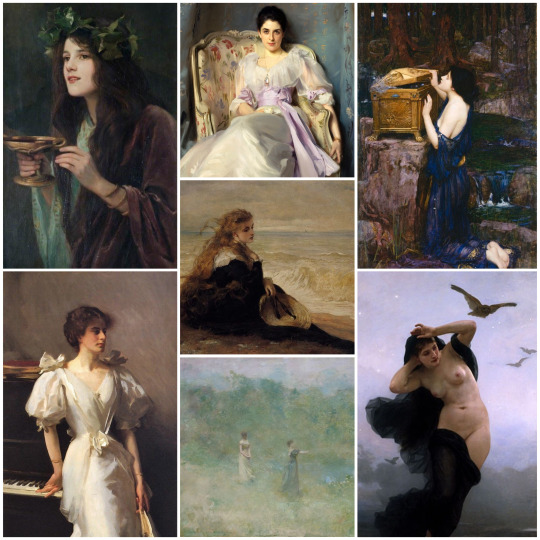
Artists featured: Beatrice Offor, John Singer Sargent, Thomas Dewing, William-Adolphe Bouguereau, George Elgar Hicks, and John William Waterhouse
Her art aesthetic is inspired mainly by portraiture, specifically from the late 19th century. For her, I’m drawn to Pre-Raphaelite art and depictions of mythological characters and allegories (like the nude lady in the right corner who is a personification of night, Circe in the top left corner, and Pandora in the top right corner)
Beatrice’s background and fashion sense are drawn heavily from the 19th century, so I find portraits of that century really evoke her aesthetic for me.
Art movements/styles: Pre-Raphaelite, Realism, Aesthetic Movement
Stella:
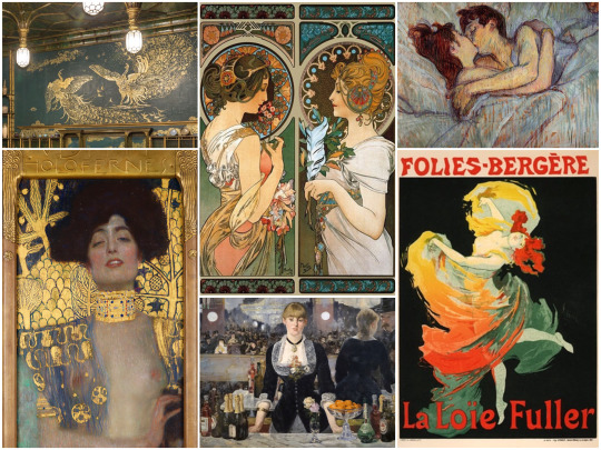
Artists Featured: James Abbott McNeill Whistler, Gustav Klimt, Alphonse Mucha, Henri de Toulouse-Lautrec, Édouard Manet, Jules Chéret
Stella’s main art aesthetic is the Art Nouveau movement. The colors and sense of movement really remind me of Stella, I think she’d happily decorate her entire house in gold like the Peacock Room (top left corner). I’ve also included a few Impressionist artists who I think Stella would appreciate, partially because GAY (the top right painting is usually read as two women hehe) and because the Impressionist movement was all about breaking from tradition which is very Stella.
I can really picture Stella in Paris in the 1920s (probably trying to flirt with Zelda Fitzgerald) and I think that’s why I chose some of these works.
Art movements/styles: Art Nouveau, Impressionism, Renaissance
Honorable mention for her is just Renaissance art in general , especially
La Primavera by Sandro Botticelli
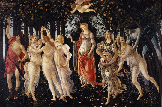
Part of Stella’s post-canon route is that she’s a patron of the arts, and might even open a museum in Vesuvia (we’ll see lol) so due to the general time period, I think the canon art she’d be commissioning and collecting would be Renaissance and Baroque art.
#i had so much fun with this omg#i will gladly talk more about art at any point#apprentice beatrice#apprentice stella#talking about art makes me so 💗💗💗💗#so thank you for asking laura
9 notes
·
View notes