#thank god for the symmetry tool��
Explore tagged Tumblr posts
Visit Tumblr Blog
Explore Tumblr blogs with no restrictions, modern design and the best experience.
Last Seen Tumblr Blogs


Fun Fact
Tumblr was the first site to host the blog for President Barack Obama in 2011.
Text

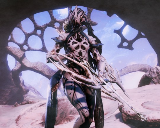
“A thousand generations serve to praise…”
#listening to the 1996 ending and getting emotional at the last line#thinkin bout how even literally thousands of generations later we’re still making new adaptations of this guy#and still talking about everyone’s favorite lil monkey guy#and after all - isn’t that true immortality?#sun wukong#jttw sun wukong#journey to the west 1986#journey to the west 1996#havoc in heaven#monkey king#monkey king reborn#lego monkie kid#lmk sun wukong#lmk fanart#digital art#my art#journey to the west#I’ve been wanting to make a piece like this for a while#thank god for the symmetry tool…#I’ve been really locked into work lately so this was a relaxation piece#my only regret is that I didn’t have enough stamina to shade it#but I still like the vibrant colors a lot so it’s cool 👍#I ordered it by timeline#some of my favorite Wukongs :)
6K notes
·
View notes
Text
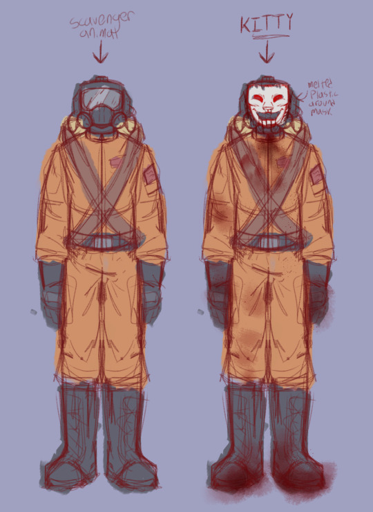
i think these are ants?
#lethal company#lethal company masked#lethal company employee#my art#im slowly finding a mask shape that i actually like the look of👍 thank god sketchbook has a symmetry tool#the beast IS feline in nature
57 notes
·
View notes
Text

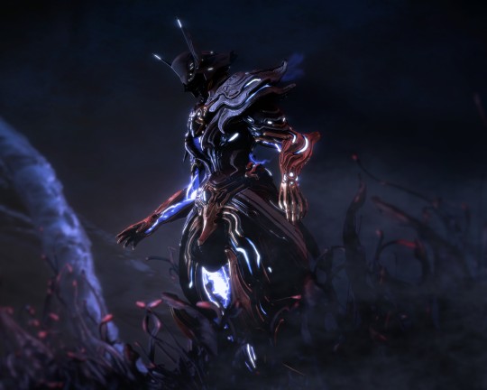
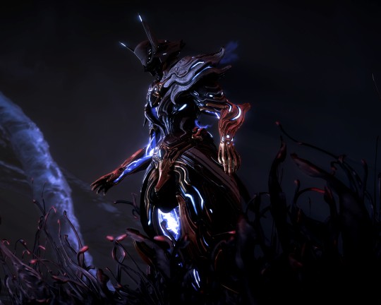
The Emperor of Lonna, Lohsevaar III.
The one who found immortality through possession.
Original from May 2022 under the cut.
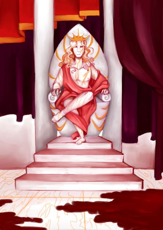
Wild what changes almost 2 years bring, huh ?
#digital art#digital painting#my art#fantasy art#art#redraw#before dawn : the age of the gods#the emperor#it is very fun that he went from 'nameless as the emperor' to 'kept his ex's name in the divorce'#valiandra is so fucking funny for this#do you ever convince your boyfriend to steal his twin brother's name ?#do you ever murder your boyfriend in vengeance and steal the name he stole ?#next time i paint one of these remind me to separate the character from the background#in terms of layers i mean#for fiddling purposes#thank you#also yep it is a lot less bright as the older one on purpose#and yes this one used the symmetry tool bc it's part of his whole deal at that point in time
8 notes
·
View notes
Text
Tomorrow is the last day of the theme week and I cant wait to show yall what I made for the free day! I'm so very proud of it
#this is another one i did in advance#its very fun. and i executed it well#like. ok small peek into it: i drew the interior of a car for this. and it came out good as hell. thank god for the symmetry tool but#it came out so good#okokokokok i have to actually sleep now. still early but at least my work bedtime isnt 8pm while the sun is still bright and shining anymore
1 note
·
View note
Text

LET'S GO OUT WITH A BANG 🚦
taglist:
@ashiyn @single-malt-scotch @goodtimeswithetho @pebbltree @crabbunch @catmaidetho @amethyst-allium @stitchthesewords
sooooo ermm i guess i get to talk about this piece now YIPPEE
i am one of those people who's constantly trying to figure out what their own art style looks like LMFAO. i take frequent breaks from art due to mental health shit so it feels like every time i come back i'm trying to find my footing again.
that being said, i had a lot of caffeine yesterday and started this on a whim and it ended up being something i'm incredibly proud of. i think it helps that i've been redrawing old emotes for a friend's twitch channel, so figuring out which brushes i like right now was really helpful, and i ended up using my personal emote palette like...a lot. that pink in Etho's eye, the purple used for shading, most of the browns are all used in my own emotes. it's wild how much having colours already picked out streamlines things!
Etho is the one i started with, of course, and ended up being one that i went back to re-draw after i'd done...three? or four? more, because the sizing wasn't right and i wasn't happy with the posing. i still wish i could have conveyed him dipping his chin into his coat fluff a little better, but oh well. i thought of the little detail of him looking at Martyn's drawing at the last second (#ethtyn4life) and it made me laugh so i did it. points to you if you caught that!
Joel was the second - life!Joel has always been fey in my head, especially after that season when he just went batshit insane the second he turned red. can't explain it, that's just how it be. i tried to give him an air of subtle menace about him but i think he just looks sleepy 💀 i'd like to do these as individual, larger pieces at some point, so maybe i can work on that more then.
Grian was the third - he reminds me of a Lost Boy here and that wasn't intentional but the Lost Boys always kind of freaked me out and life!Grian's kinda freaky so i think it fits. his little smirk is so creepy and i love him.
i don't remember who i did next after this so we'll just go in order pfft
Bdubs is SO CUTE look at him. one of the few where i couldn't make a menacing expression work, and honestly with how good his profile turned out i barely mind. i did that side profile with no reference, y'all, idk what kind of crack i was on last night. what the hell. this was about the point where i started wanting to do little lore doodles for everybody so i added the clock face - i think it clashes with the red background but what can you do.
CLEOOOOOO CLEO CLEO. i LOVED drawing them, i think their design is one of my favourites of the bunch. her hair has always been snakes in my head and AGAIN i drew those with no reference, can you fucking believe that. i loved the little detail of some of the snakes poking at the people next to her, they're so cute hehe. also Cleo has freckles now, i'm so sorry but i don't make the rules. someone complimented the teeth in the reblogs and THANK YOU!! they're not quite anatomically correct but fuck it we ball and they look cool as hell anyway.
Martyn is so smug, i love him. points if you caught that he's looking at Cleo bc Double Life, i wanted to do something a lil different with him than just another straight up symmetry tool drawing and i think it fits. he is so eye-searing tho sir please tone it down.
Lizzie is fey just like her husband, and also she is smol. i don't think it's conveyed as well as i'd like here but i also didn't want her to look like a straight-up child so i did what i could. she is So Scary with those vacant blue eyes oh my god. and drawing her hair was sooooo fun i love long hair ahh
with Gem i basically smoothed out a rough design sketch i posted awhile back and i'm so proud of the little head cock she's got going on, she looks so cool. also her hair?? idk how i did that. i love her swoopy bangs so much.
Pearl is moth. Pearl will always be Moth. so she got lil antennae and big buggy eyes. drawing that hood was so satisfying, i used to try and draw Raven Teen Titans in high school and could never get the hood to look right so seeing this one come out perfectly was sooooo good. and of course had to include a teensy moon.
that's all i've got, i think - i feel myself crashing LMFAO. maybe at some point i'll come back and say more but here's this for now!
#smallishbeans#ethoslab#bdoubleo100#grian#zombiecleo#inthelittlewood#itlw#ldshadowlady#geminitay#pearlescentmoon#trafficblr#life smp#🚦smp#vse.art#*#image description in alt#y'all doing the alt text for this was an ADVENTURE lmfao#popular? i know about popular.
226 notes
·
View notes
Text
Fox WIP

Omg his mask is so fucking hard to draw, but thank God for the symmetry tool.
77 notes
·
View notes
Note
I know it was months but, but the "Weirdly Specific Artist Ask Game", if you're still interested in answering; 1) Art programs you have but don't use 2) Is it easier to draw someone facing left or right (or forward even) 5) Estimate of how much of your art you post online vs. the art you keep for yourself and 8) What's an old project idea that you've lost interest in
O hello there! I still love this game so I will defo still answer 👀
1. Photoshop and Clip Studio.
I tried. I bought a whole new desktop PC to learn those damn programs *weeps* I still haven't given up hope. But in comparison to how light weight and intuitive procreate on the iPad is, those programs really quickly overwhelm and confuse my poor brain.
2. Depends on the day honestly. If I get to use the symmetry tool then forward no contest. But I would say facing left if I had to choose.
5. I actually post a fair amount of my stuff. I used to have a real issue finishing work or sketching w out fully rendering so I would put stuff out either slow or messier than I would have liked to share. But these days I'm actually having a lot of fun with lines and flats and it's made drawing quicker and easier if I'm just trying to get an idea down (huevember). I'm always hungry for that sweet sweet validation haha.
It's actually deciding what to draw that factors a little more for this question. I have a bad habit where I get self conscious of the subject matter I draw not appealing to my audience. If I think I can't post it and have it do well I tend not to be able to get inspired to draw it. Which is a real shame! And something I would like to work on changing!
8. Oh God how could I even narrow it down. I have the attention span of a goldfish. Looks at my fandom graveyard guiltily.
I thought of doing tarot cards for my OCS once. Like, the whole deck cuz I have so many. Yeah. No. That didn't happen.
Thank you so much for these questions! I always love hearing from y'all 😊💕
21 notes
·
View notes
Note
Okay, I have to ask... In your latest buddie set... The "in the middle" gif is the coolest thing I've ever seen. How did you do that?
I'm guessing that you created the squares and turned them into two Smart Objects (the bw group and the pink group), then attached the two scenes to them using a clipping mask? Am I right? I've been staring at it like a lizard in a terrarium, lmao.
Literally one of the most beautiful sets I've ever seen.
oh my god this is SO sweet thank you so much ♡ that gif was very much inspired by this gorgeous set! i didn't really do it in the way you described (but that also seems like a solid way of doing it!!) <3
what i did was:
i made both my gifs, and put them on the same canvas + i added a layer mask to the gif on top (which was the pink gif for me, but any order would have worked!)
i created a guide layout (by going to view -> guides -> new guide layout) with 5 rows and 5 columns; the guide layout forms a grid!
i planned out what squares i wanted to have show which gifs
using the rectangle select tool, i selected the squares i wanted to show the bottom gif, and deleted the selection from the layer mask of the top gif so that it would show the gif below it; this is another step which the guide layout is helpful for! it makes it super easy to select squares + ensures symmetry!
i then added the horizontal and vertical lines (each line had a white fill, 0.2 px width, no stroke, and the line layers were set to 85% opacity) and aligned them using the guide layout
finally i removed the guide layout! and then added my text
this is what my final layers panel looked like!

i hoped this helped you in some way, please don't hesitate to reach out if you have any other questions! ♡
#asks#ps help#petal tag#this ask made me very happy <3#also i feel like not enough people talk about guide layouts they are SO helpful <3 forever grateful to simone for telling me about them
62 notes
·
View notes
Text

Obscutober 2024 Day 25: Lacuna 🫥
----------
Lacuna (n.)
a blank space; a missing part; gap
----------
#Obscutober 2024 Day 25: Lacuna 🫥
This one didn’t get nearly as much time as I would’ve liked since I spent most of today on a very different art piece…In vain since it’s still not ready to post. 😅
But I am still happy with this one & you’ll get to see that *other* art later!
Click the "Keep Reading" and we'll talk a bit more about my general thoughts/process. ✨
⭐️ Like My Art and Want to see more of it? Here's All My Links! ⭐️
----------
I'm going to keep this description short and sweet tonight Sparklers both because I feel I don't have that much to say, but also because I spent most of the day trying desperately to get a different piece of art ready to post today too...But couldn't quite manage it, so you Sparklers will find out about that tomorrow. Point being: I'm about typed out...But I also can't stand the thought of uploading a third Obscutober piece in a row where I have to come back and type out the description later. 🙃
Likewise, I didn't have as much time as I necessarily would have liked to play with different ideas for the mandala on this one. In another timeline, I might've tried to do some kind of motif with a book with a clearly ripped page or something of that nature, since this definition is supposed to be, "Especially in a book or other piece of writing, including music." Or, thinking about that, maybe something that plays on sheet music would've been cute.
But since I was pressed for time, I opted instead for what I thought was a much cheekier option: I played on the idea of the mandala being unfinished, and therefore having lots of lacunas—missing parts—and in some areas looking like maybe the template for the mandala was still showing.
I do promise that unfinished-ness was intentional and in fact very deliberate. I've used the circular mandala templates when making mandalas traditionally, but I haven't bothered with them or any other "proper" tools beyond Procreate's symmetry capabilities for these digital ones this month. It's arguable there are some days I should have because it would've made things easier, but for the most part I've felt pretty comfortable without them.
The background was partly recycled from a rainbow swirl I made several days ago and ended up not using. And I'd tell you which Day that it was almost for, but I genuinely cannot remember for the life of me at the moment. 🫠
But you can see that I went over it with white in a lot of places. I had originally thought about making the whole things just plain black and white, about as unfinished looking as possible, but the idea of having it partially colored in a very unfinished way seemed like the more visually interesting way to go.
I stand by that assessment, though the whole thing did come up looking unintentionally a lot more like stained glass windows that I intended. 😅 Oh well!
I did also add one final, subtle touch; Just a little glitch effect over the coloring. I don't get many opportunities that feel fitting for a glitch effect like that, even though I really enjoy playing with what it does. Somehow that felt appropriate, like maybe the mandala itself glitched out at some point and that's why it's so unfinished. (Thank God that's not actually a thing that happened, though!)
Is it amazing? Probably not really, but y'know I think I could've done much worse, all things considered. I do think it's pretty in it's own unique way; I didn't expect to like the half-finished elements so much, but here we are! 😊
As usual, I'm not looking forward to cross-posting—especially after having done it once already today!—But I do feel at least a little better knowing I've got a super-obvious choice for the music pairing on Instagram...Here's hoping it'll actually cooperate with me when I attempt to add it. 🤞
That said, I best be getting to that now. See you Sparklers in hopefully less of a rush tomorrow! 😵💫
----------
See the Prompt List
Artwork © me, MysticSparklewings
Obscutober Concept Inspired by nikolas_tower
----------
⭐️ Like My Art and Want to see more of it? Here's All My Links! ⭐️
#inktober#mysticsparklewings#xxmysticwingsxx#drawtober#illustration#procreate#digital art#obscure words#rare words#mandala#lacuna#blank space#missing part#unfinished#sketchy#rainbow#mandala art
4 notes
·
View notes
Note
How do you get such nice shots in captura? I wanna get better at it could you share some tips? Been trying to figure it out but I admit I'm not the most knowledgeable in photography etc.
Well.... It's a bit of a complicated process and it relies very very much on personal preference. Much like with any type of art there are different styles that each individual artist will gravitate toward. I can only show you how I do things, so I'd recommend asking other Captura folks on here about their own styles to see where our processes and preferences differ.
I'll also include some extremely helpful videos at the bottom, they go extremely in depth as to best practices and technical exploits.
Alright, lets get started with the background stuff... the tools! ReShade: Shader injection, a MUST if you want to take dynamic and customized captura without using a program like Photoshop to do everything in post.
SRWE: Simple Runtime Window Editor.... the god among programs... It's an upscaler, allowing you to increase the resolution of the game beyond the bounds of your monitor. It's how I was able to get 15K panoramas at one point in time.
Any image editing software. Since I rely mainly on compositing to get the lighting I do, I need something to overlay and mesh the images with. I use GIMP cuz it's free, but even Microsoft Paint will work as soon as it add the ability to layer images.
Those are the tools... what about the tactics?
Well, I generally prefer moodier shots with the Warframe being the central focus (though, that's also the side effect of me cropping the image). Just a note! Moody doesn't mean dark, moody is the enigmatic space between dark and light where there is more dark than light... but there's still a good amount of light to be had. Occasionally you can have overexposure in a moody shot even.
Important to note, the overall exposure level of the environment, even is the scene lighting is low, will effect how brightly your Warframe can be lit. Both the Scene Light and Exposure sliders need to be fine-tuned otherwise you won't be able to light your Warframe at all.
Now, for shot composition I prefer low angles with either a cluttered but familiar/recognizable background, or a simple but abstract background. The Subject, be it a Warframe, an enemy, or an NPC, reside in the center with their feet out of shot.
Like so:
Each of these shots also demonstrate well the way I like to pose my subjects: Symmetry and.... not... not symmetry. The official term for this is Contrapposto, which is Italian for Counterpoise. Basically, even though the Wisp is sedentary, her body is still giving off the impression of movement based on how her waist is curving and hips are tilted, forming a loose 'S' shape. There's a handful of animation sets, Khora (Urushu) Noble, Mesa Noble, and Wisp Noble are excellent for this.
Some examples:
But... what about the lighting? This is where things get technical. So, the standard Captura's three-point lighting system is generally inadequate at properly lighting the entire Warframe. This is where compositing enters the picture, in a very literal sense. Each of these shots, shown above, are composites of between two and four separate images, each with different lighting angles. I actually have an example I made for an earlier explanation made already (thank goodness)

Getting the different lighting angles is really simple, just rotate the 3-way lighting without moving the camera. Then you overlay them in some photo editing software and just start going layer by layer, erasing bits of the topmost layer to reveal your desired highlights or shadows from the shot underneath.
Don't feel obligated to do this compositing process though! Sometimes the 3-way lighting works perfectly well for a shot or environment, don't feel obligated to complicate this process.
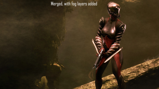
And this segues in nicely to the final part of the shot-making process, post-processing and fog layers.
Now, fog layers are important to the overall appearance and vibe of my Captura. They add texture the image that the game doesn't impart naturally, removing large swathes of solid color from the background and foreground. An added bonus is that the added texture makes the image look somewhat better (imo) when compressed, or when viewed at lower resolutions.
The same image with and without Fog
This shot contains two individual fog layers, one in the foreground, washing out the foliage, giving the general uniformity of it texture and implied depth, it also serves to cover up the manual blurring I did (poorly) around his legs. Then there's the background Fog, which is the deeper blue you see in the sky. It adds a more dynamic air to the generally dour set of greys. And, again, the fog is just something I personally like to add, even if it doesn't serve a practical purpose in a shot. No shade if someone feels the fog ruins the shot, I almost always keep a fog-free version about.
After the fog is added, blended, and blurred slightly, I will apply a few gentle blurring filters to remove any jarring or jagged pixelation from the shot, giving the Frame a somewhat smoother appearance and reducing the file-size dramatically.
That's just how I do it though, it's not a particularly popular style, but it's how I do it and how I love to do it! :3 Remember to ask around, I'm sure there's lotsa Captura Artists out there willing to explain their methods and processes.
Helpful vids! How to Captura by Vash Cowaii Hotsampling in Warframe for High Res Shots by PurpleFlurp
good luck, and happy snapping!
#warframe#captura#warframe tag#warframe captura#sorry for writing an essay... sometimes I don't know when to shut up#-_-
13 notes
·
View notes
Note
I present to you this drawing that took half of the day for me to complete 🔥🔥

Sawa😼😼😼
OMG ITS SO GOOD SHES SO CUTE AND UR SUCH A GOOD ARTIST OMFG
here i’ll give you a pic of one of my OCs
Ai Suoh (sometimes i use her for OHSHC as tamakis little sister)

it’s messy but that’s just my art style
and god thank the symmetry tool omg
4 notes
·
View notes
Text
Some... self-reflection i guess (2023)
its funny to think about how far i've come when it comes to art this year? I mean… i did doodle art beforehand but i feel like most of it ranged from "ehhh…" to "this feels like a fluke"
Then with this year, i got my self a drawing tablet and pretty much started to properly grow in April, of course, with the help of someone that is near-and-dear to me in my heart.
Started with doodling some sketches for Fredrik Knudsen, then... sorta started my try at doodling my own arts, then like... I feel like i suddenly evolved.
Hell, even then, there are times i look at the art i draw for others or for myself and I just sorta go "Holy fuck... did I draw this? It looks fucking insane."
Its just... something, iunno, i love it. I love art, I love to look at something and then begin to imagine scenarios or possible doodle layouts to the best of my abilities. A passion inside of my mind sorta sparks, like a brainworm being awakened and taking hold of my thought process, YEARNING for me to unleash the idea upon an empty CSP canvas.
But the real enjoyment, is when I share said drawing with someone or to the person i wanted to doodle it for and they go "Oh my god... this is incredible!" Or even when i share it with my close one, they just become astonished and are proud of me... it really lights up a dark spot in my day.
Sorry for the sappy bullshit or whatever, just been... thinking about it anytime i just stare at my art. It's really a "Wow... I've come so far so quickly haven't I?"
If I had to thank some people, it'd definitely be @starry-feathers for existing and helping me with my art, teaching me things and the like, and being there all the time <3, and also MorninChai, who mentioned an idea about "drawing like shit on purpose and then sorta going from there" which is what i had done when it came to my first few art pages, and it had realized that overtime, i began improving with my doodles, so I'm very glad i also listened to that advice as well.
Also most importantly, i have to thank the inanimate symmetry tool of CSP, because the moment i learned or figured out how to activate it, i became inseparable from it.
Anyways, thats about it. Happy New Years, everypony. As a treat, have something i drew back in Jan 13, 2022.
7 notes
·
View notes
Text

See this guy? Another musclehead. and another character who benefits from the symmetry tool. I'm not such the anotomic details are too accurate, though - a quick glance in the mirror tells me that ears actually do not extend down a person's neck and continue to behind their back.
But, hey, let's not judge the guy, eh? The hair looks a bit like a samurai helmet, a kabuto, which might be useful in the battlefield.
Another Liefeld-esque character. I think Liefeld was a guy who was ripe for parody, sure, both because he was so bad, but because he was unlike anyone else as far as comic book artists went. There were a lot of ripoffs for a while, but now everyone's distancing themselves from that style. And thank god too, let's keep it where it belongs, as parody fodder.
But the one thing I wanted, which is what I think most people who want to write kind of want too, is make something that felt really long and epic, with dozens of characters, unpredictable storylines that slowly evolve, a memorable final showdown. And of course, superhero stories are good for that type of stuff. After all, it's easier to make a bunch of characters feel unique if they've got different powers, different costumes.
But it's also a big cheat.
There are, after all, wonderful, epic stories that manage to avoid those pitfalls. The human condition is already infinitely diverse without resorting to those pitfalls.
#drawing#art#symmetry#symmetry tool#muscle#male#male figure#superhero#Rob Liefeld#comic#comics#comic books#writing#writing ideas#samurai
4 notes
·
View notes
Text
Alice & Theo in Art Nouveau Style!!!

Thank god for Procreate’s symmetry tool or I would have gone crazy. Anyways, more of Them because I’ve been writing so much They Hunt At Night stuff. I think this turned out good :D
#digital art#my art#procreate#vampire oc#oc art#my ocs#original character#vampire#art nouveau#I love these two gay idiots#vampire brainrot atm#do not send help
2 notes
·
View notes
Note
9, 30!
THANK U FRIEND 9. What are your file name conventions
i actually name it based on what it is fhdlskf like do you know. how much i draw. and i have been drawing digitally since i was 12. that is so many art files. if i DIDNT name them accordingly i would never find anything. @ people who just name their files "adhflksdjf" how do you live i dont understand you 30. What piece of yours do you think is underrated
oh god i mean if i'm being honest, most of them. most of my art doesn't get as much attention as i'd LIKE especially in proportion to how long i spent on them. its only recently that my art has been getting like more attention than usual, which i'm very happy about These character designs I suppose? I'm SO so proud of Solarize and Penumbra's designs hehe. it was my first time planning out/designing the alt mode ALONGSIDE the robot mode, as well as doing transformation maps, and they're just designs i'm insanely proud of
it was also the first time i tried designing using the symmetry tool and my GOD does it make things SO much easier
3 notes
·
View notes
Text
trying to make everything symmetrical but subtly different on each side is an actual fukcimmg nightmare
thank god for the ibispaint multi-symmetry tool i was abt to give up on this whole thing if i didnt get that fan right

6 notes
·
View notes