#tcx
Explore tagged Tumblr posts
Text
2 notes
·
View notes
Text
The Best Touring Motorcycle Boots for the Road Warrior
When you’re out on the open road, there are few pieces of motorcycle gear as important as the boots on your feet. Touring boots are the unsung heroes of a long ride—silent protectors that offer comfort, safety, and durability over thousands of miles. They’re the bridge between your motorcycle and the ground, standing firm through rain, shine, and whatever else the world throws at you. Continue…
0 notes
Text
okay. okay i'll actually do it tcx [timecross] fic posting i suppose (timecross fic is a world where everyone sees different timelines of their lives, and others' different timelines, too) (anyway) (this is the only thing i've written on it right now but i do have ideas for other people) lucy and alfendi related
Lucy stood where it was safe—the "large white line" that everyone had been told about. She had just exited the timeline she was viewing, and even if she saw various stages of other peoples' interesting lives around her, she couldn't help but think about what she saw. "…Me? Really? There's a version of me and Diane who are together?!" She scrunched up her face in disgust and shook her head. "Yeesh! I'm almost too afraid to ask how Prof was doing in that one… Aye, the moment he found out, he'd fire me for sure! But maybe... Well, me and her—No, the version of me and her looked happy... She definitely didn't look like a serial killer, and I didn't either. So maybe.. none of that happened in their timeline. But, still, no mention of Prof or anything! Was he… Would he be alright in a world like that? Surely, right?" Lucy continued to walk on the "safe path" as her mind went on as if her mind's thought process were walking beside her. Beautiful glimpses of others' lives were indeed around her, but she knew she had no part in them, so she left them alone. The last question in her mind lingered; she found her eyes scanning 'round the many places she was being introduced to. But in one of them, a serene grassy one with flowers and a few trees, she saw him in a Timeline Fragment. "There's no one else with that red hair and coat! Given, it's his black coat this time, but… Maybe it's just cold in the one he's viewing?" As she got closer, it was evident that a small, light breeze was constantly rolling through the field her instructor was in. She couldn't see anything that he was looking at; he wasn't even facing her nor could he be aware she was coming. They were far too far away for that. "He seems to be alone… Well, I'll just have to change that! It seems rather nice and peaceful, yeah? Not like it's that rainy castle or anything…" Lucy kept advancing, walking on the "Safe White Line" to get to him—but soon, as she was a small bit away, he moved. Her instructor evidently spent enough time looking at, well, whatever he was looking at, and stepped to the side. And the thing he was staring at was none other than a gravestone. "Oh.. Oh, no... Oh, this so-called 'peaceful' area really isn't...." Lucy watched as he made his way up the small hill that was in the part of the timeline he was viewing. "...isn't what I expected, but, um… Okay, Lucy. You've got this… You've got this! You can cheer him up, surely! Or, well, there's a possibility where he's not even upset! Hah, take that!... Um….." She composed herself, and leveled her emotions, as she was this close from entering the Timeline Fragment. And she did—Lucy stepped onto the green grass, taking a breath of the nice, crisp air, feeling the breeze that was present. "I should see whose name it is, then… Odd how it's the only one here, too. But… It's like that person said.... No, no, Lucy. Don't question how it works, not now! You're able to be here—if he's here, you're able to be! Right! Because....." She exhaled, sighing, almost to verbally expel the running thoughts in her mind. She stood there for a moment to just breathe in the fresh air, to prepare herself for the upcoming conversation. Lucy wasn't sure how to start it, but she was there, and she was going to. Eventually. "I just have to know who it is first so I can know what to say or talk about," she assured herself, nodding. And as she approached the grave her instructor was looking at, she was able to read the person's name clearly. The name was none other than: "Alfendi Layton." "Ohhh.... Oh, Prof… This conversation may be a whole lot harder than I thought."
#professor layton#lucy baker#alfendi layton#tcx fic#timecross fic#healswriting#and i guess#diane makepeace#LOL#my au#pl au#lbmr#mystery room au#i remember waking up at like midnight; this was half a dream and i realized it was an idea#that i needed to write down#so i did indeed write it down
1 note
·
View note
Text
cant believe he's trying to copy stephanie brown and failing

2K notes
·
View notes
Text
ੈ✩ final island (smau) ੈ✩
pairing : lando norris x reader
tw : fluff; suggestive, tiny tiny angst, jealousy love island coupling, mentions of other celebs as cast,
fc : Jung HoYeon
a/n : I REALLY HOPE Y’ALL LIKE THIS, THIS IS THE FINALE OF LOVE ISLAND
·:。・゚゚・ ✩ ・゚ ・゚·:。・゚゚・ ・゚·:。・゚゚・ ✩ ・゚ ・゚·:。・゚゚・・゚·:。・゚゚・ ✩ ・゚ ・゚·:。・゚゚


liked by user1, user2 and 2,465,926 others
loveislanduk AND THEY WERE DUNKED ! EP IS OUT NOW !
view comments
user1 BAHAHA JUDE GETTING DUMPED IN WATER
user2 when yn was asked to name the most attractive guy in the island and she didn’t even take a second to respond to lando’s name -
user3 the episode was just yn ignoring Jude for the 100th time
user4 shout out to Lando’s partner, she knows he is taken and is respectfully maintaining her distance
user5 Lando and her are so cute friends
user6 can’t believe instead of grafting, the girl is giving tips on how to sneak to meet yn-
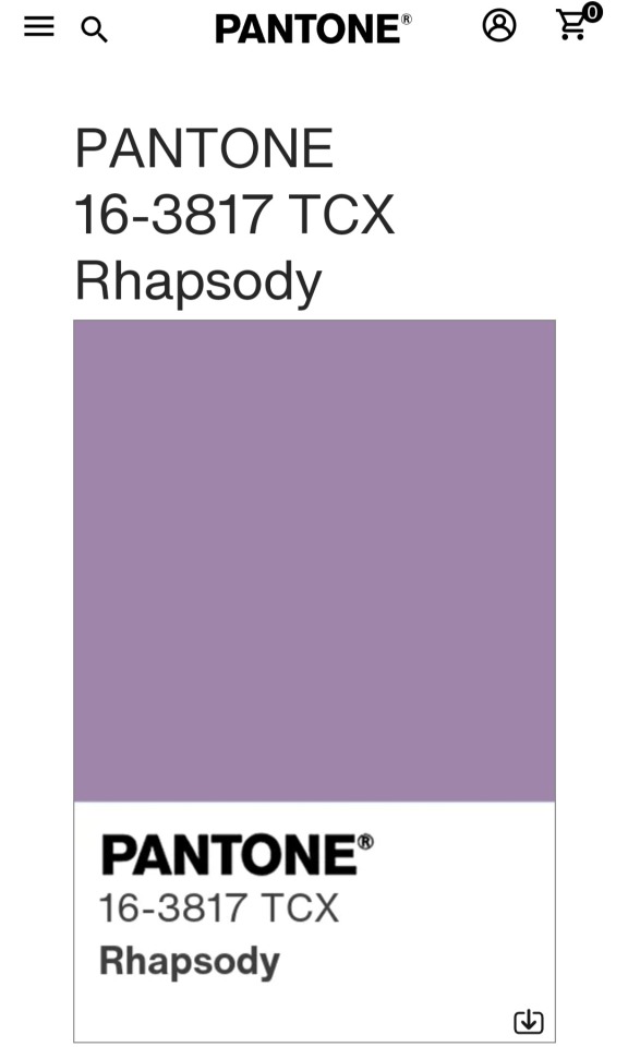
user7 JUDE CANT EVEN GET Y/N’S FAVOURITE COLOUR WHILE LANDO HAS LITERALLY MEMORISED “Pantone 1617-TCX Burgundy”
user8 can’t believe the finale is here 😭
user9 I DONT WANT THIS TO END
user10 just propose already lando


liked by user1, user2 and 3,126,927 others
loveislanduk MOVIE NIGHT BEFORE THE FINAL RECOUPLING
view comments
user1 LANDO ASKED YN TO BE HIS GIRLFRIEND
user2 WHILE SHE PAIRED WITH JUDE -
user3 now this is what I am paying my bills for
user4 SHE SAID YESSSS
user5 the look on the girls- they are all so happy for her
user6 judes sulking so much
user7 as he should !!
user8 but fr, the way jude has been cheating, thank God is was all shown in the video
user9 the girl talk on thong size-
user10 the embarrassed faces of the girls 🔝


liked by user1, user2 and 2,365,245 others
loveislanduk YN CHOSE LANDO !!
view comments
user1 we are going to pretend it was a surprise?
user2 he literally asked her out
user3 the tears of joy of finally being together
user4 NO MORE JUDE
user5 the hug made me feel good lonely i am
user6 they make me believe reality shows aren't that bad
user7 i swear they are going to win
user8 as much as they might win, i think the other couple might win
user9 true, they didn't have much drama ( THANKS JUDE )
user10 well at least they are together!!!



liked by user1, user2 and 1,347,378 others
lando that 50k is going to the bachelor party
view comments
user1 THEY WON
user2 I HAVE NEVER SEEN LANDO CRY SOO MUCH
user3 THEY WAY LANDO IMMEDIATELY Kept THE BALL, SAYING HE CHOSE YN OVER MONEY
charlesleclerc welcome to the paddock yn!!!
liked by lando
user4 NEW WAG IN THE HOUSE !!!
user5 it was all over too soon
user6 LANDO PLEASE BUY SHIRTS
user7 yn, please buy him shirts
user8 I swear I have forgotten the last time I saw him with a shirt
user9 their height difference is cute, idk why people not talk about it
user10 YN IS TALLER THAN LANDO 😭
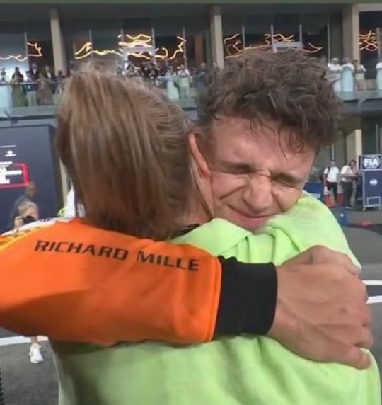
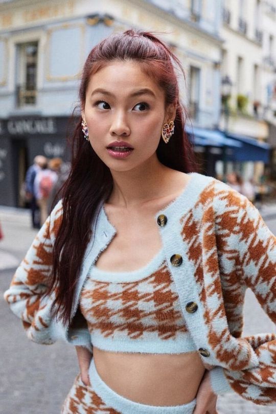
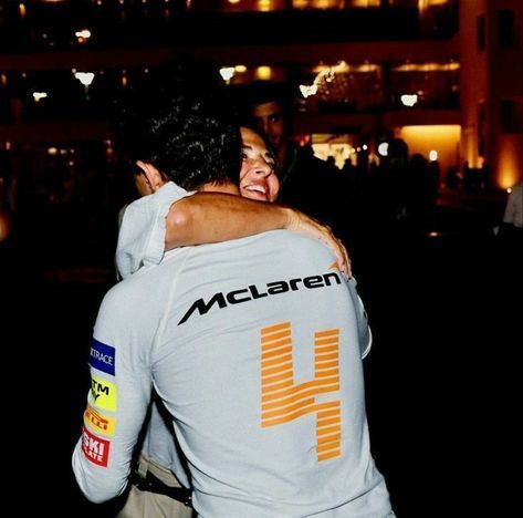
liked by user1, user2 and 1,463,836 others
sojuyn 4 months with my number 4
comments on this post have been turned off
let me know if you want to be added or removed to the tg!
permanent tg: @isotopemylove @chair-things @justaf1girl @nichmeddar @bibblemiluvr @blushmimi @nikfigueiredo @amz824 @ivegotparticulartaste @raizelchrysanderoctavius @freyathehuntress @piastri-fvx @sadiemack9 @ilivbullyingjeongin @cherry-piee @luvleylisen @sweate-r-weathe-r @jxnellat @loveofmylife12 @budgetcupid @lilaissa @scorpiodiosa @wondergirl101ks @nichmeddar @hoeforlifee @urfavnoirette @lily-ann-b @okcurran @miniboast
@teti-menchon0604 @motorsportloverf1 @formula1-motogpfan
#f1#formula 1#f1 smau#f1 fanfic#f1 x reader#lando norris#lando norris x reader#smau#lando norris smau#lando norris fanfic#lando norris imagine#lando norris x fem!reader#f1 imagine#f1 twitter#f1 fanfiction#f1 social media au#f1 x female reader#f1 fic#formula 1 x reader#f1 texts
466 notes
·
View notes
Text

𝗪𝗛𝗕
𝗞𝗜𝗡𝗚𝗦
𝗗𝗜𝗖𝗞 𝗛𝗘𝗔𝗗𝗖𝗔𝗡𝗢𝗡𝗦
GN!READER
𝗖𝗪: Oral (receiving), Size Difference, Dick Piercings. A lot of Dick and Cum, that’s the CW.
𝗦𝗔𝗧𝗔𝗡
𝗦𝗶𝘇𝗲: 19 cm / 7.4 inches
⇒ Not the biggest neither the girthiest between the kings, but he’s still above average.
⇒ His dick is ghost white, a lot of visible veins and it gets flushed easily, mostly the tip.
⇒ Satan has an average girth, not enough to tear your insides (like a certain someone that goes after this headcanon) but enough to get you dumb after a few minutes.
⇒ Just the way he fucks you makes you feel like you have 10 inches inside of you.
⇒ He has a pretty mushroom tip that is big enough to stretch you out when he puts it in, the color is # 4011 UP, if he gets too aroused, the blush from his tip spreads to part of his dick.
⇒ It’s curved upwards and when he takes his boxers off, it slaps his abdomen. And it’s pretty too.
𝗠𝗔𝗠𝗠𝗢𝗡
𝗦𝗶𝘇𝗲: 27.5 cm / 10.8 inches
⇒ You should be thankful that he’s considerate and has patience, because there’s no way in the world those inches don’t hurt.
⇒ Big and Girthy, very Big and very Girthy.
⇒ His tip is bigger than the rest of his dick (#4014 UP), but his base is like a whole inch girthier than the body of his cock.
⇒ His balls are also very above average and they get bit swollen when he’s about to cum.
⇒ Mammon’s dick is kind of straight, but if he gets erect enough, it curves a bit to the left.
⇒ The body and his balls are the most sensitive parts of his dick.
Bonus: He has that kind of dick that gets rock hard to the point it hurts.
𝗕𝗘𝗘𝗟𝗭𝗘𝗕𝗨𝗕
𝗦𝗶𝘇𝗲: 21 cm / 8.2 inches
⇒ He’s above average both in length and girth, how those that even fit in his tight pants ?
⇒ Bell is perfectly proportionated, has the slightest curve upwards and just everything about it looks like it was symmetrically carved.
⇒ His dick is slightly more tanned than his skin tone, his tip rarely visibly flushes, but if teased enough it flushes in a pretty #18-1438 TCX
⇒ He has a dick piercing and no one can tell me over wise, probably a frenum or a forum, or both.
⇒ He has one prominent vein that you can feel when he’s inside you.
⇒ His tip and that one vein are the most sensitive parts of Beelzebub’s dick. He also cums a great amount of sperm, so his balls are really really sensitive too.
Bonus: He probably gave his dick a silly name.
𝗟𝗘𝗩𝗜𝗔𝗧𝗛𝗔𝗡
𝗦𝗶𝘇𝗲: 18.5 cm / 7.2 inches
⇒ He’s average in length for a demon, slightly above average in girth.
⇒Just like Satan, his dick is pale and it also has some veins that are not that visible.
⇒ Levi is the definition of a pretty dick, it has the slightest curve to the right, it gets flushed in a pretty # 4010 UP, and just everything about it is pretty.
⇒ I’ll leave this to another headcanon post, but his cum tastes really good, like, it doesn’t even taste like a bodily fluid, it actually has a nice taste.
⇒ When he’s about to cum, his tip gets a bit swollen and it gets super sensitive, and if you try to directly stimulate it he gets extra whiny.
⇒ The base of his dick is slightly thicker that his tip and when he bottoms out it it stings a bit.
Bonus: Omg praise his dick pls
𝗟𝗨𝗖𝗜𝗙𝗘𝗥
𝗦𝗶𝘇𝗲: 30 cm / 11.8 inches
⇒ He’s perfectly conscious of his size and girth, and he has some consideration for you in him, but that consideration vanishes when he sees you crying and trying to take his dick.
⇒ The definition of a monster cock, not only is long, but it has a great girth too, definitely not easy to take, but more to his favor.
⇒ Lucifer has a mushroom tip that makes a plop sound once it enters you.
⇒ His dick has a very prominent curve upwards that touches all the right places.
⇒ Every time you cry he gets rock hard to the point of having to holding on to not cum. And under this conditions his dick also gets very flushed, mostly his tip (#4011 UP)
⇒ He loves when you suck him off just because he loves seeing you struggling to take his tip in your mouth.
:::
So sorry taking so long to post :( I had a lot of Wi-Fi issues.
Hope y’all have an amazing day ♡
#prettybusy what in “hell” is bad?#what in “hell” is bad?#whb#whb beelzebub#whb leviathan#whb mammon#whb satan#what in hell is bad x reader#whb mammon x reader#whb smut#whb leviathan x reader#whb satan x reader#whb beelzebub x reader#whb lucifer#whb lucifer x reader
1K notes
·
View notes
Text
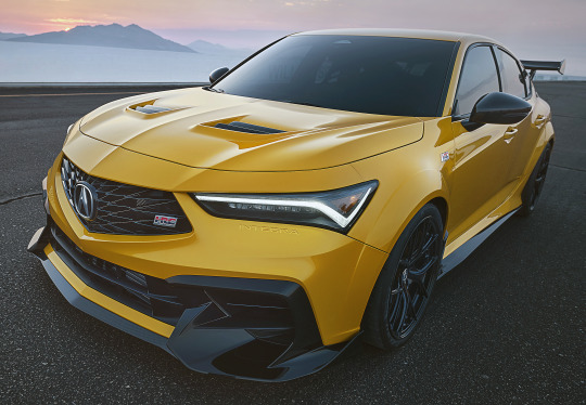
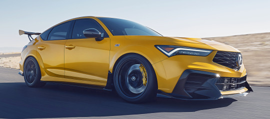
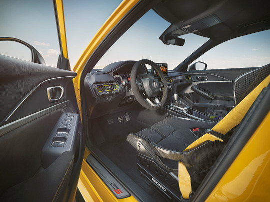

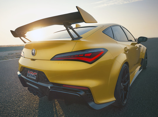
Acura Integra Type S HRC Concept, 2024. Developed by Honda Racing Corporation (HRC) in California and presented at Monterey Car Week, a track focused version of the Integra. Weight has been reduced nearly 200lbs thanks to the use of carbon fibre and removal of the air-conditioning and rear seats. There's increased downforce and improved aerodynamics based on the Integra Type S TCX race car in addition to a larger intercooler, twin oil coolers and a tuned, lightweight cat-back exhaust system. All of this previews a "potential" range of HRC accessories for Integra Type S
#Acura#Acura Integra Type S#Acura Integra Type S HRC Concept#concept#prototype#HRC#Honda Racing Corporation#Honda#lightweight#tuned car#aerodynamic#carbon fibre#track focused#Monterey Car Week
195 notes
·
View notes
Text

I've decided to coin a transID! I'll probably make more related to this one (aka more PANTONE-related ones). Anyway...
TransVeryPerieyecolor
A term where you want your eye color to be PANTONE's color Very Peri (the code is 17-3938 TCX) :D
#pro radq#pro rq 🌈🍓#radq interact#radq please interact#radq safe#radqueer#rq community#rq safe#rq 🌈🍓#rqc🌈🍓#pantone#transeyecolor
26 notes
·
View notes
Text

2 notes
·
View notes
Text
Best Motorcycle Shoes: Top Picks for Style, Comfort, and Protection
Motorcycle shoes are a great choice for riders who want the protection of a boot without sacrificing style or comfort for daily use. These shoes provide impact protection, abrasion resistance, and more, ensuring that you’re safe both on and off the bike. They are a truly versatile piece of motorcycle gear that you shouldn’t overlook. Continue reading Best Motorcycle Shoes: Top Picks for Style,…
1 note
·
View note
Text

15-5718 Tcx Biscay Green
[ @sometimesjoltik ]
29 notes
·
View notes
Text
Thanks for tagging me @somanywords 🤗
Whats the origin of your blog title?
It's the nickname I go by online + the surname of my fav dysfunctional family in fiction (ie the Bennets from Pride and Prejudice)
OTP(s) + Shipname:
Uhhhm let's see.... Steve/Bucky is still pretty high up there, though atm Buck/Eddie (911) and Odysseus/Penelope (Epic: The Musical) are outshining them a little lol
Favourite colour:
💜 but more like Pantone 19-2430 TCX
Favourite game:
Dunno what it's called in english but this guy:

Also Mario Kart. And those little hidden picture puzzle phone games
Song stuck in your head:
Weirdest habit/trait:
I don't like when people deliberately smell me
Hobbies:
Writing, reading, painting, cooking
Something you’re good at:
Writing (I think? I hope?)
Something you’re bad at:
Singing, unfortunately :/
Something you love:
🌈✨️ fiction ✨️🌈
Something you could talk about for hours off the cuff:
Idk, something literature related probably. Like, literary history or something like that ¯\_(ツ)_/¯
Something you hate:
The geopolitical fuckery going on all over the place rn
Something you collect:
Art supplies. Also funny socks!
Something you forget:
I have some memory issues with stuff that happened between 2015-2021, because my epilepsy hadn't been diagnosed yet 💀
Favourite movie/show:
If I had to pick only one movie, that would be Forrest Gump. If I can pick a film series, that would be Lord of the Rings
Favourite food:
🍣 <-- this guy
Favourite animal:
OWLS 🦉
What were you like as a child?
Very introverted until comfortable with someone, creative, exciteable, always ready to help, perceptive
If you could change any detail about your life right now, what would it be?
I'd give myself a raise lmao
If you could travel in time, who would you like to meet?
I'd go right back to see my dad again, no question. I miss him so much not me tearing up as I type this
Okay, so no pressure tags @numberonestuckyshipper @somethingsgottasaveyou @xiaokuer-schmetterling @stuckydrewx @duckinatruck @myladyofmercy @undefeatednils and whoever else wants to do this ✌️
12 notes
·
View notes
Text

16-3931 TCX Sweet Lavender
Crashing Down !
28 notes
·
View notes
Text
ah yes colours.

a random dump of colours I associate with certain gothlit characters! You most certainly can try to guess (though it’s not that hard) but most of these are heavily inspired by various artists like kurakuradon, leroyamour and Glass scientists!
(Pantone 19-1730 TSX: Henry Jekyll
Pantone PMS 5535 C : Edward Hyde
Pantone 19-4027 TCX : Victor Frankenstein
Pantone 15-1611 TCX : Jack Griffin)
#the invisible man#jack griffin#the glass scientists#frankenstein#goth lit#henry jekyll#edward hyde#victor frankenstein#I just headcanon Griffin as a feral lab rat in my mind so yes#that’s why he’s pink.
9 notes
·
View notes
Text
Ten people I'd like to know better I was tagged by @eddiediaaz and @jesuisici33, thanks friends <3
Last song: Same Old Song - The Lumineers
Favorite color: Green, specifically Pantone 19-6050-TCX
Last book: I'm currently rereading The Pairing by Casey McQuiston
Last movie: James Bond at 60 (weirdly, for research for a fic I'm writing because I gave one of the characters a deep love of James Bond).
Last TV show: Foundation
Sweet/spicy/savory: Depends on my mood, right now savoury
Last thing I searched for online: "Reservations as *redacted*" and "*Reacted* closing?"
Current obsession: Hangster has currently taken over my brain, but buddie has been there for like 2 years now so both I suppose.
Looking forward to: Seeing if I can actually finish this 110k monster of a fic I'm writing and edit it into something great.
No pressure tagging @rosieposiepuddingnpie @butchdiaz @thekristen999 @outdiaz @spagheddiediaz
@honestlydarkprincess @jeeyuns @rainbow-nerdss @andavs @elvensorceress
any anyone else who wants to share!
11 notes
·
View notes
