#tagged: ps help
Explore tagged Tumblr posts
Visit Tumblr Blog
Explore Tumblr blogs with no restrictions, modern design and the best experience.
Last Seen Tumblr Blogs


Fun Fact
70% of Tumblr users say the Dashboard is their favorite place to spend time online.
Text

COLORING + SHARPENING TUTORIAL
someone asked for a coloring tutorial and my sharpening settings, so here it is! there are also a few tips to achieve more HQ gifs. :)
tutorial under the cut!
FOR HIGH-QUALITY GIFS
FILE SIZES
it doesn’t matter what your sharpening settings are if the file you’re using to gif is too low quality, so i tend to look for the best that i can get when downloading stuff.
usually, movies (+2h) look better if they’re 5GB or more, while an episode (40 min/1h) can look good with even 1GB. the minimum definition i try to find is 1080p, but i gif with 2160p (4k) when available. unfortunately, not every computer can handle 4k, but don’t worry, you can gif with 1080p files just fine if they are big enough. contrary to popular belief, size does matter! which means sometimes a bigger 1080p file is better than a smaller 2160p one, for example.
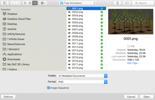
SCREENCAPPING METHOD
this can too influence the quality of your gifs. as a gifmaker, i’ve tried it all: video frames to layers, directly opening video clips, loading files into stack, and i’ve finally settled down with opening screencaps as an image sequence. with bigger files, it doesn’t matter much what technique you use, but i’ve noticed with smaller files you can do wonders if you screencap (either by loading files into stack or opening as an image sequence) instead of using video clips. for example, this gif’s original video file was only 4GB (so smaller than i’ve usually go for), if you can believe it!
here’s a tutorial for setting up and screencapping with MPV, the media player i use to screencap. again, you can keep using video clips for bigger files, but you’ll find this useful when dealing with dire causes. i don't file loads into stack, though, like the video does. i open as an image sequence (open > screencap folder > select any image > click the image sequence button). just select OK for the speed. this will open your screencaps as a video clip (blue bar) in timeline mode (i'm a timeline gifmaker, i don't know about you). you will need this action pack to convert the clip into frames if you're a frames gifmaker. i suggest you convert them into frames even if you're a timeline gifmaker, just convert them into a timeline again at the end. that way you can delete the screencaps right away, otherwise you will delete the screencaps and get a static image as a "gif".
ATTENTION if you’re a Mac Sonoma user, MPV won’t be an option for you unless you downgrade your system. that is, if you have an Intel chip. if you have M1 Max chip (or even a better one), here’s a fix for MPV you can try while keeping that MacOS, because nowadays MPV is skipping frames in its latest build. or you can use MPlayer instead for less hassle. here are two tutorials for setting and using MPlayer. Windows users are fine, you can use MPV without trouble.
FOR EVEN MORE QUALITY
ADD NOISE
here’s a tutorial for adding noise as a way to achieve more HQ gifs if your original material is too low quality.
REDUCE NOISE WITH CAMERA RAW
instead of adding noise, you can reduce it, especially if your gif is very noisy as it is.
the path is filter > camera raw > detail > nose reduction. i do this before sharpening, but only my video file isn't great to begin with. because it’s a smart filter, you can reduce or increase its opacity by clicking the bars next to its name in the layers panel.
TOPAZ AI
i use Topaz Photo AI to increase the quality of my screencaps when i need to. it’s paid software, but there are… ways to find it for free, usually on t0rrent websites. if someone’s interested, i can make a tutorial solely about it in the future.
SHARPENING SETTINGS
here are my sharpening settings (filter > sharpen > smart sharpen). i sharpen things twice: 500% 0.4px + 10% 10px. here's an action for it, for more convenience. here's a tutorial on how to use Photoshop actions. for animated stuff, i use this action pack.

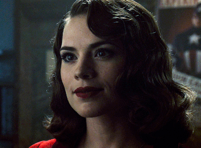
COLORING
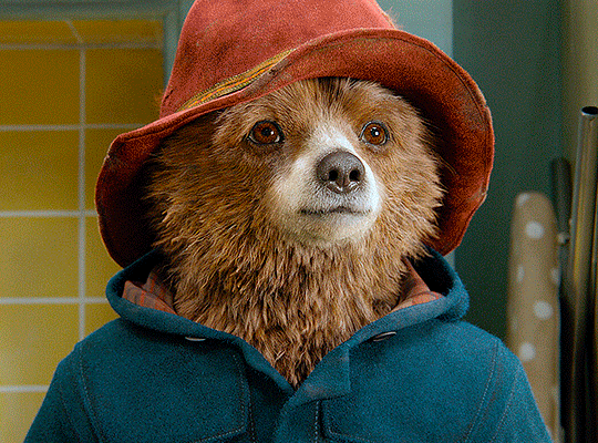
here’s the gif i'm gonna use as a base. it’s already sharpened like the way i always do it.

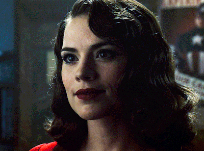
LIGHTNING THE SHOTS
half of the secret of a good coloring is good lightning. i always useCurves (layers > new adjustment layer > curves) and Brightness & Contrast (layers > new adjustment layer > brightness & contrast). the settings depend on the scene you’re giffing, but i always try make my gifs bright and with high contrast to make the colors pop.
CURVES
besides lighting your scene, the Curves adjustment layer has four automatic options that will color-correct it for you. it’s not always perfect and it doesn’t mean you won’t need to do further coloring, but it’s a great start. it’s a lifesaver for most ridiculously yellow scenes. look at the difference! this gif uses the 3rd automatic option (the screenshot below isn't mine btw so that's why the fourth option is the chosen one), from top to bottom. what automatic option you need to choose depends on the gif.

sometimes i like to tweak my Curves layer. not everybody does that, it’s not that necessary and if you’re not careful, it can screw your gif up. to modify your layer by hand, you will need to click and drag points of that straight line in the position you desire. this is the concept behind it:

basically, the lower part of the line handles the shadows, while the upper part handles the highlights of the image. if you pull a highlight point up, the image’s highlights will be brighter. if you pull it down, it will make them darker. same thing for the shadow points. you should play with it to get a grasp of it, that’s what i did when i first started giffing.
BRIGHTNESS & CONTRAST
then i added a bit of brightness and contrast.

CHANNEL MIXER
the scene looked a bit too yellow, so i used the Channel Mixer (layer > new adjustment layer > channel mixer) adjustment layer. here’s a tutorial of how it works. not every scene needs the Channel Mixer layer though, i mostly use it to remove heavy overall tints. in this particular case, the Curves layer got rid of most of the yellow, but i wanted the gif to be just a bit more blue so the Channel Mixer tweaks are very minimal.

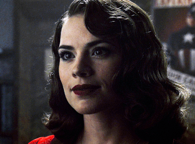
SELECTIVE COLOR
now, this adjustment layer i always use: Selective Color (layer > new adjustment layer > selective color). this is THE adjustment layer to me, alongside the Curves one. this is how it works:

ie, you can separately edit a color this way, giving it tints. for this gif, i wanted to make the colors more vibrant. to achieve that, i edited the selected colors this way:
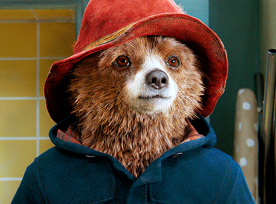
for the reds, i added even more red in them by moving the first slider to the right, making the color more vibrant. for his hat to have a more warm tint, i added yellow to the reds (third slider, moving it to the right). finally, to make the reds stronger, i moved the last slider to the right (more black).
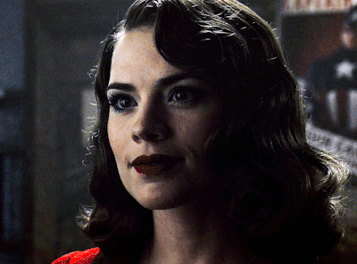
for the yellows, i made them brighter by adding white to them, thus making the tile wall and Paddington more bright as well.
for the cyans and the blues, i just added the maximum (+100) of black that i could.
i wanted for Paddington's nose to be brighter, so i added more white to the whites.
lastly, i added depth to the blacks by increasing their own blackness.
you should always play with the Selective Colors sliders for a bit, before deciding what you want or need. with time, you will automatically know what to change to correct the color grading. it all takes practice!
HUE/SATURATION
i don’t know if you noticed, but there are some green spots on the blue wall behind Paddington. to correct that, i added a Hue/Saturation adjustment layer (layer > new adjustment layer > hue/saturation) and made the saturation of the greens 0%, making that unwanted green disappear from the background.

while the green spots on the wall are specific for this gif, i use hue/saturation a lot to tweak, well, hue and saturation. sometimes someone’s skin is too yellow, i made it redder by tweaking the reds and the yellows, or vice-versa. the hue bar follows the rainbow bar, so the maximum settings (+100 and -100) give the selected color to change its hue to something more red or pink (the rainbow extremities). changing hue can give pretty whacky results, like turning someone’s skin tone to green, so you will need to play with it to get the hang of it. you can also tweak the opacity of your hue/saturation layer to further improve your gif’s coloring. i didn’t do it in this case, the opacity is still 100%. the reds and the blues had their saturation increased to make them pop just a bit more, without affecting the other colors.
COLOR BALANCE
the highlights of the gif still had a green tint to it due to the automatic correction of the Curves layer, so i used Color Balance. this is how it works: instead of giving specific colors some tints, you can give them to the shadows, highlights, and mid-tones. if your shadows are too blue, you counterbalance them with the opposite color, yellow. same thing with the cyan-red and magenta-green pairings. in my case, i added a bit of magenta.


B&W GRADIENT MAP
now, if this gif was a dish, it’s time for the salt and pepper. i always add a Gradient Map (layer > new adjustment layer > gradient map) (black to white gradient) with the Soft Light blending mode, thus giving my shadows more depth without messing with the mid-tones and highlights. it also doesn’t “deep fry” (you know those memes?) the gif too much by adding even more contrast. usually, the opacity of the layer is between 30% to 70%, it all depends on the gif. it always does wonders, though!
COLOR FILTER
finally, i like to add Color Filters (layer > new adjustment layer > color filter) to my gifs. it’s very handy when giving different scenes for the same minimalistic set because it makes them kind of match despite having completely different colors. in this gif’s case, i added a “deep blue” filter, opacity 50% density 25. you can change the density and the opacity of the layer for further editing, again, it all depends on the gif.

VIBRANCE
if i feel like it, i add a vibrance layer (layer > new adjustment layer > vibrance) to make the colors pop. this can ruin your coloring sometimes, especially when regarding skin color, so be careful. i didn't do it in this gif because i felt i didn't need it.
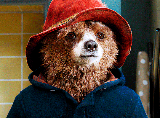
TA-DA! 🥳
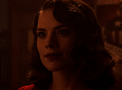
AN OTHER EXAMPLE
the color grading of the original scene it’s pretty good as it is, to be honest. let’s see a worse scenario, a VERY yellow one:
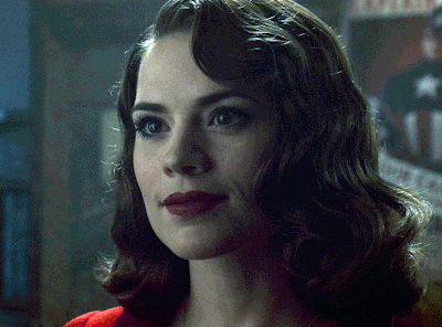
no channel mixer this time because the automatic curves option dealt with the yellowness, but you can see it made the gif too green. i needed to correct that with the following adjustment layers:
curves (automatic option) (gif 2) >> same curves layer (tweaks) (gif 3) >> brightness & contrast (gif 4) >> hue/saturation (tweaked cyan+blue+green) >> selective color >> color balance (gif 5) >> b&w gradient map >> (sepia) filter >> vibrance (gif 6)
i added a hue/saturation layer to remove the blues & greens before my selective color layer because i thought that was more urgent than tweaking the tint of all colors. color balance (gif 4) was the real hero here, though, by removing the green tint. the selective color layer was meant to make the red pop more than anything else, because the rest looked pretty good, especially her skin tone (despite the green tint). you can notice that tweaking the curves layer (small gif 3) also helped A LOT with the green problem.
tl;dr 😵💫😵💫😵💫
here's a list of my go-to's while coloring and lightning gifs. it's not a rule, just a guide. there are gifs in which i don't use all these adjustment layers, or use them in a different order. it all depends!
1. curves (automatic option + tweaks) 2. brightness & contrast 3. channel mixer 4. selective color 5. hue/saturation 6. color balance 7. b&w gradient map 8. color filter 9. vibrance
i'll suggest that you study each adjustment layer listed for more info, either with other Tumblr tutorials or YouTube ones. the YouTube ones focus on images, but you can translate what they teach to gif making very easily. you can ask me to further explain any adjustment layer, too! i was brief to keep this short (which i kinda failed lol).
feel free to ask me for clarification or something else about gifmaking wise, i always like to help. ❤️
#*#*tutorials#gifmaker tag#resources#resource: tutorials#ps help#uservivaldi#tuserjen#userrin#userelio#useralien#userzaynab#userchibi#userbuckleys#usertj#userbess#tuserlucie#useraljoscha#userdavid#usershreyu#usernolan#userhallie#userisaiah#tusergio#tusergeo#userjesslynn
813 notes
·
View notes
Text

#ps this is not actually a cry for help dw#i just find it funny#like instead of ‘i find this funny and it’s also a cry for help’#idk wtf i’m even saying anymore i really need food#sayonara you weeaboo shits#it’s mfing ravioli time😤😤#dnp#dan and phil#dan howell#daniel howell#phil lester#amazingphil#dnp memes#lobotomy mention#???#jay escapes the tags
51 notes
·
View notes
Text
To put it into perspective, the global number of MHA fans is the about the same size small European nation. The number of MHA vigilantes fans could fit in like… an auditorium.
#and we don’t even have a separate ao3 tag#(ps if you want to help us get one please email ao3!!!)#mha vigilantes#mhav#welovecloud
30 notes
·
View notes
Note
hi!! would you mind doing a tutorial on how you add subtitles to your gifs?
hey, sure! :)
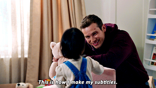
with the text tool selected, i will draw a box that is as wide as the gif and type my text. i created an action that selects all the right settings for me so it's faster and my subtitles always look the same.
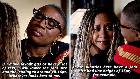
arial rounded bold is a very popular choice for subtitles, and it looks awesome, but i' always've been using the font calibri bold italic for years now. here are my usual settings for a 540px wide gif:

i usually keep the font size and leading value the same, if i change it from 18 pt. and sometimes i'll play around with the anti-aliasing method, whatever looks best for this particular gif. this will help make your text look less crispy or soft, depending on which filtering method you use. the other settings i pretty much always leave like that for subtitles.
as for colors, i always go with white first, and if there's another character talking, i will give their subtitles a different color. i usually try to pick a bright pastel color found in the gif, or even on the character's clothing (just because i like to match things haha).
it's also important to leave a bit of a gap on the sides and bottom, so the text doesn't go all the way to the edges (as shown in the next example). it's definitely harder to read text if it's too close together, or goes from edge to edge. you can push words on another line if it becomes too close to the edge, and you can nudge the text from the bottom with the arrow keys.
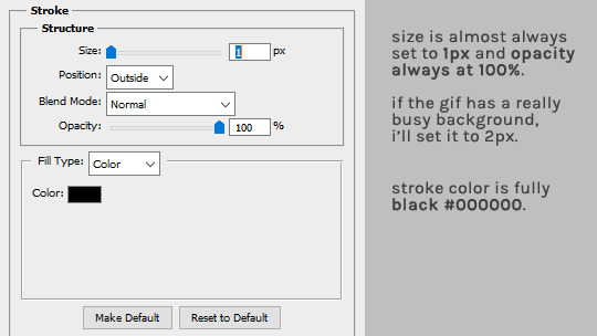
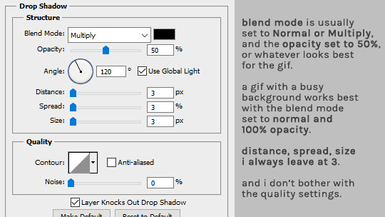
as for the layer style, i'm adding a black stroke and black drop shadow (by double clicking the text layer). the stroke almost never changes, but i'll edit the drop shadow accordingly with the gif. if it's a very busy gif, the drop shadow should be thicker to help with visibility.
and that's it! :D
#alie replies#Anonymous#tutorial#photoshop#resource#*ps help#subtitles#giffing#resourcemarket#completeresources#allresources#usercats#userabs#idk who else to tag
380 notes
·
View notes
Text

rewatching the entirety of bfdi and bubble is my new favorite character now along with leafy and im realizing now that im fucking obsessed with their dynamic & fucked up relationship . might be a little ooc but this is what they're like to Me
#leaf.art#i couldve given the background a slightly different color that fit better with the rest of the piece but ehhh what's done is done now#besides its meant to focus on the dialogue anyways#and speaking of holy shit it was both pretty goddamn difficult to get right but also SO SO fun to write too#i felt like i was trying to pry my way into bubble's head with this LMAO and in the end i think i succeeded .#some bits might still be a little wonky though so if you have any criticism on how i wrote her feel free to say it idm#bubble bfdi#bubeafy#bubbleafy#NOT tagging leafy bfdi or the main tag this is only for those who r as insane about bubble & bubbleafy as i am .#or that's my excuse the reality is that i'm frightened doing even this though HELP#ps. leafy is intentionally a little gray to look similar to her metal self
16 notes
·
View notes
Text


"GODS ARE STUBBORN. SO AM I." euripides emilia de riva, probably.

𝑹𝑶𝑶𝑲𝑬𝑫𝑪𝑹𝑶𝑾 an independent & selective headcanon driven interpretation of human!rogue emilia "rook" de riva from bio.ware's 𝐃𝐑𝐀𝐆𝐎𝐍 𝐀𝐆𝐄 : 𝐓𝐇𝐄 𝐕𝐄𝐈𝐋𝐆𝐔𝐀𝐑𝐃. unaffiliated with the DA fandom at large. contracted by willow.
#sp. › the crows send their regards.#indie dragon age rp#veilguard rp#fantasy rp#indie darp#what are tags i've been in ps all day help
25 notes
·
View notes
Text
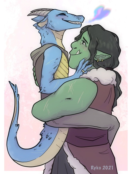
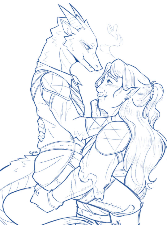
Here’s another ‘redraw’ of sorts, ft. my beloved Team Sweet Flips! (AKA TAZ sapphic ships my beloved)
Once again, I realized that I never posted this 2021 piece, but in looking at it again I wanted to redraw it (and I am always in the mood to draw more dragons) sooooo…..
(I like the idea of date-night Killian doing hair up and wearing a cute blouse, but also still accessorizing with some armor, lol)
#taz#the adventure zone#taz balance#carey fangbattle#killian taz#taz killian#killian fang#team sweet flips#furry#dragon#obligatory I LOVE CAREY tag that I always add. listen. I cant help it I fucking love dragons yall#griffin said this dragon is a lesbian and I went hootin’ and hollerin’#anw outside of style changes and fixing up the pose#i think the biggest change is making carey a little bigger#bc i felt like she would be a little too small compared to killian in the og#or maybe I just have brainrot about the other dragon (ish) x buff character ship and was mildly influenced#ps ong the way Killian’s chin is TANGENTING with Carey’s chest in the first one OH NO……
145 notes
·
View notes
Text
A couple of general gif-making tips for anyone trying out the craft!
When resizing your footage, always leave yourself a couple of pixels for margins.
I see a lot of people make this mistake when it comes to making gifs, where they resize their footage to the exact dimensions of the end gif. However, that almost always results in the pixels closest to the outside border going semi-transparent, which when saved as gif results in gifs having these tiny 'borders'.
I zoomed in a bit, but you can see that the outer edge has a line. Those are the semi-transparent pixels.
To avoid that AND leave yourself some wiggle room when it comes to moving screenshots or cropping, resize your footage to the target dimensions and add +2, +4 or +10 pixels to the number. After resizing you can then crop away the margins which will result in cleaner edges and will get rid of the transparent border.
For example, tumblr's full-post width is 540px so if I were resizing say 1080p footage, I'd put the width as 544px or 550px and then crop the edges (I use canvas size option for this) to 540px.
Make sure to use proper dimensions!
Tumblr will automatically resize your gifs to set dimensions and if your gifs are shorter or wider than those sizes, you will lose quality and sharpness in your gifs.
Ava (@anya-chalotra) has an excellent guide on dimensions and gif sharpness (as well as some other excellent information in giffing department) that goes into exact numbers.
I mostly make gifs that are full width, so they're always 540px wide.
Be aware of the size limit
According to tumblr's own guide, the general max limit is 10MB. However, anything over 3MB will be compressed by tumblr. That can result in quality loss, but most gif-makers ignore the compression and try to 'squeeze' out as much as possible out of a gif.
Some tips on how to lower your gif size to fit within the limit:
Reduce the number of frames.
Try to restrict the colors used to a selection (I usually try to have one or two dominant colors). Gif format only supports 256 colors anyway, so if you try to include all the colors of the rainbow, things might look wonky anyway.
Darken parts of your gif (usually brighter gifs tend to take up more space, so adding some darker shades can help reduce the file size).
#just something i've been thinking about observing the bg3edit tag#gif resources#ps resources#photoshop tutorial#photoshop resources#gif making#giffing#gif tutorial#my tutorials#i genuinely forgot the tag i used for my resources oops#but yeah hope it helps someone!
97 notes
·
View notes
Text
lizzie coming to hermitcraft real guys
designing joel and coloring him was so hard oh my lord also ignore how much more detail was obviously put into lizzie can we actually like not talk about that rn
#shes my queen#i couldnt help myself#hermitcraft#hermitcraft fanart#joel smallishbeans#smallishbeans#smallishbeans fanart#ldshadowlady#ldshadowlady fanart#empires smp#empires s1#okay thats enough tags#hello tag looker throughers#througher i hardly know her#PS I LOVE MY KITSUNE JOEL HEHEHEH
128 notes
·
View notes
Note
hi aish! do you have any tips & tricks for how you like to do overlays? your edits are always so beautiful and your overlay game is 🔥🔥🔥
hi syn! sorry I took so long to get to this, I've been a little sick :/
since you asked specifically about blending and colouring, I'll focus on those! I'd be remiss to not immediately point you to @usergif's vast resource directory (though a lot of links are old now) and some specific tutorials I found very helpful when I was figuring this stuff out:
this excellent blending tutorial and this excellent colouring tutorial by @nataliescatorccio
this super-detailed blending tutorial by @eddiediaaz which is a little more specific to double exposure blending but is useful for understanding the importance of dark areas for blending
also this one by @eddiediaaz it's more general and very helpful
this one from usergif which talks about colouring backgrounds of scenes with movement (super useful)
this really great tutorial by @djarin that goes through a few ways to achieve really vibrant backgrounds
and some tips of my own under the cut, which I hope are somewhat useful!
for blending:
try and pick scenes with similar lighting, it usually makes life a lot easier, unless you're doing something like double exposure which requires high contrast etc.
if you're blending two faces (which I do a lot because it's simple and effective, x and x) it's great to use scenes where they're looking at each other because the shadows fall on opposite halves of their faces; it's really easy to use overlapping shadows to create a cohesive whole
building on the above, if a certain blend doesn't seem to be working because the shadows on their faces don't overlap perfectly, play around with the relative sizes of the faces and also how close/far apart they are! in the first set I linked above, their faces are different sizes because it made for a more seamless blend + made it more interesting to look at; for the first gif in the second set, I moved their faces really close together (partly for theme-purposes but also because it made the blend more seamless; this doesn't always work)
if you're not blending two faces, there's a lot of interesting things you can do! like in becca's tutorial above, you can have a closeup of a face and then another gif with more motion/elements that comes through in darker areas, like I did in the first gif here
or you can just blend two scenes with more action in them; in this case, just make sure that each scene has enough light/dark contrast for the other scene to show through when blended. I'm not the best at this, and it does take a lot of trial and error and figuring out which scenes actually work, but the end result is usually worth it (I'm not great at this; I usually cop out and just make both scenes black&white and increase the contrast like the last gif here)
very very important to clean up blends using black paint on an empty layer set to soft light!! I'm pretty sure the tutorials I linked above cover this; also don't be afraid to go in with the eraser sometimes to completely remove pesky parts of a gif (like really bright earrings or lamps) but be careful if you do
for colouring:
most of the time I make life easier for myself by not picking scenes with too much movement lmao; it's really easy to paint around a relatively stationary subject (my go-to is colour fill layer set to colour, the subject erased with a large brush (100-150 px, sometimes 50 px to clean up edges)
play around with modes! sometimes, I set the colour fill layer to vivid and decrease opacity, or soft light/overlay and stack it on top of another layer set to colour
it's really great if a scene has a lot of cyan/blue in the background! you can always make cyan more blue by upping magentas in selective colour (or do the reverse to make blues more cyan), and then carefully use hue/sat to shift the whole thing to some other cool colour (purple and turquoise are easiest, but sometimes you can manage green)
it's a little harder to manipulate red/orange/yellow backgrounds because that often messes up characters' skintones so usually if I have to deal with those scenes I play into those colours by just making them more vibrant and using layer masks to preserve skintones
for sets with multiple accent colours, pick colours of similar vibrancy/darkness/saturation so you don't have to worry too much about cohesion
I don't really know if this is what you're looking for, but I hope at least something here is helpful! it really just takes time and patience, and ofc you can reach out to me anytime for more clarification or whatever help I can offer <3
10 notes
·
View notes
Text
Seeking advice on writing fanfiction! *pls help me*
Hi tumblr friends!
This is a question for anyone who reads OR writes fanfic in any fandom
Doesn't really matter I think, but for reference, the fic I am writing takes place in canon Attack on Titan universe. I’ve written fics in other fandoms before, but they primarily take place post-canon. This AOT I'm writing will have both canon and non-canon events, and it is be structured like so:
Start with Non-Canon Events -> then Canon Events (with some Non-Canon Events) -> then Post Canon Events.
This question/poll only applies to Canon Events.
I personally have mixed feelings when I read fics with canon events described in great detail. I've seen it done really well, but I've also seen it done so poorly it puts me to sleep, I honestly just skip ahead. I don't want to bore the reader describing canon events, but I also don't want it to be too jarring when I switch from detailed non-canon events to barely-glossed-over canon events. Also note that there will be loads of fluff/emotion/character development no matter which answer you choose. It's more a question of how much I should be describing the ACTION and EVENTS of the canon story.
Here’s my question: when YOU’RE reading a fic that overlaps with the events of the canon plot, how much detail do you prefer the Canon Events to be described in?
Since the space for answers on the actual poll are limited, here's what each answer option means specifically below :)
1. Highly Detailed Description of Canon Plot Events: Follows canon plot beat-for-beat, describes each moment in detail like you're rewatching the show. (But with new the elements appropriate to the fic!). Descriptions and prose of the fic consist of about a 50:50 ratio of Action-to-"Fluff". (Where "Fluff" = interior emotions, character development, romance, actual fluff, etc) 2. Moderately Detailed Description of Canon Plot Events: Follows canon plot, but not in minute detail. Still immersive enough to feel 'in the scene'. More emphasis on interior emotions, character development, romance, fluff, etc. We've seen the show, we know what happens, but it's still important to describe what action is occurring. Descriptions and prose of the fic consist of about a 30:70 ratio of Action-to-"Fluff". 3. Barely Detailed Description of Canon Plot Events: Canon plot is background noise. Give me just enough plot to know where I am in the show. At least 80% of the fic should be interior emotions, character development, romance, fluff, etc. Descriptions and prose of the fic consist of about an 20:80 ratio of Action-to-"Fluff". 4. Fuck the Canon Plot, don't Describe it: During the canon events, the fic is ONLY interior emotions, character development, romance, fluff, etc. I already watched the show, I know what happens, no need to rehash it. Descriptions and prose of the fic consist of about a 1:99 ratio of Action-to-"Fluff". 5. Other/Nuance/Bald/Vanilla Extract: Please please comment or DM me and let me know what more specific advice you have on this matter! OR whatever else you want to say or ask. Or if you want to tell me your favorite Levi x Reader fics heehee.
Thank you all so much in advance!
🖤🖤🖤🖤🖤🖤🖤🖤🖤🖤🖤🖤🖤🖤🖤🖤
*for those wondering ~ I’m working on the slowest slow burn Levi x reader long fic. It begins in about 847, leading up to 850 where the main canon events take place, and onward through the end of the story! (May even go past that lol..tbd)
And when I say slow burn, I mean that I’m at 300k words and they haven’t even held hands yet lmao. But it’s oh so angsty/mutual-pining-y so far. Like the TENSION. Ooooff so. Palpable.
The fic primarily follows the "Vets' (I.e. Levi, Erwin, Hange, Miche, etc.) Where I'm at in the plot timeline, I’m approaching the Ilse’s Notebook episode. That means soon the The Battle of Trost!!! I really need to know how much detail to go into lol.
#pls help me im just a baby#ps sorry for tagging so many fandoms but i really want to get a wider perspective on this#fanfic#writeblr#fanfic writing#fanfiction#writerscommunity#writers on tumblr#writer stuff#fan fic writing#fanfic writer#writer help#writing advice#fanfic authors#advice#ao3#writing help#anime#attack on Titan#AOT#shingeki no kyojin#levi shingeki no kyojin#attack on titan levi#Levi Ackerman#levi x reader#captain levi x reader#aot x reader#snk x reader#marvel#harry potter
8 notes
·
View notes
Text


MUSIC BANK.PSD a very rough and one-size-fits all type of psd intended for kbs music bank interviews! the examples i've used all have the same psd with no adjustments on them, however if necessary you might have to tweak colour balance! 💗 PSD HERE. 🕯️
#seventeen#yeahps#allresources#photoshop tutorial#ps help#ps resources#kpop resources#kpop psd#useraashna#usershreyu#ninqztual#userace#userirlvernon#sorry i forgot who to tag lol!#2605
164 notes
·
View notes
Text
ughhhh Two Time is rotting my brain rn for no apparent reason so have a little story I thought up about them <3333
TW: blood, semi-graphic (or maybe graphic) descriptions of gore (methinks), and character death (I guess mention/brief death??? Sorry I'm not too good with TWs).
Running and running and running. That was how every round was, dodging and dipping and dashing and ducking. All the same, never different, just loop again and again and again.
It drives people insane, this unchanging flow of time and time and time again. Each and every face was just a blur against the background. Every survivor, destined to die again and again, only to come back renewed. Every killer, destined to be painted in blood, the red substance bathing their souls am eternal red as they did this song and dance again. And again. And again.
A machete. Skin tearing. Two Time could feel their stomach tearing open, vision blurring as Jason tore into their flesh. Their blood poured down their legs, puddling underneath them as they struggled to get away.
Out of stamina. Out in the open. Guts beginning to spill out of their chest cavity, sloshing onto the ground below in a messy soup of crimson liquid and viscera. Two Time hated the smell of iron, the feeling of their body being torn apart, the metallic taste of blood beginning to permeate the air.
However, new beginnings arose for them again, like they always did. It was never fun feeling their life force fading, blinking in and out like a faulty light, before suddenly coming back to them in one sharp breath. It took Two Time's breath away, but their feet had already begun desperately running away from the killer, leaving their brain to catch up in their daze.
#roblox#roblox forsaken#forsaken#two time forsaken#hehehehjehehajzcyajwjw#wrote this instead of another PS chapter help#help with tagging TWs please#I’m not very good at it#;-;
12 notes
·
View notes
Text
Marionette!! Or Catrionette if you wanna use his in universe name (I usually use Marionette tho). :3
(1st picture is normal design, 2nd picture is rain/ruined design.)


This design is kinda old ngl, so he'll get an updated design EVENTUALLY, but yk not right now i don't feel like it right now lmao.
Nightmarionne is ALSO a cat, but he doesn't have a drawn design yet (he has a design. It just exists in my brain).
(You can tell this art is old it's crustyyyyy.)
Rant under cut.
Tbh I don't think his design will change TOO much in the redesign. Maybe mostly give him a more cat-ish face?? Idk.
Fun fact he's technically separate from Charlie!! We love sentient FNaF animatronics here.
He is adoptive Dad to all. Yes when I say all I mean everyone. He's also putting everyone in therapy.
He stands by the road holding a sign that says "come get adopted by a jester-onesie Cat Marionette it's free." and doesn't think it's suspicious at all. He as good intentions but he ALSO makes poor choices when trying to show that.
Tbh the murder and irritation at a lack of a music box probably didn't help.
#what do i tag this with help??#fnaf puppet#five nights at freddy's#fnaf redesign#fnaf#fnaf the puppet#fnaf marionette#fnaf au#fnaf the marionette#ps if you recognize the name catrionette from a poppy playtime/smiling critters au thats because catnap in that au#and the Marionette in my AU have the same AU name. oops.#if that AU creator sees this (unlikely i think?? idk) and wants me to change the Marionettes name I will. Kittyonette is the backup name.
12 notes
·
View notes
Text
"are people not into that?" i ask, after posting my weird niche shit to the internet, despite knowing it to be weird niche shit.
#jsyk sylkius or anything adjacent to it does not “Do Numbers” in any way and i observed this some time ago#i assume that's the “rival ships” element at work but who knows really#that sort of thing is like femslash in that everyone approves of it but nobody actually reads or writes it#but who would have thought sylvie beating loki with a stick would not bring in droves of readers???! shocking twist there!#& i don't consider sifki a rarepair but my rarepair standards are VERY strict like if there's >5 fics a pairing is basically mainstream#chasing popularity would annoy me though & i just don't have the mental spoons to try writing stuff i wouldn't personally read#yeah i *could* put my blorbos to work in a coffee shop but what cost to my own enjoyment levels? AT WHAT COST FANGELA???#you can't please everyone so you may as well just please yourself and if anyone else likes it you've found some fellow freaks so yay#i don't mean please yourself in a wanking sense. though feel free to do that too it probably counts as a cardio workout idk.#BUT ANYWAY#fic related#ps i am v glad there's the “warning: loki” tag because i think/hope it acts as a filter for 'he did nothing wrong in his life ever' types#who are Valid & etc obviously but i write my morally grey characters to be morally grey and the tag might help avoid conflict#though tbh i write almost every character to be morally grey in some way so i can't claim to have left my comfort zone here#(i'm not joking when i say the 1987-89 run of Dr Who shaped my entire future fannish life from a young and apparently v impressionable age)
74 notes
·
View notes
Text
so you've got a lotta blogs, but not a lotta patience to be signing in and out between em? i'm about to save your life !!
i. let's start with the email trick!
ps: i have only ever done it with gmail. if you use a different one, give it a try anyway! but i can vouch that it does work for gmail. it's super simple: [email protected] -> [email protected] you just add +musename and you can create a new tumblr account while still having everything in the same email account! (you do this during the "sign up" component on tumblr, not your email! it'll automatically add it to your email. you can also add the +musename part to your email in account settings)
ii. now, multiple sign ins!
google chrome: profiles! on your browser, up top, right next to the settings you'll see a button for the profile attached to that browser. when you click it, you'll see the existing profile, and the option to "add" a new one. each profile is its own browser page, which allows you to sign onto a different tumblr account in each! i like to name mine according to the muse it belongs to so i can keep track. firefox: there's an extension called 'containers' which allows you to have multiple sign ins on the same site open!
if you've got any other tips to ease the process of having multiple muses and blogs, feel free to let me know and i'll add it to this!
i hope this helps! let me know if it does or if you've got questions about it!
happy roleplaying <3
#• the one true queen speaks ! || ooc.#BIG THANK U TO VELCRYONS !!!!!!!! i only use google chrome so tysm for sharing the tip for firefox!!!#ps i can tag u fr on the post if you'd like!! i just didn't wanna bombard u with notifications ab it just in case <333#rp help#rp resources#these tips saved my life years ago when i got into rp and there was a post ab it#idk where that old post is so here's a fresh one!!
25 notes
·
View notes