#surrealist work
Explore tagged Tumblr posts
Photo
Alright, it's time for some *crack knuckles* explanations. This is French, I'm French, here we go.
"Une semaine de bonté", "One week of benevolence/A week of kindness", is not actually a "novel" per se. It is a "roman-collage", a "collage-novel", because... well it is mostly told through collages. It was created as part of Max Ernst's surrealist works. More specifically, "Une semaine de bonté" was created when Max Ernst went to see the duchess of Gramont, Maria Ruspoli, in Vigoleno (Italy). He was supposed to stay there for three weeks - during August 1933. And there he had the idea of this project: take illustrations from various books and resources, cut them into pieces, and then stick them together into new scenes to form the collages of the book. There is even a funny anecdote told by another guest of the duchess at the time, Valentine Hugo. One night she woke up hearing a strange, regular, metallic and dry sound - investigating, she discovered it came through Max Ernst's room. She didn't understand yet what this sound was - she only realized later that it was scissors when she went to check the house's library, picked up an old worn-out book (Paradise Lost, illustrated by Gustave Doré) and discovered the pages of the book were full of holes. Erst had cut pieces of the various Doré's engravings.
The "story" of this book, if there is even one, is told through these collages Max Ernst created - 182 collages in total. (There were two more, but they were rejected by Ernst' publishers) There are also the presence of various quotes sometimes slided between the collages - from Paul Eluard, André Breton, Jean Arp or Marcel Schwob. Max Ernst used a LOT of sources to create his collages: massively-sold popular novels, scientific and medical reviews, sales catalogues of the 19th century... He took pieces from so many things left and right that we can't make a full list of his sources, though we did identify some of them (Gustave Doré's engravings for Paradise Lost ; illustrations of Jules Mary's Les Damnées de Paris ; reproductions of Jean-Martin Charcot's medical photographies of women in hospital suffering from "clinical hysteria"...)
The full name of the work is "Une semaine de bonté, ou les sept éléments capitaux" ; "One week of kindness, or the seven capital elements". The latter part of the title is a pun on "the seven deadly sins", called in French "the seven capital sins". (As with all surrealist works, the text of this collage-novel relies a lot on puns and twisted expressions) The reason for this title is because the "novel" is organized in seven sections corresponding to the days of the week. It was planned to be released in the format of seven booklets, each with a different color, each corresponding to a different day of the week, each with an "element" (as in, a recurring symbol) and each with an "example" (understand, a character or a motif/theme recurring throughout the booklet). I say it was "planned" to be as such, because when the booklets were delivered and sold from April to December 1934, the sales ended up shorter than planned, and so the last three days were gathered into one booklet to save money, resulting in five booklets instead of the seven planned. [If I am correct there were only 800 copies of these booklets, since, as with all "art books" of the time, it was a limited edition/limited release]
Here is the content of the five booklets. The purple booklet was for Sunday, its element was "mud" and its example was the "lion of Belfort" statue. The green booklet was for Monday, its element was "water" and its example was also "water". The red booklet was for Tuesday, its element was fire and its example "The court of the dragon"/"The dragon's courtyard". The blue booklet was for Wednesday, its element was "blood" and its example was the character of Oedipus. The final booklet, the yellow booklet, was the one that gathered the three remaining days. Thursday, with its element being "black" and a dual example of "The laugh of the rooster" and "Easter Island". Friday's element was "sight" and its example was "the inside of the sight/the interior of the view". Finally you had Saturday, with its element being "Unknown", and its example "La clé des chants" ("The key of songs", which is a pun on the expression "La clé des champs", the key of fields, pronounced exactly as "The key of songs").
Here is what the original booklets looked like together:

And to give you an example of how Ernst's collage work went, I will let you compare one of the illustrations he used (Alphonse d'Ennery's Martyre ! illustration, 1885)...

... with the collage he created (seventh picture of the Court of the dragon/Tuesday booklet)


Une semaine de bonté (“A Week of Kindness”) a surrealistic novel by Max Ernst
#reblog#surrealism#max ernst#collage#surrealist work#une semaine de bonté#a week of kindness#illustrations#surrealist art#french things
972 notes
·
View notes
Text

Whirlpools, M. C. Escher, 1957
Wood engraving and woodcut on paper 17 ¼ x 9 ¼ in. (43.8 x 23.5 cm)
#art#mc escher#modern art#surrealism#1950s#20th century#20th century art#dutch#works on paper#wood engraving#woodcut#print#surrealist art
203 notes
·
View notes
Text

Starry Starry Night in the Elysium
______________________________________________________
based on Vincent van Gogh's "Starry Night" (1889) of course Please click for the better quality!
#disco elysium#kim kitsuragi#harry du bois#traditional art#fun fact no. 1 - I made it with my old childhood markers that are more than 10 years old and still working somehow#fun fact no. 2 - I didnt want to share this drawing at first and successfully hadnt done for the last month#kim I am sorry you turned out so yellow you are just glowing baby ok?#i tried to go kinda surrealistic + impressionistically here
107 notes
·
View notes
Text
if im being honest the problem with the mc movie aesthetic is not that it doesn't work for minecraft, it's that it would have worked for minecraft 10 years ago when everyone was in an arms race to make the most hyperrealistic texture pack and shaders possible and all the minecraft fanart looked exactly like the gamers were trying to compensate for liking the silly blocks game. but we as a Society have clearly evolved to liking retro and minimalist game graphics.
#though i will give the animals have quite the cyriak-esque look to them in a way where the uncanniness could be charming#but that would only work in a world where the point was to make surrealist art
41 notes
·
View notes
Text

Magritte, 1964, painting in a suit
#rene magritte#magritte#surrealism#belgian art#max ernst#surrealist art#atelier#1964#painter#reality#artist at work#this is not a pipe#the son of man#golconda#oil painting#breton#apple corps
21 notes
·
View notes
Text


Haha here's the doodle dump I promised two days ago
Magma time on Thursday will be 8:00 PM (CDT)! I'll be online for as long as I can stay awake so feel free to hop in and out whenever you want :D there will also be a music queue anyone can add songs to, so even if you don't want to draw feel free to come and chill in the chat! Will send out the link tomorrow evening!
Also, I was slightly wrong earlier; no downloads will be needed, but after testing it with a friend it looks like you might need to make an account to join; don't worry though, it's still free!
#phantasy star online#pso#kris#susie#ralsei#undertale#deltarune#class doodles#doodles#trying to recall what i was thinking during all of these#first i believe was supposed to be a fo...marl? One that i made the night before#judging by the ears im guessing it was meant to be a fomarl and not a foneweral but i forgor what i was going for#second is patchwork's fomar; i liked the cool hand gestures for techs i saw in the offficial pso art#so i wanted to draw it... but still only a less-than-a-minute doodle#next three are just random utdr portraits#and beardsei....#i was trying to figure out susie's mouth bc that's literally the only thing stopping me from drawing her more#then alt. kris armor w/ susie's axe for some reason... that could mean something bad for susie but#honestly she probably threw too far and lost it and kris is just bringing it back to her#next is more susie and a guy who looks like he'd have a sturdy handshake#next two are scribbles of famous surrealist works i jotted down in my notebook; i altered the one of the woman looking to the right#last one was on a day i saw a crow in the courtyard.. it was a cute little fella#and all seeing eye duck
22 notes
·
View notes
Text

Photography: Kalliope Amorphous
#art#artists on tumblr#photography#original photography#black and white#photographers on tumblr#contemporary art#surrealism#lensblr#dark and moody#dark ambiance#dark art#dark artist#original art#original photographic works#surreal photography#surreal art#surrealist art#contemporary photography#fine art prints#fine art photography
153 notes
·
View notes
Text
uhm. holy shit. go watch “the vourdalak” (directed by adrien beau) if you can (showing in some theaters in the us atm at least). if you like puppetry rather than cgi, vampire lore, AND ON TOP OF THAT A SHIT TON OF QUEER SUBTEXT AND OVERTONES(!!!????) then you had best SCOOT UR BOOT ON OVER TO A THEATER‼️ its so surreal and weird and beautiful and sad oh my god. at the very least, spread the word about it because it deserves SO much attention 🖤
youtube
#literally one of the best films i’ve ever seen but i’m a rando on tumblr so take that with a grain of salt#the vourdalak#film#adrien beau#horror#horror film#gothic horror#vampire films#french film#costume design is also fantastic in it#beau literally worked for dior so he knows his shit lmao#surrealist film#Youtube
37 notes
·
View notes
Text
Hermitcraft Fic Idea #17
When Grian Dreamslayer woke one morning from troubled dreams, he found himself transformed right there in his bed into some sort of monstrous bird.
Metamorphosis by Franz Kafka but it's Grian. I love it, like Pearl is the cleaning lady, because of course she is, and the sister is Gem because they are siblings basically, and then... um...
For an idea I've had for half a year now, it's not well thought out haha
#hermitcraft#grian#fanfic#I need to be working on chem hw#or maybe even creative writing hw#or perhaps math hw#maybe even study my geological timescale#but no#I wish to think about Grian in a surrealist novel au
22 notes
·
View notes
Text
i’m interested in the choices of artistic inspiration the call of cthulhu (2005) made, and, to be clear, i don’t agree with them. the conceit of the film is that it presents itself as a film adaptation of hp lovecraft’s the call of cthulhu may have looked at the time of its 1926 publishing.
first and most obviously, to my eye the cinematography itself was very obviously late 30s-early 40s classic noir style, rather than anything from the 20s. the fine greyscale of high quality 1940s filmstock, the constant dutch angles and shots that are extreme close-ups if they’re not 3/4 shots, the frequent fades and overlays, and the majority of the rest of its “old-fashioned” looking techniques date it very firmly after the 1927 cinematography crisis. this broke my immersion, but that just shows a dearth of research or creativity on the cinematographer’s part, falling back on more intuitive relatively modern techniques rather than painstakingly recreating the style of a relatively unfamiliar era.
but my second question, and my second issue, has to do with the research they clearly did do. much of the inspiration for the props and sets very obviously comes from the german expressionists (especially the cabinet of dr caligari (1920)), the surrealists, the futurists, and the modernists. however, i cannot help but feel that this is appropriate within the context of the adaptation. lovecraft was not a german expressionist, nor was he a surrealist, nor a futurist, nor a modernist. in fact, although i cannot say with certainty, i strongly suspect that he would have felt a great disgust for the works of these artists; if his style and worldview were to be translated into film format, the grand and baroque filmmaking of dw griffith would be a more appropriate reference point.
german expressionism, surrealism, futurism, and modernism are all conceptually firmly rooted in the real world, translating concrete concepts through the artist’s emotion—often rather agonized and alienated from the real world by the traumas of their contemporary world—back into concrete objects. the asylum in the cabinet of dr caligari (1920) is a real asylum, and everything else is the real world through the eyes of one of its occupants; the moon in un chien andalou (1929) is the real moon, and everything else is the emotions and associations it stirs in the eyes of the director. by contrast, the unreal of lovecraft’s works are intended to be utterly divorced from reality and human experience—a layman’s reading of expressionist work that denies or does not care for the interiority of the artist. there is a reason why lovecraft was a contemporary of but, to the absolute best of my knowledge, never a part of the surrealist movement, despite modern readers loving to describe his stories as “surreal.”
although this film is certainly able to create a feeling of the uncanny by applying the veneer of 1920s “weird art,” its utter non- or even anti-engagement with the context and intentions of the two styles it fuses renders its own artistic argument nothing but a fairly interesting game piece. this is not to say that the call of cthulhu (2005) is not a fun movie, but due to the choices it makes, it ultimately comes off as fairly shallow
#‘how would you adapt it then?’ I WOULDNT!!! i fucking hate lovecraft i wouldn’t touch his works with a twenty foot pole!!!!!#anyways lovecraft’s work is intensely conservative and indeed directly reactionary to expressionist and surrealist and modernist work#it’s no coincidence that those movements often engage directly with the experiences of jewish and/or queer and/or female and/or mentally il#and/or eastern european artists#all demographics lovecraft openly believed were degenerate and abhorrent#ryddles
14 notes
·
View notes
Text
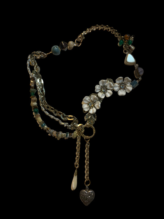

my lynch inspired necklaces, i only just now listed these on my site
#this is the best jewelry work ive done i feel like#left is based on laura#right is just generally lynch inspired but a lot of it is pretty heavily inspired by twin peaks the return visuals#d1gsart#art#artists on tumblr#jewelry#lynch#twin peaks#david lynch#sheryl lee#laura palmer#the return#twin peaks the return#lynchian#surrealist art#surreal
47 notes
·
View notes
Text
writers who intentionally leave major emotional beats of their stories "to the imagination" are cowards! COWARDS! commit to your story!
#obviously this doesn't apply to EVERY single instance of storytelling#there are very valid reasons to leave certain things ambiguous#especially in surrealist art and such#but when major moments between characters during culminations of their arc are just... left off screen#yeah that is being afraid#that's not being able to stand beside your work#that's not being willing to GO THERE#most recently this happen on the dragon prince with soren and viren's last interaction#TOTALLY OFF SCREEN#for reasons i am still not clear on#but yeah it's a plague
22 notes
·
View notes
Text
Personally my main complaint with Side Order was that there wasn't enough horror in it
Like I don't have a good frame of reference for how dark Splatoon can get (still haven't watched the story modes of 1 and 2), but the advertising for the DLC made it seem like we were going to spend a lot of time with just... the desolateness of the area, with an Eight who is probably very scared but also a little closed-off and doesn't really understand what's going on.
But with Pearl at our side from the very beginning, it's... kind of impossible to be frightened, or for the oppressive mood of the location to really set in. It doesn't help that she and Acht basically tell us what's going on immediately, so we don't even get to be confused for very long.
It's sweet that Eight gets to have friends, to not have an opportunity to be lonely and frightened, but. it seems a little at odds with the art direction, no?
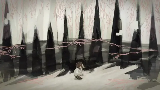

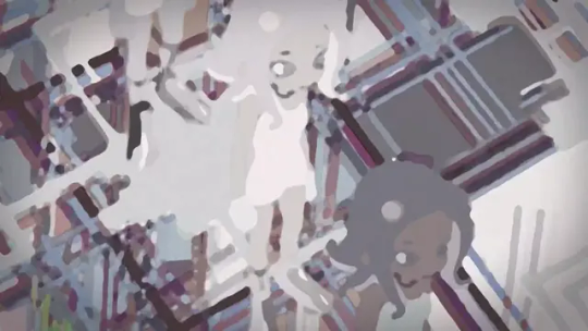
I get that Splatoon is a fast-paced action game first and foremost, but you can't advertise something with these kinds of shots - putting this surreal, claustrophobic, cold tone at the center - and not give us any time in the actual game to experience it.
The story we got is good, and the fun, colorful boss fight at the end with the boppin tunes is absolutely what Splatoon is all about, but I think it would've hit a lot harder if we actually had to work our way up to it. Start us off with no companions, so that when we do find them after ascending some floors/completing runs, there's a substantial difference in how it feels to be in this place.
The elevator, once terrifying to stand in alone, becomes a safe haven between floors where your friends can chat among themselves. Replaying the floors over and over again starts as a sanity-reducing loop, but becomes a fun game to challenge yourself with. And with Marina's help, the climb can become less grueling, the enemies easier to handle with Pearl at your side.
It's easier to sell a message about not just the power of friendship, but of the value of change and building a community, if you start us off without any of those things for contrast. Also the implied tone of the concept art is such a vibe and I just really wanted more of it in canon okay
#splatoon#splatoon 3#splatoon side order#splatoon 3 side order#analysis#meta#spoilers for slimes#Started thinking about this again after seeing more fanart that leans more into the surrealist/unsettling tones#Incredible work they're getting up to but MAN I wanna PLAY IT
40 notes
·
View notes
Text

The Salvador Dali Museum in St. Petersburg, Florida
The Salvador Dalí Museum, in St. Petersburg, Florida.
📸 flickr
#flickr#original#original post#original photography#original photography on tumblr#tumblr#artists on tumblr#architecture#Salvador Dali#Salvador Dali Museum#Spanish Surrealist Painter#art#artist#art work#art world#art news#modern art#modern design#modern architecture#blueiscoool#blueiskewl
16 notes
·
View notes
Text


》 some art that has stood out to me as of late!
#art study#art history#paintings#illustrations#romance art#surrealist art#art book#surrealism art#digital art#aya takano#andré masson#dean cornwell#hans bellmer#Jindřich Štyrský#victor brauner#edvard munch#sharing art#not my art#not my work#everyone loves you sarah♡
17 notes
·
View notes
Text

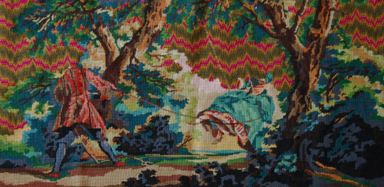
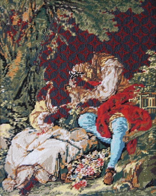


Needlepoint embroidery (found works made from hobby kits, unpicked and reworked) by Matt Smith.
#interesting how these works by named artists are translated into hobby kits for unknown amateurs to work#& then are reworked by a named male artist and move back into the art world#read an interview w matt and he’s a cool guy with a lot of admiration for the women in his family who taught him to sew from a young age#he also works with ceramics#matt smith#same name as the actor and this is why parents w super common surnames have to dig a little deeper than the bible boys#if they don’t want this scenario to happen.#matt j smith#embroidery#needlepoint#needlework#textile art#surreal#surrealist#surrealism#fave art
226 notes
·
View notes