#still need to figure out where i want to draw the line at details...
Explore tagged Tumblr posts
Text

So I also ended up making this this afternoon
So basically the story behind this is that I decided “eh screw it, I said I’d try making that megop kid idea, might as well try making some helm designs to start out with”. And I made a bit of one for TF One, though specifically inspired by their cogless designs since I’ve drawn them a fair bit
But then it dawned on me that outside of TF One, I haven’t actually drawn that many Megatron and Optimus designs. Like I drew Animated Optimus like a couple times when I was starting out, but that’s it. And also the idea itself doesn’t really work with TF One, since as it stands the war hasn’t technically even broke out yet. It works far more in a series where it’s actually been happening
So I figured, I should start at the basics and get myself some practice on g1 Megatron and Optimus, since you know, they’re the classic designs
Also side note on g1 that isn’t really related but I wanted to add in anyways, today I got the complete set of the g1 cartoon (minus the movie but that’s okay). It was a Christmas present that was supposed to come earlier but finally came in today. And I learned my PS4 can play Blu-Rays (which really shouldn’t be a surprise, I’m aware that’s what made the PS2 sell so well, but I didn’t realize they kept doing it), so that means I am now able to watch g1 on an actual TV, legally, with presumably higher quality, and possibly even subtitles
So you know, I’m doing pretty good right now. I’m glad my dad is supporting my Transformers fixation and the fact that I’m insisting on using a DVD player (for the movies at the library, but still), which means actual DVDs
Anyways, side tangent aside, back to the drawings
I think they turned out fairly decent, they don’t really bother me. I do kind of wish I added shading/lighting so the drawings weren’t so flat, but regardless
Admittedly I think I do need to work on actually doing poses and things with these designs, I’m doing a whole lot of nothing with them right now. I need to pose those cubes
Also there’s some colors shared between the two. I don’t know if this is something actually done in the show, and maybe it makes the colors look inaccurate, but I think it’s neat to use the same colors elsewhere
Now on to random things about the characters’ designs I just wanted to mention
First off, this isn’t really a character design thing, but these were the pictures I used for references, outside of some concept art I have for full body basic anatomy (getting screenshots from the show is my preferred form of reference), and I gotta say, it took a fair bit longer to find a picture online with a proper look at Optimus’ head than Megatron’s
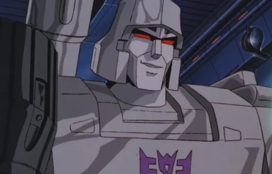
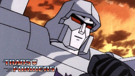
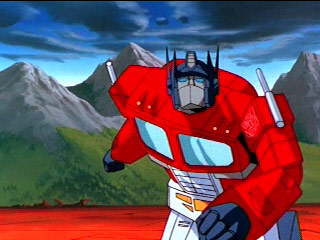
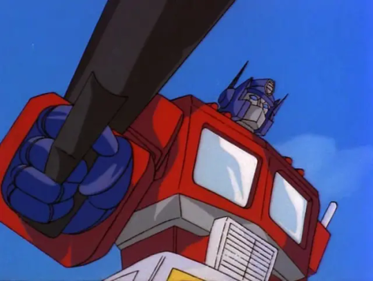
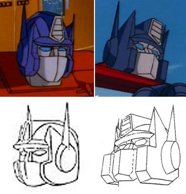
Like it didn’t take that long, like 1-2 minutes, but I just noticed how a lot of screenshots don’t really focus on his face, unlike Megatron. I assume because in g1, he doesn’t really have much of one, given his mask covers half of it
Also while Megatron’s helm itself is relatively basic looking and doesn’t really have a lot going on, the rest of his face has got a fair amount of details
Like he’s got defined cheek bone lines (I think), but he’s also one of the few (again I think) characters to have the shadow around his eyes that becomes more common later on
Then there’s also that whatever he’s got going on above his eyes. I’d say it’s eyebrows but I don’t think that’s what it’s supposed to be, given these characters don’t really have those yet
I saw someone, aka the person who makes Transformers Until One, granatu888 (idk if I should tag them here or not), turn the thing into a battle mask that drops down onto his face, and frankly I think that’s really cool, and that’s what I now choose to believe it is. Hasbro, make that what it is
Anyways, moving on. I don’t really have a lot to say on Optimus other than his helm being a lot more simplistic in its shapes than I’m used to, as well as very triangular. Like compared to TF One Optimus, who’s got a lot of details going on, his is super simple. I also didn’t make his antenna full triangles going down because I thought it looked weird, now they’re more like TFA Optimus
Also one last thing, but I swear the way I drew him looks just like that how one artist does, the one who draws Sparkplug (sorry, unlike the last mention I don’t actually remember the artist’s name, probably because I don’t follow them. Which tbh I should probably rectify, I like their Sparkplug stuff). Sorry it was just something I noticed afterwards and can’t unsee it. This also applies specifically to the face, they draw the actual rest character much better than me
Anyways, back to Megatron. Random thing, but he’s got a whole control panel on his torso. I’ve known he has it, because he has it in TF One, but why does he have it?
This kind of goes hand in hand, but random other thought I had today that connects, his design in general is a bit off compared to other characters because in g1, he doesn’t transform into a vehicle, he turns into a gun. Like that’s not to say he looks out of place (I mean I still think his helmet looks weird), but like, he doesn’t have a lot of kibble because of it. Like he’s one of the characters with no glass on his body because guns don’t have glass
Also does he have two guns? One on his shoulder, another on his back? I don’t know, I’m only now realizing that. They probably combine together when he transforms. Also I think his fusion cannon is just supposed to be his scope in gun mode, which ironically I’m pretty sure aren’t actually involved with the damage part of shooting. I don’t know, random observation
And uh, I think that’s it. It was mostly just random design details, and honestly not as many as I was expecting. I didn’t really have much to say on the art itself, mostly since it was just me trying to draw the g1 designs
But yeah, it was neat, I think I have a better understanding of their general designs, at least here. Now to actually use them in any way
#don’t know if I will be using these for the original purpose I outlined#but you know it was good practice anyways#transformers#transformers g1#my art#megatron#optimus prime
23 notes
·
View notes
Text
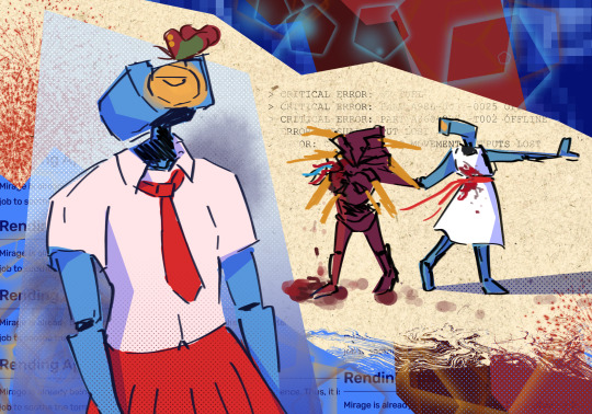
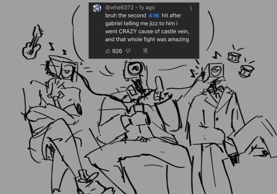
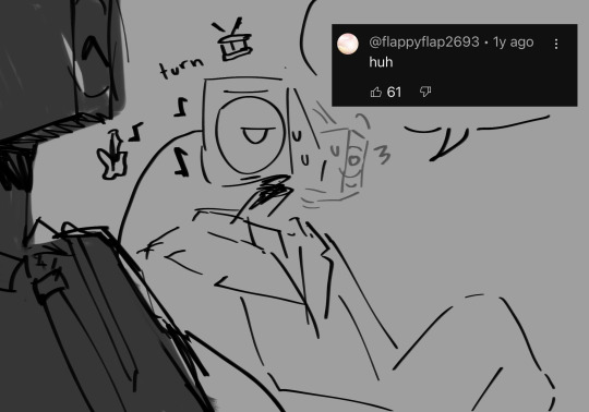
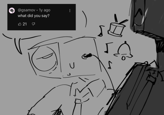
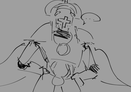
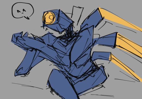
hello ultrakill community
#ultrakill#DECT#dream's end come true#ultrakill v1#ultrakill v2#ultrakill mirage#ultrakill gabriel#my art#clip studio paint#digital art#2024#im trying to figure out how to draw the chrs since im not used to drawing mechanical stuff & armor#its kinda fun!#still need to figure out where i want to draw the line at details...
438 notes
·
View notes
Note
hi, i ireally love your work and i don't know if you've answered this before but, what kinds of studies do you do or how did you learn color theory? i wanna get better at rendering and anatomy but im having trouble TT TT
Hi! Long answer alert. Once a chatterbox, always a chatterbox.
When I started actively learning how to draw about 10 1/2 years ago, I exclusively did graphite studies in sketchbooks. Here's a few examples—I mostly stuck to doing line drawings to drill basic shapes/contours and proportions into my brain. The more rendered sketches helped me practice edge control & basic values, and they were REALLY good for learning the actual 3D structure behind what I was drawing.

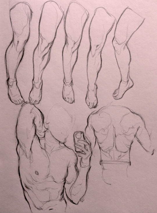

I'd use reference images that I grabbed from fitness forums, Instagram, Tumblr, Pinterest, and some NSFW places, but you could find adequate ref material from figure drawing sites like Line of Action. LoA has refs for people (you can filter by clothed/unclothed, age, & gender), animals, expressions, hands/feet, and a few other useful things as well. Love them.
Learning how to render digitally was a similar story; it helped a lot that I had a pretty strong foundation for value/anatomy going in. I basically didn't touch color at all for ~2 years (except for a few attempts at bad digital or acrylic paint studies), which may not have been the best idea. I learned color from a lot of trial and error, honestly, and I'm pretty sure this process involved a lot of imitation—there were a number of digital/traditional painters whose styles I really wanted to emulate (notably their edge control, color choices, value distributions, and shape design), so I kiiind of did a mixture of that + my own experimentation.
For example, I really found Benjamin Björklund's style appealing, especially his softened/lost edges & vibrant pops of saturated color, so here's a study I did from some photograph that I'm *pretty* sure was painted with him in mind.
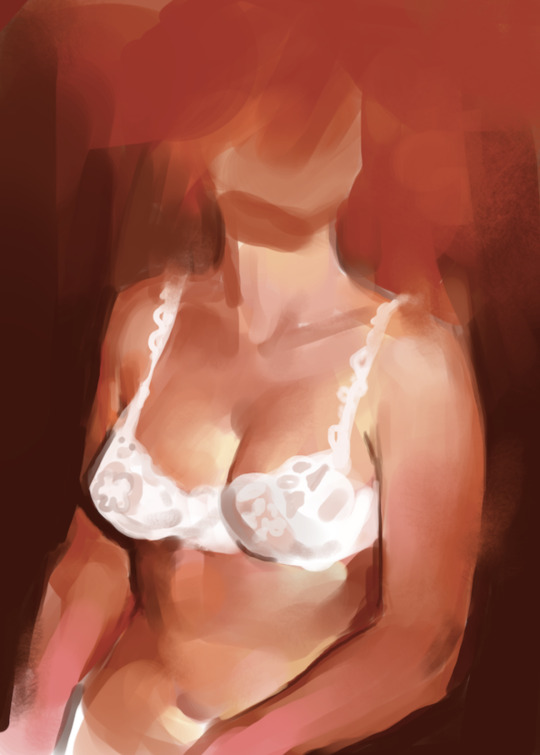
Learning how to detail was definitely a slow process, and like all the aforementioned things (anatomy/color/edge control/values/etc.) I'm still figuring it out. Focusing on edge control first (that is, deciding on where to place hard/soft edges for emphasizing/de-emphasizing certain areas of the image) is super useful, because you can honestly fool a viewer into thinking there's more detail in a piece than there actually is if you're very economical about where you place your hard edges.
The most important part, to me, is probably just doing this stuff over and over again. You're likely not going to see improvement in a few weeks or even a few months, so don't fret about not getting the exact results you want and just keep studying + making art. I like to think about learning art as a process where you *need* to fail and make crappy art/studies—there's literally no way around it—so you might as well fail right now. See, by making bad art you're actually moving forward—isn't that a fun prospect!!
It's useful to have a folder with art you admire, especially if you can dissect the pieces and understand why you like them so much. You can study those aspects (like, you can redraw or repaint that person's work) and break down whether this is art that you just like to look at, or if it's the kind of art that you want to *make.* There's a LOT of art out there that I love looking at, probably tens of thousands of styles/mediums, but there's a very narrow range that I want to make myself.
I've mentioned it in some ask reply in the past, but I really do think looking at other artist's work is such a cheat code for improving your own skills—the other artist does the work to filter reality/ideas for you, and this sort of allows you to contact the subject matter more directly. I can think of so many examples where an artist I admired exaggerated, like, the way sunlight rested on a face and created that orange fringe around its edge, or the greys/dull blues in a wheat field, or the bright indigo in a cast shadow, or the red along the outside of a person's eye, and it just clicked for me that this was a very available & observable aspect of reality, which had up until that point gone completely unnoticed! If you're really perceptive about the art you look at, it's shocking how much it can teach you about how to see the world (in this particular case I mean this literally, in that the art I looked at fully changed the way I visually processed the world, but of course it has had a strong effect on my worldviews/relationships/beliefs).
Thanks so much for sending in a question (& for reading, if you got this far)! I read every single ask I receive, including the kind words & compliments, which I genuinely always appreciate. Best of luck with learning, my friend :)
3K notes
·
View notes
Text
why Aurora's art is genius
It's break for me, and I've been meaning to sit down and read the Aurora webcomic (https://comicaurora.com/, @comicaurora on Tumblr) for quite a bit. So I did that over the last few days.
And… y'know. I can't actually say "I should've read this earlier," because otherwise I would've been up at 2:30-3am when I had responsibilities in the morning and I couldn't have properly enjoyed it, but. Holy shit guys THIS COMIC.
I intended to just do a generalized "hello this is all the things I love about this story," and I wrote a paragraph or two about art style. …and then another. And another. And I realized I needed to actually reference things so I would stop being too vague. I was reading the comic on my tablet or phone, because I wanted to stay curled up in my chair, but I type at a big monitor and so I saw more details… aaaaaand it turned into its own giant-ass post.
SO. Enjoy a few thousand words of me nerding out about this insanely cool art style and how fucking gorgeous this comic is? (There are screenshots, I promise it isn't just a wall of text.) In my defense, I just spent two semesters in graphic design classes focusing on the Adobe Suite, so… I get to be a nerd about pretty things…???
All positive feedback btw! No downers here. <3
---
I cannot emphasize enough how much I love the beautiful, simple stylistic method of drawing characters and figures. It is absolutely stunning and effortless and utterly graceful—it is so hard to capture the sheer beauty and fluidity of the human form in such a fashion. Even a simple outline of a character feels dynamic! It's gorgeous!
Though I do have a love-hate relationship with this, because my artistic side looks at that lovely simplicity, goes "I CAN DO THAT!" and then I sit down and go to the paper and realize that no, in fact, I cannot do that yet, because that simplicity is born of a hell of a lot of practice and understanding of bodies and actually is really hard to do. It's a very developed style that only looks simple because the artist knows what they're doing. The human body is hard to pull off, and this comic does so beautifully and makes it look effortless.
Also: line weight line weight line weight. It's especially important in simplified shapes and figures like this, and hoo boy is it used excellently. It's especially apparent the newer the pages get—I love watching that improvement over time—but with simpler figures and lines, you get nice light lines to emphasize both smaller details, like in the draping of clothing and the curls of hair—which, hello, yes—and thicker lines to emphasize bigger and more important details and silhouettes. It's the sort of thing that's essential to most illustrations, but I wanted to make a note of it because it's so vital to this art style.
THE USE OF LAYER BLENDING MODES OH MY GODS. (...uhhh, apologies to the people who don't know what that means, it's a digital art program thing? This article explains it for beginners.)
Bear with me, I just finished my second Photoshop course, I spent months and months working on projects with this shit so I see the genius use of Screen and/or its siblings (of which there are many—if I say "Screen" here, assume I mean the entire umbrella of Screen blending modes and possibly Overlay) and go nuts, but seriously it's so clever and also fucking gorgeous:
Firstly: the use of screened-on sound effect words over an action? A "CRACK" written over a branch and then put on Screen in glowy green so that it's subtle enough that it doesn't disrupt the visual flow, but still sticks out enough to make itself heard? Little "scritches" that are transparent where they're laid on without outlines to emphasize the sound without disrupting the underlying image? FUCK YES. I haven't seen this done literally anywhere else—granted, I haven't read a massive amount of comics, but I've read enough—and it is so clever and I adore it. Examples:


Secondly: The beautiful lighting effects. The curling leaves, all the magic, the various glowing eyes, the fog, the way it's all so vividly colored but doesn't burn your eyeballs out—a balance that's way harder to achieve than you'd think—and the soft glows around them, eeeee it's so pretty so pretty SO PRETTY. Not sure if some of these are Outer/Inner Glow/Shadow layer effects or if it's entirely hand-drawn, but major kudos either way; I can see the beautiful use of blending modes and I SALUTE YOUR GENIUS.
I keep looking at some of this stuff and go "is that a layer effect or is it done by hand?" Because you can make some similar things with the Satin layer effect in Photoshop (I don't know if other programs have this? I'm gonna have to find out since I won't have access to PS for much longer ;-;) that resembles some of the swirly inner bits on some of the lit effects, but I'm not sure if it is that or not. Or you could mask over textures? There's... many ways to do it.
If done by hand: oh my gods the patience, how. If done with layer effects: really clever work that knows how to stop said effects from looking wonky, because ugh those things get temperamental. If done with a layer of texture that's been masked over: very, very good masking work. No matter the method, pretty shimmers and swirly bits inside the bigger pretty swirls!
Next: The way color contrast is used! I will never be over the glowy green-on-black Primordial Life vibes when Alinua gets dropped into that… unconscious space?? with Life, for example, and the sharp contrast of vines and crack and branches and leaves against pitch black is just visually stunning. The way the roots sink into the ground and the three-dimensional sensation of it is particularly badass here:

Friggin. How does this imply depth like that. HOW. IT'S SO FREAKING COOL.
A huge point here is also color language and use! Everybody has their own particular shade, generally matching their eyes, magic, and personality, and I adore how this is used to make it clear who's talking or who's doing an action. That was especially apparent to me with Dainix and Falst in the caves—their colors are both fairly warm, but quite distinct, and I love how this clarifies who's doing what in panels with a lot of action from both of them. There is a particular bit that stuck out to me, so I dug up the panels (see this page and the following one https://comicaurora.com/aurora/1-20-30/):

(Gods it looks even prettier now that I put it against a plain background. Also, appreciation to Falst for managing a bridal-carry midair, damn.)
The way that their colors MERGE here! And the immense attention to detail in doing so—Dainix is higher up than Falst is in the first panel, so Dainix's orange fades into Falst's orange at the base. The next panel has gold up top and orange on bottom; we can't really tell in that panel where each of them are, but that's carried over to the next panel—
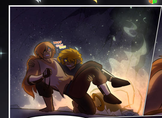
—where we now see that Falst's position is raised above Dainix's due to the way he's carrying him. (Points for continuity!) And, of course, we see the little "huffs" flowing from orange to yellow over their heads (where Dainix's head is higher than Falst's) to merge the sound of their breathing, which is absurdly clever because it emphasizes to the viewer how we hear two sets of huffing overlaying each other, not one. Absolutely brilliant.
(A few other notes of appreciation to that panel: beautiful glows around them, the sparks, the jagged silhouette of the spider legs, the lovely colors that have no right to make the area around a spider corpse that pretty, the excellent texturing on the cave walls plus perspective, the way Falst's movements imply Dainix's hefty weight, the natural posing of the characters, their on-point expressions that convey exactly how fuckin terrifying everything is right now, the slight glows to their eyes, and also they're just handsome boys <3)
Next up: Rain!!!! So well done! It's subtle enough that it never ever disrupts the impact of the focal point, but evident enough you can tell! And more importantly: THE MIST OFF THE CHARACTERS. Rain does this irl, it has that little vapor that comes off you and makes that little misty effect that plays with lighting, it's so cool-looking and here it's used to such pretty effect!
One of the panel captions says something about it blurring out all the injuries on the characters but like THAT AIN'T TOO BIG OF A PROBLEM when it gets across the environmental vibes, and also that'd be how it would look in real life too so like… outside viewer's angle is the same as the characters', mostly? my point is: that's the environment!!! that's the vibes, that's the feel! It gets it across and it does so in the most pretty way possible!
And another thing re: rain, the use of it to establish perspective, particularly in panels like this—

—where we can tell we're looking down at Tynan due to the perspective on the rain and where it's pointing. Excellent. (Also, kudos for looking down and emphasizing how Tynan's losing his advantage—lovely use of visual storytelling.)
Additionally, the misting here:
We see it most heavily in the leftmost panel, where it's quite foggy as you would expect in a rainstorm, especially in an environment with a lot of heat, but it's also lightly powdered on in the following two panels and tends to follow light sources, which makes complete sense given how light bounces off particles in the air.
A major point of strength in these too is a thorough understanding of lighting, like rim lighting, the various hues and shades, and an intricate understanding of how light bounces off surfaces even when they're in shadow (we'll see a faint glow in spots where characters are half in shadow, but that's how it would work in real life, because of how light bounces around).
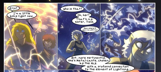
Bringing some of these points together: the fluidity of the lines in magic, and the way simple glowing lines are used to emphasize motion and the magic itself, is deeply clever. I'm basically pulling at random from panels and there's definitely even better examples, but here's one (see this page https://comicaurora.com/aurora/1-16-33/):

First panel, listed in numbers because these build on each other:
The tension of the lines in Tess's magic here. This works on a couple levels: first, the way she's holding her fists, as if she's pulling a rope taut.
The way there's one primary line, emphasizing the rope feeling, accompanied by smaller ones.
The additional lines starbursting around her hands, to indicate the energy crackling in her hands and how she's doing a good bit more than just holding it. (That combined with the fists suggests some tension to the magic, too.) Also the variations in brightness, a feature you'll find in actual lightning. :D Additional kudos for how the lightning sparks and breaks off the metal of the sword.
A handful of miscellaneous notes on the second panel:
The reflection of the flames in Erin's typically dark blue eyes (which bears a remarkable resemblance to Dainix, incidentally—almost a thematic sort of parallel given Erin's using the same magic Dainix specializes in?)
The flowing of fabric in the wind and associated variation in the lineart
The way Erin's tattoos interact with the fire he's pulling to his hand
The way the rain overlays some of the fainter areas of fire (attention! to! detail! hell yeah!)
I could go on. I won't because this is a lot of writing already.
Third panel gets paragraphs, not bullets:
Erin's giant-ass "FWOOM" of fire there, and the way the outline of the word is puffy-edged and gradated to feel almost three-dimensional, plus once again using Screen or a variation on it so that the stars show up in the background. All this against that stunning plume of fire, which ripples and sparks so gorgeously, and the ending "om" of the onomatopoeia is emphasized incredibly brightly against that, adding to the punch of it and making the plume feel even brighter.
Also, once again, rain helping establish perspective, especially in how it's very angular in the left side of the panel and then slowly becomes more like a point to the right to indicate it's falling directly down on the viewer. Add in the bright, beautiful glow effects, fainter but no less important black lines beneath them to emphasize the sky and smoke and the like, and the stunningly beautiful lighting and gradated glows surrounding Erin plus the lightning jagging up at him from below, and you get one hell of an impactful panel right there. (And there is definitely more in there I could break down, this is just a lot already.)
And in general: The colors in this? Incredible. The blues and purples and oranges and golds compliment so well, and it's all so rich.
Like, seriously, just throughout the whole comic, the use of gradients, blending modes, color balance and hues, all the things, all the things, it makes for the most beautiful effects and glows and such a rich environment. There's a very distinct style to this comic in its simplified backgrounds (which I recognize are done partly because it's way easier and also backgrounds are so time-consuming dear gods but lemme say this) and vivid, smoothly drawn characters; the simplicity lets them come to the front and gives room for those beautiful, richly saturated focal points, letting the stylized designs of the magic and characters shine. The use of distinct silhouettes is insanely good. Honestly, complex backgrounds might run the risk of making everything too visually busy in this case. It's just, augh, so GORGEOUS.
Another bit, take a look at this page (https://comicaurora.com/aurora/1-15-28/):
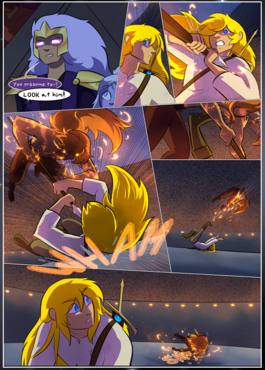
It's not quite as evident here as it is in the next page, but this one does some other fun things so I'm grabbing it. Points:
Once again, using different colors to represent different character actions. The "WHAM" of Kendal hitting the ground is caused by Dainix's force, so it's orange (and kudos for doubling the word over to add a shake effect). But we see blue layered underneath, which could be an environmental choice, but might also be because it's Kendal, whose color is blue.
And speaking off, take a look at the right-most panel on top, where Kendal grabs the spear: his motion is, again, illustrated in bright blue, versus the atmospheric screened-on orange lines that point toward him around the whole panel (I'm sure these have a name, I think they might be more of a manga thing though and the only experience I have in manga is reading a bit of Fullmetal Alchemist). Those lines emphasize the weight of the spear being shoved at him, and their color tells us Dainix is responsible for it.
One of my all-time favorite effects in this comic is the way cracks manifest across Dainix's body to represent when he starts to lose control; it is utterly gorgeous and wonderfully thematic. These are more evident in the page before and after this one, but you get a decent idea here. I love the way they glow softly, the way the fire juuuust flickers through at the start and then becomes more evident over time, and the cracks feel so realistic, like his skin is made of pottery. Additional points for how fire begins to creep into his hair.
A small detail that's generally consistent across the comic, but which I want to make note of here because you can see it pretty well: Kendal's eyes glow about the same as the jewel in his sword, mirroring his connection to said sword and calling back to how the jewel became Vash's eye temporarily and thus was once Kendal's eye. You can always see this connection (though there might be some spots where this also changes in a symbolic manner; I went through it quickly on the first time around, so I'll pay more attention when I inevitably reread this), where Kendal's always got that little shine of blue in his eyes the same as the jewel. It's a beautiful visual parallel that encourages the reader to subconsciously link them together, especially since the lines used to illustrate character movements typically mirror their eye color. It's an extension of Kendal.
Did I mention how ABSOLUTELY BEAUTIFUL the colors in this are?
Also, the mythological/legend-type scenes are illustrated in familiar style often used for that type of story, a simple and heavily symbolic two-dimensional cave-painting-like look. They are absolutely beautiful on many levels, employing simple, lovely gradients, slightly rougher and thicker lineart that is nonetheless smoothly beautiful, and working with clear silhouettes (a major strength of this art style, but also a strength in the comic overall). But in particular, I wanted to call attention to a particular thing (see this page https://comicaurora.com/aurora/1-12-4/):
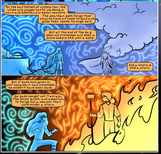
The flowing symbolic lineart surrounding each character. This is actually quite consistent across characters—see also Life's typical lines and how they curl:
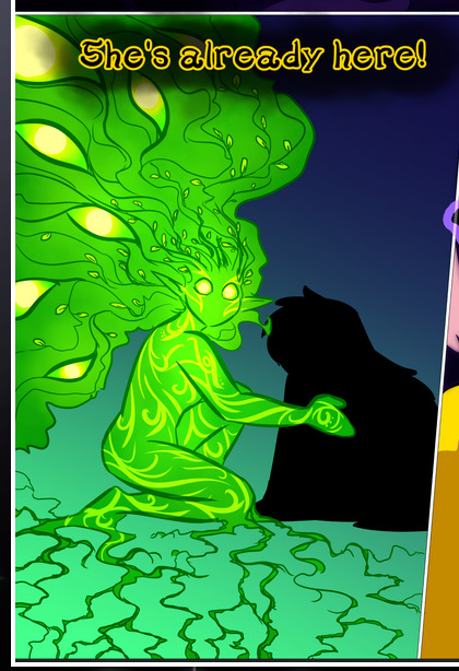
What's particularly interesting here is how these symbols are often similar, but not the same. Vash's lines are always smooth, clean curls, often playing off each other and echoing one another like ripples in a pond. You'd think they'd look too similar to Life's—but they don't. Life's curl like vines, and they remain connected; where one curve might echo another but exist entirely detached from each other in Vash's, Life's lines still remain wound together, because vines are continuous and don't float around. :P
Tahraim's are less continuous, often breaking up with significantly smaller bits and pieces floating around like—of course—sparks, and come to sharper points. These are also constants: we see the vines repeated over and over in Alinua's dreams of Life, and the echoing ripples of Vash are consistent wherever we encounter him. Kendal's dream of the ghost citizens of the city of Vash in the last few chapters is filled with these rippling, echoing patterns, to beautiful effect (https://comicaurora.com/aurora/1-20-14/):
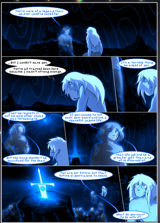
They ripple and spiral, often in long, sinuous curves, with smooth elegance. It reminds me a great deal of images of space and sine waves and the like. This establishes a definite feel to these different characters and their magic. And the thing is, that's not something that had to be done—the colors are good at emphasizing who's who. But it was done, and it adds a whole other dimension to the story. Whenever you're in a deity's domain, you know whose it is no matter the color.
Regarding that shape language, I wanted to make another note, too—Vash is sometimes described as chaotic and doing what he likes, which is interesting to me, because smooth, elegant curves and the color blue aren't generally associated with chaos. So while Vash might behave like that on the surface, I'm guessing he's got a lot more going on underneath; he's probably much more intentional in his actions than you'd think at a glance, and he is certainly quite caring with his city. The other thing is that this suits Kendal perfectly. He's a paragon character; he is kind, virtuous, and self-sacrificing, and often we see him aiming to calm others and keep them safe. Blue is such a good color for him. There is… probably more to this, but I'm not deep enough in yet to say.
And here's the thing: I'm only scratching the surface. There is so much more here I'm not covering (color palettes! outfits! character design! environment! the deities! so much more!) and a lot more I can't cover, because I don't have the experience; this is me as a hobbyist artist who happened to take a couple design classes because I wanted to. The art style to this comic is so clever and creative and beautiful, though, I just had to go off about it. <3
...brownie points for getting all the way down here? Have a cookie.
#aurora comic#aurora webcomic#comicaurora#art analysis#...I hope those are the right tags???#new fandom new tagging practices to learn ig#much thanks for something to read while I try to rest my wrists. carpal tunnel BAD. (ignore that I wrote this I've got braces ok it's fine)#anyway! I HAVE. MANY MORE THOUGHTS. ON THE STORY ITSELF. THIS LOVELY STORY#also a collection of reactions to a chunk of the comic before I hit the point where I was too busy reading to write anything down#idk how to format those tho#...yeet them into one post...???#eh I usually don't go off this much these days but this seems like a smaller tight-knit fandom so... might as well help build it?#and I have a little more time thanks to break so#oh yes also shoutout to my insanely awesome professor for teaching me all the technical stuff from this he is LOVELY#made an incredibly complex program into something comprehensible <3#synapse talks
784 notes
·
View notes
Note
Hello :D
I have been following you for the last year or so (a few days after I got my Tumblr lmao) and I absolutely love your art!
I have been wanting to study your art style for a while but don't really know where to start,,,
Could you please show me a small portion of your art process, if it isn't too much trouble of course. Thank you and have a nice day!
hello. oh my god. this took forever to find.
im sorry it took 2 WHOLE FUCKING MONTHS for me to respond to this but i wanted to put it off until i felt happy with my art process again, so here it is
my fall 2024 rendering tutorial!
(this will be very very long)

FLATS AND WHATEVER YOU WANNA DO WITH LINES GIRL. then make sure to recolor the lineart to better match your base. trust me it helps, bold dark lines are Not your best friend when rendering. wait for that post-rendering
i start off with a doodle or a sketch, and then filling it in with flats and other details such as blush

FIGURE OUT YOUR LIGHT SOURCE. FIGURE IT OUT GIRL YOU CAN DO IT you can make it as simple as possible, make it as big as possible, dont even THINK about the details.........just make it really fucking big so you at least know where the shadows and the light goes THEN add smaller shading details LISTEN TO ME. LISTEN TO ME OKAY!!!!!!!!
my key point with this is for you to learn lighting fundamentals.
it's SOOO ANNOYING but alas......they are all correct. it helps a lot.
one thing i also really want to point out is that i like creating a big shadow shape first before fixing up the little details (such as folds and whatever) because it helps me focus on the way the lighting actually works instead of tunnel vision-ing into making the shading make sense on the clothing.

contact shadows (i dont remember if thats what theyre called okay) theyre fucking ugly because im not actually thinking sorry 💔
okay so basically:
contact shadows (if that's what they're called) are the spots in shading and lighting where light will NEVER hit.
shadows are still influenced by the colors and lights around it (it's why a blue shadow and a yellow shadow feel completely different, despite both being shadows) so it's not always COMPLETELY dark.
BUT! there are small points in shadows where light never hits, and they're almost always super dark or pitch black.
it's hard to explain shadow and light so briefly for a tutorial, but you'll notice it when watching fundamental studies and when trying it out for yourself


YES i unclipped the multiply layer YES its ugly and terrifying but it makes coloring the multiply layer easier okay the colors merged w multiply so now it looks cool and has depth overlaying colors that actually make sense
so basically what i did was color the multiply layer that i used to shade the overall drawing
adding a band of red/orange/yellow around where the light hits, and blue where the shadows get big and wide, gives it a fake ambient occlusion effect in the way that a person would get if they stood under the sun with a clear blue sky
the colors don't have to make sense, especially because i never draw backgrounds, but coloring the shadows really help it give a sense of depth and extra subtle detail and effect that just helps make the painting look nicer
around the end, i also put in colors (in an overlay layer with a low opacity brush) that actually make sense in context of the drawing, which is the lit cigarette and the yellow eyelights
mostly because none of the colors were making sense and i needed to actually make use of the lighting that DOES exist in the drawing lol

adding a muddy golden yellow pin light layer (opacity turned down to like 40-50%) to make the light colors less ugly lol
i SWEAR by the fucking pin light layer style. it's so useful and so so underrated.
i used an almost brown-ish gold color on stop of all the layers, and with the pin light layer, it helped make the bright (almost blue-ish) white colors more warm and more yellow. it just helps make things more warm (something i prefer)
i could probably show what it looks like without adjusting the layer opacity to truly show off what i mean (like in the coming section) but i sadly forgot to do that lol


make a layer on top of your drawing with this color in these ranges YES the drawing is fully merged NO don't be afraid, the base was fucking ugly anyway 💔 make this layer into an exclude/exclusion layer style TRUST turn down your exclusion layer opacity from a range of 10% to 40% literally until you're happy with the contrast and the way the color over the drawing. use your eyeballs. i know you can do it im so proud of you
this is pretty self-explanatory instruction-wise, so i'll go into why i do this instead
i really like art that seems like it has low contrast, with almost mid-gray shading and lines. i don't personally use dark and bold lines and shading, unless i find it necessary for the tone of the piece, so using this method helps lower the contrast of the art and make it look "pleasantly muddy" in the way that it's easier and softer on the eyes.
the inverted blue color also helps makes things warmer!
the exclusion layer style is still a bit of a mystery to me but i really like the effect it gives, even if i don't completely get how it works lol
if you want an alternative method to this, and if you have access to it (because i primarily use sai and sai only),
i absolutely encourage you to play around and experiment with gradient maps.
there are so many out there you can make yourself or even get from others that just give the painting an extra amount of depth and color variation. they're SO fun.
personally, if sai2 gets a gradient map update, it's over for y'all it will literally be so over no one will be able to stop me


then i merged everything and actually adjusted the contrast back up because it was looking too muddy for me 💔 but the color adjustments are still there so all hope is not lost here's a comparison of the adjusted contrast in black and white (adjusted on the left) (newly merged layer without adjusting the contrast on the right)
as you can see, i actually turned the contrast back up (despite talking all about how i liked things with less contrast lol)
i wanted to demonstrate that doing adjustments should be done in moderation, and is why i adjust layer opacity often when making color effects
you are free to play around with colors to help your style, but don't lose your initial idea and colors along the way.
you still need to trust your own colors and intuition!
along with that, i just want to say that it's completely okay to change your mind mid-painting, and it's okay to make somewhat drastic changes.
don't be afraid to change things you don't like or change your mind about certain aspects way later on
that's basically the whole thing of this!!! don't be scared!!!

now im gonna hold your hand when i say this..........but you need to learn how to render by yourself. it seems like i can teach you but i literally can't, because rendering is different on every piece and depending on how clean your base is. i have to render A LOT because of how fucking ugly my sketches are LMAO to simplify it, think of it as obsessively cleaning up every detail you can see, but with a color picker and a clean, hard edged brush. if you have shit lineart, you don't have to redraw it cleanly over and over, just paint over it. that's basically what rendering is
THIS especially is where you need to be brave and stop being scared.
like i said, i can't teach you how to render, and it's something you have to discover yourself because rendering is something that will always be personal to every single piece you make. the way you render on every piece is different.
on one piece, you will barely need to render, and on another, rendering is more than half of your ENTIRE process.
don't be afraid to paint over your old art.
rendering is a process that's both very perfectionist yet also very careless.
find your balance and just go for it.

and then that's it……..u did it………..now yuo know how to paint and render. it's literally just layering shading and lighting knowledge until you think it makes sense and looks okay lol additional note: since i render in only one layer (you don't HAVE to do this, but it'll be harder for you…), i also made slight adjustments with the transform (and liquify, if you have it) tool to make things more proportionate. (i drew the head too big lol)

if you compare the finished piece to the final unrendered base, you can see that a LOT changed, including a bit of subtle proportion adjustment.
particularly, the sleeves changed A LOT (because i really didn't like them)
but it's also over all cleaner and more coherent, instead of having haphazard colors and shading just thrown about.
rendering is when you finally use all 100% of your brain to finalize and figure out where the shading should go, where to clean up your lines, where to ERASE or ADD BACK in lines, and make sure all your colors look coherent.
it's not as intimidating as it seems, i only use a hard edged brush with a little bit of color mixing and my color picker.
it's like dragging and dropping colors to cover up mistakes, it's really quite fun when you get used to it
i wish i could explain it clearer but it's hard to describe without visuals!
i hope this helped, and i hope all my yapping isn't annoying (art as a special interest beloved)
have fun studying and trying to render in my art style!
#long post#art tutorial#rendering tutorial#art help#art tips#tutorial#kia doodles shit#artxstic-scr1bbles#tutoriel
181 notes
·
View notes
Text
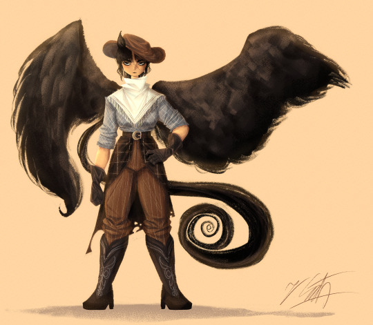
[Click for better quality]
OK finally back with some more drawings! Since Touhou 17 is approaching it's 5 year anniversary soon, I wanted to draw at least one of the charatcers (hopefully I'll still be motivated to draw Keiki lol) and I had some ideas for Saki and I've never drawn her before, so that's how we got here!
Artist's Notes;
So after doing some drawings of my OCs (who I will reveal upon a later date since I still wanna finalize their designs) and finally getting out of my art funk that I've been in for a while, I started off this drawing with the mentality of "oh yeah I'm just gonna put together this quick outfit for Saki and I won't bother rendering it"
...and then I did but to be honest I am very happy I did because oh my god clothes are so fun to render for me now. I remembered the technique I used on my drawing of Reimu and applied that here. That technique being using triangles to imply shadows and highlights in clothing and then blending out those shadows to give the clothing some three dimensionality. My favourite things that I rendered in this piece were the gloves, hat and the belt buckle (since I applied a technique for rendering gold and metal objects that I remember seeing/hearing about a while ago). Don't get me wrong, I love how all the clothing turned out in this piece but the gloves are the real standout of this piece to me. I also had some fun with the cowboy boots (I couldn't figure out how to make those cool metal star things work on the boots though that is a sin I fully intend to fix later down the line) since when I looked at references for them I noticed how some of them had these intricate details embroidered (?) onto them.
Also, in the earliest phases of this drawing Saki had this really big black coat that I decided to get rid of later down the line because it really does not work with her fighting style and it did not stand out against her wings, and the logistics of her getting said jacket with her wings on confused me. Like, I can kind of imaging that on her shirt she has a little open spot for her wings that she can just put them in. That goes for Yachie to but now I'm even more confused because all her clothes must need some open backs because of her shell??? Which raises some more questions, like, can she just never be on her back when sleeping??? Looking at Yuuma we can see that the beast yakuza in Touhou can freely change their form from human to beast so can Yachie just double down on the human bit and get rid of her shell temporarily so she can sleep comfortably??? Because if she lays on her back is she just kinda wobbling around like most turtles are when they're on their backs? Can she hypothetically retreat into her shell, if so that has some weird implications to how her anatomy works. Like, what does her skeleton look like? Seriously, what are the logistics here WHERE DOES YACHIE GET HER FUCKING CLOTHES BECAUSE THEY PROBABLY NEED TO BE SPECIFICALLY TAILORED SO SHE CAN PUT IT ON TO FIT HER SHELL I DON'T NEED SLEEP I NEED ANSWERS YACHIE WHY ARE YOU LIKE THIS-
....rant aside, you can see the remnants of this idea in the tattered back of her... idk what to call it but I know she has a variant of this in her OG design. I mainly wanted to test this out because of the cursed realization that The Ghoul in Fallout Prime is just a male Saki but if Utsuho gave Saki radiation poisoning. No seriously, they're smug ass cowboys who are so sure of their own strength that have fought at least one mechanically engineered robot in some variation of a wasteland with an affinity for dogs. I'm now morbidly curious as to what would happen if you put the two of them in a room together. Would they try to kill each other? Would they become besties? Would they try to kill each other and then become besties? Who knows. But yeah jokes aside the tattered cloth was a design choice that was inspired by The Ghoul from Fallout Prime because y'know, same vibes. And also because yes I do love Fallout Prime and I am so ready for season two IT'S SO GOOD GO WATCH IT EVEN IF YOU AREN'T FAMILIAR WITH FALLOUT AS A SEIRES GO DO IT NOW, SAIL THE SEVEN SEAS FOR IT IF YOU HAVE TO JUST WATCH IT-
I knew for Saki's face I wanted to give her some thick eyebrows, it just makes sense. I also wanted to give her some scarring on her face because she's a crime boss, why wouldn't she have scars? I also had some fun with her little horse ear that's sticking out from the side of her hat since it would kinda look weird if she just had no ears period. I also went ham on stylizing her ponytail into this weird swirl, since if I were to show you some of my recent doodles from my sketchbook you would notice that that has become a common motiffe in some of my art. I don't know why but I just like it. Saki's wings were also very fun, I found a good reference for bird wings that are specifically shaped for high speeds (though I did add some stylistic touches so her one wing that's out wouldn't look like a big blob) since her whole thing is speed. From very early on in the process I knew that I wanted Saki to not look skinny, so I found some refs of female kickboxers for her legs and noticed that while parts of their upper body are maybe a bit toned, it's the legs that have a lot of power. I mainly did this because kicking is a huge part of her fighting style.
Overall, I'm really happy with this drawing, and once Touhou 17's anniversary rolls around I do want to go more in depth on my thoughts in the game, it's themes, and how the animal realm functions as a dark parallel to Gensokyo in many ways. I'll also have to get around to drawing Yachie and Keiki as well (if I still have the time and motivation to do so) since I have some ideas for their designs that I'm very excited to draw (especially Keiki).
#touhou project#art#fanart#touhou fanart#touhou 17#saki kurokoma#wily beast and weakest creature#東方project
114 notes
·
View notes
Text

🎶 stop the clocks, i'm killing time! i don't ever want this to end, and you say "that makes two of us"
⏯ NOW PLAYING: Stop the Clocks by Enter Shikari
for @mcyt-jukebox-bonanza, featuring Rubyco and VikingPilot from Twitch SMP!
ramblings under cut:
FINAL JUKEBOX!
i was talking to Viking about Enter Shikari (i'd gotten him to start listening to them via the PMV preview) and he mentioned this song in specific as one he's been listening to lately. and, like, i've mentioned before that Radiate is my favorite from this band, but Stop The Clocks was up there for a while. so... yeah! obviously i had to draw something.
this went through a LOT of revision. after my last jukebox i fell into an art slump and was struggling with ideas and what i felt capable of. i knew the main thing i wanted was to include TwitchCon SMP-- the entire thing is that they were only supposed to exist for three days. initially the middle panel was going to be another angle of the same scene, with Viking and Ruby looking out over the beet fields in the sunset, but i didn't feel like i'd have the time or energy for a detailed background.
after that idea got scrapped, i had the idea to lean into the contrast of where they started vs where they are now. this is the version i showed Viking:

..with the middle panel being a redraw of the first thing i drew for Twitch SMP, of Viking dangling Ruby over the cliff. when i started looping the song to start lining and coloring, though, it didn't really match the tone of the song so i scrapped it again, shuffled element positions, and returned to the first idea but with it being TSMP Viking and Ruby instead. still ended up being a bit of a redraw, but this time it's of the scene where Viking talks about his dreams and how they need to embrace whatever's happening to both of them.
and yet despite all of that, the parts i like best are the tiny panels of TCSMP Ruby and Viking. i like the rim lighting, i like the expressions, i like the palette i used for the background. it's just so nice. i wanted to capture a bittersweet fondness, because neither of them expected to continue past this. yknow?
while i'm here, i wanna talk a little bit about tcViking:

he has tViking's palette (hence his goggles being brown instead of black), and he has the scar next to his eye that i draw tViking with. the other scars he got after being lost in time, but i figured having some kind of identifying characteristic would help with Ruby seeing him as her Viking, and then that coming into doubt as she saw how different he was physically and mentally.
this was really fun to do <3 it feels poetic that my first and last pieces are tRuby-- TSMP got me through what otherwise would've been a rough start to the year, and Rubyco especially has been incredibly cool and making me feel more confident and comfortable with being very vocally active in fandom again :,)
back to work on the PMV!
#leo.txt#leo.png#vikingpilot#rubyco#twitch smp#LOOKING AT MY OWN ART MAKES ME EMOTIONAL. GOD. tSPACETIME SIBLINGS BOTTOM TEXT#tsmp#mcytjukeboxbonanza
62 notes
·
View notes
Note
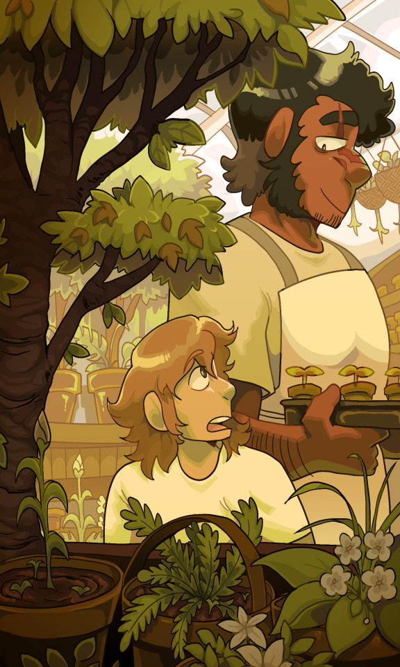
Hello!! If you don’t mind me asking, what’s your process for making backgrounds (if you have any process in particular!) They’re one of my favorite parts of the comic, and I’m interested to hear how you decide colors and stuff!
I sadly don't have a lot to say about this bc half the time i just raw dog the colors. I rely on complimentary colors (primarily orange/yellow and blue/purple, which is a fun secondary effect since Lain and Mariner are also yellow and blue) but if I want a very specific vibe I will often colorpick from pictures since I have a bit of trouble straying from my love of desaturated colors a lot of the time LOL.
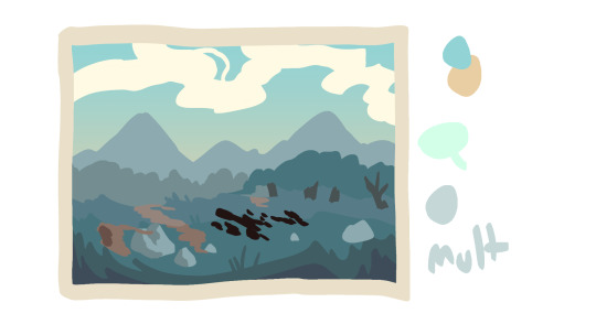
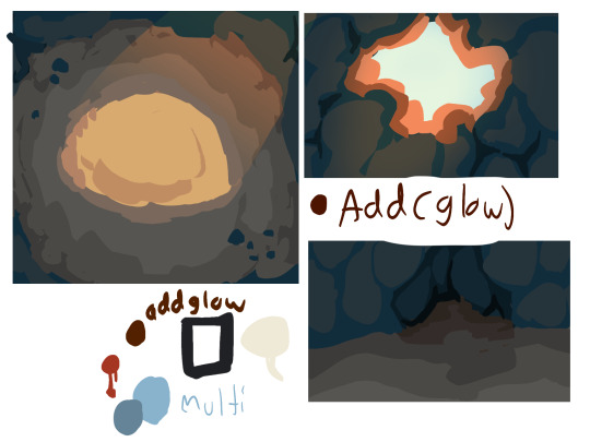
These were some scene preps I did for a couple of later scenes! I tried to find some where I made a couple of moodboard pictures to get the vibe down but i guess i deleted all of those whoops.
as for drawing them, i don't have a lot of tips on the actually RENDERING part (i'm a very bad teacher) but here's a breakdown of how i generally draw the bgs in wac
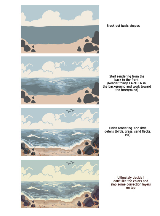
bgs in comics are really an important aspect to me personally. the way I treat and approach bgs is to not treat them as just window dressing but instead treat them as an additional character. What is the bg conveying, whether it be a specific location, a vibe, or in terms of a den or a room or whatever, what can it tell us about the character it belongs to? I will admit I haven't done this as much as I would've liked to in WAC so far, but I hope that as the story progresses I can strive to put more life into the backgrounds. It's a little bit trickier since they are kitties living in a nature environment and not humans in houses, but I still hope to create that same sense of importance.
and I know backgrounds are often seen as "the worst part" of art, but I wholeheartedly believe you just need to figure out how YOU enjoy creating backgrounds. I love drawing them! I used to paint backgrounds for years before realizing I hated it so bad. Now I prefer this much blockier style and I love lining bgs. I highly recommend just sitting down, and doing some studies of photos of landscapes, of cities, or whatever else you want your bgs to be. appreciate the little details, figure out how to simplify them for yourself, think about the big picture of things, and it'll go a long way.


111 notes
·
View notes
Note
so i keep thinking about just how thoroughly knocking vlad up would fix a lot of his issues (or it does in the series as my ass would write it). i also keep thinking the timing is SO bad on giving him any in the canon
SO
TIME TRAVEL
-Danny (late teens) is given a chance to change the past
-he decides to go and antagonize Vlad a few years before canon to distract him from murder attempts on Jack. draw his wrath onto himself and displace his previous rage target. that's a nice safe range of time travel right? how badly could he possibly throw things off when he already exists and is most of the way to who he was when he was starting out?
-small side effect--he catches Vlad's full attention. he hadn't planned to go after Jack and Maddie for a few years yet, when everything was lined up, meaning Danny is the ONLY one he has eyes for right now. it's a level of intensity he was not ready for
-Vlad, meanwhile, is unprepared for how he feels to see another half-ghost. he had been ready to go those whole 20 years totally alone, preparing for that perfect moment of sweeping Maddie off her feet. now it's a little difficult to focus on the big picture. he needs to figure out EVERYTHING about this stranger
-over a course of about three months, shit gets romantic. and physical. not necessarily in that order
-Danny realizes he's THOROUGHLY fucked the timeline as WELL as his archnemesis, so actually tells Vlad the whole story--he can't stay in the past forever, but his memories of being here and doing this will sort of... snap into place when this timeline's danny reaches the right age. Here's events between then and now, here's things he would like to still happen, here's things he never wants to happen
-he does NOT expect Vlad to wait and they're still in that spicy in-between part of enemies-to-lovers so Vlad sure as fuck isn't promising that, but he's certain he isn't obsessing on taking Maddie from Jack anymore, so looks forward to the option of picking up where they left off
-(dick so good it can fix homicidal rage)
-Danny goes back to the new future at the end of those three months since much longer and he'd start forgetting relevant details in living a day to day life and ohhhhh fuck, fuck, FUCK WHAT DID HE DO
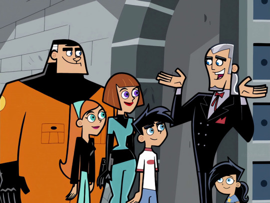
-meanwhile in the past Bitter Reunions happens and Vlad has no desire to do anything to Jack or Maddie besides introduce them to his adorable tiny four, soon to be five year old daughter Danielle, with whom he plans to move to Amity Park soon when she starts kindergarten. openly offers to train Danny with no strings attached, he's just invested in making sure he survives for at least a few more years
-(jailbait wait, but make it sci-fi)
-Vlad is much more chill about things with an attainable goal and a small child that needs him at his best
-he doesn't see his Danny in this newbie, but now he knows the future, knows that if he's just patient and helps Danny out now, HIS Danny will come back to him
-when the timelines eventually sync, THERE'S THAT FULL, INTENSE, ATTENTION AGAIN
-as well as several years of memories of becoming intensely attached to Dani and Vlad being an infuriating jackass without being an antagonizing one, keeping some of that hateful spice without actively committing crimes against everything Danny values. in fact, his help was still instrumental in pulling things off
-Vlad has been waiting for this Danny for some time now, full-on obsession building up steam, so if Danny wants it to not happen, he had better say something about it
-he does not. he kinda dreaded losing it on snapping forward, actually. and Vlad managed to thread the needle of training him and building a bond with Dani without totally shifting their relationship's tone
Time Travel makes me cry because my stupid ogre brain is not good at parsing temporal phenomena but the parts I understood were excellent and make perfect sense. And the thought of Jack and Maddie being surprised (and maybe relieved, because 20 years without a peep from Vlad and suddenly a party invite? Kinda unnerving. Is he still mad?) to find their old college friend is a happy single father to an adorable little girl who—wow, Jack, doesn't she look so much like Danny when he was that age?—is just 💯💯💯
And Vlad knowing that there's something wonderful (a relationship, family, love, connection and understanding like he's never felt before) waiting for him at the end of this journey if he can just be patient would, I think, do a lot to tone down his villainous proclivities.
Vlad's essential problem is that he's so desperately lonely and impatient that he can't see beyond his immediate need to satisfy himself. He can formulate elaborate plans, yes, but he doesn't really plan for the future beyond those plans. He's totally still living in the past (at least until this AU happens), metaphorically driving a car with the pedal to the metal but looking nowhere except the rear view mirror. And this AU totally breaks that and gets him looking ahead, invested in the present again. I love it.
50 notes
·
View notes
Note
Based on your last post- how would you handle a villain Adrien arc? Would it be from the get-go, or would you have him change sides somewhere along the line? Would it be of his own choice and motivations, or would he be coerced into it? (Or some mix of the two where he disagrees with the method his father does things but goes along because he has the same motive, his mom?)
(Post in question)
Villain Adrien is an incredibly hard sell for me. I can only think of one fic that felt reasonably in character and I think it only worked because it starts after Gabriel's defeat, so you don't have to actually see Adrien being evil. Anything that actually tries to show Adrien willingly hurting others just doesn't work. It doesn't feel like Adrien. Lashing out in the moment might* fit him, but prolonged villainy? Nope. You'd have to take his character through a damnation arc to make it fit. While canon has set him up for one, I don't particularly want to see that. Canon Adrien has suffered enough.
So why would I suggest villain Adrien as a solution?
I have actually spent a good deal of time trying to figure out how to make Adrien work as a villain because it's a semi-popular premise and I enjoy a writing challenge. After a lot of thought, I have a solution that I think would work. I will probably never write this fic, but the basic ideas are simple enough that I can explain the first act and why I think it would work as a way to take Miraculous beyond the Gabriel conflict.
The story would start in much the same way we already see in Origins. Gabriel activates the butterfly, leading to Fu choosing Marinette and Adrien. The big difference is that, this time around, Gabriel and Emilie tell Adrien almost everything. Adrien knows that his mother is in a coma, that the miraculous exist, and that a wish can fix everything. He just doesn't know that the wish has a downside because Gabriel didn't share that little detail. So, when Adrien gets his miraculous, he sees this as a way to fix everything. Just like in canon, he doesn't let Plagg explain everything. Instead, Adrien immediately transforms and seeks out his partner only, this time, he tries to get her earrings off of her. She knows that's a bad thing and runs away, leaving him confused. He goes to his father who is able to get his hands on the ring long enough to command Plagg's silence about the wish's downsides, ensuring Adrien is kept in the dark.
This leads to a short arc where Gabriel uses akumas to draw Ladybug out so her and Chat Noir can "talk" or something along those lines, but it doesn't go well and Adrien isn't okay with attacking the city. It isn't long before he switches sides and Gabriel is defeated, but the damage is done re Ladynoir. Marinette gets to do her "Adrien is evil" first impression, but while it's still a misunderstanding, it's not a minor one that can be solved with an umbrella in the rain. Fu is much more understanding and forgiving, so he doesn't take the black cat back, leading into a wider story where Adrien and Marinette have to fight a new evil while Marinette struggles to see past her first impression. So it's not so much evil Adrien so much as misguided and manipulated Adrien who has to win his Lady's trust and prove that he really is a hero while also working through his own guilt about everything that happened with his father.
*Quick note: canon has Adrien lash out in anger, so I can't say it's wrong to write him like that, but I think it's a massive misstep writing wise. The black cat's power set needs to be in the hands of someone who doesn't lash out in anger. Harsh words, sure, but cataclysms? Hard no. Season five made Adrien come across as totally unsuited to his powers.
20 notes
·
View notes
Text
In Mouthwashing, imo, we're definitely not supposed to take Curly's injuries super literally or think about the actual logistics of his treatment. Maybe I'm underestimating what's possible, but I don't see how he could have survived with a single caregiver (with at best three completely untrained assistants) with the kind of facilities and supplies we see in the game.
But definitely, I think we can take literally the parts of his care that the game specifically draws attention to. He needed to be administered painkillers, Anya and Jimmy talk about how his bandages were changed up until the supplies ran out, and Jimmy eventually tries to figure out how to feed him. So, Anya would have regularly changed his bandages for the first couple of months, and she would have been feeding him, and of course she had to treat his initial injuries (but again, I don´t think we're meant to worry about the exact details of that).
So why does Anya ask Jimmy to give Curly the painkillers, and not to do any of the other tasks? What made that part of the job specifically so terrible for her? How could that be any more painful for Curly or difficult for his caregiver than feeding him?
Anya has a line about Curly pretty early in the game, I think the second time she asks Jimmy to give him pills, where she says something along the lines of... "he doesn't want to be still anymore"? My theory is that she hated giving Curly the meds because it was the part of his care that was not only awful and painful, but unwanted by Curly. I'm guessing it was the effects of the serious painkillers he objected to - that they had a sedative effect and he was even less able to move and think clearly. And Anya was willing to/believed she should override his wishes in that regard, but forcing him was worse for her than incidentally hurting him during other parts of his care that he was willing to accept.
23 notes
·
View notes
Note
also. do you have any advice on how you draw exos. specifically when it comes to like breaking down their form in a 3d space. chewing on them /pos
ok so my 3 biggest tips for drawing exos:
USE A REFERENCE. the reason I can make my exos passable to look at is because I reference heavily. 3d models are best of course, but half the time I don't care to open up blender and look at them.
PRACTICE. do some exercises to get better at 3d shapes. trace some images of exos! tracing is a really good way to learn.
LOOK AT THE WAY OTHER ARTISTS DRAW EXOS. some artists I like are lavenderarts, rivaldi22, ninthriven, trialsofsaint14, monstyra, sylenth-l, and fmab. i look at what they simplify and what they don't, how they shade, and so on, and try to implement their tricks into my own style
this is one of my fav exercises that has helped me get better at understanding 3d shapes. it's smth I really struggle with - my brain doesn't picture objects in 3d space well, which makes driving a car very interesting. but this has helped.

this exercise just gives you an idea of volume and form that I really like. I'll fill up a whole sketchbook page with just these blobs for a warmup. it's great!
with that said I'll try to take you through my process of drawing an exo but please take it with a grain of salt as I'm still learning
some things to note:
despite being robots, exos are humanoid in shape. familiarizing yourself with human anatomy, ESPECIALLY the skeleton as exos have no skin, is really important
exos generally have the same shapes underneath their external plating, approximately the shape of a human skull (open a 3d model of an exo and remove its external face plating and you'll see what I mean)
the mouth on an exo is generally higher up than it would be on a human face. they don't have a nose to get in the way of the mouth, so the mouths are a little higher up
you can do whatever you want forever. there's a lot of stuff that I simplify when I draw exos - for example, I have very little patience for figuring out what the struts and supports inside the cheek/jaw area look like so I usually just draw them all the same unless I'm going really hard at it
when I'm drawing exos I try to focus on how the features relate to each other. I know where the eyes are supposed to go on a human face (about halfway down the cranium), so I know where they go on an exo. from there, it's about relating things to the position of the eyes.
I try to take note of important characteristics on an exo's face. I don't necessarily get as detailed as taking notes like in the image below, but this is a good start it you want to get familiar with exo features. I grabbed these two pics off destinypedia as an example

it's also important to remember that exos are very angular and have facial planes versus the smooth transitions we typically see with human skin. you don't need to necessarily draw them super precise - just a line hinting at the change of plane works wonders for making it look 3d.
these are very sloppy because I did them in like 2 minutes each but I hope it comes across how I've implemented what I said???

I hope this is helpful. you just gotta practice a lot, and if anyone faults you for your robot anatomy being off slightly they can go fuck themselves lol. everyone who draws knows that robots are hard to draw and shouldn't dunk on you for making mistakes. godspeed brave soldier
36 notes
·
View notes
Text

14. LET’S TALK ASAP
dm + written
!
hanni: hey, it’s me, hanni, r we still meeting up at lunch today?
sorry for dming u when it’s alr about to start
y/n: hi, yeah
hanni: cool
y/n: are you able to meet me in 06?
hanni: sure! np at all, see you then!
y/n: right
!
“right? i am doing my best to talk to her without dying and all she replies is ‘right’?!” hanni stared at her phone is disbelief.
she tried to think about the possible reason about y/n wanting hanni to meet her in the classroom 06, maybe mr. park gave her permission, but that idea was almost impossible.
the bell soon rang, dismissing students from their lectures, and hanni ran as fast as she could to the lunchroom - books and pencils still in hand - wanting to use the vending machine before a huge line was waiting for it. she bought a drink, for the very first time not for herself, but for someone else, the exact same brand and flavor she liked.
hanni then walked quickly towards the art room, not wanting to make the pop drink shaken up and possibly explode.
the hallway was almost empty, as students hurried to exchange their books for their lunchboxes.
standing at the door to the art room, she took a deep breath. how was she supposed to greet y/n without sounding like a complete idiot?
hanni took the liberty to open the door slowly, peeking inside the room before she entered. y/n, looked out the glass panel into the garden, lost, playing with her hair. she breathed slowly, and then quickly, before slowing down once again.
when the door creaked, y/n turned around, her face lighting up. “hanni! you made it!” she exclaimed, her smile instantly lifting hanni’s spirits. she jumped out of mr. park’s desk.
“yeah, it’s me again” hanni replied, trying to sound cool but feeling her cheeks heat up. y/n walked over, her hand reaching out to take hanni’s, and for a moment, everything else faded away.
“i wouldn’t miss it,” hanni managed, her voice a little shaky, and she saw y/n giving her a curious look, so she changed the idea of her sentence “seeing the atrocities you draw, duh.”
“yeah sure,” y/n shook her head, and incredulous smile on her face as she dragged her to a table.
hanni glanced down at the drink in her hand, suddenly feeling shy. “i also brought you something,” she said, holding it out, as if it was a peace offering.
y/n’s eyes widened in surprise. “really?” she accepted the drink, a look of pure delight on her face “you really do pay attention” she blinked, staring at hanni with a look she couldn’t figure out what it meant.
hanni laughed, trying to hide her embarrassment. “i guess,” she replied, feeling a mix of pride and awkwardness. “okay, well let’s start doing what we were going to do,” y/n suggested, changing the conversation, as they sat on two chairs near the front.
“here” hanni held out her sketchbook, and was going to hand it to y/n, along with a few more materials, but the girl declined.
y/n’s pointer finger twirled around her hair once again. “is it too much to ask if i just watch you draw something or whatever..” she trailed off, looking away.
hanni’s head turned in confusion, not knowing where that was coming from but she agreed. “no it’s not, it’s not too much to ask for” she said softly, and started to get ready.
if hanni’s younger self - who had a crush on y/n younger verision - was here, she would be so happy that hanni agreed, young-her would’ve dropped everything she was doing for y/n.
“right” y/n swallowed, almost not being heard.
“i do need inspiration” hanni thought. “is there anything you like or own that i might know how it looks like?” she asked y/n, honestly, she wanted to draw her, but she couldn’t risk messing up.
“oh! i really like goldfish” y/n pointed out “people think they’re not cool but i find them very cute” her nose scrunched, making hanni melt.
“uh huh” she replied, and blinked out of her trance, pencil hovering over the paper to plan out what she would do.
y/n intricately observed her, taking in every detail of how her eyes roamed over the page, drawing invisible sketch lines with them, imagining where the little fish would be like.
hanni seemed as concentrated as ever, if she was doing something she liked, she never let anything pull her out of it.
she traced a few curves and lines over the textured paper, leaning the pencil on an angle so it could shade parts and bits of the drawing. hanni made it look so easy, so natural, and y/n was amazed, wondering what other things she was good at in this level.
“look” hanni then said, a few moments after, turning the book towards the other girl proudly.
“you know, you should start selling your drawings, you’d be a billionaire” y/n’s mouth was slightly open, taking in the amazingly detailed sketch, wondering how could someone do something like that.
hanni let out a loud laugh, shaking her head “sure as if anybody would buy these after watching me draw something for half an hour straight” she snorted.
y/n turned to look at her again, simply intrigued by her whole self. “i would, if it meant i could spend time with you” she said, not measuring the weight of the feelings her words carried.
!
EXTRA !
masterlist.
prev chapter.
next chapter.
all chapters.
#hanni x you#kpop x fem reader#kpop x you#kpop x reader#new jeans x reader#newjeans hanni#newjeans#hanni x fem reader#hanni nwjns#hanni pham#hanni x reader#nwjns#nwjns x reader#hanni pham x reader#kpop gg
23 notes
·
View notes
Note
imagine the aliens or maybe some other motogp riders (whoever you want) as tennis players what would their playing styles look like?
oh I have extremely detailed opinions on this, let's see if I can actually remember them
valentino is obviously a counterpuncher. common misconception that defensive players can't be flashy, everyone who says so are FOOLS. but valentino is a reactive player!! he lets others design their own downfall, he lets them direct him around the court until he wrong foots them on the run and sneaks the ball past him. he's a returner more than he is a server... the serve is Fine, it does the job, but the returning is elite. some call him a pusher and he's definitely a defensively-inclined player but CAN also attack and can be ruthless when drawing in on the finish line once he's got the advantage. he's also someone who is renowned for his five set record - one of those players who knows how to play the match rhythms just right and is strongest right when he needs to be. tends to figure out a way to win no matter what. and he is a backhand boy!! his serve and forehand honestly don't even seem like anything special for a player with his record, even though he's very precise with them and his forehands on the run are a thing of beauty - but the BACKHAND is where it's all at. a backhand down the line to die for. idk why but I want to give him the krejcikova forehand, that kinda expansive racquet movement that draws a proper circle before flicking upwards. also crucially left-handed, which gives him a wicked ad out wide serve and ensures his perfectly decent forehand is attacking into the opponent's weaker side and generally just makes him even more of a pain to play against. detractors say that if valentino runs into players with a clinical enough attacking game, valentino can be swept off the court - but valentino has more to his game than retrieving shots. he's very big on short cross court balls, in particular of course passing shots, redirecting the ball down the line... and also his variety. slices on both sides, slightly unorthodox in how much he uses the forehand, plenty of drop shots, and a deft touch at the net - especially in his silky drop volleys. LOVES a good lob. and obviously this is a complicated enough game strategy that it relies heavily on somebody who is tactically astute. valentino can't just rely on dominating points, he has to constantly be thinking to outwit his opponents. wants to disorientate his opponents, wants to make them suffer. he's not actually super unorthodox in technique - maybe a little old school, does everything just right - but the tactics tend to be very unorthodox. the cunning and the craft is where it's all at, even if his weapons aren't as big as that of many of his rivals
dani has a sort of textbook picture perfect game. there is the Height Question you have to ask for all of these apart from valentino (who would still be on the shorter end for a modern elite player), and even if you bump the height but make dani proportionately short, that does have big implications for his playstyle. he should have a barty-type serve that has no right to be anywhere as good as it is with her height... the closest male equivalent I suppose would be federer, who is still quite a bit taller but still had pretty much the perfect serve despite not being servebot heights. dani has a fantastic serve! it might not be as big as some of his opponents, but the placement is inch perfect. dani is big on first strike tennis - well aimed serve, well aimed forehand, rinse and repeat. finish the point in as few strokes as possible. while Certain Other Players tend to meander their way into marches, dani starts fast and is a relentless frontrunner - he's very hard to beat when he's got a lead. on the flip side, he sometimes struggles to turn matches around from behind... if you are a short male tennis player, I kinda reckon you have to be pretty fast and a good retriever, so dani does have that in his competitive build up... gets critiqued for too much passivity when he's on the defensive. his shots are very flat, very directed, not big arm movements like you'd need to generate topspin but rather something more directed - firing the ball as a bullet through the air with his forehand. it's all very efficient, his motion making use of every muscle perfectly - dani's technique is incredibly good, and it helps him be super precise. makes his weapons very reliable
casey of course has the in-your-face talent. it's a kind of wild talent at first, the shots perfectly timed and exquisitely powerful when he gets them right but otherwise... well, maybe the local baseball team might hire him. casey plays with a one-handed backhand, a bit of a throwback - but it's one of those rare times where the shot is not a liability but instead is just ridiculously powerful and downright scary (think thiem/wawrinka not federer ALSO HENIN OBVIOUSLY). casey is pretty perfectly balanced on both wings, both just these beautifully timed shots that make you gasp (muchova-esque). also obviously a great spot server. I mean look he's kind of got it all, just needs to figure out a way to get his balls into the court and then he's off. casey actually has great hands, some of the best the sport has ever seen, and he's able to do those on the run slice winners and tweener lobs and impossibly soft volleys that make any crowd gasp. the full repertoire. he would PREFER to dominate points - he likes to be Efficient, likes to be clinical in his own service game. thinking of a serve/forehand/bh slice combo that is a bit graf-esque. his technique is somewhat unorthodox, and he becomes renowned for his open stance backhand (very tricky to pull off with a one handed backhand). great hip rotation! he's a great frontrunner and tends to be quite resilient... but he can be frustrated when he's involved in long tussles. one of those players who's constantly catching random illnesses and struggles through anyway. bit disdainful of the counterpunching approach and how dependent it is on the attacking player (see sampras thoughts). but really he himself doesn't need to just rely on attack - very capable in defence and can instinctively neutralise plenty of challenges. one of those annoying guys who already has a very polished a game but if he's pushed can suddenly play a completely different style too. good at everything he touches [insert obvious ash barty parallels nobody else ever seems to make]. as an extension to that - massively adaptable, has a game he can switch up to suit all surfaces and conditions
jorge: smooth strokes, I'm thinking the anisimova backhand (I am always thinking of the anisimova backhand) and also this nice and flow-y forehand motion.... bit rybakina-esque maybe. a baseliner big on controlled aggression, takes big swings at the ball with a fair bit of topspin that consistently go very deep into the court. an attack-minded player but crucially he wears you down with the metronomic consistency of his attack more than he does the brute force. more of a server than a returner, can sometimes be a bit slow to react when receiving - his serve is very strong and reliable without being THE biggest. he has a slight lean towards the forehand but generally his strokes are well-balanced, his entire game relies on not having any glaring weaknesses. though he does not like the wind!! some players are like that, though he suffers more than most with the amount of topspin he puts on the ball. Jorge's game has this kind of mesmerising quality, to some it can seem repetitive but the relentlessness is in itself appealing... at his best Jorge can create a sense of inevitability about his eventual victory, and he's another great front runner. he's not particularly comfortable at the net but he IS capable of finishing off points there and has a competent transition game... and he's not necessarily the biggest fan of slicing though he's perfectly capable of it - early in his career when he's a bit wilder and less sensible, he sometimes developed these dropshot addictions which were.... Not a good idea and had to be bullied out of him. It used to be this cop out from tricky rally situations... very much somebody who had to grow into his A game. once he gets the balance between power and consistency it all clicks. at his best he is pretty unbeatable
and lastly marc - you want to stress the physicality and the raw talent. one of those blokes who really just seems built for tennis, who can throw himself around the court in ways nobody else can, supreme sense of balance and all that. kinda pushing the envelope in terms of HOW you are moving on court, a sort of clijsters-type with the sliding, paired with the relentlessness and persistence and dedication to retrieving the ball, however gruelling it might be, of a gauff-type player. and then there's also the talent... this particular ability to spirit balls from positions where they should basically be gone from grasp and somehow do something special with them, balls that should be out of reach or are ALMOST on the ground. I really associate that with jabeur, like that sort of reflexive ability to just have your hands conjure up something sublime. return dropshots!! tweeners, silly flicked lobs, passing shots hit with the left hand, etc. but mostly... mostly he's just very good. the basics are excellent. his game is oriented around his forehand more than his backhand though both sides are excellent, he has quite an extreme western forehand grip that gives him a bit of an unusual technique (yes, congrats if you got it, I am thinking of swiatek here) and quite a compact backhand. good for redirecting. he's marginally more of a returner than a server though it's a very close run thing, and he's just got this incredible offensive ability going for him. he pretty much always attacks, whatever his court positioning, and he has an ability to attack from positions where attack should be impossible. at his worst, he can get carried away with his aggression and make poor decisions because he struggles to back off, also he pushes it too far on the physical front and sometimes struggles to pace himself in matches. known for being a nightmare to put away, like even if you beat him you've probably sacrificed much of your heart body and soul to do so and you're probably fucked for the next round... has a lot of very dominant wins, opens the bakery etc, but DOES have a bit of a bad habit of losing very close matches where he did a good job to make them so close in the first place - plenty of painful defeats in deciding set tiebreaks. tends to win his slams without needing deciding set tiebreaks. tactically astute player... very battle hardened by dint of playing a bunch of tight matches, and also generally highly adaptable. scary opponent
#do you know who ELSE has hit a return dropshot#probably the only men's tennis moment of 2024 tbat gave me genuine joy#ask bat anything#i have thought abkut this a bunch lol
12 notes
·
View notes
Note
any advice 4 when u want to keep drawing 2 improve but u cant get over perfectionism ? like when u just dont care how its gonna turn out, if its bad its bad yknow?
ahh yes lowkey ive struggled with this a lot. not as much now as in the past tho, and honestly its beecuz ive developed a more neutral view on myself/my art in general. its going to take time to get to this state of mind, so dont be too hard on yourself when you find yourself falling into bad habits.
advice under the cut (kind of long winded) ⬇️⬇️⬇️
the first thing ive done to overcome perfectionism is focus less on details and more about overall shape and form. when i sketch im trying to get roughly what i want, and i limit the strokes i do in certain parts of my sketch to like 1-3 depending on what im drawing (im ngl i also am very impatient and have created a workflow that makes it so i am able to start and finish pieces as fast as possible LOLOLOL. shrugs. i just like drawing fast).
a good example would be this thing i just drew:
in all of my sketches i tend to use as few strokes as possible and just get the basic idea down. good for not overly focusing on teeny tiny details and worrying about them later (i also use the same technique for lineart, but just end up connecting the lines. thats another tip i have, if you like your sketches more than your fully lined pieces, just line the same way you sketch! or you could also use your sketch as your lineart :P)
another tip i have is to draw from references, and once again, focus mostly on shape/form/the big picture of your subject before going into details (do you know how many planes there are on the human face....i still dont know howta draw faces properly but im not mad at myself anymore about it, i just open up a reference and try to learn). i also recommend having a drawing session where the goal is to draw awfully. draw something you want to draw, but that you're not sure if you'll draw it right, and draw it. dont try to correct it, acknowledge that what you made isnt perfect, and then draw something else. you're learning! of course its not gonna be perfect. but inevitably, you're going to get frustrated. just remember if its something you really want to go back to, you will be able to revisit it in the future. feel your anger and frustration, but do your best to not direct it inward.
small side tangent about shading- I AM SO SHIT AT SHADING SKFHSAFDJHS. people dont tend to notice (surprising), since ig my shading style is considered "beautiful" or something, but if you looked at it on a technical level, there are mistakes everywhere. i havent really tried to improve it. i dont really care most of the time b/c i just like shading for fun. and especially when im shading my sketches, i already have it in my mind that its not supposed to be perfect. its a sketch. this is where im supposed to make all of my mistakes. once i start making my way to the final product is when i start worrying more about if i did the lighting correctly (even then ik im not good at it im not trying to be a god im just trying to draw things that make me happy).
additionally, i really rec u dont try and fudge a sketch until its better if you're deep in a Perfectionist moment. keep the old sketch and start over on a new sketch taking bits and pieces you liked from the original, and improving on those that you dont (shitty thumbnails are also good if you have a vague idea in mind but need ta figure out howta place subjects in your scene). honestly drawing the same thing/idea over and over gets me a better understanding of my subject each time, so naturally each iteration looks better. it doesnt take me that long to sketch tho, so if sketching takes you forever (sometimes if sketching takes you forever its b/c you're a perfectionist skjfskdjf) just think about how much time you're willing to spend on something. remember☝️ its okay to give up/take a break on something and try again later. sometimes you just needta stop looking at your art and like. look at a tree or something lmfao.
i will also say that im not looking to go into a career in art, im more of a hobbyist. ik school environments dont exactly.....help with perfectionism lol. there are certain expectations put on people who go into the art field that are inescapable. if this is the case for you, i still think what ive discussed before can help you, but i also think that you may need to lean more on the mental tips i have also provided below.
alright! mental health tips in regard to art:
so, i have c-ptsd, and with that comes a lot of self image issues that ive had to work on. my feelings about myself extended to the way i felt about my art. it was shit, it was awful, i cant draw like this other person can so why bother, if its not perfect i shouldnt draw at all, etc. and honestly, something thats helped is affirmations. my affirmations are c-ptsd related, but ive noticed a shift in the way i view myself, and by extent, my art since ive started repeating them to myself daily. and honestly, i think a requirement of overcoming perfectionism is telling yourself that your art doesnt hafta be perfect, A LOT. LOL. LIKE YOU ACTUALLY HAFTA ACTIVELY TELL YOURSELF YOU'RE NOT AWFUL LMAOOOO. its funny, we dont think much about how we naturally are self critical about ourselves, and we dont realize that we are basically repeating negative affirmations about ourselves over and over and thats why we're not improving (mentally).
even when you're not drawing, i think it would benefit some people to have some kind of notification on their phone to remind them to tell themselves that their art doesnt hafta be perfect daily/however often you feel you might need it. and then with that affirmation, practice Shitty Drawing. one of the best tips ive ever gotten for this was from one of my friends monnie. get out your sketchbook or some printer paper, take out a shitty pen, and DRAW. and then any mistakes you make are permanent and you cant just endlessly try and fix them. it forces you ta sit with this uncomfortable feeling that something you made isnt perfect. eventually your brain will realize that when your art isnt perfect, you can still draw and you're ALLOWED to continue to draw even if what you make isnt spectacular. if you dont want to repeat an affirmation daily, try to remember to at least repeat it before you sit down to draw. something along the lines of "my art doesnt hafta be perfect in order for me to want to draw. im allowed to draw even if its not perfect" or something else. it depends on what you most struggle with in regards to your perfectionism. im ngl its probably going to feel cringe at first, but i promise you, it really works if you put it into practice longterm.
shoot for neutrality instead of positivity first. let me tell you thats where i am now and its so much less exhausting drawing lmfaooo. i make something that looks like shit and im just like. i dont fucking careee i dont give a fuccckkkkk
those are my tips :] i hope this was helpful!
#spacie spoinks#art tips#kind of?#art advice#i would have added more art but i dont have my art saved on this device KSHFSKJDFH#i copy and pasted my art above from my tumblr post 💀💀💀💀💀💀#anyway#have a great day anon!!
10 notes
·
View notes
Text
Erazon's Characterisation Essay (Part 1 - Cynthia Edition)
General preface; This is me snowballing on a thought I had earlier about canon v fanon trends given that it's a pretty evergreen topic. Without getting too much into the subject itself, I made the point that you can use the source material as a starting point for analysing characterisation, but in a lot of cases it's highly interpretive; using Pokemon as an example, most of the non-player characters exist to enable the player's autonomy throughout the game's storyline, and only a small handful have their own detailed arcs and backstories.
Therefore if you want to build on characterisation for them for transformative fanworks, you only have a handful of dialogue lines and some environmental storytelling that borders on olympic levels of mental gymnastics. Things like backstory and character motivation needs to be invented, to which end the concept of 'canon' characterisation becomes pretty insignificant in comparison to the story you are trying to tell, and whether or not that characterisation is thematically appropriate and compelling. Everyone is going to have a subjective opinion about the 'essence' of a character, the core traits that make them who they are, and how integral those traits are for it to be a 'canon' or 'fanon' interpretation.
And yet there's still ways to analyse the games to draw some conclusions that aren't always obvious straight away.
I'm going to go into how I draw characterisation for Cynthia for Way Out, but keep in mind that I don't consider my characterisation perfect or the One True Depiction To End All Others etc and so on and so forth. There's things I need to discard in favour of the story– adults in the Pokemon games, including Cynthia, have a pretty laissez-faire attitude when it comes to kids handling crises so that the target audience (kids) can feel acutalised as they play through the story, but it's not always what I consider a core character trait so much as a function of the medium.
I play up a sense of responsibility and duty that isn't really depicted in the games but is nevertheless an easy takeaway in order to give her character a bit more depth and relateability. And when other people take her character in a different direction, I try to keep an open mind about what they're saying about her character in their story, because their story is not a video game for children nor a webcomic, and they will need to do different things depending on her narrative role.
(I don't have to like it, but I'm no less a subjective soul than anyone else).
I also pull here and there from other sources of inspiration, one I've mentioned before is a meta-analysis of how she's treated by the fandom in general, assuming she'd be treated a similar way as a public figure in-universe. A lot of my character work is about peeling back that legendary status and asking who the person underneath is and how she might deal with the pressures of being expected to consistently meet other people's high standards, and how to balance a healthy competitive streak without it becoming toxic.
But more to the point– here's some material exclusively from Platinum that I think collates to a pretty consistent depiction of her character, to keep in mind and interpret any which way, arranged into some key traits.
She is the granddaughter of a village elder in a traditional rural town.
"My grandma has this sort of bossy atmosphere about her. I think you'll recognize her right away. Yes, I'm sure you will. She's the elder of Celestic Town"
An overlooked aspect of her character that I think holds some of the ripest potential for her character is that we know a fair deal about where her family is from, potentially where she was raised. My personal conclusions are:
It is likely she has an ingrained sense of cultural values of humility, respect, duty, and tradition. While she may not be ruled by these traits, they would influence the way she interacts with the world.
Her interest in mythology is likely inspired the mural in Celestic town, and reflects a value of heritage and history.
It's a common 'fanon' that her grandmother was her primary guardian through much of her childhood, which isn't substantiated anywhere (just because we don't meet her parents as NPCs doesn't mean they don't exist) but this idea strengthens the connection she has to Celestic town and emphasises her position as the elder's heir.
Cynthia introducing herself as a trainer and not a Champion suggests humility; she positions herself as an equal to the player as opposed to a superior.
2. She is earnest and sincere
"...The places we are born. The time we spend living... The languages we speak... We are all different. But the presence of Pokémon unites us. We share our lives with our Pokémon and our happiness grows as we all become greater than we were alone. That is why we can battle and trade with anyone we choose..."
This is a reflection of her position as a narrative foil to Cyrus; where he dismisses the importance of emotion and 'spirit', she holds it in high regard. Thus;
She sees strong emotions as the source of her bond to her Pokemon and therefore the source of her success. While it's not to say she's an overly empathetic person, I think it follows easily that is generally emotionally intelligent (generally).
I think she's self-aware about how emotional she can be too, which is to say it's something she consciously embraces despite knowing she comes across a little overly earnest (and cheesy) sometimes.
"I love the sound a piano makes. I savor every note with my entire being. It's not only my ears; my spirit hears the music it makes... Ehehe, I made myself cringe saying that."
3. She is intelligent
"I think I let myself get carried away and talked for far too long. I'm sorry, and thank you"
This feels like a no brainer (ha) but it's also easy to take someone who comes across as emotional and write them off as being illogical or not having the depth for complex thought. To me, her emotional intelligence goes hand in hand with her analytical intelligence.
Her fascination with mythology is one of her defining traits, and her dialogue is the source of much of the lore surrounding the Sinnoh legendary Pokemon.
Her pursuit of knowledge is one of her defining traits; her interest in mythology and the distant past is referenced more frequently by herself and other NPCs than the fact of her being Champion. "My big sister is studying the myths of Sinnoh. She wants to know how people and Pokemon interacted in the days of myths."
As a Champion, I consider that she's very calculating and analytical. Even without the strategic held items given to her in BDSP, her Pokemon have perfect stats and have solid type coverage. It's not something she would accidentally stumble onto.
"When you are facing a Trainer in battle, you can learn everything about them. What Pokemon they have. What moves they've taught. What items they make Pokemon hold."
4. She is kind
"I want you to keep traveling to many far-off places. I want you to keep meeting all kinds of people and Pokémon. I came all the way here just so I could say that to you!"
A Champion in this game being kind isn't really a revolutionary idea, but it's still something I consider very integral, particularly in conjunction with the prior traits; there is diplomacy and there is compassion, and to me Cynthia balances both.
She is something of a mentor figure to the player, giving them the solution to obstacles on multiple occasissions (HM Cut, the Secret Medicine), and imparts a lot of lore to them. Notably she gives them an egg which hatches into a Togepi; while this event doesn't happen in BDSP and Platinum doesn't have the Fairy type, it's still retroactively made more interesting for the fact that Togekiss' modern Fairy/Flying type grants perfect immunity to her Garchomp's Dragon/Ground typing.
Some of the few interactions the player will have with her is giving medicine to the Psyduck blocking the route to Celestic town, and then delivering a charm to her grandmother– it gives an impression that she is regularly invested in small acts of kindness.
5. Other tidbits
Every time she interacts with you as the player, it is always through the lens of an adult with a public position speaking to a child; I take it as a given that all her interactions have a slight amount of professional distance, and a formality she wouldn't have if speaking to an adult friend.
She reveals that she went on a similar journey as the player character after being given a Pokedex by Professor Rowan, which could imply she experienced similar experiences to the established protagonist journey formula.
There's a slight goofiness to some of her dialogue that suggests she doesn't always take herself too seriously. "You've seen that group of Psyduck huddled with their heads in their, uh, hands...?"
It's a pretty common 'fanon' for Cynthia to have known Cyrus in her childhood, but this isn't really substantiated in text; her dialogue towards him would be a lot colder with that context as opposed to a stranger. It's a common headcanon because giving them a history together strengthens their position as foils, but in my opinion it's equally as interesting that Cyrus succeeds as far as he does because he exists in Cynthia's blind spot- she admits she didn't pay enough attention to what Team Galactic was up to, and can only stand in opposition to him ideologically, unwilling to entertain (or empathise with) his perspective. It hints at a certain stubbornness she has when she believes she's right and someone else is wrong.
This is just what I personally glean from the text; it's possible I've missed something that somebody else considers ultimately integral. But I hope that my writing in Way Out speaks for itself in how I apply all this to her character in the story, and why I feel it's important to do so. Cynthia is the character I second-guess the most in her characterisation because she should always be recognisable, even while going through different arcs. Her values, her intelligence, her sincerity, and her kindness are all things that need to be balanced with the needs of the story; how strong she is is just a relative thing to what any particular scene demands.
There's a lot I could still elaborate on but for the sake of at least attempting to keep this (relatively) concise, I wrote all this to highlight how I try to stay on track with consistent characterisation, which may not be the perfect ideal for this character but nevertheless is the best version for my story. There's nobody I hold to a higher writing standard than myself, and I try to constantly ask myself if I'm really writing what's best for the narrative or if I can do something better. I'm not interested in the most canon depiction that exists for another story, I'm interested in what's right for my story.
And uhhhh peace ✌️
#long post#like long long#it's a whole read#but if you like reading do i have good news for you#pokemon#cynthia#characterisation#tangential enough to way out that i can tag it#way out#im also open to discussions about this because it's just my ~opinion~ and again i like to keep an open mind
36 notes
·
View notes