#some of these designs might get tweaked as I draw them more
Explore tagged Tumblr posts
Visit Tumblr Blog
Explore Tumblr blogs with no restrictions, modern design and the best experience.
Last Seen Tumblr Blogs


Fun Fact
The “We are the 99%” Tumblr blog became the slogan for the Occupy Wall Street movement.
Text
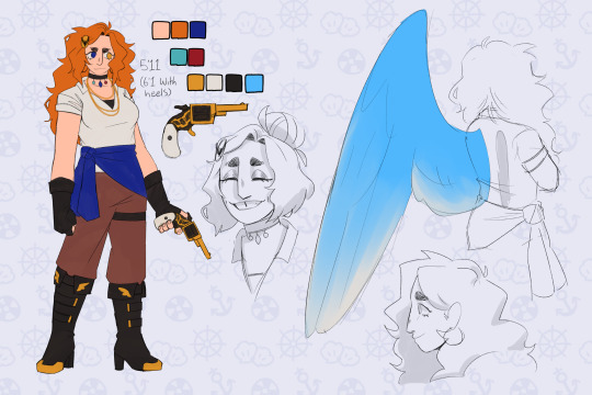
Introducing more characters for my HTTYD/The Deep story! Only this time it’s supporting cast! I’ve decided there’s three overall casts in the story. The main cast (the dragon riders and their dragons, whose story and travels this lengthy project follows), the secondary cast (all their allies and enemies; Eret, Dagur, Heather, the Berkians, the Nektons, etc, etc.) who are there through most of the story, but not all of it. They’re pretty involved, but not every character is there for every episode. And then there’s the supporting cast. Minor characters. Characters a step up from background characters. They show up for a few episodes every once in a while, not near as often as everyone else, and they’re not as important to the overall story as the main and secondary casts, but they have names. They’re involved in certain arcs and episodes, but don’t repeatedly show up throughout the story like say, Dagur, Eret, Heather, the Berkian teens, and the Defenders and Wingmaidens.
But without further ado, here’s who I’ve got so far
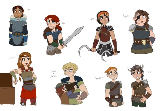
And some closeups of each person, cause I like doing so
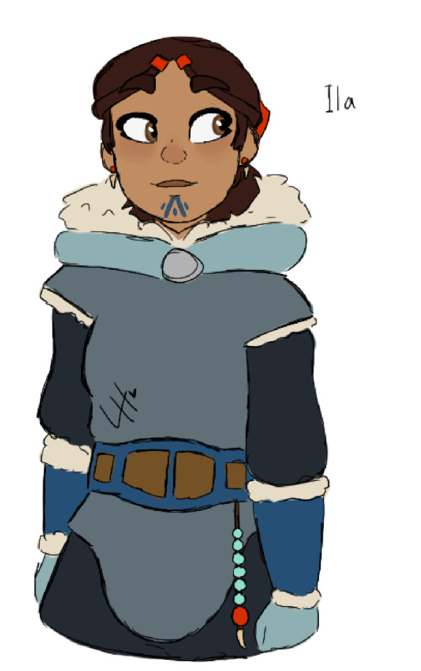
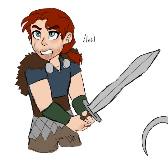

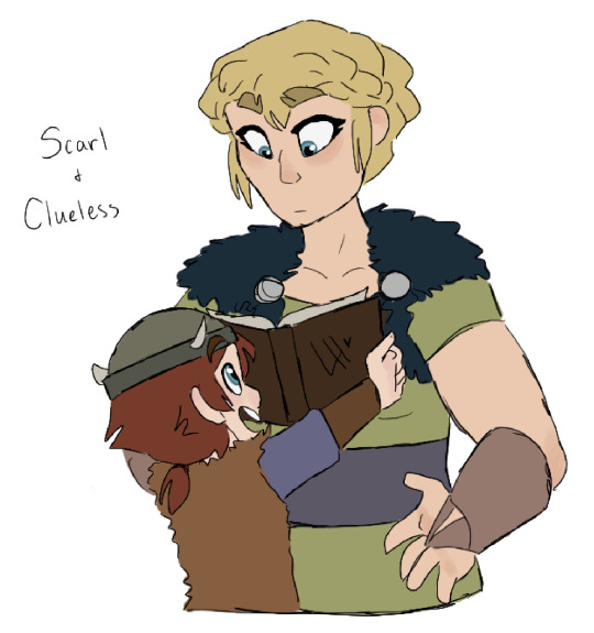
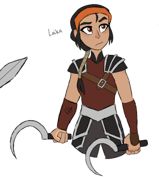
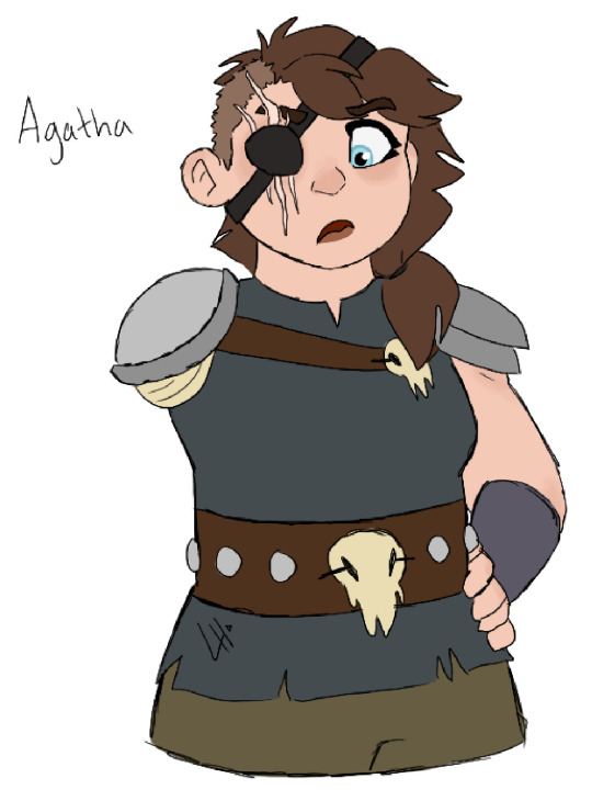
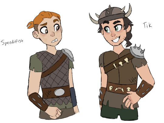
#most of these people are from the Archipelago#scarl and clueless have been mentioned a few times in prior posts but everyone else is new#Laika and Ila don’t show up until much later. more RTTE era#so does Abel. but I’m thinking about having Ingrid pop up earlier than planned#Agatha and Scarl are part of my belief that HTTYD needs more big beefy ladies#so i made big beefy ladies#some of these designs might get tweaked as I draw them more#(specifically Ila. definitely Ila. more so her clothes at least)#but the goal for the supporting cast is to expand on pre-existing tribes beyond the five people at best we meet in the show#i want to expand on other regions and tribes of this world#beyond the few people that we meet from them#people are INVOLVED. they’re not just nameless faces in the background to the main characters stories#the deep 2015#the deep cartoon#httyd#httyd/the deep crossover#httyd oc#the deep oc#Ingrid and Abel are actually the deep OC’s i put into the story#mostly because they’re central to another OC’s story#but this was my first time drawing them#(Ingrid was a nightmare to design lemme tell you)#Abel was embarrassingly easy#i kinda want to draw little doodles of these characters too#just to furhter expand on them and understand them#is there a tag limit on Tumblr? if so I’m sure I’ll be the one to find it I can’t help but ramble in the tags
14 notes
·
View notes
Text
right now tho I'm really fixated on rogue trader lmao I want to work on Ceciliana ✌😔
#her key details are there#I've been wanting to just keep playing more of the game tbh most of my ideas are small and simmering rn#I would love to play around more with her personality details and some of her past more for sure#biggest thing rn is wanting to play around with her design#I really dig her default drip for how I built her bc it's just so fitting but I might tweak some minor details#I mostly want to construct her face in more detail! see what direction I want to go with her!#her hair too tbh#my placeholder design for her was to just make my DOS2/Hero Quest character Agitha until I really Got To Know Ceciliana#and right now I think I might keep her white hair.. I really dig it.. might make it look a lil peppery.. not sure yet gotta doodle it out#style tho I'm really not sureeeee that's gonna be my biggest challenge to find out what I'm satisfied with 😩#I have an idea I wanna try but idk if it's gonna be satisfactory when I see it#IDK YET#I do have some doodle ideas tho lmao#I just want some silly drawings of her with abelard and argenta and pasqal#but probs won't get to them for a whileeeee#okay I just wanted to ramble and get some thangs out of my brain just thinkin out loud you know how it is#I'm excited abt new oc#I love when I get passionate abt something#bf is also very excited bc he loves warhammer and I've been listening to him talk abt it for like 10 years now#and he knows I've been interested in diving further in for a long time#so he is LOVING seeing me be this invested and talking abt Ceciliana#he is my biggest consultant on all the necessary details#rambling#ceciliana von valancius
2 notes
·
View notes
Text


The OUAW brain rot continues.
I love their designs! And I wanted to have a little fun figuring out how I want to draw them, with my own little tweaks and self indulgent details. :)
Originally, I only meant to draw Frost, to figure out what kind of body type I wanted to give him. Then I ended up drawing the whole part, partially as a reference to myself. Also got their canon heights on a chart and put them all together for fun and for reference. c:
Some design tweak notes under the cut, if anyone’s curious! These aren’t redesigns or whatever, I just had some ideas in mind while sketching them in a way that fits my art style.
Design notes copied directly from my server:
🔥Gid THICK BOY. He's not really a bodybuilder but he exercises and is very muscular. And he eats! A lot. So, thick boy. Scars from all the fighting. The wrists and ankles are because of his past.
I like giving his hair and beard a lot more fire. Body hair also glows fiery, it's just less bright.
🐊Kremy I figure he's the skinniest of the group after Torbek. Most of what I did is a happy medium between references of alligators, the official art, and just my art style. Mostly game him scale patterns, more alligator-like feet, and changed the tail a bit, but it's hard to tell from this angle. Not much body definition because he's a squishy magic user and a gator lol
🐯Frost Fit but not defined. Kinda thick-ish, since he's a tiger, so there's loser skin and thick layer of fur. Digitigrade because I say so.
☹️Torbek Not much changed, mostly gave him more tubes, gave him bald patches where they connect to his skin (and didn't make those are infected looking as I imagine tbh), made him fuzzier, and gave him bigger ears because I like em. Also you can't see it in this angle but I like giving him a small fuzzy tail.
🐾Gricko Fit arms, but he doesn't exercise, so he gets a bit of a tummy. Scars because of his interest in monsters, and his various accidents. Wilder hair. Freckles and moles because I say so. Decorated hair (including feathers from Hootsie!)
🍄Twig Not much really?? Went by her description, the plushie and an emote of her that exists. Made her chubbier because I wanna. Originally made her hair all curls…might go back to that. Also freckles because cute.
Do you have your own headcanons for details of what they look like? :)
-- [BTW I do commissions]
#legends of avantris#once upon a witchlight#gideon coal#kremy lecroux#morning frost#torbek#gricko grimgrin#twig toadspring
681 notes
·
View notes
Note
Ok so how does one MAKE a tabletop game because this is something I want to try!! Are there good references out there for non-d20 systems or how to balance mechanics yourself?
oooh, hell yeah! honestly the big thing is to just do it, unlike board and video games the gap between idea and execution in ttrpgs is incredibly narrow, so if youve got an idea just start writing stuff down and see where it starts pulling you, where it feels like something's missing, find what excites you and what you feel isn't working. but that's not very specific, so let's get into it!
first off, read games! read weird games! there's tons of free ttrpgs on itch, lots of people sharing their work here and on other social media, there's 200 word rpgs here and here, and lots of system reference documents written specifically for people looking to hack games. reading other games is a great way to enrich your work whether you're building systems from scratch or working in an existing framework, because every game you read will show you a new way of approaching design problems.
on that note, draw inspiration outside of ttrpgs too! i pull a lot from video, board, and card games in my work, as well as poetry, novels, movies, etc etc etc. im autistic, and ive spent a lot of my life thinking about and dissecting unwritten social rules, so that's another big source of material for me. take your passions, whatever they may be, and put them in your work!
next up, think about the core of your game, sometimes called the minimum viable product. this is whatever the fundamental idea at the heart of your work is, and it's important to keep in mind because it keeps you from spiraling down unnecessary tangents. the core of your game can change, don't get me wrong! in fact, it likely will. what you want to do isn't prevent your work from growing and changing, but have a point of light you can always refer back to and ask "is what im doing important to this game?" you might be surprised by what you find isn't actually as important as you thought at first, and what turns out to be vital to the experience you're going for.
next up, once you start working, don't throw things away. if youre working in a word processor or google docs, it can help to have a section at the bottom of your document that you copy anything youd otherwise delete into. i do the same with my Affinity documents, ill have a few pages i dont export to store all my scraps. i know other folks who keep a dedicated scraps document that they use across projects. whatever works for you! the reason you do this is twofold: it makes it easier to cut things if you know you can always put it back later if you change your mind, and it gives you a lot of raw material that you can pull from in the future. months or years from now, you might find yourself looking to fill a gap in a new design and realize that some cool toy you set aside is exactly what you were looking for.
lastly, i wanna strongly encourage you to practice finishing things. that's often the hardest part for people, cuz we have a lot more experience starting projects than finishing them. here id like to once again direct you to 200 word rpgs, because that strict limit means you wind up with a finished first draft really quickly, and the rest of it is polishing and editing. once you've finished some bite-sized projects, you'll have a better idea of what it entails, what parts you're good at and what parts you struggle with, when to keep working and when to cut yourself off. i find it really helpful to add arbitrary limitations and deadlines on my work because that helps me push myself to finish something when otherwise i'd just keep adding and tweaking, but you'll find what works best for you!
#also gonna add a note about “balance” in a reblog#cuz ive got thoughts about how balance applies to ttrpgs
211 notes
·
View notes
Text
The next Big Arc I'm excited for the webtoon to adapt is Kaizenix arc for multiple reasons but one of them is that I'm VERY curious about what they will do about heesung.
because heesung have a romance arc in kaizenix right. I don't think I need to prove it's canon like a fujoshi talking about her favourite M/M ship, red yarn and cork board style - we're all on the same page here, this is a completely uncontraversial take on the token het couple in orv, right? kim dokja sees them in kaizenix and thinks "damn I'll have to allow interpersonal dating in kimcom now" I don't think anyone is arguing for a platonic explaination here (het ship advantages etc) HOWEVER.
Jung Heewon looked like a man at the time.
"She's mentally a woman so it's fine and not gay" is a much easier pill to swallow when it's words in a novel and her appearence isn't described, and the flashbacks appear as disconnected lines of dialogue so you don't really think of them as looking like Erich and Bilston and imagine them as Jung Heewon and Lee Hyunsung regardless of their actual appearence.
But the webtoon is a visual format and that won't fly. They physically can't be non-committal about this, they have to draw SOMETHING and I can't WAIT to see what it will be, because whatever they decide to do will be massively entertaining to me.
Do they say fuck it, heesung yaoi canon? I can't imagine they want on screen (apparent) gayness in their male power fantasy manhwa, but they might bet on the 'she's a woman on the inside' cognative dissonance 'it's anime bullshit, don't question it' logic will win over in most dudebro heads, as with it did in the novel.
Or they might decide that it WON'T fly with the dudebros actually and they shouldn't risk it and-this is where it gets really funny- try to make heesung less gay.
They could tweak their scenes to downplay the romance aspect (make them more humorus or cut some parts). They could keep Jung Heewon's face and hair the same as usual except she's in armor don't worry about what's under it ok. To 'keep her recognizable' even though they're not usually afraid to make the designs temporarily unrecognizable (KDJ's YJH cosplay moment for example), or some combination of both, which is what I'm betting on.
Just friends-ing their scenes...... changing her design to a woman's...... All of this would be, and I can't believe I'm saying this, gay censorship.
heesung about to be the first het couple to experience gay erasure. that's awesome I love orv
That's why I NEED all of us to have a countdown to heesungs schrödinger's yaoi event the same way some people had for joongdok demon king stabbing scene. the POTENTIAL IS THERE OPEN YOUR EYES PEOPLE!!!
#“ill write a short heesung post. one paragraph at most” the post:#orv#omniscient reader's viewpoint#orv spoilers#jung heewon#lee hyunsung#heesung#omniscient reader#my posts#hyunhee#kaizenix arc
189 notes
·
View notes
Text
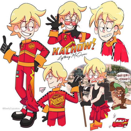

I watched the Cars trilogy recently and with that came a wave of nostalgia and a strange desire to make my own designs for the cars as humans. Aka taking all the charm out of Cars but scratching the brain itch.
So, no need to drag out the intro any longer, I have some notes written out about em for those who might be interested or just bored.
Lightning McQueen:
I tried to make his suit look as professional as possible, with references pulled straight from McQueen's paint job/stickers, while also keeping in mind that I do intend to draw him more so I didn't want to go too crazy with the design. In a perfect world I would've let my maximalist cravings win, but alas let's keep it digestible for my sanity.
I feel like everyone's kinda on this unspoken agreement that McQueen as a human would pretty much look just like Owen Wilson, and that's the big picture here. I used Wilson as inspiration while tweaking and exaggerating a few things to my preference. (Okay, well not everyone, lmao.)
The chevron markings on the front cut off at the side seams not wrapping around the entire suit as to not clash with the sponsor logo on the back.
Also, he's wearing special gloves to help him grip & have control over the steering wheel. I think sometimes that looks a little weird when his sleeves are down & cuffed, but I just feel like he needs to have the gloves there— especially when he comes out of the top half of the suit. (It's also lowkey supposed to mirror his 4 tires when you consider his shoes are also black.)
So yeah, that's basically all I have to to say regarding Lightning McQueen's page. I feel like a lot of my design choices are self explanatory and, honestly probably shared universally... I mean, he's really cut & dry. (But I love him ⚡︎)
▀▄▀▄▀▄▀▄▀▄▀▄▀▄▀▄▀▄▀▄▀▄
Mater:
I'm not gonna lie, Mater was a bit challenging for me. I definitely had to step out of my comfort zone but I wanted to stay true to the character and not butcher anything.
My first thought was to give him a fishing pole to substitute for the tow hook— but then the more I was thinking about it, the more that felt so... out of place? Radiator Springs is in Arizona, which is (not entirely, but mostly depicted in the movie as) a desert. And even though there are beautiful bodies of water in Arizona, in the movie I don't recall seeing any prominent ones, at least in relation to Mater. So, scratch that, instead I gave him a lasso, which isn't supposed to entirely substitute for the tow truck— no, he still drives a tow truck, but the lasso is so he can grab people/things similarly to Tow Truck Mater (very cartoony). My explanation for this is the cattle ranch. Yeah, Mater is a tow truck driver but perhaps he has a side hustle, or hobby, if you will.
Also, I didn't want to make him... dirty(??) Like, yeah, of course, Mater would obviously get a bit filthy from time to time, it's just in his nature, but that is NOT going to be the core of my design. In regards to the rust happening on him, I felt like instead I would substitute this with being very tan. Again, Arizona is a desert. Because of this, he would take off his shirt often, and this would substitute for the missing hood like on Tow Truck Mater. The removal of the shirt also reveals just how tan Mater actually is.
It's his uniformed overalls that have his original aqua color, but from years of wear & tear they've been patched up with brown patches, this would also reference the rusting. The one strap is supposed to mimic the one headlight being broken, and I know that's a stretch, believe me, I wanted to do something with his eyes but eyes are not the headlights in the Cars universe..... think about this. Think about it really hard... if you know what the headlights are in the Cars universe then this actually makes perfect sense.
He is taller and wider than McQueen, which is a reference to the literal frame of their vehicle counterparts. (A little hard to picture with these images, but eventually I'll draw them together!)
▀▄▀▄▀▄▀▄▀▄▀▄▀▄▀▄▀▄▀▄▀▄
That's all I have to say really, but do let me know what you guys think! Gas it up and it might encourage me to make a part 2 with some of the other characters! Who would you like to see next? ♡ Thank you so much for reading & have a great day, Kachow!!
#pixar cars#lightning mcqueen#tow mater#cars movie#cars fandom#cars fanart#pixar#beefycupcakes#rambles n shambles#gijinka#humanization#disney#im kinda embarrassed but oh well ig
259 notes
·
View notes
Text
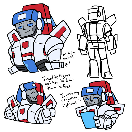
So today I decided to try and draw Skyfire, in the same sort of vein as I did the War Dawn trio, to try and practice him
I mostly chose Skyfire since I made a couple posts about him/skystar, so I figured might as well draw him, especially since he shows up far less than his counterpart
To be perfectly honest, I think I still need a lot of work in drawing these guys, as I’ve said many times before. I think I can get the heads, but I start to get wonky with the chests, and I really didn’t know how to do his shoulders
Anyways, so this design is based on his g1 design, mostly this one image I got of him
But I also wanted to take some liberties with his design, at least in the head area. I’m realizing I didn’t actually change much of the rest of the body outside of omitting bits, as per usual
I don’t know, I think I like the head design, I just need a slight bit more consistency with it. Also in my head, he’s got a visor that drops down to completely cover his face, but the issue there comes in his colors. His glass is blue, so logically his visor mask would be blue too. But the top of his head is also blue, and it’s really the only other place the blue shows up in outside of the glass. So either I’d have to make his mask red and break consistency, or change the top of his helm to be another color (probably red) and get rid of one of the few pops of blue he has
I also just don’t know how to draw his chest things, the sides that pop out. So that’s why they look weird
And also, his shoulders are like the one part of him that’s circular outside of his helm, and it really annoys me because it sticks out so much to me, with basically the rest of him being rectangular
Also also, I don’t know how to do the arms either, in part because of the circular bits and also I don’t know how to make the triangular prisms
Where was I going with this? I don’t remember. All I know is that while I like his head, I’m well aware my drawings of him aren’t the best. I still need to learn how to draw Transformers properly. Which I’ve been saying for quite a while now, but I’m not sure how much progress I’ve made on that front
But anyways, last thing to talk about I suppose is the design itself. I quite like it, but because it doesn’t belong to any continuity, only being me tweaking his g1 design, I’m not sure what to use it for. I could use it for my own if I really wanted to, but of my random AU ideas, I don’t really know where to fit Skyfire in them. And would I make all subsequent designs for this hypothetical AU based on their g1 designs? I don’t really want to do that with Megatron, I don’t really like his helm design in g1 (it’s weird and ill defined to me)
But for now I guess, I have made this Skyfire design. Not the best work of mine, but I’m still trying to learn Transformers, so I’ll take it
#also with that last corner one#I feel like there’s something to be done with having Optimus and Skyfire interact#since modern interpretations of his and Meg’s backstory and g1 Skyfire have a lot of similarities#or at least how people interpret it#with both having dearly cared about someone who went off the deep end and ultimately switching sides against them#but still missing them and (possibly?) hoping they can bring their fallen friend back to them#and especially if you keep Skyfire only emerging later on after being stuck in ice#so Optimus is seeing something similar to his own life play out only it’s a lot more fresh for Skyfire#there’s potential to be had there#anyways yeah#Skyfire’s neat and media needs to bring him back more#transformers#transformers g1#I guess? That’s what it’s based on#skyfire#my art
59 notes
·
View notes
Text


y’know generally i try to limit colour palettes to as few colours as possible to make things more cohesive but despite my best efforts only jay ended up being able to stick to that </3
ANYWAYS here’s the as-of-right-now fully updated designs for these dickheads. these will no doubt undergo even more tweaking as i draw them more but this is a start i guess. also pls open the pictures to look at them properly i worked so hard LOL
some random notes under the cut yaaaay
chip —
he jingles when he walks. somehow he’s still stealthy. i do not know how
kept the platinum ring that bonded him to gillion in the block! because hey he doesn’t really have a reason to take it off (and it’s a nice reminder of how much gill cares about him, and how far their friendship has come since that ice arena)
his tattoos shift and flicker like actual flames, and sometimes (harmless, purely aesthetic) sparks fly off them when he’s excited
i just think smoke coming out of his mouth when he’s angry would be cool :]
chipped teeth from biting rocks and coins all the time :/
he has scars from the red lightning, they’re just mostly contained to his back and shoulders. they’re a similar red to his coat even once they’ve healed
gillion —
the tail sleeve thing is so he can rest it on the ground without damaging his scales, he doesn’t usually wear it when he’s just on the ship because the wood is soft enough that it’s usually fine + it can hinder swimming a bit. it’s mostly meant for places where there’s cobblestone or gravel streets and such. i think his armour would probably have a version that looks similar but covers the whole tail minus the fins, maybe with some armour plating of its own. i didn’t draw it because there wasn’t any room lol
his scars from the lightning are pink mostly because red stood out too much tbh. they softly glow in the dark the same as his coral and the pink parts of his fins
also kept his ring! his hands aren’t really made for jewellery, though, because the webbing means it won’t sit very secure on his finger. so he keeps it on the same chain as the necklace he got from aslana to keep it safe
tried to make him look a bit bulkier and more his age than in my original design? i feel like i was leaning too much into the naivety and. shortness. originally lol. he also has thicker eyebrows now and i’m still trying to decide how i feel about them but i think? i like it? i don’t tend to give many character thin eyebrows so it could’ve been a unique thing for him but alas
i think i made the sword too small but like ignore that
also forgor to include pretzel </3 that’s okay though she can get her own design sheet later. she’s special like that
jay —
i believe in tall jay supremacy
blue magic! i was considering gold but that’d look a bit more like a canary than i wanted for her wings so. blue jay :]
her hair is supposed to look kinda like fire to mimic her dad ! kinda showing that even if she runs from her family and the navy they’ll always be a part of her. and also i just like drawing messy hair
i gave her sturdier gloves just because i feel like it fits her better. also changed up the shirt to more of a button up solely because i don’t like tank tops very much LOL
i did WANT to make her outfit a bit flashier to match the boys better but i couldn’t quite figure out where to Put the flash. maybe that’ll come later, the way the story’s going i might get to design some cool prosthetics for her or something
overall —
because there’s just so many fucking colours i triiied to add at least one or two colours from each of them into the others designs. jay has her necklace with each of their main colours on it, her wings are the same blue as gillions eyes, her jacket and right eye are the same dark blue as destiny’s blade, her hair is the same orange as the lighter part of chips tattoos. chip has a dark green sash under all the belts, the same as the hilt of destiny’s blade. they all use the same shades of black, gold, and brown
the only real exception is gillion doesn’t have anything from the other two because he has Such a specific colour palette and he already had so much going on as-is orz jay was obviously the easiest to do this with because she has both warm and cool colours in her palette by default lol (and i did her design last, so that helps)
#.png#jrwi#jrwi riptide#just roll with it#jrwi chip#gillion tidestrider#jay ferin#jrwi spoilers#THEYRE FINALLY DONE zoo wee mama#the lines are thicker on the little armour drawings because i did the sketch thing and then went yk what. good enough. and just coloured tha#also got rid of gills button nose it was too annoying to draw#i’m so used to straight and aquiline noses#another thing that could’ve been unique for him in terms of my character designs#but nah#pls ignore that i drew them all standing on diff planes/angles btw i wasn’t trying very hard w that#weirdly proud of myself for managing to give them all pretty unique profiles#that’s normally something i kinda get stuck on. drawing people from the side#in different ways besides nose shape
417 notes
·
View notes
Text
@syndrossi
So, I made some Jon and Rhaegar designs, for future fanart purposes. As a prerequisite I'm going to need everyone here to agree that these look like 8 year olds. We're making this an AU where this is what 8 year olds look like. An AU where I can draw 8 year olds, even. Look I tried my best, they look youngish. Tweens, teens, close enough yeah? How does one draw a child. help
Give a big props to Costumes/Seven Kingdoms | Wiki of Westeros | Fandom for helping me give them region accurate clothes.

Some notes:
Neither of them being in their favorite colors because they pretty much just got given hand me downs.
Jon gets more bird motif - wing shaped cloak, bird embroidery - since Rhea saw more of her house in him/he looks more vale like. Rhaegar gets some, with the long flowy cloak, but it's half-assed. There is not a single way to pretend that boy is not a Targaryen.
Jon still dresses like its winter - you will not see him in shorts ever. No human alive has ever seen his legs. Rhaegar on the other hand wears lighter stuff, since he grew up in Kingslanding and that would be what he's used to.

I was going to do the dragon headed tunics for this, but then I realized that would require drawing tiny little Targaryen emblems and I thought I wouldn't survive that.
Jon looking very knightly + everything but the cloak would be very easy to fight in. Easy to rip that off and get to killin for his brother.
Rhaegar having the open sleeves of the vale still, like how he still feels Raymar in there/is still grieving while Jon has moved entirely on with no more vale fashion.
Long hair!! Whipee!!
Both of them wearing a more modern Targ style - based off of Viserys (Dany's viserys not old man viserys) in s1 to reflect some of their modern sensibilities.
Jon wears a lot, and I mean a lot of leather. The vest? Leather. The undershirt? Leather. Cloak is heavy wool. He wouldn't feel like himself if he wasn't lugging around a mountain of heavy, winter worthy fabrics. Rhaegar on the other hand has much lighter clothes, more flowy. Some jewelry too. So pretty much Jon is roasting in Kingslanding heat and Rhaegar is living his very best ventilated silk life.
(Rhaegar's outfit is probably gonna get tweaked as it feels too simple. Not nearly enough pizzaz thrusted upon him by Daemon trying to make up for the years spent in the 'simple' clothing of the vale.)
I'll probably make some more outfits for them eventually - definitely if they go other places! I really enjoyed analyzing different regional styles and incorporating that. Someday I might even make those dreaded dragon headed tunics.
85 notes
·
View notes
Text

Hey everyone~ I'm back, and this time with a new fixation!
Long story short, I've discovered the new Fairly Oddparents reboot, absolutely loved it and was inspired to make this AU idea for the show! With a slight reimagine/redesign of the characters as well. And the first one I decided to do was Peri!
Here's some more info about my AU:
Fairly Odd Parents AU/Rewrite
Au Name: FairlyOdd Brother
Summary:
Perri (previously known as Poof) recently graduated from Fairy Godparents School and is eager to start granting Wishes for his very own godchild! Only problem is that with his lack of experience Jorgen is weary of giving him an assignment and keeps finding excuses/reasons to not give him a godkid. Realizing it might be a 1,000 years before they give him a chance to be a Fairy Godparent, Perri decides he needs to be a little bold and perhaps, bend Da Rules, to get his foot in the door so to speak. And his answer comes to him from a new neighbor in his human home, a family with a sweet shy 10 year old girl who is absolutely miserable. Perhaps Perri might be able to offer this girl a little comfort and fun as her new Fairy Godbrother!?
(Basically the same premise of the show, except Perri’s first godchild is Hazel, and through a technicality in the rule book, becomes her god brother instead of her godparent.)
ALSO please note this AU is more of a slight reimagine of the original show, meaning I did tweaked / changed some of the characters personality to match the new story I made for them. Nothing majorly different, but again just a heads up before you read on. Hope you like it~
Name: Hazel Wells
Age: 10
Sex: Female
Physical Description:
Basically the same as the show's design, I slightly changed her shirt to become a sweater with a turtleneck. I sorta did that by accident when drawing her, but I ended up really liking the look and thought it matched the semi new personality I gave her so I kept it.
Personality:
-Hazel is a very sweet and kind person with some quirky interest, more or less similar to the canon version of her in the show
-The big difference between my Hazel and the shows is that she’s much more shy and awkward than in the actual show
-Feeling very out of place in a new city/school with her brother off at college and her parents working much more than usual has left the poor girl more shy and anxiety ridden than usual.
-She still likes rocks and manga like in the show, but in her old school she was bullied and made fun of for her interest, so she’s more shy/embarrassed to admit what she likes
-But she still tries to be a good person and do the right thing whenever she can, just again she hindered by her shyness and fear of being bullied and made fun of, just wants to fit in and be an average kid
Other fun facts:
-Was bullied a lot in her last school, her parents and teacher tried to help her but despite their best effort it did little to stop the problem. It wasn’t until her older brother Anthony started to walk her to and from school that helped deter the other bullies from picking on her. Though Anthony meant well for helping his little sister, his method of helping her did little to teach Hazel how to actually stand up for herself and how to deal with bullies in general. Now without him around and her parents busy with their work, she is unintentionally thrown into a new situation with no social skills on how to defend herself from other people or how to even make any friends (she didn’t really have any of those back home). But perhaps with the help of a certain periwinkle fairy she might be able to learn to socialize and how to defend herself from bullies, and hopefully become just an average kid with friends and learn to thrive in the new city.
-Essentially Peri is the one to teach and encourage her to be more bold, as he’s the one to really get her to make wishes freely and to try new things and to teach her to not be afraid of anyone or anything, slowly with his help she becomes more and more like the canon version of Hazel in the show. As Peri ends up being a good role model to her.
Short summary of how she ended up with Peri:
Moving into a new city feeling all alone. Since her parents are excited to be here with both of them finally getting their dream jobs, Hazel tries to act ‘mature’ about the situation and tries to put on a brave face for her parents. But in reality is having a hard time in her new environment, as she finds herself in a new school and too shy to make friends, let alone talk to anyone. The only person talking to her is Dev who is supposedly ‘famous’ or something. (she doesn’t recognize him and doesn’t really acknowledge him, much to Dev’s surprise).
If that wasn’t bad enough her parents are working much more at their new jobs and have essentially left her to be watched by the neighbor next door, a strange though friendly guy named Peri. She and Peri get along okay, and she’s mostly pushed through with the reminder that her brother will be visiting this weekend, and surely once she talks to him she’ll know everything will be just fine.
But things fall apart when being watched by Peri she gets a call from her brother stating due to the weather he won’t be able to visit this week and won’t be able to come up until at least his next break, Which is a couple months away! Distraught by this news Hazel prepares to pack up and leave to try and somehow get to her brother on her own, only to be stopped by her ‘babysitter’ who tries to reason with her and talk her out of it. Despite his usually persuasive ways she’s simply too upset to think straight and in a fit of frustration wishes she could just fly to Anthony. Which, similar to the actual show's first episode, causes Peri to turn her into a fly!
The part of the episode happens similar to the original first episode, with Peri trying to get Hazel home before her parents come back from their work. He eventually does but again similar to the first episode Hazel gets stuck in a venus fly trap as Peri tries to get her to wish to turn back into her original form. After the talk with the ant Hazel realizes her mistake and finally wishes to become human again before her parents could discover what went wrong.
After the commotion, Hazel goes to Peri’s apartment to question who he is and what the heck just happened. Peri tries to deny it but during their conversation he realizes that technically speaking…..Hazel did have good and caring parents. They weren’t the reason why she was sad and miserable, she was miserable because her brother wasn’t with her anymore and she desperately missed him. And technically speaking, there was no rule or need to ask Jorgen or the fairy council to become a kids Godbrother. He only needed their permission to be a Godparent. And besides……..he more than understood the feeling of missing a big brother.
After talking and realizing just how miserable this poor girl was, Peri decides to take a gamble and formally introduce himself to her as her new Fairy Godbrother! In similar fashion to how he introduced himself to Dev in the original show. Making a promise to take Hazel from being a shy and scared girl into a brave and bold kid with lots of fun and magic along the way.
Hazel, after the smoke and glitter shimmers away for the first time, feels pure joy at the sight, and for the first time feels confident and even excited for the future, and what this city and the people have to offer her!
Sooooo ya, tell me what you guys think! Any questions or suggestions for the AU I would love to hear, good to be back!
Previous - Next
64 notes
·
View notes
Text
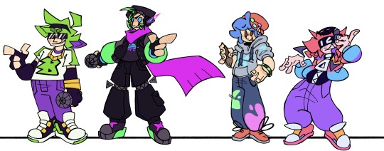
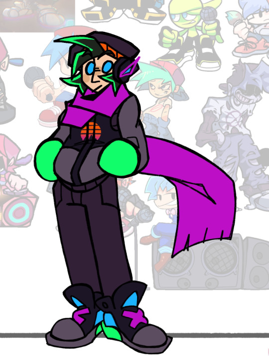
FNF CONNECTED UNIVERSE LINE UP Part 1: The Boyfriends
Chat. I spent 34 hours in this canvas. I am so tired.

Anyways, when I began working on Connected Universe AU, I already knew I'd be making line ups. Cuz I love making line ups and I also love suffering.
Close-ups and lots of yapping under the cut
THIS IS ABOUT TO BE A LOT OF READING IM SO SORRY-
Alternate Universe Boyfriends
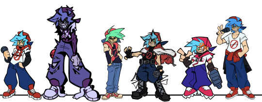
So all these guys, unlike the other BFs present on this line up, are actually BF but from different universes. They're the same dude.
I thought it'd be neat to display the fact that they're from different universes by drawing them all in different art styles. It was also a fun exercise to test my art style range.
So starting from the left, we got Base Game BF. The main universe one. He's drawn in my usual art style. Not much special about him. Boyfriend.XML my beloved. I will note here though that I did take some of the elements form my own BF design and threw them onto the AU BFs. So that's why they all have some sort of jacket/hoodie etc.
Then we got Yourself. I reverted to old tactics and used my sketch for his line art, which results in him having thicker line art in general. I also further distinguished him by giving him harsh black shading. He always has that. He already had it on his face, so I just gave it to the rest of his body too. Cuz silly. You. You could even say. Silly Billy- 💥💥💥
Then we have Funkadelix. Him and a few other BFs make use of the Blackburn brush for their line art, cuz idk I like that brush. I referenced the Mutant Mayhem style when making him, since in the Connected Universe, he's in the same universe as those turtles. His colors are mostly yoinked from the actual Funkadelix sprite. I think. I may have tweaked them a bit/eyeballed them idk. I prolly eyeballed them.
Then we got Monday Dusk Monolith (MDM). I really went with the mentality of "NO ROUND SHAPES" with this fucker. Just wanted him to look super sharp and scratchy, since that AU is literally dealing with an apocalypse. So sharp shapes just made sense in my brain.
I had a lot of issues settling on a style for Mix, so I just chose to take inspiration from the FNF loading screens, cuz it just fit in my brain, idk. His design also features present in my Pico design, like the stupid cleat shoes and stray hair lines. Yknow, since he's literally a mix of BF and Pico. He also uses Blackburn
Finally, HD. I decided to try and go for a semi realistic style for him, proportion wise at least. Cuz. Yknow. HD. He also uses the blackburn brush, but I also pulled an old tactic for him and made his sketch visible over his coloring. Cuz idk, I think it lends towards the vibe.
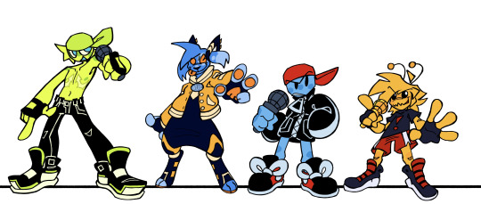
"Side" BFs
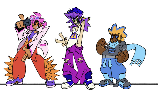
Okay, now we're REALLY getting into AU territory.
So from here on out, all the BFs are separate people from THE BF, and have their own names and shit.
So staring off, we got Blake. I was reading through his wiki trivia and saw them say his style was more "radical and funky" than base BF's. I saw the word funky and ran with it dawg. So that explains this clothes. I also tried my darndest to get rid of a lot of the BFs caps, cuz dude, I can't have that many fuckers having cubic backwards caps. So I gave Blake a pair of star shaped sunglasses cuz funky, chat, FUNKY. We decided that his stage name is Love Bird, and he chose that cuz that's a pet name his GF has for him, and if he had a band it'd be called The Birds of Paradise.
Then we got .XML. I immediately knew I wanted to give him a mullet. Look at this man and tell me he wouldn't have a mullet. Besides that, not much changed. Since he kept the name of .XML, I imagine he is actually related to BF in some way, and he just goes by his last name. They might be cousins or brothers or something idk. There's also more dumbass info on him here:
Then there's River, or G-Sides BF. I took a lot of inspiration from his teaser designs, cuz they were silly. Literally named his river after the dumbass river design on his sweater. I don't got much info on him besides that. I can't talk about River without including this image so here:

The New Yorkers
This group is literally named after the fact that they all live in NY in my AU. Technically, the Minus BFs should also be here, but they're their own group.
Starting with Bartholomew, or B3, I just took the shape of his glasses and ran with it. Chat I needed to get that shape language from somewhere. I actually drew him twice, since the first time around I really was not digging how I drew him. He's fine now tho. His ass only got brim, cuz he had to be different somehow. Other than that. not much changed for him.
Now Evan.. Evan gave me so many issues. Like, dawg I drew him three times. I kept on trying to make the orange in his upcoming design WORK but I just COULDNT chat i COULDNT
So, per @braveboiart 's request, I ended up getting rid of it entirely and replacing it with his blues and grays. They also gave me the advice of brightening the colors a bit, which was very easy for me to do, I love bright ass colors. I also touched up his design shape wise, since that was also lacking the first time around. So boom, zippers on the pants and baggy ass sleeves. I'm content with how he came out. Chat I did all his design touch ups while I was exhausted out of my mind. Sometimes you gotta be delirious with sleep deprivation in order to cook, kids, trust me (please do not be like me-)
Benjamin was pretty simple. Kept him soft, kept him round, kept him pastel. Got rid of the caution sign on his hoodie since .XML already had that, and just replaced it with paint splatters. Not much more to say.
With X's design, I got a lot of help from my good good friend @minxtheeenby , mainly when figuring out his hair style. Those braids are not actually his hair, and are fuckass cords that connect to his headphones and can move independently. Don't ask about the logic, I will not be thinking about it. He was born in Philly cuz of his fuckass white eyes. White eyes means Philly, I don't make the rules here.
Minus BFs
The colorful critters, these guys are.
So. Beta. I had actually drawn him before this point, and he didn't change much from then

He has arrow shaped top surgery scars cuz I love giving constantly shirtless characters top scars and I just. HAD TO once I had the idea to make them arrow shaped. Main things to change since that drawing are some details on his pants and some of his colors; notedly the fact that his hat is a darker color compared to his skin to further distinguish it. Also Brave kept trying to get me to make parts of his design the same color as his nipples. So that happened /lh
Chat. I let my furry show with Blue. BUT CHAT HEAR ME OUT. On the wiki it's stated that he's a "Dog??". You think I could look at that and not go all the way? So yeah. Dog. He's silly and he got his weird ear ring things from his sister (Minus Miku).
Not much to say on Mean, he barely changed. I just drew him in my style and added a few details. He might also be an alien, idk.
Now, I posted about Golden a bit, but for those who didn't see that insanity: I made him an Alien Hominid. Cuz small yellow alien=Alien Hominid in my brain. Flawless logic. (Don't worry chat, I sat down and extensively researched the AH series to the best of my ability to check if it made sense. And I didn't see anything that would make it not make sense?) But yeah, silly. Him and Otis might be buddies, cuz goofy.
Who Fuckin Knows
These guys are just all the guys I had nowhere else to put. Miscellaneous group.
So first we have Bonnie, or Saturday Night Swappin' BF. He's another one that I had to go back and touch up. I actually touched him up the same night/morning as Evan. He ended up turning purple. The name we assigned him was an omen /j Chat I swear he was originally blue, I don't know what happened
HC that he just got really into FNaF when he was younger and has just been cosplaying a humanized Bonnie the Bunny ever since /hj
BIDU GAVE ME SO MANY ISSUES AND IDK WHY. It's prolly cuz by the time I got to him I was getting SUPER burnt. But I prospered and was able to finish him. And I don't hate how he came out, so bonus points there. Main change was replacing the prohibition sign on his shirt with a lightning bolt, cuz no one but BF is allowed to have that symbol, and Bidu already had lightning bolt imagery, so eh why not. His eyebrows being green, at least in my style, implies his hair is naturally green, and he just added the blue and pink, and I find that slightly humorous, idk.
Keith (StarCatcher) was another one I had to go back and touch up, but that's due to the fact that I was informed that him and his GF got a redesign before the creator deleted their FNF stuff. So I had to go back and fix my design according to that. I also leaned into the scape suit direction cuz SHAPE.
Now, you might be wondering, why is Flippin BF here and not with the other alternates? He was grouped with him in a previous post? Well, that's because after more assessment, I decided that Friday Night Flippin' is in fact, in the same universe as Base FNF and not an alternate universe like I had previously decided. So I changed his design a bit (mainly just getting rid of his hat and changing the color of his shoes) and boom. Different guy. He is staying pixel art tho. I do still need to come up with a different name for him tho.
Now this next one, Heath, is not from a currently existing mod, but from an FNF AU my friend Minx is making.

I decided to include him cuz he's silly and I love him. Their AU is canon to the Connected Universe.
Okay, so Cam (Hellbeats BF) changed A LOT. I let my furry slip out again. BUT I HAVE ANOTHER REASON FOR IT. See, in this connected universe, it's not just Newgrounds stuff that is canon. I also made other fandoms I'm in canon. So that means the Hellaverse is canon (specifically my rewritten version of it), and Hellbeats has to fit in with that. So I had to assign the characters species from that universe as well. So I made Cam a cherub, cuz I wanted him to stay short as fuck. He's also a raccoon cuz he's a lil shit and I thought it'd fit If ur curious, this is what everyone else is:

Okay I'm done yapping now. Gonna be doing the GFs next.
#CHAT IM SO SORRY THIS POST IS SO LONG#My insanity strikes again#ashedwings post#ashedwings art#fnf#friday night funkin#friday night funkin’#fnf boyfriend#fnf bf#bf fnf#boyfriend friday night funkin#fnf au#fnf mod#fnf mods#fnf headcanons#Ashedwings ramble#long post#ashedwings design
69 notes
·
View notes
Text
Thoughts on giving critiques to comics artists.
Seeing lots of discussion from students about sour experiences with an unhelpful art teacher, so here's a long, long post about giving critiques.
NB: I have no formal training as a teacher, but I was a student, and I've spent decades giving artists feedback on their work.
When someone brings me a portfolio, I like to establish my limitations & clarify my perspective. My work is firmly rooted in traditional US comics storytelling (i.e., not manga or art-comics.) I can give feedback on other approaches but they should know where I’m coming from.
“We've only got a little time for this, so I'm going to spend that time focusing on things to correct. That doesn't mean you're doing everything wrong, or that there’s nothing good here, but it’ll be more helpful if I identify some problems and show you how to fix them.”
Why? Because for many young artists their entire sense of self worth is wrapped up in being good at what they do. (It was for me!) In school they were probably the best artist in their peer group. But now if they're hoping to turn pro, they’re at the bottom.
Sometimes you know what’s up when you see page 1, but try to keep an open mind. Some build their portfolios by sticking new pages at the back & don’t weed out the old stuff up front, so the work gets better as you go. When it’s like that I ask: “Show me your best 8 pages.”
I ask questions: "What's the goal? Do you want to be hired to work on someone else's project, or to get the story you're showing me here published?"
If 1, I steer towards a portfolio that'll showcase hirable skills. If 2, I look for what tweaks will make that particular story more effective.
"Do you have teachers giving you regular feedback? What are they telling you?" Sometimes a student is getting bad advice. In cases like that, I'll do my best to be extra clear WHY I'm giving them advice that's 180 degrees from what they've been hearing.
“What artists are you looking at? Is there someone you admire or try to emulate?” This often helps me understand choices they're making, and I can sometimes incorporate things those artists do into my suggestions.
I ask myself questions about what I’m seeing. First: Is there a narrative? If not, I make it 100% clear I'm not speaking as any sort of expert. I'm good at critiquing storytelling, but don't have anywhere near as much to offer illustrators or designers.
Can I follow the story? Or am I confused about what's going on? Are the characters and settings drawn consistently? If not, is the artist at least making use of tags (distinctive clothing, hair etc.) to keep the characters recognizable?
Does the artist demonstrate a good command of basic academic drawing? If not, Do I think they need it? Do I focus on "how to draw" or on "what to do when you can't draw?" Is the artist putting the viewer’s eye where it needs to be to tell the story effectively?
(At this point I’m usually doing little doodles to go with my instructions. I scribble out ugly little 5 second diagrams that I hope will clarify what I’m talking about. Or they might make me seem demented. Hard to say!)
Is the artist making choices that are creating more work than necessary? Is there a particular weakness? I once spoke to an artist with a portfolio full of great work when he was drawing animals and monsters, but his humans were amateurish in comparison. I spent that critique talking about drawing people.
A crit can be a grab bag. In addition to big-picture advice, I'll point out tangencies, violations of the 180-degree rule, wonky anatomy, weird perspective, places where the artist neglected to do important research, odd choices in how they spotted black, whatever catches my eye.
I also try to make a point of defining the terms, so that jargon like “tangency,” “180-degree rule,” and “spotting black” don't go over their heads. Find simple, concrete ways to talk about these things, & clarify why it's a problem when they aren't done correctly. Draw diagrams!
Recognize that even a perfectly phrased explanation might not sink in. Some lessons can only be learned when a student is ready, and it might take a year or two of work before they can understand what you were saying. It's good to plant seeds.
Are there other artists who are particularly good at solving the problems the student is trying to solve? I steer them towards that artist's work. And I always recommend life drawing & the use of reference to give work specificity, variety, and authority.
Despite what I said earlier about focusing on what's wrong, I try at the end to find something encouraging to say. And if I’ve really piled on the criticism, I emphasize that I only spent the time and energy to do so because I take their efforts seriously.
If I've done my job right, they'll leave my table with tools to make their work better. And maybe in a few years they'll be looking at some younger artist's work, surprised to discover just how much you can learn when you're asked to teach.
499 notes
·
View notes
Text

Who wants a fresh human Bill design in 2023? Here you go.
After seeing dozens of tall dapper skinny white twinky anime boy Bills, I wanted a design that matches none of those words. My other two goals were to use the show's art style; and to lightly pay homage to Alex Hirsch's "canon" human Bill with the triangle body... except not deliberately hideous. I might tweak the design some later (must be MORE triangular) but I'm pretty satisfied.
The idea behind this is your typical "Bill's post-series punishment is to be turned human, now the Pines have an awkward house guest/prisoner" AU. Naturally, Bill's miserable. Pain-inclined flesh bodies are a lot funnier when he's visiting one rather than locked in one.


I think he keeps some powers—quite a bit of the magic in the show can be done as soon as you have the right knowledge (like which words to chant and symbols to draw), and Bill didn't lose his memories; but he's still comparatively weakened, and the discomfort of being human holds him back further.
Mabel's the first to reach out; it's hard to keep harboring a grudge after several weeks of things like watching him have a small mental breakdown on the staircase because he can't levitate up and down the stairs.
So this post doesn't get ten miles long, I'll stop talking here rather than start rambling about my ideas for this AU. (Although I've been mentally poking at this AU for years, so like, I do have ideas. If, y'know, anyone is perhaps inclined to come ask me about them. This is me dropping a hint.)
#bill cipher#human bill cipher#gravity falls#gravity falls fanart#fanart#my art#bill goldilocks cipher
618 notes
·
View notes
Text
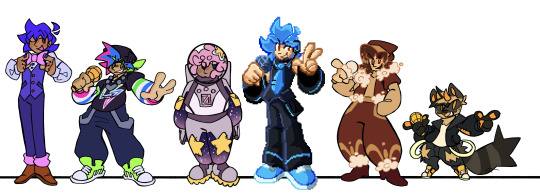
just did a thing. love drawing fish people

(aka just me playing around with the designs of the different characters. and the parents!! who up until yesterday i’m pretty sure did not have names publicly known) (if anyone wants to draw or tweak or otherwise elaborate on these designs, you’re 100% welcome to)
i tried to think about which traits come from what characters. i’m thinking darker hair, thin stripes, and bushy eyebrows are very much a tidestrider trait, whereas the zomezaths bring more uniquely colored skin and fins, as well as spots and speckles.
additionally, i like to think the tidestriders are a bit smaller in frame than the zomezaths, who are more impressively built. which resulted in edyn being relatively average in both height and bulk, and gillion being comically both short and wide.
(oh and while nothing is known about her yet, i think it would be neat if gillion and edyn inherited their grandmothers eyes)
i also have had some thoughts recently about triton hair color in mana. mostly that the brightness and vibrancy, while they are influenced by genetics, also help to suggest the age and health of the individual.
so, much like the mane of a lion, the darkner the hair, the healthier/older the individual. a young triton might have light, bright green hair, while the oldest among them might have hair nearly black.
the hair of a sick triton, whether stricken by a physical illness or by something mental, will lighten slightly and gain a desaturated, yellowish appearance, and will become stiffer, eventually resembling grass that hasn’t had enough water. this effect shows less and less prominently as the individual ages and their hair gets darker, but is still usually noticable.
#jrwi riptide spoilers#(maybe? idk)#jrwi riptide#just roll with it#gillion tidestrider#edyn tidestrider#finn tidestrider#things i drew
411 notes
·
View notes
Text
I redesigned Cosmo and Wanda for my FOP: Missionaries of Eden AU
Greetings ladies with gentle hands. I'm back with another batch of epic art now that I'm finally able to draw something other than the same two characters over and over again (read more at the end)
Just so you know, these were just quick sketches I made when I was supposed to sleep and these might not be their final designs.
Here's Cosmo:
Out of the two, Cosmo probably changed the most.
I tried to incorporate elements of his original design into the new one, like his tie, sleeves and umm... his hair? The hair-strands are supposed to be like flames coming out of his inner core (the weird ball I drew next to him that has an arrow pointing at the floating onion rings), if you understand what I'm trying to say.
I originally made him a twink until I remembered that he gave birth that one time. I suppose people can get back into shape after such an event, though I like this version of him better (plus it's show accurate!)
I know real thrones (types of angels) don’t have wings but he looked kinda silly without them. Also the wings make him have a star-shaped silhouette which I think is cute.
Also instead of a wand he has a staff
And then here's Wanda:
Maybe, since now that she has a sword instead of a wand, she should be called Sworda!... please never call her that.
It was a bit harder to incorporate original design elements into this one, so I mostly just went with what seemed fitting.
She also turned into a girlboss. Not that she wasn't already! I just thought it would make sense for her to be physically strong considering she's a power (type of angel).
Her wings also look like a sword... kinda. Her wand is also a sword now!
I didn't feel like drawing her face. It's always a struggle for me to come up with them since my art style is semi-realistic and all. Pick your battles as they say.
I also created some sigils 3 months ago
As per usual, all the mystical creatures in my AU have their own sigils for summoning purposes (inspired by real demon sigils. Look them up, they're super cool). That's why I created a bunch of them for a few important +a few miscellaneous characters, and only now did I realize that I had never posted them anywhere, so here you go:
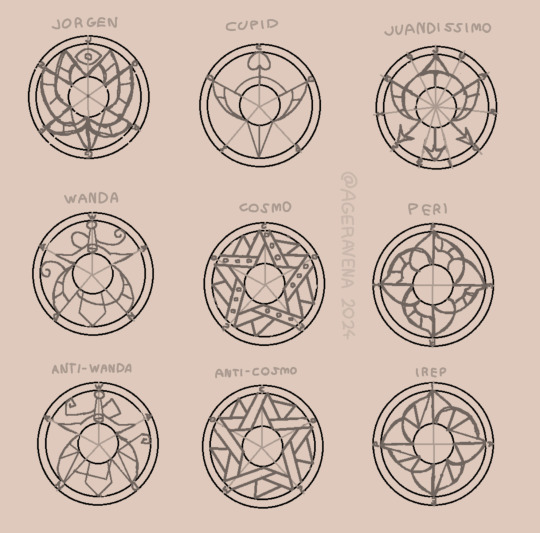
I'll probably tweak some of these (especially Wanda's and Anti-Wanda's sigils). I'll most likely make more of these since now the vespids (pixies) have kinda important roles, too.
Btw they aren't symmetrical or anything. I just quickly sketched them on MS Paint lmao. Also the light grey lines are just guides and not actually a part of the design.
- - - - - - - - - - - - - - - - - - - - - - - - - - - - - - - - - - - - - - - - - - -
(I tried to make a divider. Idk what it will look like on other devices)
Quick behind the scenes update: After three months of screaming in agony (or five if you include my two previous fixations), I have finally been freed from the chains of being way too obsessed with certain characters without my will... *cough cough*.
Though this might seem sad, worry not, for I persist by literally not caring about what my brain says. I believe it is my duty to continue this legacy I have created and continue drawing wholesome Peri x Dale ship art (+ AU stuff). It is what the fandom really needs during these trying times!
Anyway. Until next time, losertown!
#cosmo and wanda#fop cosmo#fop wanda#the fairly oddparents: missionaries of eden au#fairly oddparents#the fairly oddparents#the fairy oddparents a new wish
20 notes
·
View notes
Text
another swap au design whooo i still cant draw sir Pentious and I ain't letting that stop me
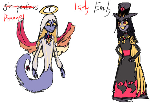
This swap was decided by y'all in this poll and I'm gonna be honest when I put it as an option I had no idea how I was gonna make it work and honestly I still only have like half an idea but that ain't stopping me. In my role swap au I usually try to keep their backstories and personalities as similar to canon as possible while tweaking just enough to make their new role in the store make sense for these two I found that that approach just wasn't feasible. So in this Au Sir Pentious was created as an angel and has lived his entire life in heaven he still has some minor trust issues mostly because even before the heavens meeting where he learns about the extermination he notices some things not adding up but questioning heaven is not something he would do as such those questions and suspicions are left festering under the surface which might lead to his fall in the future :) I leaned a lot more into the "flaming snake" depiction of a seraphim along with giving him wings becouse the boy deserves wings. Emily on the other hand is a regular sinner dieing in the late 19th century like sir Pentious and being an inventor like him. Like her canon counterpart I think Emily is still good natured and goofy getting sent to hell because while she genuinely wanted to help people her ignorance and naivety led to a lot of her inventions hurting and even killing people. She wants to become a strong overlord so she can transform the place for her idea of the better not noticing how her methods are hurting people and further cementing her place down there. Her redemption would be mostly about her connecting with the residents of the hotel learning their stories and realising how wrong her perception of hell and the greater good was. She would also play into Vaggies ark of learning to open up and trust others along with learning to actually help the citizens of help become better people instead of forcing them into strict moulds she believes to be the best for them due to her preception of hell as former angel. I actually had a lot of fun with Emily's design and while i'm still not feeling so great (why I didn't sketch out any scenes with these two goofballs I will do so when I have the energy) I'm doing a lot better and will probably be back soon. I have also been thinking about turning my swap au into a comic what do y'all think?
1 2 3 4 5
#art#artists on tumblr#my art#hazbin hotel#digital art#angel hotel#hazbin swap au#sir pentious hazbin hotel#sir pentious#seraphim emily#hazbin art#hazbin emily#role swap au#swap au
55 notes
·
View notes