#some artists have same face syndrome
Explore tagged Tumblr posts
Text
Some more drawings of my young wolf
bungie please let me pet the starcats pleasepleasepleaseplease-

#destiny 2#destiny#destiny the game#destiny fanart#destiny 2 fanart#destiny hunter#destiny oc#destiny guardian#destiny young wolf#mara sov#destiny mara sov#don’t ask me how long the wishkeeper and armour took to draw#those are hours i’ll never get back#raillue’s sketchbook#some artists have same face syndrome#i have ‘i can never draw the same face twice’ syndrome#also a fact about my young wolf#she ripped her cloak way too many times#to the point where she just learnt how to sew#and then eventually embroider
78 notes
·
View notes
Text
Crack idea: Jason Todd gets all dressed up one day for smth and styles his hair and everything. Immediately gets mistaken for Bruce.
He cries in the bathroom for an hour
#I just think it’s funny if they look alike#Jason would HATE it#Bruce would secretly love it but obvi never tell anyone#literally tho if you just give that kid a new hairstyle and some dye for the forelock#he’s a dead ringer for Bruce#or the DC artists just have same face syndrome#text post#Jason Todd#dc#dc comics#red hood#Batman
3K notes
·
View notes
Text
They're a highly-skilled professional artist but I can't fucking tell if the white-skinned character is meant to be of East Asian descent or European descent.
#i typically see this shit for video game art#league of legends sometimes being one of them#listen theyre all very good artists but the same face syndrome AND the inconsistency of facial features in splash arts are-#-bloody annoying. the higher ups probably have something to do w that but pls make them look distinct#n most of the other game art i've seen w the problem in my post r usually from asia so probably the characters r meant to be asian#but u never know if some are meant to be european because the features#also serafluer i love u n ur art u r so talented but the body type of ur girls are all the same w the same head shape too#n the proportions r weirding me out a bit like their body compared to their head. just the proportions seem off?#can u also pls learn to not make the arms so skinny all the time when the rest of their body have meat in them?#like. their arms are just sticks compared to the rest of their curvacious body#regarding the head again. theyre all too oval shaped and they seem too small in proportion to the rest of their body#i'm saying all this here because i feel like it would be too insulting to just say it to her even tho i want to give her my critique#she's so much better than me and she's great but#critique#about art#i'm not angry btw. this is just a pet peeve
0 notes
Text
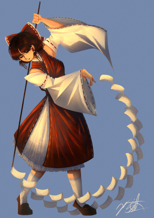
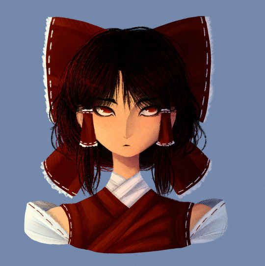
Finally decided to play around with my old lineless style again! Also figured out a way to draw Reimu that I actually really like!
Artist's Notes;
I've mentioned in a few earlier posts that I've been wanting to draw in my lineless style again for a while as a way to test what I've learnt from my previous style in regards to lighting. I did the face first and then for a while was thinking about doing a full body illustration of Reimu just to draw her outfit again. I'll talk about the face first since that's the first drawing I did in this batch.
For the longest time I really couldn't find a way to translate Reimu's face into my style. I was able to make her clothes work out well, just not really her face. I did like elements of how I drew her face a few other times, namely the tiny eyebrows and her pupils, but they didn't really feel like Reimu to me, or at least how I imagined her in my head. I then realized that it was less of a problem with the entire face and moreso the eyes, and it took me quite a bit of trial and error to make something that I was happy with. Also, as much as I thought the tiny eyebrows were cute, it didn't really make sense with her character. Like, from what I know about Japanese history, plucking your eyebrows was something that nobles (rich people) would do, and since Reimu is...neither of those things, I decided to just give her some thicker eyebrows instead (I will be saving the plucked eyebrows for another character though, so they will return). After I got to a face I was happy with, my next challenge was the hair. I did the front part first and liked that enough to continue, and then after more trial and error I realized that deep down I was a short-hair-Reimu-is-best-Reimu-truther this whole time because once I gave up on the long hair and gave her shorter hair something just clicked in my brain. And so, after drawing her outfit in again (this time without the yellow tie which is kinda sad but I'll find a way to incorperate it into future designs because it just was not making sense to me in context with the rest of the outfit) and finnicking around with the bow, I came to a version of Reimu's face that I actually liked. I thought that it made more sense for her character to have her cut it short, mainly because she's doing a bunch of Youkai extermination and she has to keep her hair out of her face somehow. I still wanted to make it kinda messy though, as Reimu is probably too lazy to clean it up herself. I think another reason I like it so much is because in Forbidden Scrollery, Moe Harukawa gave Reimu short hair and that really suited her, so I guess that was just a subconcious reason as to why I liked it so much. I also think that the shorter hair helps to separate her a lot from Marisa, as I think Marisa looks really good with longer hair. Speaking of, now I wanna do a drawing of her and Reimu together to really solidify how I draw them (unlike the previous version where it was just them standing). As much as I do like the face, I am concerned if she looks too much like how I drew Keiki now, but that might just be a product of the stylistic choices I made with her eyes and I might just be overthinking it. I am hyperaware of same face syndrome so that's probably the reason I'm so concerned about it lol.
Now for the fully body drawing. I was struggling to think of a good pose for her, so I just took a picture of myself and used that as a reference while still making slight adjustments for readability's sake. This is another case of, "I've looked at this too long and can spot every single issue with it" but this time I'm still happy with the final product mainly because this was a test drive for how I want to develop my lineless style in the future and for what it is I am more than pleased with the result. The main reason I deviated away from my lineless style was mainly because I was having a hard time with the lighting and making it interesting, and I am so glad that I've finally found a way to make it work! I'm especially happy with the clothes, as I think clothing folds are really fun to draw. I was somewhat inspired by the works of J.C. Lyendecker and the way he draws clothes, though admittedly it is not a one to one, since I mainly wanted to try implying the shading of the clothing folds with shapes (I do really want to do a study of his style one day as his art is incredible). So for the sleeves, I drew in a bunch of triangles where I wanted there to be a strong highlight, roughly coloured in the inside, and then blended them all so it looks like a more subtle. On both of these drawings, I also added in a noise filter to give it some texture (as that's what I used to often do with my drawings) and while I do like it, I might want to experiment with making it more subtle in the future, as it's pretty noticeable in both these drawings. Overall, I'm really happy with the lighting and colours of this drawing, and while I could nitpick several aspects of it (her hand holding the gohei looks too tense, I tried making her look like she was standing on the balls of her feet but the positioning of her Gohei's trail of papers ends up making it look weird, and I could've put more effort into the hair and bow and so many more things), this is more of a piece for me to experiment with my style again, and I'm excited for when I get a new idea for a piece, as I really wanna try some more stuff out with this style!
613 notes
·
View notes
Note
Hello! Hope you're having a great day/night! I absolutely adore your art, you are one of my favourite artists. I love the way you shade and do backrounds. Also everytime I get into a new show I immediately see your art for it??
I was wondering if you had any advice on drawing more realistically (backrounds, anatomy etc) but still keeping a style?
Hey hey!
Thank you so much!
I have a pretty good understanding of facial structures, because before I got into drawing more semi-realisticly, I heavily focused on realistic portraits. Here are some example, these are from around 2019!
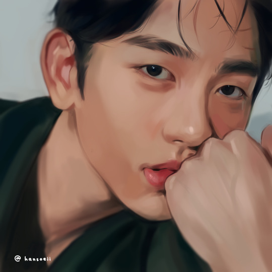
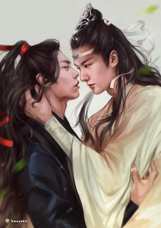
(yes, I was really into danmei and kpop back then, haha)
I just always loved drawing/painting faces and it was all I did. But at some point I realized that I wanted to do more than that because just portraits felt super restricting. So it took me around 2-3 years to somewhat find my style. Thought it would be fun to show a little timeline! Advice will follow afterwards :)
2020
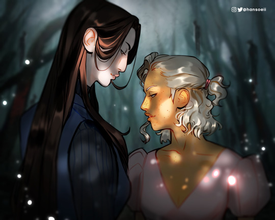
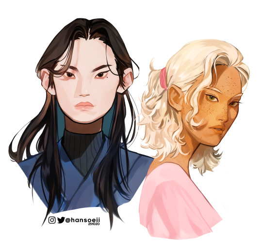
I began working on my OCs in 2020 and since I didn't have an exact reference to work off of, I struggled a lot. My art from this year is super wonky.
2021
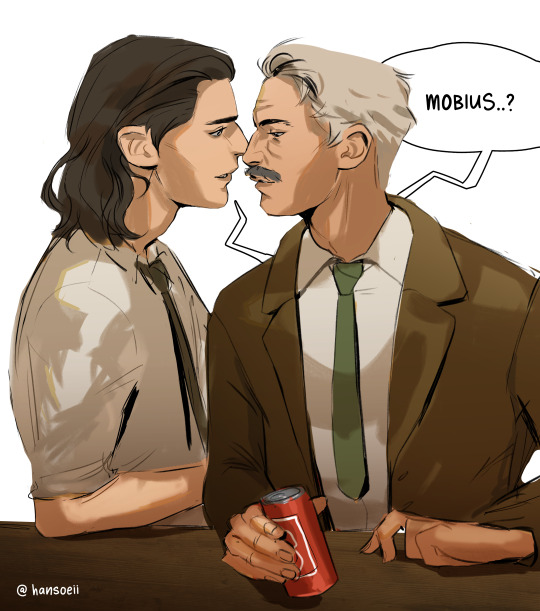
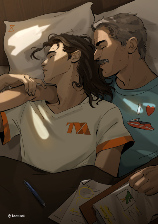
Still wonky, but the Lokius obsession was the jumpstart into finding my style! My work from this year is all over the place haha, I was experimenting a lot.
2022
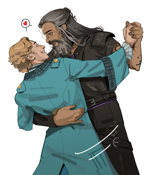
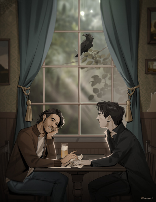
This first ofmd piece is pretty much the first drawing where you can see where my style is gonna go, which I think is pretty cool! This is the year I made the biggest progress cos I was drawing SO much. These two pieces are only six months apart. The one on the right was the first time I gave drawing a background a proper go, too! It was a good year.
2023
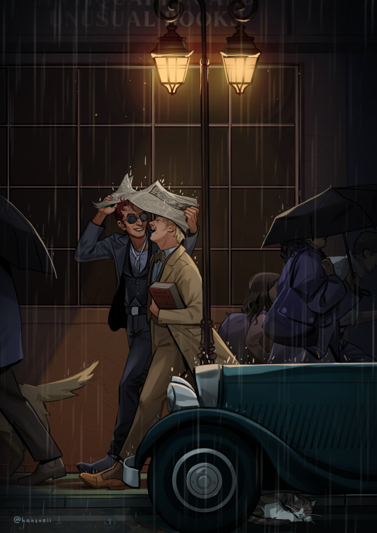
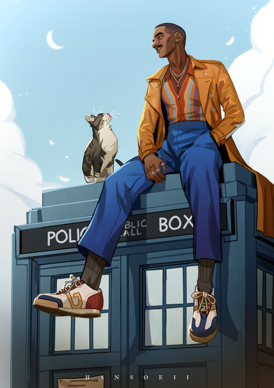
And this is where I am now! I'm still constantly learning and improving, but I'd say I have a style you can recognize now!
Now here comes some actual advice, haha:
What I highly recommend you to do is to study your favorite artists as much as you can! I have like 5 A4 sketchbooks all from 2020 that I filled with sooooo many studies, where basically all I did was look at artists I like and copy how they draw stuff, to try and figure out how to stylize certain things. Some of my favorite artists are Ami Thompson, Velinxi and TB Choi. But I also liked to just scroll through pinterest and study all the art I came across that I liked! For example, if I saw a really great drawing of a pair of pants I would copy it many times in my sketchbook and try to learn how they stylized the folds. Doing this for a prolongued period of time will naturally improve your own work! It'll be difficult at first, but you gotta push through, it's gonna be worth it!
I also highly recommend studying unique faces to try and avoid the same-face syndrome. Find some cool looking people and try to draw them as simple as you can! Maybe even draw a little timeline where you first draw them as cartoon-y as you can, and keep going until you end up with a more detailed, realistic drawing. Maybe in the middle of it you find a step that feels the most fun to you, so you can try to build on that! It's a great way to figure out what kind of style might be the best for you.
Here are some cool faces I found on pinterest!
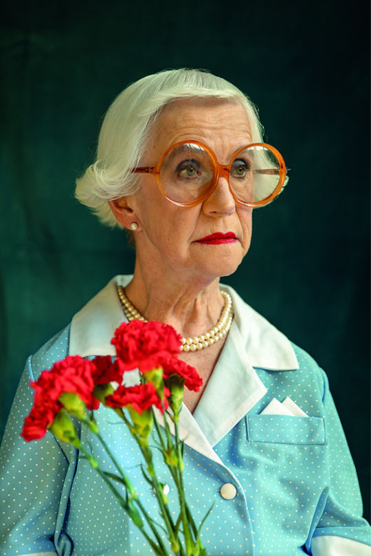
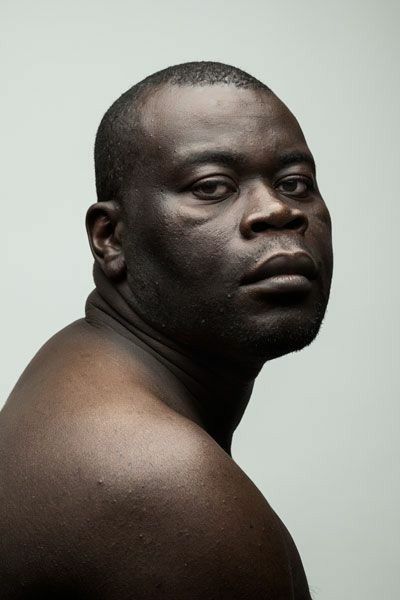
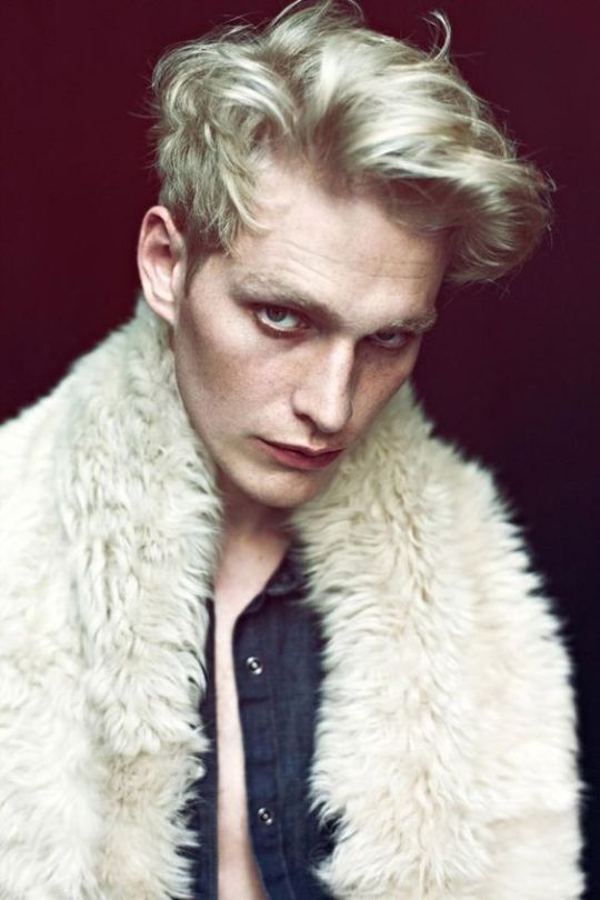
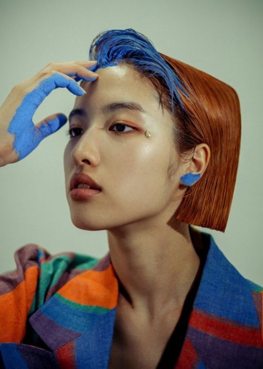
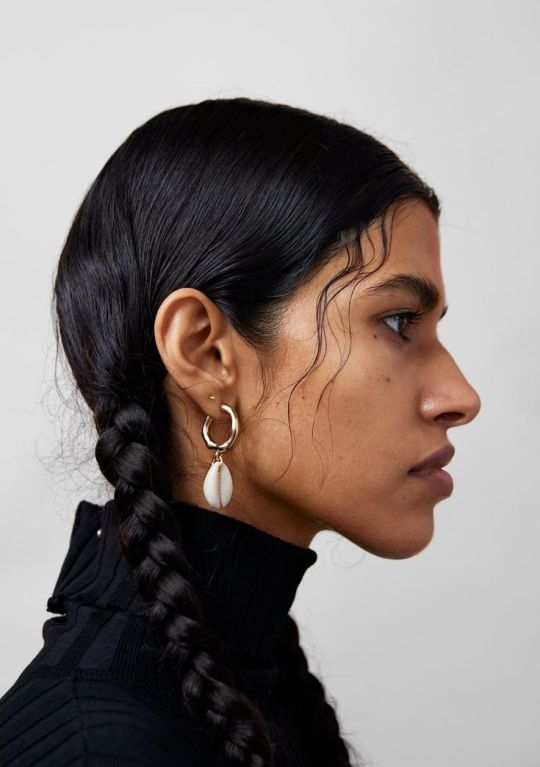
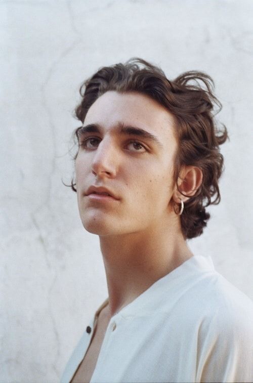
I have a pinterest board with many more!
One REALLY important part of learning how to draw all kinds of things is to understand forms and shapes and how to manipulate them. I have so many pages in my sketchbook filled with just shapes that I drew from all kinds of angles without any references.
This is a great video on it:
6 Ways to Draw Anything by Proko
Learning how to do this is so crucial! Young artists often think they first have to learn all kinds of detailed anatomy before doing anything else, but all that's gonna do is make you tired and hate drawing. Shapes are where it's at! Once you understand how shapes work and which ones to use for certain parts of bodies or objects, drawing is gonna get so much easier! Once you understand them, you can get into details such as muscles and bones!
And honestly the most important point is to just absolutely love what you're doing! I wouldn't be doing this if it wasn't for the fact that I get extreme hyperfixations on certain media that turn me into some kind of beast where I can suddenly draw 10 detailed illustrations a week, haha. Just be passionate about what you do, find something you REALLY love and go crazy!
I really hope this was somewhat helpful! My inbox is always open if there's any more questions :)
#responding to these has made me realize how much I love helping you guys out#it's genuinely really fun and I just hope it's actually helpful haha#my art#art advice#art resources#ask#anon
499 notes
·
View notes
Note
Hi!
I was wondering, with how much this fandom relies on skeletons, is it worth trying to act on "same face syndrome"? Like, they have no flesh, and most art styles is simplistic enough so it's hard to really make a different skull
Just wondering what you think, I saw some people trying making them different bodies, but never a diverse skull, haha. Not that I mind, it's easier to recognize artist that way--
Hii!╰(*´︶`*)╯
You've pointed it right: the "same face syndrome" doesn't work when it comes to different artists — the variety of artstyles helps us to distinguish (and recognize!) them, even when it's the drawings of the very same character (googled the manbaby) ☆
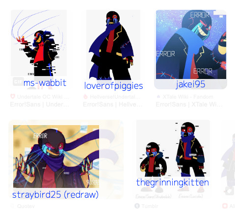
As you can see, although the skulls remain cartoonishly round, we can't call them the same (๑˃̵ᴗ˂̵) Moreover, some artists move away even from this format and more towards realism, if you wish a diverse skull >:D

As for different characters, it mostly depends on how an artist depicts them, whether they experiment with canon/fanon heights & shapes (not only the whole bodies but separate parts as well), etc. <3
Luckily, most of the sanses have unique features (including the eye sockets forms like Ink's and Killer's, or Horror's cracked head, and so on) that distinguish them from the rest, even with the same skull! ♪( ´▽`) [insert the same hat meme xd]
UPD:


For real! \(//∇//)\ Such unusual shapes for them speak volumes about their personalities here *^*
125 notes
·
View notes
Text

you know how some artist have same face syndrome? I have this thing I like to call different face syndrome, non of the faces I draw look the same, even if it's the same character.
day 2 of drawing bsd incorrect quotes I find on pinterest to improve my comic skills.
original \/

194 notes
·
View notes
Text
Mini character guide for my fellow McSpirk fanartists!
I feel like I finally have a satisfying level of muscle memory down for how I draw each of our guys in a recognizable way! My portrayals of Kirk, Spock and Bones aren't usually drawn with a reference, and they definitely don't look all that realistic, but I figure at least one of you out there might like to have a peak into what I do to try and make them recognizable!
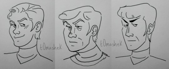
Before I show the specific lines I always like to use, I would like to shoutout all the artists out there with same face syndrome. I had very bad same face syndrome before I started drawing Star Trek fanart, the variety of characters in Star Trek REALLY helped me draw better characterizations of people! BUT, if same face syndrome is something you currently struggle with do NOT let it deter you from posting your beautiful art!
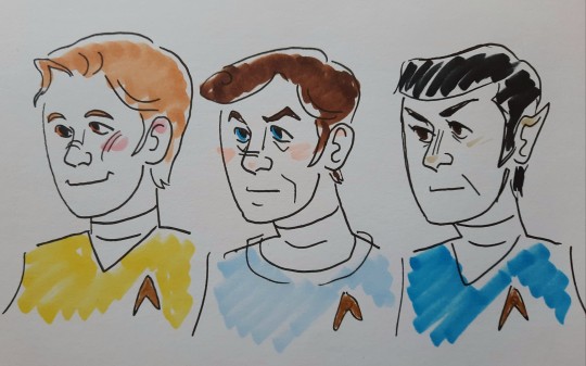
Even when drawn with the same basic face structure like I did here, it's still very easy to tell who's who, just with the use of colors, hairstyles and facial lines!
Now, for anyone who is wanting to pinpoint what I try to keep consistent in my drawings of the boys, I highlighted the lines I find most important in my drawings of each of them. I try to keep my style slightly cartoony, so I like to exaggerate!
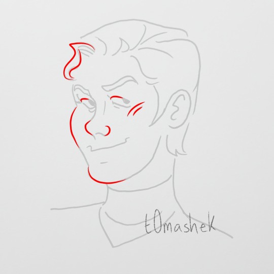
The roundness of Jim's face is what I always try to make the most pronounced in all of my art of him. The contrast to the harsher angles of the faces of Spock and McCoy is one of my favorite things to include in my art. He has a button nose in combination with those apple cheeks, they're my favorite thing about Jim to overexaggerate!
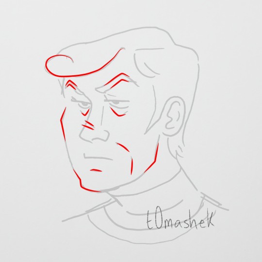
McCoy on the other hand? Give him his TRIANGLES. I try to go for a much more square face when drawing Bones, but for the lines and features within his face we love our good old friend the triangle. That man's eyebrows are pointy, and I love to give him his mouth lines. I like to balance out the sharper lines I draw on his face with the round lines of his hair.
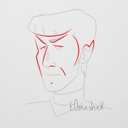
Spock has the bangs, ears and eyebrows that play a great advantage to us, no other bro serves like Spock. While I love the pointy sideburns on all of the boys, Spocks sideburns help me play into the length of his face. He's got a straighter face and straighter nose compared to his human boyfriends. And while he and Bones both have those handsome mouth lines, you can differentiate the shape of the crease to fit their faces! When I'm drawing McCoy's mouth lines, there's more of an angle, I draw Spock's lines straighter, similar to his face and nose.
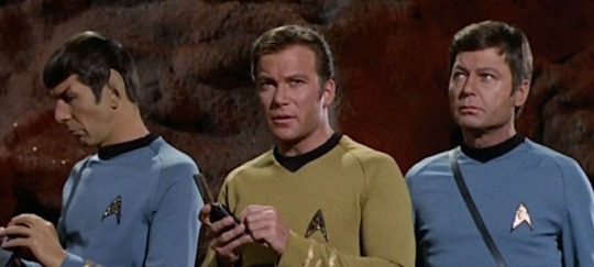
I hope this might help some of my fanartist brethren out there! Or at the very least give you a little peak into my art process! If anyone finds this helpful and uses it to draw some art, I'd love to see it! The variety of styles and character potrayals I see in all of the Star Trek fanart I browse on here never fails to warm my heart. These goofy little guys never fail to stand out from one another, no matter how they're drawn, and that is just so special to me.
Live long and draw fanart, little gay people in my computer!!! 💛🩵💙🖖
#my art#art guide#art tutorial#star trek art#star trek fanart#star trek tos#star trek#star trek the original series#captain kirk#captain james kirk#james kirk#james t kirk#bones mccoy#leonard mccoy#leonard bones mccoy#doctor bones mccoy#jim kirk#s'chn t'gai spock#spock#mr spock#mcspirk fanart#mcspirk#triumvirate#space gays
96 notes
·
View notes
Note
I mean if its unsolicited you deserve to ignore it. No one asked. But as an aartist who wants other people to enjoy your work, you should also find open time for crtiques that may be valid (like when creators use a dogwhistle they didnt know was a dogwhistle or such)
I once followed an artist who did a once a month critique hour for fans to add friendly input when they were in the headspace, and then called it good.
So that fans didn't add unsolicited stuff, and also so he felt like he had more control over his content even with fan input, as it was his, not theirs.
Idk if this would help you in any way but 👍🏾
I think unsolicited critiques are a neutral point so long as they are constructive and not worded rudely.
If one leaves an unsolicited critique, the artist doesn't have to listen and one shouldn't expect an artist to listen. HOWEVER I also think if a creator gets unsolicited critique on their work and it's constructive then it's also beneficial for them to consider what's been said so they can better themselves in the future.
I honestly am not the type of artist that's comfortable with a critique hour because I do this as a hobby and for fun and I strongly prefer getting advice from people whose words I trust and work I keep up with since there's an element of trust I have in what someone is saying versus a bunch of people I am unfamiliar with who may desire different things from my work that I don't.
BUT if I do get some unsolicited constructive critique from a follower, I do consider what's been said and weigh if it's something I want to do or not. There have been numerous times in the past I've had some unsolicited critiques from people that I let my inner OWA OWA dogs fight over before I eventually shifted a couple things in my work. One big one I used to get that I HATED but I bit the bullet one day and implemented was same face syndrome comments (this was back before I changed my style to what it is now) since in the past it was VERY anime. Another more recent occurrence was Nova and how she looked too young due to how she dressed and the style I drew her in.
Regardless of if I say I don't want unsolicited critiques or not, it's the internet, it's unavoidable. Especially with me having webcomics since, while they are free to read, people are paying with their time and many do not like to waste it. What's important is determining if what's been said is beneficial or not. And I think that's something that def varies from artist to artist.
I'm not really interested in popularity or money with my work. My end goal with my art is just to leave something behind on this Earth before I go that says I was here.
25 notes
·
View notes
Text
STARRYSHARKS FAQ: 2!
this FAQ will go over some of the questions about my process that i get in my askbox. some disclaimers:
ANYONE who asks any questions that have been answered in either FAQ will be ignored.
PLEASE don't take this FAQ as gospel or assume that it's viable art advice. it is not. i am not a professional, i am a teenager who draws in her free time and therefore many of these answers will involve things that break common "laws" of art, logic, and anatomy. this is just how i personally go about my illustrations. please also don't take me or any individual artist as your sole inspiration, you will not get anywhere believe me. art is like a balanced diet. if you eat sweets all the time, you'll get sick - but if you only eat veggies and healthy food, you'll get bored. try to take inspiration from a vast range of artists, even those you don't think you'd really enjoy. and most importantly, LEARN THE FUNDEMENTALS OF ART!!!! even just a little bit of knowledge can go a long way, regardless of how simple or realistic you want your artstyle to be. refusing to learn fundamentals had my art looking janky for years.
ok enough waffle let's get started!
Q: HOW DO YOU DRAW FACES?
A: it depends.
there's lots of things you can do to a face to make it unique. the starting point is the facial features themselves - eyes, eyebrows, nose, mouth... if they're the same for every character with the only uniqueness being in eyecolor or something like that, you get same face syndrome.
so, take your characters and apply some diverse facial features. certain facial features have certain character connotations too. like downturned eyes implying a laid-back or tired character, or a 3-shaped mouth implying a catty character, something like that.
but, for me, facial diversity isn't enough. it's not like you go out and everyone has the same head shape. so, i tend to try and get creative with face shape, and depending on how thin or wide the shape is, you can move around the facial features too.

these examples are a little shitty but that's because i put them together in 10 minutes. you can see the effect in my actual characters, who have more effort put into them, and how no character looks alike.

other than that, i tend to try and give every character a different eye shape and pupil "type" - so while krankenstein and romèo might have simple black dot eyes, octavia and vivica have large multicolor anime esque eyes, onion has cartoony circle eyes, and so on. if you just switch things around enough, even characters with similar face shapes will look unique. and even if they don't, doppelgangers do exist in real life.
Q: HOW DO YOU DRAW HANDS?
A: once again it depends. some characters have regular shaped hands while some have really tiny hands that only have 3-4 fingers instead of 5. usually my larger characters will have smaller hands but that isn't always the case.
but for the standard hand, i tend to have a line between the palm/base and the fingers. and then i um...add the fingers i guess😭 there's usually a lot of abstraction when it comes to hands for me, because i'm not the best at drawing them. usually either the last three fingers or the middle two will be connected as well depending on the pose.

Q: HOW DO YOU DRAW FURRIES?
A: i don't really know myself. i still don't know how to draw most furry species especially canines, god i hate canines!!! well not really, i can just never draw their snouts. really i draw furries like i would human, just with larger thighs and further back lower legs. and fur too. i like to exaggerate the nails too. and of course add fur, usually at the joints.

Q: HOW DO YOU DO LINEART?
A: i draw over the sketch. i do the sketch in thin, low opacity lineart, and go over it in varying thickness based on the perspective/desired look to get that comic book varied thickness look. the eraser will be your best friend more than the pen here, cuz there's a lot of cleaning up with both the sketch and the final lineart to have everything looking sharp.
Q: CAN YOU GIVE A STEP BY STEP GUIDE OF HOW TO DO YOUR STYLE?
A: no and i will never be able to. there is no formula to my style, i break every rule i make for myself. i barely follow any of the answers i write in these QNAs. they are not rules or steps but rather just me explaining my habits in art. i never have a checklist when i draw, i just do these things intuitively based on years of drawing. this might sound like some stuck up "it comes naturally" thing but trust me IT DOES NOT COME NATURALLY!!! these habits are born from over a decade of drawing. and besides, like i said before, with how varied i try to make my character designs any step by step would never be universal to my style. i'm really sorry but that's the truth. either way i hope this QNA helps.
26 notes
·
View notes
Note
hiii your art style is so good!! i got two questions :3
1) any tips for any beginner artists?
2) do you have like, an inprnt or anywhere i could buy your stuff?? i would love to hang some of your art up on my walls bc its so gorgeous :0
haiii thank you so much!
im no teacher by any means and of course don't consider myself a professional, but will try to give you some tips that kinda helped me on my journey ^_^
1. don't focus on artstyle. the way you hold the pen in your hand is already original. you don't have to use same process, same brush, same eyes size and proportions on every drawing. for me, it lead to a burnout and a safe face syndrome. try new things, new brushes, new techniques, play around with proportions, art is about fun, not about putting yourself in a box!
2. anatomy isn't a most important thing. yes, knowing how certain part connect to each other is important and learning is good, but don't focus on anatomy only. learn things as you need them, not everything at once, look for references, break them down and apply to your art. it doesn't have to look exactly like the reference, it's your art, do whatever you want!
3. basics are quite important. shapes, lines, boxes. simple art exercises such as drawing shapes in 3D can help you build a better control of your hand and understanding of space and shapes.
4. gesture drawing is very fun and helps you build more dynamic and realistically looking poses!
5. do not focus on realism if that's not what you're aiming for.
6. give yourself some rest when needed and don't be too harsh. learning curve isn't straight and sometimes you can feel bad about what you're doing, but that's alright, nothing is linear, just keep going and you'll see the result!
as for prints.. i don't think im cool enough and my art is worth printing?? but if you want i could send you full sized pngs of drawings you want if you want to print them yourself or something 🥺
26 notes
·
View notes
Note
What do you think of Ko Takeuchi as an illustrator anyway? Do you blame him for WarioWare getting normalpilled?
LOL well either way I can't be too mad at him considering that he is the one responsible for the original lightning-in-a-bottle designs in the first place (IIRC he's been the sole credited character designer since Mega Microgrames). Truly we'll never know if the Normalbobification of warioware was a personal stylistic choice on Takeuchi's part or a push from more marketing-minded suits behind the scenes, and we will likely never know because of people like me who are fucking insane about it. I will beat a dead horse and say that his same-face syndrome for women specifically is really bad. But, to his credit, and despite the depressing new art direction of the series, his more painterly character art from Get It Together is nothing short of gorgeous:


(Yes i chose the only long orbulon in the batch DON'T look at me.)
So, overall, I don't think he's a BAD artist. The fact that I like a lot of his work actually makes the overhaul even more painful; he COULD make everyone look weird and greasy again, it would be so easy for him to make everyone look weird and greasy again. This one isn't solely an art style thing, so I'm kind of derailing here, but how did we go from this:

To this:

It just ain't right!!
But, on the other side of the coin, as much as I have qualms with the new art style and some of the changes in characterization of a lot of our guys (not just Orbulon, I think Crygor and Jimmy got hit too), I do really really love that more focus has been put on their characterization at all. Hell, Warioware Move It is basically a cartoon episode disguised as a game. That's fun as hell! From the fully-voiced Gold to the saga of Get It Together, it feels like they are really making the most of the awesome cast of weirdos at their disposal - and they always have, but now instead of all the fun stuff being relegated to websites and manuals, it's taking center stage. Something I love about warioware is just how much love the crew seems to have for these characters, and it's nice that that's still evident no matter what they look like.
52 notes
·
View notes
Text
~ Monthly BL Breakdown: January 2024 ~
✨ Happy February!!! 🎭
Disclaimer: ALL shows can be streamed here or here, as well as on Youtube and other platforms. For more info on where to watch what, check out this post!
New breakdowns are coming at the end of every month - feel free to add stuff! -> previous breakdowns
What came out this month? (green = seen/currently watching)
🌟 BL Drama no Shuen ni Narimashita: Crank In Hen - January 2nd (Japan)
🌟 Ossan's Love Returns - January 5th (Japan)
🌟 Refund Love - January 7th (Thailand)
🌟 Time The Series - January 9th (Thailand)
🌟 Intern in My Heart (BL side couple) - January 10th (Thailand)
🌟 Sukiyanen Kedo Do Yaro ka (Although I Love You, and You) - January 11th (Japan)
🌟 Beside You (mini series) - January 11th (Thailand)
🌟 I Wish You Love - January 21st (Thailand)
🌟 Happy Ending - January 23rd (South Korea)
🌟 Love for Love's Sake - January 24th (South Korea)
Monthly likes/dislikes
👎🏻 I've been catching up on some KBLs from last year this month and sadly most of them were very disappointing. I put a few on my watchlist that generally had good reviews but yeah let's just say I'm glad I didn't miss anything in the last 2 years lol. The only one I liked was Love Mate, the rest was pretty much pointless. Hopefully the upcoming ones will be better 🤞🏻
New series & movie announcements
🎥 Beating Again (dance-themed, starring Kaownah K., Earth K. and others) - Date TBA (Thailand)
🎥 Unknown - Date TBA (Taiwan)
🎥 The Book Store - Date TBA (South Korea)
🎥 Term Begins - Date TBA (Thailand)
🎥 Mafia Prince and the Bookworm - Date TBA (Thailand)
🎥 Black Forest - Date TBA (Thailand)
🎥 Go Alone With Me - Date TBA (Thailand)
🎥 Can I Love You? - Date TBA (Thailand)
🎥 The Shining Star - Date TBA (Vietnam)
🎥 At My Fingertips (Unintentional Love Story spinoff) - Coming May 2024 (South Korea)
🎥 Connecting To You - Date TBA (Taiwan)
🎥 The Star (movie) - Coming March 2024 (Thailand)
🎥 What's the Nong? - Date TBA (Thailand)
Other news from the BL world
❗️ Actors Mike Chinnarat, Fluke Pusit, White Nawat, Pluem Purim and Lee Thanat have left GMMTV.
❗️ After Korean actor Choo Youngwoo won an award for "Best Rookie Actor" at the recent KBS Drama Awards, he came under fire for not mentioning his participation in the BL You Make Me Dance which launched his career and earned him the award.
❗️ Actors Jin Hoeun (All Of Us are Dead), Kwon Hyuk (The New Employee), Byun Junseo (Perfect Marriage Revenge) and Nam Yoonsu (Extracurricular) have been confirmed to star in the upcoming BL Love In The Big City, which portrays the life and love of an HIV-positive gay writer.
❗️ ZeeNunew and GeminiFourth won an award respectively for "Best Thai Artists" at this year's Seoul Music Awards.
❗️ The Chinese BL Stay with Me is getting an audiobook. The series furthermore recently confirmed its second season, further details are unknown.
❗️ Over a year after its initial premiere, the Thai BL To Sir, With Love won "Popular Foreign Drama” at this years's Vietnam Face Of The Year Awards.
❗️ The Thai BL Playboyy will no longer air on youtube after the suspension of the channel due to explicit sexual content. The show will continue to exclusively air on Gagaoolala, as well as RakutenTV.
❗️ Actors EarthMix had a cameo appearance in Ossan's Love Returns; they will star in the Thai adaption of the same name later this year. Details about the production are still unknown.
❗️ MileApo (KinnPorsche) were announced to star in the upcoming series Shine. The show is an extension/spinoff of Man Suang and focuses on Khem and Chatra's story in more detail.
Upcoming series & movies for February
👉🏻 Anti Reset - February 2nd (Taiwan)
👉🏻 Perfect Proposal - February 2nd (Japan)
👉🏻 City of Stars - February 2nd (Thailand)
👉🏻 Love Syndrome: The Beginning - February 8th (Thailand)
👉🏻 Baka Pwede pa? - February 9th (Philippines)
👉🏻 1000 Years Old - February 14th (Thailand)
👉🏻 My Strawberry Film - February 16th (Japan)
👉🏻 A Secret Love - February 17th (Thailand)
👉🏻 Unknown - February 24th (Taiwan)
👉🏻 Wedding Impossible - February 26th (South Korea)
👉🏻 Kiseki Chapter 1 & Chapter 2 - February TBA (Thailand)
#doreens monthly bl breakdown#thai bl#bl drama#upcoming bl#update#bl news#im so upset about everyone leaving gmm like wtf#idc that they added a bunch of new ones i want the old ones back#i have separation anxiety djkhkdfj 😭#how dare you change old patterns#bold of u to assume i have no mental illnesses lmao
62 notes
·
View notes
Text
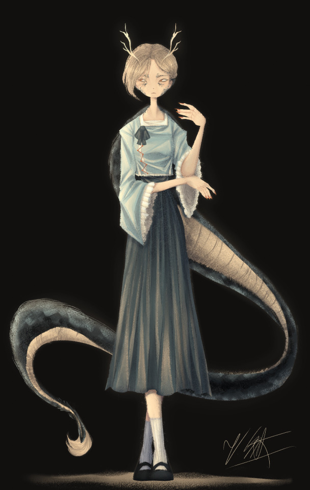
[Click for better quality]
Ok so as a sort of followup to that Yachie drawing, I did one of Yachie as well. I already had a pretty solid idea in mind (though tbh drawing her wasn't as fun as drawing Saki) but I'm overall pretty happy with this drawing.
Artist's Notes;
So I knew that I would never forgive myself if I completely missed the oppurtunity to give Yachie face scales, which is something that I haven't really seen many people do yet. I do feel like I could've pushed it a lot more, but I'm liking the direction my take on her is going.
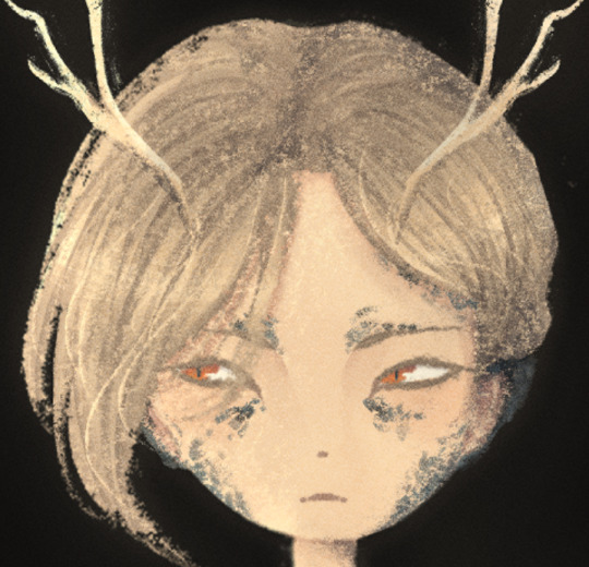
I also wanted to take this opportunity to talk about some of my headcannons for how Hell's fashion works since I've had this on my mind for a while. So ever since I refined my own design for Zanmu, I really liked the idea of having there be some connection between her and Satori in their clothes because they're both the defacto "leaders" of their respective Hells, and then I had the idea of having Hell's fashion trends mimic real life history where it mimics whatever the upperclassman are wearing in someway? I've always been really fascinated with the idea of how Modern Hell works as a society and also how Old Hell was impacted by it's abandonment, and while I am aware that the animal realm isn't exactly Hell and is moreso it's own thing right next to it, I imagine that there would be some overlap in the fashion and culture due to their close proximity to each other. Of course, I still kept a lot of elements in from Yachie's original design, the only thing I really added to the outfit was the jazzed up sleeves and the bottom of her shirt as well as those cool triangle things ZUN added to her shirt in 19. I also have her some nice and sharp nails since I thought they fit her. I also tried adding some scales onto the tips of her ears though tbh IDK how well they read. Her colour palette also ended up becoming a lot more teal than I had anticipated, but I honestly like it as I love it whenever people make Yachie's colour palette and design a lot more teal. I also wanted to try and differentiate her face from Saki's, though I do plan on experimenting more on how to avoid same face syndrome, as it's a problem that haunts me in my dreams. There's not really much I can say here aside from "hee hee clothing rendering go brrrrrr" and how the Clip Studio Paint charcoal brush is really all you need for any given piece and it is literally the only brush I use aside from the occasional airbrush for lighting (sometimes) and the blend tools. I've been doing a lot more simple character art recently and I've just been waiting for a cool enough idea for a full blown piece.
Though now that I've talked about some of my headcannons about how Modern Hell works, I really just want a Touhou manga spinoff about Modern Hell. Like, please ZUN I'm begging you, just do it, it would be so fucking cool because Touhou 17 is literally the only time in modern Touhou when we've been to Hell proper, does modern Hell have any settlements of Oni and other Youkai? Does it have cities? Towns? Villages? What's the technological level of Hell? How do they keep sinners from pulling a Touhou 17 and summoning a fucking god to save them? Where do all the characters associated with Hell as of right now fit into everything? You can't just drop a character like Zanmu who is stated to essentially be the king of fucking Hell and then not elaborate further on how she fits into the general framework of Hell! Is she officially the king or is this more of a "true mastermind using the official king/ruler as a puppet" type deal? How does the Animal Realm fit into all of this? Did Hecatia purposefully create Hell so it would be right next to the Animal realm? Did it just appear there on it's own once Buddhism started popping off on Earth or was it established once Zanmu established Modern Hell? How long was Keiki a problem for, and how did that affect the rest of Hell? Seriously there are so many unanswered questions here and I don't know if I just need to read an interview Zun had where he was asked these same questions and if so please tell me because these questions have all been stirring in my brain for quite some time and I really wished we'd just get a new fucking manga instead of going over the same settings in Gensokyo over and over and over and over again dear god. Like, I get that there's still a lot to explore with what we already do have, but it would just be really nice to see the Animal Realm get a little more explanation as to how it fits into the overall grand scheme of Gensokyo's worldbuilding because that would just make such an already interesting idea for a setting in Gensokyo so much better.
I'm hoping to get the drawing for Keiki done before Touhou 17's 5 year anniversary, though I am willing to postpone that and take my time on it and I also have something coming up where I won't have access to my main drawing tablet for a while so it might be a while until I post again, maybe, who knows, consistent posting schedule? Who are they, I've never heard of them. I do fully intend on talking about my thoughts on Touhou 17 though, even if it's a day or two late, it's Touhou 17's birthday month so it still counts! Also because out of all the Touhou game anniversaries, this is the one I care about the most because Touhou 17 was the first Touhou game I played and 1CC'd(???) on normal, and even though it has plenty of flaws (i.e. the many missed opportunities for it's gameplay, how unbalanced the mechanics are and also screen visibility), I'm always going to have a bit of a soft spot for it and I think that the game's strengths make up for some of it's weaknesses in my opinion.
147 notes
·
View notes
Text

"The characters look the same!!" Well, actually ☝️🤓 no
It's just that some of the artists who draw the cards have same face syndrome
If you look at the game models, you will notice that Belphie has a bell pepper shaped face, Asmo has a poosay shaped face, Satan's eyebrows are higher, and Mammon has the no-money shaped mouth
— Anon
#barbatosgossipsection#★ is a poll option if you're indecisive or just want to see reuslts!#obeyme#obey me#omswd#confession#queuecifer#belphegor obey me#asmodeus obey me#satan obey me#mammon obey me
30 notes
·
View notes
Note
you’re one of my favourite artists and one of the reasons I want to start drawing!!! >.< I’ve started and it’s a bit difficult but fun!!
I was wondering if you had any tips on how to draw face shapes and dynamic poses? I love the way you draw face shapes and the actual expressions!!! (it’s always so hard for me 😭) and your poses are super cute!!!
YAAYY NEW ARTIST🥳!! i’m SO happy to hear this -
and absolutely i’d love to share what i’ve come to learn (so far!) re: face shapes and poses as a hobby artist ^^
just to preface everything, when it comes to giving art advice there’s always a general disclaimer that there’s no right way to do art, in the end you should do what you like to do! sometimes i like to think of art as problem-solving, and there are many ways to tackle specific problems <3
for face shapes and expressions - lately i love to reference and do studies of Ami Thompson and Shiyoon Kim’s character design and expression sheets for Spiderverse. these are INCREDIBLY evocative and useful. you can study these expressions and poses and try to recreate them on different characters, and you’ll notice the difference in eye shapes, face shapes, noses, etc; studying these differences is what will help us avoid same face syndrome. what i generally like to do is find art that i like - comic/manga panels, fan art, anything i want to learn how to draw like - and copy it into my sketchbook for personal practice and study to see what elements i can incorporate into my own drawing.
another tip - any medium is good for drawing, but i highly suggest esp when you’re starting - learn to draw with ink! drawing traditionally and with something unerasable will help with your draftsmanship and line confidence. it’ll be wonky at first but you learn to be deliberate with every stroke. tbh becoming a digital artist has deteriorated my draftsmanship and has made me heavy-handed, and it’s something i’m trying to consciously remedy right now. digital art is highly convenient and best for sharing, but when i do studies i stick to pen and paper :)
as for poses - one v important thing i learned in creating dynamic art is to “push” or exaggerate the poses. what you see in a photo reference - if you try to draw that 1:1 on paper, it doesn’t always translate well—the energy is not always captured, and it usually looks so stiff. what is in 3D has to be translated a different way to 2D. so “push” it to create more energy - exaggerate the movements - even if they’re just standing, you can make it dynamic by being conscious of how they’re standing (where the weight is balanced, push one hip up, make them lean one direction, for example). i doodled some examples here:
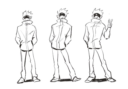
^ first one is gojo just standing; now how i would “push” this pose is to show him putting more of his weight on one hip and maybe putting his opposite foot up a bit to suggest some movement (and balance). the third one is just a bit more variation where his body is still putting weight more on one side, his feet are more glued to the ground, but i put his hand out to do his signature victory sign just for a bit of flair. so it’s a lot of figuring out how to convey balance and weight and movement and personality :) start with exaggerating the pose - then you can create more and more dynamic art from there ^^
pushing and exaggerating applies to facial expressions, too! instead of merely drawing someone with a smile, try tilting their head a little sideways (and show how their hair might move as well bc of this), add some blush, raise their shoulders a bit, etc).
and i 100% recommend taking gesture drawing classes for dynamic poses ^^ there are a lot of artists who have draw-with-me tutorials on youtube, and i personally like to use line-of-action.com for timed sessions.
i hope this is helpful in even a little way—good luck on your drawing journey and remember to trust the process bc progress is def not linear as an artist but deliberate practice and studies WILL help you! <3
16 notes
·
View notes