#so here have the first of two gifsets
Explore tagged Tumblr posts
Text


—I SAW YOU IN MY DREAM · Episode 9
#i saw you in my dream#i saw you in my dream the series#surf patchara#game orarig#yo x ing#isyimdedit#thai bl#thai drama#bl drama#bl series#i wanted to fit the whole scene into one gifset#but that didn't really work#so here have the first of two gifsets#by pharawee
228 notes
·
View notes
Text


1.01 / 2.17 (41)
#I love how out of so many callbacks in E41 (and even a direct E01 flashback) we also get this tiny little E01 callback#I love how Mahidevran immediately steps in to assure her son that she won't leave him in *any* uncertainty that may come#whether it's about them both facing the unknown future in Topkapi for the first time that would truly point to the separation Mustafa fears#(but rather separation from Süleiman and Ibrahim for *both* Musti and Mahi right from the start that Musti will sense and not take well)#or *someone else* facing an unknown future with the *exact* seperation attached to it that Mustafa fears - separation from mom#(and Musti relates and sympathizes with that situation instead perhaps namely due to whatever separation he's experienced)#(also Musti having grown fonder of his brothers as well; this whole gifset can sorta sum up Mustafa's development#re: his feelings for his brothers up until now but that will be a post for another day:))#I love how both scenes are staged with the direction emphasizing the vastness of the castle in E01 making Musti and Mahi smaller as if#they are sucked in already before even entering there but they still lean on each other seeking each other like a child seeks#his mother's closeness and E41 being set in Mahi's chambers the castle having already become their home and Musti getting this#accustomed that he has his own chambers already and goes to his mother's just to visit but always feeling at ease & the same goes for Mahi#they're already used to some distance and it is even encouraged to an extent (E34) but they're always there for each other#and Mahi gets joyful relief of SS calling hse in her chambers instead of the frantic nervousness that overtook her in E01#when SS didn't even *visit* her and her son; Mustafa gets a little sad look when SS calls her here instead of the insistence for#SS and Ibrahim to come but he goes to his room calmly & respectfully anyway for his mother to have her moment while in E01 he couldn't see#anything outside of his father's absense and of course he's like that he's a child but it's like they've all grown up and come so far aww#also the reversal of their positions in the two scenes and them talking on equal footing <33#just me fangirling all around for no reason <33#magnificent century#muhteşem yüzyıl#muhtesem yuzyil#mahidevran sultan#sehzade mustafa
11 notes
·
View notes
Text


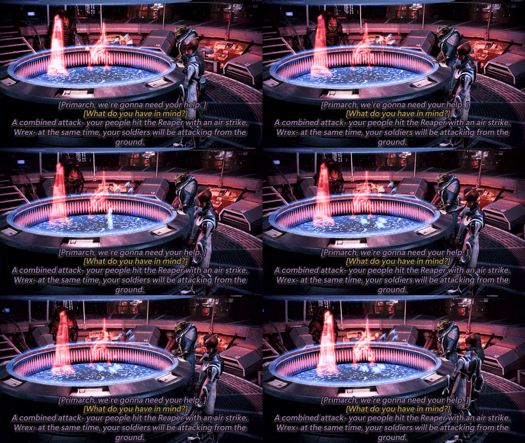
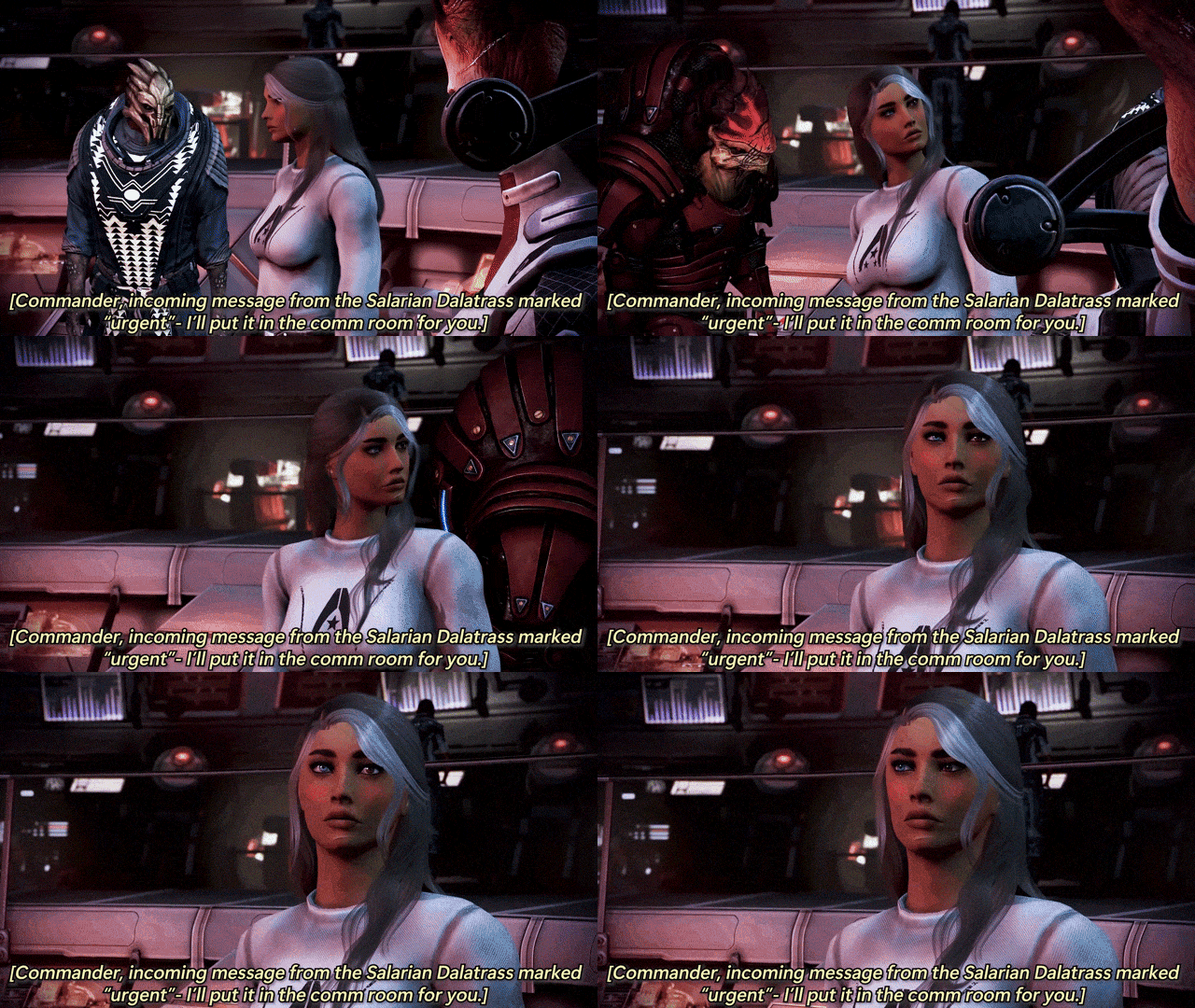

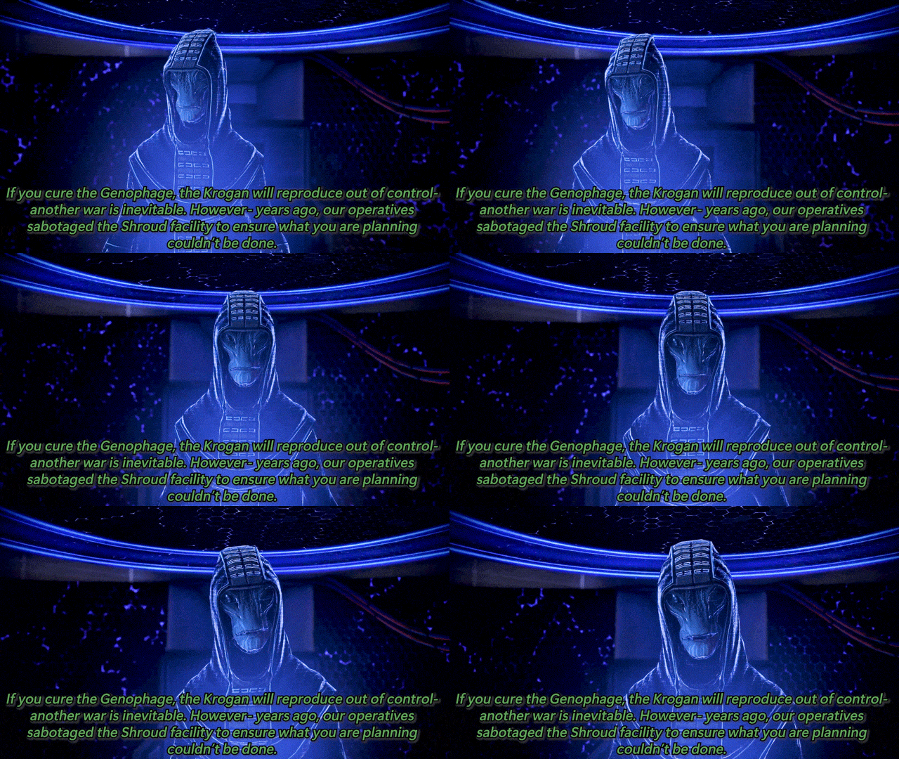


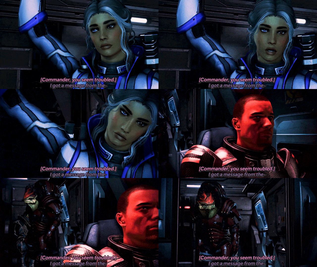
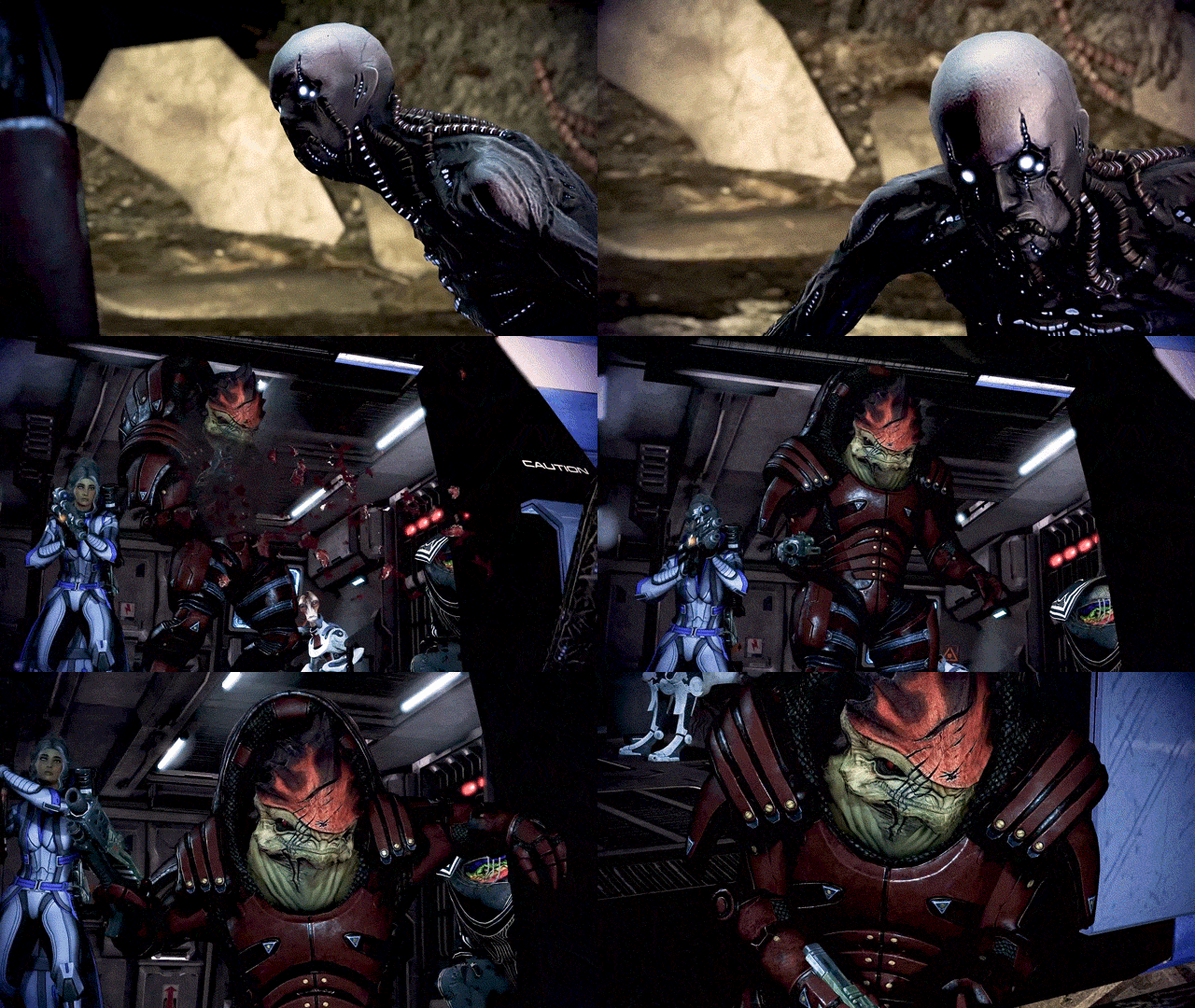
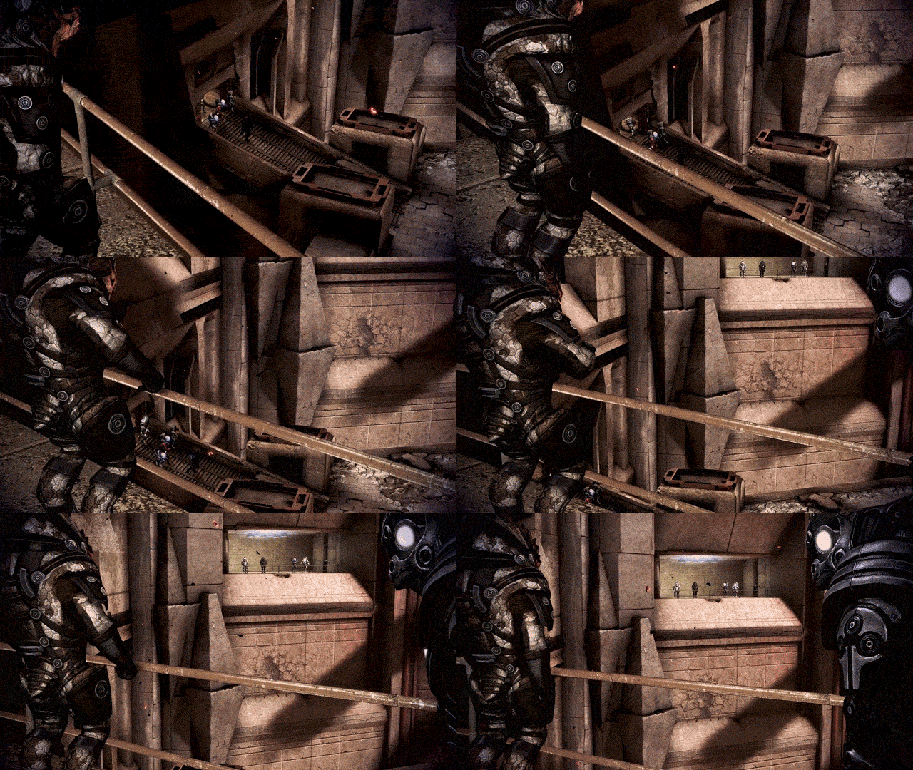
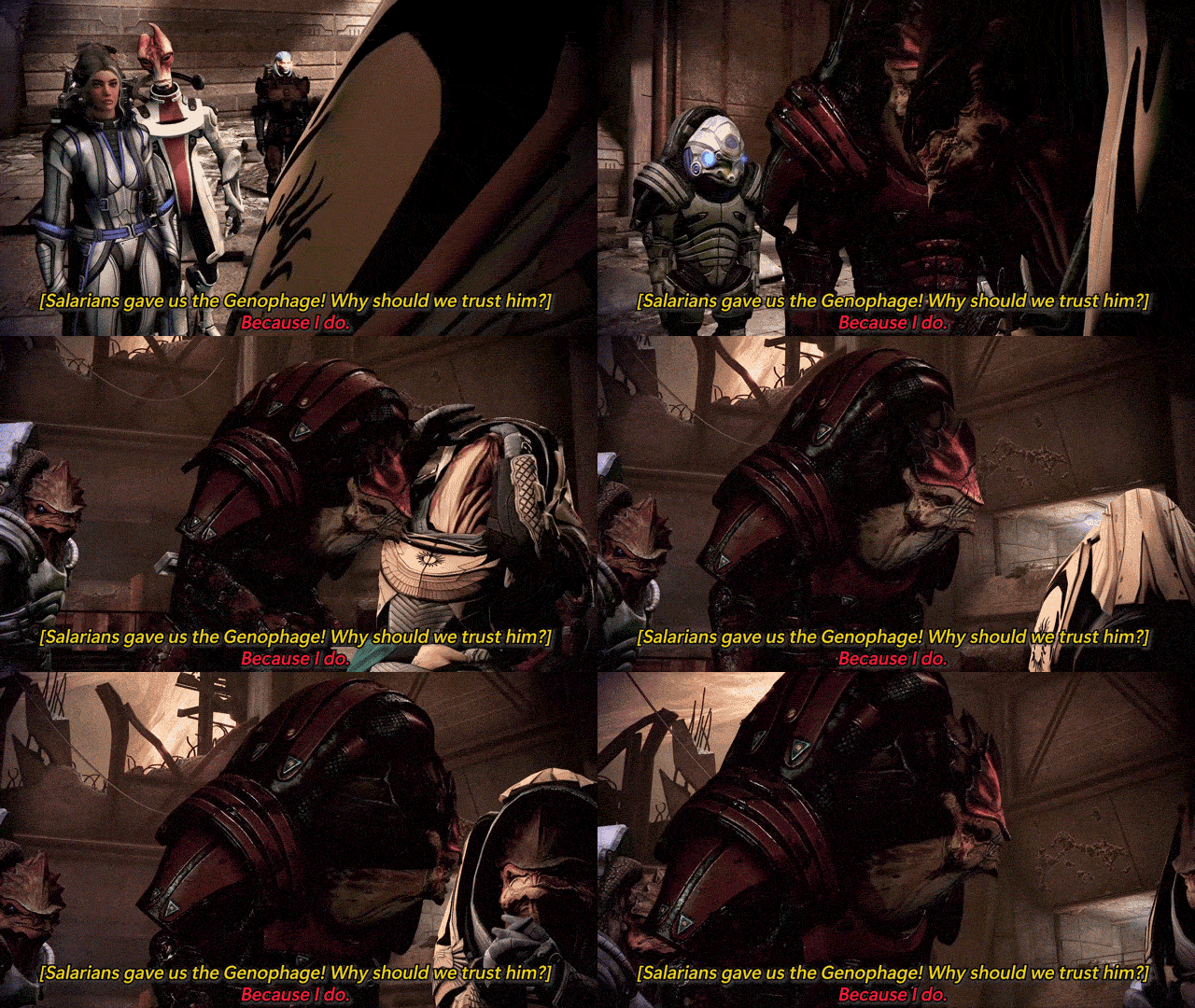
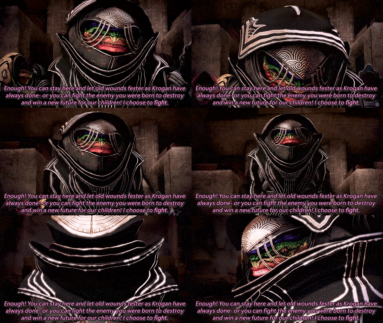
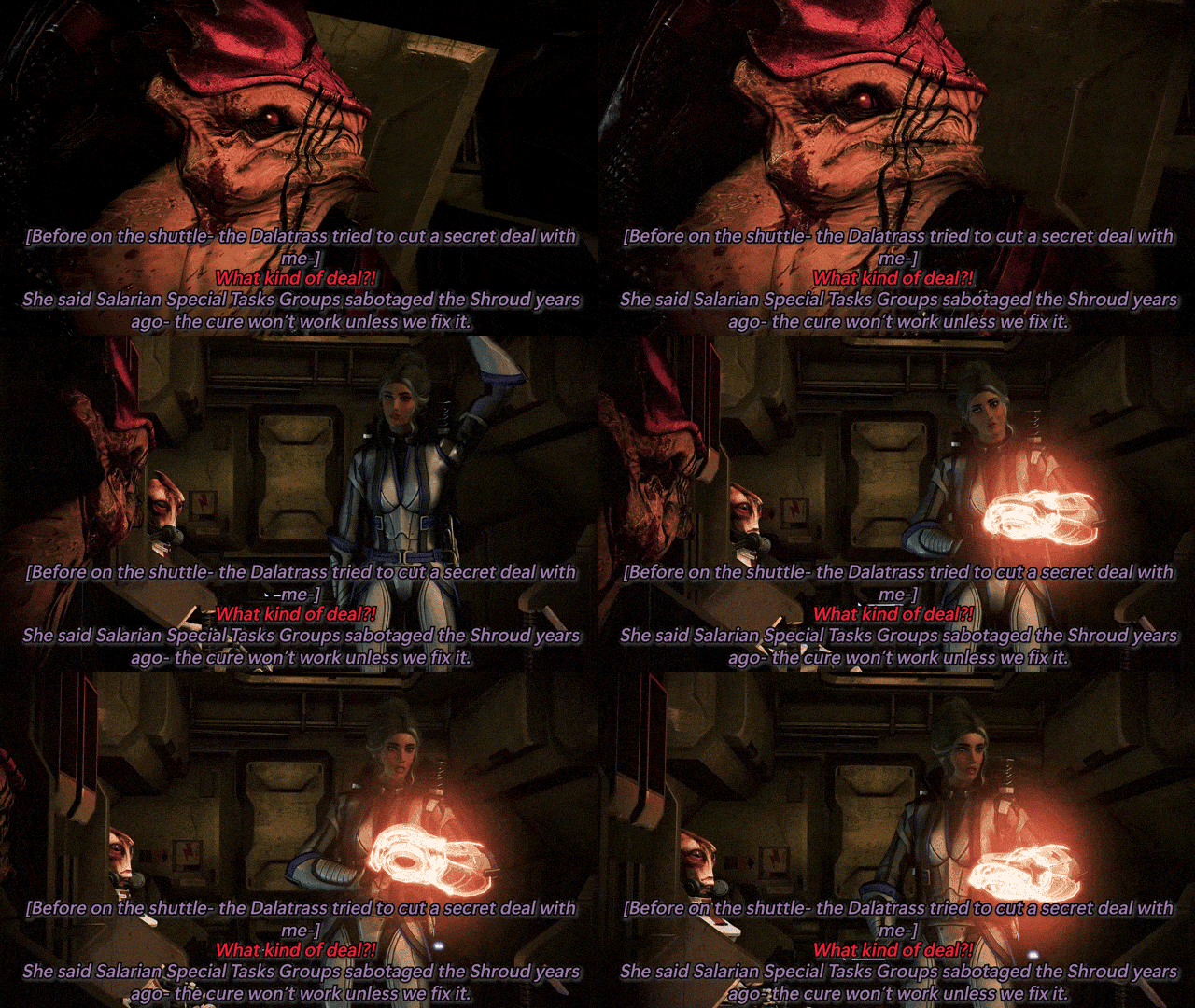


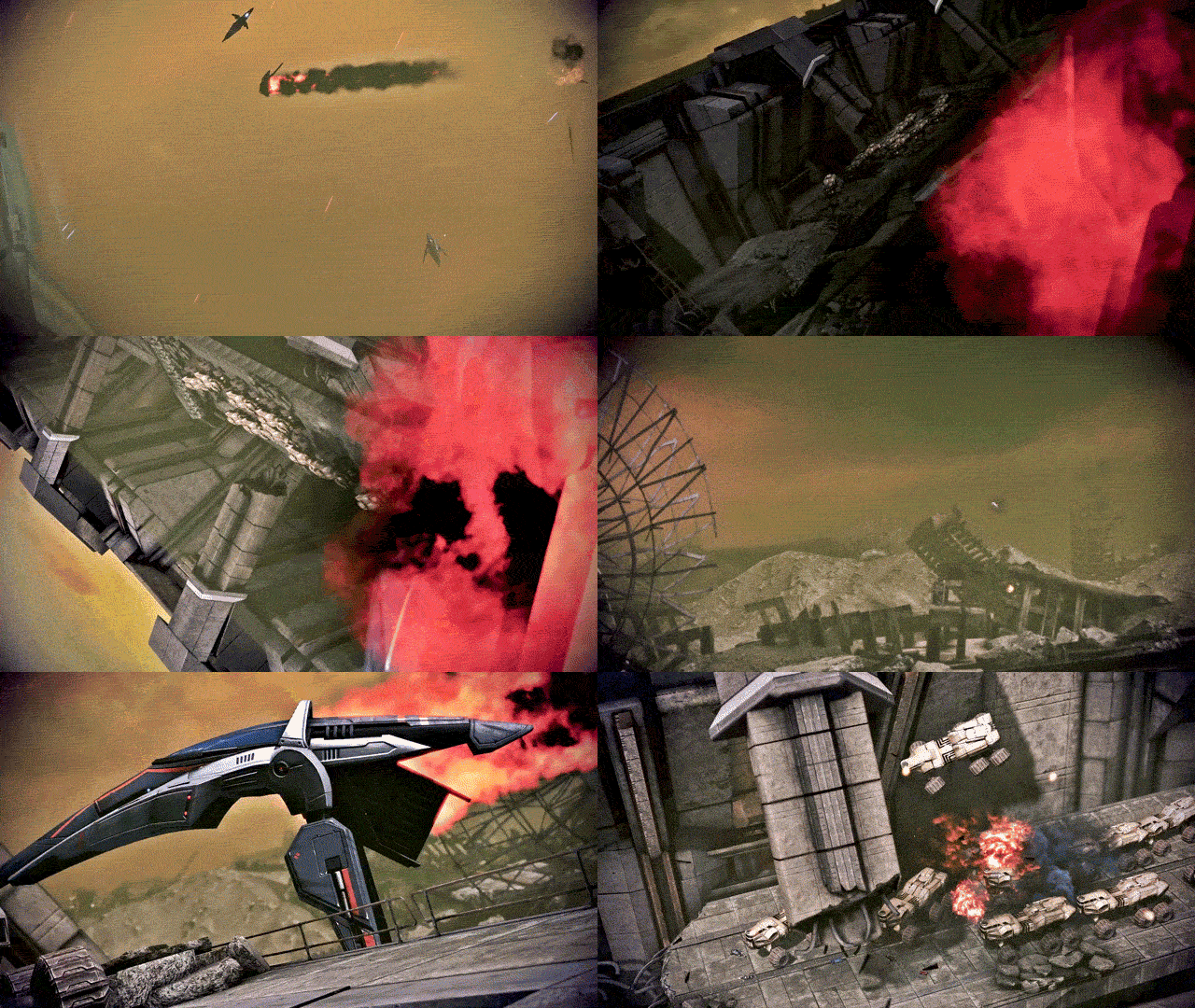
THE BEST OF PRIORITY: TUCHANKA (PART 1)
Featuring: Cmdr. Sophie Shepard, Urdnot Wrex, and Urdnot Bakara With: Dr. Mordin Solus, Primarch Adrien Victus, Dalatrass Linron, Urdnot Wreav, and Comm. Specialist Samantha Traynor This will be the defining moment of Krogan history... Mass Effect 3: Legendary Edition (2021)
#mira makes gifs ✨#sophie shepard#urdnot wrex#mordin solus#mass effect#mass effect 3#me3#mass effect legendary edition#dailygaming#tuchanka is here baby!! she’s another two parter bc she was a chonky one for good cutscenes#i was gonna enjoy some ME3 last night bc i have to redo the coup for reasons™️ but scottina released reegar returns#AND THATS MY FAVORITE QUARIAN ON THE CITADEL (plus everything scott makes is stonks!!)#so we restored the ME3 install and divvied up the tuchanka footage into gifs instead while textures reinstalled lmao#but onto the gifset commentary as per my usual tag ranting: i adore tuchanka!! it’s one of my favorites for priority missions!!#wrex and bakara have some absolutely FLAME dialogue throughout the mission (especially bakara’s speech)#i usually pick a quote i like from the mission to subquote the post with and i wanted to use bakara’s but i decided it made a better gif!#also wrex head butting wreav is hot as fuck thanks for that one wrex you kinda ate on that#the first set is kinda boring compared to the second set but i love that the dalatrass comes in#and tries to make a shady little underhanded deal with shep!!! like that’s one of the more interesting ME3 plot points imo#i myself would never side with her bc i love wrex too much and disagree with genophage politics too much#but for her to come in with a shady little deal and be like ‘you should sabotage the cure and we’ll help you instead’?#i gotta respect her shady motives even if i hate her tbh lol#i will say i wish companions had a bit more dialogue in the cutscenes in the front end (and the back end too)#priority tuchanka feels a little? light? on the commentary from EDI and james#they both deserved so much more dialogue during the mission bc this is SUCH A BIG ONE??? this is such a huge deal???#i wish they had more to say here!!! bc i feel like they would both have so many thoughts on everything going on!!! ESPECIALLY kalros??#and wreav?? the city of the ancients?? like there's so many concepts that get the BAREST of touches and i wish they were touched on more!!#bc the city of the ancients is the best part of the mission imo.. like it's gorgeous and i wish we saw just a touch more of it!!#like c'mon i KNOW the companions would have SOOOO much to say in the bigger conversations!!!
10 notes
·
View notes
Text
Just came across a newsletter thing for another fandom I am absolutely not a part of but I must say that I'm envious. Organised links to various fandom contributions in the form of short fic, long fic, images/videos/audio AND fandom discussions -- and there's a big handful of each and it's updated regularly and it's all recent stuff that covers different aspects of their fannish experience in different platforms.
Why can't we have that
#absolutely not tagging this today. also it is an unfair comparison since it's a much older show with a much larger fanbase#but still a girl can sit and brood and seethe with envy LOL#anyway. would be cool to have a hub of the sort.#and i shouldn't be here but listen i've rewritten the first page of the next fic so many times already that i've lost count#i needed to come here and do nothing for a second okay#silly blabbering#i do have some stuff to post but i'm saving it for now. might just do what i do with my drabbles and choose a day in the week for them#one essay is ready; i need to proofread and correct it. there's a silly picspam to post and another i'm building up with inane commentary#there's one more complete gifset. two drabbles in the queue for this week and the next.#hey not too bad for someone who hasn't been sleeping is it?
3 notes
·
View notes
Text
sometimes i forget that i have to physically look at my tag
#ive been on this website since 2011 dont look at me#the funniest thing is if you go on my archive#ingoring posts ive straight up privated or deleted bc i was younger and they embarassed me#i dont think ive ever actually not been on this website for more than a few weeks#like i had long LONG breaks from my lersonal where every six months id fill the q#post an odd gifset and abscond away somewhere#but if im not here im on an rp#and if im not on an rp im logged in here#and thats just been my cycle since 2013 or so#bc the first two years i would be on all ac#cts simutaneously and uhhhh thats how i deleted my original personal sO#if i didnt delete a lot pf#those rps to delete the memories which didnt eve. work#imagine how many years of complete tabble i’d have rn#i actually saw a word count page i had made in like 2016 on here snd#i at one point wrote upwards of 50000 words a month just in rp replies#and now even just getting a thread started is so hard bc i plot w ppl post a thing and nothing happens lmao#and i dont blame anyone for that we all adults now n it hard but its also kind of sad yknow#i dedicated so much time to writing bc it brings me joy but like i havent gotten anywhere w it#and unfortunately i live in america so if i cant make my hobbies earn me money then#/shrug shrug#i also feel horrible anytime i ask for money tgo for anything so like lol#growing up a people pleaser what uppppp#jts almost 430 am no i have. not slept
0 notes
Text
Propaganda
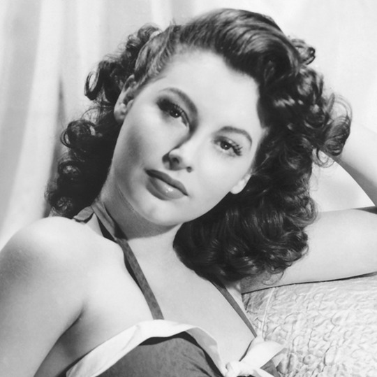
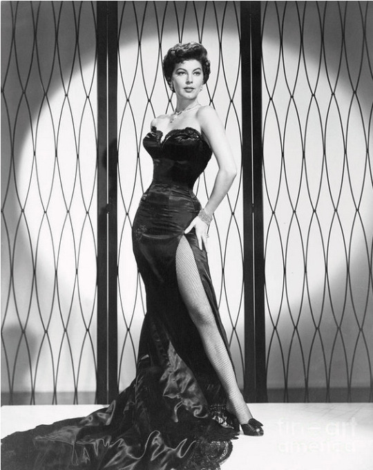
Ava Gardner (The Killers, The Barefoot Contessa)— She's so goddamn hot. Her and Frank Sinatra could've sandwiched me and I would've thanked them for the privilege
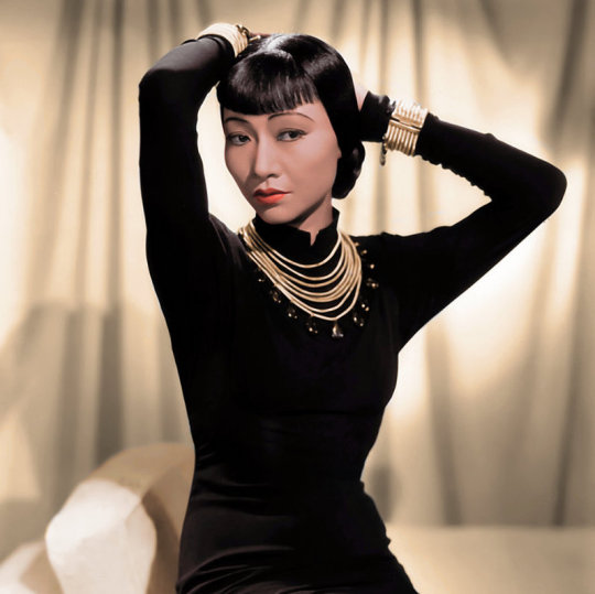
Anna May Wong (The Thief of Bagdad, Shanghai Express)—Wong was the first Chinese American movie star, arguably the first Asian woman to make it big in American films. Though the racism of the time often forced her into stereotypical roles, awarded Asian leading roles to white actors in yellowface, and prohibited on-screen romance between actors of different races, she delivered powerful and memorable performances. When Hollywood bigotry got to be too much, she made movies in Europe. Wong was intellectually curious, a fashion icon, and a strong advocate for authentic Asian representation in cinema. And, notably for the purposes of this tournament, absolutely gorgeous.
This is round 5 of the tournament. All other polls in this bracket can be found here. Please reblog with further support of your beloved hot sexy vintage woman.
[additional propaganda submitted under the cut.]
Ava Gardner:
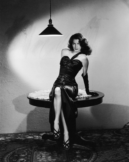
Ava Gardner is one of my favorite actresses of all time. Although a lot of her roles in movies are about her being beautiful and nothing else, there are some films where her acting truly shines.
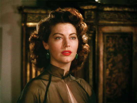
Gifset: https://www.tumblr.com/pelopides/721438308726603776/ava-gardner-as-pandora-reynolds-pandora-and-the
Gifset 2: https://www.tumblr.com/portraitoflestatonfire/731899355804598272/if-the-loustat-reunion-doesnt-look-like-this-then
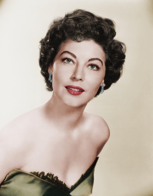
HER FACE. LOOK AT IT. Also was a life long supporter of civil rights and a member of the NAACP, had lots of fun love affairs with other stars, bullfighters, married several times but was also happy in between to just have lovers and was unapologetically herself.
I literally gasp every time I see her.
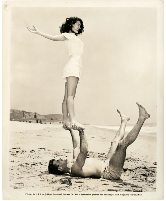
Between 1942 and 1964, Ava Gardner was credited in no less 50 films, and is still considered by some to be the most beautiful actresses that ever graced the silver screen. Despite life-long insecurities regarding her talent as an actress, she weathered public scandal, industry hostility, and outright condemnation by the Catholic Church with fearless grace. She would later in life talk candidly about the reality and pain of living through two (studio approved!!) abortions during her short marriage to Frank Sinatra, and while the two of them could not make their relationship work, they remained in each other’s lives for nearly 30 years. She would forever describe herself as a small-town girl who just got lucky, but always felt like a beautiful outsider.
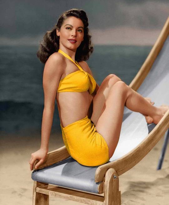
Really genuinely one of the most beautiful human beings I have ever seen. An autodidact. Had amazing chemistry with Gregory Peck to the point where I do think about watching On The Beach again sometimes because they're so good together even though that movie did destroy me. Was a great femme fatale in many movies.
Anna May Wong propaganda:
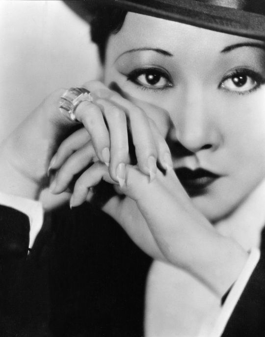
"She so so gorgeous!! Due to Hollywood racism she was pretty limited in the roles she got to play but even despite that she’s so captivating and deserves to be known as a leading lady in her own right!! When she’s on screen in Shanghai Express I can’t look away, which is saying something because Marlene Dietrich is also in that film."
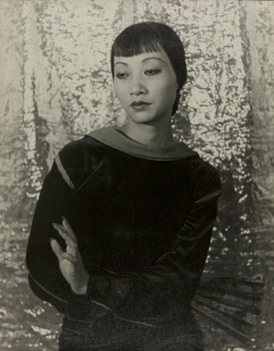
"SHE IS ON THE BACK OF QUARTERS also she was very smart and able to speak multiple languages and is a fashion icon on top of the acting/singing"
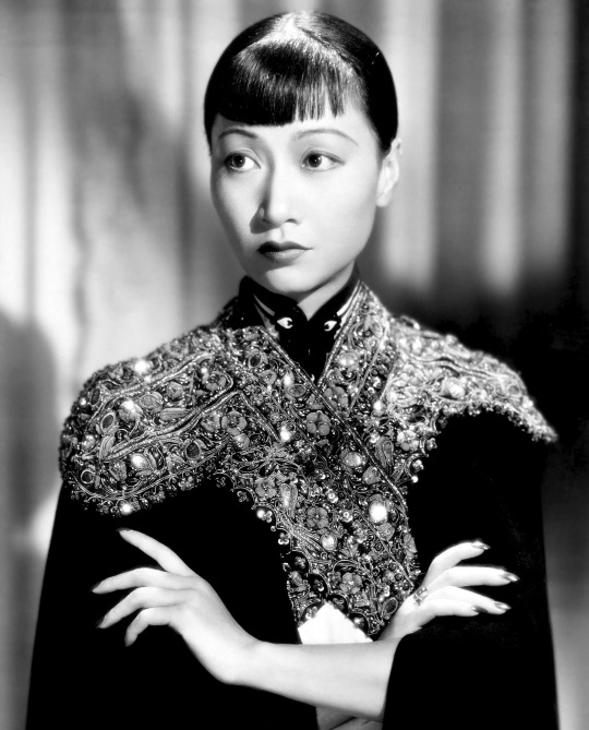
"Paved the way for Asian American actresses AND TOTAL HOTTIE!!! She broke boundaries and made it her mission to smash stereotypes of Asian women in western film (at the time, they were either protrayed them as delicate and demure or scheming and evil). In 1951, she made history with her television show The Gallery of Madame Liu-Tsong, the first-ever U.S. television show starring an Asian-American series lead (paraphrased from Wikipedia). Also, never married and rumor has it that she had an affair with Marlene Dietrich. We love a Controversial Queen!"
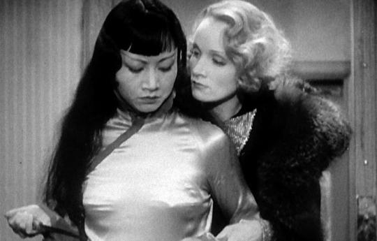
"She's got that Silent Era smoulder™ that I think transcends the very stereotypical roles in which she was typically cast. Also looks very hot smouldering opposite Marlene Dietrich in "Shanghai Express"; there's kiss energy there."
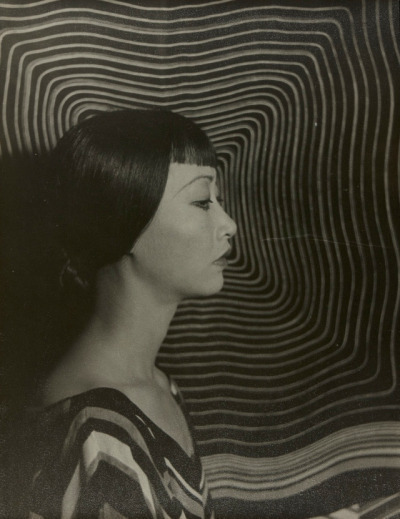
"Hot as hell and chronically overlooked in her time, she's truly phenomenal and absolutely stunning"
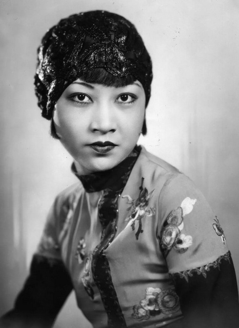
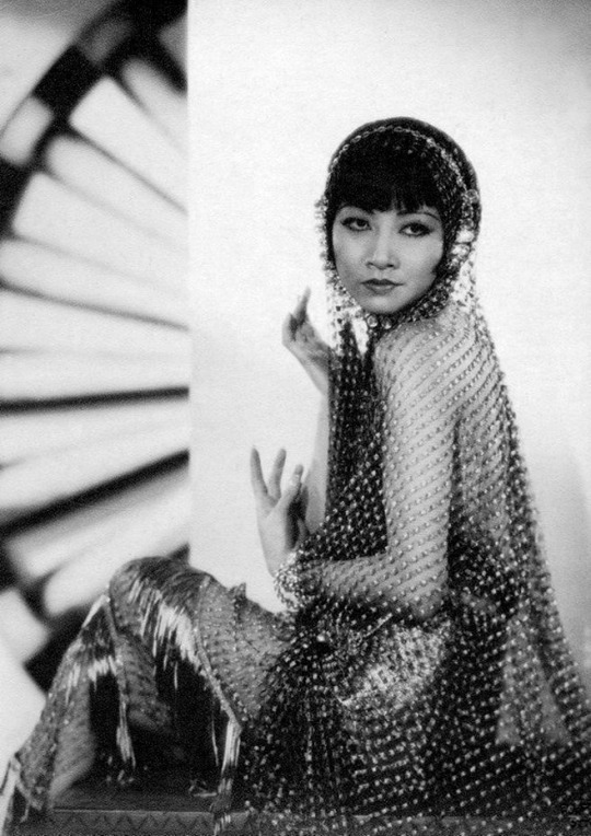
"A story of stardom unavoidably marred by Hollywood racism; Wong's early-career hype was significantly derailed by the higher-up's reluctance to have an Asian lead, and things only got worse when the Hayes code came down and she suddenly *couldn't* be shown kissing a white man--even if that white man was in yellowface. After being shoved into the Dragon Lady role one too many times, she took her career to other continents for many years. Still, she came back to America eventually, being more selective in her roles, speaking out against Asian stereotypes, and in the midst of all of this finding the time to be awarded both the title of "World's Best Dressed Woman" by Mayfair Mannequin Society of New York and an honorary doctorate by Peking University."
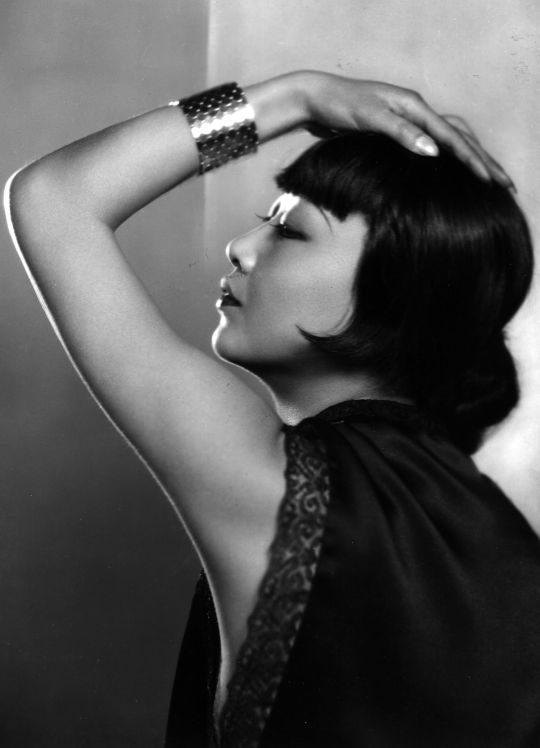
"Incredible beauty, incredible actress, incredible story."
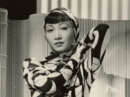
"-flapper fashion ICON. look up her fits please <3 -rumors of lesbianism due to her Close Friendships with marlene dietrich & cecil cunningham, among others -leveraged her star power to criticize the racist depictions of Chinese and Asian characters in Hollywood, as well as raise money and popular support for China & Chinese refugees in the 1930s and 40s. -face card REFUSED to decline"
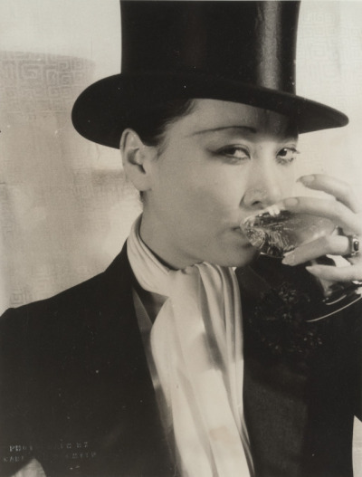
1K notes
·
View notes
Text

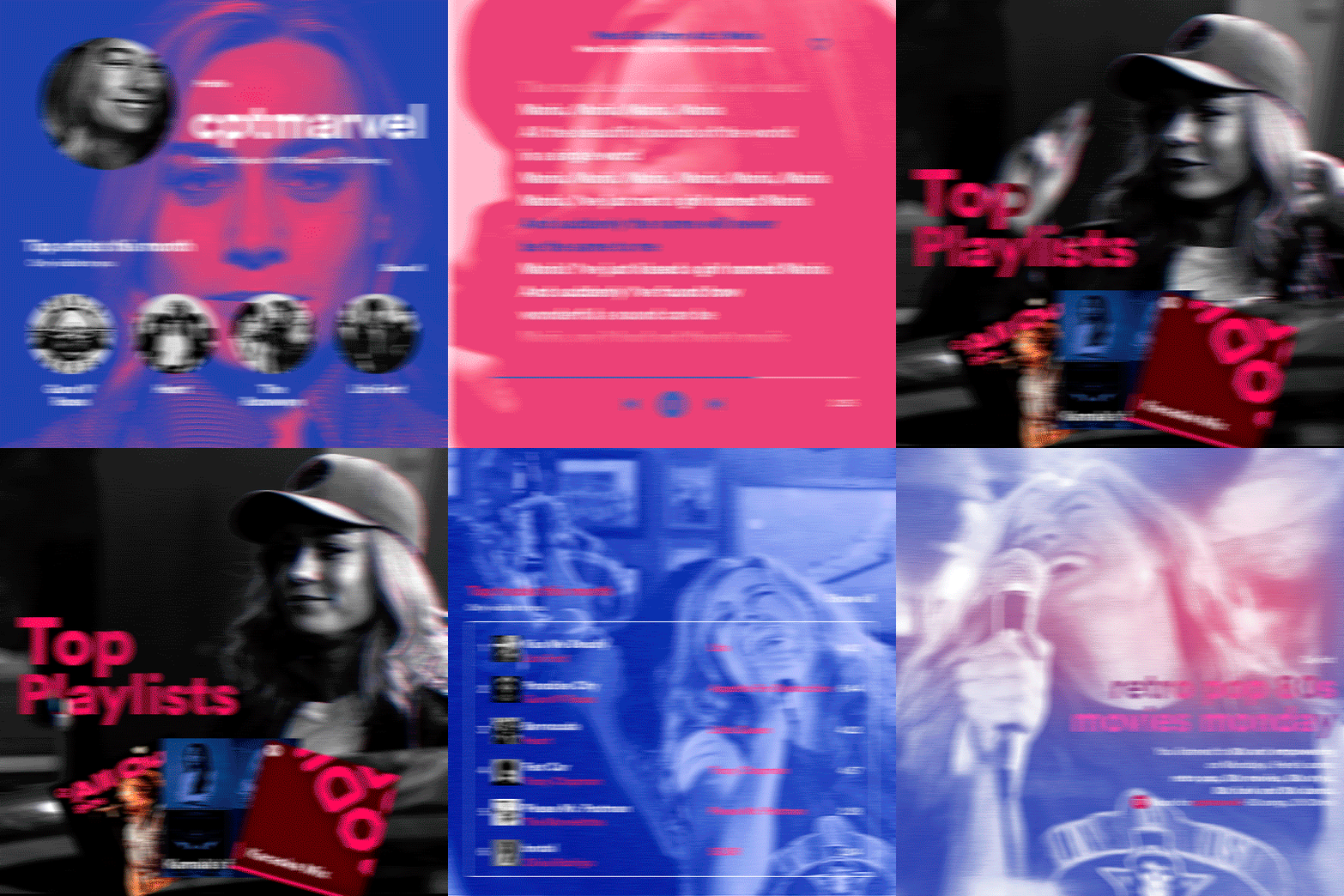
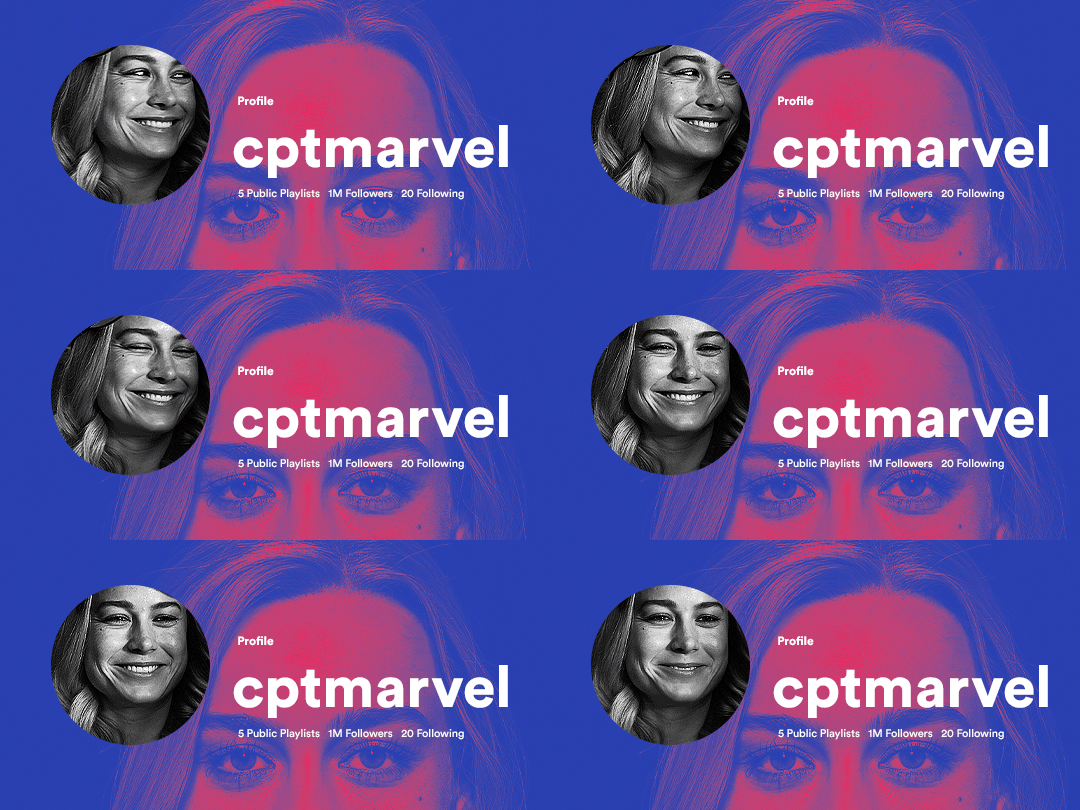
hi! someone requested me to do a tutorial based on this gifset!
this tutorial requires an intermediate knowledge of gifmaking. i won’t teach you how to do gifs from scratch, there are other tutorials for that out there.
[tutorial under the cut]
THE BASICS
AN INTRODUCTION
first off, the gifset in question is based on this gifset by @/eddiediaaz and i got permission from them to explain the process. i won’t be sharing the template because it’s a near replica of theirs (that isn’t shared to the public) and i don’t feel comfortable doing so, but you can recreate it by yourself just like i did!
also, ESL, so please pardon any mistakes.
THE FONT
Circular ST (Medium & Black). download it here & here.
CLIPPING MASKS
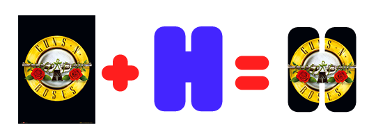
clipping masks are the way i put images and gifs inside of shapes. i used that method in the first and second gif of the Spotify gifset as you can see here. what does a clipping mask do? basically, it links two or more layers together in a way it follows the “shape” of your base layer. ie, everything that is shown follows the “shape” of your main layer and nothing more. your base layer can be anything: a shape, an image, a gif, a text, an adjustment layer, really everything. let’s see an example:
CLIPPING MASKS & SHAPES

the original image (Gun 'n' Roses logo) is intact, as in, it’s not cut like a circle, something that cannot be undone. instead, everything outside the limits of the blue circle is just hidden. if i delete the base layer (the circle layer), the original image will appear as it originally is, as an rectangle. talking about layers, let’s see my layers panel (some things are in Portuguese, but i think you can understand):
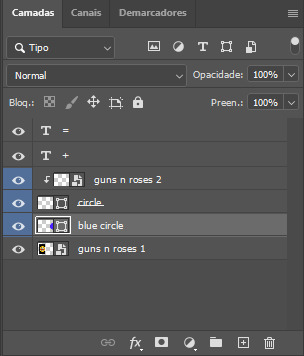
notice the little arrow pointing downwards to the “circle” layer. that is the clipping mask symbol. the base layer always needs to be below what is being clipped. if the base layer is deleted, the chain is broken and every layer clipped will now act independently and have its original shape. you can have as many clipped layers as you want. you can also have multiple chains going on in a .psd, each one with its own base layer. to clip a layer, you just need to press ctrl+alt+G or cmd+option+G while having the layer you want to clip selected (NOT your base layer). or, you can go to LAYER > CREATE CLIPPING MASK.
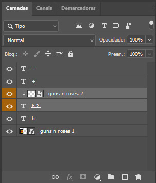
CLIPPING MASKS & TEXT
let’s see the same example, but with text instead:
A TIP
because adjustment layers are clippable, you can completely gif by using clipping masks. this is very useful when you have more than one gif inside a canvas and don’t want an adjustment layer to affect everything besides a certain layer/element.
let’s take my first gif of the Spotify gifset as an example.
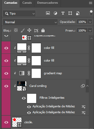
the circle is the base layer. the “Carol smiling” layer is my gif converted to a smart filter. above that “Carol smiling” layer, there is a black and white gradient map and two color fills of white so i can achieve the coloring you see. all those layers are clipping onto the circle layer, making my now b&w gif have the shape of a small circle as well. those layers are in a folder in the .psd of my first gif, so i don’t have multiple files sitting on my PC to assemble just one gif. i could have giffed that small gif separately and pasted it onto my canvas as well, but i like to do this way so i can adjust everything i want in real time instead of redoing a gif over and over every time i want to change something.
HOW TO MAKE EACH GIF
all gifs are 540x540px.
THE FIRST GIF
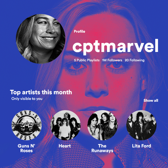
the first gif has 6 elements. the elements are: a big gif serving as a background (a close-up of Carol), a smaller gif inside a circle (a b&w gif of Carol smiling) as a profile picture and four static images for the featured artists. i giffed as i normally do (loaded screencaps, resized the gif, sharpened the gif, etc) for my background gif. to achieve the coloring, i’ve added a gradient map (layer > new adjustment layer > gradient map) purple to pink. to the profile picture, i made a 160x160px circle in the top left corner. the color of it doesn’t matter. the next step is a matter of taste: i giffed the smaller gif in the same .psd thanks to clipping masks that i explained earlier, but you can do it in a separate canvas too. for the featured artists, i made four circles with 98x98px each. for the images, i had to check Spotify for their selected PFPs. after that, i googled “[band/artist] spotify” to find the images. the PFP of bands and artists in the Spotify app are displayed in black and white, so you might have to make them b&w if you happen to find them only in color. to make the artists PFPs pop a bit more, i transformed them into smart filters and added a bit of sharpening to them (intensity 10 x radius 10). you can adjust the colors and the brightness if you want, too. the sizes of the texts in the gif are: 58px (username), 20px (top artists of the month), 15px (name of the artists), 12px (only visible to you + show all + profile) and 11px (following and follower numbers).
SECOND GIF
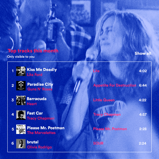
for the chart, i created a black rectangle (490x308px) that i set its blending mode to lighten (thus making it transparent) and i added an internal white stroke. i added the text and the little squares next to the top 6 numbers. the font sizes are: 17px (top tracks this month), 11px (only visible to you), 14px (song title, show all, top 6 numbers), 13px (artist/band, album title, length of the song). i added the album covers — that i made b&w — by clipping images onto 32x32px squares. for the coloring, i added a gradient map (dark purple > light purple).
THIRD GIF

there are three types of playlists in this gif: a Spotify original playlist, a playlist made by a user and a Mix. you don’t have to follow this formula if you don’t want to, but in the case you do, here’s how i did it: browse Spotify for an original playlist of theirs. chances are, if you google the playlist’s name, you can find its cover on Google Images. at least, i found the “All Out 80s” cover that i used in my gifset. you can also create your own. for the user playlist, just pick four songs and find their (album) covers, also on Google. create a square canvas on Photoshop and make four squares, each in one quadrant of the canvas. paste your images onto your canvas and clip the images to each square. then, add a gradient map (black + whatever color you want) to all those images and title your playlist (font size: ). save that collage as a PNG and load to your gif canvas or merge all the layers+transform into a smart filter and drag the smart filter layer onto your gif canvas. now, the trickiest one. while you can invent your own Mix, i wanted to use a real one, but i had no idea on how to find them. thanks to reddit, i discovered that, if you search “made for you” on Spotify, you will find their Mixes! some of them are very whacky and specific! i just picked the Mix that made the most sense for Carol from that (gigantic) list. before doing the next step, i would advise you to google the name of the Mix you picked to see if you are able to find the cover of it with good quality. i wasn’t able to find mine (Karaoke Mix), so i just screenshotted my Spotify app, pasted that screenshot into Photoshop and cut the Mix cover and pasted that onto my canvas. the quality wasn’t great, so i transformed the cover into a smart filter, added a bit of gaussian blur and then sharpened it (intensity 10 x radius 10). the color wasn’t what i wanted either, so i used Hue/Saturation to change the hue. because the original image for the Mix was smaller than i wanted and i stretched it to make it bigger, the quality of the text and the Spotify logo was botched. i painted over the Mix cover and created a text with the font i linked earlier to replace its now pixelated title. i also painted over the little Spotify logo, found a logo in the internet and pasted over the Mix cover about the same size of the original logo. to achieve the “3D effect” of the gif, i made my b&w gif, the base. then, i duplicated all layers and added a gradient map (black > pink) and merged all the layers of that duplicate. i made a second replica of my gif, now with a different gradient map (black > blue). i set both replicas to the ligthen blending mode. you will notice that the replicas will "disappear" and only the original b&w gif will remain. if you move the replicas a bit, that colored border will appear. this doesn't work much in very bright gifs without a lot of dark areas, btw.
FOURTH GIF
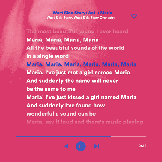
this gif used an altered (by me) version of this template. (i changed the fonts to match the rest of the gifset, too.) for the color text effect, you will have to gif with the timeline bar. take your gif’s length and do the math to find how many frames are ⅓ of it. take your lyrics’ layer and cut it into three equal parts or close to it by using the scissors icon in the timeline panel. in each third, change the color of just one line, line by line. when you play your gif, the colors of the lyrics will change like in Karaoke. you can do the same thing with frames iirc, though. i explained the timeline method because that’s the one i used in this gifset and use in general gif making. for the coloring, i added a gradient map. to make the colors pop a bit more, i add two gradient maps: the first one is in black and white, the other is in color. that adds depth to the blacks and darker colors of the gif.
FIFTH GIF
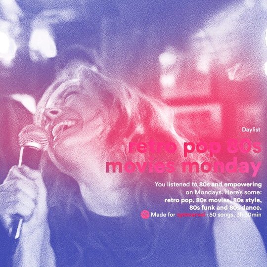
like in the Top Playlists gif, i wanted for my Daylist to be real as well. to achieve that, i listened to my Carol Danvers companion playlist (that you can listen here) for a long time until my Daylist refreshed itself. (Daylists refresh in certain times of the day — don't worry, Spotify will tell you when.) then, i just copied what it told me — the title and the genres i listened to generate such a Daylist, plus the genres i should check it out. you can invent your own Daylist if you want, but because it is generated by AI, i find very difficult to mimic its crazy titles, but you can try! you can also search in the web for other people’s Daylists if you want, but usually people don’t tell you what they listened to to get those playlists and nor what was recommended for them to listen to and i, at least, find that information important for the gifset. be aware that Daylists aren't available for every country yet (like in mine), but i found a way to work around that. the browser Opera GX offers a free "VPN" — not exactly a VPN, but it works close enough — so you can set your location to the US and listen to in-browser Spotify. i recommend not log into Tumblr while using Opera's VPN as there is a myth (that could easily be true!) that Tumblr terminates people's accounts that use a VPN. font sizes: 43px (daylist title), 13px (text), 12px ("daylist" & "made for"). for the flare effect, i searched for flare overlays on YouTube and downloaded one of those videos with 4K Video Downloader, a free software. i loaded the overlay into Photoshop and added a gradient map (purple > pink) over it, thus changing its color. i pasted the overlay onto my b&w gif and set its blending mode to screen. voila!
that's it! i hope you liked it and that i was able to express myself well. if you have any questions, feel free to contact me, i love helping people about their gifmaking questions! 💖
#*#*tutorials#gifmaker tag#dailyresources#usergif#completeresources#alielook#userairi#userhallie#userbess#userrobin#usershreyu#userzaynab#tuserju#tusermalina#tuserheidi#usertina#userabs#userbuckleys#usermagic#userjoeys#antlerqueen#userarrow#flashing gif tw
398 notes
·
View notes
Text
so i've been seeing this occasionally in the tags lately and i thought i'd bring up:
if you want someone to click or reblog your fic link you cannot simply post a link to the fic with either no description or a single sentence of description. if you do not put something beyond a link and a sentence, no one is going to click it.
part of this is basic internet safety (don't click links if you don't know where they're supposed to go), but a large part of this is that you have to catch someone's attention to make them click and leave the page they're on! people, in general, aren't going to click a link that doesn't interest them. you should interest them! so, how do you do that?
put some kind of image above your link in your post. this is BY FAR the most certain way to get reblogs and catch people's eye, but it's also the most time-consuming if you aren't already good at edits or art yourself. moodboards, little edited headers, or gifs can help you here (depending on fandom). art you've made yourself or have permission to use is absolutely the best option here, but it's by far the most time-intensive and difficult. full disclosure: i don't do this! that's because i am absolutely pants as a visual artist, even in the realm of editing or selecting gifsets. but if you have this skill and are sad your fics aren't getting attention on tumblr, this could be a potential answer!
write a summary and some kind of note with the link. there's a slightly cluttered cheat way to do this later in the list, but personally i find that formatting your fic post yourself is the best way to make these posts look good. i normally go fic link (making sure the link embed has the title) - summary of fic beneath that in a blockquote - an author's note about what to expect beneath that summary. however, everyone has different standards for how to do this! some people i know like to make sure tags and rating are present; some do not. some put some of this information beneath a cut; some do not. the main key here is to make sure there's just enough information above the cut in the main post that if i, a stranger, am browsing the tag and find your fic, i have enough information to know if it's something i might be interested in! i can always click to see the ao3 tags if i am intrigued, so it doesn't need to be all the information. just enough to catch my eye!
just post the whole fic to tumblr, including a link at the top or bottom. this is the most efficient non-art way to get notes on a fic you post, since, unlike a link with a description, a tumblr user doesn't have to leave the website to read and decide if they're interested or like it enough to reblog. however, there are two downsides. the first is that the fic almost always has to be short (~2k words if you use a cut, less if you don't), since most tumblr users aren't using the website expecting to read a bunch. the second is that doing this will mean most of your fic's readers likely will read it from tumblr, rather than following the fic to ao3. which, you may not care! i certainly don't when it comes to the ficlets i write directly to tumblr. however, it means i really don't recommend doing this with a multichapter fic.
use ao3's share button to automatically make a tumblr post. fics on ao3 have a "share" button, located above the tags and summary. this has a tumblr option, which you can then use to automatically post the fic link to tumblr. this is a bit cluttered since it includes all of the tags from the fic, alongside the full summary, rating, wordcount, etc. personally, i would then edit a little to remove some of that information so that it's more eyecatching and less overwhelming, but if you don't want to, that's also fine! that is still almost always going to be better than posting the link by itself with a single sentence to describe it, and isn't half-bad formatting-wise.
finally, you'll note my posts for ongoing chapters aren't normally given this treatment or fandom tags (although i almost always include a summary of some kind on them). this is because i generally don't want people finding my fic for the first time from a random chapter in the middle. i don't mind if they do, but i'm not going to spam the tag and i'm not going to make THAT much of an effort to make the post appealing. new chapters are things that might tell one of my followers that there's an ongoing fic they should look out for, and tell my current readers and followers that there's, well, a new chapter, but generally they aren't going to hook people. however, if you post chapters a lot more infrequently than i do, or if you simply have the energy to, there's nothing stopping you from applying these to chapter posts as well!
the thing is: look, at the end of the day, i agree with people who say you should write for yourself. how many notes you get isn't a big deal, i promise; the most important feeling is, ultimately, the feeling you get when you finish something and know you made it with your own hands. some of my favorite writing achievements are NOT my most popular, but are my favorites for reasons entirely unrelated to popularity. however, i see a lot of writers bemoaning how badly their fic posts do, when their fic posts are the ao3 embed and a single sentence that reads "this is my new fic enjoy"; the thing is, there are things you can do to make that link into something that someone is more likely to read and/or reblog! (i know i personally don't like reblogging links if i don't know their contents for the aforementioned internet safety reasons.)
just because you write for yourself doesn't mean that you can't give yourself a little leg up in finding your audience. it's worth it both for yourself and your readers, i promise.
#i always feel Weird making posts like this because i feel like they're like. influencer-y#but i do think that 'catching people's attention' IS part of writing fic! so here's a little guide on to how to post fics#hopefully this helps someone out there!#writing
207 notes
·
View notes
Note
hi sole! your sharpening is always so soft and pretty, i was wondering if you would be open to share it? hope you are having a wonderful november so far <3
Hi, Anon! Thank you so much <3 Yeah, sure, tutorial under the cut:
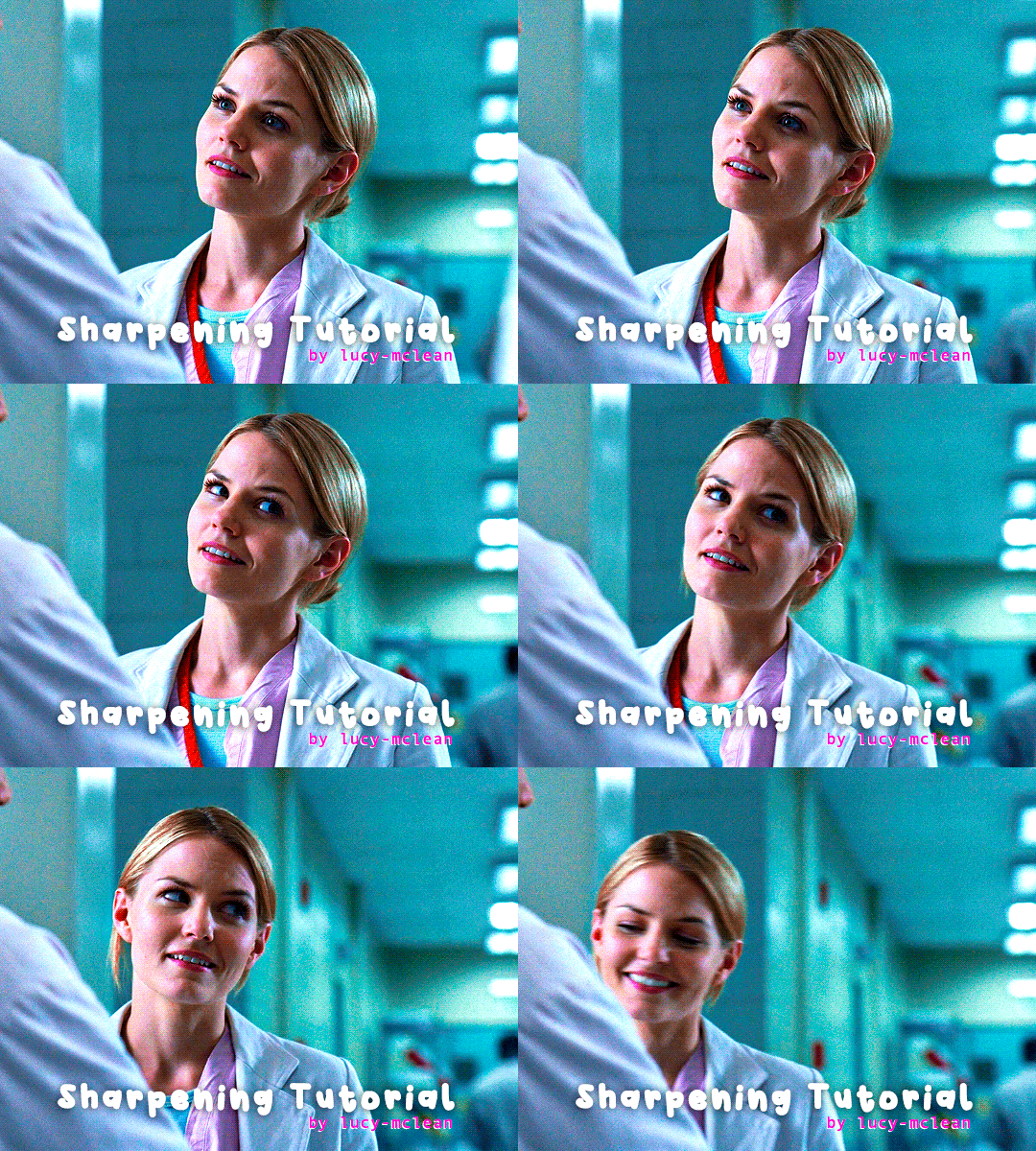
What you'll need:
Photoshop (I use Photoshop 2023)
Basic knowledge on how to make gifs
Camera Raw filter installed
Okay so, first of all, I use two different methods depending on the size of the gif. Let's start with the one I use for most of my gifsets which are big gifs (examples: x x x x.)
METHOD #1: Smart Sharpen + Camera Raw
I started using the Camera Raw filter last year and let me tell you, I'm obsessed! It completely changes the game of sharpening. I use this method for all gifs with a 540px width.
We're going to work on timeline so get your gif ready and convert it for smart filters. I'm using this scene from my last set as a base:

Here's the gif after I color it (I usually sharpen my gifs before I color them but for the sake of the tutorial I'm showing you this so you guys can see the difference):

(1) Smart Sharpen Layer: Let's start by adding a Smart Sharpen layer (Filter > Sharpen > Smart Sharpen) with these settings:
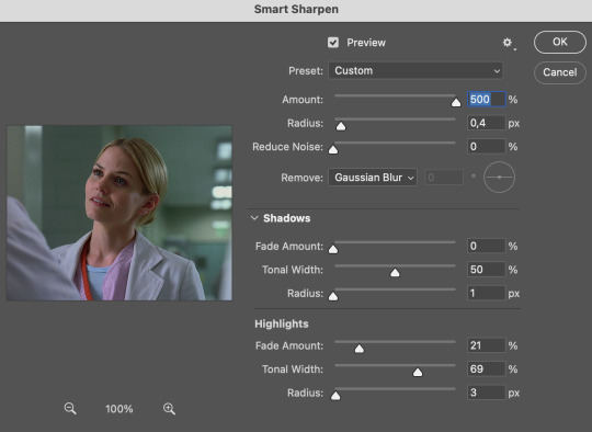
Disclaimer: I didn't come up with these settings myself I got them from these sharpening actions forever ago so I don't know which one it is :/. I also wasn't able to find that person's new blog (if they even have one since they've been inactive since 2021) so if anyone knows please let me know and I'll give them proper credit!
Now we're going to go to the 'Layers' panel and click on this little thingy:

This window will pop up and we are going to change the Opacity to 50%.
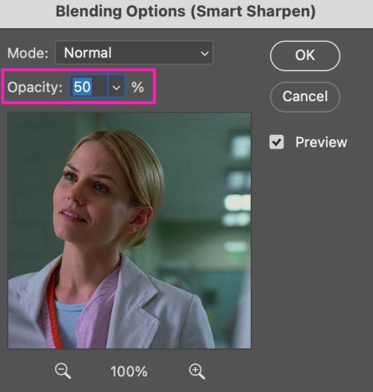
(2) Camera Raw Filter: Here's where the fun begins. Go to Filter and click on Camera Raw Filter (you'll need to have the plugin installed for it to show up.) I don't know how the Camera Raw window will look like the first time you open it but good thing you only need to change a couple of things!
If it isn't opened yet click on 'Effects' and we're going to change the Texture and Clarity:
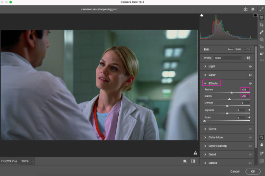
Depending on the scene/show/film I'm giffing, or if I want a stronger or softer sharpening, I'll use two different settings, but 99% of the time they are these:
First setting: Texture (+20) Clarity (+10)
Second setting: Texture (+40) Clarity (+20)


As you can see the difference isn't huge but the first setting gives a "softer" look. As I said I'll use one or the other depending on how I see the scene (it's almost always about the vibes yk.)
Feel free to experiment with these two and see what works best for you (although I wouldn't go higher than 40 on texture because the sharpening will look too fake imo.)
Also this filter is soooo good at making low quality videos look 1080p! Every time I've had to use 720p videos the Camera Raw filter has saved me 🫡
METHOD #2: Smart Sharpen
I use this method for smaller gifs. For example, 8 gifs of 268px x 180px sets (like these) or small-ish gifs in complex sets (like the second gifs in this set.)
This process is much simpler since it's the one I explained before but without adding the Camera Raw filter. That's it that's the method. Just a Smart Sharpen layer with the Opacity turned down to 50%.
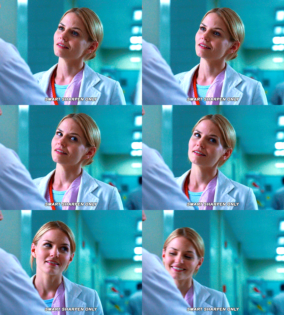
As I said this method looks best on smaller gifs but to be honest it looks good on big gifs too? Depends on what you like most!
Anyway I hope this was easy to follow and if anyone has any questions please feel free to dm me or send an ask! ♡
#ask#Anon#ps tag#useraljoscha#usermelone#userchibi#usermagic#uservivaldi#userlorna#tuserhol#usercats#userlix#usersavana
192 notes
·
View notes
Text

I got a couple of asks on how I did the text transition in this set. I'm going to explain as best as I can (with image references).
*Disclaimer: this assumes you have a basic understanding of giffing with video timeline, and keyframes. If you're new to keyframes, check out this tutorial by @userpeggycarter before proceeding.
Step 1: Go through, make your gif, color and all that jazz. if you're not familiar with giffing and need a guide, check this one out by @cal-kestis. Be mindful of the number of frames you have, as it is extremely important when keyframing begins. Make sure you have an even number of frames, or you will have an uneven transition. For this gif I'm at 60 frames total, and I'd be careful exceeding 70, as if you need to go back and delete... It just sucks, so be mindful! You'll see my gif and coloring under a group I titled "base" - and I highly recommend putting your gif/coloring/etc. into groups, as it will make the timeline a bit cleaner, and it's a little easier to find everything you need. But when you're done, you should be here:

*Quick note 1: Make sure your gif is in 8-bit mode. If you aren't familiar with bit modes, that is a tutorial for another time. For now, you can change it here:

Step 2.1: Pick your font/placement/etc. I really recommend being 100% on whatever you pick, along with the size. I've encountered problems when I move the font after the fact with alignment, so it's best to look your gif over to ensure you're satisfied. For this set, I went with Figtree, placed dead center.
I want to add to this by saying, thus far, I have found that white is the only color that works for this. I'm playing around with some other options, but black is 100% a no go. If you find a way to get that working, let me know. I'll amend this tutorial.
Photo of text settings, along with where you should be now.

Step 2.2: Since we're transitioning into a new set of words/text, you need to get that text ready as well. Shorten the length of time the first piece of text runs to halfway (I have 60 frames, so I cut it to 30).

Step 2.3: Duplicate your text layer, type your other text. The two texts should show for length of time, as you have an even number of frames, meaning you can divide by 2. Move it over to the end of where the previous text ends. If that makes no sense, it should look like the below: (again, folder for the typography to know where to reference. I have a small organization addiction so.. creator's choice)

*Quick note 2: I do not recommend changing to a new font or size with this, it won't look quite right. Of course, experiment away! This is just a small caution based on my own experimentation.
Now, to get to the actual fun part...
Step 3.1: Duplicate the first text layer. For this gif, it's the one that says "it didn't change anything". Once you duplicate it, you'll be turning it into a smart object. This is so the filter we apply works. Repeat for the second text layer. Lil gif below:

Quick note 3: I recommend going one text bit at a time, and also would tell you to put each typography layer into its own folder. This is really important for later, so doing it earlier is better.
Step 3.2: We will now apply the filter. To do this, you're going to click the smart object version of our text, then go to Filter → Stylize → Wind. For the gifset I made, I used Method → Blast and Direction → From the Right. Click "OK" and the filter will apply. Duplicate this for the other text layer.

Step 4: We now begin the keyframing. I highly recommend the rule of 0.3, which is when your transitions are over the span of multiples of 3 (i.e. if you start at frame 1 with 100% opacity, frame 3 will be at 0%). We'll be doing 6 frames from 100% to 0%, and vice versa, for this transition. This was the best time I found for this transition, but it's a matter of preference. Just follow that rule of 3.
Step 4.1: Click the smart layer of the text we made on the timeline, then click the little arrow on the left of the name of the layer. You'll see this:

See the little clock next to Opacity? Click it, and you get this lovely little yellow diamond. This is how we control the visibility of the Wind layer. It will start at 100%, keep it there.

Click the arrow on the right of the play button 6 times (aka get to the 6th frame), click the stopwatch again. While on this frame, and the yellow diamond clicked, change the opacity of the Wind layer to 0% It'll look like this:


You will repeat this, in reverse, at the end of the text layer.
Quick note 4: Sometimes, Photoshop is moody. To get the diamond on frame 30 (or whatever frame # the end of your text layer is), put it on the frame prior. You can then nudge that diamond over 1 frame. See below:


Repeat the process for the other text layer.
Step 5: We're basically done! Change your gif from video timeline to frames, maybe do a quick play through to make sure all is well.
Quick note 4 (it's the last one I promise): I have heard from many that when they work with keyframes, they end up with duplicate frames. I, personally, have not encountered this issue. I do not know if it is because of the version of Photoshop others are using, PC vs. Mac, or some other secret third thing. I recommend that, when you check your gif, verify if there are duplicate frames. The keyframe tutorial I linked earlier goes into further detail, and here is another lovely explanation from Nik, the master of all things keyframe transitions.
Step 5.1: Export, and give yourself a high five because you deserve it.
If you have any questions, don't hesitate to reach out! I'll try to clarify anything if needed. Happy giffing!
#*tutorial#c*#*ps#tutorial#userchibi#usertj#uservivaldi#userbuckleys#usertina#userroza#usershreyu#usersole#useralien#userabs#userrainbow#quicklings#userbambie#useraljoscha#userzal#userbess#userfern#tuserhol#usernolan#usermagic#userhallie#usershale#userholloway#tusermels#usergif#we will absolutely not be discussing that fact that i have been awake since 630 am
172 notes
·
View notes
Text
plagiarism in the bg3 fandom
disclaimer: this post should not be taken as a springboard to harrass anyone involved.
-
as i've stated previously, i didn't want to make this post because i have a lot going on in real life, but i have been watching this being done to others and myself for months now and i can't not speak about my experience anymore.
laiostoudenn (prev urls: lathanderr/spellbooking/wizardblood) is a plagiarist and he has a history of stealing from other creators like @minthara, @mercymaker, @onewingedangels and others.
in this post, i, finally and after much and long deliberation, want to add my voice to theirs.
i'll try to give a chronological overview of what happened as i have come to experience it, through others and myself, and as condensed as possible and to make it easier for myself to tell:
the story
i became aware of this new blog after he @ me and he messaged me. he's been following me. i was slow to engage because i have a lot of things going on in my real life that cost me a lot of energy during the day. i have also grown cautious of too quickly becoming close to strangers online. i became aware, however, that he had been doing this with multiple bigger creators in this space, like my friend @hawke, who is also a creator in the bg3 space, and who has experienced the same behaviour. they asked me if i knew him and i replied that i did not.
that was it for me at that point and i didn't engage much beyond that because i didn't know him and i thought nothing of it - until later.
during that time, whenever i saw his creations pop up increasingly, either in the tags or on my dash, i noticed more and more that they looked familiar to the works of others, from @minthara, to @mercymaker, to @onewingedangels and other creators, including myself.
it was then confirmed that i wasn't simply imagining things when, months ago, two creators were brave enough to speak up about the fact that he has been plagiarising gifsets and edits from them:
@minthara and @mercymaker:


@onewingedangels original set posted on 31st december 2023:


his set posted on 29th january 2024 (now deleted):


this was done without consent, and after he had already copied prior sets from @onewingedangels.
i would greatly recommend reading the posts shared above, and looking at the examples provided in it, so that you get a clear picture of what's happening here. it's not one isolated incident.
if you take a look at the notes in the post, you can also see other creators speaking about their experiences.
@minthara has recently also uploaded a google docs with the screenshots of the sets stolen from them because they either have been deleted, or lead to nothing due to now multiple url changes.
i was made aware today that he, following the first posts detailing @minthara and @mercymaker's experiences, apologised at first and admitted to what he's been doing on 31st march 2024:

but sadly, this wasn't to last, and the opportunity to learn and grow wasn't taken.
instead what happened was now painted as "bullying" from other creators, as "clique" behaviour and as "gatekeeping", despite many of us operating independently from each other. i, myself, have only started speaking to one other creator involved now that i have noticed the stealing and copying still ongoing.
i have in my time on this website never gatekept anything. i have shared metas, gifsets, creations, mods, art, tutorials, and many other things freely.
but back to the matter at hand: after he has been trying to ingratiate himself to me for some time now, following me, unfollowing me, and refollowing me again until i blocked him for my own mental health, i tried to remain civil before this point, engaging rarely if at all, hoping everything would go away on its own - which was a mistake in hindsight, i realise - i noticed that once again he's been lifting entire concepts and frame-by-frame gifs and sets from me.
things that he now claims - likely after he has been made aware of my prior personal posts and @minthara and @mercymaker's post circulating again by being reblogged by other people who have been affected) - were simply "remade" or "expanded" upon, that he may have been "subconsciously" influenced, while simultaneously claiming that he didn't know these sets existed in the first place, that he came up with the ideas independently, and that it's simply inevitable to use the same scenes because it's a limited game.
this doesn't hold up under scrutiny, however.
i want to make clear that i very much understand and that i am acutely aware that i do not own scenes and i do not own mods or outfits. however, what i do like to pride myself on is coming up with concepts and scene choices and captions accompanying these concepts that are unique, inspired by my metas, headcanons pertaining to gale and my own ocs altonaufein and karl, all of which i have seen copied by him several times now.
this is not as simple as simply gifing the same lines of dialogue from a scene as he and others supporting him are now postulating and i want to make that very, very clear.
another reason why this statement doesn't hold up under any scrutiny and, what ultimately confirmed my suspicion that he has been copying me, was when he - after the first post exposing his behaviour by @minthara and @mercymaker was made - reached out to me, asking if it it's ok to copy a gifset i made (note: again, this happened after he was called out for plagiarising the first time):

i didn't respond quickly enough, so he went ahead and posted it without waiting for my response (the response i gave him is pictured above and for transparancy, i responded about a day later bc of work and irl obligations).
below you can see the stolen post and what i managed to save from it:

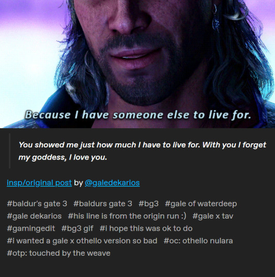
the set was a 1:1 copy. he wanted a version for his oc so bad that he went ahead and stole my concept anyhow, without even waiting for the permission he asked for.
he went to take it down after my reply, made cautious most likely by his still fresh callout done in march 2024 by @minthara and @mercymaker, and i thought the issue was resolved and it wouldn't happen again, that he wouldn't take again without asking, despite having been told not only by myself, but by other creators as well, no. we are not comfortable.
but no. he "remade" the set, switching out gifs while complaining about how he "had to make it original":
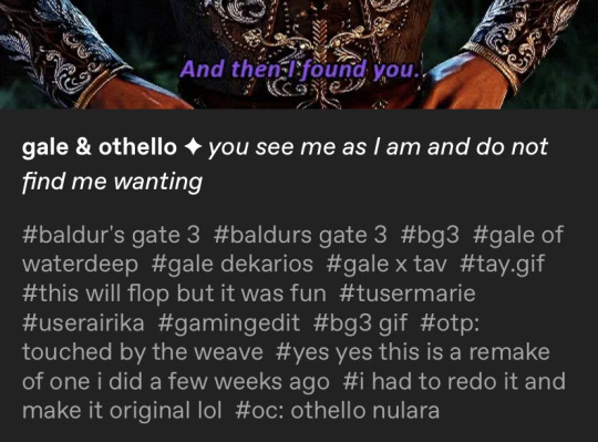
my set in question was made on 1st february 2024, he reached out to me on 22nd april 2024 to "remake" the set. he is well aware of the existence of these ideas and concepts and sets he wants to copy, underlined by the need to ask for permission when it's simply too obvious to otherwise deny.
it's no coincidence.
like others have had the experience, i too noticed that he often would not engage with content he planned on stealing or did go through with stealing. he would sometimes present it as his own "remake" of a set he did, of another he was "inspired" or wanted to "expand upon", sometimes crediting, sometimes crediting someone largely unrelated, sometimes and, more often, not crediting.
as i mentioned above, this was not the first and not the only set/concept, which he copied from me - whether that was before asking or after asking, or not asking at all, if it was ok to copy.
i use this example mainly to show a clear pattern of behaviour that exists across the board: he takes concepts from other creators and inserts his own oc and/or favourite character into it because he wants a version of it so very badly. it does not matter if said creator might be hurt, if they told him no, or if they exposed his behaviour before. it doesn't matter how old the set is or how recent.
it is still going on today, the only difference is that he has stopped asking at all once again.
my story completely echoes that of @minthara and @mercymaker's.
concrete examples
i will now go into more detail about the concept sets he's been copying, include the caption or quote attached to it. i'm sorry that these will not be in chronological fashion. i will add at a later point, just like @minthara has done, a google document to better do side by side comparisons, highlight the similarities visually even more, and preserve some of the sets, which have now been deleted by him as recently as today:
the theme of hands in gale's romance
-> mine posted on 23rd september 2023
versus
-> his 1 posted on 24th february 2024
-> his 2 posted on 17th june 2024
i want to preface this by saying that the theme of hands was and still is incredibly important to story of my oc altonaufein and has concept of romance with gale. again, while i do not own these scenes, i wished to highlight a theme that i identified as poignant and profound within the relationship context. it's also why i added the poetry and quotes accompanying the set.
notice how even the caption format matches. the only thing lacking are my quotes / poems.
the format matches almost entirely: gifs from the same scenes (pulling gale out of the portal, the bench scene in an illusionary waterdeep, the astral sea scene, the boat scene, and more of the boat scene). the only thing that was added in this gifset are scenes that weren't available to me back then, namely the updated proposal scene, the kisses patches, and the epilogue as they came out well after i made my original gifset.
the second re-make even contains a gif that's not only the same minute detail of a larger scene - one that anyone who played gale's romance knows contains a multitude of other parts that could have been used - but also the same frames:
mine vs his:


i suppose adding that one to the original post with the same format i had chosen for mine would have made it too obvious, but that is only speculation.
gale + missing waterdeep/home
-> mine posted on 30th september 2023
versus
-> his (deleted on 18th july 2024) so i will have to include screenshots so you may compare:


same caption format, overlapping scenes chosen, only new additions are of content that wasn't available to me back when i first made my original set (the epilogue, kiss patches and proposal scene).
an attempt at "credit" even though he is only referencing my tags on an entirely separate set of a different creator, not the concept i came up with in my original set months prior.
and even though i have told him no before, just like others have told him no before.
i think it speaks volumes that this set is now, like some others, have been suddenly and coincidentally deleted.
gale of waterdeep vs gale dekarios
-> mine posted on 20th november 2023
versus
-> his posted on 13th may 2024
the concept is entirely the same, the scenes are largely overlapping, again, the caption format is almost entirely identical, with the sole difference of me including the full quote and devnotes as i'm wont to do.
gale + i love you
-> mine posted 16th september 2023
versus
-> his 2 (a "remake" of an "older" set of "his") posted on 13th may 2024
again, the concept is entirely the same, it's same caption format, the scenes largely overlap, some of the gifs added that were not available to me when i made my set (which, again, would include the epilogue, kisses patches, and the updated proposal scene).
mermay gale
-> mine posted on 13th may 2024
versus
-> his posted on 21st may 2024
it's the same concept again, the caption format is similar, it's the same setting (camp at baldur's gate), the same armour, the same armour tint, the same 3/4 pose except mirrored, and, this time, his tags were inspired too:
my tag: #i have the worst art block still and virtually no time but i still wanted to do smth for mermay so have this
his tag: #i can't do art so heres my mermay contribution i guess
copied oc post
-> mine posted on (likely) 30th september 2021

versus
-> his originally posted on may 7th 2024, which has also now been deleted on 18th july 2024:


the only thing different was the font. sadly, i deleted my oc post since i have redesigned some of them and wanted to make an updated version of it in the future.
thankfully i found the link on my friends blog, @ayrennaranaaldmeri.
as you can see, all of these happened after the first cases of plagiarism and after i personally told him that i'm not comfortable with him "remaking" my concept sets as his.
conclusion
there are many other sets that i suspect have been copied or plagiarised, i want to remain objective, however, and include the ones i feel are the most damning examples, supported by the fact that he has been deleting some of them today while again, trying to set up his narrative to his audience.
again, i want to highlight the pattern is here with him. my post is not the first, my suspicious are the first.
he knows what he is doing wrong, highlighted by the fact of trying to ask for permission, by deleting sets in question, by, at first, apologising, whilst now talking about "gatekeeping", "bullying", "inevitable repeats of scenes", "taking inspiration", "scrolling by", being "subconsciously" influenced, etc.
as a conclusion, i can say nothing more on this topic other than that i'm very sad. it doesn't give me joy. it stressed me immensely then and it still does now. i wish he'd have taken the already admitted wrong-doing to heart and grown from it, instead of attempting to change the narrative and doubling down on his past behaviour, not examining what he has done and is doing several times over by now.
i have blocked him now, as have done many others, and will not engage further with him. we have been through this before and at this point, i don't think he will change.
what i do very much hope, however, is that this is the last i hear of this happening.
edit:
updated the links to lead to his "archive" so you can access the stolen sets that he still hasn't deleted and seems to have no intentions of doing so.
#again do not use this post to harrass anyone involved please#that is not the intent of my post#the intent is to spread awareness#the post is so detailed so what happened and what was said cannot be misconstrued#text: personal
233 notes
·
View notes
Text
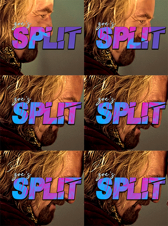
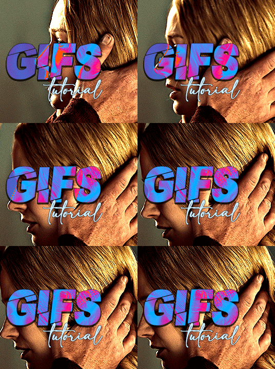
i always get questions when i do a split gifset, and it's a deceptively simple process so i thought i'd try to show how i do it! i don't know if these types of gifsets have a more universally recognized name, but that's what i call them so that's what i'm going with.
i'm going to write this assuming you have a solid familiarity with photoshop and making gifs, but please feel free to send me an ask if anything is unclear. i use video timeline/smart objects so will be showing that (here's a great general tutorial on giffing with timeline). i will also be talking A LOT about gif dimensions, so first let's briefly go over the limits and theory a little bit.
a 1 column gifset can accommodate gifs 540 pixels wide
2 columns = 268 pixels each with a 4 pixel gutter between
3 columns = 177, 178, 177 pixels with 4 pixel gutters
i'm mostly going to talk about 2 column split gifs here (what i will refer to as 2x1 from now on - 2 across and 1 high), but the process is the same for 3 column (3x1) and so on (1x2, 2x2, etc).
so, why would you even want to make a gifset like this? i mean, let’s face it, generally, bigger is better for gifs on tumblr, and there are obvious incentives to 540 width gifs over 268 or 177/8 width, especially since the upload limit went to 10MB. but even 10MB isn’t much when you’re talking about high quality footage. gif making is a constant balance between quality (whatever that means to you: frame dimensions, sharpening, coloring, etc) and file size. split gifs are a cheat to that limitation >:)
i personally believe an untapped frontier of tumblr gifmaking is playing with dimensions and time. that sentence makes me sound like an old-timey sci-fi villain, but you get the idea: gifmaking is an art and there are many fun and interesting ways of exploring the medium. you can do a lot with 268 pixels! longer frame loops to gif longer scenes unbroken, bolder coloring on a wide shot you don’t want to pare down. and, a shorter x axis means the y axis’s bang goes a lot further on a buck. also just if you have a 2 column set but only 5 gifs so you need to make one take up 2 slots. there's a lot of reasons but the most important one is it's fun :) here are some examples of other split gifs i've made: x, x, x
this isn't so much a limitation, more of a shift in how you think about gifs, but it's important to remember that each gif should ideally be doing something still. when making split gifs, it’s easy to pick a wide scene without thinking about how it’ll be split down the middle, and then you’re left with a lot of something on one side and a lot of incongruous nothing on the other - or you're left with a person cut in half awkwardly in the middle. so while a split gif can still be a whole scene, you shouldn’t ignore the break and what it means to the bigger picture. now this is personal preference, but i like to play with the break and make it a part of the gifset. mirrored movement, subjects trapped on either side but still talking to each other, a bird flying from one side to the other. fun with frames! it can be another way of drawing attention to specific images/moments/feelings happening within the same shot.
SIMPLE SPLIT GIFS
to more narrowly define what i’m calling “simple split gifs,” it’s one set of frames split down the middle into two separate gifs that are meant to play concurrently, side by side.
first thing's first, crop your gif and uncheck delete cropped pixels if it is not already (very important). i'm cropping it to the 1x1 size, in this case 268x350. if you need to see how the full size will look, you can try it out with 536 first. but this one is pretty easy, this is the exact center of the frame (the left boundary of this crop is the center line) and both their heads fit within their respective 1x1 crop.
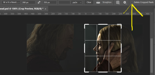
then color as you normally would. if your scene is very different one side to the other, it might be easier for you to color on a wider crop and then either crop again or copy paste your coloring to the smaller crop version. i do that with the 2x6s, but it's usually not that big a deal to color the 2x1s with just the small crop on your canvas at the time. this scene is very symmetrical, both in movement and colors, so i'm good.
now the fun part! once you've got one side how you want it, save/export as you normally would. at this point i also like to make a mental note of how many frames there are.

so i have 49 frames and it's still only ~3MB! this is just an example that i picked from my rotk fancy set, otherwise i probably would have made this gif longer.
then onto the other side, so i ctrl + z my way back to my smart object video timeline. to get to theoden i just drag and drop the smart object 268 pixels over. since this one is in the exact center of the image, it even helpfully guides me (this can get annoying if you are NOT giffing the center of the image fyi, but you can always manually go pixel by pixel too if you need to with your <- -> keyboard buttons. just always remember where you started and count accurately). i can never move around my smart object without hiding the adjustment layers on top of it, so you'll see me do that in this screen recording.
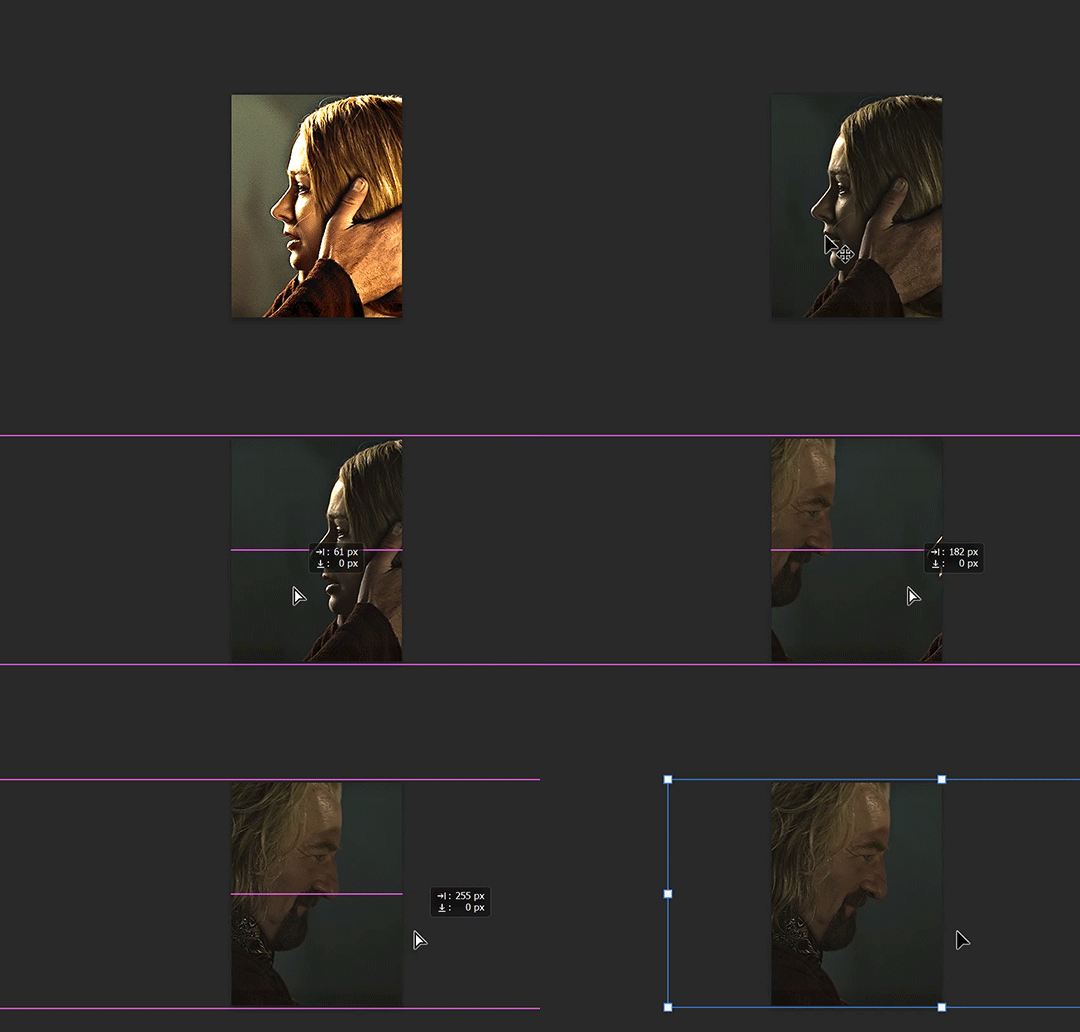
see how it corrected me when i dragged it a few pixels down by accident, and with all those pink guidelines? sometimes photoshop is good 😌
then make sure you still like the coloring, adjust whatever needs to be adjusted, but watch out! don't make any major changes because it still has to match the other side. and export again.

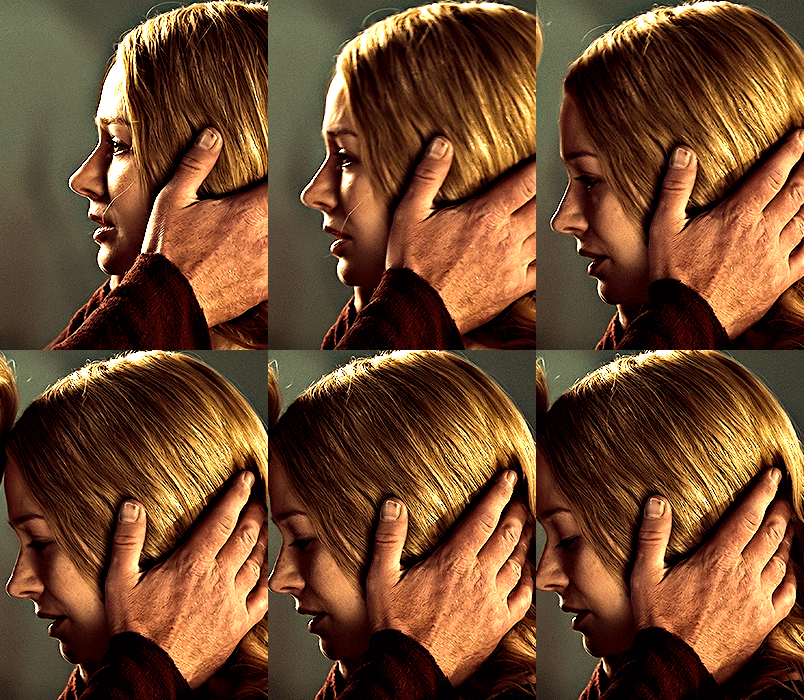
what we perceive as 1 series of frames chopped down the middle is just 2 separate gifs with the same frame rate. when tumblr loads the images, it will run concurrently in the post (even though it never does in the draft post 🙄). and that's it!
COMPLEX SPLIT GIFS
again i'm making up terms, but i call anything with more than 2 components a complex split gifset. i've tweaked some things in the process as i went along, but this is generally how i did the lotr series. these sets are basically just many split gifs with transitions. and here's where endurance becomes a factor :) there's a lot of prep done blind. but if set up well, it will be fairly easy to pull together by the end.
first i decide on my dimensions, using my upper bounds to determine how big i'm going to go. since lotr has very nice large file sizes, i can go pretty big without sacrificing much in quality. i decided on 3 rows of 350 pixel height gifs and it's worked well for me. that means my biggest gif will have a total height of 1050 pixels - fun! you could also do 8 rows, with two 2x2s or just a series of 2x1s that transition to 1x1s. there really is no limit to this except your imagination and source material.
i cap everything i'm going to use before i even open photoshop, then do all of them at once. uncheck delete cropped pixels, then i make my gifs! this is where i spend 90% of the time on this set. every gif should be the size of the smallest 1x1 gif (268x350 for me). i make all 10 into a fully colored, separate psd. (and then i usually go back through all of them a few times to get the colors to match better 😅) for the bigger ones (2x1: 536x350 and 2x6: 536x1050), i just crop them as if they were 1x1 but always thinking about how they will look when big. this gets tricky when i do the big one :) my lazy workaround for that is to basically make it twice: one cropped as it will be and one full size for me to color. then i copy and paste all the coloring layers onto the small one and voila, i know that the coloring in the upper right slice will also look good on the bottom left slice 1050 pixels away because i saw it on the full size version.
coloring is probably the biggest thing i'm thinking about with this kind of set. the whole idea is that these gifs are using the same colors, more or less, throughout each phase. even with the 1x1s, they're still part of a larger color concept, and they should (🤞) work with each other.

in a pinch, i like to eyedrop a color from one gif and add it as an accent to another. one of my 1x1s had a much more muted color palette originally, but i wanted it to have deeper blues and yellows to complement the 1x1 that would go next to it, so i added some gradients on lower opacity over it, color picked from other gifs i already colored.

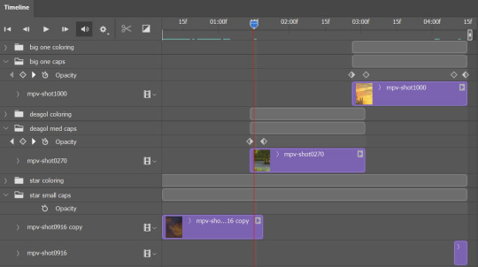
i keep my coloring and the smart object in separate folders to help me in the final step of combining everything, and then i trim everything down to my lowest common denominator of frames. you might think you need to keep frames pretty minimal if you're doing 3 phases with transitions like this, but there's more room to work with on a small gif, in terms of file size. i usually do 30-50 frames for each phase, with the assumption that i'll be adding a transition on each side of each gif that will eat up some frames (i usually do 4-6 frame fade transitions). for the rotk set my final frame count was 129 and i never went over 8MB on a gif, so there's plenty of space play around with things :)
and then, combine! whatever order you start with, you are stuck with (unless you're getting even more complicated, but we won't go into that lol). for these sets i go small 1x1 -> medium 2x1 -> big 2x6. i like to think of it in phases from this point on. small is the first phase, then medium, then big. then i put in the fade transitions, chopping up the first phase gif so the last one will fade into it, restarting the whole cycle seamlessly. i'm just doing a quick and dirty fade here, but here's a tutorial if you want more explanation on transitions.
at this point i save this psd as its position, "top left" or whatever (usually it's a psb by this point too 🥲), just in case i need to go back to it. then i export this first gif and move on to the rest.
it's the same concept as a simple split gif: drag and drop the smart object to the new position, but now there are multiple phases to keep track of. folder organization has been key for me to keep everything straight. i move through the gifs in a backwards S, starting with the top left. but you could go any direction, just gotta stick with it and remember your counts. in my case, i'm always thinking of 268 pixels over and, for the 2x6, 350 up/down. it's a tedious process, but it goes quick (apart from waiting for photoshop to load each time you export).
i did this series as a color concept aesthetic kind of thing, so my theory was by using the same-ish colors throughout, that would save me in the end when it came time to export. there's only 256 colors max to work with on a gif, and that's usually what gets me over the 10MB limit. but as i said, i have never even gotten close to the size limit on this series. it's pretty hard to reach the limit on 268 pixels, but not impossible. (i did run into that on the emma set i did, and that was hell. but also not an impossible fix in the end.)
and that's it! if you try any of this and have trouble, i'm happy to help if i can but mostly this is a "click around and see what works for you" kind of process. and feel free to tag me on your split gifsets :) i love seeing them <3
#*lotrsplit#*#split gifs#gif tutorial#photoshop tutorial#usergif#allresources#chaoticresources#completeresources#photoshop tag
286 notes
·
View notes
Text
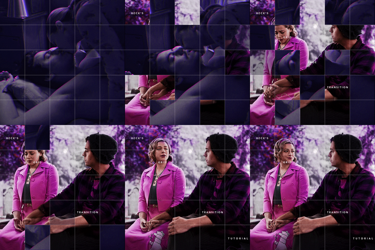
Someone asked me how I created the fade transition in this gifset which I’ll try to explain in the most comprehensive way that I can. If you've never done something like this before, I suggest reading through the full tutorial before attempting it so you know what you'll need to plan for.
To follow, you should have:
basic knowledge of how to make gifs in photoshop
some familiarity with the concept of how keyframes work
patience
Difficulty level: Moderate/advanced
Prep + overview
First and foremost, make the two gifs you'll be using. Both will need to have about the same amount of frames.
For ref the gif in my example is 540x540.
I recommend around 60-70 frames max total for a big gif, which can be pushing it if both are in color, then I would aim for 50-60. My gif has a total of 74 frames which I finessed using lossy and this will be explained in Part 4.
⚠️ IMPORTANT: when overlaying two or more gifs and when using key frames, you MUST set your frame delay to 0.03 fps for each gif, which can be changed to 0.05 fps or anything else that you want after converting the combined canvas back into frames. But both gifs have to be set to 0.03 before you convert them to timeline to avoid duplicated frames that don't match up, resulting in an unpleasantly choppy finish.
Part 1: Getting Started
Drag one of your gifs onto the other so they're both on the same canvas.
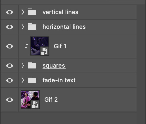
The gif that your canvas is fading FROM (Gif 1) should be on top of the gif it is fading INTO (Gif 2).

And here's a visual of the order in which your layers should appear by the end of this tutorial, so you know what you're working toward achieving:
Part 2: Creating the grid
Go to: View > Guides > New guide layout
I chose 5 columns and 5 rows to get the result of 25 squares.
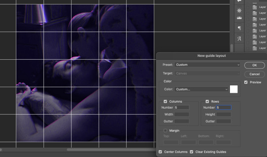
The more rows and columns you choose, the more work you'll have to do, and the faster your squares will have to fade out so keep that in mind. I wouldn't recommend any more than 25 squares for this type of transition.

To save time, duplicate the line you've created 3 more times, or as many times as needed (key shortcut: CMD +J) and move each one to align with the guides both horizontally and vertically. You won't need to recreate the lines on the edges of the canvas, only the ones that will show.
After you complete this step, you will no longer need the guides so you can go back in and clear them.

Follow the same duplicating process for the squares with the rectangle tool using the lines you've created.
Align the squares inside the grid lines. The squares should not overlap the lines but fit precisely inside them.
This might take a few tries for each because although to the eye, the squares look all exactly the same size, you'll notice that if you try to use the same duplicated square for every single one without alterations, many of them will be a few pixels off and you'll have to transform the paths to fit.
To do this go to edit > transform path and hold down the command key with the control key as you move one edge to fill the space.
Once you're done, put all the squares in their separate group, which needs to be sandwiched between Gif 1 and Gif 2.

Right click Gif 1 and choose "create clipping mask" from the drop down to mask it to the squares group. This step is super important.
After this point, I also took the opacity of the line groups down to about 40% so the lines wouldn't be so bold. Doing this revealed some squares that needed fixing so even if you aren't going dim the lines, I recommend clicking off the visibility of the lines for a moment to make sure everything is covered properly.

Part 3A: Prep For Key framing
I wanted my squares to fade out in a random-like fashion and if you want the same effect, you will have to decide which squares you want to fade out first, or reversely, which parts of Gif 2 you want to be revealed first.
In order to see what's going on underneath, I made Gif 1 invisible and turned down the opacity of the squares group.

If you want text underneath to be revealed when the squares fade away, I would add that now, and place the text group above Gif 2, but under the squares group.

Make a mental note that where your text is placed and the order in which it will be revealed is also something you will have to plan for.
With the move tool, click on the first square you want to fade out. Every time you click on a square, it will reveal itself in your layers.
I chose A3 to be the first square to fade and I'm gonna move this one to the very top of all the other square layers.
So if I click on D2 next, that layer would need to be moved under the A3 layer and so on. You'll go back and forth between doing this and adding key frames to each one. As you go along, it's crucial that you put them in order from top to bottom and highly suggested that you rename the layers (numerically for example) which will make it easier to see where you've left off as your dragging the layers into place.

Part 3B: Adding the Keyframes
This is where we enter the gates of hell things become tedious.
Open up the squares group in the timeline panel so you can see all the clips.
Here is my example of the general pattern that's followed and its corresponding layers of what you want to achieve when you're finished:
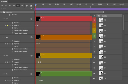
So let’s try it!
Expand the control time magnification all the way to the right so you can see every frame per second.

As shown in Part 3A, select your first chosen square.
Where you place the time-indicator on the panel will indicate the placement of the keyframe. Click on the clock next to opacity to place your first keyframe.

Move the time-indicator over 3 frames and place the next key frame.

Things to consider before moving forward:
Where you place your very first keyframe will be detrimental. If you're using a lot of squares like I did, you may have to start the transition sooner than preferred.
If you're doing 25 squares, the key frames will have to be more condensed which means more overlapping because more frames are required to finish the transition, verses if you're only using a 9-squared grid. See Part 4 for more detailed examples of this.
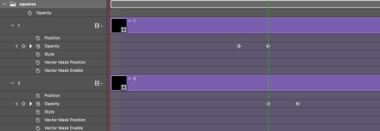
The opacity will remain at 100% for every initial key frame, and the second one will be at 0%.
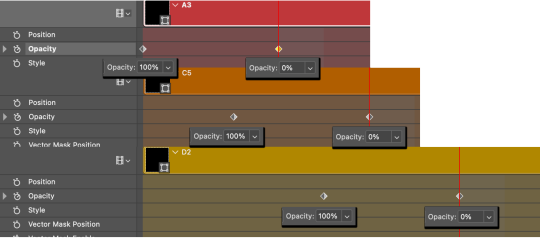
Instead of creating two keyframes like this and changing the opacities for every single clip, you can copy the keyframes and paste them onto the other clips by click-dragging your mouse over both of them and they'll both turn yellow. Then right click one of the keyframes and hit copy.
Now drop down to your next clip, move your time-indicator if necessary to the spot where the first keyframe will start and click the clock to create one. Then right click it and hit "paste".
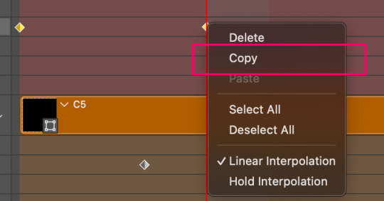
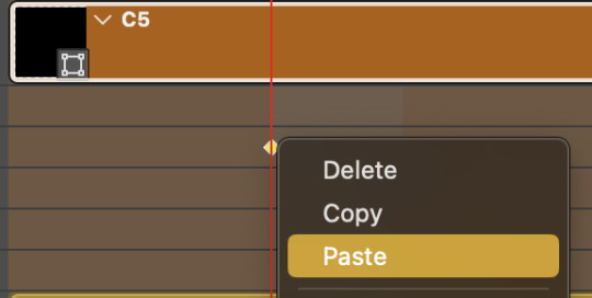
Tip: When you have both keyframes selected, you can also move them side to side by click-dragging one of them while both are highlighted.
Your full repetitive process in steps will go as follows:
click on square of choice on the canvas
drag that square layer to the top under the last renamed
in timeline panel: drop down to next clip, move time-indicator tick to your chosen spot for the next keyframe
create new keyframe
right click new keyframe & paste copied keyframes
repeat until you've done this with every square in the group
Now you can change the opacity of your squares layer group back to 100% and turn on the visibility of Gif 1. Then hit play to see the magic happen.
PART 4: Finished examples
Example 1
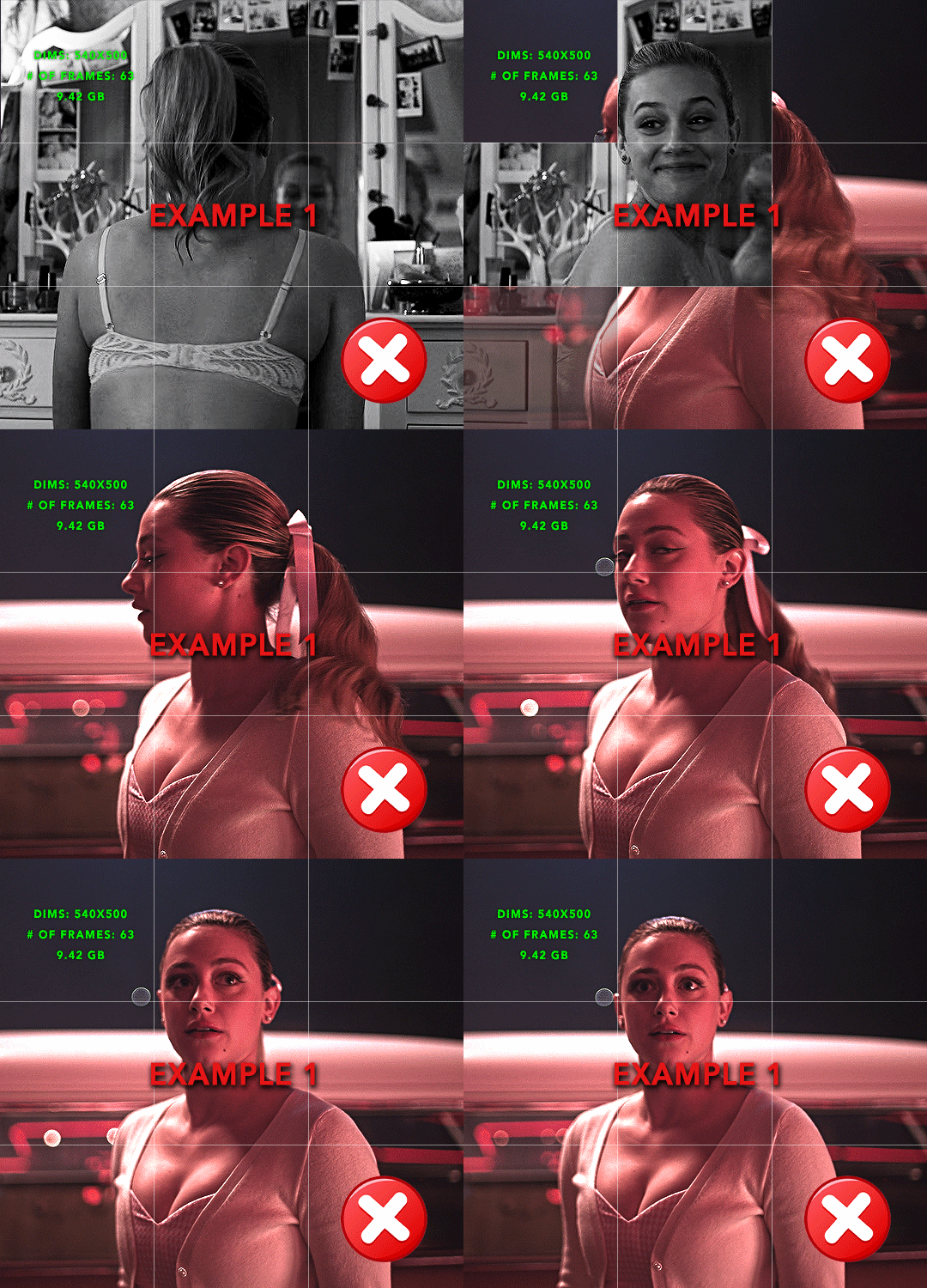
the transition starts too soon Cause: initial keyframe was placed at frame 0
the squares fade away too quickly Cause: overlapping keyframes, seen below. (this may be the ideal way to go with more squares, but for only 9, it's too fast)
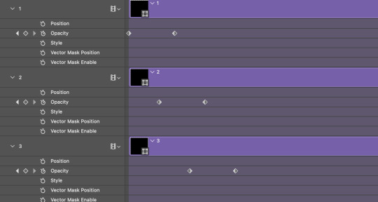
Example 2
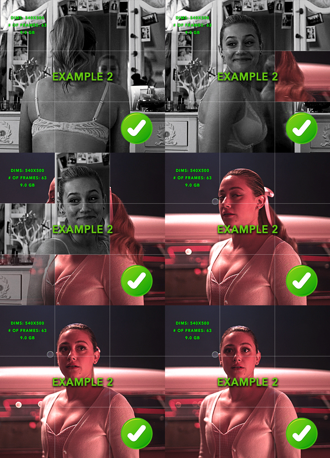
more frame time for first gif
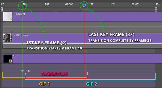
transition wraps up at a good point Cause: in this instance, the first keyframe was placed 9 frames in, and the keyframes are not overlapping. The sequential pair starts where the last pair ended, creating a slower fade of each square.
Part 5: Final Tips and Saving
You can dl my save action here which will convert everything back into frames, change the frame rate to 0.05 and open the export window so you can see the size of the gif immediately.
If it's over 10gb, one way to finesse this is by use of lossy. By definition, lossy “compresses by removing background data” and therefore quality can be lost when pushed too far. But for most gifs, I have not noticed a deterioration in quality at all when saving with lossy until you start getting into 15-20 or higher, then it will start eating away at your gif so keep it minimal.

If you've done this and your gif is losing a noticeable amount of quality and you still haven’t gotten it below 10mb, you will have no choice but to start deleting frames.
When it comes to transitions like this one, sometimes you can't spare a single frame and if this is the case, you will have to return to the timeline state in your history and condense the key frames to fade out quicker so you can shorten the gif. You should always save a history point before converting so you have a bookmark to go back to in case this happens.
That's pretty much it, free to shoot me an ask on here or on @jugheadjones with any questions.
#gif tutorial#photoshop tutorial#transition tutorial#grid tutorial#usergif#ps help#tutorials#tutorials*#resources*#requested
395 notes
·
View notes
Text
so i saw this gifset which reminded me about the events in 15.09 and just about lost my mind so i wrote a fic about that whole "dean almost confesses his feelings to Cas in Purgatory but Cas cuts him off because of the Empty deal" thing. here's the first part mwah
---
“Okay, Cas, I… need to say something.”
He’s brave enough now.
Well, okay, not brave—but the fear of losing Cas before Dean can ever spit the words out is bigger than what’s on the other side of admitting his feelings.
That prayer was apologizing. Getting on his knees and begging Cas to forgive him—for the way he was shaped, the way he was raised, the way he can’t seem to do anything but attack a problem by yelling and punching. That prayer was an explanation. An explanation that Dean would never dare tell anyone else. An admission to everything.
Well, almost everything.
Now this moment: this is his confession. Where he doesn’t apologize. Instead he boldly proclaims. Something he didn’t want to do in his prayer; something he wanted to look Cas in the eyes and say to his face.
Three little words. That’s all it is.
They poise on his tongue. Dean opens his mouth, to let them fly—
“You don’t have to say it.”
Dean shuts his mouth, wings clipped.
Cas pauses; then: “I heard your prayer.”
Dean stares at him for a long, terrible moment. Cas doesn’t smile; just looks… sad. Like always does. And Dean knows him well enough to know what Cas is saying between the lines.
You don’t have to say it.
Don’t say it.
Clear as a bell, Dean hears it in his head: He’s rejecting you.
So Dean pulls in. Frowns. Blinks himself back into reality; the reality where Cas doesn’t want Dean to cross that line. Doesn’t… want that. He swallows hard, something in his throat ticking.
Don’t say it.
Dean nods. He thinks that his lips uptick in something of a fake smile. An admission. And then Cas walks away.
And Dean feels like his chest is going to split into two.
---
(this is going to be a longer fic so let me know if you want to get tagged when I post it)
#i don't know WHERE it's going#but it's going somewhere#and it's gonna hurt!!!!#destiel#15.09 the trap
187 notes
·
View notes
Text
"LaRusso Twig 2.0"
Is it not enough that Sam has all the boys falling for her like Daniel but now she has her own 7ft obsessive and possessive karate man


You don't think Terry would have loved to have beat up a group of guys in the alley with Daniel?!
From a rival team lol. 🐍🐉
Axel was so jealous! Staring from across the room! Like Terry did for the past three seasons!
Somebody make a gifset of all the parallels I can't--
(gifset here. fandom move fast! thank)
I mean, Terry acted like the typical jealous ex-boyfriend with Chozen and Johnny.
Watch any teen, drama, Lifetime movie, and the jealous ex-boyfriend always calls their perceived rival a "pretty boy"
Karate Kid III was a Lifetime movie...
And Terry has this particular hatred of Johnny because of Daniel and Kreese lol. His two favorite people prefer this buffoon over him and it drives him bitterly nuts. I love it.
And I love Axel.
He reminds me so much of Twig. Just a sweet bby boi who doesn't quite know how to make friends and latches on to the first person to show him compassion after having an abusive mentor/father.
We haven't seen Terry defend Daniel's honor yet, but you never know...
The jealousy is what gets me. Axel and Terry can't keep their eyes off their tiny brunettes. The longing. The yearning. The anger...
It hurts. It's beautiful.
--
P.S. - Sam and Daniel in Pink and Red for their karate men. Daniel was even wearing Red for some reason when he sees Terry again.
And Tig said Terry has been trying to win over Daniel?? Hmm, ok lol. Many thoughts about that later
💙🖤
#stream of consciousness#cobra kai#terry silver#axel kovacevic#silverusso#twig#im not back but im back#im sorry#my post#parallels
127 notes
·
View notes
Note
Hi, me again!
Ty for the reply, I would love an in depth tutorial if you don't mind as i really wanna get this effect to work and I kinda work best when it's spelt out for me when learning new techniques lol :)
hey anon, no worries! here's how i used this amazing template by @danesdehaan and added a rolling effect like this (from this gifset):
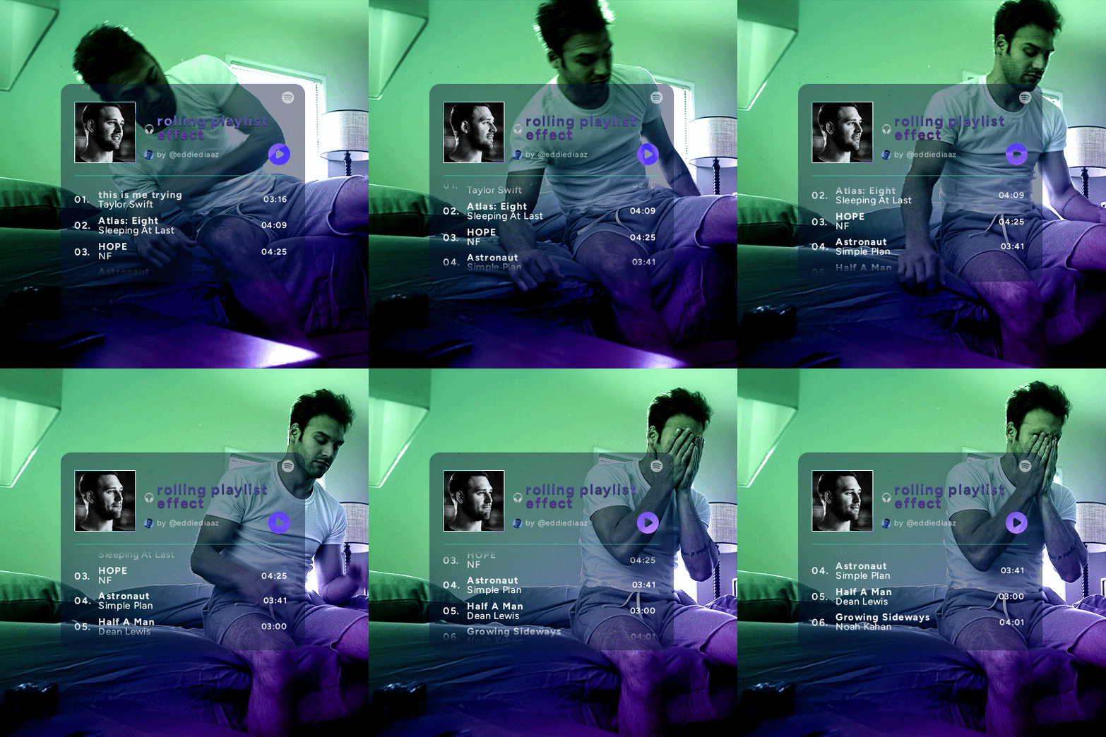
this effect uses photoshop's timeline. i use cs5, for reference.
detailed tutorial under the cut :)
I. PREPARING THE TEXT
when you open the template, you should have a group called "songs" with 3 groups for each song. what you wanna do is duplicate these numbered groups until you have the amount of songs you want. for each group, use the move tool or your keyboard's arrows to move the duplicated song text layers/groups on your canvas so they're under the first three that are already there. make sure these new duplicated layers are in the "songs" group.
then type the numbers, song titles, artists, song durations, etc. it should look like that:
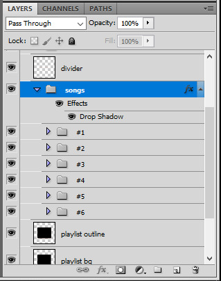

i wanted mine to have a smaller gap in between each song, so i used the arrows to move each song group closer together, and it looks like that before the animation:

II. ANIMATED EFFECT
once you have typed everything, make sure there are no mistakes and that you won't need to edit anything about the songs or durations or anything like that, because you won't be able to go back. when that's done, select all of the numbered song groups and right click > Merge Layers.
that will give you one layer with all of the songs together. i've renamed mine "SIX SONGS". make sure this new merged layer is still in the "songs" group.
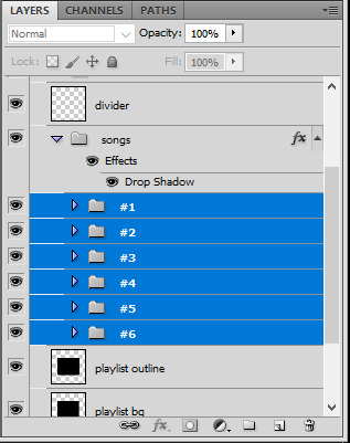
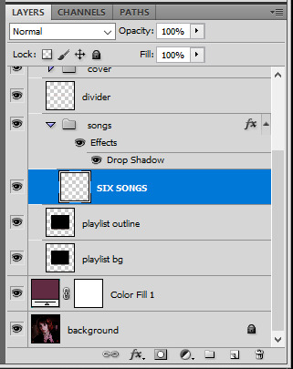
once that's done, you're ready for the animation. and it's pretty easy, because you only need two keyframes: one at the start of the gif, and one at the end.
go to the start of your gif on the timeline, and toggle the position keyframe animation by clicking on the little stopwatch icon. a little yellow keyframe should appear where the cursor is, at the start of the gif:

then go to the end of the gif with the cursor. with the "SIX SONGS" layer selected, use the move tool or keyboard arrows (my preference) to move up the text until all the songs are inside the darker rectangle. once you move this layer's position, a keyframe will appear on the timeline and the animation will be created.
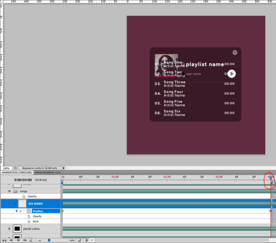
the animation now looks like this:

if you want, you can now edit the speed of the animation by moving the keyframes. the closer the two keyframes are, the faster the animation will be; the further apart the keyframes are, the slower the animation will be.
III. LAYER MASK
since we want the songs to be contained in the dark rectangle and below the line, we need to add a layer mask. i started by creating a shape of where i want the songs to be contained with the rectangular marquee tool:

then, on the layers panel, select the "songs" group and click on the layer mask icon to create a mask with that rectangular selection.
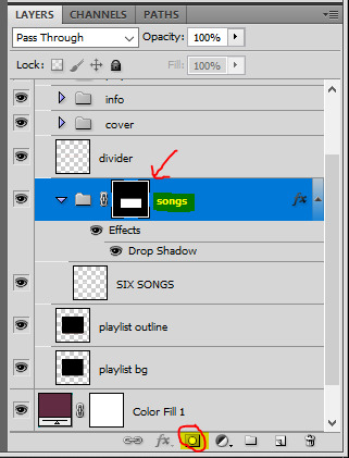
if you play the animation after making that layer mask, it should now look like this:

if you like it that way then you are done, yay!
but if you'd like softer edges, like i have done for mine, click on the layer mask's black and white thumbnail. use the brush tool with a 0% hardness and the black color to make the edges of the mask softer. make sure you are making your brush strokes with the layer mask's thumbnail selected.
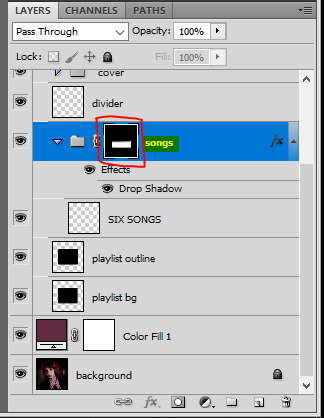

once you have brushed a bit of black with a soft rounded brush on the top and bottom of the mask, the animation should look like this:

and that's it! i hope this was clear enough :)
#alie replies#Anonymous#*ps help#photoshop#tutorial#resource#completeresources#allresources#resourcemarket#usertj#usertina#usercats#useraish#userdean#userabs#userraffa#userbuckleys#uservivaldi#userisaiah#usernorah
480 notes
·
View notes