#so I did it with inverted method
Explore tagged Tumblr posts
Visit Tumblr Blog
Explore Tumblr blogs with no restrictions, modern design and the best experience.
Last Seen Tumblr Blogs


Fun Fact
Premium Tumblr themes are available from anywhere between $9 to $49.
Text


20.12.23, wednesday
My main hobby is just procrastinating in any way I can. The plan was to make a cup of coffee and then start working. What actually happened is that I watched a 3 part video series (by james hoffmann ofc) on Aeropress coffee and made a few cups with different variables. Still not sure if I found The Recipe for me, but it’s getting better (tho I don’t love the coffee beans I have)
#altho i’m not sure I agree that inverted method is not worth the risks#maybe I just pour my water in too slow (bc I get nervous abt pouring too much) but there’s a fair bit of liquid that manages to get through#before I can place the vacuum on there#so I did it with inverted method#what I took from his recipe was the swirling instead of stirring and letting it rest for 30secs after to get a more even bed of coffee#I did 14g of coffee & 200g of water with a 5min brew -> swirl -> another 30seconds of letting it rest before pressing gentlyy for like 20-3#seconds#but idk it’s a bit ’’one note’’#which could be the beans#I have medium roast rn and I prefer light roast but the light roast beans have been no where to be found lately idk why#(there aren’t many actual light roast beans and the other ones are waay out of my budget)#(or at least good ones; there’s the one affordable light roast that’s everywhere but I don’t like it that much (but tbf should’ve still#bought that instead of these ones I got))#like this is still way better than what the drip coffee of those beans are#and the achilles heel is that I don’t have a thermometer of any kind so my water temperature is guesswork every time#so tweaking variables is always a bit sketchy bc idk if I just had a better water temperature that time#studyblr#booklr#aesthetic#bookblr#books#study#reading#read#book#coffee#2023#december 2023
427 notes
·
View notes
Note
Hi hi may I ask? How did you come up with colors for Shattered glass? 😭 (like what ya did for TFO Elita & Darkwing from previous comics) do you just- invert colors or pick randomly?? I'm working on something & I love SG but man I cant figure out how colors work HAHGHA
hello!! TO BE HONEST I WAS MOSTLY WINGING IT it’s sort of a combination? my process was basically, okay what about this design makes them look nice? colours? shapes? both? now it’s EVIL and vice versa


elita was heavily inspired by transformers prime airachnid, her pink is iconic so instead of changing it to red or purple, black became her most dominant colour. get hit with the emo laser


and for darkwing I mainly just lightened his colours, there’s a lot of ways to go about it! I think inverting colour placements is also a great method, like how shattered glass soundwave has a white torso and shoulders and stuff
268 notes
·
View notes
Note
Coloring anon here, yes, I would definitely like to know more about how you color frame by frame and the other techniques you mentioned! It would be much appreciated, thank you!
Hi anon! I'd be happy to go over my preferred methods for colouring!

First resort (ideal):
Painting over shots with little movement (the first method in this tutorial)
Colour manipulation using selective colours (the second method in this tutorial; alternate tutorial -> i also sometimes add a hue/saturation layer on top to manipulate the cyans/blues as well)
Second resort:
Keyframes for shots with consistent movement where it's easy to hide "imperfections" (tutorial 1, tutorial 2)
Last resort:
Frame by frame colouring -> DISCLAIMER: the way I do this method is the easiest way I've gotten it to work for me but that also means that it's very inflexible when it comes to editing any of the colouring afterwards. Once you start colouring in frame animation mode you're basically locked in so you need your gifs to be exactly the way you want them prior to adding your colour
So in this tutorial I'll go over how I do my frame by frame colouring as well as how I create actions to automate the repetitive parts of this process! (Some resources that explain how to create actions are here: 1 2)
To use the select subject feature you will need Photoshop CC 2018 or later
Step 1: Preparing your gif with base colouring
So first you want to do your base colouring for your gif in timeline mode, which I've explained here. I keep my gifs short (ideally 40 frames or less) since this colouring process is tedious!
I make sure that in my hue/saturation layer, I turn the saturation in the yellow, green, cyan, and blue tabs all down to -100 (and for the yellows I usually add around +20 to +60 in lightness)
Here's my gif with the base colouring that I'll be starting with:

Note: turning down the saturation in almost all the colours gives you that nice silver/grey neutral background to paint on top of. It's a lot less noticeable when your painted layers aren't perfect
Step 2: Converting to Frame Animation Mode
I use the save action from this action pack to convert my gif from timeline mode to frame animation mode.
You cannot edit your base colouring from this point onwards!
Step 3: Using Select Subject
If you're recording an action this is the step you would *start recording*
This is what your window should look like:

Making sure your first frame and first layer are selected, go to Select at the top of your window and click Subject

You should then see the marching ants outline around the person in your gif

You then want to create a new solid colour fill layer (which can be found when you click that little circle icon at the bottom of your layers panel), and set the layer blending mode to colour.
The layer mask will automatically be created since you had the marching ants outline.

Since my person is in colour and not the background, I want to invert the layer mask by clicking on it and using command + i (or ctrl + i), and now this is what it looks like:

Note: Select subject isn't always perfect!!!, depending on how cluttered the scene is and how much contrast there is between your person and the background, select subject could either do a really good job like it did here, or screw up a little like it did here:

That's okay though because it still gives us a good base to start from! We can fix any issues by painting with black and white brushes on the layer mask.
Step 3.5: Create clipping mask
Thanks to @wolfchans for telling me about this because it gives us back a little bit of flexibility when colouring frame by frame! Instead of merging down, we can make a clipping mask instead. Right click the solid colour fill layer and select create clipping mask.


If you're recording an action, it's at this point where I would *stop recording*
Step 4: Fixing the layer mask if needed
So now I want his jacket and t-shirt to also be purple, and to show his fingers behind the glass. I make sure the layer mask is selected, and paint with a brush at 60-70% hardness (painting with black erases the colour, painting with white shows the colour). User smaller brush sizes to paint smaller details!
This is what my canvas and layer mask look like now.

Step 5: Repeat
Now I click on my second frame and second layer, and repeat steps 3-4. As you can see, using the clipping mask allows you to still see and edit the colouring of the previous frame, just make sure you click on the right frame and it's corresponding layer when you're doing further editing.

This is where an action is super helpful in cutting down all the repetitive steps and clicks you need to do. So at this point I'd just play the action I created and paint on the layer mask as needed.
Repeat for all your frames and then you're done! After this I convert it back to timeline mode again so that I can add my text and do any other effects such as blending or transitions. Hope this helped!!
#answered#Anonymous#*tutorial#userbeanie#userwintersoldado#userishh#userfaiths#usercats#usertj#tuserhol#userahri#usereus#usershreyu#userchibi#userbunneis#usermibbles#uservivaldi#carolook#userbuckleys#usertenacious#tuserheidi#userholtz
229 notes
·
View notes
Note
I don't really know anything about tarot other than it being a fun excuse for themed fanart, but if you or your followers have any opinions, what might an Animorphs-themed tarot deck look like?
I was faffing around with my tarot deck, pulling cards out to see what matched, and then I figured why not and did a quick reading for each of them. The 3-card method (past-present-future; it's faster than a Celtic cross) gave me the following:
Jake:

Past: Six of Wands. Youth, hope, optimism. "Expectation crowned with its own desire," according to Waite. At the start of the series, Jake is ready for the future, filled with potential and given reason to expect that things will go right for him. He's optimistic, confident the war can be won by Christmas if they give it their all and then let the andalites save the day. Wands are the suit of being upright and dependable, so makes sense they'd occur twice for Jake.
Present: Page of Wands. Devotion, service, proclamation. He's speaking out, working for a power greater than himself. Though he is a lowly page, he works hard and serves as the voice for those with more power. Throughout the war, Jake does the grunt work, the work no one wants. He underestimates his own potential, insistent that he is only doing this to give humanity a chance to make it until the andalites show up. He sees himself as no one, but he does recognize his greatest weapon is his voice. He speaks for us: "This is Earth" (#46, #54). He leads in the sense of being first to battle, last to eat.
Future: Six of Pentacles, inverted. Charity, selflessness, gifting — perverted. Success shared freely with others, only upside-down; "gift" is the German word for poison. Notice the recurring sixes, that we've gone from one upright to one inverted. After all Jake devoted to saving humanity, he'll drop a nuclear bomb on his own hometown. He fought and died and lost his soul trying to save his brother — and then Jake himself gives the order to kill Tom. More than anything, Jake values home and safety and shelter. He goes home in the end, but he poisoned his home and it'll never be safe again.
#animorphs#tarot#tarot readings#animorphs tarot#jake berenson#everyone else coming in a minute#once i'm done deciding what they mean
151 notes
·
View notes
Note
So I wanted to thank you, because Arkham Prince AU has me in a chokehold! I'm particularly interested in the Rogues and their connexion to Bruce in this AU.
I think some have already been mentioned in other posts, like Harvey being Bruce's lawyer and how it inverts their dynamic from canon. Would it stay that way, the irony of the White Knight DA Dent visiting serial killer Bruce Wayne at Arkham, or would he eventually snap as well and become Two Face and like, get to understand Bruce on a visceral level?
And Harley, would she have treated Bruce as a psychiatrist before Joker got a hold of her? Did he like her and was worried enough about her that he tried to stop/counterbalance Joker's influence on her?
I've read in another post that Joker and Bruce would be competing for the control of the asylum and that Bruce would eventually kill him for what he did to Jason, but what's their dynamic like? It is my understanding that Joker is obsessed with Batman because he wants him to snap and show that they aren't so different after all, but in this AU Bruce has already done that on his own, more or less. So he wouldn't be as interested, perhaps, and think of Bruce more as a rival than his soulmate. Because if he is as obsessed as in canon, having Bruce on the next room over, 24/7 within reach inside the asylum, it's gonna be bad for Bruce's blood pressure...
Riddler has also been mentioned, how they have an intellectual sort of rivalry going on, but Bruce still cares enough about his wellbeing to help when he can, even if his methods are a bit dubious. But what about the rest? Mr Freeze, Mad Hatter, Ivy? Do all the Rouges start appearing once Bruce has already been locked up, or did he meet some of them on the outside while on his killing spree? What do they think of him: do they consider him one of them, are they scared shitless...? And who defeats them and sends them back to Arkham when they escape, the police? Would Bruce still beat them up even inside Arkham if they've been particularly murdery when outside?
I think you’re right on the money with these questions! Somehow I love the inversion of Bruce somehow being able to save people like Harvey and Harley from their fates, but he can’t prevent everyone from falling into Arkham.
I think Bruce walks a thin line between being part of Arkham and yet being above/below it in certain ways. He is both seen as a part of the masses, and a hated/beloved figure distinct from them.
81 notes
·
View notes
Text
PYRO! It’s Pyro! Yippee e!
I accidentally inverted the colors all of the insignias and gave Blue Pyro Red Pyro’s flamethrower :( My professional explanation for the second part is that Blue Pyro beat the living shit out of Red Pyro and stole their weapon, my professional explanation for the first part is I am is have are stupid.
Close-ups and special sketch page below the cut!!!
I remembered TF2 existed and this happened.
I have to mention that I have never touched this game, but I’ve been fairly aware of it for a really long time. I strayed away from it all because I was not/am not the best at multiplayer games, especially shooters (especially team shooters), and I never exactly felt like I had the skill to draw any of the characters. Plus the comic’s whole “missing the last issue” situation. I just really, really, didn’t want to be let down by investing myself in something I couldn’t be invested in. But something about “Meet the Pyro” stuck in my head like a burr to a shoe.
Rewatched Meet the Pyro more times than I should have. Looked into more animations and the fandom. Finally broke down and read the comic LMFAO. Surprisingly, I really enjoyed it! Even with the missing part, the format it’s presented in and the general wackiness was refreshing compared to what I normally read.
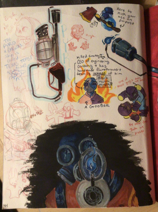
I still like Pyro, and when I remembered I’m better at drawing now, augh. There he go. They are all over, as they should be.
MF has a homemade flamethrower, canonically killed great value brand Smokey the Bear (on purpose), is/was the highly successful CEO of an engineering company, and is so efficient on the battlefield his teammates are horrified by him and his methods. Also there is no telling wether they even know what they are doing or where they actually are because of the pyro vision stuff. Plus the fun mystery of who they are under the mask. :) We don’t even know nothin about this guy.
Just a silly little guy. I’d like to take both the “They know nothing about what they are doing” and the “They know everything about what they are doing” and staple them to Blue and Red respectively. Which is which, though? Not important. Only need enough info to pit two bad bitches against each other, and also to consider how their teams treat them in response. They are both fucked up, but in opposite directions.
ALSO WHY DID I HAVE TO FIND OUT THIS FANDOM HAS THE CUTEST SHIP NAMES EVER ON MY OWN????? I don’t even really like ships in general, but like… Texas Toast? Speeding Bullet? Brush Fire??? Can someone please please confirm that French Toast is another one oh my god???? I don’t even care about the ships, I care about wordplay and cleverness. If you look up Texas Toast on this site it is all Engineer x Pyro and that is SO FUNNY
I can’t promise that this will be the last Pyro page. He might be the one that’ll actually stay.
#sketchbook 29#traditional art#art#sketchbook#gouache#watercolor#mixed media#colored pencil#alcohol markers#pyro#tf2 pyro#tf2#team fortress 2#team fortress two#team fortress fanart#fanart
144 notes
·
View notes
Text
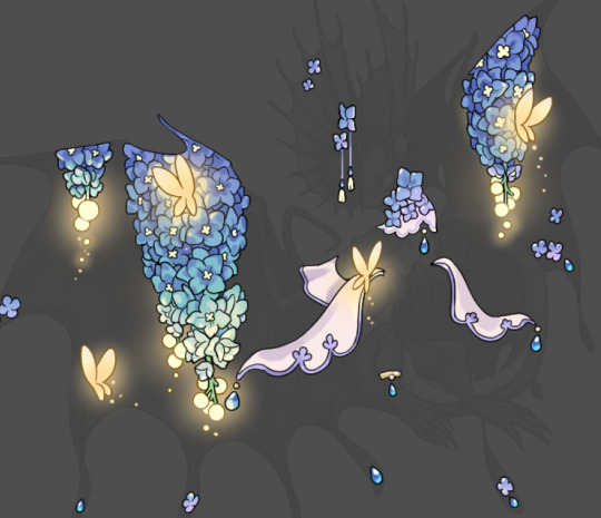
Tutorial: How I Render Accents
PART 2: COLORS
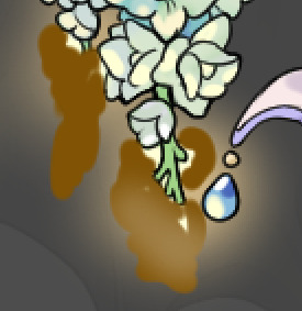
I usually do not recommend 'pixel hunting' aka going over your work with a fine tooth comb and picking out stray pixels to erase. However, for setting up a proper base layer for accents it is imperative to do so.
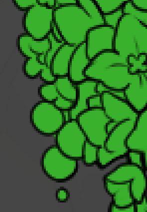
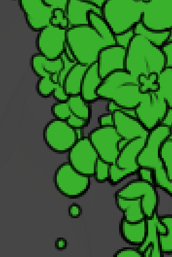
To explain my method of color blocking: I select everything outside of the lines, invert that selection, then fill in. This does a more accurate job than going into each and every section and filling them all in individually, and is also significantly faster. Only downside is small sections like above where you can see bits of the green (which I use bright green against a dark grey background to contrast the base color, lines, and background) poking out, as well as the inner section where it filled in a spot I did not want filled in. Getting all of this right in this stage will make your life easier as you go. (It's also the method I use to color block all my work, even beyond accents)
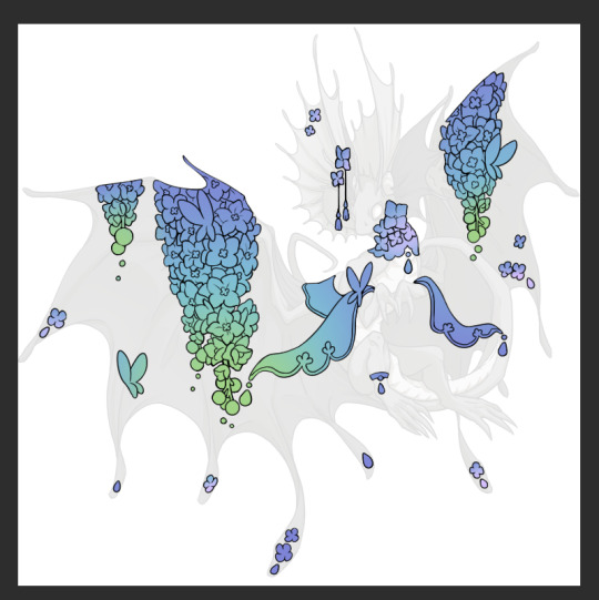
Now this where my style of rendering color may come off intimidating and, tbh it might be. I do gradients first and then I color over them with "normal" blend layers. I typically don't use multiply layers unless I'm shading something that has a lot of textures. If this scares you, it's okay I'll keep walking you through it. Here, my gradient goes from a pastel but deep periwinkle, to a soft more cyan blue, then to a lighter pastel green. Skipping steps and going from the periwinkle to green will give it a different look. There's also hints of a pinkish tone as an accent color.
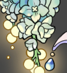
So as I said, these additional layers are done with regular "normal" blend mode layers. I've placed one in between the butterfly line art and the line art for the rest of the flowers, and then an additional layer under everything else. This allows me to create a glow effect specifically around the butterflies, and then specifically under the flowers. Going back and forth with the proper amount of opacity (by using the airbrush transparently) helps to make it glow but not be Too Loud. Also checking it against a dark background can help to check for spots where it spills past the borders, as well as really gauge how Bright it is. I've also color matched the butterflies with the flower pits and the bulbs. This adds extra cohesion and makes them all look uniform but different enough with the gradients.


The stages of how I render gems/dew drops. Take the base color, make it a bit darker and less saturated (as well as changing the hue a bit depending on what the default color is. For yellows I go more orange/red, for blues I go more purple or even pink. It depends), add a small drop light at the bottom thats a fairly saturated version of the base color, and then a stark white/ near white highlight. That's it. Don't over complicate it, it will not matter when it gets shrunk down. Note that I do not use multiply/overlay/screen layers for these types of things as it adds too much bulk to the files and doing it manually helps to strengthen your color theory skills.
For shading and rendering, again, I create a "normal" layer and simply. Draw over what exists. Color picking and hand blending allow me to create the exact shades and effects that I want that multiply/screen/overlay layers may not be able to achieve. (which isn't to say I dont use them! i just don't use them for the main meat and potato part of my coloring) All of what is shown here is also achieved with the CSP asset SOIPEN (which can be found for free in the asset store)
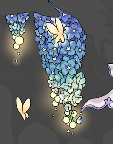

another example. The one on the right is showing how the layer looks without the gradient base layer under it. All of this is rendered by hand. I also specifically put a highlight color around where the butterfly is sitting to give a better illusion that it is properly sitting on the flowers rather than just in front of them.
Next is changing the color of the lines, if needed. A method i'll use is I color just the sections I want (on a separate clipping layer) then lock that layer's alpha setting to them add in a gradient. It's a small and subtle effect that adds more depth without doing a lot of effort. (work smarter not harder)
Now we get to the Polish Layers!
first image is how it looks as a base. second image is with an overlay layer applied. I've used some dark purples and mid tone desaturated greens to push the values a bit further (especially evident on the top left wing) Third image is with a screen layer applied, highlighting the inner most part of the flowers and adding some additional bounce light.
An important thing to note about making accents vs making full coverage skins: OPACITY AND LAYER TYPES MATTER OVER TRANSPARENT SPOTS. What I mean by this is that if you use a soft, light grey to shade with a multiply layer, don't clip it to anything, and have it go outside the lines - that will no longer appear as a 'shadow' when it comes to the final result. Instead you will have a section of soft light grey that is simply laid on top of whatever the image under it is. The same applies for overlay/screen/add layers and so on. If i use a very dark color on a screen layer (to give a soft highlight) and airbrush it over a bunch of stuff and don't clip it, it will end up with this horrible dark splotch over everything that isn't opaque. To this end, mastering normal layers is imperative to having well rendered and convincing accents.
Another thing of note: when it comes to sparkles/small details, note how 'large' the sparkles behind the butterflies are. They seem a bit chunky, yeah?
this is what they look like at proper size. If anything, I could have gone larger on the small metal beads connecting the dew drop jewels to the lace.
Another trick I also like to do is this:

a slight hint of transparency! It's just enough to let the dragon's lines underneath show through but not enough to be super noticable. I like to do this a lot when it comes to sparkly and magical effects.
Next is the worst part of all: destroying all that beautiful hard work with the shadow and line art layers! (sobbing)
This stage always agonizes me. This is my first pass of the shadow/line layers and let's hope it's dark enough.
But yeah that's a start to finish look at how I create my accents. Unfortunately a lot it devolves into needing to know, yknow, line weight and silhouette importance, color theory and the ways that drawing applications actually apply color to a png vs how its rendered in app. All of these things impact the finesse of the accent, and are things you do have to learn gradually over time, but hopefully this has given yall some additional insight and perhaps some helpful tips.
And this should also explain why I get so mad when people go 'hey can I get this accent in another color' no! no you literally can't!
157 notes
·
View notes
Text

underswap sprites i did for fun lol
-Chara and Frisk Swaps obviously lol but they still keep their personalities and Meta sides. Chara still represents the addiction to number based rewards, finality and your true RPG character.
-Frisk still represents curiosity, completionism, emotional attachment and memories you cherish and the joy from playing for plays sake But theyre in Charas narrator role.
-My take on underswap Chara’s design is based on Unused Human and The Vessel
-My take on underswap Frisk’s design is based on Hero and Kris
-Flowey is still Flowey but hes an echo flower lol I mean i have to swap something
-Asgore and Toriel keep their roles still before their childrens deaths and how they swap roles will play out like Inverted Fate
-Papyrus is the sentry and self appointed judge obviously and hes VERY enthusiastic about his role and along the way he does science experiments and hes still THE GREAT PAPYRUS NYEH HEH HEH!
-sans is an actual member of the royal guard but he doesnt do much yet it seems like he is actually doing sh!t. He sells hotdogs.
- Alphys is the captain of the royal guard but her methods are less direct and she mostly uses puzzles and diversions alongside technology to stop and capture chara, she actually is quite shy and insecure and still a weeb. She does fight direct at the end of waterfall with a mech
- Undyne is the royal scientist, a MAD one. Her experiments can be quite explosive (literally.) she is still brash, determined and willing to sacrifice herself just for the betterment of monsterkind but has expertise in technology and science.
-In this, Mad Mew Mew and Mettaton swaps. Maddie’s show will be more Anime themed and a lot more chaotic than Mettaton in Undertale.
-Again, for Toriel it will work out like Inverted Fate
-I didnt swap Asriel because i am not a fan of swapping monster kid and asriel because to me it doesn't make any sense so he is in the tragic prince role still but Frisk is his childhood best friend instead of chara
Anyways thats all i have for now because its just a random thing i came up with
#undertale#undertale fanart#Underswap#KS!Underswap (my tag)#Chara#Chara Undertale#chara the human#Frisk#Frisk Undertale#Frisk Dreemurr#Asgore#Asgore Undertale#Asgore Dreemurr#Flowey#Flowey The Flower#Flowey Undertale#Papyrus#Papyrus Undertale#Papyrus The Skeleton#sans#sans undertale#sans the skeleton#alphys#alphys undertale#undyne#Undyne undertale#mad mew mew#mad dummy#toriel#toriel undertale
73 notes
·
View notes
Text
The Video Gaming Major Arcana
The latest patron episode of Into The Aether/@intothecast asked the boys to decide a video game for every Major Arcana card. They ran out of time on it and only got 2/3s thru
my ass was like "Challenge Accepted"
0 - The Fool - Dragon Quest (The Fool is infinite potential and is at the start of a long journey. DQ as a series is a long-running, is a bedrock of the medium, and has done its own takes on everything from pokemon to minecraft, and it either did it first or did it better.)
1 - The Magician - Metroid and Zelda (The Magician is the first person the Fool meets and is a guide for the journey. The Magician is associated strongly with teaching and with tools. Metroid and Zelda both are foundational works and they revolve around gating player process through tools.)
2 - The High Priestess - FEZ (The High Priestess is another guide, but sits before the veil, keeping guard over arcane, hidden knowledge and deciding when to share the secrets of the universe. FEZ is one of the Big Games that hide under layers and layers of mystery.)
3 - The Empress - Stardew Valley (The Empress presides over growth and cultivation of her kingdom, sitting in a field with wheat in hand. SDV is chiefly about taking care of your own domain, the farm and the wider village.)
4 - The Emperor - Civilization (The Emperor is the firm hand of government and can be an important navigator in chaos but also is angered by lack of obedience and losing control. Civ is all about steering every aspect of a nation and protecting it viciously.)
5 - The Hierophant - Pokemon (The Hierophant is a cultural, societal leader that gains power from people who believe similarly but subsequently is very set in their ways. Pokemon is a huge phenomenon that unites people of all ages, but also struggles heavily with innovation and progress.)
6 - The Lovers - Journey (The Lovers aren't necessarily smoochy-smoochy, but represent a Decision, joining hands with another person and striding into the future together. It's Journey. If you know, you know.)
7 - The Chariot - Bethesda's Catalog (The Chariot is a tumultuous, potent card. They hold onto the reins of powerful beasts and drive forward, blazing a new path. But if they lose grip, everything goes to hell. Bethesda's works tend to have this incredible ambition to them, and when they hit, they HIT, but when they miss, it's dramatic.)
8 - Justice - Dark Souls (Justice is the system and its enforcement of its rules, whether they feel fair or arbitrary. I feel DS fits it well-- it relentlessly follows its own rules and is firm in them, which can either draw players in or seem cruel and unwelcoming.)
9 - The Hermit - Immortality (The Hermit is a wise person who gained specialized knowledge but through great personal sacrifice. They find it difficult to share their knowledge because they essentially traded that ability to communicate easily for the wisdom. Immortality has some deeply complicated concepts to communicate, but its methods and the basic mechanics it uses are to some people impossible to understand.)
10 - (Wheel of) Fortune - Spelunky (Fortune is the card of pure luck and the whims of fate and how you survive being caught in its spokes. Spelunky is a pure Rogue-like as opposed to a Rogue-lite and there is no knowing what the procgen will give you.)
11 - Strength - Undertale (Strength is specifically about emotional control and fortitude. It's not about slaying the lion, but holding it, keeping it from lashing out. Undertale is a game that asks the player to endure emotional struggles both against the mechanics and against their own inclinations.)
12 - The Hanged Man - Signalis (OH BOY ITS MY FAVE CARD. The thing about the Hanged Man is that it's a test, a gamble, a deal. The Hanged Man is not hung from the neck, this is not an execution, they are inverted. They choose to be inverted in the hopes of gaining some Insight into the universe, but in doing so risk madness or obsession or doom. Signalis is both a game about a protagonist going through this and also a game that will put the player through this if they aren't careful.)
13 - The Nameless Arcana - Braid (I'm not even personally a fan of Braid, but I believe it is one of the handful of Original Indie Games. The very existence and popularity of Braid and its contemporaries showed that games outside the big studios could hit big. Braid (or Cave Story for the PC crowd) altered the landscape.
14 - Temperance - Yakuza (Temperance is the melding of disparate elements that should not go together into something grand and new, and maintaining that balance. Yakuza manages to be genuine and profound not in spite of its strange mixture of tones and mechanics but because of them.)
15 - The Devil - Genshin Impact (I don't feel the need to elaborate on this one.)
16 - The Tower - Shenmue (The Tower is total upheaval and where it all comes crashing down, where ambition crumbles and brings an institution down with it. Shenmue is not solely to blame for the failure of the Dreamcast and Sega's exit from the console arena, but it contributed to it and is emblematic of that seachange.)
17 - The Star - Mass Effect (The Star is a beacon in the darkness, a distant light that indicates not so much a goal, but that the journey will continue. Mass Effect is a landmark title that maybe didn't execute on half the things it tried, strangled by its own scope, but it still showed what games could do, broadening the possibility space. It is hope for greater experiences and art.)
18 - The Moon - Metal Gear (The Moon illuminates the path through the darkness, but creates illusions in the reflections, demanding the querent move forward with care or they will go astray, go mad. Is Metal Gear really deep? Is it the closest triple-A games get to arthouse? Does it have meaning? Or is it a mess? Is it too Problematique to justify it's big ideas? Is it all just really, really stupid? Or is it genius?)
19 - The Sun - Tetris Effect (The Sun comes at the end of a long, arduous journey. It is the sigh of relief, the tears of release, the light to finally see how far you've come. Tetris Effect is the latest iteration of one of the oldest formulas ever, and it's brilliant and celebratory and invites everyone to take part in its joy.)
20 - Judgement - Pathologic (Judgement is all-seeing and all-knowing, the final tally and the reckoning. So is Pathologic. Few experiences demand so much from the player, and few games are so brutally honest in answering the player's decisions. In Pathologic, you will get what you deserve.)
21 - The World - The Outer Wilds (The beginning is the end is the beginning. Completion and totality and holistic understanding of Everything. It's gotta be Outer Wilds.)
185 notes
·
View notes
Text
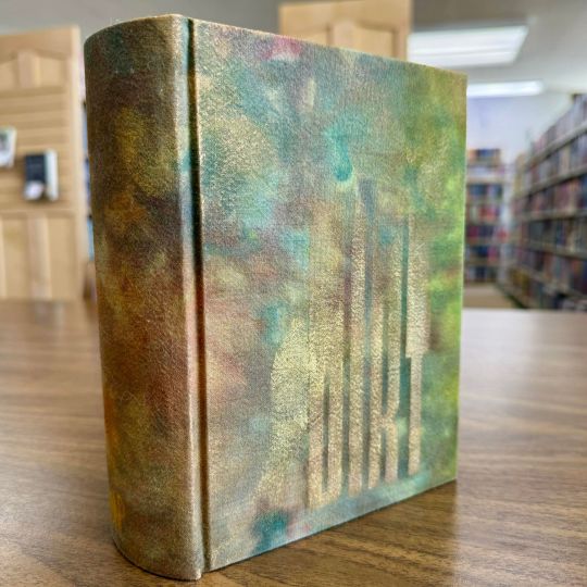
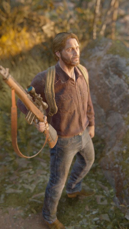
Dirt by Astern
Right off the bat not gonna tell you how long this took me to finish, cause it's embarrassing. But it's done, it's huge, and it's mine!! More glamour shots and process pics under the cut!
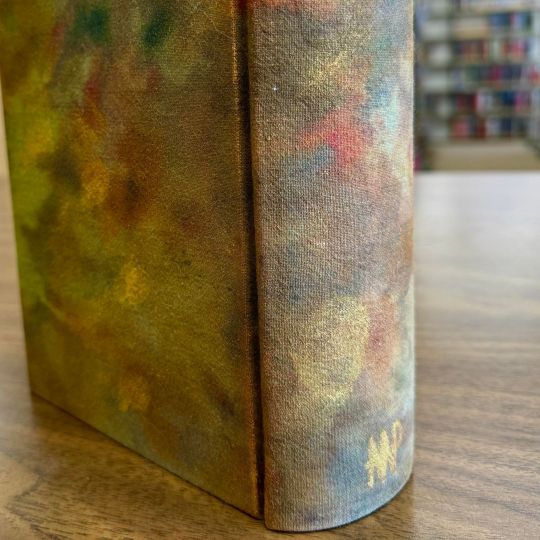
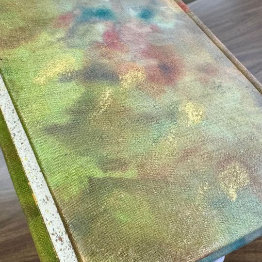
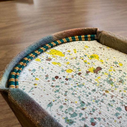
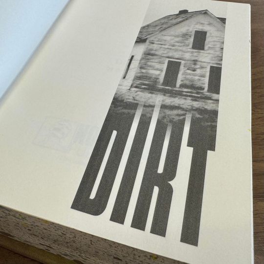
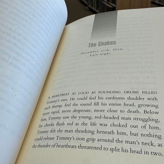
Hand dyed cloth, done with an ice dyeing method; title painted with gold paint, as well as the distressed areas; speckled edges done with acrylic ink and metallic bronze acrylic paint; handsewn endbands made from silk-finish cotton sewing thread; typeset and printed by myself all from Word.
Cheeky little video showing it all off together.
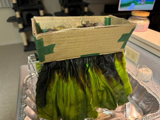
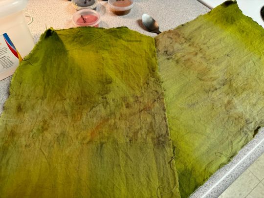
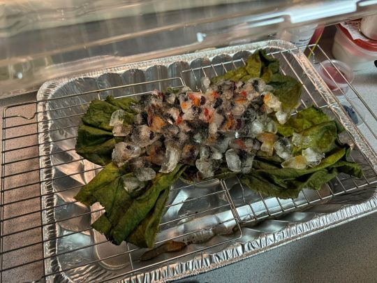
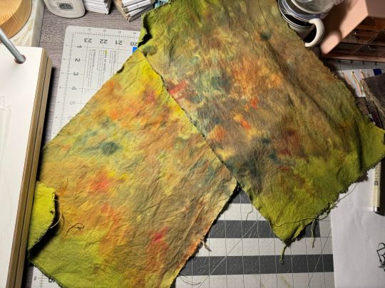
My first and sadly second ice dyeing attempts to get this looking right. First pass was not near what I wanted at all, so we stuck this bad boy back in the freezer.
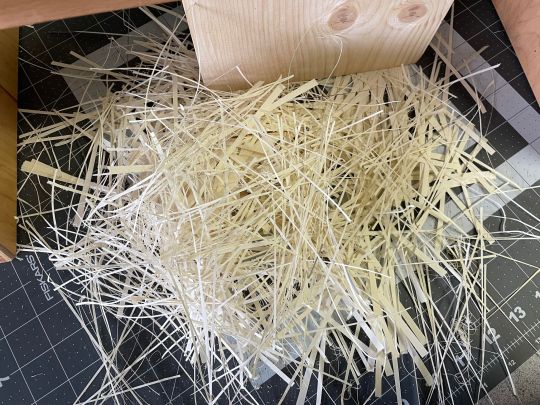
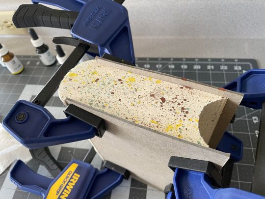
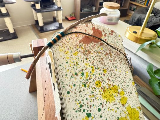
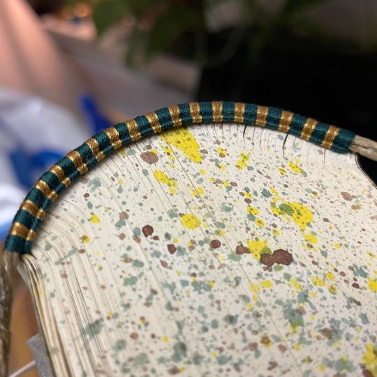
Steps from trimming the unruly head and tail, to splattering the edges, to sewing the endbands. Took me probably approx 3 hours for each one, and I did 2 copies, so four endbands RIP. (The keen-eyed will also notice the patterns do not match between the two photos of the endbands. That's because I wasn't paying close enough attention and inverted two of the colors between copies. But it's a feature not a bug!)
And Tommeh :3 Thank you for looking!
#dirt by astern#astern#tlou game#tlou#the last of us#fanbinding#fanfic bookbinding#no name publishing
131 notes
·
View notes
Note
And also about bottom surgery transmasc style is that there's a lot more methods than most people know about! Like even beyond just meta vs phallo, within phallo there's arm flap, leg flap, abdominal, etc and within that various options for what changes are made and how. Like it's my Dream to get abdominal phallo (cost, body type, time off work, legal availability what with current admin, etc dependent. Rip) but many people don't even know it exists as an option and it's got an entirely different pros and cons list than rff or other similar options. I also did a less common top surgery (inverted t rep o7) cause it suited me best and I'm so happy with my results. People deserve to know more about the options that are out there! Not only is it not the horror story people will try to sell you, its got things you can't even imagine
Yeah! Transmascs have a whole buffet of surgery options, way more than trans fems, it's kinda insane. Lots of surgery options for various needs and desires.
20 notes
·
View notes
Text
I've got a small pile of unanswered asks, sorry for the wait! got myself busy again with other projects, like a christmas themed kids book I need to get done by thanksgiving.
I've been noticing that when my uncle has the books printed, they come out very dark and muddy, which is not great! I tried to research rgb to cmyk conversion and ran into all sorts of different advice on which profiles to use, found that most of the instructions rely on very specific art software, only to ultimately learn that many places used for printing art will just apply their own cmyk profile anyways. which can actually make the colors worse if you already converted the file yourself.
and furthermore, the problem is extra bad with these books because my uncle has been going through Amazon and they use a variety of third party printers! based on the results with the books, I'd say they're cutting costs with low quality cheap printers >:/ which means there's nothing I can actually do on my end to ensure that the illustrations accurately print with the colors I'm using.
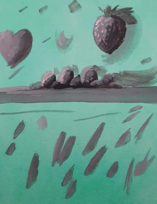
However. I don't give up so easy. I've seen artists make all sorts of color choices just so the end results looks a specific way under specific circumstances. Like using negative colors so the image only looks "normal" when it's been inverted. or using blue and red so the image looks different based on whether it's under a red lens or a blue lens. making color illusions like that blue/black vs white/gold dress or the illusion of grey strawberries looking red when they're surrounded by cyan. I did a final project in college on the topic of color illusion, making my own example paintings.
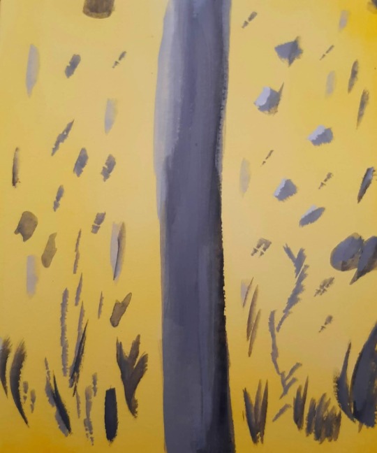
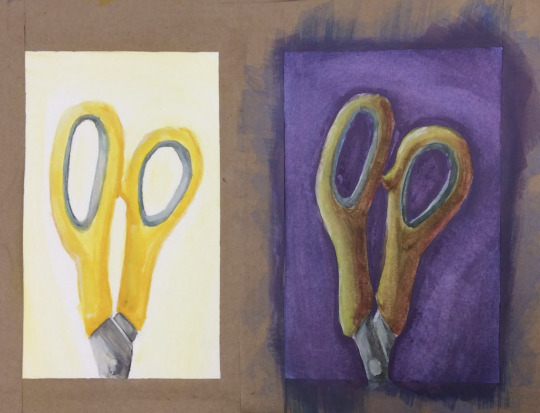
(image description: three photos of small paintings. the first two images are solid yellow and green respectively, with neutral grey abstract shapes painted over them. because of the solid color backgrounds, however, the neutral greys appear to be slightly tinged with the compliment color of their backgrounds; blue tinged on the yellow and pink tinged on the green. the third painting shows a side by side comparison of the same pair of yellow scissor handles. on one side, they are painted bright yellow on a plain white background. on the other side, a dark purple background and more dramatic lighting still give it the appearance of being yellow scissors, but in actuality the handles are painted in shades of green and orange, blended together in some places and darkened or lightened with other colors. they simply look more yellow because of the purple background and the warm shading. end description.)
So I know a thing or two about color strategy. and I am not losing a war against low quality cheap printers, not today. I spent a while looking for cmyk color charts and palettes, testing images through an online cmyk converter, and I have finally achieved my goal. the final test will come when the book is done and sent to print. essentially, I just ran a cmyk color chart through a converter to see how it might look after being printed, then set the original and the converted version next to each other on my file. I can now use the brighter original colors but base the colors I pick on how they'll look in the printed result rather than how they look on my screen. this means the version on my screen is far more pastel than I would normally go for! but the test results so far prove the method, and I think this book will print just fine.

(image description: screenshot of the rgb and cmyk versions of the same painting, which look very small and compressed because they're thumbnail images. the rgb version looks very light and uses a lot of pastel colors and soft shading, while the cmyk version looks much darker and has more distinct shading. it depicts a family out caroling around Christmas, standing at the porch of another family who look very happy to hear the song. end description.)
by golly I am not going to let Amazon keep turning my hard work into muddied disasters. I get paid for these illustrations and I'll make them look good in print by any means available to me.
here's the colors btw if anyone else needs to use this trick:
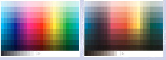
(image description: two color charts. one is very bright and rainbow, the other is much lower contrast and dark. the colors that are the most affected are the blues and greens, while the reds and yellows are somewhat more intact. the greys have also become more brown in the second version. end description.)
just figure out what the end result needs to look like and pick the brighter color accordingly. should make the low quality print jobs look at least passingly decent! sometimes you really have to plan ahead to make things look the way you want.
27 notes
·
View notes
Text
Transfemme Buggy who never realized until a certain disease is transmitted and spread on an island she and her crew visits.
Blackboard and his ilk had been there before, and Buggy had just so happened to show up within a week of the other leaving. Damages were minimal overall but the marks of their presence was there, everywhere, in the pale faces, the new graves, the sickness and fear.
It was a typical stop, supplies and information gathered in equal measure. Tasks delegated, Buggy is among a group chatting up the locals, and that layer of ignorance self consciousness is there, as it always is, when eyes catch on the captain's visage, but way that Buggy is being watched changes between one minute and the next. Someone comes into the shop, a young woman at a glance, who sneezes. Buggy doesn't think much on it, a charming smile and offered handkerchief the only response. The gazes go from wary, warming up to them, to suddenly wild and fearful and there's a shout and-
Buggy chokes on air, feeling the moment something latches in his lungs. His Devil Fruit is useful in ways few can fathom, in ways he cannot explain, but the introduction of something Foreign and Unapproved is a feeling the jester knows well, one which is often a mere reflex to Chop off of his cells, but this one adheres, latches, and Buggy can feel it seep and spread and-
Between one moment and the next, Buggy blinks past the sudden vertigo, genome shuffled and reverted and inverted until the swimming in his vision pauses, Cabaji's wide, panicked face swirling into focus. The blue haired pirate squints, confused tilts a dizzy head, and then freezes at the ambient wave over sensitive Haki, terror and guilt and panic which chokes and screams and wails.
Buggy moves to stand and freezes.
He looks down.
That is... definitely new.
A gloved hand touches his chest, the breasts straining under the striped top. "Huh," the clown captain says after a moment. "I did not have 'Sudden Sex Change' on my 1565 bingo card."
There's laughter, and Buggy preens a little as the negative emotions begin bleeding off, replaced by cautious amusement. Once tempers have calmed enough, there's a moment of questioning, where clarity is sought and then relatively received.
It's a change, certainly, and one which is yet another echo of Teach's group having been on that island. Buggy isn't upset - it isn't their fault after all, the town is just as hit by this as he is - but he is.... contemplative about it.
The crew is overall relatively calm about it. Gender equality is something Buggy does enforces heavily on the crew, assigned sex at birth or otherwise. Barring a few others, some more well renowned than most, the Buggy Pirates are the most progressive and open minded of pirates.
So after a quick explanation, things are back to business as usual - and Buggy is happy about it, obviously, the respect is there and it's perfect, the normalcy is fine.
It's the way he feels that throws a wrench in it all.
It takes a while to realize, because it's There, but it's just beneath the surface.
It starts when Buggy puts on a little weight.
All in all, that's not a big deal - but to Buggy who has a long standing problem with food and eating, it's notable. It's not uncomfortable. It's not like there's an Issue with eating or bodily image issues, it's the lack of time, of desire, of enjoyment in it. Buggy had always been on the slimmer side, never packing on muscle the way of the men and women in his life early on. Buggy was built slim and willowy, no less strong but less visibly jacked. It suited him just fine, that method of muscle, suited to aerials, to agility and speed. It fit and Buggy was adaptable.
Only now, Buggy isn't as preoccupied. There's less of a desperate, cloying need to fill his every waking moment with tasks and duties and activities. It's subtle. It's the slightest of shifts. It starts when he gains a little weight.
Then it becomes casual comments from the crew. "You look so healthy," some say warmly. "You look happy." And Buggy is. Buggy IS happy. And Buggy feels healthy. And it's strange, so strange, and it's wonderful and confusing and amazing, and it all comes to a head as things do with Buggy by sheer happenstance.
They dock at an island. Buggy and Alvida are restocking on makeup. A clerk calls them "ladies". Buggy waves it off, both the butterflies and the referral, and then that same clerk responds to a question the captain asked with a warm "yes, ma'am, absolutely"
And Buggy is having a realization in a small cosmetic shop on a tiny no-name island in the New World.
As they leave, she catches Alvida's sleeve and he - she - asks a question. "Could I... be a woman?"
And Alvida, sweet Alvida, blunt and brutally honest Alvida, snorts. "Fuck if I know. If you want to, sure, but your body doesn't determine that. If you're a woman," she pokes her friend in the chest, above the clown's heart, "then this is all that needs to be a woman. Is it?"
And Buggy breathes shakily. "I... yes. Yes? Yeah. I. I think so."
"Then you're a woman. Now come on, sister, we still need to find a foundation for me."
Buggy comes out to the crew casually though not without nerves. They get back and she just drops it with all the finesse of a bull in a China shop. "Surprise, it's a girl! And by it, I mean me."
The only response for a moment is silence, then someone asks about pronouns. And Buggy is bathed in the cacophony of her crew screeching their happiness for her, thanking her for trusting them, singing her praises, and she's a puddle, truly, she is melting into a pirate puddle.
Accepting it makes things fall into place a little easier. She's comfortable in this body in a way she never was before. The center of gravity fell in a more natural way to her senses, lower and steadier. She isn't any less strong, and she's not at all interested in the stick-thin-sensational body type, though more power to people who rock it. She is herself, and she never expected to be all that different. She's still got the musculature of an aerialist, the corded muscle of a knife fighter, no amount of hormone changes will take away that. She distributes the weight differently like this, filling her clothes in a way that looks and feels better to her. It's like she was assembling a puzzle in her heart, blindfolded, and she never knew a piece was missing until it fell into her hand, knocking the rest into place like a domino effect. Unexpected but undeniable, she was happy.
She felt beautiful in a way that she never had before, she felt more confident, more at home, more at ease in this skin of hers now that it finally was molded into a better form.
And with that contentment came freedom that she hadn't had the time for in what felt like eternity.
Freedom to experiment, to train, to explore. She felt better, so she could be better, could do better, and so she became better.
And the Seas quaked as a result.
#buggy the clown#buggy headcanons#transfem buggy#one piece#Buggy & Alvida#buggy pirates#feminization disease (one piece)
51 notes
·
View notes
Text
WOE, RATS BE UPON YE!!
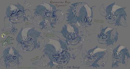
more Ruju doodles because I lost control of my hands, oops
this time, featuring a later snapshot from Ruju's Commander timeline: set around the time of Secrets of the Obscure and Janthir Wilds, he's now even farther off model than he already was!!
and now some obligatory (non-spoiler) ratmander lore-dumping under the cut:
characterization notes as The Commander™
slowly comes into his own over the years, with his softer side finally showing itself mainly when Aurene chooses him
this rat was the softest little guy wherever she was concerned
no seriously he was almost as clingy with her as she was
Caithe was the serious parent he was the fun uncle/big bro
he used to race her up the jumping puzzle in the egg room
largely wanted her to get to have the childhood he never did
he still play-wrestled with her even once she was 1000x his size
his bond to Aurene helps stabilize his magic significantly
there is an inverted bell-curve of 'respect for the Commander' based on how much experience one has with him
step 1: celebrity hero. step 2: violently insane. step 3: ok yes he's insane but also thank every divinity he's on OUR side
actually did NOT get along with Gorrik at first. he is a grade A projector and also distrusts anyone Inquest immediately
Gorrik being enamored by the murderous beetles did not help.
(that entomologist almost wound up in the sea. oops)
after multiple interventions and a few sincere heart-to-hearts though he's become EXTREMELY protective of the guy
similarly protective of Taimi, though he teases her back too
genuinely struggles to keep track of things. he writes out the canon story journal in a small notebook to help with that
miscellaneous other details you didn't ask for
consistently chooses ferocity-aligned dialogue options even and especially when he has absolutely no good reason to do so
do not pick him up. do not pick him up. do not pick him up.
if he allows you to carry him either he really really likes you or he's pretty sure he'd serve a prison sentence for biting you
acts very big and tough but is a total softie deep down
no seriously if you hug him he might actually cry
(he'll claim it's just something in his eye though)
had some crushes in college and fumbled every single one
50/50 shot of whether the rats he picked on were just easy targets or if he liked them and was trying really hard to cover it up
(if he ever met them again he might actually burst into flames)
incapable of sleeping in normal positions. also snores LOUDLY
puts bloodstone dust on ALL his food. Oxbone would be proud
also makes his own food EXTREMELY spicy when he can
dw he won't put that on yours though. he's not THAT mean
originally got into cooking as a method of training his fire magic
LOVES to put on a big show with it if he has guests, too, complete with all sorts of fancy knife tricks. you get The Works
his ADHD hyperfixation is knives/cutlery. he has told no one this
constant motion/fidgeting, can't keep still. foot tapping, scratching, claw biting, pacing, etc are all very common
#my posts#gw2#guild wars 2#gw2 asura#my art#slooowly improving my rat technique#I also wanted to get some details nailed down for Reasons#I already have his outfits figured out sorta but off model facial design stuff + piercings and scars? needed that too#AND it gave an excuse to share some more lore!! wheeze#I had a full section dedicated to Inquest family drama but I'll save that for another time when it's more relevant#anyway i wanted him to have an ear piercing. it felt right ok#having fun messing with asymmetrical design with him...#(it was also me wanting to practice his big ears and how they move too because they're VERY expressive on him)#yes I'm still avoiding drawing his complicated outfit. shh#since this is the time of soto and jw but has nothing to do with it or any spoilers. it can just be released into the wild ig#chucks this rat at you at high velocity and runs away#Commander Ruju
30 notes
·
View notes
Text


All Shook Up / É tutto cosí semplice by ke_vl
My first têtê-bêche binding! First and foremost, thank you ke_vl for trusting me with your AikuSen fics and agreeing to let me bind them 🧡 please check out All Shook Up and É tutto cosí semplice, two stories which catch me in the feels every re-read.
For this project I had to work out how to format both fics into signatures so that the latter one would sit upside down. I was fortunately able to wrangle one fic into 96 pages, while the other ran to 80. Since both are divisible by sixteen, this allowed for the fics to be formatted into self-contained 4-sheet signatures. Hey presto! So rather than navigate inverting PDFs, I printed the two fics separately, then sewed the latter set of signatures on upside down. It was a lot easier than expected, thanks to the numbers working out so neatly.


This is also my first paper cover bind, with recycled 150gsm cotton paper from Søstrene Grene. Adhesive backed vinyl for the cover graphics and text, bound together using kettle stitch. I'm not sure of what brand the endpapers are, but they're 110gsm and pretty sturdy. The endpapers and headbands reference Aiku's heterochromia, while the cover paper is peachy like Sendou lmao. rip blond Sendou


In terms of typesetting, I've found a formula that works for me and my printer... mostly. The margins are a little wide still, even after a round with the chisel. I've pretty much given up on that as a method of page trimming—it scuffs and tears the edges too badly.
Some further WIP pictures/commentary under the cut, since I actually took some for once!


Sewn textblock, then with added headbands/mull. The kettle stitch took me ages for some reason... considering going back to French link stitch for the next project, I think it's quicker.
The headbands are a little scrunched up but I'm happy with them. Green and purple is a pleasing combo.


Completed casing and textblock, then the weeded adhesive vinyl—supervised by Chigiri 👑
I always tell myself my Cricut can handle cursive and thin fonts as long as they're big enough... it really can't 🥲 Had to redesign and reprint the author name / spine titling for É tutto cosí semplice since my original design was too bitty. Weeding was hell regardless. HTV is so much easier to wrangle, but I have loads of the adhesive stuff to use up before I let myself buy more HTV.
I had a concern that the cover paper design was too busy for the vinyl to stand out on. In the end, the purple looks fine, but I think the reverse cover would look better if I'd used a darker green.

The last issue with the book is how jank the spine looks when the cover is laid flat. I think I glued the purple side of the text block too close to the edge of the coverboard, making the other side bunch? That or yet again, I made the spine stiffener too wide. It's not super noticeable when the book is closed. Hoping to improve on this in future binds!


My favourite detail is inspired by a têtê-bêche novel I owned in childhood (Sisters... No Way! by Siobhán Parkinson) It's written from two perspectives, and when you'd finished reading one, my copy had a note telling you to flip over and read the other side. I did the same thing here, accompanied by panels of the two boys nabbed from the manga.
#bookbinding#fanbinding#ficbinding#fanfiction#blue lock#aikusen#all shook up#e tutto cosí semplice#boin de bindery
23 notes
·
View notes
Note
hello! hope you're doing well :)
i was wondering if you have any tips on how to do the lighting on edits? the colorful or dark ones or maybe probably every single one you can think of because it's the part i struggle with the most so if you have the time, i would like some help in this department lol
thank you so much in advance <3
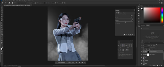
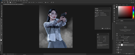
Hi! Im doing great, thank you for asking!
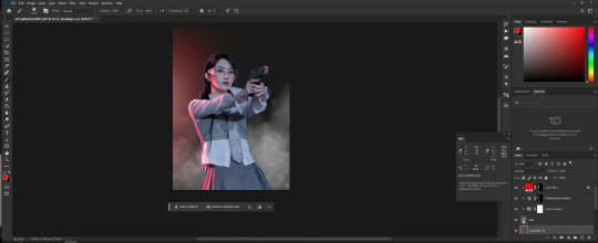
I guess my biggest advice is to use tons of references and gradually you'll start to understand where the light goes. Also deciding beforehand where the light is coming from will help you understand how to work around it. I'm also thinking about the vibe of the picture a lot, bc different lighting will give you different vibe.
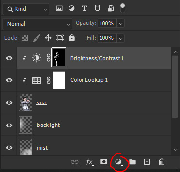
If we talking about technicality, I use Brightness/Contrast or Solid Color Adjusment Layer with Blend Mode Color Dodge and Fill around 50%, but can change the number depending on the picture. I would also recommend to do several layers of lighting with different levels of Fill/Opacity and different Blending Modes. Use a Mask to draw the light where you wan it to be. Mostly just follow the lines on clothes and face. Play with Blending Modes and Fill/Opacity. And to create a general vibe I use Color Lookup/Color Balance or Hue/Saturation. Again depends on what I wanna do or portray. One of the things that I add as well is mist/haze. It just adds to the atmosphere in general and helps separate model from the background.
Just did a quick example. I didn't use any Blending Modes here. But I hope it will give you an idea of how it works.
You can find the Adjusment Layers here:
Oh, yeah, create a light source on the background. It helps to identify where the light is coming from not only for you but for the viewer as well.
Here's one of the method I use if you wanna add color and not just the white light. Create Solid Color Adjusment Layer. You can choose any color you want. And then click twice on the layer to open Layer Style. Here you can find Underlying Layer. And by pressing Alt drag one of the points to the middle or closer to the middle.
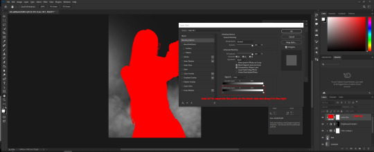
You shoud get something like this
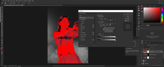
Then close the Layer Style window by clicking OK if you are satisfied and click on the Mask, invert it (ctrl +i) and then using Brush, preferably soft one, draw the light. White brush color to draw and Black brush color to erase. Or you can just simply copy the mask from previous layer by holding ALT on that layer mask and drag it to this one.
And you get something like this.
Hope this helps a little. Obviously, the more you practice and experiment yourself the more you'll understand how everything works, so I hope you won't give up and continue your journey. Good luck!
8 notes
·
View notes