#simplifying my style is making my art worse .
Explore tagged Tumblr posts
Text
You've heard of Jars of Eyeballs, now get ready for:
Vials of Eyelashes
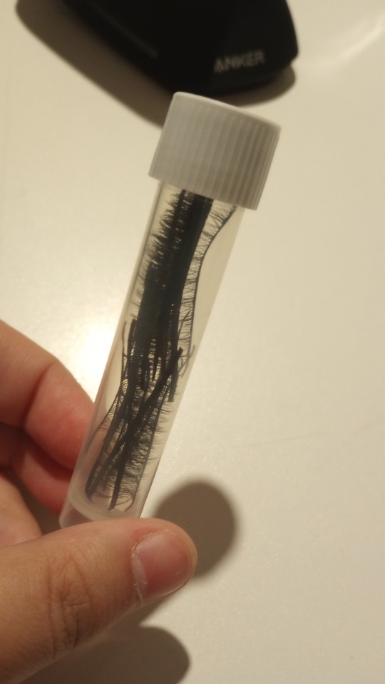
#should i tag this dollblr. would that make people less confused about the eyelash vial. or the eyeball jar#dollblr#actually i dont keep my eyes in jars i have em in awkward little baggies#the homemade glass cabochon ones in one and the professionally made acrylic and glass ones in another#my eyeball baggies. is that better or worse than the eyeball jar#im reorganizing all my stuff so like craft supplies and eletronic cables and whatever#and i had some package of really cheap ass fake eyelashes that i thought about using in a faceup#(never actually got around to using em LOL someday i'll try out eyelashes on faceups but rn ive been much more on the like)#(cartoony and simplified end of doll face painting so i havent felt much need for em)#(especially because im partial to anime style dolls)#and the packaging was really bulky to yknow keep the eyelashes pristine. but these were REALLY really cheap lashes so they were just like#by default slightly wonky. which doesnt matter too much to me because they would only be used for dolls or art anyway so they dont need to#like. keep the perfect human eye shape LOL so i was trying to figure out how to store em without taking up too much space#and i remembered all my vials for fountain pen ink and well. the rest is history. the rest is the eyelash vial#now time to put this deep in a drawer unlabeled to forget about and then give myself a jumpscare about mysterious vial years later
6 notes
·
View notes
Text
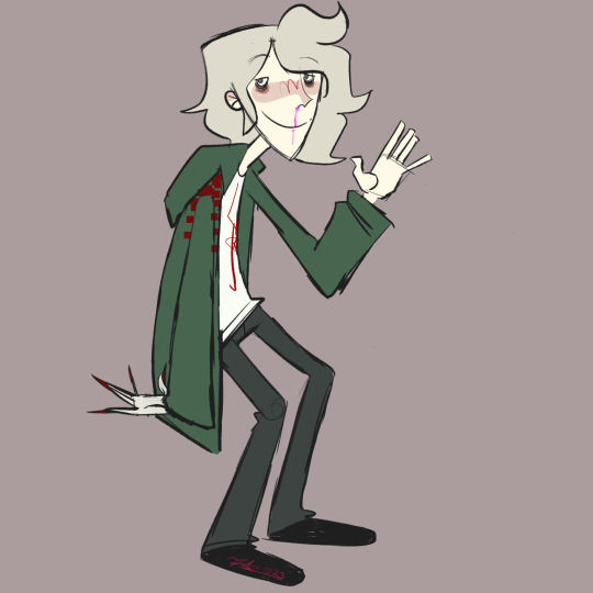
every year i draw komaeda and this year i cartoon network-ified him
(check out my last few komaeda drawings here x x)
#my art#danganronpa#sdr2#komaeda nagito#fun littl sketch. been very lazy lately and am having a hard time finishing art😞#also Yeah my art style has changed quite a bit over the past 6-8 months#im trying rly hard to stylize more and simplify shapes and stuff#its been a massive breakthrough for me creatively but i cant help but feel like my#simplifying my style is making my art worse .#i think i just have it in my head that detail = good simple = lazy#anyways. komaed a am i right? is FIHAS still funny idk i think FIHAS is still funny
5 notes
·
View notes
Text
I'm on the first reread of Order of the Stick in a couple years. And tracking how close I am to the current strip by how many years ago it was written.
Dude really slowed down the production speed at some point. But that's OK. The quality is phenomenal.
He didn't have to go so hard. He could have done a joke of the day comic for a year or so and people would have loved it. It was a relatively early webcomic and it had a clean, professional art style, if not a highly detailed or realistic one. (It still takes skill to make that simplified style of art look good.) It's been over two decades and everyone in the main cast has had family stuff and backstory stuff and character development. (And the writer's grown too. It wasn't bad at the start, but over time it's settled into having way more secondary and scenery female characters and the existence of queer people is a mundane background part of the world, rather than something occasionally pulled out for a joke.) We've had high drama, we've had subversion of expectations, we've got the sort of massively high stakes that you can only get in a fantasy setting. And it's been going on for over two decades. I can't even.
And it's so much better on the rereads. Dude will make callbacks to some tiny detail from five years ago real time. The overall plot is solid enough that it's actually enjoyable to condense two decades of strips into a week or two of reading. It holds up. I don't know how he does that. It shouldn't be possible to write something that works as a thing you read one page of a couple times a week and something that works as an archive binge like that, I don't know how it's possible to pace a story to work that way. (Well. Lots of bad puns seems to be a key feature.) QC doesn't work like that, I mean QC is fine but you go back to the very beginning and it's painful how much worse the art and the storytelling was, and it works best if you just understand it as a bunch of loosely connected storylines. OOTS is one story and you can tell where you are in it and how far out the big climax is likely to be. Dunno how he does that. It's been over twenty years. I'm pretty sure I'd be stabbing my eyeballs out if I worked on the same story for over twenty years. That's life's work stuff there.
75 notes
·
View notes
Text

This here represents a typical sketch I'd have drawn at any point in my recent life, - until now.
I will no longer be able to work in a high detail art style like this at all, until the accuracy of my new technique improves. And I can't promise it will.
Why?
I've been drawing with wrist movement for my whole life.
This is infamously unsustainable to the hand. It used to gradually become more uncomfortable until it became so painful that I can't do it at all for more than a few seconds.
I have good steam to work on comms now, but I'm forced to have a break from them because I reached the limit of this "wrist-work". If I keep pushing against my body's warnings, I'll disable myself worse and it'll last me forever.
My ability to draw is the most precious thing I have in my life. Nothing matters to me as heavily besides basic necessities, that I make art. Art is how I find friends and community and express myself in a way that nothing else satisfies that same way. Even in my worst times, this has been the light of my life. Even my best times would feel so devoid of content without making art. Art is my whole life.
Because the stakes are so high, I'm working on a solution.
A common tip for sparing the wrist is drawing from the shoulder and the elbow. This is very difficult for me since I'm not used to controlling my hand movement especially for detail from any other joint than the wrist.
Another is casing your pencil into any material (I just taped toilet paper tightly on it) to make it thicker to hold. It means you need smaller movements for drawing detail and therefore spare wrist work.
My muscle memory mostly has it all for moving the wrist to do all the stuff. See what it costs me now?
I'm practicing drawing in a new technique entirely, and figuring out what I can do.
I have to accept that my art style will not look exactly the same either, because physically I can't produce the same old thing drawn in my incorrect technique.

This is my drawing hand wrapped in a scarf to keep my wrist from bending when drawing, so I encourage sourcing the hand movement to my shoulder and elbow instead! Wearing this prevents the painful motions and helps me learn new motions.

Here are practice sketches in the new technique. I find it hard to draw small detail without moving my wrist to do it, but that accuracy can be trained by continuously drawing small shapes or objects (beans, circles, spirals, hair, fur, little horses...) from the shoulder. (This is advice I hear from professionals btw.)
Some thoughts about these sketches...
- I notice I simplify shapes more to make them easier for my hand movements to get across. I literally can not physically draw any other way, but the result looks kind of good even?
- I'm kinda excited to see where my learning goes from here
- I want to keep practicing hand control
- I was concerned especially about how to replicate my character designs like this, but it's somewhat working I guess?
So yeah... This is lifesaving for my art abilities on the long run. Gonna keep up the practice!
14 notes
·
View notes
Note
This question has been twiddling in my mind for a hot minute now but, what's a layout artist's role in the 2D animation pipeline? Coz I noticed it the in in-between stage of storyboards and animatics (or sometimes after depending on the flow chart, feel free to correct me if I'm wrong tho)
Is there a crossover with draw-over artists/animation correction/animation clean-up with that role or is it a completely separate thing? I just know there's a lot of being on model and making sure things are proportionate🤔
That's a great question!!
So, the role "Layout Artist" is not something that is typical in a US animation production. Powerhouse is a bit of a unique animal in that department. For Powerhouse, a layout artist's role is similar to what one used to be in Japan. That is, layout is the stage between storyboards and animation.
Storyboards in Japan tend to be much much rougher than boards in the US, so the layout artist goes in and refines particular shots/panels to put it on model and fill out any bg/prop information that the animator would need. You can kind of think of it as doing key frames, but with detailed background information as well.
At Powerhouse, the layout artist will just focus on the characters. Specific shots are called out by the director and passed to them. From there, they go into the boards and put the select characters on model and will even add in lighting information depending on the scene. This is then treated as the key frames for the animators once the boards are passed off.
Typically, in US animation, you have board revisionists who go in and touch up boards before they are sent out. With the way cartoons tend to be, the art style is a lot more simplified, and you're not worrying about highlights and 2nd and 3rd tones. Maybe that's kind of like a layout artist at Powerhouse? Eh, doesn't quite feel right. They're both different beasts.
As for drawovers/animation corrections, that's work typically done in post. Again, I think this is a little more unique to Powerhouse than your typical US production. At this stage, the animation is already done, so the artists are fixing what's there or redrawing keys and sending it back for the rest to be fixed. You got inbetweens now to worry about and make sure work in motion (if you're lucky, there's a pretty layout to work off of, and you just grab that and drop it in for the keys cuz sometimes outsourcers kind of...ignore it and give you something worse lol).
Every production is kind of different, and in my opinion, it's good to allow a level of flexibility to try and make things as smooth as possible. Something that works for like, Gravity Falls (was rewatching that last week; great show), is not going to work for Castlevania. What works for Castlevania is not going to work for like, The Simpsons. Ya get it, right?
Hope that answers your question!
11 notes
·
View notes
Text
Ortega. The Yuma lookalike
First post test. Just because.
You guys ever noticed how Ortega in Pokémon Scarlet and violet looks exactly like Yuma from MDA: Raincode?


I've always wanted to point that out because I find it hilarious.
• BOTH are males
• BOTH have purple eyes
• BOTH have a short physical build
• BOTH have pink hair styled in a bowl cut
Yuma: "DON'T TALK TO ME OR MY SON EVER AGAIN!"
Either way I freaking adore them both! 🩷💜
Ortega is Fairy Type Yuma while Yuma is Ghost type Ortega.
Yuma is kindhearted with a strong sense of justice while Ortega is competitive, bratty and short tempered while hiding real feelings behind the insults he throws at people.
Just some things about me:
By the way this is my first ever Tumblr post. I'm a new guy so I'm the newbie dumbass. I'm a massive fan of MDA Raincode, Danganronpa, Monster Hunter alongside other video games. I actually research multiple video games and really look into any new characters that catch my interest.
Usually I've been in the dark because I don't use many forms of social media (I was raised strictly so I wasn't allowed to talk to anyone online until I was 19 in 2019) so yeah... I'm an internet hermit. I first had a taste of online socialising when I created a YouTube account to talk in the Super Smash Bros Ultimate streams I was taking part in. Then from there I joined Discord just so that I could remain in contact with my friends I made there. However after years of struggling with fitting into online communities I've had no choice but to back away from people due to my health. Having social anxiety really doesn't help, plus I'm autistic so I really struggle with a lot of basic things people can do easily. (For example instructions have to be simplified for me so that I can understand them step by step).
I'm a gamer who loves multiple video games but always struggles with talking about my passions wherever I go. People find me annoying, see me as a spammer (especially as I love posting memes I find on the internet just to spread joy and try to make people laugh) and ban me from community servers because I'm too emotional (when I feel low I have a bad habit of venting just so someone can show some kind of support, as I don't talk to anyone in reality. Unfortunately there's a lot of people who can't stand people like me, since my depression is triggering for them, so they throw me out, never speaking to me again.
This of course made me feel worse about myself and I've been isolating myself. Due to my lack of socialising (I've always had problems with making friends) I find peace with the characters I fall in love with in video game. Mostly because I can relate to them. I believe that everyone has their mains. Their number one character(s) they love the most. That's the main reason why I love the games I play.
I'm going to give Tumblr a go. I know that people often use this place for fanart however, I'm a really terrible artist so I won't post any of mine. Also I'm extremely reluctant in showing off any random fanart I find online because I learnt the hard way that it's extremely rude to just post other people's art without crediting them. I'm deeply sorry.... I didn't get a manual of online art posting etiquette so I was completely clueless and I'm permanently ashamed of it. It was because I was so used to copying and pasting any nice pictures I saw online onto my private discord server. So I wasn't used to big communities (an example of my dumb brain however it's wired differently and I take things literally so I'm just not going to post any fanart whatsoever in public) yes.. I am terrified of being told off, and it's got only worse after getting banned from four discord video game communities. I'm also an ex mod so I can tell whenever a server mod is more into status than actually caring for the community.
I'm sick of explaining everything about myself as a human being who just happened to be born a little bit different than most people who spend their whole lives on social media. I'm sensitive, outspoken and I just want a place in the gaming community who will just accept people like me. I'm the kind of person who speaks their mind and when upset or angry I tend to say nasty things at people but I immediately regret it.
At least here i can just post random crap that's on my mind. About my favourite video games and characters while people can choose whether they want to hang out or not.
I'm a kind hearted person who looks out for everyone. I allow people to vent if ever they feel sad or alone. I hate to see people get hurt and I'd love to see them get well ❤️🩹. I will never push anyone away just because they are being too "triggering" while I understand that these things can upset other people it still doesn't make it right to criminalise the person who is in need of support from other humans. Treat others how you'd want to be treated. Yes I do talk about deep topics if I must, I am into horror game lore after all so I've heard it all. However hopefully I'll warn everyone if something I'm about to talk about is too dark.
I'm going to say this as well. I apologise if I type too much. Because of the way I am I go into as much detail about pretty much everything as possible. Yes, I've had nasty comments about it.
I DO make videos on YouTube but at the moment I've shut myself down from it. Hopefully if I feel better I'll open it up again.
Anyway I'm glad to get most of that personal shit out of the way just so that you have an understanding of what to expect from me, I'm certainly not mainstreamer. For the most part I'm just a geek for multiple video games.
P.S I suck with hashtags by the way.
10 notes
·
View notes
Note
I am sorry to bother you but I have to say, I feel Dib got treated too harshly most of the time. It's the point of the story yes but at times it just feels flat out sadistic for no reason.
It's why the Gargantis Array comic storyline sucks to me, it was just two issues of buildup to make Dib a gross fat joke and humiliate him across space. Jhonen just really seems to love torturing Dib more than anyone and it's rarely even deserved.
Oh, this is the opposite of a bother, friendo!
I actually have a lot of reading to still do on the topic of the comics. I’m woefully only really up to good knowledge about issues 46-49 and a lot of bits of pieces otherwise. If what you’re saying rings true, that is sad to hear, but pretty interesting still. I’ve always in the back of my head been a little afraid that Dib’s karma could be flanderized to the point of making him a butt monkey. Especially when we all know that’s supposed to be Skoodge’s job! (waka waka)
As for the show, honestly? I think they managed the balance just fine. It’s not so much that the show was specifically cruel to him, but that sadism broadly was one of its central themes and there were no efforts made to exclude Dib from that. And why should they have? He’s not an innocent woobie, and in fact is actually in the seat of a very ambitious antagonist against the real main character’s goals. Arbitrary events of misfortune and pain were the bread and butter of the series back then, and almost no one was spared. Jhonen (who cameoed himself in the show just to choke on a fish and die for a joke) also from what I hear injected a lot of his own qualities into Dib, so I imagine it probably IS very entertaining to him to give the boy the works.
From what I have seen of the comics, that looks like a much finer line to tow. And this more of an off the cuff ramble, but you know what I think??? I think they made Dib a touch way too sympathetic actually. There’s so much more focus on just him and Zim’s side antics, and the more time you take Dib off world and away from the rest of the Earth side characters, the fewer reminders they give you about how many of his problems are majorly self inflicted and how much of a disturbance he can be to society. And, for better or worse, a less dark overall tone in the comics means that the moments of overtly black comedy are going to stand out a little more against the modernized background by contrast.
And there’s another elephant in the room that kind of gets to me, personally. As well as I can put it well, the art style change kind of really affects the lens he can be viewed through. Maybe more than most people want to admit. And I’m not dissing the rounded down, brightened up change, it’s not a better or worse direction from the show… but it is a different one with different strengths and weaknesses.
Like, look at Dib’s early season model sheets for a base of reference.
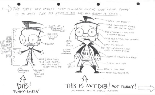
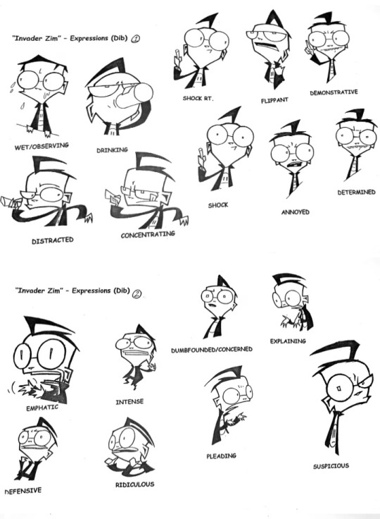
Now compare him alongside the comic and Florpus interpretation of Dib Membrane. OBVS I am simplifying a ton here, there’s a ton of room for more range than these examples.
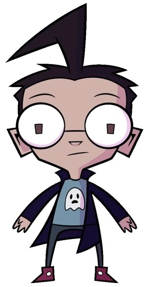
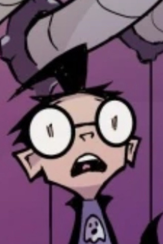
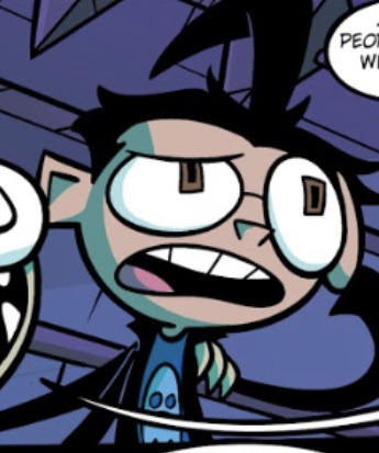
I’m not here to say he’s a better or worse Dib visually, he’s still Dib to me! But is notable how comic Dib actually breaks a ton of the “rules” of what kind of character they wanted Dib to be. To put it one way, they sanded down some of his edges and he’s not as apparently “skrungly” as he used to be.
What I like about the change is that it actually gives the better impression of him actually being the lil dorkass kid he’s always been. He’s got a slight aesthetic shift that shows off his unique interests and it definitely sets him apart from Zim, who actually retained most of his own show design. He’s still got some funny lookin’ qualities and he’s so much more endearing
One of the downsides of all that, however, is probably that he’s so damn endearing and as a default.
I dunno if you ever watched Little Shop of Horrors, amazing musical btw, but, it’s supposed to have this whole tragic ending where the main character’s, Seymour’s, long chain of mistakes catch up with him and he meets his demise. In the movie, they casted Rick Moranis for the character, and he played such a puppy-eyed, adorkable Seymour that it made audiences suddenly too bummed out to even appreciate the dark ending. They hated it so much that the crew actually just changed the ending completely so that Seymour gets a consequence-free happy ending with everything he ever wanted. Even though he’s literally a serial murderer of sorts. You were always supposed to feel for him, but not to the point where watching him fail just makes you feel horrible.
I think Dib works kinda like that on a meta level.
If there’s any ruling on what goes over that invisible line when it comes to handling his character, I think Florpus Gaz nailed it right on the head. Dib is never supposed to just utterly break under the weight of his world. Can he sometimes crack? Yeah totally, especially in the “brink of madness” sense. Or if it’s funny. The golden rule is not to give him more than he can handle, and Dib CAN handle a lot of bullshit. He may be a frustrated lil squirt but he’s been at this for a very long time, and it’s hype af watching how he’s not slowing down even in the face of that. Dib and Zim’s biggest POSITIVE shared trait is the strength of their spirits against a world that is ultimately callous and cruel at every turn to them.
Every second you write Dib where he’s wallowing in despair or feeling sorry for himself is a second you come closer to that line and it’s what you need to dish out in wary moderation.
So I guess the TL:DR of what i think I’m getting at here is… it’s all about perspective.
But I really should read more of the comics.
#invader zim#iz#dib membrane#iz dib#iz analysis#answering asks#woah I finally have asks?!?#🥹#scarlet talks about things
27 notes
·
View notes
Text
It is done. Overall I'd say the game is a 6-7/10 something. It's fun, but it lacks substance at times and nuance all the time. Thoughts and stuff and probably spoilers under the cut.
I still think the lack of carry over from previous games not called Trespasser was a mistake. There are things in the game that should have been affected by what happened in the others and the game dances around them with absolutely no elegance. And they choices you do make aren't all that important in my opinion.
Another change that didn't really work for me was the reduced party size. It didn't break the entire experience, but I could have handled three of them and it would have spiced up interactions.
I ended up like the combat once I got used to it. It's quite easy to cheese once you get some ways into it though. I'll reply it at some point in the future to see if I think it works as a mage too, since that feels like the class that should be the most affected by the reduced number of abilities/spells.
Other pros include the soundtrack, soundscape and visuals. I like the art style and the environments are very impressive and may have burnt a hole through my GPU. The general plot worked well, especially the endgame, but I thought it got a little fractured towards the middle and wasn't a fan of all the companion quests. I like how they tied in to the plot, but some of them just weren't good.
I'm having a hard time really pinpointing what the issue with the companions is. They're not particularly flawed, which I think is part of it, but other than that there's just something missing. They're funny and sometimes emotionally interesting in other ways, but they're not the DAO or DA2 crew. Davrin and Emmrich are the standouts of the cast, Neve is fun, Harding and Bellara are fine and Taash and Lucanis are not.
I'm still absolutely obsessed with Evka and Antoine though. NPCs and couple of the year. I really hope we get to see what the Grey Wardens look like under their less strict and traditional leadership. And maybe now we'll actually see an end to the calling now?
Neve and Lucanis was also a pretty fun ship, despite my not really enjoyment of him. People should be normal about it.
I absolutely loathed how much this game pulls the "Rook you have to pick" choices. The previous games would at least occasionally have a "do whatever the fuck you want" option that seemed slightly connected to your companions' development. There should have been more of that because why am I making life-altering decisions for all these people.
But the elephant in the room throughout the entire game is its treatment of previous lore and nuance. There are so many exclusions and retcons that don't make any sense and/or seem to exist only to simplify the narrative or make it more appealing to a general audience. In some ways it reminds me of how DC currently treats its lore, which isn't a good sign when you're a game series of four games and a pile of mildly canon extra material, and not a comic book company with several dozen monthly books.
It's weird that the oppression of elves is suddenly not an issue anymore. That no one isn't even casually bigoted towards them now. People are claiming that it's because we're not in the south anymore, but everything we saw before this game seemed to indicate that at least parts of the north were even worse than the south. Slavery has at most been illegal for 8 years, it shouldn't be like it never even existed.
I'm disappointed by how the Crows were handled too. Even if what Zevran said wasn't true for everyone there ought to still have been at least some kind of reference to how people like him were treated. Lucanis mentions hardships, but nothing close to the 11% survival rate and random mental abuse. I still think a plot line that explored the difference between Lucanis' more privileged position and that of less fortunate Crows could have been interesting. But really, anything that doesn't just portray them as goody two-shoes local heroes would have been nice.
But overall the game just seems to suffer from a lack of nuance. Things are bad or good and shades of grey need not apply.
Another weird thing is how much and quickly Bellara blames herself (and sometime tries to blame Davrin and elf Rook too) for the things the ancient elves did. It also felt like the game didn't really allow you to push back against that idea too much. I'm not sure if it's intentional commentary, but if it is it's poorly done. Especially if it relies on elves suddenly not being oppressed.
The endgame was really good and tight. Solas' plot was well-done, more so than any other subplot in the game, and sometimes quite emotional.
The future teaser was... interesting. Magisters? Those from beyond the sea? Did it show up if you didn't collect those circles?
I'm not sure if the game will even get a sequel, but I hope it does and that it's a bit more nuanced than this. I expect a more major time and/or space jump for that one though, so how closely married to the lore it'll even have to be remains to be seen.
Also Zevran, Fenris and Josephine were still ROBBED.
4 notes
·
View notes
Text
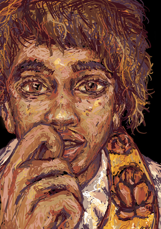
Ooooo! What’s this? An original character from my original story? Ignore the Disney Wish redesign tag. Heh. Heh. Glances nervously from side to side.
I tried doing a chicken scratch art style thing. Inspired by the artists elektricnka (on instagram) and @chasefoxart.
So this is my OC Viera (means faith, but I might change her name later). She did start as a redesign of Asha from Wish. Everyone was planning on doing rewrites of that movie when it came out. So I decided to join the band wagon. But I didn’t feel like keeping the original Spanish inspired setting. I’m already exhausted from doing endless research on early 20th century Korea. So I decided to change the setting to something inspired by my home country of Slovakia. Specifically 1950’s Slovakia. There’s still a lot of research to be done but having some basic knowledge makes things a whole lot easier.

I gave her a modified version of the Kralovany Kroj. I mainly simplified the crazy amounts of detail. I liked Asha’s concept art design where her colour palette was orange red. This is the closest traditional dress I could find to that (each village in Slovakia has their own dress).
Viera is an introverted book worm like Asha in the concept art (if you can’t tell I really like Wish’s concept art). She dreams of becoming a magician. You could say it’s her wish! In my version instead of giving wishes to… president Magnifico (got to give him a new name) people give their ability to do magic to the government on their 18th birthday. The government claims that with the combined magic they can cast bigger better spells than any one individual.
Originally the people would use their magic to help their crops. Now the crops are dying because the government’s corrupt. To make matters worse the hospitals don’t work either and Viera’s father’s sick. She tries to heal him with her limited magic knowledge. But it’s not working. So she sings This Wish (she figures out on her own the government is lying). And who shows up? The star boy! Of course he’s in this! Except now he’s a god, based off of the Slavic pagan god Yarilo.
There’s far more to the story. Such as developing Viera’s (Asha’s) grandfather more. Developing more Dahlia (I got rid of the rest of the friends). Themes of being an outcast. Now this one I’m proud of. For a while I couldn’t figure out how to keep Viera biracial. Then I decided to make her mother a traveler. A wild spirit that couldn’t stay in one place for too long. Viera has a complicated relationship with her. She left when Viera was small. Because of Viera’s skin colour she’s often ostracised. As an outsider she can see the faults of the system better than anyone. But thanks to her father she has an undying love for the culture and wants the best for the people.
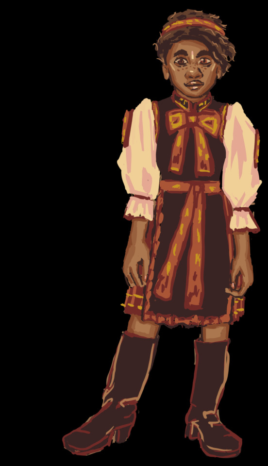
What do you think of this story? I will probably get around to working on it in the summer. I’ve got a thing I still gotta finish.
9 notes
·
View notes
Text
2024 July Monthly Update - Artfight
Another July gone by, another Artfight draws to a close. This month's update post will be primary looking at what I've made for Artfight, but first some personal updates:
I mentioned in my last post I was dealing with wrist pain but it was getting better. It got worse. The last few weeks of July I spent not moving my hands as much as I possibly could because both hands were feeling so bad. Luckily I managed to figure out the cause (I bought myself a wheeled bag to take stain off my back when grocery shopping, turns out wheeled bag + cobblestone streets = wrist destroying vibrations) and once I eliminated it my wrists started actually healing. They're feeling much better now, not fully healed but well on the way :) I'm just glad art wasn't the cause. With any luck this'll be the last monthly update this year with a 'personal circumstances' blurb at the start and I can get fully back to just making and talking about art ✨
Artfight
This year was my 8th year participating, which is kind of wild to think about. My first year was Sun vs Moon, on team moon and I drew 34 total art pieces. I don't think I've ever beat the number but I certainly got close this year having drawn 30 attacks!
I didn't have a specific plan going into artfight this year, I usually don't other than maybe a list of people I'd like to draw for. I treat artfight as a super low pressure way to experiment and draw fun designs. Not every piece comes out exactly how I want it but that's part of the fun and every year at least one artfight drawing makes it's way to my fav art that year.

At the end of June I'd just made a template for doing these chibi icons and I was having so much fun with them I started off artfight doing a bunch of them for attacks:

I think they turned out super cute but they look a little awkward side by side due to the different dimensions of each one. I've yet to find a good way to display batches of them 😔
The first bigger drawing I did was of a character I found in my bookmarks and I love how it turned out:

It was the perfect piece to break the last shackles of my artblock away and drawing it felt smooth as butter. I didn't really do anything similar the rest of the month but there's several points on how I lined and colored this one that I'm keeping in mind to experiment more with in the future.

After the first piece I was feeling in a more environmental mood and freehanded these two attacks featuring characters in funky landscapes.

My wrists were still feeling pretty iffy at this point so the lines for both of these were a very loose first pass over a rough sketch but to be honest I don't think anyone would notice unless I pointed it out.

I really thought I'd do more in this style but 🤷♂️ it ended up not happening. Maybe I'll do something with some ocs soon
The last three attacks I got out before my wrists got too bad to draw I did all in the same day

These two characters were exactly my type & I love to draw chibis on some kind of environmental base or prop so I wanted to do something with that this artfight as well. I think they turned out pretty cute!

Another one with a base, this time more like a character standee that I love to give dnd characters. Physical character models moving around on a map is one of my favorite tactile experiences of tabletop games.

The last one I did before I had to take a couple week pause - I wanted to experiment around with linework specifically and while there's a lot I like about this drawing there's several things I had to rush or simplify because of my wrists and overall it didn't end up being the strongest piece. Ah well, that's how it sometimes.
The day after I did these I went grochery shopping again and then my wrists really gave out. I didn't draw anything for artfight from the 12th until the 29th when my hands were finally starting to feel good enough to try and do just a few last drawings before the end.

I started off simple with some blocky chibis with saturated lineart. I'd played with colorful lines in the past but I never ended up liking because having all the lineart be one bright color always felt too much and too distracting. However, earlier this month I saw this gorgeous attack by ebelcities which made my realize the extremely pointless arbitrary restriction I'd been putting on myself: you don't need to have ALL the lineart be a bright saturated color, of course you don't! How trivial! And yet this was a huge breakthrough. I have to thank ebelcities for having such beautiful art 🥰 Seeing her work is always sooo inspiring.

I still didn't want to push my hands too much so my next attack was done mostly using the lasso tool, with a few textures added on top. This attack received the least attention on social media out of all of them but personally I'm pretty proud of it 🤍
In the last two days my hands were feeling MUCH better and I took advantage of that to try and reach my initial goal I had at the start of the month - 30 attacks to fill up a whole page on my all attacks section with attacks from this year.
I had 7 left to do - and I did it!

I wanted to keep them simple both of the sake of my hands (drinking game for this post - take a shot anytime I mentioned my wrists) and to actually finish 7 drawings in 2 days. But I also didn't want to just give people rough sketches, especially since most of these were revenges for some really lovely art I'd gotten. So I came up with the idea of A) a border template and B) using tones!
I've been really into dot tones recently but I've not really been using them as is the traditional method - it was a bit of a challenge doing them in these! Picking tones, getting a range of values, matching textures, getting the size of the dots right... so many decisions to make. I'll have to keep experimenting with them, maybe for some actual comics in the future :)
And that's it for this year's artfight. We'll be hearing the results soon but even before hearing them I think seafoam has probably lost haha, we've been lagging behind all month and I had a feeling this would happen when I saw the team numbers but I still love seafoam regardless <3 I'm looking forward to seeing what the teams will be next year!
#artfight#monthly updates#this is a long one folks!#I hope people will find my thoughts interesting to read :)
5 notes
·
View notes
Text
A little Glazed...
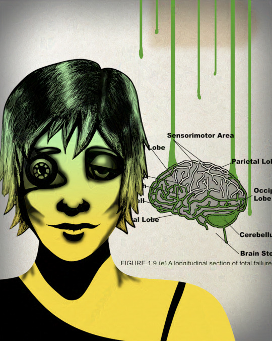
Ya know, there are some artifacts, but I'll take it! You'll put up with this art quality at the site, won't you, my few readers? More info under the cut!
The spouse says he feels this image in his soul, and I think I do too!
Glaze on a CPU is slooooooooooow! I had time for two test images today, and this is the second. The other had way more artifacts. I can try the web version, and there are instructions for running it on the GPU, but either of those is more complicated. As it is, it's worth my while to baffle WordPress, but if/when Tumblr sells out to AI, I'm going to have to take a few days and just DELETE all my art from my old posts. Hell, it's not like I'm popular. No one's gonna miss it.
I do not know how to add Nightshade, if that's possible for me. Honestly, I think this looks screwy enough and I don't want to do more things to it that take more time and might make it look worse.
Now that I have a Ko-Fi store, I can offer you the real, print-quality (300 dpi at 8 by 10!) illustrations as downloads. If, for example, you want Erik as Natalie Bassingthwaighte on your desktop or wall.
Here's my reference image, screenshotted from Voodoo Child by Rogue Traders:

Not bad in comparison, huh? See what I was goin for? I can still do shading and copy a style! I'm just slooooooow like Glaze on a CPU!
The brain is based on Open Clip Art and I'd swear the heart in the video is too. They look really similar! Everything else is all me and the line tool.
I think I want this illustration for A Little Loopy, but I might want it for Black Box. The content of both is similar! I'll put it up when I decide, and I'll see what I can do with my store.
I really, really miss this level of complexity, but I can't do shading and everything every time and keep up with myself. Even with my new, simplified style, I already can't keep up with myself! I'd have to slow down way more to give you this kind of art on time with every instalment, and I don't wanna. I wanna tell stories!!!
But I also really like it when I can make something that looks cool. I want better eyes and better motor skills and I lost my antifouling glove somewhere and I think I'll wobble less if I can find it. Bleh.
More art is inevitable, it'll just take time! And days in a row of skipping my eye exercises and staring at pixels instead!
2 notes
·
View notes
Text
Uncanny X-Men #195- It Was a Dark and Stormy Night
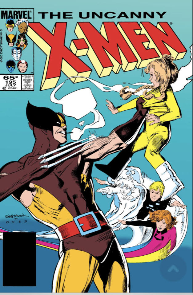
Last Issue Recap: A routine stakeout on Juggernaut turned nasty when Nimrod showed up and started blasting. He was barely driven off thanks to a clutch move by Rogue, but the X-men's decision to let Juggey go without a fight has landed them in even hotter water with the public. Meanwhile, Ruskies are scheming and Storm's off in Africa.
This cover is so amazingly dumb and beautiful and I love it. Like, its literally Wolverine about to murder a child. Everyone's expression is gold. Of course its a fakeout, Wolverine isn't going to murder a child this issue, but I'll be damned if its not effective at grabbing my attention. I vaguely recognize these kids from a Thor comic from the same era they should up in but I'll be damned if I remember a thing about them. I guess Marvel was pushing them really hard at the time. Edit: after doing some research I have discovered the Power Pack was actually created by one of the Marvel comics editors, which explains a lot about their seeming omnipresence.
The opening narration gives a brief summation of who these little rascals are (they are called Power Pack, a quartet of siblings who were given powers by a dying alien Green Lantern style) which explains them I guess but also doesn't explain them at all.
We see the Power Pack in bed with their parents, awoken by the sound of thunder. Because, its a Dark and Stormy Night, get it? What a waste of a good title, why would you name an X-men story "It Was a Dark and Stormy Night" when Storm isn't even there?! A great pun, flushed down the drain.

I think the following dialogue is a good example of Claremont's limits as I writer. Even though I can tell he's trying to simplify his style for kids, this dialogue is still quite longwinded and a bit too verbose. Of course, struggling to write convincing child dialogue isn't a Claremont specific problem, I don't recall Power Pack sounding any more natural in the Thor comic they showed up in. But in the Thor comic, the characters I actually cared about showed up pretty quickly. We spend the first third of this comic with these kids as the only focus, so the awkward dialogue starts to really grate. Doesn't help that the art on the kids is not so hot, their bodies are sometimes weirdly proportioned, and their faces misshapen. Kids are clearly not John Romita Jr's wheelhouse, although he's a great artist.
The Power Pack realizes their parents and neighbors have forgotten who they are, and what's more, all their possessions have been cleared out like they never existed in the first place! This is an excellent setup that will quickly become an extremely stupid plot hole.

The phonetic accent is... certainly a choice. It's Claremont in the 80s, could be worse I guess. But more importantly, these children call themselves the Power Pack... and their their last name is "Powers"... and they don't even wear masks! Wikipedia tells me they had secret identities, how the heck did they keep that up?!
The kid's parents are about to call the police, so they make a run for it, using their powers to blast a hole through their apartment building and causing massive property damage rather than leaving like normal people, I guess because we needed to establish their powers. This doesn't really help me understand their power sets at all, though. Also their personalities are pretty much interchangeable, except for perhaps the youngest, so no matter how many times they repeat each other's names I'm not going to remember them. Best I can gather, the youngest girl absorbs (matter? energy?) to make things explode, the brown haired boy turns into mist, the older girl has Canonball powers but with the pansexual flag, and the oldest boy does gravity manipulation?
The children decide that this series of unfortunate events must be the doing of Annalee, a Morlock who'd previously attempted to forcefully adopted them, with the help of another Morlock with memory manipulation powers. You might say to yourself, "but Fix, this makes no sense because if the Morlocks could access the Powers' house and steal all their stuff why wouldn't they have just kidnapped the kids as well?" You would be right! Unfortunately, so are the kids.
The kids decide to confront the Morlock's themselves, rather than try to find help in the city where literally every other person is either a superhero or related to them, which does seem like the sort of idiotic action a child would take.

The X-men, Spiderman, Cloak and Dagger and Thor?! Jesus, these kids must know everyone in the MC(omics)U! Hell, give them a few more issues and they may meet Jesus too!
The kids enter the sewers, quipping the whole time. Actually, they've been quipping throughout the entire issue; never let it be said that a mood-killing sarcastic comment in a Marvel Movie is not comics accurate. They're confronted by the Morlocks who (unsurprisingly) overpower them quickly. Only the youngest, Katie, escapes, but not before being disfigured by one of Morlocks, Masque, who has plastic surgery powers. The damage to her face is hidden from us and from the way Masque's fingers stick to Katie's flesh in a previous panel like it's hot play-dough, it must be pretty nasty. I kind of enjoyed the brief body horror here, its definitely an interesting idea, I want to see Masque again used to her full potential.

Exactly my reaction if some stranger approached me talking like that.
We finally cut to the X-Mansion and Kitty having her morning breakfast/midnight snack, where its revealed she apparently does some work for the Power Pack's father. Not sure if she's a student assistant or an intern or what have you, especially since she's supposed to be a highschooler, but it doesn't matter because this will never come up again!

She living my life fr fr. Love the little detail of the milk missing the bowl.
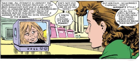
We finally get a reveal for what Masque did to Katie's face and I'm going to be honest it really doesn't look that bad. Nowhere near as horrifying as Kitty's mullet.
Kitty and some of the other of the X-men rescue Katie. Not Nightcrawler, though "he's on another mission." Boooooo. I might as well just stop reading. Unfortunately, my completionist tendencies urge me onward, although I expect the next issue to be a totally Nightcrawler-centric or I'm going to write a letter to the editor.
Rachel recaps the first half of the issue via telepathy for the X-men, who vow to help the little tyke.

No she's fucking not, she was literally introduced kidnapping torturing and attempting to rape Angel! I seriously don't get how the X-men manage to gloss over that in all of her subsequent appearances, or why she's ever written as remotely sympathetic (aside from the fact Claremont wants to get stepped on). I'd put her on par with Mastermind for deplorable levels.
Kitty is unanimously elected Team Leader. You got to love a team of people so dysfunctional that the teenager is their current most competent member. This does explain why the best boy has been so unceremoniously left out this week, as Nightcrawler probably wouldn't enact a plan as boneheaded as "rush head-on into Morlock territory with one of the children you're trying to rescue. I can't blame her, though, she is literally a child.
We get a cute little character moment where Wolverine comforts and bonds with a scared Katie that I kind of mentally glossed over because I don't care. It's not that it's poorly written or anything (although it is longwinded), its just I'm really not invested in these kids we never met and their emotional struggles I've been introduced to five minutes ago. I just want to get to the part where people punch each other already.
And get to the punching we shall! The X-men find the room where Annalee is keeping the children, and their stuff.
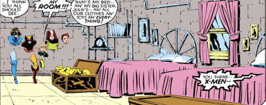
Average College Dorm Experience.
To the X-men's shock and horror, the Morlocks have mutated the other Powers' children to be slightly uglier as well! They've also brainwashed them to think Annalee is their real mother. Again, why this couldn't have been done when they snuck into their house to steal all their furniture, I don't know.
The X-men start brawling with the brainwashed kids, plus a menagerie of Morlocks. Rogue is kicking ass but gets whammied by Leech, who whammies himself in the process. I'm really enjoying the creative scenarios that Rogues' powerset can create. She's definitely the highlight of this issue.
Leech temporarily strips Rogue of her powers, meaning she'll have to take out the Morlocks the old fashioned way, which she does no problem because Rogue is a badass.
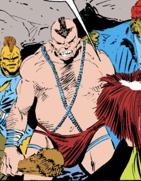
Damn, Aang really let himself go.
Meanwhile, for the rest of the team (sans Rachel who just disappears for a couple pages?) the mooks start coming and they don't stop coming, so Kitty Pryde slips off to rescue the kids herself while Wolvie performs gratuitous offscreen violence. She gets Annalee to surrender with a quick "what would your dead children think?" speech, at which point peak femcel Callisto shows up, just in time to be useless.
The plot is resolved, and Annalee finally processes her trauma from her children's death and makes peace with the Power Pack. And then Rachel and her rattail show back up to let the team know they're being summoned to the X-Mansion... by Magneto, for Secret Wars II!
Wait didn't we just have Secret Wars?!
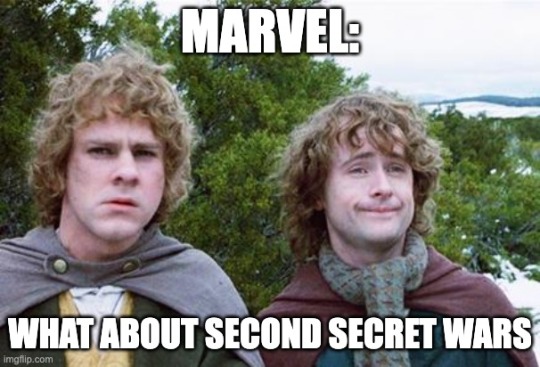
Oh god, we're entering the Age of the Event Comic, aren't we?! There's going to be a new one every year (at least every 12 issues!) and its going to be convoluted and my completionist ass is going to read every single one of them. But not here because I don't want to.
Anyway, this was a waste of an issue. Usually I'm chill with a breather episode, but I don't care about Power Pack and this wasn't really that fun. The X-men weren't given a lot of time to shine, especially Rachel and poor, poor Kurt. Especially since now I'm going to have to speedrun through Secret Wars II real quick just to make sure I'm all caught up on the drama (expect a brief, unhinged review coming soon).
#comic books#marvel comics#uncanny xmen#rogue#kitty pryde#wolverine#power pack#morlocks#rachel summers for like five seconds#way too long#way too many tags
2 notes
·
View notes
Text
I know I’m beating a long dead horse with this, but it came up again in a you tube video released couple of days ago
and it has gotten to a point of no return so here’s my input as an animator (my daily job)
sailor moon crystal 1 and 2, do not have a horrible animation whatsoever, in fact crystal 2 is the best animation sailor moon ever had in it’s history including the recent movies with big money budgets and lonnnnnnng periods in the making.
first lets address the elephant in the room
ART STYLE =/= animation
screencap of a single frame of a 24fps animated sequence =/= animation
slow detailed animation =/= bad animation
MANIPULATING said screencap frame to look worse than it is(a.k.a stretching the image to prove a non existent point) =/= bad animation
example from s01ep08 net release:
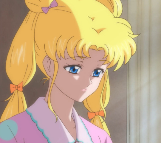
this is the actual screencap of that well known giant head “screencap” some crystal hating blogs here have made you to believe.
the meme face from episode 3 has been fixed, and while the episode 3 IS the one with the most noticeable without pausing mistakes, it’s just few scenes not the entire thing. (and both the meme face and the rei face are from that ep)
and the reason of that episode being particularly bad has been explained by an animator: basically Toei gave them the last fixes 3 days before release, and if you know anything about animation you know that 3 days are not NEARLY enough to get animation for 25 minutes + rendering, and post production things.
beyond that one episode, and after they got TV money (around ep 8 it was announces that s2 will be on tv) the animation quality raised significantly to the point of crystal 2 being flawless.
another thing that separates crystal 1-2 from crystal 3, eternal, and the 90s anime is that they do not use copypasta animation outside of the VERY FEW transformation sequences.
in crystal 3 for example you have both long transformations each episodes, and the attacks being copy pasta. I wont even touch on the 90s because about 30% of the episode back then was a repeat animation lol.
on top of not having copypasta, crystal 1-2 had a lot mot animation time, as it included at the beginning and end of every episode new animation, unlike crystal 3 that it had a reduced time due to copy pasta all transformations/attacks, + at the beginning it was a summary of previous ep.
crystal 1-2 was harder to animate because it was more detailed, and they had so many hair flowing animations, while crystal 3 had a simplified moe art style that was easier to animate, but very generic. and still had animation hiccups all over the place. it was just that once the haters got the crystal 1-2 animators fired, and got their moe bs artstyle they stopped tearing it apart frame by frame, so the general public doesn’t know that the animation is worst.
now with all that out of the way, there is one thing that infuriates me to no end
talking bad about the animators
Toei is trash and cheap we all know that, but just because they look for cheaper labour in other counties doesn’t make the animators in those countries “talentless” “lazy“ “bad” or anything else that has come to their way because of few hiccups in ONE episodes of an anime series.
it is extremely condescending to assume that just because animators in less fortunate countries have a cheaper labour, that means they are bad.
in a recent project of creating a 25 seconds animation for a commercial, that took me a week to make, and I was paid 600euros for it. If the client had not outsourced it in my country and had it made in the US where his company is, it would have been double or triple the price or more. does that make my job bad, or make me lazy, or do I suck? because my income is lower than most west europeans/americans in my field?
I’m sure an animator in the Philippines who was to make the exact same animation as me, would have been paid even less than me, because of how their economy works. but it wouldn;t make their work any less good!
all in all
crystal 1-2 was never badly animated,
if you dont know how many long hours animators have to work shut your mouth really. especially the lazy accusation is the biggest bs ever.
8 notes
·
View notes
Text
On identifying artificial intelligence generated art.
my brain's coming apart. there's so much worse stuff going on in the world, and I'm up past midnight getting so mad about computers making bad tiddy drawing.*
There are porn-bots putting "Artificial Intelligence" as tag spam on real(-ish, probably touched up and edited) photographs. The machines aren't coming for us, we're already in The Machine.
So.
Before I get into it, I want to admit that I do worry I'm being over confident. Would honestly love to be challenged on my conclusions here**.
To me, a whole lot of it still feels uncanny.
Okay.
look at this stupid bird picture:

It is, superficially, pretty convincing.
I don't remember how I got to here. Someone posted it, and sourced it to a clip-art ...blog? and neither seemed aware it is not a real painting.
First off, nonsense continuity.
The weird angle of the tail feathers, and the pitch black that ends at the dove's wing for no particular reason are pretty suspicious.
That's not conclusive. Human artists can make stylistic choices, or forget to finish drawing an arm.
I don't think any human thinks leaves work like this:

also note how 'stems' turn into the edges of leaves.
You also get breaks in continuity.
weird floating tree top.

...these things are like hidden image puzzles, and later I notice these branches:

are also weird and floaty.
I think this is the best place to start, pick out "lines" in the image, follow them around. Do they make sense? like at all?
Next, repetition.
They're getting better at repeated symmetry, but there's still a lot of things that should match but don't, and things repeat where it makes no sense.

The feathers on the wings are pretty different in shape, size and style. Again, just a little suspicious, not conclusive.

these two bunches of "flowers" sorta connect to different bunches of greenery, but are very similar in shape and color.
Lastly, Incoherent details.
I'm putting this at the end because i think it feels the most definitive, but is also prone to false positives, as human artists simplify and stylize the little things all the time.
But also, this is definitely AI art:


Bad to look at.
In conclusion,
I put this picture into the google image search, to see if someone posted it earlier, and google also brought me to a bunch of other "clip art" and stock photo sites, and
they're also teeming with very obviously AI generated images

hateful.
*on the one hand, this application is probably the least likely to be competing with human artists, on the other it is vile and should stop.
**the problem is I'm mostly scrutinizing stuff I already know is AI generated. The other problem is that a lot of the louder proponents of the bad computer art do not like or respect art, and are very bad at lying about it.
0 notes
Text
The Freedom It Gives
Blog III: Desktop Publishing
Imagine a world without art. Pretty sure humans would be bored to death while the world rots into its own void. Creativity and human expression will be non-existent, leaving us to act like robots or worse, zombies. Tragic isn’t it? Because art is what gives us life. It gives us something to hold on to and to look forward to. It is something that saves us because no matter its form, it will still matter; may it be music, painting, literature, films, and even a single page of a paper filled with colors that could captivate and interpret our emotions. Hence, knowing that art has flourished and continuously advancing as centuries go by, it is truly thrilling that in these modern times, anyone can now produce and publish their art with the help of new innovations like computers, and various software in it. And yes you’re correct, I am talking about desktop publishing that has been providing individuals different opportunities to create art. It has given people the freedom to practice their creativity and put their exceptional ideas into life. What’s more amusing is that humans have now the liberty to showcase their talent without getting judged by their art’s peculiarity. Society right now is more open and accepting to one’s uniqueness - the reason why more creatives are emerging from one place to another which is totally gratifying. More creatives means more art that we can consume which translates into more things that can give us hope and joy. Besides, it also makes our life easier as it simplifies the ways on how we can draw and design our works that even non-artists can do and their product can still look good. As for me or as someone who consumes and creates art in her daily life, the democratization of design (a big thanks to desktop publishing) has given me a chance to produce something without feeling the fear of being judged by others, especially professionals. It has given me an idea that the arts and design that I create may not look good for some but it can also appear for others’ eyes as a pleasing one. Because to be honest, we cannot really please everyone and we cannot cater everyone’s needs when it comes to art since we all have different tastes and outlook on things. What we can only do is to do our thing and focus on where we are good at. We shouldn’t be afraid that no one will consume our art because believe me, someone out there will need and want it even if it’s just a few people. And just to tell you a little story, I am an aspiring writer and I have been doing my own book covers. Most of the time I am not content with what I layout and design because I think of what my readers or target audience has to say. I was afraid that they would not like it and that I would not be able to catch their attention to read my story. But fortunately, being exposed to books with numerous book covers and its art styles (that are also made through DTP) has changed my perspective. I am now able to conceptualize my book covers through the accessible software I can master and by getting inspiration from those book covers I deemed to be pretty as it helps me widen my imagination as well as my creativity. Apart from that, consuming freestyle designs gives me a lot of options to choose from which definitely gives me joy as I and other people can feast on different kinds of arts with the help of desktop publishing.
09/13/23 written by: Pamela Abegail
0 notes
Text
I can't speak as much about post reboot (imo that's just a different character, and not one I'm super familiar with), but OG Cass saw a lot of inconsistency, even with her original creative team, a lot of which comes down to art drift, With Damion Scott's pencil work in particular becoming significantly more stylized, exaggerated, and rubbery over time. I'm not saying his art got worse, but change significantly in ways that very much affected Cass's appearance.
It was a sort of gradual change, but it's pretty striking if you put cass from an early issue in her ongoing (this is from Batgirl (2000) #1:

...
next to a cass from one of the later issues of Scott's run on Batgirl (this is from Batgirl (2000) #36, the second-to-last issue from the initial creative team)

...
Here's some pics with Bruce also in them from the same issues:
early Scott's Cass & Bruce,

...
vs later Scott's Cass & Bruce

...
you can see how much rounder Cass's face got, how her hair got flatter, eyes changed shape, nose mostly disappeared except in profile, eyebrows still prominent but less bushy. In contrast Bruce got sharper and more square. Both of them have been simplified with details streamlined.
Again, I'm not saying the art got worse over time, but it definitely changed, and my personal preference is for his earlier work (at least when it comes to comic book illustration, his later style I think works much better for his magazine & gallery art). IMO the slightly more detailed, slightly more naturalistic earlier look was better able to convey the emotions of the characters involved, and the more detailed backgrounds with more attention to perspective along with the less exaggerated posing and proportions of the characters to me worked better for conveying what was happening in the stories visually instead of leaning on narration, which was a big part of Batgirl (2000), especially early on, and at least partially the point of Cass being initially introduced as non-verbal, to specifically force a sequential art narrative to rely on the art more than the narrative.
...
As for skin color... changes in skin tone went along with this shift. It wasn't super consistent the whole way, but later Cass was much more often shown with much lighter skin than early Cass, though that's not down to Scott, but rather to Jason Wright, who was the colorist for both of these issues, and iirc most of the Puckett/Scott run.
There is a level to which skin color differences in the specific images above could be attributed to the different lighting in the scenes depicted, but there was definitely an overall lightening trend over time, which yeah isn't great in terms of representation.
....
Honestly, when it comes to representation Cass was always kind of all over the place, a disabled asian woman hero created and depicted by non-disabled non-asian men who seemingly weren't thinking about representation at all. Again, Cass was non-verbal for the interesting challenge it posed to crafting her stories, and for the way being mute played into the core thematic elements of her character - her isolation and difficulty connecting to others, the way her physical super-ability but communicative disability ironically mirrored barbara's physical disability and communicative super-abilities, straining their relationship.
Depicting a person with a communicative disability - the particular challenges of such a disability or how real people navigate those challenges was seemingly never on her creator's minds. They never tried to depict it, and when they were told that Cass being mute played into some negative stereotypes around asian women in western media - something that would have been obvious if they had been considering the racial representation angle - they contrived an excuse to drop most of Cass's disability outright, not realizing that in trying to correct the racial representation problem they had blundered into they were making a different blunder in erasing disability representation.
And of course the lack of considering racial representation wasn't just a matter of blundering into the 'silent asian woman' trope or lack of care & consistency in skin coloring. Cass was asian in the first place seemingly because her creators liked anime and martial arts movies - ie purely aesthetic. For a long time the only family connection she had was to her white father, and her isolated upbringing - core to her character concept - meant she had no cultural connections at all. This could have worked if forging those cultural connections was part of the process of Cass overcoming Cain's upbringing - a concept used to such wonderful effect in the non-cannon au 'shadow of the batgirl' book that I was sure they were going to use the same concept with the same or similar surrogate grandmother figure at some point for postboot Cass, but I don't think they ever did.
...
On the other hand, I'm not exactly sure this creative team would have done a better job if they were specifically trying to represent 'an asian character' instead of 'a character (who happened to be asian)', or 'a disabled character' instead of 'a character (with a disability that serves their narrative themes)'. Early Batgirl was super focused on specific thematic and narrative ideas - guilt and isolation and family, characterizing bruce and babs through cass, comparing bruce and david cain as mentors and father figures and contrasting Babs against them, using the individual stories Cass interacts with to reflect and highlight different aspects of these themes. It's a very tightly focused run, at least as far as mainstream big 2 superhero books go, and the things that team got right they got /so/ right that we're still talking about and missing this character who hasn't been as compelling since then. I'm not sure the creative team would have succeeded as much as they did with the parts they did get right if they had been diverting effort into concepts outside of their wheelhouse.
is there a reason cass cain is always drawn so pale by dc? ik she’s mixed, is her being light skinned relevant in any of her stories? or is it just straight colorism
51 notes
·
View notes