#simple design but i think its neat :3
Explore tagged Tumblr posts
Text
Soso! In some funky book I bought a while back, i read a little fact I didn't know before- Holt plays Roller Maze! I think it's absolutely criminal that it isn't even brought up in Friday Night Frights, even more so the fact that he didn't get a doll. So, I had to change that! Say hello to my SKRM holt design!
(please click Tumblr crumpled this poor fella)
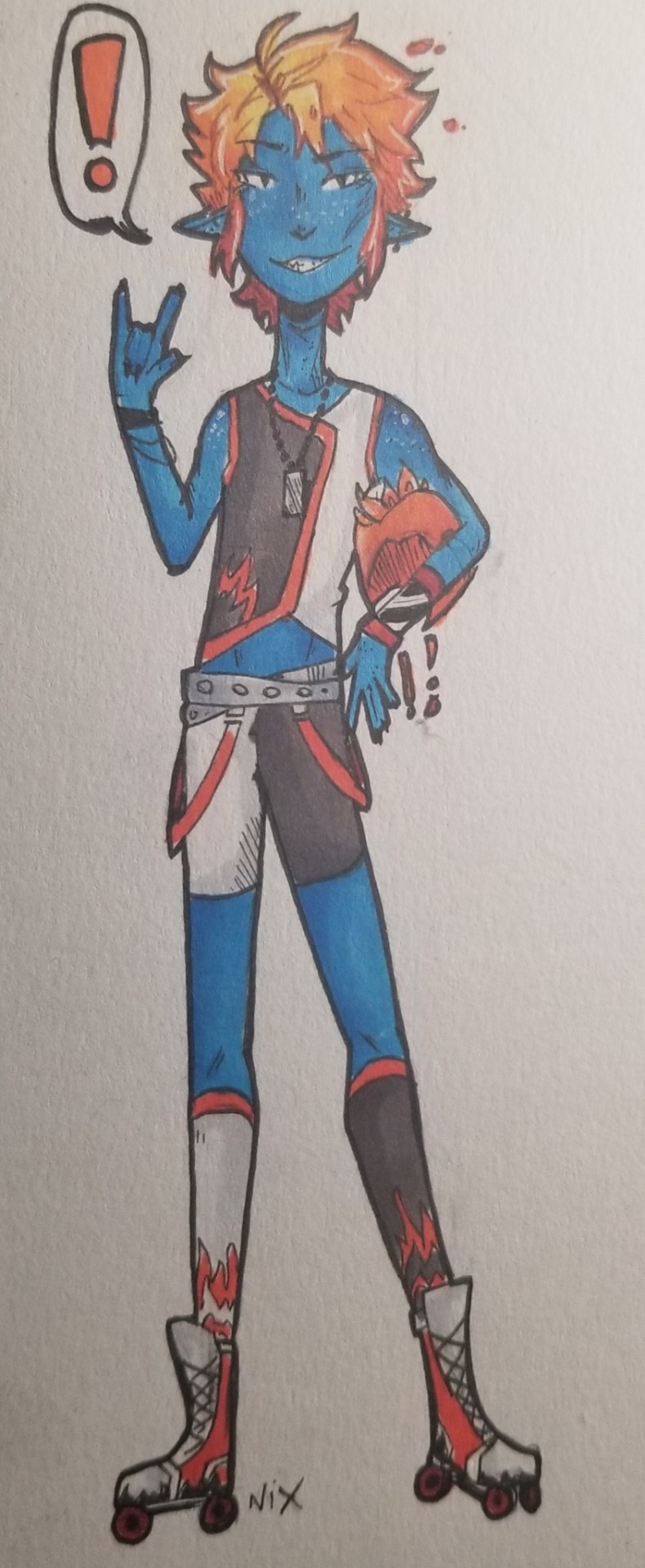
#I DONT FUCKING KNOW HOW TO DRAW HELMETS DONT AT MW#monster high#holt hyde#monster high redesign#skulltimate roller maze#friday night frights#monster high fanart#hee ho ha ho im a funny lil art man#really wishing that we got to see holt play skrm!!#he doesnt wear kneepads bc he thinks theyre for losers#simple design but i think its neat :3#i think the skrm team should have names like roller derby players do#Holt's would be firecracker i think#(a fun nod to the lisi harrison books uwu)#im sorry about the weird lighting SOBS#just realized i forgot his tail uwu#lets pretend its tehre#wow what an awesome tail woah drew that so good
34 notes
·
View notes
Text

Eight of Pentacles 🌤️
Eight of Pentacles symbolises diligence, self improvement and learning new skills. Miki sits peacefully in an overgrown sunlit garden, having spent all day painting birdhouses. Instead of chasing his nostalgia, he's honouring it by creating something practical and new. Sometimes you need to let go of perfectionism and just enjoy the act of creating - it might not be a masterpiece that perfectly captures the magic of childhood, but putting a lot of effort and sincerity into a project will always be worth your time.
this is one of my pieces for a zine that was unfortunately cancelled. the other piece is here, go look at this kid winning the cycle of violence. drafts and notes below
will you guys make fun of me if i over-explain this to death 🥺👉👈 so um the inspiration for this is the start and end of ep26: starting with kozue trying to save a birds nest as a tree is being cut down, and ending with miki putting up a bird house to replace the tree. the bird house doesn't repair their relationship - they don't speak in the moment except to insult each other - but when we see them next in the finale they're a lot more comfortable with each other! is miki's birdhouse an empty gesture or is it the first shaky step to finding an understanding? idk 😊 i think its neat
i thought itd be nice if he was approaching art and creativity in a more relaxed way, just enjoying learning a new skill. repeating the same song over and over will only get you so far <3 i think this boy needs a new hobby <3
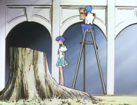
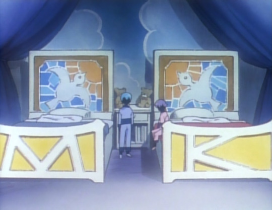
some things:
the designs of the birdhouses are based off the twins' bedroom. they start off a bit more messy and simple but get more detailed towards the bottom. he's getting better thru practice! and the last pentacle is still a work in progress
the fireflies were originally going to be flowers, and i think i spent like 20 minutes googling native japanese wildflowers that would grow in a setting like this and also had the right flower symbolism i needed 🫠 but anyway in one of the early check-ins someone said they liked the fireflies and i thought sure!!!! sounds good lmao :D imo they imply a late summers evening and a long day of outdoor work which probably works better than me struggling with flower symbolism lol
the shoes looks good as hell before i remembered i had to cover them up with grass and the frame. now they just blend in to the piano a bit. sad!
for some reason i did all the line art for this and then painted it anyway. why did i do that.

i'm still kinda fond of the first one with miki studiously leaning over a miniature rose garden while the actual garden grows wild around him... one of the interpretations of eight of pentacles (reversed) is being so focused on details that you overlook the bigger picture, which i think really fits miki as the student councils Bloke Who Does Fuck All. he has the appearance of someone who's very analytical and sensible, but he's so locked in his own tiny perception of the world that he mostly just comes up with whatever conclusions suit him best, regardless of any harm he might be ignoring or outright causing. HOWEVER that's kind of an ungenerous interpretation for a relatively chill card 😌 also i had no ideas for a background and the composition didn't work with the border so rip to that idea
i liked the stopwatches as pentacles so tried to reuse it in the third design but was out of ideas by then. the seconds thumbnail with the birdhouses and the piano kind of came naturally so that's what i went with :) and it more or less stayed the same in the final result. i was thinking of adding some kozue presence, like empty milkshake cups or a birds nest or graffiti on the side of the old piano, but imo that would have made it too cluttered. i literally did forget to add paint pots tho OOPS
#revolutionary girl utena#rgu#take my revolution tarot#mine.png#posting these without the frame#thats why theres a lot of empty space at the top and bottom
299 notes
·
View notes
Text
On the Amphibia Timeskip Designs
Hi! I know I normally don't do analysis posts like these, but I got into an interesting conversation (read: infodumped hard to a couple of unsuspecting friends) about the subject on Discord earlier and I felt like it might be enjoyed by you all. Anyways, to begin...

I think the best place to start is Marcy. The thing that jumps out to me about her new design the most to me is her color scheme.


Across the board, everything is brighter and more saturated. Her dark blue coat has been swapped for a bright blue jacket, her dull green skirt has been traded for some vibrant green pants, her shirt has gone from a light gray to an off-white, and her debatably brown boots have been replaced with light brown, almost orange shoes.


Through the entire series, her hair is neat, properly combed (when not messed up by water or helmet-hair, anyways), and it's got this layer of gloss to it. It's a pretty innocuous set of details...

...but I think the picture comes together better when we compare it to her hair in the finale. It's less neat, it's messy in places, but it's not greasy anymore. It's not constrained at all, it's healthy and doing its own thing. And I think, in a way, that applies to her outfit as a whole. Throughout the "present" of Amphibia, Marcy is nearly always wearing a uniform of some kind; her school uniform, the Newtopian Night Guard uniform, the Core's greaves, it's always a look forced on her. In the finale, though, she finally gets to make her own decision on what to wear. It's casual, but it's her, emphasized by the personal touches like the pins on her jacket and the figures on her bag that expand out from little expressions of freedom on her original design. She's even got ear piercings, something typically associated with rebellion and freedom. She's finally allowed to be her own person. Not anybody else's, just... herself.
My thoughts on Sasha and Anne are a bit less in-depth, but there's definitely interesting stuff to mention regardless.


It might not seem like Sasha's changed much visually during the timeskip. Her hair is cut pretty much the same way, she still has a pink accessory on her head, she's still wearing a skirt and a jacket (like she did over her school uniform), and... I think that's intentional. It's a subtle sign that most of Sasha's growth wasn't off-screen during a ten-year time jump...


...it was during Season 3. With every redesign she got from her Barrel's Warhammer redesign onwards, her design got softer. Less spikes, more rounded edges, less rigidity. She even undid her ponytail, not holding her hair back anymore. Her reds got less area on her design, until on the timeskip look they were pretty much replaced entirely with a simple purple skirt. All that aggressiveness is gone, replaced with a comparatively soft design...

...and with the addition of a blue shirt to her color palette. It comes off as a little random, but considering her new profession as a therapist, I think a light and soft color palette featuring hues that are easy on the eyes is an important part of that. It's subtle, but I think it helps a lot.
And finally... Anne.

I find Anne's timeskip design to be the most difficult to talk about in this context, because it's mostly just a regular uniform. The green polo, beige shorts, white undershirt, and lanyard are just what she has to wear to work, and I find it a little difficult to find meaning from it... but that doesn't mean there's nothing there.

Let's get the obvious one out of the way. The leaf scrunchy is a cute way to call back to Anne's hair leaves, a pretty defining aspect of her original design dating all the way back to the first episode of the show that followed her all through her journey in Amphibia. It's a fun little way to reminisce on her past... but it's not the only part of her outfit dedicated to reminiscing.

That little blue flower band on her wrist is also easy to miss, but pretty obvious what it's referencing once you notice it.


It's most obviously a callback to the blue flower crown from earlier in the same episode, but Anne's almost always been associated with blue and flowers, with even her energy aura in her Calamity form taking the shape of blue flower petals.
But those are just simple callbacks. I think the two things that tell us the most about Anne's growth and who she is now... are these.

For her entire exodus in Amphibia, Anne's had one ragged shoe to keep her company. She wasn't ready for an adventure in the swamp. Now, she has proper rain boots, something designed to actually withstand the kind of work she does now. She's fully become comfortable with where she is and who she wants to be. And, of course, there's that little bandage on her leg. Perhaps it's a sign that she's still going out there, undergoing little adventures, taking risks and getting into trouble. Maybe it's a sign that that spirit we come to know so well over the course of the show is still alive and well... or maybe it's where she takes her estrogen shots
242 notes
·
View notes
Note
To my great surprise, one of my friends expressed interest in DnD, bringing the total people interested including myself to a whopping THREE! Now, I've only played DnD a few times at a game shop and literally no other TTRPGs, but I'd be open in checking out other stuff (and can hopefully persuade my friends)! Would you happen to have any recs for maybe a bit more of an intro/beginners game that one could run with three players total? (If you happen to know any that maximizes a player feeling badass, that'd be neat & appreciated, as I think that's the main draw for them lol). Anyways, thanks for your time :3
Hiiii thanks for your question! So have in mind that I haven't played any of these firsthand because I'm mostly into games that mechanically emphasize disempowerment (the games i run tend to go less for the Found Family of Heroic Misfits Go on an Epic Quest approach and more for the Gang of Amoral Treasure Hunters Get Themselves Killed While Looking For Treasure in a Dark Scary Hole one), so I'm going off mainly from the play experience implied by reading the rules themselves and by what I've heard other people say about them.
First of all Is Quest RPG
I've seen it recommended a couple times by @thydungeongal and after reading a bit of it I have to agree with her assessment that this is the game that most D&D players seem to ACTUALLY want to play when they start invoking Rule 0 and the Rule of Cool and playing fast and loose with mechanics. It's a game where the explicit design intention seems to be natively supporting the style of gameplay that most popular D&D Actual Play shows feature, without any of the negatives of trying to fit 5e's square peg into that particular round hole. It's also available for free, which is pretty nice.
I would also recommend Brighthammer: Rules Light High Fantasy (which is a hack of Sledgehammer: Rules Light Dark Fantasy)
It's a simple system with a d100 resolution mechanic which fits into two eight-page mini-zines, one for the players and one for the GM.

It leans into the heroic fantasy angle specifically by letting players continually accumulate advantage to rolls during combat encounters by performing heroic actions, such as defending an ally or an innocent bystander. This one is also free and it's a pretty quick read so you don't lose anything by checking it out.
Next up is The Basic Hack
This one is a slightly streamlined version of The Black Hack, which itself is a massively streamlined version of early editions of D&D. Just like The Black Hack, it uses D&D's classic six-attribute array and a lot of other mechanical elements that make it pretty easily compatible with a lot of D&D materials while still being a very distinct system of its own, but where it differs from TBH is that it simplifies a lot of its mechanics and overall has a less gritty and more heroic tone.
Lastly there is Break!!, which is the only game in this list that is going to cost you any non-zero amount of money
Break!! has some old-school sensibilities here and there (seems to take some inspiration specifically from games like Cairn and ITO) but aesthetically and tonally it takes most of its cues from fantasy anime and JRPGs. It has a pretty cool-looking setting, and some interesting twists on classic fantasy TTRPG races and classes. You get everything from "basically a D&D fighter with a different name" to "paladin meets magical girl" to "literally an isekai protagonist". Anyway one way in which it leans into making the players feel pwoerful and badass is that its initiative system rewards being proactive in fights: whatever side starts the fight gets to act first, with no checks or rolls required. Also, it handles health depletion on a per-encounter basis. Health regenerates fully imbetween fights, essentially ensures that players always start fights at full strength and gets rid of long-term resource depletion. Which, you know, i like long-term resource depletion for my games, but if what you want to do is feel like badass heroes this is definitely the way to go, and it still has some interesting long-term consequences for running out of health in a fight.
110 notes
·
View notes
Text
Qipao/Cheongsam Taobao Shop Recs
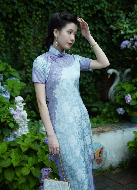
A while ago I received a direct message asking for recs on where to buy qipao/cheongsam, and I figured I’d make a post for others who’d also be interested.
First of all - I think qipao should be tried on and bought in-person if at all possible, since having the right fit is important - especially if it’s for a formal occasion like a wedding. However, since that’s often not possible, I’ve compiled a list of online shop recs, mainly for more casual occasions.
Since English-language online qipao shops are plentiful and easy to find, I’ll be focusing this list on Taobao shops only. Please note that these are my personal recs, based on my own aesthetic preferences. Thus most of the recs are for shops focused on retro-inspired, minguo-style qipao made using the traditional 平裁/pingcai (flat tailoring) method. Also, I have not actually purchased qipao from any of these shops (all my qipao were bought in person) - this is based mainly on how appealing I find the designs.
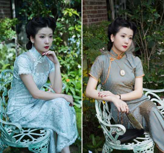
1. 嬉姷/Xi You - Elegant qipao modelled closely on historical designs, mainly from the Republican era/minguo. Careful attention paid to historical details. My favorite qipao shop to browse for fun:
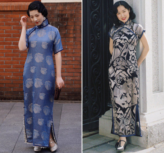
2. 海上芳时/Shanghai Fancy - Specializes in chic minguo-style designs of the 1920s-1940s. Recently came out with a neat art deco-inspired collection:
3. 唐之语/Tang Zhi Yu - Retro-style qipao in a variety of bold prints, with a focus on the form-fitting designs of the 1950s-1960s, including those from the film “In the Mood for Love”:

4. 繁莳/Fancy Dream - Dreamy, delicate retro-inspired qipao and modified qipao. Also has a nice selection of winter majia (vests):

5. Top Ulara - A large selection of classic, retro-style qipao with a hint of glamour. Offers lots of long/thick/layered qipao suitable for colder weather:

6. 梦回故里/Menghui Guli - Nostalgic, conservative retro-style qipao for all seasons. Old-fashioned in a good way:
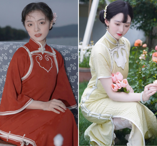
7. 晴山制衣/Qingshan Zhiyi - Retro-style qipao in fresh, vivid colors and an interesting variety of designs and patterns:

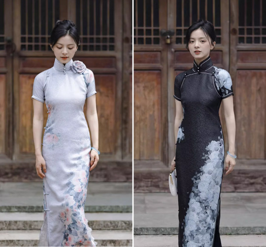
8. 限时赏味/Xianshi Shangwei - Streamlined, retro-style qipao in subtle colors and prints that exemplify understated elegance:
9. 茉茉/Momo - Tons of options for simple, cute, and casual retro-style qipao suitable for daily wear. Designs tend towards monochromes and all-over prints. Another review/rec here:

10. 如及/Yu Gallery - Simple yet elegant retro-style and contemporary qipao. I love the shop’s use of sheer fabrics & layering in its designs:
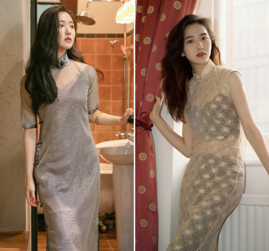
11. 向南飞FLY - Offers a selection of casually stylish retro-style qipao and modified qipao for daily chic:
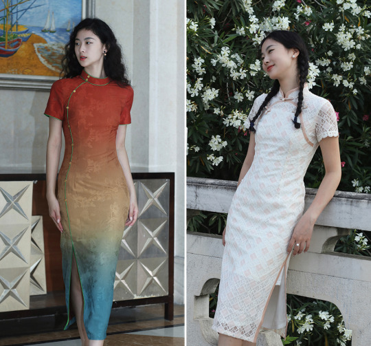
12. 川黛/Chuan Dai - Soft, feminine, pastel-infused qipao & modified qipao in retro-inspired and contemporary styles:
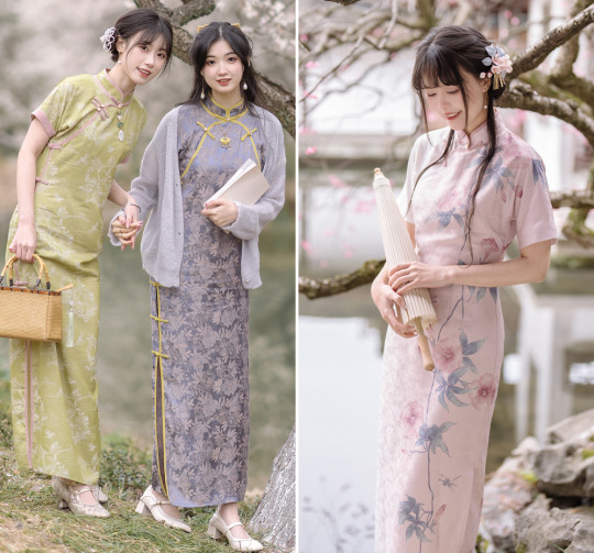
13. 四斤自制/Sijin Studio - Creative, avant-garde takes on (modified) qipao & qipao-inspired outfits:

14. 密扇/Mukzin - Colorful, playful, and irreverent modified qipao and qipao-inspired outfits. There’s also an English website here:
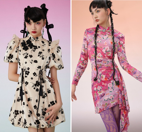
If you like the above qipao but still want an English website, there are several Taobao resellers that carry similar designs - for example, Beth and Brian Qipao. The hanfu shop Nuwa Hanfu also offers a carefully curated array of qipao, including plus-size qipao.
Finally, when it comes to in-person shops, I want to highlight Xiangjiang Silk Co., a relatively new boutique in New York City specializing in actual vintage 1950s-1960s qipao. There’s an article here on the boutique and its founder Heather Guo (who was featured in Vogue). Store visits are appointment-only, so you’ll have to reach out to Heather via her social media if you want to drop by.
If anyone has reviews of the above shops and/or more qipao shop recs, please share! ^^
Bonus: I also have online shop recs for hanfu (1, 2), modified hanfu/hanyuansu (1, 2), hanfu accessories, weimao, and hair accessories.
#qipao#cheongsam#modified qipao#recs#taobao#hanfu#modified hanfu#hanyuansu#>500#chinese fashion#chinese clothing#china
838 notes
·
View notes
Note
have you ever ranked pirate flag designs? i think i really need to know your take on that… and also who you think designed them in the crew?
Oh this is a good one, i havent done it and havent even thought about it before!
Im not gonna rank all the flags bc im sure i'll forget some, so...
Top 10 Jolly Roger 💀
10. Hawkins Pirates
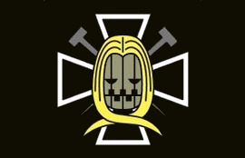
It has a bit too much going on but i like it, i think its creepy and gives off black magic vibes, true to Hawkins powers and aesthetic
9. Kid Pirates
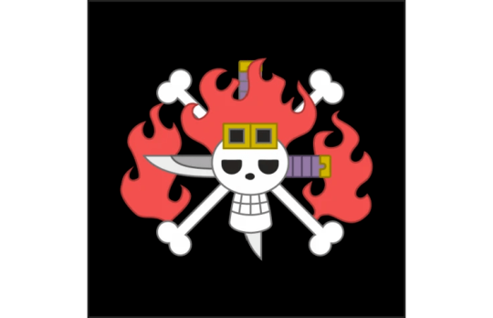
There so much going on but its badass. It feels like a 13 y/o boy assisted in the choices but its also feel honest, like he genuinely is that. Very true to Kid's personality
8. Thriller Bark Pirates
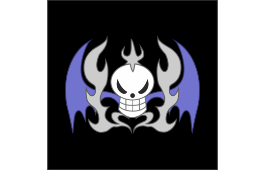
They showed a bit more restaine than the other two, more clean. Strong aesthetic game in desing and colors, you just know they have a haunted mannor dracula shit going on
7. Whitebear Pirates
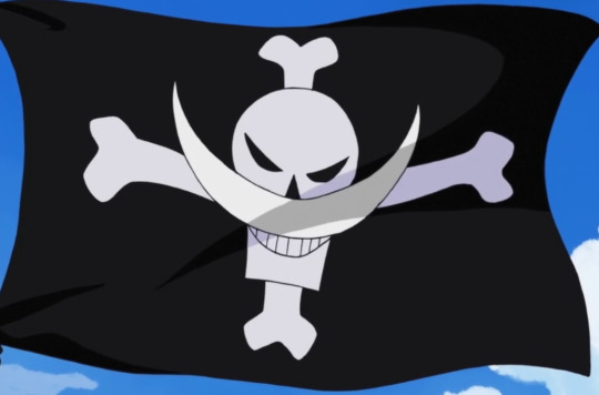
Instant classic. Neat and to the point. If you have a physical trait like that use, brand on it. I also like the angry eyes on the skull
6. Buggy Pirates
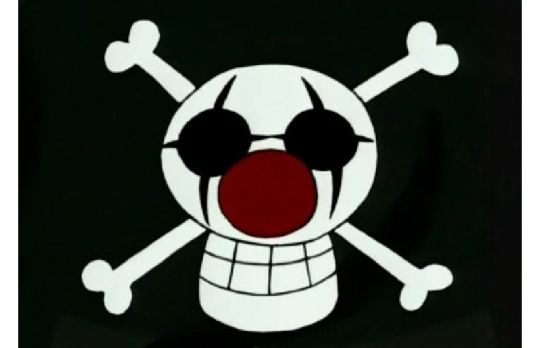
Speaking of physical traits. No messing around, clown, bosh. I also like it looks silly, it doeant strike fear but its so funny looking that i like it
5. Red Hair Pirates
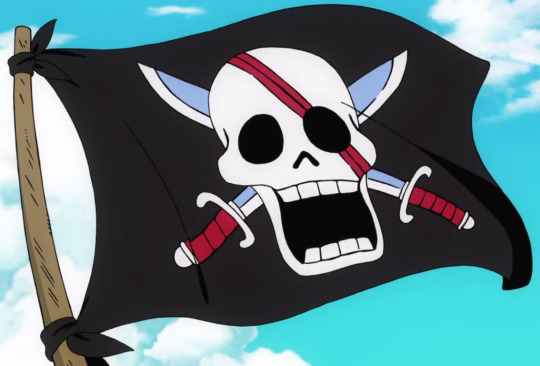
Against what i've saying, i love they resisted the urge to give their jolly roger red hair (there are other red haired people, its not that unique). Its a classic timeless look. The red streaks bring it together to look like Shanks scars but also an eyepatch but also blood.
4. Heart Pirates
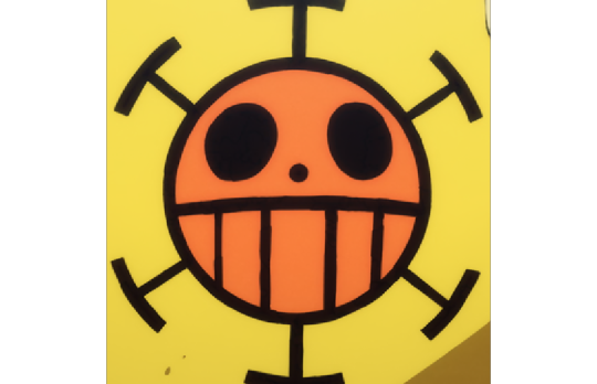
Law does not have a jolly roger he has a Brand™. The jolly roger has nothing to do with his physical appearence of name of the crew but it has a story, or backstory rather. Its a unique shape, it has its own color scheme, he slaps it on on everything. Its a logo, and i like it
It also if you look at it for long enough it starts to look like a surprised egg with striped piyamas on
3. Straw Hat Pirates
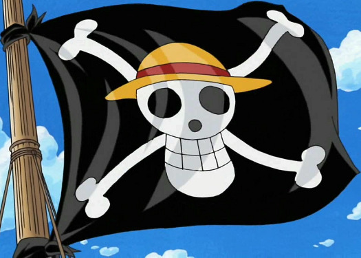
Talking of branding. Simple, effective, a pop of color on the hat. Silly looking and you inmediatly know who is behind this crew. A personalised classic and bc its so straight fowards just beats Law's desing to the top three
2. Cook Pirates
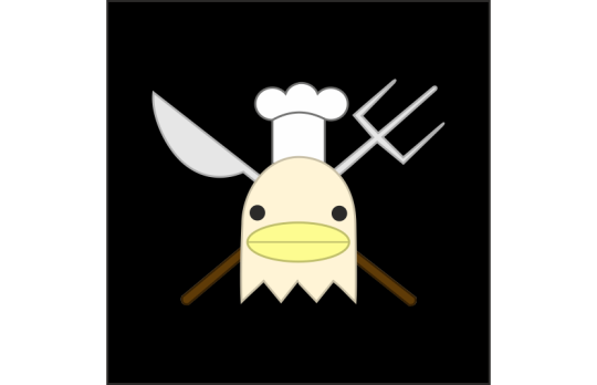
Its so silly i cant not give it high marks. Can you even imagine been terrorised by a crew that sails around with that? Amazing. And from the man nicknamed Red Leg Zeff bc of the blood that his kicks drew, duality of men
1. Kuja Pirates
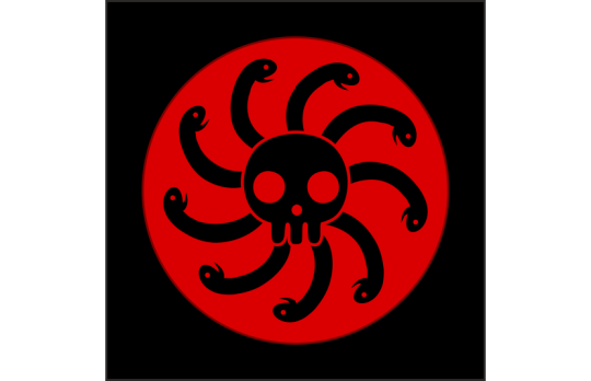
Now that is a look. Its simple yet scary af. It really intimidates you, and its related to Boa but not in a too obvious way, a call back to Medussa and gorgons, badass and dangerous women. Impactful, effective and iconic.
And as for who made them: Hawkins(?) (dont know any other members) / Kid and Killer helped / Hogback / Whitebear but i think he consulted Rogers and they sortof copied eachother / Shanks age 14 as a joke / idk why but Lucky Roux / Law. / Luffy and Usopp helped (as we know) / Zeff (he is quirky like that) / Amazon Lily's CM
181 notes
·
View notes
Text
Collar-ful Engravings

Vox x Hellhound!Reader - Fluff - Gender Neutral
Vox gets a hell hound, you, as a business gift. He doesn't really care about you until he sees how much your presence bothers Alastor. Now he's all about you, spoiling you and flaunting you around. Now, he's even got a gift with your name on it... its not too tight now, is it?
TW: Unsexualized petplay(? Reader is a Hellhound so it comes with the territory?), any Hazbin Hotel warnings
Hello hello!!! This is my first attempt at publishing a fanfic. I know it's not perfect so if you have any feedback then please let me know!! Remember to stay hydrated and remember you are loved! <3

You cleared your throat; the sensation of something against such a vulnerable place felt odd. The collar sat proudly around your neck, the design wasn't anything over-the-top, which was how you preferred most things. It was black with a simple silver buckle but in neat cyan cursive engravings read “Vox”.
Vox stood next to you as you stared in the mirror, you hands gingerly testing the fine leather.
"So what do you think? Pretty nice, right? I had Velvette pick the material. It's not too tight now, is it? If you don't like something about it then I can get it altered, or better yet, get you a new one. I think a neat collection would be nice, wouldn't it?" The T.V. head rambled behind you, his hands resting firmly on your shoulders. Occasionally, his hand would lift off to do some gesture, ever the animated talker.
"No, it's..." You struggled for words. Oddly possessive? A bit kinky? Really fucking embarrassing to wear? "It's something. Nice quality it's just... a bit much, don't you think...?" You chose your words carefully, not hoping to incite his wrath. You were never a disobedient hellhound after all.
He laughed off your concerns. "Of course not! You're now a face in the brand. You need to represent, y'know? People have to know who you belong to, that you're associated with the best of the best," he explained, turning you around by your shoulders. He didn't seem to understand how his words sounded. People have to know who you belong to.
You tried to school your face into something a little more pleasant, so he at least knew you were receptive to his generosity. "Thank you, sir. I believe this luxury is wasted on me though. There are better ways to allocate your resources and money rather than on some random mutt,” you tried your best to explain your thoughts gently. You winced at his unamused expression. It felt like you were letting him down simply by letting the emotions slip.
“No, no, no. None of that” he chided, booping your nose with his index finger. Your snout wrinkled up as it always did when he booped you. “Are you judging my taste? My impeccable eye? Keep your head up high. You aren't just some mutt. No, you are among the big players, so show some respect for yourself. Anyways, it'll show off your brand-new accessory better if you keep your chin up,” he hummed, grabbing your chin to tilt your head higher. He always spoke in such a theatrical way that lifted your mood. Your thoughts may not be kind to yourself, but he was plenty proud of you to make you feel better.
You instinctively straightened up, not wanting to let him down. He smiled, clearly pleased. “There we go. Now then,” he wrapped his arm around your shoulder, leading you out of the loft and into the elevator. During the long trip down (seriously, it always took a bit to get from the top floor where all the Vee's usually buzzed around in to the bottom) Vox's screen split into two.
On one side was his face, on the other were designs for another collar. The sight of him going split-screen always amused you greatly, reminding you of the silly reddit story videos trending in the living world. “I was thinking for the next collar we go all out. There's this trend of really decked out chokers with charms, charms and all the ribbons. We can easily apply it here, so look, what do you prefer? Black or silver chain? Ah, actually let's just get both variations,” he seemed to be more of talking to himself as he guided himself through a collar shopping spree.
You were flustered at all the spoiled attention he was giving you. You felt like a cute doll with how he pampered you, meant to sit still and look pretty as he handled all the rest. It was funny, to think a few months ago you were simply another hell hound in your old master's army of hell hounds, doomed to do menial labor for the rest of your life. Now you were on T.V. screens, even a few posters. You were a mini celebrity, the latest gossip when people talked about Vox.
“How about we leave it to Miss Velvette? It's more of her department,” you suggested meekly. You hoped Velvette would have some mercy and create less flashy collars.
He snapped his fingers, creating finger guns pointed at you. His face maximized, no longer sharing two windows. “You’re right. She'll make sure it's perfect. We can even get some new outfits to match,” he agreed much to your relief.
The elevator doors opened and it was like being seared by a million blinking suns. Vox's hand traveled to your waist, pulling you against his side as he flashed a charming grin. You blinked, trying to look pretty and charming to some degree as your eyes adjusted to the flashing cameras. He guided you out, the reporters parting like the Red Sea for the two of you. You were always impressed that they never tried to block him, but you supposed frying a few daring reporters and stepping over them when they tried him was an effective message.
You shifted closer into his side, a feeble attempt at shielding yourself from the lenses. To the outside perspective it was a sultry move, as if bragging that only you could get close to him. The news articles for the next few days would rave about this, much to your future dismay.
“Sir, where are we going?” You muttered to him, a shy smile on your face.
“There's a new VoxTek megastore opening. We are doing the opening. You want to hold the scissors for the ribbon?” He teased you, his claws pressing into your side slightly to convey his joking intent. It wasn't a threatening gesture, but rather a comforting one. The pressure was like a gentle reminder that he was here, with you, holding you, and his grip was firm, ensuring no rascal could steal you away.
His smile seemed to grow even larger as you both walked down the street. You glanced around, noting nothing of interest or joy around the two of you. He looked down at you, as if understanding your confusion.
“They're already posting about your latest accessory. I wonder, if they're going so wild over a collar, what will they say when the leash comes in?”
Ah shit, he got you a leash too?

#vox#hazbin vox x reader#hazbin hotel vox x reader#hazbin hotel x reader#vox x reader#hazbin vox#vox fluff#hazbin x reader#hazbin hotel#hazbin hotel vox#rabit-writings
73 notes
·
View notes
Text
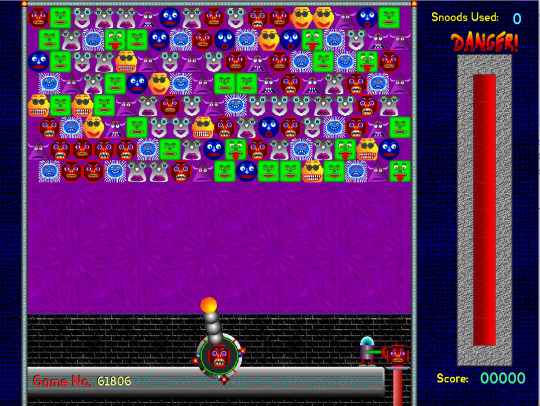
Hey you know Snood? I've been thinking about Snood lately. It is fascinating, in a "weird old game series that I have never thought about very much" sort of way. It's not the first Matching Icons Puzzle Shooting game, since that was Puzzle Bobble, but it was ONE of the first, and replaces bubbles with some little freaks, so it is neat enough to me!
I started this post with the intention of reviewing every single Snood individually, but then I realized, I don't really care about the Snoods themselves at all! Sorry Snoods! I appreciate you being weird little guys, you're just not my kind of weird little guys.
But who's that weird little guy in the bottom right...?
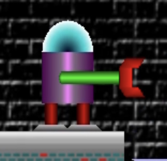
Name: The Robot
Debut: Snood
Oh hell yeah! A The Robot? Now that's my kind of weird little guy! The Robot is NOT a Snood, but I think it is the most important character. The game is ABOUT the Snoods, but The Robot is the HERO. The Snoods are all trapped, and must be freed by matching three or more together! And who is loading up the cannon with snoods, allowing for this to happen at all? That's right! The Robot!
The Robot's design is very simple and very 90s shareware game. This thing has gradients like nobody's business, and they sure do make it look metallic and cylindrical, so that's good! Its "head" is a glass-looking dome, and most notable is probably its single arm, that it uses to transfer Snoods. However, it's kind of easy to view the claw as a pair of lips on the end of a stalk.
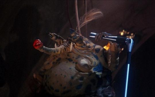
Like Sy Snootles, the best Star Wars character! Wait... Sy SNOODles? The implications are staggering! (I will not elaborate about what the implications could possibly be)

In Snood Plus, The Robot receives a bit of a redesign, which I don't like all that much. That's not colorful... where's the love, in the soul of this robot? I know it's in there somewhere. This one floats, which is cool and maybe more efficient, but it's just much more bland and generic, especially its claw arm, which no longer looks like ANY part of Sy Snootles. Next!
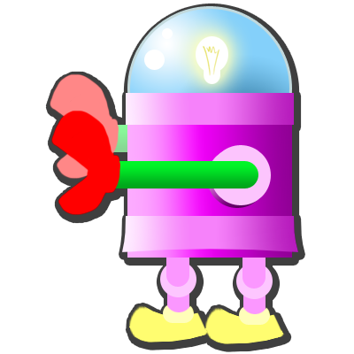
YES! YES! AWESOME! This is how The Robot appears in Snood Slide, a Match 3-style spinoff, and it is the best! I love this cartoony style, keeping the bright and eye-catching color of the original, while making it look more like a thing that exists, rather than just some shapes! There's a light bulb in its head, it wears SHOES, and it has TWO arms now! Is that canon? Has it always had two arms, and we only ever saw it from the side? Is Snood Slide canon to the greater Snood series? Well akshually, Snood HD, the version of Snood released in 2009, completely redesigned all the Snoods, and said that the original style was just a simulation. I bet the Snood loreheads were furious about that!
I'm sure you aren't wondering how The Robot factors into Snood Slide, considering there is not a Snood-O-Matic Cannon to be loaded. That's something only Snoodheads would worry about. But the answer is that The Robot will appear and move a line of Snoods if you use the hint feature! So kind of it.
Hey... The Robot is not in Snood HD, and that game decanonized the original Snood! Is The Robot even real? Is it a fictional character in the Snood universe too, and therefore fictional TWICE over? I don't know. Snood is a mess.
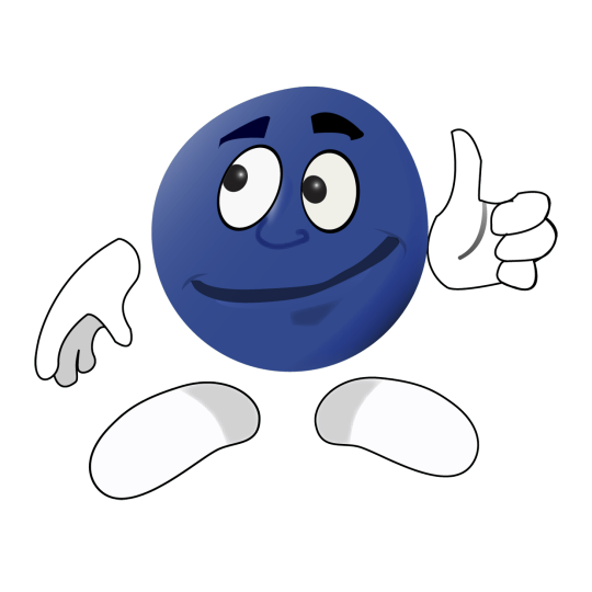
They released a game in 2022 where the icon looks like this. That's so quaint to me. Never change, Snood.
#snood#the robot#robot#snood hd#snood plus#snood slide#snood allies#not mario#funky friday#mod chikako
58 notes
·
View notes
Text
Random thought: Silver Wolf's virtual companions seem to loosely correspond to the other Stellaron Hunters (+ a bonus)
Warning: Long post
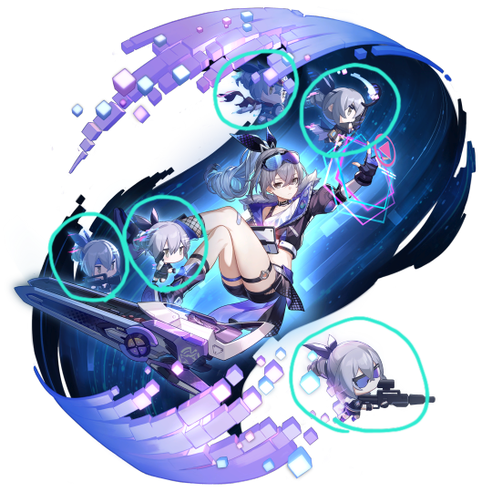
For those not in the know, SW's weapon holds an A.I of her creation, which she calls Prometheus (hmmm). Prometheus comes with five modules -the chibis pointed out above- each of which has its own special name: Friend, Demon Lord, Whitecollar, Servant, and Preschool Classmate.
I'm unsure if they all look and act the same as they did upon creation, so the theory here is that she based or modified them using her colleagues as inspiration after joining the Hunters. Now, here are the parallels I think make the most sense:
1) Friend -> Kafka. Most of SW's appearances are on joint missions with Kafka specifically, and that -along with the banter they exchange all the time- leads me to assume she's the closest colleague to our tiny hacker. Friend is also the first and currently only companion that actually talks to us ingame and outside of the game (she shows up in one of SW's lines and in her Keeping Up With Star Rail video), and who was the first Hunter we encountered in the story?
Yeah.
2) Demon Lord -> Ren. According to SW's second character story, the companion is inspired by a poster she saw one time, and she based it off the idea of a veteran who lost the ability to speak. Ren isn't perpetually silent, of course, but he's a man of very few words, and is strongly associated with demon imagery as well (that one vidyadhara elegy, the kit icons, the clothing design, etc.). I also think Demon Lord is the chibi on the top left with the sword, right next to Friend, and what would you know- there's only one Hunter we know whose signature weapon is a sword!
(That and he's also seen a lot alongside Kafka. Neat.)
3) Whitecollar -> Sam. Admittedly there's pretty much nothing to go on in regards to Sam, and that makes him a weak link in this theory, so I hope for some future crumbs that can clarify things. All we know about him so far is that he's a more straightforward and efficient sort of guy who doesn't fool around on the job- if SW's express visit line is anything to go by. That makes for a veeeery threadbare argument that he'd make a good whitecollar with these qualities, but honestly they apply to any job, and Sam obviously doesn't sit around in an office all day...
4) Servant -> Elio. This is a pretty simple one: Elio is literally called Destiny's Slave. If that's not Servant, then who is? More crumbs are always welcome to give further proof or contradict this assumption, but for now it seems pretty reasonable to me.
Bonus:
5) Preschool Classmate -> Trailblazer. This one is the most interesting to me because, here's a fun fact: Preschool Classmate was actually deleted soon after its creation. This parallels the Trailblazer being left behind to join the Express and set the script in motion, in a way, and might explain SW leaving alongside Kafka without talking to them at all. But then this raises the question of why she personally visits them at the express, and why she became their gamer buddy.... hmmmmmm.....
Overall, I think this is a pretty nice design element, and while my theory has little substance to go on, I think it would be better if this wasn't a mere coincidence. If anyone has anything more to share on the topic, then by all means, go ahead! I love hearing about small tidbits and trivia and fuel for the found family agenda!
#if you didn't scroll away four lines in then salutations#claim your cookie of choice here!#honkai star rail#hsr#stellaron hunters#silver wolf#hsr kafka#hsr blade#hsr sam#hsr elio#trailblazer#pink's musings#(btw there's further stuff about sam but they go into leak territory. if you wish to hear that please ask and i'll dm)
184 notes
·
View notes
Note
pls can u tell me everything about fhq and esp fhq iwaoi i don’t really know what it is but every time i see you repost one of those beautiful heart wrenching artworks i want to die in the best way
YES GLADLY I WILL TELL YOU EVERYTHING I CAN !!! under the cut because you're getting everything.
ok so some of the history lesson portion of this may be a little off, it's been a hot minute since i've done much research into this lol. but final haikyuu quest first appeared as a spread in one of the bonus pages in the manga! throughout the manga's run were occasionally drawings of the characters in little fake movie posters, one of them being an action/fantasy movie called final haikyuu quest:

this first poster and the original character designers are drawn by furudate! from there, it went on to become a mini bonus game in the haikyuu 3DS game, which is kind of crazy if you think about it too hard.
there's a playthrough uploaded on youtube here, but it's obv in japanese and i don't think there's been a translation of the game. there's a translation of part of it here on tumblr, but i don't think it's complete. poster from the 3DS game:

from there, it went on to be a CD drama (videos 8-10 on this youtube playlist, with subs), which is super neat. it's also one of the haikyuu light novels, but i have yet to find a full english translation of that.
i haven't read the novel or watched the videos with the CD drama audio myself, so i'm not sure how much it differs from the 3DS game. i assume they're pretty similar though.
so the premise at its most simple is that hinata and his party of adventurers are off to defeat the demon king oikawa and his henchmen! those are the basics.
the "canon" characters in hinata's party are hinata, kenma, aone, iwaizumi, and kageyama. on the opposing side we've got oikawa (the demon king), kuroo, and kiyoko. kiyoko has servants in the form of tanaka and nishionoya (they don't care for oikawa, they're just there for kiyoko). there's also michimiya, who is in the "fair princess kidnapped by oikawa" role that hinata & co. are trying to save. the full character profiles can be found here (everyone in game) and here (heroes only)!
now this whole premise is like. a little silly. the whole deal is a little silly. this is a volleyball manga.
with THAT being said, though, sometimes the most fun to be had is when you take the silly thing and make it devastating. and it's so easy to do that with FHQ. so let's talk abt iwaoi now <3
so in the story, oikawa is the demon king. because the premise is so simplistic and boiled down to good v. bad due to, like, this not being a real piece of media, oikawa is objectively on the "bad side." iwaizumi, on the other hand, is a knight, presumably human, and "oikawa's (former) friend."
iwaizumi being oikawa's former friend is literally his speciality and i think about that all the time btw. for context, kageyama's specialty is "prodigy" and hinata's is "strongest decoy." and fucking iwaizumi is out here like yea hey guys i used to be on the bad side but im mad at oikawa so now i'm with y'all. also my specialty in this fantasy universe is that i used to be oikawa's friend :)
like. what the hell. as you may imagine, the iwaoi angst potential here is ENORMOUS. iwaizumi who has betrayed oikawa and joined the heroes' side to take him down, iwaizumi whose greatest strength comes in knowing oikawa in and out, because the villains you love are both the hardest and the easiest to destroy. iwaizumi who loves oikawa, and who cannot save him.
(**side note, there's a lot of kuroken angst potential involved in this au as well, but let's focus on iwaoi for this post and save kuroken for another day)
so, as i said, the game's interpretation of all this is pretty simplistic and pretty silly. but personally i love thinking too hard and finding depth in things that are so not that deep. and it seems like most fhq fans also employ this as a favorite hobby because holy shit the angst people put in this au is INSANE.
the way i've interpreted it myself has been that iwaoi were besties/lovers/unclear situationship until oikawa kind of "fell into the dark side," because this is an au of every fantasy trope possible, and his reign over aoba became corrupted and "evil." iwaizumi betrays him to join hinata and take him down--save the world, at the cost of the demon he loved so much. but that demon, who oikawa was, is gone already, isn't he?
one of my favorite comics about them is here by @/ichigomaniac, where oikawa falls to the dark side and iwaizumi kills him to save the kingdom he loves. another FAVORITE similar one is here by @/hawberries! the premise of a lot of fics/art in this au run along these lines <3333
another super fun interpretation is a 5 part comic by @/duskisnigh, where oikawa and iwaizumi are running a kind of underground rebellion/safehouse in a world demons are oppressed by the human race. but as oikawa sees more and more evil on the behalf of humanity, he gets more and more unhinged until iwaizumi feels that he no longer knows him--and runs away with kageyama, with the intention of taking oikawa down.
personally i think the BEST aus are where iwaizumi--so loyal, so in love--is forced to leave because he can't stand to watch oikawa fall to more darkness, while oikawa himself is so devoted to iwaizumi that it's his love for iwaizumi that is corrupting him.....
in the fic i wrote, it's a story about forbidden love and how oikawa just wants to be allowed to love iwaizumi and he'll fight a war in order to do it. but iwaizumi can't watch oikawa fight this war anymore, because he's getting more and more dark as the war rages on. so he leaves, and was any of this ever worth it?
ggaahadhgjkadg . fhq. its crazy. i have a tag for it here, where i have been curating my favorite art. special shoutout to @/amezure who has some GORGEOUS pieces in their tag. OH ! and some of my fave fics in this au :
in the arms of loyalty and the hands of devotion (iwaoi, 23252 words), self promo lol
i can go anywhere i want (just not home) (kuroken, 3662 words) by keplcrs
wondering if your heart's still open (iwaoi, 683 words), by birdintheriver
Diorama (iwaizumi & kenma, 2027 words) by PlumTea
the ao3 tag is beautiful everywhere you turn, but i have a special love for those fics <3
so yeah that's the general deal! if you ever want to talk more about it, i am HAPPY to discuss !!! pls pls plsplsplsplsplssplsplslpslslslss!!!!!!
#ask#fhq#iwaoi#TY FOR THE ASK !!!!#this was so much fun to write out#i love final haikyuu quest SOOOO Much
53 notes
·
View notes
Text
Corazón Marikit :3
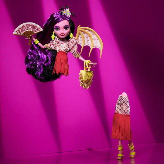


okay no need to worry about another sad soul on your dash sucking the fun from every new doll they release (self roast bc ive definitely done this in other posts but this is different i swear) for the most part this is all positive with like a few small notes of "eh idk abt this but its no biggie" BUT overall i think its a super cool doll i really like it :3
i totally started writing this BEFORE seeing ANY other opinion post about her btw bc my tl hadnt caught up yet so sorry if it seems similair to another's
this started as a simple opinion post bc i do it for all the new MH characters but here i am THREE HOURS later finally finishing writing this and its basically just an entire deep dive into every single piece of her outfit and how it was inspired by Filipino fashion and culture bc i kinda autism'd too close to the sun for a while there HAHA
okay thanks anyway enjoy my silly words
**also to preface, im not Filipino so i cant speak on if its good/bad rep obviously SO this is j from an outside perspective and with the small facts i already knew about the manananggal aswell as my somewhat brief research deepdive into Filipino culture and fashion in relation to the doll, which i did try my best to make sure i got these right (part of the reason this post took me 3.5 hours to make LMAO) BUT pls correct me if im wrong for any of these names bc i dont want to spread misinformation or seem like im treading on someone else's culture... oh and dont take my word for shit HAHA **
EDIT here is a great post from someone who IS Filipino, bijoubetrayal if you want to know their insight from personal ties and firsthand knowledge into her design, i recommend reading through it :33
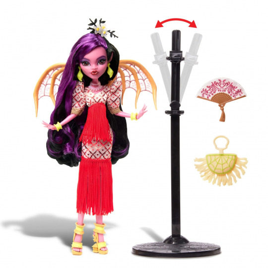
before we start for the maybe one person that was wondering yes i totally bought the doll already HAHA im a massive sucker for extremely unique monster high body features (isi's hooves, marisols huge feet, iris' single eye, wydowna's 6 arms, etc) so when they announced her as a manananggal and that she can separate at the torso i immediately ran to snatch her lmao i am not a strong soldier okay. also u can get her [here] if u want
FACE + HEAD
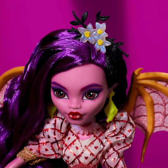
her screening is super cute, and she's got bat ears ! bc well ig shes basically a vampire HAHA but i think thats neat PLUS im always a fan of beauty marks and darker/thicker eyebrows theyre really nice
AND !! the nose is so pretty we dont get to see a lot of MH dolls with the flatter nose bridge :3
idk where else to put this so i'll do it here but her name Corazón Marikit means Beautiful Heart (im fairly certain) and i find that really sweet for some reason but also its like humorously ironic given that manananggals eat the hearts from their victims AHAHA
okay idk if ive been staring at her too long but they somehow managed to make her color palette coherent ? like red pink purple cream and lime yellow generally dont work well together and it worried me when i first saw her but it actually looks pretty good the longer i look? i could be losing it tho so
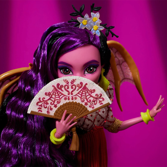
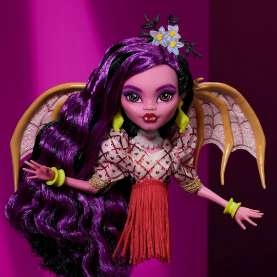
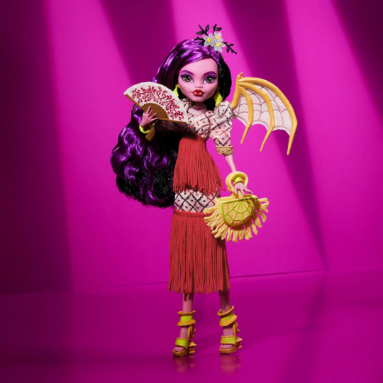
DRESS + SHOES
the dress pattern is starting to grow on me, still not sure on if i totally like the foil but that might just be bc im not a fan of red-heart designs in general, although thats just for the pattern, i still like the look and style of the dress overall its cutie
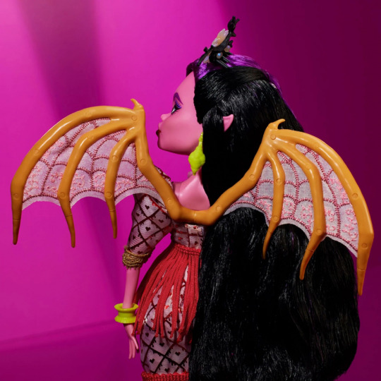
i think the puffy sleeves plus the cut of the neckline and shape of the dress are all akin to the Filipiniana style mestiza dress and terno sleeves (from what i could tell)
also dude ? the red tassels imitate how the intestines hang out when manananggals detach themself brooo thats so neat LMAO like iykyk but if u dont it just adds some fun motion HAHA
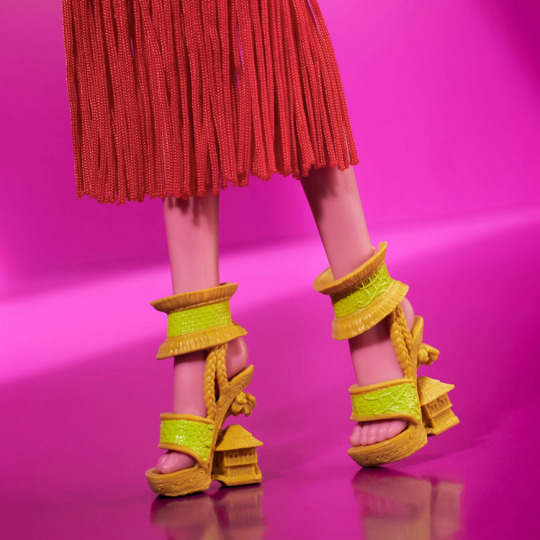
cannot make out the specific design of her heels i think its like a palmtree over a house ? but anyway i always love when MH make heels look like tiny objects or a person or smth its so fun HEEHEE
and the sculpting for the shoes are suuuper detailed looking like woodgrain and woven palms, maybe a shoe design from PH which im fairly certain are Bakyâ (?) so uh hell yeah HAHA

ACCESSORIES
those wings thooooo like the wingers (wing fingers) being so thick and prominent, though they couldve been bigger kinda like batsy claro's given theyre such a big part of the story but alas
ALSO WOAH the skin(?) between them being actual embroidered fabric instead of just plastic ooh that is SO INTERESTING to me its so tiny and intricate omgggg
neon lime green jewelry is an uhhh interesting choice to pair with her color palette but i dont really care enough about colors to get into that lmfaoo
the necklace is super hard to make out from the stock photos but it looks like pooka shells ? which i doubt is correct, however the closest thing that it looks like i THINK are the bailog style of necklace from what i can find, but theres a a bunch of styles of those it seems so i cant be completelyyy sure
her head piece are sampaguita/jasmine flowers which are the natl flower of PH its pretty lmao
PLUS !!! the stand is SO COOL !!! it bends at the top so u can position her to look like shes separated and flying THATS SO THOUGHTFUL ?? idk it made me smile at least lmao
ADDITIONAL THOUGHTS
OKAY SO i think she looks reallyyyyy cool definitely one of the better skullector dolls from the past few years imo
ofc i really like the idea of introducing other cultures’ monster-mythology to mainstream, especially bc there are some really cool ones out there that are seldom heard or seen unless theyre completely butchered or changed in western media
and its a nice way for people to learn about them,, plus for people who grew up with these folktales to see their stories and culture actually represented
it is amusing to me that they somehow turned this horrific mythological monster lady-- that usually has intestines hanging out of her torso, flying around at night, eating fetuses straight out of the wombs of pregnant people and seducing men before eating them alive-- into a cute pink and purple girlie HAHA /lh but i mean yeah clearly thats kinda always been the point of monster high lol, this one just feels especially drastic if you compare a manananggal to like an original sea monster or a were-animal LMAO
and like everyone else already said, that price tag is a lot as usual🙄 like mattel seems really inconsistent with their pricing on creations dolls that are seemingly super close in detail and quality lmao idk... i wasnt expecting mattel to be humble tho, and i wont go into another fang club pricing rant here again, its just always a tad disappointing to see but oh well i guess, doesnt play that big a role in this post's topic so im not elaborating lol
it seems like a lot of care and effort went into her design, however, in order to represent PH as far as i can tell, so that makes me happy bc MH Does Not have the greatest track record in that category lookin at you jinafire lmfao
okay thats all im officially out of words to conjure up in my brain :3 if u sat through all this, im sorry for allat but thanks for staying HAHA
#this is more of an autistic yap for myself as i find out more information about the backgrounds of the accessories and whatnot#bc my tumblr is highkey just a diary for myself.. but for the entire internet to see HAHA yall j happen to be here too#but also for anyone else who didnt know either and like to see how different elements of clothing are inspired esp on dolls#n it seems like most dislike for her dk shes based on an actual Filipino folktale with actual Filipino designs and not j a random gimmick🤨#like maybe take your time to learn what monster the doll is based on and where it comes from before blindly throwing insults idk#i always find the country of origin's fashion and mythological elements that are put into MH designs super cool and interesting#also i just really appreciate when MH uses actual real design elements from their dolls' country instead of always western youth fashion yk#anyway i hope this didnt seem too critical of anyone or anything i actually grew to like her more as i wrote this out but#ofc i have no personal ties to this so i'm gonna see how Filipino people think of her and if they feel represented respectfully :)#corazon marikit#monster high#monster high skullector
12 notes
·
View notes
Note
ok so this is maybe going to be a little confusing? there’s a specific type of fabric called aida that has rows and columns of holes woven into it to make cross stitch easier. aida also comes in different gauges of stitches/holes per inch. iirc this particular aida is 14 stitches per inch. my personal method of doing a cross stitch changes every single time i start a new project because there’s multiple ways you can do a cross stitch. example of a half done row:

currently the way i work is bottom left to top right (for working rows left to right. i think this might be called the first pass but im not sure really) and then bottom right to top left for the opposite direction. this leaves a fairly neat back. one of the sections for this project i did differently (bottom left to top right, top left to bottom right)

this (section on the right) leaves long floats that waste thread. it also isn’t exactly aesthetically pleasing, but personally i find the goal of the back is to look neat, rather than pretty. some people judge the back of others work but those people are kinda assholes imo. you want to anchor your thread at both the start and end of a section so that your work doesn’t come undone. you also want to keep your hands clean, especially when working with light coloured or white thread and fabric. moisturiser is a necessity imo. there’s multiple different brands of embroidery thread available. i like dmc bc its most readily available to me. look for the words mercerised cotton. generally embroidery thread has six strands which you can seperate and use two, three, however many you like. this piece uses two! patterns will generally tell you how many strands to use and what thread colours to use. you can also get kits that come with the thread :3 a hoop isnt necessary but it helps to keep tension on the fabric, which opens up the holes a little more. a personally use a sit-on hoop with a sort of pear shaped wooden base so that i don’t have to hold the hoop the whole time, as that makes my hands cramp. these are kind of expensive brand new though and mine actually used to be my mothers :)

(Just adding other ask to answer both)
I bought some materials and I did get aida and a hoop!! (I did notice that the aida one had small holes already. Also ngl getting the fabric in the hoop was harder than it looks). Also that's good to know to do it in rows. That makes a LOT more sense than what I was thinking which was that doing the outline first would be better (that probably depends on whether or not you actually want an outline though) Also I did look up back stitches and they look simple enough 👀 (especially with this fabric I have). Ty for the tips!!
I do have one question, is it recommended to draw your design out first on the fabric or no? I'm assuming very lightly with a pencil is fine but I could be wrong.
8 notes
·
View notes
Text
uhh here's my media roundup for the last week or so, w funny x out of 5 reviews. lmk if you hate my opinions or whatever:
dune 2: astounding to see and hear, lots of extremely creative stuff in there, a single pitiful crumb of critical thinking. definitely stwars for this era which means lots of fun and not too much more. love the stupid character drama sadly. we do still owe everything in action movies to fury road, all i could think the whole time. and it was so long.. nothing for it but yr not an epic of yore. 3/5
darksoul 3: it's fun, it's quaint. it's so cynical and straightforward, a patchwork world of tired but self aware references. it feels really easy...too generous, the whole thing from design to gameplay feels like giving in to whiny demands. slow enemy aggro infinite dodge safety cheap levels etc etc. fun but it's like, a fusion of darksoul and blooby b4 it and a prototype of eldy after, and those are all 10/10. ill keep checking it out tho. 3/5
slay the princess: neat. i appreciate where they took the choices vn concept, blew it up to ridiculous proportions while also obfuscating the players role in the story. it's not quite my thing...the splintering "mc" guy and the narrator dick do nothing for me, but the relationship between the choices and the princess (ultimate) is worth a lot. i got the "wait with calamity princess at the end of time forever" non-ending and that's good for now.. curious for sure but i have many books. 3/5 (probly 4 when i get back)
toho19: finally installed the TL patch and it's really, really good. the design upd8s r cute, the new additions are the best in almost 10 games, the woven plots and writing and ending drawings are inspired. i must admit the system feels a bit..wrong to me. for what it is, vs STG, it's radical, but it only Just works. noticing during the final boss (a gender of all time :x) that the spell card pattern and her mini-special are both pretty simple, but combined it's kind of just an unavoidable barrage (charming in its own way). makes me appreciate the perfection of the first windows era more. 4/5
eldy ring no hud mode: fuuuuuuck. you dont even realize how beautiful and ingenious this game is. we dont even realize what was accomplished here. top 3 rpg ever in history. 5/5
twin peaks season 2: it's a drag. pretty much every plot fills me with dread, and not the magical-fearful type but the social schlockmentary bloated exhaustion kind. i love the core cast characters still and the gravity of where it's headed and what comes after s2 but jeez it's hard to see something close to genre masterwork reduced to...this. you cant always just do More, is kinda the media theme this week. 2/5
#if nothing else this helps me keep track bc i really cant otherwise lol#i need to read more and albums more. immediately#i have way more thots on eldy all the time but thats its own thing#plain doll posting
7 notes
·
View notes
Text
Objectober Day 16!
Today's theme was Warm!

Such a silly little guy,, ik their design is simple but this is honestly what the embodiment of warmth and light would look like to me lol
ik they aren't TECHNICALLY a fairy light, but whatever its a cool name (also, they're nonbinary they/it :3)

bonus drawing under cut :3


School doodles so yeahhh
I was still kinda figuring out their design, took me a minute to decide that i wanted the more complicated eyes
Personality wise, i thin they're very wholesome and spacey, and always sleepy, just kind of floating around and going with the flow...They can also make others sleepy cuz yk, warmm
They do the burst thing whenever they get shocked or excited, which for a person like them is kinda rare to happen lol but it happens sometimes
also I havent made an object oc with no legs and yes arms so thats cool (i also think its kinda neat how their mouth cna just dissapear lol)
#lol#:3#digital art#art#cute art#artists on tumblr#my art#osc#osc art#osc community#object show community#object show art#osc fanart#object shows#object oc#osc oc#osc ocs#osc oc art#object show#object show oc#object show character#oc#oc art#ocs#my ocs#original character#drawing#original characters#character art#character reference
11 notes
·
View notes
Note
Wait, you haven’t done a review of regular pikachu? Will you?
Have you reviewed raichu?

(Ironically I have literally reviewed every part of the Pikachu line except for Pikachu itself. Review links: Pichu, Raichu, Alolan Raichu, Pichu and Pikachu forms)
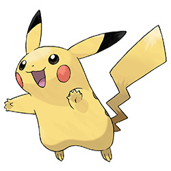
Pikachu is such an iconic design that it's actually hard to approach it from a normal standpoint, given how heavily ingrained it is in both Pokemon as a brand and modern culture. I'm more of a Raichu person myself, but Pikachu is obviously a pretty great 'mon on its own.
Originally, the creators actually intended Clefairy to be the mascot, but I think they made the right choice in going with Pikachu instead. What makes Pikachu work is that it has simple but very clear visuals—those red cheeks and black-tipped ears pop instantly, to the point where only its head can be used as an icon and it will be recognizable. Clefairy doesn't really have a single visual element like that. Pikachu also manages to be cute but not to the point wherein you can't see this thing battling, which is an important balance that i don't think Clefairy achieves as much.

In terms of said visuals, the lightning-bolt tail helps communicate the typing immediately and is a fun twist on a squirrel's tail (and yes, Pikachu is partially based off a squirrel, as confirmed by its designer Atsuko Nishida.) Likewise, the red cheek pouches pop instantly and play off of the idea of rodents storing food in their cheeks by having it store electricity instead. The brown stripes on its back help to fill the space in the backsprite and keep it from being too plain, and the little :3 face is always a winner as well.
Obviously I wouldn't actually change anything about the design, but if I were to be hyper nitpicky the way I usually am, the brown gradient at the base of the tail might've made more sense as a black tip, to match the ears. (Ironically, apparently a lot of people actually do misremember it being like this, though I'm not one of them). You could even make the brown back stripes black for contrast. But yeah, overall, very effective design even if it wasn't the face of the franchise.
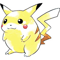
And no Pikachu review would be complete without talking about the OG fat Pikachu design. Originally Pikachu was supposed to be more of a mochi pastry than a rodent, and some of that roundness was retained in Pikachu's early designs. Over the years, it was slimmed down to make it easier to animate. (It also had a white underbelly, though I actually like dropping this, as it gives more of a sense of progression to Raichu.)

While I do love the original design, I do think slimming it down a bit doesn't hurt anything, and making the tail shorter and wider makes it stand out more. I think sometimes it can get too slim in modern media, but the official art shown above feels like a good weight.
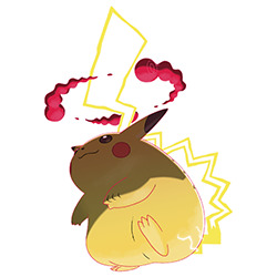
Thankfully, we get to have our cake and eat it too, as Pikachu's g-max design is a throwback to the original sprite. This is both a clever concept and feels appropriate for the g-max theme of "thing, but really big". There are a few obvious changes—most notably the tail, which has been lengthened far beyond what it originally was and is now all-white with a yellow outline, to look more lightning-y. It also has an extra stripe and bigger cheeks to better balance the space.
I'm not sure making the tail white adds all that much, but making it longer makes it so the g-max clouds can swirl around it like a storm, and I think that's pretty neat.
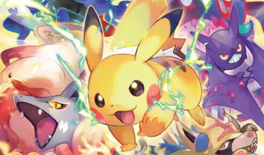
So overall, iconic Pokemon that deserves its status as series mascot. Don't think I need to say any more.
75 notes
·
View notes
Text
alright closing umineko for the night!! i had a great time with it so far!! i really like the writing style, and for the most part its actually a lot less dense than i was expecting. I thought it might be some house of leaves stuff but no this is pretty easy to read, at least so far! im rlly glad for that like it doesn't feel too simple, not too complicated, its good!
current character thoughts run down, though i've barely started so i dont know much yet: ginzo: he sucks he totally sucks and im convinced that he made some kidna deal w/ beatrice in order to take advantage of the earthquake and war and such. not entirely convinced hes not about to just murder the whole family bcs he seems like he would do that. krauss: also sucks. just a real dick, but in like. he's a standard asshole really. natsuhi: much in the same vien, but she's got that matriach of the family thing going on i hope will b explored more <3 jessica: she's neat i like her! looking forward to more on her. Eva: i was digging for her a while and then i saw how she treated shannon and it went out the window hideyoshi: ive yet to expirence a thought on this man George: he's very tropey in a good way and i enjoy he's friendly guy swag. looking forward to it inevitably falling to pieces rudolf: DICK!! kyrie: girl leave your husband. i can treat u better <3, im glad she has some decency but my mind aint set on her yet battler: HES SO CRINGEEEE <333333333333333333333333333333333333333333 sometimes he does genuinely offput me but mostly he's just stupid <3 rosa: be a bit nicer to ur daughter, but beyond that shes chill i think. no big thoughts here. i do like her dynamic in relation to the rest of the siblings so far maria: MARIA MY DARLING MY DEAREST SHES SO SWEET AND SILLY AND CLEARLY OMINOUS I CANT WAIT TO SEE WHAT DARK MAGICS OVERTAKE HER OR WHATEVER <333 maria for whatever the fuck she wants 2024 love her so much no crazy thoughts on the head butler or doctor but i think in a different world the butler and ginzo had crazy gay sex shannon: shes soooo sweetie <3 suspiciously so this game wants me to like her so bad and i do <3. i am aware of one key spoilery fact about shannon uncovered in some content warnings i recieved, but its kinda fun seeing the set up for that! everyone be nicer to my girl kanon: hes suspcious but overly so and i wonder what his deal is. i also think all the servants need to be treated better this fucking furnature stuff <3 its awful i love it narratively gohda: i think he would kill someone with very little hesitation. i wanna try that panna cotta. kumasawa: shes like a grandma to me <333 i like her!!
i havent met beatrice yet but im looking forward to it she looks super neat.
i also apperciate how slow burn this is, a few hours in and very little has happened yet it's nice. there's already a lot building but like. nothing big yet it's nice. i like it. it feels like it's moving at exactly the pace it wants to and i enjoy it a lot. the sound design is also rlly good. the music is really nice a couple times i got distracted and just listened to it in the bg. the sfx r nice too.
i do not regret my sprite choice i like these designs they're fun, but i do think maria looks a little off for her alleged age of 9, but it's easy to ignore after a min or two.ironically when i was loading the game and saw her on the steam page it def aligned better, but at the cost battler to my eyes is now yassified. he cant be a pretty boy to me he's too lame.
voice acting is great everyones putting fucking everyting into it and i enjoy that. fully commited to the enviroment and its great.
where i left off: everyone just finished having lunch! kumasawa covered for shannon not knowing the red sauce's ingredients. that's all for now! not sure when ill paly more, probably tomorrow, but its been good!! good game so far i like this setg up!! im also eagar to get more into the murder and violence and witch stuff but like, it does a good joib of setting up the characters so i dont feel impatient, and unlike a lot of games w/ murder n mystery that get right into it i kinda find it refreshing how slow this one is to start its like we all know itll get there so the tension of everyone being relatively calm is great.
anyway, umineko day 1: it was good =D
15 notes
·
View notes