#quick sketch plus color
Explore tagged Tumblr posts
Text

Finally free from exams prison, am i too late?
Also yes they picked drinks that reminded them of each other
#apologies for the shit quality i guess but this was sketched horribly quick in a hospital library and proceeded to be dragged on for like.#a week#this is also extremely blursed and i got my bf from being against it to enabling me#plus i suck at any kind of shading have mercy of me i colored So-Lo’s skin properly#art#my art#oingo boingo#good for your so-lo#good for your so lo#because it’s a gamble to guess which tag is the right one#also good for your YOLO the way i am yeeting myself off with this one I don’t want to see it ever again#I should also add that i am not in any kind of server i picked this up from the tumblr tag
13 notes
·
View notes
Text

KHR Rarepair Week Day 4 - Murder Spree - Hibari & ???
Try to open my right hand and have a look? You'll find a crimson sky. If you see it, will you be shocked? The crimson sky is so beautiful, yet you never know. (empurple by harumaki gohan)
base ref here
#khr#khrrarepairweek2024#khrrarepairweek#khre#khr oc#oc#einart#WE'RE SO BACK!!!!#tw eyestrain#eye strain tw#eye strain#hibari kyoya#something oc#not exaacctlly sure who/what that is--- but i can estimate and it's smth around [redacted][redacted][redacted][redacted]#hibari&something#a quick sketch as warm-up for day 7 (that i also alr finished so im guaranteed two posts alr for this event ehehehe 💪✨)#its been a while but sometimes i rlly like drawing smth with a bright color plus also b/w (its so cool when i see other artists do it)#just rlly wanna draw horror and murder spree is my delicious low hanging fruit prompt#also tyl hibari i'll draw u properly someday believe in me my bestie 🫡💜✨ i just got out of exam jail so i forgor how to draw by like >50%#not me posting this during work lunch break#bc it won't be day 4 here anymore when work ends
15 notes
·
View notes
Text
i have all of this Artistic Energy in my body but none of the Physical Energy
#marzi speaks#anyways. i may have started a quick art piece with a New Style again#i will never have a consistent art style. that's the rules#plus! it's good to branch out#when i get into a new thing it happens. the Flurry of Energy in my Brain#anyways. they're screenshot redraws <3 sketches with rough color is the plan#that's all ur getting. teehee
3 notes
·
View notes
Text
did the zeet studio sketch session and realized ive never done figure drawing with clothed people b4 :|
#jk we did do like small warm ip sketches with other students but they were in tahirts and fit jeans not. baggy baggy baggy baggy#its just. recallibrating the brain. draw what you SEE not what u think the limbs r doing under there.#but i know how to quick gesture drawing set up for limbs not draping!!!! ah. learning hurdle.#PLUS marcilles putfit being all jean color. brain hurty#.txt
0 notes
Text
ミ✰ BIRTHDAY EVENT! A SONA PARTY! ♪

🎊 toki! I'm Muffin! Let's celebrate by drawing our sonas in silly party outfits 🎊
For my birthday (Dec 2nd) I thought… what would be a better gift than getting to see so many diffrent sonas? Especially if it’s of my friends, moots and possible future friends! I designed a party version of my sona and am hoping others will draw their own sonas in outfits to match that aesthetic
The plan is to draw submitted sonas in a big drawing at the end of the event! If you’re interested feel free to read more but if not please reblog this post anyway so that others can participate!
How To Participate:
1. Reblog this post with the specific tag #RSVP so I know you’re interested! 🎉
2. Submit your sona design! I am gathering the designs beforehand to hopefully get a head start on the group drawing. You can submit a design by sending me an ask with a reference! Simply draw your sona matching the outfit shown below. It can be a quick sketch, I just request it be fully colored- Also please include height or approximate size plus any other important details in the ask!
3. Attend the magma! I will have a magma open Nov 29th - Dec 3rd where I’ll be drawing and doodling throughout the days ( this is optional! But feel free to join me! )
4. I will do my best to draw all sonas submitted to me before Dec 1st in a group photo!
Thank you for Reading! ☆


#THANK YOU LOAF SM FOR HELPING ME WRITE THIS POST#also Selene and bones for checking it over as well#I have some non tumblr friends who seemed interested so thought I would extend the invite to anyone who wishes to come!#art of mini is not required!! just your sona plz >:D I love others sonas sm#please be covered in confetti#confetti is very important#/silly#the dress code is very loose and I want you to have as much fun as you can!#make it colorful! make it rainbow!#hope to see you at the magma!#I will be checking in throughout the days and drawing for several hours two of the days#don’t know which ones yet#there will be apple high chart#maybe cake#putting in my order for brithday cake#party address: the void#my moots are so cool..#birthday#happy birthday#silly events#rainbow#confetti#sona art#self sona
89 notes
·
View notes
Note
if Jimmy and Timmy get married, how would the wedding go? Who proposes to the other? how does the proposal go?
this is the best ask ever i forgot how much i love schmaltz <3<3. heres some quick doodles as a bonus <3


as for the wedding and events proceeding, i think its go well! they deserve a little break from the stuff in their life, as a treat /q. Unless something like the syndicate crashes their party (i.. dont think theyd be that evil to do that tbh, i havent really dabbled w them story wise but idk, its a wedding im sure they'd be civil for once..) or some interuniversal threat pops up that needs their immediate action (something like garnet's wedding from su). which tbh would probably inhance the expirence for timmy, hes a straight menace and thinks stuff like that is awesome </3. but anyways
in general relationship stuff timmy may be the more forward one but i think jimmy would be the one to establish the milestones, plus that hes more traditional in my characterization of him. that being said, timmy would totally unintentionally propose or joke about marrying him and jimmy would 100% take him up on that with no hesitation.
now onto wedding stuff bc damn do i have a soft spot for this kinda stuff <3<3
the flowers i chose are forget-me-nots and pink / peachy orange aster flowers with a touch of roses in those same colors as well. i implore you to look up the flower meanings i had fun w em <3
I chose the color peach/a coral (is that what that color is ??) for the wedding because its a combo of timmy's pink and jimmy's redish orange (vermillion ?). i just think combining their colors when it comes to ships is just so so CUTE <3<3<3. this is also why that jimmytimmy painting i did a while back has primarily those colors <3. it didn't fit the theme but timmy wanted them so he gets a green, hot magenta pink, and purple flowers for his suit so his only family that loves him can be there.
this is uhh kinda angst implied but it wouldn't be something i made without a bit of angst <3. timmy's biological family would not be there, his mother would probably call once she heard that he got married but timmy decided to abandon that life and those people for good, and for the better tbh. the rest of the nicktoons unite crew would be there + maybe their plus one ig, but dib instead of zim, or maybe them both (zim wants to look normal so attends these events where its expected u show up yk, and dib follows bc clearly. hehe). cindy would probably arrive and agree to being a bridesmaid to show she isnt homophobic but would probably cry and/or drink in a corner the whole time </3, losing both of her boyfriend prospects at once /j
when they toss the bouquet danny is the one who catches it.. he looks over to manny and they share a flustered look while everyone else cheers <3
this is how id imagine it to go at least, there might be more sketches of this in the future i just gotta clean em up first </3. aaah this post is so long </3. told u i loved this kinda stuff SHHSHUSH !! <3<3<3
#jimmytimmy#jimmy timmy power hour#timmy turner#jimmy neutron#danny phantom#spongebob squarepants#nicktoons unite#S☆K♡#art#clip studio paint#digital art#tigerghost
108 notes
·
View notes
Text


INTRODUCING THE MOST MANIPULATIVE KING IN HISTORY , MAGNIFICO!!! 🎇🎇🎇🎇(I hate him but he deserves a redesign lol).
For those who see this post for the first time, I introduce myself, Hi :D! I'm Aled and this is a collaboration with @ animación , author of the rewrite of Wish that is on her profile (read it, the story it's soooo good) and I am in charge of drawing the redesigns of her story.
Now, coming back to the main thing, I will show how we got to this result :)
FACIAL FEATURES AND HAIR:
-Honestly, I never thought that getting used to drawing Magnifico would be so difficult lmao, how in most of my procedures to make the designs, I start with sketches and studying the structure of the character's face, this was a little difficult because I'm not that I'm used to drawing people over 20, but with a few practices I was able to figure out how to draw him :D
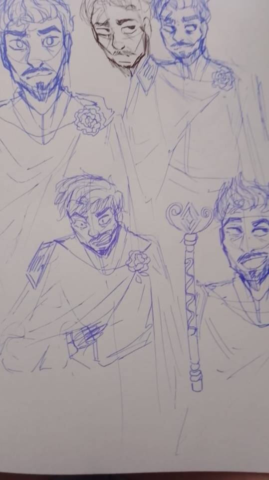


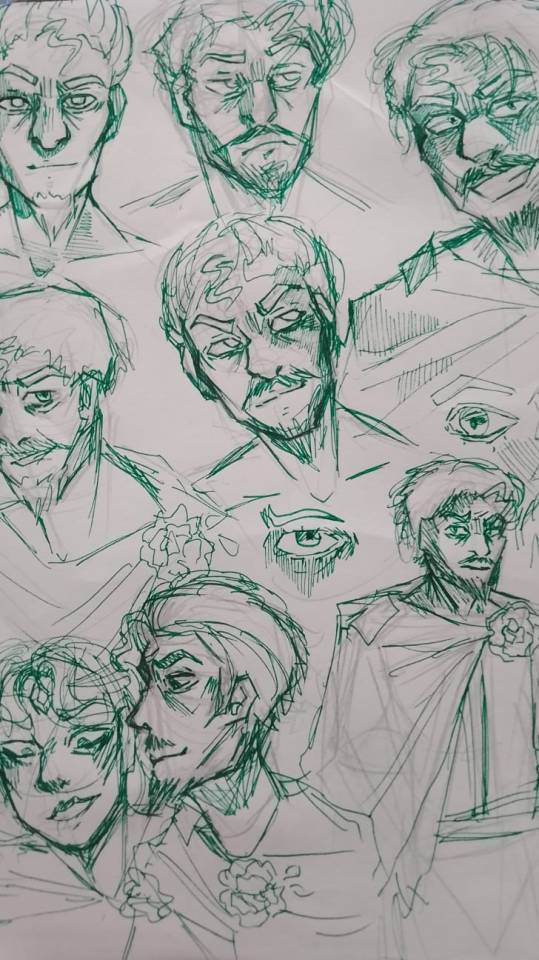
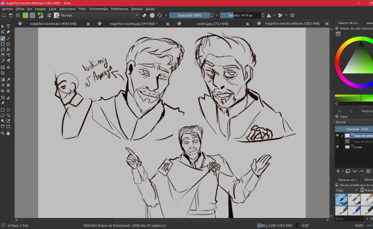
(I also did digital internships, but I didn't save most of them because I forgot lmao)
COLOR PALETTE:
-Don't think that I chose a palette of yellow and gold colors just because I thought it was pretty (well, that's also another reason), what happened is that when I was searching through conceptual arts, I found some designs by Magnifico where They used a blue and yellow color palette
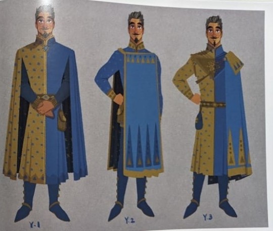
I did a quick search and found this:

-Tell me this doesn't remind you of Magnifico, then yes, that's why I chose a yellow color palette, also adding a golden tone to give it a royal vibe.
-I also applied this in the design of Queen Amaya, in the publication of her design I explained why I added details of a dark blue color in her costume and Magnifico's costumes
ATTIRE:
-From the beginning I always wanted to modify Magnifico's cape by adding a rose as a brooch, and searching through the conceptual arts I found quite a few interesting models, so it can be said that I combined everything I liked and that's how I got the cape for Magnifico, Also adding other details that occurred to me.
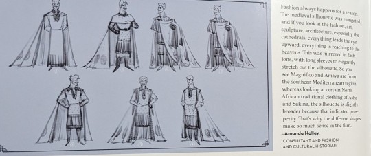
-The author sent me several ideas for Magnifico (thank you by the way :D), one of them was associating Magnifico with the sun, I really liked the idea and that is why there are so many symbols of the sun in his suit, plus these It reminded me how in so many cultures the Sun is worshiped, just as the kingdom of roses worships Magnifico, there are also other reasons why the sun fits with Magnifico but I already mentioned that in the publication of Amaya's redesign.
-The truth is, I only drew the other details improvised, this time I just got carried away, but hey! The outfit didn't look bad at all :)
-Another important part of Magnifico's costume is the "M" on his badge, but in fact it is not an M 😅, it is the sign of Scorpio ♏, this idea was from Anny Mation
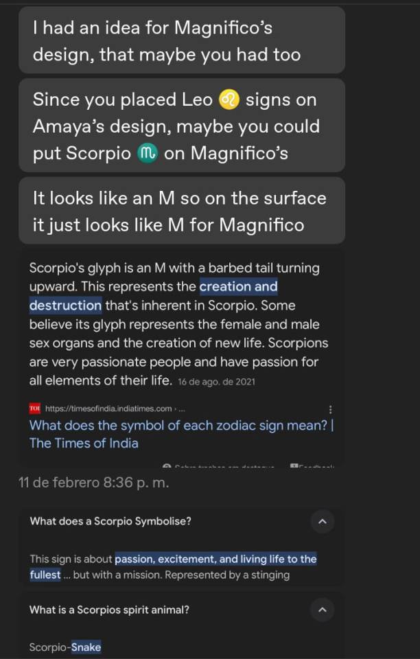
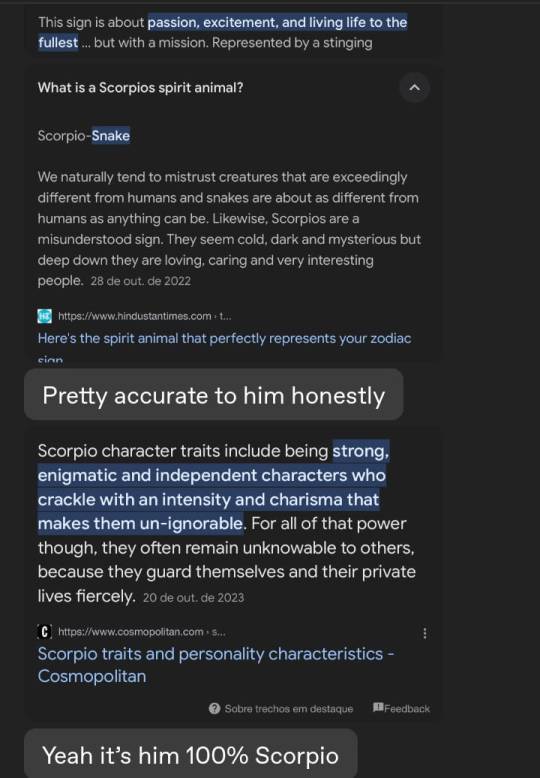
-So yeah, I had to add the Scorpio symbol yes or yes, at first I thought about adding it to the back of the cape but I wasn't convinced by the idea, but then I thought: "Wait, why don't I add the sign on the gold plate ? that would look elegant."
FINAL COMMENTS:
-I'm proud of how this turned out, I feel like it does justice to a villain that commemorates 100 years of Disney :)
-Also, I think that those who have already seen the other redesigns know which character is next, right 👀✨? For Aster, I don't know how long it will take me to draw him, since the boy is literally a walking animation studio lmao.
That would be all for now, until next time :D!
#sketch#art#artists on tumblr#artwork#disney#disney wish#drawing#digital art#illustration#my art#magnifico wish#king magnifico wish#king magnifico#magnifico#wish magnifico#magnifico x amaya#wish disney#wish 2023#redesign#wish reimagined#wish rewrite#wish movie#wish#disney movies#disney animation#disney fanart#wish star#asha#queen amaya#redesing
193 notes
·
View notes
Note
Has bulzar ever eaten someone or eaten one of his human “friends” to keep them safe or just to fuck with them in an endo way?
Not too sure about the first option. It’s not completely off the table, but Bulzar isn’t an affectionate sort of monster, and his protective papa bear instincts really only kick in for his son. Plus, the bounty bros can usually handle themselves fine when things get dangerous. That said, if the trio gets into some SERIOUS peril and there’s no other way to rescue them besides tucking them away in his gut, then it’s certainly an option the big boi would consider.
As for the second option? Most definitely, especially if it’s Balroc.
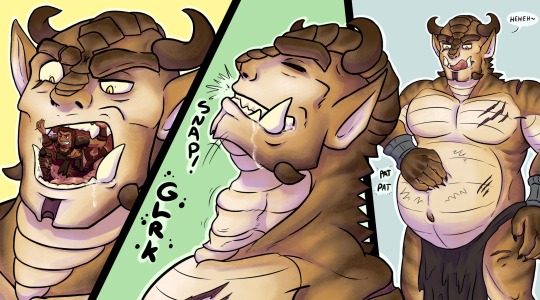
In fact, he might use the “I’m eating you to keep you safe” excuse if he’s in a cheeky mood and wants a quick snack, even if there isn’t a threat for miles around. XD
“Oh yeah, there’s a dragon over that cliff there. Breathes fire an’ everything! Don’t worry, I’ve got the perfect place to hide ya…” Cue him pointing into his open mouth.
(Btw, the artwork was a collaboration between me and TitanLeon on FA. He did the sketch and lineart while I colored it in).
#hooter’s ocs#asks#hooter draws#not my art#swallowed whole#throat bulge#bulzar#meradon#bounty bros#Balroc#Owin#grimaldus#soft vore#v.ore#v0re#non fatal vore#safe vore#teasing vore
95 notes
·
View notes
Text
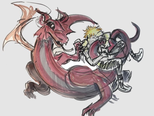
Another 5 min challenge commission!! Thank you @doumadono for the commission! The gamble commissions are the most fun for me bc they have to be done so quickly!
If you are interested commission me here!
(Disclaimer I don’t time when I look up the references and when I look for markers and things like that. Plus I have to take a picture and clean up the lighting on the computer. It doesn’t take much to do all that part but don’t want to mislead the with the minor editing involved. In other words just drawing is counted.)
Commissions open!! 🙏☺️☺️
#bnha#my hero academia#bakugo katsuki#katsuki bakugo#kirishima eijirou#dragon kirishima#fantasy au#mha fantasy au#commissions open#art commissions
94 notes
·
View notes
Text
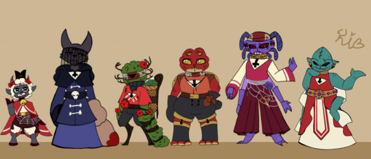
Since everyone is making their own little version of the characters I thought I would join the fun for my Fallen crown Au! These were supposed to be quick little sketches just to get some ideas down but they still took me the whole day:'D will probably change as I draw them but I wanted at least something down on for the time being and I do like how most turned out!
Single versions plus some info and ramblings about each under cut for those interested:
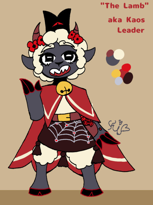
My lamb was mainly based on both, yes the actual player character but also the vibes of my own plathrough which were very "oh god who let this child be in charge?-" while I'll still mostly just call them Lamb I figured they should still have a proper name so I went with my friends @/tamaruaart suggestion as it suits them rather nicely! And most note worthy detail is honestly just the fact that they carry something from each bishops realm on their person now, I like to think they treat those items like little trophies:>
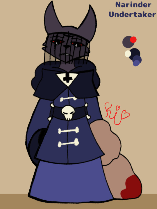
Narinder is probably my weakest I feel like, he definitely needs something to give him some extra "ompf!". I basically made his undertaker fit a sorta reverse or at least loosely inspired by his white robes in game. I imagine he is very boney or a straight up skeleton underneath so he covers it all up beneath heavy fabrics, but because I lack subtly I still covered him in bones regardless-
And yea I kept the veil cause 1. It's a look and 2. It coviently covers up his now sewn shut third eye.
There wasn't much reason behind making him an undertaker, I simply thought it suited him, when your the former god of death you aren't exactly squeamish around corpses. Lastly the dark blues are there to contrast the other followers warm tones, as they kinda seen him as an outcast which is just fine for narinder he isnt exactly thrilled to be here.

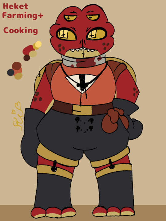
I'll put Leshy and Heket together as they were sorta designed as a set.Since they are both youngest among the bishops I sorta latched onto the headcanon that they get along pretty well and just stick together after getting into the cult so they just share a lot of their duties. So I gave them some matching elements like the puffy shorts but also stuff that contrasts like Leshy having looser clothing and Hekets being more tight. Or Heket getting working gloves with a little belt to hold tools plus a hat for the sun, meanwhile Leshy will happily dig through the dirt bare clawed in the sun for hours-
I debated on giving Heket an apron but honestly I think she would only wear one while cooking or tending the farm plots there is no reason for her to wear it casually, the gloves though stay for I reason I utterly love because its PETTY-
Literally the only reason she keeps them on almost constantly is because when the lamb asks she can be like "ew, I'm not touching you with my bare hands." Yes, my humour is broken moving on-
I also gave Leshy a cane just so he actually has something to feel around with when he is areas he isn't too familiar with so he isn't running into crap- on that note, Heket can speak a bit but not exactly loud or for a very long time without seriously hurting her throat, once I properly learn it I definitely wanna draw her using sign language.
Lastly bodies, Leshy was based off a previous drawing I made of him in bishop form, I simply made it less monsterous but he is in charge of chaos so he had to remain a creature- Heket is more straight forward, she is a frog and she is large and in charge.
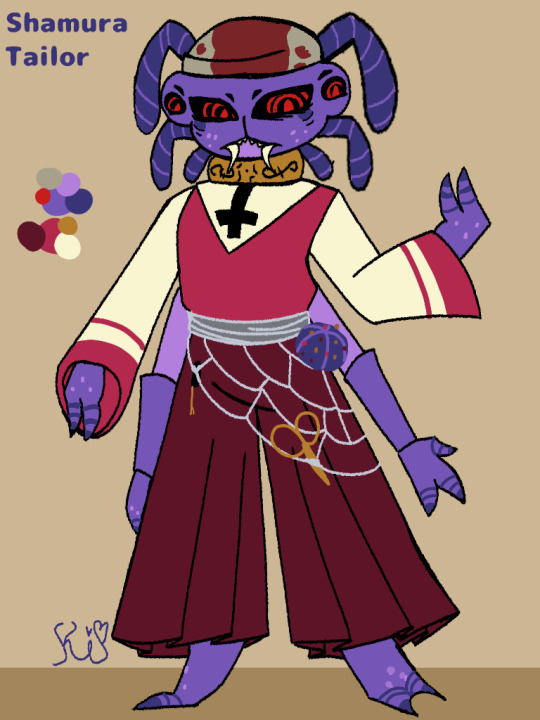
There was one reason why I made Shamura a tailor and that was the mental image of them sewing the bishops clothes when they were younger and dressing them up all cute.
I went for more pink colors mainly because I thought it better suited the purple and would make their red eyes pop! Honestly I really love their colors they remind me of a Berry! I've drawn shamura before but honestly the only things that stuck were the colors,face and then also the hand markings I did tweak their eyes a bit I wanted something more stern feeling.
For clothing I kept everything nice and loose, while they are the tailor I also love the idea that in their spare time they either teach the youths in the cult or are like the champion of the fighting pit because war is also their domain and they can be- so I wanted them dressed pretty comfy to deal with whatever may come! But still keep everything pretty mature and mildly fancy maybe in the future I'll do some fancy gold and silver embroidery to the pants because of that.
As for body type I wanted them to be pretty thin but unlike Narinder who is twink material under his cloak they have a bit more bulk on top to show that they can choose violence if they so wish-

I adore me some pathetic but still serving men, honestly except for the cross on his belt I completely ignored the fact I made him a medic- If he needs to treat something gross he can throw something over to protect his clothes but just like Heket there is no reason for him to wear that while not working.
Otherwise my main goal was simply to make Kalamar look pretty and fancy. I debated on either short or long bottoms until I realized I'd have to figure out his tentacle situation, then realized I don't hate myself THAT MUCH so bro got put into a floor length gown, work smarter not harder kids.
If I have an excuse to give a character a shawl I will take it so fast.
His body type I mainly wanted to flesh out the roster so I tried making him very squishy and huggable looking, I debated on thinner so he looked more dangly and stretchy but that made him kinda to similar to Narinders build for my liking.
#doppel rambles#doppel draws#cotl bishops#cotl shamura#cotl kallamar#cotl leshy#cotl heket#cotl narinder#cotl lamb#cotl au#cotl#cotl fanart#cult of the lamb heket#cult of the lamb leshy#cult of the lamb fanart#cult of the lamb shamura#cult of the lamb narinder#cult of the lamb kallamar#cult of the lamb#fallen crown au
78 notes
·
View notes
Text
Not so quick sketch I did of some Beta characters for my project! 🥁⭐Btw if you want to know more about the characters you can send an ask! I'd love to share more about them in this blog!⭐🥁
Sketch/Colored version:


⭐: Steorra
🟡: Sphera
∆ : Scalene
⭓: Pentad
(I can't tell if all names will be official, but you can call them that until then!)

🥁⭐⬇️ Fun facts below ⬇️⭐🥁
⭐🥁⭐🥁⭐🥁⭐🥁⭐🥁⭐🥁⭐🥁⭐🥁⭐🥁⭐🥁
Steorra and Sphera are together! Just a wlw representation that I added :D
I decided that the bubbles 💬 should have the shape of each character's head! It will be easier to know which character is saying what!
Scalene will always joke about Pentad being shorter than her, Even though he's not the shortest person in the group!
Both Pentad and Steorra are workaholics
I've done research to know people's opinions on plus-size sessions from clothing companies so Scalene's opinion would be accurate
Scalene hates the plus size clothing from stores, so Sphera sews customized clothes for her!
⭐🥁⭐🥁⭐🥁⭐🥁⭐🥁⭐🥁⭐🥁⭐🥁⭐🥁⭐🥁
#artists on tumblr#drawing#digital art#oc#i like polygons :)#THEY'RE ALL GAY GAY GAY#digital illustration#artwork#Sphera and Steorra are together :DD#Yes. Steorra is a woman (butch lesbian)#fun facts#my ocs#object ocs#polygon ocs#gay gay homosexual gay#hahahahah
34 notes
·
View notes
Text
Ceramics Vase!!
I've kept this project on the back burner for quite some time because I didn't want to showcase the mess that was the vase prior to painting.
Plus, I didn't keep a good track of it...
Lore below

The ceramics professors taught the class how to start making a vase, where she first demonstrated using a large metal roller to flatten a large clay pile into a flat slab.
However, the clay pile that I picked up had a tear near the inside, where I struggled to cut a decent circle on top of a turn-table thing. The misalignment forced me to redo it once.
Next up, the professor rolled up a thick piece of clay into a relatively thick string of clay. She wrapped the clay around the circular base and overlapped one end over the other. She then cut into the top end into the bottom end to link the two cut ends together. The professor called them coils, or coil.
I struggled so much with making them and it didn’t help that I was arriving pretty late.
The professor also demonstrated how to properly stick the coils together; she gently pulled pieces of clay downward from the inner side with the tips of her fingers on one hand, while she supported the overall shape with the other. (It’s to prevent the coil from moving around).
Sticking coils together with the tip of my fingers was a tedious process where my hands were uncomfortable.
—

At some point in the class, the professor introduced us to the process of widening the vase by wrapping longer coils on the outer side of the previous smoothed out coils.
It was at this point that my vase turned out to be asymmetrical in shape. My coils were inconsistent because I had very little space on the table that I worked in.
But the main reason as to why my vase was asymmetrical was because I continued to struggle with rolling coils, as they clumped into flat shapes and dried up from overuse.
But I had to press on, especially since I made the rookie mistake of making the thing as wide as possible. The professor had to help me carefully shape it into an upward curve to prevent it from falling apart.
—


Not gonna lie, I was stuck with this shape for a long while. Plus, I had to make a side project where I cut a shape into a slab. Hexagonal plate/bowl 😎
Occasionally, I worked on it as much as I could within the next week.
—
Now I don’t have an image for the final shape because I didn’t take a picture of it.
I managed to shape it past 9 inches of height, but before I could paint on it, I had to smooth it out.
I spent minutes flattening out bumps and smoothing out grooves, often going over the same spot more than once.
Once I was done, I made a quick sketch of the vase decorated by clouds and a moon on the large part and a city on the small part.
I then colored the night sky, dark blue.
With only an hour or so left, I started painting the scene on the vase. I started by applying blue paint on the top, making sure to cover enough of the area, then I added white on the bottom.
But once I started painting simple clouds and a moon, it was weird at first.
—

Then I painted the black skyscrapers on the white bottom.
But as I painting the clouds, a familiar painting habit reawakened, a habit that allowed me to define the volume and space of a subject.
I borrowed grey paint and defined the shadows, gave depth to city, and then applied excess black paint to the buildings before I gently painted the clouds to give them most volume in their respective space.
Once, I was nearly done, I placed little ‘yellow’ stars (yellow paint didn’t show yellow tho).
Then another idea struck me, ‘this reminds me of my old art’, so I drew a silhouette of Madeline and then carefully painted her silhouette on the clouds.
After a few finishing touches, I had finally done it, I painted a scene.
It received a bunch of compliments from the other classmates and the professor.
For now, I pray that the vase will survive the kiln and not explode.
#cermaics#art progress#art#vase#ceramics 1#artists on tumblr#traditional art#painting#painted vase#madeline rivera oc
15 notes
·
View notes
Text
okay don't mind me just gonna ramble for a second haha-
(this was originally going to be under the drawing, but it got too long, and i can't add it in a reblog because both things are on queue, so separate post it is)
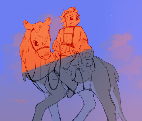
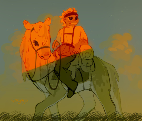
i just love how every time i start a drawing im like "well alright, just a quick sketch yea? no color, maybe some gray to white gradient and that's it, okay?". and then i start drawing (and obviously it takes longer than i thought because duh) and i go "okay but- i gotta at least do the flat colors, right? just the flats- maybe even some random colors to not spend too much time on it--". and then. of course. i do the flats, and im pretty happy with the result yeah? looks simple but not too simple, like it has some color some personality to it, but its not over the top so. so, i leave the drawing i go to get some water and start on an actual piece, and when i come back and take a look at what i drew its like, "well. listen. listen-- yeah im still pretty happy with how it looks but, but. it could be a little better, yea?" and then i sit down, put my water down, put my other drawing to the side, and i sit there making this quick sketch look better. "oh i don't like the colors anymore! but its all on one layer now so i can't exactly change them, plus i still like the idea, so maybe some filters? yeaj some filters on top will do!" (and of course its a yellow shade filter, because im original like that and 90% of my drawings don't also have it on). and then i add them filters and i think" well maybe some bounce light now? surely it already looks better with the filter but its kinda flat, and i want to bring *a little bit* of the original color in" so i add the bounce light, but now it looks out of place! shocker! so i decide that surely i can maybe add some grass at the bottom to hide the edge of the drawing a little. and well, alright, grass looks good, but its too dark, brings a lot of attention to it! and i can't exactly make it lighter, so, the logical choice would be to make the characters darker too, bring some contrast into the thing! and lets just do all the values while we're at it, why not! patterns to the horse, make the pants and skin darker, yes yes. and, oh- but now the eyes are lost because there's more dark hues! gotta make a new layer on top and make them eyes a little bit darker, maybe also color the bandana red and not brown so it looks special, hm? oh and! while we're on this top layer, lets also fix up the hair a little, maybe add some blush... oh and the straps of the saddle look weird, gotta fix those too! oh man and not that i look at it-- the head is too big! lets merge all the layers together and start that same thing over again! yes yes make the head a little smaller, yeah looks much better now! oh, better add some fading as well, to make it fit in the background a little, oh and some glow, suuure sure, and some lights in the eyes, and-
(and now that im looking at it, i realize that i somehow didn't save the final version????? like, i did a lot more to the thing, fixed up the saddle and that awkward shade oh his knee, and the grass-- i wont fix it now because NOW im too lazy to do it for some reason, but yeah, a bit unfortunate u_u)
anyways, point being, love art, art is pog, wish i cared a little less about it sometimes, but it also turnes this into this (imagine me pointing at the drawings as i say that, overly dramatic and sounding a little annoyed with myself)
270 notes
·
View notes
Note
I'm really happy seeing your post.
Yeah I'd like to see some Yeva in these times..
.....it's been way too much for me.... I'd like to see some things with her
I getchu. But dw you came to right place
Here are so fanart of her! They are all wips lol
They go from oldest to newest

Over here I decided to draw yeva in a different outfit I took from pinterest, I thought she would look pretty in it and plus I was like “SHE DESERVES NICE CLOTHING AND NOT THAT OILY AND GREASY LAB DRESS”
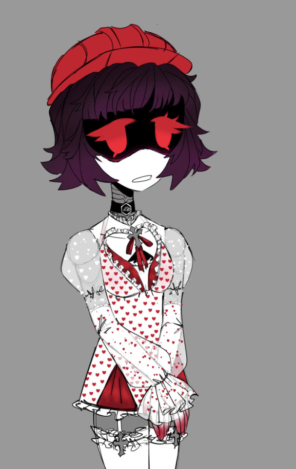
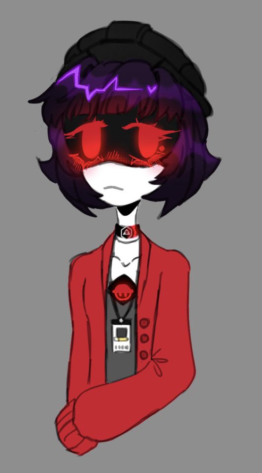
In here I was experimenting with a bit of my art style
I like how the hair turned out. And in here I drew her with her canon clothes, but I liked the idea that maybe she occasionally wears a cardigan on top
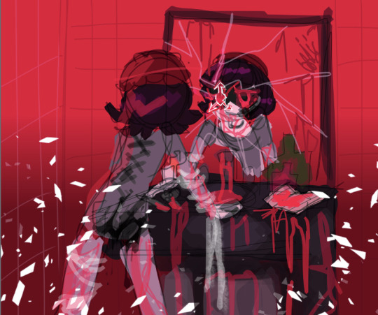
Ok so this was my first attempt at like a fully fledged colored sketch, it was a quick one to get the idea out
I rlly liked the color palette and the I love the whole glass shattering gimmick the AS, which is why it’s present here. Since it can be used in fun ways in terms of visual art and story telling
Funnily enough there wasn’t much though behind the mirror crack on this sketch, I just thought it looked cool
Actually I may add some shadows representing all of Yeva’s problems in the shattered mirror fragments
Here is the most recent one and am actually very proud of it! I started experimenting after watching up an artist’s tutorial, i forgor their username but they are known in the MD, TADC and sonic fandom!
56 notes
·
View notes
Text


New-ish fairy!
Back in 2020, I tried to make some flower fairies for huevember, but the idea didn't really take off besides some quick sketches, like the one on the second image. One of them was a dahlia flower fairy, that I named Kore, but didn't do anything else with it. I really like dahlias, so I decided to go back and do a revamp to them, and a big one at that
Kore likes doing pottery, especially little cups and cute bowls, and they're hoping to get a little shop going for them. They are pretty serious, mostly just because they care about things very deeply, and prefer to be alone most of the time. It likes Hydrangea though, they vibe together sometimes, maybe it even teaches them how to work with clay.
I have no idea why I named her Kore. I know it has something to do with Persephone, but I don't know what my train of thought was about that.
I still think the wings need a bit more contrast from the skin, but I kinda got sick of having to deal with contrast on this piece XD it still looks good, just a tiny detail that I didn't quite get but not the end of the world
I will come back soon to figure out her pottering outfit so expect to see her again soon!
Turns out I had a lot to say about the design so its going into a read more XD
What really got this design idea going was me rewatching Dollightful's valentine's day doll for this year, Valentine, and I really liked her hair, and dahlias have a similar puffy-like shape, which I already wanted to do, so it was a nice inspiration for it! I'm also meaning to practice more kinds of black hair so this was a good starting point I think. Then the pants and shirt came next, Pinterest was showing me a bunch of split colors stuff, so I wanted to do that + a more bottom heavy design, since I don't do that a lot usually. The shirt was just a collection of fun shirt shapes I was thinking about.
The sun motif actually was my second choice for their design, the first was a blade, because red dahlias can mean betrayal, but I decided to go with suns instead, because its more fun to draw, the shape kinda matches dahlias and apparently they really love sunlight. It worked out in the end XD.
Speaking of the color, dahlias technically are usually light pinks, maybe even yellows, but I just adore the colors of red and black dahlias, and I wanted a flower fairy design with a heavier lean on darker colors. Fun fact, black dahlias aren't really black, they're really dark red/burgundy. Plus, since I drew Hebe with chimeric coloration recently, I wanted to kinda try that with Kore since there's already the split colors on the pants, it would be a fun connection.
14 notes
·
View notes
Text
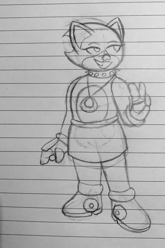
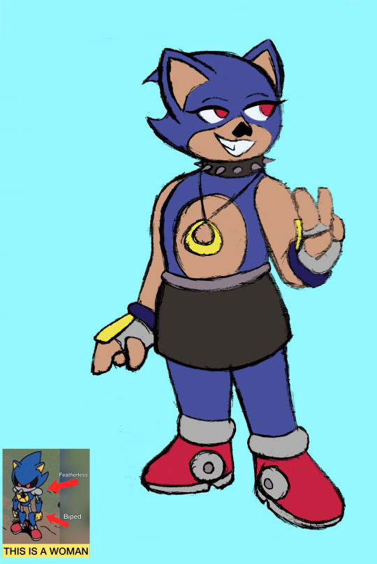
Metal is here babyyyy, allow my bias to take over for this one (plus the fact I had to get more creative with this one outside of just a style translation)


Originally I drew the Metal on the left, but the design itself wasn’t clicking for me which led to me making a second version, the right
A lot of design ideas from the first version stuck, like the sharper nose, spiked collar, the tan shade, and the shoes.
To put more context behind the design, the idea here is that this isn’t ACTUALLY a real organic Metal. This is still our robotic Metal hidden behind an organic disguise. Tho is probably a really obvious one
I like to imagine she’d sneak into the restoration and Amy can tell super quick but plays dumb in hopes maybe making her stick around can bring some change. Has others play dumb too
Anyways- There’s two ways that could go design wise when it comes to this trans girl Metal story

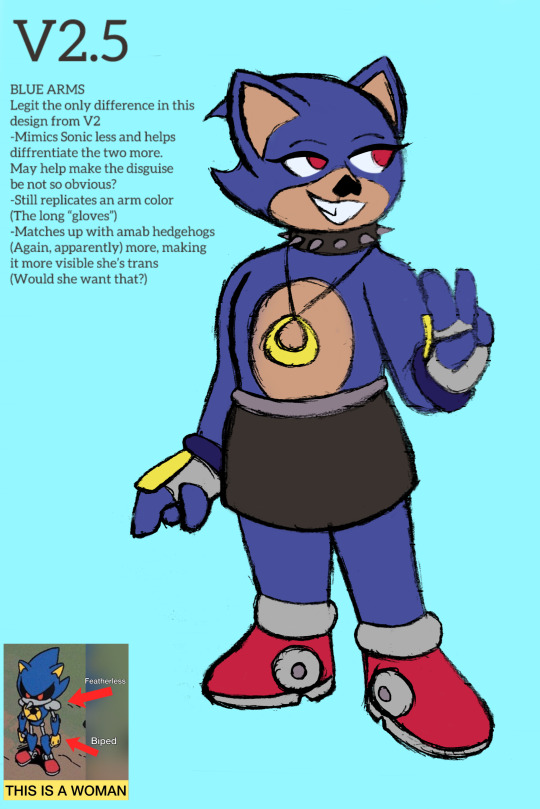
Which is where V2.5 comes in, that’s right baby there’s actually three takes now
A fun idea is that from the get go Metal pretends to be a girl, the plan being that it’d make it less obvious it’s her. Though over time, you guessed it, damn she kinda likes it.
Other route is that she starts the mission off under the guise of being a guy, but over time and through other means realize maybe “guy” isn’t what she wants
Design/story wise I like the tan arms more, it breaks the colors up more, BUT feedback is something I appreciate so what do y’all think?
Anyways yeah Knuckles next since the last voting poll was INSANELY close
Rouge Amy Blaze
Like my work and wanna support or commission me? Check out my Ko-Fi!
No text and sketches below cut; expect normal format next time this was a special case dnnsnd
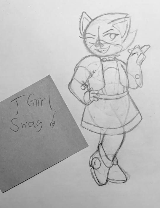
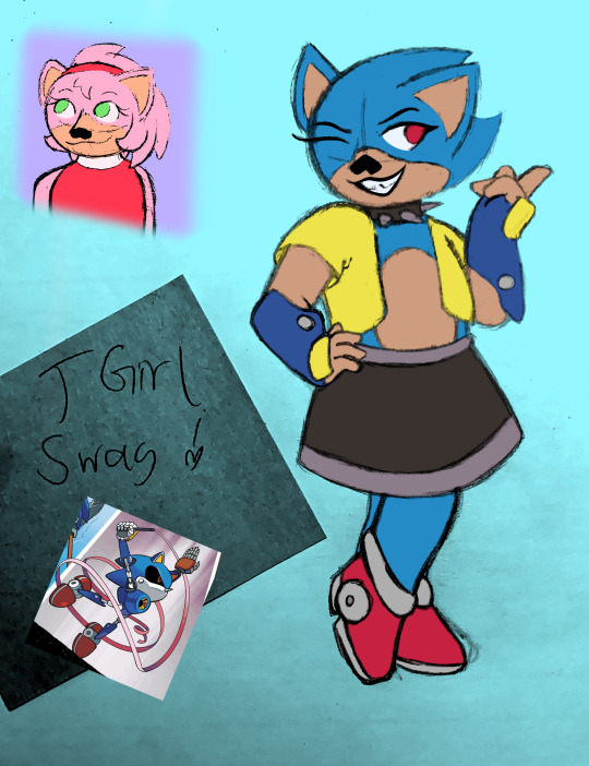

#metal sonic#trans metal sonic#organic metal sonic#sonic#sonic fanart#sonic fandom#sth#sth fanart#sth fandom#sonic the hedgehog#sonic the hedghog fanart#sonic the hedghog fandom#digital art#traditional art#traditional digital blend#mixed media
27 notes
·
View notes