#printmaking is an art of its own and i love it so much
Explore tagged Tumblr posts
Text

ms paint. you know her. u used her age 8 to make loads of rainbow ovals all over the canvas and then scramble it with selection tool. now u will know her true powers with my handyrandy tips under the readmore. some will be pretty basic and others are very special.
this post has 8 cool trix to learn for you. enjoy and i may do another in the future if i remember/learn more stuff
some of it might be common knowledge. but its got some deep cuts. all tips have gifs to show process easily.
🙂 enjoy and i hope this encourages you to fuck around in mspaint more
soundtrack for this post (loop it while you learn for advanced learning experience)
TIP 1) the right click trick
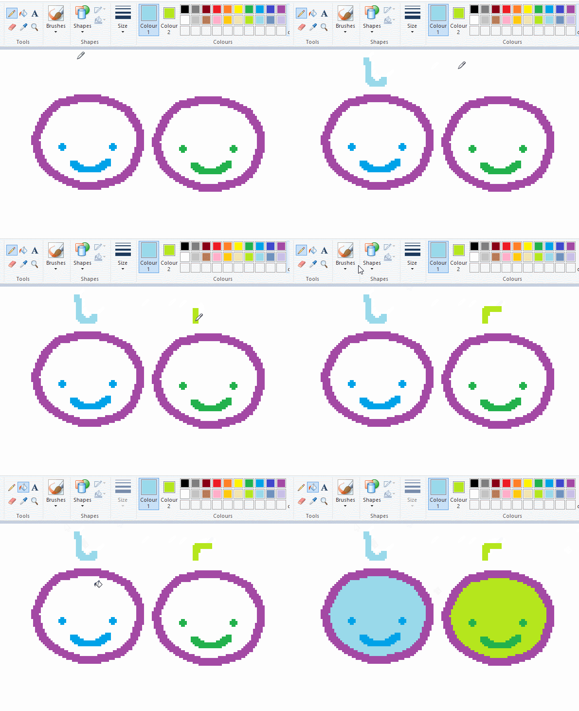
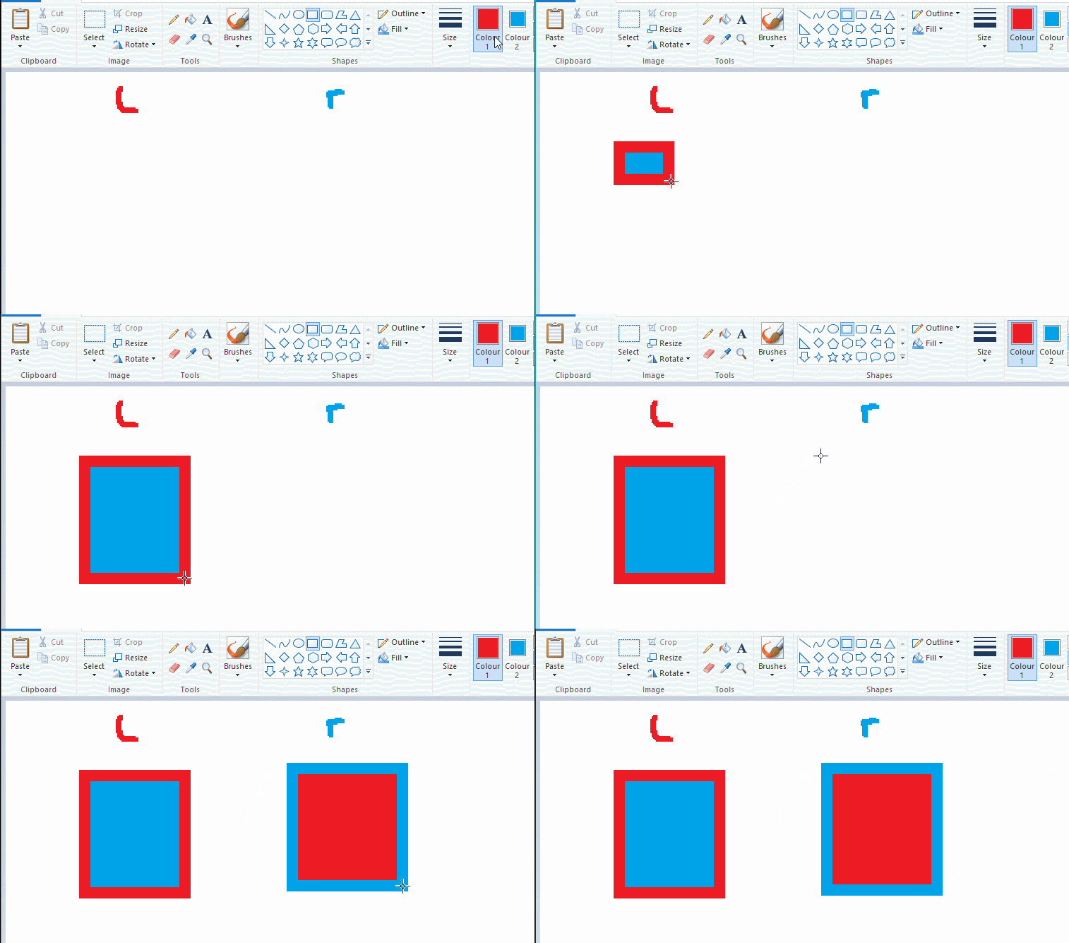
left and right mouse click correspond to col1 and col2 respectively, which u can see in the top bar. this applies to all brushes and the fill tool like above. when using shapes col2 will be the fill colour (if you have solid fill selected). right clicking with shape maker will reverse the colours use on the shape.
TIP 2) right click eraser
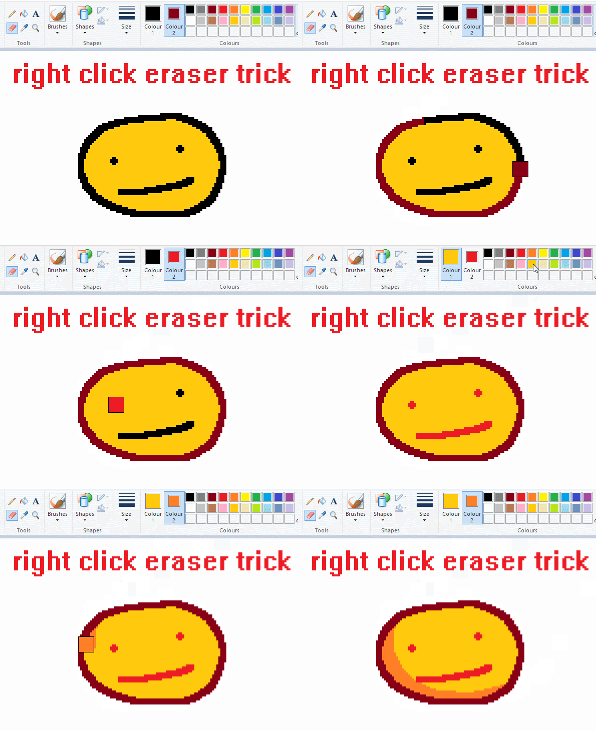
this one is extremely helpful for lineart or add shading. the eraser always uses col2. so your eraser can technically be any colour. but here's where you get powers: right clicking with eraser will only erase onto col1, with col2.
TIP 3) transparent selection change a guy destination
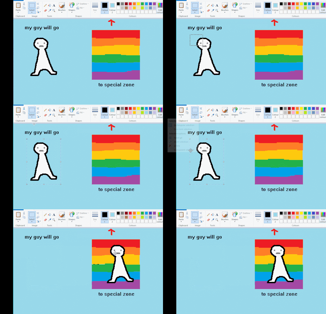
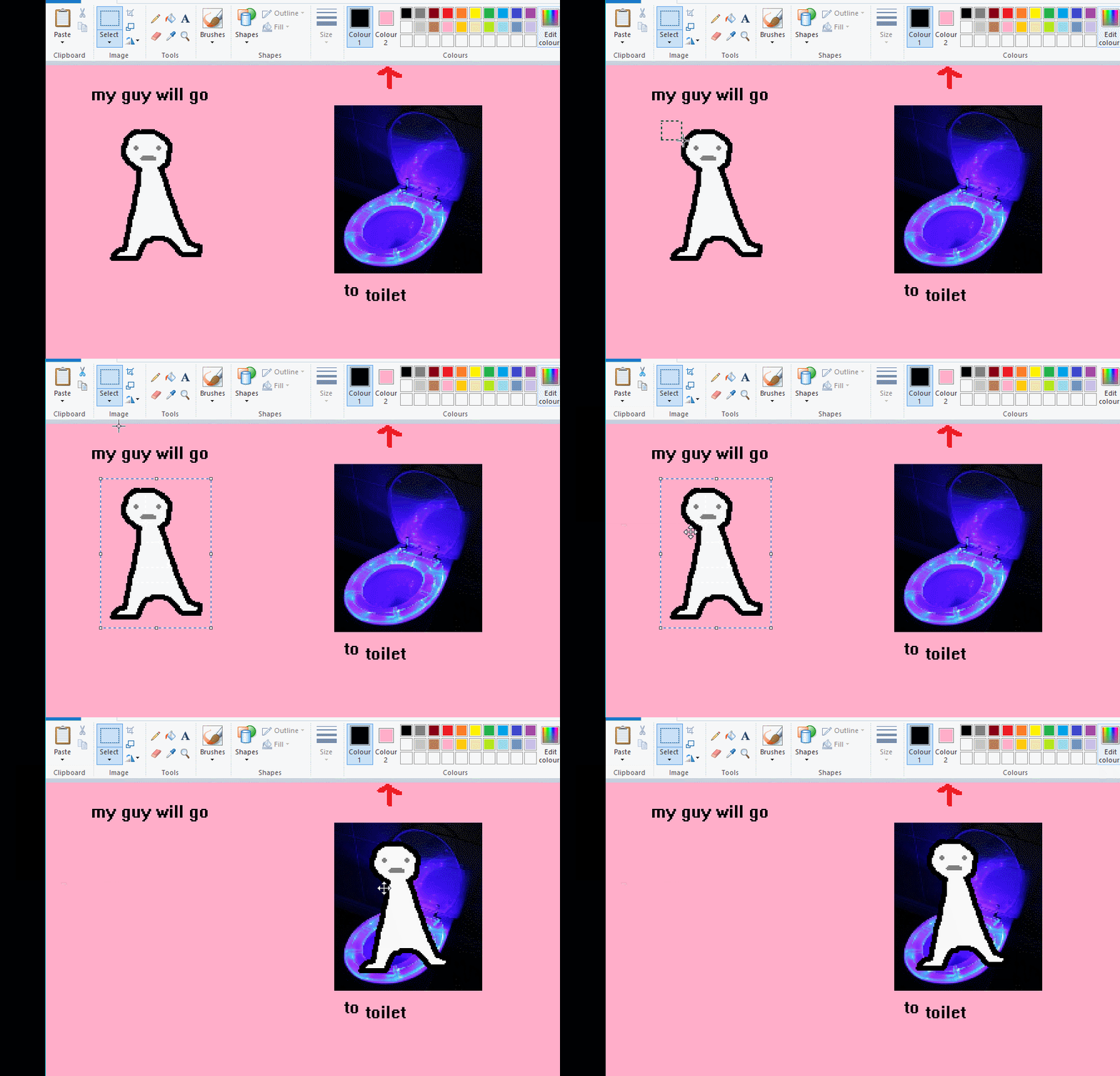
the beloved transparent selection tool works based on what is selected as col2. so long as you have the correct colour as col2 you can make any image transparent and put it on top of anything else. and yes this works with photo bg as you can see.
TIP 4) the gradience
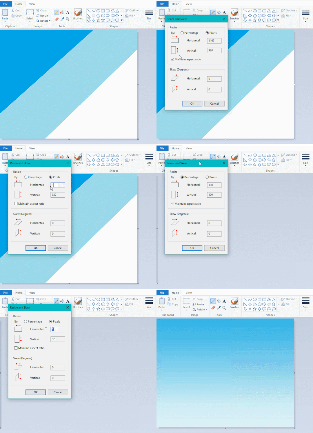
this one is a little more complex. you want to start off with any canvas size, and make as many diagonal coloured bands as you want. (protip: holding down shift makes a perfectly diagonal line with line tool)
then you need to resize the canvas to a width of 1px (make sure you resize by pixels, and do not maintain aspect ratio). then resize again back to its original width (or a different width i cant stop you). you will have your lovely gradience.
TIP 5) superimposter

so. you got a cool gradient and wanna put a guy on it. heres what i do:
i open a 2nd mspaint with same canvas size and draw whatever i want on there. i then pick a completely unrelated colour to my entire piece, and set that as the bg. you could use white, pink, geen, whatever you want as long as it doesnt appear somewhere else in ur drawing. copy the guy.
go back to your gradient tab. ensure that col2 is set as that bg colour you picked (lilac for me). have "transparent selection" enabled. paste your guy in. cue fanfare
TIP 6) advanced superimposter
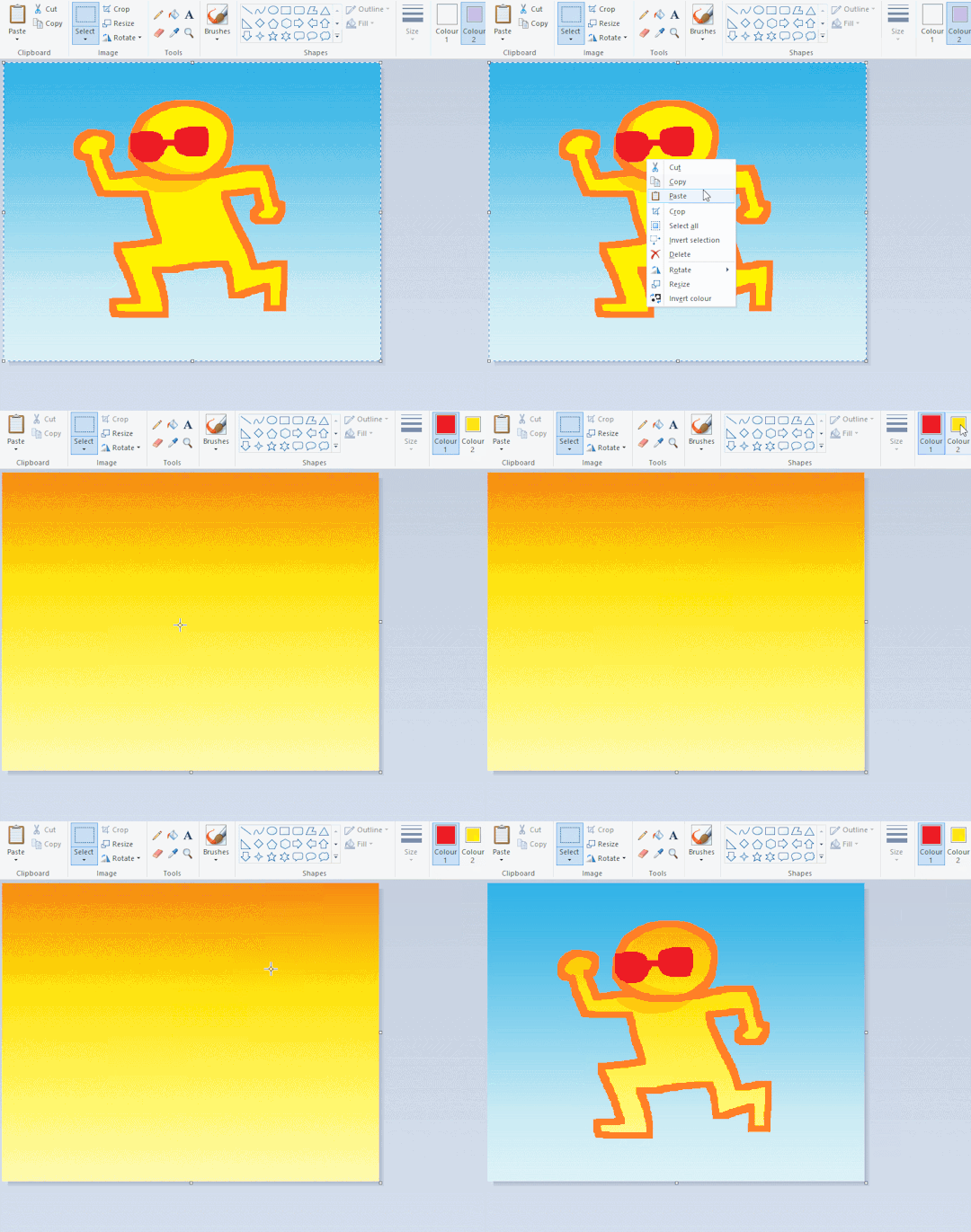
the great thing about this method is u can put multiple gradients in multiple areas of the image. this is where it gets all japanese printmaking type of shit. ukiyo-esque
all you need to do is make another canvas with a new gradient, ensure col2 is set as the colour you want to replace, then paste your original piece onto the new gradient. now my guy has a soft fade. you can do this as much as you want. (you could even make a canvas with a texture or photo and paste your drawing onto there)
TIP 7) "sketch layer"
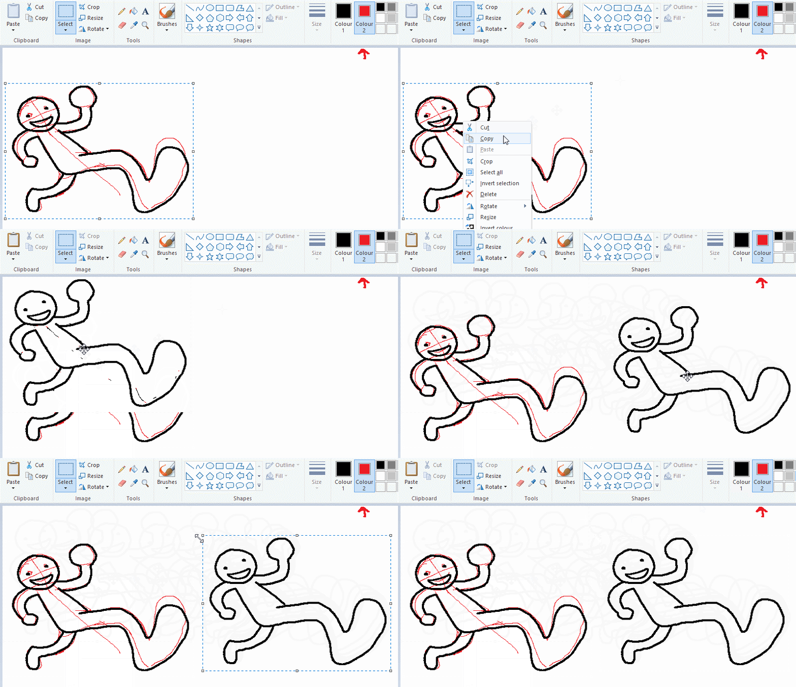
so as you now know, col2 is what is removed when you click "transparent selection". which means you can also remove any instance of a colour from ur drawing. which means you can have a unique colour for sketch layer and remove it from the drawing later. i admittedly dont do this but it is a great trick to have.
now combine this with lowering your dpi for smoother lines. may seem obvious but it helps. its like a free stabiliser whenever u want.
TIP 8) rainbow art
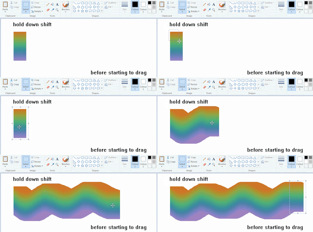
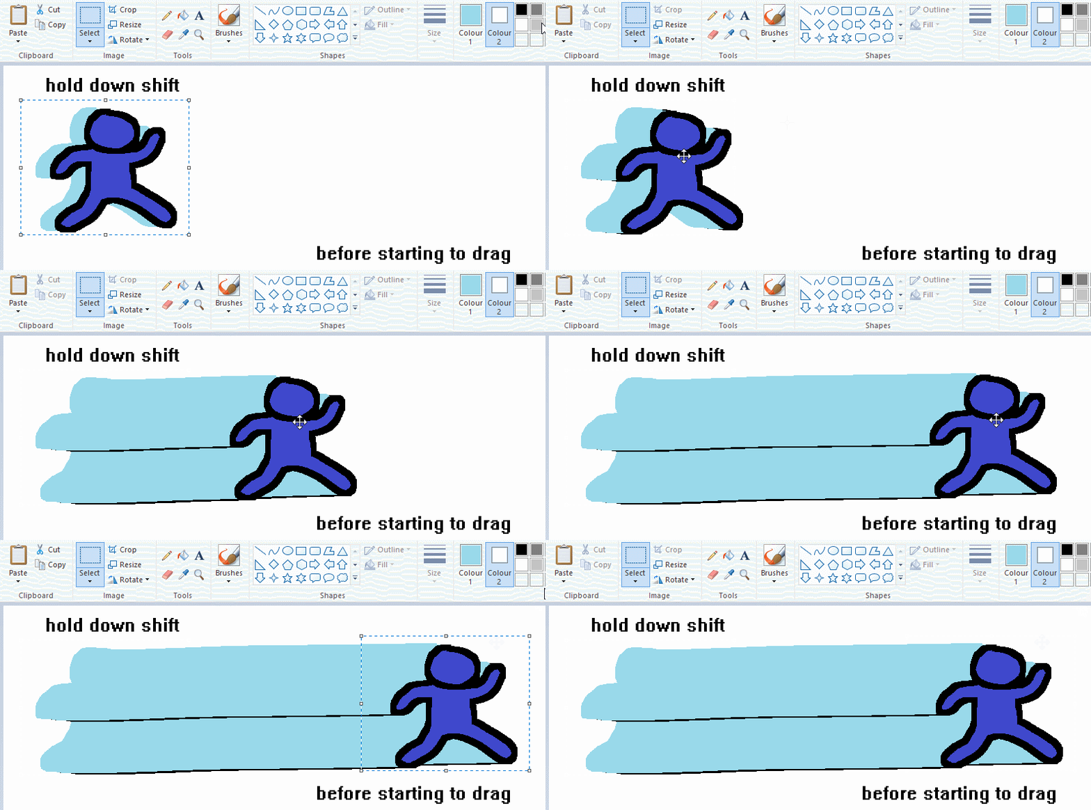
now this is where you can get dizzee rascal "bonkers". check out my small and shitty rainbow trick. you can select anything and hold down shift, then drag with left mouse, to turn that selection into its own brush. i even did it with a guy. and you can of course do this with a photo as well.
🙂well that it for now. hope you liked it thanks for reading now back to your regularly scheduled tgcg programming
2K notes
·
View notes
Text
My art inspirations
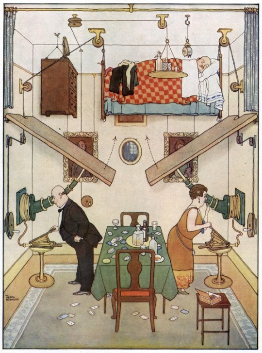
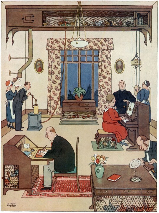
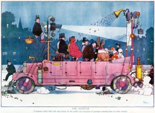
William Heath Robinson- He was an English Cartoonist that lived though 1872-1944. Not only do I enjoy his drawings because of the fun elements that he would bring into them with machines, but I really like his use of line. His use of a single width for his line work and other artists have directly affected my own works. I also really enjoy the flat colors that he uses in his works.
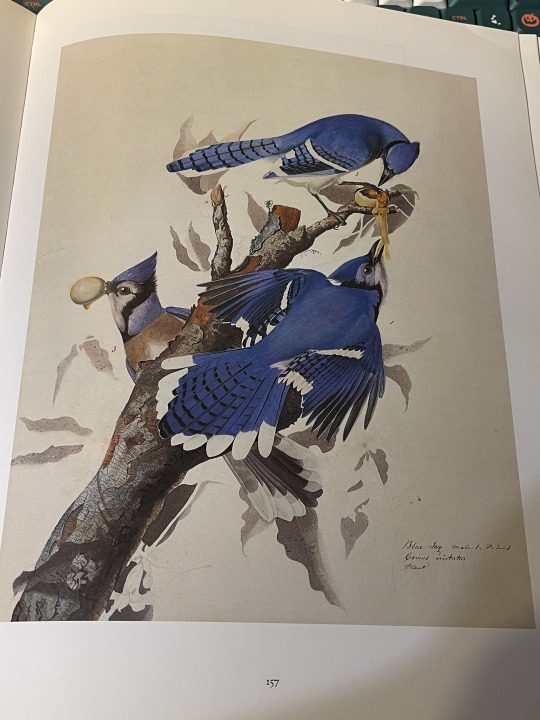
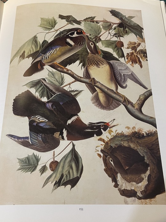
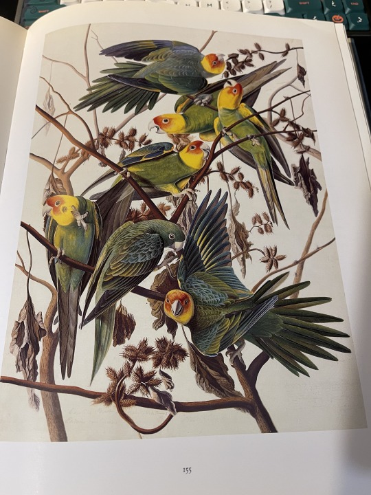
John James Audubon- He was a American- French artist and ornithologist ( study of birds) who lived from 1785-1851. He recorded and painted many species of birds that are native here in America. I love his art. The composition, the colors, the accuracy of the birds is to die for. Huge inspiration when it comes to drawing birds. Recommend studying his art if your interested in bird drawing!
(Also the last bird picture is of a Carolina Parakeet, which was the only parakeet native to the southwest of North America)
(unfortunately it went extinct around the 1900's, which is a shame as it looks like it was such a pretty bird)
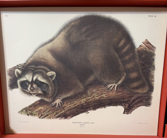
He also drew some mammals from America (tbh though some of them look a bit..... odd). This guy looks hella cursed lol
(both bird and racoon pics were from my collection of books based on his art)
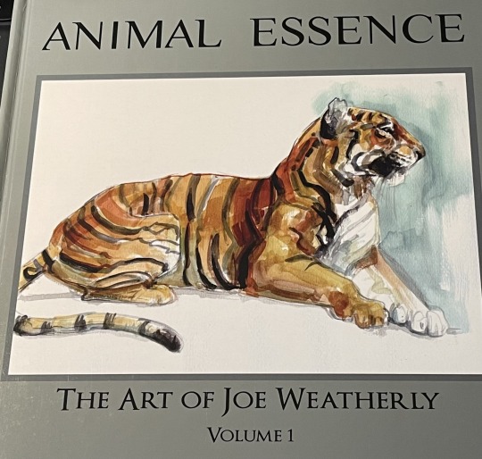
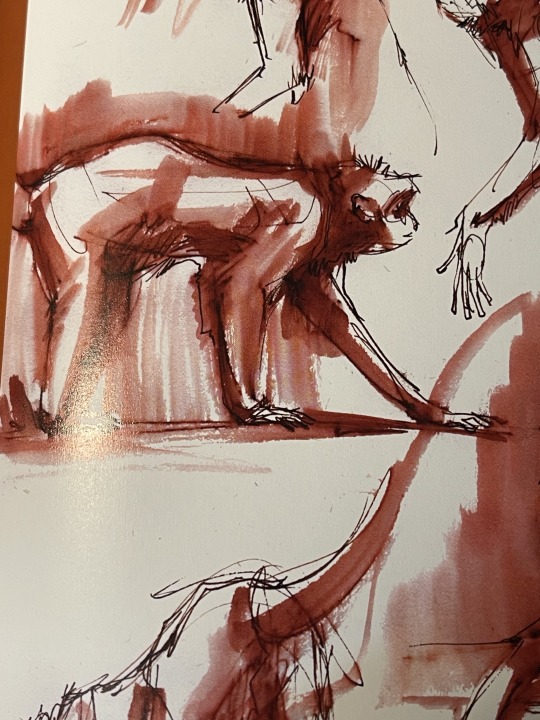
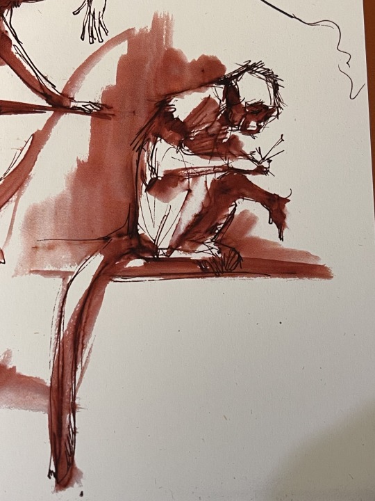
Joe Weatherly- He is a California based artist that focuses on animal art. His artworks are very dynamic in nature and I love his use of color in his artworks. He also has done multiple books on drawing animals and of his own art (first picture is of his book Animal Essence). I highly recommend him to anyone interested in learning how to draw animals!
Here's a link his website for anyone interested https://www.joeweatherly.com/
(Images were taken from my own copy of his book Animal Essence)
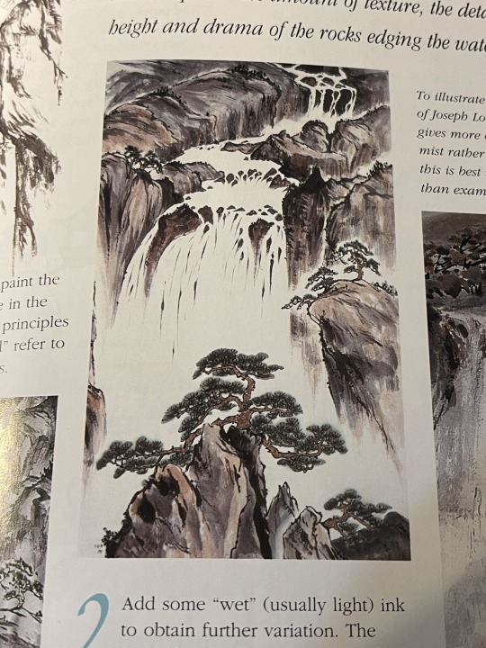
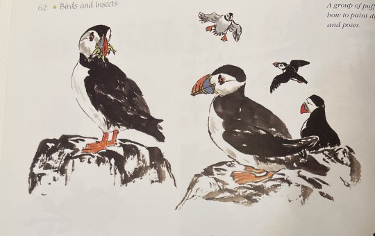
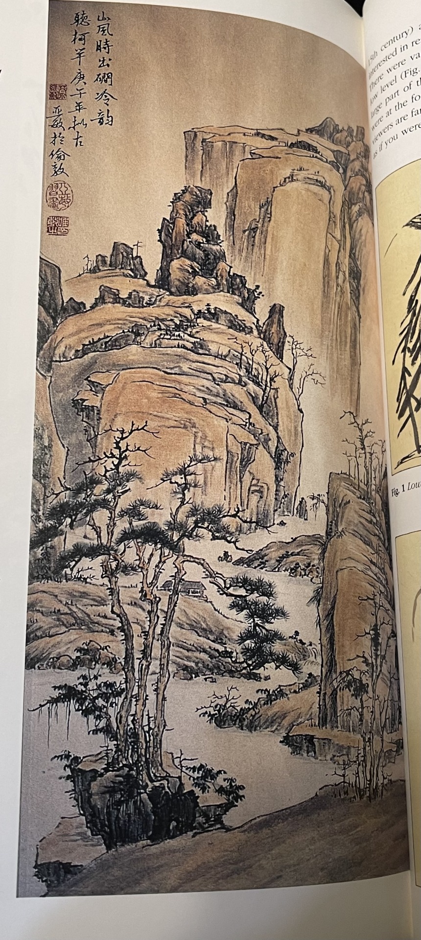
Group of artworks from Pauline Cherrett's book "Chinese Brush Painting: A Beginner's Guide"
I have always been a fan of brushwork in artworks and have always been inspired by Chinese brush painting and Japanese woodblock art. I've always liked nature and landscapes and flowers which tend to be the main subjects of this type of art and honestly I just really enjoy them ( I mean look at the brushwork its amazing).
(all of these pictures come from my copy of the book)
So this was just a small list of some of the artworks and artist that inspire me and my art. Wanted to write this blog for myself as a sort of reference point and to show others different artists that they may not know of. I also have another blog like this one which I'll link if anyone is interested.
Honestly this was so much fun to write! I mainly write a ton for college and it can be a bit taxing but it's nice to write something for myself and on a topic I really enjoy!
#art#artwork#art history#animal art#bird#bird art#other people's art#history#blog#text post#traditional art#william heath robinson#john james audubon#audubon#joe weatherly#pauline cherrett
120 notes
·
View notes
Text
lalala hi dt fandom i wanted to share this little gingi print i made in 2022! it was for my art class from my sophomore (?) year in high school :)

if anyone is interested in reading some of the process and context behind it (with pics) you can read below! its a bit of a long read though...
but i do wanna say my teacher liked it so much not only did she used it as an example after i was done, but she also wanted to add it to my school's first art gallery! really fun stuff :)
for starters: context
the assignment was printmaking, the teacher told us to make the assignment about something we loved. since my dialtown hyperfixation was at its peak i decided to go with that as my theme! i also tied it with my love old phones :)
down here are some of the sketches of the ideas i had in mind

we were supposed to have one big print along side two small ones, thats what the little drawings at the bottom of the characters were supposed to be. i took this pics to show my friends and ask which one i should go with iirc? i also asked the teacher and everyone seemed to agree that gingi was the best option!
for the stamps themselves, we carved them with linoleum, and while it was REALLY tiresome it was a fun process!! i enjoyed it a lot. i still have the stamps :) i forgot the specifics before the carving part since its been... 3 years since ? but whatever

they are a bit ugly since they were painted over, but this is how they look today!! fun fact: two girls asked me if they could use the eggs and the hearts for their own projects when i was done, i said yes and when they were done they asked me what my theme was and i panicked a bit 😭 it was a bit silly but whatever
after we were done carving, we tested the stamps on paper, it took me a couple of tries (i read in my old messages that apparently it took me like four pieces of paper to get it right bc some details werent visible enough...) but this is a pic of my first successful attempt!!!

after this point all i had to do was do more prints, rearrange them and paste them on the bigger paper. i used brown and gree paper for gingis color pallet and black and white for some contrasts!

this is the pic i took after i was done! you can probably see a bit of a pattern on how i arranged it :) i have to admit this was probably my favorite art piece ive made traditionally, im still really proud of it.
after i was done, my teacher said she loved the color palette and the arrangement. it was really flattering! i honestly wish i did more of these, it was really fun!
thank you if you read til here lol i usually dont post much here but i really wanted to share this since its smth i put a lot of effort on! i have it displayed on my wall with some of my other posters :)
#dialtown#dialtown fanart#phonegingi#gingi#dialtown gingi#i have been meaning to post it when i made it#but i got really nervous lolol
25 notes
·
View notes
Text
Processing Process, and More Processing
I made this post free and publicly readable on Patreon, but I'm reposting the whole thing right here too because, well, it's a free post, and I don't want to make you click away from your dashboard if you don't need to. But also if you want to support my work, here's the link to the post.
It's a little bit about cartooning, a little bit about drawing, and then it turns into a eulogy for a chicken.

I wrote “process” more than once, and now the word looks funny and is beginning to lose its meaning to me.
This post is about a few things, and it’s a little bit on the sad end of things. Nothing dire! No worries. There’s just a little mention of death, just as a heads up.
Before we get to that, though, I’ve been doing some work and had some thoughts.
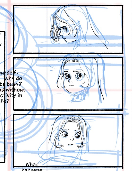
I’m often asked about how I draw the noodle hair on my characters, and the answer is typically that I draw each and every line with my hand. But there are considerations of movement and volume that go into it beyond its texturally decorative purposes. I love being able to convey shape and motion with it. It’s less evident, I think, in my illustration work, but I think it’s much more obvious when I do sequential work. In the above image, you can see me working out a sequence of Angelica having a series of thoughts. Her head sort of moves, and her eyes follow. You can see I’d planned out the general shape of the hair and how I’d like it to move.
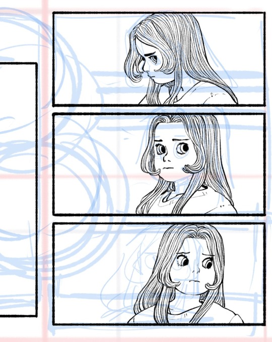
I wound up moving the drawings a little bit so that the readers eyes will actually follow the character’s eyes as it moves gently rightward on the page. The hair is there to accentuate the movement, like so:
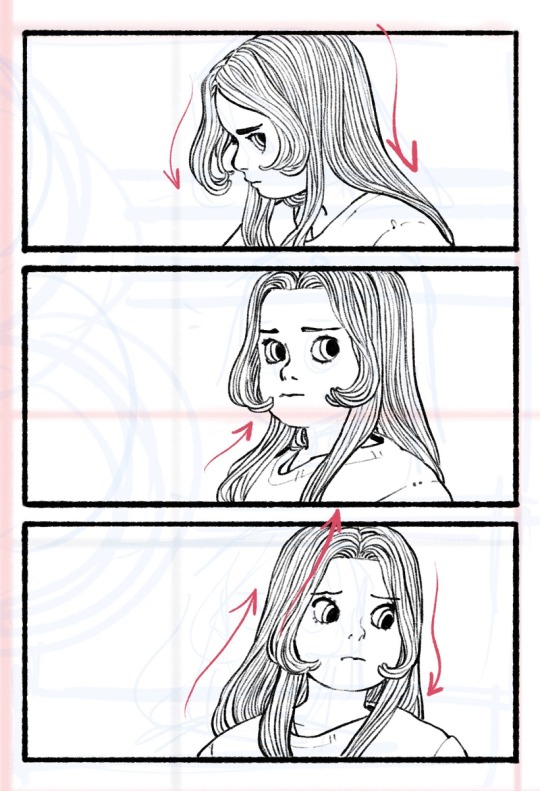
It’s a consideration I employ in all my drawings, but especially when I’m drawing hair and fabric. I don’t use a lot of action lines, so this becomes an important way to give the reader the information that someone is moving through a space. Resistance, gravity, and motion are all things I have to keep in the back of my head when I’m doing these little drawings. I think the planning actually takes more time than the inking, which can happen pretty quickly once I map it all out.
In other news, I’m starting to take my extracurricular artistic development a little more seriously in the silliest way possible.
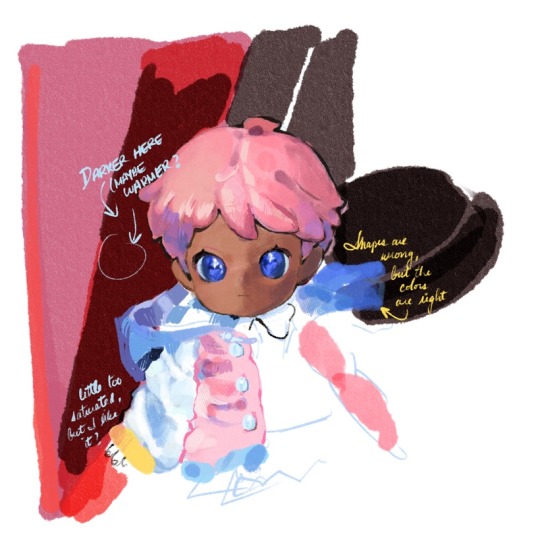
You wouldn’t know it, but I studied painting college—a medium I switched to after the printmaking professor and head of the Art Department at the time told me I probably shouldn’t be an artist (he gave me a hard candy for my trouble). I recently bought a bunch of little dolls, dressed them up, and am returning to my painting roots. It feels really nice to work in big blobs of color instead of lines. It’s an exercise I came up with in response to a common lament from art students.
One of the more aggravating generational tensions described to me by art school students is when professors describe a student’s portfolio as “too anime” without much explanation. I know what the professor means. They’re trying to get at how referencing your favorite anime or cartoons means that your style becomes a simulacrum, an imperfect copy of a copy, and you never learn to develop your own sense of judgment about where a line or a shape needs to go. And we can tell. It’s a way of working that is perfectly fine for cartooning because cartooning is closer to hand-writing than it is to drawing. I always turn to Charles Schulz’s work for an example. Those figures aren’t literally depicting children—with their little chessboard-pawn proportions and bread-loaf feet—but we read them as endearing children because we’ve come to a consensus between us, the readers, and Charles Schulz, the author, that those shapes mean those things. There are no whiskers or paws in the shape of the word “CAT” but you look at those three letters together, and you know the thing to which it refers. That’s an aspect of cartooning, too. Of course, what elevates it from mere writing is, in part, due to the fact that those little figures do not lose their meaning the more you depict them.
To really draw well, though, you have to do those fundamentals. You have to draw from life. There’s no way around it. It helps you develop a stronger sense of where you like to lay down your lines and shapes, no matter how stylized you like to work. It grows your judgment, and every artist’s best tool is their own well-honed sense of artistic discernment about their own work.
But that doesn’t mean you have to surrender the stuff you like or the things that inspire you to make art! I tell students that if they want to hold fast to their anime style AND hone their fundamentals to develop their eye as an artist, they should buy little figurines and toys of their favorite characters, prop those up against a light source, and draw them as still life objects. Like, yes, do the vases and the figure drawings and all those, I still think those are important. But if this is what you need to keep you interested in drawing from life, having some toys around is a great way to do it! Also, bless those sculptors and toy designers. They’re the best.
I think there’s something to be said about remembering to imagine the physicality of the things we draw, in all its dimensions and in the way it catches the light or casts a shadow. It helps sentimentalize things, too. Makes them feel more real, even emotionally.

Edwina died on Tuesday night, after a few final snuggles, surrounded by her favorite treats. She was about five years old, which is old for a chicken, and she had a very comfortable life. We buried her this morning. She was a good hen, J’s personal favorite.
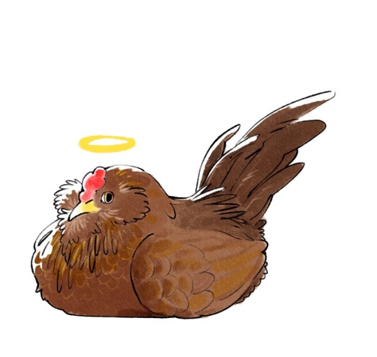
It really feels like the end of an era. She was the last surviving member of our very first flock. After the other hens died, she really seemed to prefer the company of people over other hens. She is survived by Snooki and Nelly, our two other young birds who get along quite well together, actually.
A baby chick costs between three and five American dollars, typically. An egg-laying hen could be between twenty and fifty bucks, depending on the breed. There are roughly 26 billion chickens living in the world today, about 518 million of them here in the United States. They come pretty cheap. And a part of me was moved to cynicism, entertaining the thought that it might be strange to feel sadly over a little animal that, at most, might be roughly equivalent to the price of a fancy lunch and a coffee.
I watched the 1974 musical version of The Little Prince recently, and I remember it mostly because Bob Fosse was in it and scared the crap out of me as a kid—he played the snake that would take the Little Prince back into the sky when his body gets too heavy to take with him. Gene Wilder plays the Fox whom the Little Prince befriends and tames among a garden of roses. The Fox explains that he is like any other fox in the world, but he is changed—made special and particular to the Little Prince—with time, effort, and patience. So, too, is the Prince’s little flower special to him. Out of all the flowers in the universe, she was the one he watered and protected under a little glass jar. And that’s enough.
I knew my little hen would not live that long. It could be very easy to take a broad view of the life expectancy of a hen and distance myself from it by virtue of its mortality and its commonness. People who raise livestock do it all the time. But I also think it’s wonderful that we should all be capable of loving very small, very brief little things. Edwina is not, to my mind, the rough equivalent of a fancy lunch and a coffee. She was our little hen. For her whole life, she was ours. And I’m so happy she was here.
109 notes
·
View notes
Text
Welcome 🌙
Hello there! For a long time my blog has been pseudo-inactive with not much but the occasional reblog and a very rare personal post. I’m slowly working on changing that.

Who am I?
You can call me Jayde or Jay. I’m a bisexual, genderfluid, polyamorous witch in my early 20s. To put it simply—I’m Queer. I am also mentally and chronically ill, so consistency isn’t happening.
I’ve got a BA in Drawing and Printmaking, with minors in Psychology and English, and will be pursuing a Masters in Creative Writing.
I have a love for botany and ecology, folklore and anthropology, philosophy, astronomy, poetry, video games, and D&D.

What do I Practice?
I describe it as a semi-homebrewed magical and spiritual art that I refer to as a form of Witchcraft. A lot of its foundation is rooted in animism and traditional witchcraft with a bit of sabbatic and chaos magic flavor. It runs on my own personal philosophical paradigm.
Most of my current practice revolves around spirit work, divination, thresholds, veneration of the natural world, pathworking, and some casual astrology/celestial influence. I am currently working on leaning more into spellcraft, energy artifice, and hedge-riding.

What is This Blog?
It’ll mostly be me rambling about my life, my craft, and reblogging posts, theories and ideas I find interesting. This blog started as me collecting resources and ideas, and will continue to be such alongside my ramblings.
I am not an educator or authority on anything, or even an entertainer. I just like sharing my thoughts and experiences. That being said, I’m more than happy to discuss my practice if you find yourself confused or curious.
My asks and DMs are always open, so feel free to say hi!

BYF | Side Blog | Tag Index
4 notes
·
View notes
Note
U kno what. Go ham and answer all (or as many of the questions as you want/are relevant) for uhhhhhh Robin and/or Fig (idr if Fig is your OC or Justice’s OC so I’ll leave it up to you)
damb!!!!!!!!!! an excuse to talk too much about robin lets go!!!!!!! (fig is @saltylenpai's and he's not feeling 2 well so i dont wanna bombard him w messages rn dsfds but if i know something for them ill answer it)
also warning for ~mature themes~ or w/e bc this is about robin and she fucks. sorry (nothing graphic just the acknowledgement that she does)
also just for clarity's sake, when i say 'connect 4' thats just the name juice & i use for august/piper/robin/felix bc thats easier than naming them one by one dsfds. on w the show
✨- How did you come up with the OC’s name?
god ngl i can't really, remember, justice might have named her?? like. that's the most likely scenario :sob: he's named so many of my ocs when we were doing back-and-forths trying to figure out the vibes of guys. robin was fun tho bc she didnt have a name when i first posted her bc i really liked her design and wanted to post it despite not having. u know. a name for her yet. also just checked her og post and it has 69 notes. its what she would want
🌼 - How old are they? (Or approximate age range)
when i first made her, robin was 25! now its sort of just a nebulous mid-to-late 20s depending on when art of her takes place tbh! i'd say she's 24/5-ish around the start of that story (so, like, when she finally breaks it off 100% w zoey [her shitty ex that she started dating in highschool], piper moves in w her, potential one night stand w felix, etc etc). maybe a little younger but also not by much. by the time she's got shit more figured out (ie felix has moved in, she & piper have started dating, getting help for her various neuroses etc) would be like 28-29, probs in her 30s by the time they ALL move in together imo. i could be off w that tho but its fine dsbhfs their story is always changing and growing so who knows!
okay wait i just came back to this like 3 hours after starting to write these & sitting on it and. i think robin is roughly 23 when zoey breaks up w her and piper moves in. august is in her senior year of undergrad when she meets piper (again) and she's younger than robin. i think piper is the youngest?? okay wait. ok. robin is 23 when piper moves in, who is 21 at the time. august is 22 & felix is like 21 and a half. or something. at the very beginning. or maybe robin is 22 and piper is 20 and they dont encounter august for another year or so??? idk. ill figure this out eventually. where i draw her most is her late 20s when shes happy w everyone HSDVSFV thats what matters
🌺- Do they have any love interest(s)?
yeas :3 felix is their partner/fiancé (they dont get married for a long time even after getting engaged bc robin just, really likes calling them her fiancé. it's really special to her) and piper is her girlfriend!! it took a long time for robin to realize she was worth loving tbh but all of connect 4 are out here trying to remind her whenever they can (even august. begrudgingly.) (also just to clarify, august is piper's wife) (and felix's gym buddy/bestie/fuck buddy) (she and robin have some sort of fwb thing going on. enemies with benefits. they pretend to hate each other but dont be fooled. theyre besties) (august just isnt romantically involved w anyone But piper) (same w felix & robin)
also fig is dating wren! however i have no current art of them :sob: he's a sweetheart printmaking major who meets fig in school. fig is a fine arts type major who minors in, like, photography, & also tries to work w as many mediums as possible. wren is kind of infatuated w them but tries to hide it bc he's... a dork. he's a dork who does NOT know how to talk to people. and takes to doodling fig in their sketchbook & making prints abt the nebulous Feelings they give him. fig is Aware of it but is Very Autistic abt it all & cant place their own feelings for a while. it all comes to a head when they're. like. hanging out together in the studio and fig just drops a description of how theyve been feeling around wren and wren is like. um. ummmm. did they just fucking. confess to me. and then it's another week before wren is like heeyyyyyyyyyy. would you. like to go on a date. and fig is like. ok :) anyways theyre very in love.
🍕 - What is their favorite food?
is coffee a food. i think robin would live off of it if she could. felix is like, the main reason she starts actually Eating Food Normally bc they wont let her drink 5 iced coffees & call it a day. but to tell u the truth ive never really thought abt her fav food! it's probably something really simple, tho, like one of her dad's pasta recipes. comfort foods to the max.
💼 - What do they do for a living?
robin works as a barista at the coffee shop below her apartment (let me have this fantasy). ive said it once and i'll say it again: robin is the epitome of coffee shop au (derogatory). she doesnt Hate it bc so much free coffee & all her coworkers are some kind of queer but shes also like. not exactly a social butterfly & if anyone's ever a jackass to her she will Not take it (let me have this fantasy also). she's llike 5' even but if anyone yells at any of her coworkers. even ones she doesnt like. she's up to bat so fast. u wanna speak to the manager? ok speak to me. ill kill you
🎹 - Do they have any hobbies?
YEAS robin likes to sew & make clothes/costumes in her spare time. zoey used to make fun of her abt it so she kind of fell off of it for a while, but when piper moved in w her & showed interest in it, robin picked it back up! didn't get fully back into it for a while, but she's out here making clothes for connect 4 as a labor of love (esp felix bc. theyre fucking huge & have trouble finding things in their size sometimes. especially in the arms). also i specify costumes bc she absolutely drags all of them 2 conventions w her in themed cosplays that, like, none of them but robin understand dvgfsdgv. she also sometimes tag-teams w ellis (august's old college roomie) bc xe's actually really into cosplay & nerd shit but can't sew. however xe CAN work w robin to add cool practical effects to costumes and as much as they bully each other . ngl their cosplays always fuck. OH ALSO robin has a tattoo gun . she gives herself tattoos sometimes. when she's feeling it. sometimes the others get in on it dsfds
🎯 -What do they do best?
bitch and moan and be a hater. fuck nasty lesbian style. etc etc
jokes aside tbh . i dont want to boil her down to "barista" but she IS, like, good at what she does. the shit she makes slaps. one of those bitches who has as many fancy coffee gadgets around the apartment as she can afford (and some she cant). no one's complaining tho bc. despite all the bitching she does. she really likes doing things 4 the people she loves and has everyones morning favs down pat
🥊 -What do they love to do? What do they hate to do?
once more. bitch and moan and be a hater & fuck nasty lesbian style. dsvbhgfvbsdh. this is only half a joke tbh robin can be hypersexual & genuinely really enjoys sex so like. yeah. she loves to bone down w any mix of connect 4 and it's a blessing that there's 3 other people bc sometimes i dont think any one of them could keep up. lmao. other than that she enjoys, like, reading indie comics & also manga tbh. loves to cuddle up w felix in bed while they read bc they have sleeping trouble & she knows she helps sometimes. loves to plan dates & hangouts even if she complains the whole time. loves spending any & all time she can w her loved ones now that she lets herself Connect on an emotional level as for shit she hates 2 do. working closers @ opening back to back (happens often). not a fan of cooking. hates going to the gym but will do it to watch felix & august work out. thinks most chores are a sisyphean task that she, personally, has been burdened with (enjoys doing laundry tho). hates talking abt her feelings but gets better abt it
❤️ - What is one of your OC’s best memories?
the first christmas she spent w felix was. ngl. life changing for her. even if shit broke bad shortly after :sob: (they get it worked out but it gets messy for a hot second). genuinely one of the first times she feels Loved for who she is & like she could deserve it someday. which scares the hell out of her in the moment but. despite everything she still thinks abt it fondly also. when she proposes to felix is up there. not necessarily the proposal (that was slapdash & embarrassing and she kind of wants 2 crawl into the dirt) (after weeks of planning & getting cold feet Once Already, she just drops it on felix while they're driving & they nearly crash bc thats nothing they would have ever expected robin 2 say. and robin ends up so embarrassed she nearly has a panic attack trying to backtrack bc what was she doing what was she saying this was the worst obviously youre going to say no im so sorry please ignore everything ive said in the past 5 minutes--) (felix has to pull over on the side of the road to help robin Chill)but the aftermath, when she's calmed down enough that felix is able to be like, hey, hey, baby. look at me. you can take it back if you really want but the answer would be yes either way ok? and they have a Moment and end up making out w robin sat up on the guard rail while the sun sets around them. very romantic save for all the honking they get
✂️ - What is one of your OC’s worst memories?
most anything involving her ex and highschool. tbh. that's all kind of a blur for her but it's not like she Wants to remember any of it. zoey has always preyed on her insecurities & kind of molded her into the bitter cunt she pictures herself as so. it's kind of all bad. she wasn't a good person when she was with zoey & she knows it & feels guilty abt it. other contenders include: when she lied to her dads abt going to college in LA (she went for a semester and dropped out) specifically to be w zoey, knowing they wouldnt have Let Her Go had they known zoey was involved (they did not like zoey). any memory involving holidays spent alone (or worse: w zoey) when she would ignore calls from her dads. another contender for worst is the memory of seeing felix for the first time after their initial break up because ough ouch oof owie that sucked shit.
🧊 - Is their current design the first one?
nope! she was originally a splatoon octoling :^] still very similar vibes tho!
🍀 - What originally inspired the OC?
juice & i wanted to make splat ocs that were salmon runners! her og lore is that she worked salmon run shifts over night & coffee shop shifts during the day. no time to sleep she needs to make money. now she just has the coffee shop job but she's still just as cranky and mean. FELIX HOWEVER has changed so much. i know this isn't abt felix but its still wild thinking abt just how much they've mellowed out compared to like, og felix.
🌂 - What genre do they belong in?
slice of life :^] same as august and piper. there's a post going around abt, like, coming of age stories for adults where. u know. people over 25 or whatever are finally coming into their own & if that was a Genre id absolutely smack robin into it. she grows A Lot from her 20s into her 30s. continues to grow from there, too. haven't thought too much abt, like, Older Connect 4 bc i have some Neuroses around that, but shhh
💚 - What is your OC’s gender identity and sexuality?
robin is cis </3 but a lesbian! <3 fsdfds (august is also cis and a lesbian. piper and felix are the partners w the genders) (piper is a trans lesbian & felix is. genderfluid? queer? has something going on. & bisexual. like. fuck men as a man, fucks women as a woman, etc) (u only technically asked abt robin but shh)
fig is (wavy hand motion) and demi :^] juice is still playing around w their gender, when i asked it was like. some variation of nonbinary or agender leaning on towards transfem. gender simply does not matter to them
🙌 - How many sibling does your OC have?
both robin and fig are only children!
robin feels Guilty abt that often bc she feels like she's kind of a fuck up and that her dads deserved a better daughter (they love her dearly and would never think she's a failure or a burden) (but robin has Neuroses)
fig is. tbh. very much a spoiled only child. theyre very sweet and kind tbh but they were (and are) Very Protected From Everything & their parents can and will do anything for them at any given moment. money is no object. they use this power for good as often as they can tho
🍎 - What is the OC’s relationship w/their parents like?
ope didnt realize this was the next question dsvfgsd so. uh. oopies. i will add on that like. robins dads went the surrogacy route w her. her godmom was the gestational carrier & is pretty good friends w her dads so she shows up to family functions a lot dsfsd. ive yet to design her tho (very double income no kids lesbian aunt vibes from her) (i need to flesh her out more actually) (juice and i half designed robins dads once but didnt settle on anything. need to do that again)
🧠 - What do you like most about the OC?
i like that robin grows and heals w time, and even though she fucks up she still ends up happy w her friends and family. she has a support system of people who love her. despite going through deep shit & dealing w a lot of mental health issues, she's happy and safe and loved & has learned how to cope w things & is on her way to forgiving herself. she doesnt want to die anymore. she finally looks forward to the future. im normal. dont look too much into this. anyways
as for fig . my fav thing abt them is how in love w the world they are. they never get tired of how beautiful everything is, from sunsets to grass growing in cracks in the sidewalk to the patterns that gnats follow. its part of the reason they get into art tbh. they want to translate that beauty into their work. why they dabble in every medium they can. i love fig so much
✏️ - How often do you draw/write about the OC?
robin is easily my most drawn oc (followed shortly by jo, but mostly bc jo was like. my only oc for a while & they were directly connected to a special interest at the time) BUT EVEN THEN. I DONT DRAW HER ANYWHERE NEAR ENOUGH 😭😭😭 rip to all my ocs who arent my comfort characters that no one fucking Knows about because i never draw them. BIGGER rip to the OCs who dont even have toyhouse pages bc i only drew them once years ago and have since redesigned in my mind but havent drawn yet. looking @ ellis & atlas & wren & graham especially. sorry to my boys (and ellis) i just never draw guys ever :sob: (posts that made me realize its literally like. all my guy ocs - and ellis - who i havent uploaded yet 😭😭😭)
💎 - Do you ever see yourself killing off the OC?
lmao no absolutely not robin is going to live forever. all my ocs are immortal (<- guy who has Intense Neuroses & Anxieties revolving around death and is not in a place where he can unpack that shit yet)
💀 - Does your OC have any phobias?
i dont think robin has any ACTUAL phobias (like., defined ones. you know what i mean??) (like arachnophobia or agorophobia or w/e), but for the longest time she was terrified of showing anyone that she cares bc she didn't want to get used again. that's why the initial break-up? w felix happens (she admits she loves them during sex & then immediately panics and kicks felix out & runs away to her dads house for a month w/o telling anyone & purges all her socials. she's normal and makes totally rational decisions). she also has a pretty big Fear that zoey is going to dredge up old shit and start shit and make the rest of connect 4 leave her (which. like. zoey DOES try after a couple of years) (bc shes a petty motherfucker who is upset that robin's doing well) (it obviously. doesn't work) (piper writes a. quite frankly. scathing ass message to zoey) (august swears if she were a few years younger & stupider she would have gone out and started a Fight) (felix just holds her so tight) (anyways)
🍩 -Who is your OC’s arch-nemesis or rival?
fig is absolutely incapable of having an arch-nemesis or rival. like. thats not something that could exist 4 them. they love everyone too much and just assume good intentions. its a problem sometimes.
also robin has several rivals tbqh. the peppy gay barista at work who is too much of a ray of sunshine. she is going to get him to crack. ellis is a rival bc xe hates everyone august has ever slept with (barring piper) (i dont think xe realizes she slept w felix though bc . those two had . a lot of risky hookups in public places i dont think they really ever boned at the apartment LMAO). august is her BIGGEST rival (said lovingly). their relationship is very (robin voice) shut up august im gonna go fuck your wife now. and august bullies her so hard. relentlessly. also full disclosure they also fuck sometimes but its specifically (i warned everyone abt sexual themes or whatever so i can say this) really rough nasty stuff bc august doesnt mind getting rougher w her and robin lives for it. lmao. very hatesex type shit where they're constantly butting heads while robin is tied to the bed. we have fun here
🎓 - How long have you had the OC?
i posted robin for the first time on sept 7 2020!! which is the same day as justice's bday which is fun. so! she'll be 4 this year :^] wild as shit tbh it still feels like she's a new oc to me.
fig also looks like they have a 2020 bday, just earlier in the year! wild!
🍥 - What age were you when you created the OC?
me sitting here like. okay how much pain am i gonna be in acknowledging how old i was in 2020. okay lets see. ok. robin was a week before my birthday which means i was. oh my god. i was 24. i wasnt even 25 yet. oh my god. ohghh my god. time comes for us all. i made robin older than me when i made her im gonna throw up. im gonna become an oyster. im gona

#ask meme tag#ask.pdf#morgan.pdf#nightbloggingbyday#long post#edit: added a link to robins og image. for fun
3 notes
·
View notes
Note
😊
what are your oc’s career/general life desires? what do they want to get the most out of life?
auggie is a printmaker and full time exhibiting artist, which is exactly what he wants to do (its truly the only piece of happiness i'm willing to give him). outside of his career i don't think he really knows what he wants. he wants attention, certainly, but he doesn't know how to get it in a healthy and sustainable way. would he like to get married? settle down? have kids? i don't think so. he's not interested in family like that. i think his time at college did make him a bit more interested in a sort of found family/chosen family/close group of friends/relationships kind of thing but i imagine that sort of fell apart after the events of his junior year. he would never admit it, but i think he wants them (his college cohort) back in his life again. he's very suited to dorm life.
other characters under the cut because i love to ramble
elias wants power. he wants to be the one who takes over the ellings law firm, he wants to feel firmly in control over himself, his life, his narrative, and the people around him. he does not get to take over the ellings law firm but eventually becomes a partner at a similarly well-respected firm in savannah. he gets married, he has a kid, he does live that perfectly manicured life that he broke himself down and rebuilt himself to want. he still wants auggie though. auggie scratches a different, more intense itch for him. he will always want that, i think, no matter how much he wishes he wouldn't.
margot has a number of semi-conflicting desires. she wants to be in control of her own life, she wants to be tied to her brother forever. she wants to be taken care of, she wants to do everything for herself. she is not given a lot of time to think about herself during her childhood, unlike auggie, so i think her own career/life path desires aren't something she thinks about as much. when it comes time to go to college i think she goes to a large state school (somewhere good, but one of those places where you can kind of major in anything). i think she changes her major a couple times. as much as i love the idea of her and auggie as a weirdo art duo (in this reality she would maybe major maybe in film or music? an arts-related field) i could also see her going against everything and majoring in a science, or dropping out and going to technical school. just something totally out of the blue and different. i don't even know if she'd like it, i just think she'd be floundering a lot on her own and want to do everything she possibly could to make up for all the time when she couldn't make her own decisions.
#ask tag#auggiecore#eliascore#margotcore#had never thought abt margot's college years before i bet she was fun
1 note
·
View note
Text


Printing Workshop Class - linocut, drypoint, vernis mou (soft-ground etching?)
#linogravure#linocut#drypoint#vernis mou#traditional art#printing#school stuff#school assigment#graveyard#fish#pike#portrait of my dearest of friends#i absolutely love printing workshop like this is the ONE thing i would never try 9n my own and its SO COOL#so much fun to work in different materials and then get c o p i e s of your work like *--*#also the fact that i got to do a graveyard and fish skull? while everyone else made a normal scenery and fruit??#i love when people let me do dumb things for assigment xD#printmaking
25 notes
·
View notes
Text
I think recently im experiencing some frustrations with neopets that I also do with screenprinting/printmaking and stickers.
I love printmaking but I'm not very creative. I had access to printmaking tools for the majority of my college life and I was the only invested student that didn't use em. Because I dont have Ideas. Im not actually (a) creative. I love stickers and decorating my journal with em, and wish I could make sticker sheets people could use too!!! But I can't. No ideas.
You'll notice in general I don't draw very many sorts of things + if I woke up tomorrow magically mastering art I'd still just draw figures standing there lol... I just cant think Creatively i guess. I'm never gonna be artist who makes gorgeous illustrations or meaningful comics or has a voice or story to tell. Im just Here taking up space for some reason.
+ it frustrates me because I Love these things so much, I want to be a bigger part of them than just an enjoyer...i wanna wrap myself in em fully! I want to participate so badly!
Its the same with neopets rn, I wish there had been more paintbrushes made because I love alt colors for things. I could just make a fan one, right, but I'm stupid. I wanna make neopets ocs or alt brush colors but I suck at character design!! Nothing comes to me. (+ Then whats the point of an oc if theyre just meant to be drawn standing there doing nothing etc etc)
I'm left sitting here really tense and feeling like I need to be squeezed (idk how else to word it) because I can't love something, in my own way, to the extent I would like to. The same tension a toddler feels, wah. A very strong, relentless, But I Want It I Want It I Want It I Want It.
13 notes
·
View notes
Note
I’m a printmaker, and I use Intaglio Printmaking for most of my art (engraving, or using other methods, to put a design a metal plate to hold ink and then rubbing the plate on paper to transfer ink, making a print). I have an Aron as my Pokemon and he always watches my work very intently as I etch into plates for hours, and create prints...it makes me feel a bit guilty...I was wondering if etching a design into my Aron’s armor would be safe and engaging way for us to create experimental art together? I don’t want to risk harming my best buddy.
WELL, this is a fine line really, the actual shell armour of an Aron is oddly enough not attached to its body, and when and if it should ever evolve, you will find its old metal plating left behind, as it grows a more permanent new one for its Lairon form. This means you could technically etch into them and they would feel nothing from it, and not take any damage or increased rick of disease. The soft form under the armour should be left WELL alone, this part of the pokemon will take damage from etching tools.
Now, with the basics info in place you must know, once you add an etched area, it will not repair. The dinks and scratched Aron gain are for the rest of their lives in that form, so whatever you may decide to add to them, give it some really long thought, theres only so much of their shell to use as a printing plate before you run out of space. Id also always say that it MUST be ok with the pokemon too, it is after all their shell, their body, their rules.
As you etch into metal a lot to make your plates for printing, it may be that your pokemon is eyeing up the metal itself as a snack, depending on its diet, it could be craving higher quality steel for food. If their diet is a little lacking they can display this behaviour towards many household items. It doesn't sound like the issue, but I figured i’d mention it just in case you've spotted something that may suggest this.
an alternative option is to hone its attacks to create excellent mark making, precision is often overlooked when we talk about pokemon training, but i deal with a lot of pokemon who have honed skills to a real fine point. Your little Aron may not have dexterous hands to hold tools with, but they do have attacks used in battle. These attacks are actually pretty adaptable with the right training, reducing big bold moves down to smaller more low powered versions may provide your partner with an ability to join in with your work, without using its own plating as an etching surface. I have seen many pokemon using the attack ‘Metal Claw’ in diverse ways (and your buddy should be capable of learning it too). some pick locks with it, others carve stone and wood into beautiful things, heck, it’s an attack with practical uses even in surgeries when done on a micro level. If you can train your pokemon to use that move much like a paintbrush, one claw, not a whole paw full, small movements, not a big swing, then they too could join in. who knows, if they can get their head around micro movements and low power outputs then they could make some amazing marks and patterns I bet, if not actual drawings of things they know and love. It’s kind of like taking a baseball bat and using it like a pencil, but with time they could become quite accomplished. If you can, try to get ahold of some old paneling off of a car, something thats been wrecked is just fine, you can use these panels as targets, practice areas for your buddy to get their head around mark making and smaller versions of their current attacks. It may not look like much to you at first but with work your partner will get the hang of it, it’s just all about practice.
After a while your bud may develop their own tastes, sense of style, and THEN you could certainly think about ideas to etch into their plating on their body. if they choose to evolve you also get to keep the old shell, a monument to their younger self. A Lairon will regenerate their shell body, so after a few years the new etchings and marks will fade and you’ll get a chance to make something new with them. Try as many other options before you etch an Aron’s body, as you wont be able to retry if you get it wrong. Make sure you do this in a controlled environment, with a good steady hand. you may pierce the shell and could potentially hurt the pokemon within. Their shells are on average 3-5cm thick and are pretty dense, so you may find it easier to etch them while they're knocked out, for everyone safety its wise to do this.
147 notes
·
View notes
Text
Happy One Year Anniversary!!
I’ve been making these diary comics about my life as a disabled person living through the pandemic for what feels like an age. At the very least it’s certainly been an important chapter. Before starting these comics and finally striking up the nerve to post them (and later to actually use tags) I had really only dabbled with digital drawing and cartooning in general. I’ve aspired to work as a cartoonist for some time but I in fact mostly worked with printmaking before these diary comics funnily enough.
So the last year has been a lot of learning. I started with a lot of energy, excited to learn something new and to expand my skillset, but over the course of the last year, with my stubborn commitment to routine and busyness after years of being bedbound, I’ve kept going for the sake of it and out of a desire for a sense of completion. I love making these comics but as my art’s become stagnant and I no longer feel like I’m learning a great deal, these daily comics have outlived their usefulness. At first, they allowed me to build a routine, helped me to make healthier decisions and manage my symptoms better, but now with constant catching up, its affecting my health and wellbeing and I would have abandoned this project long ago if I wasn't so hard headed.
I find myself stuck in a pattern of gritting my teeth, barrelling through and eventually collapsing in pain and exhaustion once I’m through to the other side. I was made to struggle through A-Levels this way but I’m on my own now and I don't want to be trapped in old harmful behaviours, once imposed on me by others, but now self-inflicted. I guess this is a long way of saying I'm trying to break that pattern and have a better relationship to work, which is of course very fraught for a cripple.
I don’t want to stop doing these diary comics altogether, I do enjoy doing them, but by removing the self imposed daily schedule I hope that they’ll be more focused, with art that actually challenges me creatively. I aim to post weekly on Sundays, but I’m also trying to be more forgiving to myself with regards to scheduling. With a move to weekly posting, I’m also hoping to rejuvenate my creative drive by working on new projects! I plan to start working on longer comics with a vague fairy tale theme to find my style and learn to colour properly, all of which I plan to post here. These short form comics are just about me chasing learning so that eventually I’ll have the tools to work on a webcomic of my own! (Something I’ve dreamed about for a long time).
This is a long post but I wanted to explain these changes to everyone that follows this blog. It’s weird that anyone even reads my stuff and I’m still very much getting used to the idea. Seeing my amateur comics receive any attention is very flattering & hugely appreciated, and I hope to continue making comics for everyone to enjoy.
Cheers, Eaven xox
#not a comic#1 year#anniversary#I really did a comic every day huh#im so powerful#love yall#disability#disabled#go read some of my old comics#you can search the date by the tags x
30 notes
·
View notes
Note
Hey!! I'm a hot mess right now who cant enjoy art anymore so if you could help me solve this out I would appreciate but i understand if you can't so here's the deal: Is being rich while people are starving unethical? And if so how can I enjoy my favorite artists, rich people, knowing this? I mean it's obvious you want you and your loved ones to live comfortably but there's a point where is just too much, right? And all these big artists that I love they are way above the threshold of too much.
This is probably my favorite ask I’ve ever gotten only because I wasn’t really expecting anyone to ask me about this particular political and philosophical question, and I, an anarcho-socialist English major, have some thoughts on the subject, to say the least. Let me preface this by saying there’s no right answer to this question, as much as I wish there was one, and I can only give my opinion and how I’ve chosen to go about my life. That said the majority of people on this site are still pretty young. I’d encourage you to take my opinion with a grain of salt and ask other people you trust and read more theory so you can form what you think is the right way of going about consuming art for yourself! Regardless, I’m really proud of you for asking this and interrogating these sorts of topics within yourself, it can be hard to maintain the balance of keeping hope while attempting to live ethically within capitalist society, but the fact that you are trying is commendable, and it’s my hope that more people asking questions like this will bring about the change we wish to see in the world c:
Alright, answer under the break!
For starters, yes, I do believe being rich is unethical. While there is a multitude of reasons for this being the case, the one you brought up (hunger) is more than enough reason on its own. Now, no one rich person could end hunger, or at least not permanently. Estimates on how much it would cost to end world hunger range from 7 billion to 265 billion USD annually according to the IFPRI, which sounds wild right off the bat, since those are two unfathomably different numbers, but basically the difference boils down to the 7 billion dollar approach aiming to reduce malnutrition to World Health Assembly goals in about 15 years, and the 265 billion plan aiming to actually end world hunger (reach a “zero hunger target”) within about 20 years by targeting the sources of hunger, mainly being poverty and agricultural infrastructure.
So when you hear people say things like “why doesn’t Bezos end world hunger” one short answer is that he can’t. But the fact that he can’t doesn’t really matter because what really matters is he’s not trying. Without getting into liquidizing stocks and all that nonsense, if the ten richest people in the world made a one-time donation of 60 billion each, we would have enough and then some for the first two years of that zero hunger target plan by that alone. And the “poorest” of those ten billionaires would still have a net worth of 15 billion, which is still an unfathomable amount of money.
I say all of this to point out why it still matters to say the rich aren’t doing enough to end world hunger, and not to say that this is my ideal plan for solving it (which involves a lot more social restructuring and abolishing the value-form). I think if someone wakes up with billions in assets it a capitalist society in which the median “living wage” (which includes covering basic expenses, building savings, and having “fun money”) in my country is roughly $67,700, they must have woken up on one of those days and thought “oh hey what if I ended hunger in my home town” or “oh hey what if I funded a food co-op in a food desert nearby” or maybe even “what if I fucked around and tried to end world hunger” and then they didn’t. They turned around and went back to sleep, or went to a business meeting where they continued to exploit their workers or did whatever it is they do that I will never understand. And I think that is unethical.
Here’s the thing, and I’m sure some people will disagree with me on this one (I’m more than happy to read anyone’s replies and take them into account going forward) there’s a difference between corporate wealth and celebrity wealth. Do I fucking hate looking at pictures of Drake’s mansion? Yes, completely. Do I think that, like Mark Zuckerberg, he should be tried for crimes not limited to aiding and abetting ethnic violence in Ethiopia and failing to remove a militia event in Kenosha in which people planned to kill BLM protesters and then did, proceeding to lie about it in order to continue to profit off of the traffic and internet buzz white supremacists provide his site with? No, because Drake is not Mark Zuckerberg and there is a difference between what crimes it takes to make and uphold a 170 million dollar net worth versus a 98 billion dollar one. While I’m not jazzed to say the least about millionaire celebrities lounging in their wealth, in a way they are a very successful worker being rewarded by a capitalist society in exchange for a service they provide. So yeah, I feel more comfortable cheering on John Boyega for succeeding in a system set against him than I do any corporate capitalist.
That said, there are ways to support the art you love and strive to consume art more ethically. Support local artists, black artists and other creators of color, artists who support sustainable printmaking or give part of their proceeds to charities you care about. In terms of music, for every band you like that has problematic views there are thirty small bands with similar sounds you can support if you go looking. If you find a band you think is doing great work, support them on Bandcamp or buy a CD, and if you really want to listen to Kanye’s Power because its just that kind of day, listen to him on Spotify, where they’re literally paying people jack shit for it. If you’re going to participate in a capitalist society (and if you’re not, let me know how since I haven't figured that one out yet haha), reward the people you feel good about supporting.
Speaking of which! One of my favorite rappers noname has an online bookclub that uplifts POC voices by featuring two books a month. It’s awesome, noname is awesome, and I feel good whenever I listen to their album for the thirtieth time because telefone is the best. There’s art out there for you to feel good about loving. Sometimes it just takes a little digging to find.
I think my last note is going to be this: art is human. Art isn’t capitalist. People have been making art before capitalism and they’ll be making art after, art is an expression of the pain and hope and past and future of us, and we need it. To try and cut yourself off from consuming art to distance yourself from capitalism won’t work, because we need art to be human, and it was never capitalist in the first place. You aren’t evil or unethical for wanting to consume art, that’s the most natural urge in the world. It is a sign that our system is unethical if it makes us feel guilty for the things that make us human. So consume art, love it, love the people who make it, because its the good stuff. It’s the stuff that makes the rest of this more hopeful and more worth it. I know this can all feel like so much sometimes. But you’re not alone. There so many people out there working to make the world better and brighter, and making art to get us through it. I love you, and I hoped this helped even a little bit and I’m sorry its so long haha. I hope today is a little better for you than yesterday, and tomorrow’s even better than today c:
#long post#like longest fucking post sorry#tal asks#noahvincent33#cw violence#cw death#what else do people blacklist#capitalism#bezos#cw hunger#cw food#ask to tag#taliesin blathers
19 notes
·
View notes
Note
where did u learn to draw? if it was from a website could u please link it? esp if its abt male anatomy bc i SUCK at drawing men. ur art is truly stunning!!🥰🥰
Totally get what you mean about drawing men, I’ve always found guys more awkward to get right. But I’ve improved a lot after churning out so many naked avengers, practice really works with male anatomy, and with as much reference as possible. I dunno about you but I’m a copier, I can nail a likeness but take away my reference and I’m fucked. Marvel provide a tonne of reference and I’m fortunate to live with a huge partner who doesn’t mind if I pose him for Thor and sometimes Cap. Nobody has ever taught me to draw really. The best help I’ve ever had was learning how to use a critical eye doing life drawing in college. People always hate it when you tell them the best way to improve is life drawing and practicing - but it’s the truth.
Here’s a website my partner uses to generate random images of life models. He’s a designer and really skilled at comic style art, but struggles with anatomical proportions so he draws from life to warm up all the time.
https://quickposes.com/en
With regards to drawing dudes I’d suggest a couple more things:Have a closer look at comic book art. They’re full of testosterone pumped characters that fucking OWN a page like a punch in the face, great examples of confident mark making. There’s also a lot of really bad anatomy you can use to test your critical eye; when bad proportions work and when they don’t work at all.Personally I think you can find the most beautiful examples of crafted male anatomy in renaissance marble. There’s a fun activity where you look through a load of renaissance sculpture of women and try to spot the ones where the models they used were actually male. (Here’s a hint - the breasts look like they’re stuck on with an ice cream scoop). Renaissance printmakers, too, cause etchings and woodcuts use crosshatching to make them 3dimentional and it’s a great way to learn where and how to apply shadow.


Michelangelo and Albrecht Durer. Practiced on his pillows.
All this depends on what you want to do and how you want to improve. If you want to message me or leave more anon asks with what you’ve got already, or something you want pointers on I’d love to see and an more than happy to help. I have more artist referance books than I know what to do with, and a lot of thoughts to go with them.
Forgive my quarentined and intelectually starved ass the longest answer known to this blog.

124 notes
·
View notes
Text
Armenian Women in Visual Arts

I took a class on Armenian culture and history in university that exposed me to this beautiful country and people and opened my eyes to the undeniable tragedy of the Armenian Genocide of 1915.
I’m not Armenian, but I’m Greek on my dad’s side which I found out is very similar. We both love our dolma’s and hate the Turks. But in all seriousness, we share a lot of similarities with Armenian culture, including its political history, which has helped me to further empathize with the current struggles they are facing as a country. It's heartbreaking to see that, just five years after the 100 year anniversary of the Armenian Genocide, Armenians appear to be facing a second genocide. Armenia’s neighboring country Azerbaijan has been ensuing deadly attacks against them for some time now with the aid of Turkey and the issue continues to be mostly ignored by the international community. Protests have been raging on both in the nation and diaspora. In no way do I consider myself to be an expert on this subject, but I feel responsible at least to educate myself and do my part as a citizen of the world.

There is no civilization in the world that, given it possess the resources and will, doesn’t have artists, doctors, lawyers, chefs, musicians, poets, farmers, accountants, etc... The meaning of this to me is that it is proof we are all valuable people, no matter where we come from or what we look like. Just think about how sand is made from millions of tiny parts but looks like one uniform blanket on the beach. If you were to put a handful of sand into a jar, and another handful into another jar, you’d find that each jar is made up of entirely different rocks. But somehow, both have all the elements needed to still look like a handful of sand. That’s how I view culture. Every culture is a handful of sand; they all have necessarily found their own way to explain the universe (religion), their own way to communicate (language), their own way to nourish themselves (diet), and so on... and each way is original and different. But somehow, all of the elements add up to create a civilization, a culture, and a people with a shared identity. The only thing that makes us different is that we’re arbitrarily placed into one jar and not another, but when you look at the big picture, we’re all the same.

As embarrassing as it is to admit, I think by human nature it’s much easier to care about someone else’s journey in life when they have something in common with you. What I love about art is that when you meet another artist, no matter who, you feel a sort of magical connection to that person and are bonded over your mutual appreciation of it. I am a woman and I am an artist, and because of that, I feel lucky and unworthy in saying I have something in common with these incredibly talented Armenian women that I’m about to share with you.
I. Zabelle Boyajian (1872-1957)
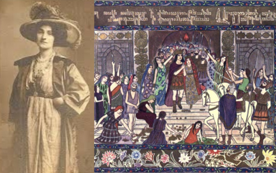
Zabelle C. Boyajian was a poet, painter and playwright of the Ottoman Empire, born in 1872 in Diyarbakir, one of the ancient Armenian capitals, ‘Tigranakert’. After the murder of her father during the Hamidian Massacres of 1895, she, her mother and her brother immigrated to London. She travelled extensively throughout her lifetime and learned to speak eight languages fluently, including Armenian, English, German, Italian, Greek, Turkish and Russian. Being skilled in so many languages, apart from the arts, she was a great contributor to the translation of many great Armenian works. For example, in 1948, she translated Avetik Isahakian’s epic poem “Abu Lala Mahari” and published it for the world to read. In 1938, thanks to her wide travels, she published several illustrations from her visit to Greece, entitled “In Greece with Pen and Palette”. Exhibitions of her art were held in London, Egypt, France, Italy, Belgium and Germany. She was close friends with Anna Raffi, the wife of the well-known Armenian novelist, Raffi. One of the leading female trailblazers of art, literature and translation, she published her first novel in 1901, entitled “Esther”. She is well known today for her gorgeous storybook illustrations.
II. Miriam Aslamazian (1907-2006)

Miriam Aslamazian, sometimes called the Armenian Frida Kahlo, was born on October 20th, 1907 in Alexandropol in the village of Bash-shirak. She was was a Soviet painter of Armenian descent recognized for her exquisite ceramic plates. In 1929, she graduated from the Yerevan Art-Industrial Technicum and later in 1933, from the Leningrad Academy of Art. In 1946, she became a member of the CPSU (the Communist Party of the Soviet Union). Her work is often described as decorative, flat still-life pieces as well as possessing dramatic, colorful themes. Many pieces of her artwork can be found today in the Aslamazian Sisters’ Museum in Gyumri. She was honored as People’s Artist of the Armenian SSR 1965 and People’s Artist of the Soviet Union in 1990.
III. Gayane Khachaturian (1942-2009)

Gayane Khachaturian, born May 9th, 1942 in Tbilisi, Georgia, was a Georgian-Armenian graphic artist and painter. She studied at the Nikoladze Art School and the Secondary School of Working Youth, where she graduated in 1960. Sergei Parajanov, who she was close friends with, was a major inspiration for her. Some of her works are permanently displayed and can be seen at the National Gallery of Armenia, the Yerevan Museum of Modern Art as well as the Sergei Parajanov Museum in Yerevan. Her works have also been purchased and are included in several private art collections. Her first informal solo exhibition was at Skvoznyachok Café in Yerevan in 1967.
IV. Sonia Balassanian

Sonia Balassanian is a mixed media artist, art curator, founder and Artistic Director of the Armenian Center for Contemporary Experimental Art in Yerevan, Armenia. Born in Iran of Armenian descent on April 8th of 1942, Balassanian uses her artwork to advocate for human rights and women's emancipation issues. In 1970, she obtained a BFA from the Pennsylvania Academy of Fine Arts and the following year worked on an independent study program at the Whitney Museum of American Art. In 1978, she completed her MFA from Pratt Institute in Brooklyn, New York. The following year, however, the 1979 events in Iran caused her to turn to “political art” as self expression. She is also a skilled writer, publishing several works, including, “There Might Have Been An Insane Heart” (1982), composed of selected poems written in the Armenian language, “Portraits” published in New York in 1983 and “Two Books” (2006), a publication of two books of poems in one combined.
V. Nora Chavashian
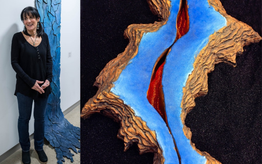
Nora Chavashian is an award-winning production designer, art director and set decorator, recognized for her sculptural stage sets, born in Philadelphia, PA on October 25th, 1953. OMG we have the same birthday, no wonder I like her! There, she studied sculpture at the Pennsylvania Academy of Fine Arts. In 1974, Chayashian graduated from the San Francisco Art Institute (SFAI). In 1984, she married Joe Morton, an American actor, director, writer, singer and songwriter, with whom she has three children, Hopi, Seta and Ara, and one grandson, Moses. In 1988, she and her family relocated to the East Coast. Her sculptures often have organic shapes and are reminiscent of nature.
VI. Anush Yeghiazaryan
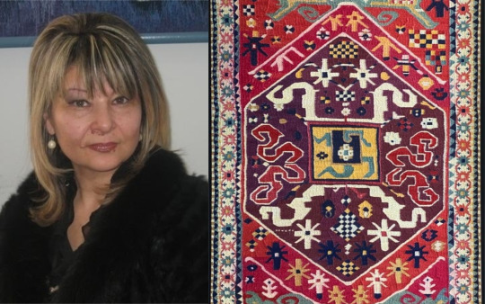
Anush Yeghiazaryan is a painter, weaver and professor born on June 15th, 1965 in Yerevan, Armenia, known for her stunning tapestry creations. Hailing from the family of Karapet Yeghizaryan, patriarch of the Armenian school of art weaving, she has held up the traditional weaving techniques of her ancestors. From 1984 to 1990, she studied graphic design at the Yerevan State Fine Arts Academy. From 1991 to 1994, she worked on obtaining her PhD from the State Armenian Pedagogical University. In 1996, she became a member of the Armenian Union of Artists. In 2010, Yeghiazaryan joined the Pan-Armenian Painting Association. She has had her work presented in exhibitions around the world, from Yerevan to Paris, Moscow, Sankt Petersburg, Bouve, Plovdil, Tehran, Italy and Praha. Quoted for saying, “I have not chosen art, it’s in my blood. It’s my lifestyle and I love it up to sublimation degree”. Some of her pieces displaying masterful weaving techniques include,“If you live, create” (1998), “Once Upon a Time in Paris” (2003), and “Urbanization” (2006).
VII. Taleen Berberian
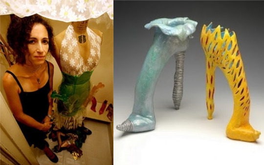
Taleen Berberian is a modern Armenian visual artist, specializing in mixed mediums, crafted fabric, clay sculptures, drawing and the use of the traditional Armenian sewing, embroidery and crochet techniques in unconventional ways. She is especially recognized for her famous sculptures of shoes. Berberian has been on the forefront of women’s issues, a theme that can be seen through her artwork. She is an active participant in both Los Angeles and New York’s art communities. In 1995, she obtained a BFA in Sculpture from the California College of the Arts in Oakland, California and in 1998 she continued on to achieve a MFA in Studio Art and Art Education from Pratt Institute in Brooklyn, New York. In 2009, she received her Initial Teachers’ Certification in Visual Art for grades K-12 and currently serves as a quilting and ceramics instructor.
VIII. Joanne Julian

Found out artist Joanne Julian and I are both CSUN alum and native Angelenos! Julian, who is of Armenian ancestry, says she has been highly influenced by her travels to Asia and thus became skilled in certain Asian techniques, such as mono printing and the “flung ink” or “Haboku” style. Her pieces possess a “Zen quality” to them, as portrayed in her “Zen Circle” series, illuminating the Yin and Yang of Taoist painting. She received her Bachelor’s of Arts and her Masters in sculpture and printmaking from California State University, Northridge. She later received her MFA from the Otis Art Institute of Parsons School of Design. She has participated in over sixty group exhibitions and twenty solo exhibitions nation-wide. Since 1973, Julian has served as the Chair of the Fine Arts Department and Gallery Director at the College of Canyons in Valencia, California. In 2008, from January 25th to February 23rd, she held an exhibition at CSUN’s Art Gallery entitled, “Counterpoints”.

All of the female artists I mentioned have given people a better look into what it means to be Armenian and how the community and its diaspora are trying to solidify the Armenian identity to enable its rich heritage and traditions to live on. And they are just a few of the proud Armenians who have helped raise awareness of the issues Armenians face, as well as give Armenians their due respect in the realm of International Art. And to go one step further, my deepest hope is that one day, art will overcome the war.
#armenian#armeniangenocide#genocide#journalism#armenianprotests#azerbaijan#femaleartists#artists#art#artist#femaleartist#armenianart#armenianartist#armenianartists#armenia#culture#zabelleboyajian#joannejulian#taleenberberian#anushy#Miriamaslamazian#Sonia Balassanian#soniabalassanian#female artists#armenian genocide#armenian artists#armenian art#armenianwomen#armenian women#peaceforarmenians
15 notes
·
View notes
Text
Who am I as an Artist? Moving Forward
There are so many different methods of printmaking, each with their own character and charms. Linocut prints producing patchy and carefree prints, etching specialising in tone and monoprints creating one-of-a-kind pieces each time. I am personally most inspired by screen printing, also known as silkscreen printing. Screen printing is a form of printing using a screen made of stretched fabric and a frame1. The artist creates a stencil by applying glue, film/paper or photoresist to the areas of the screen that they don’t want printed, then smears ink through the untouched parts of the screen to create a print. This method is primarily used on paper and fabric; however, it is possible to print on other materials such as wood and metal if using specific inks. Screen printing is wildly popular due to its ability to print bright and even colours regardless of the surface2. Screen printing works similarly to a reduction print, creating multidimensional art using layers rather than tone and shading. It is also praised for its ability to produce identical prints in little to no time, making it a key method in the mass production for the likes of posters. Screen printing started being used in the 1920’s for advertisements, even though the method dates all the way back to 221 AD China3, and was being used by artists only 10 years later. By the 1950’s, screen printing had become a widely appreciated media amongst artists. During the 1960’s, screen printing boomed in popularity after pop artists such as Andy Warhol and Keith Harring used it for their designs4. Screen printing was the prime medium for the pop art movement because of the ease at which you could create colourful block shapes and patterns, as well its ability to mass produce designs. Screen printing has a long and diverse history, but not one that is going to end anytime soon. The method is still wildly popular today amongst printmakers, with its charming characteristic and accessibility maintaining its popularity as strong as ever.
Ben Rider
Ben Rider is an illustrator and prink maker based in London. Rider is known for his messy neon prints with punk undertones. His work is created using a screen print to bring his illustrations alive, usually in a psychedelic pop art style. One of my favourite pieces of his would be ‘Pleasure Thyself.
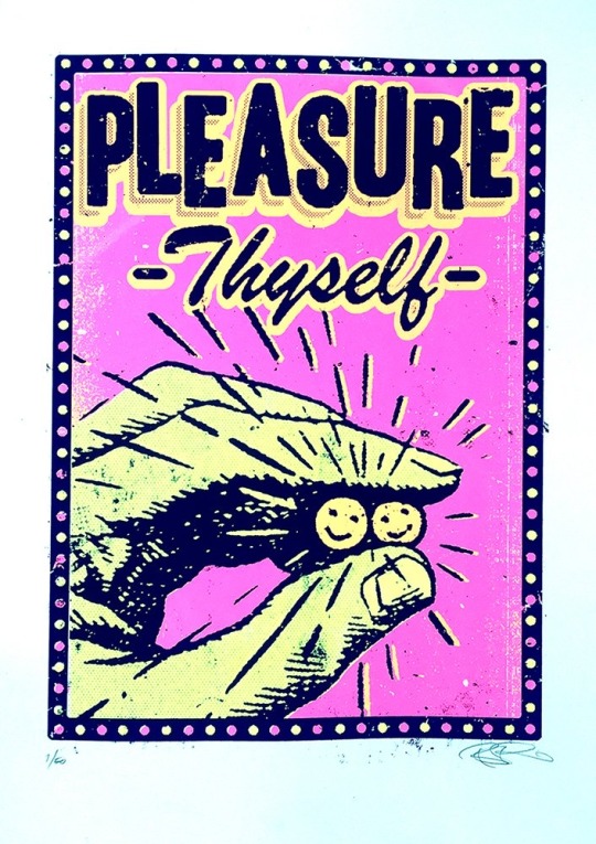
5Print Club London. (n.d.). Pleasure Thyself by Ben Rider. [online] Available at: https://printclublondon.com/shop/pleasure-thyself/ [Accessed 13 Mar. 2021].
This print includes a hand holding to smiley faces, as well as the name of the piece, ‘Pleasure Thyself’. This print is fairly simple; however, I feel as though there's a lot of depth to it. At first glance, it simply seems to be a print about looking after yourself and your mental health. The description of the piece states, ‘In these strange days it's good to be reminded to just be kind to ourselves too!’. I feel as though there could also be a comparison drawn between this piece and drug culture. The hand seems to be holding two smiley faces, which at first reminded me of pills. The slogan of, ‘Pleasure Thyself’ could also relate to the act of getting high or taking an upper. I feel as though the colour pallet helps strengthen this analysis. The piece includes bright pink and yellow, creating a psychedelic feeling. There are also a bunch of lines coming out of the faces, making them the main focus point of the piece. I feel that this also adds emphasis to the pill like shapes. However, some may say that these lines were included to replicate a sun. It could also be argued that this print was inspired by addiction. Many people fall into a dark hole and use drugs as a form of escapism, using the euphoric feeling of being under the influence as a stimulant during hard times. Over all, I feel that this piece was created with this double entendre in mind. It could simply be enjoyed as a print about looking after yourself and staying positive, but on the other hand, could also be viewed as a piece inspired by drug culture. With many of Rider’s pieces having a sense of social commentary to them, I don’t doubt that this was his intentions.
Steven Wilson
Steven Wilson is an artist, designer and animator based in Brighton. Born in London, Wilson currently works for his own self-titled business alongside Pedro Cardoso. The company works in both analogue and digital methods to create unique and colourful pieces of art. Steven Wilson has found a great deal of success since launching his company in 2001, creating work for big names such as: Nike, The Oscars, Virgin and the New York Times, amongst many others.6
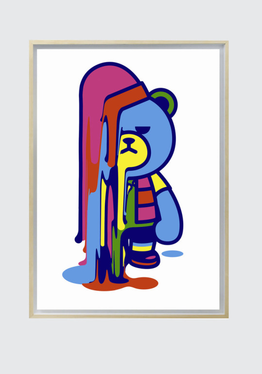
7 STEVENWILSONSTUDIO. (n.d.). Krunk Melt. [online] Available at: https://www.stevenwilsonstudio.com/prints/krunk-melt [Accessed 13 Mar. 2021].
‘Krunk Melts’ is a screen print, made using 3 layers, by Steven Wilson. It includes a bear, with a rather unpleased look on its face, melting away. I really liked this print because of the bright colours and unusual subject matter. Many of Steven Wilson’s work has a huge pop art style to it, and you can definitely see the correlation in this piece. The print uses a lot of bright colours, creating a cartoon style. The bear is outlined with a dark blue rather than a black, softening the piece all together. I feel that this makes the print feel a lot more comforting, compared to creating a stark contrast between the bright colours and a solid black outline. However, this carefree style is contradicted with the expression on the bear’s face. It has a very disapproving look on its face, as opposed to the stereotypical cheery smile cartoons are often given. This changed the feeling of the piece completely. The look on the bear’s face, along with the fact that it is melting, created a more sombre feeling to the print. This is strengthened with the fact that the bear itself is blue, a colour often used to convey sadness. I really liked the contrast this created. The use of bright colours in a piece that feels rather negative confuses the viewer. The art that, at first, seemed so cherry and carefree now has a sense of melancholy that was not initially obvious. I feel that this depth, mixed with the simplicity of the design, created a really interesting and effective print. After closely inspecting the piece, you are almost left not knowing how to feel about it, highlighting how powerful an image it is.
Andy Warhol
Andy Warhol was an American artist who explored a huge selection of media such as: painting, printing and sculpture as well as photography and film. Warhol was best known for his screen prints that explored the relationship between advertisement and celebrity culture. His art boosted him to fame during the 60’s, leading to him being considered a leading artist of the pop art movement with pieces such as, ‘Campbell’s Soup Cans’ and ‘Shot Mrilyns’. 8
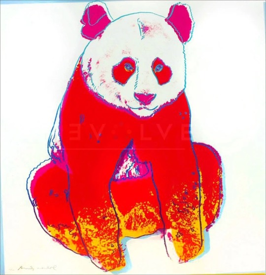
9Revolver Gallery. (n.d.). Giant Panda 295 by Andy Warhol. [online] Available at: https://revolverwarholgallery.com/portfolio/warhol-giant-panda/ [Accessed 13 Mar. 2021].
Giant Panda 295 is a screen print done by Andy Warhol in 1983. The piece was done as a commission by Ron and Freyda Feldman, and was one of ten pieces created inspired by endangered animals. The print included a red panda with a thin blue outline and pink and yellow details. I really liked this piece as I felt it was instantly obvious why it was created. The red and yellow together somewhat mimics a fire, creating a sense of danger and anxiety. The use of a blue outline really helps the piece stand out more, especially against the red. This choice was especially effective in the eyes of the panda. There isn't really much detail, however I feel that this colour choice makes them look a lot more unnatural. The blue against the red really helps the eyes stand out. I feel that this was done to make the view feel like the panda is looking right at them, almost as if the panda is shaming you for not helping. This small detail, along with the intense colour pallet creates a sense of urgency, almost pushing you to help the cause. I think that this was a highly successful piece, managing to capture so much emotion in such a simple print. Even without looking into the background of the piece, you can hazard a good guess as to why it was created. Proving just how powerful a print this is, highlighting Warhol’s talent as a whole.
Screen printing inspires me for many reasons, and I feel that the more artists I research that explore the medium, the more passionate I feel about it. I really love that every artist that uses screen printing does it in their own way, with every artist’s work looking wildly different from each other's. Yet, the use of bright colours and layers ties them all together. I think throughout my journey as a printmaker, I want to experiment with screen printing more, taking into consideration how I can use both colour and layering to enhance my work.
Word count- 1.487
1 Tate (2017). Screenprint – Art Term | Tate. [online] Tate. Available at: https://www.tate.org.uk/art/art-terms/s/screenprint [Accessed 13 Mar. 2021].
2Customplanet.co.uk. (2020). What is Screen Printing? A Step-by-Step Guide to Silk Screen Printing. [online] Available at: https://www.customplanet.co.uk/what-is-screen-printing-step-by-step-i50 [Accessed 13 Mar. 2021].
3www.leicesterprintworkshop.com. (n.d.). A brief history of screenprinting - Leicester Print Workshop. [online] Available at: http://www.leicesterprintworkshop.com/printmaking/screenprinting/a_brief_history_of_screenprinting/#:~:text=A%20brief%20history%20of%20screenprinting.%20Screenprinting%20originated%20in [Accessed 13 Mar. 2021].
4My Modern Met. (2018). 8 Print Artists That Will Inspire You to Try Silk Screen Printing at Home. [online] Available at: https://mymodernmet.com/silk-screen-printing-artists/ [Accessed 13 Mar. 2021].
6STEVENWILSONSTUDIO. (n.d.). About. [online] Available at: https://www.stevenwilsonstudio.com/about [Accessed 13 Mar. 2021].
8Tate (2019). Andy Warhol 1928-1987 | Tate. [online] Tate. Available at: https://www.tate.org.uk/art/artists/andy-warhol-2121 [Accessed 13 Mar. 2021].
2 notes
·
View notes
Text
Art Analysis Essay
Identifying which printmaking process works for me is pretty hard due to not having much experience in each different process, so I’d have to base this essay and my decision on which technique I’ve enjoyed the most this past year. I evaluated each process and my outcomes, and I feel the best would be Screen-printing. I also, came to this decision due to the speed and efficiency of this process. My art style can be quite graphical, and I feel this process captures that in print form the most, by using digital applications like Adobe Draw initially then exposing them onto a screen to produce a print. Using the specific colours in the initial design or being able to experiment freely without changing the integrity of the initial outcome.
After conducting initial research, I discovered that screen-printing started as early as the 17th Century progressing through the decades ever evolving as the technique, we know it as today. Artists like Andy Warhol, David Hockney and Roy Lichtenstein really giving it the platform of popularity. The process makes up of a exposing a stencil onto a silk screen, then pushing the ink or paint through the screen so it transfers onto the material you’re wanting to print on. The stencil is exposed onto the screen in a similar way to a photograph, using light to burn the image into the reactive emulsion paint which hardens it. Any areas that weren’t covered by the design stencil remain a liquid which can be washed off to reveal the image you’re wanting to print, then allowing the ink to flow the screen to your desired layout or design.
Kate Gibb
Kate Gibbs is artist I’ve researched as part of another project and is printmaking artist from London, England. I loved her work previously, as I find it to be very expressive with her use of colour, lines, shapes and texture. The obvious use of mark making within her work can be visualised in different works. Utilising the chance of happy accidents that can occur during the creative process.

kategibb.co.uk. (n.d.). Kate Gibb. [online] Available at: http://kategibb.co.uk [Accessed 1 Mar. 2021].
My analysis of Kate Gibbs ‘Pleasure Garden’ starts with my initial feelings on the overall, composition, colours, textures and shapes she has used to create this piece. When looking at this design I get cultural references of Japanese printworks though her use on colour and their tonal ranges, after conducting further research I noticed that this design in particular references Kyoto, Japan for a magazine publication. This explains why she worked in this way to portray a more abstract outcome in relation to her way of working. As similar to her other prints works, I’ve researched Kate Gibb prefers the use simple shapes, colours and lines combined with layering. These marks on top of one another make her prints more cohesive to me, I think she does this, so her style is fluent and easily recognizable predominately, in her album cover works. My eyes are more drawn to the circle which looks like sun on the bottom layer, then flow around the composition following the brush strokes down the page into a pool of different mark marking processes. I find this design very relaxing compared to her other designs, the colours are more complementary of each other already mentioning their tones but, also different shades blue ranging to green and aqua. I think she might have done this to relate back to Japanese culture, as I also find the ‘The Great Wave off Kanagawa’ by Japanese artist Hokusai, very harmonious and calming. I like her use on paintbrush strokes to add texture especially in the larger areas where you can see the background peaking through. The little areas of detail filling negative spaces with repeated patterns and the shadowing of the background adds dimension also, contributing to the flow of direction when looking at the design. I like that there are some elements more subtle than others I think she would have done this to keep eyes on the piece for longer a the more I look and analyse different shapes and lines appear.

Google Arts & Culture. (n.d.). The Great Wave off the Coast of Kanagawa - Katsushika Hokusai. [online] Available at: https://artsandculture.google.com/asset/the-great-wave-off-the-coast-of-kanagawa/fAFp7yddSAtcTQ?hl=en-GB [Accessed 10 Mar. 2021].
Laurie Hastings
Laurie Hastings is a printmaking artist I’ve discovered recently on Instagram; her simple illustrative style of screen printing really caught my eye. Her background as an illustrator shows through into her silk-screen works, with the cartoon influenced figures and use of block colours. She is a commission-based artist with displaying works on her online portfolio but, also international exhibits.
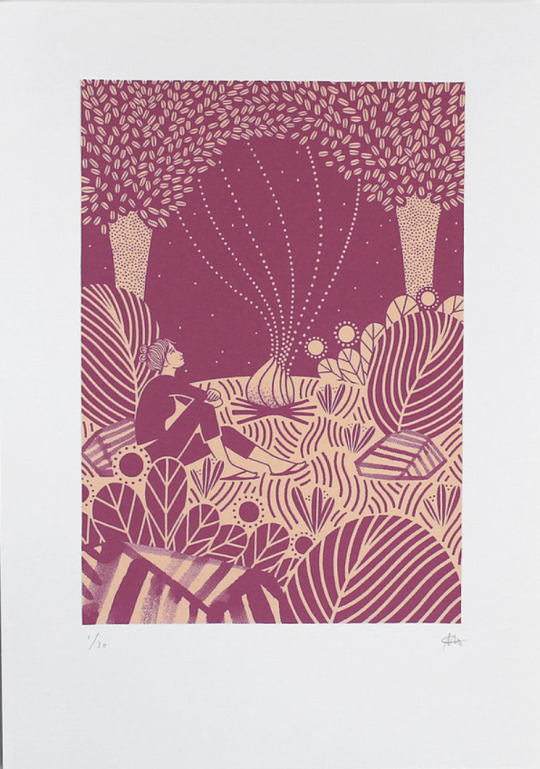
Laurie Hastings. (n.d.). Portfolio | LAURIE HASTINGS Illustrator and Printmaker. [online] Available at: https://www.lauriehastings.com/ [Accessed 1 Mar. 2021].
My analysis of Laurie Hastings ‘The Adventurers - Campfire’ starts with my initial feelings on the overall, composition, block colours and line work she has used to create this piece. My initial reaction was to the process of how this piece was made, as at an initial glance I thought it was a Lino Print, very similar to another artist I’ve researched called Michelle Hughes in terms of line work and block colours. I feel the simplification of only two blocked colours, one darker, one lighter which have no tonal range, shadows or highlights to them, then to be applied in layers create this effect. I get a real homely, warming feel from this, warmth relating the fire and her use of organic lines and shapes in waves. I can feel movement within the design to how it has been illustrated this way with fewer straight lines and the trees being more suggestive than realistic shapes. The figure in the print is of a woman looking out at the sky looking comfortable in her overall position. My own relation to camping and a sitting in front of a fire is that I’ve always found it very peaceful which also, strengthens the warmth intuition as I have a personal relation to it. The ground has also, been flipped in colour to create extra dimension of shape, grounding and stability. Highlighting this area to be different to the sky and other elements of the print. After looking deeper, I discovered this piece being part of a series of 3, with the other designs having similarities within their illustrative forms. Making all 3 designs a cohesive collection together. Looking at the bottom of the print your eyes automatically are drawn upwards due to all the different marks/lines facing vertically then interconnecting with different elements then drawing focus back looking at the print and its entirety.
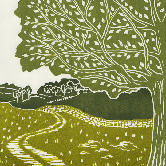
michellehughesdesign. (n.d.). Yorkshire Dales III, original linocut print. [online] Available at: https://www.michellehughesdesign.com/yorkshire-dales-3-linocut-print?lightbox=dataItem-j97a2han [Accessed 10 Mar. 2021].
Chuck Sperry
Chuck Sperry is another screen-printing artist I’ve come across recently. He’s an American printmaker based in San Francisco also, working from his studio there. He exhibits his work internationally propelling his American rock poster style into fine arts using a silk-screen process. His use of text, patterns and various materials to print on caught my eye as I’d not seen this before.
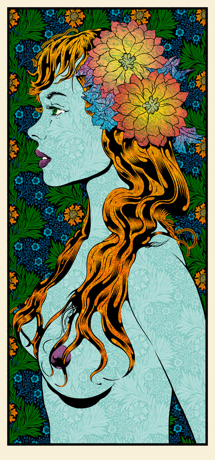
Chuck Sperry. (n.d.). Original Art Archives. [online] Available at: https://chucksperry.net/category/original-art/.
My analysis of Chuck Sperry ‘Vivien 2016’ starts with my initial feelings on the overall, composition, colours, patterns and influences that have gone into creating this print. My eyes are drawn to the initial profile of a woman as the title suggests is Vivien. Vivien reminds my highly of Marvels villain Mystique in the X-men series due to her being topless, the colours used for her hair and body along with the watermarked style texture of the background pattern showing through. I also researched his influences and among them was the era of pop art which I can see this print is heavily inspired by. Roy Lichtenstein portrayed women in many of his designs and the facial features and hair of ‘Vivien’ here compared to his ‘M-Mm Maybe’ print look very similar to me regarding there cartoon comic style. Although I do see the differences, I see I that Roy used dots to add definition in specific areas strengthening comic references whereas Chuck Sperry uses florals it his work. The floral head piece which looks as if it’s glowing from radial illusion created is the most eye-catching part of this design dividing the figure away from the busy background. Highlighting aspects of the background, the style of how the leaves have been drawn remind me of Celtic symbolism, and a traditional illustration of a Scottish thistle, the repeated pattern and the colours used a similar to a tapestry. Chuck Sperry has created a series of these designs uses the description of ‘muses’ and female names to title them, each design has similarities to the hair, florals and beauty creating a series print. Although his more recent work in this style looks less like a comic and more like a realistic portrait of a woman. The title of Muse to me highlights the feeling of confidence, strength and beauty which I feel is portrayed along with sensuality.
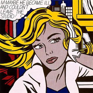
Wikimedia.org. (2021). [online] Available at: https://upload.wikimedia.org/wikipedia/en/2/23/M-Maybe.jpg.
All of the prints I’ve chosen have some form of an organic natural feel I find I am most inspired by these elements in terms relating to my own work. Different aspects of each artist drew me in for the analysis of their work. I find Kate Gibbs expressive abstract style very freeing with the use of her bold colours and layering. Whereas both Laurie Hastings and Chuck Sperry although using the same printmaking process have more of a graphical, planned technical feel. While writing up my analysis I wanted to include both styles of working as depending on my mood I like to work either way.
Word Count- 1,532
3 notes
·
View notes