#pop designs
Explore tagged Tumblr posts
Note
https://www.tumblr.com/popdesigndrama/738342359768645632/this-a-personal-thing-but-i-dont-like-it-when-a?source=share
this actually goes the other way too. as someone who does commissions and adopts, it makes me so uncomfy when my clients try to act like they're my friend just because they've commed me a lot or bought more than one adopt from me before;; it feels parasocial, like, i don't know you so why are you dming me every other day when the only time we talked before was me doing work for you...
both clients and creators should have professional relationships, none of that weird trying to be friends crap as some way to get something from the other (whether it be money or free stuff). -🃏
#popdesigndrama#drama blog#pop designs#pop designers#toyhouse#toyhouse drama#popular designers#toyhouse dramas#popdesigndramas
5 notes
·
View notes
Text
Modern PoP Designs For Lobby Look In 2024
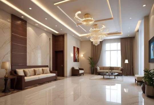
Why Choose PoP Designs For Your Lobby In 2024?
Versatility: PoP is incredibly versatile, allowing designers to create intricate patterns, textures, and shapes that suit any aesthetic
Durability: Despite its delicate appearance, PoP is surprisingly durable, making it ideal for high-traffic areas like lobbies.
Cost-Effectiveness: Compared to other decorative materials, PoP is relatively affordable, making it an attractive option for budget-conscious projects.
Customisation: PoP designs can be customised to suit your specific vision, whether you prefer a minimalist look or something more elaborate.
Timeless Elegance: PoP designs have a timeless elegance that adds a touch of sophistication to any space, ensuring your lobby remains stylish for years to come.
Trends In Modern PoP Designs For Lobbies In 2024
1. Minimalist PoP Ceiling Designs
Minimalism is a prevailing trend in lobby design for 2024, with many properties opting for sleek and understated PoP ceiling designs. These designs often feature clean lines, smooth surfaces, and neutral colour palettes to create a sense of spaciousness and serenity in the lobby space.
2. Sculptural PoP Wall Panels
PoP wall panels are gaining popularity as a way to add depth and visual interest to lobby interiors. In 2024, sculptural elements such as waves, curves, and abstract forms are being incorporated into PoP wall panels to create dynamic focal points that capture the attention of visitors.
3. Geometric Patterns And Shapes
Geometric patterns and shapes continue to be a favoured choice for PoP designs in lobbies this year. From intricate tessellations to bold, oversized shapes, geometric motifs add a contemporary edge to lobby spaces while maintaining a sense of order and symmetry.
4. Art Decor-Inspired PoP Features
The timeless glamour of Art Deco design is making a comeback in 2024, influencing PoP features in lobby spaces. Elegant curves, geometric patterns, and luxurious finishes like gold or silver leaf are being used to evoke the opulence of the Roaring Twenties.
5. Integrated Lighting Fixtures
Lighting plays a crucial role in enhancing PoP designs, and integrated lighting fixtures are a key trend in lobby design for 2024. LED strip lights, recessed lighting, and strategically placed spotlights are seamlessly integrated into PoP installations to highlight key features and create ambience.
6. Textured PoP Surfaces
Texture adds depth and tactile interest to PoP designs, and textured surfaces are a major trend in lobby design for 2024. From subtle ripples to bold textures reminiscent of natural materials like stone or wood, textured PoP surfaces add a sensory dimension to lobby interiors.
7. Multi-Level PoP Ceilings
Multi-level ceilings are adding drama and architectural interest to lobby spaces in 2024, and PoP is the perfect material for realising this trend. Stepped or tiered ceiling designs create visual intrigue and define different zones within the lobby area. To know more About POP designs
0 notes
Text
PVC Ceilings For Living Rooms: Why They Are The Best Options
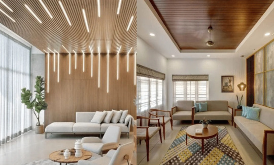
Do you want to upgrade your living area with modern interior design? Confused about what ceiling design to choose for your living area? PVC ceilings are on trend and are also the best options for your living rooms. Let’s discuss the reasons why you should go with PVC Ceiling designs.
You can also hire Ryan Creative Living- a top interior design company specializing in transforming residential and commercial spaces. We have a team of skilled and creative designers who can help create a perfect living space with the best ceiling designs. Read More PVC Ceilings For Living Rooms
#FALSE CEILING FOR LIVING ROOMS#PVC CEILINGS FOR LIVING ROOMS#bathrooms and kitchens#PVC ceilings#POP designs
0 notes
Text

"Mon Amour." Magazine cover illustration for La Vie Parisienne, November 20, 1920. Gouache and watercolor on paper. Rene Vincent.
#illustration#art#vintage#magazines#poster#posters#pop culture#graphic design#design graphique#design grafico#1920s#art nouveau
7K notes
·
View notes
Text

Artwork Copyright © Tyler Spangler
Shop: shoptylerspangler.com
#tyler spangler#art#design#tylerspangler#typography#illustration#artists on tumblr#collage#pop art#graphic design
2K notes
·
View notes
Text

the otter pops! a lil redesign of the original six zippy flavors
#misc art#otter pops#character design#redesign#inspired by those cute japanese otter plushies#me n my bf loooooove otter pops they're the best
2K notes
·
View notes
Text
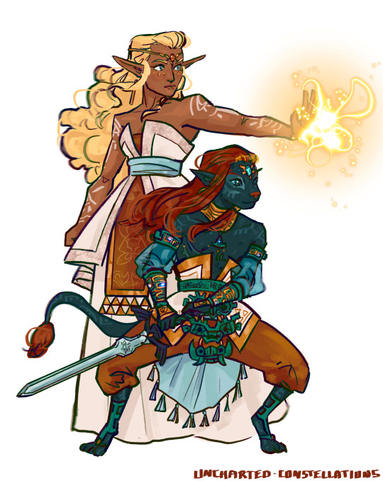
The Princess and Hero of the First Great Calamity
The orange snoot is very important to me….
#tloz#princess zelda#link#assumedly?#botw#totk#technically#loz redesigns round 2#the first great calamity#the ancient heroes aspect#the ancient hero’s aspect#art#my art#redesign#listen this is probably the one and only time ill draw something furry so if it looks a bit wonky i dont really care lmao#this is one of the few designs where im Under designing one of the characters#ie the heroes aspect is such a messy design#i went of the mural a little bit more for the coloring so a little more orangey red involved in his design#and also changing his face to look a little less offputting#and the greener looking eyes from the mural#the darker fur also helps the teal pop#but yes i made his armor a little less zonai-y and a tad more guardian inspired?#i didnt take away all the zonai vibes because he’s seemingly related to them somehow#i do wish we had a timeline for how long after rauru sealed ganon that this calamity happened#but oh well#but yeah uh zelda#vaguely based on sonia#thats pretty much all i have to say about her lmao#i used more neutrals on her dress to semi emulate the pure white of the mural#while also bringing in more of those sheikah tech colors
2K notes
·
View notes
Text

perforated squares for LSD
Blue Unicorn, San Francisco, ca. 1980. 31⁄4 × 31��4 in.
4K notes
·
View notes
Text


T-120 Videocassette (front and back)
#vhs#cassette#mt fuji#mount fuji#nostalgia#cassette tape#aesthetic#a e s t h e t i c#retro#80s#90s#design#pop art#packaging#graphic design#supercassette#graphic art#warakami#warakami vaporwave#art
806 notes
·
View notes
Text
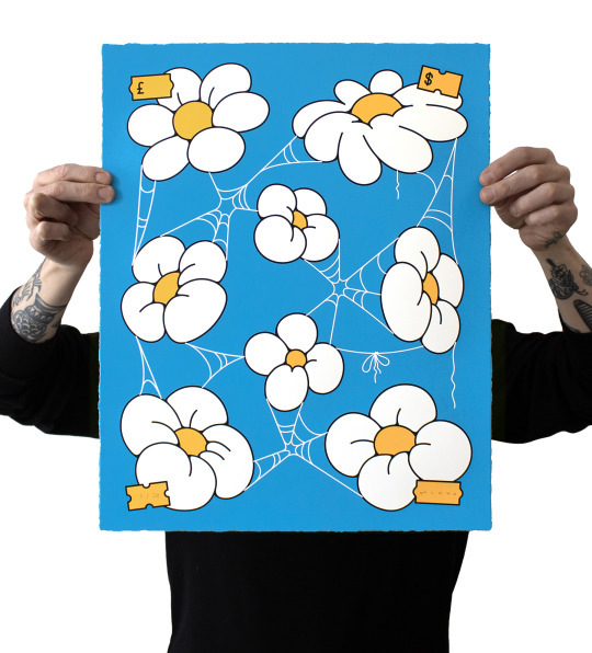


Available now: Mikko Heino's "Pushing Daisies"
Currently available at Hyper Editions is artist Mikko Heino's exceptional 3 color screenprint, "Pushing Daisies."
A limited edition of only just 30 copies!
Pick one up over at Hyper Editions!
Featured on Juxtapoz!
#art#illustration#graphic design#limited edition#fine art#contemporary art#modern art#pop art#mikko heino#painting#artists on tumblr#sculpture#drawing#artwork#prints
1K notes
·
View notes
Text


it's finally done, and it's probably the gooiest garbage i'll ever make.
credit to my new buddy @i-love-tdp-if-you-can-tell for doing almost all the characters' flat colors!! i am so so so infinitely thankful to them bc otherwise none of the other efforts of making this would have happened. between the lineart, backgrounds, shading, and touch-ups, these five pages have taken years off numerous braincells' lifespans, and without their help, may have annihilated my entire brain capacity.
if you like, please reblog! we put in a Lot of time and effort into this!
you would think that between last time (one other event) i tried comic-ing and now, i would've learned to not handwrite the text, but alas...
thank you for answering my plead for help, sky! and for managing to work around my design inconsistencies and sketchy lineart <3 ik you said you didn't need anything, but if you ever decide you want an art, hit me up any time :)
and to the tdp fandom, whoops… sorry for all the requests rotting in my inbox. it was a fun september and a fun six years of lurking, but alas i think i will be bailing for the moment. maybe you'll see me around.
#tdp#the dragon prince#the dragon prince fanart#tdp fanart#soren tdp#tdp soren#corvus tdp#tdp corvus#sorvus#that's a technically--implied-#lychee's trash art#you guys likely will not be seeing tdp art from me for a hot minute#so please enjoy my offerings#btw the costume details are hell#also corvus' old design was vastly superior#there i said it i'm a hater of arc 2 corvus design#the struggles of the designs i want to draw versus aligning to canon#to be clear that's just arc 1 corvus & clean shaven arc 2 soren LOL#sorry i'm also a hater of soren's facial hair#off topic i really would like 2025 to be my return to ao3 so might see less lychee art#finding that it's easier to pop out a doc and write fic between lectures#sort of thinking to start pulling up on yt too but who knows#you can probably tell the parts where i gave up lol sorry it's a bit scuffed#i'm really tired my eye has been twitching all day#a lot of the details are a bit scuffed and the shading's sorta lazy but#there's a lot of art here okay </333
542 notes
·
View notes
Note
83685888/survuls-style-looks-more-and-more-like-knites
That’s bc they’re related irl. Sibling art tends to do that if they learn off each other
Huh, never knew that. That’s pretty cool. -🃏
#popdesigndrama#popular designers#pop designs#pop designers#toyhouse#toyhouse drama#toyhouse dramas#popdesigndramas#drama blog#knite#survuls
3 notes
·
View notes
Text


This is your protagonist, everyone. This is the man sap that we’re supposed to cheer for.
#disney fnaf#disney michael afton#michael afton#this michael would unironically say stuff like “dont sweat it pops”#fnaf#fnaf fanart#laddersarts#artists on tumblr#i keep thinking about how an actual disney-esque fnaf movie would go (bc ive been picturing some animated sequences) and-#one obvious starting point is that michael would be the protag. i also realized that i never actually made a proper michael design-#before so this was a bit of an experiment on what I think he could look like.#ive also-also kind of realized i should tag characters individually with “disney [name]” bc i notice that its a common question about-#whether ive drawn a stylized version of a specific character or not. so since i already tag “disney fnaf” bc thats the main inspo and style#that im going for i figured that it could be an easy way to see if ive drawn a stylized version of a certain character by checking if i-#have something tagged with them (especially since ive been planning on doing some more of those stylizations to other characters recently)
852 notes
·
View notes
Text


A couple of vintage inspired Christmas cards for our degree exhibition shop!
#didn’t print many this year but I’ll be selling by dm as well#cos our pop-up shop is getting very little traffic#it’ll have to be UK sales only tho#cos posting costs#maybe start tomorrow but I’ll update on post#also#can I just say being on this design course has made me realise Why and How Much I love illustration instead#there is something so lovely about being able to tell a story in a single image#my art#wwi#nutcracker#illustration#historical art#historical illustration#vintage inspired#world war 1#christmas truce#ballerina#soldier#christmas
1K notes
·
View notes
Text

River to Sea, Palestine Will Be Free!
#art#artists on tumblr#digital art#vintage#expiremental#pop art#vintage art#vintage posters#graphic design#popart#palestine#palestinian genocide#israel apartheid#israel palestine conflict#palestinians#genocide#free palestine#gaza#support palestine#isreal#israeli occupation#israeli apartheid#nakba#al nakba#isntreal#communist#communism#al aqsa flood#al aqsa mosque#al aqsa storm
4K notes
·
View notes
Text
OC introduction

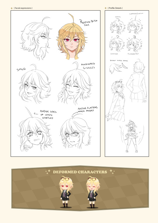
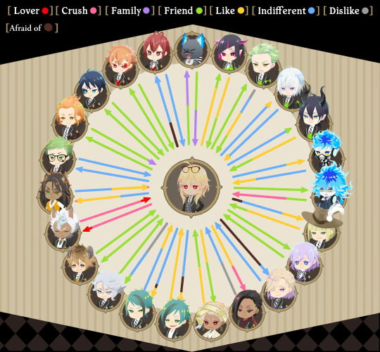
[Thank you @haryuwu, @stestylius-arts and @ai-kan1 for the templates they look so clean and organized and I love them 😋]
Personality:
At first glance, Vic comes across as reserved and ordinary, maintaining cordial relationships without actively seeking friendships. However, once she grows close to someone, her brighter, more playful side shines through—she’s witty, bantering, and a bit tomboyish. She dislikes feeling restricted and tends to rebel against rules she finds unfair or unreasonable. While she firmly denies being a "mom friend," (she repulses the thought even) her actions often tell a different story. She’s fiercely loyal, quietly looking out for her friends and always stepping in to support them when they’re in need, even if she doesn’t admit it outright.
Though Vic sometimes comes across as naive or a bit of an airhead, it’s often by design—she purposefully plays the fool, keeping others guessing about her true thoughts and intentions. Why does she do this? Well… whatever the reason, there’s more to her than meets the eye.
Backstory:
Vic was once a naive, pure-hearted child, eager to please and willing to follow anyone’s whims. That all changed after a traumatic incident during a school trip to the woods. A classmate told her, “Wait right here and don’t move. I’ll be right back.” Obediently, she stayed put, unnoticed by her teachers or classmates. Hours passed as she waited, terrified and alone, until she was finally found by school staff after her mother reported her missing. This event left a deep scar on Vic, and the phrase “I’ll be right back” still triggers a wave of unease in her. Afterward, her submissive tendencies only worsened. She believed that by doing everything people asked, she’d be liked and accepted, avoiding the risk of being abandoned or badmouthed. Throughout middle school, this behavior made her an easy target for manipulation and psychological abuse. By her final years of high school, something within her snapped. The years of mistreatment awakened a rebellious, sharp-edged side. Vic stopped letting people walk all over her, becoming grumpier, colder, and more distrustful. She built a fortress around her true emotions, frequently lying or feigning indifference to protect herself. Though she hated the version of herself her pain had created, she learned to survive in her own way.
After graduating, Vic celebrated the end of that painful chapter in her life and vowed to reinvent herself. But just three days later, her plans were upended when she was hit by a mysterious carriage.
After the events of the prologue and her enrollment at NRC alongside Grim, Vic was struck by the mortifying realization that she’d have to relive high school all over again. Adding insult to injury, she remembered that, at the time she was hit by the mysterious carriage, she had been on her way to celebrate her graduation with an açaí smoothie—a treat she never got to enjoy. To this day, she can’t help but lament the smoothie that never was.
Notable relationships:
Jack Howl 🐺
At first, Vic was intimidated by Jack, fearing he’d be as condescending and judgmental as her classmates from middle school. However, once she got to know him, his caring and loyal nature quickly won her trust. Because of her magicless status and petite stature, Jack’s protective instincts naturally kick in around her. He often escorts her across campus, which leads to them spending more time together and growing closer.
Vic admires Jack’s honesty and strong sense of justice—qualities she found rare during her school days. His loyalty and protective behavior deeply touch her, even when he tries to hide it behind his tsundere demeanor (which she secretly finds adorable). Around Jack, Vic feels safe in a way she hasn’t before.
As their bond deepens, they begin to pine for each other, turning what should be simple interactions into painfully awkward moments. Jack’s straightforward and genuine nature makes Vic’s carefully constructed mask of aloofness crumble in his presence, leaving her vulnerable and overwhelmed by her emotions. Her feelings for him force her to confront her fears and insecurities, often leaving her shaken.
"If only there was someone like you by my side back then… maybe I wouldn’t have…!”
Leona Kingscholar 🦁
Initially, Vic and Leona barely interacted. He seemed indifferent to her presence and quietly appreciated that she didn’t nag him or try to change his lazy ways. However, her frequent visits to Savanaclaw piqued his curiosity, and he couldn’t help but wonder if she was some kind of thrill-seeker. Her seemingly fragile, harmless appearance contrasted sharply with the boldness it took to linger in a dorm full of beastmen, leading him to nickname her “little mouse.”
Vic usually treats Leona with sweetness, but he sees right through her doe-eyed facade. Her true motives remain a mystery to him, and that intrigue makes him determined to unravel her secrets. To that end, Leona enjoys teasing and flustering her, just to watch her carefully constructed mask crack.
Leona is also keenly aware of Vic and Jack’s feelings for each other, which he finds highly entertaining. He takes great pleasure in cockblocking taunting them about it, using his sharp wit to nudge them closer to confronting their emotions. His teasing is particularly merciless with Jack, often warning him with sly remarks like, “You’d better keep a close eye on your prey, or she might just wander into the lion’s den.” What exactly does he mean by that? Who knows…
Ace Trappola ❤️ and Deuce Spade ♠️:
Vic’s first friends at NRC, Ace and Deuce quickly became two of her closest companions. The trio spends much of their time hanging out and bantering, creating a dynamic full of playful teasing. Her provocations often escalate with Ace, leading to occasional spats, though they’re always quick to reconcile.
With Deuce, Vic adopts a softer, almost sisterly demeanor, though she doesn’t hold back from teasing him—just not as intensely as she does with Ace. Around them, Vic maintains her cool, tomboyish exterior but will sometimes show emotional vulnerability when she needs comfort or support. Ace, however, never misses a chance to mercilessly tease her about her crush on Jack, much to her frustration (and embarrassment).
Idia Shroud💀:
Vic and Idia became friends through the Board Game Club, bonding over their shared interests and similarities. During club activities, they often team up to gently? bully and bicker with Azul, much to their mutual amusement. While Vic enjoys their camaraderie, their interactions mostly happen through DMs, as Idia’s shut-in nature makes face-to-face meetings rare—despite her frequent insistence that they hang out more in person.
Idia has developed a crush on her, which makes him even more hesitant to meet up outside of the club. He’s painfully aware (and secretly salty) about her preference for the athletic types in Savanaclaw, which makes his hopes—if he had any—practically nonexistent. For now, he keeps his feelings to himself, hoping to drown them. Vic, ever the supportive friend, often encourages him and occasionally flirts or gets touchy to tease him, delighting in his flustered reactions. Is she aware of his feelings? Who can say...
Azul Ashengrotto 🐙:
Vic initially had a strong dislike for Azul, finding his sweet-talking, calculating nature, and tendency to demand repayment for even the smallest favors uncomfortably reminiscent of her old classmates. She was openly hostile toward him, often meeting his charm with sharp-tongued, vulgar retorts. Yet, Azul remained undeterred.
Over time, as they spent more moments together in the Board Game Club, their constant bickering and competitive banter began to grow on her, almost without her noticing. She realized Azul was more "relaxed" during club activities, which made him easier to talk to. Vic now views him as a sort of rival, someone who challenges her wit and strategies, though neither likes to show vulnerability or weakness around the other.
If asked whether they’re friends, Vic will promptly deny it with a firm “no,” while Azul confidently responds with a smug “yes.” Despite their clashing personalities and opposing morals, they quietly look out for each other in their own way—remembering birthdays, exchanging souvenirs, and occasionally offering subtle gestures of support. Deep down, Vic knows Azul is an important friend, but she’d rather swallow a rock than admit it. Tsuntsun
Jamil Viper 🐍:
Vic harbors a superficial, puppy-like crush on Jamil, idolizing him and finding everything he does impossibly cool or impressive. Jamil, however, doesn’t seem to return her affections—or trust her, for that matter. He usually cuts her off with polite but firm indifference, which only seems to intensify her fascination, much to his exasperation. To Jamil’s dismay, Vic sighs dreamily whenever he’s cold or sharp-tongued with her (masochist much??) but gets utterly confused and flustered when he shows any hint of worry or care for her.
While Jamil would never admit it, he doesn’t entirely dislike her attention. Her admiration strokes his ego, and perhaps—just perhaps—he’s considering how he might use it to his advantage... t this doesn't seem very healthy...
Rook Hunt 🏹:
Like most people, Vic initially felt uneasy around Rook’s overly flamboyant and romantic demeanor. She couldn’t understand his fascination with her or his flowery praise, often responding to his compliments with pragmatic retorts or modest deflections. However, as time passed and she recognized the sincerity behind his words of encouragement, her wariness faded, and she began to trust him more.
Knowing it’s nearly impossible to keep secrets from Rook, Vic sometimes reluctantly vents her frustrations and insecurities to him. In turn, he offers thoughtful advice and unwavering emotional support. He nicknames her “Mademoiselle Fantôme” (ghost) and seems to see right through her composed exterior.
Like Leona, he’s aware there’s more to her than meets the eye and enjoys analyzing her hidden depths. Rook takes particular delight in evoking various reactions from Vic, describing her as a “kitten with hidden claws,” always intrigued by her blend of aloofness and fire.
Trivia:
While Vic appears tomboyish and sisterly with the first years, Jack is the exception. Around him, she’s notably sweeter and more bashful.
The more nervous or flustered she becomes, the higher-pitched (and more pathetic) her voice gets.
Vic used to be close with her older sister, a prosecutor. Her strong sense of justice and argumentative nature were heavily influenced by her sibling.
When heated, Vic becomes highly argumentative, delivering well-constructed, logical points to dismantle her opponent’s stance—a rare display of bold confidence.
Her dream is to become a detective/investigator.
Vic doesn’t get angry often, but when she does, it’s described as a “cold, merciless ire with sharp words that could make a grown man cry” (Ace’s words).
Though she’s a bit of a coward and dislikes confrontation, her quick thinking and improvisation often help her slip out of sticky situations. (Both Leona and Rook take notes on her sharp survival instinct.)
Despite her unassuming appearance, Vic has surprising leg strength and flexibility from self-defense classes she took as a child. She claims she’s rusty and fell out of practice for the most part, but her kicks prove otherwise.
Her birthday (February 4) is the same as Cater’s, so their celebrations are often combined in Heartslabyul. Cater affectionately calls her his “twinsie” and refers to her as “cute lil sis.”
Floyd nicknames her “Axolotl” and teases her relentlessly about her height. He especially enjoys being overly touchy with her in Jack’s presence.
Vic occasionally treats herself to Mostro Lounge visits to gossip with Jade, often about Azul’s defeats in the board game club. Jade uses this intel to tease and blackmail Azul later.
The Light Music Club adores pampering her and repeatedly begs her to join as a singer, but she always flusteredly declines.
Like Ace, Vic can be mischievous and a bit greedy. She shamelessly accepts Kalim’s generous offers of money (though she hopes Jack doesn’t find out...)
Vil intimidates her to no end with his sharp gaze, but she secretly admires him and dreams of having him give her a makeover someday. Rook frequently (and gleefully) tries to push her to approach Vil, much to her horror.
Malleus believes they are closer friends than they actually are, often due to misinterpreting her words and actions. Vic, too kind or maybe scared to correct him, finds herself roped into his gargoyle monologues during their awkward little outings.
#twisted wonderland#twst oc#twst mc#twst yuu#yuu/mc#twstvic#hi its been almost 3 years since i introduced her properly and i compelled 2 months worth of shower thoughts in this#NEW DESIGN REVEAL *party pops*#i swear im rlly fucking embarrassed about the coffin icon bc i didnt know what else to do. but i also didnt want to leave it blank#''oh shit whats one characteristic that deeply resonates with her character and will make ppl look at it and immediately think of her''#''its......its the ahoge isnt it.......''#is it blatant obvious the mystery novel protagonist syndrome here (coughnhbs not aceattorney or umineko inspired at all 😇#i encourage asks if youre curious about anything else abt her !! hehe#myart
474 notes
·
View notes