#pin up lithograph
Explore tagged Tumblr posts
Photo

(via Pulp International - Life sized pin up lithograph of Pat Hall)
U.S. model and actress Pat Hall - 1953
29 notes
·
View notes
Text
"Occupations for Women" 1887 trading cards


Bandmaster/ Fireman/ Teacher Highwayman/ Fisherman/ Sailor
#lesbians pspsps come get your vintage crossdressing pinup#id in alt text#ask to tag#lithograph#19th century#pin up#newspaper clippings#probablyrambles#victorian era#met museum#1880s
321 notes
·
View notes
Text

Billy DeVorss - "Honey Moon" - 1939 C. Moss Calendar Co. Lithograph - American Pin-up Calendar Collection
258 notes
·
View notes
Text

Hajime Sorayama: 'Gold Robe' (1989)
#hajime sorayama#hajime sorayama archive#gold robe#pin up girl#1989#super realism art#body#lithograph#illustrations#japan
226 notes
·
View notes
Text

George Petty Art Deco Pin-Up Girl Lithograph
Source: Independence, MO Carrell Auctions
#george petty#art deco#lithograph#pin up#pin up girl#will this go against community guidelines? lets find out together#auction#vintage#link
97 notes
·
View notes
Text

"Right Number" 1958 Lithograph
25 notes
·
View notes
Text

1956 pin-up lithograph featuring an unknown model titled "Fair and Warmer", likely photographed during one of the colder months of that year.
#pinupphotography
6 notes
·
View notes
Text
Album Review: Weezer "The Blue Album 30th Anniversary Edition"
In 2024 Weezer are alt-rock elder statesmen, but back in the early 90s they were just making a name for themselves in the L.A. scene. A band equally influenced by metal bands like Quiet Riot as they were The Beach Boys. They were too nerdy and full of irony to fit in with L.A.'s metal scene and it was a little before emo had begun. But it was their 1994 debut album Weezer (known as The Blue Album) on DGC that put them on the map. Their brand of power pop was reminiscent of new wave and particularly The Cars and appropriately, the album was produced by The Cars leader Ric Ocasek. I first became aware of the band in the Fall of 1994 when I heard “Undone (The Sweater Song)”, which had this infectious rhythm that just stayed in your head long after hearing. That music video was directed by Spike Jonze, who did their so memorable next video “Buddy Holly”, which is amazing in the way it combines classic Happy Days footage with newly shot footage of the band performing at Big Al’s! I got the album around that time. It didn’t exactly set the world on fire when it was first released in May 1994 (the alt-rock world was still mourning from Kurt Cobain’s death a month earlier), but in the years that followed, The Blue Album has been looked at as leading the Emo movement and it’s appeared on many Best-Of lists, notably 90s lists. I saw them in 2005 when they co-headlined a tour with Foo Fighters, known as the Foozer Tour. Great band! Singer/guitarist/songwriter Rivers Cuomo is still a power pop genius. To celebrate the 30th anniversary of the band's biggest selling (and arguably best album), UMe is releasing a deluxe box set this week.

original album cover
The band had formed in 1992 with Cuomo, drummer Patrick Wilson, bassist Matt Sharp (he left the band in 1998), and after starting with guitarist Jason Cropper in 1992-93, Brian Bell replaced him and the classic Weezer lineup was in place. This box set is a deep dive into the album and the demos and live recordings of that era. I got to review the 3-CD set. CD1 is the remastered album and BBC recordings. CD2 is early Kitchen Tape demos and early recordings. CD3 is early live recordings and LMU sessions. There is also a fanzine with liner notes from the band's friend and collaborator Karl Koch, lithographs, a poster of Weezer as Kiss, song-themed sticker sheet, twelve-sided die, enamel Bokkus pin, and the box set boasts “sweater” embossed graphics complete with a pullable and retractable thread.

some of the goodies that come with this box set
Here is the thing with this box set: It is definitely For Fans Only, but not nearly as much as I thought it would be. I thought you were going to have to be a Weezer fanatic to truly appreciate it, but to my surprise it was kind of impressive with some of the early rarities. There's loads of bells and whistles that fans are going to eat up, but the biggest treat for me as a fan of The Cars is hearing their early rehearsal demo cover of "Just What I Needed" that they did to woo Ocasek, which worked. He worked his magic on this album and produced two more albums with them. There are some gems in here, but a double album would've been better. If you can afford it, there's definitely some cool bells and whistles in the packaging itself. But the real treat is the album itself, still their best IMHO!
For info on the 30th anniversary Blue Album
Original album: 4.5 out of 5 stars
30th Anniversary Edition: 3.5 out of 5 stars
4 notes
·
View notes
Text
FITFWT23: KAUNAS RECAP
Concert number: 48
Date: 8 SEP 2023
Place: Zalgiris Arena
Capacity: 20,000
Venue: [oli crump] [oli crump] [jdelf] [program] [oli crump]
Livestream
Louis’ IG Story
LTHQ Twitter and Instagram [x]
Concert Group Picture [close up]
Fashion: Neill Barrett t-shirt, Neil Barrett IG post and IG story, Sergio Tacchini tracksuit
Lithograph
Setlist
Photos: [HQ] [HQ] [with fans] [with fans] [with fans] [with fans] [with fans] [with fans] [x] [x] [x] [with fans] [x] [x] [x] [with fans] [with fans] [with fans] [with fans] [face] [with fans] [x] [with fans] [with fans] [x] [x] [gifs] [with fans] [barricade] [the moment and the photo] [x]
Videos: [x] (HEADLINE!)
Speeches: Fucking hell you can hear a pin drop in here [x]
Outro: Can’t Help Falling In Love, by Elvis
Press:
Trends: [x]
Merch: [x]
Misc: Joshua tweet, Helen IG story, LT band, lthq TikTok
ZOUIS
Rumor: AOTV to be available on Paramount+ in October 2023
18 notes
·
View notes
Text

In "Etched In Stone" by @SylWritesStuff, how did Aziraphale get himself into this situation and—more importantly—how will his lithograph sketch of Crowley turn out? Only in Pin Me Up 2: A Good Omens zine! Preorder today at: https://pinmeupzine2.bigcartel.com/
#good omens#crowley#aziraphale#good omens fanart#good omens fanzine#Good Omens Zines#Good Omens Fanfic#Pin Up#Pinups#Pin Me Up 2#Zine
9 notes
·
View notes
Text

"The Genius of Advertising Could No Further Go"
National Police Gazette (Vol. 36, Iss. 147).
Magazine illustration, 17 July 1880.
Archive Link.

Fair warning: yapping ahead. Things I explore: the National Police Gazette, the illustration, and a teeny history of 19th-century women brothel owners... and also an apology because I didn't mean to write all of this.

THE NATIONAL POLICE GAZETTE

"THE Genius of Advertising Could No Further Go—An Enterprising Proprietress of a Bagnio Places a Photo-Lithograph in Her Window Setting Forth The Charms of the Inmates; New York City" (full caption) is from the National Police Gazette, a magazine founded in 1845 by Enoch E. Camp and George Wilkes that covered murders, outlaws, and sports—as any man-interested tabloid would (I'm not a man, but yippee-ki-yay, would I tune in). And, of course, the gazette would include scandalous (on the cusp of obscene and illegal (Victorian era, keep that in mind)) images of female sex workers and performers (think of it as the time's Playboy... silly enough, they also had Marilyn Monroe for their cover, this being 1956 instead of PB's 1953).
TRAGICALLY, the National Police Gazette would see its largest spike in popularity during the Great Depression before suspending publication from 1933-1935 due to selling ownership twice, being sold again in the late sixties, and then killing the magazine's production in 1977. A whole 132-year reign, including being the prime news for Boxing in the 20s (the editor and proprietor, Richard Fox, handed studded belts to champion fighters) and being barred by USPS, declares this magazine not only a historical relic but also a forgotten yet still-living America—one for the men (and, of course, us girls. After all, this was peak American).

ILLUSTRATION

BACK to the picture. The caption mentions the word 'bagnio,' which, upon scanning, accidentally read the N as an X, so I searched up the word to make sure I was reading it entirely correctly—I was. It's an archaic term for 'brothel' (a place where patrons visit prostitutes). The illustration depicts men staring at images of prostitutes that are pinned on the window by the owner (can't blame men for using women to make money as, in this situation, it's a female owner).

WOMEN & BROTHELS

SURPRISINGLY enough, women dominated Western America, building communities and providing for the economy. The fact I call it surprising is because I just learned this (Feminism should fight against history erasure because this should've been a widely talked about chapter in HS American History)! As much as I believe women shouldn't sell their bodies and that we need to better take care of women (forced prostitution—sex slavery—runs the prostitution industry), I can't deny the history women have with Bordellos, not as employees but also as owners. Madams are the title of these female brothel owners, and they were common back in the 19th century. Most of the time, Madams were entry-level (showgirls) who made almost as much as factory workers and worked their way up to the top or used their money to create inns and parlors, expanding their wealth. These women, though taking advantage of their own and other girls' (usually aged from their mid-teens to middle-aged) bodies, capitalized and found their place in labored society... something that can be considered early feminism. They planted themselves in the economy and made it known that they could own property, make money, and (yes, even in 1800s United States) vote. That, you can applaud.

APOLOGY

I didn't actually expect to yap on this post; I was writing my book, scrolling for images, and found this one, and wanted to include the full caption... which ended down a rabbit hole😭

#art#illustration#magazine#1880s#victorian#the gilded age#gilded age#artwork#history#brothel#american#the national police gazette#national police gazette#feminism#american history#us history#19th century#1800s
4 notes
·
View notes
Text
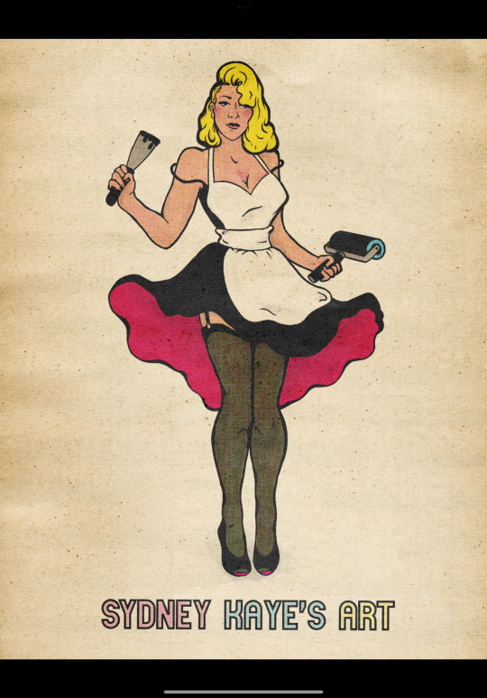
Part of my Branding.
First she was an aluminum ball ground lithograph. Then I did an MDF woodcut. And then I did her digitally in half tone.
I am a tall lady, I used to have neon yellow hair, and I do like to dress like a pin-up sometimes. Hi!
#printmaker#printisnotdead#small artist#procreate#illustration#pinup art#pin up illustration#pinupdrawing#50s pinup#retro pinup#pinupgirl#halftone#small business
4 notes
·
View notes
Text

Ted Tinkler, Painting and Printmaking
Winner GSA Sustainability Degree Show Prize Summer 2023
"they are containers of fluidity"
Ted Tinkler (they/them)
My practice centres around handcrafts – playing with ideas of intimacy, liveliness, multiplicity, and trans- ness. I work with the animacy and performativity of crafted objects. They are my co-collaborators. Access and care are at the heart of my practice. I move through making by prioritising intimacy, space, and vulnerability over a productionist, scarcity-based mindset. My work tends to a slowtime.
Deep in the details of hand crafts.
Of spinning, knitting, quilt-making, and wood-working.
This installation is made of many hands.
These objects are full of liveliness and animacy.
Of tales and futures. Of deep roots covered in soil. Of naming as personhood.
Of intimacy lying at the boundaries. As sites of radical, speculative imagination. To cross these boundaries. Back and forth.
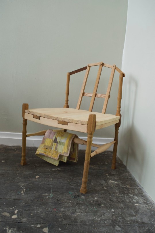
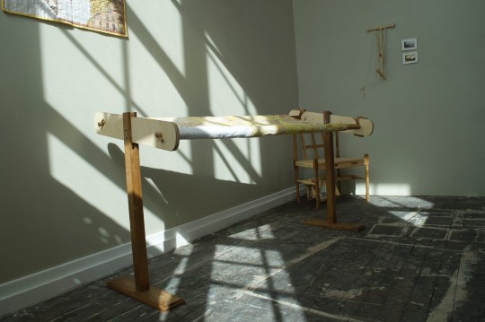
Multimedia installation of hand-crafted craft tools for hand-crafts. – (Suspended hap frame, with hand-lathed pulley system [handmade with walnut, bocote, and oak]. 4 plate photolithographs. White linen quilt top with embedded hand-knitted Shetland lace samples – on hand-lathed oak. Standing quilt frame for hand-quilting [handmade with oak, iroko, and cherry]. TED quilt [in progress] made with coreopsis, buddleia, indigo, woad, dock leaves, found linen and cotton tablecloths and handkerchiefs, and a woollen blanket. Naturally dyed, in community, bird/tree of life quilt block. Scrap chair of gender-queer joy made in collaboration with Jules Dunn [oak, iroko, and pine] with scrap seat-top quilt. Hand-lathed, pine, niddy noddy wound with white, hand-spun wool. Spinning wheel from unknown maker, in traditional design of Scottish flax spinning wheels. Paper, books, zines, sewing pins, cork, wool, coreopsis. Quilt top of a lace pattern [naturally dyed].)
On the 4th floor, in the furthest corner at the right of the room, the installation called “they are containers of fluidity” lies. The space sits in a spiral shape with false walls creating hidden corners that lie out of sight when you first enter the space. Most of the year the space functions as a working studio for students, so there is paint scattered across the dark wooden floors. With squares of white paint, and a few floorboards a bit worse for wear.
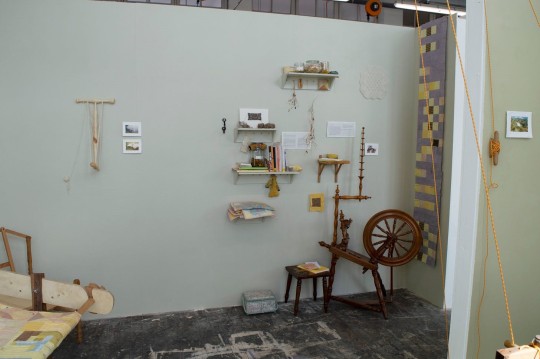
For “they are containers of fluidity” there is a new lick of paint, the floors are freshly cleaned, and new objects fill the space. The wall to your left is painted an olive-green-esque colour. It is bare and marks the beginning of this imagined interior. The wall to your front and right are painted a browny-grey with strong hints of green. The wall to your right is full. Bursting at the seams. The first half is busier and is set up in the structure of a workshop-esque wall.
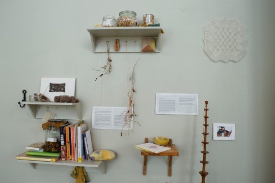
From right to left there is: A long and thin patchwork fabric piece in naturally dyed hues of purples and yellows; A wooden spinning wheel on the ground, found by the artist, and based upon traditional designs of Scottish flax spinning wheels; A small print of the artist spinning white wool at the wheel; Above this hangs a knitted lace handkerchief that almost blends ethereally into the wall; Five shelves scattered with books, flowers, small folded naturally dyed quilts, lace knitting, hand-spun wool skeins, scraps of fabric in jars, and hand-made zines; On the floor below stands a small stool with two zines and a book lying upon it, alongside a slightly ragged sewing box.
There is a small gap before a ‘niddy noddy’ and two small lithograph prints are hung. The ‘niddy noddy’ is a spinning tool for taking the wool off the wheel just after spinning. It is made of three pieces of hand-lathed pine wood, joined in two perpendicular T-joints. White hand-spun wool is looped around it in a figure-of-eight, with the remaining ball pinned to the wall beside the object itself.
The wall directly in front of the entrance to this installation is the largest, at around 4m in length. This is not a false wall, but the wall of the room itself so stretches up to the ceiling. The paint line stops at the same height as the false walls, around 2.4m, and above that is the traditional cool white. In the right-hand corner sits a wooden chair. It is made of a variety of woods, carefully pieced together and oiled. It sits fairly low to the ground and has a wide, deep seat. The back is made in a lattice formation, and on the support beams below the seat a quilt is draped. The quilt is a scrap block that uses leftovers from all the other naturally dyed objects within the installation. The three layers have been sewn together and bound, and it now lies folded, almost touching the floor.
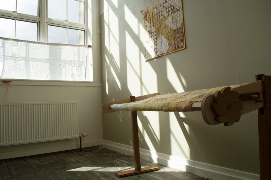
A quilting frame stands to the left of the chair, not quite parallel to the wall. It juts out towards you as you first enter the space, at a gentle angle. It is made of oak, cherry, and iroko wood. The sturdy and delicate wooden structure has been sanded, oiled, and waxed so it is smooth and sumptuous to the touch. It has two legs with decoratively detailed feet. On one end it has two wooden cogs which help turn the beams and the quilt. A quilting frame is somewhat like a hollow table, with moving parts, to allow a quilt to be stretched across its limbs.
Upon this frame a naturally dyed quilt is stretched. You cannot see the full quilt as the top and bottom edges are rolled up on oak and cherry beams. Colours of reds, browns, pinks, yellows, white, and hints of blues dominate. The hand-quilting is partially completed with indigo-blue and coreopsis-yellow thread. These bind the three layers together – linen and cotton, wool, and linen again. The design of the quilt top contains the ‘bear claw’ quilt block, a block spelling out ‘TED’, and larger swathes of white linen. There are patches of embroidery throughout, overdyed, cut up, and sewn into the pattern. The quilt frame is tilted slightly towards you, and away from the wall.
Behind the quilt frame, another quilt is hung on the wall. This one is finished. It manipulates a traditional ‘pine tree’ or ‘tree of life’ quilt block into a ‘bird/tree of life’ quilt. Again, the fabric is naturally dyed in community – with yellows, purples, pinks, and white predominantly making up the palette. This quilt is made of lots of carefully sewn triangles and bound at the edges with yellow-buddleia linen.
As you step further into the space, more is revealed. Notably a large, bright window and two painted-white, wooden beams across the space, well-above head-height. The wall around the window remains white and has a few simple objects attached to it. One of the beams intersects the window and is smoothly joined to the wall on the left of the window. Two oak cleat hooks with thin orange rope wrapped in figures-of-eight’s around them, are also affixed on this wall.
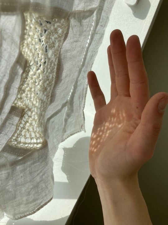
A hand-lathed circular oak pole, with a few delicate details, is hung in front of the window. It is attached with two wooden pegs, like found on the spinning wheel on the opposite side of the space. From this wooden pole hangs a white quilt top. It is made of parts of a linen tablecloth and has hand-knitted Shetland lace sewn amongst them. The top is folded over the wood and pinned with simple white sewing pins to keep the fabric in place. When the late afternoon and early evening sun shines, a strong light comes through the window. The window frames cast shadows across the two larger walls, the floor, and the lace inserts cast more delicate shadows too. If a hand is held up to the piece, a delicate pattern of holes will be shadowed upon the flesh.
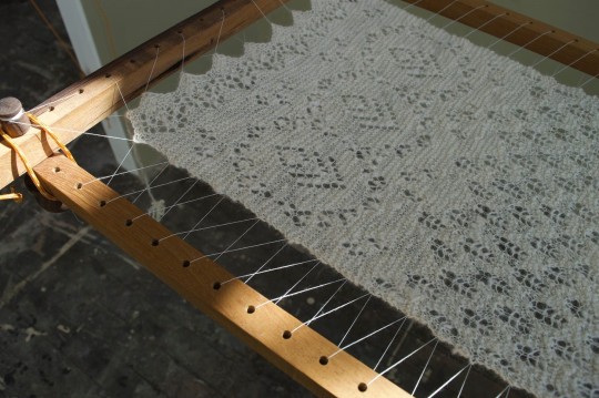
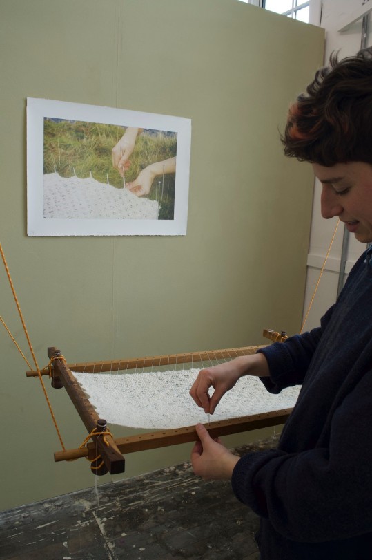
Obscured from the entrance but now fully revealed: a L-shaped wall to the left, painted olive green, and a hanging wooden object. The wooden object is a hap frame. Four sticks in a rectangle, with drilled holes at regular intervals down their lengths. It is made of deep coloured woods, iroko and bocote, and has dark wooden knobs made from walnut at the four corners. A hap frame is a traditional Shetland tool for stretching (or blocking) knitted lace. This activity is completed at the very end of the process, to fully reveal the knitted holes and show-up the lace design.
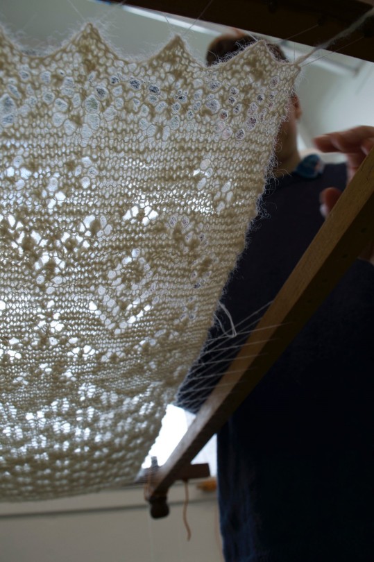
This hap frame hangs on thin, orange rope from a hand-made, hand-lathed, oak pulley system. It is like a pulley you might find on boat rigging, or a Glaswegian, tenemental washing airer. A piece of knitted lace is stretched in the middle of the hap frame. It has been hand spun on the spinning wheel in the opposite corner. The wool comes from Shetland and is undyed and brilliant white. Full of sheepy texture, and smell. The lace is made up of a repeating ‘fir cone’ lace pattern and diamond motif. It is rectangular, with straight (as straight as knitting is) long edges, and scalloped short edges. The lace has been sewn into the frame with thin, white thread to join the knit to the holes in the wood.
Behind the frame is hung a lithography print of a 35mm film photograph. This makes up the performative gesture of the work titled “pegging down their lace”. The lithography print is made of four coloured layers (cyan, magenta, yellow, and black) to create a full colour image. It retains the quality of the original film photograph. The white paper is pinned at the four corners with sewing pins into cork behind. The image itself is set amongst the mossy, loch edge in the Kilpatrick hills, just outside Glasgow. The blue ripples of loch Humphrey are just visible on the top edge of the image. Two young, white hands touch the knitting and steel knitting needles – pinning it out on the grass and moss. Small moss sporophytes peek through some holes in the lace. There is a gentle light settled across the photo and small shadows of the knitting needles are cast on the hand closest to the foreground.
On the smallest wall, to the left of this print, is another lithograph. This one is far, far smaller in comparison and depicts the whole lace piece lying amongst some grassy tussocks. The white of the lace piece glows and floats. Just beside this is another oak cleat hook with a figure-of-eight of rope. The final hook is near the ground on the edge of this wall. Following these in sequence takes you back around to the central space of the interior, to face again the quilting frame.
Instagram
Website
3 notes
·
View notes
Text
FOR THE RECORD:
"I never stabbed [you] with even a single push pin... because I got [my girl]'s lithograph done up in the most fitting frame."

@taylorswift
...and now I want to listen to "Guilty As Sin."


TAYLOR SWIFT Fortnight (2024)
2K notes
·
View notes
Text
Research, Week 3
Topics of Interest: The Museum (on a local scale), Cataloging History for Posterity, Material/Artifact as Historic Record
This week my main task was visiting the Hoboken Historical Museum down by shipyard. I figure visiting the local museum of the (relatively) small city I live in would be insightful in more, or at least different ways than necessarily one in, say, NYC. Plus Hoboken has a rich history and produced some cool artists.... who then moved out of Hoboken......shoutout STIEGLITZ <3
The first part of the museum I looked at was the current exhibition featuring Hoboken artist Darren Kall who had illustrated the streets and buildings of Hoboken in the 80s. The below drawing is an illustration of the entire of Washington Street! It was very interesting to compare this drawing with what I could remember around today and seeing where the constants were. What endures, what changes.

This is a very old-school means of documenting your surroundings/experience. Drawing what you could see was the standard before there was any form of "objective" documentation like photography. This is certainly one direction my foray into archiving can take.
Also the man working at the museum that day was very nice! We had an on-and-off conversation for the couple hours i was there and he showed me a bunch of books they had in their archives to look over. Most were photography-oriented although there was a "Chronological History of Hoboken" made from some traditional lithographs. I also overheard him talking with another man saying "Bob doesn't think I have an artistic side... that's because he doesn't recognize his often." Bob you've got some serious opps.

Also there was a cool lamp! That came from an old dentist's office!!

Just seeing these various relics completely outside of their original context caused a lot of dissonance and perplexities. These artifacts end up looking almost cosmic outside of their intended settings. I want to channel that dissonance when making my archive.
The next exhibit I saw was the one on civil rights movements. My biggest interest here was the pin display they had as a documentation of various political and social sentiments across urban America. I think something like this would be very striking and informative (in a show-not-tell way) as part of my own "exhibit."


I found the above photo just so striking. This was taken at a march in Central Park after MLK was assassinated.
I ended up making my own pin at the interactive part of the exhibit. I might consider some interactive aspects as I go forward.
The final exhibition I took to in the museum was the Frank Sinatra....shrine? Life size diorama? Immersive room dedicated to him? I'm weirdly intrigued by these forms of exhibits and means of archiving; it reminds me of the MoMA Fallout Shelter Work, except unironically, even uncritical, of its interest.

If I had the space and the budget something this immersive would be my ideal vision to implement. There are artifacts you can actually interact with, like the record-player cabinet, contemporary books, vinyls, fedora, and other memorabilia. The space was almost surreal in how obsessive and nostalgic its design was.
In response to this research, I sketched out a speculative schematic of what a house constructed to represent the life of a singular person would look like. As you gain height, the person's life progresses as does the era, seeking to fluidly represent their domestic ecosystem.

1 note
·
View note
Text
Article Critique of: The Role of Women in the Iconography of Art Nouveau, Jan Thompson, Art Journal, 1971-72
Masterlist
BUY ME A COFFEE
Thank you @nasalnozzle !! Without your guidance and help, I would not be where I am - you've truly helped me in so many ways and I'm eternally grateful.
The Role of Women in the Iconography of Art Nouveau, 1971-72, is an Art Journal by Jan Thompson. She presents a critical analysis of the Art Nouveau movement, the role, and the influence of women. Thompson puts forward that women were used as decoration and lacked agency. Her analyses of the role of women within the movement is flawed and here I will challenge some of her points.
The Art Nouveau movement, roughly through the years of 1890-1914, was a decorative art movement combining themes of the natural world with the man-made. Through mediums of fine art, graphic art, architecture and decorative arts, this movement was heavily influenced by Japanese art prints, which became accessible in Europe from 1850 onwards.
The overarching problem with Thompson’s analysis is a misuse of context: she ignores it and misinterprets it where she sees fit, leading to the misinterpretation of women’s roles in the artworks.
Thompson uses advertisements of Jules Cheret and Alphonse Mucha, to claim that there are “two distinct types” of women created by male artists. “This early pin-up girl was either bubbly, carefree and gay, as in Jules Cheret’s light-hearted, light-headed posters, or terribly seductive in the manner of Mucha’s cigarette-smoking ladies.”
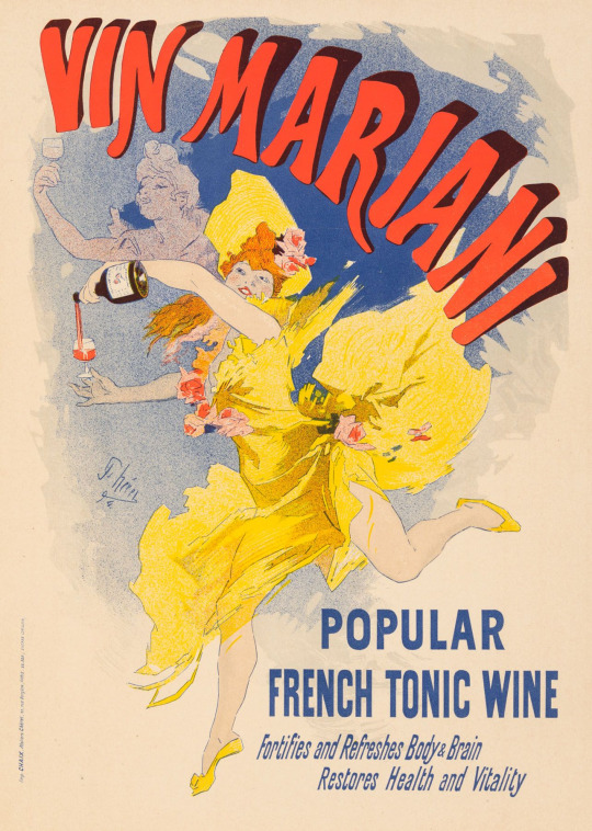
Vin Mariani, Jules Cheret, 1896 – 1900, Colour Lithograph, Poster
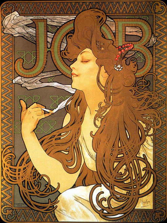
Job, Alphonse Mucha, 1896, Colour Lithograph, Poster
She fails to acknowledge the main purpose of adverts. An advertisement exists to promote an item, and so the context surrounding the product in the advert needs to fulfil that role. Cheret’s poster displays a woman holding wine, a party item, hence the “light-hearted, light-headed” aspect of the poster. Thompson merely classifies the woman as “bubbly” but does not explore why an advert for wine might portray a “carefree and gay” character.
Thompson chooses a poor example to demonstrate the “terribly seductive” archetype in Mucha’s poster, once again ignoring the context of the cigarette. For many a cigarettes function is to provide relief and relaxation. Furthermore, the company JOB (a well-known brand of rolling paper for cigarettes) commissioned Mucha for several designs, so it is difficult to say that it was Mucha’s intention to present the woman’s character as “terribly seductive”.
There’s a more nuanced idea to these adverts. They feature women participating in these activities because women are the new target audience, independent thanks to their new self-made income. This isn’t a point Thompson ignores. She openly acknowledges it in her introduction: “for women in terms of employment outside the house.” Even going further back to her first main paragraph, on the topic of the artworks: “it is the woman who is featured, almost to the total exclusion of the male. Men are cast in roles subordinate to women”, reinforcing how women take centre stage. Despite this reaffirming, in some way, that it is women who are most important, Thompson sees it as a negative and uses this point to criticise the male artists for their inability to acknowledge women’s autonomy. She even claims that “It was an era in which women were kept as virtual pets, set up on marble pedestals and made to feel helpless and therefore desirable.” Thompson makes this observation on the lack of agency, specifically with her choice of calling the real-life women “virtual pets”, and her other classifications and generalisations.
Thompson proceeds to project these ideas onto every artwork within Art Nouveau, and unfortunately for her argument, she cites Alphonse Mucha and his work with “Sarah Bernhardt […] the woman most remembered today for her contribution to the arts at the turn of the century”. By acknowledging Bernhardt, and even citing that she “contracted Mucha to design costumes, props and future posters for her productions for the next six years”, Thompson can no longer generalise the portrayal of women’s lack of agency, as this is a clear example of a woman who has a job, an income, and even hires an artist to present her in the style of Art Nouveau. Although Bernhardt may not have had total control of how Mucha portrayed her in the artworks, it is fair to say that as the employer, she had some input. One may argue that it is through their partnership that she is remembered today.
Thompson’s choice to condemn all of Art Nouveau as objectifying women to be decorative is misplaced, as looking at the wider context challenges her interpretations. Thompson chooses to see seduction in Mucha’s Job, to see advertisements featuring women as decorative, not consider why they feature them, and opts to ignore and separate Bernhardt’s role in Mucha’s life from his works of her. Thompson even concludes that the movement “seems to have gone overboard in one last hedonistic fling at the same time that suffragettes were changing themselves to public buildings and an increasing number of women were awakening to the idea of their own individuality”. She’s inferring a causation; she gives her own inference of history that the Art Nouveau period was focused on portraying women “as decorative object […] as a last-ditch anxiety-ridden attempt to keep women in their traditional places”. While Thompson doesn’t ignore the wider context, she does not necessarily lend it enough weight when presenting her argument. It is precisely the wider historical context of some of these works that changes their interpretations and the role these women take within the artworks.
#art hitory#writing#essay#paintings#art tag#art show#art exhibition#artwork#art#art gallery#art nouveau#art history#art nude#drawings#illustration#traditional art#art challenge#poster#poster design#graphic design#poster art#graphic designer#artists on tumblr#history#culture#essay writing#personal essay#in this essay i will#creative writing#writeblr
0 notes