#halftone
Explore tagged Tumblr posts
Text
No More Scrollin’ And Stewin’ For Me! (2024)
A semi-autobiographical comic told by way of Daffy Dumas Duck
#fan art#looney tunes#gold key comics#dell comics#vintage comics#daffy duck#elmer fudd#comic art#comic book#halftone#illustration#daffydoodles#Eliza Herndon
1K notes
·
View notes
Text
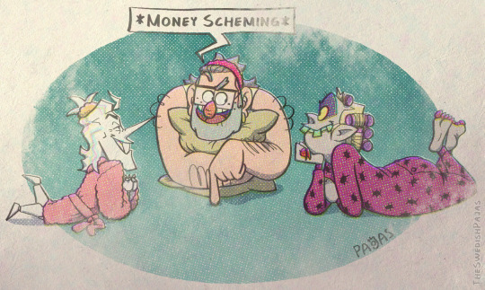
Girls night 💸💸💸
#my art stuff#digital art#comic book style#gravity falls#stanley pines#beetlejuice cartoon#beetlejuice#toonjuice#deltarune#spamton#spamton oc#big shot era#TV#deltarune chapter 2#girls night#money scheming#pajamas#halftone
3K notes
·
View notes
Text
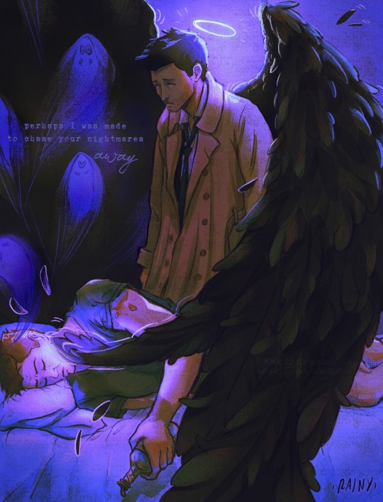
You know what they say… that freckles are kisses from angels ✨ (x)
#destiel#fanart#destiel fanart#castiel#dean Winchester#spn fanart#supernatural#deancas#procreate art#artists on tumblr#disabled artist#castiel fanart#dean winchester fanart#angel art#inprnt#print shop#artwork#digital art#art prints#rainydraws#comic art#halftone
2K notes
·
View notes
Photo
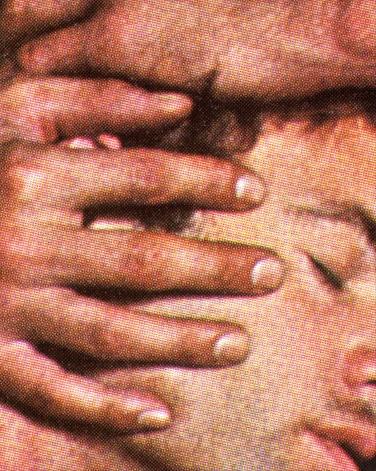
Pacifico Silano, Faded Glory, 2022
2K notes
·
View notes
Text
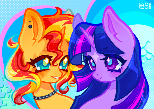
experimenting with my artstyle 🌟
#digital art#art#illustration#procreate#digital illustration#my little pony#pony#mlp#pony art#portrait#sunset shimmer#sunset sparkle#twiset#twilight#twilight sparkle#halftone#bright colors
1K notes
·
View notes
Text
there was a cool jason todd cosplay on tiktok and i needed to draw it
#mine#jason todd#jason todd cosplay#red hood#red hood fanart#dc#dc fanart#batman#digital art#digital drawing#artists on tumblr#my art#art#drawing#digital illustration#illustration#halftone#halftones
2K notes
·
View notes
Text
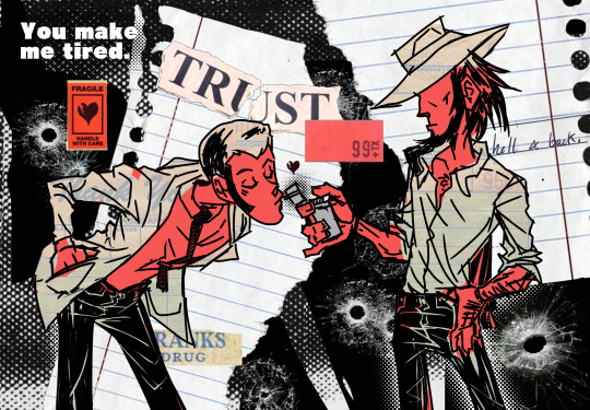
I finished! I’m actually really glad i took a break and then finished it, be se it came out *really* nice, i think i wanna make more collage stuff in the future.
more versions
#art#grunge art#collage#lupin iii#angst#jiglup#lupin x jigen#jigen x lupin#lupjig#arsene lupin iii#jigen daisuke#halftone#digital art#illustration#vent art#my art
728 notes
·
View notes
Text
since you guys liked the nami’s fanart, here’s another one
#digital art#anime art#digital illustration#fanart#arte digital#artists on tumblr#digital drawing#artedigital#one piece#one piece fanart#nami fanart#one piece nami#nami#cat burglar nami#op nami#halftone#att#illustration
1K notes
·
View notes
Text
something, something, I am Not immune to toony-looking lagomorphs.
u can tell I sketched the one on the bottom left first because I was Convinced he wore a Roger Rabbit-esque bow tie and couldn’t bring myself to remove it upon realizing the truth 😔
anyways, I loved the Amazing Digital Circus pilot a ton! gave me a bunch of good laughs, I highly recommend checking it out. in addition, it gave me some quick inspiration to draw, and working on something quick and silly like this is rly helping me get out of a current funk haha
#skwtch art#the amazing digital circus#the amazing digital circus fanart#fanart#jax the amazing digital circus#the amazing digital circus jax#vintage art#toony art#toony#vintage#halftone#halftone art#artists on tumblr
1K notes
·
View notes
Text
October 10th is World Sight Day! It is a day to raise awareness for blindness and vision impairment. Having the resources to afford eyeglasses or having access to an optician is actually quite new, considering eyeglasses (in some form) have been around since the 1300s.
Eyeglasses can not only correct vision but also provide protection as well. For today, Jared letterpress printed a halftone from the Brett from Pennsylvania Collection. This halftone depicts a 1950s workplace safety reminder. That reminder states, “2 good reasons for wearing EYE PROTECTION.” On each of the lenses of the safety glasses are a young boy and girl representing a worker’s children. This was printed with black rubber base ink using our Washington hand press, which was made in 1852.
#worldsightday#glasses#eyeglasses#museum#sacramento#history#letterpress#printing#art#printmaking#old sacramento#halftone
206 notes
·
View notes
Text
DETECTIVE. ARRIVING. ON THE SCENE. I've been kind of obsessed (understatement) with these boys and their world since I picked up Disco Elysium for the very first time this past October. "How did you get so cool, Kim?" "Despite all this -- [Detective Du Bois] is a great detective. One of the best I've seen, in fact." I love them so much.
#disco elysium#kim kitsuragi#harry du bois#harrier du bois#disco elysium fanart#procreate#true grit texture supply#digital art#halftone#detectives#partners but also partners#smoking is bad for you#talking to your necktie is also bad for you
928 notes
·
View notes
Text
An attack. Reimu
185 notes
·
View notes
Text
Was experimenting with halftone effects after watching this video and it almost has spiderverse vibes honestly. I actually learned some neat things about why printers use CMYK instead of just CMY so I thought I'd share !!
So in our optimal little computer space, Cyan (0,255,255), Magenta (255,0,255) and Yellow (255,255,0) all multiplied together gives us a perfect black (0,0,0) Awesome! The issue is that ink colors irl arent exactly perfect like this, and color is a bit more complicated irl compared to how computers represent it, so they aren't the greatest at combining into black if they aren't those perfect CMY values:
Left: CMY
Right: CMYK
(thats not even black, its a dark blue in the original image but dark colors just look so much richer)
An important step to make sure you arent doubling up on the black values though is to divide the image by it's own "value" (the max of all 3 color channels) that way the value is equal to 1 everywhere, and you're letting the black ink take care of the value on its own.
Left: CMY (normalized value)
Middle: K (black)
Right: Combined
Now obviously the grids of dots cant be aligned perfectly with each other because you'd just get a bunch of black dots in unwanted areas, but if the grids are misaligned, then some dots become more prominent than others which tints the whole image. This was an issue because older printing methods didn't have great accuracy and these grids were often misaligned.
The solution was to rotate these grids such that they can move around freely while getting rid of that tint effect if they aren't perfectly aligned :D
(I have no idea how they came up with these angles but that might be something to look into in the future who knows)
SPEAKING OF MISALIGNMENT
I wanted to implement that in my own filter to get some cool effects, and I discovered another reason CMYK is better than CMY for lots of stuff !!
With CMY, you're relying on the combination of 3 color channels to make the color black. This means if you have thin lines or just details in general, misalignment can make those details very fuzzy. Since CMYK uses a single color of ink to handle value, it reduces color fringing and improves clarity a lot even if you have the exact same misalignment as CMY!
Left: CMY
Right: You guessed it! CMYK
(yes these comparisons have the exact same color misalignment, the only difference is using a fourth ink color for black)
ANYWAY I just thought there was a lot of cool information in this tiny little day project, I also just think it looks really neat and wanted to share what I learned :3c
EDITING BECAUSE THERE'S ONE MORE THING I WANTED TO ADD
So, I talked about how to get K in addition to CMY instead of just CMY, but how exactly do you separate CMY from an image in the first place?
Well, CMY is a subtractive color space, meaning the "absence of color" is white, compared to RGB where it's black. This makes sense because ofc ink is printed on white paper. You can use dot product to get the "similarity" between two vectors, and this can be used to separate RGB actually! Using the dot product of a color and red (255,0,0) will give you just the red values of the image. This is cool though because if we get the dot product of our image and the color cyan (0,255,255), we can get the cyan values from our image too! If we first divide our colors by their value to separate the value from them, then separate CMY using those dot product values, and using K for our final black color value, our individual color passes end up looking like this:
While it's called a "subtractive" color space, I find it more intuitive to treat white as the absence of color here, and then multiply all these passes together. It makes it much easier to understand how the colors are combined imo. Notice how cyan is the opposite of red: (255,0,0) vs (0,255,255) and magenta and yellow are the opposites of green and blue respectively! This means you can actually kinda get away with separating the RGB values and just inverting some stuff to optimize this, but this example is much more intuitive and readable so I won't go too deep into that. THANKS FOR READING I know it's a very long post but I hope people find it interesting! I try my best to explain things in a clear and concise way :3
oh thank you I realized I should probably add an eyestrain tag
1K notes
·
View notes
Text
Nidoking of the Jungle
#Nidoking#gen 1#kanto#pokemon#pokemon gen 1#retro#retro aesthetic#halftone#for the record im not a gen 1ner but nidoking is a purple monster i simply must
248 notes
·
View notes
Text
i romanticize even the worst of times // when all it took to make me cry was being alive
crave - paramore
insp. - punk zines and flyers from the 70s & 80s
#paramore#paramore lyrics#music inspired art#this is why#crave - paramore#digital art#punk zine#halftone#collage art#forgot to post this here when i made it almost a year ago lol oops#my art
373 notes
·
View notes
Text
AF attack for @cozylittleartblog of her OC Desdemona! + a speedpaint :P
youtube
Fight me!
#art#my art#necrotic arts#digital art#illustration#other people's ocs#artfight#artfight 2024#af 2024#team seafoam#spooky#witch#historical#green#monochrome#halftone#manga#Youtube
162 notes
·
View notes