#photorealistic floral painting
Explore tagged Tumblr posts
Visit Tumblr Blog
Explore Tumblr blogs with no restrictions, modern design and the best experience.
Last Seen Tumblr Blogs


Fun Fact
Tumblr has been banned in Indonesia for providing people with access to pornographic content.
Text
Serene Beauty: Pink Lotus in a Tranquil Natural Setting - Posters with Wooden Frame

Experience the timeless elegance of a pink lotus flower in full bloom, delicately floating on a calm pond amidst a serene natural backdrop. With intricate gradients of soft pink petals, luminous highlights, and vibrant green lotus pads, this artwork captures the essence of tranquility and harmony found in nature. Perfect for adding a touch of peace and sophistication to any space or project, this stunning design blends photorealistic artistry with natural beauty.
visit our shop for more designs
#Pink lotus flower#serene nature#tranquil pond#elegant floral design#natural beauty#soft pink petals#blooming lotus#peaceful artwork#photorealistic floral painting#nature-inspired art#delicate flowers#harmonious design#lotus pad#calm water#blooming flowers in nature
0 notes
Text
I may or may not have bought perfumes because they reminded me of Mountain and Rain…my thoughts under the cut

I got “Two cups of Tea, a Summer Monsoon, and Me and You”, “Lay Me in the Earth, and from My Fair and Unpolluted Flesh Let Violets Spring” and “FROGS!” by the company Death and Floral (it was a pain in the ass to get them to Germany)
I want to highlight how pretty the artworks on the bottles are! Especially the one with the baby dear on it.
Also, these are “photorealistic” scents, so they smell like the thing they are describing and not like a typical perfume that smells like…well…perfume. I don’t know how to describe it better sorry! But here we go:
1) Two cups of Tea, a Summer Monsoon, and Me and You
Obviously I think Rain would smell like this.
What it’s supposed to smell like: Rain on cracked soil, wet creosote, a swelling monsoon, desert cedar, black tea.
I was searching for a realistic rain scent, and boy did I get it. It doesn’t really smell like petrichor, instead like pure rain, which is amazing. And then the slightly sweet notes from the tea are so interesting! It smells like rain splashing in your tea in summer. It’s exactly what I hoped it would be.
2) FROGS!
Didn’t get it for any specific ghoul, let me know who you would think could smell like this.
What it’s supposed to smell like: Grounding and warm woods, Virginia cedar, cold-pressed yuzu, overgrown moss, forest mushrooms, wet humid frog skin
It smells really sweet somehow with a bit of citrus but the moss and wet forest smell comes out after letting it sit for a bit. It’s nice but personally it’s a bit too sweet for me to wear :( Will give it to someone else probably
3) Lay Me in the Earth, and from My Fair and Unpolluted Flesh Let Violets Spring
Obviously I needed this because of Mountain.
What it’s supposed to smell like: Milky baby deer skin, soft fur musk, warm earth, oak trees, floral forest floor moss
This is a light animalia (it’s vegan). I can’t do too heavy animalia, but this one is good for beginners I would say. The flowers and moss come through after some time and balance the more heavy musk. It’s really interesting, I keep smelling it but can’t pinpoint the scent. So I have to guess that the description is accurate. I wouldn’t wear it everyday, because I’m sure it smells bad for some people who are not used to it to be honest. As a kid I used to have sheep furs in my bed so I’m really used to smells like these. It’s more of a little fun thing for myself.
4) Don’t paint the sun anymore. DONT PAINT THE SUN ANYMORE!
I got it as a freebie, but I somehow connect the name to Dewdrop after his elemental transition.
It smells like blood orange I think. It’s really sweet and citrusy. I will give it away too, because it’s not really my thing :(
#fynn talks#the band ghost#ghost band#ghost bc#nameless ghouls#mountain ghoul#rain ghoul#dewdrop ghoul
20 notes
·
View notes
Text
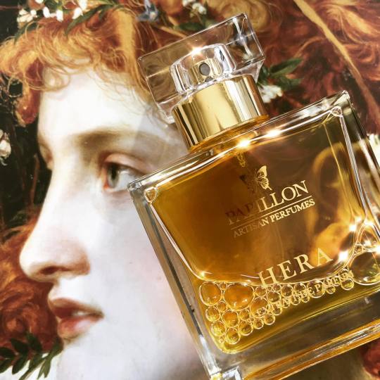
Papillon Artisan Perfumes is one of my favourite niche houses. It has a very cohesive and distinctive voice, one that draws heavily on vintage perfumes. Although the prices have gone up a fair bit (when I bought Salome in 2016, it was US$160 and it's now retailing at US$205), it has managed to maintain its singular vision and integrity over the years. I feel like when niche houses reach a certain point of success, there is a lot of pressure for them to grow by increasing the frequency of releases and then the quality/creativity suffers. Thankfully, Papillon has resisted that pressure.
I recently tried the house's two latest: Spell 125 and Hera and I enjoyed them both.
Spell 125 seems like a bit of a departure for the house. It has a powerfully resinous, coniferous opening that leans toward the photorealistic end of things. This was surprizing to me as it felt very contemporary, more Slumberhouse than Guerlain. But as the scent develops, Moore's familiar touch begins to emerge - even though Spell is in no way a vintage throwback. But the complexity of the dry down, its development, turns the scent's initial piney blast into something far more beguiling and it is here the scent really begins to distinguish itself. In particular, contrasting with the scent's coolness is a soft, animalic blur of "white ambergris" and fragrant, slightly sour frankincense that imparts an aliveness and a gentle heat that is very much in line with the more overtly fleshy Salome and Bengale Rouge even though Spell is completely different genre of scent. It evokes a spaciousness, stillness and serene vitality that makes it another winner for me.
Hera is more in line with Papillon's traditional vibe and is the more complex scent of the two. To be honest, I personally did not like it as much as Spell (which is just as well as it's retailing at a much higher price point than the others at US$310). It is beautiful, but this scent, originally designed for Moore's daughter's wedding, is perhaps one that speaks so much to someone else that it had less to say to me. It's still an excellent perfume, a vintage style aldehydic floral - but not in a diva-esque, attention seeking way. Quite the opposite, it feels incredibly well measured. Hera opens with a lovely veil of aldehydes that give its florals just the right amount of lift. As the scent develops, the flowers are abstracted but not stereotyped and certainly not the innocently fresh bouquet we associate with brides. Rather they are lushly dense with subtle, interchanging degrees of powder, butter and sweetness, all grounded in a gentle but hefty base of musk, labdanum and sandalwood. One has the impression of light, but it's not sunny in any Pollyanna sense, nor is it one of Dryad's sun dappled fields. It's more of a radiant, soft focus effulgence. There is too much of a sense of corporeality for Hera to evoke simple summertime sunshine. Allusions to the body in perfume are almost always a reference to sexuality, sweat and what goes unwashed but here, it is really about presence. What I like most about Hera is that it paints a portrait of a woman that feels very real, one that you can feel is authored by a woman's perspective. There are no fantasies here about blushing brides, no virgins or whores, no maidens, mothers or crones. I almost feel like I know something about Moore's daughter through Hera.
3 notes
·
View notes
Text
Zoologist Part 3: Bee
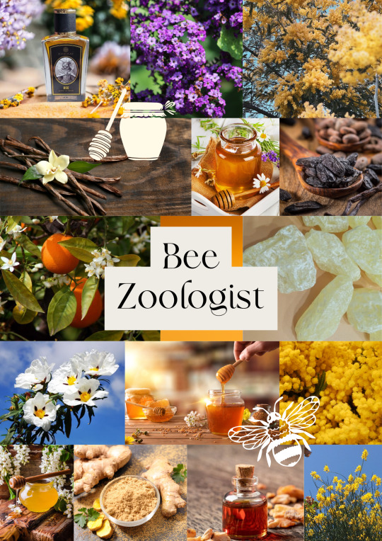
Embarking on the fragrant voyage of this elixir was akin to stepping into an artist's canvas, a masterpiece meticulously painted with strokes of olfactory brilliance. The opening act, an instant immersion into the photorealistic world of honey and beeswax, resonated with a spellbinding enchantment. A jar of honey materialized with each spritz, rendering the experience akin to a bewitching act of alchemy rather than a mere perfume application.
As the aromatic tale unfolded, an hour on the skin ushered in the emergence of subtle bitterness, reminiscent of propolis, offering a soothing illusion—perhaps a placebo, yet comforting. Concurrently, beeswax asserted its presence, not as an extract but as an intrinsic part of the composition, amplifying the fragrance's already potent allure. The evolving symphony continued to captivate, weaving an intricate narrative of balsamic notes, delicate florals, and the subtle dance of resins and incense.
Around the fifth and sixth hours, the fragrance gracefully descended upon a soft base of sandalwood, vanilla, and tonka beans. A lingering ode to the preceding olfactory journey, the beeswax remained steadfast—a testament to the enduring artistry behind the perfume.
The unyielding intensity of the honey is too much for my personal taste. Despite this, the profound appreciation for the next-level artistry invested in this fragrance prevails. Each whiff encapsulates the dedication and mastery of the perfumer, creating an immersive experience that transcends the boundaries of conventional perfumery. It is an adventure adventure, even though not tailored to my individual preferences, is an homage to the creative genius behind the bottle—a work of art in its own right.
#eau de parfum#fragrance#moodboard#perfume#perfumes#aesthetic#aesthetic board#aesthetic moodboards#eau de toilette#fragrance review#animals#perfume recommendations#pretty things#parfum#zoologists#bees#bee#honey#zoologist bee
2 notes
·
View notes
Text


Renaissance Reverie: An Ethereal Beauty by the Sea A beautifully composed portrait of an elegant woman, set against a rugged coastal landscape with rocky cliffs and a dramatic ocean background. The woman has a serene and ethereal presence, with flowing wavy hair adorned with delicate roses and floral accessories. She wears an off-the-shoulder, ivory-colored, vintage-style dress with intricate gold embroidery and gemstone accents. Her jewelry is opulent, featuring a matching necklace, earrings, and bracelets, adding a regal quality to her appearance. The lighting is soft and warm, casting gentle shadows that enhance the romantic, classical atmosphere of the scene, reminiscent of Renaissance portrait paintings. –– highly detailed, atmospheric, baroque-inspired, photorealistic, dramatic lighting, romantic.
0 notes
Text
35 Gorgeous Wedding Nails Ideas: Perfecting Your Bridal Look
Your wedding day is one of the most memorable days of your life, and every detail counts, including your nails.
Whether you're a bride looking for something classic or bold, there's a perfect nail design for everyone. Here are 35 gorgeous wedding nail ideas to inspire you and ensure your hands look flawless as you exchange vows and showcase your new wedding ring.

French Manicure: Timeless and elegant, the French manicure is perfect for brides who want a clean and sophisticated look.
Soft Pink Ombre: A subtle gradient from nude to soft pink adds a touch of romance and elegance to your nails.
Nude with White Tips: A modern twist on the French manicure, nude nails with crisp white tips offer a chic and clean look.
Pale Peach: Soft peach nails provide a delicate and warm touch, complementing a variety of wedding themes.
Ivory with Gold Accents: Ivory nails with subtle gold accents create a luxurious and sophisticated look.
Rose Gold Glitter: Add sparkle to your wedding look with rose gold glitter nails that catch the light beautifully.
Silver Glitter Tips: Keep it elegant with nude nails and silver glitter tips for a hint of sparkle.
Gold Foil Accents: Nude or blush nails with gold foil accents offer a glamorous and modern twist.
Glitter Gradient: A glitter gradient from the tips to the base of the nails adds a touch of magic to your bridal look.
Holographic Sparkle: For a unique twist, opt for holographic glitter that changes color in different lights.
Pressed Flowers: Encapsulate real dried flowers in a clear gel for a natural and ethereal look.
Floral Water Decals: Add delicate floral decals to your nails for a touch of nature-inspired beauty.
Leafy Greenery: A minimalistic approach with small green leaves painted on nude nails offers a fresh and natural look.
Lavender Fields: Soft lavender nails with small white floral designs create a romantic and whimsical feel.
Blossoming Cherry Blossoms: Paint delicate cherry blossoms on a soft pink base for a feminine and intricate design.
Red Roses: For a bold and passionate look, choose red nails with detailed rose designs.
Royal Blue: Make a statement with royal blue nails adorned with silver or pearl accents.
Emerald Green: Rich emerald green nails with gold details exude luxury and elegance.
Black and Gold: Opt for black nails with gold accents for a dramatic and glamorous look.
Deep Burgundy: Deep burgundy nails with a glossy finish are perfect for a fall or winter wedding.
Sheer Nude: Keep it simple and elegant with sheer nude nails that provide a polished look.
Simple White Line Art: Add minimalist white line art on nude or blush nails for a modern and chic design.
Matte Finish: Choose a matte finish in any color for a sleek and contemporary look.
Geometric Designs: Incorporate subtle geometric designs in neutral tones for a minimalist yet stylish effect.
Single Pearl Accent: Add a single pearl or small gem to each nail for a touch of understated elegance.
Marble Effect: Create a marble effect with swirls of white, grey, and gold for a sophisticated and artistic look.
Lace Designs: Mimic the look of lace on your nails for a delicate and intricate design that complements a lace wedding dress.
Mirror Chrome: Opt for mirror chrome nails in silver or rose gold for a futuristic and dazzling effect.
Stained Glass: Create a stained glass effect with colorful, translucent polishes for a unique and artistic design.
Celestial Theme: Incorporate stars, moons, and constellations into your nail design for a dreamy and celestial look.
Initials: Add your and your partner’s initials to your nails for a personal and meaningful touch.
Wedding Date: Include your wedding date in a small, elegant script on one or two nails.
Love Quotes: Choose a short love quote or meaningful word to feature on your nails.
Custom Art: Work with a nail artist to create a custom design that reflects your wedding theme or personal style.
Photorealistic Designs: Opt for photorealistic designs such as tiny portraits or intricate scenery that hold special meaning.
Conclusion
Your wedding nails are a small but significant detail that can add to the overall beauty and uniqueness of your bridal look. Whether you prefer classic elegance, bold statements, or personalized touches, these 35 gorgeous wedding nail ideas offer something for every bride.
Take the time to choose a design that complements your style and makes you feel even more special on your big day.
1 note
·
View note
Text


Style: Floral Decoupage
Illustration
Painting
Digital/Photorealistic
0 notes
Text
On AI and Death of the Author
I saw a comment online about someone taking a "Death of the Author approach" to AI art. Their take on AI is that using this principle, we should be able to enjoy AI art without caring that it wasn't made by a human. As long as the end product is good right?
There is a lot to be said and unraveled about AI art, specifically the strain of tech bro hype we are seeing recently, not real experimental and explorative art that uses AI (I really like the work of Lingdong Huang). For here, I just have some thoughts I want to get out, so let's make the assumption that AI can produce art that is indistinguishable from that produced by a human.
As example, I'll use this picture of Obama by Kehinde Wiley.
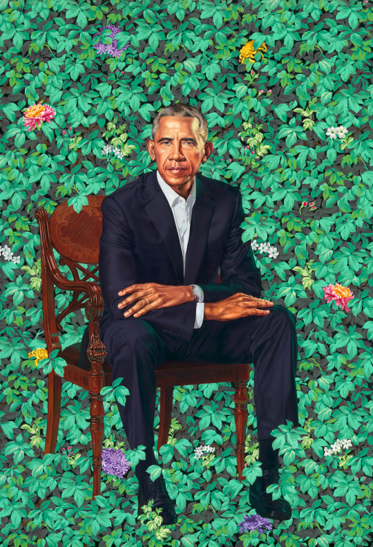
Let's imagine for a second that this was actually created by an AI. We put on our analysis/critique hat.
--
One opinion we could offer is one about the pure aesthetic principles of the image, ignoring the creator. I think there is a lot of awesome stuff to say about this painting from a "Death of the Author" perspective. I won't get into it but tl;dr it looks good. It looks pretty. It is colorful and all the elements are expertly composed and rendered.
--
Another opinion we could offer would be one that takes into account the creator(s)--the person who typed in some prompts and the AI that was used to produce this. So they must have typed in "photorealistic President Barack Obama sitting on a chair amidst some leaves with colorful flowers sprinkled throughout." But why? Why did they make this, why this prompt? Why does the AI produce this specific type of chair for Obama to sit on in this pose? If the prompt is more complicated, say they specify the exact type of chair he is sitting on and what wood it is made of and what pose he takes--why?
In this hypothetical, if the "artist" had some meaning behind the choices they made and they really worked that prompt within an inch of it's life to produce an image with several meaningful elements woven together, maybe we can consider that something close to meaningful art.
But maybe they specifically sought to copy someone's style.
And it doesn't take into account all the images that the AI used in its training--perhaps that chair comes into play because there are a lot of photos of obama on that certain type of chair. Maybe there was a specific photo of him on a chair that became a meme, so that particular image got duplicated a lot on the internet. Maybe the AI accounted for that while it was trained.
--
You can see that considering the author raises a lot of interesting questions. We are happening upon the beginning of some real Analysis here.
The actual meaning behind the elements of the painting and Wiley's general style are very interesting and answer a lot of these questions. I think having the Author be alive when analyzing his work elevates it pretty pictures. Wiley likes to put render black people, young black men especially, in a neoclassical style and with neoclassical props amongst backdrops of bright florals, feminine and prestigious elements that contrast the image that black men typically have in society. It makes you think about the role of black people in culture, history, and art history.
With this context, I hope you can see why I think "Death of the Author" analysis of this painting is useful. You can compare how the meaning of elements change depending on whether you factor in the artistic intent or pull more from your subconscious biases, and that can say something about yourself or society.
--
All this to to say, analysis is cool, even in the context of AI. In general, I am lukewarm about "Death of the Author" in media analysis (you can tell from my analysis) but I think it's perfectly worthwhile and valid. Notice however, that this is not really a defense of AI art. In our imaginary scenario, I did not at any point say this wasn't problematic (it is) and that people shouldn't feel some sort of way about enjoying AI art knowing that it is built off what is essentially stolen artwork from millions of artists on the internet--and that is the best case scenario where this art isn't specifically mimicking a real artist's style.
This is because most people understand "Death of the Author" less as a lens or approach to analysis and more as a selective philosophy for media. One interesting example is how some people came to adore JK Rowling more when they found that she supported the Dumbledore/Grindelwald (Hooray the Author is Alive) and then pivoted to trying to ignore her altogether when we found out she was transphobic (Let's Kill the Author).
Lindsey Ellis on Youtube has a great video on this in the context of JK Rowling, and I am kind of stealing her thesis here but the point of all this is that we should avoid conflating analysis with personal moral opinions. Claiming that you take a "Death of the Author" approach to consuming media doesn't mean anything. It lends willfully ignorant consumption false credibility and legitimacy, both to yourself and others.
--
Most people do not give a flying fuck about any of this. Most people are shallow idiots and like pretty pictures. But if someone has the depth to recognize that the creation of media you like is potentially problematic, I just find it really irresponsible to write off that small feeling with this heavy-handed, misused brush of "Death of the Author."
0 notes
Photo


Painted my pink rose black. Pink just isn’t me.
#acrylicpainting#acrylic painting#rose#rose art#roses#florals#black#marble#marble painting#hyperrealism#photorealism#photorealistic painting#artstagram#artists on tumblr#female artists
30 notes
·
View notes
Photo

Šį paveikslą galite rasti "Klaipėdos galerijos" filiale, mados ir verslo centre "Herkaus galerija", Herkaus Manto g. 22, Klaipėda.
#oilpainting#florals#flowers#green#nature#lithuanian#lithuanian art#artist#art#painting#inspiration#still life#paint#canvas#klaipeda#photorealistic#aesthetic#renaissance#menas
1 note
·
View note
Text
[image ID: a near-photorealistic painting of a well lit still life centered on oranges. At the top, an orange tree grows into the room through an open grate window, showing off delicate white orange blossoms and heavy ripe fruit. Below the branches, on a counter set into a beige wall, a red and white floral arrangement sits beside a clear glass decanter of a dark liquid and a simple glass of a pale yellow liquid with a spoon in it. In front of those is a spill of oranges, many in the process of being peeled. Some are sliced horizontally, showing off the juicy insides; many are peeled and partially separated, fuzzy white pith flaking away from each section of the orange. A few orange blossoms are scattered along the table as if fallen. The warm colors of the oranges and floral arrangement pop off the image, feeling vibrant and real. The green leaves of the tree glisten and curl with life, highlighting the oranges still growing on the branches. The artist's signature is in the bottom left corner. End ID.]
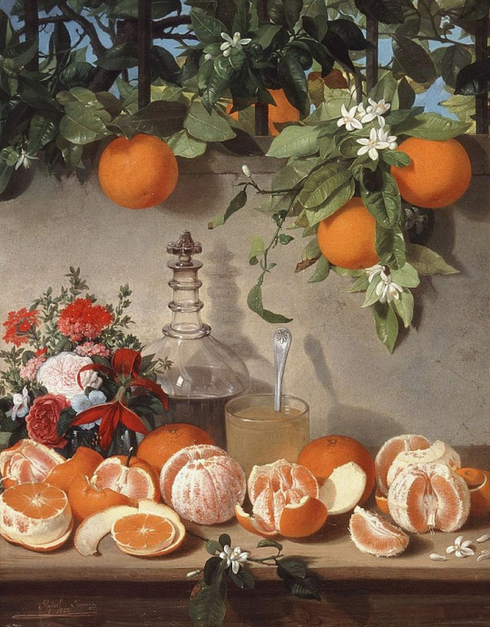
Rafael Romero Barros (1832-1895) “Still-life with Oranges” (c. 1863) Oil on canvas Located in the Museum of Fine Arts of Córdoba, Córdoba, Spain
#Image described#You gotta be artistic when describing art#You have to keep the emotions and details in there
4K notes
·
View notes
Text
Tag Game
Tagged by: @reluctant-martyrs
Nickname: (I don’t really have nicknames. People just call me by my first name)
Zodiac: no comment
Height: 5′9.5?″
Last Movie: Night At The Museum (2006)
Last thing I googled: Citizen Kane soundtrack - I was looking for the cover art to the Joel McNeely re-recording.
Favourite Musician[s]:
Ella Fitzgerald / Jamie Cullum / Barbra Streisand / John Barry / Michael Giacchino / Shirley Bassey / Lalo Schifrin / Doris Day / Antônio Carlos Jobim / Sarah Vaughan / Henry Mancini / Julie London / John Debney / Bernard Herrmann / Nelson Riddle, Frank Sinatra, Mel Tormé, Jerry Goldsmith, John Williams
Song stuck in my head: I heard Dancing Queen in the grocery store and it’s been stuck in my head for the past half-hour
Other blogs: @noirespiration @the-goddess-files @boys-boys-b0ys-b0ys @i-drew-this are my sideblogs, though I don’t do much with them
Do I get asks: Occasionally. @hildy-dont-be-hasty and I often exchange asks, but I welcome more!
Blogs following: 425
Amount of sleep: 7-9hrs
Lucky numbers: 13
What I’m wearing: dingy white Vans (the low-cut ones with laces), long black socks, slim-cut khakis (from Old Navy), a vivid floral short-sleeved button-up from Forever 21 (black b.g., white flowers, red, yellow, and green accents), and my shiny silver Casio watch.
Dream job: Big-time Hollywood film composer
Dream trip: I’d love to go to Venice sometime. The Bahamas too.
Favourite food: Pasta
Instruments: piano’s my main, though lately I don’t play very much, I more write. I also sing a bit and I played the alto saxophone through school up ‘till the last 2yrs or so.
Languages: English - I took 3 yrs of Spanish in high school, but I don’t get much of a chance to use it. I have an interest in Portuguese stemming from my love of Brazilian music.
Songs: Lately...
today Sergio Mendes’ Look Around popped into my head, I’m planning to take a walk after I write this post and listen to that song on my walk
Last night on the drive back out to my apartment (moving back after spending winter break at home with my family) I played Ella’s 1962 recording of Street Of Dreams a lot.
Describe yourself with aesthetic things: Hand-painted old movie posters, black fabrics with lush non-photorealistic flora patterns, brush-painted Asian porcelin, tapered furniture legs with brass endcaps, white sheepskin rugs, 60s Thunderbirds and Lincoln Continentals, soft melodic hi-trombone solos
I tag: @passez-une-adventre-avec-moi @hildy-dont-be-hasty @gay-jesus-probably @tyronepowerbottom @puhtatos-ayyye
2 notes
·
View notes
Photo


IAN HORNAK
On this day of 9th January, Ian Hornak (January 9, 1944 – December 9, 2002) was born in Philadelphia, Pennsylvania, USA.
He was a draughtsman, painter, and printmaker and one of the founding artists of the Hyperrealist and Photorealist fine art movements.
At age 9 Hornak received a set of oil paints and a book of important Renaissance paintings from his mother as a gift. From the book, he began credibly interpreting the works of Michelangelo Buonarroti, Leonardo da Vinci, and Raphael Sanzio.
Upon graduating from high school in New Haven as an honors student, Hornak attended the University of Michigan–Dearborn before transferring to Wayne State University in Detroit where he earned a bachelor of fine arts and master of fine arts degrees. Between 1966 and 1968 he taught studio art courses at Henry Ford Community College and Wayne State University.
He was introduced by art dealer Gertrude Kasle to Pop Artist, Lowell Blair Nesbitt. Hornak sublet one of Nesbitt’s large studios in the Meatpacking District, they developed a friendship, and Nesbitt in-turn introduced Hornak into the New York City art scene.
While living in East Hampton, New York Hornak befriended art world figures, Robert Motherwell, Willem de Kooning, Robert Indiana, Andy Warhol, Claes Oldenburg, and Fairfield Porter.
Hornak’s gallery representations include the Stable Gallery, Tibor de Nagy Gallery, Fischbach Gallery, Armstrong Gallery, The Katharina Rich Perlow Gallery, Fuller Building and, others.
He debuted a series of floral and still life paintings inspired by the Dutch Golden Age which led to nine critically acclaimed, and financially successful solo exhibitions for the artist.
Hornak cited the Hudson River School artists as major influences, especially Martin Johnson Heade and Frederic Edwin Church in addition to Nineteenth-Century German Romantic Artist, Caspar David Friedrich.
Hornak suffered an aortic aneurysm while painting in his studio and he died on December 9, 2002, as a result of complications from the surgery. He was 58 years old.
#ian hornak#famous painters#famous artists#art history#anniversary of artists#hyperrealist#photorealist
1 note
·
View note
Text
He’s a fucking MASTER at it too. Everything about cross stitch appeals to him the way he loved color-by-numbers as a kid.
He does those kits that are made for retired senior citizens with no other hobbies—thousands and thousands of stitches—and ends up with like yard-long photorealistic tapestries of birds or landscapes or Norman Rockwell paintings.
He eventually convinces Beverly to pick it up, for something to do with her hands in the process of quitting smoking. She’s more of a fan of the subversive: classic-looking floral wreaths with “damn it feels good to be a gangster” backstitched in the middle.
When Richie and Eddie get married, Stan’s gift is the most grandma-looking possible framed cross stitch of their names and their wedding date and Richie is like come on man, I can’t be seen with this thing, but it’s also the first thing he puts up in their new apartment after they get home from their honeymoon.
Stanley Uris loves cross stitch
25 notes
·
View notes
Text
Wallpaper Designs For Bedroom That’ll Make It Look Absolutely Stunning.March 16, 2020Your bedroom is like your sacred sanctuary. It is a place of rest and rejuvenation-one where you come to unwind after a long and tiring day. Therefore, it needs to be designed in such a manner that reflects your personality and likings It should be designed in a manner that makes you feel comfortable and happy. One great way to make sure that your bedroom reflects your personality is having beautifully designed, good-quality wallpaper. You may think that wallpaper is outdated especially in the era od contemporary interior designing.Choosing the right wallpaper for your room is very crucial when it comes to excellent bedroom interior design. But, if you find the right prints, textures and colours it can actually be quite stylish. Wallpaper designs for bedroom are the best way to personalise your space and your taste to the walls.Though we suggest getting your room designed by professional and best interior designers in Mumbai if you decide to do it yourself first plan out all the elements in your interior design.For more bedroom decor and design tips, you can read our blog on bedroom interior design ideas. If you are confused about which wallpaper designs for bedroom fit into your aesthetic then look no further for help. We have curated a list of 20 stunning wallpaper design that will add elegance, beauty and style to your bedroom walls. 1.Graphic PrintsIf you want your bedroom walls to reflect your personality which bold and modern then a graphic print is the way to go. For example, a wallpaper with a linear line print that gives the wallpaper an optical illusion of being three-dimensional and makes it seem like it is from the future. 2. Ombre Wallpaper Prints:You can use the ombre wallpaper designs for bedroom if you want it to reflect a mood. For example, this beautiful wallpaper is inspired by a sky on a sunny day. You instantly feel calm and tranquil as you step into this beautiful haven. Paired with simple white sheets, matching pillows, plants and a modern light fixture, it transforms into a restful sanctuary. 3. Floral Print Wallpaper:If you like having neutral colours in your bedroom and feel like adding too many things will make it feel cluttered but still want your bedroom to look pretty and interesting then a floral print will work best for you. This bedroom has a muted floral print in a background of pastel green that works really well with the otherwise neutral palette bedroom. It adds complexity to the simple interiors and adds more colour to the room. 4. Digitised Nature Prints: While floral prints are a little retro, digitised nature bedroom wallpaper truly reflect a modern style. These prints are photorealist interpretations of classic designs, for example, a contemporized botanical print, or a print with wood grain swirls. This wallpaper, for instance, mimics tree branches for a nature-inspired twist. These types of wallpapers are great if you want to bring nature into your bedroom but still want to keep your contemporary aesthetic intact. 5. Geometric Wallpaper Designs For Bedroom: If you want to add a sense of everyday-glamour to your bedroom walls then the symmetrical geometric pattern should be your go-to. It adds aesthetically pleasing symmetry to your bedroom and makes your bedroom feel even more luxurious. You can warm up a minimal and rustic place with a strong geometrically patterned wallpaper. For instance, the wallpaper really brings out the matching duvet and lampshade and accentuates the light fixture. A good tip is to choose a wallpaper that has metallic accents that will catch and reflect light beautifully. 6. Textured Wallpaper:If you don’t like the idea of bold colours or overbearing patterns taking over your bedroom, then try the textured bedroom wallpapers. They add more depth to the bedroom without using bold colours or loud patterns. They create stunning visual effects and keep a room light, bright and makes the room feel more spacious. Plus you can cover a large wall with a textured wallpaper without it looking like your bedroom design is cluttered and has a lot of things going on at the same time. 7. Batik Block Prints:The batik patterned wallpaper designs for bedroom are a more organic take on modern wallpapers. Inspired from ethnic art, these prints are timeless while at the same time have a modern appeal. If you crave a light-handed look in your bedroom then opt for wallpapers in light or neutral coloured background. The batik print should have at the most three complementary colours to it. 8. Dark Floral Dark floral wallpapers add depth and certain moodiness to your bedroom. They make the bedroom feel more intimate while creating a cosy and comforting atmosphere. Dark floral wallpapers are a modern twist on the general pastel retro floral wallpapers. If you love the floral pattern but still want to give a contemporary touch to your bedroom then dark floral wallpaper is the way to go. You can pair the wallpaper with furniture in neutral, light and blush tones like in this beautifully designed bedroom. 9. Eclectic Backdrop: If you want your bedroom to feel more playful and relaxed then get wallpapers with eclectic patterns. For example, in this bedroom, the rose gold leaves add a very artistic, sweet, and playful vibe to the bedroom. The different textures give the bedroom a soft look and the blue starfish pillow complements the wallpaper. 10. Minimalistic Wallpaper Designs For Bedroom: Yes, minimalistic wallpaper exists. Minimalistic wallpaper gives your room a neat, tidy and contemporary look especially if you chose a tonal colour scheme. You can pair the wallpaper with crisp bedding and timeless furniture for added warmth and texture. 11. Bold Animal Prints:While in the past animal prints have been considered to be gaudy and over the top, this trend has taken off in the last year. If you are looking to decorate your feature wall and need a dramatic accent then you must consider animal prints. It will look absolutely breathtaking covering the walls of your bedroom. It is a good idea to get animal print wallpaper in light or dark hues to bring out the gorgeous print.Having this type of wallpapers in lighter hues and shades will work gorgeously in the Kids room interior.12. Shiny Metallic Wallpaper: Metallic wallpaper lends the bedroom a sense of luxury and grandeur and makes it seem larger and brighter. If you want to add an element of opulence and timeless chic to your bedroom, then metallic wallpaper should be your go-to. You might think the metallic wallpaper would look tacky but when done right, these wallpapers look glamorous and elegant. 13. Statement Wall: If you don’t want to cover an entire wall with wallpaper but still want wallpaper in your bedroom, then you can choose your favourite nook and cover it with a fun, wild print. You can even mix and match your prints by using a few contrasting prints on stuff like throw pillows and your headboard. 14. Painted Statement Walls: This is another great style for people who view their bedrooms as an artistic masterpiece. A play on the watercolour design, having a painted statement wall will instantly add more texture, style and beauty to your bedroom. Take this bedroom, for instance, it just exudes calm and dreaminess. The matching furniture in muted tones just adds to its look of tranquillity. 15. Palm Leaf Print Wallpaper Designs For Bedroom:If you want your bedrooms to reflect your carefree spirit and give your fun, beachy vibes then a palm leaf print wallpaper is the way to go. You can keep things interesting by getting furniture and bed accessories in matching colours. For example, this baby pink ottoman adds to the relaxed vibe of the room and the throw pillow and blanket complement it really well. 16. Ceiling Wallpaper Designs For Bedroom: You can add some spunk to your bedroom by adding wallpaper to the ceiling. This idea is for the people who don’t like conventional design and want to do something different. It also gives you much more space in the room to work with different ideas and designs without different designs clashing. Ceiling wallpaper also makes the entire space feel more inviting and cosy and doesn’t overpower your walls or space. 17. Splatter Paint Print Wallpapers: If you want to have a playful, bold and fearless design covering your walls then you can opt for the splatter paint patterned wallpaper. The best part about this wallpaper is that many different designs are available in various intensities of splattered paint. So, you can choose how neat or messy you want it to be. This pattern adds a great contemporary touch to your bedroom and shows that you aren’t afraid of experimenting. You can play up the colours by painting the ceiling in a similar colour palette. 18. Bold Intricate Patterns: Especially suited for a feature wall, this wallpaper adds a sensuous touch to your bedroom and creates an eye-catching contrast with the bright pops of black and red. You can opt for an all-black bed to give your bedroom a sleek and glamorous finish. If you are looking for wallpaper which will give your bedroom a more passionate and romantic feel then wallpapers with bold and intricate patterns are the way to go. 19. Spring Themed Wallpaper: This wallpaper designs for bedroom will lend a more cheerful and relaxed feel to your bedroom. Usually, in shades of blue, green and brown, this wallpaper adds an earthy texture to your room, especially when paired with low-key materials like jute. The delightful florals add subtle beauty and flair to the bedroom. 20. Make Your Wallpaper A Statement Art PieceThis bedroom wallpaper type doesn’t require you to cover your entire wall to make a statement. You can just frame your favourite wallpaper design and display it like an art piece. This is also a more affordable and less effort option. For example, in this elegant bedroom, the wallpaper adds a splash of colour and glam to an otherwise plainly decorated bedroom. This brings us to the end of our list of stunning wallpaper designs for bedroom. As you can see, there are many options out with many interesting and beautiful designs. You just have to find one that works for you and your bedroom. If you are looking to get it designed from professionals then reach out to Urban Dreams as we are known as one of the best residential interior designers in Mumbai. We don’t only design living room bedrooms but also are well known modular kitchen manufacturers in Mumbai. As we design and manufacture a variety of furniture like wardrobe, tv unit design in India, dining tables etc we are also termed as the best space-saving furniture manufacturers in Mumbai.
0 notes
Link
PHOTO: COURTESY @MARIEHONEYB VIA INSTAGRAM If you’re familiar with zodiac sign basics, you’re probably aware that Virgos are known as the organized, perfectionist sign. Including birthdays between August 23 and September 22, Virgo is an earth sign that is ruled by the planet Mercury. Some famous Virgos include Zendaya, Michael Jackson, Keanu Reeves, and Queen Virgo herself, Beyoncé. Us Virgos have a lot to be proud of. Besides the fact that Beyoncé is a Virgo, we’re also known for being humble yet ambitious and studious. If you want to show off your Virgo pride, a great way to do so is by getting a Virgo-themed tattoo! Even if you’re not into astrology, your star sign can provide lots of material for an aesthetically-pleasing tattoo. If you’re considering getting a Virgo tattoo, we’ve compiled some of the best Virgo ink to get you inspired! Virgo Glyph Tattoos It’s not clear what exactly the origins of the Virgo glyph are—some say it’s an “M” for “Maiden,” and others say it depicts a maiden carrying wheat. Even if we’re not sure exactly what it means, it’s an easily identifiable way for you to brand yourself as a Virgo and has endless potential for tattoo designs. View this post on Instagram A post shared by Adriana Pereira (@adriana.pereirap) on Aug 12, 2019 at 6:02am PDT You don’t have to be a Virgo to get a Virgo tattoo! This tattoo artist had the Virgo glyph inked on her shoulder in honor of her best friend, who is a Virgo. Getting your best friend or significant other’s zodiac sign inked is a perfect way to keep a piece of them close to your heart without the commitment of getting their name inked. View this post on Instagram A post shared by MARIE ERIKSSON (@mariehoneyb) on May 17, 2019 at 8:11pm PDT The only thing better than getting a Virgo tattoo for your friend is getting a Virgo tattoo with your friend! If you’re lucky enough to have a Virgo buddy, consider getting matching ink like @marehoneyb did. A clean, simple tattoo of the Virgo sign like hers is subtle yet intimate. View this post on Instagram A post shared by Tonks Boudreau (@boudreau.art) on Jul 14, 2019 at 11:39am PDT This Toronto-based artist, Tonks Boudreau, specializes in inclusive art using vegan ink. Her talents shine in this symmetrical floral back tattoo. Your eye will likely be drawn to the lotus or wing design first, but if you look closely, you can see the Virgo glyph featured towards the bottom of the tattoo. View this post on Instagram A post shared by 🍁 E v e l y n 🌺 (@gardenofevelynn) on May 26, 2019 at 3:51am PDT Your finger is the perfect place to put a tiny Virgo tattoo! You can either get the Virgo glyph by itself as Instagram user @gardenofevelyn did or accompany it with star or moon tattoos down the rest of your finger. View this post on Instagram A post shared by Mᴀɢ Fᴜ ⊛ 𝔽𝕌𝕝𝕝 𝕋𝕚𝕞𝕖 𝔾𝕠𝕒𝕥 𝕃𝕠𝕧𝕖𝕣 (@goatmag) on May 19, 2019 at 1:03am PDT When you first see this tattoo by Mag Fu, you probably won’t be able to identify it as a Virgo glyph. However, after a second glance, it’ll start to look more and more like the M-shaped glyph—a geometric, edgy take on it. If the usual Virgo glyph doesn’t fit in with the rest of your tattoos (or if you just want something different), consider this unique design. Virgo Symbol Tattoos The Virgo symbol, not to be confused with its glyph, is less well-known than some. For instance, Leo’s symbol is a lion, Scorpios have the scorpion, and Tauruses have a bull. Virgo, on the other hand, is typically represented by the Maiden or Virgin, which is usually shown as a young woman. This general description of the Virgo symbol gives us Virgos a lot to work with when it comes to tattoos! What does the maiden look like? What clothes is she wearing? What hairstyle does she have? Take your inspiration from your idea of beauty. View this post on Instagram A post shared by Elizabeth Moroni (@softfury) on Jul 28, 2019 at 9:00am PDT This Virgo tattoo from Los Angeles tattoo artist Elizabeth Moroni features a side profile of a Virgo Maiden. Her clean linework shines in the Maiden’s hair, and her whimsical art style stands out in the tattoo’s design. View this post on Instagram A post shared by 🏄♀️🏄♀️🏄♀️ (@inkedbynissaa) on Aug 1, 2019 at 3:53pm PDT This tattoo by artist @inkedbynissaa combined multiple Virgo motifs. Not only does it feature a Virgo glyph, but also a space-themed Maiden. The Maiden’s hair is cleverly inked in a crescent moon shape and mirrored by a scattering of stars. View this post on Instagram A post shared by Naomi Suzuki (@nasuzuki_) on Jul 11, 2019 at 4:09pm PDT There’s a lot going on in this tattoo by Naomi Suzuki! It features a portrait of a girl with a Virgo glyph in her forehead, bordered by tree branches and poppy flowers. View this post on Instagram A post shared by 🌿 Carolina Santoscoy (@casanu) on Jul 6, 2019 at 7:14am PDT This Mexico-based tattoo artist’s cartoon-like style makes for a wonderfully unique Virgo tattoo! While others may choose to ink the Virgo Maiden as goddess-like or celestial, artist Carolina Santoscoy opts for a more simple, quirky design. The girl featured in the tattoo can be identified as representing Virgo because of the stalk of wheat perched in her hand. If you want to try something that sets your ink apart from the average Virgo tattoo, you might want to try a style like this one! View this post on Instagram A post shared by Joanne Baker (@milky_tattoodles) on Jun 21, 2019 at 9:44am PDT Joanne Baker, a Scottish tattoo artist, shows off her watercolor tattoo skills in this ethereal piece. The splashes of blue, purple, and pink in the background create a galaxy scene that perfectly complements the delicate Virgo Maiden portrait. If you look closely, you may notice that the Maiden’s earring is engraved with the Virgo glyph. View this post on Instagram A post shared by Moni Ferrari (@urbantattooestudio) on May 29, 2019 at 5:04pm PDT In this tattoo, Moni Ferrari takes inspiration from both the Virgo constellation and a piece of classical art. She interprets the Virgo Maiden as Venus from the Sandro Botticelli painting, “The Birth of Venus.” Unlike the painting, however, this Venus has no face or features, giving the tattoo an abstract twist. Virgo Constellation Virgo, the second-largest constellation in the sky, depicts the Greek goddess Demeter, the goddess of the harvest. It’s the perfect inspiration for a minimalist tattoo, space-inspired tattoo, or whimsical fantasy tattoo. View this post on Instagram A post shared by Luigi Marcantonio (@cartastracciait) on Aug 5, 2019 at 11:49am PDT In this tattoo by Italian artist Luigi Marcantonio, the Virgo constellation acts as a background to a gorgeously detailed portrait of a flower. Its layers give the tattoo depth and substance. View this post on Instagram A post shared by Handpoke Tattoo 🕷 Déjà Mort (@dejamort_tattoo) on Aug 1, 2019 at 6:07am PDT Because of Virgo’s association with the goddess of the harvest (and because of its status as an earth sign), the sign is often associated with wheat. This tattoo by Bali, Indonesia-based studio Deja Mort combines a hand-poked constellation, glyph, and wheat sprigs for a tattoo that’s Virgo through and through. View this post on Instagram A post shared by WIKA (@ciezkiezycko) on Jul 26, 2019 at 11:18am PDT Looking at the Virgo constellation, you might think, “How does this random assortment of stars look like a woman?” @ciezkiezycko, a hand poke tattoo artist based in Poland, helps you to make the connection by inking an abstract portrait of a woman over the constellation. This artist’s interpretation makes for an avant-garde, Picasso-like tattoo. View this post on Instagram A post shared by The Peoples Ink (@the.peoples.ink) on May 25, 2019 at 3:32pm PDT Constellation tattoos are cute, but only astrology fans will likely be able to identify your tattoo as the Virgo constellation. If you like the look of the constellation but also want everyone to know you’re a Virgo, you might want to integrate a cursive “Virgo” script into the tattoo-like artist Gab Horton did. Replacing the stars with flowers for an adorable touch doesn’t hurt either! View this post on Instagram A post shared by 핸디트립 부산타투이스트_지오 (@handitrip) on Aug 11, 2019 at 9:35pm PDT If you think a tattoo of a constellation by itself is a bit boring, you might want to combine it with something else you love or find pretty. This person chose to use the constellation as a subtle background while placing beautifully colored, almost photorealistic lilies in the foreground. View this post on Instagram A post shared by Savannah Foxx (@savfoxx) on Aug 2, 2019 at 7:09pm PDT Keep the mystical astrology theme going by adding moon phases to your tattoo like artist Savannah Foxx did! If you like, you can also add your rising sign or moon sign underneath the moons. This tattoo would also work well in the middle of your back, on your outer arm, or on your chest. View this post on Instagram A post shared by Cristina Saroj (@cristinasarojtattoo) on Apr 16, 2019 at 12:02pm PDT This tattoo by Cristina Saroj is as unique as it gets! Instead of using the typical minimalist design to portray the Virgo constellation, she incorporated it into a tarot card-like design that features an incredibly detailed moon and night sky. Her skillful shading job makes the tattoo look like a wearable painting! Other Virgo Tattoos View this post on Instagram A post shared by Doğukan Atlı (@equestriantattoo) on Jul 22, 2019 at 1:21pm PDT This Turkish tattoo studio specializes in meticulously shaded tattoos, and it shows in this harvest-inspired wheat tattoo. The grid design in the tattoo’s background symbolizes Virgos’ analytic and calculating nature. View this post on Instagram A post shared by kristen dullum (@phantom.orchid) on Apr 22, 2019 at 10:16pm PDT This whimsical hand-poked tattoo by Kristen Dullum features three delicate stalks of wheat held by the hand of Virgo and surrounded by stars. It’s the perfect tattoo for someone who doesn’t quite want to flaunt their star sign but wants to keep a piece of it close to their heart. View this post on Instagram A post shared by 🌶 | ♍ | ☕ | 📚 (@deusavirginiana) on Aug 12, 2019 at 2:23pm PDT Is Virgo, like @deusavirginiana says, “the best sign?” That’s up for debate. But is this one of the most adorable astrology tattoos I’ve ever seen? That’s for sure! This Virgo tattoo incorporates a watercolor style into a line tattoo by using pink, purple, and teal ombré ink along with a delicate constellation, a mini Virgo glyph, and a dainty moon, planet, and stars.
0 notes