#patience exercise
Explore tagged Tumblr posts
Text


(✿◕‿◕) die (ꈍ ꒳ ꈍ✿)
#MY GIRLLLLLLLL <333333 you're doing amazing sweetie kill them all you deserve to#anyway. coping mechanism. the problems in my life i could solve if society just let me have a death note#this show really is an exercise in patience and suffering i get SO squicked out#by how much the horrible characters and situations mirror the insanity of what's happening in real life#also the revelation that some of the actors are Exactly as shitty as their characters are is. ugh.#but every time i'm like okay i can't take it i need to stop to protect my headspace#i think of kimiko and am like.... no... i need to see my gir....#hope karen gets jucy roles in other shows too PLEASE#the boys#kimiko miyashiro#karen fukuhara#theboysedit#tvedit
17K notes
·
View notes
Text

the text originally read "EGADS! DO MY EYES DECEIVE ME?"
#i got tired of looking at rendering so i just said fuck it and decided to upload the lines and flats#i love when these two are depicted a bit more skeleton-y#sans looks a little fucked LMAO#wizard-laundry art#undertale#sans#papyrus#art is still incredibly hard for me rn thank you all for your patience#i've been drawing but nothing worth sharing mainly exercises#been trying to find a copy of High-focus Drawing: A Revolutionary Approach to Drawing the Figure by James McMullan#i read the first couple of chapters on the internet archive and i definite want the physical book
2K notes
·
View notes
Text


#top gun maverick#hangster#sereshaw#long post#movie: tgm#my gifs#yeahh this was an exercise in patience#with me and photoshop#but im happy with how it turned out#rooster: no thoughts only love songs#this scene is the Most Insane to me#also idk why they've fucking sped up on tumblr ughh
2K notes
·
View notes
Text

loosely based on “Almond Blossoms” by Van Gogh
#witch hat atelier#tongari boushi no atelier#witch hat atelier spoilers#coustas#wha#my art#Im redrawing almond blossoms in ms paint and its definitely an exercise in patience#coustas im sorry they got rid of your swag brim
431 notes
·
View notes
Text

art block kicking my ass but i’m constantly inspired by the work of my fav creators leeeike @enden-agolor ‘s au ^^ again. scene pulled directly from their fic which is really good
#i just got my nails done and i usually use my fingers to draw#so this was a real exercise in patience#mcsm#minecraft story mode#mcsm jesse#mcsm lukas#personal headcanon not at all related to this comic but i just had to say it but jesse would love shania twain i think#THANK YOU FOR 100 FOLLOWERS BY THE WAYYY
185 notes
·
View notes
Text
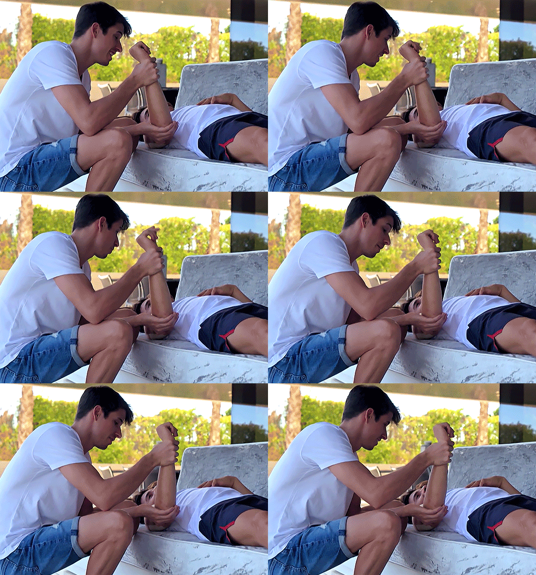
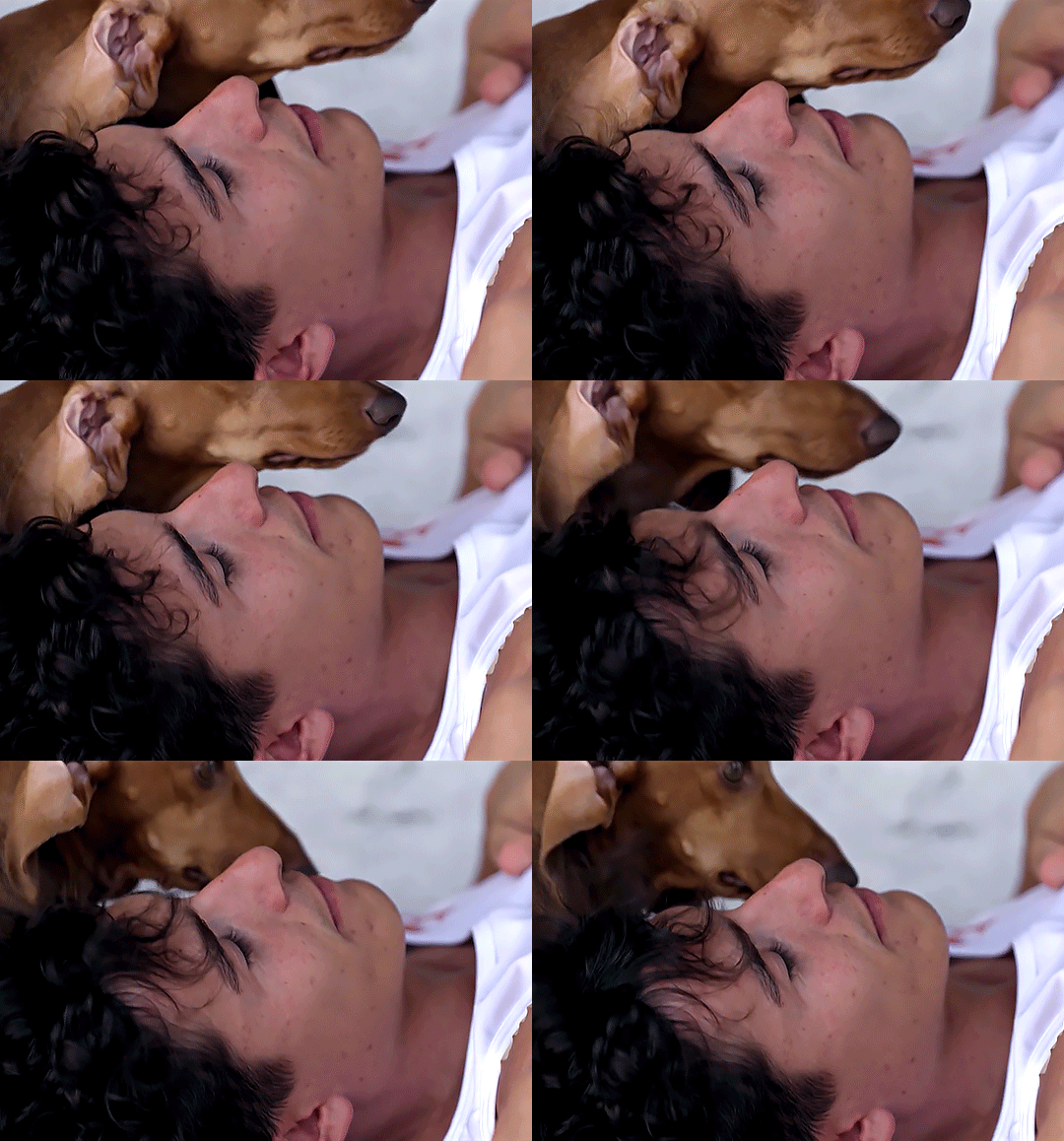
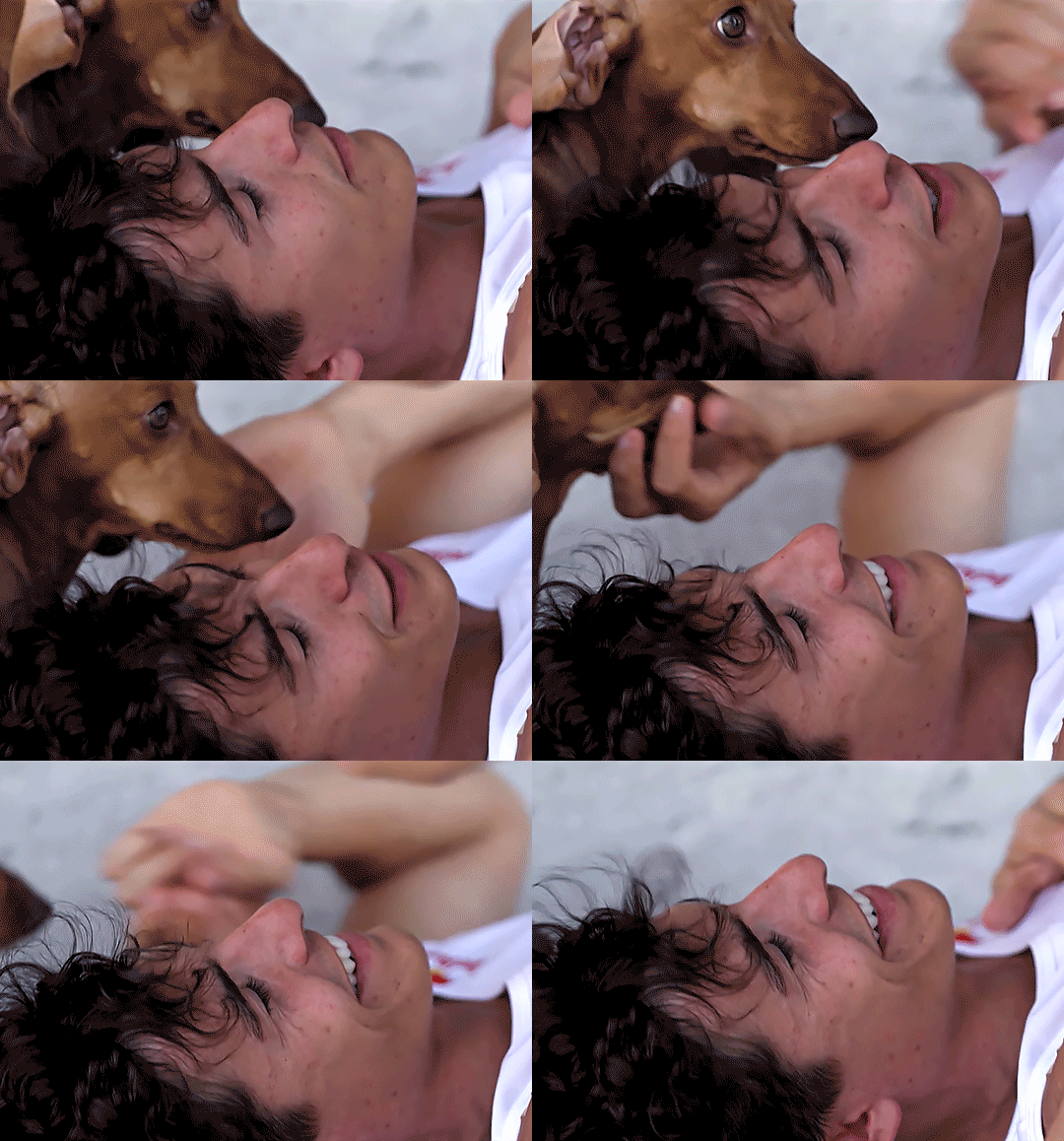

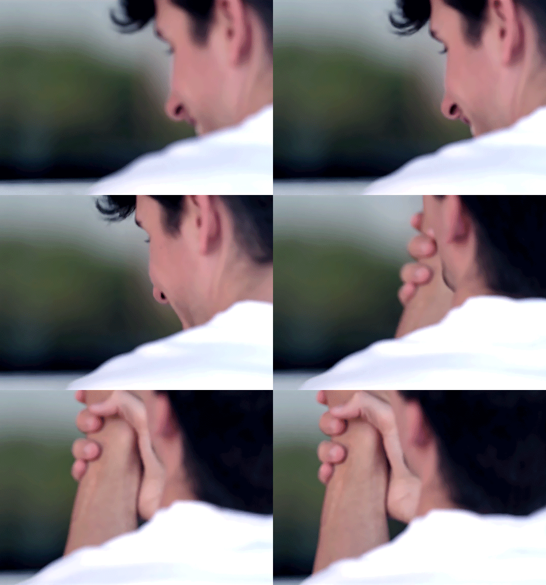
all in rewatch - 12/∞
#motogp#marc marquez#alex marquez#air#my gifs#*#y: 2022#marquez family#them them them#alex taking care of marc and helping him with his pt exercises#dogs#if I had a tenth of alex's patience in life I would be such a balanced person#100#200
262 notes
·
View notes
Text


kids these days love falling into mountain holes
#skye's doodles#little character design exercise bc its good for fighting artblock and bc my dearest friend undertale has been on my mind lately#ihad designs for these guys ages ago but i was also like 12 so it was fun to come up w new ones. maybe ill think of names for them sometime#also chara n frisk were nice to draw again i missed them so much. chara's one of the most important skye comfort characters of all time <3#undertale#frisk undertale#chara dreemurr#patience undertale#bravery undertale#integrity undertale#perseverance undertale#kindness undertale#justice undertale
103 notes
·
View notes
Text
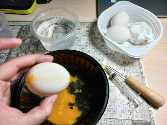
Preparations for making pysankas is always a fun part of the process.
387 notes
·
View notes
Text
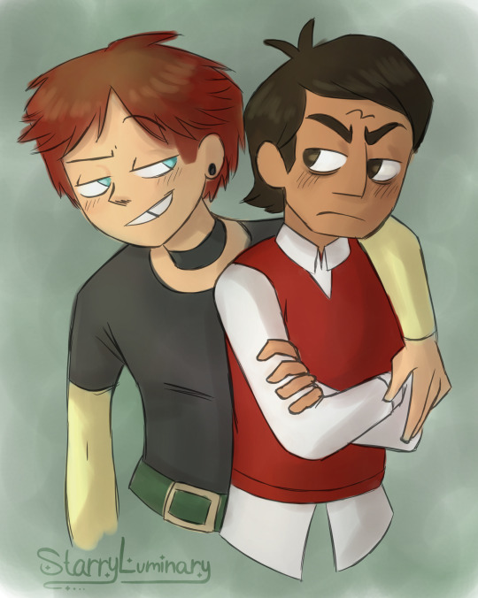
If Noco were a canon couple’s stereotypes: The Delinquent and The Type-A
#yeah I don’t know#I’ve been in a rut lately and I thought this would be a fun exercise to get back into the swing of things#so I kinda went with the flow with this one. If that wasn’t obvious#opened MediBang and blacked out#total drama#total drama noah#td noah#total drama cody#td cody#cody anderson#noco#total drama noco#td noco#Starry makes art#I actually wanted to draw them as Gwen and Trent first#but that required me to draw a keyboard for Cody to replace Trents guitar#and I did NOOOOTTTTTT have the patience for that#maybe next time
194 notes
·
View notes
Text
Killer who needs pressure like a weighted blanket to calm down but he doesn't know that that's a thing or that weighted blankets exist so he just buzzes around Horror annoying him for 30 minutes until Horror puts him in a headlock
#UTDR#UTMV#Killer Sans#Horror Sans#He just needs to be slightly compressed#Just a light squishing#Horror just thinks he's a pain in the ass and tries to have more patience and not give into his shit#It doesn't work because Killer is persistent and can't settle down#Horror probably doesn't get peace until Cross joins and Killer starts pestering him instead#Except when Cross gets pissed he just straight up wrestles him#And when Cross pins him down (because he was actually trained how to fight) Killer just. lays there. content. this is good#Eventually Cross learns how to cut out the middleman and just go sit on Killer when he's getting too feisty#Unless he's in a mood or wants the exercise. Then they throw each other around for a while
54 notes
·
View notes
Text
The minor spn characters rarely interact with each other, especially the women. It goes without saying how rare it is for spn women to have meaningful relationships (in the broad sense of the word) with other women. So.
#and everyone wept#you can see how by the option for patience and jody i started to get desperate#and played loose with the words 'meaningful relationships'#women from last options interacted like once or twice on the screen but at least they're implied to have meaningful relationships#polls#spn#supernatural#charlie bradbury#dorothy baum#patience turner#jody mills#donna hanscum#kaia nieves#alex jones#claire novak#alicia banes#tasha banes#jo harvelle#ellen harvelle#this was an exercise in how many relationships between spn women i can remember#not many#why tf tumblr published the old version of the post with mistakes#why does tumblr hate me
102 notes
·
View notes
Text
I miss them so bad (Dick and Damian)
#ramblings of a lunatic#dc comics#damian wayne#dick grayson#ITS JUST NOT THE SAME MAN#idk i was reading nightwing must die (again...) bc i was in a funk and saw another post saying how fans exaggerate the closeness btwn them#and on the one hand i get it. there is a very rosy portrayal of their relationship you'll come across in fanon#and they weren't very close at the beginning of their relationship#but man. reading Nightwing must die again was like#YES they fight. damian instigates it and while dick tries to exercise patience he does fight back/lash out on occasion#but despite all that it's still emphasized how important the two are to each other#when dick is forced to picture a future where he's lost his way he pictures damian being the one to bring him back#not necessarily bc damian is his favorite person on the planet but bc he gave damian robin. for a lot of practical reasons-#-but also bc how far damians come is (i think at least based on this arc) a testament to dick that hes doing Something right#both as a hero/person#damian is more than just a burden saddled on him (although there's an element of that in their batman and robin run)#he's also a last remaining connection to bruce when he's gone (remembering where he comes from) AND he's training damian+#-his own way! with a dash of tough love and workaholic spirit inherited but also a lot of patience and focus on being More than the darkness#idc what ppl say nightwing must die makes sense for these two. its a retcon but one that works imo#that dick buried his head in the sand about how much damian meant/the responsibility he had to him bc it was a commitment he was afraid of#and how damian ultimately was a point of maturation for dick even if he went back to being Nightwing#they were SO goddamn close and now they're still close but only in ways that are implied#and their bond is deemphasized in comparison to each others bond w/ say bruce. which i think is a shame#it was a wrinkle! a fun wrinkle that the batfamily had that in some ways dick understood damian better than Bruce-#-even if he didn't feel like he could handle the responsibility of raising him full time#it kills me that bc of the n52 we never got the handover of the batman mantle (and damian) from dick to bruce#next nightwing writer...include a flashback to that moment AND have damian appear in the book in present....AND MY LIFE IS YOURS!!!#anyway. dick is damians brother but also damian a little bit imprinted on him like a baby duck and its rubbed off on dick#they're partners they're mentor mentee but most importantly they were batman and robin. and they were the greatest#NOT bc it was all peaches and roses but bc they cared for each other exponentially despite all that
131 notes
·
View notes
Text
google search writing prompts
google search good writing prompts
google search writing prompts that aren't bad
google search writing prompts that are not stupid and in the very particular tone of certain social media writing communities that i do not especially care for
GOOGLE SEARCH WRITING PROMPTS PLEASE AAAHHHH
#maybe i would have better luck looking for a random word generator#seems like all of the writing prompts i find under these searches are extremely specific#describing specific scenarios and characters and actions#almost always in a way i find extremely off putting#i think i really just want a Word or Concept to gnaw on like a teething puppy#not a fucking mad libs exercise in patience lmao#or maybe i should just go to dictionary dot com
68 notes
·
View notes
Text
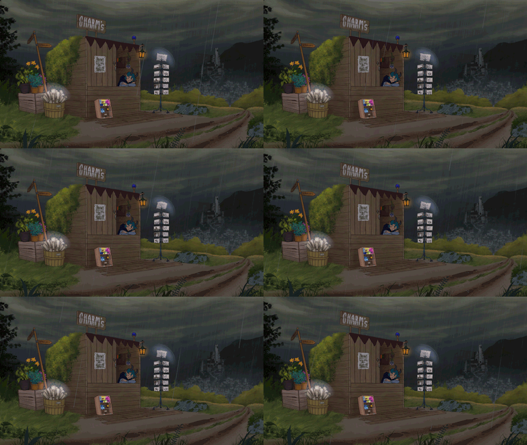
an uneventful evening
#i did a sketch swap with my friend and i used it as a loose inspiration for this#i don't want to post my friend's sketch here since they don't use tumblr but basically it had a shack and a hill and some mountains#this is 100% not optimised for tumblr or mobile lol - you can't even see the details#but i worked on this for some two weeks and learned a LOT#glad to be done with this - maybe someone will enjoy it even if it's not mobile friendly#it turned into a more of an exercise of patience for me than something people will actually look at lolll#art#animation#jitterbugbear art#illustration#digital animation#procreate#artists on tumblr
357 notes
·
View notes
Text
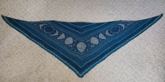
I am NEVER doing flat colour work again
[pattern]
#this thing was an exercise in patience and definitely a learning experience#gotta experiment with ways to wear it that make it more cloak-like or else it's destined to be a fancy couch blanket#but I'm very proud of it and it was fun participating in a KAL group for the first time#note for anyone planning to make their own: I used worsted instead of DK so it's literally longer than I am tall#knitting#textiles#original post
119 notes
·
View notes
Text
DRAWING BACKGROUNDS: TIPS AND TRICKS
So many people are afraid of drawing backgrounds and I think it's a shame, so here's some tips and tricks, because I'm not perfect at it myself but I think the hardest part is really just knowing where to start.
First off: Perspective
Yeah, yeah, that's the scary word. But I promise you, once you're familiar with the basics, backgrounds are a LOT less intimidating. Don't get discouraged if WHEN you have trouble with it. Even professional artists struggle with it. I promise you, screwing it up is good and normal. That's how you learn after all!
Now I'm not going to go into detail on how to do it here, because honestly there are a thousand and one free resources online and in libraries that can explain it far better than I ever could in a singular broad-strokes tumblr post. But I AM at least telling you you should familiarize yourself with these basics:
Important Terms: Horizon Line: A horizontal line across your canvas, showing your viewer's eye level and providing a location for most of your vanishing points. Vanishing Point: Integral to drawing in perspective. The sides of a 3D object get smaller as they become farther away from the viewer in space. This point is where the parallel lines of a side eventually meet.
The Basic Types of Perspective: One Point Perspective: Good for drawing things that you're looking at straight on. Two Point Perspective: Good for drawing things at an angle. Three Point Perspective: Good for drawing things the viewer is looking up or down at, especially at an extreme angle.
[Click images for ALT descriptions]
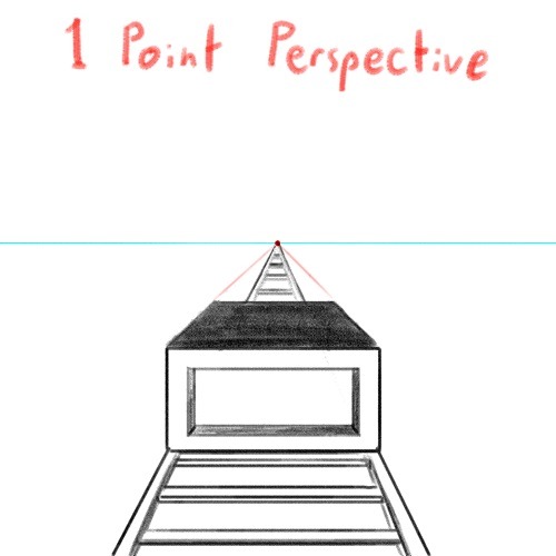
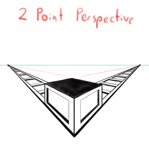
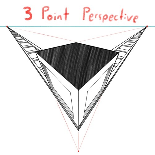
And if you're comfortable with these and serious about improving your skills for use in storytelling, I also might suggest looking up:
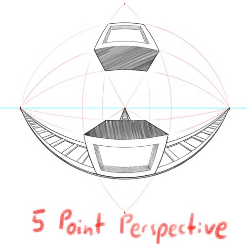
4 Point Perspective: Great for extra wide or tall shots and for camera tilts if you're doing an animation or animatic. I think some other names for this in animation include "banana pan" and "warp pan."
5 Point Perspective: Fish-eye lens. Good for all your angsty anime boy slipping into madness needs!
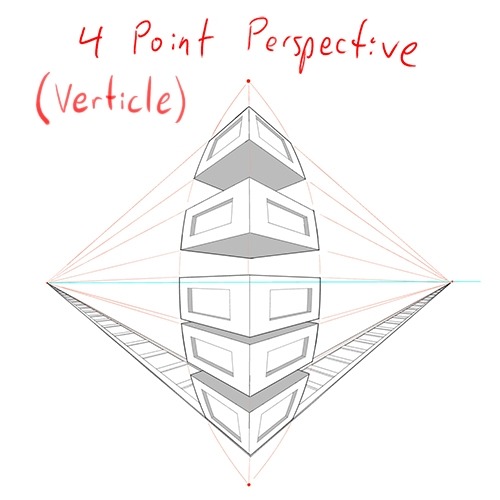
Some perspective tips I wish someone had told me earlier:
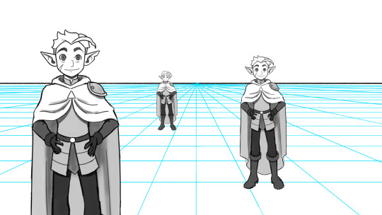
Objects' relation to the horizon line is constant. A super helpful tip to remember when placing a character or object in space is that they will always (assuming they aren't changing in size or moving up or down) have the same relation to the horizon line no matter how far or close they are. If your horizon line is at shoulder height for your focus character in the foreground, any character of the same height in the background will still line up with the horizon line at the shoulders.
How to pick the distance between your vanishing points: 2 pt perspective uses 2 vanishing points, 3 pt uses 3, etc, etc, but how close should they be? Well, first of all, for anything that isn't one point perspective, one or more points will usually be off the canvas. Super annoying, I know, but the closer your vanishing points are, the more warped your drawing will become. Second, a helpful thing to know is that choosing the distance between your points is basically the illustration equivalent of picking your camera lens! Photography buffs will know that wider (shorter focal length) lenses show more space and make the distance between foreground and background more dramatic, while longer focal length/telephoto lenses are flatter, and more focused and intimate. The same is true of vanishing points that are closer (shorter focal length) or farther apart (longer focal length).
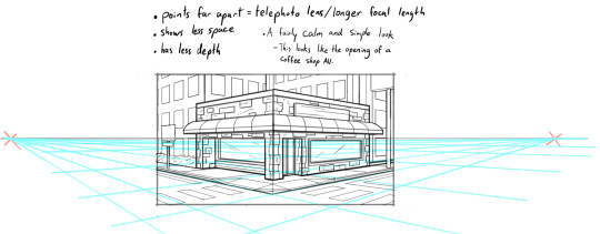
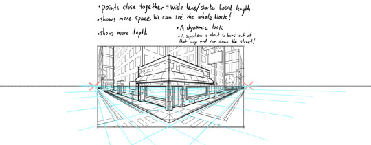
2 point/3 point/etc doesn't actually mean you're limited to that many points total on your page. this one confused me a lot when I was getting started, lol. A lot of examples will show you drawings of nice, neat cities or something, in which all the buildings are facing the same way in order to demonstrate perspective drawing. But in real life, buildings don't all face the same direction. They're at all sorts of different angles. So how do I do that??? Answer: Just because you're drawing in 2 point perspective or whatever doesn't mean you... have to actually keep your 2 points in the same spot. You can move them around, just keep them the same distance apart, so you're not screwing up your camera lens.
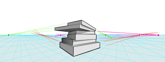
Other Tips:
Use reference! The instant you try to draw a house, you're going to forget every house you've ever seen. That's just how it goes. Buildings are complicated. Do yourself a favor and collect a few reference images first, buddy!
Consider details (like architectural style, amenities, and materials) Your building will look more like a building when you keep in mind that buildings have gutters and door knobs and light switches and paneling and stuff, and aren't just boxes with roofs on them. Again: reference! You will forget electrical sockets and baseboards exist immediately. Art brains are dumb.
Use details and texture to fill in negative space Giant stretches of blank space tend to be boring and distracting. Put a few suggestions of wood grain or something on that wall back there, bud, just don't overdo it.
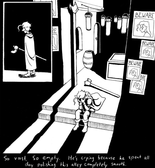

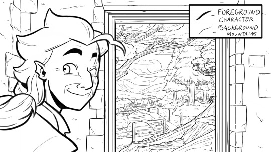
Line weight Darker, thicker lines draw more attention, look heavier, and look closer to the viewer than lighter, thinner lines do. Take advantage of this to draw the viewer's attention to your focal points, de-emphasize less important details, and imply depth. It's up to you to decide how you want to use this and what your style is, especially once you start getting into combining or replacing it with shading, values, and color, but a helpful rule of thumb is to try reserving your thickest lines for focal foreground characters and use thinner lines on backgrounds, especially details in the far distance.
Perspective guides If you're drawing digitally, take full advantage of any perspective tools you have access to! A lot of art programs lately have begun adding perspective guide features that let you set up vanishing points and then literally guide your hand as you draw so you stay in perspective. Some of these include Procreate, Clip Studio Paint, and Adobe Fresco. (still sadly none in Photoshop as far as I'm aware, what the heck, Adobe!). Check through the settings of yours to see if it gives you any perspective guides or other similarly useful tools. They're 100% worth it! And for god's sake, if you've got any skew or perspective warp tools, draw your complicated shapes flat and then warp them instead of spending an hour on it! Don't make my mistakes!
#backgrounds#art tips#tutorial#art reference#drawing tips#perspective drawing#the owl house#hunter toh#doodle art#doodletext#rambling topic#yes i'm using my blorbo to demonstrate art tips what about it#this took longer than i meant it to lol. i got really into the examples#thank you for your patience guys#this turned out to be a GREAT exercise for me as an artist too actually. Trying to explain things is rlly good practice#I didn't even get into values and such. I can only ramble so much I'm afraid
983 notes
·
View notes