#ok the story is going well
Explore tagged Tumblr posts
Text
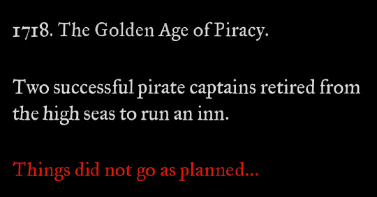
calling it right now that season 3 starts like this
#so confused about people saying the season finale feels like the end because to me it didn't at all#there's like 5-10 issues immediately set up for another season#they're in a happy place at this point because they've both realized their love is bigger than anything else#and makes it worth working on their problems together#the problems are still very much there#both of them have deep self esteem/self loathing issues that haven't been resolved in the week since ed woke up#ed doesn't know about stede's trauma#they haven't talked through anything#and they'll be shit at starting/running an inn lmao it's not gonna go well#and those are just some of the internal issues#then there's prince ricky and all the authorities that would very much like to get their hands on both blackbeard and stede bonnet#because stede just full-on kept using his government name after faking his death. nice one#the crew are not “gone” they're more like off to college for a bit but will probably run into trouble immediately#again because while they escaped to the ship they didn't eliminate the threat (the british empire)#it's not a forever goodbye#ok this got super long already anyway i have a whole fic marinading in my brain until i've finished these 4 wips i'm in the middle of ✌️#hope we get a renewal soon because i want to see the rest of their story!!#ofmd s2 spoilers#ofmd s2#ofmd#our flag means death
2K notes
·
View notes
Text

guys i started reading this recently and let me tell you. You have to read this one.... ITS SO GODDAMN FUNNY. im having the time of my life... wholeheartedly rec
#the comedic timing really hits unlike a lot of comedy webtoons that miss the mark for me...#but not only that but it's genuinely a rly solid story w a likeable cast??#it genuinely has a lot of heart and the emotional beats hit (i cried)...#im up to ep 62 now#it balances comedy action and heartwarming well...#its been a long time since ive read such a genuinely good gag manga like this#tbh i didn't have much expectations going in but u see that 9.9 rating... i understand why it's so high now fkdhdj#deserved tbh#webtoon recommendation#the greatest estate developer#tged#talk tag#cant wait to read more whenever i have downtime#ok im going to wait a bit to rb fanart
167 notes
·
View notes
Text
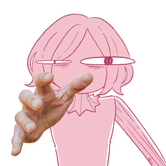
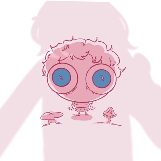
Read dungeon meshi up to vol.8 so far, so here you go Can't stop taking back the (vol.8) book and looking through the pages again and again and I'm wondering why does Mithrun just... grab Not even to use his magic, he just... grabs...
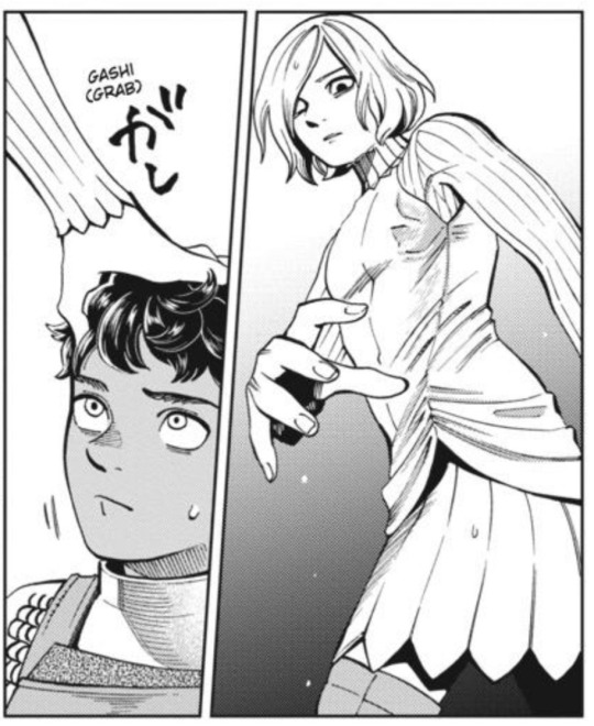
#dungeon meshi#mithrun#kabru#I know I don't have all the infos yet but yeah sir are you ok#does he even actually see anything#don't answer that I'll get to this when reading the rest#love him though I love elves so so so much whatever the story or media theyre automatically blorbos#and tbh the elven crew is part of why I started dungeon meshi#0 regrets everyting is fantastic from all the designs to the storytelling#going insane abt elf senshi as well#might draw more when I'm rested
352 notes
·
View notes
Text
why Aurora's art is genius
It's break for me, and I've been meaning to sit down and read the Aurora webcomic (https://comicaurora.com/, @comicaurora on Tumblr) for quite a bit. So I did that over the last few days.
And… y'know. I can't actually say "I should've read this earlier," because otherwise I would've been up at 2:30-3am when I had responsibilities in the morning and I couldn't have properly enjoyed it, but. Holy shit guys THIS COMIC.
I intended to just do a generalized "hello this is all the things I love about this story," and I wrote a paragraph or two about art style. …and then another. And another. And I realized I needed to actually reference things so I would stop being too vague. I was reading the comic on my tablet or phone, because I wanted to stay curled up in my chair, but I type at a big monitor and so I saw more details… aaaaaand it turned into its own giant-ass post.
SO. Enjoy a few thousand words of me nerding out about this insanely cool art style and how fucking gorgeous this comic is? (There are screenshots, I promise it isn't just a wall of text.) In my defense, I just spent two semesters in graphic design classes focusing on the Adobe Suite, so… I get to be a nerd about pretty things…???
All positive feedback btw! No downers here. <3
---
I cannot emphasize enough how much I love the beautiful, simple stylistic method of drawing characters and figures. It is absolutely stunning and effortless and utterly graceful—it is so hard to capture the sheer beauty and fluidity of the human form in such a fashion. Even a simple outline of a character feels dynamic! It's gorgeous!
Though I do have a love-hate relationship with this, because my artistic side looks at that lovely simplicity, goes "I CAN DO THAT!" and then I sit down and go to the paper and realize that no, in fact, I cannot do that yet, because that simplicity is born of a hell of a lot of practice and understanding of bodies and actually is really hard to do. It's a very developed style that only looks simple because the artist knows what they're doing. The human body is hard to pull off, and this comic does so beautifully and makes it look effortless.
Also: line weight line weight line weight. It's especially important in simplified shapes and figures like this, and hoo boy is it used excellently. It's especially apparent the newer the pages get—I love watching that improvement over time—but with simpler figures and lines, you get nice light lines to emphasize both smaller details, like in the draping of clothing and the curls of hair—which, hello, yes—and thicker lines to emphasize bigger and more important details and silhouettes. It's the sort of thing that's essential to most illustrations, but I wanted to make a note of it because it's so vital to this art style.
THE USE OF LAYER BLENDING MODES OH MY GODS. (...uhhh, apologies to the people who don't know what that means, it's a digital art program thing? This article explains it for beginners.)
Bear with me, I just finished my second Photoshop course, I spent months and months working on projects with this shit so I see the genius use of Screen and/or its siblings (of which there are many—if I say "Screen" here, assume I mean the entire umbrella of Screen blending modes and possibly Overlay) and go nuts, but seriously it's so clever and also fucking gorgeous:
Firstly: the use of screened-on sound effect words over an action? A "CRACK" written over a branch and then put on Screen in glowy green so that it's subtle enough that it doesn't disrupt the visual flow, but still sticks out enough to make itself heard? Little "scritches" that are transparent where they're laid on without outlines to emphasize the sound without disrupting the underlying image? FUCK YES. I haven't seen this done literally anywhere else—granted, I haven't read a massive amount of comics, but I've read enough—and it is so clever and I adore it. Examples:


Secondly: The beautiful lighting effects. The curling leaves, all the magic, the various glowing eyes, the fog, the way it's all so vividly colored but doesn't burn your eyeballs out—a balance that's way harder to achieve than you'd think—and the soft glows around them, eeeee it's so pretty so pretty SO PRETTY. Not sure if some of these are Outer/Inner Glow/Shadow layer effects or if it's entirely hand-drawn, but major kudos either way; I can see the beautiful use of blending modes and I SALUTE YOUR GENIUS.
I keep looking at some of this stuff and go "is that a layer effect or is it done by hand?" Because you can make some similar things with the Satin layer effect in Photoshop (I don't know if other programs have this? I'm gonna have to find out since I won't have access to PS for much longer ;-;) that resembles some of the swirly inner bits on some of the lit effects, but I'm not sure if it is that or not. Or you could mask over textures? There's... many ways to do it.
If done by hand: oh my gods the patience, how. If done with layer effects: really clever work that knows how to stop said effects from looking wonky, because ugh those things get temperamental. If done with a layer of texture that's been masked over: very, very good masking work. No matter the method, pretty shimmers and swirly bits inside the bigger pretty swirls!
Next: The way color contrast is used! I will never be over the glowy green-on-black Primordial Life vibes when Alinua gets dropped into that… unconscious space?? with Life, for example, and the sharp contrast of vines and crack and branches and leaves against pitch black is just visually stunning. The way the roots sink into the ground and the three-dimensional sensation of it is particularly badass here:

Friggin. How does this imply depth like that. HOW. IT'S SO FREAKING COOL.
A huge point here is also color language and use! Everybody has their own particular shade, generally matching their eyes, magic, and personality, and I adore how this is used to make it clear who's talking or who's doing an action. That was especially apparent to me with Dainix and Falst in the caves—their colors are both fairly warm, but quite distinct, and I love how this clarifies who's doing what in panels with a lot of action from both of them. There is a particular bit that stuck out to me, so I dug up the panels (see this page and the following one https://comicaurora.com/aurora/1-20-30/):

(Gods it looks even prettier now that I put it against a plain background. Also, appreciation to Falst for managing a bridal-carry midair, damn.)
The way that their colors MERGE here! And the immense attention to detail in doing so—Dainix is higher up than Falst is in the first panel, so Dainix's orange fades into Falst's orange at the base. The next panel has gold up top and orange on bottom; we can't really tell in that panel where each of them are, but that's carried over to the next panel—
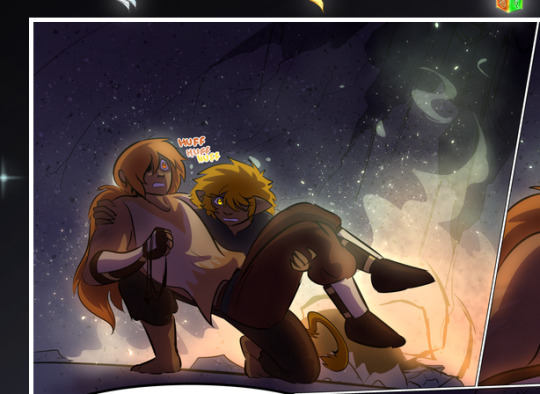
—where we now see that Falst's position is raised above Dainix's due to the way he's carrying him. (Points for continuity!) And, of course, we see the little "huffs" flowing from orange to yellow over their heads (where Dainix's head is higher than Falst's) to merge the sound of their breathing, which is absurdly clever because it emphasizes to the viewer how we hear two sets of huffing overlaying each other, not one. Absolutely brilliant.
(A few other notes of appreciation to that panel: beautiful glows around them, the sparks, the jagged silhouette of the spider legs, the lovely colors that have no right to make the area around a spider corpse that pretty, the excellent texturing on the cave walls plus perspective, the way Falst's movements imply Dainix's hefty weight, the natural posing of the characters, their on-point expressions that convey exactly how fuckin terrifying everything is right now, the slight glows to their eyes, and also they're just handsome boys <3)
Next up: Rain!!!! So well done! It's subtle enough that it never ever disrupts the impact of the focal point, but evident enough you can tell! And more importantly: THE MIST OFF THE CHARACTERS. Rain does this irl, it has that little vapor that comes off you and makes that little misty effect that plays with lighting, it's so cool-looking and here it's used to such pretty effect!
One of the panel captions says something about it blurring out all the injuries on the characters but like THAT AIN'T TOO BIG OF A PROBLEM when it gets across the environmental vibes, and also that'd be how it would look in real life too so like… outside viewer's angle is the same as the characters', mostly? my point is: that's the environment!!! that's the vibes, that's the feel! It gets it across and it does so in the most pretty way possible!
And another thing re: rain, the use of it to establish perspective, particularly in panels like this—

—where we can tell we're looking down at Tynan due to the perspective on the rain and where it's pointing. Excellent. (Also, kudos for looking down and emphasizing how Tynan's losing his advantage—lovely use of visual storytelling.)
Additionally, the misting here:
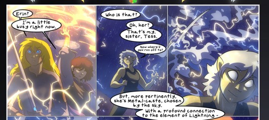
We see it most heavily in the leftmost panel, where it's quite foggy as you would expect in a rainstorm, especially in an environment with a lot of heat, but it's also lightly powdered on in the following two panels and tends to follow light sources, which makes complete sense given how light bounces off particles in the air.
A major point of strength in these too is a thorough understanding of lighting, like rim lighting, the various hues and shades, and an intricate understanding of how light bounces off surfaces even when they're in shadow (we'll see a faint glow in spots where characters are half in shadow, but that's how it would work in real life, because of how light bounces around).
Bringing some of these points together: the fluidity of the lines in magic, and the way simple glowing lines are used to emphasize motion and the magic itself, is deeply clever. I'm basically pulling at random from panels and there's definitely even better examples, but here's one (see this page https://comicaurora.com/aurora/1-16-33/):

First panel, listed in numbers because these build on each other:
The tension of the lines in Tess's magic here. This works on a couple levels: first, the way she's holding her fists, as if she's pulling a rope taut.
The way there's one primary line, emphasizing the rope feeling, accompanied by smaller ones.
The additional lines starbursting around her hands, to indicate the energy crackling in her hands and how she's doing a good bit more than just holding it. (That combined with the fists suggests some tension to the magic, too.) Also the variations in brightness, a feature you'll find in actual lightning. :D Additional kudos for how the lightning sparks and breaks off the metal of the sword.
A handful of miscellaneous notes on the second panel:
The reflection of the flames in Erin's typically dark blue eyes (which bears a remarkable resemblance to Dainix, incidentally—almost a thematic sort of parallel given Erin's using the same magic Dainix specializes in?)
The flowing of fabric in the wind and associated variation in the lineart
The way Erin's tattoos interact with the fire he's pulling to his hand
The way the rain overlays some of the fainter areas of fire (attention! to! detail! hell yeah!)
I could go on. I won't because this is a lot of writing already.
Third panel gets paragraphs, not bullets:
Erin's giant-ass "FWOOM" of fire there, and the way the outline of the word is puffy-edged and gradated to feel almost three-dimensional, plus once again using Screen or a variation on it so that the stars show up in the background. All this against that stunning plume of fire, which ripples and sparks so gorgeously, and the ending "om" of the onomatopoeia is emphasized incredibly brightly against that, adding to the punch of it and making the plume feel even brighter.
Also, once again, rain helping establish perspective, especially in how it's very angular in the left side of the panel and then slowly becomes more like a point to the right to indicate it's falling directly down on the viewer. Add in the bright, beautiful glow effects, fainter but no less important black lines beneath them to emphasize the sky and smoke and the like, and the stunningly beautiful lighting and gradated glows surrounding Erin plus the lightning jagging up at him from below, and you get one hell of an impactful panel right there. (And there is definitely more in there I could break down, this is just a lot already.)
And in general: The colors in this? Incredible. The blues and purples and oranges and golds compliment so well, and it's all so rich.
Like, seriously, just throughout the whole comic, the use of gradients, blending modes, color balance and hues, all the things, all the things, it makes for the most beautiful effects and glows and such a rich environment. There's a very distinct style to this comic in its simplified backgrounds (which I recognize are done partly because it's way easier and also backgrounds are so time-consuming dear gods but lemme say this) and vivid, smoothly drawn characters; the simplicity lets them come to the front and gives room for those beautiful, richly saturated focal points, letting the stylized designs of the magic and characters shine. The use of distinct silhouettes is insanely good. Honestly, complex backgrounds might run the risk of making everything too visually busy in this case. It's just, augh, so GORGEOUS.
Another bit, take a look at this page (https://comicaurora.com/aurora/1-15-28/):
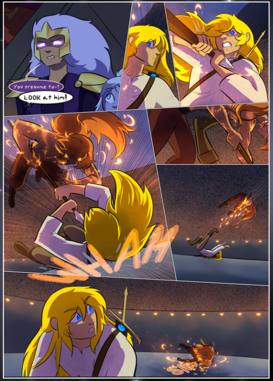
It's not quite as evident here as it is in the next page, but this one does some other fun things so I'm grabbing it. Points:
Once again, using different colors to represent different character actions. The "WHAM" of Kendal hitting the ground is caused by Dainix's force, so it's orange (and kudos for doubling the word over to add a shake effect). But we see blue layered underneath, which could be an environmental choice, but might also be because it's Kendal, whose color is blue.
And speaking off, take a look at the right-most panel on top, where Kendal grabs the spear: his motion is, again, illustrated in bright blue, versus the atmospheric screened-on orange lines that point toward him around the whole panel (I'm sure these have a name, I think they might be more of a manga thing though and the only experience I have in manga is reading a bit of Fullmetal Alchemist). Those lines emphasize the weight of the spear being shoved at him, and their color tells us Dainix is responsible for it.
One of my all-time favorite effects in this comic is the way cracks manifest across Dainix's body to represent when he starts to lose control; it is utterly gorgeous and wonderfully thematic. These are more evident in the page before and after this one, but you get a decent idea here. I love the way they glow softly, the way the fire juuuust flickers through at the start and then becomes more evident over time, and the cracks feel so realistic, like his skin is made of pottery. Additional points for how fire begins to creep into his hair.
A small detail that's generally consistent across the comic, but which I want to make note of here because you can see it pretty well: Kendal's eyes glow about the same as the jewel in his sword, mirroring his connection to said sword and calling back to how the jewel became Vash's eye temporarily and thus was once Kendal's eye. You can always see this connection (though there might be some spots where this also changes in a symbolic manner; I went through it quickly on the first time around, so I'll pay more attention when I inevitably reread this), where Kendal's always got that little shine of blue in his eyes the same as the jewel. It's a beautiful visual parallel that encourages the reader to subconsciously link them together, especially since the lines used to illustrate character movements typically mirror their eye color. It's an extension of Kendal.
Did I mention how ABSOLUTELY BEAUTIFUL the colors in this are?
Also, the mythological/legend-type scenes are illustrated in familiar style often used for that type of story, a simple and heavily symbolic two-dimensional cave-painting-like look. They are absolutely beautiful on many levels, employing simple, lovely gradients, slightly rougher and thicker lineart that is nonetheless smoothly beautiful, and working with clear silhouettes (a major strength of this art style, but also a strength in the comic overall). But in particular, I wanted to call attention to a particular thing (see this page https://comicaurora.com/aurora/1-12-4/):
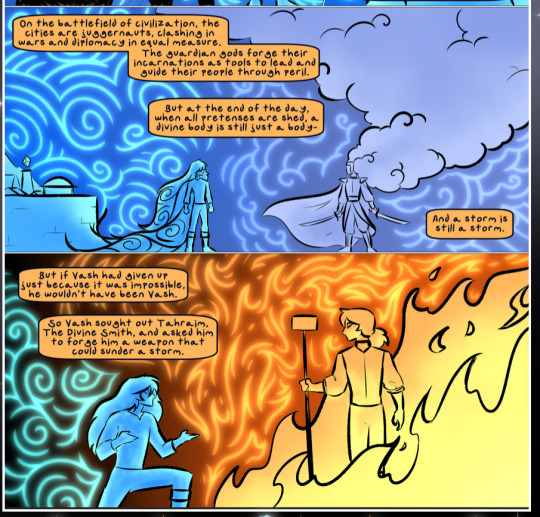
The flowing symbolic lineart surrounding each character. This is actually quite consistent across characters—see also Life's typical lines and how they curl:
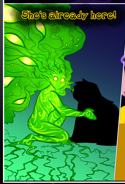
What's particularly interesting here is how these symbols are often similar, but not the same. Vash's lines are always smooth, clean curls, often playing off each other and echoing one another like ripples in a pond. You'd think they'd look too similar to Life's—but they don't. Life's curl like vines, and they remain connected; where one curve might echo another but exist entirely detached from each other in Vash's, Life's lines still remain wound together, because vines are continuous and don't float around. :P
Tahraim's are less continuous, often breaking up with significantly smaller bits and pieces floating around like—of course—sparks, and come to sharper points. These are also constants: we see the vines repeated over and over in Alinua's dreams of Life, and the echoing ripples of Vash are consistent wherever we encounter him. Kendal's dream of the ghost citizens of the city of Vash in the last few chapters is filled with these rippling, echoing patterns, to beautiful effect (https://comicaurora.com/aurora/1-20-14/):
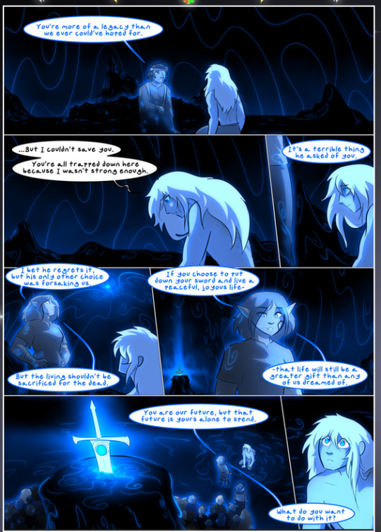
They ripple and spiral, often in long, sinuous curves, with smooth elegance. It reminds me a great deal of images of space and sine waves and the like. This establishes a definite feel to these different characters and their magic. And the thing is, that's not something that had to be done—the colors are good at emphasizing who's who. But it was done, and it adds a whole other dimension to the story. Whenever you're in a deity's domain, you know whose it is no matter the color.
Regarding that shape language, I wanted to make another note, too—Vash is sometimes described as chaotic and doing what he likes, which is interesting to me, because smooth, elegant curves and the color blue aren't generally associated with chaos. So while Vash might behave like that on the surface, I'm guessing he's got a lot more going on underneath; he's probably much more intentional in his actions than you'd think at a glance, and he is certainly quite caring with his city. The other thing is that this suits Kendal perfectly. He's a paragon character; he is kind, virtuous, and self-sacrificing, and often we see him aiming to calm others and keep them safe. Blue is such a good color for him. There is… probably more to this, but I'm not deep enough in yet to say.
And here's the thing: I'm only scratching the surface. There is so much more here I'm not covering (color palettes! outfits! character design! environment! the deities! so much more!) and a lot more I can't cover, because I don't have the experience; this is me as a hobbyist artist who happened to take a couple design classes because I wanted to. The art style to this comic is so clever and creative and beautiful, though, I just had to go off about it. <3
...brownie points for getting all the way down here? Have a cookie.
#aurora comic#aurora webcomic#comicaurora#art analysis#...I hope those are the right tags???#new fandom new tagging practices to learn ig#much thanks for something to read while I try to rest my wrists. carpal tunnel BAD. (ignore that I wrote this I've got braces ok it's fine)#anyway! I HAVE. MANY MORE THOUGHTS. ON THE STORY ITSELF. THIS LOVELY STORY#also a collection of reactions to a chunk of the comic before I hit the point where I was too busy reading to write anything down#idk how to format those tho#...yeet them into one post...???#eh I usually don't go off this much these days but this seems like a smaller tight-knit fandom so... might as well help build it?#and I have a little more time thanks to break so#oh yes also shoutout to my insanely awesome professor for teaching me all the technical stuff from this he is LOVELY#made an incredibly complex program into something comprehensible <3#synapse talks
786 notes
·
View notes
Text
What I loved about Cinderella's Castle is it is so entirely about Ella. We know starkid can handle a show with tons and tons of characters but I found it quite refreshing for it to be so wholly her story? I think it was a lovely choice for this show and man Bryce did such a perfect job of it, she is truly such a star
#starkid#cinderella's castle spoilers#cinderella's castle#cc#cc spoilers#I think I want to rewatch it a couple of times to actually ascertain how I rank it with other starkid shows but. yeah what a great show#they used that money well too every aspect was STUNNING#and I could go on and on about the choreography maybe the best from any starkid show it looked so fucking good#anyway. justice for my girls Justine and Lucy I miss you#OH more things I loved! no romance! starkid write fantastic romances which I love dearly but again it was so nice#to just see Ella discover herself and her power. and yes I know her and Tadius are heavily implied but! I love that it was allowed to#just be the very beginnings of whatever they might become!!!#I will say that I predicted the Justine and Lucy thing which is heartbreaking I miss them#but anyway I loved it as a version of Cinderella and I loved it as a musical and MAN the music FUCKING SLAPPED#I made like 7 pages of notes because I regret that I don't remember my immediate reactions to bf and npmd#they are insane and most of them are just 'oh my god' and 'he's just a little boy' whenever crumb was on#ALSO WHO THR FUCK WAS THAT MASTER DWARF CAN WE GET MORE DETAILS ON THAT!!!!!!!!!!!!!!!!!!!! WHI IS HE AND HIS WOODBLOCK#OK ALSO ALSO oh my god there are too many thoughts in my brain. also. so it's basically confirmed they want to be Beauty and the beast and#snow white now right?#were there any other fairytale references?#ok fuck it finally last thing verrrry intrigued by how much the audience were clearly part of the story
161 notes
·
View notes
Text

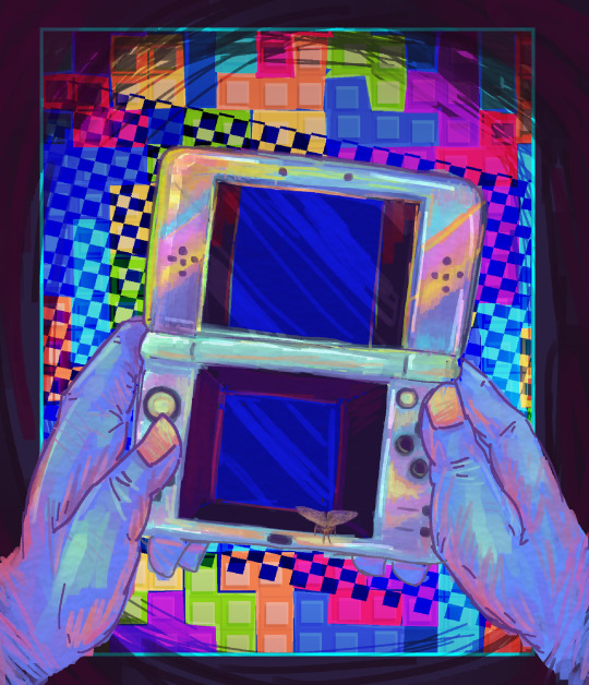
Tetris Fanart.
I've been playing tetris while listening to horror podcasts. and yeah
#text#art#eyestrain#cw eystrain#bright colors#cw bright colors#tetris#nintendo#god i dont know what to tag this with. i dont wanna tag it with the podcasts themselves cuz that feels disingenuous. swagever#i actually started this piece a while ago. ok yeah looking at the date that was almost 3 weeks ago wow#but i finally decided to bring it back and finish it#ive been getting back into digital art and its been really nice. its nice having finished pieces.#ive been trying to get weirder with my art. like this piece was weirdly 'personal' in a sense#its been my unique experience listening to these pieces of media. the game in the bg is jsut as important to my experience as the art itsel#the looming sense of dread these podcasts give fit weirdly well with the high tension of some of these games of tetris#i wanted to have that sorta weird ominous vibe to it. have even the pieces feel loud and threatening.#and the gameplay being Past the ds itself is something i thought could be neat#ykno the tetris effect? where you play a bunch and then after you see the shapes everywhere;you play it in your mind?#that was part of what i wanted to channel there. but also like; how your attention works with this stuff#i might be looking straight at the ds but my attention is elsewhere; my brain is in another world#the game is still inescapable tho. tetris effect whatever. these stories stick in my brain just as much.#its all given me some. very very annoyingn anxiety. but i have to go back to them. like a moth to a flame etc. hince the moth climbing out#but uh yeah. that set up was my life for a few weeks whenever i had free time.#the main podcast this is about was magnus btw <- not typing full name so im not on the tag#and uh.#objectum#yeah i think. i think yeah.
336 notes
·
View notes
Text

starscream has normal reactions

no starscream shall escape being haunted by bumblebee and vice versa. primus said thou shalt be married !!!
#bee: YOU SHOT ME WHILE I WAS LYING ON THE GROUND HELPLESS POINTBLANK NO HESITATION NO CONCERN JUST RAGE J-#starscream: yea & it was in the face#bee all a sudden all hoity toity abt dark subjects after detailing them grossly: ok bro we get it -_-#hes not even that grossed out by the getting shot in the face part. hes just pretnding to be bcs#hes actually just mad abt getting his lecture discarded & interrupted with another detail he was getting to#until starscream's RUDE interjection >:[ !!#bee thinks hes normal then thinks rumble body combusting right in front of his mother's eyes is the funniest fcking story ever#to tell to children#bumblebee the type of mom who tells her child's deepest traumas as funny stories to pass the time with strangers#well it's better than boring the company ok! stop being upset ! dont interrupt mother >:[ !!!!#it's lowkey funny that starscream shot him in the face like he rlly hated his yapping that much im crying#didnt shoot the spark just aimed for that big mouth while it was shut for once#bitchy on bitchy crime#also unrelated but i love skybound cliffjumper he is so fking ugly my baby old man 💛#skybound starscream: at least i managed to solve one problem ! time to go create 5 million more now !#idw bee: what the fuck bro#skybound starscream : ?????#ravage: fix me bro#skybound starscream: !??!?!?!??? WHAT THE HELL ARE yOU DOING HERE#idw bee: shut up & fix ravage >:[#ravage: yea meow yea#transformers#maccadam#bumblebee#starscream#starbee#transformers skybound#transformers idw
144 notes
·
View notes
Text

viktor prev 🤖
#i forgot 2 flip the canvas back but his mole is on the correct side i prommy .. first time ive ever kept it accurate lol#im chipping away at ths sooo slowly …#unimaginable number of drafts and im just opting 4 the most simplistic one instead#umm fav viktor moments . his im from the undercity remark & slapping jayces hand away. lets gooooooooo#or that scene of him mel and jayce at the table where hes fiddling w jinxs bomb i like tht whole exchange#when he transforms into the machine herald#when he transforms in2 the machine herald (2)#ans when he transforms into the machine herald😁 THE FACE SPLIT IS JUST SOOO FRWAKING COOL#wht else . guys can i be honest can i be brave and honest w u all. hated the sky plot . hated#the scene of him crying over her i was like scratching my neck n pulling at my collar like u guys seein this … 🧍#the story never developed sky enough to make her death impactful#she only exists in the context of viktor and how she can further his story or personify his emotions ykwim . boringg#i think the timeline is such a big issue 4 arcane writing in general bc#they try to pass off their quasifriendship as something genuine bc theyre partners or have known each other for years#supposedly but they dont show it let alone say it . like i cant tell u the amt of times i saw something after watching that was like#oh this timeskip was a year or seven years or idk and aside from the obvious timeskip we see w charas aging up in s1#or the montage once cait takes power its just not . discussed . rmbr after the arcane anomaly ambessa was like theyve been missing for 6#months or something and if you didnt hear that one throwaway comment u would just be like wht is going on#all that to say they want you to believe they have a strong foundation 2 make her death and later reunion meaningful but they dont give you#anything to actually Feel it#so . MY TWO CENTS !!!!!!!!!!!ok#sorry im blowing up the tags in ths random post that never asked for this 💔#lg doodles#arcane#viktor#well ok bc im going on and on i will say . i thought singed was pretty interesting in the show but never rly cared for him#until i played him in aram n im like oh so ths guy is awesome actually#HAHHAAH#dude and b4 they got rid of the hectech chests i pulled his arcane skin . bsooo much fun#i also played jinx for the first time and now i understand why ppl like her gameplay so much . soo smooth w it like she feels soo polished
54 notes
·
View notes
Text
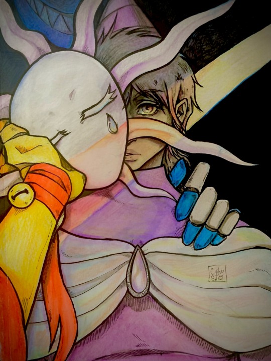
@pluck-heartstrings things always look a little different under a spotlight, huh?
#pluck my heartstrings#medieval times au#remember when I said I’d likely fuck up the rendering?#I did!#tried using some color store colored pencils I got for the first time and it didn’t go well lol MY BAD#im also just… bad at coloring#but that’s ok! I had fun#anyways#I hope you like it#thanks for sharing this story#I am Very Normal about it :>#beloved moots#fanfic fanart#my art
187 notes
·
View notes
Text
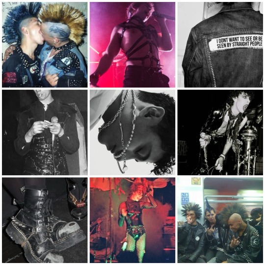
DBD x Met Gala (3/4): Charles Rowland and Punk: Chaos to Couture (2013)
#ok so he's a little different than my other Met boards because like I just do not think he'd be down for a full couture look!!!#like he'd want it to be rough and authentic feeling! not some high brow crazy expensive piece of clothing#so I tried to go more punk rock loverboy for him 🥰 and I think it works really well!#when you see the looks from the carpet not many people look punk and that's truly a shame because the whole theme was honoring#Vivian Westwood and like her fashion story is so rich that you really could've taken inspiration from any era of it and had some sort of#punk vibe BUT PEOPLE JUST DIDNT AND ITS SO UPSETTING#anyway I feel like Charles might wear like a Westwood pendant or something to have a little homage but for the most part I think it'd be di#dbd#dead boy detectives#dbda#dead boy detective agency#Charles Rowland#dbd met gala#mine#my dbd boards
55 notes
·
View notes
Text
Nothing to see here just steph stealing glances of klay like he’s afraid he’s going to get caught 😃😃 (via namxsj on twitter )
#nba#golden state warriors#dallas mavericks#steph curry#klay thompson#steph/klay#ok first of all oh my god#secondly i need asg week to be NEOW actually I don’t think im capable of waiting til feb#both teams have kinda been floundering (mavs to a lesser extent but still) and I am growing Impatient for the reunion !!#also the buddy hield cycle being proven right for the 4th(?) time. lmao. some of those dumbasses rlly thought they got prime klay back#the victory lapping after beating the blazers jazz pelicans and pelicans was like nothing I had ever seen#especially towards a fucking legend !! like klay fucking thompson !!!!#no one not even pr-trained to high hell steph curry himself could ever convince me that he’s hopeful or even okay with this bullshit#he needs klay. klay needs him. they need each other and always have but it’s looking more and more likely that steph is#gonna go out like kobe while klay is gonna gonna keep chasing the ghost of pre-injury self#that last part felt so wrong to type out because i personally think he’s been everything you could want and more from a guy#who went thru everything that he went thru and#his comeback is probably my favorite comeback story in any sport ever of all time bc it’s such a fairy tale. and it also actually HAPPENED#!!!!!!!!!!!!#ppl talk abt the injuries like they happened to him and then he just disappeared forever like no bitch !!!!#he came back and they won it all that same year !! led the league in 3pm the year after that !!!!!! led the league in ft% the year#after that n ppl still acting like he adds virtually no value to any team that wants to win a chip when in reality that couldn’t be further#from the truth#I wrote it like that because I get the sense that they both look a little lost/confused at times and I can’t help but think that#losing embarrassingly or not they might at least be in better spirits (if nothing else) if they still had each other’s company#oh well. lol#ok I think that’s everything I had and a million sorrys if this post exploded on ur dash i wish I could turn off my stupid sports rpf brain#but I can’t ❤️#wishing every happiness to the two of them tho they’re my babiest girls frfr#nik's rants
44 notes
·
View notes
Text
if AI completely "obsoleted" writing/painting I'd
paint about as much as I do now – how well other entities paint compared to me has <3% bearing on my own internal drive to paint
write almost not at all – my drive to write is >90% driven by the dearth of other entities who are writing what I want to read
#rambl#if I could pay an AI $30 every week to write 3 novels with kinks XYZ that hit a higher than 8/10 score on characterization plot and setting#I'd... ok I wouldn't whoop and frisbee my writing laptop out of the window#in some part because I expect the generation of those 3 novels to be highly collaborative#(a very enjoyable one for me where I provide 50% of the ideas and do <5% of the hard part)#don't get me wrong. writing is one of my peak life experience generators but a lot of that is bc I'm discovering the story or scene as I go#and reading provides that nutrient to a similar extent; I expect collaboration with an intelligent & infinitely patient AI will as well
46 notes
·
View notes
Text

i am so deeply enamoured with @deniigi's fic 'broken surface'... I genuinely think I have reread it more than anything else at this point. [id: an illustration of clone wars era Obi-wan, hunched over a sink. His face is in complete shadow with his robed form blending into the background and his hands gripping onto a sink. The sink is overfull and spilling over the edges, and is highlighted in a vibrant blue and white. There are some lines in the background to indicate pipes but overall the setting is indistinct and cramped. The illustration is accented by swirling shapes and hatched lines. /end id]
#obi wan kenobi#star wars#fanart#illustration#ok gushing time#i LOVE this fic. i feel like it not only includes everything i personally like but it executes it perfectly#all the elements are so well balanced. I feel like all of the story aspects shine and none overshadow one another#I also just personally adore stories about obsessions/compulsions as someone who grew up with a very obsessive sort of anxiety#the scene with the sink where he is just constantly thinking about it. i could reread it a thousand times (hence the art)#tl;dr i love this fic. everyone go read it#pherrie draws
42 notes
·
View notes
Text
so because we have only three chapters left, I’ve decided that I’m going to wait for the official release instead of going through the leaks as I’ve been doing for… almost the past 2 years. I don’t want the leaks and the fandom discourse to ruin my last experience with jjk as a still ongoing manga… plus I thought it would be more fun and enjoyable this way... more special ig (I’m being so sappy ik) wish me luck guys!!
#Plus I want to know what it feels like to read a jjk chapter without the leakers’ wonky translation and shitty panels quality#also… I’m soooooo tired of the discourse I’m genuinely over it.#I’m trying really hard to avoid it and just enjoy the chapters#cause even if I had my own doubts (that expressed here) about certain things#they were more or less later addressed in the next couple of chapters#so at this point I’m like ok I still don’t know what to expect or how gege is going to tackle all of it.#I have more questions than answers regarding characters like sukuna yuuji or megumi.#yes I loved sukuna’s conclusion and no idk how certain his ending it is as everything about it felt quite vague and unclear.#so yes I’m happy but I’m also open to whatever gege has planned for the last three chapters…#and basically whatever. just you do you gege I really don’t know what to expect. AT ALL.#all I know is that I want to let gege finish his story so I could have a full picture in mind#I’m tired of reading and going through assumptions criticism about new released chapters#while knowing that there are still more (now just three) chapters left#this was basically my whole jjk fandom experience after EVERY new chapter “this is bad and doesn’t make sense” like…#the story is not even finished yet 😭#I just want gege to finish the manga and then we can talk about what went well or what went wrong… and all#but in the meantime I just want to enjoy the story for as long as I can#that’s all#jjk#personal
50 notes
·
View notes
Text
‼️update about mr hot neighbour who's in a band‼️
so like I said ran into him at the store again, and he came up to me himself, without any need to help me cause for the first time I was not like actively dying as I met him, first thing he says is "glad to see you not having a crisis today" TT o TT
#—rayrambles#Lmao he then panicked and was like “not that I think you're always in a crisis uh um well you look good! I mean you always do I mean YK”#Ok so ig he's a cutie patootie#Anyway helped me with my bags :D and gave me his number and ig involuntarily TT o TT#Because I asked fir his name and whether he's in a band or not I needed to know the story behind two guitars on his back#So ye :3c I am going to his gig which is literally TONIGHT!??? like idk how that happened TT o TT?????#God I hope I don't flake last min TT o TT#Texted me as soon as I got home TT o TT he's like so cute wtf how's he in a band????#I feel slightly bad thinking how I want to like YK fuck him. But ye well. He's really hot wtv#ANYWAY IK IT HE'S A BAND GUY#also he's a year younger than me that's very new never been attracted to a guy younger than me??? Concept of age is so like tf
36 notes
·
View notes
Text


who asked for this. nobody. but unfortunately as a creator i actually have to CREATE for my au 😞😞😞😒😒😒 jk fashion au ink and swap designs ig,,,,,,
ink. ink. ink. she's totally not holding a gun to my head as i type this,,,,, because she CANT break the fourth wall ok she totally doesnt realize that she's forever gonna be stuck living life as a high schooler with no chance of ever graduating or progressing in life,,,,, BECAUSE THERE'S NO ANGST IN JK FASHION AU HAAHAHAH 😁😁😁😁 anyways she's soooo silly :3333 i'm not a connoisseur of anyone that's not the mtt (biased 🙂🙂🙂) but i wanted her to be silly but also a bit freakish,,,, ya!
what do the people think about INK???? featuring everyone in jk fashion au so far 😇😇
dream: "ink is another one of my close friends. she's been there for me when even nightmare couldn't, and i've supported her likewise. sometimes her head is in the clouds, so i send her texts to remind her of things like homework and such. maybe she forgets lunch sometimes, so swap and i give her a share of ours. and when ink wants to talk about anything she's thinking of, whether it's a painter's use of color or the reason we exist, i'm always open to listening. she's an amazing person, really."
nightmare: "ink. ah, that girl is an enigma, truly. somedays she supports me on my path to world domination, and other days she just laughs at me and says as if it were a fact that i would never achieve it! ugh... but despite my slight grievances, she's dream's friend, and i've grown fond of her. quite often, without me even requesting, she gifts me paintings. now, they may seem normal at first, but recently i've discovered a pattern with them. as if ink had peered into the mind of god and depicted it visually, the paintings assist me in handling dream appropriately. i must say, she's skilled as well..."
killer: "see now ink? she's my type of gal. we get along pretty well, hehe! we're on the same wavelength or something, i dunno. not like she can predict what i do, but i wouldn't be surprised if she could, but ink and i just click. we talk about all sorts of silly stuff; similar sense of humor, after all. ink and i can yap about different shows and movies we've watched and stuff, she gives really good insight on the more technical stuff like color psychology and framing, and she once drew me art for one of my big follower milestones on twitter! she's suuuuper cool, haha!"
dust: "okay, just... keep this between me and you, but i think ink has some sort of secret sixth sense? i dunno. nothing against her, she's a fun person. just that, uh... sometimes she just comes up to me when i least expect it and starts asking me about my progress on my writing. which is... confusing. i've only ever told killer and horror about my writing, so i don't know how she knows...?"
horror: "y'know, dust and i have a bit of a bet going on. all jokes and all, but i've got a feeling ink's pulling some sort of elaborate spying prank with how much she knows about us... dust doesn't think so. but i'm betting 20 bucks she does. like, once i was at a vending machine and the stupid thing didn't give me my goddamn candy bar, ugh. i had to stay cool. but then ink just pops out of nowhere, says its okay for me to drop the act and get mad around her, and then does some sort of vending machine trick to get the candy?? yeah, she's definitely a wizard or something. in a nice way, i guess."
NOW SWWAAAAAAPPP she's silly. i included the bit of her getting into trouble because of her good will SOLELY because swap gets bullied a lot in other aus 💀 (askerror, something new, etc,,,,,,) i also read a canon underswap doc??? SWAP IS SO SILLY!!!!! i cant really explain her personality through text i'd need to draw comics for her which uhhhh,,,,, (looks away)
THOUGHTS ON SWAP????
dream: "ah, swap! she's one of my dearest friends, i truly care for her deeply. out of sheer coincidence it seems, that she, ink, and i were chosen to be the star students of the school, but surprisingly it works out well... swap's truly a delight. she's a great motivator, and she's saved me from a few situations that would've ended up terribly had she not been there, hehe."
nightmare: "sometimes the world hates me. ah- well, what i meant was, the path of fate has me set on a predetermined path of struggle! and yet, when even i, the queen of negativity, could not stop my kin from slipping on a ridiculously placed banana peel and almost breaking her neck, swap was her knight in shining armor and caught her. needless to say, just as fate despises my bloodline, fate also has angels sent down from heaven. i do suppose swap is one of those, bless her soul."
killer: "heh, swap?? that girl's a riot! couple years ago i tried convincing her to show me some of those sick moves she learned at kickboxing, or karate, taekwondo, whatever... she broke my wrist, haha! but then i pulled a knife on her and then we both got in trouble. hah, good times, good times. no, i didn't stab her?! in fact, she's very good friends with mr. mew and the grumpen, thank you very much! a friend of my kitties is a friend of mine!"
dust: "she's nice. her type of energy is something you only see is like... a sugar-rushed ink, and killer normally. but anyways, swap's a good help around the school. she's a bit ridiculous every now and then with all her "the magnificent swap" and how she's a bit of a showoff, but whatever. aren't we all? anyways, at least the scavenger hunts she makes during school dances are fun."
horror: "swap is uh... she's something. gotta admit, she's pretty normal compared to some of the people at this school. but man... enthusiasm, much? eh, whatever. i'm not the type to complain when her burritos are to die for. we're partners in cooking class... let's just say, she carries us hard."
anyways jk cross and epic soon. sooner than you think heheheh
#jk fashion au#banana peels and dream are a reoccurring theme btw#nightmare has NIGHTMARES of banana peels. they are her biggest opp. DREAM KEEPS ON FUCKING SLIPPING ON THEM HELP#FOR CONTEXT THE STORY KILLER WAS TALKING ABOUT HAPPENED IN 2020#so killer was a bit deranged back then! haha! good times indeed#so ink MIGHT be self aware she might not. i've just decided now that she wont be alone in the self aware club (error......pspspspspsp)#star students are best buddies!!!! theyre best buddies!!!!!!!! i love friendship and kindness!!!!!!!!!#also technically ink could go by she/they in jk fashion au (i MIGHT forget this detail later on sorry!!!!!)#cant wait to make classic and fell so swap can also have an alternate group of buddies#it might seem like jk mtt think well of swap individually but dont be fooled#they bully her (/pos) when theyre all together 😭😭😭 its all in good fun tho :333#ink doesn't have the tattoos og ink does because no multiverse shenanigans#so in replacement!!!!! the doodles on the legs :3333#this was so fun but also difficult figuring out dynamics between characters i wouldnt normally think about#like fucking horror and ink???? craaaazyyyyy. killer and swap was all on purpose tho#for context on killer's story about swap and her kitties read the next upcoming jk fashion au hcs (hopefully i will post soon :3)#ANYWAYS im a bit scared to go outside of my usual mtt corner of the internet...... but whatever!#whyyyy am i even tagging this LMAO i just need the references and the character interactions#if this flops that will be ok with me i only use these posts to stay in character if i ever make a 4koma or whatever :p#ink sans#swap sans#star sanses#utmv#sans au#dream mentioned in this..... idk about the others but MAYBE ill tag that too just out of association#dream sans#thank you to the Two JK Fashion AU fans you guys keep me going ‼️‼️‼️
28 notes
·
View notes