#oeuvre moderne
Explore tagged Tumblr posts
Photo


Peinture sur toile : Éclat de couleur rouge iridescent violet.
œuvre réalisée au couteau à la peinture acrylique sur châssis en bois entoilé en coton (100% coton). Couleurs iridescentes Rebords du châssis peint à la peinture acrylique noire. Protection : œuvre vernie à la bombe aérosol brillante.
Pour voir un aperçu vidéo de cette peinture, rendez-vous sur : https://youtu.be/0nHFiYXTPwA
Format : 50 cm x 50 cm x 1,5 cm.
Diagonale : 70,7 cm.
Poids approximatif : 0,500 kg.
Date de réalisation : 02/2023.
Artiste : Jonathan Pradillon
Pièce unique.
œuvre signée. Certificat d’authenticité fourni. Emballage soigné.
Prix : 150 Euros.
Pour acquérir cette peinture, rendez-vous sur :
Artinsolite : https://www.artinsolite.com/product-page/tableau-design-%C3%A9clat-de-couleur-rouge-iridescent-violet
Artsper : https://www.artsper.com/fr/oeuvres-d-art-contemporain/peinture/1823460/eclat-de-couleur-rouge-iridescent-violet
Etsy : https://www.etsy.com/fr/listing/1412913786/peinture-sur-toile-eclat-de-couleur?click_key=a63ba538218e9a7e40dec5282498a5586d831ab3%3A1412913786&click_sum=ead71ef8&ref=shop_home_active_1&langid_override=3
Artmajeur : https://www.artmajeur.com/jonathan-pradillon/fr/artworks/16604848/eclat-de-couleur-rouge-iridescent-violet
Artfinder : https://www.artfinder.com/manage/jonathan-pradillon/product/red-iridescent-purple-shine/?utm_campaign=shareaholic&utm_medium=copy_link&utm_source=bookmark
Singulart : https://www.singulart.com/fr/oeuvres-d-art/jonathan-pradillon-%C3%A9clat-de-couleur-rouge-iridescent-violet-1793949
Saatchiart : https://www.saatchiart.com/art/Painting-Red-Iridecent-purple-color-shine/968246/10203949/view
Amazon : https://www.amazon.fr/dp/B0BWYZY2JV?ref=myi_title_dp
youtube
#Éclat de couleur#couleur iridescente#peinture sur toile#tableau sur toile#œuvre sur toile#décoration sur toile#peinture contemporaine#peinture abstraite#peinture design#peinture moderne#tableau abstrait#tableau contemporain#tableau moderne#tableau design#oeuvre contemporaine#oeuvre abstraite#oeuvre moderne#oeuvre design#peinture au couteau#tableau au couteau#couteau sur toile
2 notes
·
View notes
Text
Man I really need to watch Bamboozled, it's been on my to-watch list for a while.
#i should get more familiar with spike lee's oeuvre in general.#ive only seen Malcolm X in my highschool modern history class and i remember really liking it
2 notes
·
View notes
Text
Brancusi - Centre Pompidou
Petit retour sur l'exposition de Pompidou sur Brancusi
L’art ne fait que commencer Voilà presque trente ans que Brancusi n’avait pas investi de nouveau le Centre Pompidou. Il était temps de faire honneur à ce Roumain qui dès 1904 avait choisi de s’installer à Paris et de léguer, à sa mort en 1957, au Musée d’Art Moderne, l’ensemble de son œuvre et son atelier. Celui-ci avait fait l’objet d’une reconstitution sur le parvis de Pompidou d’une surface…
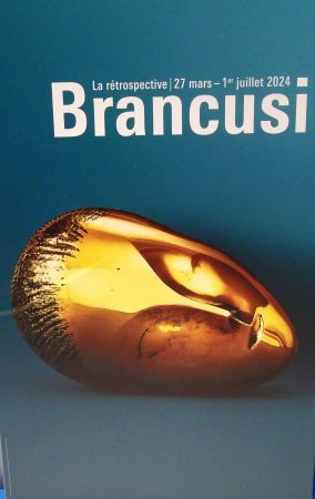
View On WordPress
#art#Art abstrait#Art comptemporain parisien#art moderne#Bric à brac de culture#Centre Beaubourg#Centre Pompidou#Chronique culturelle#Chroniques culturelles#Exposition#Expositions#Musée#Musée Art Moderne#Oeuvres du Centre Pompidou#Sculpteur#sculpture#Sculptures
0 notes
Text


▪️ 3 styles, un intérieur 🏡
Objectif : Aménager l'espace intérieur dans 3 styles différents : "pop", "baroque" et dernier style libre de choix.
Pour le thème libre, j'ai décidé de partir sur le style Romantique, car, quoi de plus beau et inspirant que l'amour 😍😊⚘️.
Pour le petit cours d'histoire : la Farnsworth House est une œuvre architecturale emblématique. Située à Plano, dans l'Illinois, elle a été achevée en 1951 par l'architecte Ludwig Mies van der Rohe. Cette maison de verre et d'acier est renommée pour son design minimaliste, intégrant la nature environnante dans son esthétique. Commandée par Edith Farnsworth, c'est une référence de l'architecture moderne du milieu du XXe siècle et du style international. 🤩
----- Je suis Marina Greneau, Créatrice de coups de cœurs. Ensemble, créons le vôtre ! 👩💻🎨
Un projet ? envoyez moi un message, nous pourrons en discuter ensemble ! 💬
EI Marina Greneau Décoration 👩💻 Décoratrice d'intérieur et Événementielle 📧 [email protected] -----
#decoratricedinterieur#decoration#decorationevenementielle#deco#conseils#homestaging#renovation#inspiration#teamdeco#edaa#edaadeco#farnsworth house#pop#baroque#romantique#style#interieur#oeuvre#verre#acier#minimaliste#nature#moderne
0 notes
Note
Do you happen to know the origin of the fantasy trope in which a deity's power directly corresponds to the number of their believers / the strength of their believers' faith?
I only know it from places like Discworld and DnD that I'm fairly confident are referencing some earlier source, but outside of Tinkerbell in Peter Pan, I can't think of of any specific work it might've come from, 20th-c fantasy really not being my wheelhouse.
Thank you!
That's an interesting question. In terms of immediate sources, I suspect, but cannot prove, that the trope's early appearances in both Dungeons & Dragons and Discworld are most immediately influenced by the oeuvre of Harlan Ellison – his best-known work on the topic, the short story collection Deathbird Stories, was published in 1975, which places it very slightly into the post-D&D era, though most of the stories it contains were published individually earlier – but Ellison certainly isn't the trope's originator. L Sprague de Camp and Fritz Leiber also play with the idea in various forms, as does Roger Zelazny, though only Zelazny's earliest work is properly pre-D&D.
Hm. Off the top of my head, the earliest piece of fantasy fiction I can think of that makes substantial use of the trope in its recognisably modern form is A E van Vogt's The Book of Ptath; it was first serialised in 1943, though no collected edition was published until 1947. I'm confident that someone who's more versed in early 20th Century speculative fiction than I am could push it back even earlier, though. Maybe one of this blog's better-read followers will chime in!
(Non-experts are welcome to offer examples as well, of course, but please double-check the publication date and make sure the work you have in mind was actually published prior to 1974.)
#gaming#tabletop roleplaying#tabletop rpgs#dungeons & dragons#d&d#tropes#media#literature#religion#death mention
4K notes
·
View notes
Text

A débardeur costume by Paul Gavarni, c. 1830s.
It is the year of our Lord 2024 and I am still not entirely sure what is a débardeur in Gavarni's oeuvre: but it is a type of stock character in the 19th century Carnaval de Paris.
The word translates as "dockworker" (and apparently can refer to a tank top in modern French), but it's a somewhat racy choice for usually female carnival goers, a very stylized get-up based on a working class man's clothing.
And I accidentally published this instead of saving the draft. I'll return to it after work if I can.
108 notes
·
View notes
Text

++++++++++ About Les Demoiselles d'Avignon
“Les Demoiselles d’Avignon” is a seminal artwork by Pablo Picasso, completed in 1907, that represents a radical departure from traditional European painting and a cornerstone in the development of Cubism. The artwork is an oil on canvas, measuring 243.9 by 233.7 cm, and it currently resides in the collection of the Museum of Modern Art (MoMA) in New York City, NY, US.
The artwork depicts five nude female figures, each rendered in a disconcerting confrontational manner that distorts traditional perspectives of female beauty in art. The composition is characterized by a fractured space where the figures and background intersect with sharp geometric lines, angular shapes, and contrasting planes. The faces of the figures are influenced by both Iberian sculpture and African masks, as evidenced by their unnaturally contorted and mask-like features.
Picasso’s palette is primarily composed of ochres, whites, and grays, with a stark juxtaposition of warmer and cooler hues that accentuate the figures’ angular forms. This landmark painting paved the way for the development of modern art by challenging the conventions of representation, form, and perspective. It is considered not only a revolutionary work within Picasso’s oeuvre but also a foundational piece for the Cubist movement and avant-garde art in the 20th century.
60 notes
·
View notes
Text

Hi there! I'm Witch! This is my main blog. Here you will find my fanfics and also get to enjoy (and possibly be traumatized by) the weird (and very horny) stuff that I share!
Below the cut you will find my Masterlist. All links will take you to my AO3. It is organized by fandom. For specific fandom click on their links to see all related works. SFW/NSFW ratings and pairings are listed for each fic. Series and Multi-Chapter fics are labeled as such. (Click on their links to see all works related).
If you prefer to read my fics on Tumblr search #sandwitchstories or visit my side blog @oeuvre-of-sandwitch (starring ONLY my Tumblr fic posts).
Fandoms I currently write for: Jujutsu Kaisen (JJK) and Demon Slayer (KNY)
Other Fandoms I have works for: Fairy Tail and Buddy Daddies
MDNI with NSFW fics and posts
Banner, header and pfp by me - DO NOT USE
Dividers by @sweetmelodygraphics
SandWitchStories Complete Master List:

Jukutsu Kaisen (JJK) Fics

Satoru Gojo
Kintsugi (Satoru Gojo x Y/N - NSFW - Winner of 100 shares poll)

Ryomen Sukuna
On Going Series! Daddy Duty (All of my Dad!Sukuna and Mouse's Mini-Verse works in one location! Dad!Sukuna x Y/N - SFW)
Chance Encounter - Series-Parts 1-3 (Sukuna x Y/N - NSFW)
For Better and For Worse (Sukuna x Y/N - NSFW)
But When It Comes To You (Sukuna x Y/N - NSFW)
My Monster (Sukuna x Y/N - NSFW - Kinktober 2024 - Day 2 Prompt: Monster)
Spoiled (Sukuna x Y/N - NSFW - Kinktober 2024 - Week 3 Prompt: Massage)
Stoned and Boned (Sukuna x Y/N - NSFW) - NEW 1/19/2025

Demon Slayer (KNY) Fics

Kyojuro Rengoku
New Multi-Chapter Fic- Modern Muses ( Kyojuro Rengoku x Bri Uzui - Self-Ship) - NEW 2/9/2025 (Ch 1 & Ch2 are up now!)
Gratitude and Gratification (Kyojuro Rengoku x Y/N- NSFW) - NEW 2/1/2025
Carnal Delights (Kyojuro Rengoku x Y/N x the Uzuis - NSFW)
Mistletoe and Idle Hands (Kyojuro Rengoku x Y/N- NSFW)
The Sweet or The Spicy (Kyojuro Rengoku x Y/N- NSFW)
Red Light Special (Kyojuro Rengoku x Y/N- NSFW)
I Will Wait For You (Kyojuro Rengoku x Y/N- ANGST & NSFW)
Five Seconds (Kyojuro Rengoku x Y/N- NSFW)
What He Likes (Kyojuro Rengoku x Y/N- NSFW)
Stress Relief (Kyojuro Rengoku x Y/N - NSFW)
Challenge Accepted (Kyojuro Rengoku x Y/N - NSFW)
Safe In The Arms Of Love (Kyojuro Rengoku x Y/N - NSFW)
Hot For Teacher (Kyojuro Rengoku x Y/N - NSFW)
The Frog(tied) Princess (Kyojuro Rengoku x Y/N - NSFW - Sequel to Hot For Teacher but can be read alone)
Grown Up Birthday Blues (Kyojuro Rengoku x Y/N - Happy Birthday, Kyojuro! - NSFW)
Wildfire (Kyojuro Rengoku x Y/N - NSFW)
Fools Rush In (Kyojuro Rengoku x Y/N - NSFW)
Love At First Bite (Kyojuro Rengoku x Y/N - NSFW - Kinktober 2024 Day 1: Vampire)
The Reward (Kyojuro Rengoku x Y/N - NSFW - Kinktober 2024 - Day 18: Free Use)
The Battery Incident (Kyojuro Rengoku x Y/N - NSFW - Kinktober 2024 - Week 4: Mutual Masterbation/Toys)
Forever In Love (Kyojuro Rengoku x Female OC - Kimetsu Academy AU - Contains NSFW - Multi-Chapter)
Twin Flames (Kyojuro Rengoku x KNY OC, Rengoku Demon AU - NSFW - Multi-Chapter)

Sanemi Shinazguawa
The Best Present (Sanemi Shinazugawa x Y/N - Happy Birthday, Sanemi! - NSFW)
Accidentally Happily Ever After (Sanemi Shinazugawa x Y/N Surprise Pregnancy - NSFW - Three Chapters- Completed)
Say It (Sanemi Shinazugawa x Y/N - NSFW)
A Cure for Restlessness (Sanemi Shinazugawa x Y/N - NSFW)
Temptation - (Sanemi Shinazugawa x Y/N - NSFW - Kinktober 2024 Day 3: Costume)

Shinjuro Rengoku
A Father's Love (Shinjuro Rengoku x Y/N - SFW) - Head cannons about Shinjuro getting a 2nd chance
The Shy Guy (Shinjuro Rengoku x Y/N - NSFW)

Buddy Daddies

Bitey Daddies (Vampire AU- SFW)
I'm no hero, and I'm not made of stone (Kazuki Kurusu x Rei Suwa - SFW)
I Choose You (Kazuki Kurusu x Rei Suwa - SFW)
Jump Around (Rei Suwa - SFW)
The Diabolical Grandpa (Kazuki Kurusu x Rei Suwa SFW)

Fairy Tail

Erza Scarlet
A Game of Facades (Erza Scarlet x Jellal Fernandes - Evil Erza AU- Event: Fairy Tail Reverse Bang 2022 - CW: implied sexual content)
3G: Gay Girls Ghost Hunting (Erza Scarlett x MiraJane Strauss - for the Fairy Tail Reverse Bang 2022- SFW)

Laxus Dreyar
The Little Spoon (Laxus Dreyar x Orga Nanagear - SFW)
Electric Love (Laxus Dreyar x Freed Justine - SFW)

Sting Eucliffe and Rogue Cheney
The Story Of Us (Sting Eucliffe x Rogue Cheney- SFW - Series has been completed )
A Little Bit Older On This Roller Coaster (Sting Eucliffe x Rogue Cheney NSFW)
Groomzilla (Sting Eucliffe x Rogue Cheney NSFW)
You're the night, You're the light (Sting Eucliffe x Rogue Cheney NSFW)
Totally Worth It (Sting Eucliffe x Rogue Cheney NSFW)
Simply Eerie-sistable (Sting Eucliffe x Rogue Cheney - Halloween - NSFW)
Sex For Breakfast (Sting Eucliffe x Rogue Cheney NSFW)
Feel The Beat Of My Heart As The Count Down Starts (Sting Eucliffe x Rogue Cheney - New Years - NSFW)
The Sweetest Taboo (Sting Eucliffe x Rogue Cheney x Yukino Aguria- NSFW)

Stingue Event: Shadowlight Week (2021 and 2023)
Lost and Found (Sting Eucliffe x Rogue Cheney - SFW - first meeting - Shadowlight week -Day 1- First-2021)
Anything For Love (Day 1 -Dare- Sting Eucliffe x Rogue Cheney - SFW- 2023)
The Monster Mash (Day 2 - Thrill/Undress - Sting Eucliffe x Rogue Cheney - NSFW)
Showtime (Day 3 Prompt - Watching - Sting Eucliffe x Rogue Cheney NSFW-2023)
Lion Bears, Bugs and Potions OH MY! ( Day 4 - Monsters/Potions - Sting Eucliffe x Rogue Cheney - SFW-2023)
In Your Love (Day 5 - Sweet/Spice - Sting Eucliffe x Rogue Cheney - SFW- 2023)

Fairy Tail x OC (All of my Fairy Tail x OC works. There are one shots and multi-chapter works. These are all from my very early days in fic writing. I may revisit these someday. Sting Eucliffe x Rogue Cheney x OC, Rogue Cheney x OC, Sting Eugliffe x OC - NSFW)
#sandwitchstories#masterlist#fairy tail#Demon slayer#buddy daddies#sting eucliffe#rogue cheney#kurusu kazuki#rei suwa#kyojuro rengoku#sanemi shinazugawa#kny fanfic#buddy daddies fanfic#kyojuro rengoku smut#sanemi shinazugawa smut#sanemi x reader#rengoku x reader#kny x reader smut#kazurei#kny smut#stingue#stingue smut#demon slayer smut#demon slayer x reader smut#rengoku shinjuro x reader#jjk smut#sukuna x reader#sukuna smut#gojo satoru x reader#kny x reader
176 notes
·
View notes
Text
"Gazelle bondissante" de Guido Balsamo Stella (Ca' Pesaro, Venise)

Figurine de gazelle bondissante sur socle façonné
Oeuvre de Guido Balsamo Stella (Italie, 1882-1941)
Éditeur : SAIAR Ferro Toso
1930
h: 33 cm
Verre de Murano, soufflé et irisé
Fondation Chiara et Francesco Carraro
Musée d'art moderne / Ca' Pesaro
Venise
56 notes
·
View notes
Text


The architecture of Eva (1927-2000) and Karl Mang (1922-2015) is characterized by simplicity, easy legibility and a great deal of calmness. No spectacle, just solid yet sensible architecture. All of these qualities come to life in Karl Mang’s self-edited monograph “Karl Mang - Architektur der Stille”, published by Böhlau in 2007. After a brief introduction to his life and work by the architect himself, the book unfolds the architect’s surprisingly rich oeuvre that covers shop designs, houses and churches just as well as exhibition designs. Annotated with comments by the architect and illustrated with numerous photographs and plans the book offers a handsome cross-section of the the architects’ work from the 1950s up until the late 1990s. Interestingly Eva and Karl Mang in their late years got more and more involved with building in existing contexts, a task they approached with great sensibility while still maintaining a decided modernism.
“Architektur der Stille“ is an unagitated, handsome publication and a more than suitable tribute to an architectural oeuvre that is worth discovering.
26 notes
·
View notes
Text
German expressionist painter Franz Marc was born #OTD (8 Feb 1880 – 4 Mar 1916). Since it’s also #Caturday 🐱:

The White Cat, 1912
Oil on cardboard, 50 x 60 cm
Cultural Foundation Saxony‑Anhalt – Moritzburg Art Museum Halle (Saale)
"This picture is one of the most popular in the Moritzburg collection, and also in Franz Marc's entire oeuvre. The motif suggests domesticity, peace, privacy, softness, warmth. But in this picture and in his animal pictures in general, Marc was interested in more than the unpretentiousness of safe motifs. He, the co-founder of the 'Blue Rider', was driven by the search for a 'pure and light style', as he wrote, and for this he needed an appropriate starting point. Beyond the expressive movements of subjective life development that otherwise characterized modernism, Marc was more interested in the cosmic dimensions of the visible, the rhythm, the organic and crystalline growth in the world of forms in nature. For him as a painter, finding purity meant taking back the meanings and aspects of use attributed to objects and beings and resolving them in a world of innocent encounters between dream and pure idea. For Marc, the ' animal' is less a motif than an opportunity to rediscover harmony in the larger context of life. And so Franz Marc gives this small picture the splendour of a festive event. The yellow of the pillow is a twin colour with the red of the blanket and its yellow stars, so that the gentle harmony emerges from the objects in the background. The sleeping cat, however, radiates white and alien from these tones like an untouchable royal animal that is happy with the most magnificent things, as long as it can be slept on. The audience's deep affection for this cat stems from precisely this: from the animal's oneness with itself, which is celebrated in the spiritual order of its picture. ( Schneider, Katja (ed.): Modernity and the Present - the Art Museum in Halle, 2008, p.82f)"
CC BY-NC-SA @ Kulturstiftung Sachsen-Anhalt, Kunstmuseum Moritzburg Halle (Saale) Photo: Punctum / Bertram Kober
#animals in art#20th century art#european art#painting#cat#Caturday#OTD#birthday post#Franz Marc#expressionism#German art#german expressionism#der blaue reiter#oil painting#white cat#1910s#modern art
18 notes
·
View notes
Photo

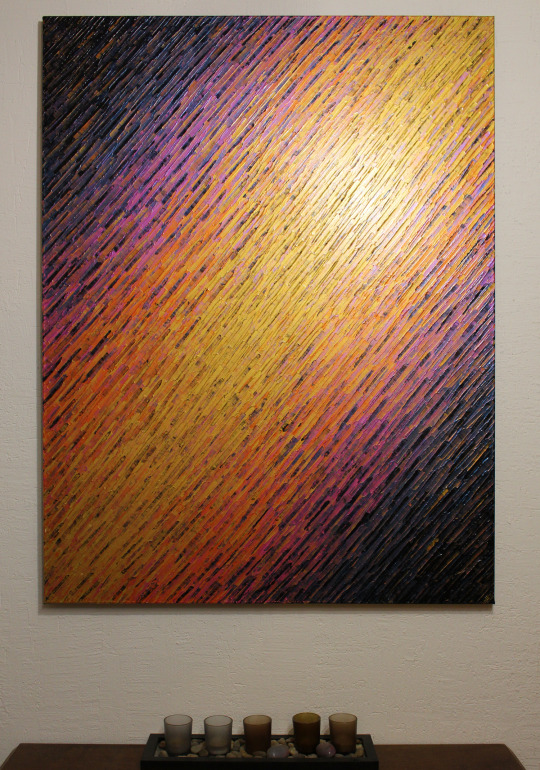

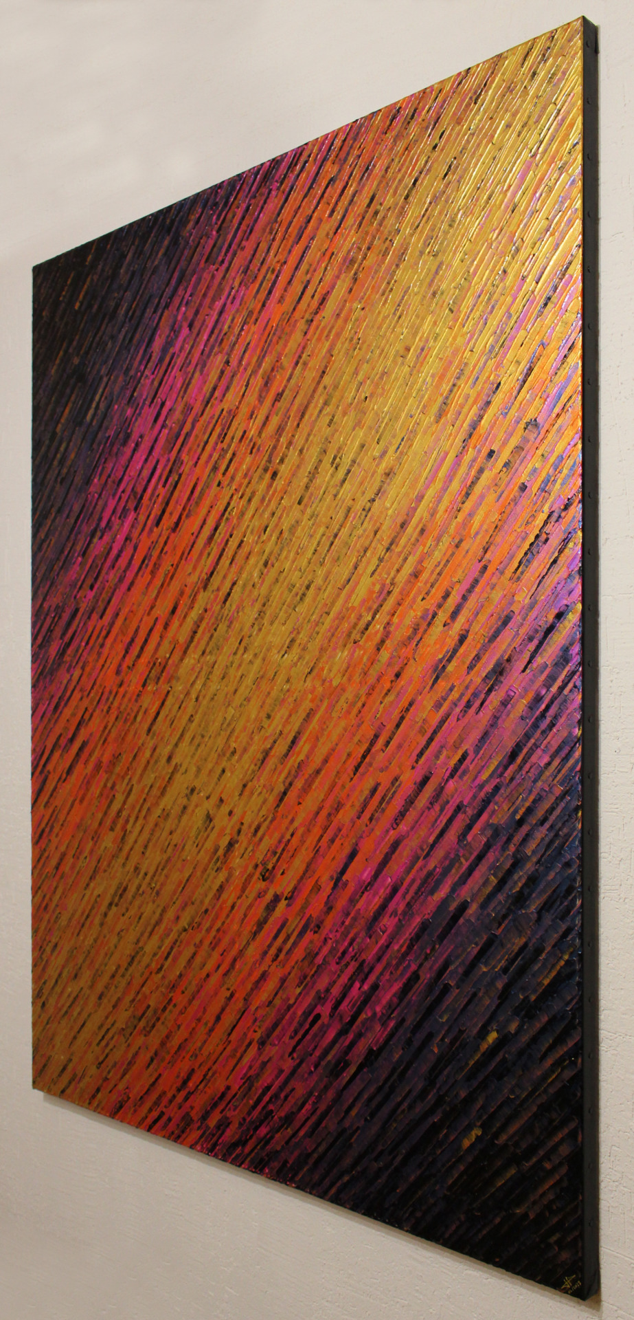
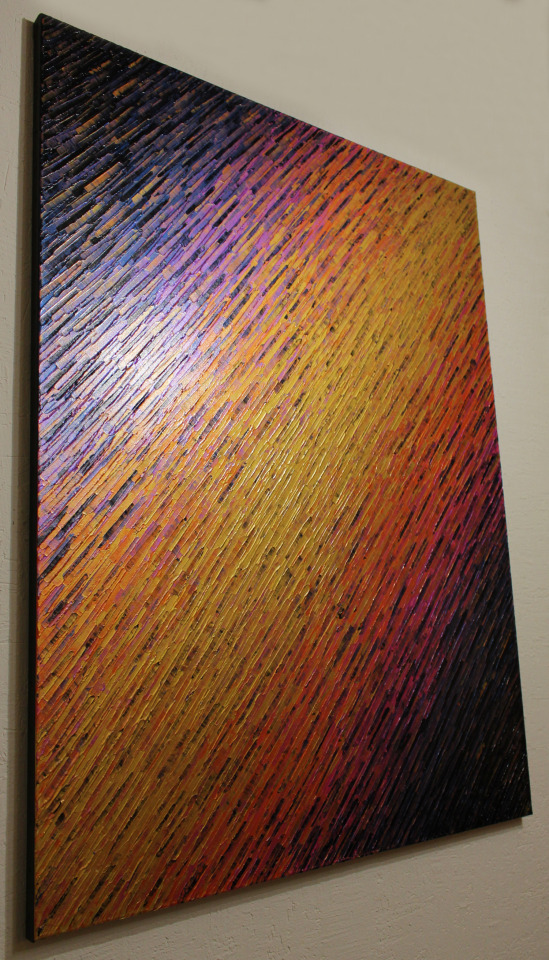
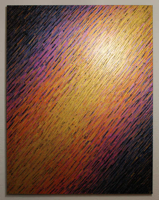

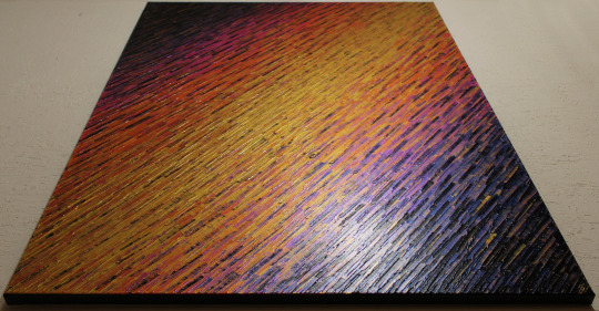
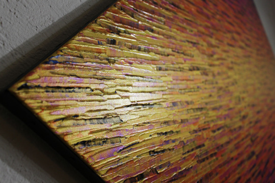

Grand tableau contemporain : Vaste texture couteau or orange rose iridescente.
œuvre réalisée au couteau à la peinture acrylique sur châssis en bois entoilé en coton (100% coton, toile cloutée). Couleurs iridescentes. Rebords du châssis peint à la peinture acrylique noire. Protection : œuvre vernie à la bombe aérosol brillante.
Pour voir un aperçu vidéo de cette peinture, rendez-vous sur : https://youtu.be/sEZ-nLe0H5I
Format : 116 cm x 89 cm x 2,5 cm.
Diagonale : 146,2 cm.
Poids approximatif : 3 kg.
Date de réalisation : 02/2023.
Artiste : Jonathan Pradillon
Pièce unique.
œuvre signée. Certificat d’authenticité fourni. Emballage soigné.
Prix : 600 €.
(ŒUVRE VENDUE)
Pour acquérir cette peinture, rendez-vous sur :
Singulart : https://www.singulart.com/fr/oeuvres-d-art/jonathan-pradillon-vaste-texture-couteau-or-orange-rose-iridescente-1795704
Artmajeur : https://www.artmajeur.com/jonathan-pradillon/fr/artworks/16633747/vaste-texture-couteau-or-orange-rose-iridescente
Artfinder : https://www.artfinder.com/manage/jonathan-pradillon/product/vast-iridescent-pink-orange-gold-knife-texture-6c2fc/?utm_campaign=shareaholic&utm_medium=copy_link&utm_source=bookmark
Saatchiart : https://www.saatchiart.com/art/Painting-Vast-iridescent-pink-orange-gold-knife-texture/968246/10231059/view
Etsy : https://www.etsy.com/fr/listing/1432247105/grande-peinture-sur-toile-vaste-texture?click_key=598a933d0d62afcea349203c8300e327339d807b%3A1432247105&click_sum=f1d8b7e7&ref=shop_home_active_1&langid_override=3
Artsper : https://www.artsper.com/fr/oeuvres-d-art-contemporain/peinture/1886796/vaste-texture-couteau-or-orange-rose-iridescente
Amazon : https://www.amazon.fr/dp/B0BXL98SN5?ref=myi_title_dp
youtube
#grand tableau#grande peinture#grande oeuvre#grande décoration#peinture sur toile#peinture abstraite#peinture contemporaine#peinture design#tableau contemporain#tableau abstrait#tableau design#couleur iridescentes#or orange rose#décoration design#décoration abstraite#artiste français#art abstrait#art moderne#art contemporain#art sur toile#décoration sur toile#acrylique sur toile#peinture au couteau#couteau sur toile#acrylique au couteau
4 notes
·
View notes
Text
hey, so— i’ve been ~officially writing a web serial since 2021 (unofficially, since at least 2014). Updates are currently very irregular, but i’m definitely still working on it!
✨🧿 THE BITTER DROP 🧿✨
modern fantasy romance about gay/trans Eastern Bloc Jews, set in a secondary world counterpart of early Soviet communes
The lounge is nearly empty tonight; all the action is downstairs at the grinding workshop — in the basement discotheque; you if I’m to have any hope of pulling, that’s where I ought to go but … ekh, I’m foggy tonight, between the psychosis and the laudanum for the pain what likes to haunt nefilim and the horse pills they made me take at the Mamka — nu okay, I skipped tonight’s dose so I can drink but like, neuroleptics don’t let go that quick — and as the brainfog settles on my thoughts, it turns to hoarfrost and my will seizes up like a rusty hinge.
Lev/Lyubov Morgenshtern, a queeny bigender flamer who’d once been one of the Pale’s youngest-ever ordained rabbonim, has just returned to the Talons Ghetto sovyet — an autonomous workers-and-peasants commune of the kind that directly preceded the Soviet Union (and indeed the thing that the USSR named itself after).
Lev is fresh off a stint on a psych ward that’d followed a far longer stint living in the tzarist-held half of Svet Dmitrin with a bougie respectability-obsessed ex-boyfriend — he’s got nowhere to sleep, no assurance her old friends, Red Guard and civilian both, would want to see them and the only workable plan she’s got is to find someone willing and soft-hearted to take him home for the night …
… and what luck if their rescuer, a medical necromancer by the name of Anzu Menelikov (Nyura to friends and lovers) is a beautiful trans flamer from a prominent rabbinical family! who better to welcome Lyubov home than a fellow hothouse flower and dedicated scholar? and does it matter if Nyura did anything the White Guard might still bear a grudge about? after all, most of the old Ghetto walls are still safely intact, and it’s not like Reb Doktor Menelikov personally set the Winter Palace on fire, right?
i’d say if you liked the Baru Cormorant series, Michael Chabon’s The Yiddish Policemen’s Union and Gentlemen of the Road, Fallen London and its associated games, China Miéville’s oeuvre, and Disco Elysium, this’d probably be your thing!
content warnings
(under the cut)
reclaimed homophobic slurs
the narrator has a history of psychiatric institutionalisation
homophobia, transphobia, transmisogyny and antisemitism are environmental hazards in the setting, though by far not the focus
#the bitter drop#web serial#web fiction#web novel#fiction#tell your friends#and tell me if you read it tbh
88 notes
·
View notes
Text
threadfic posted to my bsky last week
[find here] as always, it's formatted to fit the character limit so probably flows weirdly as a block of text.
As always, author is 3 dick jokes in a trenchcoat. This is my oeuvre.
⋆˙⟡ —
modern au - comphet / oblivious wwx who is going through life blissfully unaware that he’s 1. into men, and 2. specifically super into lwj 🔞
⋆˙⟡ —
Sure, if asked he’d admit to being a 1 or 2 on the Kinsey scale because everyone is a little bi - you know?
but he doesn’t feel actionable about it
Then he gets his huge slap in the face moment.
Is it because someone convinces him? No (and they have tried). Is it because he realizes his feelings for lwj? Also no.
It’s while he’s watching porn.
It would make sense if it happened early on in his porn watching journey but it does not. He’s had his account for a decade at least, is almost hitting his 30s himself. He’s been watching every video released by the same pornstar for 3 of those years and never questions it because he likes the guy.
Not LIKES likes but he‘s comfortable with him and enjoys his content. It never fails to get him off. It is, he assumes, based on how he interacts with his female partners.
Until the day he gets a notification for a new video and the partner is another man.
If there’s one thing about wwx he’s not squeamish but this situation is testing his resolve. There have been a few threesomes so maybe this is just the start of one of those?
He deliberately doesn’t check the content description. He likes the uncertainty, he decides. It’s all about the surprise.
And oh boy is he surprised. But not by the sudden late arrival of a woman. No! He’s surprised that he doesn’t need the woman to get off, because it was always about the man.
And fuck!!
Is he gay!!!
Did he figure out he was gay via porn!!! Like a 14 yr old or an extremely closeted middle aged man!!!
Oh god is he the extremely closeted middle aged man??? He's only 29😭

It’s ok! He can figure this out! Less intelligent people before him have figured out their sexuality, surely he can at least decide if he’s bisexual or what!
He should download Grindr!
He’s halfway to dling the app before he realizes that’s the nuclear option. He doesn’t want to sleep with them! He just wants to figure out if they’re hot.
Then he shrugs and does it anyway.
“Is Grindr one of those apps that shows you matches based on location?” He asks Lan Zhan at brunch the next morning. “Cause you might see my account.”
lwj very slowly lowers his phone and looks at him.
“I’m just trying to get unsolicited dick pics.”
“Why?”
“For science!!” wwx says! “Hey do you think that rate my dick site still exists?”
“Science,” lwj echoes and looks poleaxed.
“Yeah,” wwx says cheerfully just as lwj is taking a drink of his tea. “The science of figuring out how into the dicks I am.”
lwj chokes.
Aww shit. wwx is never going to convince him that meal time is talking time again.
But he’s curious now. He knows lwj sometimes uses the app. He can’t imagine what for. Maybe putting together a bookclub? Bc surely lwj doesn’t just fuck people???
What does his profile look like? What pictures does he use? What does it say? What thirst traps could a man like lwj use? looking like that?
He picks up his phone and starts browsing.
And finds it almost immediately.
That’s lwj’s sofa. That’s lwj’s silk robe. That’s the edge of the matching sun tattoo he talked a drunk lwj into in uni.
Fuck.
Fuckfuck. Abort.
He can feel his face flushing, the heat crawling down his spine and settling in his gut. There’s some artful angles and draping going on and he’s not looking closely!! He doesn’t want his brain to even try interpreting that!!
He 🔥&⭐️s lwj’s profile and goes to exit, but before he can he gets a dm in the app. He opens it (IN PUBLIC) and comes eyes to dick with the most glorious dick in the most familiar setting.
It’s the same picture as lwj’s profile, just significantly less artful draping and a whole lot more nudity.
“As requested,” lwj says, mild and unbothered.
And wwx is bothered ok!! He doesn’t know what’s fucking happening. That’s a whole lot of dick. He feels like he’s staring at a Rorschach test that at some point is going to reveal itself as a smaller dick.
It doesn’t.
He lets out a sound like a whistling teapot and slams his phone face down on the table so he doesn’t have to look at it. It’s just seared into his eyeballs but whatever.
lwj looks mildly amused by the time wwx meets his eyes again, likely witnessing his entire face journey.
“I’ve decided I’m done with this experiment,” he says in a haughty tone.
“inconclusive?”
“No. It’s conclusive.”
He’s super into Lan Zhan, specifically.
Suddenly, he’s just really exhausted. “I’ve got to go. You’ve got the bill, right er-ge?”
lwj stops looking amused. Wwx feels like a jerk for that because he likes it when lwj is amused at his expense. He just can't be at the same table as him and actually think, and he needs to THINK
lwj has texted by the time he gets home.
lwj: I apologize. I’d been under the impression that was what you asked for.
IT WAS! That was the problem! He’d asked to figure out his shit and he’d figured out too much!
wwx: it’s not your fault
wwx: you have a nice dick 10/10.
wwx: that’s the problem
lwj: that it’s nice?
wwx: fuck
wwx: it’s not nice. It looks mean.
lwj: ah.
He’s silent for a moment. wwx stares at his phone willing lwj to say something. What does ah mean??
lwj: you may need to broaden your search parameters. Do not make a conclusion based on such a small sample size.
SMALL? lmao.
Wait. What did that mean.
wwx: ????
lwj: do not dismiss your experiment just because you did not enjoy my picture.
What????
WWX hit the video chat button.
lwj answers immediately, frowning into the camera. His frown deepens as wwx laughs.
“I enjoyed it!” he finally manages to say. “I just needed to think about that. Ruminate. Freak out a little.”
“You enjoyed it?”
“Yes.”
“Ok, I will speak with you about it tomorrow.”
that's a lot of pressure to put on someone. "we could just fuck about it," he offers instead.
"Yes, we could do that." lwj agrees.
(and they do)
(and honestly probably also speedrun a relationship and marriage)
[fin]
⋆˙⟡ — SHARE ⋆˙⟡ — FOLLOW ⋆˙⟡ —
#mdzs#wei wuxian#lan wangji#wangxian#wangxian fanfic#relenafanel writes threadfic#relenafanel writes wangxian
13 notes
·
View notes
Text
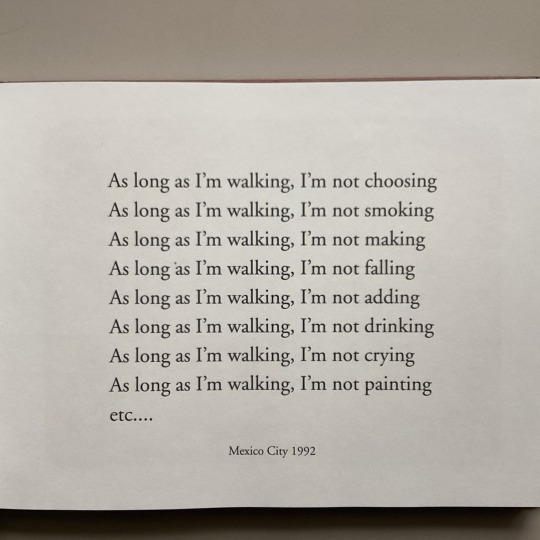
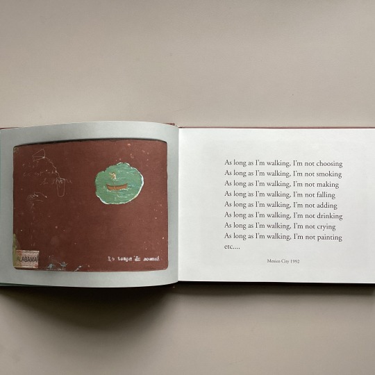

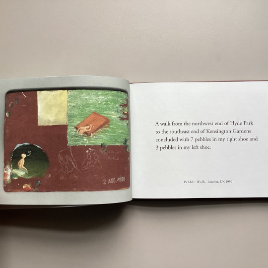
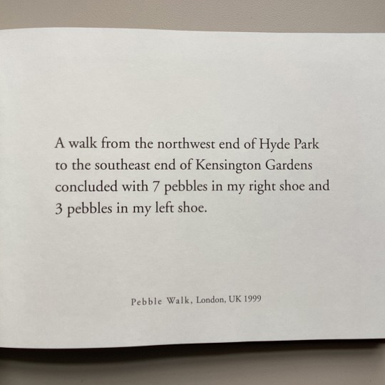

We had fun brainstorming for National Walking Day post yesterday, so here’s another one about walking. But we’re seeing some snow showers today here in Cambridge. Not a good day for walking. We can’t wait for the spring to arrive!
Francis Alÿs (b. 1959) is a Belgian-born, Mexico-based artist who creates a diverse body of artwork spanning from performance, social practice, video, and paintings. And walking has been an important element in his work throughout his career.
In 1991, Alÿs dragged a small magnetic toy dog on wheels throughout the streets of Mexico City to collect any metallic residue lying in its path (“The Collector”). In 1995, he took a walk after unravelling the sweater he has on, leaving an ever-lengthening, blue-thread trail in his wake. (“Fairy Tales”).
This small publication is a record of a unique series that has been described as a storyboard or archive of Alÿs’ oeuvre, polyptych of 111 paintings called le temps du sommeil. The intriguing images are paired with the words, or instructions, behind his past and future performances.
Le temps du sommeil Francis Alÿs ; catalogue editor, Catherine Lampert. Dublin : Irish Museum of Modern Art ; Milano : Charta, [2010] English HOLLIS number: 990123544680203941
#FrancisAlys#FrancisAlÿs#Walking#WalkingAsArt#HarvardFineArtsLibrary#Fineartslibrary#Harvard#HarvardLibrary
47 notes
·
View notes
Photo

9 novembre 1918 : mort du poète Guillaume Apollinaire ➽ http://bit.ly/Guillaume-Apollinaire Esprit moderne, ironiste, fantaisiste, voire paradoxal, âme de lyrique traditionnel, d’historien et d’érudit, voilà tel que, dans sa curieuse et attachante dualité, apparaît Guillaume Apollinaire à travers ses oeuvres, tel qu’il se révélait à certains de ceux qui l’ont connu
#CeJourLà#9Novembre#Apollinaire#Poète#Écrivain#Poésie#Littérature#Lettres#histoire#france#history#passé#past#français#french#news#événement#newsfromthepast
6 notes
·
View notes