#not used to painting/rendering so this was practice
Explore tagged Tumblr posts
Photo
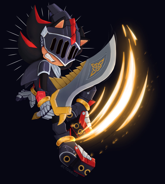
a little late but, made this as a celebration of the 14th anniversary of SATBK!
#sth#sonic the hedgehog#sir lancelot#SATBK#sonic and the black knight#shadow the hedgehog#started as a doodle and I quickly got too invested#not used to painting/rendering so this was practice#its a little messy but I like how it looks regardless
818 notes
·
View notes
Text

for @cherryys who (rightfully!) hcs lategame megumi as having a bunch of scars befitting his status as resident punching bag
#my art#jujutsu kaisen#jjk#megumi fushiguro#fushiguro megumi#fanart#jjk fanart#megumi#guess who hasnt slept its meeeeee#finding refs fr this took forEVER#mostly bc all the pinterest boys are too gd beefy to use as megu ref#but even once i found good refs i am so used 2 drawing beef!!! so used 2 shirtless torsos tht look like yuuji's!!!!#had to keep Undefining my lines n slimming him down#n then he didnt look toned enough!!!!!!!!#constant too hot/too cold . endless suffering .#bangs head on desk all i know to draw is BEEF and this boy is 100% sinew........#but we got there . th render helped a LOT#but then right back 2 suffering bc i asked sam fr Scar Recs n they had th idea 2 give him a lightning scar from when he was taming nue#and i was like omg ya!!!! (voice of some1 who did Not know what lightning scars look like)#so to say i looked them up and uh . new least favourite thing 2 draw just dropped :)#th more accurate i tried to be the more it looked like a weird artsy tattoo#n that scar wasnt even part of what cherryys mentioned they envisioned !!! optional hurdle !!!!!!! i torture myself but fr naught!!!!#th scars tht they mentioned are the glass eye/eye scar from th sukuna/gojo fight + burns up the jaw + abdomen stab wound a la toji#everything else is just visual flavour#sighs at least i got some good shameless torso practice out of this#once i got 2 painting i took my sweet time with him and i am happy now . sleep deprived but happy <3#one of my megumi mutuals(tm) says jump i say how high
667 notes
·
View notes
Text

brush test slash rendering practice with ayem
#morrowind#almalexia#the elder scrolls#tes#tes fanart#art#id in alt#ok that's all the tags this needs ANYWAY#i started this 1. for experimenting with coloring from dark to light#2. because i wanted to draw someone kind of back turned to the camera#3. rendering practice for hair particularly#4. to go from sketch to rendering rather than doing lines to see if that doesn't smooth out my workflow a bit#5. because i've never actually used this brush past flat coloring#and out of those 1. i don't think i had enough of an idea of the palette or process to jump into dark to light painting so i did scrap that#and go with my usual “flat color with one of the mid shadow tones add shadows add light”#i do think that painting from shadows out is a thing people do digitally i just think this wasn't the drawing to test it on for me#i think i'd need to look at some other peoples processes and start with a more fleshed out idea of where to go#2 and 3 i think worked out. i'm gradually figuring hair out which i think is sick#4 i also think worked out for me which is also sick because i do get caught on lines a lot. they're fun sometimes but i think some drawings#benefit better from not having them and that it might be a bit faster#and of course everything i do is so that i can draw slightly faster and better for next artfight#as for 5. i have mixed feelings on this brush but that might be because i hate change. and also because i started this drawing on the 15th#of november and finished it yesterday. so im kind of just sick of working on and looking at it#it was a valuable learning experience and i think it came out well! i am also going to drop to my knees and rejoice when i can finally#close this file out and free medibang paint from under it so i can work on Literally Anything Else#thank you almalexia for being my test subject i should've used a reference for your armor when i did the sketch but i didn't#maybe the crown looks weird because of it maybe it doesn't. not my problem anymore i can draw other elves again#my art#iiii think i forgot a my art tag last time
111 notes
·
View notes
Text
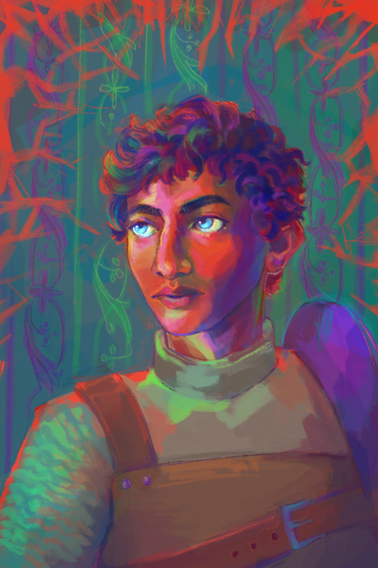
suffuse
#kabru#dungeon meshi#draws#had the quiet moment of 'ah. halfway through the year and you have not yet committed to finishing *any* paintings or drawings'#'AND ARTFIGHT IS COMING UP 😳😳'#(though: it's been a solid six months in terms of sewing & crafting output; so not an entire creative parching)#this was a fairly straightforward bit of portrait practice in the vein of /aaaa can you still sketch & render & paint & use colours????/#& the wrist-buzzy reminder of 'oh yeah there are Good postures for sustainable drawing and BAD POSTURES that you do NOT draw in'#i gotta ;;;;;; generate a fullbody reference for shasta q'ola T___T#*kisses this weird little guy on the forehead* good night kabru thanks for the painting practice#time to go follow senshi's advice! honk shoo
114 notes
·
View notes
Text
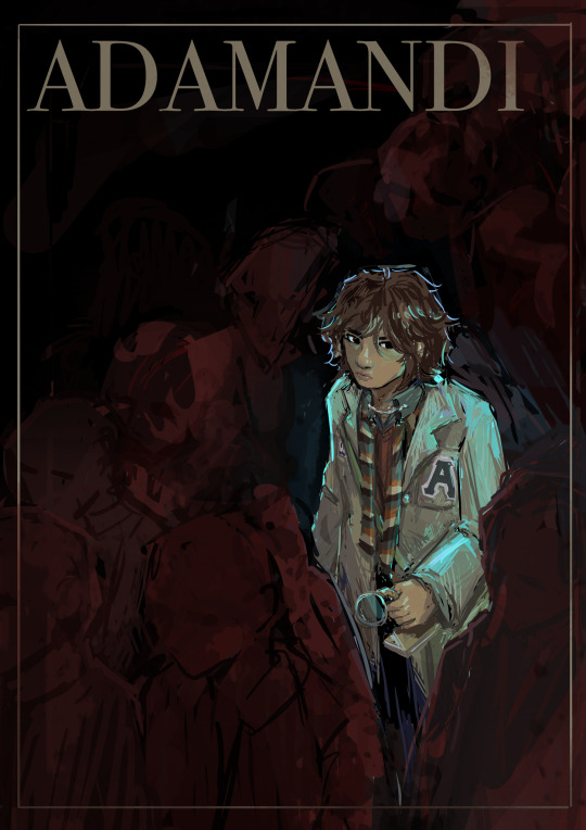
no one would notice if i ever vanished // if bodies could sustain // this never-ending army // like blood pumping through a vein
(click for better resolution!)
:OOO hello. anyway since these are all posters i'd have in an ideal world or smth and i'd like to store the high res versions somewhere,,, here's the google drive folder for them? hehe ''
close up!
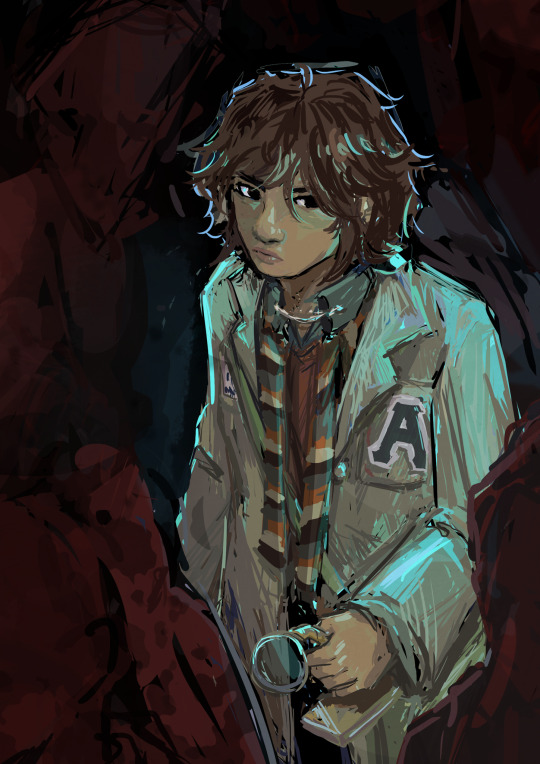
#adamandi#vincent aurelius lin#i'm back with the posters! or smth! idk!!#i'm maybe just a bit obsessed with vincent. such a Character.#where can i run is sustaining me single-handedly through this exam season (<- has cried thrice in the last two days; alas; but moving on)#my stress response was that in a fit of apathy i shut myself down from academia and stopped to paint this#six hours total? on this funky little thing! had to push myself to finish the magnifying glass but!! looks so cool. i'm impressed with my e#fun fact: all the shades are hand-coloured. aka everything is digitally hand painted hooray!! i havent painted for a long time (ish)#smth about this musical makes me want to paint. it's very lovely that way#it's also a miracle i haven't gotten carpal tunnel or any wrist injuries so far... i'm a lucky person! hooray#i had so many thoughts to ramble about and now i don't recall any of them.#-! about this piece: inspired specifically by that one line that i doodled in the margins of a math practice last night#the diagonal slant was very. thinky. the rendering and angle were kinda contradictory to do but it's fineeee (draft was diff. pov)#i liked the red abstraction. and the way that people (misc) gave same vibes as red blood cells.#green for vincent because contrasting colour!! considered a spotlight that was more obv bc. again theatre lighting is so cool. but that was#a bit too literal? i think. so just fun little highlights. no one look at the accuracy of anything here though.. shadows do Not do this#also like hehehe lin. forest. forest of people. i really liked thinking about that. hehehe#i didn't know the font to use!! or quote!! so i slapped on the name of the musical and called it a day... the blank one is in the google-#-folder if you want to add your own stuff :') also also i wasn't sure about cropping at all. so again high res in google drive link#which is under the keep-reading sign! kind of a choose your own adventure because i'm lazy :3#ajhshdhfhfhfhf i think i've been fuelled by the tags under each post so far. so intensely. so very nice.#also when the cast or creators drop fun facts... serotonin right there.. they're all so nice waaagh it's so cool that they like my stuff ><#<laughs> really grateful that the whole fandom's so sweet <3 thank you for your support TvT#alright!! off to mess about with chemistry. jiayou me.#oh yes. a post script about the cropping crisis: i wasn't sure how small i wanted to make him. in proportion to the crowd. so if you see it#on mobile ig it's tiny and on laptop it kind of makes sense ...
147 notes
·
View notes
Photo
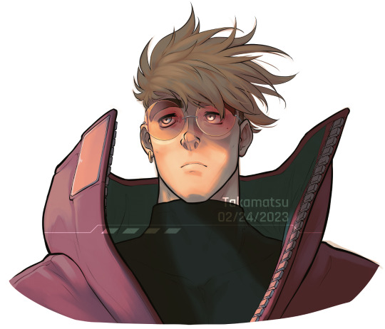
why did love put a gun in my hand? was it for redemption, was it for revenge? was it for the thrill of pushing my hope to the edge?
#Trigun Stampede#Trigun#Vash the Stampede#Fanart#[ gosh I've been sitting on this for a while lol#I wasn't sure how I wanted to render it and admittedly I didn't like it for a while#but aah i am very happy with it now :'D#I tried something new with the hair and I like the outcome a lot#i've never had a style for hair i liked that i felt went with my style but this one worked out#i've never done a paint-over before so I wanna try and practice with it more#anyways im scheduling this before the new ep comes out#i've never used tumblr scheduling so we'll see how this goes ]#Neon Ocean Art
394 notes
·
View notes
Text


Oc Au where everyone has cool tattoos
#art#artists on tumblr#artwork#digital art#illustration#my art#drawings#oc artwork#oc art#original character#2022 art#digital illustration#digital drawing#colored#art study#clip studio paint#art practice#digital painting#I used references for this but man why I used to render skin so good now I just can't AAAAAAGSHYASFAUHFG#rak has posted art#los niños del caos#my oc stuff
20 notes
·
View notes
Text
i forgot what it feel like to draw digitally i love this so much


idk time spent oops! forgor to measure but it was like at least an hour or two
just sketches and concepts of an oc for an smp im gonna be playing soon :33
#rpj draws#my art#GUESS WHOS BAAAACK#with a whole new artstyle as well#and a new program!! im using magma now!!#oc art#my oc#minecraft oc#im excited i can finally draw digitally again its been#like#months#the reason i havent been able to draw is actually#my ibis paint broke because my phone is also broken#and it sent me down a lil bit of a spiral#but now im drawing again and very happy#im very proud of this piece too#knocked my breath away a bit#ive been practicing rendering traditionally but apparently it also affected my digital skills#so im very happy with the improvement#much more motivated now :))
9 notes
·
View notes
Text

i swear every time i open krita i have to relearn how to draw. one of these days im gonna figure out a style that i like and use it. consistently
#yes this is from the drawing of elizabeth and vanessa#it bothered me that it wasnt fully rendered so i used it as a base to practice painting today#nat's rambles
32 notes
·
View notes
Text
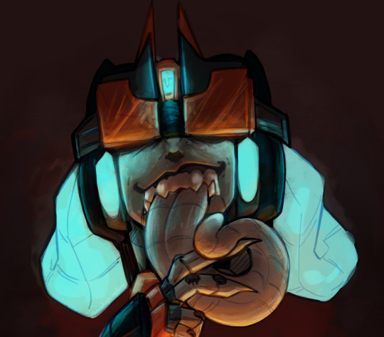
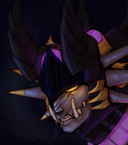
Some shading practice with Halcyon and Paradigm! I'm really digging this style, and I'm definitely learning a lot about the different layer types and what they can do to create these more interesting and dynamic shaded works! Overlay layers are my prized children in these. Mmm, the way they can really sell a glow is so nice.
#Halcyon#Paradigm#transformers#transformers oc#maccadam#my art#Rendering has been really fun lately#Also doing the sketching and lineart in ibispaint then doing coloring in Procreate is SO HELPFUL#I love the brushes for painting in procreate and I love the sketch brushes that I have in ibis#They don't feel the same when used by the other program#Does that make any sense?#I hope so lol#Shading practice#dynamic lighting is something I've been really wanting to work on lol
11 notes
·
View notes
Text

Wish we could have seen more of what happened in the human realm :(
#my art#the owl house#uhhh 8 hours maybe???#I got very tired by the time I reached the shoes so that's where the watermark goes baby!!!#somebody get this boy a nap#hunter toh#there was such a nice energy in the sketch that got lost but I have the motivation to practice digital rendering so I am going to USE IT#because I haven't been this excited about digital art since I was eleven and using a trackpad and ms paint#fernart
19 notes
·
View notes
Text
Some coloring practice w my ocs :)
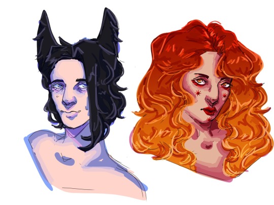
Though I must say, I always really just like the lineart the way it is, I guess they're perfect just the way they are
#i miss painting(digital painting fyi) but the way i did it before made it so i got frustrated by it and never finished stuff#so kinda trying to find a new style of rendering#which is just several layers where i keep changing what that layer was supposed to be for lmfao#but big fan!!!!#its a lot of fun which is always good!! bcs thats a lot better than giving up out of frustration#i love the highlight layer aaaaahhhh its so fun to make it all shiny!!!#also ignore that its 7 am 💀💀💀 I SWEAR IM ABOUT TO SLEEP SHHHHHHHHHHH#just wanted to practice portraits and then drew for like an hr and a half#also if youre curious!#the oc on the left is Rüß and on the right is Sola(goddess of the sun ☀️)#two characters with opposing color schemes that i find very fun to draw#sola is fun bcs i dont really ever draw lips or makeup and then she has a bunch!!#she used to have a heart motif but then i saw mycenaean blush and it fits her perfectly so !!!#i wanna draw ocs but next fanart i think will be more nandopoleon since i like drawing historical more than race suits#i wanma draw strollonso as napoleon and empress marie louise(only Cofi understands why LMAO)#and then at some point nandopoleon in the emperor robes however that requires more research#catie.rambling.txt#catie.art.
6 notes
·
View notes
Note
hi, i ireally love your work and i don't know if you've answered this before but, what kinds of studies do you do or how did you learn color theory? i wanna get better at rendering and anatomy but im having trouble TT TT
Hi! Long answer alert. Once a chatterbox, always a chatterbox.
When I started actively learning how to draw about 10 1/2 years ago, I exclusively did graphite studies in sketchbooks. Here's a few examples��I mostly stuck to doing line drawings to drill basic shapes/contours and proportions into my brain. The more rendered sketches helped me practice edge control & basic values, and they were REALLY good for learning the actual 3D structure behind what I was drawing.

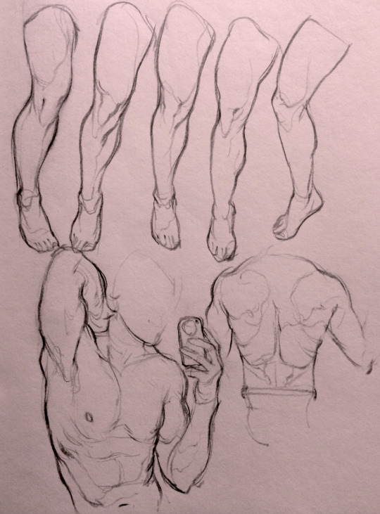

I'd use reference images that I grabbed from fitness forums, Instagram, Tumblr, Pinterest, and some NSFW places, but you could find adequate ref material from figure drawing sites like Line of Action. LoA has refs for people (you can filter by clothed/unclothed, age, & gender), animals, expressions, hands/feet, and a few other useful things as well. Love them.
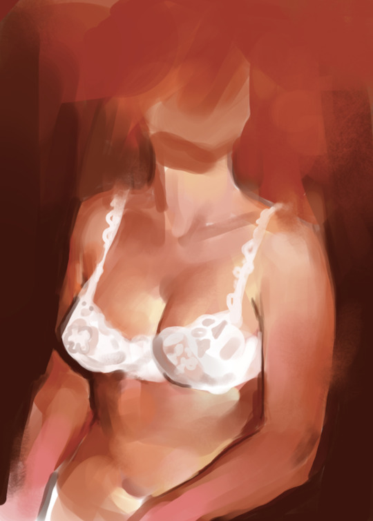
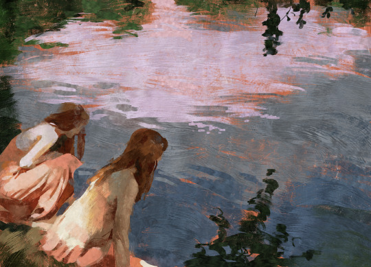
Learning how to render digitally was a similar story; it helped a lot that I had a pretty strong foundation for value/anatomy going in. I basically didn't touch color at all for ~2 years (except for a few attempts at bad digital or acrylic paint studies), which may not have been the best idea. I learned color from a lot of trial and error, honestly, and I'm pretty sure this process involved a lot of imitation—there were a number of digital/traditional painters whose styles I really wanted to emulate (notably their edge control, color choices, value distributions, and shape design), so I kiiind of did a mixture of that + my own experimentation.
For example, I really found Benjamin Björklund's style appealing, especially his softened/lost edges & vibrant pops of saturated color, so here's a study I did from some photograph that I'm *pretty* sure was painted with him in mind.
Learning how to detail was definitely a slow process, and like all the aforementioned things (anatomy/color/edge control/values/etc.) I'm still figuring it out. Focusing on edge control first (that is, deciding on where to place hard/soft edges for emphasizing/de-emphasizing certain areas of the image) is super useful, because you can honestly fool a viewer into thinking there's more detail in a piece than there actually is if you're very economical about where you place your hard edges.
The most important part, to me, is probably just doing this stuff over and over again. You're likely not going to see improvement in a few weeks or even a few months, so don't fret about not getting the exact results you want and just keep studying + making art. I like to think about learning art as a process where you *need* to fail and make crappy art/studies—there's literally no way around it—so you might as well fail right now. See, by making bad art you're actually moving forward—isn't that a fun prospect!!
It's useful to have a folder with art you admire, especially if you can dissect the pieces and understand why you like them so much. You can study those aspects (like, you can redraw or repaint that person's work) and break down whether this is art that you just like to look at, or if it's the kind of art that you want to *make.* There's a LOT of art out there that I love looking at, probably tens of thousands of styles/mediums, but there's a very narrow range that I want to make myself.
I've mentioned it in some ask reply in the past, but I really do think looking at other artist's work is such a cheat code for improving your own skills—the other artist does the work to filter reality/ideas for you, and this sort of allows you to contact the subject matter more directly. I can think of so many examples where an artist I admired exaggerated, like, the way sunlight rested on a face and created that orange fringe around its edge, or the greys/dull blues in a wheat field, or the bright indigo in a cast shadow, or the red along the outside of a person's eye, and it just clicked for me that this was a very available & observable aspect of reality, which had up until that point gone completely unnoticed! If you're really perceptive about the art you look at, it's shocking how much it can teach you about how to see the world (in this particular case I mean this literally, in that the art I looked at fully changed the way I visually processed the world, but of course it has had a strong effect on my worldviews/relationships/beliefs).
Thanks so much for sending in a question (& for reading, if you got this far)! I read every single ask I receive, including the kind words & compliments, which I genuinely always appreciate. Best of luck with learning, my friend :)
3K notes
·
View notes
Text


Synopsis: Mihawk lets you wrap him up and you decide to have your fun with him- that is, until he breaks free and flips the script on you. Pairing: Mihawk x AFAB reader CW: NSFW MINORS DNI, bondage (both reader and mihawk receiving), oral (reader giving), p in v sex, unprotected sex, creampie (wrap it up!), reader being a tease • ficmas masterlist • ko-fi • discord server •

Mihawk looked as though he would rather face a thousand marines in battle than endure the position you had put him in now. Bound in silken ribbons of pale pink, they crisscrossed over the sculpted ridges of his chest, hugging the lines of his abdomen, wrapping around his arms and neatly pinning them behind his back, and secured by an artful bow that sat proudly against his spine. The greatest swordsman had been turned into nothing more than a decadent present awaiting its unwrapping.
His golden eyes bore into yours with a simmering blend of what you could make out to be irritation and reluctant indulgence. The faint flush painting his cheekbones betrayed more than likely intended.
“You realize how ridiculous this is,” he said, voice a low, gravely murmur. “I’m only tolerating this so you’ll cease badgering me about it.”
Your posture was relaxed but your gaze was anything but as you took in the sight. There was something delicious about seeing the Dracule Mihawk stripped of his usual authority, rendered vulnerable by ribbons and your own whims.
Your lips curved into a languid smile that only made him clench his jaw further. “Ridiculous?” you mused, stepping forward with an elegance that drew his gaze despite himself. “I think you look rather festive. Like a gift meant to be cherished and unwrapped slowly. Carefully. Thoroughly.”
You paced around the chair he was sitting in, the soft patter of your footsteps against the floorboards echoing in the space. The outfit you were wearing left practically nothing to the imagination which certainly didn’t help the situation. Your featherlight fingers traced the silken ribbon stretched taut across his chest, letting your touch linger a little longer than necessary. His breath hitched- not much, but enough for you to notice.
“Careful,” he warned, his tone dripping with restraint. “You’re treading on dangerous ground.”
“Oh, the only danger here,” you purred, stopping just behind him and bending your head so that your lips ghost against the shell of his ear, “is how much I’m going to enjoy this.”
His head tilted slightly, as though daring you to make good on your threat. A flicker of something dark and wanting- perhaps desire- flashed in his eyes, though he said nothing, His silence was telling, though; the predator now played prey, bound but not broken. Not yet.
You stepped back in front of him sinking to your knees, the movement enough to make his brow lift faintly in question. In front of you was a beautiful display: his cock hard, the tip red and angry as pearlescent beads of precum dripping from him. The sight alone was enough to make your mouth water.
You didn’t hesitate wrapping your hand around the thick base giving an experimental stroke, marveling at the way he twitched in your grasp. Before he could think too long, you took him into your mouth, the salty tang of him flooding your senses as you moaned around his length. He inhaled sharply, his control slipping as your tongue swirled over the sensitive tip. His hips jerked instinctively though it was no use against the ribbons.
Your hand stroked the base of his cock in tandem with the bob of your head, spit glistening as it pooled at the corners of your lips. The sounds that filled the room were nothing short of obscene as you worked him thoroughly. Mihawk’s breathing grew heavier, his chest rising and falling in uneven intervals as he fought to maintain control.
“Damn it,” he growled, wrists flexing against the silk bindings. His hips bucked up into your mouth once more, desperate for more, but you pulled back, letting his cock slip from your lips with a wet pop.
A thin string of saliva connected you to him, only breaking once you leaned back, your hand still stroking him slowly and lazily. “Ah ah,” you chided, a wicked smile playing on your lips. “Don’t you dare try to take charge.”
His eyes darkened, the molten gold now blazing as he looked at you, chest heaving as a result of your actions. But he didn’t dare say a word.
Satisfied with his silence, you leaned back in, dragging your tongue along the underside of his cock, savoring the way it bounced slightly as it twitched. You took him back into your mouth, your lips stretching to accommodate as you pushed him in deeper, swallowing around him until he hit the back of your throat, earning a gag from you.
Mihawk cursed softly under his breath and the sound sent a thrill through you. His muscles tensed as you pulled back, tongue tracing every ridge, every vein. You continued your assault, alternating between slow teasing licks and deep, throat-stretching plunges that left him gasping. His composure cracked further with each pass of your tongue, any semblance of control he had left slipping away as the ribbons around his wrists creaked under the strain of his efforts to break free.
Just when you felt him begin to pulse against your tongue, his breaths coming in faster as he crept closer and closer to that release he oh so desired, you pulled away entirely, your hand falling still at the base of his cock. He let out a half-groan, half-whine, the frustration palpable as you licked your lips and savored the taste of him lingering on your tongue.
“Not yet,” you murmured, rising and straddling his lap. His cock pressed against your slick folds, the warmth of him brushing against you as you rolled your hips teasingly. His eyes couldn’t decide where to look as they darted from your face, to your chest, to where his length disappeared between your thighs.
“Do you think it’s about time you release me?” he huffed out, eyes glamping with frustration and unrestrained desire.
You smirked, leaning in and capturing his lips in a deep kiss before pulling back. “Hmm. Release you. Do you mean like… this?”
One of your hands snaked around his back to the bow that held the ribbons all together. You kept eye contact with him as you undid the bindings one pull at a time, not moving too fast as you didn’t plan on releasing him quite yet. You were too busy reveling in the way his muscles flexed beneath your touch, that you didn’t notice that you freed the restraint just a bit too far, and with a single jerk, he snapped free of the remaining bindings, his hands flying to your waist as he stood up in one fluid motion, lifting you effortlessly.
A yelp escaped your lips and the world shifted in a blur as Mihawk tossed you onto the bed, your back hitting the soft mattress with a bounce. Before you could even comprehend what just happened, he was on you, his movements quick and intense. His lips claimed yours in a searing kiss that made your head spin, his tongue sweeping past your parted lips to tangle with yours, demanding and all-consuming.
His body pressed you into the bed, every inch of his frame pinning you down as if reminding you just how easily he could overpower you. One hand tangled in your hair, tilting your head to deepen the kiss, the other ghosted down your side, setting your nerves alight with every brush of his calloused fingertips.
You felt his grip shift, his hand sliding to your wrist as he guided your arm above your head. His kiss trailed away from your lips, his breath hot against your jawline as he murmured, “Have you had your fun?” The rhetorical question slipped past his lips, the rich timbre of his voice making your pulse race.
It wasn’t until you felt the soft silk of the ribbon wrap around your wrist that realization dawned. He drew back just enough to meet your gaze, his golden eyes smoldering with intent. Your breath hitched as he secured the ribbon to the bedpost and he captured your other wrist, binding it alongside the first.
“You look perfect like this,” he said, leaning back to admire his handiwork as his gaze raked over your now bound form hungrily.
Before you could muster a response, he leaned down, his lips finding the curve of your neck. His teeth scraped against the skin, drawing a gasp from your lips that turned into a moan as he bit down just enough to leave behind a mark. Your body arched against him as he licked over the stinging mark in a half-baked attempt to soothe it.
His hands roamed over you with a purpose, his fingers tracing every curve and dip as though memorizing you anew. His hand found your chest as his thumb brushed over the hardened nipple before tugging aside the thin fabric to bare you to his hungry gaze. His mouth followed soon after, his tongue swirling over the sensitive peak before sucking it into his mouth.
You gasped out his name, the sound a mixture of desperation and delight as he lavished attention on your chest, his free hand sliding down to grip your thigh.
He spread your legs effortlessly, his fingers quickly finding that slick heat between your thighs. A low growl rumbled in his chest as he felt how ready you were for him. “So wet already,” he murmured, his assault on your chest stopping momentarily to brush his lips against your collarbone. He easily slid a finger inside of you, then immediately another, curling the digits in a way that had you crying out.
Your hips bucked against his hand in an attempt to seek more, and he obliged as he pumped his fingers inside of you once, twice, thrice, before he withdrew, his absence leaving you aching with need. Before you could voice your frustration, he positioned himself at your entrance, the head of his cock pressing against you. He thrust in shallowly at first, drawing a whine of protest from you before he finally relented and sunk inside, stretching you out with every inch. Your walls clenched around him as he bottomed out, the air filled with shared sighs at the feeling.
“You feel incredible,” he said, voice thick with desire as he pulled back, only to thrust back in with a force that jolted your body towards the headboard. He set a punishing rhythm, each thrust driving deeper, harder, his body pressing you into the mattress as he took you without restraint. His hands gripped your hips, holding you in place as he pounded into you.
You writhed beneath him, your body arching as he leaned down to claim your mouth again, the kiss as intense as the way his cock bullied your insides. His teeth nipped at your bottom lip, pulling a moan from your throat as one of his hands slid down to your legs, hiking it up as he drove into you at a new angle that had you seeing stars.
His mouth left a trail of bites and kisses down your neck, leaving behind deep red marks for everyone to see. The heat coiled tighter in your core as he inched you closer and closer to that blissful edge. His cock hit all the right spots, each thrust dragging against your inner walls in a way that left you trembling beneath him.
“Mihawk, please,” you whimpered, your wrists straining against the bindings as your body begged for release.
“Not yet,” he growled, one of his hands sliding down to where your bodies met, his thumb finding your swollen clit and circling it with devastating precision, sending you spiraling and your vision blurring as the pleasure built to an unbearable peak.
A broken, desperate, string of pleads tumbled out of your lips, the needy sounds and the way you look so utterly wrecked making it hard for Mihawk himself to hold back. He cursed under his breath, his hips stuttering, huffing out as he finally gave you the go-ahead to let go. And when you finally did, it was with a force that left you shattered, legs shooting out as your thighs quaked violently, a sound caught between a gasp and a cry ripping from the depths of your throat. Your hole convulsed around him as you gushed all over his cock, a creamy ring of his efforts left at the base of his cock.
He followed soon after, his thrusts growing erratic as he captured your lips in an open-mouthed kiss. Abdomen tensing, he finally buried himself to the hilt, spilling warm ropes of cum inside of you with each pulse of his length. He rode out his release through deep groans of your name, bruising grips on your hips and shallow thrusts until he eventually stopped completely.
Your chests rose and fell rapidly as the tremors of your highs subsided, and his lips planted kisses along your lips, jaw, and temple, before murmuring against your skin, “I think you should enjoy this present a little longer.” and with another roll of his hips, it became clear that you were in for a long night.
#nina writes~✦#dracule mihawk x reader#mihawk x reader#dracule mihawk#one piece x reader#x reader#ficmas 2024
513 notes
·
View notes
Text
"Nothing."
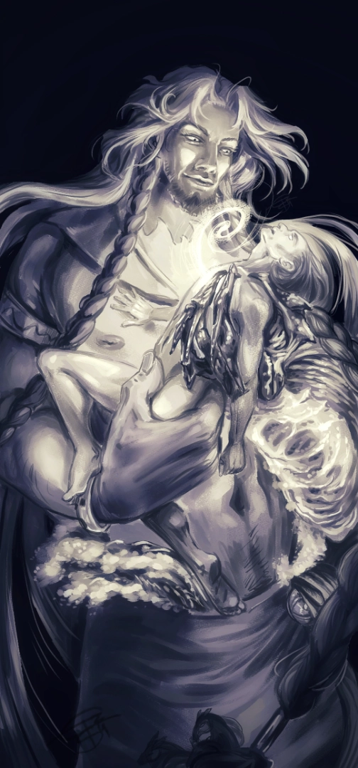
— for madnurse on AO3, inspired by chapter 6 of "600 deserved strikes" (<- fic rec for the stout of heart) || full edited render of this lineart/sketch
Poseidon's design is neal-illustrator's as referenced in the fic.
"Poseidon’s eyes burned with a terrible, unfathomable light. For a moment, the god said nothing, letting the answer hang in the waterlogged silence. Then, with a slow, deliberate movement, he spread his arms. The gesture was alien, almost human, and it struck Odysseus harder than any blow. It was an offering, an embrace. Odysseus froze, disbelief flickering across his hollowed features. Was this a trick? A final test? ..."
👀 details below 👀
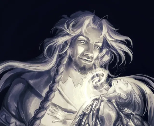

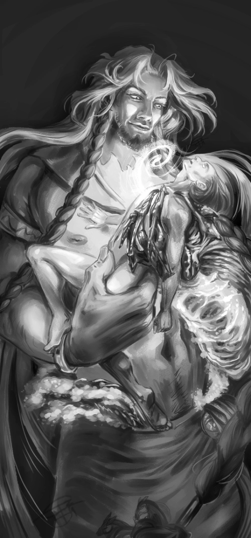

This is the first full render of anything I've done for near three years, and keeping it black and white was enough for practice. I tried colour, but it wouldn't convey the atmo as well.
Part of my resolutions for 2025 is to get back into shape again. Haven't had as much joy painting since the Cyclops Saga aired and gigi's and mircsy's stunning animatics dislodged a real old bottlecap on my joy of the arts. Being part of this fandom brought a huge breath of fresh air to a house full of grief and stale air.
So, ... thank you, the fan creators in the fandom, for your tireless work and passion and your tremendous loveliness.
💙 Happy new 2025 ✨🙇♀️🙏
Bonus for realness, folks, because my painting process is usually smth like this: As long as there's an angry Klingon in there, I AIN'T FINISHED. And yeah - CLIP Studio on my phone, that's all atm, I use pretty much the vanilla brushes and edit for contrast in another app after exporting - so the stuff is probs not very printable aside A6, but maybe in the future I'll do larger formats.

#epic the musical fanart#epic poseidon#epic odysseus#eintausendschoenart#etsart#fanart#epic the musical#digital#poseidon x odysseus#odysseus x poseidon#fanart for fanfic#fic rec#cw: nudity#the 600 deserved strikes
239 notes
·
View notes
Text


EXPLICIT CONTENT | MINORS DNI
Steve Harrington x Reader • Includes oral (f receiving) unprotected p in v sex • Utter fucking filth :) Wrote this because I’m so goddamn tired of Summer/the heat, and Steve Harrington raw dogging me on a cool kitchen floor would make it all better… 😆
Tagging @thosefuzzywordfeelings 💕

Steve nestles his cheek against your inner thigh. Sweat slicks your skin and his; it’s mid Summer, hot as fuck. Every room in the house is miserably hot, except for the kitchen, with its cold, tiled floor. It’s so hot that going out didn’t sound fun at all when you and Steve were deciding what to do with your evening. But fucking around on the kitchen floor in nothing but your underwear? That seemed like a perfect way to spend the night…
The cold, smooth tile feels refreshing against your back. You hum softly, stroking Steve’s hair as he rests against your thigh. He’s watching the sweat drip down your skin, the way it catches in the curve where your pussy meets your thigh.
He feels himself getting hard, but Steve decides that can wait. For now, all he wants to do is rest here, watching your pussy glisten in the heat of the afternoon, your scent stronger than ever and so close to his tongue he can practically taste you.
Steve’s tempted to bury his face in your cunt right now, but he holds back, drawing out the moment, building the tension in both your bodies. He blows a cool stream of air against your lips, watching them pucker in response. The air carries your scent back to Steve and he closes his eyes, savoring you.
His self control is faltering; he won’t be able to resist tasting you much longer. As if teasing him for his lack of restraint, you playfully wiggle your cunt in Steve’s face. If you can smell yourself, you know he can. And you know it’s making him crazy.
He gives your other thigh a playful swat, his big paw of a hand putting you in your place: “patience, honey-wanna take my time down here-,” he chides. His hands on you always get you riled up; you like it when Steve uses a little force. You roll your hips again, curving your pussy into Steve’s face, bumping the tip of his nose. His heart practically stops; you’re fucking destroying him. He’s so hard it hurts, the scent of you filling his nose and painting his lungs, a slippery string of your arousal clinging from the end of his nose to your cunt.
He can’t wipe it away, can’t bring himself to, no matter how long he’s trying to wait, trying to stretch this moment. He’d make it last forever, if he could. If Steve had to choose a place to die, it would be right here, in the soft bed of your thighs, surrounded by your most intimate scent, the warmth of your skin against his cheek.
He spanks you again, your pussy this time instead of your thigh. You gasp, a little giggle squeaking out of you at the same time. Your lips flutter in the wake of Steve’s palm, a soft vibration humming through your lower body, electric and warm. Steve’s teeth catch the supple flesh on your inner thigh; he nuzzles his nose into the bite marks he leaves, spreading the string of slick over your skin. His tongue accidentally catches it, rendering Steve defenseless. As the creamy musk of you sinks over his tastebuds, he loses all willpower and restraint.
Steve slides his hands under your ass, tugging you forward so your cunt is pressed against his lips and nose. You choke back a sob as Steve eats you, wet smacking sounds coming from where he’s sucking your juices, his head bobbing as he ruts between your thighs.
Steve’s groaning as loud as you are, filthy, shameless sounds of absolute gluttony, gulping at your release like it’s the only thing that can sustain him. The salt of your sweat mixed with the musk of your cunt is driving him beyond the point of being turned on; Steve’s coming in his boxers before he even realizes it. His hips start bucking as a wet patch of semen darkens the cotton over his crotch.
You watch Steve’s boxers fill up with cum, knowing that your cunt in his mouth is the reason he came without even being touched. It’s so fucking hot, such an ego trip for you, that you feel a surge of confidence and want to dominate Steve even more. You take a handful of his hair and hold him in place, swing a leg over his shoulder till he’s laying flat, with you straddling his face. Steve’s hands immediately find your ass again, groping the plump mounds of fat where your thighs and ass meet (his favorite place in the world) and he’s sucking your lips between his, while you grind your clit against the bridge of his nose.
You extend a hand behind you and place it on Steve’s crotch, feeling the gooey wet patch of semen spread inside his boxers. As you continue to hump Steve’s face, you bring your fingertips to your lips and suck his cum off of them. He watches you spread his semen on your tongue, the way you extend the soft pink pad and let him see, before swallowing it. Steve swears he could come again, just from watching you act like this. Something about the heat has turned you both into animals, acting on your most carnal desires.
Arousal pools in the contours of your body, trickling down your ass to the tile floor. Steve’s tongue finds every drop, pressing his hands against the backs of your thighs, bending your knees into your chest as he eats you. Your pussy is on fire, a beautiful burn that radiates to your center, a twisting spasm that catches you by surprise and unwinds through your body in waves. Your knees seize inward, fingers clutching onto Steve’s hair to keep yourself grounded. Your pussy trembles in his mouth, slippery cum spilling between his lips.
The puddle under your ass squelches as you twist on the floor, slathering the cold tile with your cum. Steve is hard again, his stiff cock dragging across your stomach as he crawls over your body. His mouth finds yours in a deep, wet kiss that’s all tongue and tastes like your pussy. He flips you over, one hand on your shoulder and the other gripping your hair, locking your body between his thighs as he mounts you.
You’re folded into a mating press, your breasts squished to your knees, Steve’s big hands cupping your ass as he sinks inside you. Your cunt swallows Steve whole in one slow, deep thrust. He growls inside your mouth, an open kiss connecting your lips, sweat dripping from the ends of his hair. You clutch at his shoulders, your fingers pressing into the contours of the firm muscles along Steve’s upper back. He rests his forehead against the puffy swell of your breasts squished together, rocking his full weight into yours, pinning you to the floor like conquered prey.
The sound of Steve’s heavy balls slapping your ass is deliciously sinful, a wet, thick sound that reminds you both how much cum he still has left to give you. Steve moves his hands up your body till his palms are pressed against the floor beside your head. You feel him tense, watch the muscles in his chest contract, hear the pretty, desperate grunts Steve makes as he begins to come. You seize on his moment of weakness, throwing all your strength into flipping Steve over. He’s on his back now, with you bouncing on his cock and absolutely ruining Steve in the most glorious way possible.
You drink in the subtle beauty of Steve’s features, each of them like brushstrokes made by an artist’s hand. His eyelids are heavy, half-concealing sleepy hazel eyes, his forehead wet with sweat and lined with concentration. The tip of his strong nose glistens with your sex still coating it, dripping down to pouty, kiss-bitten lips, rosy pink and slack as he surrenders fully to your control.
Closing your hand lightly over Steve’s throat, you slam your hips down against his, forcing his cock as deep inside you as possible. Steve moans, eyes lolling closed as he reaches to pull your lips to his. Whimpering as he empties himself inside you, a thick load of cum deposits against your cervix. You squeeze your pelvic muscles around Steve’s cock as tightly as you can, milking him. His body goes soft beneath you, all the tension draining from Steve’s muscles as the last of his cum drains into your pussy. You lift yourself off of Steve’s cock, watching between your legs as it lands thick and wet against his stomach. He tugs you into his arms, breathless and grinning, dotting your face with kisses and filling your ears with sweet, soft assurances of love…
#stranger things#steve harrington#stranger things smut#steve harrington smut#steve harrington x reader#steve harrington x you#joe keery#steve harrington imagine#steve x y/n#steve x you#steve x reader#steve x you smut#steve harrington one shot#steve x female reader#steve harrington fanfic#steve harrington fanfiction#steve harrington x y/n#steve x reader smut#steve x y/n smut#Steve x fem#steve harrington x you smut#steve harrington x fem#steve harrington x fem!reader#steve harrington x reader fanfic#steve harrington x reader smut#steve harrington x y/n smut#stranger things x reader#stranger things x you#stranger things x y/n#summer
453 notes
·
View notes