#not that my art style was super consistent to begin with-
Explore tagged Tumblr posts
Text
I wanna try experimenting with how I draw people and do art of things I don’t do much or enough of, like perspective, backgrounds, more than just flat colored doodles, etc
#glitchyko#glitchyko ramble#artists on tumblr#ramble#adhd artist#I don’t really have any reason in particular for saying this#I just kinda#felt like mentioning it#so yeah#if my art is different from how it normally looks#then you know why#not that my art style was super consistent to begin with-
1 note
·
View note
Text

[Click for better quality]
Ok yay I'm back from my vacation yipeeeeeee. I started this drawing of Keiki before I left and I was half considering just giving up on it.... until I did a short study of facial planes and then got motivated to work on this again! I'm glad I didn't give up on it though, as I'm actually really happy with this one!
Artist's Notes;
So as I mentioned in my last post about Touhou 17, I wanted to finish this by the game's five year anniversary but with how progress was going I didn't want to rush this so I decided to take a long break from it. Mainly because of the face. For a while now I was kind of feeling like I was stagnating with my drawings, not really in the clothing but in the bodies. There was something about the way I was rendering them that I just wasn't happy with, and after talking with someone else about this issue, I realized that the reason I felt this way was because the faces were too flat and didn't match the rest of the drawing and that I needed to find a way to make the rendering of the face feel consistent with everything else. So after doing a short study of the plains of the face (I used this 3D head model from art station as a reference for my short study, please go give this person some love as they are a lifesaver) I went back into this drawing and applied what I learned here. It was only after that that I finally became motivated to finish the piece, and while it started off as just a simple character sketch like Saki and Yachie's were, the moment I added in Keiki's little fire dragon I knew I had gotten in too deep and now here we are with a full on background. OK it's not super crazy or anything, but it gets the job done and it's better than there just being an empty void behind her. It's rare moments like this when I use brushes other than the Clip Studio Default Charcoal Brush and use the Clip Studio Default Paint Brushes as well (god bless the oil paint and dry gouache clip studio brushes, they were amazing). I don't know why but painting fire has always been really fun for me, there's something oddly satisfying about it y'know? I do think that another reason for this problem was because I was drawing faces like I would in my more sketchy style that didn't mesh well with my lineless style, so I'm glad I've started remedying that.
After adding in the fire dragon I had an idea to kinda make it feel like splash art in the way the composition works... probably because I have been playing Reverse 1999 again and it has taken over my brain. I do feel like Keiki's tools get a little lost in the composition, and I didn't fully render the metal parts of them mainly because I didn't feel like they needed it, but that's just something for me to improve on later down the line.
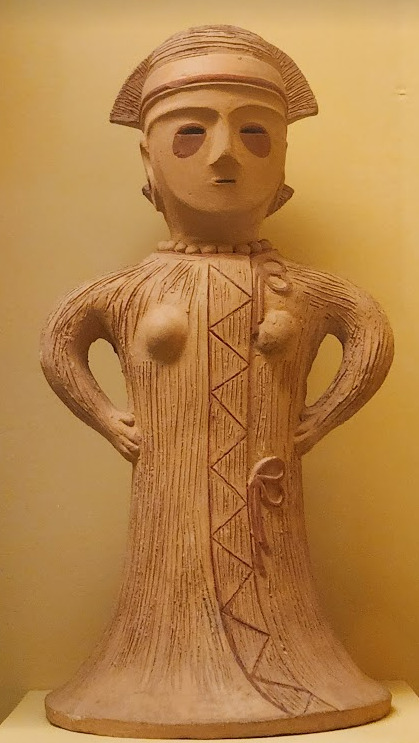
If you guys are wondering where I went for my vacation, I went to New York and got to go to the MET and the Museum of Natural History. In both places I found Kofun period stuff and I was so happy to see it you have no idea. I remember one of the Haniwa I saw had some neat face paint under the eyes that I tried to replicate with the makeup under Keiki's eyes in my drawing, though I think I'll gave to figure out how to draw makeup on characters because this reads more like blush to me than anything. While drawing this I also looked up some references of Kofun period jewelry and really liked the stuff I found, which also meant that now she has proper Kofun earrings instead of earrings shaped like Kofun tombs. I put some of the things I referenced with a closeup of Keiki's face as well down below. I made her outfit more reminiscent of the outfit I gave her at the beginning of the year with the buttons and all, though I do want to try and draw her in some more period accurate clothing like the Haniwa I took a picture of at the Museum of Natural History. I wish I could find a way to make her handercheif look better though as I wish I made it a little bit bigger, though I think I'm saying this because I've looked at this drawing for too long lmao. Once again something to work on for when I next draw her. Also want to get better at rendering hair, as some details (like the little strands in front of her ears) kinda got unreadable due to the similarities in colour lol.



Now you may have also noticed the little cracks I added onto Keiki's face, and that's because I have fallen in love with the idea of Keiki's body being made from ceramic and that she crafted her body herself. While they aren't very visible I also tried to add some doll joints to her body, which is an idea I played around with in the past but never went to far with. I also want to get better at rendering cracks in ceramic, porcelain, etc, as I'm not sure how those read in the drawing. I also have a headcanon where the cracks in Keiki's face show up because of heightened emotions, and while Keiki is aware of this and does her best to make sure her face doesn't break off.... she will still end up with at least a few cracks during any given day, and she can often forget to repair her own body quite frequently so Mayumi has to remind her quite a lot. Mayumi even taught herself some basic sculpting techniques to help repair parts of her body that are so badly damaged to the point where Keiki can't repair them herself, i.e. if both her arms broke off, Mayumi would put them back together for her so Keiki can at least have something to repair herself with rather than nothing. I also like to imagine that if Keiki created her own body, if you took a look at Keiki from the beginning of her life she would look completely different compared to now.
BTW If you guys are wondering what a very very angry Keiki looks like....ok in order for this to make sense have any of you read volume 11 of Land of The Lustrous? Am I bringing back some memories for those of you that have? Ok good, glad we all got that mental image brewing in our minds, I'll probably draw a version of Keiki that is somewhat inspired by that one day as it's an idea I've had for a little while now. And to those who haven't gotten to that volume yet and are confused.... don't worry about it, just keep reading :)
#touhou project#art#fanart#touhou fanart#touhou 17#keiki haniyasushin#wily beast and weakest creature#touhou#東方project#own art
190 notes
·
View notes
Text
"Welcome To The Slime Den!"

"Howdy person reading this, welcome to my 18+ writing/drawing page!"

Call me Blue or Bluester! || She/Her || 20 || Requests: Open || Art Comm(s) are CLOSED! [Ko-Fi] || Feel free to talk to me in DMs! I'm pretty friendly if not a bit of a yapper ngl
. . .
Multi-Fandom [I'm decently consistent in these following places, however—]

|| Stardew Valley || I. Recommended By Yours Truly :: [SDV] "Sins of the Guilty" Most Popular Work :: SDV Bachelors x Farmer Who Squirts

|| Twisted Wonderland || I. Recommended By Yours Truly :: [TWST] "Free" Lodging At SavannaClaw Most Popular Work :: Kinktober Day 13 - "Masturbation" [Leona Fic]

| | Genshin Impact | | I.
Recommended By Yours Truly :: [💧] Kinktober Day 10 - "Exhibitionism" [GI Fic]
Most Popular Work :: [💧] Kinktober Day 3 - "Sharing" [GI Fic]

|| Zenless Zone Zero || I.
Recommended By Yours Truly :: "How To Recieve An A+ In Housekeeping!" Most Popular Work :: "How To Recieve An A+ In Housekeeping!"

| | Cult of the Lamb | | I.
Recommended By Yours Truly :: "Heket v. Dionysus Artwork"
Most Popular Work :: "Heket v. Dionysus Artwork"

|| OC Stuff || I. OC Rant(s) + World-Building Rant(s) :: Masterlist
. . .


Extra Information
♡ - Lol I know I put my pronouns at the beginning of this masterlist but I really don't care + won't get offended if you address me a different way. It's the internet. ♡ - I write afab and/or gender-neutral readers (I will, however, write male-centered readers when explicitly asked to) ♡ - I don't take nsfw writing requests involving minor characters from any form of media. ♡ - I love drawing for people! But please make sure to be specific as to what you want if it involves your character with a canon character [If not specified. I may ignore the request entirely. I'll also only take three characters max per request and nothing more!] ^ to add to the drawing bit... here are my do(s) and don't(s) for doodle/art requests.
Do(s)
I will draw NSFW / Suggestive material (NSFW material will be censored per the guidelines and trying to make sure I don't get shadowbanned and/or smited from Tumblr.)
I will draw OCs
I will draw canon x canon characters
I will draw angst (nothing involving gore though)
Don't(s):
I won't draw anything homophobic, transphobic, xenophobic, racist etc.
I won't draw any NSFW material involving minors (I'll only draw SFW material when asked to draw a minor character)
I won't draw any hardcore kinky stuff (Scat, piss etc. are a big no for me)
Do not request for me to design a character for you, please!
[I reserve the right to add onto this should the need arise]
⚠️ I don't believe that it is my job as a smut writer/artist to be a beacon of safe or realistic sex. Everything I write is rooted in fantasy and unrealisim ⚠️

"See ya later person who stumbled upon this cave of mine! While you're at it, search up these fellows of mine and follow 'em. They're the bomb.com!"
. . .
["They're super sweet and have an amazingly cute art style! They're my main source of inspiration when it comes to anything I draw + write!"]
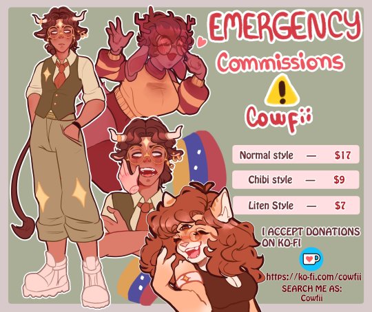
@cowfii
Comm(s): Open! https://ko-fi.com/cowfii
["I'll always boost up my fellow degens + they're a fellow writer who has a great sense of humor! They have a work-in-progress book with a juicy story plot so far!"]
@keter-kan
. . .
If you have the funds and are looking for another way to spend them—
Please donate to @mahmoudayyad go-fundme campaign! []
I don't have to explain, everyone already knows that this genocide is the most recorded but denied massacre in human history. No person in Gaza deserves to go through this so please, if you have something extra to give. Please donate it to this family! They need $100,000 to leave and are only sitting at 53 donations!
. . .
Ongoing Event(s):


#stardew valley#sdv#zzzero#zzz#zenless zone zero#genshin impact#genshin impact fandom#genshin fandom#twst#disney twst#twst fandom#artwork#art#digital art#artists on tumblr#oc artist#smut#artist#art comms open#art commisions#art commissions open#art commission info#art community#masterlist
31 notes
·
View notes
Note
Hii! First off i just want to I'm such a big fan of your art and animatics! Your art is just so expressive and unique its addicting to look at 💞💞
I was wondering if you could go over how your process or tutorial in making an animatic? Whenever I try to start to make one, I get jumbled up and end up ditching it lol
I'm sorry if you get this question a lot 😭
So sorry it took me so long to answer this- I was in a Busy time (diseaseridden with covid and being punched by finals) when I got the ask and wanted to answer it with some stuff Im using for my next TOH animatic!!
I'll say one thing first: I get jumbled up and ditch so many animatics. For every one animatic I release, there are three to five more I have that have NEVER seen the light of day (yet). And that's okay!! It's fun just to make them for me, and I hope it is for you too!! Animatics are scary because if you're working on it alone, it can be really hard to be your own cheerleader to keep up the mojo to keep going. So that makes it really special when there is that project that makes it to the finish line- cuz you can look at it and go "holy crap I made this. holy crap i MADE that look how SICK that is dude!! all that work and look at the turnout!!"
The following stuffh is just my personal process and is by no means representative of a professional animation pipeline, but this works for me as a Lonely Artist! It all begins with the idea - whether it's a song, or just a story you wanna tell. In the case of the one I'm gonna demo here with , I wanted to animate Hunter's first day as Del's apprentice!
The first thing I did was write a script. Not fancy or AO3-quality, but enough that I understand the pacing and the visuals of each shot. I usually just put this in a doc or put it in a script format, if I feel fancy.
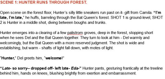
Then, I take that script and find music that I think would fit for it- and remix it (if needed) to fit the pacing/mood/etc! This is what this new animatic looked like before I began ANY artwork- this is a me thing because I'm super inspired by audio as opposed to visuals first. But you might be different- this is just how I like working personally!

Then begins the research! I find references for characters, background layouts, and create a style guide for the animatic that tells me how thick lines will be for characters, backgrounds, if there'll be tons of value or no. I make a turnaround for each character so I can refer to them because Im gonna be drawing them over and over a LOT and want to be consistent! Luckily TOH has no shortage of references, so I based my work off them.
THEN, I can begin drawing. I'm a little,,, (a lot) ADHD and may not always do this process, but if you're new to animatics or daunted by the task at hand, make beat boards of the entire project.
This is just a page of rough thumbnails that get your visual idea down - look how rough and quick these are!! I try not to spend over a minute on each beat board if I dont have to, unless it's a particularly complex shot.
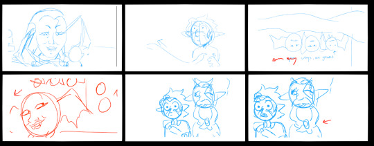
When it gets to the stage where you're ready to begin the actual scenes, I personally tend to do backgrounds first because I like to set characters into backgrounds - and for every animatic, I have the Awkward Blue Sketch Stage which is basically my beat boards timed out as an animatic.
I used Storyboard Pro for this (Toonboom, not free ): icky), but the process can be replicated across most art platforms in whichever way you feel most comfy with! This is so I can time the drawings before I devote time cleaning them up-- which can make for some Pretty Funny looking little guys but theyre important!! trust!!
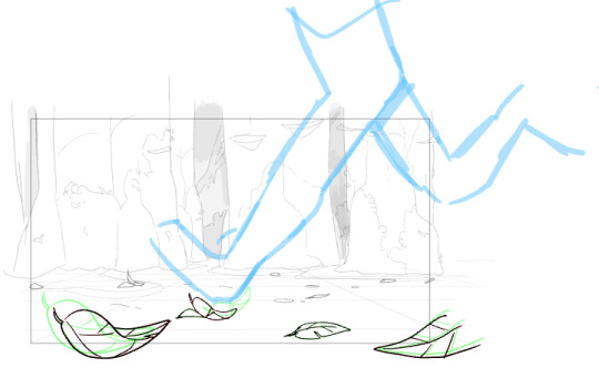
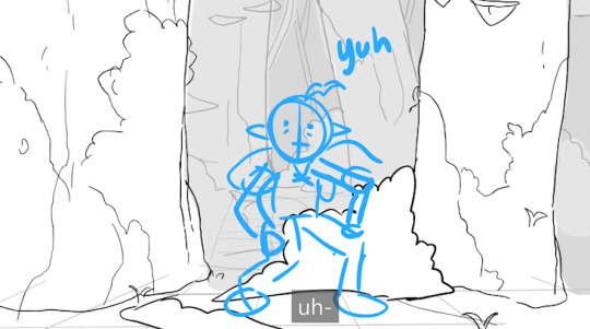
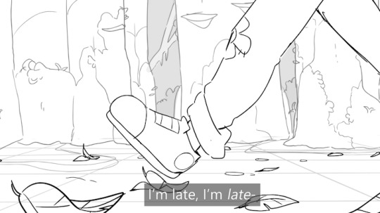
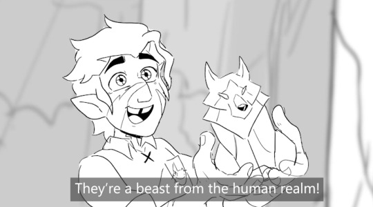
Once a big sequence of shots is cleaned up (I usually do 40-60 second chunks at a time), I export the .mov and send it to my editing program (which in this case is still Premiere Pro) - and then repeat this process again and again until.. it's done??
Here's like a TL;DR list of basically everything I said summed up:
• Make a loose script or bulletin of the idea! Do your research!
• Depending on what kind of animatic you're making, time it to music!
• Make a beat board of very loose gestures for your shots, and time them - then move on to refinement & cleanup!
• Combine all shots, refine music cues and timings, add any last needed VFX, and export!
There's no secret recipe or anything, it's just learning a pipeline that best suits you, whether it is for something professional or something you want to make for fun because you just love to make!!
#riley talks#long post#SORRY ITS LONG but i couldnt just put a bulletin list like “this is the ONLY method that works” bc thats not true!!!#everyone works diferently especially artists#and this is just my specific method of working#im very fortunate to have programs that make animatic-making a little easier#so i hope whoever wishes to make one in the future finds something that works well for them!! i have a blast making storyboards/animatics!!#text post#ask#tutorial#idk how to tag this lol
339 notes
·
View notes
Text
I’m stuck inside my head a little bit so I’m like, moving way too slow I’m losing the crowd and the time and people, but I’m trying to pick up the pace to catch up.
Anyways, so glad I did this. You guys have NO IDEA how many naked unfinished Adam’s I made, naked and most of them faceless. Ive been practicing anatomy and I’ve been struggling trying to stick with the Hazbin Vivziepop Style (I’m new to Digital Art, and I have not been a very consistent traditional artist IRL so I don’t have a style) but I keep mKing it to realistic and it’s taking me too long and it’s hurting my head my heart AND MY HANDS. I Cannot be stuck with trying to perfect a boob for an hour straight. It just leaves me frustrated.
Anyways I have a bit of perfectionist problem so I tend to hate my works but I love this one. I finally finished two Adam fanart and I LOVE IT.
I give you this grumpy chibi Adam. He’s a sulky unhappy baby

Why? Because Adam died and then time travelled back to the Beginning. He’s pissed because he lost, and he died, and then he gets sent back to start from level one, Again!

Now this is what he actually looks like when he was sent back.
Dude is SUPER PISSED that he died, he lost, and he got sent back to the Beginning. There’s no FUCKING WAY he’s gonna do everything again. Absolutely No 👎🏻. Fuck Lilith, Fuck Lucifer, maybe Fuck Eve, and Fuck Everybody Else.
LEAVE HIM ALONE (Adam becomes a hermit, using his experience to hide from everybody else.)
He has messier and longer hair , because Canon Adam hair is too fuckn confusing, I dont know what I am doing with the hair and I am Shit in doing hair!
So uh this is a Adam centric au thats gonna become an Eden04, In The Beginning Again.
I M Super Excited to do the rest of the trio!
22 notes
·
View notes
Note
I really wanna get into art history but I’m just not sure where to start. Im a history nerd though and though and would love to get into art history but my anxiety makes me second guess myself whenever I start to research it about starting at the wrong point. Do you have any tips on getting into it?
also any tips on writing a long fic consistently? Ahb and tcb were amazing. You have a gift with words! 💕
hello!!!
i would say as for art history, there is no right or wrong way to go about studying it. it just depends on what you want out of the experience ? if you want to be knowledgeable about art history generally then i would start at the beginning !! (if you want a brief “these are the artists that defined the time and the most famous works and the movements” knowledge) but you’re probably not going to get a very in-depth knowledge about everything.
if you’d rather know everything about the renaissance or everything about van gogh you can start there and get super into the politics/pigments/styles of the time and become an “expert” in that one area.
if you want to answer a lot of trivia questions right, take a tour of the most famous art works ever made ! and start there !!
if you’re more interested in modern art and the philosophy then there’s no shame just starting in the 1920s onward!!! there is no right or wrong way!! it’s all about what interests you most.
if you don’t know what interests you most yet, then i recommend starting chronologically and moving forward until you find something that sparks your interest !!!
khan academy is a great resource to start at !!!! (and it’s free)
as for writing a fic consistently, i wish i knew 😭😭 i have never had a consistent upload schedule for anything ever. and i hop around when things don’t interest me anymore 😭 i would say that and outline is always good!! so you always know where you’re going next with the fic ! it’s always easier to write when you’re like “chapter two: x,y,z happens and y sets up the thing for chapter five” <- i feel like i’m not being revolutionary here 😭 but yeah !! thank you for the kind words friend!! 🫶🏻💖
23 notes
·
View notes
Text
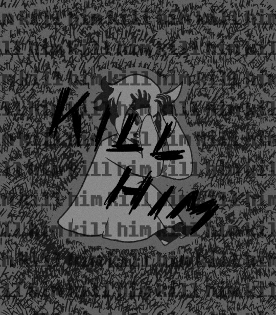

This is the first proper thing I've drawn in ages (and first are I think I've posted in over 5 years?) I just needed to draw the opening to Act 5 and my reaction to it.
Nothing has gripped me in such a way and forced me to finish an art piece like this in so fucking long. I see far too much of myself in him. I just want them to be ok after this is all over. STARS, this is just Asriel all over again isn't it. But WORSE!/pos
…I guess that could make this vent adjacent? ¯\_(ツ)_/¯
I also made a shitpost edit that I posted separately here.
There are so many things covered by each other and I just need to share and talk about them. Bonus details and rambles under the cut.
Siffrin's expression was like the first thing I drew and if it didn't turn out as good as it did I probably wouldn't have spent almost 10 days slowly adding to this and I just need to show it because his hands/arms end up covering most of their face.
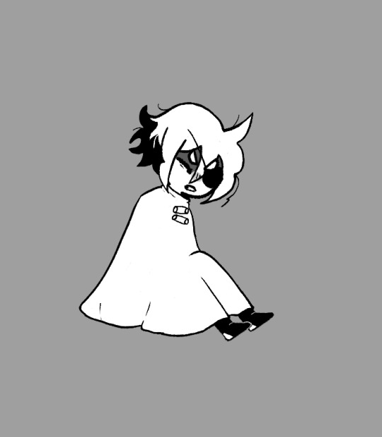
Nothing much else to say about him, I'm just super happy with how everything about him turned out (I did have to go back and redraw some of his hair towards the end because the line thickness wasn't consistent with everything I drew after.
Next is ME yippeeeee. I have no idea why I spent so long adding details even tho I knew alot of it would get covered by Sif 'cause of how I was posing this.
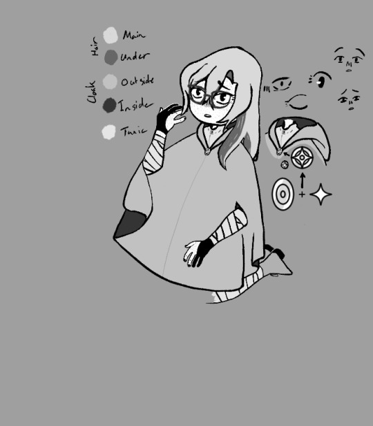
I even designed a little button based on the Change Ornament + Star (the Change Belief and Lost Belief in The Universe really spoke to me in so many ways)
The gloves are an Archery Glove on the right hand and a Drawing/Writing Glove on the left.
The cloak is based on the style of cloak my mom made for my family for SCA events when I was young. It's just a simple hooded cloak but it has a slit in each side so you can stick your hands threw without needing to open up the cloak. I imagine it being stylized like, the opening doesn't exist until you stick your hands threw and then it can just freely glide around the face of the cloak to wherever it's needed, stopping at the elbow only letting threw the forearm, below the slit beginning to hang off the elbow with gravity while the part above begins to move with the upper arm.
I didn't even try to draw the outfit under the cloak because dealing with the folds of a thick wool cloak was enough for me (you can see how I gave up at the knees because I KNEW Sif was gonna cover them up). What I imagine the outfit being is this big baggy tunic and pants that are tied down at the forearms/calves to keep from getting in the way, it's also supposed to have a big baggy turtleneck thing that can be pulled up as a(nother) hood (iirc, this sorta thing was used so someone could wear a chainmail hood without it grabbing your hair(there ware also like stand alone cloth hoods that did the same thing too but eh, my memory is bad I might just be misremembering this)) but I couldn't figure out the folds and ended up just doing a simple button up thing (which then got covered by Sif's big head anyway.)
I spent soooo long trying to draw my eyes, trying to figure out the shape, and ended up just doing a bunch of small tests to the side before finding one that actually looked right. Drag it over the face and see that it fit EXACTLY, didn't even need to redraw it or anything.... unless you're talking about the other eye in which case I just duplicated it, flipped, and did some perspective warping until it looked ok because I could NOT draw that again especially at a different perspective (can I just say I have no idea how I drew that creepy eye but I love it, it was the first eye I drew and I just threw 4 lines down what the fuck how. Also the Mira-ish one looks cute too but didn't fit the expression.) I also needed to figure out what the hell was wrong with the expression I had before so you get 2 faces from me figuring that out (turns out I had the eyebrows facing the wrong way.)
I ALMOST FUCKING FORGOT MY FRECKLES TOO AAAAAAAAA (they're actually missing from the version I posted in the official ISaT server.) It was super weird trying to add them at the obscenely low resolution I was drawing at and they're probably gonna get compressed to hell and back but I think they're cute.
final thing.

Why is my hair so similar to Sif's but longer? Like, you can see I was sketching over my drawing of him to make sure I'd keep the proportions right when I started working on myself but in the process I realized that I was basically drawing over his hair but longer for mine (drawing I was using as ref here made by @leemak)
Add that to the uncomfortably long list of things I have in common with Siffrin I guess.
#In Stars and Time#ISaT#ISaT Spoilers#ISaT Act 5 Spoilers#Siffrin#ISaT Siffrin#vLink Art#oh hay this is the first time I can finally use the tag I thought up for art of myself yay#technically the fan art tag would be 'fArt' instead but eh
29 notes
·
View notes
Text
The Issue with "Foefic"
For as long as humans have created things, others have looked at the fruits of their labour and thought, "I can do that better." Drawing inspiration from something you see and think you could improve upon is not wrong, it is how innovation works when it comes to creating tools, art, cooking. However, some people mean it in a malicious way. A way that teeters on jealousy and, if I may, clout-thirsty.

Lore Rekindled is a "retelling" of the (unfortunately) Eisner award winning webcomic Lore Olympus. From what I saw on the post introducing it, it is "better drawn and better written." I, like many, have issue with Lore Olympus. The writing is lacking and absolutely not award-worthy, and it even misses the mark as a cheesy harlequin romance. Persephone's characterization has no consistency. The art, while striking and easily recognizable, leaves a lot to be desired, especially when it comes to backgrounds. I don't consider it noteworthy, but it is heavily pushed by Naver's Webtoon, and that is probably why it keeps winning awards. With how low my opinion of Lore Olympus was, I dived into Lore Rekindled hoping to find something with more substance.
I did not find that substance.
LR suffers in different ways than LO. It assumes that you have read or are at least familiar with the major characters of Lore Olympus, which is understandable. The characters are re-written and interact strangely. Many of the characters in LO are meant to come off as "old money," and this shows in their lifestyles, fashion, and way they speak. The characters in LR all appear to have the same voice. If I were to print out a transcript of this comic and read it out loud, they would all be indistinguishable. LR is "better drawn," but what I think they meant is it is less toony. The backgrounds are better most of the time, but the panelling is boring and lacks the dynamicism seen in the original work. The plot is, if I'm being honest, just AU fanfiction (derogatory).
When I also learned that this creator had an original comic, I was very interested to see what it brought to the table. As I understood it, LR was a side project. So you can imagine my surprise when I looked at both the old and the new Project Reaper and it is just objectively a worse comic. The the majority of the cast has same-face syndrome, and seem to live in a cool-tone hell with no furniture most of the time. The concept of how to dress and style characters seems to be locked into what a 15 year old thinks is badass, but that fits for the story. The plot and dialogue reads like something a middle-schooler would make as an RP scenario with friends. The colouring is lazy dodge and burn, which just emphasizes that the author does not care about cultivating a space or atmosphere or world for these characters to live in. They are just toys to mash together to make your angsty super cool comic that you're going to pitch to Dark Horse for REAL, GUYS. And the first comic for this series is written right to left. In the author's defense, they were a teen when they started the original comic.

So how does someone whose average panel looks like the example above come to the conclusion that they can make a better comic? It's simple: Project Reaper is original, but LR has base material you can go off of. Anyone can read a comic and think "I would do THIS for this panel, and I would do THAT for this character introduction." I did it reading both of these comics. But if I were handed only the script for either of these projects, it would not come as easily. Lore Rekindled only looks "better" because it has Rachel's work to build off of. This goes back to what I was saying at the beginning, that the "I could do that but GOOD" view isn't doing you any favours, especially when you aren't doing your own IP well.
I think writing a little hate piece once in a while is good. Draw a hate piece if you really need to (though I would just show it to friends, personally.) Consuming a little media you hate is also good. As a creator, it is important to see and understand why you hate something, what you would change, and what little glimmers of good are in an otherwise pile of garbage. It helps you grow, to realize your tastes, and what not to do in your own work. Critically acclaimed writer Alan Moore agrees! But to have a whole comic with a regular update schedule redrawing something you hate is... It's giving "look at my sonichu comic redraw!" It is loser behavior.
Plenty of people create media out of spite, and I encourage it. I do it too. But the work should be your own. You need to put this energy into your IP. If you keep being a "hater," you'll never guess what you attract. Other haters! And those haters will like you, for now. But one of these days, someone will go through your list of essays and think, "oh, but I don't see any fat people in YOUR work that aren't plus-size model attractive." All it takes is one comment or take that a similarly-minded reader doesn't like and there could be a master list about you!
I am, of course, not saying you can't make derivative works at all. The doujinshi market is full of fan creations, and every art site you go to will be full of fanart. But the difference between LR and these works (generic sexy flavour of the month artists aside,) is that they are made with love. With passion for the original work. I think back to Homestuck AUs because, while I may not have liked them, these creators were doing it out of love for the characters. I follow a few guys on twitter who have been drawing a picture of their anime wife every day for over 10 years. That's love! Then you have more transformative works like Hello from Halo Head, of which some of it's characters are off-brand animal crossing characters. I love that. I think it's neat that the creator loved that little cat twink enough to bring him into their comic in a new form.
I think the point of this post is that you can use spite as a motivator, but it should be for your own creations. We have a limited time on this planet, and even less time where our hands are still able to pick up a pen. Put this towards your passion for the medium, for the stories in your heart. It's rough out there for creators, and it can be hard to find an audience in the ever-churning seas of the internet. But, please, don't put all your effort into "foefiction." That is cringe. And, if you're going to anyways, it'd better actually be good.
PS B^u

27 notes
·
View notes
Note
Have you also watched the One Piece anime? After watching the new live action I was like “oooh! I should check out the anime!” But it is like 1000 episodes. Is it worth it?
Hi! I've watched a good chunk of the One Piece anime, yes! I watched up through at least the Arabasta arc, probably up through episode 150 or so, but at the time that was all that was released, so I had to switch to the manga. (I kind of fell out of One Piece for awhile after certain events in the manga hurt my heart too much to keep going for awhile, but I've always intended to go back. So I would say I've read somewhere just past half of the manga?) So, take that into consideration, that I'm coming from "started with the anime, got 150 episodes in, that's all the further the anime was along at the time, so I had to switch to the manga, but I fell out somewhere around chapter 500 or so, but that was long enough that I had plenty of time to compare the manga and the anime to each other, once the anime caught up to where I was in the manga". My ideal One Piece watching order is pretty much exactly what I went through: - Be prepared for the first ~20 episodes to be kind of dull, maybe you'll like them, but most people find them kind of tedious, but idk maybe you could skip the first 30 episodes or so because OPLA covers the events reasonably well - Watch up through the Arabasta arc (episode 150 or so), the pacing of the anime is really, really watchable up to that point and the voice actors are ASTOUNDINGLY perfect in their roles - Switch to the manga for the Jaya arc/Skypiea arc, unless you're having a really hard time with it, Skypiea should still be pretty good pacing (up to episode 195 or so) - SERIOUSLY GET OUT OF THE ANIME AROUND THIS POINT because it has to start stretching out the events to fill time because it catches up to the manga too quickly, so there's a TON of filler, like by the time I went to try to watch the events of the Davy Back Fight in the anime, it was EXCRUTIATING trying to slog through the long, looooooong minutes of characters just STARING at each other to fill time Is it worth it? Yes, yes, and yes. One Piece is genuinely my favorite manga ever, nothing has ever come close to how well done I've found it to be. It's not perfect, it definitely has trouble when it comes to women (though, I think Oda is at least trying to get better about that) and the art style isn't going to be for everyone, but the sheer WORLDBUILDING and PLOT are absolutely NUTS, Oda knew exactly where this story was heading when he started and you can see that dedication unfold as it goes along, things that you had no idea were important back then, that just seemed random, will suddenly be MASSIVELY important, like as an example: When Shanks tells the sea monster to GET LOST! after it chomps his arm, there's a whooshing, the camera in both the anime/manga and the live action make a point of how the air kind of 'shakes' around him, and it's super dramatic, right? THAT'S GOING TO BE IMPORTANT LATER and watching OPLA I was struck all over again HOLY SHIT ODA PLANNED THAT FROM THE BEGINNING. One Piece is a deeply silly and ridiculous series, not everything is meant to be taken seriously, sometimes it's just Oda joking around and being goofy! But there's a genuine story about friendships and a massively internally consistent world that will slowly unfold before you and some of the most epic battles I've ever seen. One Piece is a series that has made me genuinely cry over Luffy's hat more than once, it has made me cry over a ship, that's how powerfully the story can affect my emotions, because it's genuinely such a loveable series. Yeah, I absolutely do recommend it! Start with the anime, but for the love of all things holy, stop at least around episode 200 and switch to the manga, it's a tough adjustment for a few chapters, but it's totally worth it!!
28 notes
·
View notes
Text
My brain wants to ramble about Mario movies, so I will do that. There will be bias, and there will be spoilers, but I think I'm going to at least put the section about the 2023 movie under a read more. Let's begin.
Super Mario Bros.: The Great Mission to Rescue Princess Peach! (1986)
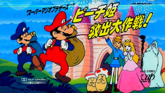
My love, my light, my heart.
Making a movie based on the Mario origin story(?) of "guys stumble into fantasy world, save princess from monster" is difficult if you don't add something to it, but adding things comes with the risk of deviating from the source material’s vibe, since it’s so simple. It’s the same problem with movies based on Dr. Seuss books.
Something a lot of people don't realize when watching this one is that Super Mario Bros. only came out a year prior. The people tasked with making this movie had very little to work with. Luigi didn't even have a consistent color scheme (though prior to this, he was always depicted with green somewhere.)
This movie’s solution to these problems? Keep it simple. Mario and Luigi spend the movie collecting "the three legendary powerups" with a dog and then go fight Koopa. They have misadventures on the way, and Mario eats Mario-branded ramen. It's fun, it's silly, it's goofy!
This is all accompanied with a charming art style that really takes advantage of the ability to push character expressions. For the cast, we have:
Mario - He’s not the smartest, the strongest, or most fearless, but he’s determined, and sometimes that’s all you need. This movie depicts him as a lovestruck dreamer, so a good chunk of his lines involve him calling out to “Piichi-hime~” Also, he’s a gamer. His character is nothing unique, but it sets the tone of this movie, something that I feel like Mario’s character does in all three.
Luigi - Pickaxe in hand, his number one priority is getting his coins. He and Mario share about three brain cells total, but he lacks the idealism of his brother, trying to keep him grounded in the things that really matter: money, food, and their business as…grocers? He’s there for his brother when it counts, though. Most of the cast has their fair share of goofy moments, but he is the designated comic relief, and Yuu Mizushima’s performance serves that well. He sounds unhinged half the time, it’s great! Fun fact: This is the first time Luigi is depicted as thinner and taller than Mario.
Peach - She spends most of the time wishing that Mario would save her, as one might expect, but even this early on, she has a little bit of agency. Her first introduction is her fighting off the enemies after her, and she manages to pull a clever trick on Koopa midway through, though it doesn’t help her much.
Koopa - Very doting on Peach and willing to accommodate her whatever way he can, except for letting her go. His portrayal by singer Akiko Wada combined with the rounded artstyle makes him more adorable than menacing.
Kibidango - The dog that tags along with Mario and Luigi. He tries to be their voice of reason, but he can’t talk, and they don’t listen. He’s mostly there to help the plot along and provide a twist at the end.
For the most part, this movie sticks to using material from the game. There’s some deviations, like the dog and a wizard, but they don’t feel too out of place and, if anything, lend to the movie’s fairy tale-like quality.
Mario games generally try to maintain a whimsical, timeless vibe, and this movie captures that best. It’s not perfect, but it's a fun little romp that I highly recommend watching at least once, only an hour long. Please watch it!
Next are my thoughts on Super Mario Bros. (1993).
I also finished my thoughts on Super Mario Bros. (2023) if you're interested.
#text post#super mario bros#the great mission to rescue princess peach#it's so strange to me when people say this version of luigi is wario-like#yes they wear yellow and both like money but wario is greedy out of selfishness. this version of luigi is greedy out of practicality#he's a small business owner#he has bills to pay#his brother is running off after a girl who for all he knows is a gaming-induced hallucination
10 notes
·
View notes
Text
Luna's Review: Jack Jeanne

Official Summary:
Kisa is about to give up her dream of becoming an actor when she is given the opportunity to enroll at the prestigious all boys Univeil Drama School that she has always admired and dreamed of attending. She is granted admission with two rigid conditions: be chosen as the lead in the final performance and hide her identity as a girl!
Competition at the school is fierce and the rivalry is real! Will Kisa be able to forge powerful bonds with her all-male classmates while competing against them?
Will she be cast as the lead in the final performance at the end of the year all while keeping her secret?
.
Luna's Thoughts (Spoiler Free)
I don't particularly like rhythm games or stat building games — I'm more of a straightforward visual novel kinda girl. But I chose to play Jack Jeanne because I read a glowing recommendation on another game blog.
I admit, I struggled with this game at the beginning. The impetus for the protagonist joining an all-boys school was, in my opinion, too fast, poorly explained and lazily written, and I feared the whole game would feel that way.
But I was pleasantly surprised as the plot unfolded. Subtly charming, Jack Jeanne is a rare otoge that doesn't feel the need for epic events or contrived details. The straightforward plot follows the protagonist through a full school year during which she become confident in her skills as an actor, charms her fellow classmates and works toward her ultimate goal of catching up to her brother.
Once I got used to a few things, I found myself enjoying this game immensely. The character development is slow, natural and gorgeous. Every main character gets at least one satisfying arc, including the protagonist. The cast is complex and enjoyable — even the side characters are pretty well fleshed out. And I cannot believe how many side characters get full sprites, cgs and sometimes even character arcs themselves. Fitting to a game about theater, Jack Jeanne features a true ensemble cast.
This is a pretty unusual otoge, as the majority of the plot is common route, with some special scenes mixed in depending on who your affection is highest with. You don't get into a "route" until pretty close to the end of the game. When you do, though, the final performance is highly customized based on your love interest character.
The first time I heard the songs in this game, I didn't think much of them. During my second playthrough, I caught myself humming a few. After the third time, I downloaded the whole playlist onto my phone lol. Some of them are absolute BANGERS. I didn't particularly enjoy the rhythm games, but I acknowledge that's just a personal preference. The game does not penalize you for playing on super easy mode — thank god — so that's what I did most of the time. Even hard mode is pretty easy for the most part.
The game arcs are broken up into sections depending on what play/musical is being performed. Jack Jeanne does a great job of showing you rehearsal scenes without completely giving away everything about the story, so you still get to enjoy the play yourself during the performance. And every sprite gets a new, gorgeous costume for EVERY play. It made me genuinely excited to get to that portion of the game each time.
I do want to talk about the art in this game. The cgs are lovely, but tend to feel ethereal as they are painterly and many lack backgrounds, creating the illusion that the characters are floating in space. I liked them but they are a different art style than the sprites, which felt inconsistent. Add to that a rather adorable cel-shade chibi style, which is used for the stat-building scenes, and you have three completely different art styles used for this game. I'd have preferred some consistency.
I also wish Kisa had a sprite on screen, because we don't get to see what she looks like except in cgs. It's a bummer because she's so cute~
Other than that, all my other complaints have to do with the format of the game. Due to the nature of it being a stat builder, the pacing of the relationship pursuit feels off. You get these really lovely occasional heartwarming scenes with the character you're pursuing when they're triggered, but then they're not acknowledged in the next scene. It interrupts the flow of the plot. But if you're used to stat builders, this will probably not be a problem for you.
Gripes aside, Jack Jeanne is a thoughtful, delicate and delightful look into a group of students doing their best to advance their skills and follow their dreams. I highly recommend checking it out.
Here are a few spoiler-free tips of things I wish I knew before I started the game that will help you through it if you decide to play:
As this game is SUPER LONG and mostly common route, you'll be doing a lot of skipping after your first playthrough. Unfortunately, as there are lots of scenes that are gently customized based on your love interest, you can't just leave it skipping for long intervals. I recommend finding something else to do while you're skipping and just keep an eye on the game so you can breeze through the common portion.
You don't have to start at the beginning every time. For the first two performances, try to maintain equal affection and stat levels for each romanceable character before summer break, and then save. You can use this as a flexible save file and pursue your character of choice from here.
When you're ready to aim for a route, only take lessons in that character's stat until you get to level 30. It will take almost the entire rest of the game. Only see that character during days off until you max out affection. If your character isn't available during days off, go to Mona Star School and raise their stat. You need to get to level 30 to unlock a special post-game scene for each character.
"Weekend with Ion" is just a way to get extra rhythm game practice and you don't have to do it.
If you're playing the game right (IE not failing the stats or rhythm games), there aren't any "bad" choices; just choices that give you affection points for certain characters. When you get onto a specific route, choices are just flavor. Feel free to pick different things each time and see what happens.
Please find below my thoughts on the protagonist and each romanceable character in the order I pursued them. Don't read sections marked with spoilers if you want to avoid them!
.
(Spoilers) Kisa Tachibana (protagonist)

Kisa Tachibana is one of the best otoge protagonists I've ever played. I have a lot to say on her, so I'll get the bad out of the way first.
I was a little disappointed with Kisa's writing at the beginning. We know she looks up to her brother Tsuki and wants to be an actor like him, but she's given up on even going to high school because she needs to support her family. But the opportunity for her to attend Univeil comes up so quickly that her struggle and longing are not really fleshed out.
We also don't get an explanation on why her brother was allowed to go to a (seemingly expensive) drama school, nor why he isn't using his success to send money back to the family. In fact, the game just casually mentions Tsuki has vanished without a trace, and nobody seems that concerned about it. Kisa is sad but doesn't seem to question where he is or what he's doing, and nobody asks her about it, even after figuring out she's related to him. And no, this is never addressed, even at the end of the game.
Anyway, onto the good.
Kisa is an amazing otoge protagonist. She goes through not just one, but many character arcs, learning from and responding to her classmates (and even other classes) and becoming not just a better actor but also a better friend and teammate. Unlike a lot of otome game protags, Kisa doesn't get a lot of down time to reconcile her thoughts. Instead, you're left to largely understand her thinking and feelings through dialogue, making her feel less like the game's protagonist and more like a regular character. I didn't like this at first but I came to appreciate it as the game went on.
Every character teaches Kisa something about herself and something about acting. She learns how to feel comfortable in the spotlight, but she also learns it's just as important to prop up other actors. And she gets to go through different arcs depending on her romance choice.
She also has to learn how to perform as a Jack (male character) and struggles with this in a way that felt natural. She even ends up overcorrecting and finds it hard to go back to playing a woman.
My absolute favorite arc of hers is when she decides she has to embrace her femininity in order to make a show a success. This, to me, is the culmination of the whole game, as Kisa decides to risk being discovered in order to help her classmates shine. Of course, if you play all the routes, you realize she actually isn't doing a great job of hiding her gender at all lol. But fortunately she's endeared herself to her classmates so much that they don't mind.
Overall, 10/10 otoge protagonist.
.
(Spoilers) Kai Mutsumi

I chose to play Kai's route first, because tbh I thought his sprite was ugly and I wanted to get it out of the way lol. I did warm up to it eventually. And I regret playing his route first because Kai is an utter cutie patootie and I fell hard for him.
He tells you really early on that he only sees himself as a way to highlight the Al Jeanne (female lead). So his character arc is about him acknowledging that he also wants the spotlight, and Kisa helps him by highlighting him.
Though Kai is usually quiet, contemplative and reserved, once he and Kisa have acknowledged their feelings for one another, he starts getting jealous, both of Fumi (as a rival) and of Tsuki-nii (as Kisa's inspiration.) It's heartbreaking but really satisfying to learn that Kai feels emotions just as intensely as everyone else but didn't know where to direct them. I love him so much!
Kai also gives you one of the only laugh-out-loud moments of the game during the common route. I won't spoil it but it involves a certain weasel in the forest.
Kai's is one of the more intense routes, so I would perhaps save it for a bit later if you're wanting to get the lighter stuff out of the way first.
.
(Spoilers) Suzu Orimaki
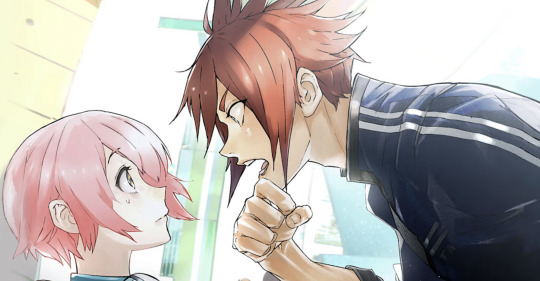
Suzu is the genki character of the game, and the senpais make fun of his dancing at the beginning, so I thought the running gag would be that he sucks. But I was pleasantly surprised. Suzu is shown to be committed, a good actor and surprisingly quick with memorizing his lines, though he does make some stupid mistakes throughout. I adored him as the Sleepless King.
Suzu's route is the one I would call the most generic as far as otoges go. A lot of his route is him struggling with his feelings for Kisa. He starts to like her before he's sure she's a girl, and once he knows for sure, he has a really hard time hiding his feelings. To his credit, he also discovers Kisa is a girl on his own, showing he's smarter than we're led to believe.
If you wanted something more nuanced, maybe Suzu's not the character for you, but I really enjoyed it. The more a character struggles with their feelings, the better, imho lol. The cutest scene is after Kisa gives him sweets for valentines day, and he just can't handle how happy is is. You can't help but love Suzu!
You do actually get a lot of character growth as far as acting goes in Suzu's route — just not with Suzu himself. It's Kamiya — one of the side characters, who fanboys over the amazing Tanakamigi, one of Kisa's rivals in a different class — who gets to experience his own arc this time. While it doesn't feel totally resolved in the end, it was nice to see the game highlight some other characters as a result of the decisions Kisa has made.
I also really loved Mare-chan's little arc, as he learns to appreciate standing on stage with his brother. Actually, all the first years are highlighted in this route, which was fun.
Unlike Kai's route, Suzu doesn't confess to Kisa until the very end of his route — but it's very sweet when he does. Overall, Suzu's route felt like a very normal otoge route, but not in a bad way. He's very kind and protective of Kisa. It's hard not to like him.
.
(Spoilers) Soshiro Yonaga

Sou shows obvious signs of being into Kisa, even during the common route, so I figured I'd get a nice little bit of angst in his route. I normally play the childhood friend route closer to the end, but while I really enjoyed Sou's role and growth in the common route, he was such a little jealous bitch in Suzu's route (lol) that I decided to play him next. He pissed me off so much haha. I thought it would be over when he punches Suzu after Suzu discovers Kisa is a girl — something like a send-off to his rival, knowing he can't compete. But he proceeds to be whiny and annoying throughout all the rest of Suzu's route, and this made me want to get his route out of the way.
Sou on his own route is a lot better. He actually impressed me with how straightforward he is. He's the first character (that I played) who confirms he is properly dating Kisa on his route, and his confession was really brave, direct and passionate. It's sad to think that he loves Kisa in every route but won't tell her. He even followed Tsuki to Univeil just to see her again T_T
I was very excited to see we'd be getting some Momonashi context in this route, because he's easily the most mysterious character in the game. You never really understand his motivations, and he always hides his thoughts with a smile. It excited me that he was chosen to be Amber's Al Jeanne this time around, and he is every bit as dark and horrifying as I wanted.
This is also the first route (I played) in which Kisa does not get the lead role by default. I nearly had a heart attack and thought I failed the route because it was so different from Kai's and Suzu's routes. Rest assured, this is what's supposed to happen and it all works out ok. Mitsuki's subtle understanding of the things going on around him is also critical in this route.
But back to Sou. He actually goes through a few different arcs in his own route. While I thought it ultimately ended up ok, I would have liked to see the version of Sou infected with Momonshi's darkness for a little longer. He's only there for a little bit before Suzu's anger snaps him out of it. The back-and-forth of Sou's route felt a little disjointed, and in some places too similar to his plot during the common route.
But ultimately I was very proud of him when he pumps up the crowd during the final performance. Sou comes a long way and his route ends with the promise that there's more to come. Good for you, Sou-chan!
.
(Spoilers) Mitsuki Shirota
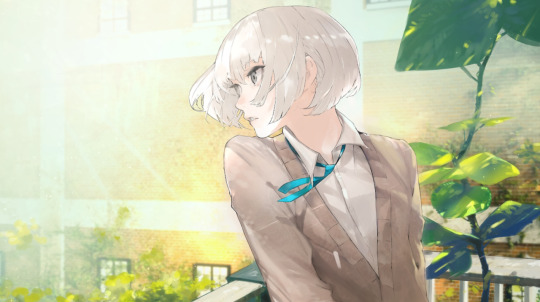
Mitsuki is the standoffish character, so he's the only romanceable character who is outwardly rude to you at the beginning of the game. I sometimes have trouble with this sort of character, so I was a little worried about him. But I didn't need to be — ultimately, he became one of my favorites.
Mitsuki is the most observant character in the game. He notices subtle changes and tells Neji to back off when he's putting too much pressure on people. And he's the first to tell Kisa he'll accept her no matter what. Mitsuki is so important to making this game work.
He knows he's good at singing, but when he's put in a starring role, he crumbles under the pressure. Obviously Kisa helps him stand up again, but it was really gratifying to know his aggression comes from a place of fear.
While learning to enjoy the spotlight is part of his common route arc, doing a Mitsuki playthrough really adds to this, as you learn how much Kisa's secrecy is weighing on him. He knows something's up right away, and as he comes to trust and admire Kisa, he begins feeling sad that she doesn't trust him enough to unload on him. There's a particularly poignant scene where he undresses in front of her — something we know he's afraid to do for anyone else. Mitsuki's cutscenes really emphasize his words to Kisa on stage as Rukiora and Chikachina, roles that parallel their own experiences.
I will say that, like Mitsuki himself, his route is very subtle as he quietly influences those around him. You don't get a lot of Amber students in this one, as his focus is more on the second years of Rhodonite and Onyx. He quietly fires them up, and it's so sweet to see how the second years, previously in the shadow of Tsuki Tachibana, become determined to do their best because of Mitsuki.
My only gripe for this route was that we didn't get any more Mitsuki background. His mother appears in a really intense cutscene toward the beginning of the game, so you know he's got family stuff going on, but we never really get any more elaboration on that.
Anyway, I love this boyee so much and I just want to give him a hug.
.
(Spoilers) Sarafumi Takashina
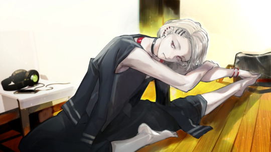
Honestly, I shipped Fumi with Kai more than with Kisa. They had such a nice and supportive relationship.
Fumi is calm, confident and pretty. He tells Kisa he likes her early in the game. He's a mysterious character under a lot of pressure, but you wouldn't know it unless you participate in his cutscenes. If you pay attention, you'll notice he gives nearly everyone nicknames.
Fumi's main game arc involves him growing complacent with the theater because nobody can match him. It's up to Kisa (with help from Sou) to fire him up again.
I tend to have trouble with flirty characters, but Fumi is so confident and kind that I liked him quite a bit. Because he's so aware of his own skills, I was wondering what his next arc would be in his route. I was pleasantly surprised to find that it's Kisa who gets to experience the most growth in Fumi's route as she struggles with the pressure of working alongside Quartz's star.
While perhaps not as dramatic as some of the other routes, Fumi and Kisa work together to understand each other, both on stage and off, and do their best to become suitable partners for one another. Fumi is also grooming Kisa to be the next star of Quartz, so there's a bittersweet dynamic of passing the baton here, too.
There weren't any dramatic twists and turns, but Fumi's route felt natural and gentle. It was a good conclusion for these two. He's also the only character other than Sou who confirms he's dating Kisa by the end of the route, which I appreciated.
.
(Spoilers) Neji Kokuto

Neji is the least serious character in the game acting-wise. He's silly and jokes around, and never gives himself a huge role in any of his own plays. But he's ultimately the one pulling the strings, and he seems to have an extremely good grasp on every character's strengths and weaknesses. He's also the only character who doesn't get his own arc in the common route.
However, I was disappointed with some of his cutscenes during the common route. While I appreciate that he deals with the deep trauma of losing his father with humor and spontaneity, I thought it was an oversimplification for him to say he's afraid of women. The resulting scenes don't feel serious enough and it didn't feel natural that Kisa would fall for him.
If he were simply afraid of falling in love, which is what ultimately led his father (allegedly) to losing his creative flow, I could understand that a bit more. But to have him attend an all-boy's school just because he feels like all women are a risk seemed like a strange move for a game that has been really inclusive about gender so far. It felt very off-putting for Neji, who often puts himself into a female role, to fear women.
But once he realizes Kisa is a girl — once he realizes he knew it all along and was trying to block it from his mind — the tone becomes very dark and sad. My heart was pounding as I felt the weeks go by with no script for the final performance. It was thrilling simply because I didn't know what to expect. It's so different from the other routes.
But I wish Neji was able to express his emotions a bit more. In the end, even as he was contemplating throwing himself into the sea, he wasn't able to be completely serious. I would have appreciated a scene where his walls fully break down, in which he's able to fully embrace Kisa as a woman and appreciate the weight of his own feelings.
I also never felt like Crowley, the character Neji plays in the final performance, was suited to be a main character. He never opens up or shows any weakness. He's just a silly guy and didn't feel like the lead at any point.
I did like how Neji ultimately decides to move forward, even being unable to write. But of course, at the end, Neji is suddenly able to write again. I knew it was coming, but it was a rather convenient ending.
Ultimately, I felt Neji's route was the least successful. I wish he got more growth in his own route. I did love him proposing to Kisa at the end though. It felt very in keeping with his character.
.
(Spoilers) Kisa Route
This is the route you get if you choose not to spend Christmas Eve with anyone, and it's the closest this game gets to a true ending.
Boy, does it deliver. It ties in all the themes from the game into a really strong ending, where every character feels valuable and Kisa gets to lead Quartz to a strong finish. We also finally get an explanation for the title of the game, as Kisa takes on a special role — neither male nor female, just the protagonist who everyone falls in love with.
A fantastic final route for a fantastic game!
#jack jeanne#otome game#otoge#visual nove#vn#kisa tachibana#review#otome review#game review#luna's review
9 notes
·
View notes
Text
Hello you jubilant jaguars!
We've finished our final project and have placed all our things on the wall for assessment on Thursday. I didn't have as much to physically present because I didn't have my larger drawings from the first animation brief.
I've very much enjoyed the animation discipline work we've done and the overall process and pacing of the workflow. It was a little bit jarring in the beginning but once you started getting into it, it felt productive and consistent.
Final Brief "Nursery Rhyme"
I have to admit I was a little hesitant with doing group work that is often either really good or really annoying. I was blessed to be in the former of groups.
In the beginning I was a little withdrawn perhaps because my mind was on CCS and the prompt of
Three Blind mice
Epic/Historical
Space Age
wasn't something that sparked many ideas for me. I don't have a great pool of reference for space themed bits of media so I didn't feel super comfortable coming up with ideas. The first day we were supposed to make draft scripts to which I opted to do some research instead of. In the beginning it didn't feel like I was pulling my weight as such but during the weekend we had a call on Sunday to show off our newly written script, of which I did do.


It was my first time writing a script but I was actually really enjoying it towards the middle. I finished after an hour and didn't really revise it because I was occupied with CCS work I needed to get done. There's a couple of things I learned, from the time I spent.
I'm not supposed to write descriptions of shots. (in the beginning)
My dialogue was really long and wordy. (I wanted to get my ideas of characterization across and didn't give myself time to revise and edit it which I would've done usually.
On Monday we finalized the script after taking different aspects of each of our scripts that we liked. From my script they took:
The beginning shots of the space craft showing characterization through visuals.
"Some of the characterization and dialogue ideas such as "is that Russian?"
I spent Monday working on CCS and then on Tuesday my group had storyboard stuff done but I didn't have much of an impact on it besides revising the argument scene between Ridley and Latimer in the buggy. I found myself although not contributing as many new ideas to a discussion but rather looking at the ideas we had and seeing if they fit in with an overall vision. I suggested having an overall theme for the story as it is an Epic and came up with the idea of blind beliefs and the consequences that can lead to.
I knew I had to start pulling my weight for the group and we started doing research. I was put in charge of landscapes as well as spaceships and their interior.


I found the Observing the Moon book to be quite useful for looking at the Apollo missions, reasons for its' discontinuation and the geography of the moon. Moonshine was a Dreamworks background art book that more so served as inspiration and motivation for my future background work.
We put together a google slide consisting of the research we did and these were the ones I made.


We then went onto look at style/aesthetic and once again I felt like I didn't contribute much to this discussion although I was okay with going for the Star trek, Akira hybrid we settled on.
We then started going into concept art. I was put in charge of landscapes and backgrounds along with Mik. I focused on the moon surface and the spaceship interior and exterior. I found this youtube video to be quite useful for getting started as I wasn't too confident in my abilities to make background art.
youtube
I found this process quite fun in keeping loose shapes with wide brushstrokes and practising stroke economy which aims to show great detail and imagery to the viewer with implied detail. I also tried playing with values. It was also my first time really using the gradient tool which add a little interest to the sky as opposed to just a flat colour.


I feel like I could've experimented more with composition but I wanted to get more work done so I took one of the compositions and changed the hue/saturation/brightness to show different colours and palettes to see what type of feel we want for the background. I did try and place the ship in different spots to see how it'd look composition wise but that was the extent of it. I settled on a closer view of the ship for my master shot.

My group liked the bottom three particularly the bottom left purple hue. I then took this and fixed the sky to make it pop more with stars.

I also spent time working on the space ship itself. I sketched them out traditionally based off the video I had in my research to get used to the shape and structure of the exterior and then went to do it digitally/. I quickly sketched out my shapes and then went over them with a paint brush. I didn't do line art and kept it pretty basic.

I think I got the basic look of it down here and once again played with the hues/saturation/brightness to see how it would look differently.
I went over it again but took more time to make it fit the Akira aesthetic more. I used airbrushes, with a lack of line and tried to make it more detailed in spots. In the end I finished it early and was mostly happy with the top half.

Before starting my master shots at home, I wanted to look at other parts of the project for my time in college. I felt like we were lacking some of the civilization development and ideas and started drawing up designs for that.

Basing it off roman architecture with elements of irish stone carvings with the idea of rat/mice imagery and looking at how a language could be formed from this with writing. When it comes to writing I knew the writing would be composed of scratches as if done by mice. The writing I thought would look like symbols not too dissimilar to kanji or Chinese characters but in a more primal less sophisticated form.
I knew the pillars would be the most opportune asset in our storyboard to illustrate a culture or some form of civilization. I played with shapes and tried relating them to Ryan's work so they would feel connected. (Ryan's work below).

I then took these designs and tried making very quick digitized versions but I didn't quite like how they turned out. I also tried seeing how their look in a dark environment being lit with flashlights to the same result.


This was all the concept and design work I was able to get done and I was quite happy with the results. If I gave myself more time to work on this I would've liked to have breached out to other parts of the project such as character work, cave interiors and the city itself. I think it would've been interesting to see what we all would have come up with for each part of the project but with the time we were given I would've liked to have experimented more with composition I think.
After preparing for the pitch presentation I focused on the master shots I was responsible for. I did the exterior of the ship on the moon landscape in the composition I picked out earlier.

Liberty did the sketch for the interior of the ship taking reference from the video I had seen for research.

I went over this in my style to keep it consistent. I found this workflow to be more efficient.

I think a big thing I learned from doing these backgrounds and something to keep in mind for next time is to use darker colours against the light ones to create more contrast and create depth. I feel in some parts of my work certain things don't pop out as much as I would like them to.
We then had our presentation which went well. I wrote down a scripts and practised it multiple times until I felt confident In what I was saying and could talk around it if I forgot any words. I used a Q card to help prompt my sentences with words that I knew I blanked on during my practises written down. I felt my part went smoothly and I remembered my points. I did speak too early for one of my script lines during the animatic but I don't think it that much of an impact.
Coming to the end of this project I learned quite a bit working with my group. I was quite happy with the work I did do and wasn't used to the actual good communication and enthusiasm my group displayed overall. Although I faltered in the beginning, all members in our group felt they had a moment or moments they weren't doing as much. We still covered for each other and always had new work to look at each day. It was really nice to work on something with people who were equally as dedicated to making something together.
If I had to change somethings for next time it would definitely be how much I contributed to new ideas in the group. I did come up with ideas but I felt I kind of took a back seat and looked at the ideas we already had to see if they would fit without coming up with much of an alternative.
I felt also that there were some things I was thinking that I didn't quite vocalise at times but as I grew more comfortable with the group I was more relaxed in sharing my ideas and criticisms.
This might be my last Tumblr post but thank you guys for the support and love you've all given me throughout this journey.
Signing out,
~K00297230
7 notes
·
View notes
Text

art challenge i wanted to try !!
ft. the evolution of my gordon design.
one of my favorite artists, sapgoon, came up with this little challenge. i thought it would be super fun to try to imitate my old art styles- not only that, but it was also surprisingly easy. i guess they're still a part of me after all this time.
have you guessed my favorite character to draw yet?
i will go a little in depth about them under the cut !!
2017 (perhaps it should be 2018, but it's the same style for that, so whatever.)
-very dull colors, same face syndrome, completely black lineart, messy black/dark purple shading, extremely shaky fingers and little to no care for consistency. this is quite literally my very first art style, as 2017 is when i first began drawing digital art.
as you may know, however, hlvrai did not exist in 2017, so i never actually drew gordon like this. i just drew what i think i wouldve drawn back then, if hlvrai had existed.
2020
- this is the art style i had when i initially learned about hlvrai's existence! same face syndrome is still there, but i get a little bit better with colors and my hands finally stopped shaking. im not a fan of the design i gave him back then (i really couldnt make sense of the hev suit at all), but every artist has their ups and downs.
2021/22
- i begin to get confident and find my own art style, trying to overcome the same face syndrome and learning a little bit about color theory. its a very messy style, and its the first time i began keeping my hlvrai designs consistent through all my drawings.
2023
-present time !! im... not sure what happened. i definitely improved a lot of aspects, but i don't wanna jinx anything. just look at it! wow.
looking back i realize hlvrai has been very important for my art journey, encouraging me to push myself out of my comfort zone multiple times. and though i just began posting my art again recently, i hope i continue getting better and better in the future !!
2023.08.12
#hlvrai#hlvrai gordon#hlvrai fanart#art improvement#sapgoon#art challenge#i can never escape. never escape#deep down i am still in 2017
30 notes
·
View notes
Text

"proof of concept" design for Voidball + some pupil designs from '22 (back when he still had a tail)
quite a lot has changed! a few key design details have carried over from this one (chipped ear, singular eye, and the heart-shaped hole in the torso), but many aspects have since been scrapped or reworked
design notes under the cut! but be warned! its just a little under 1k words
before we begin, there's this phrase that i'm going to be using a lot and you ought to know what i mean by it!
the phrase is "design philosophy" and in simplified terms, its a set of rules or principals one follows when designing a character. there's a ton of different design philosophies and they vary wildly depending on the medium, the team behind it, the art style, tone and even country of origin!
the one i used for Voidball is a mix of my own observation/analysis of Rob's character design and some principals that the team of Across The Spiderverse used for The Spot. here are the rules i eventually settled on!
remove as much recognizability as possible from the character's appearance, save for their physical stature and select features (eye/mouth/hair/ears/etc.) the end result should be almost entirely unrecognizable
details such as textures, markings, or accessories must either be done away with or heavily simplified
use sharp angles wherever possible, rounded shapes must be sparse (can you tell which part i gave myself more leeway on lol)
do not clutter the design or over-complicate it; principal of Occam's razor
now, let’s get started!!
Head and Ears
i set out with the intention to give him a similarly complicated head shape to Rob, but i quickly dropped this idea because i hate drawing complex geometry! the slice taken out of the head, however, ended up sticking around! you can see some examples of what was dubbed the "sliced melon" head in the doodle dump post.
you can see that the ears have stayed about the same, although i now avoid drawing them with super defined geometry. out of all of the details carried over from this design, the chipped ear is my favorite :)
Eyes
those pesky eyes! i wanted to keep the singular eye, but at first i was unsure of what to replace it with. you can see here that i initially replaced it with an isolated box of static. this looks bad and is not visually appealing!
as i began to imagine static functioning as more of a viscous, liquid substance, i decided to cover the left side of his face with a constantly dripping river of it, obscuring the eye completely. this is both easier to draw and more visually interesting! plus it removes recognizably, which was very important to the design philosophy.
as for the right eye, the pupil shape depicted here has two sharp triangle indents in it.
while it was an interesting idea, it looked too similar to the eyes you see on rubber-hose animated characters, which wasn’t what i wanted. the other three ideas i sketched had similar ideas regarding negative space, but all of them would eventually be scrapped.
as it turns out, the original pupil shape works for a reason! i learned there that going against the original philosophy would not end up working in my favor. i went on to pull many future design elements directly from Rob's design, such as the doubled pupil!
Upper Body
his left hand was originally disconnected/fragmented from his arm/wrist. while cool in concept, this was eventually dropped because it was too difficult to draw consistently. oh well!
his torso/waist were originally more cylinder/sphere-shaped to contrast how Rob's design is made of squares/polygons. again, i have since decided to follow the original philosophy instead of going against it.
my favorite design detail for the torso is the heart-shaped hole in their chest! it is by far my favorite thing to draw :3c
Lower Body
you can see that their waist was more of an elliptical shape here; the legs were also cylinders devoid of much static and largely maintained their patterns.
also notable are the missing portions of the legs. the right leg prominently features a jagged empty space below the knee and a missing section near the hip. this aspect was dropped to simplify the design and remove recognizability
not so much as a note as it is a funny tidbit, but the feet aren't meant to look as if they've been attached at the heel. i just drew the legs before the feet and didn't bother erasing the overlapping lines.
this design wasn't meant to be super solid or well-thought out, i just needed to get the general idea down on paper, and that's what i did! :)
Tail!
ah, the static tail! the visual style of the tail was meant to hearken back to the scan lines you see on old VHS tapes.
as cool as this idea was, it conflicted with him needing to have gained a pig tail in The Future, which i consider to be crucial to the story progression. hah! i love getting to write stuff like that.
having a tail also made him more closely resemble Gumball, which conflicted with rule #1 of the design philosophy. on top of that, i had already used the static tail idea in The Sister, and i felt like recycling it for another character would cheapen the impact of that moment.
and so i revoked his tail privileges. a tragic, yet necessary sacrifice 😔
and with that the notes are done! i don’t know if anybody will actually read this, but i sure did enjoy writing it!
#this is really more like concept art than a proof of concept but its too late to change that now lol#while i was working on this i actually stumbled across a second draft of this design from around the same time (august 24th to be exact)#but this post was already long enough#so i'm saving that for another time#long post#the amazing world of gumball#tawog#danny's roleswap au#drsau#voidball#voidball drsau
8 notes
·
View notes
Text
Best Underrated Anime Group F Round 1: #F3 vs #F6
#F3: Daily lives of tiny forest women
Hakumei and Mikochi are two tiny gnome-women who live together in a house built into a tree in the middle of the forest. The show is a slice-of-life about them meeting and talking to other gnome-people or animals of the forest.

#F6: Normal school until stuff happens
Fifty years ago, horrific creatures dubbed as the “enemies of humanity” suddenly appeared around the world. To combat these threats, teenagers gifted with supernatural abilities called “Talents”—such as pyrokinesis and time travel—hone their powers at an academy on a secluded island.
Nanao Nakajima, however, is quite different from the others on the island: he has no Talent. With many “Talented” teenagers around him, Nanao is often a target for bullying, but even so, he still strives to complete his training. Soon after, two transfer students, the mysterious Kyouya Onodera and the mind-reading Nana Hiiragi, join the class. But just as everyone starts blending as comrades-in-arms, mysterious disappearances begin to threaten the class’s entire foundation.
Titles, propagandas, trailers, and poll under the cut!

#F3: Hakumei and Mikochi
youtube
Propaganda:
It really is super adorable, and the art is gorgeous. Every bit of the world is rendered lovingly with a great level of detail, from the characters to the environments. The anime has this really cool effect where they use paneling to emulate the manga’s style while also making the characters visually smaller on-screen, which works because they’re tiny.
For a slice-of-life show, there’s a good amount of continuity. They introduce the swamp necromancer Sen in one episode, and she keeps showing up later on, helping rebuild their house when it explodes, then Mikochi repays her for that by designing and making a dress for her. The show gets really into the intricacies of everything, like how dying fabric is a multistep process that is similar to chemistry, or how soap is made with aromatics.
Every character is well-realized, with their own set of quirks, profession, the tricks and tools they use in that profession, and they make pretty consistent re-appearances. And the writing is very dry and witty despite the whimsical setting. It’s cute, but it feels very adult, all the characters are adults with jobs who get drunk sometimes. Everyone is very professional and responsible, and it’s a nice change of pace from teen shounen.
Trigger Warnings: None.

#F6: Talentless Nana (Munou na Nana)
youtube
Propaganda:
I’d like to start off by saying that this is NOT a copy of My Hero Academia, even though it sounds as such. It’s kinda hard to explain the show without spoiling a major plot point, but it’s pretty much as the summary says. Honestly, if you want to watch this, don’t look up anything about it—you will get spoiled right away, and it does ruin the experience. I started this without knowing anything about it and I think that’s for the best because it’s plot twist after plot twis,t and you’re not sure what to expect next. That’s honestly something I really liked about it because you don’t know where the story will take you. Anyways, highly recommend because more people should know about this series.
Trigger Warnings: Child Abuse, Emotional Abuse, Violence (not heavy), Necrophilia.
The abuse part is mostly implied instead of shown. There is violence, but it’s not graphic, though it may be a little disturbing.

If you’re reblogging and adding your own propaganda, please tag me @best-underrated-anime so that I’ll be sure to see it.
#anime#best underrated anime#polls#poll tournament#tournament#anime tournament#animation#animated show#group stage#group stage round 1#tournament polls#hakumei and mikochi#talentless nana#munou na nana#group f
7 notes
·
View notes
Text
The Ultimate Orange Muffins


Hello everyone! So, previously, there has been some discussion on this blog about trying out several different orange muffin recipes on the quest to find the best Art Heist, Baby! James (and Regulus Black approved) Orange Muffin™️ ever made. I am now ready to begin this journey and will document my research and discoveries along the way! Please feel free to follow along on this orange muffin journey!
Starting Information:
I will be working my way through orange muffin recipes at least once a month (maybe twice if I can manage and have people to pawn muffins off on! We will see!)
The goal is to try at least 10 different iterations of orange muffins which i will rank (1-5) on skill (how easy is it to make, how many/what types of ingredients/ special tools you need, how long it takes), orange and overall flavor (arbitrary but it's my muffin bracket so idc!), and texture (consistency, moisture, idk, like, crumble factor)
After giving each recipe an overall score, the top scoring muffin will be crowned The Art Heist, Baby! Orange Muffin (James' version).
If you wish for your orange muffins to be included in the running, please feel free to send along your recipe and I will add it to the docket to bake! 😋
If you want to follow along with these bakes and form your own opinion, I will post all the recipes here for you to try!

All that being said...Here is the first recipe and rank for September's bake! ✨
Chai Orange Muffins!
Ingredients: 🍊 3/4 cup Oil 🍊 1 cup Sugar 🍊 2 Eggs 🍊 1 tsp. Vanilla 🍊 1/3 cup Chai tea latte concentrate (store bought or make your own!) 🍊 1 and 1/2 cups Flour 🍊 1 tsp. Salt 🍊 1 tsp. Baking soda 🍊 2 Tbsp. Orange zest, grated
Directions: Set oven to 350 degrees Fahrenheit. Line 12 muffin cups with paper liners. Combine oil, sugar, eggs, vanilla, and Chai Concentrate. In a separate bowl, stir together the flour, salt, baking soda and orange zest. Blend in the oil mixture and stir lightly. Pour into muffin cups. Bake for 15 to 25 minutes. Serves 12.
Extra: I also made a chai glaze to put on top of the muffins which is optional but here is the recipe for that as well!
🍊 1 cup of powdered sugar 🍊 2 tbsp of chai concentrate 🍊 1 tsp of vanilla 🍊 1 tsp of cinnamon
Directions: Stir until glaze consistency and add more chai concentrate as needed! Wait till muffins are cooled to add the glaze.

Ranking:
Skill: 4 (Super easy to make! Had all of the ingredients at home to make besides the chai concentrate! Just needed a bowl, a fork and a muffin tin really. Kinda hard to nail down a set bake time though. The recipe said 10-15 minutes mine needed like 25.) Flavor: 4.5 (The chai is so wonderful and it doesn't overpower the orange flavor. Muffins are good with or without the glaze. Can definitely taste the orange!) Texture: 4 (So yum. Not dry! bUT some cooked a little unevenly (that's on me ik but shush). Also they don't really have a good muffin top. They're more flat like a cupcake so I deducted some points for the aesthetic. Sorry!) FINAL RANKING: 4.2/5

Final Thoughts: The muffins are good! Almost more of a dessert muffin because they are very sweet! But they're a strong contender for my favorite already because I love chai, and the muffins made my entire house smell so lovely. A slay! (Would Regulus be able to stack several of these on his plate and save them for later though??? Kinda doubt it. So we continue on!) ✨ Tune in next time for my "Bakery Style Orange Muffin" Bake! Recipe posted here for reference! 😋 ✨
#ahb! orange muffin bracket#there's a lot here y'all!#had a lot of information to cover! but next time it'll be more condensed!#yes i baked these muffins 2day and yes my dad has already had 3 of them so that's proof they slay btw#send me ur recipes if you want me to try them out!#only requirement is that they have to be orange muffins first and foremost ! <3
25 notes
·
View notes