#not rendered bcs am lazy
Explore tagged Tumblr posts
Visit Tumblr Blog
Explore Tumblr blogs with no restrictions, modern design and the best experience.
Last Seen Tumblr Blogs


Fun Fact
The most popular pages on Tumblr are about Minecraft, GIFs, and David J. Peterson.
Text


it seems like my artstyle has changed a little from past year, so i tried to draw SWORD leaders again....
#giving them colored eyes like my tokusatsu fanarts#caption actually just an excuse for me to draw hyuga and smoky#high and low#high&low#high & low the story of SWORD#hino junpei#murayama yoshiki#rocky#smoky#hyuga norihisa#sannoh rengokai#white rascals#oya kou#rude boys#daruma ikka#not rendered bcs am lazy#my art#rkgk
49 notes
·
View notes
Text
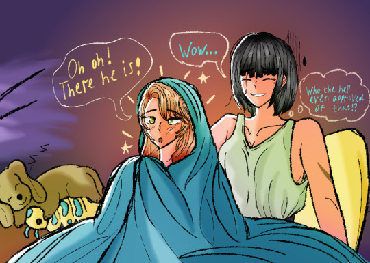
They are watching The Jalapeno Topping Was Pretty Spicy (Chaewon is not impressed)
#mystic messenger#mysmes#mysme#mm#rika kim#kim rika#mystic messenger rika#rika x cmc#rika x oc#oc chaewon lee#rika x chaewon#PLEASE IGNORE THE BACKWARDS 'Z' I HAVE NO IDEA WHY I WROTE IT LIKE THAT AND FRANKLY I AM VERY EMBARRASSED ABOUT IT#also was too lazy to do the lineart and pretty rendering so colored sketch it is#chaewon does not understand musicals and zen has no effect on her#especially the jalapeno topping#but hey rika enjoys it#she may as well sit through it#also isopod plush cameo bc it is now canon#sally adores it#and hey this is the first art of pre mint eye chaewon#neat
25 notes
·
View notes
Text

#ya girls gotta get good at rendering bc I am actually so lazy#can you see how much I like to do the sketch#and nothing else#line of action
2 notes
·
View notes
Text

Raphadoodle! Mikey Leo Donnie
AU Mastapost
Design notes below the cut!
First of all, I STRUGGLED. Men are not my strong suit, beefy men especially. Like all the previous ones, the poses are references (and one of the fits teehee)
First of all, | STRUGGLED. Men are not my strong suit, beefy men especially. Like all the previous ones, the poses are references (and one of the fits teehee)
My man's defining (turtle form) features include: yellow-y eyes, snaggletooth. That gives me nothing to work with, which means I can make stuff up. Yippee! I gave him a similar nose to Leo be those two have CLEAR parallels and if it's not expressed in their design, l've failed as a creator (jk).
He has a scar where his mask rip is (and probably would have some over his eye post Krang) - I was debating giving him a patch or Band-Aid or smthn but decided against it. Raph chasm is present for presumable obvious reasons? He has yellow eyeliner and spiky star eyelashes (?) because that's something that alligator snapping turtles actually have! Firstly, the FACE. My man’s defining (turtle form) features include: yellow-y eyes, snaggletooth. That gives me nothing to work with, which means I can make stuff up. Yippee! I gave him a similar nose to Leo bc those two have CLEAR parallels and if it’s not expressed in their design, I’ve failed as a creator (jk). He has a scar where his mask rip is (and probably would have some over his eye post Krang) - I was debating giving him a patch or Band-Aid or smthn but decided against it. Raph chasm is prominent for presumable obvious reasons? He has yellow eyeliner and spiky star eyelashes (?) because that’s something that alligator snapping turtles actually have!

Wikipedia ⬆️⬆️ (definitely a reliable source Imao)
Gave him a durag because I was too tired for hair and it looks like his bandana. Sue me ig. Also, I HATTTEEEEEE rendering silkier fabrics, I shoulda just left it flat colours (or drawn hair instead of being lazy lol). I also see him wearing a durag in most of the human designs, and I think that imprinted on my brain lol. Don’t fix what ain’t broke ig
The durag usually is tied up in a big ol’ bow because he’s a sap (and everyone knows). Sometimes it’s not tho bc practicality (also I forgot but shushshhhh)
I gave him ripped sleeves and a hooded jumper to mimic the bulkiness and jaggedness of his shell, but I tucked it in because ultimately, he is square. Rounded square, but square.
He’s probably got the most yellow undertones of all his brothers, mostly because if I gave him a red undertone it’d just be so much, and I needed to break up the colour pallet somehow.
His shoes say boss and hoss on them respectively, because that's the exact kinda dumb funny l am tbh. Also, I really wanted to do just... massive bulky shoes but I can't draw shoes AUGGHHHHJHGHVDGH. I just gave him whatever the RotTMNT equivalent of converse is (foot shack probs made something).
He still has his wraps (mostly because his arms look weirdly blank without them). ALSO a binder bc transmasc Raph makes me happy (ik a lot of people headcanon him as transfem but this is my design. I can do what I want.)
I gave him a little bandage under his binder tbh he has a bandage on his shell lol
His jeans are super ripped bc he keeps doing stupid stuff (like falling off of waterfalls or martyring himself to save Leo of all people) and it damages them.
I modified the jacket he has in clothes don’t make the turtle to be spikier bc, once again, I wanted to mimic the bulkiness and jaggedness of his shell.
Ghost bear merch because even tho GB is kinda a jerk, Raphadoodle still loves him! It's like how Mikey still kinda admires Swaggart. Speaking of Mikey, the bracelets were made by Mikey - one for sunset duo, one for the Mad Dogs.
I need to stop drawing the ones with the shiny noses from the side, it looks too goofy.
Cyaaaaaaa <3
#artists on tumblr#art#character art#digital art#digital artist#my art#original art#artwork#queer artist#small artist#rottmnt human designs#rottmnt au#rottmnt art#rottmnt fanart#rottmnt#save rottmnt#unpause rottmnt#rise tmnt#rise of tmnt#rise of the tmnt#rise of the turtles#save rise of the tmnt#rise of the teenage mutant ninja turtles#rise raph#raphael#rottmnt raph#raph tmnt#rottmnt dawn au
33 notes
·
View notes
Text
jesskas sunshine institute au
HII okay so i came up with this awhile ago and posted a bit about it in the beacontown server but umm i never really posted it here bc i was nervous/embarrassed lol so hopefully its a little bit up to tumblr expectations.
so !!! lukas is a warden there with insomnia. hes usually in the office where (gordon) the warden was seen and dewey is like his little buddy that sits on his desk all the time. he immediately takes interest in jesse bc of his attitude and the way he carries himself :)
for jesse, hes a prisoner that is much more closed off besides w petra. he is more than capable of getting into fights and will indeed result to violence if he feels its necessary, but he doesnt pick fights 24/7 like,, idk aiden or smth. umm he doesnt rly like lukas at first at all js bc hes a warden (like how he was friends w aiden in s1 !!) but eventually grows to like him and he sneaks off to the office during the night to talk to him
theres also gonna be a fic for that but i am lazy as hell sooo idk when thatll be a thing but:3 i have the story outlined at least.
wellll last but (definitely) not least, i made some silly renders of them bc i love them


these kinda suck since these renders r me kinda learning mineimator but yahh :) only got the courage to post bc i got really sweet reactions to my renders on the server so ty everyone for that <33
#mcsm#minecraft story mode#mcsm jesse#mcsm lukas#mcsm jesskas#lukas mcsm#minecraft#jesse mcsm#sunshine institute#au#alternate universe#siau#siau my love#jesskas#sorry for the long post#im yapping#but its ok
51 notes
·
View notes
Text
📩 simblr question of the day: any other simblrs that you love
i did something similar to this a while ago but i just wanna spread some love because there are so many amazing and talented people and i just hope you all know i appreciate all of you! (also this post is super long so i apologise i advance)
@squea honestly you are such a sweet person and you’re so so talented! you inspire me so much and you already know i appreciate you but i really do and i’m so thankful to call you my friend💛
@circusjuney june, you are so cool. not only are your edits amazing, you can make poses as well??? you’re so talented and also i love talking to you you’re honestly so lovely and so sweet <3
@youredreamingofroo you have such cool and chill vibes, and your renders are amazing!! i also love reading about your ocs and stuff or seeing the stuff you reblog that reminds you of them, i told you this already but i legit stalked roo and leo’s tag the other day because i wanted to find out more about them!
@druidberries you already know ily, but honestly i am so invested in the tjol gang i love seeing them pop up on my dash and hello the latest update??? i am so excited for baby 3!! also ofc butterberries is the best duo and no i will not accept criticism thank you💛
@sunyos jaci, every interaction i have with you is so chaotic but you never fail to make me laugh so hard! you are honestly so chill and i love seeing your sims so much and i just love talking to you!!
@fizzytoo i love your sims and your gameplay screenshots so so much! honestly your postcard legacy was one of the reasons i wanted to get the horse ranch pack bc you just made it seem so fun! you also just have such good vibes! (also i saw your posts about playing sdv, i’m expecting updates from your farmer butter!!)
@stellarfalls literally where do i even begin. i mean if you haven’t seen bree’s edits already i’m going to assume you’ve been living under a rock? just so talented and honestly you inspire me so much (although i don’t think my edits will ever be on your level)
@stinkrascal honestly again just such a sweet and lovely person!! also i just love your vlad so much and i love reading your story like i love learning more about your characters and their backstories!
@alelelesimz honestly where would we be without your cc free townies, thank you for your service🫡. but not only that the way you style your sims in general is amazing like their outfits are always so so good
@solargrove you are so so sweet! despite the fact we don’t interact much you sent me such a lovely ask after i was upset by that anon and it just really cheered me up! not only that but your builds and your gameplay screenshots always have such a nice warm and cozy vibe to them like they literally can i live in your game pls?
@folkbreeze your edits your gameplay are so so good every time! your screenshots are always so full of life and literally look like they belong in a photo album i love it so much and i just love the way that you edit them as well
@eljeebee such an amazing story teller! if you guys aren’t following lana you should be!!! you put so much love into your stories and it really shows they’re so good! also you are so lovely and have always been so nice and supportive and i appreciate it so much💛
@citrlet honestly i’ve said this so many times at this point but you are so lovely! also your screenshots are so pretty and soft and i love them so much! i also love seeing your stardew valley screenshots like i really love the fairycore/cottagecore vibe <3
@crazy-lazy-elder-sims i’m so sorry i sound like a broken record but you are so lovely!!! every time i’ve interacted with you you’ve just been super sweet or supportive and i really appreciate it! also in general just the fact you reblog so many posts and support so many people is really nice to see honestly i always love seeing stuff that you reblog whether that be sims or not!
@windslar honestly your gameplay screenshots and your edits are so good!! and literally where would simblr be without your psds we would literally be so lost like they’re so good and so useful
@orbitsuns your gameplay posts are so pretty. they have such a sweet and wholesome vibe to them if that makes sense? esp your secret garden screenshots they just feel very cozy and wholesome. also you have the sweetest vibes <3
@wildmelon you have always been one of my biggest inspo esp when it comes to fantasy! also even though you don’t just post sims i love your blog so much. it has such a whimsical vibe and i just always associate you with fantasy <33 (also your sims are STUNNING)
this is already super long so quick fire of some of the other people on here that i love and that you should go show some love to as well @glittermutt @simelune @cottageivy @thefunniestjester @flovoid @finnsim @kopimoss @futurelabs @velvet-disc @aliengirl @zleepyhollow and so so many others that i’m probably missing honestly anyone that i follow has inspired me in some way or another and i appreciate each and everyone of you 💛💛 also just anyone who has liked commented on or reblogged any of my posts i appreciate it so so much thank you all for being here 🫶
#simblr question of the day#probably the only one i’m gonna do of these#just wanted to share some love#butter’s thoughts
73 notes
·
View notes
Note
YOUR ART IS LITERALLY ENCHANTING HELLO??? I feel like I'll get sucked into it Narnia style... Would you mind talking about your art process 👀
thank you so much?!! i dont mind if you dont mind me taking this chance to yap
my art process has changed a bit since i last posted a step by step... i would say my ideation phase is still
seeing something that really makes me want to draw (ie alien stage round 6 or a really good gacha card (sorry) ) or forcing out thumbnails
go on my pinterest board of poses/colours from other artists i like for the general vibe (i reference a lot from my own photos as well, usually pics i take around my city/a lot of selfies taken from 0.5x angle LOL)
and then start the drawing. usually not a lot of thumbnailing..i would like to get better at that to explore more interesting compositions >_< also trying to flatten my art style a bit but i still go overboard with rendering extraneously oops
these days im also switching back to paint tool sai/csp on my pen tablet rather than procreate..i really dont like the blending engine sometimes and it makes it really difficult for me to motivate myself to paint there. i guess walking through a recent painting i like:
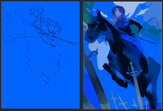
sketch on a colour bg ( usually this kind of decides the colour palette for the rest of the painting, building off of this main bg colour) (i erased some of it bc i was using it in the final painting ^^;;; it gets redrawn on top a little)
blocking the main foreground - sword, horse - just going from dark foreground > middle > background lightest as a frame of reference, having the least amount of detail at the right since i want the horse's hind legs to fade out in perspective

3. layer at a light opacity using a big brush to just suggest light/shadows (yellow at bottom right and around her face to complement and contrast the blue/purple)
4. render details (this is what gets me and i am very lazy and typically give up on a piece once we get here. working on it..)
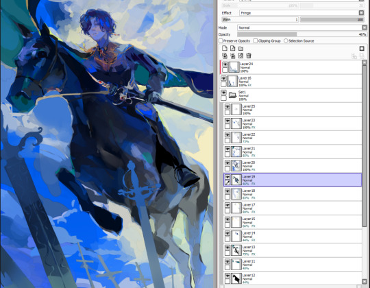
5. yeah. done! outline some desaturated areas (horse hind legs) with a saturated colour found elsewhere in the painting (lighter colour of the bg) and then add final touchups on top of everything. my layers dont make sense. also i love using the fringe effect on sai to fake edges/lines (every layer has it. yay)
#my art#asks#process#thank u op for letting me be yapatron 300000#idk if this is what u wanted but its what i can give
37 notes
·
View notes
Note
Hello goodnight. I would like to know what setting you use to render your photos. They are always so beautiful.
Hello! Thank you so much! ♥ My settings are pretty generic. If I like how a downloaded scene's render turns out, I often will copy the settings from it. I usually render between 500-1000 samples, but the recent Emeric ones were actually 150 samples because I was lazy lol. These are my standard render settings (under cut so I don't disturb anyone's scrolling experience lol):


I do 200% res bc it's sort of like SRWE "hotsampling" where you render it super large and then size it down. It preserves details better.

*Make sure that you always select compression 0% and 16 for color depth. I'm not sure why so many scenes have 100% compression as a default, but it will literally lower the quality of your pic if you have compression on.
Compositing Nodes:

Lighting is also really important for getting a decent render. I'm actually not the best with lighting and am still learning. It definitely seems like less is better for it. But I do like to take an area light and put it super close behind the model like this, because it highlights them from behind.


I also have a general rendering tutorial HERE!
Also, I do have to admit, I heavily edit my photos, so they look different than the raw render. But, if you peek below, you can see how that area light really helps add some highlights/rim lighting to the sim before I even edit it.


If you have any other questions, let me know!
16 notes
·
View notes
Text
speculating what the s8 islanders will look like as an excuse to draw lol idk why im not going in order here's the sports physiologist

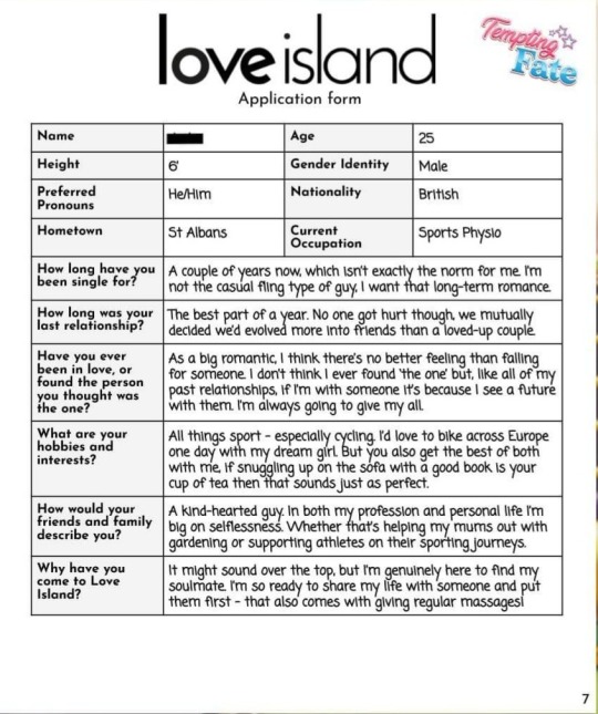
ok so obviously my art style is a bit simpler than the game's and I didn't take a ton of time to render it but I think the elements are there and here's my reasoning (warning this is long lol)
the disclaimer is I read the application once and then started drawing so I think in my head I got it confused and thought this was gonna be the Bobby/Rafael cutesy fun guy of the season and rereading it now I realize I am wrong, but I still stand by certain choices.
Sports physio/cycling thing was a big thing for this. I think he shouldn't have very defined abs but the game will draw him like that. Cyclers tend to have skinnier torsos but bigger thighs/legs and I didn't draw the legs bc I'm lazy but know that in my head, he's got thick thighs. I didn't draw him with like a huge chest or arms also because of that, but because it's still LITG, he does have some definition on his arms, just not a lot. I really think I could see this guy working in sports physio.
And because he takes care of people for a living and is the "big romantic," I think he needs to look very charming, to a point where he's almost disarming. (This is where I got it in my head that he's the Bobby/Raf of the group bc lover boy vibes. Personality wise he feels like Rohan imo who is similar). Therefore I drew a lot of his features as very soft (softer jawline, fleshier nose) but also just big round eyes to draw you in. I looked at Tyrique from love island season 10 for a bit of inspo because I think he's got such a pretty face but still is pretty masculine, and he has big round eyes so that's why I did that.
I also decided on curly hair, in part because of my confusion with Bobby/Rafael, but also I think it adds to the charm because it's clearly styled but tries to look effortless. I used a younger picture of Dev Patel for it. That's also why he has a little bit of facial hair to help age him up but also works with the aesthetic I was going for. The piercings are fully a self indulgent add-in, I just it's attractive.
Ok so this is where it gets confusing because I did intially draw some sharper features on him and had a different color palette for his skin and hair. I was imagining him as "spicy white" just because Bobby and Raf are mixed so they would change it up just slightly for this guy. I think nothing that's too contrasting to make him look brooding like Joyo. So initially this was definitively a tanned white guy with curly reddish brown hair, some facial hair, and a defined nose, and then I was like this is really close to Rocco. So I changed some features and some colors and here we are now at ethnically ambiguous? I'm not gonna think too hard about the ethnicity of this character because this is fake and it's fusebox's problem when they release the real character.
Looking back, if I redrew the character, I'd go for full or half South Asian just because I did use dev patel as a hair reference. But also maybe just hopeful because aside from Angie, the other South Asian rep in recent memory I can think of is Marshall (messy), Ozzy (messier), and Suresh (messiest), so I just think we should get a cute one. (also Priya, Rohan, and Arjun who aren't nearly as bad but only one of those is a LI and they're sort of dead right now so)
anyway overall the process of drawing him was kind of a mess because I had confused some things in my head and like I said, was accidentally drawing Rocco (underrated design btw) but this was the first one I did and I don't think I'm right, this is just a fun little activity for me and he's the first one I drew so I wasn't very sure about a lot of things.
so if you read this far congrats for getting though my ramblings. The next ones I'm doing aren't nearly as complicated 😂😂
#mixed feelings about my prediction here but it's fine#im wary about tagging this for s8 bc its not canon its just speculation buuuuuut#litg s8#speculation#litg#firefighter next and by firefighter i mean gary/alex fusion
14 notes
·
View notes
Text
soo @drizzit i don't know if you were expecting an actual answer but I love rendering gold/silver actually so i'll answer haha
I'll tell you that my method was derived from a video I saw like one time and then just ran with the vibes. it might help you but it also would probably be most beneficial when used with actual references lol which I am very bad at using
short version, the shinier you want something to look the bigger the difference between the base and the darker colors and also the more solid the shading should be. if its textured (metal or fabric) it'll reflect less and therefore have less extreme color difference and less solid shades. I also tend to put all my gold pieces on one layer (and silver its own, essential one layer per type of metal) so I can shade in larger sweeping strokes
more with examples under the readmore bc this got kinda long oops
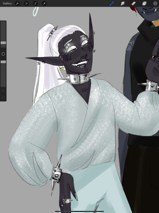

So here's some places where I wanted things to be shiny and chrome. To give it that look i pick a base color, then I pick a waaaay darker color to be the darkest shading, for silver that'll be dark gray or black and for gold I typically use a darker yellow/brown. Then I pick one or two lighter shades in the metal and then sometimes white
below is a typical three colors I use for gold
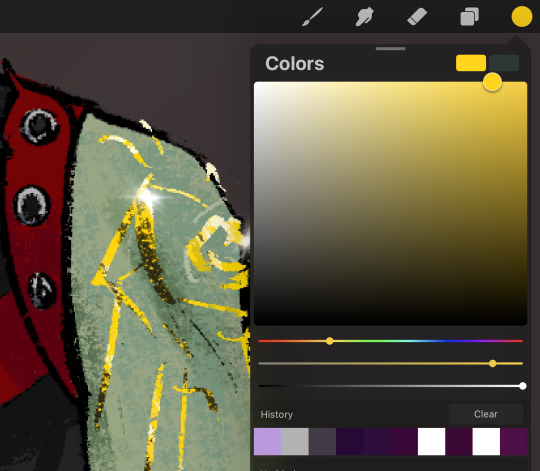
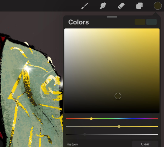

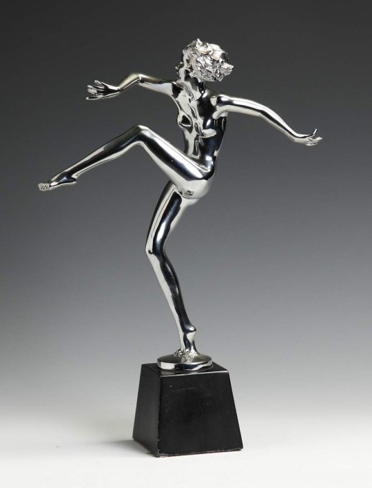
dont be afraid to use A LOT of the dark color, because the shinier and chromier an object is the more its going to reflect, see below and look how much of the object is NOT silver/gray in color because its reflecting so much. ALSO the different color areas are going to be more solid, like in the silver choker in the first pic where its solid lines of black and gray or below where large, smooth swaths of it is white/black/dark gray
adding a sparkle can also help lol, procreate has a premade shine brush

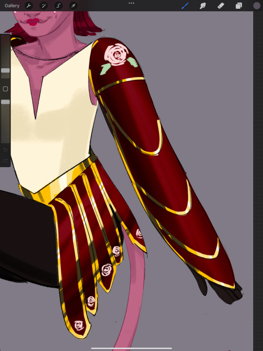
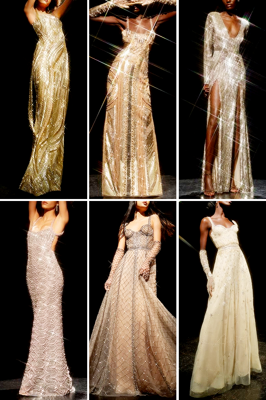
if an object is textured it will reflect less so you can do less extreme difference between colors and use softer, grainier brushes, below are some reference examples of how those textured metals look


here is a design I made with both gold fabric and textured gold pieces, the shading on the cloth is a lot less... rigid? solid? then the chromes and the dark color not quite as dark, same with the belt buckle. Also the brush i use is softer and with more of a grain so it's less solid and more diffused over the texture
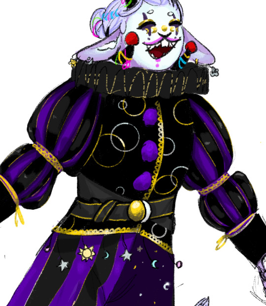
these can be applied to more complicated designs. Typically I like to work with long sweeping strokes because i like to do things fast and a lil lazy. This isn't always going to end up with the most REALISTIC end result but hey, it works. you should still consider things like 'where is the light?' 'where are the objects and things that might reflect on the metal?' but if you want to get nitty gritty use a ref
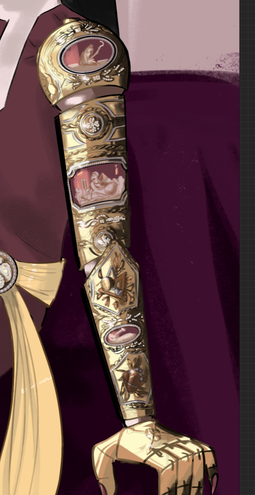
below is an drawing i did where I started coloring the arm with large sweeping strokes down the whole arm and then I went in and did the detail work to give the decorations depth
i hope any of this made sense lol
#art tips#but also plz use references it is my biggest weakness that i dont#I’ll just post it here in case anyone else finds it useful
15 notes
·
View notes
Text
ok one last post about the Project to truly exorcise it from my brain. just some process/design thoughts (also now that it's done if you want to read my liveblogged whinging for whatever reason here it is)
first off some stats because i kept stats like the nerd that i am:
time wise making this animatic took about 93.5 hours give or take (thanks procreate process replay) spread across exactly 2 months
anyway when i said i finished this project mostly through stubbornness and sunk cost fallacy this is what i meant lol like a lot of my thought process through this was just 'no way in hell am i letting some of these drawings disappear into my drafts forever'
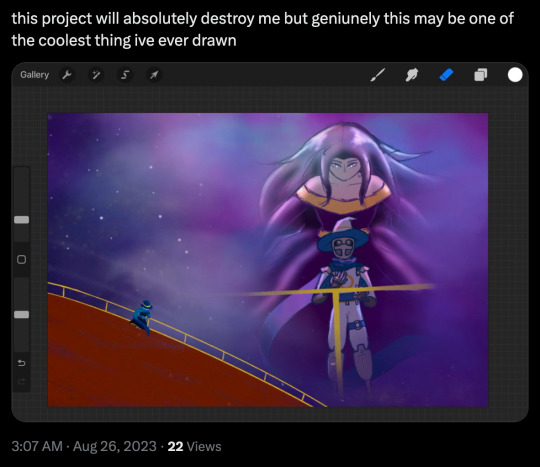
on average each frame took about 2 hours 45 minutes but thats a bit of an overestimate since i forgot to count some of the animated bits from the first two lines (so id guess the actual number is more like.. 2 hours 20 minutes?)
btw that line with the starry apparition fading away? 12 hours total
the single longest and most painful frame to draw was the one of the crew walking through tu'narath (5 hours 30 minutes) because a. perspective b. architecture design c. for some reason i put a lot of detail into rendering the armour on all the githyanki i drew why on earth did i do that
(its especially painful bc that frame was one of the ones that didnt... feel like an important enough moment in the actual story of the show to be worth capturing the way the wish or even like, endellion is, i just needed to put that there for the storytelling flow or whatever of the animatic itself and it bothered me so much)
one other interesting little mishap was that i did all of these on canvas size 1080x720px (so that's why the youtube resolution isnt particularly high lmao) which is why procreate let me put an absolutely absurd amount of layers in one canvas (all 8 frames of with memories projected on the astral sea were done on one canvas. 159 layers) because the layer limit for that canvas size is 400 BUT. i accidentally started the starry apparition fade on an A4 canvas (my default canvas size for like all my normal fanart) and i only realised after finishing all the lineart and starting on colouring because i hit layer limit so i had to resize the canvas which did... interesting?? things to the lineart resolution
also if youre wondering how i drew K-LB that many times in something resembling timely fashion the answer is i sacrificed some... amount of sleep to 3d model and rig him in blender which. honestly? i consider it a roaring success
splitting the frames by bar was a Choice and certainly a choice ive.. had doubtsTM about but thats the kind of thing you cant really change without bringing the whole project crashing down so if the frames seem to move a bit too fast im so sorry there was really not much i could do there
idk if people actually noticed the very very tiny drawings of the crew moving around on the ship in the 4th line especially since they sometimes get obscured by the subtitles but the REASON for that is in my original drawings the subtitles went in the top left corner but they kept conflicting with other stuff so i just gave up and threw them to the bottom (also i originally included the chinese lyrics but then i got lazy lmao)
anyway that little detail like VR-LA angstily looking at the sea reminiscing about the JourneyTM and the crew sort of appearing along with the memories of their adventures together was one of those things that seemed SO COOL in my head but once i actually execute it its like. hmmmm not sure if that worked out the way you thought it would buddy. also the tiny crew was EXTREMELY hard to draw so put that down as another point in 'me subjecting myself to deeply painful and out there compositions for no good reason'
anyway i called this my magnum opus but i do actually have some thoughts about another one (a companion piece, if you will) for another song by the same band because now that i know what capcut can do im.. really itching to try something a little different because this like powerpoint presentation style? fully a product of me using iMovie as my only available video editing software for the past like 7 years of my life
#rwd#asto speaks#re: the projectTM#one last time using this dumbass tag lmao#honestly? also put another point in 'i worked on a project for so long it became just a Project to me and proceeded to get#absolutely blindsided by the emotional affect it has on people'#2 months. 2. months.#whatever actual emotion this idea was originally trying to draw from is long fucking gone buddy#like i did manage to re-experience some of it looking at the finished product but#i appreciate yalls screaming a lot i just truly did not anticipate it LMAO
5 notes
·
View notes
Note
What's your opinion on the recent Frontiers teaser?
Right between "Nothing", "Fucking boring" and "Is this game still a thing?"
Nah I am joking, my serious opinion is that this shit fucking sucks, its ass and I am sad it aint dying faster.
Let's start with the basic problematic stuff of this trailer
Eggman, why in the name of chao is Eggman tired, oh, let me guess, someone had the brilliant idea of "Lets make him lazy hahahaha", but guess what, WRONG, Eggman has been shown to be a fairly strong person, and have quite the physical prowess, where in fuck did this concept of "He uses machines bc he lazy" came from, really, because He has been shown doing physical activity before without breaking much of a sweat.
Second, these motherfuckers are so cheap they couldn't even get a few voicelines on the thing? Because I gotta be honest, this entire thing is very devoid of any emotion, it doesn't makes me feel anything, there is music sure, and there are things happening on the screen, but none is making an impact or being meaningful, they just stand there, clench their fists as if any of them was gonna do shit (because in case anyone forgot, the 3 stooges on the left don't have a physical form, Baldy McNosehair on the right aint certainly gonna fight this robot and Alexa 2 in the middle has no control over the robot so she is as useful as the first Alexa by Amazon.)
The fuck is this, really, the fucking flying fuck is this, this has to be the ugliest motherfucker I've seen all day, and I don't mean that as a compliment, is this supposed to be The End's new form? Because it looks like an amalgamation of all the other Titans into one, trying to look menacing and creepy but all it does is look like the failed fusion of Mistral and MG Rex from Metal Gear Rising, it even has Mistral's colour palette lol.
Wasn't The End supposed to signify your deepest fears (assuming for a second that was always a thing and not something someone in sega made up at the last instant to simply justify that awful touhou minigame at the end of the game) so why would this be in any form the physical manifestation of fear?
Again, the design is utter garbage, it only has two arms to the side, the rest are on top of that carapace thing on its back, which renders all arms automatically useless because they are barely able to reach for anything at the ends of it, he can't grab anything with those, they are just there to look menacing and "oh look, he's eeeevil" but they serve no function, besides, what is he gonna grab with it? Because there is only one titan with stuff to grab, and that's Knight, and that is only a sword and a shield, what you gonna use the rest of your arms for? Oh wait, for nothing! Just like I expected you to!
I assume this is the part that you and (literally nobody) everyone wanted me to talk about
This utter waste of screen time and hype-bait.
Why do I call it that? Because that's what it is, is literally what we had before but now the eyes are blue because blue is now the new orange or something like that, that is all that changed.
His transformation into this wasn't anything spectacular, just another burst of energy and ta-da, done. I'm sure 99% of the kiddies that are dying to play this shit aren't even old enough to watch the original dragon ball z, but when Goku turned into Super Saiyan 2 for the first time, not only there was a physical change on his appereance, it truly was something magnificent, you just had to be there; now, why would I compare this to SS2? Because in case anyone forgot, Sonic is just Furry Goku, and if you don't believe me, ask any actual sonic fan, not the newer ones that unironically think this game is well written, the ones that are old enough to consume alcohol, legally, in all jurisdictions of Planet Earth.
Anyways, i am getting sidetracked; this is supposed to be a "Teaser", why in heaven's name would you reveal your biggest card in a teaser? Is like the "Would you kindly" thing from Bioshock 1 was shown in the first trailer, y'all get what I'm saying right? Please don't ever play poker in your life, because you're gonna start jumping up and down when you get a pair of aces. Why the fuck would you show the "wowzers" moment of the update in a teaser, not even a trailer, a teaser.
Second, what purpose does this form serves? Super Sonic is already strong enough to easily conquer the other titans, he was never struggling in any point of the game as super sonic to kill them, he always had this "Imma kill you" expression mixed with "Pathetic" on his face, he killed all four titans without even sweating, why a new one would be a problem? This overhyped tech demo has zero idea of how to escalate a context because it aint escalating, is the same thing we had before, but then again, his new form also is the same one we had before but now featuring big blue evil demon eyes (or some bullshit like that some fans are gonna start calling it in a few days, or maybe they are already because oh my god we've never played a real game in our lives before.)
This form really serves zero purpose, it is just there to pretend like SEGA is trying to get sonic somewhere other than the bank to cash in all of their millions that the "highest selling game in the franchise" gave them while at the same time spending as little money as they can so they can maximize their profit margins; this form is just there to make you look the other way and be all hyped for "look super sonic with blue yes" so you can ignore the blatant problems of this game that are still not fixed and the updates actually added more or made them worse; this form exists so you can look up to big boy sonic team and thank them for the crumbs while at the same time chanting your mantra of "At least it aint forces" and/or "At least it aint 06" while you eat up whatever that is remotely serviceable and praise it to heaven and back not because is good, but because it doesn't sucks like 90% of the content we've gotten for the past 15 years.
But deep down I know all the answers to my questions
This shit was planned from the start, this is the same shit EA does with 90% of their games but everyone hates because is cool to hate EA, this is the same game that many other companies have played before, the whole "thank you for your imput" and then they wait until what people says alligns with what they were gonna do since the beginning so they can either say "look guys, we listened to you" if it comes out good, or "this is what you asked for" if it bombs; this is the same shenanigans we've seen countless times before, but since is SEGA, we must bow to them like they are reinventing videogames, but I guess I expected too much of the average internet user.
Don't think I'll ever forget when I predicted all of this shit almost a year ago and y'all called me "overthinker" and "paranoid".
5 notes
·
View notes
Note
Y'know what? Imma say somethig positive about the reboot... The title cards look incredible. I really love that they made some of them animated this time around! Renhattan, Bad Stimpy, 2 Slow 2 Furious, A Stimpy is Born, and Plane and Simple are my favorites based on visuals alone lol
thanks for pointing this out, what a great takeaway! and good on you for finding light in the darkness 😊 I did NOT notice some were animated so ty for that too!
sadly I couldn't find any info about the artist(s), which fits one of the major conception issues with the reboot. I think there may be more than one as there are some stylistic differences amongst them, don't ya think?
yes! I'm with ya on 'Bad Stimpy' and '2 Slow.' the rendering and composition of 'Aw Hell No' is pretty nice too. some, (only some) of these cards do a great job of enticing the viewer without giving away too much.
I've got an apple custard in the oven and a few mins to kill, so feel free to stop reading here, because I'm going to actually purge the peeves I've got with the rb title cards, in general. now, I am fully aware I am nooowhere near the best at drawing these guys. and no, not every tc from TRASS is cutting edge graphic design either. that said, I think the 'less is more' rationale applies to some very noticeable layout deficits. simplicity is the heart of a good illustration, which by design, should give a little appetizer of what's to come, or at least, a thematic glimpse to make you want to consume more.
just a couple comparisons for ref, chosen for somewhat similar color schemes.
I could absolutely get in the scrutiny weeds here, but I'll try for brevity; just focusing on artists' font choices respective of the content, and proportions and placement of figures within the frame. are the rb pieces nice drawings on their own? yeah, sure. do they function well as tc's? ehhh. I mean, look at ALL that negative space around the central images. too many tiny details in the background that become busy rather than contributory. plus, they are basically a fully rendered cel from the episode itself, offering nothing unique or compelling on their own. but really, just look how those images on the right pop off the screen! look at those pallettes! the use of space!
separately, some of the actual titles are just so...lame. like come on guys, this isn't even clever word play, it's just lazy homophones that make no contextual sense, re: 'Now Sea Here', 'Plane and Simple.' really, there were no other puns or phrases to choose from? limited to dated language like 'Aw Hell No' bc <HeLl iS iN ePiSoDe>! also, why is "Ren & Stimpy in" shown in each of these? are they seperate properties from their own show? I'm thinking the creators wanted to maybe harken back to older cartoons of yore, but it just feels even more awkward on top of the bad titling here, imo.
finally, wtf is this:
it irks me they didn't even bend the letters to the creases in the page, or maybe hey, use like a stamp font on a piece of paper that looks like a deed? smth topical? idk, wtfdik, right?

my custard is about done and this was probably way more than anon bargained for. I'm really hung up on the devolution of art in this show and many others over the decades overall, so, as my friend would say, this topic is one of my sleeper agent ignition switches.
thanks for the ask! and again for finding things to enjoy in life! now I'm curious about which tc's are fan favs 🤔
#ren and stimpy#ren & stimpy#my crap art#answered ask#thank you for getting me to talk about art wheeee
9 notes
·
View notes
Text
hi sorry i took a while to respond I actually was responding 10 hours ago but I fell asleep.
So first of all thanks a lot for your tips I appreciate them, truly, I've been sometimes struggling particularly with Honkai fanarts, although it was my first honkai fanart in like a year, ngl. Act 2 succesfully scared me out (and let's be honest, honkai is not exactly the easiest game to come back to, even with the returnees gifts).
So I can't tell you that much about my process tbh, bcs I've been quite sick lately (I mean, literally, this is my first time being sick in 12 years so I'm not taking it well, lol. Nothing serious tho, I just have a fever and sore throat, still, absolutely not used to it and therefore I'm kinda pissed as hell). That's also why I kinda went lazy, although I still liked the outcome so I posted it.
One thing I remember quite well is that the first thing I did was draw a pose for practice (I honestly just wanted to practice coloring, bcs while I can shade there and then I had trouble with rendering in digital) and after finishing the sketch of the pose I was like "hey, this kinda fits my girl Eden". And so I had a reference and I was supposed to draw the pin but kept forgetting about it.
However the goblet thing is actually embarassing as shit bcs I had it in my reference and I still managed to forget that she has it. Her signature goblet. And worst of all, let's be honest, I got lazy on the glass and drawing the goblet would have made it 100% times easier - and she's literally drinking wine come on, what was I thinking. As for the hair I genuinely can not tell, I don't remember what my intention was. The eyes however I think might have popped too much? Idk
Anyways thanks for all the tips, they are all quite useful, plus now I learned two lessons I suppose, because I also learned (with the goblet) to not ignore my fucking reference, that's why I have a reference XD Also pardon my english, I am using 1% of my brain rn
also yes, I did reblog it from the wrong account at first, don't mind it

15 notes
·
View notes
Text
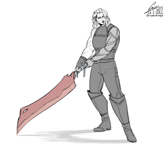
idk if i’ll live draw more tonight, but here’s yasha and scaldsaber
🌟 Instagram | Twitter | Youtube | Ko-fi 🌟
#combat in the beginning made me tired and i didn’t know what to draw during it so i just drew yasha and scaldsaber#its design’s lackluster rn bc i’m lazy to think up anything cooler and i am not good at Designing things#i just draw pretty art i cannot come up with original designs i s2g#i may or may not render this further later#cr spoilers#critical role spoilers#critical role#cr#crit role#the mighty nein#the mighty nein reunited#yasha nydoorin#critical role fanart#fanart#casu art#my shtuff
1K notes
·
View notes
Photo
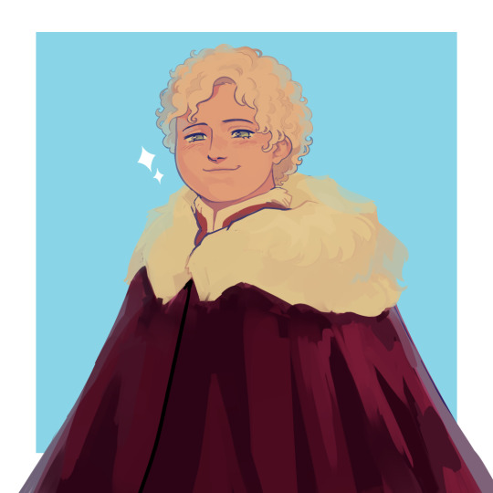
older tommen with short hair bc idk it’s kinda growing on me
#asoiaf#a song of ice and fire#valyrianscrolls#tommen baratheon#my art#ngl part of the reason i like the short hair is bc i get to draw 2 eyes lol. no i am NOT giving up the emo fringe its my brand ok -_-#idk how much older exactly like uh. 12?#idk why hes in winter clothes either i just did it bc i was lazy uhhhh maybe he's visiting his bestie bran :)#tried something with this. i dont like it lol#something=rendering with untextured brushes only+low contrast shading kind of#i hate it its too smooth idk. final result is. fine tho
593 notes
·
View notes