#also was too lazy to do the lineart and pretty rendering so colored sketch it is
Explore tagged Tumblr posts
Text
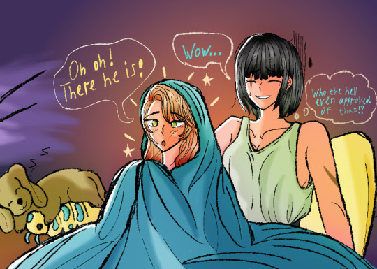
They are watching The Jalapeno Topping Was Pretty Spicy (Chaewon is not impressed)
#mystic messenger#mysmes#mysme#mm#rika kim#kim rika#mystic messenger rika#rika x cmc#rika x oc#oc chaewon lee#rika x chaewon#PLEASE IGNORE THE BACKWARDS 'Z' I HAVE NO IDEA WHY I WROTE IT LIKE THAT AND FRANKLY I AM VERY EMBARRASSED ABOUT IT#also was too lazy to do the lineart and pretty rendering so colored sketch it is#chaewon does not understand musicals and zen has no effect on her#especially the jalapeno topping#but hey rika enjoys it#she may as well sit through it#also isopod plush cameo bc it is now canon#sally adores it#and hey this is the first art of pre mint eye chaewon#neat
25 notes
·
View notes
Note
how to make. comic
Step one after coming up with a really epic idea (aka daydreaming for hours on end) write it down and doodle it really shitily in your notes
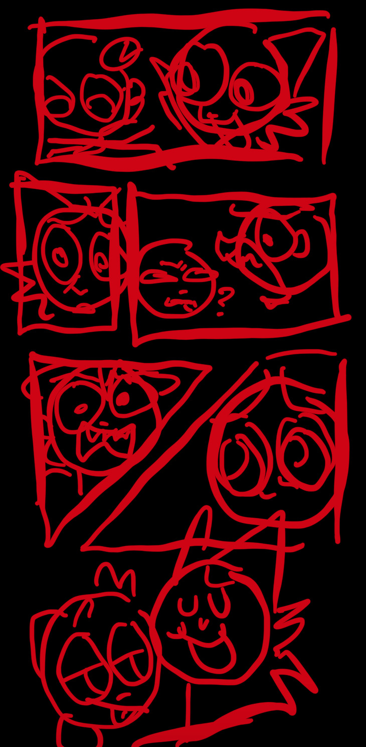
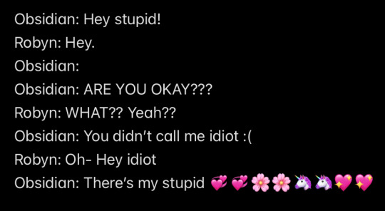
Step two forget about it for months on end before making it (I have so many random comic ideas unfinished) (this is why you write it down before hand)
Step three finally get your ass up and make the sketch 💞💞 Step four spend way too much time making the panels because they HAVE to be perfect for some reason (or else I’ll freak tf out and die /j)
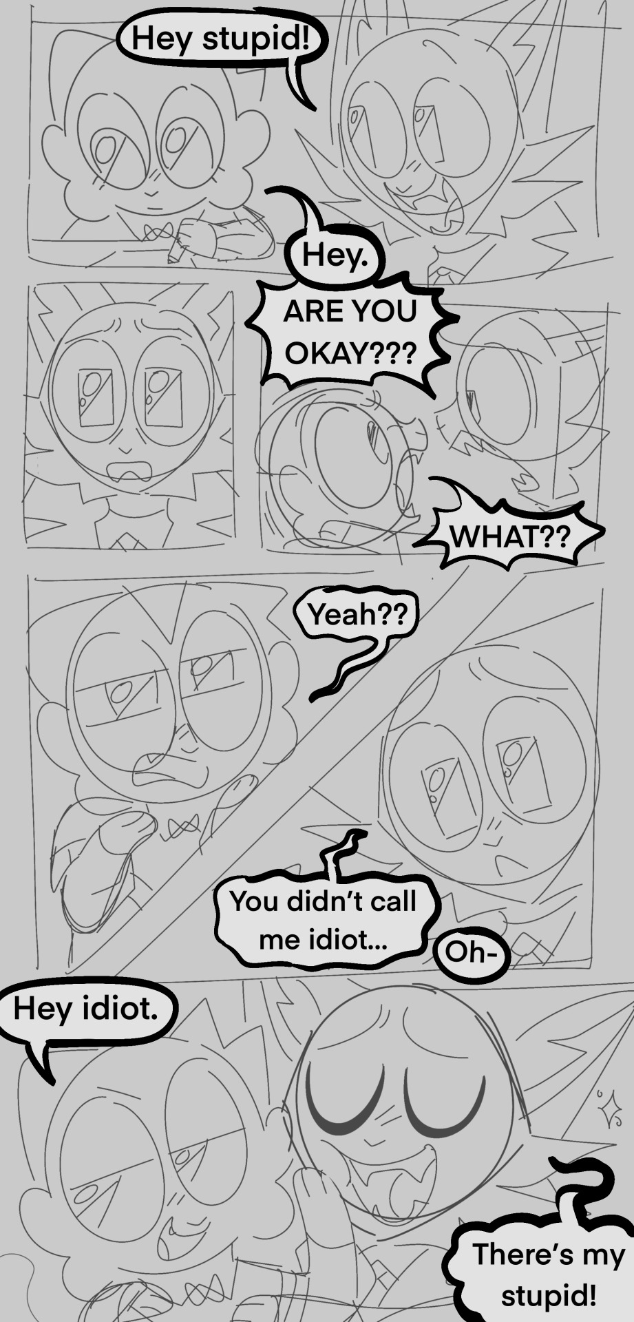
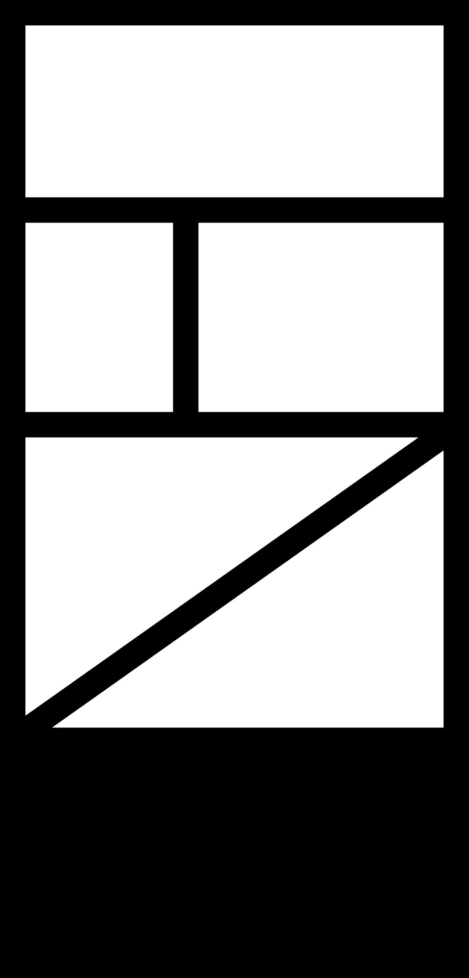
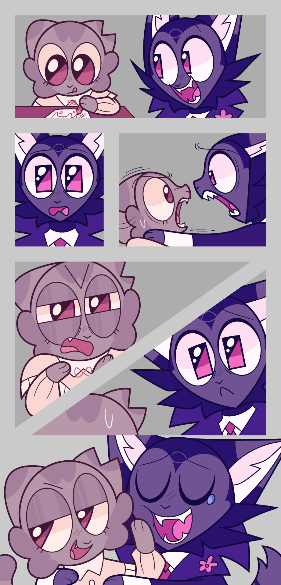
Step five and six make the lineart and coloring, and then add the speech bubbles, this is where you can tweak the wording and or change where the speech bubbles go (mostly done so it flows better)
(Don’t be afraid to cover up your art with speech bubbles if needed, ik it kind of sucks but reading ability is very important in comics, and having your speech bubbles all wonky WILL turn off readers, no matter how good your art is)
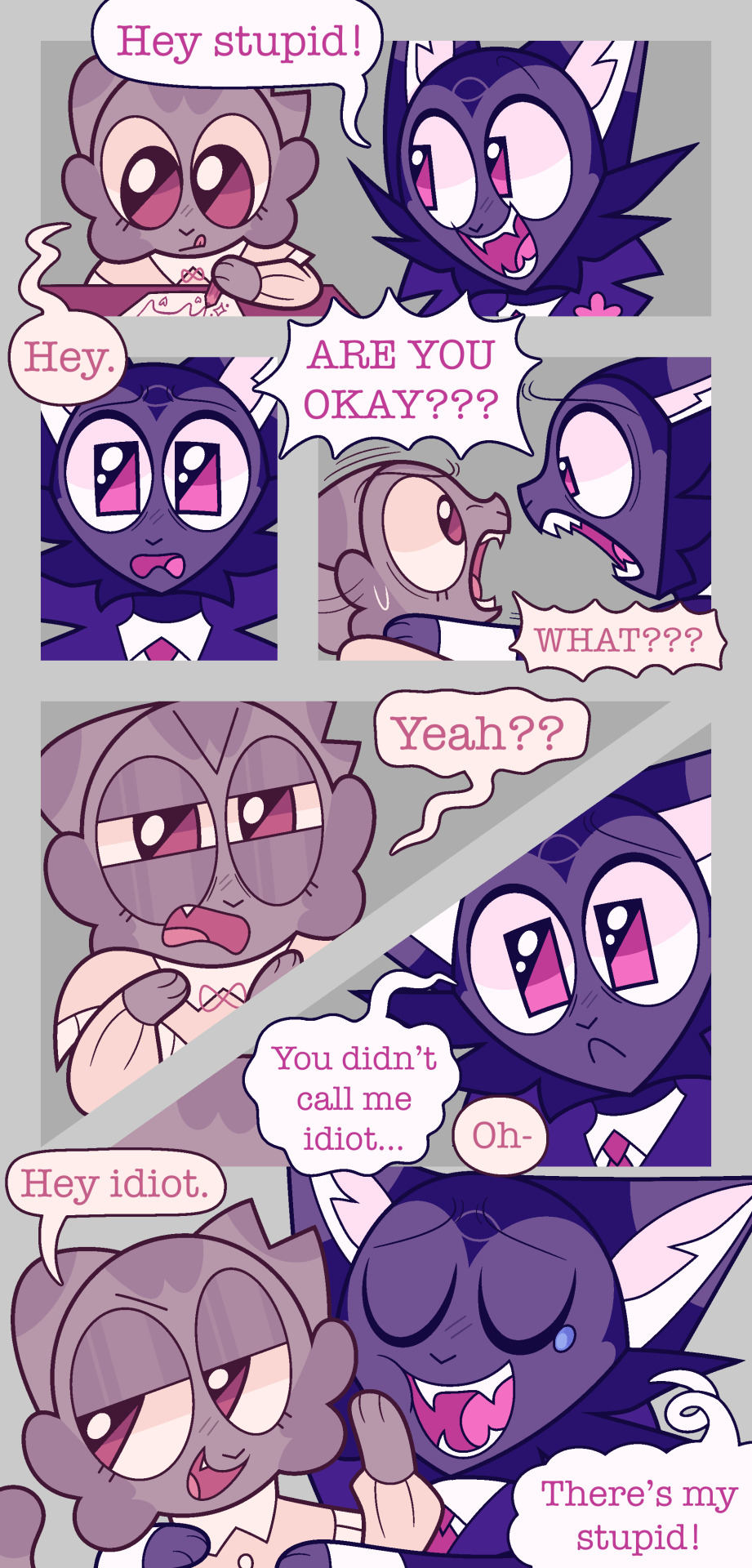
step seven make a REALLY lazy background because you do NOT want to do shit this time!! (Pretend they don’t have lighting on them I merged the layers 💖)
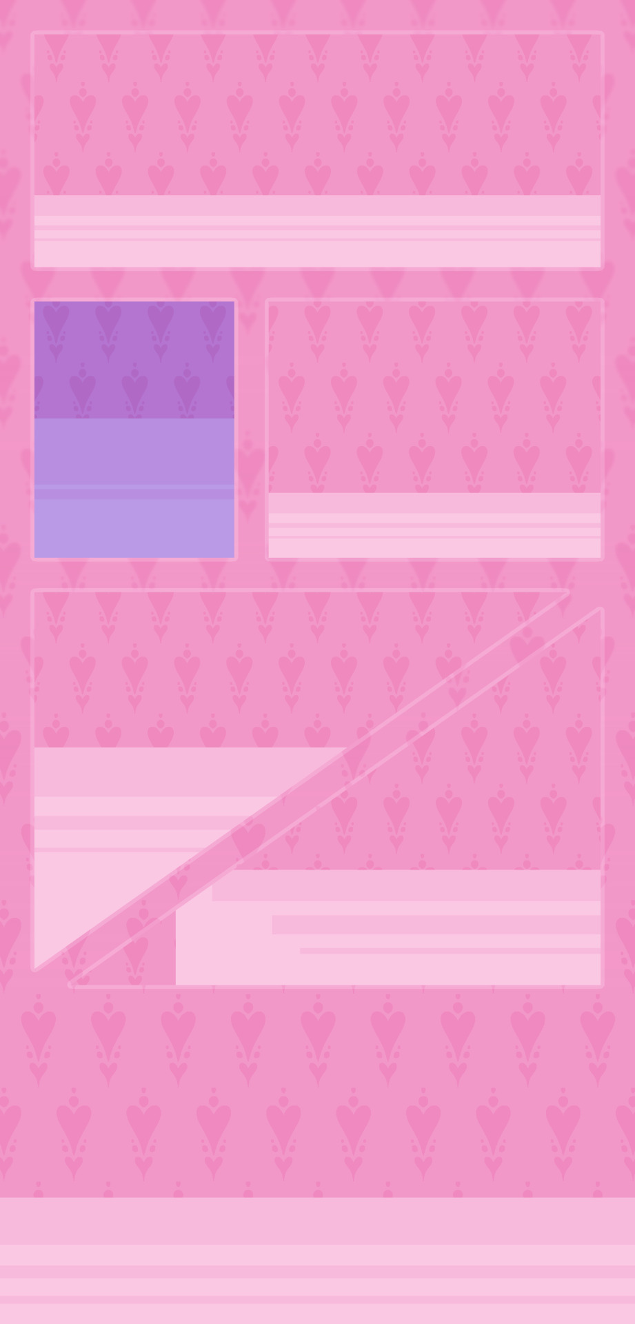
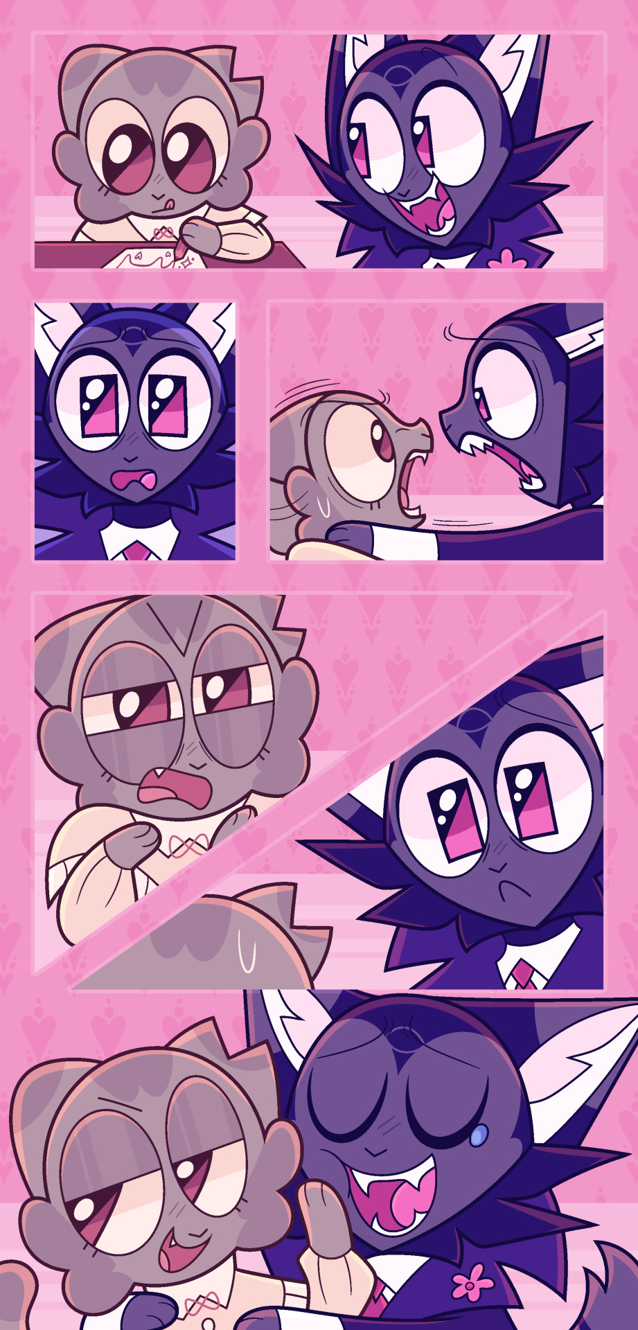
Step eight spend too long on rendering aka lighting and shading!! Step nine add more epic effects aka final touches!! This is always nice to do because it makes it look a lot prettier (like adding overlays, gradient maps, blurs, and noise… idk)
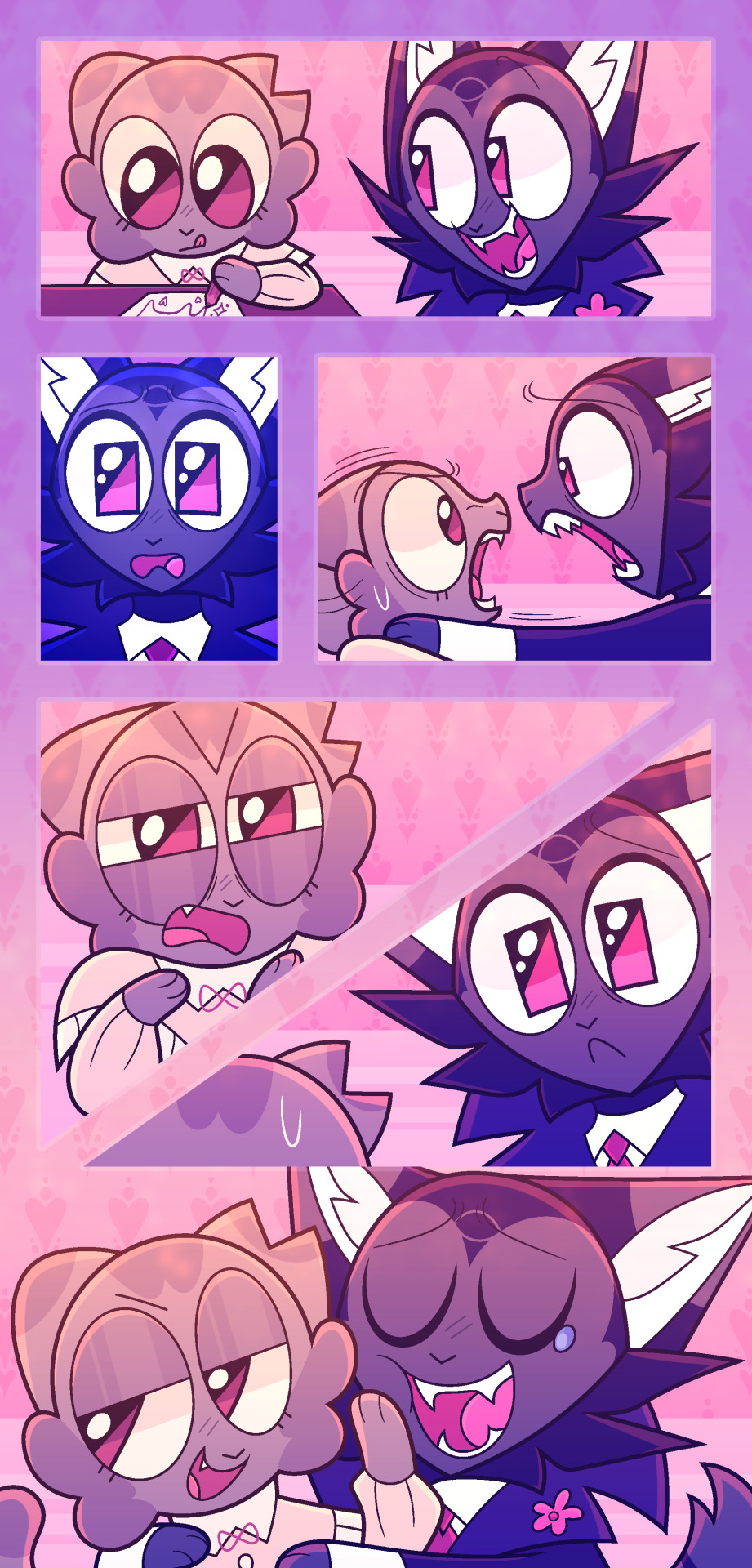
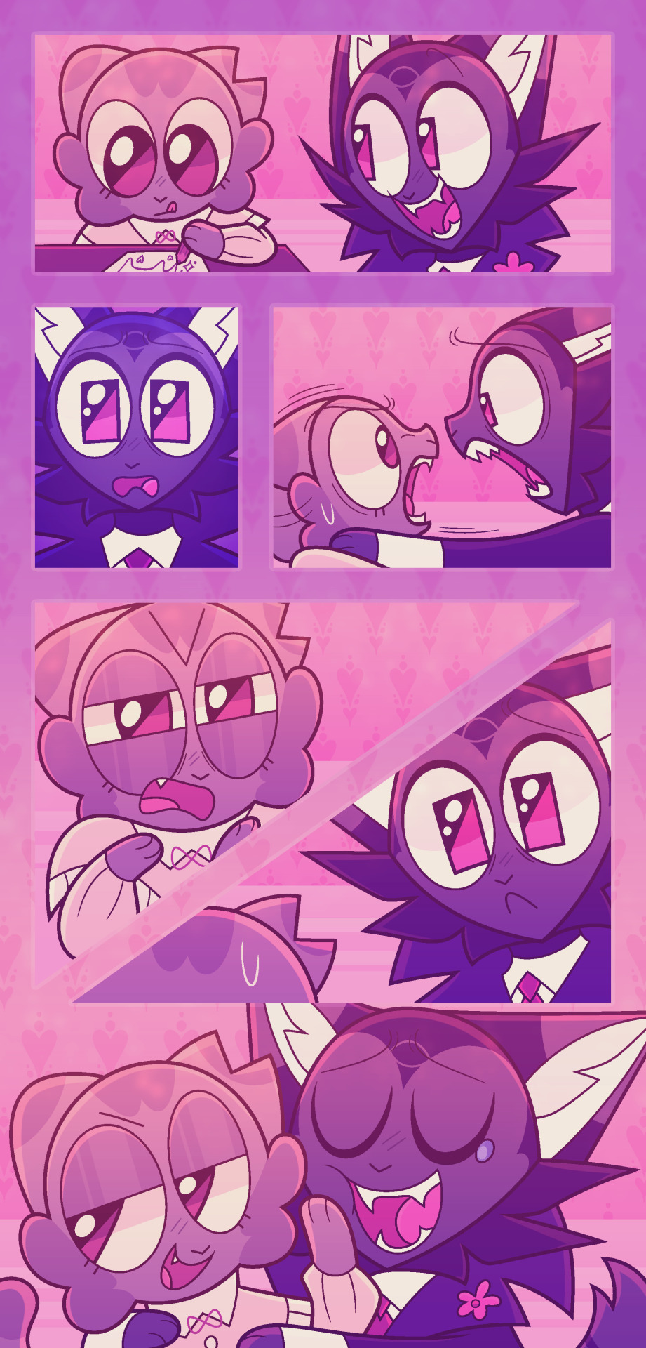
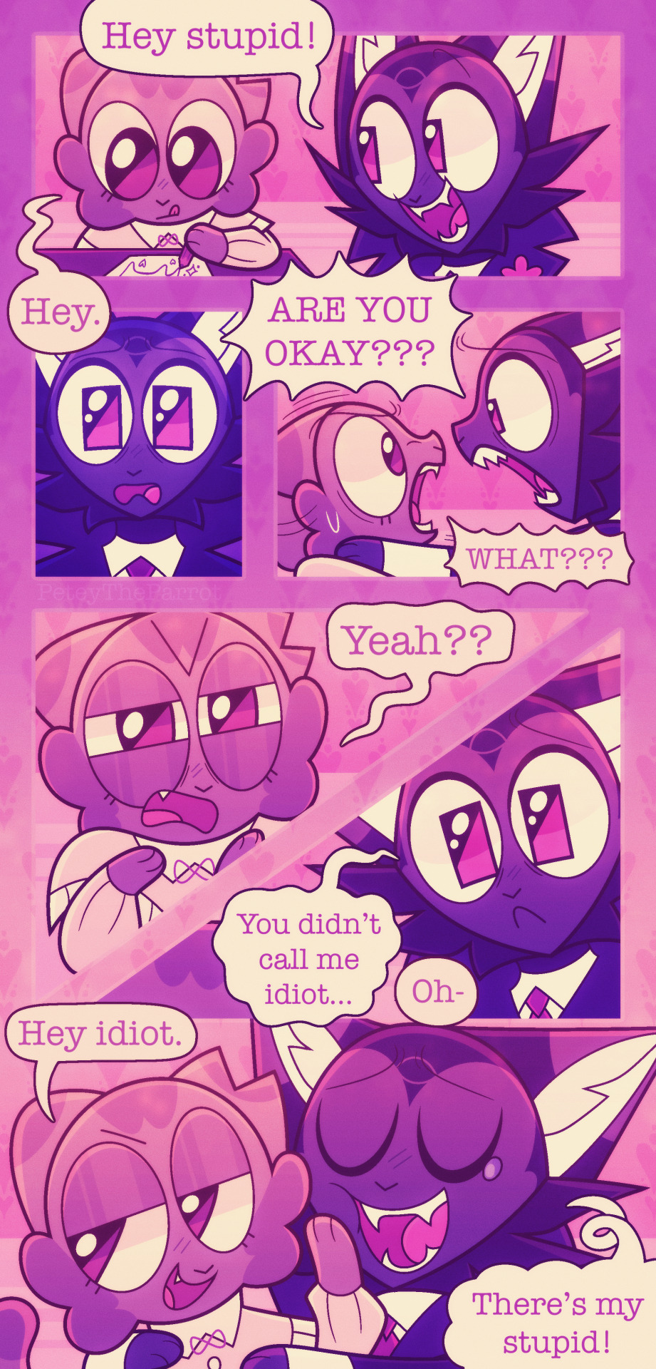
Andddd you’re done, I usually work on multiple comics at once because I CANNOT sit on one thing only!! Nuh uh!! Comics take fucking ages and will ALWAYS take ages so if you don’t have the patience for it I’m sorry bro 💔 you will not handle it 💔
Although! When I started making mini comics they took me like? 10+ hours but the more I did them they now take around 3 hours at the shortest. This one took 5 hours.
This is just how I make comics btw, most comics I see don’t go fucking crazy on the rendering/lighting/shading (usually on comics I see there is none tbh! And it works for them!) I’m just insane and like to make my comics look really pretty or else I’ll explode for some reason.
Also 😇 if you wanna see more comics of these guys go here for places you can read them at 😇
#Asks#myart#sorry I took so long to answer this anon (this ask is from November whoopsies 💗 I take ages to answer things but I’ll get to them#eventually lol)#UHHHH IDK IF THIS WAS HELPFUL I DONT REALLY HAVE?? THAT CRAZY OF A PROGRESS I JUST#WRITE DOWN IDEAS AND THEN DECIDE TO TURN THEM INTO COMCIS IF I HAVE THE TIME LMAO#comic#comics#comic tips#tips#tip#art tip#art tips#comic tip#comic strip
53 notes
·
View notes
Note
Hello! I am a beginner artist and I love ur art!! Super pretty and the colors are very tasty. Do you have some tips? I'd love to see your art process!
HELLO ANON!! first of all i am very honoured that u would ask me this because 90% of the time i feel like i have no idea what i am doing and like im still a beginner artist myself DSDSJDF. i would love to share some stuff i learnt and some stuff about my process (regardless of how messy it is sdfhsj)
(final piece)
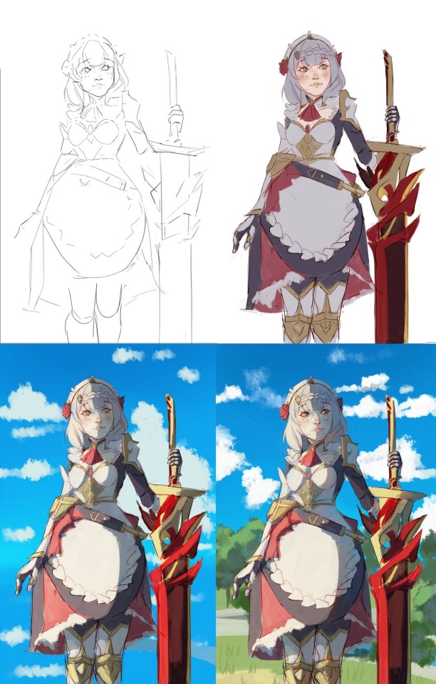
here's an old example of my process i found! while the steps sometimes look different for other pieces, i feel like this is a good demonstration of how the basic structure looks.
1. the sketch - this is where i'm mainly figuring out how i want the piece to look. i was redrawing a screenshot for this piece so it looks a LOT neater than what a lot of my other sketches look like, for example, here's the process of me figuring out my recent drawing of haise:


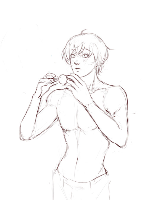
(final piece)
in the first two steps, i was mainly working with showing myself what the piece was going to be. the last one was where i used references/technical knowledge to try and show whoever will be looking at it what the piece was
2. cleaning up the sketch + base colours. these two usually occur simultaneously because i will get bored cleaning up the sketch midway through and want to start adding colour LMAO. on a more practical note, sometimes putting down the base colours and having a better idea of what the finished product will look like might make it easier to refine things.
a note: cleaning up for me doesn't mean doing lineart. it mostly means erasing any overly messy lines on the sketch and redrawing small parts to make it look tidier where needed. i often leave it 'messy' at this stage, too. like here:

(final piece)
3. light/shadow. this is my FAVOURITE part because it's where the piece starts pulling together. the method i used in the current piece was putting a multiply layer over the colours folder and filling in where light would be obstructed. after that, i used a luminosity layer to put in some bright sunlight. marc brunet has a great way of explaining it by advising to pretend that the light is the camera and you're behind the lens. this is such a good way to block in average light/shadow values! sometimes this looks a bit crazy because everything is still so messy but that is why we have...
4. rendering. this is where i fit all the remaining pieces of the puzzle together. i'll refine the colours a bit more -- e.g. colouring in the eyes, -- and fiddle a bit with the shadows to add some more variation to the hues/value. this is where i think a lot about light and shadow theory and try and make it look more realistic. marco bucci saved my LIFE with his videos about ambient occlusion and ambient light (part 1 / part 2) -- essentially, what i keep in mind the most is that if a plane in shadow is facing the sky (or is open to any other form of light that isn't the direct light source) it will contain ambient light. it is SUCH a game changer when you add it to your pieces, trust me, even if youre lazy about it. if needed i'll pull up some references to make everything look good!
5. rendering... part 2? honestly this step kind of blends with the last one as i tend to do it simultaneously. i basically clean up all the messy lines from before by painting over them! with the majority of the colours i need put down, i can just eyedrop them and paint over anything that's needed. this also comes in with the light/shadow, where, if i need a more subtle hue for either/or, i will eyedrop it and brush it in.
some further notes:
i very rarely use references during the first stages of my sketch. i think it tends to look quite stiff and unnatural if i rely too hard on the. and i personally prefer the creative room when the idea is still being conceived. references come in when i can look at what i have down on the canvas and have a fairly decent idea of what i want, including pose, composition, etc. it's essentially a first draft to guide me to where i want to go with the piece. it's when i'm done with this that i bring out references, and even then, they don't necessarily have to be the exact pose -- i'll usually get a couple of pics which show what i need to double check and keep them up as a guide. by the end of the 'sketch', i usually have a basic construction of what i need to continue, even if it's messy.
i use very soft brushes when putting down colour because it allows for more hue variation. like i said, i enjoy eyedropping and brushing in colours afterwards, so this really helps!
layer modes are ur friend! i try not to rely on them too hard during rendering because i like the freedom of painting over but they're very useful when you're blocking in your initial colours
sometimes, when i feel like i want to try something new with my art, i'll keep pieces that inspire me up in front of me. i have two of sui ishida's art books and sometimes i'll just flick to a page that oils the Art Gears in my brain and keep it open while i draw. i don't necessarily reference it, but i like having it there so i can glance over every once in a while. i don't usually make a conscious choice where i'm like "ok i want to render skin the way he does" but it's more like. my brain knows what it likes in his art and it'll try and push that part of my art in a similar direction.
honestly the best advice i have is that art is very much based on vibes. everytime i've tried to think too much about it, to do things 'correctly', to rigidly stick to art theory, my art has not come out nicely. i think the technical parts of art are important to know and understand but i also think it's important to let your knowledge come through naturally when it is needed instead of pressuring yourself to do things 'right'. tbh you probably already know that but it's something i forget a lot so maybe it serves as a helpful reminder?? sedsfhsl
ANYWAY SORRY THIS WAS SO LONG! i hope i covered what you needed and if you need anything else/want me to expand on anything feel free to drop me another ask ! <3
make sure to look after yourself and trust yourself and ENJOY!!! art is about having fun!
81 notes
·
View notes
Note
how do you nail the enstars style so well... what are your ways... (only if you want to ofc im just curious if you have any tips)
hi!!
i dont know if i have anything that could be helpful, but heres my process!
first, i get the pose down
i either use a picture of myself as reference or a persons pose from pinterest ( i used multiple references for this one)
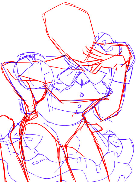
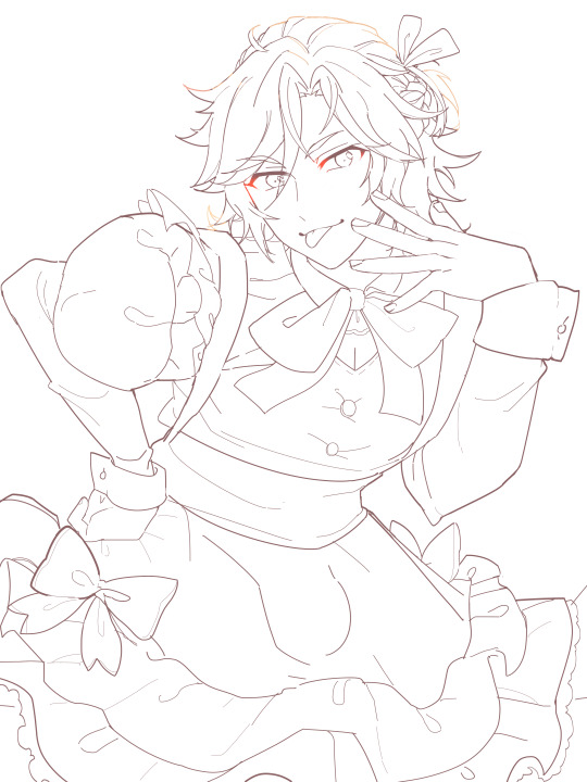
lineart:
i make the canvas huge, so i dont stress too much abt the lineart being clean enough
i heavily reference official cards, especially 3* because they have less angles and dynamic posing than 5*
i try to make it thinner and cleaner than my usual style but not too thin
outer lines are thicker than inner ones if that makes sense
i make it a dark brown instead of pure black and set it on multiply instead of normal
edges of the eyelashes are redder and softer, blush lines are always a subtle pink/peach shade
sometimes i make a second cleaner sketch before jumping to lineart, depends on how confident im feeling though
then the flats, pretty straightforward step

rendering:
i try to replicate the rendering on official cards as much as possible by keeping the references in front of me and color picking
i always make the contrast between shaded and non-shaded areas higher than im comfortable with usually because its what often makes the pieces pop (to me) and i make sure to add reflected light
i use gradients a lot, especially for hair
i make the lineart lighter in areas where the light is hitting like this
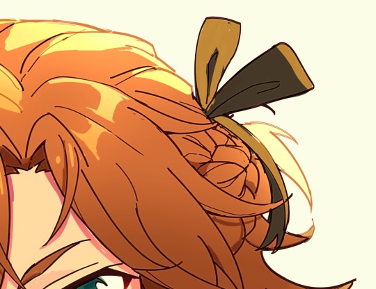
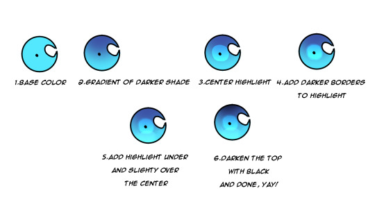
what i generally do for the eyes:
another tip is that i duplicate the lineart layer, make that duplicate into the "add" layer mode and glaussian blur it to give that lineart glow effect you find in cards:
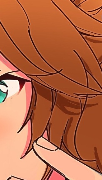
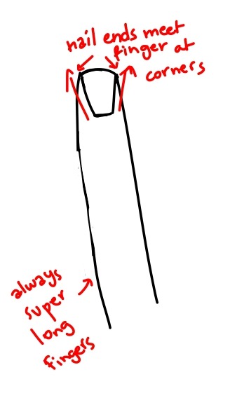
i also noticed this is how nails tend to be drawn and i kind of adopted that into my own artstyle because i love how it looks:
-lastly for the background, i used the ingame dressing room as a reference, did some blocks of color to express it and blurred it so i dont have to bother with any details because im lazy <33

-i lastly added some sparkles and stipples and a white blur around the edges to make it look more finished.
thats pretty much it! ofc take all of this with a grain of salt because im no expert HAHA this is just what i learned works from trying my hand at fake cards over and over again, so its practice too <3 i hope this was somehow helpful!!
46 notes
·
View notes
Note
Do you have any art tips or a step by step on how you color??
Please its ok if you wont
sure, i can give a tiny bit of insight on how i colour. Under the readmore:
At this point of my personal understanding, i would say colouring is just two things: 1) making sure your colours look good together, and 2) lighting (if u decide to even do lighting/shadows, that is)
The 1st one you can achieve by doing palette studies based on photographs or other ppls art, or by doing trial and error, or apparently by learning colour theory (im too dumb to understand it) and also applying digital tricks like overlay layers and also fiddling with hue/sat/brightness/contrast until it looks good to you. Below is my latest Audrey drawing without the overlay layer (left) and then with the overlay layer (right).
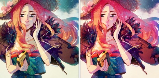
It’s magic, right!? I’m so used to having an overlay layer in every drawing now that these days i just slap one on before i even start colouring lmao. usually 20-50% opacity, usually a saturated orange or pink and then i’ll adjust as i go. mostly i just do trial and error like fitting wooden toy shapes into the right holes - my brain will go “ding!” when the arrow on the hue gauge hits a colour that looks good to my eyes.
The 2nd one, lighting, is more complex. I always say “lighting is everything” because to me it IS...it can control the entire mood of the picture. Where is the light? Is it hard or soft? is there a secondary light? What emotion are u trying to convey? and then how can you execute it? how would light look on THIS object compared to THAT object? A big part of lighting is being able to visualize your drawing in 3D. Once you can do that, you can lay down the light and shadows quite naturally depending on where your light source is. this ties into the way you DRAW things tho (like, u have to already be thinking about 3D while in the drawing stage) so i dont wanna get into it since this post is about colouring.
Lately I’ve been p lazy and doing all my major shadows on a single layer, set to “Shade” on sai (it might be something diff on other programs idk), 42% opacity (for this particular piece), and clipped to my folder of colour layers. So that means almost all my actual colour layers are just flat colours! Here’s my main shadow layer all by itself without any base colours (left), and then shadows + base colours (right):
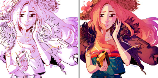
sometimes i’m already thinking about lighting while im still sketching the picture. sometimes i’m already thinking about lighting before i even start to draw. For this particular pic I ended up with 5 different layers for lighting: 1) all shadows (42% opacity Shade layer); 2) some extra shadow under her hat (72% opacity Shade layer), which then allowed me to create the cool hat texture by simply erasing bits of this layer 3) a soft angelic backglow coming from behind her. this layer goes somewhere above the lineart layer to give the illusion of light spilling in front of her and fading out her edges; 4) secondary blue reflective light coming from the....sky im presuming, but mostly because i just felt like the drawing needed some blue lol; 5) a 55% opacity overlay layer containing a trace amount of vignette in 3 of the corners + an extra glob of light just to the right of her cuz i was experimenting with different instagram filters near the end and found one i rly liked and tried replicating it on sai 😂 Here’s the picture with only my main shadow layer (left) vs the picture with all 5 lighting layers (right):
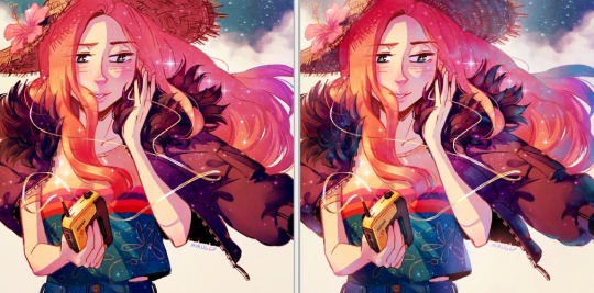
The pic on the right makes her look more like she is Somewhere. I think I could’ve pushed the depth even more but i wasn’t confident enough. And sai doesn’t have blur tool :(
I also always have at least one layer that i name “extra”. The Extra layer goes on top of the colours/shadows/lineart layers, but under the overlay/glow layers. This is for extra details (including extra LIGHTING details) that I wanna add like extra sparkles, extra straw hat strands, hair strands, hair shine, zipper shine, etc all for that “extra” touch of realness. I don’t do all this stuff at the end, though. I have my Extra layer created pretty early on and i go back to it and add to it when I need to. Here’s what it would look like without the Extra layer (left), and with it (right). Try to find all the extra bits i listed:

One last note is i don’t colour one thing at a time. Before I start, I slap on all the base colours and all the shadows super roughly, just to check if my lighting and colour choices look good TOGETHER and make the entire composition look good. no point in spending hours rendering all the lighting and shadows on the character’s hair if in the end u decide there was actually a better lighting design u could’ve gone with. So here’s the rough colouring plan I made for myself before i started rendering for real:
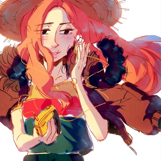
im not sure if this was useful at all but i hope it was interesting at least! if you want to see my actual chronological process for colouring you can watch the gif of wips i compiled here: [link]. You’ll notice that i edit my lines as i colour. I think it’s good to be adaptable, and to be ready to go back and change ur lines to benefit your lighting, colouring, and overall look of the piece.
Also here’s the finished version of the pic: [link]
#Anonymous#miruask#miru art#tutorial#there's a lot more i didnt mention#i didnt mention my texture layers#cuz i felt too ashamed lol im just a sham artist using textures and overlays and texture overlays#textures can absolutely make ur colouring look interesting tho so try some out!#i didnt use a texture for the hat tho i did that all on my own and im proud#i also didnt mention locking ur lineart layer and colouring the lines themselves#but thats such an age old technique that im sure everyone already knows it
32 notes
·
View notes