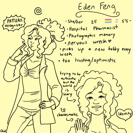
#my lineart just like. looks better with more simple stuff
Explore tagged Tumblr posts
Visit Tumblr Blog
Explore Tumblr blogs with no restrictions, modern design and the best experience.
Last Seen Tumblr Blogs


Fun Fact
Total funding amounts to $125.3M.
Text
god the amount of art i would pump out if i stopped letting lineart talk me out of it i would be unstoppable
#this is a rant @ me and not to sound like i'm bragging when i say what i'm about to say#but i swear to god it takes more time/effort for me to do a cartoonish drawing than a photo realistic-ish drawing and i hate it#because sometimes i just want to do a simple drawing that's just lineart. maybe SOME shading.#but i fuss so much on how the lines should look and where to add more/less lines and what kind of thickness and blah blaaah#i have SO many art ideas i want to bring to life i stress myself out about it#i know that sounds so stupid#like yes just do art! do it bad! it's better than nothing!#but it's... deflating. especially when i literally have an art degree like#5 years of art school and i was barely taught anything about line art#'oh well that's in animation so you'd want to do a degree in television' ???#and those few times lineart was relevant was when there was a naked person in front of us when you're told to just replicate what you see#but we rarely had any variety between models and when i'm in that setting drawing someone my mind is just#~oh god naked person don't stare but i must don't think about it but it needs to be right oh god naked person i'm uncomfortable -+#like it was just overwhelming stress of getting it right rather than actually learning anything#which honestly sums up my art school experience overall#but it also doesn't help when you hate your own body so much and the idea of someone trying to draw you is just humiliating#(like at one point we had to partner up with someone and both paint their portrait AND model their head with clay#and i nearly had a breakdown and refused and asked if i could use someone at home instead#bc I've got plenty of scars and deformities and my face isn't symmetrical and i knew that was either going to be overlooked or exaggerated#and when it's the other way around i try my best to pay attention to detail but it's becoming this debilitating anxiety#of doing exactly that back. and it's made me paranoid to do anatomy related stuff) ANYWAY#it would have been good if people weren't ALWAYS naked and they helped us narrow down how different fabrics work on bodies and stuff#and to help us convey that through LINEART instead of needing to do whole ass paintings and detailed sketches and stuff#[SpongeBob voice] WHAT I LEARNED IN ART SCHOOL IS--- 😬#anyway if any fellow artists have any tips they'd be willing to share i would very happily listen#like i've got my drive back to draw things again which in itself is nice but man#it would be nice to not lose steam 5 minutes after anything i start drawing because i freak myself out#okay rant over if anyone's still here thank you for your patience and interest#me ranting
5 notes
·
View notes
Text
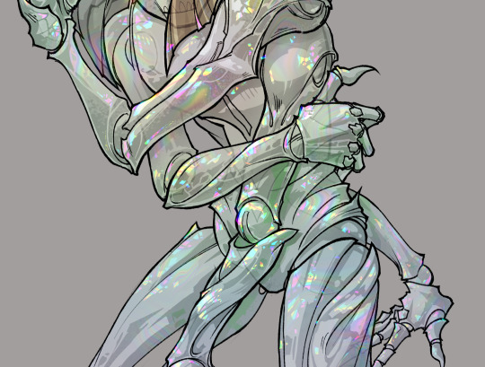
gonna show u guys a little opalescent highlight hack i threw together today
rainbow gradient above your main figure (i usually have all my main figure folders/layers in one big folder, so i can clip gradient maps + adjustments to it!). liquify tool to push the colors around a bit. STAY WITH ME I KNOW IT LOOKS STUPID RN I'M GOING SOMEWHERE WITH THIS
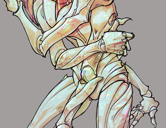
THEN: set it to add/glow (or the equivalent in ur drawing program), lower the opacity a bit, and apply a layer mask. then u can edit the mask with whatever tools you like to create rainbow highlights!!
in this case i'm mostly using the lasso fill tool to chip out little facets, but i've also done some soft airbrushing to bring in larger rainbow swirls in some areas. it's pretty subtle here, but you can see it better when i remove the gradient map that's above everything, since below i'm working in greyscale:
more granular rambling beneath the cut!
u could also just do this with a brush that has color jitter, but what i like about using layer masks for highlight/shading layers is how simple and reversible it makes everything. i can use whatever brushes i want, and erasing/redoing things is super low stakes, which is great when i often approach this stuff with a super trial-and-error approach.
example: have u ever thrown a gradient w multiple colors over an entire piece, set it to multiply etc, and then tried to erase it away to carve out shadows/highlights? it's super frustrating, bc it looks really good, but if u erase something and then change ur mind later, u basically would have to like. recreate the gradient in the area u want to cover up again. that's how i used to do things before figuring out layer masks!! but masking basically creates a version of this with INFINITE undo bc u can erase/re-place the base layer whenever u want.
anyway, back to rambling about this specific method:
i actually have TWO of these layers on this piece (one with the liquified swirls shown above, and another that's just a normal concentric circle gradient with much broader stripes) so i can vary the highlights easily as needed.
since i've basically hidden the rainbow pattern from myself, the colors in each brushstroke i make will kind of be a surprise, which isn't always great -- but easily fixable! for example, if i carve out a highlight and it turns out the rainbow pattern in that area is way too stripey, i can just switch from editing the mask to editing the main layer and blur that spot a bit.
also, this isn't a full explanation of the overall transparency effect in these screencaps! there's other layer stuff happening below the rainbow highlights, but the short version is i have all this character's body parts in different folders, each with their own lineart and background fill, and then the fill opacity is lowered and there's multiply layers clipped to that -- blah blah it's a whole thing. maybe i'll have a whole rundown on this on patreon later. uhhh i think that's it tho! i hope u get something useful out of this extremely specific thing i did lmao
12K notes
·
View notes
Note
Do you have any tips/tricks for doing lineart? That piece of all your da protags turned out so good but whenever I try to do the lineart for a full body piece it always comes out too thick and simple or too detailed so that it just looks like a mess
Thank you so much!
I totally get that tbh I also have issues with that as well - think something that helped curb it is taking a second to zoom out every couple of strokes? I don't know what program you use but I have a little navigator screen in my CSP, If it looks too cluttered or thin from a more zoomed-out perspective, I'll go back and change it. It's really easy to get caught up in the details especially if you're zoomed in but it is important to remember that when people see your art they're not seeing it super zoomed up like you are - take a step back and look at it from the perspective of someone else seeing it come across their dash.
Idk if this is an artist sin ™ but I change the brush size frequently when I do lineart as well - I never keep it at the same size. With faces and smaller things like jewelry I go smaller and with stuff like fabric and armor I go bigger. Don't be afraid to switch when you need it!
If I think it needs more detail and I'd like to add something to it I make another layer, lower the opacity on my lineart layer, draw what I want to add on the new layer, and just erase everything underneath what I drew on the original lineart layer, then raise the opacity, and merge - just so I'm not doing everything on one layer and I have room to experiment with what I want.
I don't know if this will help but I also have a post here about how I do linework personally (however the brush link is down bc CSP removed my brushes for using my own artwork sigh. I'll redo it one day):
Im not sure if this is super helpful but I hope it makes sense! Thank you!
50 notes
·
View notes
Text
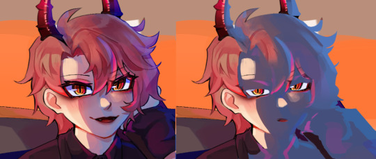
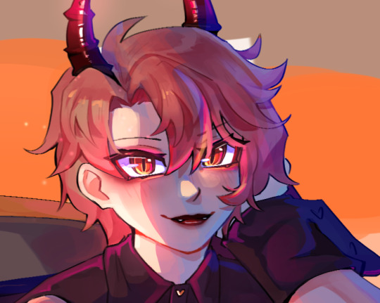
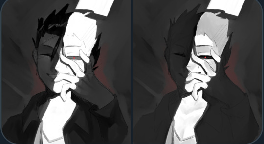
bOO‼️
@if-you-heart @if-you-mind @if-you-soul
told heart this but i drew fanart of ya’ll’s sweet angular soul guy :]! i couldn’t not…look at his dumb face…..🥺
i have two versions because the lighting experiment came out ok-ish. t was originally blue (because it was coming from the left side lmao) but red looks better 🤷
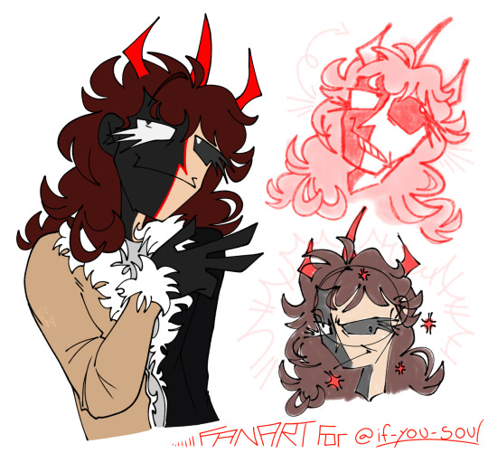

it’s a little simple and the composition is messy, but it was a good stress relief + shading practice :D! im proud of it. i’ll definitely draw him (and the gang) more though if i can!! been getting better with hair recently and tested out my skills with this one :]. styling and keeping consistent with hair is tough, but oddly relaxing. did some lineart in the car somehow 👀??
he looks like such a,,,bro i can’t….. i love how stupidly spindly he is
i was attached to this stupid lanky fictional(???) man the *moment* i saw this post. absolutely bonkers. i was so charmed by this concept i shared it to all of my friends you don’t understandjshdkdhdgsgd /silly /but yeah i did do that XD
also you fazgang have been reblogging and liking my stuff 🐥 <- looks up at you like this chick
which,,,,thankie,,…🐥🐥😳💛✨
.-.
for you onlookers have some more posts by the fazgang (what the if-you-hms-gang call themselves) to gaze upon. you will not regret,,
.-.
i’ve noticed a trend that i often tend to write big paragraphs about a simple piece of art i’ve made, which is okay but i get the lack of interaction lol. im very proud of my art, and go on rambles on why i like it. the formatting i turn to aswell as the text and images almost turns the post into a collage? visually?? i love collages so it works out XD! but anyways,, im not upset over notes, i just like getting my art out there. so thank you to everyone whose viewed, read, liked, and followed for the ride :]. im glad you appreciate my stuff, it’s what i can offer <3. it won’t be consistently one fandom but im glad to not be alone in my interests. good god that sounded like a traumatized rant (maybe it was but:)
TLDR: check out if-you-heart/mind/soul :]! they are very cool and nice💛
#fazgang fanart!!!#chonny jash#chonny jash hms designs#chonny jash soul#cj soul#PUNCHES HIM IN THE STOMACH#ibispaintx#lighting practice kinda#jashling design#jashlings#gives him a squeeze of a hug#i love the trident horn design…in one of my souls i took it very literally (dyadracide)#dyadra does look like a jim henson character ur right heart XD💔#another friend of mine said the same when they first saw him lmao#this turned into a traumatized post real fast what the hell#chonny jash fanart#chonny jash jashling fanart#hashtag cool jashling design#shading/lighting practice#ibispaintx illustration#he looks like the 🫥✌️ meme 😭😭😭😭i love that so much#oh god the lawnmowers just started in my area adios#very messy post but i love it like that >:3
73 notes
·
View notes
Note
Hello!!!
A friend of mine really, really loves your art style and wants to know if you have any tips for getting the smooth geometric designs you get on your lifeless art?
Thank you so so much (and your art is gorgeous!! We both love your objectum pieces and ultraviolet pieces!!!)
i think smooth geometric designs take up like. two parts of an art process, one of which is "designing something in a geometric fashion" and the other of which is "making the design look smooth in some way".
so below are some examples of how i work out designs and geometric shapes when drawing things. usually it is the general process as many other artists advise, start with drawing out the overall shape. a keyboard is a rectangle with some more sides. a water bottle is a rectangle with curves. a pen can be just a rectangle. the sun is a circle. and then after i break stuff down into basic shapes i look for how i can make the details clearer.


like with the ibm pc (left) you can see that theres a little gap in between the part of the computer with the screen and the rest of it. if i want to make that depth more noticeable, what i can do is either make that little segment a different color from the top and bottom parts of the computer, or i can simply put space around it to make it clear that its a separate segment. so you can see when i color in the computer in black, the middle rectangle sement is surrounded by white and it has a bit more distinction than it would without that.
same thing for the pen in the given example on the right, i visualize the overall shape as a rectangle with a few extra details. then i add the details in shape, color it in, and erase out a few lines where the pen would be cut into segments. so really for my geometic shapes my approach is just to divide things up into a few simpler parts.
now to make the stuff look clean or smooth usually i erase things out instead of drawing all the lineart. you can see in my earlier example of the pen that i erase parts of the pen rather than draw new lines in, i think that this keeps the form and shape of the pen better than drawing a line over the pen itself.
for specific tools, i use the digital pen in ibispaint x, which lets me get very finicky with details down to individual pixels. but also even if you don't have that specific brush, using tools like a circle tool or ruler tool to draw/erase straight lines is a big thing i do. because nobody can draw perfect straight lines, and its near-impossible to erase in a perfect circle. in the above examples you can see the horizontal brushstroke ive made, i then use a ruler tool at 90 degrees to erase some of the right and left ends of the stroke, creating a nice neat little rectangle. i do this a lot for all of my pieces, especially in more recent ones like the building piece and such.
but yea all in all my art style was made to be easier and make shapes more clear for myself, usually i just find myself focusing on whether i can illustrate something nice with simple lines and shapes
19 notes
·
View notes
Note
Could you show your sketching process? Like what base skeletons you use for the characters to make it so dynamic? Maybe using cuddy x cameron or hilson :)
Of course!! This is going to be long winded so Ill put this under the cut hahah
Im gonna follow my process chronologically with a few of my works to explain my different approaches!
HILSON
So especially for poses including two people i often use an app on my phone called "Magic Poser". This helps me understand the perspective and scale of the characters a bit better since this is something I struggle with. So ill take the models and pose them how I want them. What this app REALLY helps me with light sources since that is customizable too^^
So then I enter a phase where I am studying the pose. For this drawing I did it traditionally. first thing i do is break down the figures volumetrically, which is a figure drawing method where you break down the figure into simple box like forms. This helps me gain an understanding of how the shapes are interacting with space.
After that, I draw over the forms adding things like hair and clothes and building the specific face/body shapes of the character.
I do also use the little "circles" to mark joints when im drawing fast!
After that I scan the pencil sketch I do into Krita, and follow my work to get some lineart!.
CAMCUDDY
This one was a similar process, but i ported the reference image straight into my drawing program.
After that i do a volumetric sketch over the reference to break it down.
And then i do a more creative pass where i make these boxy dolls look more like the characters im trying to draw!
from there i do a final line art pass, and then i sit back..... and stare at it..... because even though model references SEEM fool-proof there are often things that just dont look right! Its really important to remember to not use those kinds of references as gospel, it should be a convenience and assistance rather than a crutch. So ill often go in and change things, either outright erasing and redrawing or using the warp tool to move stuff around! These models are only so helpful if once ur done you look at the drawing and it just looks straight doo doo lol.
FREESTYLE
While I do use models alot for something i want to draw really fast, its important to not rely on them! That can make your art become super rigid if you don't push yourself.
For drawings I approach without, i kinda go buck wild! Here on this one you'll see i kind of blend my volumetric phase with my detailing phase:
With these looser drawings i focus on shape and gesture. Then ill just do a final cleaning up pass for the line art.
I have a really fast and dirty drawing style that doesnt always lend itself to "perfect anatomy", but im far more concerned with visual appeal rather than realism.
Alot of the confidence I have with anatomy comes from yearssssss of drawing casually, and my classical study in college!
RESOURCES
I do really recommend some level of classical study when it comes to drawing the figure! Here are some video's on it I have watched and studied during my time in college that I really recommend:
youtube
youtube
youtube
I hope this was helpful!! haha sorry i get really nerdy about drawing process :))) If you have any additional questions let me know!
15 notes
·
View notes
Text
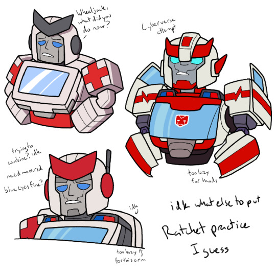
I started making this Tuesday and finished today
I’m not entirely sure what my intention originally was, I think I might have been attempting to draw various Ratchets. Or just g1 Ratchet, but then I realized I made him too small to just post him alone
I got myself some references for g1, I think his IDW self (they were on the same page), Cyberverse, Animated and Prime. So I might have been trying to draw all of them, but I’m not sure
But yeah, I drew g1 Ratchet, and then I decided to draw Cyberverse him, because he had a neat design
For my first attempt at the style, I don’t think it turned out horrible? Not the best though, and I especially need to work on the arm joints
Also none of them have hands because I was too lazy to give them any. So just ignore the lack of hands
Anyways, so after that (but also on Tuesday, I just finished the lineart and colors today) I think I was trying to combine features to get a Ratchet design I’d like to draw. It was mostly these two for inspiration, but there was also a bit of the IDW design I took as well. But also it’s mostly in the head, I didn’t care much about the rest of it
I don’t think I intended to use the CV eye lines, but I wanted something and just ended up doing that. Might change them later. I also gave him the big eyebrows because I thought it suited him. Grumpy old man
I gave him the antenna because I thought he’d have one. Like he needs to keep the radio on in case anyone needs his assistance (and he’s surrounded by idiots)
I gave him circles and the simple chevron because it’s just easier for me to draw and I’m lazy
I gave him the sirens from CV because I liked them. I also gave him the thing in the back because it looks like a backpack and I like that on him, I like to read it as a pack with his medical stuff, even if it probably isn’t
But on to colors, I do wish I could have more red, but admittedly there isn’t much else to put it in the little I drew. So fair enough
But also, I didn’t want to give him the red chevron. That’s like, the common chevron color, and I like how he didn’t follow that in his g1 design, being grey instead. But the grey isn’t in much else of his colors, and the red would be more consistent. And also, I like the white with red accents, it fits him as the medic. So I don’t really know how to get rid of the problem here. I guess the best solution is to change other chevrons?
I’m also debating changing his eye color from blue. I consider it with most of the Autobots (and I would the Decepticons, but I haven’t really drawn them), since they almost all have blue eyes, and I want variety. I think Ratchet can still have blue eyes, since it kind of fits, at least with the blue half of the sirens. If I were to get rid of that, maybe his eye color could change, but I’m not entirely sure what to. I know I tried yellow and red, but maybe I need to expand
But yeah, I don’t know. I finished this, wanted to share it. I really do need to get better at figuring out vehicle modes/the rest of the body. Probably need better references than the g1 cartoon
#oh yeah never talked about the g1 Ratchet there#I think he looks fine#probably the best in execution since I generally know what I’m doing with these designs now#I still don’t know how to draw the joint bits though#they’re the true bane of my existence I tell you#outside of the angles of the rectangles I suppose#anyways yeah I think I’m done here#they’re basically all making the same face aren’t they?#my bad#transformers#transformers g1#transformers cyberverse#tf ratchet#my art#my designs#I should probably have that as a tag when I mess with the designs tbh
13 notes
·
View notes
Text
@thepinksky18 hello, and thank you sm!! <3 I hope it's okay to reply like this, I got kinda carried away with reference images..! I can try to share some things that help me with my art, hopefully they'll be of some help for you too!
when I do group pics like this, the thing I focus on the most is how everything looks and feels together! details and stuff can wait for later, first is to figure out that the overall picture works, and the characters are in balance with each other!
I'll use the Tenma horse pic you replied to as an example, will be continued under read more!
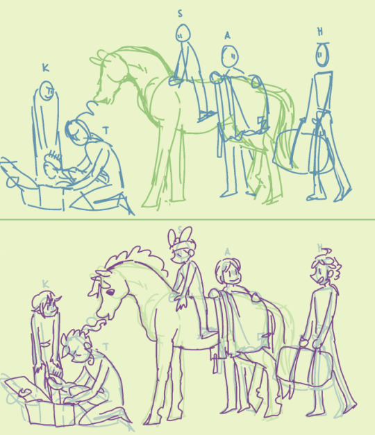
here's the sketches for the art! the very first sketch is very simple and blocky (I usually use a thick brush) to just settle everything in place and see how it all works out. the second sketch is more detailed and sometimes deviates from the first sketch a lot, if something seems to work better some other way.
depending on the complexity of the finished art, I do just these two sketches or add one more even detailed one, but the last sketch before lineart is the one I tweak the most! usually I draw characters on different layers so it's easy to select them separately and resize, fix proportions or positions, etc. to make the big picture look good to you!
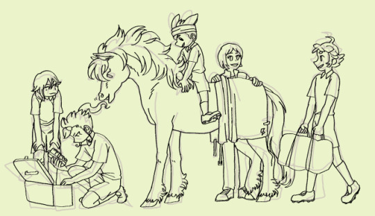
here's the lineart (which could also be the 3rd sketch) compared to the previous layer. now I'm adding more details, but I still keep fixing the overall image - you can see how the lineart doesn't quite match the sketch in places: hikaru is shorter, the position of aoi's feet and tenma's hind legs are different, etc. some people like to do a very detailed sketch and practically trace their lineart over it, and if that's what feels good for you, go for it! I'm the kind to just throw lines over vague sketch and call it a day, especially with more simple drawings like this :,)
there's good tutorials and studies on bodies and proportions online already so I'm not going to even try to speak about those, but I got a few tips! I tend to do them in my mind nowadays, but I tried to draw them out for easier visualization!
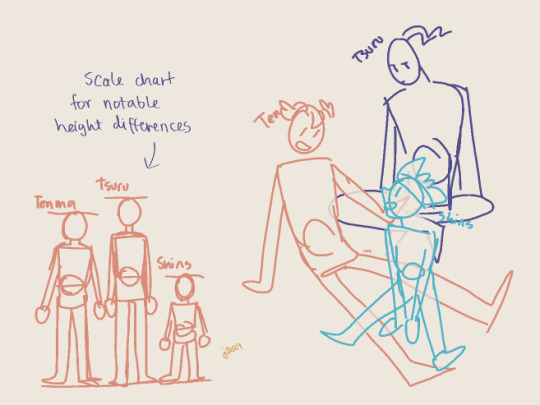
I mentioned earlier how for me the main thing is that everything's balanced, right? that also inclues characters and their proportions. I think that in group pics it's more important the characters work out together, not so much if their insividual proportions are perfect. especially if there's notable differences between them - height, bulk, lenght of limbs, and so on! a few pixels here and there don't matter in the overall image, but for example with Shinsuke who is Tiny, it's important for me to really make him smaller than others.
my most used tool is a scale chart! it helps to visualize the proportions for the characters, even when they're piled up like in the example doodle, or otherwise not in a neat row on the horizon line. (again, separate layers help you tweak them individually if needed! there's no need to get them right on the first try, especially when drawing digitally when there's layers.)
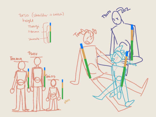
if your drawing eye hasn't gotten used to proportions, the chart can also be used to make a neat little ruler to check your sketch! the rulers over the sketch are all same size, just moved around; tsurugi and shinsuke fit in pretty well, and while Tenma's torso is a little long (even when taking into accound he's a little bent from waist, which makes him even taller when straightened out), it's not by much and it wouldn't bother my eye.
and while I myself sometimes tend to be a slave for the references and get gray hair over minor details, or of some part of the anatomy is off and I can't fix it the way I want, the overall feeling and style mean a lot more! I think it's important to put some thought into the proportions especially if you feel like wanting to make progress with your art, but if it's getting too stressful or draining the joy of drawing out of you, then screw it and just have fun! (I say this as someone who has learned not from studying anatomy and stuff, but instead just. has drawn a shitton and had fun while at it. I think getting comfortable with just creating is the bigges step you can take!)
...oops, sorry if this got too long or off the rails! and yeah hopefully you (and anyone else reading all this) got something out of it!
#me after writing all this: wow I hope I understood the request right and didn't just blabber about something unrelated for a long post#thanks for asking though!!#hmmm should i tag as art... maybe I will#own art
25 notes
·
View notes
Note
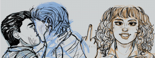
Hiiii i just saw your Outsiders/Christine art and HOLY SHIT. When i say my jaw was on the floor it was on the floor. I’m a huge Stephen King fan (I’ve only read his books bc to me his books are good enough. I’m not a huge horror movie watcher girlie but i can do thriller/horror books. I have like 8 of his books, including Christine, on my bookshelf) and once again: HOLY SHIT. I can lowkey see the Outsiders trio as the Christine trio. Now whenever i go to reread the book, i can’t view it the same anymore haha. Another Outsiders/Stepehen King art idea for Halloween: 11/22/63. It’s one of my absolute favorite Stephen King novels. And if you haven’t read it, highly recommend it. It’s so intense and entertaining and i do get lost in that book. Anyways, HOLY SHIT. But i was also wondering if you have any tips for beginner digital artists? Like on layers, line art especially, shading etc.? I really want to get into more digital art but my tradional sketches lowkey look better than my digital ones haha. Whenever i see your stevepop or Outsiders art it just gives me a boost of inspiration. And i love them your honor.
Woah, thanks!! I’ll have to check it out- so far I’ve only read Christine and The Body (because my dad’s obsessed w/ Stand By Me), but I really dug both so I’m looking forward to it!
And as for digital art tips, I guess I’d say to keep things loose! I like to use a modified version of the Shale Brush on procreate for my sketches and lineart because it resembles a pencil, and the rough messiness makes it a whole lot easier for me to just relax and draw the way I do on paper. I don’t shy away from messiness especially in digital art- it makes things flow better in a medium that can get really stiff sometimes.
I like to do my sketches in bright colors, and I tend to assign every subject a certain color so I can tell them apart easily (idk how helpful it is, but it works for me!) Then I lower the opacity and draw on a layer on top like this:
Then I turn off the sketch layer and either fill everything in with base colors, or color it in grayscale w/ this Copic marker brush and varying levels of opacity for my comics.
As for shading, I do a combination of cell shading and painterly shading (picture for the uninitiated lol). Both have their merits, and shadows in real life usually include a bit of both.
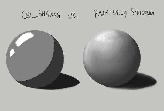
For more simple stuff, I take a shade of either purple or sometimes magenta and cell shade everything with this pencil brush on a multiply layer, usually set to 30-ish% opacity depending on the drawing. Then I’ll blend it out a bit to soften some edges, which is what makes it look painterly. Also if you don’t know, “clipping mask” layers are really helpful for shading! You just put the shading layer over the colors and it stops you from going outside of the colors, it can be super helpful. This method is the one I usually use, and the one I’ve been using since I first started about five years ago now.
For the Christine poster specifically though I mostly just kept everything to one layer and color dropped from the reference, altering the colors as I saw fit- and just sort of guessed for Evie because she’s way tanner than Leigh and needed her own colors. The only times I used different layers were for each individual character so that they didn’t mess each other up, and also for the sketches, which I put on top of the colors but lightened the opacity on. Idk that I’d recommend this for a beginner tho, it’s taken me years to get comfortable working like this!
Sketch is set to a multiply layer here too. You can’t see it super well here tbh, because of how dark everything is, but oh well. Here’s a study I did last year with the same method tho! (Also she’s got some similarities to Evie huh?? I guess I have a type lol oops)
Anyhow, that’s probably enough for now lol- but lmk if there’s anything else you wanna know! And obviously this is just how I do things, there’s no hard and fast rules for any of this- I’m making it up as I go along, and you should too!!
14 notes
·
View notes
Text
TNBC Shower Thought: Comparing the worst to best TNBC posters
((OOC:
I know how much you love my pedanticy-pedantics about unimportant TNBC details and reviews. Or, at least, I think you like em and none of you have told me to can it yet...
So I figured in the spirit of that and Christmas season, why not compare some of Nightmare Before Christmas's movie posters? Comparing posters and covers is a fun activity for me. There different kinds of posters and cover art throughout the years for all sorts of things that are great at subtly, creativity, minimalism or just being a good cover overall. One day I hope to compare some of the Walt Disney features' many fantastic poser art for their films, but for now lets stick to Nightmare.
I'm starting from the bottom to work my way up into the GREAT stuff. Lets not waste anymore time...

This is easily the worst cover for the film and what I hate is that it's the most current cover. I already hate when they try to make the clipart we're used to all shaded and three dimensional-like, but just...LOOK AT THIS?!?!
Who thought THIS looked good? Honestly?!? The characters are all way too colorful and smooth and it's plastered on top of the film cel like it fits together...it DOESN'T!!!
Next we have the 2008 DVD cover.
I'll try not too be too harsh on this one in case anyone here grew up with it...but I'm sorry I am so not a fan. It tells you nothing about the film and is more of that '3D-ish take on the og lineart that looks ugly to me.

The 2023 30th anniversary art is...fine?
Like there's nothing WRONG with it, but it feels incrediblly lackluster compared to some of the screen-capped and colored up artwork I've seen on things like T-Shirts and even fan made posters.
Also, and I hope this ISN'T true, it's so basic I worry that it at some point was made by or with AI or at least with an artist who wasn't paid that much in a short amount of time. Like, the composition is all there: Sally and Jack in the forground, Lock, Shock and Barrel under them and above the title, Oogie in the moon behind them all...but I don't know why they didn't do something really cool like make all the intricate purple and blue-shapes into silhouettes of the other characters and other iconic imagery or scenes?

Look at how...ALONE Zero feels off the side there!!
This is another older image I remember on the back of my VHS growing up, though I never knew it was used for an actual cover of the movie.
It does INFINITELY look better than the first shaded-lineart image (this was done in the 90s...how...) but while I love the composition of Jack and Sally and them walking around in Christmas Town, I never liked the colors of the image at all.

I also never got why Lock, Shock and Barrel are there, chillin and watching them like they're Belle and Beast and they're Beasts' servants trying to wingman for him...Where's Zero? Everyone knows HE'S jack's wingman.
This is an image I found on IMDB that took my by surprise. To be honest I have no clue if it's an actual film poster or a fan poster, but I like the composition of it all as a Universal Horror film poster. Doesn't work as well as Frankenweenie, but still...

And now, the classic. The one you most certainly grew up seeing everywhere or around the place regarding this movie in the 90s or 20s. It's the cover to the soundtrack and VHS I had. This is obviously the most famous version.

But there's also this slightly different version with Jack's arms in a different pose 'to receipt Shakespearean quotation'. This is the same version of the cover used on our "The Film, the Art and the Vision" book as well.

But, for my own PERSONAL favorite cover of the film (even if it's just a simple photoshop), I have to go with the original 'special edition' DVD my sister and I still have.
Somehow Sally just being on the spiral hill next to Jack and holding his hand is so sweet and doesn't feel like the cheap and quick edit it is. I think it's because, despite being a reference to the scene I never saw this cover as directly portraying "Jack's Lament", that this was Jack having a nice moment of peace after the events of the films somehow and waxing his poetics in reference to the film...so somehow the idea of Sally coming up to join him in that with his other arm let out to her is ADORABLE.

Here's a different version on a French DVD.

Lastly, since it does technically count as a poster for the movie itself, I'd be remissed not to mention Nightmare Before Christmas 3D's poster. This this was great back in the day and it's still great now. I'm fairly certain they just photoshopped stills and photos of puppets themselves but y'see kids- THIS vvvv

This is how you photoshop. Everyone has a unique face and pose. Everyone's doing something you think that character would be doing if they were going to MT3K their own film (Sally that's rude!) and they're all drenched in theater accurate lighting. That's more like it!! Besides Oogie being smol, this is the perfect poster to catch the eye of a rerelease!
Hope you enjoyed!
))
#nightmare before christmas#the nightmare before christmas#the nightmare before xmas#movie poster#movie poster art#sally the ragdoll#lock shock and barrel#mayor nightmare before christmas#tnbc shower thought#tnbc analysis#nitpicking#fan criticism
18 notes
·
View notes
Text
@raccoytefox809 i got ur ask but tumblr was being difficult and i accidentally deleted my whole post including the ask ;; luckily i screenshotted all the stuff i wrote
mostly digital art tips bc traditional is not my strength lol
flip the canvas occasionally to check for mistakes, but not too much or it defeats the purpose
use references, the more the better!
if something is hard to draw, trace a picture of it to practice and then try it on ur own
learning basic color theory is easy but you can also cheat with blending modes lol. (pssst make a new layer on top, fill it with a nice color, change the blending mode (my favorite is Soft Light), and/or change the layers opacity)
do stuff with ur lines! varying line thickness is great for making important things stand out, separating things that overlap, etc... you can use darker colored lines for important stuff and lighter lines for details, or all light colors for a soft feel. i almost never have pure black lines
i also never use black for shadows; i use a color from the rainbow (usually blue) with the blending mode set to multiply. purple looks good almost everywhere, green gives a natural vibe, red is good for human skin tones
it might not affect the final art that much but i like drawing on a medium gray background, not white. it reduces eyestrain and kinda helps me color stuff better?
sketch a simple stick figure to plan out a pose before actually drawing it
do warmup sketches! i dont feel a huge difference from this personally but some people do, i usually just draw something simple like a snake
keep simple physics and gravity in mind. body parts squish when bearing weight on something. things like hair and loose clothes tend to hang down when still. if youre drawing a character in motion, those loose things should also reflect that
this is really specific, but eyeballs are not just spheres. the iris (colorful part of the eye) is kinda like a bowl and the pupil (black part) is at the bottom of the bowl. keeping that in mind with perspective is a nice touch of realism and depth
super lazy secret hack to make it look glowy when the drawing is done: save it as a png, have png as a new layer on top, blur until unrecognizable, set blending mode to overlay, lower layer opacity as you want, enjoy!!


finally heres the brushes i use in ibispaint for lineart and static :)
16 notes
·
View notes
Note
Do you have any tips on how you do shading ?? Your art really inspires me and I literally suck at shading lmao.
hello anon!!! im honoured i can inspire you sdfhkjh it's crazy to me that i can inspire literally anyone :,DDD <33
tbh i do all my shading purely based on vibes/what makes me happy so im not sure im a good advice person but ill show you a breakdown of how i go about shading and hopefully that might help a bit? :o i've left it below the cut because i have too much to say and it ended up being really long LOL
of course if there's anything you want more details on i'm always happy to explain, just let me know!
okay SO ill use this asmo as my example, i think there's enough to talk about here that it should be helpful hopefully
so here's my lineart and flats! i do all my flat colours in one layer because i find it easier to make everything look more cohesive when the pieces arent separated (i usually like it when the colours bleed into each other a lil), but i also just dont like the process of having to switch between layers for everything too LOL flats are unfortunately my least favourite part :,D probably because my lineart is so messy hahah
as you can see, the shading is very minimal here, just some subtle stuff in the wings/sheer parts of the fabric and some blushing on the skin, i also stole the orange under eye/liner thing from TBHK because <3
and then i clean up any messy stuff by just painting over top of everything on a new layer, i also rendered the metal at this stage because i felt like it i guess???
i dont think i did a suuper good job at rendering the metal here (because i was lazy), it looks fine but something to note about metal is that usually you want to push the highlights and the shadows a lot more, as well as the reflections because it is so shiny and smooth this is why you'll see a lot of pink and blue in the metal, to show the reflections of his hair and the sky
i would recommend using reference to get a better idea of how metal ACTUALLY works but again, i was lazy lol so that's a simple explanation based on what little i know/have observed
the jump here is a bit drastic and you might be like woah starr where'd all this come from?? but this is all in one layer-
('hard light' - 62% opacity)

this is how that layer looks as a normal full opacity layer, for reference:
lately i've been using hard light layers to shade! they're very versatile because unlike multiply layers i can do my shading and my highlights within one layer (do you sense a theme of me disliking having too many layers lmao)
SO this is where i have a bit more to say about shading you'll notice the prominent shading colour here is blue, this is because the main environment here (the sky) is blue. i dont know if that's how things work in the real world but it works for me LMAO i usually prefer to have my shading lean cooler purely for aesthetic reasons, i like how it looks more
you might also notice some areas where the blue is a bit brighter, this is to imitate reflected light, again because the environment is blue light tends to bounce around on things and reflect back even into the shadows so this is the effect im trying to get, i like to typically go with a brighter blue cause it gives things a sort of shinier? quality that i enjoy aesthetically, idk if its very accurate to real life tho it also helps me to give depth to the shading since shading isnt usually just one flat blob, and this is a bit of a shortcut to having more dynamic (?) looking shadows

i also want to point out my use of bright reds on the edge of the shadows:
i believe this is called diffraction- there's a real legit scientific reason why it happens but i... dont know what that is i just know it happens in real life (maybe not to this extent?) and it looks cool so i do it SFHJKSFH i usually blend it into the shadows though as opposed to into the lighter parts, i find that tends to look better
some miscellaneous things-
don't be afraid to throw random colours around!! who cares about realism, it's fun lmao
this artwork is a spoiler for asmo's bday so shhhhh but i did want to quickly show that you can also use hard light layers to create a glowy effect, i literally just painted the pink/orange directly on the shadows layer and it helped to make his eyes more glowy
of course i do go in and paint over a little after and add some layer effects but it helps to have that base there
now that you've learnt that i dont know what i'm doing, i wanted to highlight a couple of resources that have helped me! i hope they help you as well <3
this video gives some really interesting insights into this artist's process and some problems they had throughout, as well as how they overcame them! it looks a lil clickbaity but i promise it's good!!

this tweet also shifted how i think about rendering when i want to do something with dramatic lighting!
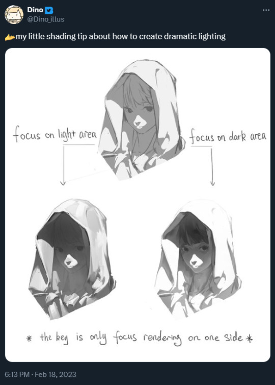
+ an attempt i made to replicate this (i wanna try this again lmao it was fun)
i hope that helps even a little bit, i did my best to explain but sorry if it was mostly nonsense though :,DDD best of luck with your art, anon!! <3333
19 notes
·
View notes
Note
if it's okay, would you mind sharing your art process? your style is SO gorgeous dude. keep it up spardacest nation!!!
Thank you so much anon, and of course! I kinda posted about it on twitter a while ago, but for anyone not also on there, here's a paraphrasing of what I said there! (under a cut bc it's gonna get a bit long)
(speedpaint video from procreate mostly bc like I also said in that post, it's one of the few pieces I've done entirely on procreate and thus entirely recorded kdfjhdk I usually don't do the sketching + painting parts on there but every now and then I get lazy and want to get it all done quick in one program lol! It's not as good as it would look if I were using krita to render (which is what I normally use) but it gets the idea across decently of what it is that I do)
The short version of my process is: sketch, clean up sketch for lineart, then flat colors, then paint over the flats (i make the flats my shadows and paint on the light), then a multiply layer for skin details (like lips, eyebags, etc), then an overlay layer for skin transparency details (red over the ears/nose/fingertips etc), then i do hair over the lineart, then a multiply layer with the contact shadows in a light beige/grey/neutral tone on top of everything else, and then i unify layers, paint over the details, and color correct the HELL out of it The longer version is: SO, first of all, I will say, my entire process for a finished/fully redered piece is pretty scattered and uses a lot of different apps, because after many years of trying out different drawing apps I found that I just worked better when I could incorporate the parts I liked best from each individual one rather than having to adapt to another app entirely! In total, what I use is: autodesk sketchbook and procreate for the first half I do on my ipad, then krita and photoshop on my computer when I'm actually rendering (but any photo editing app instead of ps will do, I'm just used to photoshop bc that's what I learned as my first drawing app WAAAY back in the day lol), and then meitu on my phone for color filters (also any phone editing app with filters in it will do), AND also optional just for references: blender and daz3d on computer + magicposer on my phone The actual step by step of what I do: First of all, if I want to do a detailed, well rendered piece I will start by getting my references ready. That means either just grabbing a screenshot from the game if it's like, a simple portrait, or a photo reference, taking a picture of myself in the right pose/lighting, and if it's something more complex I will recreate the scene in Daz3D to simulate a realistic lighting, OR even just blender (i have the game models for the dmc characters downloaded, so I can just pop them in, pose them and change the lighting to get a realistic idea of what shadows their faces will cast in that specific angle/lighting.) Note: references are pretty essential to me, and there's nothing to be ashamed about for using them! Personally I don't struggle a lot with the drawing/sketching part of art, but my tiny little pea brain cannot fathom how to make an object 3D in my mind, and how to visualize shadows realistically... thus the reliance on 3D programs to do that for me, and then all I have to do is draw what I'm seeing lol. My art improved significantly ever since I started making 3D refs so I could get /exactly/ what I needed - there's still a lot of leeway you need to learn though, because as realistic as the lighting will be in a rendering program, you'll never really get a fully natural looking image, as far as stuff like the body stretching/squishing/pulling when it's in movement, facial expressions, folds in clothing/fabric, etc... so really it's more a guide than something meant to be followed 1:1.
Then, once I'm confident I know exactly what I'm gonna draw/have the idea in my head, I start sketching it in sketchbook. Not really getting very in depth, just blocking out rough shapes - I like sketchbook and to be on my ipad for that because it feels very reminiscent of traditional sketching on paper to me, which while I'm not super confident on my traditional art abilities, I do get the most natural/fluid/non-stiff figures out that way. Then when I think I have the general idea ready, I export the sketch layer as a png and import it into procreate - which is where I kinda start picking at the sketch and polishing it like i'm carving it out haha. Lots of liquify tool, flipping the canvas to check if it's even, blending out some of the lineart to help out with the rendering later, and then polishing up what was once the sketch into serviceable lineart. I usually reimport it back into sketchbook at this stage - while I like procreate for drawing I don't love the brushes I can use for lineart there, and so I usually only draw the "base" naked figure in there - when I'm in sketchbook I use a hard pencil to refine the details, then on a separate layer add all the things "on top" like hair, clothing, etc - usually I can get it pretty easily in one go, and once I'm satisfied I erase the naked body under the clothes and unify the lineart layers. Then I will just do the flats with a hard brush, turning the lineart layer into an overlay layer and coloring things in with the shadow colors. At this point, I export the file as a psd and import it on my computer - I give it a once over in photoshop first to see if there needs to be any adjusting (like whether any layer that has an effect needs to have a different effect, if all the colors look right since the ipad screen isn't the most faithful, if i wanna change the background color, etc), and once I think it's ready enough, I open it up in krita, where I do the actual bulk of the painting/rendering (as to why specifically krita: it's because I've gotten very comfortable with the brush/painting brush dynamics there and cannot seem to get as good results anywhere else, it's just the goldilocks spot of a brush for me haha.) If anyone's curious, here's the brushes I usually use for painting:
The one in the middle is my go to painting brush, left one for tinier/more refined details, right one for blending out soft shadows (though I learned the hard way to not overuse it, or it will look like I went ham with an airbrush tool lol). (I don't change any of the settings on these brushes, so if you wanna try out the exact ones I use! Just fresh off how they come out the app haha) I paint on the lights on top of the shadows, and just focus on that for the time being - once I'm done with the basic painting, I'll make a separate multiply layer for details like lip color, eye waterlines, makeup if there is any, eyebags, etc, and then adjust the opacity until it feels right - then I'll make an overlay layer with skin translucency details (like, when you hold your hands in front of a light and see the tips of your fingers become bright orange - many parts of your body are always a bit translucent to the blood underneath, specifically parts where the skin is thin like noses, cheeks, joints, knuckles, etc, and I found it makes the character look a lot more alive to add that subtle coloring in) - then usually I do hair on a separate layer on top of the lineart (because that way I can add small flyaways, more details, etc, and just use the lineart as a guide) After that, I'll usually make a multiply layer on top of everything where I'll add contact shadows in a neutral color (usually pretty pale, it'll be darker anyway since it's multiply), and once I feel like I've rendered everything out properly, I save the psd and re-open it on photoshop.
In photoshop, I'll mess around with the layers a little bit more (changing hue/saturation, opacity, etc), fuck around with the background to make it look pleasing, and once I'm happy with it, I'll unify the layers and start color correcting - usually by duplicating the unified layer and messing with the curve/hsl of the image and then changing the opacity of that edited layer until it's as strong or muted as I want it to be - then I also edit the RGB curves individually and adjust the opacity of that also (because I just really like how it ends up looking if I give a bit of a red/warm tint to the shadows lol), and at that point often I will reimport the finished image into procreate for some finalizing touches! Like, blending out shadows that came out too harshly, painting over anything that came out not the way I wanted it, redefining the lineart if it got messy during painting, and adding any extra small detail that might have gotten lost like catchlights, hair shines, hair flyaways, tears, etc. I also do one last round of flipping the canvas and liquify if needed! At this point, I export the finished image both to my computer and my phone - on my phone I open it up on the photo editing app, and add a bunch of different color filters - I don't hesitate from going completely balls to the walls here, and just kinda applying as many filters as will make an image look pleasing to my eye. Once I think it looks good, I'll export the edited image to my computer - and then open both the version without filters and the one with them on photoshop, and use the filtered version as an opacity layer, and adjust it until it doesn't look as crazy anymore lol. One last step I recently started incorporating was also changing the image to grayscale after I'm done, and doing one last round of curves in greyscale to make sure the values look right, and nothing is getting too lost because the values are too similar (because i know i get a bit swept up in getting repulsed by harsh contrasting lighting and can end up washing out all of rendering if I don't check myself kjdfgk) AND that's it! Yes it's a pretty long and chaotic process, but it's coming from years of trial and error and realizing I can just let myself fo whatever makes me happier with the results, and I don't have to stay constrained to one program if I don't like every tool it has to offer/don't have to accept the final image fresh off the painting app as the "finished" image with no adjustments allowed after, lol. I don't find it takes a lot more time than if I didn't do it this way, but YMMV. Hope this was helpful and sorry for taking so long to explain! I just wanted to give a thorough explanation dfhdkhkx
#asks#sorry i know its a bit chaos hfdgd#but i hope its helpful anon! thanks for asking#also for anyone wondering#no i am not paying for ps lmao#fuck adobe#it is always morally correct to pirate adobe products people#if you have an alternative photo editing app you like best youre welcome to use it#but if youre too used to photoshop. everything is free on the internet if you know where to look#i also wouldnt recommend meitu bc it feels like a pretty sketchy app all things considered#im just too lazy to care to change my go to app but i would look for a different phone app#p sure theres billions that let you add funky color filters instead#actually i think you could use photoshop camera raw filters for that too#its just way too intensive of a process for my tiny potato computer and it feels a lot faster + seamless on phone
13 notes
·
View notes
Text
Omgggg
Sksjsks I went onto my insta and saw that someone liked this… old Jolynes from like, 2015-17 or so that I never got to finish (they’re all on my old laptop… I will rescue my files one day… this was my old cartoony style. I’ve revamped it a LOT. It used to be so much more loose… I kind of wish that it still was because it made the style look more simplistic and free? I’ve always been a huge fan of simple art styles!) I remember making an attempt at drawing every canon Jolyne outfit that I could find (at least the official colored drawings, not the ones from the manga since that would’ve been too much for me. I have the Jojoveller (I bought the Jojoveller back when it first came out from Japan and paid like, almost $200 for it orz….. should’ve waited for the price drop lol. I have every JJBA artbook tbh. But that helped me track down most of the official Jolyne stuff. Not all but a lot of it!) I’d drawn up at least 20 outfits at this point. At least I think so? These were just some of them. Hopefully, I’ll be able to retrieve my drawings again… the faces that I used to draw on my old style used to be so ugly, sorry.
Here’s an example of this same style but revamped to now lol…
(Yuki wip…. The bodies have more standard anatomy but the hands are still blocky like??? The faces are prettier tho…. Has it lost a bit of personality? Maybe… I do like my new style tho… But could I still even call it a cartoony style, especially since it looks more anime than before :/…. Uh, I’m thinking too hard on this :(….)
Another example is this Rengoku… it’s a little diff from the Yuki one despite being the same cartoon like style? (Barely cartoon anymore…) I don’t usually draw the nostril slit for this style but I did so for Yuki since it just looked better… idk if I’m gonna start doing that or not, I’ve literally been driving myself insane over deciding if I want to start drawing nostrils or not… for this Rengoku, it’s definitely more accurate to the style that I was pushing for but hm….. Similar to these Makima’s…. I didn’t draw the nostril…
I like to keep the ears very simple in this style as well and again, look at Makima’s hands. They’re supposed to be blocky like this hehe. The Yuki wip is more of an improvement of this same style but I’ve been so all over the place with it… I feel so bad, omg. The most polished example that I could find immediately of the original cartoon style was of these Shinobu’s… see how round and free everything is!?
Don’t even get my started on the chibi styles…. I have a handful… because I’m indecisive. The Sukuna wips are from a new chibi style that I’ve been thinking about and I rly like it… The Kak/Oc chibi was for a commission that I had sm fun drawing for. I still like the style! I’ve always loved when artists left the pupils white for some reason? I wanted to do that, too! I forgot to color the lineart in the girls skirt lol….
This style with Sanemi and Uzui is rly cute to me as well… I will not be retiring it. I kind of hate the old chibi style with Josuyasu tho. Hideous to me. And overly complicated. I don’t really like chibi styles that have TOO much going on, especially if they’re not as cute since chibi’s are supposed to be cute. I said ugly but beauty in art is subjective sjsjs… if they’re pretty and cute than idc. So I technically have three chibi styles that I like.
Ohh actually, I have two other chibi styles….. fuck, I just don’t have any pics of them that I’ve uploaded, only saved as files. One isn’t really a serious style at all tho, they were for fun (experimental) and the chibi that you can see hanging in the corner of Yuki in the wip above is of another simpler style as well…
#whaaaaaaaa#rambling#my art#sorry I’m always yapping!!!#an artistic Journey haha… I hardly ever talk about my artistic thoughts so…
10 notes
·
View notes
Note
Hey bean!!!! I love your art so so much and your comics fill me with joy!! Would you mind sharing what's your process to make them?
Helllooooooo ty!! Of course!! Tbh it’s pretty loosey goosey and procreate isn’t the greatest program for comic building, but I manage lol. I usually start with the dialogue (my favorite thing to write!) which may initially be written blearily in bed at 3am in my notes app or directly onto the canvas. I usually build scenes based on the dialogue, which I’m sure is obvious in hindsight since most of my comics are just long drawn out arguments LOL. From there, I do a very rough sketch/storyboard to get the idea of the page down and how I want the panels to look, expressions, movement, etc. I’ll use a piece from queening the pawn act 2 part 2 as a simple example:

I primarily use the 6b pencil for these two stages. Very rough!! Then I turn the opacity wayyy down and do a cleaner sketch over the top, nailing down more details and expressions. This is also where I will use pose references if needed and warp the lines if I need to make something bigger/smaller (bc I don’t have vector layers and they will get blurry once I resize lol). I also usually add the dialogue text at this stage so I can refer to it without having to open up and squint at the barely-there storyboard layer lol. (More under cut, I am not known for my brevity)
Now I can do the lineart (studio pen!) and draw the panel boxes (by hand like a loser using the monoline calligraphy brush). I do the panels after the lineart so I know exactly how to size them for the characters and what I might be cutting off. I do the background lineart after so I don’t end up drawing more than I need to outside the boxes.
You can see at this point I decided to change Guillermo’s position in the first panel, having his arms down rather than up and removing his glasses - the angle of his left hand ended up being very finicky and I decided I wanted to see his expression (and not worry about his glasses immediately reappearing in the next panel lol). I can now add the background, which I either erase around the characters or use a masking layer on (if I have room for more layers lol) Then I start coloring, primarily using a very plain no-pressure paint brush (custom, for to save my wrist) for base colors and then build on patterns from there, changing layers as needed. I add my cheek color at 50% multiply, pop on the dialogue bubbles, and that’s pretty much it!
Very simple shot-reverse-shot scene, but my process is pretty much the same even for more complex stuff like
I’ll play around a lot with effects and background and lighting if I feel like it or if I feel the scene demands it (like the glasses panel - the Tarantino eyes and the glasses flash add to the dra~ma lol), and one thing I know I need to work on is flow! My instinct is often to expect your eyes to go left to right, down, and left to right again, but it’s really pleasing to have something to follow with your eye -like dialogue boxes. In the above you can see how I warped the panels and the angles of Guillermo’s attack to try to make it more exciting to look at and have a smoother flow. Def better than just two rectangular panels on top of each other, but I could have gone way harder on the angle of impact. Always learning and growing!! I just run out of room so often bc I hate using different canvasses for multiple pages, I feel like I lose the flow if I can’t see them on top of each other lol.
ANYWAY. Long fucking post. If you want to start drawing comics my advice is to Just Do It. The more you do them, the better you’ll get and the more fun you’ll have making them!! I never ever thought I would be the kind of person who does longform fan comics (we love you reapersun), but here I am having a blast lmao. Hope this answers your inquiry even a little bit, I’m afraid I am both long winded and extremely undisciplined!! ❤️❤️
50 notes
·
View notes
Note
hii!!! i’ve been following you for a long time now and i really love your art!! i’ve also been trying to learn how to draw so i was wandering if you’d have some advice for someone who’s completely new to this ??? pleek-
forgot to say this in the original ask, but of you have any tips on how to draw hair i’d thank you forever 😭 i’m really struggling with that
aw thanks! idk if im the best to ask for advice but hopefully you find any of this useful!
honestly it's really as simple as just drawing even if you think it looks bad don't get discouraged because it's all part of the process and you will get better when you are drawing on a regular basis. just look at the first drawings i had on here compared to my more recent stuff - the more you do it the better you'll get!
look for inspiration and references, its not cheating to use references as long as you are not straight up copying your reference 1 to 1. i like going on pinterest for inspiration especially for clothes! i also like to see what other artists are doing, instagram is also good for finding art inspo, i also found watching speed paints on youtube a good way of seeing how other people color and how to apply it to your own drawings
I'll talk more about what i do under the cut lol
for my process, i like to start off with a super messy sketch im talking chicken scratch. it's not supposed to look good its just supposed to give you a base for your drawing and allow you to figure out what you want to do.
then i start a new layer on top, lower the opacity of the initial sketch and i start drawing on top and refining everything so I have a cleaner sketch that's closer to the final drawing. this is usually where i finish figuring out the poses anatomy, hair, expressions, hands etc. it's still kind of messy but it'll feel more like you are filling in the blanks rather than starting from scratch
finally i do my lineart in another layer and for your lineart where you just make sure to keep your lines smooth and clean


Then i just do my base colors and shade, for this one i didn't really go all out with the shading so it may not be the best example lol, i just kept it simple which is ok! sometimes less is more it just depends how you want the final piece to look.
for hair specifically - i don't really have a tutorial, when i draw hair i just sketch out the shape i want the hair to have in the initial sketch, and then i had more detail when i clean up my sketch. I usually start by adding the strands that frame the face first or the hairline and then go out from there to the rest of the hair. I also don't draw every single strand, i tend to keep it more simple since i have a simple style
I found this tutorial on pinterest which pretty much how i go about it execpt i usually have a rough idea of the overall shape first and i don't go as detailed as the final result, i usually stop around the third step
i hope ANY of this was helpful and not too rambley! feel free to ask more if you have any more questions!
18 notes
·
View notes