#mainly just giving it a model for armor
Explore tagged Tumblr posts
Text

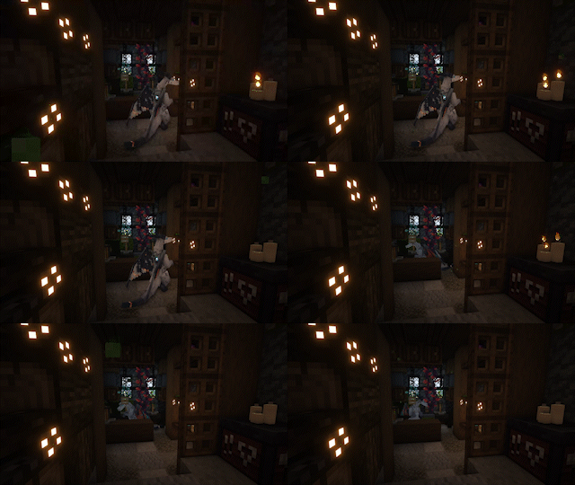

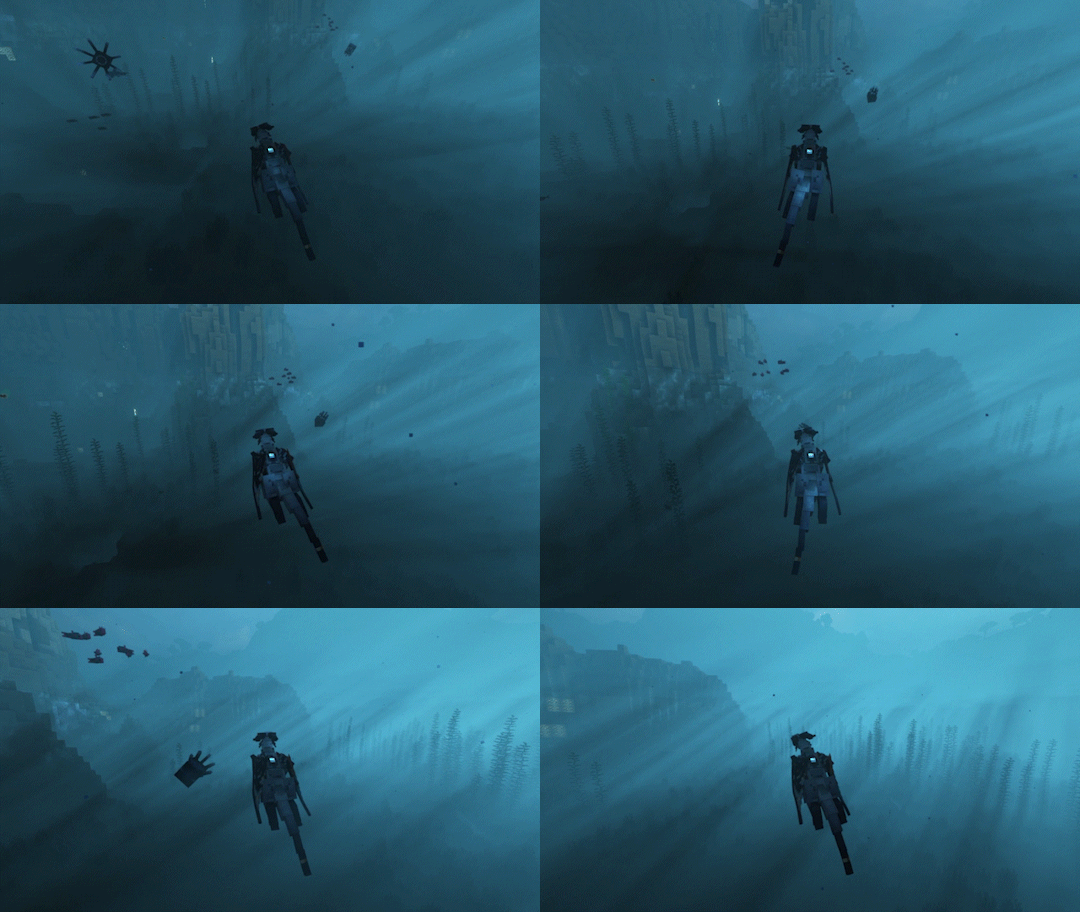
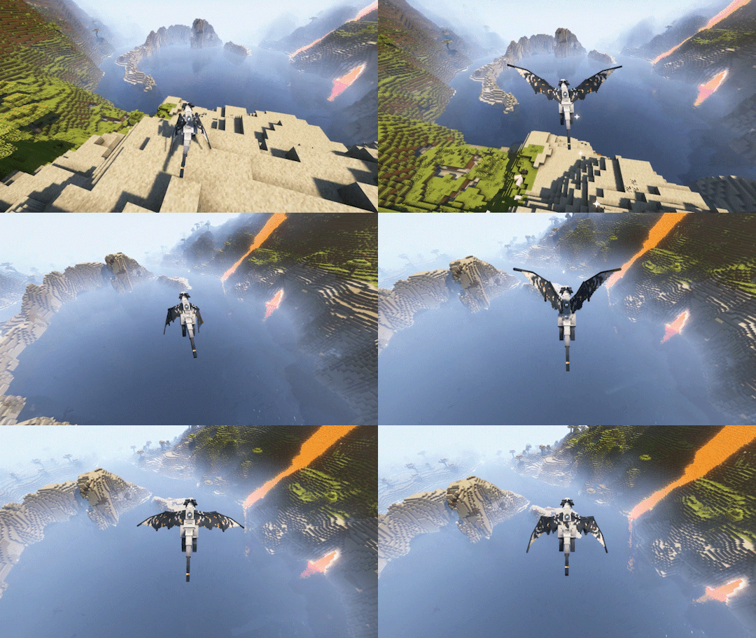
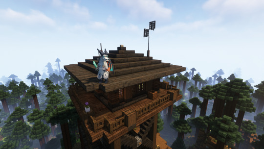
What if you woke up one day as a dragon 🐉(in minecraft)

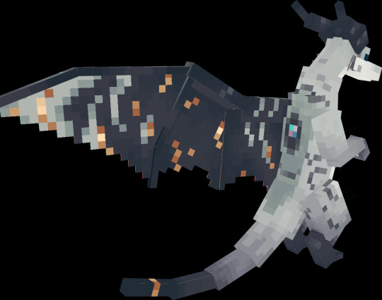
#I am so in love with this model that i made a whole gifset ♥#made from a template by the PiedPipeCleaner on the CPM discord!#and big shoutouts to hazel and casey for helping me with blockbench!#theres still a lot i need to do with this model before i consider it done btw#mainly just giving it a model for armor#but i had so much fun ill prolly dabble more with blockbench soonish#terminal draws#oc:strata#minecraft#mc#aberrations#dragon
2K notes
·
View notes
Text
-a few hobby hcs i have for some corries, more under the cut-
Fox: may not have time for it, but likes to collect guns and sometimes customize them to increase their power/strangness. He gives some of them silly names, and doesn’t let anybody touch them unless it’s an emergency. Keeping this hobby is a bit anxiety-inducing, because a lot of the guns he collects are actually illegal to own and use, and with the customizations added on, non-illegal ones tend to become illegal. He also likes solving those giant puzzles that you’re supposed to do with a group of people but alone; unfortunately, he never has the time to actually complete any of them.
Thorn: likes to collect knives that he finds, but does let others use them and borrow them, and in rare cases, keep them. He also loves to study vehicles and learn everything about them, and will talk your ear off about his favorite models of the month. He doesn’t have the credits to, but he would love to start collecting miniature models of speeders and fighters. Imagine every Car Guy shoved into one body, and that’s basically him. Also, likes skating because it’s faster than walking, and makes him feel a little cooler and intimidating, but doesn’t realize he actually appears more approachable.
Stone: loves drawing/painting whenever he can, and keeps a little sketchbook that he gets very shy about showing to others. He tries to draw mainly people, but sometimes likes to draw random animals and plants he sees while off-planet. He also loves reading murder mystery and romance novels. Specifically, he’s listening to novels he’s downloaded while on duty. He’s not shy about the reading, but doesn’t really like talking about the books with just anybody. He likes reading aloud to brothers and asking them questions like a teacher would, though.
Thire: more of a thrill-seeker than usual by clone standards, so he has more risky hobbies, like crashing parties when he’s got free-time, street/sky racing with random people, stealing “probably won’t notice it’s missing for a while” things from people before returning it days later, and skating just like Thorn, but usually without any protection and in dangerous spots. Has gotten in trouble with this multiple times, and even after his promotion, still does it. If he was able, he would love to go surfing.
Hound: likes to run and people-watch a lot. Running feels very natural and it’s easy for him to slip into that trance-like state and just empty his mind of any overwhelming thoughts, which happens a lot since I also hc him to be force sensitive to the smallest degree. People-watching is another source of learning what is and isn’t appropriate/expected of him in a more general sense, and he’s also just a nosy people person, so he genuinely enjoys watching people interact with the world around them (and hopefully, with him).
Jek: won’t admit that it’s something he enjoys, but considers himself a professional gardener in training. Whenever he’s able, he likes to pick flowers and bring them back to Coruscant for his brothers to see, but struggles with keeping them alive for longer than a few days. Stone helps with sending him books about plant-care, but Jek has trouble remembering it all. He is aiming to grow a small patch of berry and rose bushes somewhere close to the Guard HQ, and frequently gets other clones to help him build, find manuals, soil, make a schedule for it, etc. After he’s reassigned, he no longer continues with this hobby, but regrets every plant he doesn’t try to sneak back onto ships.
Rys: is still trying to find hobbies that he likes and sticks to, but tends to find himself fixing things for his brothers and himself after his Rugosa mission. “Things” is very broad here, and can range from small scratches on armor, to broken datapads, to broken bones. The commanders are secretly considering him for medic training just in case they ever need him to be an official one, but it’s not likely. He also fixes less physical problems too, like soothing anxieties & conveniently remembering things others forgot, but this isn’t usually on purpose. He once fixed a marriage on accident by convincing the arguing spouses to jump someone who lied and robbed them, something other clones find hilarious. His “fixes” are not always the best solutions.
-Fox also skates, but does it out of wanting to connect more with his brothers and train others to do it. It gets expensive since isn’t essential and covered by the Republic or Kaminoans, so only a handful of clones under Thorn’s command actually get skates. They share them between each other, but of course, they won’t always want to-
#radio.static#coruscant guard#commander fox#commander thorn#commander stone#commander thire#lieutenant thire#sergeant hound#clone trooper jek#clone trooper rys#star wars#star wars the clone wars#tcw#sw tcw#clone wars headcanons
56 notes
·
View notes
Text
"Deltarune Brawl!" Models

Its finally DONE!
And as a bonus these designs are free to use for any Deltarune/Undertale AUs (to the people who own their OCs. Please ask permission still if the OC isn't yours)
Attacking everyone below:
@somemismatchedsocks
@emthimofnight
@6larosie9
@silvers-starrway
@ekaycheem
@einelitas
@yellowvixen
@polkychu
@zhampip
@totaleclipse573
@sonlc
Skaerial
Lunateaq
Okay, so... I did all of the models from the Deltarune Brawl piece and lined them up. I also did a bonus Undertale fight screen version down below along with Soul types. I'll explain why I made the design choices I did for appearances along with explaining the Mobian Soul types.

Design Notes:
✨Stardust✨
Stellar's design is an almost fusion between her normal look and villain look, however she was granted shoes and a storage belt to carry items.
Camellia got a more modified princessy design that also felt more adventure oriented. Now with proper boots and a seperated two piece instead of a dress, she'd be able to move around a lot more easily.
Rime's hands and feet are actually now iced over, making her attacks much more volatile. But by contrast, her actual outfit appears more sleek and tight-fitted since most of the detail went into her hands and feet.
Sunshine is also a primary Healer, with her scarf being modified into a more cape-like appearance. She was also given a cross bag and connected belt with a pouch for extra storage.
Arthur is heavily knight focused with his design taking the most pointers from Kris.
Orion is pretty streamlined, with the only thing to note being the protective shoulder guards and the side cape. He is definitely a warrior type, but I opted for something slightly fancy while allowing for ease of movement and some protection.
Terios is also an attack oriented Mage, with a much longer cape and a cross belt to keep everything secure. The bracelets are just for decoration.
Juice doesn't like clothes at all since they're too restrictive, so to keep in line with her character I simply kept her original bracelet and just gave her a simple belt to tie the look together. And put her quills down. Her psychic wings are now always active and visible.
Keira actually comes with a retractable scythe, which can normally look like a sword and can be used as such on first glance. But with special attacks, it comes out like a scythe. Other than that her outfit was changed to allow for more movement.
Estelle's original outfit surprisingly fit deltarune, so I kept most of the original elements but chose to remove some of the capes for ease of mobility.
🌊Seafoam🌊
Kaiko was given visible vines and flowers in his quills and on his arm to signify him having plant powers. His original outfit was also modified to appear more combat oriented.
Maria always struck me as a combative type, hence her design wasn't changed too much besides providing extra protection in case she got hurt.
Tulip's outfit mainly serves mobility, however it does lack the shoes and gloves due to preference and not for convenience like some other characters.
Sakura's mainly a healing Mage, with her design being soft and calming as a result. Not much to say here besides thinking a cloak would look nice on her.
Nymph maintains her princess look with a more streamlined and less restrictive look. The skirt is also a back high low to prevent it from snagging from behind if she ran.
Rosemary was dressed in a more guarded and combative style, with the short skirt being a more stylistic choice and to provide some extra protection from injury.
Mallow is definitely more armored with knightly gear. But since she originally came with a dress I decided to give her a skirt instead.
Meredith is a more attack oriented Mage, and as such her outfit appears both flowy yet elegant. Even without armor the outfit is quite protective where it needs to be.
Naomi is very focused on both protection and movement for attacking, so her outfit comes with wrist and shoulder guards to protect from attacks along with sleek long gloves and socks with only the elbows, knees, and toes exposed for better flexibility. She also has a belt with a pouch for extra storage.
Azarael is a slightly modified version of her original outfit. She also has small fins at the backs of her legs to swim more efficiently but that's about it.
Character Types and Role explanations:
Each character has a primary strength and weakness of the group. This is mainly intended for balancing purposes.
The knights score in high defense but middle in attack and can't use magic.
Warriors have the highest attack and are somewhat skilled in magic, but lack defense hence they can get downed easily.
And mages have the highest magic casting, middle in defense, but lack the strongest attack.
For our roles we have...
Knights: Arthur, Rosemary, Naomi
Warriors: Stellar, Camellia, Rime, Sunshine, Orion, Keira, Maria, Mallow, Azarael
Mages: Terios, Juice, Estelle, Kaiko, Tulip, Sakura, Nymph, Meredith
And now, for the soul types.
Mobian Souls share attributes with human souls, yet respond quite differently with their own unique abilities. Everyone has a special soul type in accordance to their color. However, Determination is a human soul ONLY. It cannot be found in a Mobian or Monster. They also go by different names but still share similar qualities to the human variants.
Pink: Understanding. Special Ability: Teleportation.
Orange: Courage. Special Ability: Endurance
Yellow: Fairness. Special Ability: Strength.
Green: Compassion. Special Ability: Healing
Cyan: Humility. Special Ability: Levitation.
Blue: Righteousness. Special Ability: Shielding.
Purple: Persistence. Special Ability: Energy Orbs
And for main method of attacking:
Arthur: Sword
Rosemary: gauntlets
Naomi: Throwing Knives
Stellar: Shoe Blades
Camellia: Knuckle Busters
Rime: Cyrokinesis
Sunshine: Photokinesis
Orion: Katana
Keira: Retractable Scythe
Maria: Chaos Energy
Mallow: Dual blades
Azarael: Claws
Terios: Chaos Shards
Juice: Psychokinesis
Estelle: Photokinesis
Kaiko: Chlorokinesis
Tulip: Techopathy
Sakura: Chlorokinesis
Nymph: Pyrokinesis
Meredith: Hydrokinesis
#artfight#artfight 2024#sonic#sonic au#sonic oc#digital art#sonic fanart#🌸mine#text post#Spiritrune au
59 notes
·
View notes
Text
Mortimer Outfit Catalogue (Part 1)
hey there, stranger! have you ever wanted to see every single one of mortimer’s outfits? no? well, with me and @scummiezzz’s extensive knowledge on mortimer media, we’ve collected all mortimer fits known to the public into post format just for you! (but mainly for ourselves lol)
i’ll go over (and rate) each outfit from his animated appearances, while scummiezzz will do the same for his comic + video game appearances! let’s begin :]
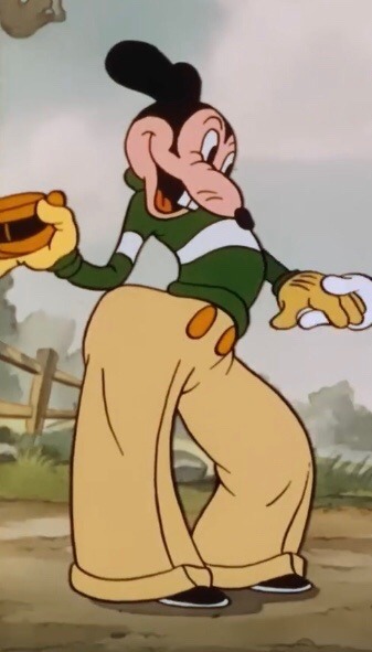
10/10
this is baseline mortimer. he establishes a common look for him, with the cuffed, striped sweater, the high waisted pants, the fancy hat. the pleats on his pants are a nice touch as well.

2/10
the difference in whites haunts me. i hate his shoes made out of ashes. why couldn’t he have just worn black or brown shoes? 😭
only getting 2 points because i did giggle when i found him in the movie.
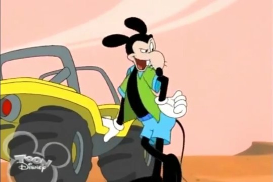
12/10
whoever decided his shirt should be unbuttoned should have gotten a raise 🙏
ALSO!!! HE HAS HIS TAIL 🥹🥹🥹
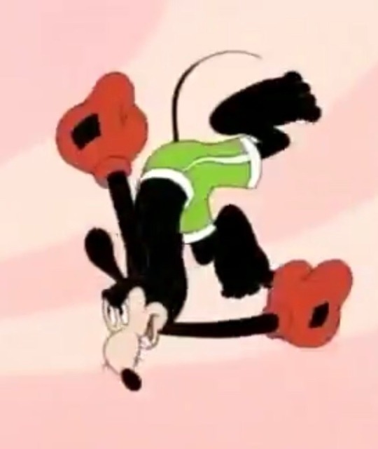
6/10
although this is a quick outfit for a gag, it’s interesting to me how they chose green with white stripes. they could have easily chosen blue, but they chose green. i like to believe this is a nod to his classic design, especially since this is mortimer’s first reboot appearance :)
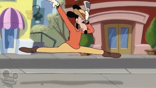
3/10
this design is lacking. i like how they tinted the gloves yellow to go with the warm colors of his outfit, and that they’re establishing his color as orange, but the hat throws me off idk
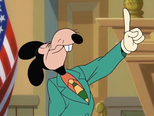
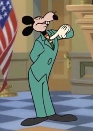
10/10
oh my god. the colors!!! the striped tie! the fact that he lied in court in this outfit! this is the epitome of mortimer! ❤️❤️❤️

5/10
i mean… it tricked the judge lol, decent disguise
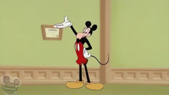
he even wears it again in “mickey’s april fools”!
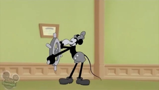
3/10
it served its purpose, but realistically, he can’t pull off the shorts. also does he have PECS here the hell???
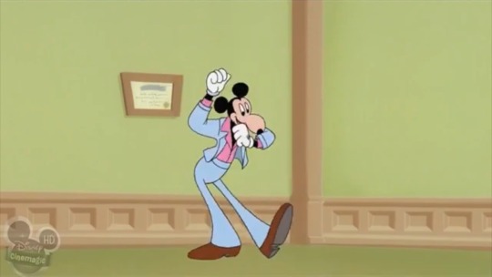
5/10
now this is more like it! there’s potential here. add a few patterns here, and a few bright colors there, and you got yourself an outfit made by mortimer!
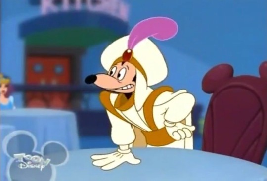
-10000/10
rating this gag outfit low because i cringe too much when i see this clip 😬
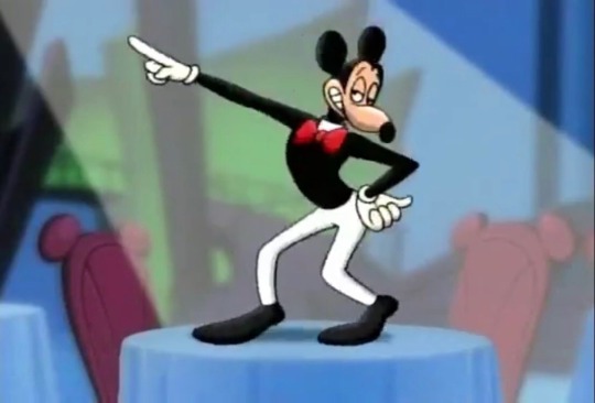
4/10
he just had this outfit on hand i guess LMAO
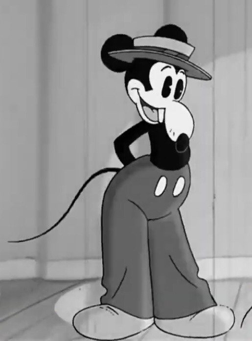
8/10
a great retro design for mortimer!! here, the hat works with the pants. also!!!!!!!!! he has his whiskers and tail :)
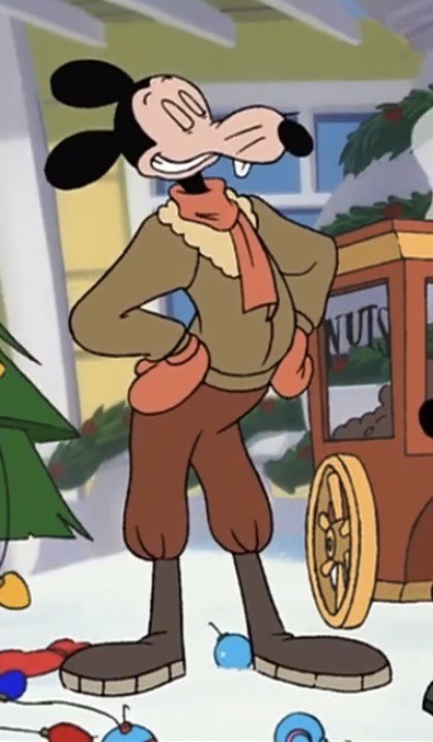
7/10
HE’S SO DEAR TO ME,,, he looks all nice and toasty for winter!! i like how they still establish that orange is his color in this series. it’s so cute how he tucked the pants into the boots. it gives this design a fun shape.
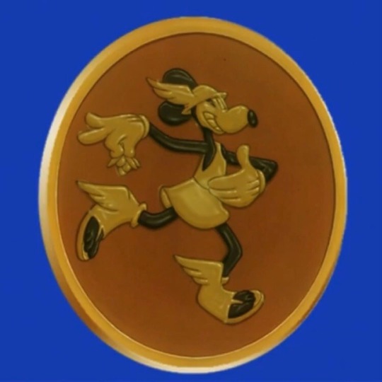
5/10
i don’t know what it is, but he can pull off this look. rated it a 5 because we don’t know the colors of this outfit.
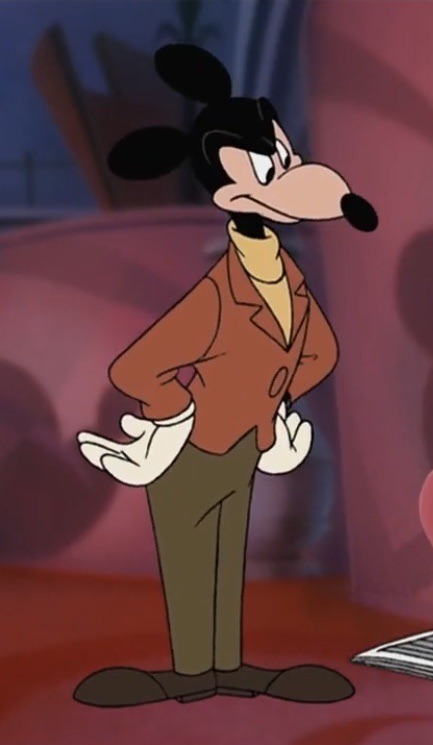
9/10
this is one of the first mortimers that comes to mind when i think of him, so it’s definitely an iconic look. the color palette goes so well together here. the turtleneck gives this a more casual vibe. looks like a modern revamp of the suits he used to wear in the comics. :] (ALSO love how they made the jacket cropped, that was such a good move on their part.)
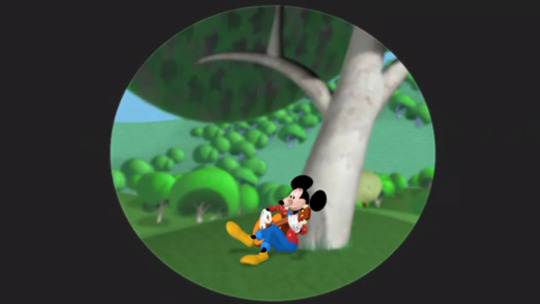
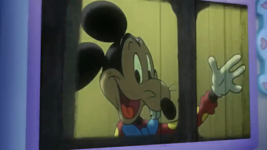
7/10
ngl… this one’s pretty endearing to me. awwwww, the primary colors. he’s wearing cuffed jeans??! THE BOW TIE IS SO DORKY… i guess you could say it ties the whole outfit together :D (BOOOOOOOOOOO)
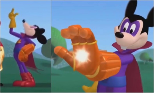
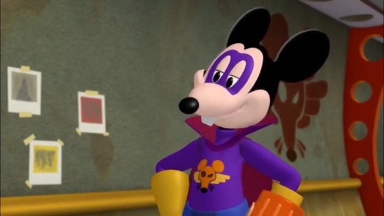
8/10
he’s on model, with his own personal emblem and a dramatic collar?? you know i gotta rate that high.
also reminder that mortimer somehow obtained (or even created???) this glove of inordinate power.
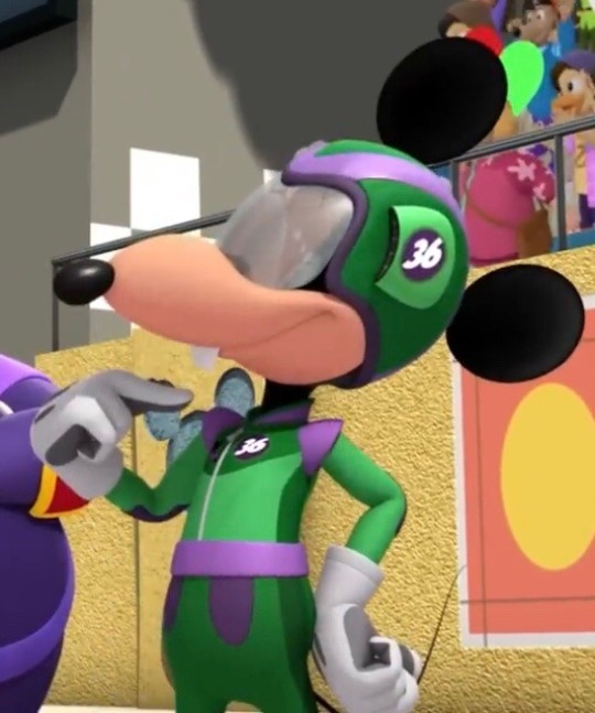
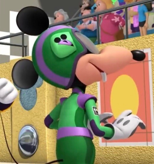
5/10
i’m pretty indifferent to this outfit, but i do appreciate how they gave him his own emblem (again) and made his number 36, which is a nod to the year his original short was released!
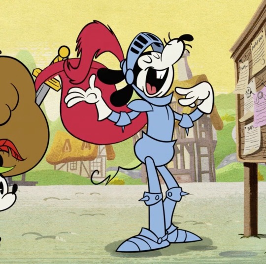
7/10
you can’t go wrong with armor!
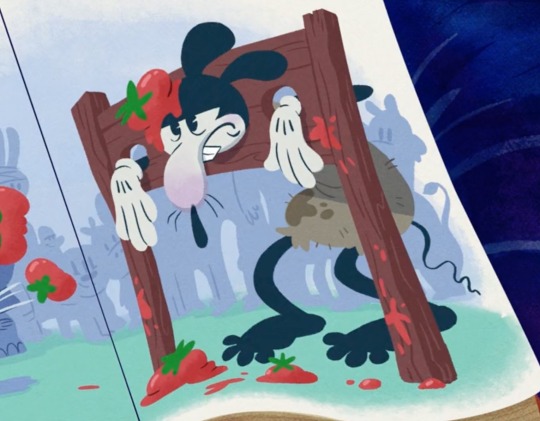
2/10
strangely, this matches him… 🤔 /JOKING
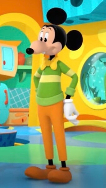
3/10
i don’t know what it is, but i just can’t like this outfit. maybe it’s the big pupils combined with the round ears that makes him off kilter??? i don’t like the choice of colors, nor his bowtie here. it’s nice that they added cuffs to the ends of his sweater, tho! (and they gave it a stripe :,))
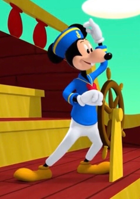
4/10
i definitely like the sailor’s hat, but the rest is just okay. (shrugs)
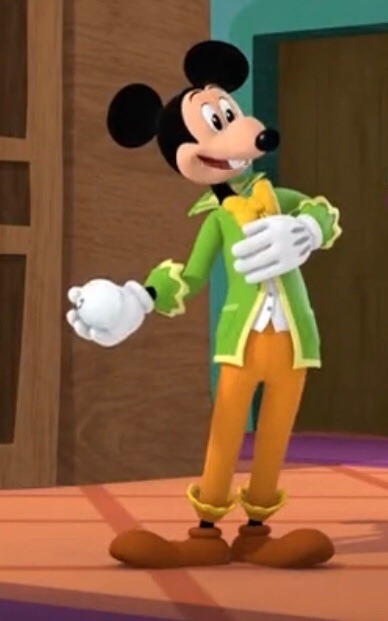
6/10
i like the frilly bits and the bowtie here. he’s at a ball, of course he would wear something formal! the collar is always a nice touch (so dramatic XD)
(link to part 2)
20 notes
·
View notes
Text
Death Mask Steph
Oh boy. This is the big one. I've agonized over this, and getting the design right has been... ugh. Nevermind. Here we go.
Death Mask needs to draw on Red Hood and Steph designs. (I would draw from Black Mask designs, but frankly Roman's designs are all kinda boring? He's a skull-head in a suit, and basically always has been; it's simple & effective, but there's not a lot to iterate on there.) Steph's suits tend to be armored one-pieces, but layering is so crucial to most Red Hood designs, that balancing the two has been... tricky.

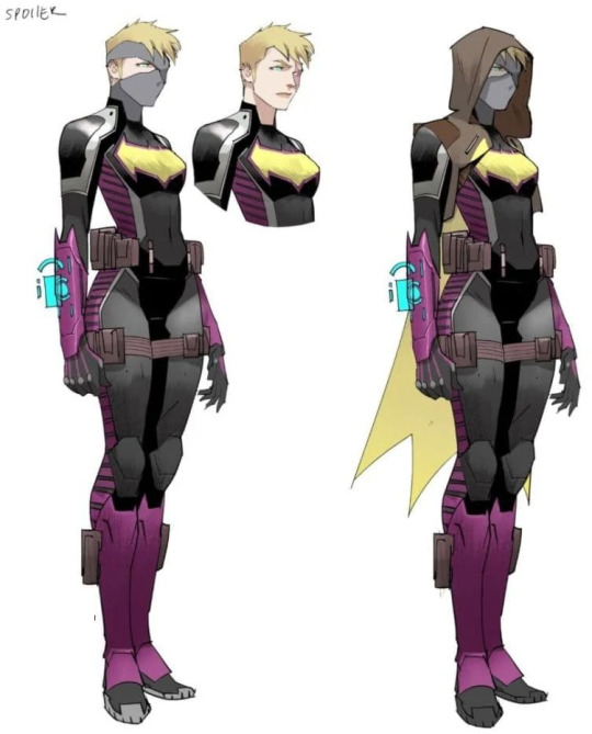
(I've already shared the Stephanie Brown Costume History page. Unfortunately, the n52 designs page seems to be just descriptions with no pictures, and the page for her n52 appearances doesn't give you many good angles. So here's Steph's "Future's End" & "Future State" designs, as the stand-out missing designs, in my opinion.)
The absolute vital part of any Red Hood inspired design is, of course, the helmet. It's also been the biggest pain. Jason's had some good helmet designs and a lot of bad ones over the years, and (as I've previously stated) finding a full reference page for them is basically impossible. So here's what I'm going with.
Steph starts with a sleek, sculpted black metal base. Say something like this model of Jason's Injustice helmet. The primary difference would be that Steph's helmet opens up at the front rather than the back; the faceplate would be hinged at the top of the head, and it would swing up & forwards to reveal her face.
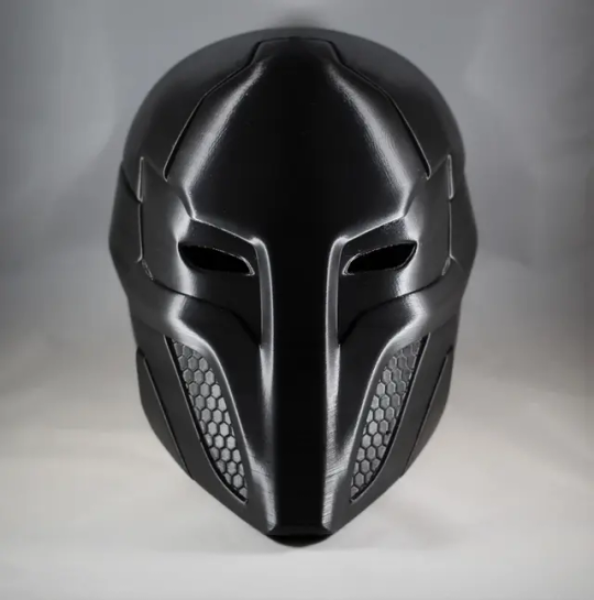
(Using the Injustice helmet as a base because it more than most looks like it really should open from the front. I'd also say the sides would also be able to open wider, so that it can still fit snug without being a pain to get in & out of. Not that anyone would ever bother to draw that detail, but I think it would look neat opening up in 3 directions all at once.)
Next, most of the face plate is covered by a sculpted skull. This is how she invokes the whole "Death Mask" idea, as well as purposefully stealing Roman's gimmick. Below the teeth are a couple understated tubs & valves, evoking a gasmask---something like this.
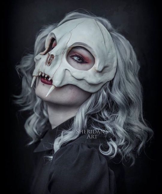
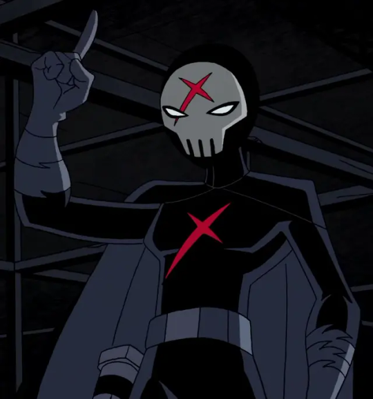
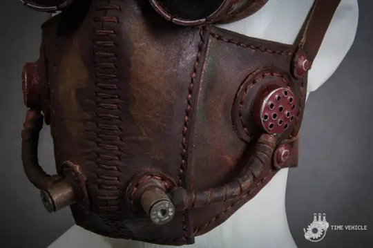
(Kinda a Red X look, I'm realizing now that I'm digging through my reference folders all at once... Anyway, this piece seems to be by Laura Sheridan, but her website seems to be down, you can only buy her art seemingly 2nd hand, and I can't find this picture listed anywhere but pinterest.)
The edges, mechanical bits, and any detail work added should be done in copper.
Within the eye sockets are two recessed glowing lenses, like Jason often has, though Steph's glow a dark magenta, casting light that borders on red.

(Obviously, these lenses change size & shape to show emotion through the mask, like you do. They're not designed to---in fact, logically all the bat-masks are designed like this in order to help hide the wearer's emotions---but that's comic logic for you.)
Below the helmet, Steph's suit is mainly made up of reinforced black leather motorcycle pants, a black undersuit, and an armored vest like this.
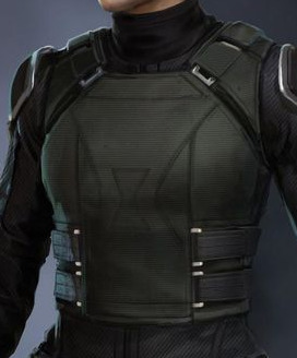
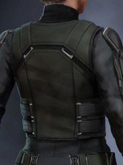
(But black. Obviously.)
However, she accessorizes. Steph has added a decorative metal ribcage to her armor, as well was plates mimicking a spine. The ribs should be copper-colored, while the spine can be either metallic or black.
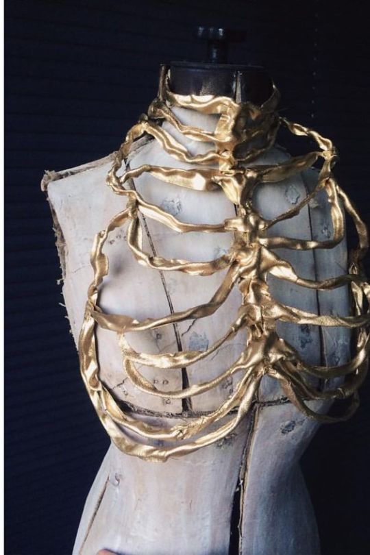
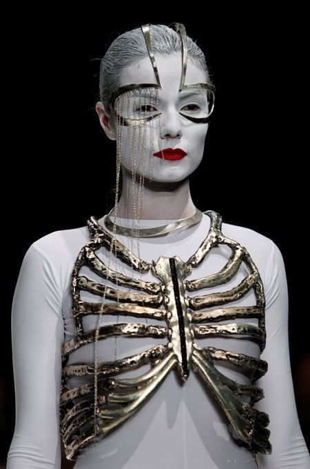
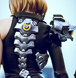
(Depending on who's drawing them, the ribs could range from purely decorative to practically another layer of armor. And following the links from pinterest, both of those artists have apparently taken their rib-art down, which is once again very disappointing.)
Steph wears a chunky utility belt which sits crooked on her hips. I personally think it should be black (maybe brown?) with either copper, ivory, or dark magenta snaps/clasps holding the pouches shut (pick one for all pouches, not a mixture). She has a gun holstered on each hip, one on each thigh, a set of throwing knives (3-5) on the front of the belt, and wears her sickle-swords strapped criss-cross on her back.
The swords themselves are made from a copper-alloy, retaining their coppery color, and easily double her reach (are about as long as one arm.) They have a hilt not dissimilar to an Egyptian khopesh, but a completely different blade; Steph's swords have a much more exaggerated curve, and crucially, they're sharpened on the inside of the crescent, where a khopesh is sharpened on the outside. They legitimately look like a crescent moon sickle, stretched out to sword size.
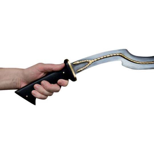
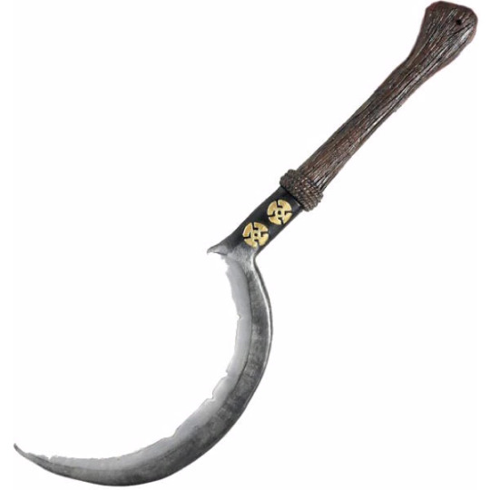
(Khopesh hilt, and genuinely the best crescent sickle sword I can find for what I'm picturing. Steph's would be in much better shape, obviously.)
Steph keeps it understated-but-still-stated with knee-high, buckle-up, black leather motorcycle boots.
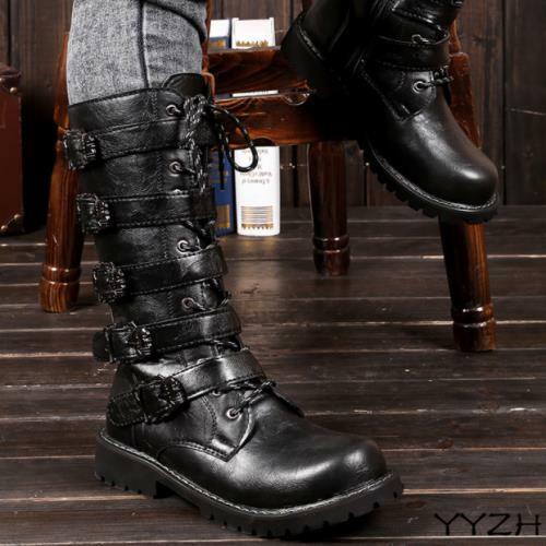
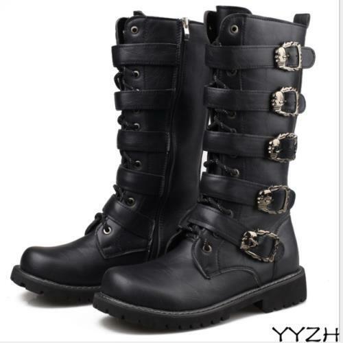
(These are mid-calf, but it's the closest I can find that aren't completely over the top. Also, any artist who figured out how to make the laces work without losing the straps would win my unending love for the symbolism of Steph clearly still mimicking her big brother but trying so hard to hide it.)
Steph’s sleeves are armored in black metal plates, ending in sharpened black gauntlets. I don't care much about the specific structure, I just really want that clawed look.

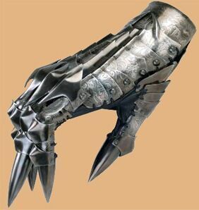
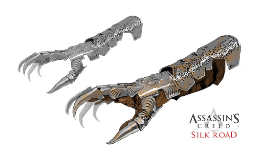
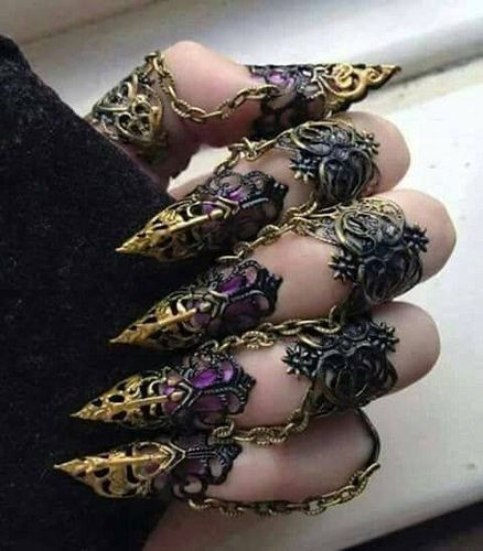
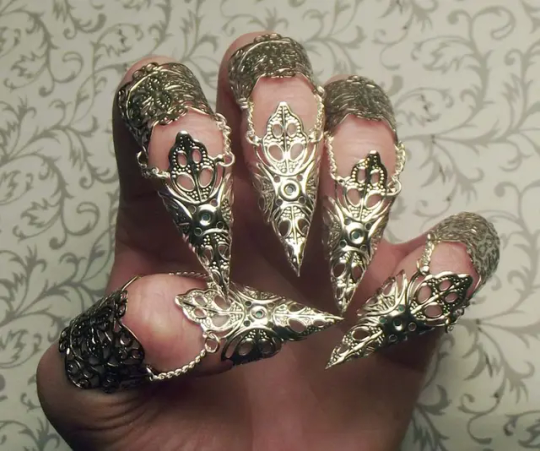
(Shorter would be more practical for finesse work, while longer claws could be worked into her fighting style. I am going back & forth on whether this should be both arms or just one of them, because I’m a sucker for asymmetric designs, but I think it might be a bit too much with all the other details.)
Finally, over top of it all, Steph wears an uneven ivory-colored hooded shawl made of layers of thin, wispy fabric. It hangs down her back to her waist, but bunches up in the front over her collarbones. It's purposefully designed to look tangled & messy, hiding her body shape with all its bulk & fly-aways, and is flimsy enough that grabbing hold of basically any part of it will just leave you with a fist full of torn fabric.
This is the hardest to find examples for, but... okay, so it's shaped roughly like this:
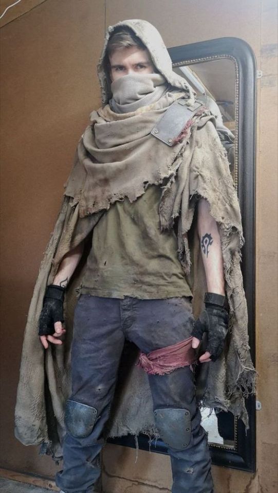
(If anyone can find the non-pinterest source for this one, I'd hugely appreciate it; all I'm getting is a dead twitter link.)
It's layered like these:
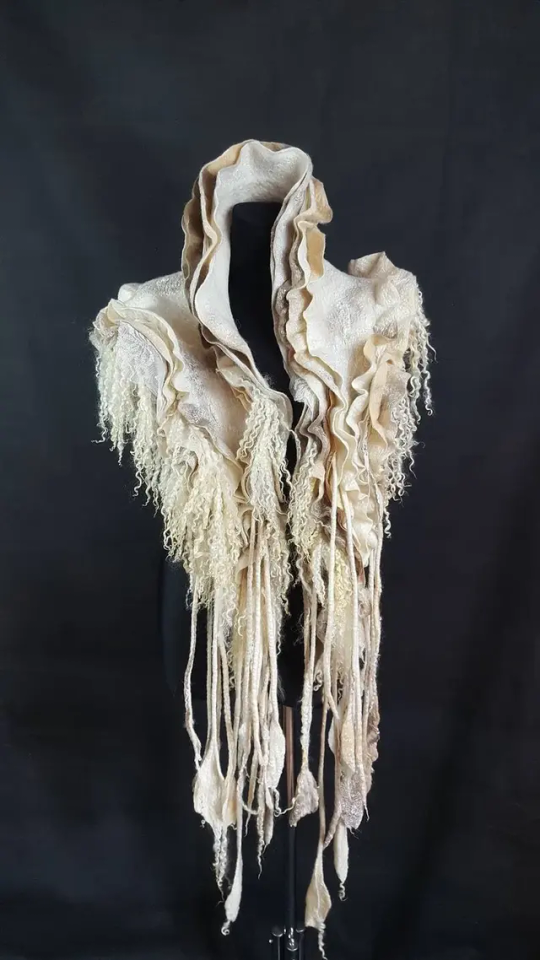
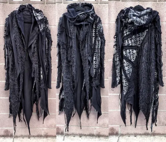
And it's made from material like this:
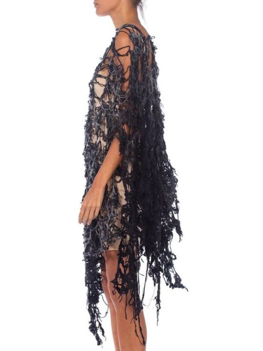
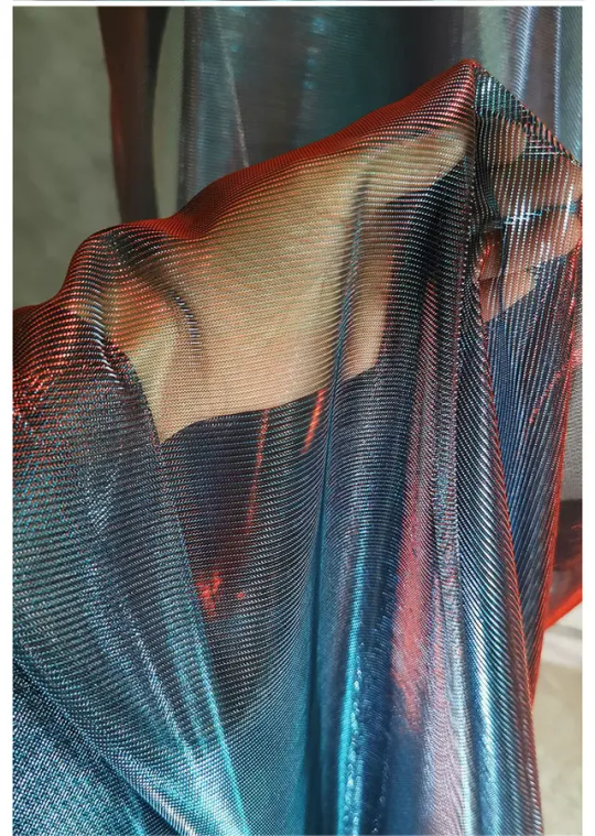

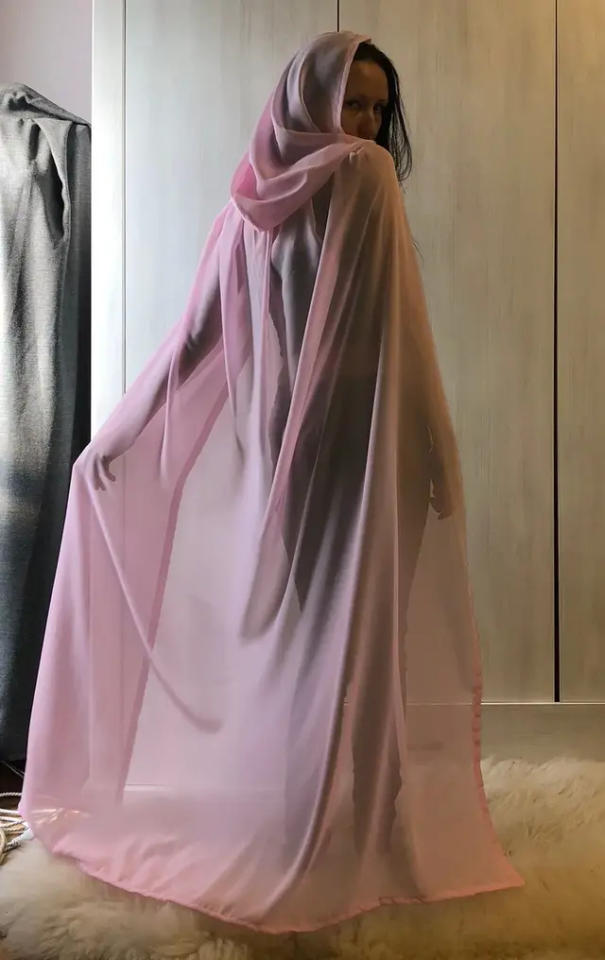
(This definitely gets swapped out for either a white scarf or a brown trench coat pretty regularly, just because those are easier to wrap your head around/draw. I think both could work & be cool, but Steph is trying to give off “undead vibes” with this original costume, and this gives her a more ghostly look which… okay, is heavily inspired by this Jason design.)
Also, Steph's hair is still long, but she ties it up in either a french or dutch braid before going out most of the time. Dutch is for going out in public or to the gym, where she'll lift it off her neck in a ponytail, french then gets coiled into a bun inside of her helmet.
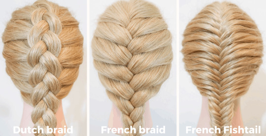
(I am undecided on whether or not she also has an undercut.)
#rh!steph#red hood!stephanie brown#red hood!stephanie#red hood!steph#red hood stephanie#red hood stephanie brown#red hood steph#reverse robins#reverse!robins#reverse robins au#reverse order robins#reverse order batkids#reverse batkids#reverse batfam#reverse batfamily#batfamily#bat family#bat fam#batfam#batkids#bat kids#batsiblings#bat siblings#stephanie brown#costume design#my writing#mine
64 notes
·
View notes
Note
I just saw a post calling ahoska and obi wan anakins truest loves and uh what? It brought up the mortis arc of tcw and essentially minimizing the anidala love for one another as some form of escapism and how its poison ( even tho vader literally gets saved bc of luke - padmes son🙄) Its so strange how ahsoka fans want to make her a more prominent character than she really is. Also a recurring opinion that gets brought up is ahsoka knowing/understanding anakin better than padme and obi wan when she didn’t even know things about him (like he was a slave) and we consistently see anakin confide in padme its just so odd how alot of star wars fans diminish her
That doesn't surprise me at all since Star Wars is Ahsoka Wars at this point. And even if it wasn't, you have to give the Skywalkers at least some rest uk? The constant retconning and addition of new stuff most people didn't even ask for is tiresome. Ahsoka from the start felt very OC-ish to me because she was constantly hyped and favored in a way not even Anakin was. She felt like a self-insert jedi character so her place is canon is just weird. And forcing her to be important in places where she's not needed just shows Filoni's favoritism. At least GL wasn't ever really biased towards Anakin and Luke. Anakin mainly suffered through so much and had enough flaws and complexies which Ahsoka never had. She's constantly in a plot armor and just overpowered imo. But ofc she's a badass Jedi so she is more popular than Padme. I cant even.. I just hate the way TCW and Filoni wrote her. I don't see Anakin as being a big brother to anyone. Or being a teacher. The only other natural interaction he has except Padme and his mother is with Obi-Wan and even that took time. They didn't get along well in the first two movies and although he does joke around with Obi Wan in ROTS, he has his own slightly awkward and shy way of doing it. And I imagine he's semi reserved and shy with other Jedi. Or when we see him interacting with Padme's family. But to make him a responsible master is strange because even in ROTS he was too young and not mature enough to be level-headed and responsible all the time. And I like that because he has flaws but he was trying to learn and wanted to be a good father. And I do believe he really gained that maturity (which was stunted due to obvious trauma) and fatherly affection for Luke after ESB and not before. I think he would have had trouble connecting with Leia as well post ROTJ because he wasn't prepared to and had no experience being a role model for anyone. Meanwhile, 22 year old TCW Anakin with Ahsoka acts like a 30 year old man with anger issues...
It's also frustrating to see Padme being reduced to a love interest when she was a main character and part of the trio. She, like Han, didn't need to be a Jedi to be one of the main characters and it's boring to see a trio of Jedi only. I don't really blame Ahsoka fans - only Filoni for constantly dragging her into everything and I'm glad it's backfiring because I see fans who previously liked her are beginning to get tired of her being shoehorned into every single SW thing and acting all Mary Sue. Also, see the amount of concept arts and storylines they wrote for Padme during the prequels. She had more arts than Anakin and Obi-Wan. GL clearly wanted her to be important even more than Leia in ANH because we see much more of Padme and the first movie directly involves her and her planet with Anakin's discovery being a sideplot. It's disrespectful to reduce her to a love interest.
This video puts it really well (although he isn't a fan of the prequels as far as I can remember): "Dave Filoni's biggest problem as a writer apart from his complete inability to write interesting dialogue or craft stories that are more than just fetch quest for Magical McGuffin or create people who actually make smart decisions or his borderline fetish for the boring mediocre character he's trying so hard to insert as the driving force behind the entire Star Wars narrative is his constant [ __ ] around and reconning of past events and World building to suit the needs of his own narrow story. It's like he's staying in a hotel room for a couple of days and decided that he now has the right to completely remodel the place because he feels like it. This isn't your job Dave you're supposed to work within the rules of the world that George created not write a whole bunch of new ones just to suit yourself that now affect everyone else."
Lol applause for saying that out loud
39 notes
·
View notes
Text

Tankiste Operating Inside the Tank
This is an impression of a French tank crewman operating inside their tank. One may see this uniform on tankiste when in their vehicles during battle. The iconic leather 'Veste en Cuir' can be seen, similar to the coats worn by the Paris Fire Brigade. These coats were mainly issued to motorists and tank crews, however its fire-resistant qualities meant that flamethrower troops also wore them into battle. Many variants of this coat exist and the model shown here is a standard double-breasted version with a leather collar and left breast pocket. Other more common examples would feature a felt collar. The black coat was worn over the light blue tunic as its color masks the constant bombardment of vehicle oil and grease the tankiste would attract when operating inside their vehicle. Burn resistant gloves can be worn as well, mainly used to handle hot extracted shells from the tank's guns.
What is truly unique to the tankiste uniform of the Great War is the tank crew splatter mask, seen looped around the neck and worn. When bullets and other projectiles impacted the outside of the tank, the shock of these objects would sometimes cause the armor to spall on the inside. Flakes of armor would fly off inside the tank and depending on the impact strength and size of the spall, could cause irritation, wounds, or even death to the crew. By far the number one leading cause of injury in the tanks was head injuries. Because of this, the British would design a splatter mask that protected the wearer from medium to small sized armor spalling and burns. The masks consists of a steel faceplate perforated with horizontal slits with a nosepiece and chain mail covering the lower face. The faceplate is covered by brown leather on the outside and chamois leather on the inside. The mask is fastened to the face using four canvas ribbons.
The AS would obtain the masks through American officers who had trained with the British tankers and 1,840 masks would be first issued to crews of the Schneider CA and Saint-Chamond tanks in May 1918. The first three light tank companies’ part of 501e RAS named AS 301, AS 302, and AS 303 would also be entrusted to test the splatter mask in real battle conditions in late 1918. While the mask was effective in protecting the crew's face from spalling, many would opt to not wear it in order to maintain unobstructed visibility when inside the tank. This is an original example which I am incredibly happy to have as they are quite rare nowadays.
Another unique piece of kit for the tankiste was their Adrian helmets - or more specifically the modifications the tankiste would perform to them. As the Artillerie Spéciale was considered to be part of the regular artillery, the tankiste were issued standard Casque Adrian Modèle 1915 with the artillery badge of a flaming bomb over two crossed cannons. The front brim of the standard Adrian helmet did not allow the tankiste to get decent visibility through the 5 mm wide vision slits on the tank, so the tankiste would cut off the front brim to allow for closer viewing. Some modified helmets would have makeshift padding of either cloth or leather on the front of them. Others just folded over a few millimeters of the brim so the sharp edge of the cut was not exposed. The modifications would begin to be seen in late 1917 and was widespread among the crews by late 1918. It would spread naturally through the tankiste in the field and by the time that Generals had taken note of the unauthorized modifications, they would have already seen the combat improvements this modification would give the crews and allowed for it to be done. This helmet features the second model liner with six teeth and four corrugated aluminum spacers which reduce helmet wobble. The leather helmet liner was fixed onto the Adrian helmet through the use of two spikes on each side which puncture the scrap wool outer panel on the liner and are then folded over to secure the liner to the helmet.
Also pictured is a pair of civilian racing binoculars. It was up to the tank commander on whether they wanted to purchase a pair of binoculars for use in the tank. There were several options available at the time, both within military bazaars and within the civilian realm. Soldiers equipped with basic civilian binoculars was not an uncommon sight.
We also see the use of a flare pistol, specifically a Pistolet Géant pattern flare pistol designed by Manufrance before the war. As a tankiste within the Artillerie Spéciale, a flare pistol such as this would be used to signal supporting friendly artillery to lay down smoke shells to mask the tank's movement during attack. Each tank was, in theory, provided a flare pistol for this purpose. Smoke was important for masking the movement of the tanks during the attack because the tanks main threat apart from mines was accurate German artillery fire. There were several methods the AS would use to prevent German guns from being able to engage the tanks such as having an aircraft that would accompany the advance of the tanks. This aircraft was mainly tasked with directing counter-battery fire on enemy artillery. A further six fighter aircraft would be attached to protect this plane from responding enemy aircraft.
#history#tanks#renault ft#technology#world war one#reenactor#uniforms#reenacting#reenactment#reenactors#tactical gear#uniform#ww1 history#world war 1#warfare
10 notes
·
View notes
Text
2023 Minecraft Mob Vote
What I learned about the armadillo that Minecraft is modeling theirs after:
Did you know that there are around 20 different types of armadillos, but only two types that can roll into a ball?
That's my way of sharing a fact and saying that I have no idea which one Minecraft would be basing theirs off of, but I do have some facts about the creatures that may make it into the game if you end up voting for this strange creature! (I've made one of these for each of the creatures and I'm, so far, partial to the penguin)
Fun Facts:
Armadillos have bad eyesight but a great sense of smell - This means that they may be very good at detecting you or very bad at it. Will they be able to smell you coming or never notice you because they can't figure out if you're a tree or not?
Armadillos have sharp claws - Not only can they defend, they can attack back! Perhaps messing with these creatures could leave you with some battle wounds.
Armadillos can hold their breath for about 6 minutes - They crawl right through rivers and streams without any issues. They also can swim by filling their body with air, swallowing it, and paddling across as they float. They probably wouldn't drown unless trapped under something.
Armadillos burrow underground to sleep for up to 16 hours - we could possibly find them in the many small holes and caves of the Savana or maybe they'd simply pop out of the ground like a tiny warden. though they might be harder to find as they tend to sleep for long periods of time.
Armadillos aren't territorial - They'll gladly give up their burrow or feeding grounds if it means avoiding a fight. No worries about invading territory it would seem. Though they are quite fast if you're trying to catch one, so hopefully we won't have to.
Armadillos are most active at dawn and dusk - when the sky is still bright but the sun isn't up in the sky. These critters are considered nocturnal so you might have to venture into the night to find them.
Armadillos mainly eat bugs but also small reptiles and amphibians with the occasional egg or plant - We may see bugs be brought into Minecraft, more than just silverfish, endermites, bees, and spiders! Creepy crawlies!! Perhaps they'll be able to eat all of these creatures. Imagine that, an armadillo killing a Minecraft spider!
The nine-banded armadillo can jump 4 feet into the air but can't roll into a ball - Only three-banded armadillos can roll into a ball and that's what Minecraft has advertised so I don't think we'll be getting any new high jumpers, but it's still a fun fact!
Remember that what we've been told so far about the mobs that we're voting for is just a little of what we could get and it may be different in delivery to what we expect and hope for. The dog armor will probably only be the one type and un-dyable as it won't be made of leather. The armor may not work against all types of damage. The armor might break very easily. The armor might not be able to be taken off once it's on.
We also could get some unexpected good things though! Perhaps it will be dyable. It might never break. You might be able to use armor trim on it. you might be able to enchant it.
#sorry's thoughts#minecraft#armadillo#mc mob vote#mc mob vote 2023#mob vote mc#mob vote mc 2023#mob vote armadillo#mob vote penguin#mob vote crab#crab#penguin
6 notes
·
View notes
Text
Continuing with the Magic Knights Rayearth models today completed and present the next model Windom, the Rune Spirit of Air. Piloted by Fuu Hououji. While personally was not my favorite character or mech from the series, still important to have as part of the complete set.
Review:
The model over all was a easy build over all, again came with a pre painted face and sword this time the model is mostly color accurate to the show, needing only the tips the fingers to be painted silver to be a hundred % accurate to its art. The kit does come with some silver stickers to put behind some of the gems which really helps them pop, however in this instance I did opt to just pain the areas silver instead while not a reflective as the foil still gives a good overall finish behind the gems still helping them catch the light. The build difficulty/time is on par with a HG 1/144 scale Gundam of simulator complexity, though it’s a 1/100 scale in total size.
The parts fit snuggly and easily together. With the joint again being all hard plastic with mostly smooth movement that hold in place well. That said their are a couple points that I think could have utilized better part design. The first is the base wing mounts they are hook and eye connections at the base of back so only offer side to side movement. I feel a ball and socket joint would have been better for a wider range of motion. The next part are the hip armor skirts. While they used a ball and socket at the waist, the connection to the armor was another hook and socket which made it awkward to get in to a position and I think needlessly restricted movement of the parts. Lastly the feet, much like with the Rune God, prior the feet are really restricted in the movement, mostly in the forward direction. Which makes it difficult to get to stand on its own with out making it lean forward awkwardly from the hips/waist to counter balance the wings in the back. Basically requiring a base for it to be upright in almost any pose. I think if the golden portion of the ankle was allowed to move even just up and down that would have helped. I expect similar with the remaining two models. That said as a saving grace, the head has much better range of then the Rune God, and all the other joints and points of motion are good and work very well.
The wind effects in this photo, are a separate kit that that you can get for about $9.00 from Good Smile Co. and and each of the three sections come in three parts with the assembly instructions on the back of the box. They where also easy to assemble, with snug fittings and have decent balance not tipping over too easily. And definitely add a nice look to Windom, so I am glad I picked them up and also got the ones for the remaining two. Sadly I couldn’t find similar for the rune god, but I think the translucent sword and angle wings make it sand out just fine.
In closing I still say the over all it’s definitely not a bad kit, and if a Rayearth fan and or a fan of the air spirit totally worth picking up if you can. I am going give it a 3.5 out of 5 mainly because it can’t stand on its own due to the feet issues. The model can get picked up directly from Good Smile Company’s website for about $30 plus shipping if it’s in stock still. Though I have seen other prices ranging all the way upward of $60 from third parties.

#plastic model#magic knight rayearth#mahou kishi rayearth#Windom#fuu hououji#gunpla#spirit of air#Rayearth#model kit#magic#wind effects#green#mech#magical girl#clamp anime
9 notes
·
View notes
Text
Some thoughts about healing in combat in games
Hey, I'm no game designer, so please be very critical of everything I'm about to say. Please do say if you don't agree with me, I'm very much in need of external point of views. Also, everything following is my point of view. If you find that I present it as general truths or whatever, this is because I have a hard time expressing myself correctly. Autism will do that.
I've thought about a way of representing and considering combat in games. What triggered this was my frustration about how healing and anti-healing mechanics are handled in games. Mainly, the two games that inspired this are Paladins and League of Legends (yes I know, "league cringe", but that's besides the point)
What I'm about to describe is the way I use for modeling HP-based combats when considering balance. Like all models, this will be very inaccurate when considering actual examples, but it serves as a basis as to how tackles the problems existing in games.
With all content warnings done, let's dive-in:
Hp-based combat, for a lack of better name, is what I call combat where fighters have a set quantity of hp and have to bring their opponents' to 0 before them. We can start the model as two characters, each having HPs and dps. The metric as to who will win is whichever of the two has the lowest "required time to kill the adversary". Here, in the simplified model, it is computed as "kill time = Opponent HP / Your Dps"
Dodging, attack range, and many other mechanics can be translating in these terms: dodge lower the opponents dps, range delay the moment the enemy starts to dps, etc.
In such a context, it is important to notice that the two variables we have, health and dps, have a diminishing returns effects. If you go from 1K hp to 2K, you doubled the time required to kill you. If you go from 10K to 11K, it's just a 10% increase. Meaning that an opponent with a higher dps will be less impacted by that extra HP. The same goes for DPS.
To understand it mathematically, in the computation "HP / DPS", you may say that increasing HP increase the time linearly, and yes, but it only does so while DPS is stagnant. So, if you increase both HP and DPS linearly, at some point DPS will take over. And increasing DPS linearly does not reduce the kill time linearly. It will only reduce it by a lower and lower amount.
Diminishing returns are an important factor in balancing these types of combat. They encourage diversifying your stats, and overall they prevent situations where an opponent could not be taken down in a humanely reasonable amount of time, or situations where an opponent is killed before they got to play.
This is why, for example, when you introduce other variables to the model, you design them in a way that includes diminishing returns. If you were to introduce a defense value to the model, under the form "the damage dealt to a player per second is dps - defense" then you'd get a situation where, since dps has diminishing returns, defense, instead, would get increasing returns. It can be seen when you rewrite the formula: "kill time = HP / (DPS - Defense)". The closer defense gets to DPS, the closer the kill time gets to infinity. So very few games design their defensive stats that way (and those that do do it for reasons that are specific to their games, so I won't include them in my reasoning)
The way League of Legends handle defense, for example, is by giving you an armor stats that translate to a "percentage of damage reduced" value. Kill time would look like "kill time = HP / (DPS * (1 - damage reduction))". Damage reduction itself still has increasing returns, but the way armor converts to damage reduction uses a formula so that it reintroduce diminishing returns. The exact formula is complicated and I can't be bothered to look it up, but basically 100 armor = 50% damage reduction, and as armor increase it gets closer and closer to 100% without ever reaching it. It makes it so that while tanky characters are encouraged to get some armor, you will need other defensive stats at some point.
So in the words of Voltaire, all is good in the best of possible worlds.
Let us talk now about healing. Healing is the amount of HP a fighter regains as time progress. They exist in different forms, but most of the time it's in the forms of "I get set amount of hp upon casting an ability" or "dealing damage heals me for x% of the damage dealt". In the model, we will represent them both as "per second, I heal x" as it is close enough to what actually happens in games.
Now, remember when I talked about defining defense in terms of your opponent's dps so that you never get unkillable ? Well, it is quite hard to define healing that way. Removing defense from the formula and adding healing, it now looks like "kill time = HP / (DPS - Healing)" which as you remember is exactly the formula I described as being problematic. Healing CAN causes you to go infinite. The amount of damage you need to deal to kill your opponent increases with time, which in turns increase time needed to kill, wich in turns increase the HP needed to be dealt, etc.
There are plenty of clips from PvP games where a character cannot die because they reached a tipping point in healing amounts.
And unless my model is fundamentally wrong on a point I failed to consider, game designers are very much aware of it. We keep including healing in PvP games because it is a genuinly fun mechanic. I love playing healing supports and being the one to bring my friends to glory. I love lifestealers and the dopamine I get when I'm so close to death and yet so far from it. When the only way out of a fight is to kill my way out of it (yes I am very much a warwick mid enjoyer). And I'm clearly not the only one appreciating a good healer. But because of the increasing return nature of healing, which means there is a tipping point where healing goes from useless to overpowered, many games have to include counter-balancing measures.
Battlerite made a mechanic where damage would also reduce your max HP by a percentage of it. You couldn't heal above it, and even with infinite healing there would be a point where your max hp is just 0.
I'm ... not a fan of this. First, there was something that didn't really tick for me in Battlerite, and I didn't enjoy the combats for some reasons I couldn't really put into words, so I am biased here, but the issue I have with this approach of anti heal is that it does not make it have diminishing returns. it just straight up puts a ceiling on it. Healing continue to have increasing returns BUT past a point it stops doing anything at all. And I don't like that. If I increase some stats on my character, even if I increase the wrong ones, it should always help me a little more.
League of Legend and Paladins took a different approach. There, you can buy items which reduce the healing the opponents get under certain conditions. The healing reducing is a set percentage, that does not stack.
I'm ... also not a fan of this. Similarly to previous anti heal, it doesn't remove the increasing returns. But even worse, in this case it just overall lowers it. Meaning that because of the tipping point nature of healing, whenever an opponents buys an anti heal item, your heal based character either suddenly becomes completely useless if you go too low under the tipping point, or is completely unaffected if you stay too high above it. Not only does that make the design of healing characters really hard for the game designers, because they are suddenly walking a very unstable bridge, it also makes fights that will always be frustrating to at least one player.
Here's what I propose: Your anti-heal item no longer reduce healing. Instead, whenever you see your opponent healing, you gain increased damage as a percentage of your DPS against them, stacking with no limits for as long as the fight duration (and is reset afterwards). The total bonus damage dealt this way cannot be more than the total healing you saw your opponent get (as a way to make sure you can't be punished for healing).
The main idea here is that healing still has its utility for short fights. You are still buying more time for yourself. But as time progress, the tipping point keeps getting higher and higher and at some point will get too low below it. Your time is still limited. Also, it redifine your dps and your opponent's healing in a way that links both, as armor in league does. Your 1v5 hyper-carry lifestealer may look unkillable in the fight, and you may feel the dopamine from being so low hp and yet so far from dying as you kill enemies after enemies. But your enemies still stands a chance. You may still see your HP yo-yoing between being full life and on death's door, which is deeply fun for you, but at some point if you fail to win fast enough your opponent will land an attack that will straight up one shot you, which will be satisfying for your opponent. A real unmovable object meets unstoppable force situation.
What are your thoughts ?
2 notes
·
View notes
Text

Starting things off is the 300R. It's fitting that it's the first car in this feature, since it was the last car I ever bought and it never got to see public use. I love the Z line so I picked it up just in case I felt like coming back, but that time never came. Sad, because it's a beautiful car and more jammer vehicles are always nice.

The Granger was the original party wagon. It was fun to load up eight people on this thing and go terrorize the town, until someone eventually clipped a lamppost and we had to start driving a little more carefully.

Picked a Pigalle up early on because it had louvers like my first IRL car. Kept it around because of that wonderful engine note, and for the novelty of having a FWD car, which were surprisingly rare in the GTA world.

Ruiners, and by association third-gen Camaros, are some of my favorite cars. Seeing them make the jump from GTA IV to V had me elated. I had a few in my garages, and this one was done up in maximum gaudy neo-'80s fashion. I assure you that the others are much less eye-searing.

Gallivanter Baller LE LWB (Armored). Ain't that a mouthful? It and the other classic armored CEO vehicles were loads of fun, because shitters never knew it could take a rocket to the face and keep on ballin'. This particular Baller model was special in that owning one gave you access to infinite free Ballers just like it from the CEO menu, making it very useful for getaways under fire where you didn't have time to wait on the ever-fickle mechanic.

I was never much of a fan of the Open Wheel races, but they were a welcome foray into more technical racing, and I'm glad they were a thing. Mainly because this R88 was instrumental in glitching F1 wheels onto countless other vehicles, as you'll soon see.

Here's an example. This Coquette Classic made use of F1 wheels for lots of meaty muscle car sidewall, and it had low grip tires for giggles. Adding low grips to classic dragstrip muscles just felt natural.

When low grip tires were added to the game, you bet I had to get some on a Gauntlet Hellfire. This bloodthirsty beast was so torquey that it felt like driving on ice, and getting it up to speed was immensely gratifying.

Everyone had to have a silly Futo. It was the perennial meme car, and I'm glad it got some love throughout the game's life. This Futo here had Benny's wheels glitched onto it for extra schlock.

Back in the day, we didn't need low grip tires on a ballsy uncontrollable car to have a good time. We had the Mamba for that. By glitching the extras off of it, you could give it the look of an old race car, as well as the party trick of being able to drive under the parking gates around downtown.
7 notes
·
View notes
Text
Thoughts on: Faerie Court Skin Line
Alright, no one asked, but I love character/skin design and I want to write my piece on these because they have me excited.
The first thing I noticed about the Faerie Court Skins, which I will be calling "FC" for short, was the colors. Each splash art and in game model has lots of colors. I am going to be mainly talking about the splash arts here, not the in game models. I've got a couple things I wanna say about each skin, as well as the skin line as a whole, and some complaints that I am gonna tack on here and there.
Starting with Ezreal,

I really like this! I think it embodies Ezreal's silly, charismatic personality quite well. It has charm, especially with that big grin on his face and the littler faeries all around him. Seeing him playing or exploring with the smaller faeries gives this sense of playfulness, like he's leading them on an adventure. Having him lean on the tree like that gives the feeling that he just landed, mid flight. It reminds me a lot of that feeling you get from Treasure Planet, or Tinkerbell, that childhood exploration of "going on an adventure!" with all the charm and silliness that is Ezreal.
The face markings/pieces are a really nice touch. I think Ezreal's standard blue marks are all too easily forgotten, especially because I don't think we actually *know* what they are? But with FC we have these elegant, larger pieces that take up more space on his cheekbones and forehead, really adding this magical charm that he *isn't* just a human in a faerie costume. Not that they wouldn't be hard to replicate, any good cosplayer could make them, but I do think they are a nice touch that helps solidify the gem on his chest as it's own, connected piece and something separate from the gauntlet. Having the,, jewelry (?) match with the center gem, where the gauntlet takes on the color of his wings comes across quite well to me. I think those choices do a good job at showcasing which parts of him are the most magical; those of course being the faerie wings and the mystical gauntlet.
Overall, I'm a big fan of FC Ezreal, I'd honestly give this skin a 9/10.
Moving onto Kallista!
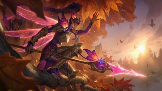
I am ESTATIC that Kallista finally got a skin, it's been too long. And I REALLY like this as well! First of all, the color scheme. The warm colors of orange and red and pink with this fall forest really make her keep purples and elegant golds stand out without alienating them. I think the splash art itself is just beautiful to look at.
I do think it was a little unnecessary to give her shorts here, I think pants and no feathers would've sufficed, but it's not a huge complaint. Having her with pink on one side and purple on the other is a little bit messy, especially since it seems to swap sides only on her hip piece (sorry don't know the armor term here) and then go back to normal on the arms and legs, but that's again, not a huge complaint. My only real complains with this skin is small things, like "quality of life" kind of stuff.
However, my absolute FAVORITE thing about this skin, is the wings. Using the sharpness of these dragonfly-esque wings to replace the shape language that her spears construct is a GREAT choice. I think it's clean, it's well done, and with the glowing details on her shoulder, headpiece and spear, I think this is a really cool skin. I will touch more on the crystal weapons once I talk about more of them, that is coming up.
Once again, high rating here, she's getting an 8/10
Next we have: Seraphine!
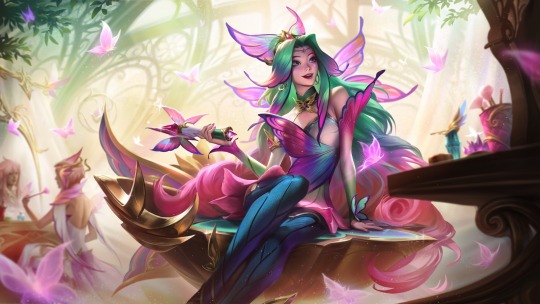
Now I'll be honest, I always tend to have mixed feelings when Seraphine skins come out, because many of them simply go "she's a singer!" and don't tend to change her story very much. However, without knowing the lore, I'm going to give FC Seraphine the benefit of the doubt, because this splash art does not convey "musician" to me. She is sitting on her stage, surrounded by makeup. There is a vanity in front of her, as well as someone doing their own makeup in the back. This reads much more like a makeup artist, like a faerie I would see doing court makeup than a music artist. And honestly, I like that! If that's true, if they are actually going with that concept instead of "the court musician" then I'm ecstatic! This will be really the only skin of Seraphine's to make her anything other than a singer, and she was in desperate need of that.
I love the colors here, making her hair fade from that green to pink with her bangs just slightly turning into wings is a really pretty and clever trick, as well as turning her normal hair floof at the top of her head into a cute little butterfly hairpiece is a nice touch.
My only *real* complaint with this skin is one that has a catch. If this is skin *is* Seraphine; the faerie who loves makeup, rides around on her vanity seat using pixie dust and making people feel good about themselves through the power of art and song: I think they toned her own makeup down WAY too much. I'll talk about it when I address the induvial characters more, for Fiora and Katarina have such bold makeup, Fiora in particular, that if the royal makeup artist/the one who's supposed to be good at makeup and making herself look friendly, presentable, and a little over the top because after all she is a performer, only has a bit of pink and a butterfly painted on? Seems a little bit boring. But, that's really my only complaint here, other than maybe smoothing out the shape language of the stage a bit. I do say, this is a tentative complaint, because I doubt we're getting anything other than "Seraphine, the faerie who loves to sing and brings people together by her vocal fae magic!" which is cute but, unoriginal for Seraphine.
For my rating, I'd say she gets two. If it's "just another singer skin" Seraphine, I'm giving it 4/10. If it's something more creative, maybe using the makeup or pixie dust I mentioned, 7/10. I think this skin is going to rely HEAVILY on it's lore.
Next: Milio!

I'll be honest, I don't have a whole lot to say about this splash art. This is of course, Milio's debut skin, but I was struggling to find a good image of his original to compare it to.
Overall, I will note the things I like about this one. I think making his little companions have a little more form to them other than just blobs was a cute choice. I also like the new outfit, it's a little more form fitting and I think expresses the "court" part in faerie court. He looks like a little kid who got dressed up for a special occasion, his outfit is a little over the top because he didn't pick it, he's trying to look formal. The haircut I have mixed feelings on, I think it's cute and makes him look a little chubbier with how it frames his face (which by all means is a good thing, we have a lot of dainty itty bitty thin shapes in this line, having a character with a rounder face is a nice change of pace from your typical skinny white elves.) I think they tried to keep a bit of the boxy shape his other haircut gave him by using the headpiece, but it didn't quite work. My only real complaints is the strange shoulder light bulbs and the little crown that's somehow magically floating on his bangs.
I'll give Milio here a 6/10. I like the vibes, the playfulness, but it's got a few things it could tweak.
Next up, Fiora

This is where I slow down on singing the praises of the FC skins. Not that I don't like it, I very much like it, but I've noticed a reoccurring pattern with these skins and their splash poses looking very,,,, bland. I like some of them, but there is a lack of life to others, like Fiora's here.
Having her guard some sort of special butterfly/faerie area I like, I think this pose and the composition here is well done. But,,, it's just another Fiora splash art where she is showing off her sword. I think her design in this skin line is pretty, it's interesting! And this just covers up most of it with her sword. I want to see the details of her outfit, I want to see how it looks without her sword pointed at me. I think that this is a pretty skin, but leaning into the faerie armor that Kallista's skin brings to the table, this feels honorary, this feels like she was given permission to "bring her sword to the dinner table" because she still has her crown on. Hopefully the lore will make it a bit more interesting, but it's not doing a whole lot for me.
Note: Did realize while looking at this that there is people in the back like an audience, and that lead to the implication of like, a royal fighter in an arena, which could be cool but I do think that everything I said before still holds.
Sorry Fiora, but unless that lore drop really helps build this splash art, I can only give you a 3/10. Lovely splash, but it doesn't feel like it's bringing anything *new* to Fiora.
Up next, Karma!

I,,, still haven't made up my mind about this one yet. There's things I like and things I don't, so let's get into it.
For a few good things to start, I love the shape language here. I love the flow. Her shield feels natural here, it feels like she is truly a Faerie Queen, radiating her power, reaching out to the magic around her. I think the gold on the wings is a strong move, though could have been a bit stronger. Having inorganic pieces on one of the most organic parts of her, the wings, feels powerful, it feels like some kind of upgrade or augmentation.
However, I do have some issues with this skin. I think it's colors are a little all over the place, with her hair feeling incredibly light compared to the deep purples of her outfit and wings. The pink on her wings is very subtle, and I don't think it connects it enough. I also think they leaned REALLY hard into the butterfly theme with this entire skin line (cough elderwood rakan and xayah cough) but then kept the lotus COMPELTELY the same as usual. Her makeup seems a bit boring, and with how they gave Ezreal these fancy upgrades for his face markings, it feels unbalanced that the faerie QUEEN still just has her simple ones.
I like this skin, I think it's very pretty, but it really doesn't radiate "all powerful and elegant faerie queen" to me. 6/10
Last but not least, we have Katarina.
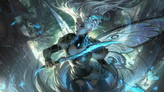
Since she has two, I'll sort of talk about them in tandem. My single biggest issue with these two skins is an issue Riot has a LOT: Same Face Syndrome. In this case, it applies less to the actual face, but more to the detailing in the splash art.
I'll give, normal FC Katarina doesn't do this has much as the prestige, but these two skins?

Are a bit,,, too similar for my liking. They are different, I'm not saying Diana and Kat are completely the same here, but you can't deny the similarities. White hair being held up in the air mysterious, blue color schemes with hints of lighter blue, grey, white, and maybe a little green, as well as a subtle metallic.
I like FC Katarina, but it does feel a little,,, bland, with winter blessed being so recent. However, putting that aside, there are some things I like about this skin.
For one, her expression. Kat is kind of a mischievous character, and many of her skins portray that with her expression, like Battle Queen or Battle Academia. Both of those skins give off a "ready to stab you when you aren't looking!" vibe that fits Kat, but with this? She looks somber, thinking, like she's done this fight a million times before and knows how it will play out reliably. And I like that, I like that sort of otherworldly reliance on her own magic and skills, it makes her feel confident but not arrogant. The eyes on the wings are gorgeous, and the wind moving as she spins and slices through it adds as a gracefulness that suits it very well.
Putting aside it's similarities to Winterblessed Diana, I'll give this skin an 8/10. I truly think it's beautiful, and I love the sort of "new" vibe it gives Kat.
Prestige... on the other hand...
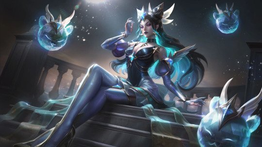
*sigh*
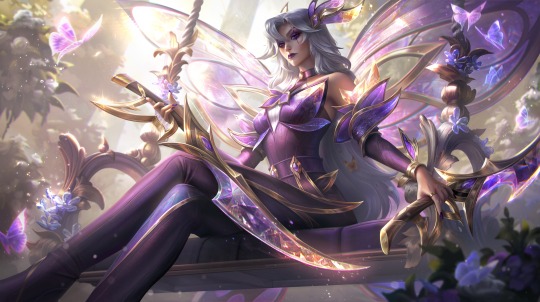
Honestly, if you told me these were the same character, I would probably believe you.
Now, I will be honest and admit, I hadn't seen Prestige Star Guardian Syndra in a while and I did think it was more purple, however these two,,, they feel the exact same. They even have almost the same expression, Kat's mouth is just closed.
I've always thought that the artistic goal of prestige skins was to add to a character cosmetically in ways the original skin did not. To add details and an alternative outfit/aesthetic to their new form provided by the lore of the skin line... and this... isn't that.
I really don't know what Prestige FC Kat is supposed to convey other than the fact that Riot seems to think powerful women with cool color schemes sitting is sexy or something because I'm not getting a lot here. She's a pretty woman,, sitting,,, with her weapons. I would even give this a little more of a break if there was anything Unique here, but there isn't: The only character with an different title is Faerie Queen Karma. This skin feels much more like royalty with the big wings and the seat and everything, and I think that Karma deserved the prestige much more here. Making a "Lunar Moth Queen" Karma would've been a MILLION times better than,,, this. Sorry Kat mains, but I'm giving it a 2/10.
For my final sort of overview of all the skins, there's a couple things I need to mention. First off, the weapons. I think the "crystal weapons that match your wings" is really cool looking. I don't know how well it'll hold up lore wise when that time comes, but I like how they look at I'm curious at how that universe will talk about them. Secondly, the butterfly in the room: butterflies. I think this skin line can technically be boiled down to "upgraded elderwood rakan and xayah" but that's okay. I would've loved to see Rakan and Xayah get skins for this in sort of a "from the elderwood they have grown, and in the court of faeries they blossom" where it connects their elderwood stories with the fearie court and we get new skins for them, but that's a lot to ask right after they got new skins with Broken Covenant, like, today? I think the skinline would've been served better by having more variation than just "butterfly." My favorite skin in this would have to be Kallista, and a good part of that goes to her being unique, she's the only one who isn't completely butterfly. Overall, I think the skinline is pretty, I think it could tell a really fun fantasy story if done right, and I have my gripes with certain parts of it, but I do like it quite a bit. For the whole skin like: 7/10.
If you read this far, thank you, it really means a lot to me that you read through all this. I'm really passionate about character design/skin design and my views on it have absolutely been inspired and shaped by TBSkyen, so credit to him for inspiring me enough as a creator to feel confident enough to share these thoughts. If ya'll like this sort of thing, I would absolutely be willing to make more posts addressing skin lines and character design. Let me know in the notes! ^^
#league of legends#league skin review#character design#skin design#ezreal#kallista#seraphine#milio#fiora#karma#katarina#ezreal lol#kallista lol#seraphine lol#milio lol#fiora lol#karma lol#katarina lol#ezreal league of legends#league of legends skin#league of legends skin review#zdux#zdux speaks#character design review#league of legends faerie court#faerie court#faerie court skins#faerie court ezreal#faerie court kallista#faerie court seraphine
15 notes
·
View notes
Text
This is just a rough idea for now but if anyone wants to work on it & give it a polish, go ahead. TFA Mob AU is by @pastelpaperplanes , this idea list is by me. I might make this into something more like a One-Shot but I'll need some help writing Mr. Megazarak's parts. "Sheltered Playboy Womanizer" isn't my main theme in writing. 😅

>Megazarak's old flame from his early boxing days appears unexpectedly in his penthouse seated in his favorite lounge chair.
>He only spotted her after she greeted him, prompting him to switch on a light with his gun drawn.
>All he could make out in the limited lighting were custom, low-key pink Christian Vuitton heels settled over thick nylons & the skirt to a reputable women's suit. It was all monochromatic pinks, purples, & blacks, but that made her shoes' soft beige soles pop.
>She has been enlightening herself by idly perusing his playboy magazine collections, having it opened to a page that folds out into a swimsuit model that had a striking resemblance to her.
>"Your taste in femmes seems very familiar, Megazarak. Did you miss me that much?" she tilts her head, slowly lowering the graphic work just enough for her smokey, subtly lined optic(s) to peer over the work's many dog eared edges.
>The last time Megazarak had seen her was during one of his last boxing matches in his youth when she was but a ring girl in skimpy garbs holding numbered signs above her head; a practically customary sight in places like that.
>She was unlike most other girls in her role; most would be eyeing him, hoping to get past his boxing shorts later or right after the match, but her? Nope. She focused on her job & civil life, mainly her education.
>This drew him to her more than any other femme ever had, leading to him attempting to get her attention instead of vice versa.
>He once tried to force himself onto her after a particularly draining fight once he saw her (inadvertently) grin at his opponent causing a winning yet depleting match to ensue for him.
>He was promptly reminded that the femmes of the city are each a force to be reckoned with all her own; pedigree, income, or job title be damned.
>Before The Drama© between him & his brother, she left town to pursue grander levels of education that local, mech-dominated schools could possibly give her.
>He changed after that wintery evening as he hid in an alleyway to discreetly see her onto her train, his heart slowly forming impenetrable armor of its own.
>> However, a part of him was obstinate about leaving only the space she had inadvertently claimed without knowing & he'd never tell anyone. Ever.
>Any & every courtesan he has brought into his bed has had her face but not her heart; a ruefully abundant fact he has known since the first paid sliver of amorous recreation.
>He longed for the femme he never got to touch or hold, the one he would not merely engage in heated acts with, but rather make love with.
>For Primus-knows how long, he has fantasized about her strolling back into his life, respectable attire & all, to rejoin him so that he could give her the life she has always said she'd earn for herself.
>Obviosly, he was servicing himself as he did so, dreaming of having young ones with her, teaching them everything he knows (pestering his brother, throwing a correct punch, how to handle the fairly novel family business, & so on), make the kids a younger sibling(s) & then living to see himself & her become grandparents. All while keeping the lavish life he has now.
>"Uh... H-hi?"
>He'd curse himself if it weren't for the many thoughts scurrying through his mind like countless rodents on their oiled wheels.
>Suaveness? Womanizer's charm? Who's that??? Nobody currently.
>It takes him a second or two to gather himself but he does.
>"Why are you here?"
>She has long since placed the paper back in the box with its kin & crossed her ankles as Megazarak fussed over himself.
>"A symbiotic business proposal."
#prompts#help lol#prompts needed#writers on tumblr#mature#just thinking#fanfiction writer#oc art#@pastelpaperplanes#I can't write Zar Zar correctly 🥺🤔😰
2 notes
·
View notes
Text
Oh no yeah damage in SOTE is insane, even if you are packing a lot of Scadutree Fragments, have 60 VIG and are packing some of the heaviest armor in the game, you still get dropped in 2-3 shots by bosses, it's ass lmao, I can't imagine how annoying it has to be for lower VIG characters.
In conjunction with this, I think one of the other things I don't like is that some bosses have attacks that give you no feedback on what you did wrong. A certain optional boss, which is quite big in size and not draconic, has a phase 2 attack in which she rises in the air, starts spinning Bowser style, and then charges at you. The attack, obviously, isn't unavoidable, but learning to avoid it is a whole ordeal. With charge type attacks, you usually dodge at the boss to pass through them, but this one's too big so your iframes run out inside the boss model and you get hit. You can't dodge left or right either because it's too big and you don't get out of the way. Diagonals just get you hit as well. The game doesn't care to communicate what it is it wants from you, and I don't want a game to hold my hand, but I do want it to be clear when a mistake has been made, why it is a mistake.
Now, I've been enjoying the DLC a lot, but it does have some pretty hefty "did they playtest this at all" moments. Mainly with bosses from the main game put in the DLC, mind you, but also with a few of the DLC originals.
It is PAINFUL to co-op in DLC, though, half of the players I get summoned by are dogwater at this, legit hanging back and casting Swarm of Flies nonstop forever while I fight and redirect aggro. Not only do I have to bear the disgrace of playing the role of the lowest lifeform (tank) but also when the boss inevitably bleeds/I have to back off to drink or recover stamina, the boss will aggro the host and, since they are dogwater, die in one wicked strike because they don't know how to actually dodge the boss.
112 notes
·
View notes
Photo

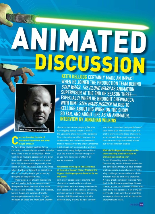

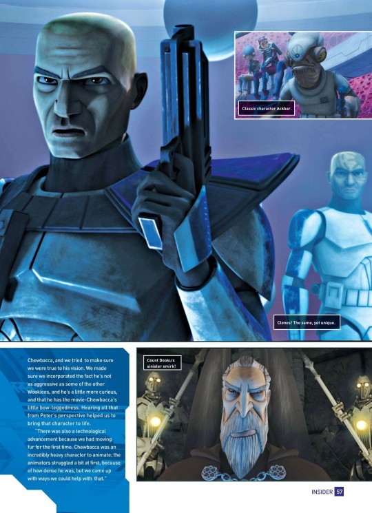

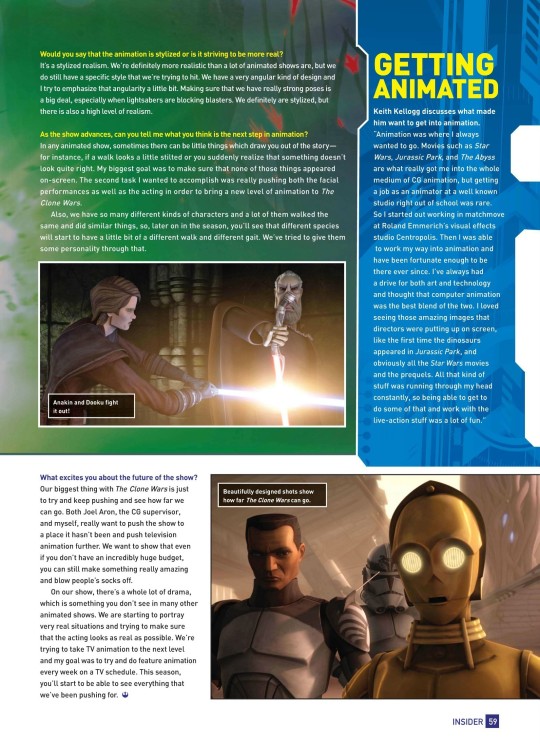
ANIMATED DISCUSSION (#130, JAN 2012)
Keith Kellogg certainly made an impact when he joined the production team behind Star Wars: The Clone Wars as animation supervisor at the end of season three especially when he brought Chewbacca with him! Star Wars Insider talked to Kellogg about his work on the show so far, and about life as an animator. Interview by Jonathan Wilkins
Can you describe the role of Animation Supervisor and what the job entails?
We have three studios working for us currently, so basically every studio submits their shots to me on a daily basis. We’re working on multiple episodes at any given time, and I review these shots—around 80 to 100 of them each day—and I make notes on them. There are also many times where I will record myself, as sometimes this is the easiest way to get across my thoughts on the performance.
There’s also a lot of work that is done upfront, earlier in the design process of the episode. From the start of the show, the assets are created. These are modeled, both in-house and overseas from the amazing designs on the show. I’ll give feedback on these and make sure that the characters can move properly. We also have rigging dailies to take a look at the upcoming characters in the episodes. This is to make sure that they meet the deformation and motion requirements that are necessary for the show. Sometimes a still image can look good, but we have some really crazy designs and outfits—plus the armor of the clone troopers—so you have to make sure that it all works onscreen.
You started working on The Clone Wars at the end of Season Three. What are the biggest challenges you’ve faced so far on the show?
With every episode we’re creating new characters, new locations, and new designs—so each and every show has its own special set of challenges. Obviously, we have our main characters: Anakin, Ahsoka, Obi-Wan and so on, but with different story arcs we also get to delve into other characters that people haven’t seen in the Star Wars universe yet. It’s a lot of work creating those characters on an episodic basis, and making sure the character stays consistent across our three animation studios.
Which is the bigger challenge on the show: creating a new character or animating an existing one?
To me, it’s creating a new character. Occasionally, due to different production and scheduling things, we have different studios animate a new character. That’s a big challenge, because there’s a lot of different ways to animate a character. A really great example of that was Pong Krell in the Umbara quadrilogy. He was created across two different studios, with each doing two episodes. A lot of my job is trying to make sure that we maintain a complete character with all the subtle characteristics intact.
Speaking of characteristics, is it difficult to make sure all the clones in the show are different?
The challenge is finding their different personalities. The upcoming arc on Umbara is mainly about clones. Obviously, they all look the same, so trying to make sure the audience could tell them apart by both their body language and facial expressions was a big challenge. Some clones would be more questioning, so I’d have their inner eyebrows up just a little bit, just to kind of get that subtle nuance across that this is the one that’s questioning the orders. There might have been another who is angry about what’s going on, so maybe his brows were down a bit more, his lower lids up slightly more; just subtle little things like that.
Do you have a favorite character?
I tend to like the villains, just because they can really chew up scenery; you can be a little more aggressive with them, have little jaw-rolls here and there and little nuances in the face. It might be a facial tic like we had with Osi Sobeck in “The Citadel.” Whenever he spoke to Count Dooku, we gave him a little bit of an eye-twitch to show how nervous he was. With villains, you can push them probably about 20 percent more than what you can do with your heroes.
You brought Chewbacca into the show —are there any other classic characters you’d like to see?
We just got to do Ackbar in “Water War,” which was really cool. To see him as his younger self, commanding an army in the field was really fun, and to be able to see him mentor Lee-Char was great.
I liked seeing Tarkin come back; it gave the audience a glimpse of what he was like when he was young. As we keep going through Season Four, I’m sure you’ll start to see some more classic characters that have been brought back, but I’ll just wait for those to surprise you as they come!
THE CHEWBACCA CHALLENGE
Keith Kellogg reveals how Chewbacca was brought into The Clone Wars.
“When we introduced Chewbacca to the show, it was the first time the world had ever seen Chewbacca being performed by somebody else. [Original Chewbacca actor] Peter Mayhew was really heavily involved in our recreation of the character and he gave us subtle ideas of how Chewbacca should behave. Peter is the only person to have ever portrayed Chewbacca, and we tried to make sure we were true to his vision. We made sure we incorporated the fact he’s not as aggressive as some of the other Wookiees, and he’s a little more curious, and that he has the movie-Chewbacca’s little bow-leggedness. Hearing all that from Peter’s perspective helped us to bring that character to life.
“There was also a technological advancement because we had moving fur for the first time. Chewbacca was an incredibly heavy character to animate; the animators struggled a bit at first, because of how dense he was, but we came up with ways we could help with that.”
How has it been working with some of the guest directors?
There have been some really big names, for sure. Duwayne Dunham’s episode was an incredibly challenging thing to do because we were going underwater for a three-episode arc. We had to create all-new environments and the characters had to be constantly treading water and moving. I chose a lot of the underwater fight scenes from Thunderball, the James Bond movie, as reference for the animation studios to look at, and I’d constantly be sending them clips of other things. Reference is always the key. Duwayne also pushed us on the amount of characters that we use, and we’ll be seeing a lot more of that in Season Four. We’ve started using Massive at some of the studios, which is a crowd software package, and we’ll be using more of that and fleshing out the universe. It all adds to that level of realism.
Another guest director was Walter Murch, who worked on the Umbara arc. Everybody around the studio was obviously really happy he was here and learned a great deal from him. He’s got so much experience. You can really see his camera-work and all the details in the Umbara arc; you feel like you’re down in the actual trenches, fighting alongside the clones.
When you’re working, do you study the actors at all, and how closely do you work with the voice actors?
One thing I’ve always found to be a really big help in animation is filming the actual ADR [Additional Dialogue Recording] sessions of the actors. You can see what the actors were thinking and get an idea of what their emotions were when they recorded the scenes. In studying the performance, you always find little things that you can bring out that take the performance to another level.
Some of our animators don’t actually speak English, and it’s a real challenge for them to animate lip-sync. So to actually be able to show when the mouth is opening and closing, and what the different shapes are, helps them a great deal.
Would you say that the animation is stylized or is it striving to be more real?
It’s a stylized realism. We’re definitely more realistic than a lot of animated shows are, but we do still have a specific style that we’re trying to hit. We have a very angular kind of design and I try to emphasize that angularity a little bit. Making sure that we have really strong poses is a big deal, especially when lightsabers are blocking blasters. We definitely are stylized, but there is also a high level of realism.
As the show advances, can you tell me what you think is the next step in animation?
In any animated show, sometimes there can be little things which draw you out of the story—for instance, if a walk looks a little stilted or you suddenly realize that something doesn’t look quite right. My biggest goal was to make sure that none of those things appeared on-screen. The second task I wanted to accomplish was really pushing both the facial performances as well as the acting in order to bring a new level of animation to The Clone Wars.
Also, we have so many different kinds of characters and a lot of them walked the same and did similar things, so, later on in the season, you’ll see that different species will start to have a little bit of a different walk and different gait. We’ve tried to give them some personality through that.
What excites you about the future of the show?
Our biggest thing with The Clone Wars is just to try and keep pushing and see how far we can go. Both Joel Aron, the CG supervisor, and myself, really want to push the show to a place it hasn’t been and push television animation further. We want to show that even if you don’t have an incredibly huge budget, you can still make something really amazing and blow people’s socks off.
On our show, there’s a whole lot of drama, which is something you don’t see in many other animated shows. We are starting to portray very real situations and trying to make sure that the acting looks as real as possible. We’re trying to take TV animation to the next level and my goal was to try and do feature animation every week on a TV schedule. This season, you’ll start to be able to see everything that we’ve been pushing for.
GETTING ANIMATED
Keith Kellogg discusses what made him want to get into animation.
“Animation was where I always wanted to go. Movies such as Star Wars, Jurassic Park, and The Abyss are what really got me into the whole medium of CG animation, but getting a job as an animator at a well known studio right out of school was rare. So I started out working in matchmove at Roland Emmerich’s visual effects studio Centropolis. Then I was able to work my way into animation and have been fortunate enough to be there ever since. I’ve always had a drive for both art and technology and thought that computer animation was the best blend of the two. I loved seeing those amazing images that directors were putting up on screen, like the first time the dinosaurs appeared in Jurassic Park, and obviously all the Star Wars movies and the prequels. All that kind of stuff was running through my head constantly, so being able to get to do some of that and work with the live-action stuff was a lot of fun.”
16 notes
·
View notes
Photo


So some updates i’ve been working on. I really wanted to start Josuke much sooner but i’m actually glad I didn’t mainly because I had some issues with using the more updated Blender and the Smash exo plugin. I managed to figure it out but it caused a lot of headaches in the process. So going in order...
Megaman.EXE + Lan Hikari I actually randomly decided to start with as he felt like he was going to be an easier mod to start on for using updated programs and make sure everything is working out as intended. Lan actually wasn’t planned at all but from when I got the model from the XDiVE game, I forgot that it comes with Lan on the monitor with a few expressions and I thought to myself, well Megaman is going to have his mask on majority of the time with most attacks so you won’t really see any of that but I could use Lan to do so. The only expressions I gave to Megaman was blinking but Lan covers everything included also blinking. I made a few expressions of my own with some editing and also one of my friends I met through Smash related stuff who is obsessed with Megaman named Frosty actually helped make one expression for Lan which was really cool. At first for the cross fusion in the final smash I was making the textures but then I gave them to Frosty and he finished them and they came out really clean. He also gave me a couple ideas for the voice mod on them which was awesome! A mod that was going to be way more simple then originally intended but i’m extremely happy with the outcome! The only thing that was really annoying was the Cross Fusion FS as I had to rig that on Corrins dragon form and trying to rig a humanoid looking character on that is a nightmare and making them look decent. It does give me ideas for future characters to give stuff like that too (One being Tommy the Green Ranger giving him the Dragonzord as I made him over Corrin earlier on about a month or 2 ago). Oh I almost forgot that I also made my own custom render again and i’m very happy with it and I learned some new stuff so i’m definitely improving on making them look more Smash accurate.
So Xehanorts Armor I decided to make as there is 2 mods of him out there and the ability to change Sephiroths wing to something and no one fully took advantage of that. DSX8 whos Xehanort that I used in this just had Sephiroths wing which looks really wrong to me. My friend Dusk who instead gave him the X-Blade changed his wing to make it a little more unique and more KH themed but just seeing other Sephiroth mods like Vergil or Jin being able to change their appearance made me really want to see that happen with Xehanort. I will say this mod was an absolute nightmare and I didn’t think it was going to take as long as it did, the only issue I came across on the final version is sometimes his head clips through the neck of the helmet but nothing I can really do about that unless I removed his expressions but I really don’t want to do that. This mod paired with my Leonard Nimoy voice mod just feels too good to be real. Oh another thing that was a pain with him was I had to shrink his arms down to scale with Xehanort/Sephiroth has they were too big and adjusting the bones with that was a bit annoying. But it worked out and i’m so happy with it!
So finally Josuke, this is another mod I want to dedicate to Billy Kametz as Josuke is such an amazing character and the more I look back at him, the more I really appreciate the work Billy put into his character and honestly Josuke probably has moved up on my favorite Jojo characters a lot as I went back and watched some of just Part 4 when I wasn’t feeling too great. This mod will probably take a bit of time but it should go a lot smoother than Maruki as I know a general idea on how to keep Crazy Diamond with him, I just need to refresh myself on what to do and probably clean up their skeletons as Smash has a limit on how many bones on characters you can bring into Smash before it crashes. He is going over Ken as I want variety from the other main Jojo characters as Jonathan I want over Ryu, Joesph is over Richter, Jotaro is over Terry, Giorno is over Joker along with DIO. Jolyne, I haven’t seen part 6 yet but i’m interested in making some point after I see some of it unless someone mods her first and I can’t think of any better ideas although I would love to give her a stand considering. Too many Jojo characters I want in Smash, Mista is a pretty high priority too and also modding Sex Pistols/Six Bullets over Morgana to go with Giorno since he has Mistas gun and there isn’t really a good way to include them with Bayonetta at least that I can think of since he would be modded over her. Too many mod ideas, never enough time to do them but no matter what Josuke is next and even though unfortunately he won’t be getting a voice mod i’m going to try to give him expressions if I can get them to look right. Plus as usual now he’ll be getting his own Render and Stock icon that i’ll make as well in the end too!
I completely meant to make an update post the past couple days but stuff kept coming up so didn’t really get a chance too but here we are now! Probably be a bit before my next post, it will most likely be either when Josuke is mostly done or when he is done for sure then I get to decide on what to work on next! (Leaning on KawoShin over Aegis or Tifa) Probably Tifa first since she’ll be a lot quicker to get done and can probably finish her in a day easily but also depends on if her materials are annoying to work with and how her skeleton is for posing for a render. I’m still debating what outfit to focus on for KawoShin, probably the Eva-13 plugsuits since they’ll match. Meanwhile Toji will just sit in the background in his typical outfit xD I would love to give him his plugsuit, maybe if I can scale him onto Kaworus or Shinjis and recolor him and edit the number, i’ll see what I can do! I got so many render ideas for KawoShin and the day Arc 4.0 happens and I can add more slots, I want to give them 3 outfits and they’ll all have unique renders based off of official stuff but i’ll also see what I can fit in the Smash UI!
#Smash Bros.#Modding#SSBU#Updates#MegaMan.EXE#MegaMan#Mega Man#Xehanort#Master Xehanort#Josuke#Josuke Higashikata#I'll wait to tag Billy since I rather keep stuff fully related to him and not bring in other mods on his tag unrelated
10 notes
·
View notes