#lj icons
Explore tagged Tumblr posts
Text

Hello and welcome to "Icon Making With Killian: An Intro to the 'Lost' Art of LiveJournal Icons"
aka, I'm still making them and I'd like to teach you how to do it, too!
This tutorial was written in Photoshop 2020, but you can probably recreate it in as far back as CS2-ish (since I still use the same sort of techniques I've been using since then, lmao). It also assumes basic understanding of the software, though I've tried to be as clear as possible throughout.
With that out of the way, let's get this tutorial on the road!!!!!!
I started with the bloomed art of Hiiro from the White Lilies scout box (image courtesy of the Ensemble Stars!! English Wiki).

I basically always start with a blank 100x100 canvas and paste the image into it. I try to go into icon making with a vague idea of what I want to do, and I knew from the beginning that my vision for this icon would have the top 1/4-1/3 of the image covered by a solid band of color. To make positioning the image of Hiiro easier, I made a rough version of the band with temporary colors (though they're pretty close to what I ended up using in the end).

With that in place, I could start working with the actual image for the icon. After pasting it in and adjusting the layers so it was under the band, I resized it and moved it around a bunch until I was happy with the position. Once I liked how it looked, I used an Unsharp Mask on the base.

Next up, I used a texture from lookslikerain. However, purple is all wrong for the color scheme I had in mind, so I went to Image > Adjustments > Hue/Saturation... to change it up to better suit my needs. Never be afraid to mess around with textures!

Here's how I adjusted this specific texture, but each one is unique- both the texture and the icon you're creating, so it's best to play with it until you get good results.

I then pasted this into the icon, making sure it was under the layers making up the top bands of color (because I was only trying to affect the base for now), and set this layer to Darken.

Now it's time to mess with the colors of the top band. They sorta matched before I did anything to the base, but now...not quite. I used a layer style for each part of it, but using the paint bucket tool would work just as well. I went to Layer > Layer Styles > Color Overlay... for each, changing the colors as necessary. The thickest band is #85d0bf, the middle band is #086371, and the thinnest, lightest one is #fcfcd8.

Time to start putting stuff on top of everything!! I took this light texture from ianthinae, rotated it, and set it to Lighten. I decided I wanted it to be a little bit brighter, so I duplicated the layer, set it to Screen, and dropped the Opacity to 20%.

I then used a texture from Sarah-Dipity and set it to Lighten as well.

Okay, now that's what I'm talkin' about!!! It's time to throw some text on this~ I went for something simple to go with the theme of the story this card is from: Princely. The font is Georgia, 10pt, in #086371, set to all caps. I decided it didn't stand out enough, so I duplicated it, changed the color to #8b4235, dragged it under the first text layer, and moved it 1 pixel to the right.

I wanted a bit more embellishment around it, so I used this simple tiny text brush from colorfilter in #06444d. I also erased part of it to make it fit the space better.

Finally, I used a texture from shiruji, set to Darken to get a bit more color variation in it, and called it done! :D

If you have any questions, please feel free to ask, and I'll answer as best I can- as long as it's not about making icons in other software D: I only know Photoshop (and Paint Shop Pro, but I don't think anyone uses that anymore). If there are any other icons of mine you're interested in seeing tutorials for - or even just specific techniques! - just lemme know. I love helping :D
Also, I'm happy to share where I get icon resources from. I have a whole post dedicated to that on my DW graphics journal, though tbh that's the best place to talk to me about making graphics in general. But I will absolutely answer asks/replies/etc about icons here on tumblr, don't worry!!!!
#livejournal#icons#icon tutorial#graphics#graphic tutorial#photoshop#LJ icons#100x100 icons#100x100#tutorial#tutorials#reference#what do I even tag this as XD
96 notes
·
View notes
Text






















THREAT OF TREATS! 100x100 Livejournal icons. One zip file contains ones not made by us (and are foldered by LJ Icon creator) One zip file contains two PSDs that we forgot existed, a wallpaper one (for like 20 years ago) and a 100x100 one. -- and then a ton of random GIF icons and PNG/Jpg ones from like 2005.
File Garden Link ONE - LJ Icons by others
FILEGARDEN LINK TWO - PSDs + ICONS BY us like 20+ years ago
Reblog - and then if you can credit us for remembering to share the stuff and credit the OG icon makers for the one file that'd be amazing!
Come to think of it WE MIGHT HAVE ALREADY SHARED the 2nd link - but we found a couple other jpg icons that were sitting arouond that we made that we added to the zip.
#rp resources#psd#cocloring psd#carrd resources#rentry resources#icon#rp icons#capsekai#lj icons#q? que q? que.#f2u icons#icon mask#icons#icon psd#gg icons#girls icons#icons with psd#messy icons#female icons#pfps#layout#header#kpop icons#rentry graphics#rentry decor#rentry inspo#rentry stuff#rentry template#carrd icons#carrd stuff
55 notes
·
View notes
Text
Remember how LiveJournal let you have several icons (or avatars or "pfps" as you might call them now)? And you'd carefully choose an icon to fit the subject matter, your tone, and the blog on which you were commenting or posting?
And it could make your argument look that much snarkier if you used a rude one? Or you could use it to add a multiplier to a joke?
And icons, alongside banners and wallpapers, were a whole genre of fanwork with its own design language, conventions, and norms, including carefully crediting people for them?
That was neat.
#remember how most LJ culture occurred in the comments?#livejournal#web nostalgia#a paid account also got you a bunch of icon slots
7K notes
·
View notes
Text

We can go where we want to The night is young and so am I And we can dress real neat From our hats to our feet And surprise 'em with a victory cry
Men Without Hats - The Safety Dance
#twenty years ago i was making lj icons#this is basically the same thing#with an added element of 'rediscovering my teenage pursuits in my 30s'#playlist typography#inception#arthur x eames
35 notes
·
View notes
Text

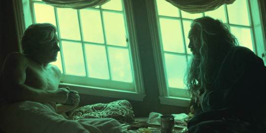
I'm a summer dream, I'm a real light beam - I'm worthy of all the goodness and the love that the world's gonna give to me I'ma give it back ten times, people, are you ready? If you think you're alone hold on, I'm coming - x
#i just love them so much#soulmate bullshit TRULY love before first sight it's absolutely insane#this song makes me so emo abt them#edward teach#blackbeard#stede bonnet#ed x stede#gentlebeard#blackbonnet#our flag means death#ofmd#my stuff#ofmd edit#save ofmd#yes i'm taking my LJ icon technique into the tumblr sphere lmao
64 notes
·
View notes
Text
you know i gotta be an old bastard about it but i miss the old school rpc.
#ooc. o kaptain.#[like. the days when you could arbitrarily send whatever and not ask yourself 32 times if it was fine. the days when reblog karma wasn’t a#discussion and no one had thread trackers or interest trackers because it was just writing and that was it. when the most graphics anyone#ever had were icons they probably found on lj or had painstakingly printscreened their obsessive media. i just. miss it sometimes. i wish it#didn’t feel so completely locked down and obsessively critical on every level. just thinking thoughts honestly. i just. miss when it was#RELAXED and everything wasn’t second guessed to hell or abandoned.]
31 notes
·
View notes
Text

top scully moments (1/?)
9x13 improbable
#txf#txf s9#improbable#top scully moments#liwl makes a gif#txfedit#i just love her so much#also i'm very much enjoying making gifs using the same techniques i used for lj icons back in the day
65 notes
·
View notes
Text


compiling some of my favorite Twin Peaks (S1) visuals (s.)
#they're awakening within me a long dormant want to make a bunch of lj icons#i miss icon posts#second to last is 4 in the eyes and 1 in each nostril#it kills me every time#twin peaks
11 notes
·
View notes
Text
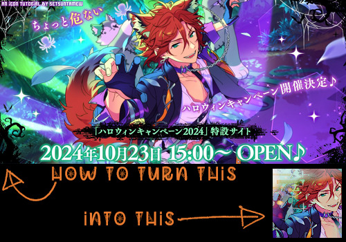
Welcome back to "Icon Making With Killian: An Intro to the 'Lost' Art of LiveJournal Icons"
aka, you didn't think I was one and done, right?
This tutorial was written in Photoshop 2020, but you can probably recreate it in as far back as CS2-ish (since I still use the same sort of techniques I've been using since then, lmao). It also assumes basic understanding of the software, though I've tried to be as clear as possible throughout.
I was possessed with a need to both make an icon of Madara's new event card and then write a tutorial, so let's all be proud that I busted it out before Halloween 💪
I started with the bloomed art of Madara from The Howling Forest★Lupine Halloween event (image from the Halloween 2024 campaign announcement, because the event hasn't started yet).
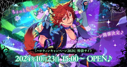
Since there's a lot of extra text & etc on this, I knew I'd be cropping it pretty close. I started with a blank 100x100 canvas, pasted the original image in, and then resized + rotated it until I liked the composition/crop.

First up, I wanted to get some cobwebs in here (for Halloween!), but didn't want them to overwhelm the whole icon. I used a texture from lookslikerain, set to Lighten, and rotated it a bit before erasing anything covering his face.

Next, I used another texture from lookslikerain and set it to Darken. There's a lot of green in the images for this event and I wanna pull some of that back into the icon, since it most got cropped out.

Time for light textures!!! I used a bunch in this icon~ I started with one from lookslikerain (can you tell I love their resources?), rotated it, and set the layer to Lighten, before deciding that it was too harsh. I used a small, soft brush set to 30% Opacity to erase most of the texture from his face, as well as softening the edges of the light.

The next few light textures are kinda subtle, but overall add to the icon. I'd say sometimes less is more, but I'm a maximalist at heart XD For the next few steps, just assume that the light textures were rotated/resized/moved/etc as I saw fit. I used yet another texture from lookslikerain, set to Lighten, and tucked in the bottom right corner.

This light texture from Sanami276 is also set to Screen. I moved it around to get just a bit of orange in the top left corner- gotta keep those Halloween colors in there!! :D

I wanted some more depth/texture in the upper left corner, so I decided to use part of a texture from Sanami276.

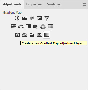
However, it's way to harsh to just throw in there like that...at least not for my purposes. I decided to invert the colors and recolor the black parts orange. My go-to method is with a Gradient Map adjustment layer. The easiest place to find it is in the Adjustments window.
I then used these colors for the gradient itself: #e7b676 at 0% and #ececec at 100%.
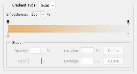
And it left the texture looking appropriately orange! I then pasted it into the actual icon, moved it so the rectangles were in the upper left corner, and set the layer to Darken.

Now for more light textures!! I used a couple from ianthinae, set them to Lighten, and went to town. I cut them up, moved them around, rotated them...just about anything to make them fit where I wanted. I love playing with light textures in general, and I find that even when I use similar ones a lot, they can look very different depending on how they're place.

Finally, I used part of a large grunge-y texture that I've unfortunately lost the source to D: I inverted it and set the layer to Multiply, before moving it around a bunch until I found a spot that looked good.

And with that, it's done! You've now got some new skills to make icons with~
If you have any questions, please feel free to ask, and I'll answer as best I can- as long as it's not about making icons in other software D: I only know Photoshop (and Paint Shop Pro, but I don't think anyone uses that anymore). If there are any other icons of mine you're interested in seeing tutorials for - or even just specific techniques! - just lemme know. I love helping :D
Also, I'm happy to share where I get icon resources from. I have a whole post dedicated to that on my DW graphics journal, though tbh that's the best place to talk to me about making graphics in general. But I will absolutely answer asks/replies/etc about icons here on tumblr, don't worry!!!!
#livejournal#icons#tutorials#graphics#icon tutorial#graphic tutorial#photoshop#LJ icons#100x100#100x100 icons#tutorial#reference#halloween#madara mikejima#enstars#ensemble stars
12 notes
·
View notes
Text


These are probably SOMEWHERE on the internet, but we're aware of who made them. We did!
These are a TON of old LJ icons we just found in an old portfolio folder. They date back to about 2005-2007, and are all different kinds of content.
Yes, there IS A ZIP FILE!
NO, we don't have the original PSD's (or if we do we'll find them and share them... by god it's 20-22 years since we first started doing these!!!)
#rp resources#psd#cocloring psd#carrd resources#rentry resources#icon#rp icons#capsekai#capsekai resources#visual kei#hakuouki#vivziepop#video games#jrock rp icon#free rp resources#boop#boop o meter#beep boop#blep#lj icons#livejournal#tumblr icons#q? que q? que.#f2u icons#icons#kpop icons#icon psd#gg icons#girls icons#messy icons
8 notes
·
View notes
Text
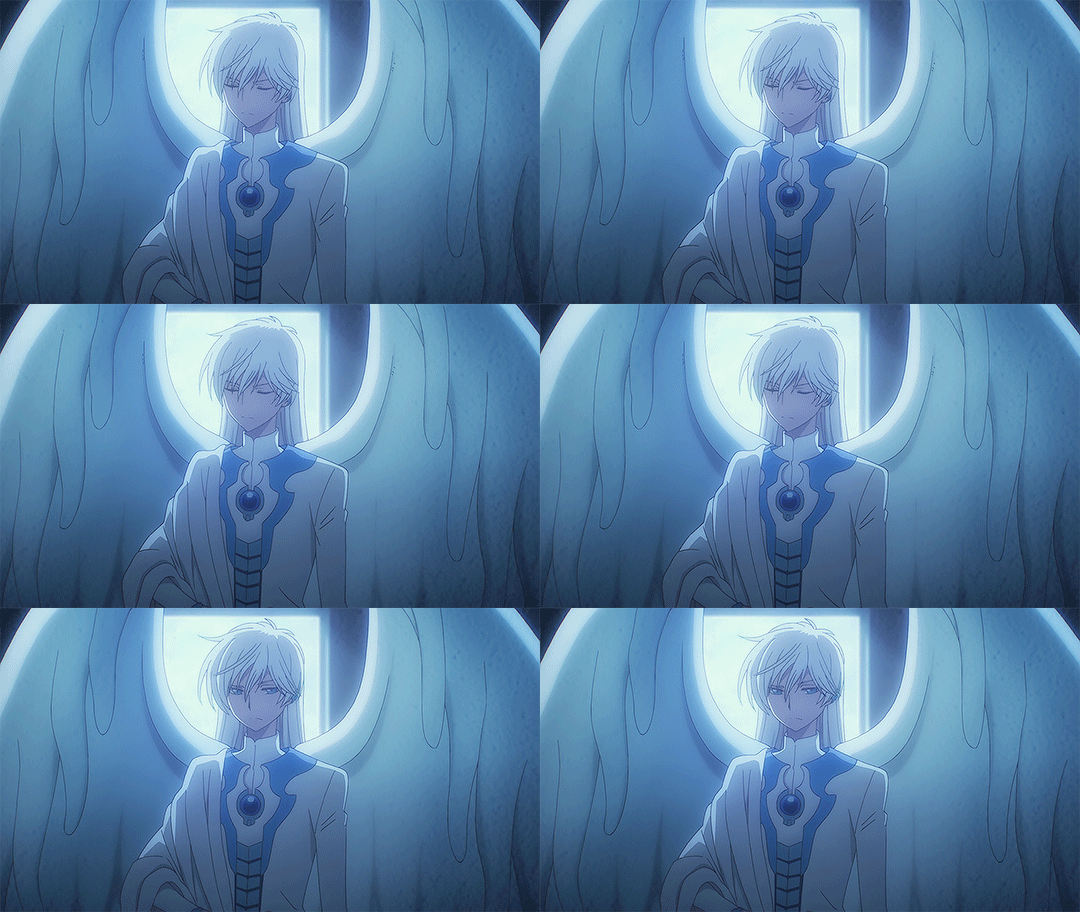
#ccs#cardcaptor sakura#yue#my gifs#he's too damn pretty not to gif#just playing with filters like it's lj icon days all over again
27 notes
·
View notes
Text
the weird thing about House resurgence is like
that was my LJ fandom. The first time i was in with the injokes and memes and fanart and and and
this might just be me being forced to Feel Old
#BACK IN MY DAY WE SHIPPED BOTH WAYS UPHILL IN THE SNOW#I WAS THERE GANDALF#i found one of my lj icons the other day#what a throwback#anyway all i cared about was cuddy#did i know i was homosexual? no#did that stop me from being gay all over the place? also no
8 notes
·
View notes
Text
No but it really is starting to settle on me just how much MORE popular Yuki/Kakeru is since the new anime came out.
Like: I recently regained access to my old livejournal from the late 00s!!!! And unfortunately I made that after the height of my Fruits Basket phase, but I still did make some mention of Yuki/Kakeru... And, well.
18) A pairing that is woefully unappreciated! YUKI/FRICKINGKAKERU. I swear, there's less than a PAGE of this on fanfic.net. Less than a PAGE. Geez, it's implied SO MUCH in so many scenes, even WITHOUT the whole 'I'll brake up with you' thing. Bloody fandom, don't appreciate good characters and pairings when they see them... (8/3/2008)
And as I implied in an earlier post, while I was trawling through the Ao3 tag (still on-going!!) I decided to give myself a blast from the past and re-read through the Yuki S. and Kakeru M. filter on ff.net, which I remember checking religiously. Today? Three pages.
Ao3 has 10 pages and 200 works!!!
And even then, like, lately I've been going through my old bookmarks (sadly I've only found one Yuki/Kakeru, which I'd already remembered anyway), with a current focus on Zuko/Aang. Well, even just by googling I can immediately summon up whole rec lists of livejournal snippets and fic memes and the like, so I was excited to see what I could dig out for Yukeru, since I certainly remember Fruits Basket having a big presence on that site!
Nothing. Literally, I haven't found anything yet. Save a livejournal comm with exactly three posts, long-dead.
Of course, it makes sense that the new anime brought in new fans: Kakeru famously never showed up in the old anime, so people would only have ever even met him if they read through to, what? Volume 8? Later? of the manga. And I do recall the fandom being far less... Yuki-positive, back then. Yuki/Kyou was a popular ship, of course, and Yuki/Haru was around, but those ships had Kyou and Haru fans behind them; you'd only ship Yukeru if you were really invested in Yuki himself.
But it's still just boggling me. I did find Yuki/Kakeru rec lists, but they're all from the last few years. They alone have as much fanfic as ff.net had of Yukeru total back in 2008, when Kakeru had surely existed for a good half a decade at least, even in English.
Is there something about the current fanfiction landscape that is far more amenable to Yuki/Kakeru? Probably, yeah, I think: it's a pairing very situated for queer coming-of-age found family type stories, which are much more popular now. (Not that they never existed before! But fandom was much less... consciously activist-y. Maybe I'm just betraying my age back then, but it was much more common to ship boys simply because they were ~smexy~ together, as I think I myself cringefully wrote about Yuki/Kyou in my very first livejournal post...)
And it's. Such a strange feeling. I remember when I realised that season 2 of the anime had come out, and on a whim deciding to check the Yuki/Kakeru fanfic tag on ao3. And I thought I found only a small number! And I read one, and went 'oh cool, my old ship has Plural New Works!' and moved on!!! I truly had no IDEA there were so MANY... or that they were so GOOD.
Yuki/Kakeru was one of the first ships I ever wrote. The fic was very long and I'm sure very bad, though unfortunately this is from the period of my writings lost to time, so I'll sadly never be able to check it out for my (current) self. I think it was the first lemon I ever wrote; on a Pirates of the Caribbean fic I exclaimed that this second lemon was much better than my first, and I have a sneaking suspicion Yuki/Kakeru is who my 14-or-so old self had written like that.
I made a friend on ff.net because they were one of the very few Yuki/Kakeru writers. I have a visceral memory of coming upon the 'I'll break up with you' scene while reading the manga at school during lunch, and how I immediately exclaimed it aloud in great excitement, startling a poor teacher who had been talking to one of my friends and no doubt knew me as being very quiet. I'm sure I must have drawn it in all sorts of little doodles; I saved a lot of my old high school arts, so maybe I should try going through those as well?
I don't know. I'm just feeling a great sense of awe, I guess, haha. That ship was *so important to me*, and it was *so hard* to find anyone else who felt as strongly as me! (My friends all liked Fruits Basket with me, of course, but we've always tended to have divergent ship tastes.) And right beneath my nose, it has had a renaissance! It sprouted and bloomed and then went dormant again while I twiddled my thumbs, vaguely promising myself that I'd get back to the new anime at some point or other!
God I just. REALLY wish I'd been paying attention while the anime was airing, hahaha. :') My inner child has been so thoroughly validated by this all, that this ship I cared so much about really IS as great and important and meaningful as I'd always thought it was! But how must it have been to be in the thick of it all, when the ship tags were thriving? When I could've seen the new viewer's reactions to famous scenes? When everyone else was thinking about Yukeru as much as I have been, this last month or so?
But I'm not only unhappy. i can't not be grateful that these people have come and made works which I can still now and enjoy, and that there are still certainly people around to like my silly little Yukeru posts and even maybe make new ones. Things are so much better now than they were back then.
It's just. Incredible. Why didn't any of this happen back then?! Why did this Understanding take so long to spread and percolate?!? I don't know. But I'm happy. My younger self... is so, so happy. :'DDD
#yukeru#fruits basket#i. literally just went to choose an appropriate avatar.#FUN FACT yknow all those lj avatars I shared recently??#I uploaded a couple to my dreamwidth account!!#who'd've thought those icons made possibly 20 years ago might still find use :'D
7 notes
·
View notes
Text
tumblr avatars - Ahsoka series spoilers

128x128 avatars for tumblr - the individual avatars that you can snag are behind the cut! (Because tumblr's ability to display pictures is ridiculous.)









I might do some blog headers next because I'm in a photopea kind of mood. :D
#tumblr avatars#tumblr icons#ahsoka spoilers#anakin skywalker#ahsoka tano#sabine wren#ezra bridger#shin hati#chopper#jacen syndulla#captain rex#night troopers#star wars#ahsoka series#ahsoka show#i whined about lj icons no longer existing so i did something about it#i really wish you could have multiple icons on tumblr
26 notes
·
View notes
Text


LJ WAYNE ICONS
ᯓᡣ𐭩 Requested by 𓇿 no one .ᐟ
𐙚˙⋆.˚ Date Posted 𓇿 10/20/24 .ᐟ
ᯓᡣ𐭩 Terms of use 𓇿 Free with Credit .ᐟ

#💋 𐙚˙⋆.˚ edit type ᯓᡣ𐭩 icons#icon edit#pfp edit#lloyd jefferson wayne#lj wayne#l.j. wayne#resident evil#resident evil alice chronicles#resident evil anderson#andersonverse#resident evil: apocalypse#resident evil: extinction
2 notes
·
View notes
Text
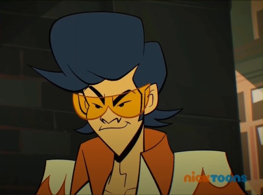
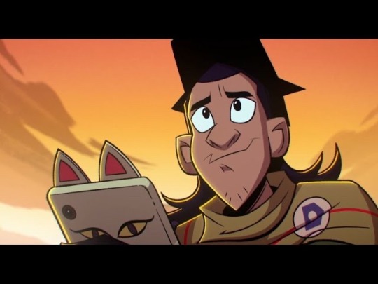
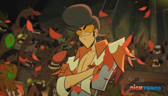
I have one question for the Rise!Fandom that’s been burning me alive for a while:
Why does Casey Jr. look so much like Lou Jitsu?!
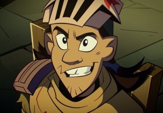
#watching yt and a vid icon w/ CJ was right next to one with LJ#and I promptly choked on my drink#and that pointy chin is not a common look on this show#I don’t think LJ is CJ’s dad though#if I remember correctly I believe Splint has one human kid in typical tmnt canon#so maybe that applies#my other thought is that the turtles like… became human for a day or something#which would explain why Mikey has hair#though odd thing to experiment with during the apocalypse#and just weird in general to even consider#anyway I do not ship Cassandra with any of the boys#but if one MUST secretly be his dad#I vote Donatello#I refuse to even consider Mikey#and I just don’t want to give Leo the satisfaction#Raph is like…. 10% chance#rottmnt
54 notes
·
View notes