#like. i need to see it in 3d. in motion. the different angles
Explore tagged Tumblr posts
Note
hello, I hope you're having a good day <33 I saw your recent post on my dash and I was STUNNED at the animated scene! It's insane to me I get to see your characters animated. Feeling blessed to be alive to see it, I am not exaggerating. You know, one of these times where you wake up and things are a little bumpy in your life but there's one thing that shines brightly you didn't know it could give you so much excitement? Yeah, that kind of thing ((:
I took my time for the past hour to reminisce over your blog again. It is one of the places I really love scrolling through and reading your writing. I had a question, if you don't mind me. The way you have improved is truly admirable. I know this might not be an easy ask to say "hey, how did you learn how to paint", so I'll ask this instead: I don't know how long you've been working full-time in art, but when do you make time for studies / drawing for fun? If it's not too much to respond to, how do *you* study? I remembered your posts with your redlines and wanted to ask how do you go about those, or if you switch your routines based on your needs (sketches vs speed painting backgrounds etc). The notes there were very interesting, seeing the mental exercise.
Pretty sure you have a fKTON of stuff on your plate, so please don't feel obligated to respond quickly or even at all. Thank you in advance for taking the time to read my message and for all the time you take to respond in general. Love reading your responses <3
Take care, ok? <3
I'm glad the animation made you feel better! I'll put the answer under the Keep Reading thingy.
I'm not entirely sure... I think I don't study as much as I should/could. I mostly learn as I go. Standalone studies are helpful, I'm just drawn to doing things that are more fun/satisfying to me or things that actively progress my creative goals. Imperfect illustrations for my stories, and incomplete research for worldbuilding! Many people learn faster than I, and those people do a lot more studies than I, but I have no info on whether they have more fun than I. Dopamine is rocket fuel, so it's important. :)
I'm always on the lookout for reference pictures, but I study almost only when I have a practical goal in mind, I guess. Studying is part of my job too, I think? As an indie concept artist I'm supposed to build a hoard of references and pull several new/sensible things out of them, and I think part of this process is understanding the material, and revisiting even what I already know. Illustration is similar. If I'm commissioned to draw an anthro alligator, it's time to study gators. It's not separate from work.
I mean, straightforward version: I wake up at 03:30, make coffee, and start working for myself until the paying work starts, lol. Brain is fresh before noon, and tired late in the evening just like everyone else's. It also helps that the city more or less shuts up at 4am.
The studies with the redlines... I do them when I fancy drawing characters or creatures but feel out of shape. I can get discouraged, feel like I forgot how to draw. I sketch if I plan to sketch, and paint if I plan to paint or want to study colors Drawing live models helps. Studying videos of people and things in motion. Hopping down rabbit holes about how/why things work (e.g. flintlock, Davy lamp, mansard roof). Drawing from refs. Hoarding refs. Trying different mediums (e.g. charcoal, 3D, etching). Small screenshot of one of my ref boards for the animation; I'd say I studied it a lot. How clothes move, what are good clothes, how do good clothes move, lion/tiger + human + eagle anatomy (from specific angles during specific motions if/when possible), how to dive roll, proper sprinting form, how to survive falling from a great height, spearfighting, pole vaulting, poledancing, lighting, colors, environment, kicked-up sand in motion, spear types, emu/cassowary/griffon vulture feet, etc. I didn't draw studies, unless you count the animation itself (I would).
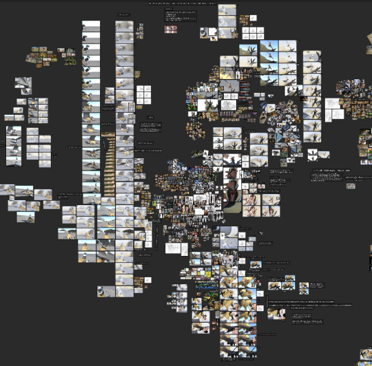
#whiteraventxt#studying#hope it doesnt read like i enjoy sniffing my own farts#Griffin's knees probably got blown when he fell btw
32 notes
·
View notes
Note
I absolutely ADORE your art style!! I've really wanted to draw my own twst OC, but I can't draw, and I'm trying to learn how. Do you have any tips on how to get started or any anatomy bases that I can try to learn? No pressure! Have a great day!!
hello! Thank you so much for the kind words! 🩷
And as for your question, I'll try my best to explain, as I don't really have the time or resources to give a visual explanation. I hope that's alright! ^^;
as a basis I would suggest you start from the very basics in order to be able to get the hang of anatomy. A good way to do that is by practicing how to draw mainly cubes and cylinders in different angles. You'll also find many tutorials or free websites from esteemed artists that teach you how to add flexibility to these otherwise static shapes, like how to draw a 3d rectangle as if it was twisting— which you will then be able to translate into a person's torso later on!
References are also important, obviously. You can go to websites like Line Of Action or Bodies In Motion for dynamic poses, or even just search on Pinterest for some poses to practice with. Break down the bodies into simple 3d shapes atop each other, practicing on how to angle them or implement them into the line of action needed to draw whatever pose you want (the line of action being a dynamic line that helps you determine the movement of the body and the flow of the captured motion iydk)
You will need to practice with this a lot until you gain the confidence to exaggerate the movement and master how to make the flow of movement look natural and dynamic, the confidence in your lines will improve with time as well. Another suggestion is also seeing archives from animation studios like Disney or gobelins to see what their sketches look like and imitating them to get a good idea on how their lines were drawn— the facial expressions and their exaggerations will also help you gain a primary idea of how expressions can be presented, and in the future you can make it more natural if you'd like, depending on your preference.
Aside from that, the internet also has no shortage of tutorial videos on art basics and anatomy tips— just know what to watch first so that you don't stress yourself out on things you still haven't mastered :) (let it be known that "mastered" doesn't necessarily mean that it has to be art museum levels of perfection— what's important is what you are comfortable with and consider to be your favored result or style) :]
I wish I could have given a more in-depth advice, but I'm self taught and half of the things I picked up or learned were from more than a decade of practice and under my belt,, I pretty much grew up on the internet, so i would always try and copy drawings that I really liked so I can try to the best of my abilities to reach their level, and the more I practiced, the more the basic idea gets fixed in my mind, and I can implement it in a different way in my own original drawings!
I'm still personally re-learning drawing basics as I'm now in my first year of fine arts, so even I have some room for improvement. It's very cliche of me to say, but the more you practice and the more resources you look into, the more opportunities you will have for improvement and learning :)
34 notes
·
View notes
Text
I recently witnessed someone on twitter with the spicy but interesting position of: the only people vehemently bitching against 2D puppets are the animators who have to use them. So, what's the tea, why's this debate even a thing, and is one side wrong?
Rigged 2D animation, also known as puppet animation, and prolly other terms I'm not aware of. Most 2D animators I know treat it with disdain as something they're forced to work on to survive instead of "real" animation (=hand drawn in this case), and while I've encountered less negative sentiments towards the medium coming from fans, I have seen several people complain about it unknowingly, correctly nailing visual aspects they don't like without knowing their cause. Additionally, it can be really hard to tell apart what's rigged and what's hand drawn in 2D, with many series mixing both to their advantage.
The reason for rigged stuff being so prevalent is that it's cheaper and faster. Where hand drawn requires redrawing your entire character/thing frame by frame to make it move, puppet animation uses, well, puppets, ready-made articulated models you just need to pose. It's also possible to use interpolation - instead of deciding by hand every image between two poses, you let the computer calculate it and come later to tweak how each part moves to make it look good. There is little to no drawing involved in rigged 2D, asides of rare shots that need a little part drawn over when the puppet can't do something specific, or drawing the eyes/mouths/hands/etc when you're making the puppets themselves. Notice I said series and not films in my previous paragraph - this is because animations with longer runtimes and/or shorter production times benefit strongly from this medium. You will not need to clean, to inbetween, to color and whatever other steps can go in hand drawn 2D when you have puppets. You can use the interpolations to your advantage on some movements. It's near impossible to be off model. You don't even need to draw!
And most animators uh, they're here because they like to draw. You can say animating and drawing are two different things, that is true, I've even heard it from the mouth of an insanely talented hand drawn animator called Liane-Cho Han who described himself as a poor drawer despite an impressive 2D portfolio. Poor drawer, good animator, it blew my mind at the time but when I started animating I understood what he meant. But puppet animation is still animation, and much closer to how 3D animation works, with stop-motion being comparable to hand drawn in terms of difference between these mediums. Yet you don't see industry-spanning bitching about 3D vs stop motion! This leads to my next point: puppets are limiting.
One of the advantages of hand drawn animation compared with other animation techniques especially those using character rigs is that you're not limited to said rigs. You can just draw anything, regardless of digital puppet constraints, of art style, of physics. If you can put it on paper, you can animate it. Puppets, both 3D and 2D, have limitations - the art needs to be made (sculpt, drawings) and be placed on a complex invisible digital skeleton allowing you to correctly manipulate your character, which is a job in itself. The more stuff you want your character to be able to do, the more complex it gets. You can't automate all of it. This means productions with lower budget and/or ambitions will tend to have simpler rigs which allow less. An example is angles: when you're hand drawing a character and want to pose them, you can pick whatever angle you'd like for all body parts. Rigs might not give this as an option, especially subtler angles of the head and foreshortening. This might make some movements you had in mind impossible, with a need to stylize your poses and your breakdowns. Not being able to have these angles can make for animation that looks stiff or awkward and can be very annoying to work with depending on the animator.
That artificial stiffness is to me, one of the telling signs something is rigged, and part of the reasons I don't like it myself! That's right, I'm with the haters here. Except stiffness doesn't necessarily mean something used digital rigs, and stiffness isn't inherently a bad thing - as with all art styles, it can just be that, a stylistic choice. Enters a director who's work I'll use as a counter example to the dislike of 2D puppets, both from an animator's and a hater layman's point of view on the results: Michel Ocelot.
Famous in France and way less internationally, two staples of his work are his fixations on fairytales and Africa. Fittingly, his most famous movie is probably Kirikou, a feature film which mixes both. Ocelot's work is stylized in a way unique to him, which can make his work very repetitive, but also makes it instantly recognizable. Some of his staples include static shot compositions, actors that talk like they're reading their lines out of an old book, busy backgrounds and folk tale tropes. Stiffness is just a part of what his movies look like, as are art styles that take inspiration from traditional art and past periods. He started out working before digital puppets were a thing, and while he's embraced digital techniques, releasing a full CG feature film in the 00s before it was the norm, he has worked without, including on Kirikou which is animated the old way.
The earliest of his films I've seen is called Princes and Princesses, it's already got everything typical of his work, and one of the latest of his films I've seen (and among my personal favorites of everything he's done) is called Black Pharaoh, and while decades and different techniques separate these two, they're both based around, you guessed it, puppets. P&P is a blatant hommage/reference to animation pioneer Lotte Reiniger, who used literal paper puppets to animate fantasy movies who's style is very reminiscent of the graceful, slightly simplified illustrations popular at the time. Black Pharaoh uses digital 2D puppets and is entirely animated using the (meticulously researched) style of ancient egyptian wall paintings. Both of these films tell a story, not like movies usually do, but like an orator retelling a tale does. And it works! The characters don't move in a 3D space, but it doesn't matter, they're from a fresco or are paper. The character's don't move realistically and it doesn't matter either, they're not trying to trick your eyes into looking real, they're characters of a story. Ocelot's films are a case where using puppets and their limitations works in favor of the film, not otherwise, and his stuff that's not made with puppets looks like it could be.
I'll briefly talk about a film I hate here to make the final point before my conclusion, netflix's Klaus. This is a film who's insanely impressive animation has floored people regardless of how much they know about animating. Unlike a lot of "this looks very cool" (actually p easy to make) animations you see going viral online, here everyone's right, it is indeed insanely hard to animate like that. Klaus was hailed because of it's uncanny ability to look like modern CG while being entirely hand drawn, which I think is stupid, because it's a lot of effort and talent wasted for a result that looks incredibly generic. Would this film have been bad if it had used CG? Why do people think hand drawn is better than CG in the first place? That I can't answer but the reason studios use it is money: either because it's trendy and will make more money because it's trendy, or because it's cheaper to make, which depends on what you're trying to achieve. In the end, they're techniques. Techniques have pros and cons and things they're better at than others. Time and money are essential to producing a film wether you like it or not.
So: are people wrong to hate on puppets? Nah, it's a question of taste. You can hate the look a technique gives and that's fine. But "ugly" is subjective and it's important to be aware of that if critiquing stuff is your job.
Was that tweet right? Yeah, pretty much, lol. For many if not most animators it's a technique they're forced to use, that removes a major reason they like their job from said job, and can be frustrating to work with. It's worth noting a lot of the work you'll get nowadays is on cheap productions, and the techniques they'll use most will be associated with the slop they are. Doesn't mean you'll inherently make slop. A technique is just that, a technique.
#might add pictures/links if theres interest#animation#mine#i almost made a short film that would have strongly benefited from puppets and ironically one of the reasons i did not do it is.#because idk how to use that technique and it just wouldn't have been as good to animate without!#the cheap look can be a style too: see - of all things - south fucking park#u can hate that show but its look is iconic and it stems from having a 3 peanuts budget and embracing that
32 notes
·
View notes
Note
Hey! I love your screenshots so much! Do you have a guide on how you take them? Which mods, if any, do you use? How do you get the camera parallel to the ground at different heights etc? Any help would be amazing. Thank you!
Hey! Thank you! I love them, as well, and it’s always lovely to hear when others do!
Unfortunately, I am not much of a technical writer so I don’t have any guides.The reality is I spend hours and hours taking screenshots and I often feel like I luck into things looking nice.
But I can give you the same tips I give to my friends who have said it’s helpful advice:
Vanilla gpose is very good! You can do a lot in it without the need for 3rd party tools and I’ve found having a good, solid understanding of how gpose works is what really rockets shots into ‘oh wow’ territory. You really just have to touch all the buttons and see what they do and how they interact with each other.
The main thing is, for re/g-shade users: If it doesn’t look good in vanilla lighting, the preset isn’t going to make it suddenly stunning.
The second thing, for everyone, is: Play. Play is very important. If you’re not having fun you’re probably not gonna love the final result. If it feels like a chore, come back to it later! Play a different game!
The third thing, for everyone, is: These are not rules, these are not laws. Just because I do something a certain way doesn’t mean it’s the ‘right’ way to do it. Your eye is what makes your art beautiful.
I'm putting the rest under a cut because this wound up being three pages without the pictures because I ramble.
The parts of vanilla gpose I touch with every shot:
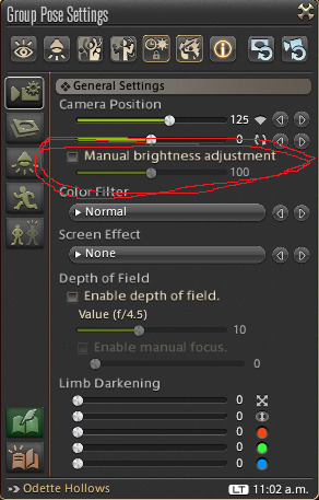
Camera Position: The first slider is your field of view. For portraits I set it to 200, but I tend to fiddle with it in all other shots until I get something I like. The second slider is rotation, very helpful to get to exactly 45 degrees or 90 degrees for shots. But you should also be able to use Q and E to rotate and this is fun to get neat angles on shots! Play with it!!
Depth of Field: I’ll be honest, I turn this sucker off because Reshade has ADOF which I think is better! But, I still suggest playing with this a little bit.
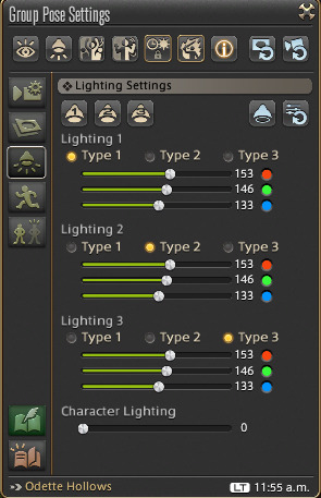
Lighting settings: You have three lights, each with three levels and each able to be a unique color. USE THEM. Find lighting objects in your setting that you can use to base the colors and directions off of. Is the moon full and above? Use a pale blue light as a rim light. 3a. Also, highly recommend looking at RL photography lighting set ups. This has been the most helpful. You can do a lot with three lights!!!!! 3b. Typically, I am mostly using two lights at type 1 or type 2. Sometimes I’ll use a third light, or that type 3 lighting, but it depends heavily upon the vibes. 3c. On this page there is ‘Character Lighting’ this makes your character brighter. I don’t use this at all because it tends to wash out shadows and shadows are an important part of lighting. I DO suggest that YOU use this to see how it works! A little is a lot, you know? 3d. THE MAIN THING IS TO PLAY WITH IT. Get weird with the lighting. Do really intense close up lights! Do funky colors! Cover them in bi lighting!!!!
Lighting Round Two: The one thing that my friends have said is the most helpful is telling them to use the Manual Birghtness Adjustment. This is on the general tab, not with your other lighting settings (circled in red). This controls the light of the WHOLE setting, including the brightness of your three lights. This is what really makes me go OH WOW. Turn it on, wiggle it around, be amazed. (Say it with me: Play with it!)
ADJUST YOUR LIGHTING.
Vanilla Gpose has a Motion Settings tab. This is what I use for my expressions but also a lot of ‘poses’ are just well captured emotes. A lot of this tab should be self explanatory.

The Eyes: The first eye has your subject turn to face the camera. You can have them look in a direction, turn it off, and freely move your camera around. The second eye is eye tracking. This is your friend! The head will stay stationary and the eyes will follow the camera.
Movement: Walk, run, sprint. Forward, left, right, back. Pause, play, reset.
Lip Movements: This, in junction with expression emotes, is very handy! Type 1 is minimal, type 3 is a lot more head movement. Pause, play, reset buttons.
Emotes: You already know what I’m gonna say. PLAY WITH THIS. Almost every emote can have an expression emote overlaid it and have lip movement added.
A personal favorite is /aback, /beam, lip movement 2, eye tracking.
Now. When you enter Gpose your subject is gonna be doing the animation they were last doing. To stop this, ground sit and stand before you enter gpose to start with a clean slate. However, this is also how you can get cool action shots. Using a dummy you can use an attack, reset the dummy, and enter gpose and your subject will be flailing wildly.
Some of the emotes and actions can move very quickly! To move things frame by frame we’re going to use the Disable/Enable Motion buttons. You have two of these at the top of the gpose settings.
Disable/Enable All Motion - This will pause or start all the motion of all the targets in your gpose! My Keybinding for this is 1 and I think this is the default for PC users. Disable/Enable Target Motion - This will pause or start the motion of your current target. (Tab cycles through the characters caught in your gpose.) My Keybinding for this is 2 and I think this is the default for PC users.

To go frame by frame by frame through an emote or action you’re going to freeze the character (1) and then, rapidly, you’re going to hit 1 then 2. (1 2 1 2 1 2 1 2) this unfreezes your subject and then refreezes them. Be mindful of your eye tracking and camera! One last thing: Take a LOT of shots. From all sorts of angles, with all sorts of lighting, with different expression. For every 1 screenshot I post there are about a 100 others that I didn't like as much.
Whew, okay, I think that covers the stuff I tell my friends. Sorry this got kinda long and it might be confusing because, again, I am no technical writer!
Now, I do use 3rd party tools but I’m only comfortable talking about those off anon! Other than Reshade. I understand social anxiety might keep folks from asking directly but I am a nervous person myself and just do not feel comfy talking about that stuff so publicly. But I try to be helpful where and when I can!
Apologies, anon, if this isn’t what you were hoping for in a reply but if anyone else reads this maybe they’ll learn a new trick or idea of idk something!!!
If you read the all thing that's fucking WILD and the only reward I have for you is my love !!
#AHHHHHHHHHHHHHH#I'm just posting it sorry if this isn't what you wanted anon!!!#the camera thing I don't think i fully understood but!!!#feel free to DM me sometimes I'm slow to respond but !!! I don't mind helping!#idk what to tag this as so like idk idk idk#guide#every time a friend asks me for tips these are usually what I give them btw#play with things#take your time!!!!!!!!!!!!!!#The other secret is that I am usually zooted out of my fucking mind and I take 5 hours to do a single gpose
60 notes
·
View notes
Text
Are ppl just like. using "AI" as a catch-all term for every unethical use of technology now?
Like, regarding the SAG-AFTRA strike, the push to use 3d scanning to make digital replicas of actors that companies can use in movies without needing to ask for the actors' permission or consent because they're technically owned by the company IS horrifying and completely undermines an actors' rights to their own image.
But it's weird to me that whenever I see people commenting on it they keep throwing the word "AI" in there (even some publications describe the situation as stuff like "the move to digitize background actors with AI") despite the fact that like. The tech behind this issue involves no AI or machine learning of any kind whatsoever? Like it involves using a 3d scanning rig to make a 3d model of the actor which can be animated by human CGI artists the same way any other 3d model is animated, or used in conjuction with a motion capture camera to digitally replace a person in a MoCap suit with the actor in question. It's been a thing since waaay before the current concerns regarding machine learning and generative AI were even a thing.
Like I'm confused. Are people just mixing up this with Deepfake videos (which do involve AI)? Are we using AI as a buzzword to elicit a visceral negative reaction? Or is everyone so tunnel-vision focused on AI as the current tech that takes creative people's jobs that everytime they hear about some tech taking creative people's jobs they immediately associate it with AI? Or is it because the process involves taking hundreds of pictures of the actor from a bunch of different angles and the current discussion of AI has conditioned ppl to immediately associate "feeding hundreds of pictures into a machine" with AI training databases?
20 notes
·
View notes
Text
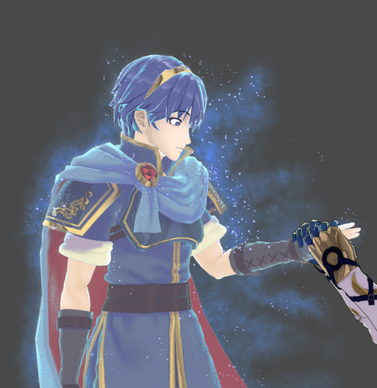
Bonus Content & Bloopers for the fake marlear screencaps
(I love behind the scenes stuff ok can you really blame me)
Ripping animations to help with some basic expression work was..... it was an adventure.
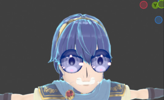
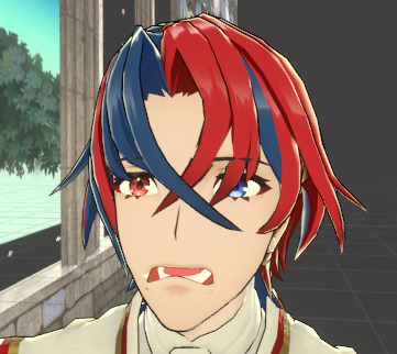
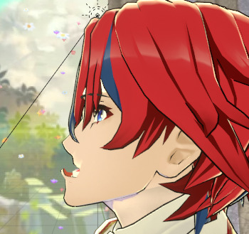
The first image above is an attempt to blend Marth's "surprise" and "smile" faces together but I uh...... Hit the wrong setting in the dropdown. I nearly died from laughing too hard pff.
The Alears there are what happens when you import the characters face rigs with different settings (still screaming at myself for that one) and then try to use a facial expression from one of them on the other one of them. That was supposed to be an :0 face.
The FEH players among you may have recognized the setting of that piece as the scenery for S supports in FEH! Figured if I'm setting the scene in Askr anyway I may as well go for the cheekiest spot. :P
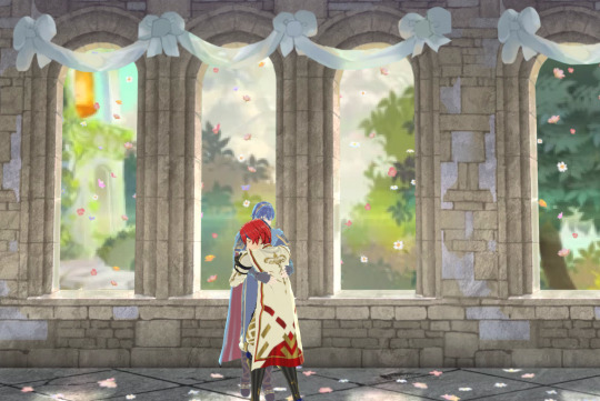
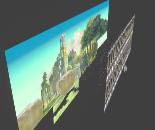
While it probably would've looked great if I'd modelled all that out, after the effort that went into getting the character models looking good I really just did Not have it in me to do that, so this scenery is... A complete and utter lie made of layered image planes.
This was part of why I opted to crank the depth of field so much in the final piece. Helps hide that everything aside from the guys themselves are crusty PNGs. :P It does a half-decent job of looking like a 3D scene even in motion though, so long as you don't rotate the camera TOO far.
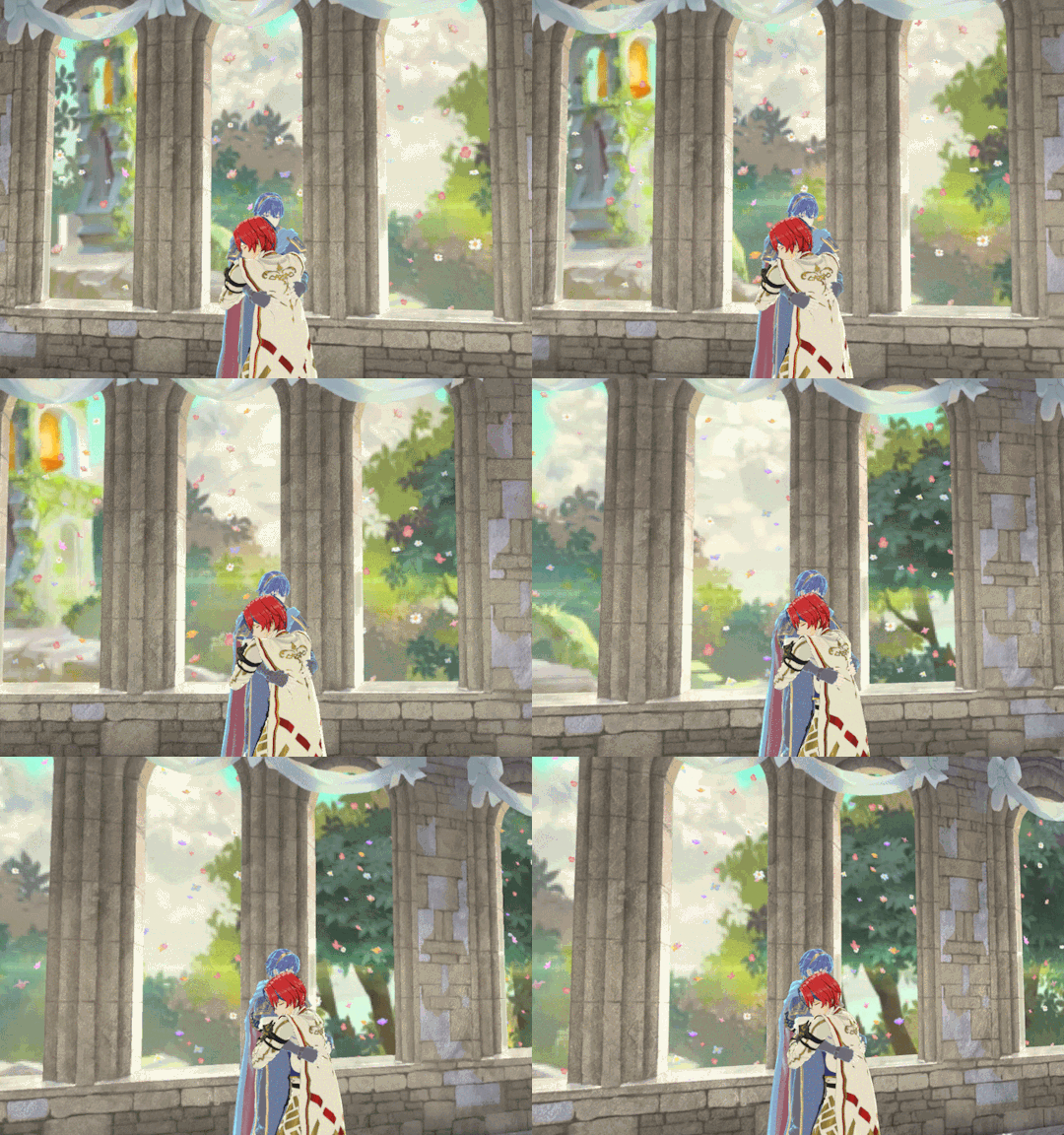
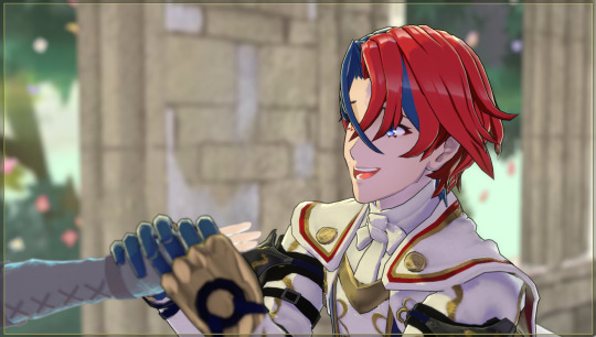
I REALLY liked how these close shots of Marth and Alear for the first pose turned out, but in the end I didn't think they fit with the other two poses. There was a timeline where I modified the expressions a bit and made fake dialogue boxes where they're talking about how surprised and happy they are they can actually touch each other in Askr, but I didn't feel confident enough to write in their voices for that.. So in the final shots that story just gets to be implied in their poses and expressions instead.

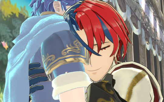
For the hug shot, I feel it is important to reveal that Alear's head is clipping halfway into Marth's shoulder and armour there. It's fine though. Animate for the camera, professionals always say! If it isn't gonna be viewed from every angle it doesn't have to look good from every angle. :P
Engage renders their characters' eyelashes and eyebrows ABOVE their hair, no matter what, in order to help the readability of facial expressions. I wanted to stay true to that look, so I had to render their eyebrows and eyelashes separately and then combine them in post. Enjoy eyelash-free Marth and Alear. :P
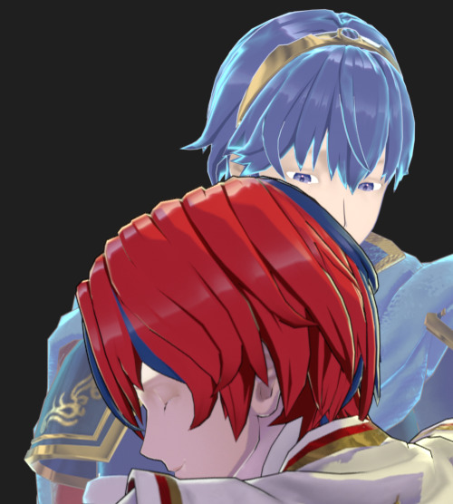
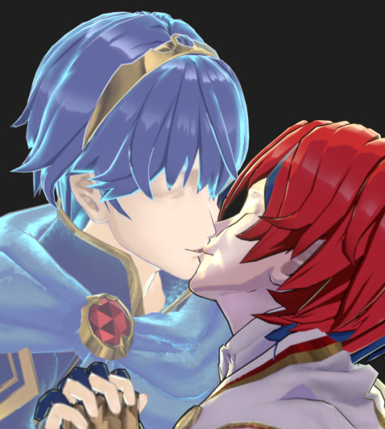
You can also see some areas there where I had to manually fix some shading and outlines in post, too. Blender has a bug with rigging right now that was affecting the face shading in odd ways, so I painted over that; and the inverse hull method I've been using for most of the outlines is very much imperfect and needed touching up in some areas, lips especially.
Since these character rigs were.......... We'll say not intended for use in Blender, they were fairly tedious to get posed right. No rotation or location constraints. These were joint-only rigs with no connections between bones so you couldn't use the auto-IK feature to, say move the whole arm at once. (Which made hand posing the WORST THING EVER AAAA EVERY FINGER JOINT MOVES INDIVIDUALLY why did i pick TWO poses where hands were a critical component)
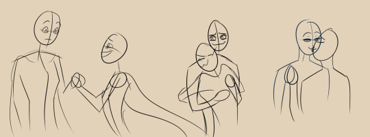
Part of my process ended up being doing rough sketches of what the final shots were going to be first, so I could keep in my head what sort of poses and expressions and camera angles I was going for. And by rough I mean ROUGH. I kept laughing looking at these little egg head guys for reference as I worked.
Engage's models also come with some "extraneous" bones; "piv" bones that I can't figure out what they do, spots where weapons and shields can snap to, "vol" bones for changing the thickness of specific body parts as defined in the big XML file of character proportions buried in the game. Unfortunately these bones overlap the actual posing joints in many cases, so until you get fed up enough to find and hide them all, you'll try to move the character around and end up doing shit like this by accident
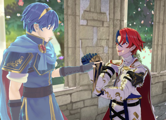
(Me too Marth, idk what the hell his skeleton is doing either)
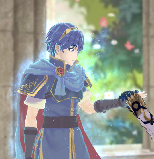
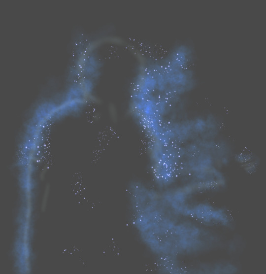
And as you may have noticed - no particle effects in these behind the scenes shots so far! That's because I both A) couldn't for the life of me figure out how to do that smoke effect, and B) couldn't render a particle system with anywhere NEAR the number of objects I would need to get a similar look to the game. So, I drew those in post! Shoutouts to the random sparkle and smoke brushes in my collection, you're the real ones.
#my art#i like treating my art like the DVDs from my childhood and including blooper reels and bonus contentwhenever possible#i just think its fun to do! documenting the process n all that#also nicely proves that i made this shit with my own two hands. i struggled for this y'all
2 notes
·
View notes
Text
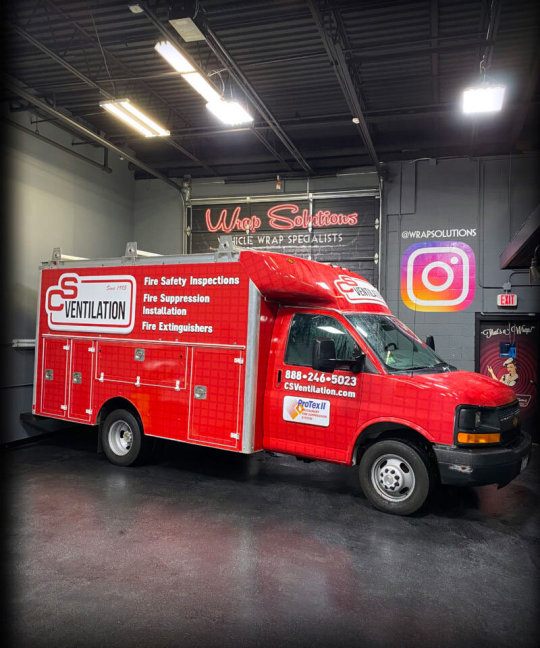
Truck Wraps with Custom Designs for Eye-Catching Branding
In today’s competitive market, businesses need innovative ways to stand out and attract customers. But what makes a wrap truly eye-catching? The secret lies in the science of visual perception, color psychology, and strategic design elements. In this blog, we’ll explore the key factors behind successful wrap designs and how you can use them to maximize brand visibility.
The Psychology of Visual Perception in Vehicle Advertising
One of the most effective forms of mobile advertising is truck wraps, offering a moving billboard that reaches thousands of potential customers daily .When designing a wrap, it’s crucial to understand how the human brain processes visual information. Research shows that people have limited attention spans, and when they see a moving vehicle, they have only a few seconds to process the message.
Contrast and Readability: High-contrast designs help essential information stand out. A dark background with light-colored text (or vice versa) improves readability.
Simple and Clear Messaging: Overloading a wrap with excessive text or intricate details can overwhelm viewers. A clean and concise message increases brand recall.
Eye Movement Patterns: Studies suggest that people read vehicle graphics from left to right and top to bottom, so placing key information accordingly enhances retention.
Choosing the Right Colors for Maximum Impact
Colors are powerful in shaping consumer perception and evoking emotions. In wrap design, selecting the right color scheme is critical to capturing attention and reinforcing brand identity.
Red: Creates urgency and is often associated with energy, passion, and action. Great for restaurants, delivery services, and retail brands.
Blue: Conveys trust, reliability, and professionalism. Ideal for corporate businesses, finance, and healthcare industries.
Yellow & Orange: Bright and attention-grabbing, these colors represent positivity and creativity. Best for entertainment, food, and promotional brands.
Black & White: A timeless and elegant combination that conveys sophistication and luxury, commonly used in high-end brands.
Font and Typography: Readability on the Move
A wrap must be legible even when viewed from a moving car. Typography plays a crucial role in ensuring that people can easily read and absorb your message.
Bold and Simple Fonts: Avoid script or overly decorative fonts that can be difficult to read. Stick to sans-serif fonts like Arial, Helvetica, or Impact.
Font Size Matters: Key information (business name, phone number, website) should be large enough to be read from a distance.
Proper Spacing: Avoid cramming text together. Adequate spacing between words and lines improves readability.
Strategic Logo and Branding Placement
Your wrap should reinforce your brand identity by incorporating logos and branding elements in the right places.
Side Panels: The sides of a truck offer maximum visibility. The logo should be prominent, with supporting details like a tagline or website.
Rear of the Vehicle: Ideal for displaying CTAs such as “Call Now” or “Visit Our Website” since vehicles behind will have time to read it.
Hood and Roof: These areas are less effective for advertising unless viewed from above in parking lots or high-rise buildings.

The Role of High-Quality Images and Graphics
Graphics should be high-resolution and scalable to ensure a professional look. Blurry or pixelated images can ruin the wrap’s effectiveness.
Vector Graphics Over Raster: Vector graphics maintain quality at any size, whereas raster images (JPEG, PNG) can become pixelated when enlarged.
Minimalist Design for Maximum Impact: Avoid cluttered visuals. A simple yet bold design ensures the message is easily digestible.
Using 3D Elements: Subtle 3D shading and gradients can create a sense of depth and realism, making the wrap more visually appealing.
Understanding Motion and Viewing Angles
Because a wrap is seen from different angles and distances, it should be designed for maximum visibility from all perspectives.
Avoid Low-Placement Text: Text positioned too low may not be visible from a standing position or from another vehicle.
Consider Traffic Conditions: Larger, high-contrast designs work best for high-speed roads, while more detailed wraps may be suitable for city traffic with frequent stops.
The Science of Call-to-Action (CTA) in Wrap Design
A strong CTA encourages people to take action after seeing the wrap. The CTA should be clear and easy to remember.
Examples of Effective CTAs:
Call for a Free Estimate: (123) 456-7890
Visit Our Website: www.example.com
Follow Us on Social Media: @BrandHandle
Strategic Placement: CTAs should be positioned in high-visibility areas like the sides or rear of the vehicle.
Material Science: Choosing the Right Wrap Material
The durability and longevity of a wrap depend on the quality of the materials used.
Cast Vinyl vs. Calendared Vinyl: Cast vinyl is high-quality, durable, and conforms better to curves, making it ideal for long-term wraps. Calendared vinyl is more affordable but less durable.
UV Protection & Weather Resistance: A quality wrap should be resistant to fading, peeling, and cracking under extreme weather conditions.
Laminated Wraps for Extra Protection: Laminating a wrap adds a protective layer against scratches, dirt, and sun exposure.
For more information -
Address - 278 Lowell St, Wilmington, MA 01887, United States
Contact no - 781-942-0111
Website - https://wrapsolutions.net/
0 notes
Text
What is 3D animation?
Well 3D animation is creating moving, three-dimensional images and putting them together. The visuals are made using 3D software, allowing animators create 3D objects even though they are made on a 2D surface. One of the software's that people use, is Unreal engine it's self. But what games is it used in?
3D animation is used mostly everywhere in this day and age, with it being used in games, shows and obviously animations. One game that I think used 3D animation is used uniquely is, Guilty Gear Strive.
Guilty Gear
In Guilty Gear, the developers and the 3D artists use, 3D cell-shaded animation in the games fighting mechanics even though the games models are mainly just 3D.
As you can see from above. One of the fighting moves changes the game to a more CGI look from the games regular look and merges 3D game models to more of a anime look. I love this idea, because it makes the game look way cleaner, in terms of quality and visuals, it just looks really smooth and with this idea being somewhat unique to guilty gear. I just personally haven't seen it in other games.
I selected Guilty Gear personally because I've just started playing it recently with it being one of my first fighting games. Compared to other fighting games, Guilty gear was just one of the few games that stuck out to me in visuals and was recommended by friends.
Another game that uses 3D animation is Apex Legends.
Apex Legends
Apex Legends is a first person, battle royale game with 3D models and animations. Pretty much every thing in this game has 3D animations, the guns when you use/pick them up, the character models with running, jumping, using there abilities. However one thing that you can use in Apex is what's called as a finisher. During or at the end of a fight, you can use it get armour (health) back. Obviously, there are plenty of games that use finishers in different ways but what makes Apex's more unique?

As you can see from the really scuffed gif above, this one of the finishers the game offers for a character called mirage. When it comes to it's finishers the game adds the character personally, in detail and visuals, and they also do it to pretty much everything else in the game.
The developers make finishers by using motion capture suits, and the team loves making them this way. It is just an easier way to just the most out of a persons personality and who else than mirage himself.
Mirage is the type of guy who likes the stand out, get peoples attention by being stupid, funny and fooling around. In the finisher you can see his personally, and the animation hits the mark with how he acts. This is something I would like to see in more games that are more fast paced.
The last game I'm going to talk about is Honkai: Star rail.
Honkai: Star Rail
Honkai: Star Rail is a turn based game that use 3D animation that it uses to take advantage of the nice visuals and effects that the game has. What makes star rails animation stick out to me however is how they use the dynamic camera angles when a character attacks or does something.
youtube
(lmao because of limit)
This video shows what the camera angles look like, and from what is shown from the video, Star Rail uses it's camera angles in the best places to show the player the most of there 3D animation in the best ways possible, which is probably why the 3D animation looks as well made as it does. Personally, this is what sticks the game out from other turn based games of this style.
A few other examples
Personally, there are a few other good examples that I think need talking about that aren't in games and are shows or just individual animations are:
Arcane
RWBY
Murder Drones
Meta Runner
Spider Man: Across the Spider Verse
0 notes
Text
【Magi】 Judar doodle ❤️


Intro Rambles
This one turned out nice ^^ I like this one hehe. It looks similar to the other one I did but this one also has a nice vibe to it
I like both! I did the 2nd one last night.
Inchresting...
My sketching style is very recognizable so it's 100% my art style but I think it's interesting how things like the shape of the eyelashes, thickness of the eyelashes, underlashes, and how the eyes and rings in the eyes are drawn make my drawings give off a different vibe
Cuz I'm using the same art style for all of these doodles. I tend to draw the eyes of sharper tsurime-eyed meow meow mf charas the same way. I just do the details differently depending on the character
VRoid Studio and MMD Rambles
I don't think I mentioned it here yet but I wanna make VRoid models of my OCs and fave charas eventually so they can be used in MMD so I can make them dance to Vocaloid songs~ It's because I'm really interested in making my ships dance hehe
I want to make my OCs in VRoid one day 🙏 ✨ This includes my rehomed cat cots I treat as OCs and my faves. Would be super useful to have refs I can turn around and take from different angles! And it'd be super cute to see my faves dance omg
List of charas I want to make VRoid models for:
OCs:
Selena (KHR AU)
Linh (KHR AU)
Rehomed cat cots I treat as OCs:
Tatsumiya (WATGBS AU)
Idate (WATGBS AU)
Takama (WATGBS AU)
Meow meow mf faves:
Xanxus (KHR)
Judar (Magi)
Kuroha (KagePro)
Like this is the main list
Thankfully people already did my job for me with LimGuda and ObeGuda <3 So I don't need to make ones for Douman, Oberon, and Ritsuka
(Credit: Yutaka's Douman and Oberon MMD models)


FGO MMDs


But ngl guys I want to make my meow meow mf faves in VRoid too. Cuz I was just thinking I need my meow meow mfs too for my ship fuel. 🙏 🫶
Xanxus (KHR), Judar (Magi), Saeran (MysMes), Edward (ROTRK)
And the list goes on~
I'll start simple with my OCs though.
Who knows. It'll probably get me to start finishing art
Judar with my HC design tho cuz I ain't drawing that ugly ass racially stereotyped outfit he wears in canon 😭
I'm definitely not distributing my VRoid/MMD models publically though. My mutuals/friends are free to have access to any VRoid/MMD models I make in the future, though <3
I like to have my scans and art stuff under my control and limit access to my stuff, to make sure my things don't get used by unsavoury people, so that it doesn't get reposted around, etc.
Especially with how bad the MysMes fandom's reposting issues are.
And I hate Funa and her fanbase in general cuz they're uncritical af, etc., so there's no way in hell I'm sharing my WATGBS AU MMD models
VRoid Rambles
I watched a bunch of FGO MMD videos (of Douman, Oberon, and Morgan), and now I feel tempted to try my hand at making MMD models for my faves (Selena, Tatsumiya, Idate) in VRoid Studio…
I wanna make 3D models so I can make my faves dance in MMD Selena and IdaTatsu MMDs you will be real someday…
I'd use VRoid Studio because it provides bases for hair and clothing, and I don't feel like using Blender tbh
Also I watched a bunch of VRoid Studio model making tutorial videos, it's way easier than I thought. Most of it is honestly just drawing normally and using preset assets as a guide
Thank god FGO being so big and Douman and Oberon's huge popularity means that people will definitely make MMD models for them
People have already done my work for me (Bless you!)
JP fans have already made models of many FGO charas, so I can play around with them. I can make LimGuda and ObeGuda MMDs… It's common practice in the MMD community to credit all the assets you use: Models, Camera, Dance Motions, Stages, Lighting Effects, etc.
I saw JP users say they made 3D models of FGO charas (such as Douman and Oberon) with programs like VRoid Studio or Blender. So it's totally doable
It'd be kinda fun to try making MMD models for my FGO faves in the future too, but not now
Especially with how detailed their designs are (especially Douman's)
Imo Douman is way harder than Idate because of their hair and outfit
Cantarella MMDs
I wanna make 3D models one day so that I can convert them to MMD and get LimGuda, IdaTatsu, XanLena, JuAli, and KuroEne dancing to Cantarella and other Vocaloid songs... OH MY GODDD
Cantarella by Kurousa-P ft. KAITO & Hatsune Miku
youtube
Cantarella ~grace edition~
youtube
I'd have to use the OG Cantarella motions though, Idate, Judar, and Xanxus would not know shit how to play the violin LMFAO
Like for Douman and Kuroha, the violin part would actually still fit, like I could actually still see that for those two, but it just doesn't fit charas like Idate, Judar, and Xanxus
I personally prefer Cantarella fan covers (VOCALOID/UTAU and human fan-covers) over the original due to stronger tuning/mixing
But Cantarella's instrumentals are excellent
The original Cantarella MMD has a dance section. I love the little spin and jump in the air and landing on the ground, I think that fits my faves more
The remastered Cantarella ~grace edition~ has a violin playing part which is aesthetically nice
Sitting in the throne fits all of my meow meows tho
#magi#magi: the labyrinth of magic#judar#judal#judar magi#judal magi#wip#doodle#sen's art#mmd#vroid#vroid studio#sen's rambles#Youtube
0 notes
Text
Conceptual references:
Backroom series and Scp series The urban legends, which are spontaneously supplemented and described by netizens on YouTube, make the audience feel different by "spooking" everyday things. These series contain horror, tranquility and nostalgia, reflecting a variety of people's exploration of fantasy and reality. I think these series fit in a way with VR art and my vision: they show reality in a way that people conceive, and they combine physical things with fictional things through thinking and feeling. 3D design is the possibility of realizing these ideas, and these arts are also about building entities out of things that don't exist, and I think they are common. Just like Madoka Magica's artistic style mentioned above, this work uses a lot of 3D and 2D visual effects together to achieve the final presentation style. The texture on paper and the diffusion of painting/watercolor traces are one of its major features. Therefore, I chose to enlarge the paper texture while deliberately obscuring some areas with 3D scanning to add a strange feeling between reality and fiction. As for the part where the plane is transformed into 3D, I took into account the audience's feelings. Most of the sources of fear come from things that are considered "non-existent" or "impossible" in common sense. One of the contents called "monster fear" is to create an atmosphere by combining normal actual reference objects and objects of abnormal size with special effects. With reference to this concept, I made the works very large to reflect the sense of vastness. At the same time, I found that such a large volume in styly would cause slow motion of the viewing Angle, so I tried my best to put the things I needed to watch in the position where the main viewing Angle could see them, and such slow movement was only a necessary condition for increasing the experience rather than viewing all the works.
0 notes
Text
Hauntii Review - Life After Death - Game Informer
New Post has been published on https://thedigitalinsider.com/hauntii-review-life-after-death-game-informer/
Hauntii Review - Life After Death - Game Informer
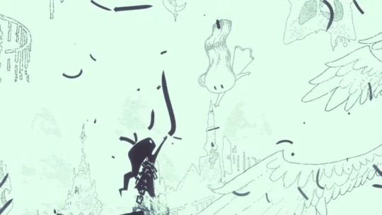

Hauntii drew me in immediately thanks to its striking illustrated art direction and enchanting jazz noir soundtrack. A powerful opening sees the protagonist, an adorable ghost who recently died, attempting to ascend to a heavenly plane hand in hand with an angel-like guardian, only to be shackled and pulled back to the depths of Eternity. It’s an emotionally effective moment, and while the gameplay doesn’t always prove as captivating, it provides enough thrills to propel through an eye-popping journey through the afterlife.
As the ghost seeks to reunite with his winged companion, the game takes players across beautifully designed biomes in the realm of Eternity. From a dense forest village to my favorite locale, a bustling amusement park, I can’t stress enough how cool the game’s two-toned line art looks, especially in motion. Backing the visuals is a superb soundtrack that ranks among my favorites of the year. It bounces from sparse piano melodies and saxophone-fueled lo-fi beats to uplifting grandiose scores that effectively stir emotion.
[embedded content]
Despite its serenity, Hauntii is an action game at heart and plays like a top-down twin-stick shooter. In addition to the simple thrill of blasting foes with spectral energy by aiming the right stick, shooting objects lets you “haunt” them and utilize their unique abilities. Possessing other enemies can aid in the sometimes challenging combat encounters thanks to the superior firepower they can pack. Sure, I could rely on my own might, but it’s far more satisfying and effective to obliterate foes as a bomb-spewing flower bulb or take down aerial threats with a firework-blasting theme park employee.
Hauntii routinely pushes players to rely on possession to overcome tough bouts that sometimes feature upwards of a dozen enemies firing bullet hell-style projectile spreads. The moment-to-moment blasting wears thin after a while, but creative boss encounters add interesting wrinkles. My favorite includes possessing a bomb-laden rollercoaster to drive through a trap-laden track to reach a towering monster.
Other haunting interactions are less involved and more bespoke, like capturing a tree to shake currency and health from its branches. In that sense, Hauntii reminds me of Super Mario Odyssey, as some objects had no practical use but provided humorous, novel interactions. Other, more creative possessions let you manipulate the level design and navigation, such as raising platforms to create elevated pathways or inhabiting cosmic sand whales to navigate a turbulent vortex.
Each area contains a number of hidden stars to collect, used for upgrading your number of hearts, shooting ammunition, and how often you can use the evade dash. They also unlock simple yet effective vignettes revealing a core memory of the ghost’s former life. Gathering these stars channels the satisfying scavenger hunt of 3D Mario games. Some stars lie in obscure corners, while others must be earned by completing basic side quests or performing hidden challenges, like clearing an area of threats. You don’t need them all, thankfully, as these aren’t always the most exciting tasks, and some repeat, like timed races and finding a lost dog.
Exploring is also dampened by the deliberate movement speed, which is a notch slower than I’d like. Since most zones are expansive and require multiple visits, I often mashed the dash button to expedite travel. The elaborate art design and isometric viewing angles can also make navigating certain pathways, namely elevated ones, a tricky and sometimes irritating proposition due to the perspective. I could also do without collecting various but identical currencies to unlock different hats that, while cute, I wish you could remove instead of just switching to another.
Though Hauntii offers simplistic shooter pleasure, my favorite moments didn’t involve blowing targets to smithereens. The voice-less story of the ghost gradually regaining precious memories only to be faced with surrendering them to crossover touched me at points. I enjoyed interacting with the kooky, amusing ghosts, like a paranoid scientist concocting hair-brained schemes to capture your angel friend like a Team Rocket villain. I never tired of soaking in the swelling musical score as the camera panned out to reveal a jaw-dropping backdrop. The beautiful ending sequence stands out as a highlight of the year. Hauntii transforms the understandable anxiety and fear surrounding death into an alluring and comforting reflection of the joy of life.
#2024#3d#ammunition#anxiety#Art#beats#Capture#Cute#Design#Developer#direction#dog#energy#eye#fear#forest#game#games#hand#Health#heart#how#it#LESS#life#memories#memory#Moment#movement#namely
1 note
·
View note
Text
My context and reasons why I am making this project.
I will be making a cutscene in relevance to a hand to hand fight between two gladiators where they were told to fight with no weapons. Along side it there will be an asset pack of animations that I would tend to do for commissions.
My project will not be related to a story or a story building. I am making this project for an industry. I receive commissions from people who need an animation for a ROBLOX game. I make asset packs for these people and singular animations. They give me a description of what they are looking for me or send me a reference.
The reason why I chose to make this project for my FMP is because I have experience on animating for ROBLOX on the blender engine. I have been animating for Roblox for 2 years now, and I got into the selling industry recently, around 8 months ago. I have a online profile where people can see my work and if they like it they message me what they want and how much it would cost. For simple singular animations I charge £8 per. If they want a cutscene I charge the amount I think is reasonable depending how long I think it will take me to complete it. I have a portfolio on Discord where I add it into my description where I say what I do and put the link of the server in it.
The reason why I decided to use Blender for Roblox animations is because the engine is much smoother than the one Roblox provides us with. On blender we are given with a lot more opportunities to make our animations more professional because of how much smoother it is. Blender is used for so many different things that is not animating. It is used for visual effects, art, 3D models, motion graphics, interactive 3D applications, virtual reality and video games. However I decided to go with animating because I enjoy it and to me its really understanding compared to all the other things that Blender can do.
Animating is a difficult job if you are not aware of what choreography is. Choreography is a necessity for animating because it is all about posing and angles. You need to know how a person moves and how someone would move if they were doing a certain action. The arm swing, the leg position if they are attacking, the torso swing, where they would be looking, etc. Animating also requires some creativity if you want to make a unique character with unique skills and moving traits which many people on the Roblox industry are looking for. Over my 2 years of animating I have learned how to make everything sooth together with attacks. Posing the legs correctly on animating is probably the most important part of any animation. If the legs are not placed correctly the rest of the animation will not look correct.
How the marketplace works is that the people who want an animation from me tell me what they want/show me what they want and I give them a price, if they agree with the pricing I do the animation show them it. If they are happy with it I export it into Roblox Studio and get the animation ID and send it to them only then they send me the money of the animation through PayPal. People may see this as a risky payment system but if they attempt to take the ID of my animation and try to use it without paying I can disable the ID making it uncopiable and unusable. In the end if they refuse to pay for my animation I publish the animation I made to my portfolio since it will not be used for a game so it will not be leaking so either way it helps me.

This is the official Roblox marketplace where everything is sold for a currency called Robux, Robux is the platform currency to buy anything that applies to your account across multiple games.
My target audience is people who are interested in making Roblox games, games developed on Roblox can be highly profitable since the software is free and it only takes a few financial usage to advertise your game. Which is why I am greatly into Roblox development because its relatively cheap and you can get paid well if your work exceeds their expectations.
Roblox is a platform where people of all ages typically children find games and play them for entertainment, there are millions of games to play and explore within Roblox. As an animator I want to make games stand out with unique animations which will intrigue players because it is far from every default animated game.
My process on animating is like so: I initially move the rig slightly lower than its default height so I can position the character's legs better (bend more making it look better). If the animation is supposed to be a walking animation I will set it to 30 frames per second at first and make it 40 frames. I will add the simple cycle of the walking meaning the torso swinging side to side and the legs going back and fourth by 20 frames they have taken the full step and is about to take the other with the other leg. After I am happy on how much the torso turning and I can picture how it will look only then will I add more movement to everything all together. After adding enough detail to the leg cycle and torso going up and down making it look like there is power behind it. I then make the basic swings in the arms. After I see everything going well with each other is when I add dramatic swing in between frames giving it more detail yet still smooth. This can all be seen on the animation posted below on the walking animation. Head movement is the last thing I apply. Just so it does not seem out of place to begin with. I do this for every animation.
The rig I am using I created it by following a tutorial on how to make rigs but I made it better for myself by turning it into blocks instead of it being visible bones inside the character. I find those rigs more confusing they need to be but I can work with them as I already have previously and I am aware not all models can have the blocky rig which is why I need to also know how to use the skeletal ones.

A pack can have any amount. If they are for a combat game with individual characters they tend to have the following:
Walking
Running
Idle
Combat stance (when put into combat mode)
Jump
M1s meaning swings per click they tend to have 4-5 in most combat systems.
M2 (heavy attack when right click is pressed)
1-4 ability animations depending on the character.
Blocking
Blocking impact
As I charge £8 per animation in total this would be £104 not including the abilities. The abilities were not included because I need to know what it is they are looking for and only then I will decide my price on the abilities. The time it would take me to do all these animations that is not including the abilities would take me around 2 hours to make. So essentially I am being paid £52 pounds an hour for this pack.
Roblox animations are expensive because people who hire developers on Roblox do not understand animating and anything else so people who are highly more experienced than me are paid around £15 per animation. Which I am aiming to get up to over my time in animating.
Since movement is a key point in animating, looking at FIFA animations can also help a lot on how to make ideal running animations for actual rigs. But for Roblox animating making a realistic animation would make it look really weird in game. Which is another reason why Roblox animating is so different compared to realistic model animating. Yes us Roblox animators can do realistic animations for Roblox but we don't because it does not fit everything else on Roblox. We need to remember that this is a 2006 engine working with Blender which is used in movies.
youtube
1 note
·
View note
Text
Further Development Project 1
Of Myth And Notoriety/Lycanmancer
Post #2
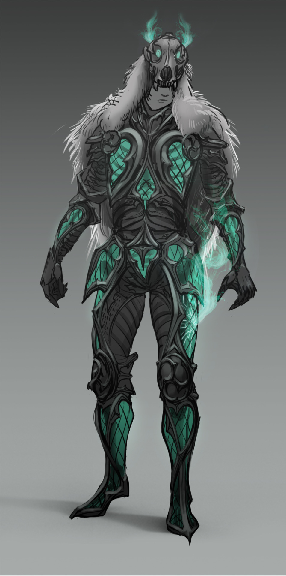
I've started exploring gravestone designs that would match my necromancer character concept. The necromancer has natural/druidic (through the wolf skull and fur cape) and Gothic (through the Gothic window-style armour) elements. Using the parameters from my alignment chart, where lawful should have Gothic elements, and Neutral should have druidic elements, I would say that my character is Lawful Neutral.
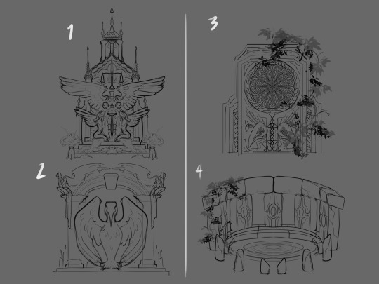
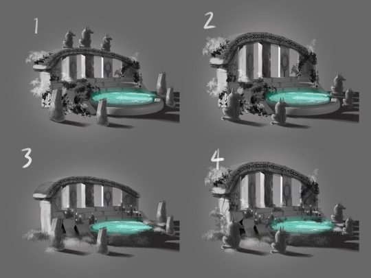
Concept 1 (below), although it uses sharp shape language, comes across as good and worshipful. Concept 2 was leaning toward Lawful Good again, but it is still too 'holy' with it's seraphic motifs. In concept 3, I used the Druidic and Gothic elements of my character, but the squareness is too stoic, it seems to be in conflict with the delicate glass of his armour. In concept 4 I decided to lean more toward the Druidic element by creating something not at all Gothic and more of a Good or True Neutral alignment through a memorial henge. I feel that these concepts are still relevant for the idea as these are props in motion that can change based on the character's choices in-game.
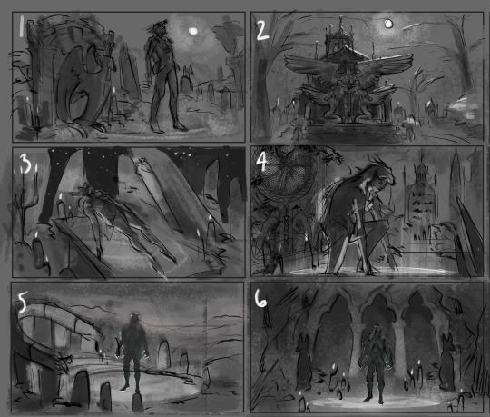
I incorporated the above concepts into thumbnails exploring composition, as well as a couple of new design ideas. I used some compositional types to help guide me in their creation.
I feel concept one is too unbalanced and too generic. The leering mausoleum in concept 2 is epic, but I couldn't figure out a way to incorporate the character in a way that would make them a focal point. I really liked the composition and angle of 3, I felt it was dynamic and intriguing, but I also think it's too cliche. I liked the character pose in 4, but with such a close up shot, I would struggle to show more of the environment and gravestone prop. I went with a diagonal composition in 5, the circular portal acts as a focal frame for the character, I really like the natural henge design for this one, and an amphitheater element makes it unique. In concept 6, I wanted to carved the mausoleum directly into a cliff-side with some intimidating angles and lighting, coming across as more evil and imposing. I really liked number 6, but felt it was a composition similar to another of my portfolio pieces. Taking these explorations into consideration, I've decided to pursue the concept of the Druidic henge, number 4 above, and composition 5 below.
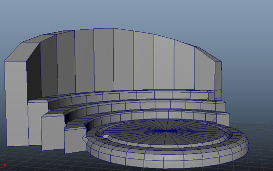
The henge design is simple, but its angles can be easily miscalculated if drawn free hand, so I modeled a basic mock-up in Maya to use as an underlay for further exploration. The accuracy of the 3D model helped elevate my concept sketches and also provided me with a little lighting information to inform the values. I rendered the angle based on the image I chose for the background by Tomas Robertson.
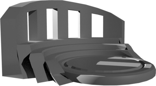
I incorporated the 3D model as an underlay to further conceptualise details of the henge design. There are subtle differences between the type of decoration and level of vegetation. I wanted to add more elements of my character to the design since I didn't include Gothic architectural elements, I did through his wolfish cape design and the wolf statues surrounding the henge. This also adds to the character's unique influences. I like all of the elements of concept 4 the best.
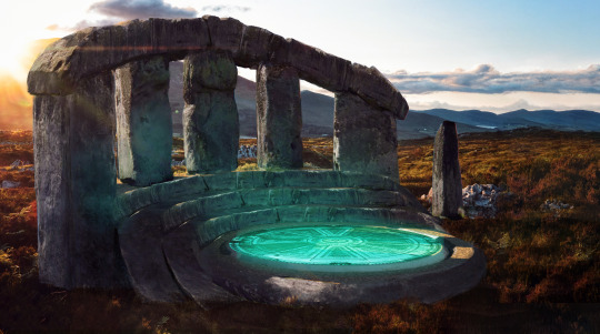
I made a start on the final concept through photobashing and manipulating pieces of Stonehenge (see stock images below) onto the 3D mock-up to ensure correct perspective.
These are the stock images I used. The photograph of Stonehenge by Jonathan Ridley was particularly useful as the foreground stones contained similar lighting information that I need for my amphitheater. The Scottish highlands at sunset set the mood perfectly for my necromancer's summoning.
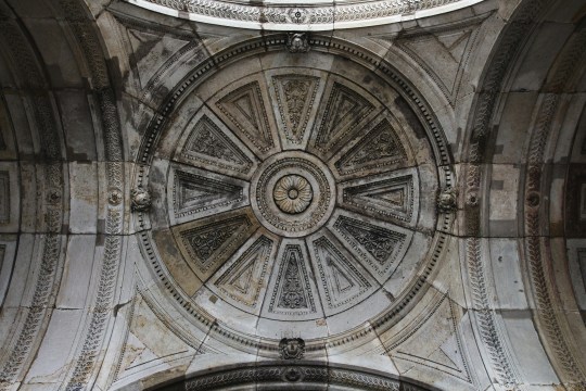
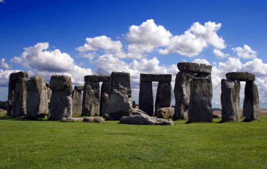
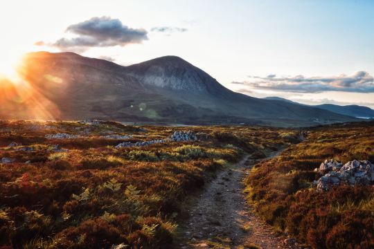
Image References:
DAZ STUDIO. (2015). Genesis 3 Male. [3D Asset]. DAZ 3D
Rawpixel. (n/d). Abstract gold sunburst effect background. [Photograph]. https://www.freepik.com/free-photo/abstract-gold-sunburst-effect-background_15559471.htm: freepik.
Ridley, J. (2020). gray rock formation under white clouds and blue sky during daytime. [Photograph]. https://unsplash.com/photos/gray-rock-formation-under-white-clouds-and-blue-sky-during-daytime--ZLDp: Unsplash.
Robertson, T. (2018). brown pathway near grass and stone. [Photograph]. https://unsplash.com/photos/brown-pathway-near-grass-and-stone-0kKcSc4dD7o: unsplash.
Spindler, S. (2016). gray building interior. [Photograph]. https://unsplash.com/photos/gray-building-interior-ippIhSrimC8: Unsplash.
textures.com. (n/d). 3D SCANNED STONE SURFACE - 1X1 METERS. [Online]. Available at: https://www.textures.com/download/3DScans0467/133923
TEXTURES.COM (2023). INKSMOKY0052 Image 3. [Photograph]. CC BY-SA. Available at: https://www.textures.com/download/InkSmoky0052/28558 [Accessed: 11 October 2023]
0 notes
Text
Forefront 10: Black slide (2021)- Realms of story!

Black slide is a 3D animated short film by Uri Lotan it starts with a scene from water theme. A wide establishing shot explains where the story happening. Two kids sneak out from the park to an area where only elder can access. They both jumps out of a fence, while jumping, it makes a scar on the young Eviah on hand by the fence. By going forward, we understand that this is not worrying challenge for him, more than that, something else worrying thing happening in his head. First, we will think by pressure from his friend, as he is a young boy doing things by peer pressure, so he tries to sneak out to adult water Slide. But he is worried about personal more serious things.
youtube
According to the reviewer robe “It’s this layered approach to the storytelling where Black Slide really feels like it reaches another echelon, serving up not one, but two defining moments for young Eviah and hitting us with a double whammy blow where we feel both relief and devastation. It’s an emotional journey and one, unfortunately, influenced by Lotan’s own experiences”.
After finding it directors personal experience or personal journey he experienced in his young age, I feel extremely sad by the story while he takes audience another level. He sneaks for that water ride experience other than that gives audience an emotional feel of devastation, unfortunately things.

He says that the film inspired by his own life when he lost his mother due to cancer. on the day she passed away, he was with his best friend at local water. If terrible things happen in a joyful day that remains unforgettable or makes a scar on his heart. So, he wanted to make a animation related to this incident. Until the world knows about this, it will remain stylish day, but we remember it as the most terrible day of his life. But he didn't directly tell the story uses depicting emotions in different visuals.
I watch this movie without knowing his personal experience, with this realisation about the story, I feel emotionally connected on the painful haunting feels. Even without knowing the personal angle anyone can connect the story with the emotion and feelings. After hearing directors talk about this devastating loss of his own mother then this story is adding emotional impact of his storyline even harder. The first thing happened with the Boy, is the scratch, it hurts but he's on a mission, he needs to complete that with all bravery so he patched up then he continuous.
As it impressed with the storytelling, animation is in another level. They created in 3D animation with a stop motion feel, initially I think it created in stop motion later watching more closely I found it's 3D animation, the texture of every object looks like hand sculptured as the directed wanted it to be appeared as a puppet animation. He added additional fingerprints in character, on each character's face we can see fingerprints, that's adding personal elements. Keeping personal imprints on our artworks is interesting, this one inspired me in my own practise. It got shortlisted for the best animation Academy Awards and also win many awards.
Bibliography
Short of the Week. (2022). Black Slide by Uri Lotan | Drama Short Film. [online] Available at: https://www.shortoftheweek.com/2023/01/12/black-slide/ [Accessed 27 Aug. 2023].
www.animationmagazine.net. (2022). You are being redirected... [online] Available at: https://www.animationmagazine.net/2022/10/director-uri-lotan-takes-us-on-a-ride-down-his-black-slide/ [Accessed 27 Aug. 2023].
www.youtube.com. (2023). Reckoning with Grief at the Water Park | Black Slide | The New Yorker Screening Room. [online] Available at: https://www.youtube.com/watch?v=LNgBJPzBobU&t=599s [Accessed 27 Aug. 2023].
#university of hertfordshire#major study_digital media arts#ma animation#major study#animation#Youtube
0 notes
Text
FOREFRONT 9 : JOHN WICK CHAPTER 4 (2023)

I've never been so pleased by the cinematography and the lighting more than this film and I've taken a lot of inspiration from this film which I definitely will be using for my future films when time permits. only in a film like this can a character be at any place in the world and it would still look relevant to the film and not take us out of the story whatsoever. This film has also made me do my research on background elements that might have a hidden meaning behind them so they can be used to foreshadow something that is about to happen, convey emotions and the mood of the scene, etc intention was to make this movie purely epic. The lower set shots, which they have used before, went to an entirely different level.
youtube
I was watching an interview given by Dan Laustsen to Collider Interviews regarding the action sequences of the film in general and there was a section where he spoke about how it took them a whole week just to set up the lighting for a scene. he then goes into depth explaining how every single element counts in contributing to a scene with great lighting and although it's different to set up lighting in real life than in 3D software, I will definitely remember some of his words about the positioning the light and keeping multiple lights in a certain angle to give a better result.
The production design by Kevin Kavanaugh was impeccable too. Seeing the blossoms come out of the tree with John standing there is just poetry in motion. You don't need John telling us he's still full of his pain and grief, but also full of anger towards the world that he used to be a part of. It's all played by these sorts of moments well. He looks to his friends to find a path, find some solace. They understand what sorta of man he is and why dying for/with him is a worthy death in honor. Because what happens in this epic-scaled story of the end of John, will be set in stone against the High Table.
REFERENCES :
Stahelski, C. (2023)John Wick : Chapter 4 . United States: Lionsgate Films.
Interviews, C. (2021) John Wick 4 cinematographer on Keanu Reeves, Donnie Yen, the action, and filming in Paris and Belin, YouTube. Available at: https://youtu.be/PmtQ4rHi9v4 (Accessed: 23 August 2023).
0 notes
Note
Hey! I was wondering if you have any tips/ would be willing to share your process for drawing character faces and expressions? It's something I'm trying to improve in my own art, and I adore how specific and clearly readable yours are across all your different pieces.
Absolutely! To start, I wouldn't say I have a "process", it kind of varies depending on the style of the piece I'm doing. That being said, since most of my art here is mostly all comic book/animesque style, I'll give some info on how I tackle expressions and how to build a good foundation for any expressions you want to draw.
The Basics: The Skull
Everything starts with the skull 💀 I've spent a lot of time learning the underlying structure of the human head, namely the skull and facial muscles. The skull is divided into many zones and regions (of which I do not remember all the scientific names), so to simplify things, I divide the skull into the four main parts below:
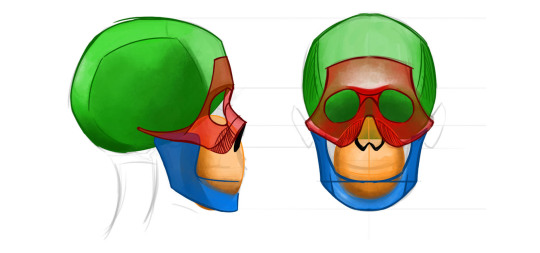
(I simplify the maxilla and teeth into a circle, since it's approximately curved when closed.)
I usually spend at least 5 min a day just doodling skulls so that way I don't lose the visual inventory I have in my mind. It makes it easier when I want to sketch characters and expressions on the fly.
That's the structure, but now you need to learn how the motion of the skull actually works. Do studies of how the jaw moves compared to the cranium and maxilla. This is important because if you want to draw your characters screaming/crying/arguing etc., you need to understand how the face stretches to accommodate the open jaw.
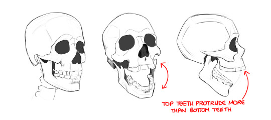
It's also important to learn how to draw the skull in 3D space. Yep, I'm talking about head angles. For my Tucker Neon post, since we’re staring down at him from a high angle I drew a rough skull to figure out how his facial features would work in this perspective:
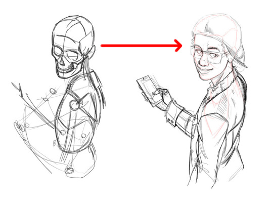
Having a good understanding of the skull will provide you with a solid blueprint for drawing any expressions you want, which brings us to...
Facial Muscles
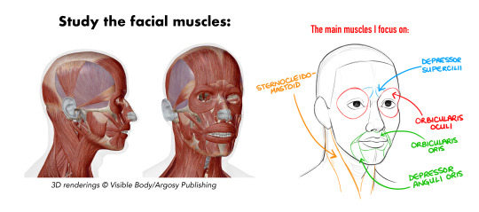
If the skull is the foundation, I would say that the facial muscles are loosely the “architecture” of a person’s face. It’s always moving, always changing, and learning how they behave across the human face is a must for nailing expressions. To get a better idea of how the muscles contract/stretch across your face, I would recommend two things: scrunch your face, and use a mirror!
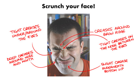
Here you can feel all the areas that crease, which areas are tighter, and which areas “lift” more when you work those muscles! 💪 These creases can add more emotion and intensity to whatever expression you’re drawing; how much creasing depends on the intensity, which is up to you.
This is something that manga & anime make excellent use of; they’re not shy when it comes to conveying what their characters are feeling:
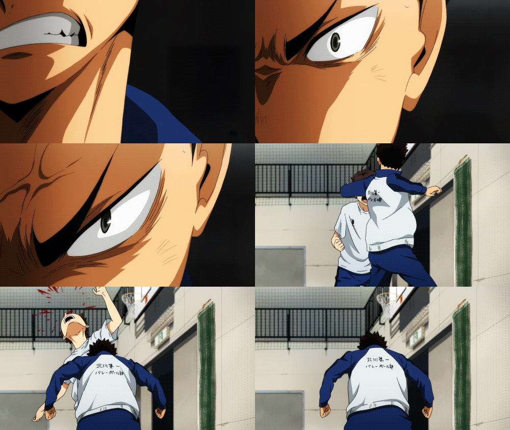
Which brings us to our last topic...
Stylization
Are these guidelines I said so far hard rules? No, they are not. Part of drawing expressions is stylizing and exaggerating realistic human proportions and behaviors. This is why I love collecting anime expression studies. Look at these awesome faces and acting:

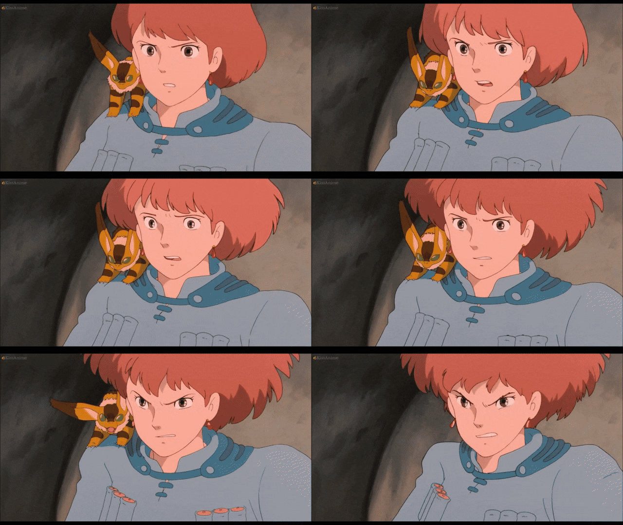
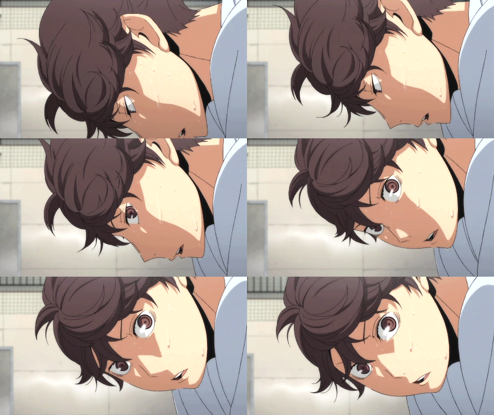
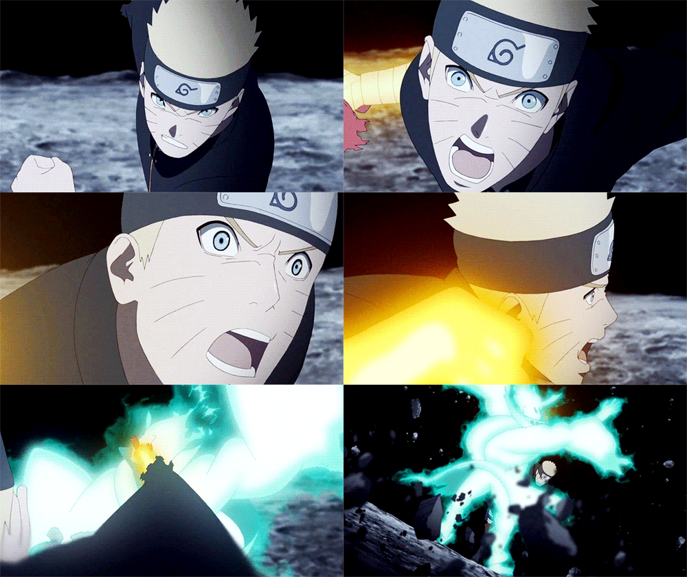
And here’s some western animation examples added for good measure:

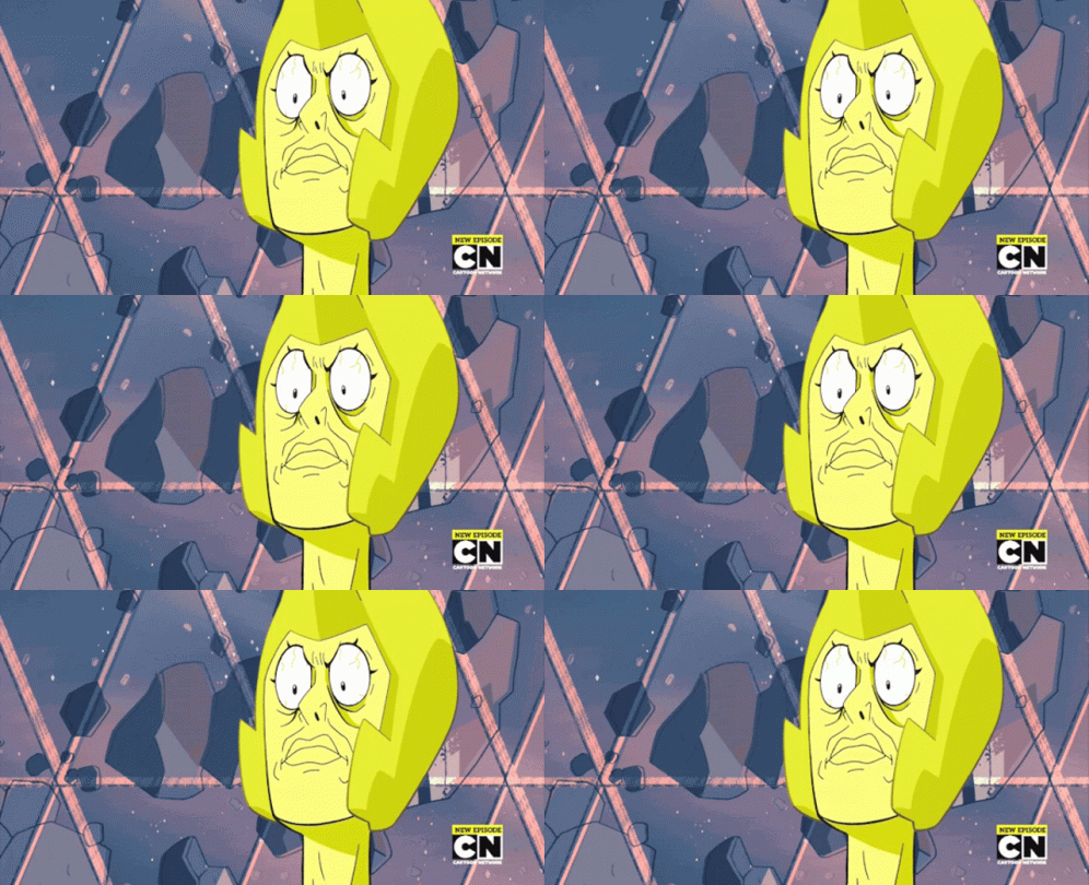
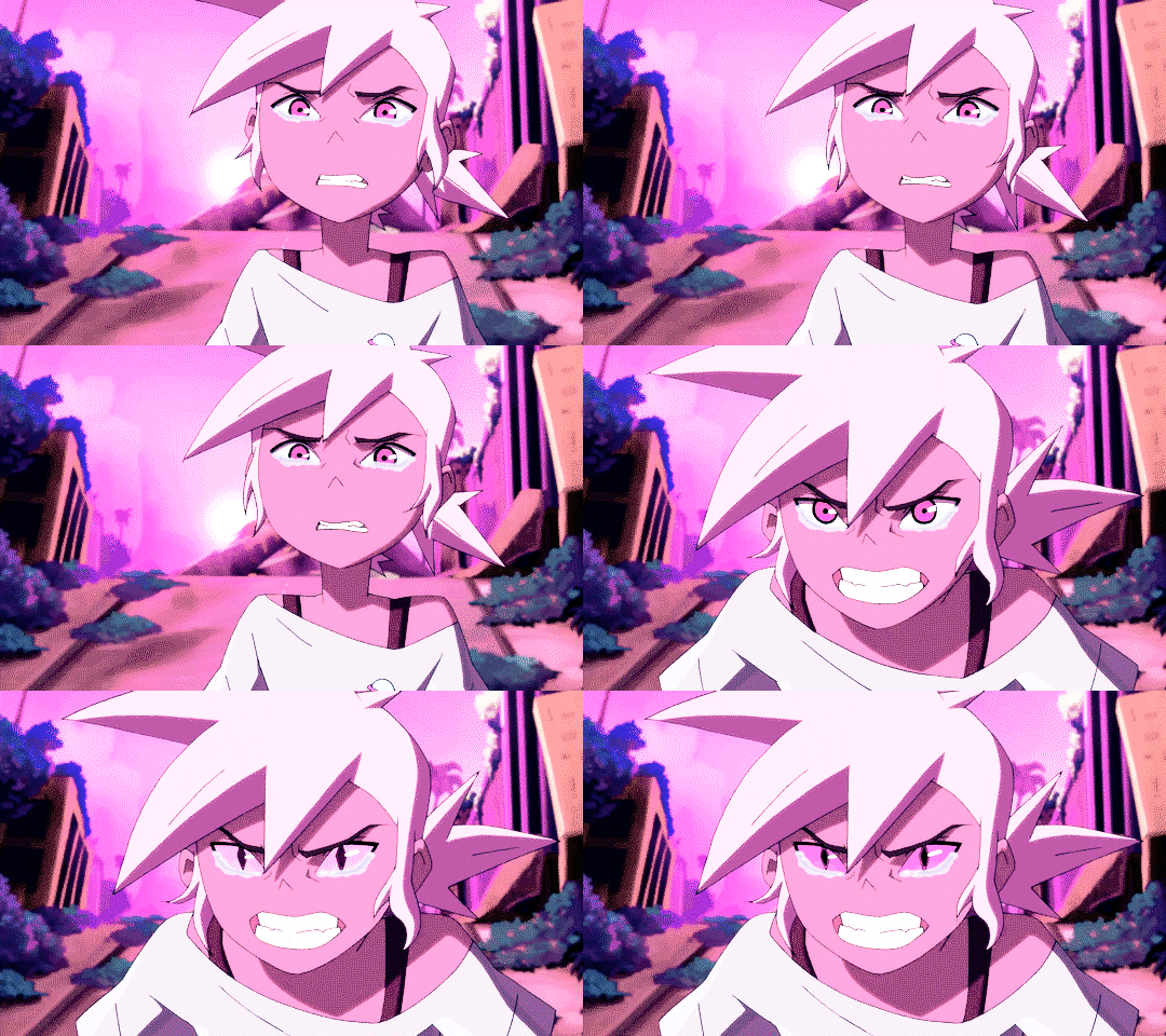
Do real-life mouths stretch like that? Or do eyebrows move on top of the eyes when you glare? No, but it’s all in the service of exaggerating the expressions and emotions that the characters are feeling and really communicating that intent with your audience. You learn the structure of the skull and facial muscles to get a good understanding of how they work, and then you use what you know to stretch and exaggerate the physical limitations of the human face.
Essentially: Learn the rules so that you can break them.
And now that I have subjected you to my long-winded TED talk, let me get to answering your actual question and showing you my process! 😂
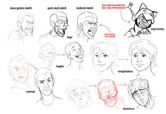
When I’m drawing expressions, I act them out in front of a mirror; this is the best way to learn expressions, by drawing them from real life. As you can see, sometimes I do a quick sketch of a skull to get an angle accurate, but if a character is stylized or facing the viewer at eye level, I just skip ahead to the final sketch.
I hope this was helpful! I’m going to include a post full of good resources and tutorials on drawing expressions later today!
33 notes
·
View notes