Text
Self Evaluation
What have you uncovered in research? How well are your entries written? What areas of your research blog could be improved and how?
As this class started I knew this won’t be like other classes we have been used to, our brain had to start thinking in different way. Someone might think it is easier to write critically about some art/design, because it is already made, but actually is not true. It is rather exploring than creating. At the beginning, we had to think about our topic for the blog. I am very interested in business side of design but at the same time I am a big fan of User Interface Design (Mobile especially). Therefore, I knew it will be something about UX/UI/Business. I didn't know the exact name of the blog quite a long time (till week 5), on the one hand it was good because I discovered and learned small peaces from everything. On the other hand, if I had known my topic earlier, I would go to more details later in my blog posts. As a most valuable assets during this class were: exploring the new styles of writing: 1. 3 Questions: What is it? What does it mean? Why does it matter? 2. semiotics using the theories of Peirce, Saussure, and Barthes. and Encoding & Decoding. These 3 theories I didn't know before and they opened me a new door to the world of critical writing. As another great finding was when I wrote about my influences. This forced me to start thinking from the beginning of my career. I went really deep inside my mind and memories and I found out some interesting facts about myself. When the part about resources started it was so beneficial for my future I would say. It forced me to learn a lot and read a lot of interesting articles/ blogs/ books but also to watch educational videos on vimeo and youtube. Not many sources was connected to my topic, it is somehow specific and just a small number of people researched this area. However, I was able to reference everything I was writing about. What could be improved? I think my blog has no economical and statistical background. I looked on gartner.com and found some interesting fact but most of them were outdated and the new ones are only shown for premium users.
To sum up, this assignments was beneficial for me, I would never cover that about of pure informations and I enjoyed the writing even thought, sometimes, it wasn't easy.
0 notes
Text
Research Question & Thesis Statement
Research Question:
What is the difference between iOS and Android Design?
Thesis Statement:
The Difference Between iOS and Android Design.
0 notes
Text
All Accessed Resources
1. https://www.youtube.com/watch?v=tUeqYVm-KZw
2. https://medium.com/@PipesApp/ios-design-vs-material-design-f0c388e56879
3. https://developer.android.com/guide/practices/ui_guidelines/icon_design_launcher.html
4. https://developer.apple.com/ios/human-interface-guidelines/graphics/app-icon/
5. http://ivomynttinen.com/blog/ios-design-guidelines
6. http://taybenlor.com/2013/05/21/designing-for-ios.html
7. https://material.io/guidelines/patterns/navigation.html#
8. https://webdesign.tutsplus.com/articles/a-tale-of-two-platforms-designing-for-both-android-and-ios--cms-23616
9. https://vimeo.com/195808790
10. https://android.jlelse.eu/4-things-to-know-about-good-android-ux-design-bc1a5a7ab9a6
11. https://www.dropbox.com/tour/1
0 notes
Text
Resources #5
Dropbox App Analysis
Dropbox is a mobile application that allows people to access their files from their cloud storage. It has covered both iOS and Android. Dropbox is great example of the difference between android and iOS, the hierarchy of app as not complicated, but in the same time covers all important elements.

Opening Screen: 1. After clicking on the Application Icon/Launcher Icon the app automatically sends you to “Recents” which is not a home screen, just a top level of apps hierarchy. “Recents screen” (fig.) allows users to directly access these screens: Settings, Notifications, Search, Recents Files, Files, Action Button, Photos and Offline. Android has just four direct screens to offer: Drawer Menu, Search, Recents Files and FAB.
FAB stands for Floating Action Button, FABs are usually located in the bottom-right corner and visualised with strong contrasted color and shadow. FAB is popular in Android, but it is getting quite common in iOS as well. However, dropbox for iOS is not using this type of navigation.
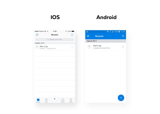
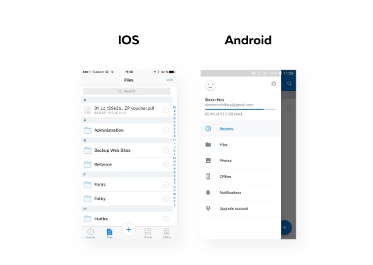
2. The picture below (fig.) illustrates the main difference in navigation. When Android users has to open drawer menu in an effort to access file screen, iOS is using tab-bar/bottom navigation, what means that they can access it within one tab.
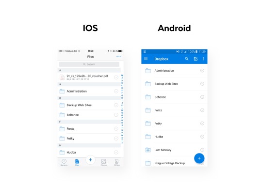
3. Files screen, is a screen from which you can access all your uploaded files. The main difference is in sorting. iOS uses “sort by name” type by default, Android uses “sort by type” by default. It means, in this particular scenarios (fig.) the unsorted PDF file is located on the top in iOS and in Android is on very bottom(is not visible on screen). Another difference is on Navigation Bar in on top right corner. iOS is hiding all Navigation Icons on the Navigation Bar, instead of icons it uses 3 dots. After clicking on this 3dots users have access to needed actions. Android, is showing Search Icon, Check-Mark icon and 3dots. This allows them to checkmark needed files directly from file screen.
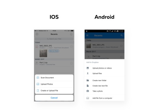
4. Action Botton (iOS) and Floating Action Botton (Android) are the most recognisable buttons. On the click they allow to Add, Scan or create file. FAB has more function: Upload photos or videos, Upload files, Creat Folder, Create new text file, Take a photo or Add file from a computer. Action Sheet that is showing these options covering almost 2/3 of whole screen. iOS is leaner in offering list. It has just 3 buttons plus cancel button. Action Sheet is smaller and has rounded corners.
5. Search button is necessary in apps with big about of data. After click on search in iOS user is still able to see the screen he was before in the background. Android’s search hides the screen with white solid. After typing “pa” into search iOS shows almost 8 results directly without hiding a keyboard. Android shows just 3. The reason why it is like that is the vertical size of table rows.
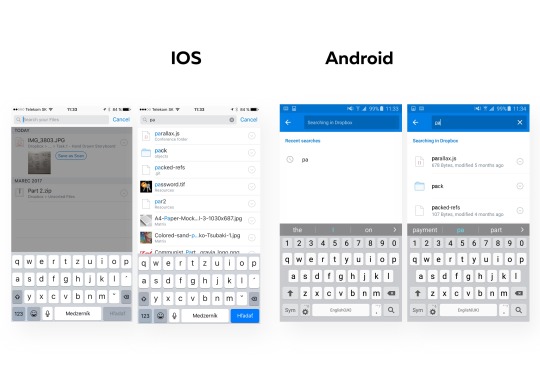
6. Let’s assume, user wants to make some actions with the first shown file “parallax.js”. He needs to click on the arrow icon in both operating systems. The action sheet comes from the bottom. Android as well as when clicking on Action Button/FAB offers more options. Action Sheet in Android covers the majority of the space and the only way how to go back in navigation is to swipe the sheet down. In iOS users is still able to see the screen he was before the click and there are two possibilities how to go back from this screen. Either tap on shadowed area or tab on Cancel Button.
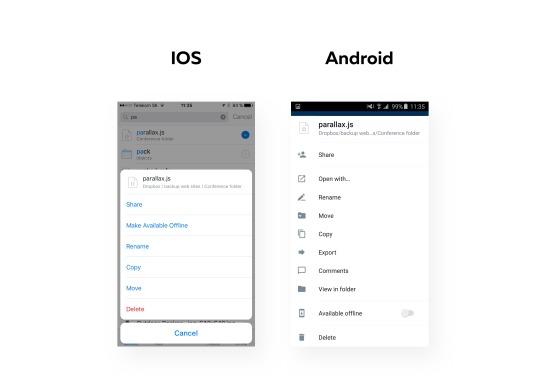
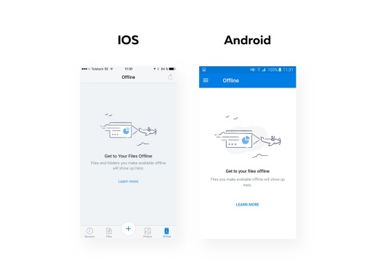
7. The last screen is the “Offline” screen. This account has no file in this category therefor the screen is showing a Zero Data Screen. Zero Data Screen,is there instead of white space and is often giving a hint how to fill it with data. Both operating systems has really similar illustration. The background is in different color, but what is interesting is the typography here. The header “Get to Your Files Offline” is written differently on Android. The only capital letter here is letter “G”. On the other hand, iOS’s “Learn more” has just capitals “L”, where Android has both words in capital letters: “LEARN MORE”.
Resources: DropBoxLogo: http://www.pcmag.com/business/directory/cloud-storage/657-dropbox
https://www.dropbox.com/tour/1
https://android.jlelse.eu/4-things-to-know-about-good-android-ux-design-bc1a5a7ab9a6
https://www.youtube.com/watch?v=tUeqYVm-KZw
0 notes
Text
Resources #4
Navigation
Navigation guides users through different parts of your app. - Navigation (https://material.io/guidelines/patterns/navigation.html#)
Navigation is probably the most important thing on mobile applications, it allows users to navigate trough different screens of mobile application.
IOS
IOS use 2 visual patterns for navigation. The first one is 1. Tap Bar (fig.), the primary navigation element. The second one is 2. Navigation Bar (fig.).
1. Tap bar, is always situated on the bottom of the screen and it allows quick switch between screens. It can includes any number of tabs (usually 3,4 or 5), however the number of those that are visible is different based on the screen size and orientation of device. If the horizontal space do not allow to include more tabs due to limited space, the last tab turns into to “more tab”.

2. Navigation bar appears on the top of screen, right bellow status bar, and it allows users to navigate trough the hierarchy of an application. On the left side, when the new screen is opened, usually appears the back button that is sending to the previous screen. The right side is used for buttons like: Edit, Done or Add. The color of Navigation bar might by customised and might be hidden when the keyboard is onscreen. Navigation bar, can include the segmented controls(fig.). These controls help users to find sections and are mostly used to keep the the hierarchy flat.


Android
Material design, when talking about navigation patterns, is much more opened. It allows to these types of mobile app navigation: 1. Tabs, 2. Bottom Navigation Bar, 3. Navigation Drawer, 4. In-context Navigation and 5. Side Navigation and Tab
1. Tabs (Fig.) as well as IOS, Android allows tabs, it is the fastest way to change the screen. However, these tabs are located on the top of the screen, below the status bar, in the same level as Navigation Bar in IOS.

2. Bottom navigation bar (fig.) is the tab bar in different words, the functionality is the same. It sits on the bottom of the screen.

3. Navigation Drawer (fig.) is good solution when a lot of screens are in the same top-level of hierarchy. It appears on the left side of the screen, it vertical and therefore much buttons can be included here.

4. In-Context Navigation (fig), use an application’s data and its less linear. It allows to go on the specific screen really quickly, therefore its used in applications with strong primary view.

5. Side Navigation and Tab (fig), is a combination of Side Navigation and Tabs. This type of navigation allows to have some items on in the drawer and sub-items in the tabs.

Resources:
https://material.io/guidelines/patterns/navigation.html# https://developer.apple.com/ios/human-interface-guidelines/ui-bars/tab-bars/ http://ivomynttinen.com/blog/ios-design-guidelines https://developer.apple.com/ios/human-interface-guidelines/ui-bars/navigation-bars/ https://medium.com/@jrejaud/developing-for-android-vs-ios-navigation-patterns-c0e11286562c https://webdesign.tutsplus.com/articles/a-tale-of-two-platforms-designing-for-both-android-and-ios--cms-23616
0 notes
Text
Resources #3 - Components
Keyboards
“To streamline data entry, the keyboard displayed when editing a text field should be appropriate for the type of content in the field.” - iOS Human Interface Guidelines (https://developer.apple.com/ios/human-interface-guidelines/ui-controls/text-fields/)
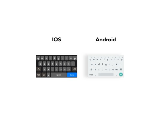
Both, IOS and Android platforms are offering 2 types of keyboards, Email Keyboard (Fig.) and Phone Keyboard (fig.). Each keyboard is designed for different input, if the text label asks for an email address for example, Email Keyboard should be displayed, because various symbols will be typed such as: “@” and “.”. Phone Keyboard is used when there is no need for entering advanced symbols.
Even thought functionality of both keyboards is same, the design is different. Android Email Keyboard allow users to type numbers, dot and comma directly from the main view, IOS users have to tap on the number button. The action buttons on IOS Email Keyboard are displayed with boarders that are showing the action zone. Android’s action buttons are placed without any boarder or shadow. The only action button with boarder and shadow is “Done Button”.
Email Keyboards
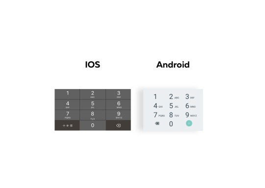
Phone Keyboards
Status Bars
Android Status Bar is showing system, notification icons, time and mobile operator. Time is placed on the very right, next to time are system and notification icons such us: battery, signal, wifi. Operator is displayed on the very left. By default settings Android’s Status Bar has white icons on the dark background (fig.), color also might be in the shade of another element in the layout or be translucent. Android allows to use an alternative to dark status bar. Light Status Bar with dark icons.
The position of elements in IOS is different. Time is Aligned to the centre, on the right side are system icons and battery icon on the left side is operator and signal icon. On the left side there could be and back button that will bring users back to app from which the actually opened app was opened. From the legibly and readability point of view, status bar comes in two different styles: dark (with black icons black) and light (with white icons).
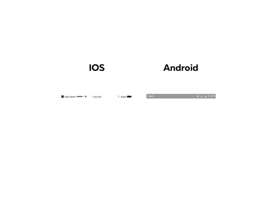
Status Bars
Slide Bars
“The slider control allows the user to choose one specific value from a range of allowed values.” - The iOS Design Guidelines (http://ivomynttinen.com/blog/ios-design-guidelines)
Slide Bar is just one of the many of default elements designers can use for increasing user experience. Slide Bars are mostly used for choosing a specific value from a range of values. The great example is audio volume. To compare android and IOS default design, IOS is showing accessed value in darker grey color, action button is white with a shadow and non accessed value is lighter. Android’s accessed value and action button are in the same color without any depth. Non accessed value is displayed in dark grey color.
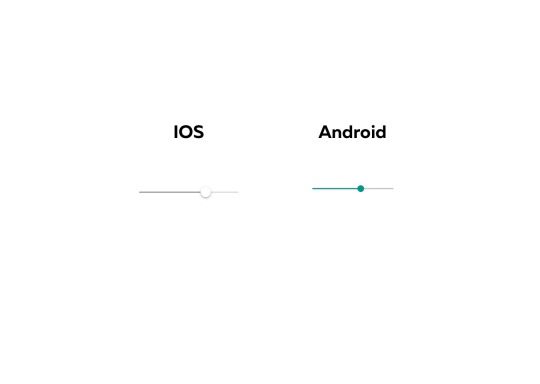
Slide Bars
Alerts with title bars
“The infrequency of alerts helps ensure that people take them seriously.” - iOS Human Interface Guidelines (https://developer.apple.com/ios/human-interface-guidelines/ui-views/alerts/)
Alerts are informing the user about some critical action that is about to happened. Alerts includes headline, body, one or more buttons and text fields if it is necessary. The function and purpose of Alerts are the same, user interface is different. When Alert pop out in IOS the background becomes darker and the dialog is slightly transparent, header is in regular cut and buttons cover the whole width of the dialog. Android’s Alert pop out with a shadow, the header is in bold cut and body text has larger leading. Buttons are positioned in the right bottom corner.
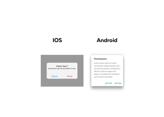
Alerts with title bars
Search
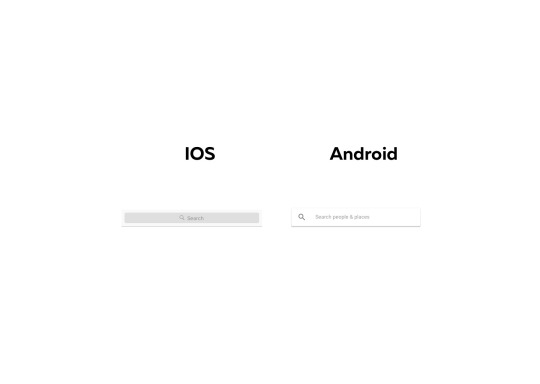
On the picture below are 2 Search bars. Both are disabled. IOS search comes with dark grey background and in the centre there is word “search” and search icon. When the search is active, it changed its color on white to increase readability. Android’s Search bar comes with white color and doesn't change color after tap. The icon is bigger located on the left and is separated from the text which is in the center.
Search
Back Navigation
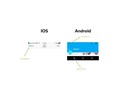
Back Navigation is probably the most important thing inside the mobile application, it allows users to navigate back from screen views. IOS’s back navigation is much more simple than Android, there is only one back button that take you back on the previous screen or to the up navigation. This depends on the application hierarchy.
Android has two buttons Up and Back Button. Up button is located in the top left corner and brings users back to previous screen INSIDE the application, even though its called UP button it takes you back until you visit the home screen of the application. The back Button, navigates in reverse chronological order thought the history of visited screens and can take you OUTSIDE the application.
“Whereas the Up button ensures the user remains in your app, the Back button may take the user back through recent screens outside of your app.” - Patterns - Navigation (https://material.io/guidelines/patterns/navigation.html#navigation-up-back-buttons)
Back Navigation
Resources:
https://www.sketchappsources.com/free-source/1905-android-m-ui-kit-sketch-app-freebie-resource.html
https://www.sketchappsources.com/free-source/597-google-material-design-ui-sketch-app.html
IOS Keyboard: https://developer.apple.com/ios/human-interface-guidelines/ui-controls/text-fields/
IOS Alerts: https://developer.apple.com/ios/human-interface-guidelines/ui-views/alerts/
Sliders Android: https://material.io/guidelines/components/sliders.html# Status Bar Android: https://material.io/guidelines/layout/structure.html#structure-app-bar Tool Bar Android: https://material.io/guidelines/components/toolbars.html# Dialogs: https://material.io/guidelines/components/dialogs.html#dialogs-alerts Android Back Button IMG and resource: https://material.io/guidelines/patterns/navigation.html#navigation-up-back-buttons
http://ivomynttinen.com/blog/ios-design-guidelines
0 notes
Text
Resources #2 - Iconography
Iconography
Icons are great graphic element, using icons is good way how to save some space or support the text labels. Icons can appear on Tool Bar, Navigation Bar or Tap Bar. With different design of operating system, automatically its need to design different icons. The picture (Fig.2) is showing 10 icons. Five IOS icons and five Android Icons. The first pair is “Delete” icon. People associate delete button with trash. Therefore both operating systems are showing trash. But they are in totally different style.
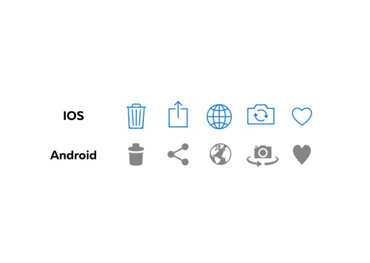
Delete IOS trash is an outline with 3 stripes inside. It is flat and without any depth. Android’s trash has a feeling of look-from-top, its full filled and the lid is separated from the body of trash.
Share Share button is probably the most different from all. Android is showing 3 dots that are connected in the shape of triangle. IOS has a non-closed square with an arrow.
Web Web icon is associated with earth and both designer are showing it. However, IOS in more corporate and general style. Android, tried to interpret some contents what give it more detailed look.
Camera Switch This icon came with first phones that has 2 cameras. Android’s Camera Switch has an 3 dimensional feeling because of horizontal arrows. The camera is showing the lens and the action button. Camera Switch that IOS is using is flat and is not showing action button and lens. Arrows are in the centre of camera and can be understand also as the lens.
Favorite Both of favourite icons are without depth. However, IOS icon is wider , smaller and more rounded. Android’s icon is vertical stretched what might save some space from sides.
Resources: http://ivomynttinen.com/blog/ios-design-guidelines Video: https://medium.com/segue16/think-different-android-vs-ios-design-approaches-6a909439c925#.itc4yurk0 https://material.io/guidelines/style/icons.html#icons-product-icons
0 notes
Text
Resources #1- Application Icons
Introduction to the Application Icons
Let’s start from the very beginning. Application Icons, also known as Launcher Icons, are doubtless the first interaction between user and mobile application. An Application Icon is a graphic representation of application. App Icons appears mostly on home screen but also in Application Stores (App Store for IOS/ Google Play for Android), settings, search results and also inside the application. Since Application Icons appear on multiple places, those places don't always allow to show the Icon in the same size. Therefore icons have to be designed to be clear and visible on both small and large places.

Definition of functional Application Icons
- App Icon should be a simple, clean representation of your brand. - In most cases details make the design, in this case details might be the difficulty, because they might not be visible in small sizes. - The color and design should suit to brand’s design language. - Including name in the App Icon is a mistake. Name of the app is written below the App Icon. Word are accepted only if its part of the logo of brand. - Images can be detailed and might be hard to identify. - App Icon should work against different color backgrounds. App Icons should work the same on white and black background.
Examples
The picture bellow is showing the difference between Android and IOS Design Application Icon Design.

IOS Application Icon Design
“You don’t need to fill the entire icon with content.” - iOS Human Interface Guidelines (https://developer.apple.com/ios/human-interface-guidelines/graphics/app-icon/)
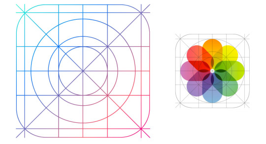
To make the operating system consistent for everyone, Apple introduced a grid system (fig 1.) with its own guidelines. The template is a square with rounded edges. Apple designed this grid system based on golden ratio that allow designers to make their icons consistent and balanced. Probably the word that will describe it all is “Simplicity”, design could be either placed in the centre with a safe zone around it (Dropbox(fig. will be added)) or cover the whole space (Duolingo App Icon (fig. will be added)) or show just a part of the design (Maps(fig. will be added)). Application Icons are flat and clean without any inside and outside shadows and without any depth. When using a white background, a 1 px boarder will be added to make it visible and to make edges recognisable.
(fig. 1 Golden Ratio)
Dimensions of Application icons for IOS

Android Launcher Icon Design
“Not all Android app icons should be square” - Launcher Icons (https://developer.android.com/guide/practices/ui_guidelines/icon_design_launcher.html)
Android Launcher Icon Guidelines has a different approach to design. Design is related with depth and 3D space according to Material Design (Guidlines from Google). Android Launcher Icon Guidelines are much more opened. There is no limitation in the final shape, because it allows transparency. Outer Shadows are automatically applied to every icon on home screen what helps to support the Application Icons on different color backgrounds. Cropping the design, is against the guidelines, design should be all visible.
Dimensions of Application icons for Android

Resources:
Android IMG - http://www.geek.com/android/the-best-custom-android-launchers-1616295/
IOS IMG: Own IMG
IOS Golden Ratio + IOS Dimensions IMG: http://ivomynttinen.com/blog/the-ios-7-design-cheat-sheet
IOS - https://developer.apple.com/ios/human-interface-guidelines/graphics/app-icon/
Android - https://developer.android.com/guide/practices/ui_guidelines/icon_design_launcher.html
General - http://ivomynttinen.com/blog/ios-design-guidelines
Video - https://medium.com/segue16/think-different-android-vs-ios-design-approaches-6a909439c925#.vbf2jyodo
0 notes
Text
Blog Post No. 5 - 2 Resources
Don't Make Me Think, Revisited: A Common Sense Approach to Web Usability (3rd Edition) (Voices That Matter)
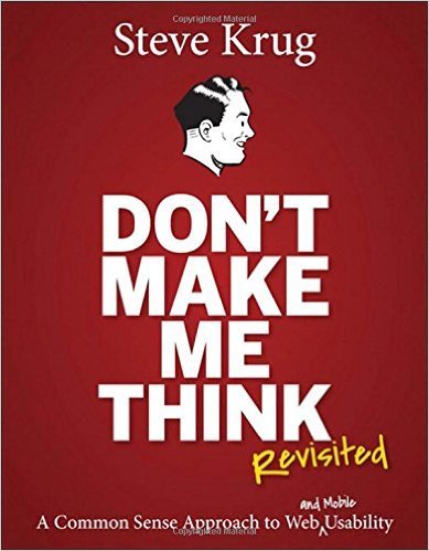
The First Book I choose is: Don't Make Me Think, Revisited: A Common Sense Approach to Web Usability (3rd Edition) (Voices That Matter). I choose this book mainly because I read it so know it's content very well. It is a 3rd, what means that people see a quality in this book. The 3rd version added a pair of words: “and Mobile”. This addition was mainly because, the whole world is now excited about smartphones and it is becoming an irreplaceable part of our life.
Mobile Materail Design 2016 - Tips, Examples, Resources

The second book of my choice is: Mobile Materail Design 2016 - Tips, Examples, Resources. This ebook was written by: Carrie Cousins (more than 10 years experience in the media indus-try, including design, editing, and writing for print and online publi-cations), Ryan Thomas Riddle (UX Content Strategist at UXPin. He is an award-winning writer for his work as a mild-mannered reporter for the Bay Area newspaper, The Daily Post) and Jerry Cao (Content Strategist at UXPin). The main reason why I choose this book, is mainly because its super temporality. These days its hard to write, print and sell the book that is up to date. Uxpin skipped the second and third step - print and sell. This book is online and free for everyone who want to know more about mobile design and user experience, like I am.
0 notes
Text
Blog Post No. 4
Ideology - Encoding & Decoding
What is the ideology behind UBER? Loyalty, this word explains it all. Uber was found by Garret Camp and Travis Kalnick in 2009. They both built it with clear vision, helping people, making their life easier and give a job to the people. But the most importantly, they built the company that people can trust.
How Uber help people? The problem when taking a taxi is that every taxi company has different prices, and you can really find out if you are sitting in the one that charges 100CZK/Km or you are sitting in the cheap one. Uber solved this problem for people, When you open an app, you can choose from 3 types of transportation: UberPOP, Select or Black. UberPOP is the cheapest one (but still very good), Black is the luxurious and logically the most expensive type of transport, Select is something in the middle. This feature of choosing the type of transportation is highly efficient, because it offers the trusted prices.
Sometimes using a taxi can be dangerous, especially for women. Because you never know, if the car is licensed or who is the driver. Uber solved this problem, the app has a feature, that you can instantly see the drivers name and face, whats more even the type, color and license plate of his car.
The typical taxi drivers when the are looking for someone to pick up they are usually driving around the city, mostly thought streets with high number of people. Usually on these places is traffic caused by taxi drivers. Then using uber as a driver, you are not depending on looking for people and causing a traffic, all you need is to find some free parking spot and have your smartphone charged.
On the first glance, it seems like there is nothing bad on Uber at all, but unfortunately there are some things people should know.
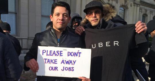
Uber gives jobs, but also takes jobs. Many of taxi drivers, lost their jobs because of this company. Simply, uber was better and taxi companies had to reduce the number of drivers. Usually taxi drivers are from lower class, so every salary could lead to problems with mortgage payments are university fees of their children. The question is, why they didn't joint Uber Family? Mostly, taxi drivers do not have their own cars, or if they do, surely not the new models. When you want to become as uber driver, your car have to meet the strict conditions. Have a car not older than 10 years, is the one on most of the people finish.
People can also negotiate about paying a tax or insurance. Uber’s headquarters for Europe is located in Netherlands and Uber is paying tax their. But is it legal? Isn't it tax evasion? Taxi drivers based on this informations carried out a protest against Uber and asked government of their countries to eliminate Uber.

The last thing, the Uber’s CEO Travis Kalnick is closely connected with Donald J. Trump, the president of United States. This connection raised awareness after message from Uber’s CEO to employees: "We'll partner with anyone in the world as long they're about making transportation in cities better, creating job opportunities, making it easier to get around, getting pollution out of the air and traffic off the streets.” After this message, uber drivers started the protest, in front of Trump Tower on 5th Ave in New York. The action comes also from the users, to protest against the Trump&Uber connection they deleted and stoped using Uber.
0 notes
Text
Blog Post No.3
What influenced me as a Graphic Designer?
Till my 18 years I spent my whole life in Slovak Republic, my parents are both Slovaks so I could say I am pure Slovakian. I am glad I came from Slovakia, we have wonderful nature and our culture is very traditional. If I look on countries around the world is not safe at all, strong radicalism is taking lead on places I would never expect. Here in Slovakia is no war and people are relatively safe for now.
But it wasn't like this. My country went through hard times that influenced the whole population and next few generations will still feel it. The first impact came after Austro-Prussian War in 1866 when Austro-Hungarian Empire was established. Sad to say, but Slovak Republic as we know it nowadays, belonged to this Empire. Austria-Hungary was led from Budapest and Wien mainly, what meant that Slovakia was without any power. Austrian-Hungary existed to 1918, in 1918 we managed to establish Czechoslovakia, but it was just escape form evil to less wrongness and the principle was same. The capital city was Prague and Slovakia was just like distant relative on the East.
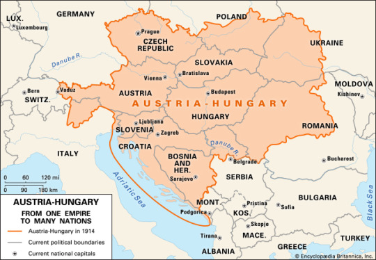
Without any prejudice, I can say a lot of people are influenced by these historical events. And I am as well. With these moments I realised that I do not want to be the fifth wheel on the car anymore. Therefore, I am creating the design that might shift me somewhere I will find what I dream about. I can really see that, I do not like when I am the person who is doing the monkey job, it reminds me those horrible times. In my carrier, I would like to break this historical moments and shift me on the top.
Slovakia is not very wealthy country, the capital city Bratislava is deeply below the average comparing with other capitals around. Sadly, its still the best city to live in. However, in most of cities is high level of poverty. And it wasn't different when I and my twin Paulina were born. In 1996, just few years after fall of communism it wasn't easy at all to live normal. My parents lived from their parents money and brought up 2 children.
Thanks to my parents strong will and responsibility I am where I am now. Studying and working in Prague. But those moments are still in my mind and I would say that it influenced my work a lot. My workflow and problem solving situations mainly. My workflow is really stable and straight forward and problem solving is openminded and always on top every situation.
In 2004, when I was 8 years old, my parents divorced. And me and my sister started to live with our mother. I didn't accept it really well, and I had to visit psychologists, I didn't understand why this happened to them when all of my classmates parents are happy and still together. My grades went rapidly down and I was under depression all the time. However, I successfully finished, primary school and started to attend Grammar School. During this time my mother had to travel for work a lot what meant, that most of the time, me and my sister were home alone.
Everything bad comes with something good, in my 15 years I lived life of 25 year old man. I started to do the ironing, cooking and most importantly I started to be responsible for myself and how to by systematic. Nowadays, my work is exact reflection of those times. I try to approach every project as most responsible as I can and by systematic in everything I do.
During my studies on Prague College and work experience in IBM, I met a lot of people that opened my eyes and showed me that design could be done differently and with totally different approach. I saw style of designers in New York and San Francisco - the heart of technologies and design. Thanks to this, connections I am looking forward and trying to do design more minimalistic, logical and clean with future prospects.
0 notes
Text
Blog Post No.2
Interpret selected images with use of semiotics using the theories of Peirce, Saussure, and Barthes.
Image No.1 Icon of Duolingo - Language Learning App
The name " Duolingo" came from Latin word "duo" what means number two and " lingo" means language. Someone would expect 2 conversation bubbles with different flags as their icon, as most of learning applications have. But appearances are sometimes deceptive. Instead of conversation bubbles, there is an owl. What more, its design reminds more of Arcade, Family or Fantasy game, than learning platform. However, after a few moments you get that wow moment when you realise, that an owl is the symbol for wisdom. The ancient greeks already know that, therefore the owl was considered sacred and featured on their coins. Duolingo’s owl has neutral face that is looking in front, right into your eyes and it seems that she is always on top every situation. The owl’s hair is designed in monochromatic green style. There are 3 layers for this dulling icon. The first layer is in the very back and its a soft green gradient that goes from light to dark green. Next layer are eye-pits and on the very top there are 2 elements. Back&White innocent looking flat eyes and yellow bill that has a soft shadow. On the one hand green is quite odd color for an owl, but on the other hand Duolingo is full of out-of-box solutions therefore the green color may stand for coolness, because they aim people to be calm while learning. The minimum of colors used for the design of the owl helped designers to customise logo for different seasons or events. For instance, turkey day or halloween on the picture below.
All in all, thinking out-of-box while designing an app icon might be painful and people may hate it (as they did with the new instagram icon) but at the end people will understand the whole aim of the design team and later they will understand it and start to love it.
- With Roland Barthe's theory which as about denotative & connotative meaning, I would say denotation is a green abstract owl. This owl's design reminds a IOS game rather than education platform. Connotation in this case could be a positiveness, coolness because of the green color, but also entertainment because of the soft minimal flat design.

Image No.2 Icon of Aribnb - Online Marketplace
Airbnb is an online marketplace people to list their property. This application helps mostly tourists, who don't want to either feel too closed in hotel room or spend too much money. Airbnb is popular and a lot of people use this service. But do they know how Airbnb get it’s name and what does the name mean? One day Joe Gebbia and Brian Chesky (today founders of airbnb) became roommates in San Francisco, neither of them had a job and they needed money for rent. They were both designers and they knew the International Design Conference was coming but and all the hotels were sold out. So they thought they could turn their apartment into a bed and breakfast. They got three airbeds and make a web called Air Bed and Breakfast. After a few years Airbnb become one of the fastest growing startups on the world. Their actual icon is as somebody would say: Strange capital letter “A”. But its more than that. Airbnb represents a symbol of belonging that could be drawn by everyone on the world. They call it Bélo. The symbol stands of 4 things: people, place, love and letter “A”. For someone it is more than just icon, its a symbol for people that want to know they belong, its a symbol for those who want to try new things and explore world, for some people its a symbol that will help to extinguish a mortgage, that will keep mother’s children clean or that will pay food for them. The symbol stands on the very special color. The color something between orange, red and pink. This color represents the brands culture and delivers emotion and passion around the world. They called the color: “Rausch”.
Most of the famous icons come under critique, the airbnb icon wasn't an exception. Some people compared airbnb icon with sexual reproductive organ in the male and female anatomy. Somebody says the icon looks like icon of Automation Anywhere (company), and believed the new icon was stolen. But as there are millions of companies, the new original shape is very hard to discover.
- Roland Barthe would say that denotation is a weird A or for those who know this icon it is Airbnb. Connototion, because of the Rausch color is love, smile, good vibes, great memories and the warmth of home.

Image No.3 Icon of UBER - Taxi App
When you heard word UBER you have immediately a capital letter “U” in front of your eyes. Or you used to have. Uber no longer moves just people, they are moving food, goods and soon much more. With the expanding to another market uber were force to change their icon to keep the brand consistent. At first glance the icon looks somehow weird, there is a square in the circle and black background. Here is the explanation: Their icon stands for 2 things: atoms and bits. Bit is the building block of the digital world and it represents a high technology that uber use. Atom is the second element. Atom is responsible for our lives, atom was on the start of everything you can see now. Therefore Uber, considered what if they could connect these 2 things into their icon? Its basically what they do right? The are connecting technologies and human beings with providing save and low cost transportation options for everybody. This is a nice idea. But there are tons of companies that do the same thing. Connecting people and technology. Google, Facebook, Instagram all these connect people with high technologies.
The idea is super nice and logical but its hard to understand. People remember icons that make sense for them, icons that can connect with something and uber customers used to connect uber with capital letter “U” not with atoms and bits.
- With using Barthe's theory, for me the icon of Uber reminds me a navigation or the pointer on the map (denotation). For connotation it is trust, stability, luxury, professionalism that black color symbolise.

0 notes
Text
Blog Post No.1
Hello all readers and welcome to my new blog!
Let me introduce my self really briefly. My name is Simon Rico, I was born in Slovakia and I am studying in my 3rd semester of HND Graphic Design on Prague College. I found myself in Graphic Design when I was 15 years old. I liked watching James Bond Movies when I was younger and I was always wondering how they done all those video effects like: explosions, high-tech weapons and so. All these questions forced me to search google for answers and for downloading my first Graphic Software.
(5 years later) In this moment I am 20 years old and still have a lot of questions but don't worry I found an answer on James Bond Video Effects. Today, I have much more complicated and complexed ones. I am starting to finding my self in the field of Graphic Design and I definitely know that the digital world will be my cup of tea. Therefore, it is logical that I would like to know more about my future specialisms, which might be: mobile and desktop interfaces, the logic behind Interaction between human and computer/mobile or how graphic design is connected with business. The name of my topic for this assignment is not clear yet, but for sure it will includes one of these phrases.
The reason why I stared this blog is the Critical Studies Class. Maybe you are asking yourself: Why should I continue reading? If you are interested in digital interfaces, mobil apps, user experience or how business is connected with mobil apps, you should definitely continue. Otherwise, its wasting your time :)
This blog will be updated every week with different kinds of topics and here is the first one:
Research on 3 selected images

Image No.1 Duolingo - Language Learning app
Learning a foreign language is something you can’t cheat on. It requires a strong will, responsibility and systematic. In summer 2016 I thought about to start learning Russian but in the same time I wanted to take a rest from all kinds of learning. It was the middle of June and I was laying in my bed and suddenly I discovered something that changed my life.
Duolingo is an mobile and desktop application that helps people with learning foreign languages. On the picture you can see a main screen of Duolingo Mobile App presented on iPhone 6s. The whole interface was designed by young UI Designer Marcel Uekermann. Marcel joined Duolingo team on the very begging and became as the first designer in this startup. It didn't take long and Marcel’s first personal style features were transformed into duolingo interface. Rounded typeface feels really optimistic and friendly and it is supported with cute flat design iconography. Icons represents the difficulty level. For example, the very first level is Alphabet represented by chick, which give you a certain image about the level. The soft design based on few key elements aims users to have fun while learning. Whats more, this app has integrated a system which gives you exercises based on what you are not really good at. The whole atmosphere of the app is highly positive which might means that world has finally a user friendly language learning platform. Moreover, its for free.

Image No.2 Uber - Taxi app
I am not using taxi services, but when I do, I use UBER!
Uber is typical peer-to-peer platform that helps people to connect with taxi driver within a minute. Why it is cool? Firstly, it has one of the greatest UX solutions I have ever seen, its almost like tie the laces for me. Secondly, no longer waisting time with finding coins in your wallet, ones you call for taxi app takes care about your payment. Thirdly, you shouldn't describe where to go, the driver knows the address in advance of your car entrance. From the visual point the app feel really professional and serious (what is good because you have money in this app). Interface is built on clean and outlined icons, almost monochromatic design and a lot of user friendly features like: natural transitions between screens, micro-animatins and useful on boarding. Navigation is fast and intuitive, what might be a plus especially if you are in a hurry and lastly, you can see how many cars are around you so you can easily call one. I think Uber showed us how to do things better and smarter and I won’t be surprised if my kids wouldn't know any other taxi company than UBER.

Image No.3 Spotify - Music app
The last pick is Spotify which is a music and video streaming service. Its can by used from both mobile and desktop. What is interesting on this screen? Here is a proof that high quality pictures can sell things. Let’s break it down, standard 5 icon bar with home, browse, search, radio, your music. It’s quite common. The interesting part is above, the approach how to show different categories on one screen. What more, you can list both categories without even leaving this screen. Music streaming was here long time before spotify break into the market. For instance, Apple Music offered this kind of service before Spotify. So what made Spotify so famous and attractive? The answer is: personalised content supported with high quality images and perfect strategy.
0 notes