#lightened to scene's original lighting + edited out
Explore tagged Tumblr posts
Text
castlevera kiss without the bad persons watermark <3

#average tumblr user castlevera post#lightened to scene's original lighting + edited out#all by me btw#it looks good if you don't look at it too closely#so don't#the casting of frank stone#castlevera#bonnie rivera#linda castle
23 notes
·
View notes
Text
Thank you!
A big thank you to everyone who got a copy of Mostly (h)Armless! I think that for an obscure little fancomic it did really well! About 30 copies have gone where none can ever take them away again. I've also finally received my own version and I am happy about the quality.
I've now unpublished it but turns out you can never entirely take a book off the store once published. You can't edit it to be something else either. (which is what I had hoped to do, I have a bunch of unpublished original comics lying around). So it's just kinda going to sit there for all eternity, unavailable for sale. I sincerely hope it won't give me problems later on.
Anyway, if anyone is curious about one day printing their own comics, here are a few things I have noticed that I will definitely remember for my future printing endeavors:
Most glow and blending effects like Lighten, Color dodge, Hard Light, Linear dodge (add), etc don't look that nice in print despite looking awesome in digital.
Make your line art thick enough.
soft shading looks bad, cell shading looks good. (But it's better to fully fill shapes with a contrasting color rather than doing fancy lighting.)
Consider shading in black rather than color. (optional)
Details and soft lines are usually lost and a waste of time (Mostly in case of a colored book. Black and white may be different)
Keep panels spaced far enough apart.
Draw big panels. Small panels aren't as nice to look at and the eyes are naturally drawn to the larger panels.
Gradients don't look very nice either. Unless they have a light color.
Vintage comic textures and effects actually looks nicer in print than digital (which surprised me).
In dark scenes, rim lights are essential to make the character pop out. M(h)A would've looked like ass if I hadn't added those.
Stay away from the borders of your page, especially the left and right ones. Not just for the text but for the drawings too.
Keep track of which side of your page will be closest to the spine, keep a distance from that side especially. Because your book will be folded and part of the page will be hidden (the thicker your book, the more will be lost).
fancy panel compositions are cooler in digital...
contrast contrast contrast...
Don't be afraid to use pure black a lot.
Don't be afraid to use white a lot.
The 3D shake effect is also not that cool on print. But looks gorgeous on digital.
To myself… keep the font size consistent…
If text is outside a text bubble, it should have a high contrast stroke
Text should always be high contrast in general.
Motion blur is really cool in digital but not so much on print.
Keep black silhouettes black, avoid adding any kind of subtle glow or texture.
Text bubbles can have color but they should be light (again high contrast) watch out for saturated green or blue or red. Test in greyscale. Contrast should be more than 70%.
Line art should not be colored. Keep it black for print.
Hard borders are better than soft borders. On everything.
white panel borders are better than black panel borders.
But white borders with a black stroke are probably the best (cause more contrast).
Again light colors are better than dark colors. To do dark scenes it might be better to just use black and contrast with a lighter color.
Line art perfection is not that interesting, especially in regards to hard surface shapes like robots. (Might be personal taste though. I enjoyed looking at robots with messier line art more than those where I did perfect brush strokes.)
Beware dark blue and purple...
Compositions and colors of both the left and right page should always fit together. I think I did that pretty well here at least.
If possible make your total amount of comic pages devisable by 4. (so 24 pages total, or 28, or 96, you get the idea) not including the cover and back. Or else add a little extra drawing to fill the remaining pages.
I think that's about everything I can see based on my own print. I'm sure that a fair few of the things that I found looking worse in print than digital could be resolved by just being... better at converting your files. There's the whole CMYK color mode thing but in my personal experience that has been such a pain to work with, and each time my prints looked worse attempting to convert the file rather than had I just left it in RBG and let the printer do the guessing work for me.
So if you're like me and you're hopeless at this technical mumbo jumbo printing stuff, I think just avoiding the things I mentioned while drawing should get you well under way to having a nice print. The most important thing to remember is that digital and physical media are two entirely different beasts and if you are interested in getting your comics printed it's easier to adapt your workflow to that from the start rather than going back and altering. A lot of the mistakes I made here are rookie ones and I should have known better. But it's very easy to get lost in the process once you've started. I hope to improve my next print significantly. Once I can make RBG look good, I might try CMYK again.... Maybe. Potentially. No.
Hope these tips can be of service to somebody. They'll be a useful archive for myself in any case. If anyone wants me to elaborate more on a specific point, I'm happy to explain.
41 notes
·
View notes
Note
beach house au for the wip ask game?
Thanks for the ask! <3
I'll start with a snippet. Loki and Mobius' first meeting on the beach right outside Thor's house.
“Apologies, I shouldn’t have approached you like that,” Loki says, tightly. Mobius waves him off. “No harm, no foul. I probably would’ve done the same.” His voice is calm and raspy and smooth, and Loki kinda likes it. A beat of silence and then Loki asks, “So, you own a shop? What do you sell?” Mobius’s face lights up immediately with a bright smile, wide and gleaming. Loki feels his chest flutter a bit. “It’s a jet-ski rental! Well, we have other rentals, too — scooters and bikes — but nothing beats feeling the wind in your hair as you're cruising out in the water on a jet-ski.” There’s a wistfulness to Mobius’s that pokes at Loki’s chest fondly. “You ever been on one?” “Oh, no,” Loki replies. “I’m not the, uh, beach and open waters type.” Mobius shrugs his shoulders in a dont-worry-about-it fashion. “Well, if you ever change your mind, come by and see me.” He smiles at Loki, it’s inviting and it reaches his eyes. Loki can feel himself shrink a little under the radiance Mobius exudes, quickly wrapping his arms around his torso, shielding himself. “Uh, that’s okay — thank you, though.” There’s an odd bubble forming in his chest, and suddenly he’s very self conscious. “Mobius!” Loki winces at his brother’s sudden appearance. He watches as Thor trudges over to them, no doubt coming to make sure Loki isn’t causing any trouble. “I see you’ve met my brother,” Thor says, placing a firm hand on Loki’s shoulder, squeezing gently. “Yeah, a real charmer,” Mobius says, tossing a wink Loki’s way. Loki feels his face heat up.
Oh, the beach house au, which originally just like a few disconnected scenes that I kept replaying in my mind, has now eaten my brain. I even have a pinterest board dedicated to it. (lots of long hair mobius edits and bts pics of tom as loki but in casual clothes)
Loki moves in with Thor, who lives in a nice little bungalow in a beachside neighborhood, after getting out of a bad relationship, needing some time to recharge and figure his shit out. Enter Mobius, the personification of sunshine and comfort.
I think I had intended it to be a bit heavy, angsty, lot's of hurt/comfort, because that's just what I love. And then I guess I wanted to lighten it up a bit? I was having a rom-com marathon one day and I was suddenly very inspired to give it a more cheesy feel.
Anyway! I'm slowly adding to it whenever inspiration strikes, but it's still just a bunch of disconnected scenes 😅
WIP list here!
#lokius#loki laufeyson#mobius m mobius#ask#wolfpup026#wip folders game#fic planning#fic writing#mine: fics#mine: wips
12 notes
·
View notes
Note
Questions 1, 2, 4, 7, 11, and 13 for the Simblr Story Process Ask! I'm dying to learn alllllll about your writing process! :D
Hiiii @esotheria-sims! Thank you 🥰
And shout out to @thegingernerdist who also asked for 13! I also answered question 7 in the previous post!
1. Do you hide any secrets in your story that only a few people will find?
Hmm... I mentioned in an earlier post that I like to sneak in some foreshadowing, so I guess that could also fit this question!
2. Sims writing has a visual component. How do you utilize color/objects and setting in your story?
I use it a lot! Every character has a favorite color when it comes to outfits, and their magic is also distinct (Ren has green blasts, Andra's got fire, Inna the lightening, the Baranims have white bolts...) which comes through in battle scenes. Inna has a changing color scheme, although she prefers to dress in pink she sometimes dresses in white to appear more innocent than she is when she's trying to manipulate people. Kadja also usually dresses in orange, but she went for blue to "fit in" the monastery.
The architecture is also a big one. In my original idea, Cambremon was actually an underground city but that's just not practical gameplay wise. I try to create closed spaces with stone walls or dark wood. The hub is supposed to feel very dark, as opposed to the bright white snowy wastelands.
Some objects have become motifs, like Kadja's painting representing Ren's obsession, the creepy slave pillars representing the Cambremon's harsh rule, and the red dress representing Ren's one-sided desire for Kadja. There's also the portrait room which is a recurring setting, and usually alludes to the weight of the first generation and of the Cambremon name on the second generation.
Another little color detail: a lot of scenes with Bone Spirit have a purple light effect because the Sun n Moon candles with mana powder have a purple light!
4. What scenes do you find hardest to write?
Hardest to pose are definitely the group scenes! My computer can't handle more than 10-12 sims on a lot, so I have to get creative with deco sims (but the lighting on them is usually a bit wonky, or they get covered in snow like other objects! Argh it's a struggle)
Hardest to write... well that's actually descriptions, which is why I love the simstory format, I can focus on just dialogues 😁 I also find that I edit dialogues a lot, usually to cut them down to the essential. I feel like I now have a much better grasp of the characters and their voices, so it's getting a little easier to write them!
11. What are some elements you think are becoming cliché in the genre you're writing?
Honestly couldn't say, I'm actually a big fan of tropes when they're done right or subverted. One thing that I personally love as a reader is when there are real consequences for characters' actions, so I guess not a fan of stories with extensive plot armour or deus ex machina twists to get the main characters out of a bad situation.
One thing which does annoy me is when sexual violence is either swept under the rug or exploited for cheap thrills in fantasy stories. On one hand, it's definitely an aspect of any unjust, hierarchical society, but on the other, not something that should (in my opinion) be used just for "shock value". I sometimes struggle on the best way to adress this within the bounds of Cambremon, and I've settled with indirect allusions, as with this Simstober post.
13. What characters do you feel most connected to? Why do you feel connected to that character?
That's a tough one. Depends on the day, but it's a tie between Kadja, Inna, Bruk and Marek. They're all interesting characters to play with, and I'm also invested in Cambremon eventually becoming a better place, so hoping the "good" faction wins out! (But the evil faction makes for juicy drama haha)
12 notes
·
View notes
Text
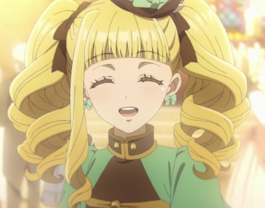

Here's another edit of lizzy this time! While I do like the warm browns in the original picture, the anime is doing this trend of leaving out proper blacks in scenes so the values end up looking muddy and washed out. I tried to adding some contrast, darkening the browns, and adding a light overlay. Her hair was throwing me off a bit so I lightened the shading while keeping the lineart dark.
#i liked how her hair turned out#hoping future anime adaptions will have better contrast between values 🤞🏽#like this is such a trend in current shoujo anime#and with the atrocious light colored line art--ugh#nothing against brown lineart <- pmmm girlie#it wouldn't look bad if they just understood contrast#b.txt#elizabeth midford#kuro#weston arc
9 notes
·
View notes
Text

MODELING GIG 003 ( MODEL BRANDS UPDATE )
all of the MODEL BRAND OWNERS ( HAN JISOO, KIM JINYOUNG, KIM JINSEO, and ZHENG AMELIA ) were called to a meeting by the staff members in their creative teams. during the meeting, the staff members inform the brand owners information regarding the final details of their upcoming campaign, which are listed below:
( important note: there may be some minor changes to the original info given by the brand owners, so what is listed below is what was accepted and finalized. )
AURORA ( BRAND OWNER: HAN JISOO )
MODELS: jeon haru / @lgcharu ( character b ), xu lili / @lgclili ( character a )
CF CONCEPT: it's a spectacle for those on earth where during the day, it will be dark for a few minutes. at this moment, it's still bright, it is clearly daytime. the moon ( character A ) is running towards one specific meeting spot where it seems that the sun ( character B ) is waiting. you can see that both the moon and sun look excited as they make their way to the meeting spot. when they see each other, they sprint and embrace, and it pans away from what is alluded to as a kiss to a shot that focuses on a solar eclipse in the sky, over the ocean. the ambience is moody, dark, and everything is shaded due to the eclipse. the couple can still be seen holding each other close, until the skies start to lighten again. the darkness only lasted a few minutes, and the couple knows they must inevitably part, despite not wanting to. the commercial is ending as the two separate, and the sun stands there again, alone, waiting until the next time the two are permitted to meet again. the mood is somber, despite the sun being basked aglow from the sunlight.
PRODUCT(S) FROM THIS COLLECTION: three items; moon & sun hair jeweled pins, eclipse-shaped ring (sliver of moon with circular outline - in gold.) and moon and star ear cuff (clip-on or piercing editions available.)
BABYLON ( BRAND OWNER: KIM JINYOUNG )
MODELS: bae sojin / @lgcsoji ( model a ), won yeonwoo / @lgcyeonwoo ( model b )
CF CONCEPT: two friends go to the gym. one of them (a) is wearing an off-brand set of leggings and plain t-shirt while the other (b) is dressed in the newest babylon releases. the scene begins with a entering the set, clearly uncomfortable and tugging at their leggings while b is stretching. they each prepare to do squats with weights, equipment lined up beside them. b asks a if they're okay and a confirms while trying not to continue shifting in their clothes. b dismisses it and they both get to lifting their weights. as the guys begin working out, there is an audible ripping sound that can be heard with a's face clearly shocked while b attempts to hold his laughter. the scene fades into the background as the slogan "cause comfort matters" is being said out loud by b's voice while the babylon logo appears on screen.
PRODUCT(S) FROM THIS COLLECTION: seamless unisex gym leggings and shorts as well as a crop top and a muscle shirt.
ELYSIUM ( BRAND OWNER: KIM JINSEO )
MODELS: choi kai / @lgckai ( psyche ), kim yujin / @yujinlgc ( eros )
CF CONCEPT: psyche is known throughout the land for their beauty that people have started worshipping them instead of the goddess aphrodite. in her envy and anger, aphrodite sends eros to cause psyche to fall in love with a hideous monster. but when eros sees psyche, they fall in love with psyche instead. disobeying aphrodite, eros carries psyche off to a hidden palace, where they become lovers. but though eros visits psyche every night, eros never tells psyche who they are and forbids them from seeing their face. psyche’s alone during the day, but at night, eros comes to see psyche. [night time will be depicted by the elysium candles hanging all over the place]. psyche learns to love eros despite not seeing their face. but somehow, psyche is curious to see the face behind their lover. so one night, while psyche thinks eros is asleep, psyche takes courage and lights a candle. walking quietly, psyche approaches the bed. the light does not show a monster but the most beautiful of people. suddenly, eros sits up and looks psyche in the eye (has an intense look of both love and betrayal) before blowing out the candle.
PRODUCT(S) FROM THIS COLLECTION: two types of scented candles: one is the typical scented candle we all know and are familiar with, the other kind is the type that melts into a massage oil. both types of candles will have two scents, eros and psyche. eros: a scented candle that smells like sandalwood and roses / psyche: a scented candle that smells like willow, almond flowers, and lily of the valley
NYX ( BRAND OWNER: ZHENG AMELIA )
MODELS: lee yushin ( @lgcyushin ), moon jiah ( @jiahlgc )
CF CONCEPT: the commercial opens with a red screen. the camera begins to pan out slowly and it's revealed that the red was actually the pajamas of a young girl. she's dressed in a pajama set that is red and has dragon patterns on it. the camera continues panning up and around until her face is in the centre of the frame. suddenly, two hands cover her eyes. they are large hands and clearly belong to a male. the girl is riding a dragon along with a male. he smiles at the girl and she smiles back. her outfit has changed and she's wearing a red silk nightgown with floral patterns and she has a red silk dressing gown on. the camera pans back and the viewer sees the two riding the dragon as it continues flying through the air. soon after, it’s revealed that the girl was actually dreaming. she's laying in her bed, a red and black sleepmask covering her eyes as she smiles. the camera slowly pans out until the screen goes black and the nyx logo appears.
PRODUCT(S) FROM THIS COLLECTION: four items; a red silk unisex dressing gown with dragons printed on it. a red and black coloured sleep mask with a floral design and made of soft silk-like fabric. a red silk nightgown with a lightly coloured floral design. a unisex pajama set that is made of silk, is red, and has dragons on it.
due to everyone’s busy schedules, filming for the cf videos and photoshoot will be done sometime around late APRIL and MAY. the campaign will be set to launch around JULY-AUGUST and will last until the end of 2024.
a few days after the cf filming, the MODELS for the brands will be asked to sit down individually and film their own review video! the video will last around 10-15 minutes but they will be given all of the products in their respective brand’s collection and give their initial thoughts about it! release dates for when all of the cfs and review videos will be announced during Q3!
( important note: for all of the brand owners and anyone in the MODELING path, you may use these threads for WRITING CHALLENGE 004. )
REQUIREMENTS
this will be split between the brand owners and the brand models for easier reference.
BRAND OWNERS
PREPARATIONS: write a 300+ solo or a 4 replies (minimum 8 lines) thread with anyone in your group about the cf filming, photoshoot for +5 MODELING and +7 NOTORIETY ! ** can do it up to two times as long as it’s with different partners for the thread. if you plan on doing a solo, you can only do one solo **
BRAND MODELS
PREPARATIONS: write a 300+ solo or a 4 replies (minimum 8 lines) thread with anyone in your group about the cf filming or photoshoot for +5 MODELING and +7 NOTORIETY !
REVIEW VIDEOS: write a 300+ solo about your muse’s thoughts and reactions to their respective brand’s cf and products for +5 POINTS TO ACTING, PERFORMANCE, OR MODELING and +6 NOTORIETY !
BONUS: for being chosen as the model of the brand, you will get an additional +5 MODELING !
POINTS FORM
you have until JUNE 29, 2024 11:59PM EDT to finish the writing requirements. please tag all solos and posts pertaining to this with lgc:mbq224. when you’ve finished the writing requirements, send the form below to the lgcpoints blog:
MUSE NAME ∙ MODEL BRANDS (Q2 2024) - PREPARATIONS: +5 MODELING, +7 NOTORIETY [ LINK ] ** can be done twice for the brand owners ** - REVIEW VIDEOS: +5 ( ACTING, PERFORMANCE, OR MODELING ), +6 NOTORIETY [ LINK ] ** only for the brand models ** - BONUS: +5 MODELING ** only for the brand models **
5 notes
·
View notes
Text
Generative AI in Movies Market: The Rise of Artificial Intelligence in Film Production - UnivDatos
According to a new report by UnivDatos, the Generative AI in Movies Market is expected to reach around USD 2,763.24 million in 2032 by growing at a CAGR of 26.5%. AI has been identified as one of the most innovative technologies in the media and entertainment industry, especially in the making of films. Generative AI in movies is the sub-field of AI whereby new content is made by using patterns learned from the data to design new scripts, effects, animations, sounds, and more using machine learning models. With the advancement in AI models, the film industry is now using these technologies to improve creativity, production, and decrease costs.
The application of Generative AI in the global film industry is no longer a luxury but rather a need in the present time. The market research shows that the generative AI in movies market is expected to expand rapidly in the future owing to the increasing adoption of AI technologies. The rising need for better content in a highly competitive entertainment industry is also a factor that is driving AI applications in filmmaking.
Request To Download Sample of This Strategic Report - https://univdatos.com/reports/generative-ai-in-movies-market?popup=report-enquiry&utm_source=LinkSJ&utm_medium=Snehal&utm_campaign=Snehal&utm_id=snehal
Generative AI has recently become popular in movies.
1. Scriptwriting and Plot Development
Some of the applications of generative AI tools include the creation of queues by considering millions of scripts, novels, and other forms of written texts to come up with new and original storylines, dialogues, and character development. They assist writers in coming up with new ideas, rearranging images for scenes, or even writing an entire script. Even though the scripts created with AI are still not as emotional and innovative as hand-written ones, they are highly efficient in helping with idea generation and overcoming writer’s block.
2. Visual Effects (VFX) and Animation
The VFX technique that is used in many films demands a lot of resources such as artists and equipment. This makes generative AI capable of creating realistic environments, characters, and movements that are capable of being interjected in live action. This AI helps in creating some effects like fire, water, explosion, or any weather effect which lightens the work of the VFX department and makes the effects seem more real.
3. Automated Editing and Post-Production
Post-production is one of the most time-consuming processes of making a film, but generative AI is now making this a thing of the past. A.I.-based editing tools can trim the clips, and reorder the sequence of clips, and sometimes it may also tell you where to insert a cut, or what color correction may be best based on patterns. These tools play a crucial role in speeding up the post-production process, especially in ensuring that there is consistency between different scenes.
4. Virtual Cinematography and Pre-visualization
AI is also being used in pre-visualization and virtual cinematography where directors can try out different aspects of the camera movement, lighting, and scenes without the need to invest in physical props. With the help of AI models, it is possible to create a realistic 3D environment and to simulate various shooting conditions which will help filmmakers to be more creative and forget about time constraints.
5. Marketing and Distribution
AI can also contribute significantly to the marketing and distribution of movies. This way the generative AI can help the studio to predict the preferences of the viewers and hence come up with better and more efficient marketing strategies. It can also create content that can be used for marketing purposes like trailers, posters, and posts for social media platforms suited for different audiences.
Recent Developments/Awareness Programs: - Several key players and governments are rapidly adopting strategic alliances, such as partnerships, or awareness programs: -
• In February 2024, Pulp Strategy is revolutionizing the advertising industry by integrating advanced AI capabilities across their workflow, highlighted by their Innovation Lab and the creation of unique AI-driven campaigns, while emphasizing ethical practices and human-guided creativity to enhance client outcomes.
• In November 2023, Map Book, a cutting-edge 3D generative AI platform, emerged from stealth mode after securing an impressive ~$6 million in seed funding.
• In November 2023, Amazon unveiled its business chatbot, harnessing the capabilities of generative artificial intelligence. This chatbot can synthesize content, streamline daily communications, and assist employees in generating blog posts.
Ask for Report Customization - https://univdatos.com/reports/generative-ai-in-movies-market?popup=report-enquiry&utm_source=LinkSJ&utm_medium=Snehal&utm_campaign=Snehal&utm_id=snehal
Conclusion
In conclusion, the global generative AI in movies market is rapidly expanding due to the need for more effective, affordable, and innovative approaches. All aspects of scriptwriting, post-production, and even marketing can be transformed thanks to generative AI, which means that it has a significant impact on how movies are created, promoted, and watched. In the future, as AI technology develops further it will be interesting to see how the film industry will evolve and use these tools, thus creating an interesting future for the cinema. According to the UnivDatos, generative AI reduces production costs by automating complex tasks like CGI, animation, and special effects, minimizing the need for large teams. Furthermore, AI tools are increasingly used to edit footage, recognize patterns, and suggest cuts, reducing the time spent on post-production. The market was valued at USD 366.9 million in 2023, growing at a CAGR of 26.5% during the forecast period from 2024 - 2032 to reach USD 2,763.24 million by 2032.
0 notes
Text
Retouching for Realism: How to Enhance Without Overdoing

Introduction
In the world of photo retouching, the challenge is often to enhance images while maintaining a sense of realism. Over-editing can result in unnatural photos that lose their authentic charm. This blog post will guide you through techniques for retouching your photos to achieve a natural, realistic look without overdoing it.
Understanding Realistic Retouching
1. The Goal of Retouching
Enhancement, Not Transformation: The aim is to improve the image while preserving its original qualities.
Subtlety is Key: Small, subtle adjustments can often have the most significant impact.
2. Identifying Key Areas for Improvement
Blemishes and Imperfections: Focus on removing temporary blemishes rather than permanent features.
Lighting and Color: Enhance lighting and color to make the photo more appealing without altering the scene.
Techniques for Realistic Retouching
1. Skin Retouching
Frequency Separation: This technique allows you to work on skin texture and tone separately, smoothing the skin without losing detail.
Healing Brush and Clone Stamp: Use these tools to remove blemishes while preserving skin texture.
2. Color Correction
White Balance: Adjust the white balance to ensure accurate colors. Natural light often results in more realistic skin tones.
Selective Color Adjustments: Use selective color adjustments to enhance specific areas without affecting the entire image.
3. Dodging and Burning
Add Depth and Dimension: Use dodge and burn tools to lighten and darken areas, creating depth and enhancing natural contours.
Subtle Application: Apply dodging and burning subtly to avoid unnatural shadows or highlights.
Tools for Realistic Retouching
1. Adobe Photoshop
Adjustment Layers: Use adjustment layers for non-destructive edits, allowing you to tweak settings as needed.
Layer Masks: Layer masks enable you to apply adjustments to specific areas without affecting the whole image.
2. Adobe Lightroom
Local Adjustments: Use the Adjustment Brush, Graduated Filter, and Radial Filter for localized edits.
Profile Corrections: Apply lens corrections to fix distortion and vignetting, maintaining the natural look of the photo.
Avoiding Over-Retouching
1. Regularly Compare with the Original
Before and After Views: Regularly compare your retouched photo with the original to ensure you’re not overdoing it.
Zoom In and Out: Zoom in for detail work but zoom out to see the overall effect and maintain balance.
2. Use Light Touches
Low Opacity and Flow: Use tools at low opacity and flow settings to build up effects gradually.
Multiple Layers: Use multiple layers for different adjustments, allowing you to fine-tune each one independently.
Examples of Realistic Retouching
1. Portraits
Natural Skin: Remove temporary blemishes, soften wrinkles slightly, and enhance eyes and lips without creating an unrealistic look.
Background Enhancement: Clean up the background while keeping it natural and unobtrusive.
2. Landscapes
Color Enhancements: Boost colors to make the scene more vibrant without altering the natural hues.
Detail Enhancement: Sharpen details like foliage and rocks subtly to maintain a natural look.
Conclusion
Retouching for realism involves enhancing photos in a way that preserves their natural beauty and authenticity. By focusing on subtle adjustments and using tools like frequency separation, color correction, and dodging and burning, you can improve your images without overdoing it. Regularly comparing your work with the original and using light touches will help you achieve stunning, realistic results that captivate viewers while maintaining the photo’s true essence.
0 notes
Text
Archeological Find of the Century! || The Cave Runes on Dragon’s Edge (RTTE/HTTYD)
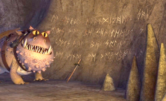

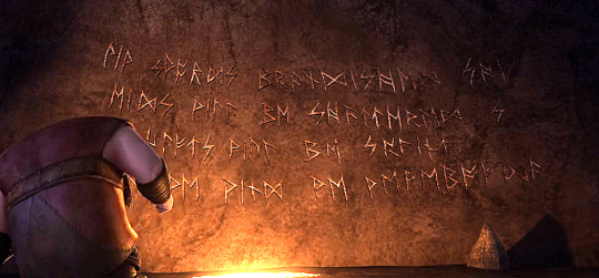
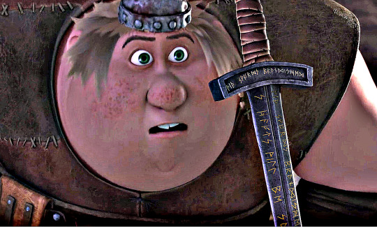
So, as you can probably guess, I'm going to be getting into the "Ancient" Sword and the Runes that are found inscribed on both the sword AND on the wall.
(I edited the screenshots so you, the viewer, can have a clear view of these pictures since the originals were in bad lighting.)
I was re-watching "Follow the Leader" (S3E3) when I saw the scene where Fishlegs discovers the sword and the script on the wall and became greatly intrigued. For some strange reason, I never really wondered until now about what the translation was, and if anyone had translated it (like what they did with Dagur's arm). However, after doing some research, I was surprised that nobody seemed to either notice the runes or come up with the idea of translating them.
So, with Noctus being Noctus doing what Noctus does best, he sets out to investigate and does some research! Research, research, research! One of the one ten things you get to know about me is that I LOVE to research and learn stuff. If I don't know something, I go research it until I do.
So, I once again re-watched the episode, this time making sure to do it on the computer so that I could snip various shots and angles with certain scenes directly showing the runes on the sword and wall. Then I went on Ribbet (a popular *and free* photo editor site) to spruce up the photos and lighten them up, since they were in a dark cave and with low lighting. I did the best I could without distorting the photos themselves, making sure that I tried to highlight the runes so I could see them clearly.
Once I did that, I then went to Pinterest to search for some Nordic Rune charts so that I could use them to help decipher and translate the runes on the sword and on the wall. I ended up downloading a few since they varied and there were different variations. Not counting the time spent on photo editing and looking for the right shots to snip (which took me the whole day), it took me about an hour or two to search for the right ones.
Fortunately, the runes on the sword and on the wall contained the same message, so, with the help of the charts, the brighter and clearer photos, and the sword (or certain parts of it), I was able to translate the entire message. Some runes were difficult to define due to the rough surface and the bad lighting in some areas (not to mention rock erosion and fading of some of the runes), but I was able to make them out perfectly.
All-in-all, the whole project took me just about the whole day. And the translating took me about a couple of hours, mostly to double- and triple-check to make sure I missed nothing. The end result was this:

(If you wish to use this picture, please make sure to give me the credit and the shout-out.)
I do have to say, though, that it was moderately challenging. Not too much so, but enough. Some words like "shields" and "shafts" were split (as you can see in the top right corner of the message), so it took a few ticks to notice the actual words once I got the letters themselves translated.
Then the word "splint" caused me to scratch my head for a bit; unlike the two words, this one wasn't split awkwardly. So I decided to take some literary historian liberties and assumed that since we're dealing with shafts (as in arrows), it would be "splintered," rather than "splint," which seemed to fit with the rest of the script so far.
So after spending an hour or two translating, I ended up with this:
"With swords brandished, shields will be shattered; shafts will be splint(ered)..."
Makes sense, right? Sounds like a reference to a Saga or a Skaldic poem or even some sort of rune-enchantment to enhance the sword's abilities in battle (historically, Vikings did this quite a bit; they were weird like that.) Something totally and completely logical and practical.
But then, I come across THIS last part of the message, and this is what it looked like AFTER translation:
"...whd we wind we wewebofda."
I'm not joking. It LITERALLY says this. And this is AFTER THREE HOURS of re-checking FIVE times or more, on top of editing the photos even MORE in order and studying them meticulously and looking at EACH and EVERY rune and comparing it with the charts to make sure that I didn't make any mistakes. I didn't. This is REALLY what it says. Even if some of the P-shaped runes (which translate into "w" in English) were actually thorn "ᚦ" runes (pronounced as a sharp "th" sound, like "with" or "Thor"), and if some of the faded runes weren't what I assumed to be, the results would barely be any different than what I currently have.
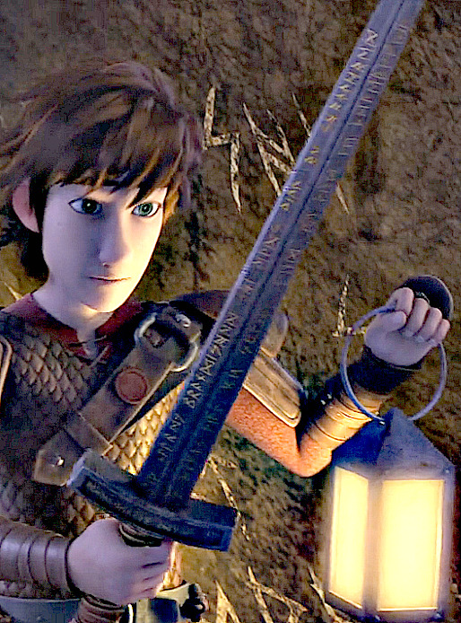
I've even tried brightening and clarifying this particular picture of the sword in a hope of having a more definite view of the runes, only to be disappointed.
As you can see, the lower right quarter of the sword, where the runes that I am looking for are located, isn't clear enough for me to decipher, forcing me to depend on the runes carved on the wall. If you guys are able to make this more discernable and clear-cut, please let me know. But I'm not holding my breath; I'm fairly confident of my translation at this point.
"...whd we wind we wewebofda."
Now, I'm pretty sure you're laughing at this point from the sheer absurdity of the sentence (to be honest, I am, too). It can't be helped. It IS absurd. In fact, it sounds like something Snotlout would say after getting struck by lightning. And it seems contradictory that 2/3s of the message makes sense while the rest of it is in inconceivable gibberish babble! It boggles the gray cells to no end!
My Theory(ies):
Okay, so I have a few theories as to why this babble exists.
1) Whoever wrote this was drunk or buzzed,
2) Whoever wrote this was becoming senile,
3) Whoever wrote this was dying and was losing control of his ability to coordinate words,
4) DreamWorks either can't write or is trolling us big time!
(If you have any theories, give a shout!)
Whatever the case, it bugs the tar out of me. But I'm just going to let it go and just ignore that this last part exists. That's the beautiful thing with taking literary and creative liberties and having an imagination: you can come up with whatever best suits the story — so long as it makes sense, that is.
Conclusion:
So in conclusion, this is basically what the translation is in its entirety!
My theory is that the runes and sword could’ve belonged to the Twins’ uncle. Or this could’ve been even older, belonging to one of the Hamishes, or even Grimbeard or one of the first two Hiccups. Or perhaps some Viking whom we don’t know of.

However, this was bugging me the whole time, and I refuse to admit defeat, nor will I allow this translation to remain like this. Thus, I had already taken the liberty of creating several versions of this translation according to my discretion. You may choose which translation you prefer, or you can make your own. ^_^

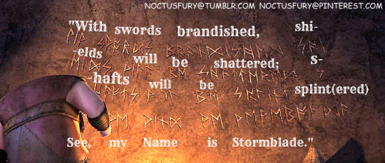
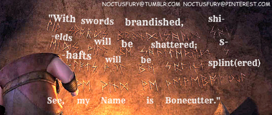

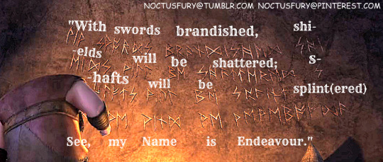
Here ya are! Don’t they look so much better!! I think so!! ^_^
And if you're curious as to what rune charts I used, I'll happily give you them.
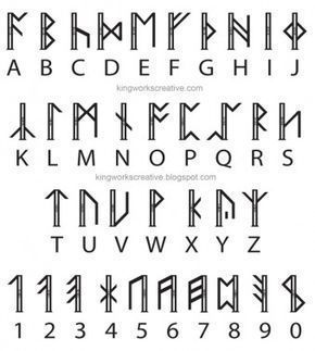
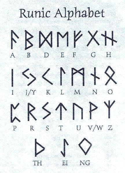
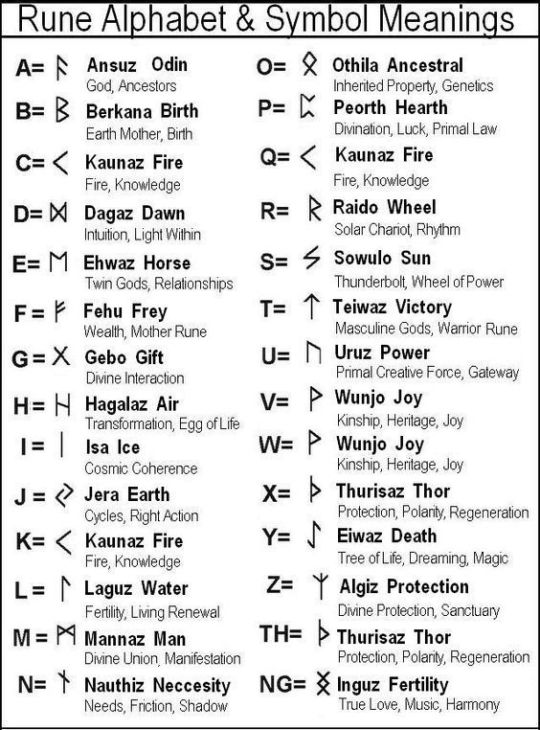
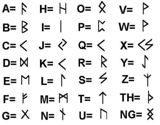
(Please keep in mind that letters such as "J", "C", "W", and a few others do not exist in the Old Norse language. Many of these letters are modern and didn't come up until the 1600-1800s. If you see them on these charts, they're more for guidance for modern users.)
In total, this project took me about 1-1/2 to 2 days to work on this — mostly having to do with research and editing pictures than actual translating. That in itself took about a half-day at most.
What about you? What do you think the real translation is?
Thank you for reading this article. My first one, in fact, for this book! Started with a BANG! I hope that you enjoyed it and that it was a blessing for you. Regardless if you ever had a curiosity about what these runes said or not, I hope that this now satisfies it and that you can leave this page with a new knowledge that can increase your love for this amazing Fandom.
Long Live the Night!
— Noctus Fury
#noctusfury#httyd#httyd fandom#httyd articles#viking runes#translation#dreamworks dragons#race to the edge#season 3 episode 3#follow the leader#fishlegs ingerman#fishlegs#runes#httyd franchise#httyd series#vikings#historical#fan translation#httyd edits#httyd article#httyd edit#httyd fan edit#viking age#this was really fun#I really enjoyed working on this project#httyd theories#httyd theory#httyd headcanons#httyd headcanon
39 notes
·
View notes
Text
Whitewashing, Gifs, and Elyan
As we get closer to the start of Elyan Appreciation Fest, I wanted to take a moment to go over how to avoid whitewashing the characters of color that make up the Merlin fandom, but more specifically, Elyan.
The BBC didn’t do Elyan any favors by giving him a majority of dark colored or poorly lit scenes. However, that’s not an excuse to washout, lighten, or oversaturate Elyan’s skin when giffing his scenes.
Black and brown skin is significantly warmer in tone than light skin and the way you bring that out is by enhancing the reds and yellows. However, in an attempt to bring Elyan’s true skin tone out, some editors may unintentionally oversaturate by bringing out too much red and yellow without balancing with blue which then makes Elyan look orange.
A lot of BBC Merlin scenes are also very dark or blue colored for “night time” scenes and in trying to lighten them, especially when next to light skinned actors, Elyan’s skin may unintentionally come out looking ashy or lightened.
This feeds into part of the reason I think he is so under-giffed. The fear of unintentionally whitewashing or oversaturating can be very overwhelming. With this tutorial I want to help create a more secure and informed environment for giffing Elyan.
I am absolutely not an authority on giffing. This is just the process that I use and should not be considered the be all-end all for giffing Elyan. Additionally, this process might not work for all scenes and is subjective to the original coloring of the scene.
This coloring tutorial is created on the basis that anyone using it already knows how to create a base gif. I use Photopea for editing (ya girl broke), but this should work with Photoshop as well.
Again, this is my process for giffing and some of you may already have a process that works for you, this is just to help ensure that Elyan and other characters of color do not get unintentionally washed out or lightened when giffed.
This is the original:
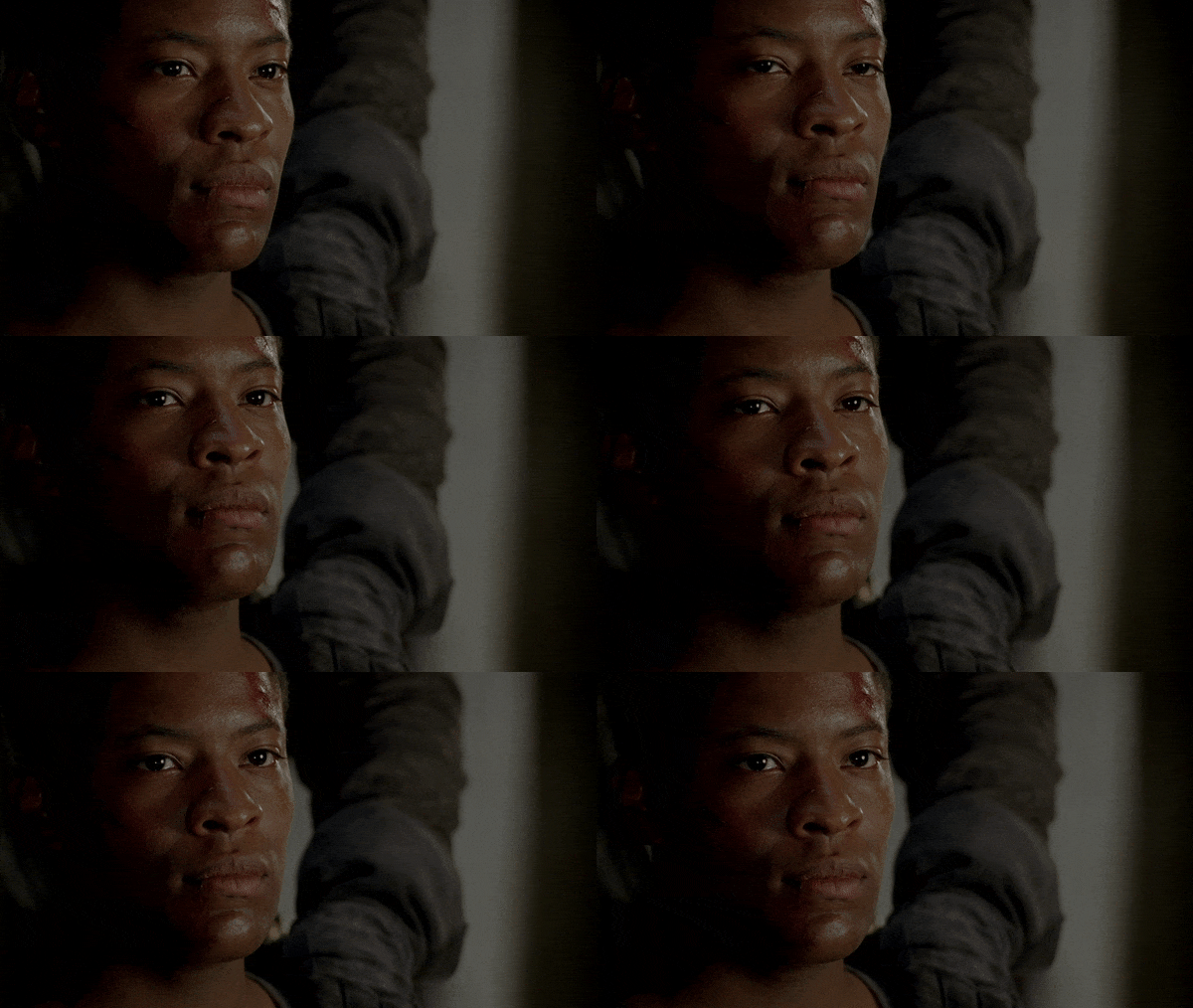
To start with, I sharpen the gif and do some basic coloring using Curves, Hue/Saturation, and Selective Color.
My gif comes out looking like this:
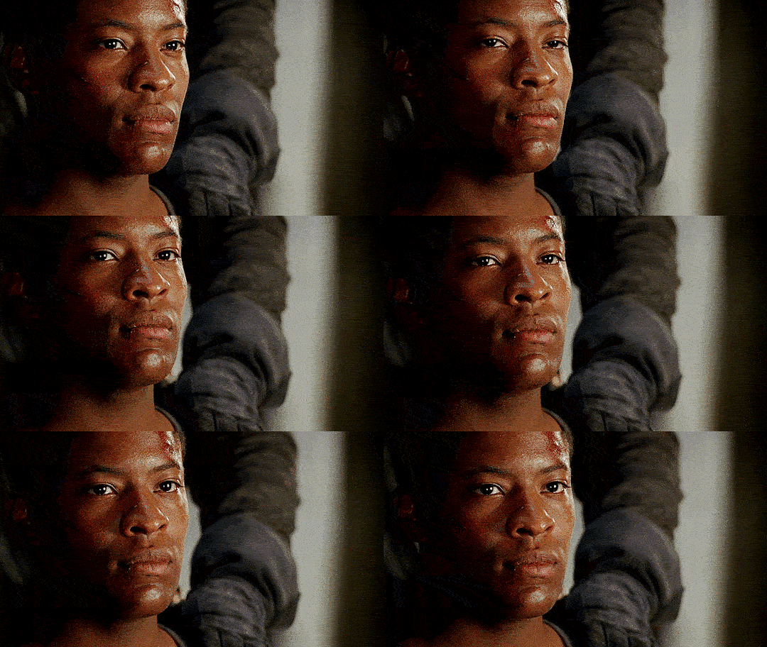
It’s brighter and more vibrant than the original and I know a lot of people would probably be fine with how this looks and move on. However, Elyan does look a bit more red than he should and I know that we can do better.
To correct this, I’m going to add a Hue/Saturation Adjustment layer and isolate the reds. I’m going to bring the Saturation down to -30 and the Lightness down to -5.
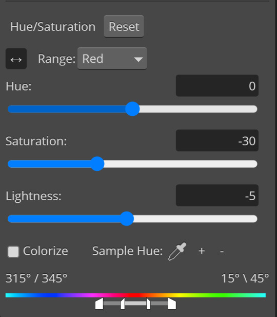
And I’m also going to add a Vibrance layer at 30.
Instead of adding more color, the Vibrance layer is simply going to enhance the existing colors within the gif and make them pop more.
The vibrance amount is also very subjective. If this scene were lighter, like a daytime scene, I start with 10. My personal rule of thumb is to start with 30 and subtract or add additional vibrancy layers in small amounts.
Adjustments such as Vibrancy, Color Balance, Selective Coloring, and Hue/Saturation can drastically affect the overall gif and it’s better to go slowly and make small adjustments than to rush and make a mistake.
The gif now looks like this:
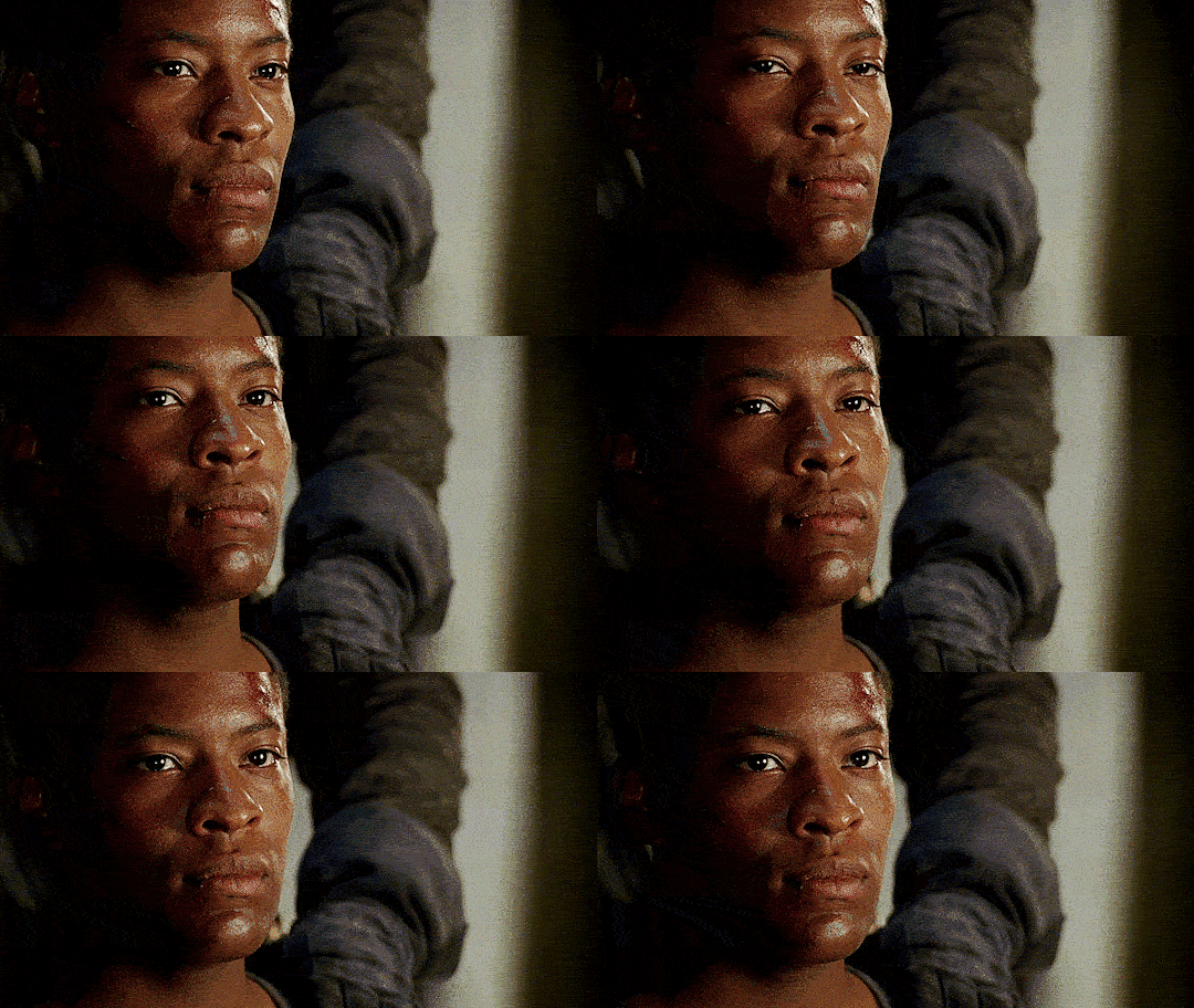
Instead of looking reddish, Elyan’s skin is now more true to tone. I prefer slowed gifs, so I’m going to reduce the speed to 70%. From here, you could add other coloring layers, text, or whatever fits your preference and post it!
The important thing to remember when coloring gifs is that it just takes practice. My first gifs were not great and even now I’m definitely not the best. I’m still learning and finding better ways of doing things.
Again, this is just my way of doing things and there isn’t one correct way of giffing and coloring. Sometimes the coloring just doesn’t work! So many of BBC Merlin’s scenes are poorly lit or have that fake night coloring on them that makes the scene come out very blue and can be difficult to fix, much less make Elyan true to tone when there’s so much blue involved.
At the end of the day, making an effort to keep Elyan and others as close to tone as possible is always best and you, the editor, should use your best judgement.
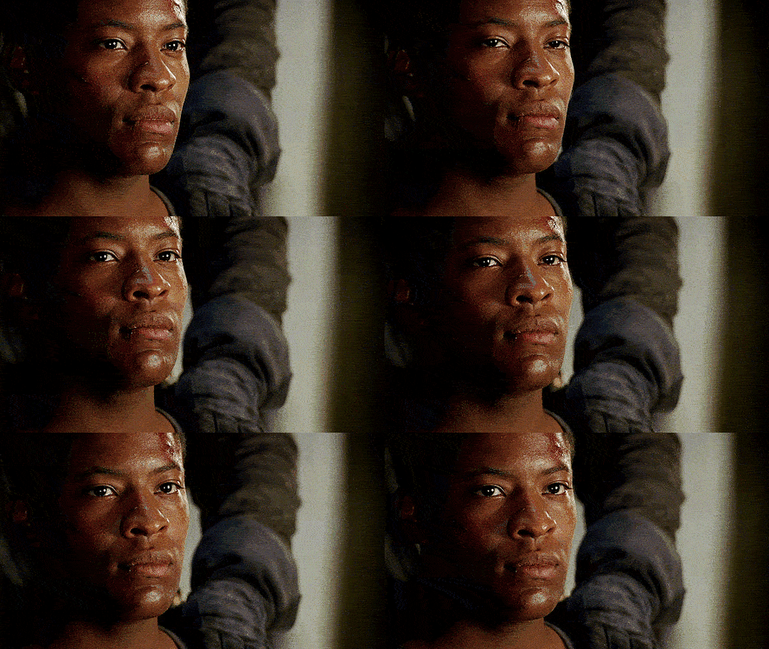
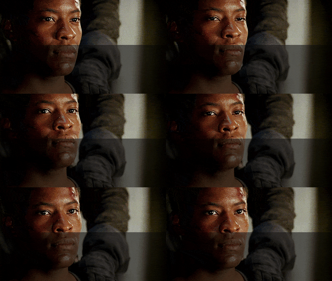
Final gif compared to the original.
I’m always happy to talk about Elyan or Tomiwa in general, so if you have questions you’re welcome to ask!
#bbc merlin#gif tutorial#photopea#photoshop#adetomiwa edun#elyan#coloring tutorial#my gifs#lion gifs#elyan appreciation fest#liontutorials
340 notes
·
View notes
Photo
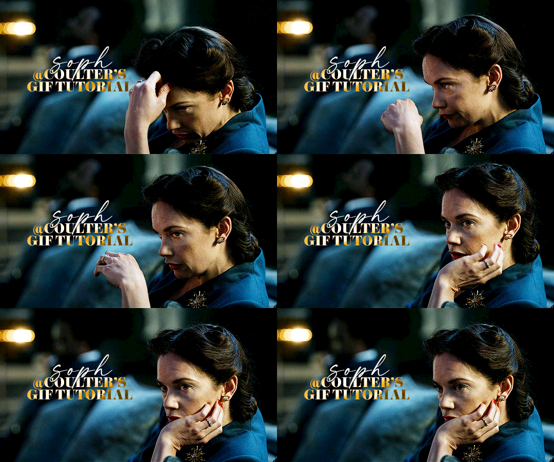
Hello! As requested, here is a tutorial on how I make my gifs. I would like to preface this by saying there are many ways to make gifs, and there’s no right or wrong answer imo. This is just how I personally go about doing so!
I will be using PS CC 2017, but as long as you have the video timeline option, it shouldn’t matter too much; on any version of PS, you should be able to adapt anything I mention here! You will also need some kind of screen recording software. I’ll talk a little more about that under the cut.
To start, you need the source material you will be making the gifs from! I get mine from snahp(.)it (avoiding links so tumblr hopefully doesn’t banish this from the tags lmao) and I always opt for either 1080p or 2160p. Not all laptops will support 2160p as it’s 4K, but either works great! You just want your gifs to be the best quality possible.
Next is where the screen recording comes in. I don’t use the screencapping method to make my gifs (where you use a program to cap a clip and then load those caps into a stack in PS). This isn’t for any particular reason… it’s just how my friends, (who very kindly taught me to gif), had always done it, so it’s now how I do it too. Personally, I find the quality to be just as good as the screencapping method, and have never noticed a difference between the two.
As I have a PC, I use the software built into it for screen-recording. If you go here: theverge(.)com/2020/4/21/21222533/record-screen-pc-windows-laptop-xbox-game-bar-how-to – you can see how to use the XBOX screenrecorder to record from files you have d*wnloaded. This also works on some streaming sites, but I think it depends on what browser you use. Personally, I recommend Firefox, as that seems to bypass a lot of the blocking and ads that occur when trying to do this sort of thing.
For MAC users, I have been told handbrake works well, as it converts MKV files to MP4, which can then be used to make gifs. You only need to convert part of the file to MP4 depending on how much you want to gif, and this also bypasses the screenrecording stage, as you can edit MP4 clips on Quicktime. I am told you can split them into smaller clips by going to edit > trim and it saves the new clip!
I have also used anyvideoconverter for small clips, but I can’t say what it does to the quality of your video, or how big of a file it lets you put in! With the XBOX screenrecorder, it doesn’t matter what type of video files you get, as the recording will save to MP4 anyway.
LOADING YOUR FRAMES
Now, go ahead and record whatever clips you want to gif. Make sure you have the video timeline open, by going to window > timeline. Then, go to file > import > video frames to layers.
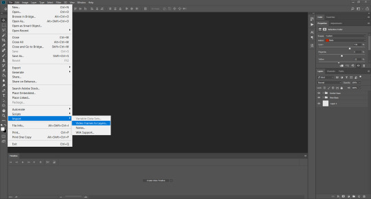
Next, select and open your clip from where it has saved (with the XBOX recorder, it saves in video > captures). You should see a little window pop up, where you can move the sliders back and forth to clip your recording to whichever part(s) you specifically want to gif. I recommend trying not to load a lot of frames into photoshop at once, but I would be a hypocrite to say that, since I do it a lot lmao. Just be patient if you do!
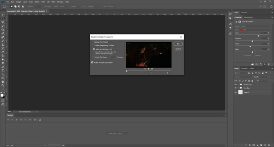
Once you have chosen the length, click okay. Never, EVER, I repeat NEVER click the button that says “limit to every __ frames”. This really ruins the flow and quality of your gif—it’s better to have shorter, but smoother gifs, I promise. And with tumblr’s new 10 MB limit, it shouldn’t be a problem anyway!
Then, your frames should open up. What we want to do is make them into a smart object, so we can edit all the layers at the same time. To do this, click the small button in the left-hand corner. ALWAYS click this first. If you don’t, it will only convert the first frame to a smart object and the gif won’t work.

Give it a second to sort itself out, then, on the right-hand side, select all your frames at once using the shift key.
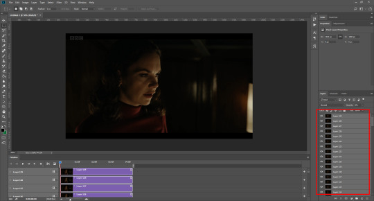
Then, go to filter > convert for smart filters. This might take a minute. Don’t click anything else in case PS gets angry lmao, just leave it for a second and it’ll do its thing. The more frames you have, the longer it takes! Now we have our gif, but it needs to be cropped, sharpened and coloured!
CROPPING
You want to start by selecting the rectangular marquee tool on the left-hand side, then drag it across by clicking and highlighting the area you would like to crop your gif to, like so:
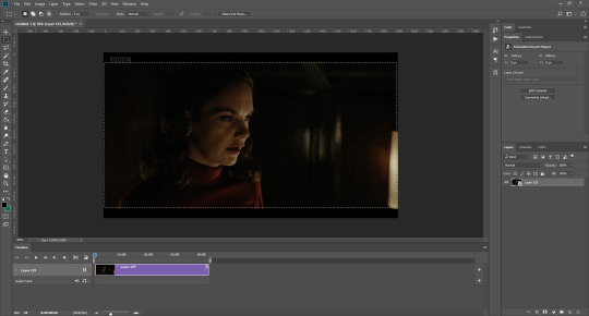
What I tend to do is select everything inside the black lines you sometimes get around your gif (this depends on what file you d*wnload), and also the tiniest bit inside the sides. This is because I’ve found if you crop it right up to the edge, you get a tiny bit of transparency on the sides of your gifs, which I’d rather avoid.
Once you have your desired selection, go to image > crop. Now, the dimensions for tumblr are 540px width, so all your gifs have to be that width. However, the length is up to you. I really like big gifs, so sometimes I even make a full square, or even longer. It’s entirely up to you, and what kind of set you want to make.
For the purposes of this gif, I will stick to what I usually go for, 540px by 350 px. This will mean you’ll have to crop some width off, but that’s okay, since Marisa isn’t central anyway. The cropping is always trial and error for me, as sometimes people move out of the frame within in the gif. The best thing to do is just try it, and then move the slider in the timeline window at the bottom to see if the person stays inside the gif, and if not, adjust accordingly.
Next, go to image > image size:
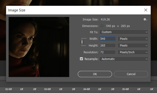
In this box, if I put the width as 540, the gif is a smaller height than I want, as it keeps to the dimensions of the gif when you load it into PS. That’s okay, just put the height you want instead, and we’ll crop off the excess.
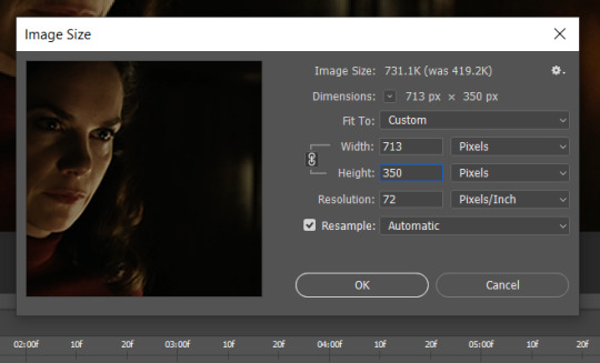
Then click OK. Using the rectangular marquee tool again, we need to remove the excess width. Part of the reason I like this version of PS is that it tells you the width of your selection as you do it, but you can always use the ruler as a guide, and check the size of your image by going to image > image size again.
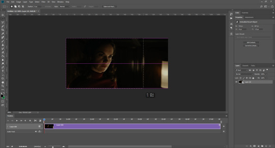

Again, use image > crop, and your gif should now be the correct size!
You can also use the crop tool in the timeline window to crop the length of your gif:
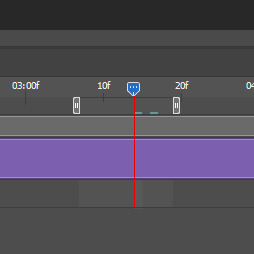
However, I tend to wait until later on to do this (which will be explained further down!)
SHARPENING
Next you want to go to filter > sharpen > smart sharpen.
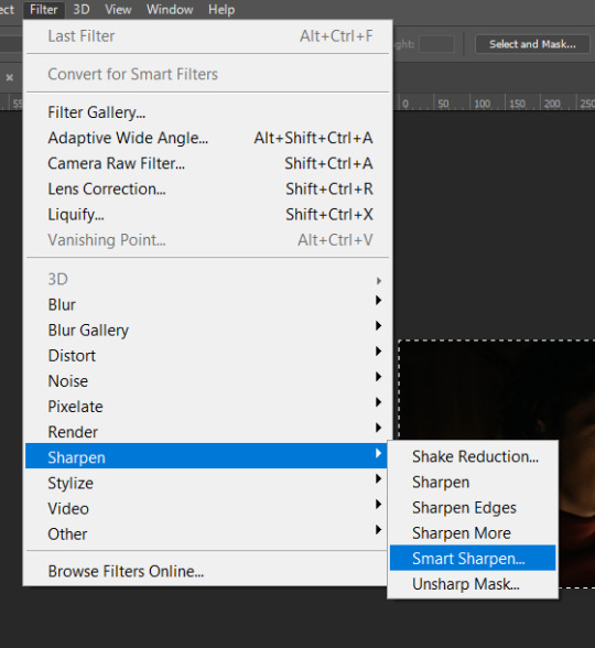
These are my settings. However, 0.4px is very sharp, too much so, but that’s easily fixed.
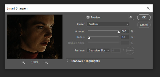
Go to filter > blur > Gaussian blur and then set it to 1.0.
Now on the right-hand side, we need to reduce the blur, so double click the little adjustment button, and change the opacity of the blur. I usually go for 20-30%!

Then click OK, and that’s your sharpening done!
COLOURING
I picked this scene on purpose as it’s dark, so good for showing how to colour a gif. I have a base psd which consists of some very basic adjustments, but it mostly exists so I don’t forget what adjustment layers I like to use. I adjust them every time I make a gif, essentially colouring each gif from scratch.
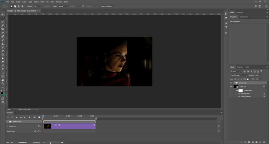
In this case, the psd actually makes it darker. So, what I will do is turn each layer off, and adjust as I go. A lot of people say using lots of adjustment layers ruins the quality of your gif… I have never found this to be true, as long as you are gentle with them. If you whack the brightness right up to the top, it’s going to ruin your gif no matter if you use 1 adjustment layer or 100. I would just say use your common sense, and adjust a little at a time!
I start with a simple black to white gradient map set to soft light, because I think it helps you see depth once you add some brightness to it. I usually do this on about 10%, or more if needed. It’s probably unnecessary, I just like how it looks!
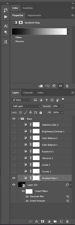
Then, I move onto using curves and levels. This is where things can diverge depending on who you’re colouring. If this person is white, it doesn’t matter too much. If they’re not white, you don’t want to white wash them. My best advice is to play around with it. By adding vibrance and other (usually the red) selective colour settings later, you can ensure you don’t change the person’s skin tone from what it originally was. You can also use layer masks at varying opacities (various shades of grey), on your curves and levels, to remove some brightening so that you’re not changing anyone’s skin colour. Just brighten slowly and check in with yourself honestly about how your gif looks.
Some people don’t like using levels, or curves. It’s completely up to you. I tend to use both because levels are good for bringing depth, even if not brightening (though I like to use them for that as well).
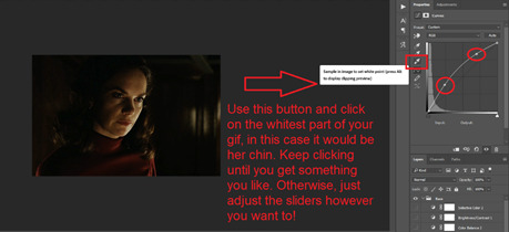
One thing you can do is use the white point of the gif to make PS adjust the curves itself, however I like to drag the sliders myself and see what it looks like. Just make sure it’s not too bright, as we will be using further layers to brighten more, after.
Next is levels. The slider on the left controls the black point, the one in the middle controls the midtones, and the one on the right controls the white points. The black brings depth, the midtones adjust the overall brightness, and the white points produce stronger highlights. Again, you’ll get a feel for how this works as you practice. Just don’t use the white point excessively, especially if your characters are not white.
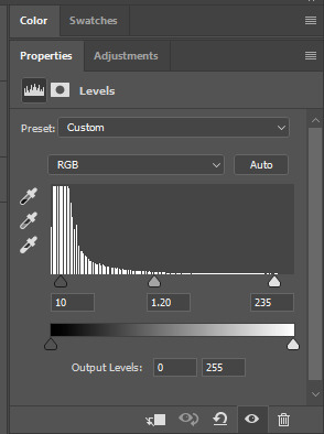
Then I add vibrance (+20!), because we’ve removed a lot of it when lightening the gif. Next is exposure, which I find brings out the highlight and shadow areas more effectively:

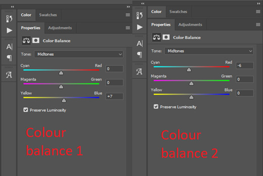
Then colour balance! This helps with scenes that might be a certain colour, i.e. too blue, too green, too red, etc. Moving the sliders in the opposite direction of the colour your gif is will counteract it. The best thing to do when accounting for different colours, is to make a new layer every time you change colour, so that you don’t get confused. I always add a new layer for colour balance and selective colour if I want to change more than one thing. So one for red, one for yellow, one for pink, etc.
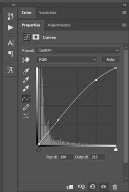
A layer of brightness just to make the gif pop, and because the scene is extra dark, I added a very gentle extra curves layer:
SAVING YOUR GIF
Time to save the gif. You can go ahead and file > export > save for web (legacy) now, but then you’ll have to reopen the gif to reset the frame rate from 0.07, to 0.05. Instead of doing that, I use a modified action. The original was made by the very talented @elenafisher! So I do not take credit for that at all. You can find the original here: elenafisher(.)tumblr(.)com/post/190817437374/gif-sharpening-action-2-preview-download and in my resources tag. Please reblog it if you’re going to use this!
To use an action, first make sure you have actions turned on in window > actions. To load in your action, go to the little lines circled, and then load the action from your downloads:
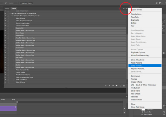
Obviously if you don’t want to sharpen your gifs yourself, you can use the action as it is, and it will give you a beautiful glowing effect. If you’d just like to use it to flatten your gif into frames like I do, make sure to take out all the items I have highlighted:
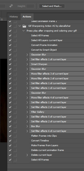
Until it looks like this!
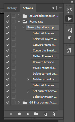
Make sure you have the layer under the file name highlighted, and then click the play button at the bottom! (If you get a screen saying select all frames cannot be found, don’t worry, just click continue!) You can delete the layer that does that if you want, I just keep it in case I realise I’ve forgotten to do something, because you can click cancel and edit your gif before you flatten it. Of course you can undo the steps to get back to the smart object version of your gif, it just takes longer!
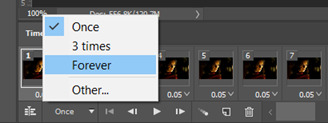
And now your gif is in frames and set to 0.05 already, so you don’t have to change the speed! All you need to do now before saving is change the gif cycle to “forever” in the bottom left-hand corner:
Then to save the gif go to file > export > save for web (legacy). Sometimes, the gif is bigger than the tumblr 10MB limit. You’ll be able to see this in the bottom left-hand corner of the gif save settings. If this is the case, I like to preview the gif, to see whether it would be best to cut frames off of the beginning or the end, or both. When you’ve decided, you can select the frames at the bottom, and in the right-hand side panel, and delete them both using the little bins/trash icons.
I keep checking and deleting frames until I get the gif under 10 MB! Just don’t delete frames from the middle, as then you’ll have the same issue as if you selected “every other frame” when making the gif: it won’t flow!
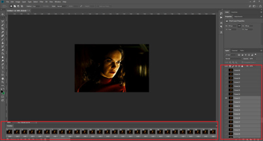
Lastly, these are my save settings:
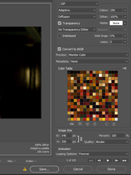
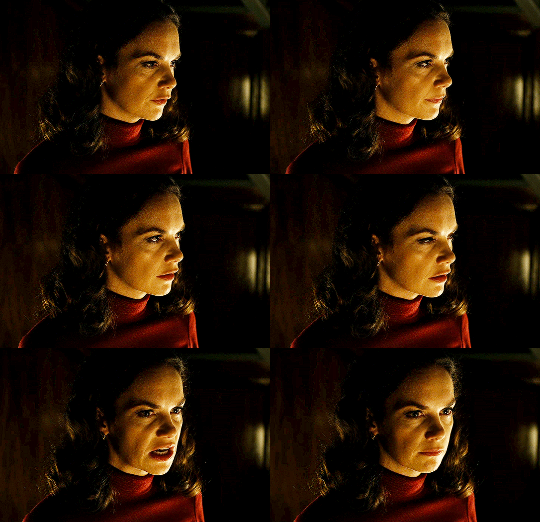
So that’s it! That’s how I make all my gifs. Blending I do when the gifs are in the grouped, smart filter stage, whereas text I add on during the framing section above! Really hope this is helpful, please feel free to ask any questions you may have! 💖
#gif tutorial#tutorial*#completeresources#yeahps#chaoticresources#allresources#mikesmom#usergeo#userava#usertix#usersmile#usertom#if you'd like me to cover anything more advanced just shout#i wanted to show how i add text too but tumblr wouldn't let me add any more pics#but people can let me know if that's something you'd want!
516 notes
·
View notes
Video
tumblr
TBT: The EPIC moment Johnny Depp, as Gellert Grindelwald, surprised the 2018 San Diego Comic Con.
On that day, July 21, 2018, right in the middle of the “Fantastic Beasts: The Crimes of Grindelwald” panel at the San Diego Comic Con, in California, everyone was caught by surprise when suddenly all the lights were turned off and Grindelwald’s logo appeared on the big screen along followed by a Grindelwald speech:
“Friends... You’ve come today because you crave something new… Something different… The moment has come, open your minds, and I will share with you… the future”
While the big screens shows an alternate never released scene from the amphitheater with Grindelwald’s followers with their wands lightened, Johnny appears from the dark fully dressed as Grindelwald.
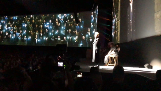
And when I say “fully” is really in his entirely: Hair, make-up, contact lenses, wand, tone of voice, accent, personality, and even his tattoos were covered by make-up.
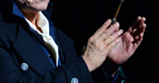
But on that day, “that” was not Johnny, “That” was Grindelwald.
"If I take a character, I’ll know it thoroughly. Then I am no longer myself in the film." ~ Johnny Depp (July 5, 2018)
And without breaking the character (not even when a fan shouts “I LOVE YOU JOHNNY), he starts and follow his speech:
“My brothers, my sisters, my friends… The great gift of your applause, is not for me, but for yourselves… Therefore, applaud yourselves. It is been said, that I hate Le Non-Magique, The Muggles, The No-Maj, The Can’t-Spells... I do not hate them. I do not. I say: The Muggles are not the lesser, but other. Not worthless, but of other value. The magic blooms only in rare souls… It is granted to those who live. Oh, what a world we would make for all of humanity. All the humanity, we who live for freedom, for truth... The moment has come to rise up and take our rightful place in the world.”
And just like he appeared he left the stage after raising his wand and sounds of explosion be heard, breaking the silence in the arena. Johnny did not gave interviews and did not attended the panel. Instead, he returned to his musical life and traveled to Phoenix, Arizona to attend and play at Jeff Beck’s concert. Friends first.
> Curiosities: Behind Johnny’s surprise and the differences between the Live Speech and Movie Speech.
*Although the cast of Fantastic Beasts where there for the panel which was scheduled days in advance, they only new about Johnny’s appearance the day before.
* Apart those involved on the backstage, no one knew that Johnny was there, those who knew and saw him for a couple of minutes smoking outside the building, did not leak the secret and no one saw when he entered and left the Comic-Con.
* The same thing happened during “ Fantastic Beasts and Where To Find Them”. The actors didn’t know that Johnny was going to be Grindelwald, and only found out on the day he was going to shot the scene.
* Johnny’s appearance happened few minutes before the “Aquaman” panel with the cast. Some people said that Ms. Heard didn’t like his presence and that saw when she was talking to some security guards. They did not talk to each other, but she was caught by surprise.
* The pre-recorded speech during the intro, is both an edited cut version from the original speech in the movie and an alternate version taken from the movie rehearsals. While in the intro Grindelwald says “The moment has come, open your minds, and I will share with you the future” in the movie is “The moment has come to share my vision of the future”. For those who didn’t know, Johnny tried dozens of different ways to make some scenes, collaborating with new lines, extended speech, different way of moves, alternate takes (such interacting with his followers on the amphitheater, and other scenes never released) and scenes recorded in dozens of different tones of voice. For example the scene which Grindelwald speaks to Leta Lestrange at the amphitheater has at least 4 different versions. Although they were recorded and even aired during an exclusive exhibition of the unfinished version for a selected public to check if the audience was approving the plot, most of them were replaced and/or taken from the final version, but still some can be seen and heard during the official trailers. * Johnny’s live speech is around 80% similar to the movie. Some of the lines he didn’t speak were added in the intro, while some were not spoken maybe to avoid a bigger spoiler, once we were going to watch and listen in its entire version in the movie, 4 months later.
JUSTICE FOR GRINDELWALD JUSTICE FOR JOHNNY DEPP
#Johnny Depp#Gellert Grindewald#San Diego Comic Con#Special Surprise#July 2018#Epic Moments#Justice for Grindelwald#Justice For Johnny Depp#Johnny Depp is My Grindelwald
41 notes
·
View notes
Text
The Broadway Revival Doesn’t Get Comedy
Here’s another long essay hating on the Broadway Revival. I promise that this will be the last one of these, because I think I’ve summed up all the problems I have with it by this point.
The title of this essay isn’t universally true. There is good comedy in the Broadway Revival. But, most of it comes from the actors improvising. When it comes to the comic relief numbers of the show, the changes in choreography and staging, and even in plot in one case, generally fail to understand how the jokes in the numbers work.
Now, I know that explaining the joke makes it less funny, but in order to explain why the 2016 comedy doesn’t work, I’ll have to explain why older versions do. Why is the 1998 film funny, and why are bootlegs/pro-shots of earlier productions funny, in places where 2016 falls flat?
To begin with, you might be wondering, “in a show full of strange nonsense and little concrete plot, what would you call a comic relief number?”. There are plenty of numbers in the show that have a comedic tone to them that I don’t consider comic relief numbers. The Rum Tum Tugger is usually full of comedic bits, for example, but it’s not a comic relief number. Why? Because it does something other than be funny and lighten the mood. It’s a song all about a major character who’s just appeared. Apart form Chorus Tugger in the opening, who usually doesn’t stand out much, we haven’t seen Tugger yet. After the cats leave after The Naming of Cats, we don’t see him again until his own number, where he interrupts the party to tell us what he’s all about. Tugger, as a character, is introduced as high-energy and a troublemaker, which leads to comedy, so the song has comedic moments, but it’s not purely a comic relief number.
Most songs in Cats are like this. They’re songs about what makes a character tick, and because these characters are onstage for most of the show, it’s good to let the audience get to know them. But, there are a few numbers in the show that don’t introduce characters and don’t advance the plot. They’re just entertaining little skits that don’t fit anywhere else. These are the comic relief numbers.
In a full production of Cats, in which no songs are cut, there are three comic relief numbers: Bustopher Jones, The Pekes and the Pollicles, and Growltiger’s Last Stand. The first one might be confusing. Bustopher Jones introduces a character. Shouldn’t it count as one of the character songs like The Rum Tum Tugger? The difference is that, while Tugger sticks around and plays a role in other events of the show, Bustopher is only present for his number. He shows up, there’s a song, and then he leaves and is never seen again. This makes the number into something of a non-sequiter.
Gus the Theatre Cat also revolves around a character who’s really only there for his own song. In productions that cut Growltiger, this is all you see of him. But, Gus the Theatre Cat isn’t a comic relief number because it’s one of the few songs that doesn’t have a comedic tone. There are jokes here and there, and in most stage productions the character of Gus is more comedic than he is in the 1998 film, but the song has a softer tone, no dancing, and Gus eventually leaves in tears. Though the 1998 film stands out in this regard, even in other productions, this is not a comic relief number.
Another thing you’ll notice is that Bustopher Jones, The Pekes and the Pollicles, and Growltiger all come after more serious, less energetic numbers. Grizabella the Glamor Cat and Gus the Theatre Cat are both quite sad, and the play basically changes the subject to lighten the mood. Old Deuteronomy isn’t sad, but it’s slow and more serious. When the tone of the show starts to get serious, a comic relief number is added to lighten the mood. The pattern breaks with Macavity, with the song followed by a fight, to show that the stakes have been raised and things are getting serious. Mister Mistoffelees comes along as a more upbeat number, but the change in tone here is pretty much a plot point. Everything seems bleak and then Tugger starts this number to give everyone hope. Mistoffelees restores power after the light goes out as part of this shift. We were at our literal darkest moment and now there’s a spark of hope.
So, now that we know what numbers are comic relief numbers, it’s time to go into how and why they work, or how and why they don’t when things go wrong. Since the Broadway Revival cuts Growltiger, I’ll focus more on the other two, but the new version of The Pekes and the Pollicles borrows from Growltiger, so the stuff that was borrowed will also have to be discussed. But, before we get into all that messy business, let’s take a look at Bustopher Jones:
Bustopher Jones:
Most of the comedy in Bustopher Jones, though there are a few simple fat jokes in there, comes from how other characters react to Bustopher. Bustopher keeps an air of dignity about him as he formally greets everyone and discusses his clubs. He’s not the joke here. This is a song of Amusing Background Events. With the queens, you have Jenny’s crush on Bustopher and Bombalurina clearly not getting it but trying to be polite about it and not kinkshame Jenny over it. With the toms, you have the kittens getting over-excited and the older cats, desperate to impress Bustopher, rushing to stop them from making a scene, making a scene themselves in the process.
In particular, there are three characters to watch in this number who provide the best comedy: Mistoffelees, Skimbleshanks, and Munkustrap. Two out of the three of them, which two depends on the production, will go into fanboy mode, often competing for Bustopher’s attention. Broadway-based productions tend to have Misto and Skimble compete for Bustopher’s attention, while London-based productions, such as the 1998 film, tend to put more focus on Munkustrap. He barely contains his excitement and is shown to be Not So Above It All, though he’s usually more level-headed than whichever cat, Misto or Skimble, he’s being contrasted with.
Basically, the joke is that Bustopher is considered super-important, despite not having a clear place in the tribe’s hierarchy, and everyone goes nuts trying to impress him, get his attention, and make sure that everything is perfect and nothing goes wrong. This joke works best when Bustopher is actually pretty laid-back and everyone’s freaking out over nothing.
The 2016 version doesn’t get this. You do see characters scrambling around, trying to make sure everything’s perfect, and get Mungojerrie and Rumpleteazer as far away from Bustopher as possible, but, at the moment when it’s the most important to get this right, it fails.
The biggest problem with the number is Bustopher’s solo. It’s performed well enough, like most of this production. That’s not the problem. There are two main problems: a staging problem and a writing problem. The staging problem is where the above explanation comes in: When Bustopher sings his solo, no one gathers near him. In other productions, a group of toms gather around Bustopher where they hang on his every word, try to get his attention, and try to look important in front of the others. There’s always one, Misto, Skimble, or, more rarely, Munkustrap, who tries to stand way too close. But, 2016 Bustopher is given plenty of room to just stand there and face the audience. No one seems to be paying that much attention to what he’s saying.
There’s also a problem with how the solo is edited and the break that follows it. The problem isn’t that Bustopher’s solo is shortened. Lots of productions do that. The problem is in what’s cut.
The full solo consists of four quatrains: sets of four lines. The second and fourth lines rhyme with each other, so each quatrain ends on a rhyme: rules and Schools, Blimp’s and shrimps, bones and Drones, Glutton and mutton.
The original Broadway run of the show, and many other productions copying it, the second and third quatrains are cut. You go from Joint Superior Schools to “If I’m seen in a hurry”. The 2016 version cuts the first and second quatrains, only including the second half of the solo. The problem with this is that it cuts the first quatrain.
Cutting directly to the third quatrain is musically awkward, because there’s no build-up to this point in the song that’s song loudly with a choir backing it up. But, when it comes to the joke that’s being told in the solo, cutting the first quatrain removes the set-up and changes what the joke is. With the first quatrain, the solo is about the various clubs Bustopher goes to. Starting at the third quatrain, the joke is mainly a list of foods that Bustopher likes, even though the clubs are mentioned.
The first quatrain is the only portion of the solo to not mention food at all. It’s all about the social etiquette of gentlemens clubs. A gentleman in the early 20th century wasn’t supposed to belong to more than one club. So, in order to go to eight or nine, as Bustopher does, one would have to make sure that the clubs didn’t meet too close together, so that someone from one club might see them at another. It’s part of his strategy in going from club to club: he imitates the etiquette of the humans on the surface, while actually breaking all the rules behind their backs.
But, the point is, Bustopher is listing the various clubs he’s managed to get food from. He’s sort of cheating them all, though I doubt they’d care that a cat was frequenting more than one club. Going to different clubs that are located far enough apart that people from club A are unlikely to walk past the meeting place of club B is quite a feat and it takes a lot of skill to pull off. Bustopher knows what clubs he can do this with and what food he can get from them. If he wants seafood, he goes to the Stage and Screen. If he wants curry, he can go to the Siamese or the Glutton. Foxes is too close to one of his other clubs for him to go there, but he can get fresh meat of the same quality at Blimp’s.
The first quatrain sets up and explains the joke. Without this set-up, the joke becomes one about gluttony, making it more of a fat joke than it is when the first quatrain is included. To make matters even worse, the 2016 choreography adds this instrumental break where the cats put together a restaurant for Bustopher and give him various foods, doubling down on the joke being purely about Bustopher’s gluttony, not how he messes with high society. It’s still a joke and people might still find it funny, but it’s not the same joke and comes very close to being “it’s funny cuz he fat”.
The entire point of the number is that Bustopher’s weight is part of why he’s celebrated. He’s fat because he’s clever, managing to trick a bunch of rich humans into giving him fancy food off of their own plates. Because he looks like he’s wearing a tuxedo and spats at all times, the gentlemen at the clubs see him as fitting in, even though he’s most likely a stray. If he had an owner who was feeding him, he wouldn’t have developed this whole routine for getting food. The people who probably wouldn’t give food to a homeless human, seeing it as “feeding strays”, will literally feed a stray just for looking like he belongs. It combines two things that cats tend to love: food and messing with stupid humans.
So, the lack of emphasis on how other characters react to Bustopher and the reason why they react that way weakens the joke. But, to give credit where credit is due, I do like how they double down on Bustopher being Tugger for older women but have Jellylorum seem to be just as into him as Jenny is.
The Pekes and the Pollicles:
Here’s where the Broadway Revival goes completely off the rails. Both The Pekes and the Pollicles and Growltiger are often cut from productions to save time. They’re both “play within a play” scenes, which can be a bit confusing in a show that rarely ever uses dialogue to introduce the numbers. The Pekes and the Pollicles in particular seems to come out of nowhere. “Yay! Old Deuteronomy is here! Now let’s make fun of dogs!”
So, the Broadway Revival, like every production, had to decide what to do with these numbers. Would it keep them? Cut one of them? Cut both of them? But, for some reason, they invented a new option: Combine the two.
2016 Pekes and Pollicles isn’t The Pekes and the Pollicles. It’s a combination of The Pekes and the Pollicles and Growltiger’s Last Stand. The song is moved to where Growltiger is normally done and parts of the melody are mixed in. The Rumpus Cat, as a character, is equated to Growltiger as a character Gus played back in the day. This is where the trouble starts.
Now, I’ll once again stop to give credit where credit is due: The 2016 opening to The Pekes and the Pollicles is really sweet, with Old Deuteronomy encouraging Gus to play the Rumpus Cat one more time. Growltiger is basically a dream sequence of Gus flashing back to when he played Growltiger. Getting to see him actually relive his glory days one last time is nice. If they used this opening for Growltiger instead of The Pekes and the Pollicles, it would’ve been a good addition to the number.
So, Growltiger and The Pekes and the Pollicles are both plays within a play. Why not combine them? Well, the main problem is that The Rumpus Cat is not Growltiger.
Now, a lot of people hate Growltiger’s Last Stand and I’m not going to act like it’s some kind of masterpiece. I personally find the number to be sort of middle-of-the-road. If you see it more than once, the shock value of the cringey Asian stereotypes starts to wear off and, with a few exceptions, the number feels kind of dull. Andrew Lloyd Webber himself said that he was never really pleased with how Growltiger turned out and the London Revival rewrite might be worse than the original, at least musically. But, I’ve seen a few productions of Growltiger that I thought were kind of funny, usually by taking the racial stuff and sort of saying, “We know it’s bad and we can’t make it better, so we’ll just make it worse” and playing it up to the point of absurdity, like a parody of the sort of Yellow Peril stereotypes the song includes. I’ll also give credit to the Tecklenburg non-replica keeping the Siamese in silhouette behind a sheet.
When I say “The Rumpus Cat is not Growltiger”, I mean that how the two characters work comedically is completely different. You can’t just swap one for the other without rewriting the comedy of the entire number to match.
You’ll notice that Growltiger is in the title of Growltiger’s Last Stand. The song centers around Growltiger as the main character. The Pekes and the Pollicles includes the Rumpus Cat in the full title, but said title is so long that you rarely ever hear the song called that. The Rumpus Cat plays a key role in the story, but he shows up later on. The song isn’t about him. He’s not onstage for most of it.
This means that the comedy surrounding Growltiger and the comedy surrounding the Rumpus Cat work completely differently. The comedy of Growltiger is the comedy of Growltiger’s Last Stand. It all revolves around him. This is a joke based on a wacky character. The joke in The Pekes and the Pollicles isn’t about a single wacky character. It’s about a play where everything that could go wrong does with Munkustrap acting as the straight man. He’s the only one taking this seriously, perhaps a bit too seriously. The Rumpus Cat is just another thing that goes wrong. He’s funny, but so is everyone else who calls attention to themselves throughout the number.
Putting Gus as the Rumpus Cat into the Pekes and Pollicles is performing the number but with the joke from Growltiger. The Rumpus Cat enters the story too late for this to work, so Gus spends most of the number onstage, sharing the narrator role with Munkustrap. Furthermore, in order to include Rumpus Catified versions of Growltiger’s jokes, pretty much every memorable joke from The Pekes and the Pollicles is cut. Nothing goes wrong with the rest of the cast. The first Peke and Pollicle say their lines correctly. The March of the Pollicles and the Scottish Pollicles are cut, removing all the gags there, including Tugger playing the bagpipes at such a fitting moment that only Munkustrap is upset at first.
The fact that nobody messes up is especially weird in this version, because it’s spontaneous. Old Deuteronomy decides that Gus should get to play the Rumpus Cat again and everyone just automatically knows their role in the play. The Pekes and the Pollicles is a show Munkustrap put together for Old Deuteronomy. He had everything planned out. There were rehearsals. But, nobody showed up to rehearsals and nothing goes according to plan. If the play were spontaneous and everyone messed up, it wouldn’t be as funny, because that’s what you’d expect. Nobody had time to learn what to do, so they don’t do it right.
Instead of having the comedy come from the cast of the play messing up, the comedy is about how over-the-top Gus is. He’s narrating now, so why is Munkustrap even there? He does sort of play the straight man to Gus’ antics, but, because Munkustrap isn’t in charge here, he can’t show as much frustration. He can only awkwardly question things and be ignored. The worst case of this is with the “heathen Chinese” line. Most modern productions replace “heathen” with a less offensive word. It almost always feels a bit forced, but it works well enough. Some productions just leave the line as is, which makes it seem like they don’t care, but it doesn’t make the problem any worse. 2016 instead decides to call attention to how bad the line is by having Munkustrap question it, with the line being the older Gus’ fault. Not only does this make Gus less likable, it doesn’t actually solve the problem. The song can’t stop to acknowledge it, so, even though Munkustrap questions it, he still says the line anyway, making the whole thing a waste of time. They should’ve either changed the line or left it alone. But, they basically tried to have it both ways.
Trying to have it both ways is the fatal flaw of the number. They could’ve cut Growltiger like the 1998 film did. If you hadn’t seen any production of the show before seeing the 1998 film, you’d never guess that there was supposed to be a song between Gus and Skimbleshanks. It can be easily edited out. They also could’ve kept Growltiger and used redesigned, less stereotypical costumes for the Siamese, like the Vienna Revival did. It wouldn’t solve everything, but an effort would’ve been made. But, by combining Growltiger with another number, they both did and didn’t cut the number. Instead, the messed with and weakened The Pekes and the Pollicles so they could reference Growltiger without actually performing it.
The places were Growltiger’s melody is used for lines in The Pekes and the Pollicles feel forced, because those words weren’t written for that tune. That basically sums up the whole problem. One song was combined with another in a way that felt forced and awkward, because the elements of the two numbers weren’t meant to go together.
In conclusion, I think the Broadway Revival’s comedic downfall came from a sort of indecisiveness. They wanted to keep things the same but also change them, possibly not even knowing what they wanted to change them into, only that they wanted to change them. They wanted to shorten Bustopher’s solo, but not the way it’d been done before. They wanted to cut Growltiger, but not in the way it’d been done before. They wanted to do Cats, but not in the way it’d been done before.
There’s nothing wrong with wanting to try new things. This could’ve been the template for an interesting non-replica if they really committed to doing things in a different way. But, they got stuck in between, wanting to be different, but not wanting to be too different. So, they tried to fix what wasn’t broken and sell it as New and Improved. This paved the way for the 2019 film to do the same, but with even worse comedy and without the advantage of the numbers being performed well by a devoted cast who knew what they were doing.
TLDR: 2016 messes with comedic numbers in ways that weaken them. It makes Bustopher Jones more completely about gluttony and tries to combine The Pekes and the Pollicles with Growltiger, failing both.
#bustopher jones#gus the theatre cat#the pekes and the pollicles#growltiger#cats 2016#taking comedy too seriously tbh#do the thing or don't#you can't have it both ways
31 notes
·
View notes
Photo
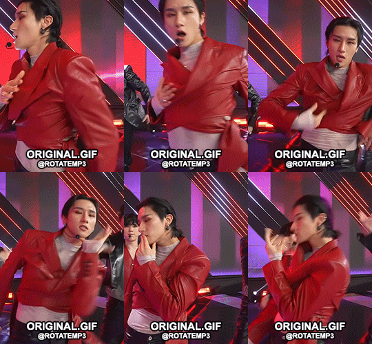

hi!!! i am making this tutorial for the anon who asked me how i coloured this set. so here is a short tutorial on the adjustment layers i used to achieve this look. as you can see, the way i coloured this set is very basic… but i do hope that this will help you colour your own gifs. also, you can download the psd i made here if you would like and apply the colouring to your own gifs/adjust each layer to suit the colours in your original gif. the tutorial is under the read more link. works best on the desktop!!! (idk why it turned out all over the place on mobile)
so before i start the tutorial i am assuming you have already made your gif and ps is open… anyway let’s start!!!
1. as you can see from my gif, the colouring style i use tends to ‘darken’ the colours in the gif. performances tend to have grainy backgrounds so darkening the gifs can make the gifs look cleaner in a way too (apart from using denoise and such). to achieve this, i start with selective colour. this layer can strengthen certain colours that you want in the gif… and can do the opposite as well. it’s hard to explain it in text but once you open the layer you can play around with each of the sliders and you’ll see what i mean. in this set, i used the neutrals and blacks setting to make the darker colours even darker. these are my settings for this gif:

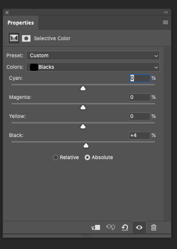
but play around with it and the other colours!!! trial and error is really the best way to see what each setting does so i recommend you play around with this adjustment layer and see what it does to the colours in your gif. for skin colour, i use the reds and yellows setting too to make the skin stand out. for this gif, i stuck to neutrals and blacks only as each gif i used for my set had different colours and i wanted to make the colouring as cohesive as possible.
2. i darken the gif further by using curves. this layer is good when you want to darken a scene but you can also lighten a scene without making the scene too bright (if that makes sense?). it’s really useful for darker scenes where you want the person to stand out from the background. but for this gif, i used it to darken the colours. these are my settings for this gif:

if you pull the little square in the middle down, the scene will turn darker. and if you pull the square above the line, it’ll become brighter. also you can make more than one point on the graph.
3. the next layer i use is levels. so like with curves, this can make your gif darker or lighter depending on where you drag the arrow. i wanted to darken the gif so i drag the arrow to the right. these are the settings for my gif:
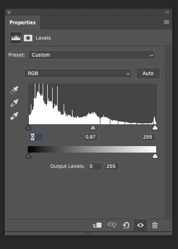
the most i really go is 0.95 because i don’t want it too dark.
4. the next layer i use is black and white. it turns the gif black and white… like the title suggests but this layer changes the colour depending on the blending mode you use for your gif. once you choose the blending mode, you change the opacity of the layer to change how intense you want the colours to look. for this gif, i used the soft light and colour burn blending options and changed the opacity for each one. these are the settings for my gif:


soft light kind of intensifies the colours and darkens the scene. colour burn also darkens the scenes. try our the other blending options too and see how it affects the colours on the gif. you can use lighten or screen to make the gif brighter… increase opacity if you want the effect of the blending option to be greater.
5. the next layer i use is brightness/contrast. this layer basically does just that… it can affect the brightness and the contrast of the scene. i tend to decrease brightness and increase the contrast to make the scene darken and intensity the colours. these are the settings for my gif:
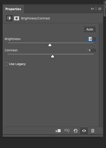
i am making subtle changes because the gif is already dark. but see how this will look on your gif.
6. the next layer i used is vibrance. this makes the colours more vibrant like the layer title suggests… i slide the arrows to the right to increase the vibrance. these are the settings for my gif:
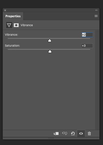
if you slide to the left, it’ll give the scene a more desaturated look.
7. the next layer i use is hue/saturation. it gives the colours a more vibrant look. this layer can also make certain colours stand out more than others. these are the settings for my gif:

it’s only subtle here because the colours are already quite vibrant. but you can adjust it so certain colours look washed out or brighter. use the drop down menu on master to change colours.
8. the next layer i use is exposure. this layer is good for giving the scene a darker overlay. and for giving the scene a kind of a translucent effect. it’s like a little bit of brightness but not really… it makes more sense if you play around with it and see how it affects the scene. these are the settings for my gif:
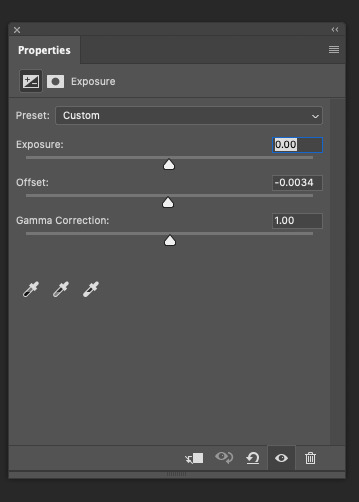

so i decrease the offset and increase it… it kind of makes the scene brighter without making it overly brighter.
9. so by the end of it your gif should look something like this with these settings:

here’s the gif with the original and edited version in one:

i hope this was easy to follow and that my explanations made some kind of sense… sorry if it doesn’t i’m not really good at wording things. but i hope you understand the general idea of what the adjustment layers do. my advice is to play around with each adjustment layer, including the ones i didn’t mention, and see how it affects your gif. it’s really all about trial and error. performance gifs can be tricky in that the background can be noisy and the colours are all over the place but see how you go with these settings. if you would like a tutorial for a specific performance i have giffed, let me know and i can remake it and give you the settings. (here’s an example of how i coloured the same scene differently:
this:
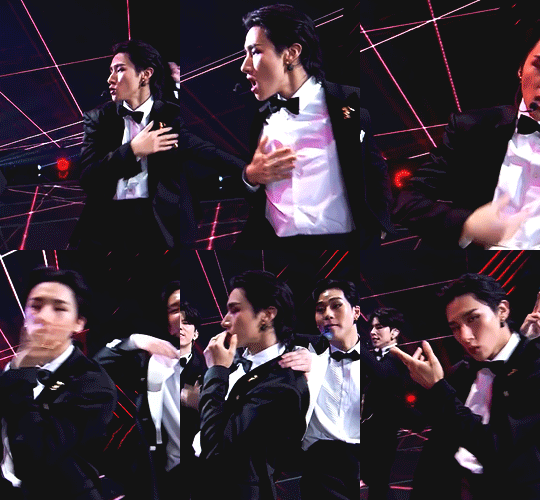
versus this:
you can see the first gif is more blue while the second gif is is darker and the background is now black).
also if you would like the psd for the gif, download it here. please let me know how you go!!! i am sure your gifs will turn out nicely!!! feel free to ask me any questions. and good luck!!!
21 notes
·
View notes
Text
Thoughts on Grey’s Anatomy: 17X15
SPOILERS AHEAD!!!
Wow! A lot happened in this episode. It was billed as Jackson’s goodbye episode, but it turned out to be so much more than that. Meredith got discharged and was reunited with her kids, Tom decided to move to Boston to work for Jackson, and we got the show’s first Indigenous doctor and patient storyline! I honestly think Jackson’s farewell was really well done! While it’s true he could do the work he wants to do just as easily from Seattle everything else about his exit makes sense to me. He’s tired of sitting on the sidelines and he wants to make real change where he can.
I loved his conversation with Meredith and how he was the one to sneak her out. I loved Meredith's voice over for this episode and how it followed Jackson's actions and the flashback montage set to music. I thought it was fitting. I would have liked him to have said goodbye to Ben because they were the Plastics Posse until he left to become a firefighter but apart from that I was happy with it. The character has come such a long way during his run on the show and I feel like this episode reflected that.
The editing was really well done too. Especially the shot of him overlooking the lobby. That transition was seamless. I loved his goodbye scene with Meredith. It made me so emotional. I love that Meredith tried to lighten the mood by making a joke about how she won because she's the last one standing. That scene when she hugged the pillow after he left because she misses him and everyone else really got me. I also really liked the conversation he had with Bailey and Richard.
I'm glad he said a proper goodbye to Jo although I didn't find it super emotional. In addition to Ben, I would also like to have seen a goodbye with Maggie. I'm surprised they didn't do that. Maggie was so focused on Meredith's recovery that it's not clear if she even knows that Jackson is moving to Boston. They also could have done a big emotional scene with Catherine. On a lighter note, I am so happy that Meredith is doing better for real this time and has been discharged! I've been waiting for this since the mid-season point.
I loved the scene where she was reunited with her kids and Amelia was panicking about the state of the house and Meredith told her it was fine and that was just how she liked it. Meredith getting Jackson to sneak her out of the hospital felt very in character to me. As her voice over says Meredith isn't one for tradition or big hullabaloos which is why I think the others tried to keep it a secret. I'm not surprised that she ducked out early. While I get why the other characters wanted to do a big send off for her, I feel like they should know by now that's not her style.
I loved the scene where Amelia and Link found out Meredith might be coming home, and they hugged and then Link said he had to go to work and Amelia started crying and then asked why he was still there. Link was so confused and then Amelia told him she’d be crying off and on like that all day to get her emotions out and that she’d be fine and he needed to go to work. That is so Amelia! But in a good way. Post-tumour and with her addiction under control even in a pandemic Amelia is now able to express her emotions in a healthy way so she doesn’t relapse or spin out of control. That is such huge growth for her. I loved the scene at the end with her and Meredith.
The smile that they share. The look between them. You could see early seasons Private Practice Amelia in that look but also mature and stable new Amelia. I loved that Amelia was all worried about the state of the house and Meredith was fine with it being a mess because as a working Mom she knows what it’s like and all she wanted was to be at home with her kids in her messy house.
At the end of the episode we find out that Tom’s near death experience with COVID has caused him to re-evaluate his life. He feels lucky to have lived to have been spared and he wants to help Jackson make real change in Boston. On the one hand I was surprised by Tom’s exit, but on the other hand I wasn’t. I love Tom and will truly miss his character, but ever since the affair came out and he and Teddy split and she started working on trying to repair her relationship with Owen, Tom hasn't had a lot to do.
I'm sad they didn't do more with him because he's such a great and complex character and I know some people had speculated they might pair him up with Mama Ortiz which could have been interesting. I'm sad we didn't get to see him say goodbye to Amelia, Link, Teddy, Catherine, or Meredith. Tom and Amelia are old friends, he trained her, he took out her brain tumour, and she rushed to the hospital when she heard he had been admitted for COVID-19.
Tom and Link seemed to be getting along as of late and Tom was ready to be a father to Teddy's baby before she got back together with Owen. He found her the perfect apartment and he built a crib for a child that wasn’t biologically his that he was so excited to meet and be a Dad to. All this after his own son died and his marriage collapsed as a result. He treated her like gold and she’s done nothing but treat him horribly for no reason. I don't think I’ll ever forgive Teddy for that.
Catherine and Tom are also old friends that go back even farther. She appointed him as Chief Medical Officer of the Fox Foundation. She told him about DeLuca’s death and took him to the Memorial. When Richard was sick, she told him she wanted him to take over the Foundation in her absence. Tom and Meredith had such an emotional scene earlier this season and he's been praying for her every day. Does she know that? Does Meredith know that Tom has been praying for her and worrying about her? I was expecting a follow up scene to that, so I hope we get one.
I found the patient storyline that Tom, Levi, and Indigenous intern James Chee had really moving. Grey's has never had an Indigenous patient or doctor on the show before and while the dialogue did feel heavy handed at times, they brought some really important issues to light and were trying to make up for lost time so that’s understandable.
Robert I. Mesa who plays Dr. Chee is Navajo Soboba and the patients that they treat at Coast Salish whose traditional territory encompasses the province of British Columbia, Canada and the states of Washington and Oregon in the United States. It’s really great to see an Indigenous actor bring stories about Indigenous characters to life in a realistic way for the same reason that it’s important to see black, brown, Asian, latinx, and LGBTQ+ actors bring stories about characters like themselves to life. It brings authenticity and ensures sure that white straight cisgender people aren’t taking roles away from people within those communities.
When I found out through Twitter that the show had cast its first Indigenous doctor, I was very excited. I work for an Indigenous organization currently and so Indigenous representation is an issue that is very near and dear to my heart. The first thing that came to mind for me was the Coast Salish artwork you see in the background of so many scenes of the show. From the show’s earliest seasons, you can see beautiful art pieces in red, blue, and black depicting fish, birds, and other animals on the walls of the hospital and in people’s offices.
Yet it is never addressed or mentioned that that is Coast Salish artwork. In order for it to be there someone from the art department must have travelled to Seattle to buy some local artwork to put up around the hospital. While that’s great for making the hospital look authentic to the area by not mentioning its origins or the fact that Indigenous people exist for 16 seasons does all Indigenous people a disservice. Indigenous people are not stereotypes or tokens or simply makers of pretty pictures.
Every group has their own culture, artwork, language, and traditions. I’m glad that Grey’s Anatomy is finally acknowledging the existence of Indigenous Americans and the fact that Indigenous people exist and continue to exist despite repeated ruthless attempts to murder and assimilate them. This is a huge problem in the United States, Canada, Australia, New Zealand, and other nations. While in the last few years Indigenous issues have gotten greater coverage in Canadian media there isn’t as much media coverage of Indigenous issues in the United States.
I love that Tom and Levi treated both the pregnant woman and her grandfather with respect and dignity and didn't dismiss their concerns or mock their traditions. I love that Tom actually had some knowledge of smudging ceremonies and that he referred to Dr. Chee respectfully when needed and allowed him to perform a smudging ceremony for the grandfather. When the pregnant patient’s husband thanks them and says that in the past they haven’t had great experiences in big hospitals that is unfortunately a sad reality for many.
Like other people of people and other marginalized and oppressed groups the concerns of Indigenous patients are often not taken seriously, and they often encounter racism that leads to poorer treatment and death. When the pregnant patient talks about how their centres are under resourced and that they were sent body bags instead of medical supplies that is a real thing. The Trump Administration actually did that in the States and the Harper Government here in Canada did that during the H1N1 Epidemic.
Thankfully, here in Canada the COVID-19 Pandemic response of the Trudeau Government has been worlds better. No sending of body bags and instead medical supplies and lots of relief money has been given to Indigenous organizations like mine to help real people. Indigenous Canadians have also been given priority status for vaccinations and as a result people are alive today that would have died previously. Now that’s not to say things are perfect here. There are still so many issues that need to be addressed including police violence, discrimination within the justice system, and the rate of missing and murdered Indigenous women. But at least some progress is being made.
The fact that they wrote Tom off reminded of an old adage about Grey’s Anatomy that I heard someone talking about at the start of this season which is that if there isn’t anyone significant for a character to date and you’re not an original character your days on the show are numbered. The fact that they wrote Tom off after putting Teddy and Owen back together makes me even more sure that Meredith and Hayes are going to end up together and that their relationship will be a key plot point of Season 18.
If that wasn’t the plan, I don’t think Hayes would still be there. There have been episodes this season where he has been very prominent, episodes where he’s been completely absent, and episodes like this one where he has a few short scenes. He wouldn’t still be there hanging around in the background if the plan wasn’t to set him up with Meredith. To me the only explanation that makes sense is that they are going to put Meredith and Hayes together hopefully before Season 17 ends.
Side note, I bet all of the actors who passed on being Meredith’s love interest or backed out for a movie or tv role on a newer show probably feel real dumb right now. Grey’s is about to go into its 18th season and Richard Flood who plays Hayes is getting paid mad bank whether he’s prominently in the episode or not! Plus, he slays that role. While the path they took to get here was bumpy I’m so glad that we got Hayes as a character and we’ve gotten to see his relationship with Meredith develop.
I would have loved to see more of Hayes this episode. I was expecting a scene in which he visited Meredith and I was a bit disappointed we didn’t get that. I get that the focus of the episode was on Jackson’s departure, Meredith being discharged, and Tom’s epiphany, but it would have been nice to see that. The scenes we did get were great! I love his dry sense of humour and his comments about Jo’s terrible handwriting.
My favourite moment of the episode was hands down when Hayes came to clap out Meredith with everyone else and then Perez came out and they realized that she had snuck out early and Hayes laughed and said, "Nice one Grey, Brillant!" And then he wished everyone a good night and headed out. If Meredith isn't there, he's out. He’s not even trying to hide his feelings for Meredith anymore. It’s an open secret that he likes her and is clearly smitten. Hell, at this point I wouldn’t be surprised if the janitors have a group chat about it.
I love that he laughed about it like it was some big cosmic joke they were both in on. He knows her so well. Everyone else was confused and her sisters were worried when they didn’t hear from her, but Hayes wasn’t worried because he knew she’d snuck out the back and that someone must have helped her. Speaking of romance, I’m guessing that next season they will bring in a new Head of Plastic Surgery for Jo to date. I feel like they will have more luck finding someone than they did when they tried to hire a new love interest for Meredith over the last few years because right now work is scarce.
Also, in the romance department Teddy and Owen are back together. I'm happy for them, but other than that I don't really have any strong feelings about it. I am happy that they seem to be good and that the fighting and long-drawn-out drama is over. I've never been a ride or die Teddy and Owen shipper, so I don't feel an emotional rush seeing them back together. I loved Tom and Teddy together so I'm sorry that ended especially since Teddy and Owen have always been such a mess.
I think that they should have spent less time fighting and more time rebuilding their friendship before getting back together. We spent the first half of the season watching them fight non-stop and Owen made it clear he wanted nothing to do with Teddy ever again. Teddy treated Tom like crap while trying to win Owen back who clearly didn’t want her. While I’m glad they have reconciled, and the drama appears to be over I wish they had spent less time on the fighting and more time on exploring Teddy’s trauma and having them rebuild their friendship if that was the route they were going to go.
We also get more details about Maggie and Winston’s wedding this episode. I posited on Twitter a few days ago that I thought Maggie might ask both her dads Bill and Richard to walk her down the aisle as she'd want to include both of them in the ceremony. I think having Bill walk her down the aisle and Richard officiate is lovely. It reminds me of when Bailey stepped up to officiate Callie and Arizona's wedding.
I’d like to see more interactions between Meredith and Winston and Meredith and Link in the future as both men have become a part of the family largely while Meredith was sick so it would be great to see them get to know each other and bond. I really loved the scene between Winston, Link, and Owen where Winston was trying to figure out if Teddy and Owen were back together and Winston and Owen were teasing Link about the Sister House. It’s nice to see them all bond. It would be even better if they would all have more scenes with Hayes and for them to bond as well. I hope to see more of that next season.
I get why Link wants to get out of the Sister House, but I think he was a bit unrealistic about the situation. Meredith just got discharged. Amelia and Maggie aren’t going to want to leave her side until she tells them she’s ready and it’s okay for them to go and take a step back. I foresee them going with a hybrid approach next season where Maggie and Winston move to his place following the wedding and Link, Amelia, and Scout move to Link's place, but they still spend time at Meredith's house frequently. I imagine after being away from her kids for so long at some point Meredith is going to want her house back and to spend time alone with her kids.
I'm interested to see Meredith talk about her time on the beach in the upcoming episodes. Richard and Bailey were struggling to figure out how to tell her about DeLuca’s death but we the audience knew that Meredith already knew he had died. When she coded previously, and Ellis Grey passed away the first words out of her mouth were about her mother being dead. But here we see something different. When Meredith wakes up this season the first words out of her mouth are about how much she and Derek love Zola. She uses the word ‘we’ so the audience knows what she’s talking about, but the characters don’t.
It appears that at least a week has passed since the previous episode possibly two and we learn that Meredith hasn’t brought up her time on the beach or her visits from the dead to anyone. I think that she’s keeping that to herself for a few reasons. She didn’t want to leave the beach and telling that to the people who just spend the past three months trying desperately to save her life would probably come across as suicidal and upsetting. The conversations between her and Derek were personal and private, and she may not be ready to share them just yet.
Her conversations with George, Lexie, and Mark were also pretty personal so she might not be ready to talk about that either. In this episode we see her tell Bailey and Richard that DeLuca is okay because he’s with his mother. The scene cuts away, so we don’t know what else she tells them. Hopefully we’ll find out next week. My guess is that the first person she’ll talk to about the beach in the following episodes will be Hayes because he will understand her desire to stay because of how he lost his wife.
He won’t see her desire to stay on the beach as suicidal or crazy because he would probably think about doing the same thing if given the opportunity. We saw Meredith be really vulnerable with Hayes when she first got sick about her fears of dying and falling asleep. They’ve talked at length about their spouses and their past relationships in a way she hasn’t with other characters. I feel like he is the perfect person to talk to about what happened on the beach because he won’t judge Meredith or take her desire to stay personally.
They’ve already established that Hayes is a supportive and understanding person who is happy to sit there and listen to Meredith talk about her experience of dating after death and past relationships and so I think he’s someone Meredith can open to about what it was like to see Derek again, what it was like to realize her ex-boyfriend was dying, what is what like to get closure with George, and gain wisdom from Lexie and Mark. I’m hoping that will happen in next week’s episode and if not in the finale.
We saw Helm having a tough time this episode. I think Helm moving in with Levi and Jo is a good idea. I think it will give Helm the support she needs and I'm glad Levi is there for her. We haven't seen Jo and Helm interact much so far, so I'm interested to see how Jo is going to feel about her moving in. Also, where is Helm going to sleep? Jo and Levi live in a one room loft where Jo sleeps in a large bed and Levi sleeps on the couch. I would have liked to have seen more scenes along the way building up to this as Levi and Helm haven't had a scene all season and now right at the end you see him trying to help her. I also really miss Parker as a character. I wish they brought him back as well as Helm.
Something I didn’t like was that they seem to be focusing on DeLuca, his death, and his absence more than they should. I get that the writers and people behind the scenes liked the actor who played him, but the character himself was pretty widely detested by the other characters for seasons 15 and 16 so having them talk about him like he was such a great guy that everyone was super close to and that they all miss feels hollow to me and kind of annoying.
DeLuca and Meredith were not that close. They weren’t friends and rarely had a scene together prior to Season 15. They stopped talking entirely after he broke up with her in Season 16 and they weren’t friends when he died. So, talking about how he would have been so happy for her and one of the first people to cheer her on is strange. Also, I felt like Jo’s comments to Carina were out of place. I get that when someone dies its customary to say nice things about them to their family and Carina is mentoring Jo and she’s grateful for that, but DeLuca was god awful to her.
They become really good friends after Alex attacked him but then they stopped being friends when she got back together with Alex. They stopped having scenes together after that until he took an interest in Meredith at which time Jo and Alex both made it abundantly clear to his face and behind his back that they disliked him, and they hated the idea of him and Meredith together. All he did was antagonize both of them during seasons 15 and 16 for absolutely no reason and then after Alex left DeLuca walked up to Jo at the Emerald City Bar touched her without her consent and attempted to kiss her and get her to sleep with him to the point that she wound up throwing a drink in his face to get him to leave her alone.
He then told the bartender she was crazy after she told him to get some help. That’s sexual assault and attempted rape and DeLuca should have gone to jail for what he did. Instead we never see it addressed, he never apologizes, and they don’t share a single together after that. My hope is that they will finally moving on from talking about DeLuca and his absence next season. It’s getting a bit ridiculous at this point and it’s time to move on.
Onto next week’s promo! We don’t get a lot of information from this one. We see Bailey talking about how she’s losing surgeons left, right, and centre and she can’t afford to lose anymore and Meredith talking about how she can’t operate if she can’t stand on her feet. She’s worried she might never get back to operating, but this is Grey’s Anatomy so we know she will. Link talks to Amelia about wanting more children which considering that Scout is only a few months old and they couldn’t wait to get out of the house full of children just last week is a terrible idea. Link finally calls Jo on the fact that she clearly wants to adopt Luna who promptly codes! Yikes!
Until next time!
#grey's anatomy#meredith grey#cormac Hayes#winston ndugu#maggie pierce#jackson avery#jo wilson#zander perez#richard webber#miranda bailey#amelia shepherd#atticus lincoln#tom koracick#teddy altman#owen hunt#carina deluca#taryn helm#levi schmitt#james chee#indigenous#17x15#tradition#season 17#grey's spoilers
27 notes
·
View notes
Note
Hi! I hope I'm not bothering you, but I love your mood board edits and was wondering if you could explain how you go about making/colouring them? I see lots of places to find gifs but turning them into a set is so hard. Thank you in advance!
hi! first of all thank you so much and second of all it’s not a bother at all! i am happy to give some of my own tips even if my explanation probably isn’t super helpful. i won’t give like a ps tutorial but below the cut (since i included example gifs, it’s VERY long) is my process for my latest jily aesthetic:
i keep track of all my ideas/sets in a spreadsheet (which i won’t show bc there’s a lot of info i’d have to blur/black out) but i always have a list of what scenes i need to gif/what gifs i’m editing and where i’m getting them from. i also include a couple extra ideas in case the gifs i have planned end up being too hard to color or don’t fit in the set. i’ve found it’s best/easiest to start w the list bc there is literally nothing worse than spending hours on a set and then not being able to complete it.
as for actually finding the material, i have a pretty healthy number of scene packs saved in my giffing folder, esp. for things i know i will gif frequently. most of the time i will peruse youtube, vimeo, and instagram for any aesthetic scenes. i also have a lot of gif packs saved specifically for the purpose of making mbs (usually i mix my own gifs w gif packs), if you msg me i’m happy to direct you to some gif packs i use regularly or you can check my #resources tag. a couple tips for finding material:
always opt for download when possible, i used to screen record and the difference when i switched to downloading was astronomical. (it’s easy to lose quality and esp if you’re on mac, quicktime duplicates frames so either you have to manually delete those extras or you get sort of choppy gifs when you load them into ps.)
always use 1080p or better, 720p will work in a pinch for 268px or 177px gifs since you can make up some of that resolution loss with sharpening, but don’t go any lower than that, just love yourself.
for pale sets, look for the right colors. i tend to look for scenes w high color contrast especially if it features poc so it’s easier to color without whitewashing, ie if the subject is a person then i look for light colored or blue/green/violet/white backgrounds. it’ll make your life wayyyyy easier. this also means if you’re making a set try to find scenes with already similar lighting bc you won’t have to work so hard to make it look cohesive.
here’s a quick rundown of what i do before coloring:
import all frames and save all the files in a folder together!!
play around with frame delay so all the gifs are moving at about the same speed, usually keep it between 0.03-0.05s
crop and resize gifs (i use 268x145 most of the time)
convert to timeline
when it comes to coloring it can be really hit or miss, i’ve recently gotten back into my groove but i was having sooo much trouble earlier this year. in general, don’t stress yourself out!! sometimes it’s easier to just find a new scene/gif (hence my list of extras!) than to try too hard to fit a gif into your set. i color all my gifs by scratch (ie no psds) but i tend to follow the same pattern, i’ll explain using these gifs/psd as an example since then i can also explain how to fix white-washing:
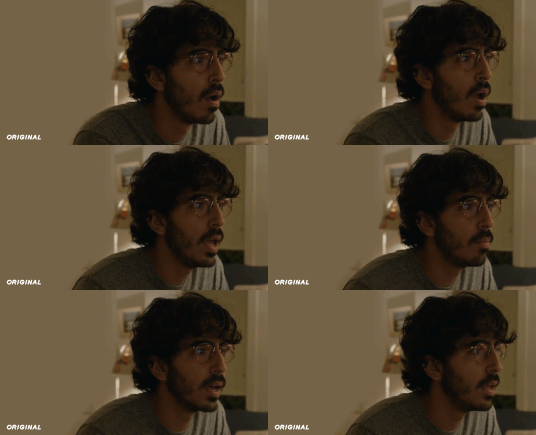
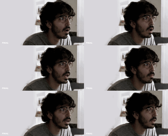
first off when you’re coloring gifs with poc always always always make a layer mask so you can compare the edited and unedited skin tones directly! i use the marquee tool to make a selection in the middle of the character’s face, select the folder of my adjustment layers, and hit ‘add vector mask’ (the third button from the left on the layers panel, it’s a white rectangle with a circle in it).
i almost always begin by using hue/saturation layers to highlight and delete certain colors. here i highlighted red and raised the lightness on yellow by a lot since it’s a very yellow scene. then i use a combination of brightness/contrast, levels, and curves layers to brighten the scene. here’s what i have now:
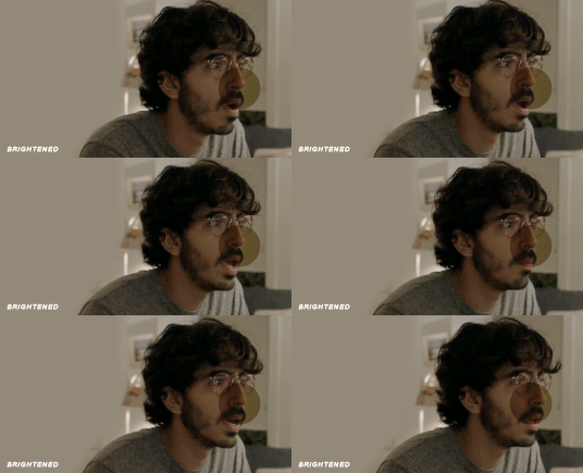
i add a gradient map set to black/white, change the blending to exclusion, and lower the opacity to between 5-10% (depending on the scene) to lighten the contrast further:

then i add back a little depth with selective color in neutrals and blacks:
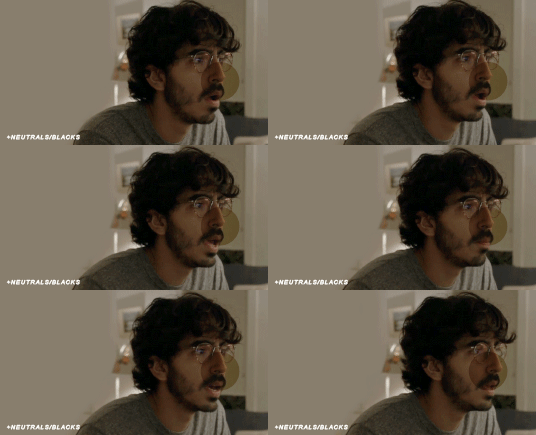
now i have two main goals: 1. add contrast between the background and the subject, and 2. brighten the scene into a pale gif. to do this, i use color balance to tweak the color of the background, taking out the yellows. this step works best if there’s at least some shade difference between your subject and background, otherwise isolating the two will be impossible. here’s what i have after adding color balance:

i use hue/saturation to selectively highlight the background color. in this case i chose to adjust magenta and used the color picker (the first eyedropper on the left) to identify the exact shade i wanted to lighten. now i have a fairly neutral background and a colorful subject, which gives a sort of pale effect:
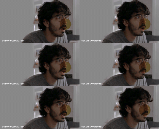
and now i use a curves layer and a selective color (white) layer to brighten further:
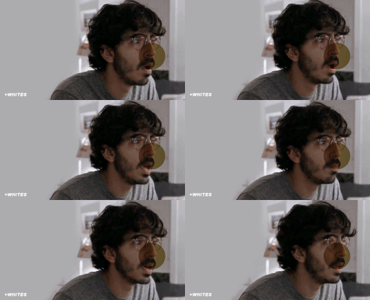

before i go further, i start fixing white-washing. keep in mind that some variance is normal since you are naturally changing the lighting of the scene; this gif shows it rlly clearly bc of how yellow and dim the lighting is, so some lightening is to be expected. however, both because the vector mask shows a lot of whitening and because i’ve giffed dev patel before and have a general idea of what he looks like in this type of lighting, i know what needs to be fixed, so i go back in under the psd/adjustment layers with a combination of selective color (red and neutral) and hue/saturation layers to darken his skin again:

now that some more contrast has been added in, i can go back to working on the psd and use curves and selective color to play around with the background again:

i use another hue/saturation layer and a black/white gradient to tone down oversaturation:


usually i leave those layers on top, so if i want to make any adjustments (like lightening the background more), i go in under those two. in this case i tweaked the whites and reduced the contrast a little to get this:
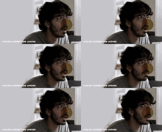

again, you can see his skin tone has changed from the original, but variation is to be expected given how much brighter the room is, the fact that i took out a lot of yellow lighting, and the brightening effect of the computer screen in front of him. some other things to keep in mind when coloring:
when you add layers to correct white-washing, you’re likely to end up with overly red/orange skin tones (red-washing). this can be fixed by upping cyans in the reds, desaturating/darkening the reds, or adding b/w or desaturation later on.
when in doubt, it’s better to be darker than lighter (the issue with white-washing is that it promotes colorism, and there is nothing inherently wrong with a darker skin tone) but really. just put in the effort to color poc correctly.
when changing the lighting a lot it helps to look at pictures of the subject in natural/bright lighting, since you get a better idea of what their normal skin tone is.
don’t try to squeeze all your selective color layers into one. you’ll get less grainy gifs if you separate them out and work one by one.
TURN OFF NIGHT SHIFT/NIGHT MODE! yes i KNOW it’s bad for your eyes (especially if you’re like me and gif at night, when the lighting outside isn’t changing every 20 seconds) but your gifs will look VERY different under f.lux or night mode compared to daytime screens. especially if you’re giffing at different times of day, blue light filters can really change the way your coloring appears. best to keep it consistent.
my sharpening settings vary depending on what i’m giffing but in general i do two layers of smart sharpen (500% with radius between 0.2-0.4, 10% with radius at 10px) and then gaussian blur at 2.5px and adjust the opacity so it’s somewhere between 15-20%. i try to strike a balance between smoothing out the graininess from selective color, and sharpening details like clothes and hair. here’s what i ended up with for the gif above:

then i rinse and repeat for the rest of the gifs in the set! i tend to start with the gifs that i know will be hardest to color, which is usually the darker ones (coloring is limited by how much i can brighten the scene) and those that include poc (again, limited by how much i can brighten and adjust the scene’s lighting without white-washing). then i check set cohesion as i go, using those first few gifs as benchmarks. once i have all 8 (or 9 or 10) gifs, i play around with composition and try to balance and vary the subject, colors, and composition of gifs next to each other. i go back and make a couple of adjustments here and there according to what i observe and what i think might improve the overall appearance.
and that’s pretty much it! i hope this was helpful, if you have other questions feel free to message me and i’d be happy to help/troubleshoot. happy giffing!
#Anonymous#*#resources#answered#sorry this was sO long but i hope it helped on the coloring end#tbh i exceeded my own expectations with the dev gif lol#yeahps#completeresources#chaoticresources#tutorial#coloring tutorial
55 notes
·
View notes