#lightbox graphics
Explore tagged Tumblr posts
Text
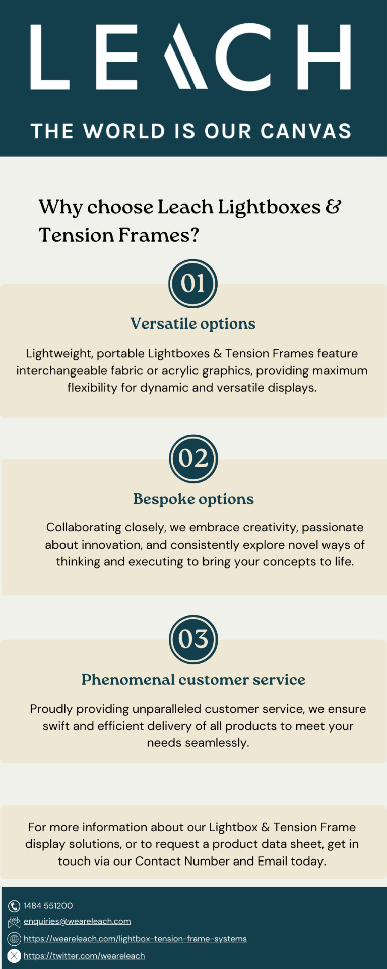
A leading manufacturer & provider of Retail lightboxes, graphics and Backlit display tension frame systems – with versatile options to provide the best display & installation solutions with maximum impact.
#lightbox graphics#retail lightboxes#tension frames#lightbox installation#lightbox display#backlit display frame#lightbox manufactures uk
0 notes
Text
Here's what we gave out at Lightbox Expo this year! We passed out 100 pamphlets and 40 pins, and donated $41.31 USD to AID IA!


#union yaoi#union yaoi zine#lightbox expo#lightbox expo 2024#zine#convention#pasadena convention center#awi shorts#animation workers ignited#umbert actually#misterman guyfella#stand with animation#no ai#art#graphic design
151 notes
·
View notes
Text
https://www.sign-land.com
#signboard#oman#sign makers#laser#stamps#banner design#3d printing#graphic design#design#web#لوحات فنية#عمان#مسقط#muscat#bannerprinting#lightbox 2024#neon#neon lights
2 notes
·
View notes
Text
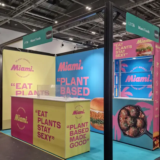
Stunning Shell Scheme Graphics – 5 Studio
Take your ordinary walls and make a bold statement about your brand with powerful Shell Scheme Graphics from 5 Studio. Designed specifically for your requirements, our Shell Scheme Graphics will lift your exhibition space to the next level, giving you the opportunity to stand out from the crowd with next-level photography, and create lasting impressions on the visitor's experience. Expertly fitted and professionally printed, our Shell Scheme Graphics will enhance your brand's visibility, whilst looking polished and professional. Are you ready to make your showing at the next exhibition? Allow 5 studio to design Shell Scheme Graphics to say something meaningful about your brand!
0 notes
Text
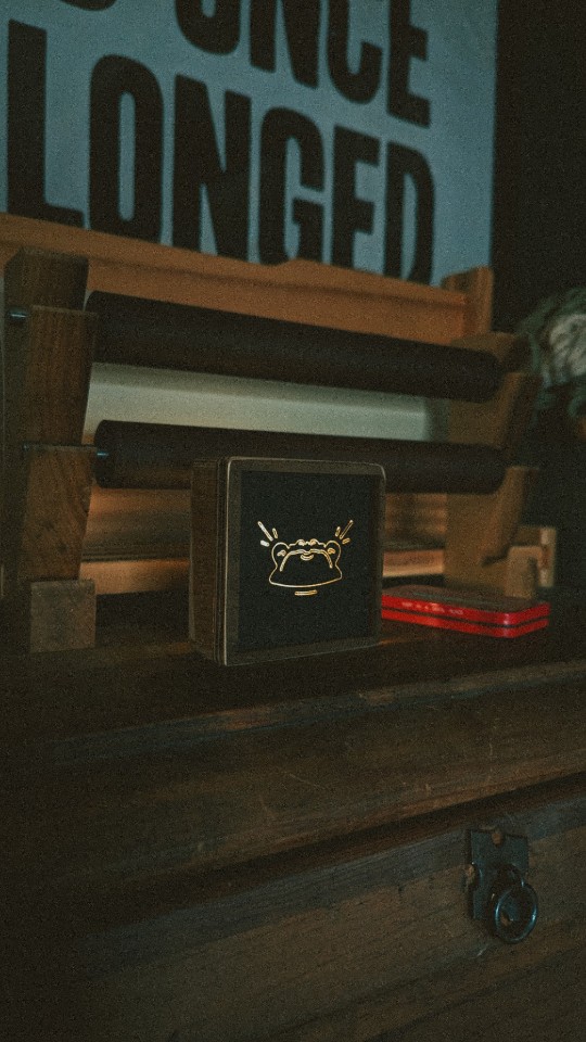
The Tiniest Lightbox — FTHB
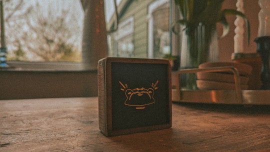
#graphic design#lowbrow#graphic art#design#tattoo#digital art#poster#art#low brow art#darkarts#light box#lightbox#frog#woodwork#woodcut#toad
0 notes
Text

Creator Spotlight: @jdebbiel
Deb JJ Lee is a non-binary Korean artist based in Brooklyn, NY. They have appeared in the New Yorker, New York Times, NPR, Google, Radiolab, and more. Their award-winning graphic memoir, IN LIMBO, about mental illness and difficult relationships with trauma, released in March 2023 from First Second.
Below is our interview with Deb!
Have you ever had an art block? If so, how did you overcome it?
That implies I am over my art block, but I’m still in it! I think about Kiki’s Delivery Service a lot and how she had to stop doing a thing, and that you can’t really force it, and you have to let it come back to you. It’s a pretty humbling moment, realizing there is more to life than just drawing. I’ve been trying to consume other content like reading or watching movies—anything that is not drawing-related—and to trust that it will come back to me. I think not being afraid to do the small pieces before committing to the big pieces is helpful. Because big pieces are what I am known for, I dig myself into a deeper hole, thinking that each piece has to be bigger than the last one. So yeah! Relaxing and doing the small things before overcommitting to a big piece is the best way to go about it for me.
Which 3 famous artists (dead or alive) would you invite to your dinner party?
I feel like these are all artists that I have second-degree connections with! Jillian Tamaki, Victo Ngai, and Tillie Walden would be my picks!
What are your file name conventions?
…What file name conventions? I mean, I don’t have specific file name conventions, but I actually have a public Google Drive archive! But I usually put “djjl_whatever-the-title-is_final,” and I would always know it’s the final and legit version.
What is a recent creative project that you are proud of?
I did an illustration for the whiskey brand Johnnie Walker. It’s so wild because I only had four days to finish it, and it usually takes me a week and a half if I rush. And honestly, it’s probably one of my best pieces from this year, which is funny. It was for the Mid-Autumn festival, so I made it as Korean as possible.
How has technology changed the way you approach your work?
I only use my iPad to draw everything now, and if I want to pretend that I have a steady workstation, I’ll use my Cintiq. I still am not as comfortable on the Cintiq as I am on Procreate, but it’s still pretty solid and nice. That’s the good part about technology. The bad part about technology is how AI art has been messing things up for me. I’m currently in a lawsuit about AI art as a class rep. Some of my stuff got turned into AI art late last year, so I have to give a deposition at some point.
What is a convention experience that has stuck with you?
Honestly, they’re all good! I feel like Lightbox Expo has been really nice because it’s truly been a convention for artists. I feel like that’s where most of my audience is, and they’re all around because their purpose is to be better at art. That’s where a lot of original artists do well because they’re getting art they’re inspired by, not so much fanart. I like the Lightbox Expo because it encompasses the pure love of art very well.
Top tips on setting up an Artist Alley booth?
Use a Y axis, not just your X axis! Take advantage of it! Branding is also something to think about. It is definitely something I’m getting better at. Having an assistant is also very important. I’ve also heard that 8.5x11 to 12x18 inches is usually a good size for prints, but I also provide postcard-sized prints because sometimes people don’t want to commit to a larger size.
Who on Tumblr inspires you and why?
You know this is so funny. I’ve been following @alicexz for over a decade on Tumblr and other platforms. I’ve followed her work since high school, and we’ve only recently become peers. I found her, and we met for the first time in real life, and she recognized me. And then I found all my drawings from when I was in my Alice phase, back in high school, and I was like, “Yo, this is when I was trying to be you so badly!” and she was cracking up and was like “Wow, this is so good!” It was such a sweet moment. I wanted to take a picture of her holding my drawing up. It’s really nice because now we’re peers.
Thank you so much for stopping by and sharing, Deb! Be sure to check out their Tumblr blog over at @jdebbiel.
2K notes
·
View notes
Text


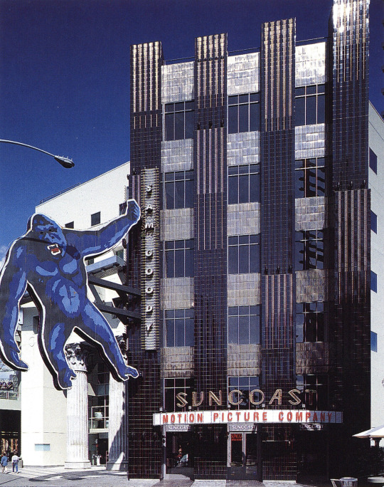


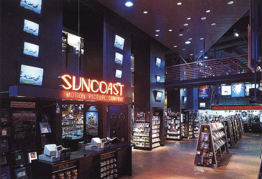
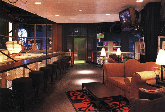
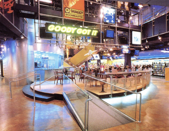
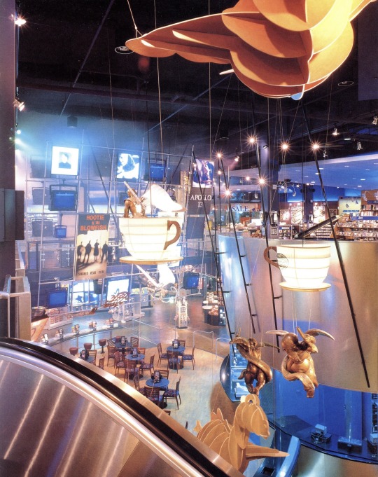
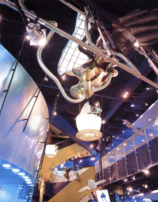
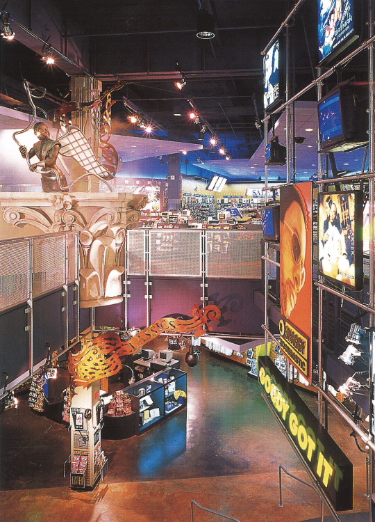


Sam Goody stores at Universal CityWalk & Horton Plaza (1993 & 1995)
"The synthesis of three distinct merchandising departments for the new Sam Goody store at the Universal Citywalk exhibits a design of dynamic expression by the Jerde Partnership design team.
The new building sits on the center court of an outdoor shopping mall in Southern California. Representing the three merchandising concepts of Sam Goody, the design pronounces each area through unique and interrelated façades.
The customer enters the Popular Music department through an animated, neon-accented color plaster façade. The entrance to the Classics department and the upstairs Coffee Cafe is between two 40 foot high, 10 foot in diameter Corinthian columns within an interpretative classical façade. A 35 foot high, two-dimensional profile sign depicting King Kong climbing the face of a black and metallic bronze tile building hangs over the entrance to Suncoast Motion Picture Company (video).
The central sales environment is referred to as Backstage, and has the character and atmosphere of a soundstage/studio. The two-story space is defined by upper level catwalks and the destination mezzanine known as the Coffee Cafe. A three-dimensional, walk-through Media Wall features music advertising, photos, oversized images, photo lightboxes, video monitors, projected music videos, reader boards and graphic elements.
Media events are orchestrated throughout the day in an ever-changing environment that depicts the trends of popular music and movies. Weather reports, current events and promotional messages continuously scroll by on the reader boards. In-store performances, CD signings and record promotions bring a sense of "an event" to the store. A live VJ/DJ controls all aspects of the store's music and video media, and interacts with the customers.
On a floating piano-shaped level, the Classics department features a state-of-the-art inventory of classical and jazz selections and creates a controlled, intimate area for the customer with special acoustics, localized sound systems, listening stations and lighting. In the Suncoast Motion Picture Company department, tall video columns accent the environment, supporting the sale of videos and laserdiscs. Interspersed throughout the department are video monitors creating the effect of video confetti.
The Coffee Cafe features a wide variety of interactive listening stations and media experiences. It is intended to be an intimate environment where the customer can pause, enjoy the fare, engage in conversation and take in views of the store as well as the street below through its windows."
Designed by The Jerde Partnership
Scanned from: Stores - Retail Display & Design (1997), Great Store Design 2 (1996), Shops & Boutiques (1994)
406 notes
·
View notes
Text
I totally forgot that I can just share my whole portfolio on here. The course I applied for is centered on illustration, graphic design, and printmaking, so I didn’t include any of my sculptures or painting in this (apart from the life drawing in the third slide). Translations below :)
They had a strict limit on the amount of pages you could submit so a lot of stuff I would normally add had to be cut.
Censored my full name to keep my semi anonymity on here lol
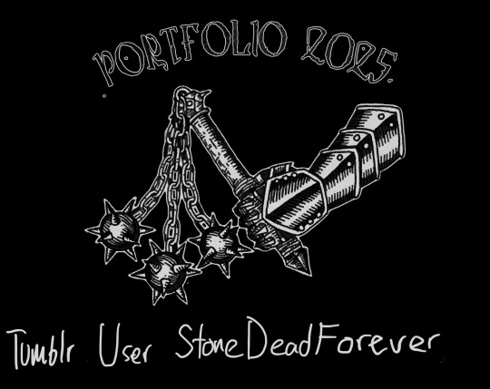

Induktri death to this generation (2024)
Album cover, band logo, and graphics for the punk band induktri. The illustration is made with ink and the text is digital.
Selected band shirts (2024-2025)
A few of the band shirts I have designed for different punk, emo, and metal bands
(All the genres are lies or stretches. I was paranoid that if I would confuse the teachers reviewing my portfolio if I put emoviolence, grindcore, hardcore, and powerviolence since they don’t even sound like music genres if you are not in the know)
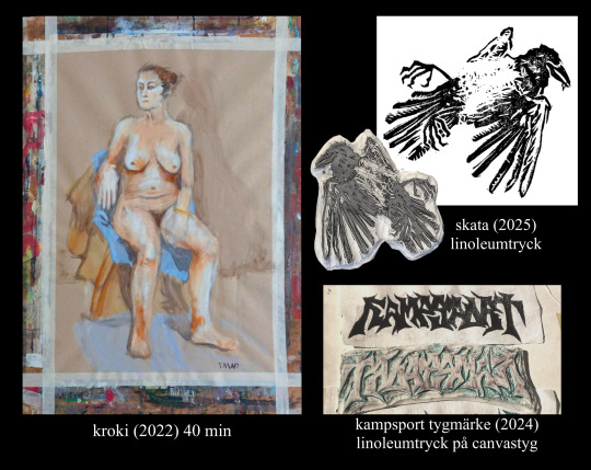
Still life (2022) 40 min
Magpie (2025) Linocut
Kampsport patches (2024) linocut on canvas fabric
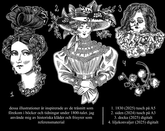
These illustrations are inspired by the woodcut prints that were common in books and magazines during the 1800s. I used historic clothing and hairstyles as references.
1. 1830 (2025) ink on A5 paper
2. Silk (2024) ink on A3 paper
3. Doll (2025) digital
4. Lily of the valley (2025) digital
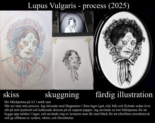
Lupus vulgaris- process (2025)
Sketch, shading, finished illustration
Bic ballpoint pen on A3 paper in an antique frame
Here you can see my full process. I made my sketch with colored pencils in multiple layers (yellow, red, blue) and moved everything to my lightbox to trace my sketch on a separate paper. I used a dried up ballpoint pen to build up darkness in layers, and used the texture you get with that ink to replicate a drypoint print and to give the effect of wrinkles, warts, and decomposition.
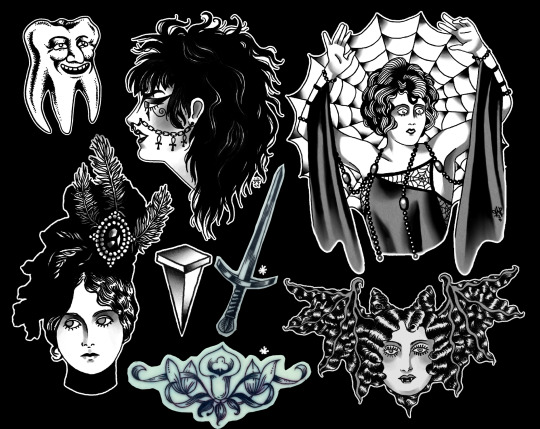
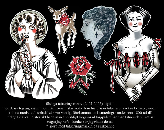
Pre made tattoo motives (2024-2025) digital
I took my inspiration for these from romantic motives from historic tattoo artists. Beautiful women, roses, christian motives, and things like cobwebs were common motives in tattoos during the late 1800s to early 1900s. You historically had a very limited colour range when tattooing which I had in mind when I drew these.
*made with a tattoo machine on silicone skin
(I know this is a bit of a bastardised explanation, I found it difficult to write about these without using tattoo specific terms and references that are hard to understand if you aren’t invested in traditionals. I would never write it like this in my tattoo portfolio)
I have no clue when I will get to know if I get accepted or not, let’s see if its weeks or months of panicking lol

26 notes
·
View notes
Text
100 things to try
getting off the phone can be hard. i find that i’m only ever motivated to do it when there’s something else to do. so! here are those things, dollie.
hobbies:
collecting (figurines, blind boxes, vinyls, books…)
2. embroidery
3. thrift flips / diying clothes
4. jewelry making
5. kandi
6. collage making
7. painting
8. sketching
9. start an album list
10. thrifting
11. baking (w/o the box mix !!)
12. cooking
13. origami
14. doll customization
15. making stuffed animals
16. building models
17. clay sculpting
18. customizing shoes
19. dancing
20. yoga
21. pilates
22. singing
23. learn an instrument
24. skating (skateboard, roller skating/blading, ice skating)
25. biking
26. hiking
27. jogging/running
28. doing nails
29. doing hair
30. building costumes/cosplays
31. soapmaking
32. play dnd
33. writing
34. poetry
35. web design
36. character design
37. graphic design
38. font design
39. make short films
40. make bath bombs
41. start tutoring people
42. join a new club
43. start a book club w/ friends
44. read a play
45. write a play
46. go see a play (support small theatres!!! wooh)
47. journaling
48. programming
49. design clothes
50. crochet
halfway through… ps, if you’ve had the energy to scroll this, you have the energy to start one. pick your battles!
51. knitting
52. cross stitch
53. beading
54. learn solitaire
55. typing
56. learn cursive
57. start learning a language
58. make a dreamcatcher
59. start making smoothies
60. take cute notes
61. photography
62. climb a tree!!!
63. swimming
64. press flowers
65. get a pen pal
66. make tea (the nice kind)
67. make coffee (same as above)
68. make bookmarts
69. annotate books
70. jigsaw puzzles
71. crosswords
72. sudokus
73. word searches
74. quilting
75. make perfume
76. make lightboxes
77. skincare
78. making jams
79. whittling
80. carpentry
91. tie dye
92. archery
93. axe throwing
94. martial arts
95. making ornaments
96. music writing
97. terrariums
98. gardening
99. scrapbooking
100. pottery
#study blog#wonyoungism#hobbies#pink pilates princess#it girl#that girl#self care#self improvement#well being#it girl lifestyle#it girl tips#self healing#glow up#lifeblr#advice#cosmo txt
194 notes
·
View notes
Text

Retail Lightbox graphics display installation UK | Backlit display Tension frames
A leading manufacturer & provider of Retail lightboxes, graphics and Backlit display tension frame systems – with versatile options to provide the best display & installation solutions with maximum impact.
lightbox graphics, retail lightboxes, tension frames, lightbox installation, lightbox display, backlit display frame, lightbox manufactures uk
#lightbox graphics#retail lightboxes#tension frames#lightbox installation#lightbox display#backlit display frame#lightbox manufactures uk
0 notes
Text

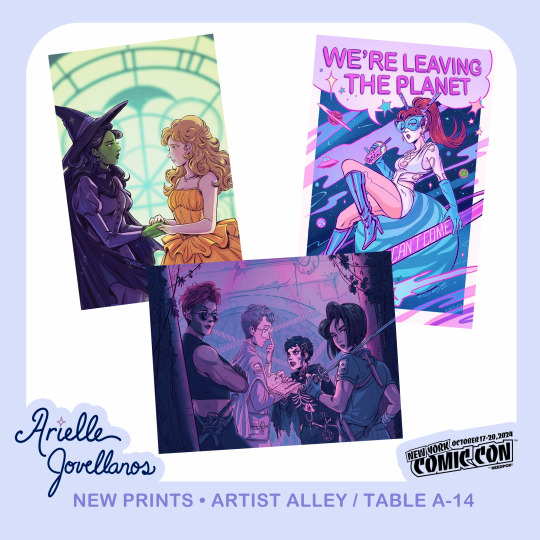

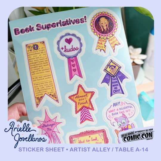

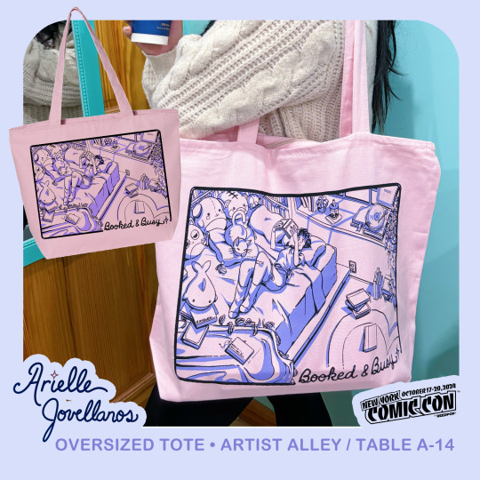
🌸 Hi NYCC! I'm back in the artist alley this year at Table A-14, all the way on the left side~ This year, I'll have some new prints, oversized stickers, sticker sheets, and a special limited run screenprinted tote bag! I'll also have my graphic novels with me~ I had a lot of fun trying new things for this year and I hope you like them!!
Feel free to bring your issues of Monster High, Women of Marvel, Captain Marvel, Jemini, and Mask of Haliya for signings as well~ 💖
Can't wait to see everyone! 🙌🏽✨
I’ll also be bringing these to Lightbox Expo and then putting the rest online after. 💛
29 notes
·
View notes
Text

god it feels it's been AGES since I made one of these things but AAAAHHH!!! Going to be tabling at Lightbox Expo this weekend in Pasadena! Will have a mixed of old and new work, including limited copies of my graphic novels 🧡 ✨
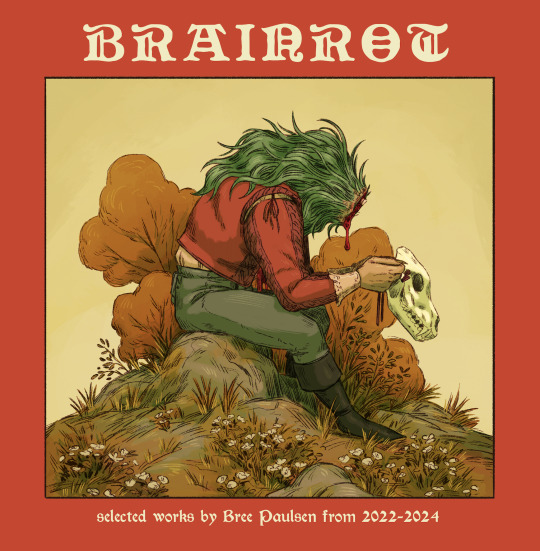
One of the new things I'll be selling is BRAINROT, an artbook containing a selection of personal work and FromSoft fan art. For those not attending and wish to snag a copy, GOOD NEWS there is an online listing for the PDF and physical book.
21 notes
·
View notes
Text

Stunning Shell Scheme Graphics – 5 Studio
Make a statement at your next event with bespoke Shell Scheme Graphics produced by 5 Studio. Our graphics stand out using high-quality print and graphics to transform boring shell scheme walls into beautiful, impactful showcases for your brand that allow you to stand out from competitors and draw in visitors. Our bespoke designs are perfectly made to fit your booth design making an impression on every visitor. Whether you are showcasing a new product or just building your brands presence, 5 Studio can offer an array of creative solutions to elevate your exhibition experience. Don't miss out, make the jump today and reach out to 5 Studio to start on your custom Shell Scheme Graphics!
0 notes
Text
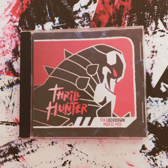
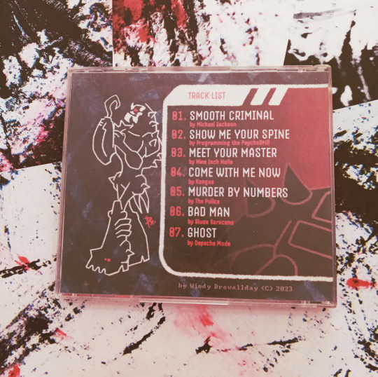

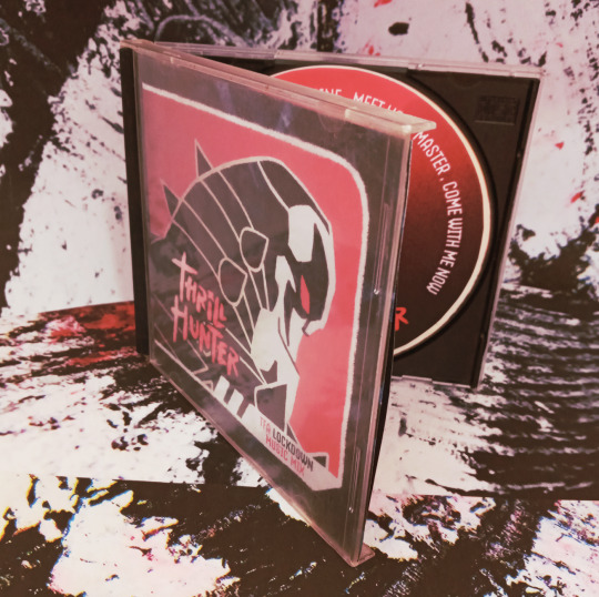
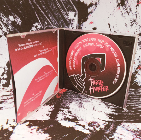
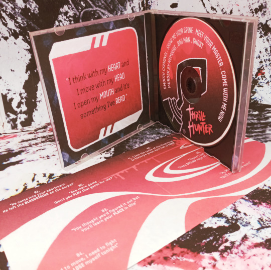
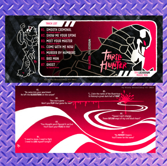
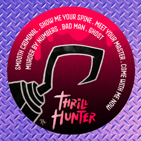

THRILL HUNTER
Another quick experiment to see my art in a different printed format! This time I designed the Cover, Back, Spine, Internal graphics, and even a tiny quote/lyric Booklet for a spare battered acrylic CD case I had lying around (that suits the character haha).
Another of my bazillion dreams from forever was to do Cover Art for Music Albums and I thought WHY NOT even if the playlist is hypothetical and I needed to glue the illustration for the actual CD because I'm still figuring out how to cut with the Cameo lmao
Was quite the experience, including the chaotic photo session using old dirty printed papers (still I need to install a good lightbox next time), and in general I'm happy with the results x)
PS I noticed LATEEE the typo on "Thrill" that's on the text in the Spine PLS kshfkjdshf anyways IT STAYS as a testament of my dumbness haha
And if you are asking: no, there's no content burned on the CD, which means it's... a virgin *Is bonked out of existence.*
I hope you don't think I'm a pest for this @jarofloosescrews mentioning you not only for the character but because I know you enjoy experimenting with a variety of formats too x)
#myart#transformers fanart#transformers animated#tfa lockdown#maccadam#cover art#music album cover art#playlist#mockup#cd case#im so sorry for my dumb sense of humor HAHAHA#but i had this one since the past week waiting to be finished#even if i find the booklet a bit so-so because i wanted to do those quotes like the title#i can say im satisfied and done with this x)#i love creating items for the characters i love AAA#ifellinrobothellagain#windydrawallday fanart
131 notes
·
View notes
Note
Can you do Lightblox?

not sure if this was a request for a. soda can lightblox, b. lightbox graphics, or c. literally just a request for lightblox
here's your insect anyways
16 notes
·
View notes
Text
Secrets from the Set of Andor Season 2: Week 4 Trivia

14. (Above) For Star Wars: A New Hope and Rogue One: A Star Wars Story, Yavin 4’s airfield and hangar were shot in Cardington Airfield, a former Royal Air Force station in Bedfordshire, England. But for the more extensive build needed for Andor Season 2, including the creation of an adjacent jungle village, the Rebel base was relocated to Longcross Studios’ Stage 1.

17. (Above) The game of rianza that we see Cassian Andor, Ruescott Melshi, and K-2SO play in Cassian’s home on Yavin was created by the Andor art/graphics department, with tiles designed by graphic designer Elle McKee, who also crafted a full set of rules to play. Rianza was inspired by both ancient Mahjong sets and dominoes.
More at the link.
https://www.starwars.com/news/andor-trivia-guide-week-4
The Secrets of Ghorman, Mina-Rau, and More: Creating the Worlds of Andor Season 2 - Updated

A large “u-shaped” set was constructed, according to Hull, that could be redressed to appear as different floors. “We wanted this kind of nowhere-to-hide, bright clinical look,” the production designer adds. Set decorator Rebecca Alleway researched a number of different real-world counterparts for inspiration, including “a few Japanese hospitals for lighting and graphics and lightbox-y type things, which the graphics team took even further” as she says. “And then I had fun delving into strange apparatus from the 30s, 40s, and 50s.”
Alleway describes Luthen’s hospital bed and life support system as “one of the highlights to design in Season 2.” The final moment between Kleya and Luthen also triggers one of a handful of flashbacks seen in episode ten, which were shot on location in Spain. “From Luthen in his hospital bed, you cut to the young Kleya and their relationship and how that all started,” Alleway says. “I think that's fantastic and a stark contrast. You have the color palette of Valencia in the market, and the stark contrast with the color palette of the hospital.”
More at the link.
https://www.starwars.com/news/andor-season-2-world-building-production-design-feature
6 notes
·
View notes