#kind of a weird design choice
Explore tagged Tumblr posts
Text

tried an expression pose here ^w^

bonus og small version
#limon arts#pokemon mystery dungeon#pmd#pokemon#tinkaton#tempted to redraw my icon to be more like this#buuut i am kinda lazy so w/e#wonkyton will be the icon for however long i feel like keeping her as such#will say i dont like how the bangs have a white outline#kind of a weird design choice#i could have omitted them again but i wanted to be a little closer in style to the og design#most maddening thing about working in pixel art is noticing a single pixel miscolored
6 notes
·
View notes
Text

rough concept for a hare pearl design, just a normal lass
#pearlescentmoon#double life smp#hermitcraft#furry#my art#I've assigned fursonas to every hermit. within 5 seconds for each one so i don't overthink it. just on vibes#hope to design a few bc i think my animal choices are based as hell. normally a wolf pearl truther but this felt more applicable overall#rabbits are associated with the moon and hares are kind of like them but weirder. felt fitting for pearlo!!#kinda weird and lanky and can attack you. lives in tunnels yknow
2K notes
·
View notes
Text
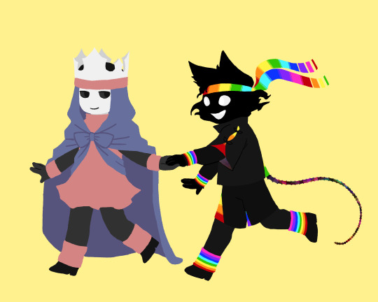

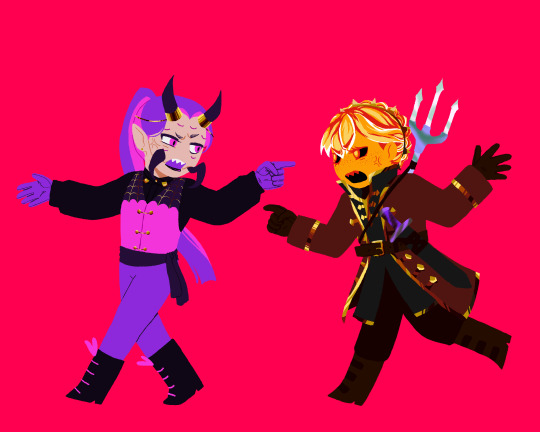
the unstable boys and the guys they have a totally normal attachment to
#mine.art#jamatoP#spokeishere#wifies#its called the unstable universe cause everyone in this universe is unstable /j#they all have a unique look for the series#some with less changes than others#but regardless i made sure they all have matching elements of some kind#put a lot more thought into this than i thought i would lol like right down to the bg colors#man it feels weird drawing wemmbu not decked out in a bunch more jewellery#but i think having less jewellery is more in character for him in unstable#at least until something changes#was gonna talk about my design choices but idk if itll hit the tag limit#might rb with it later tho if i dont forget/get too lazy#zam#parrot#uu#unstable universe#unstableverse#wube
355 notes
·
View notes
Text


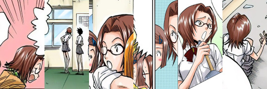


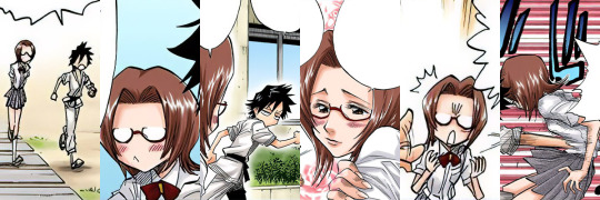
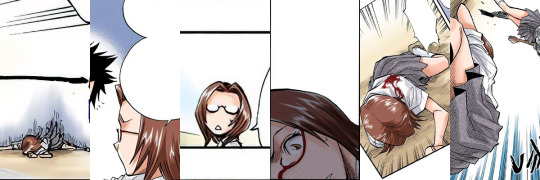

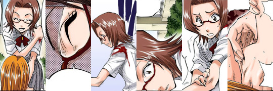
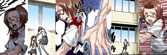
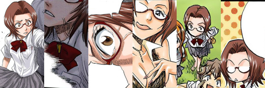
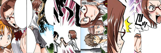
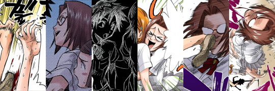
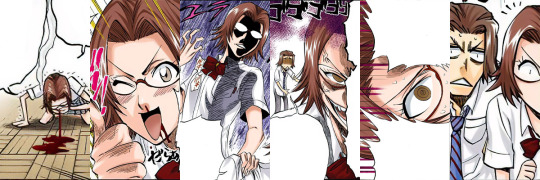

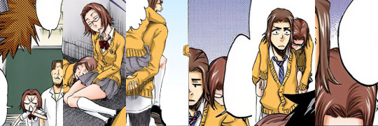
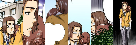


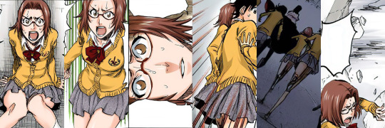

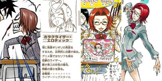
#bleach#chizuru honsho#i forgot some random bonus chapters#and had to go back and tack them onto the end there#its a shame chizuru was just kind of a weird joke character#i actually really like her design#the digital colorist picked a weird washed out color for her hair#but Kubo's omake art gives her this pretty sort of plum red color#she was not my first choice but she's kind of one of the only characters left with both enough appearances to be worth cataloging#but also few enough to not be an impractically large collection
38 notes
·
View notes
Text
I'm always like man i hate making ocs but i also want to make a visual novel one day and that's only become more true now that I write
so like i'll have to learn how one day
like i mean i know technically how to like ive made four characters
its just do i give a fuck about them thats problem because the answer is no i'm a bad mother
i just can't bring myself to care about them enough to like do anything with them
so they are useless to me as they are now
#even though from what ive seen of people talking about indie vns lately#alot of people are hella annoying about not having anything 'gross' in them#it's not a vn technically but like people acting like it's weird that a horror game had incest#and god would that be annoying#thats not even going into the whole lgbt media is never good enough thing that some people have going on which is just very gross to me#like i know anything i make would label me as problematic as hell#i think it also doesn't help that my taste in vn love interests do skew more um- not the kinds of characters that get included much anymore#like i look at indie vn games alot but most of the time none of the LI's look at all interesting to me#especially especially especially when there are both Male and Female options ive noticed#since they include both it's even less likely the archetypes i love will be included#since they are still working with like maybe four or five lis max#so it becomes either all look the same stock sexy can tell nothing about who they are#or if they are all obviously different then like the same three or four types on rotation#there are exceptions#like i loved our life with a passion#because Cove is very cute#but i think our life is in it's own like category#the amount of choice in it and how you age through out it is just mwah#and i want to play doki doki dollmaker becasue i have it hell i backed the kickstarter for it adfkjd#but again a little different because it was in production for so long that the character types for the boys still feel to my tastes#even if a few designs are a little goofy but they are dolls that came to life so like you know
2 notes
·
View notes
Text

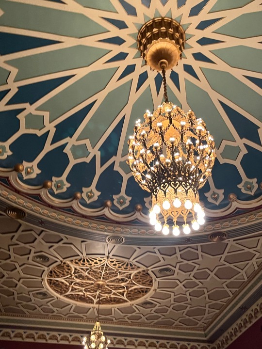
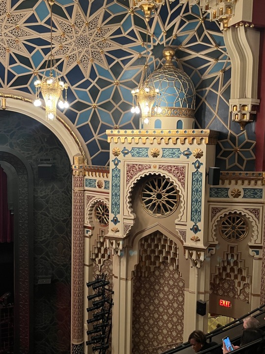
When you want to visit the Alhambra but mom’s like “we got the Alhambra at home”
#niche joke maybe?#unclear how many millennials and elder gen z are familiar with moorish decorative arts#but this is the theatre at New York City center#described in the show program as ‘1943 neo-moorish’#I think theatres need to start having themes again why did we stop doing that#I’m not saying we should randomly model them on landmarks of other cultures#because it’s so fucking weird#like the garde arts center in CT is vaguely Egyptian and it’s like??? that’s a choice#but new build theatres are just like neutral spaces#which I understand completely you don’t want to distract from the production happening onstage#but surely there’s some middle ground we could reach!#some kind of neo art deco revival could be lovely#especially as more and more art deco theatres are getting restored to their historic designs#I don’t know if theatres are this way in other countries but I’m assuming that the American trend at the turn of the century#was influenced by European theatrical tradition#I’ve seen color plates of concert halls and opera houses#so I’m pretty sure our heavily themed theatres built 1900-1950 are a translation of that#unfortunately I don’t really have a knowledge base for American theatres older than that because I haven’t really been to any#well wait that’s a lie I’ve been to ford’s theatre in DC#but I don’t think there was much that stood out stylistically to me I think it was just very bog standard federalist#which isn’t the period most people associate it with because of Lincoln#but I don’t know off the top of my head when it was built and that is likely a modern design choice anyway#this has been another episode of ‘I have approximate knowledge of many things’
7 notes
·
View notes
Text
Went to Halloween Convention™ (mini version of Spring Convention™). Because I love Death Note, the anime with a note book that makes you death™, I got this Death Note Note Book equipped has replica Death Note note book pages inside!

#sorry#like its not That Weird as far as anime merch goes but i thought it was kind of a funny design choice#ah yes my replica death note which is hidden away in this classy hard cover note book#no one will ever suspect me#idk anyway i have to buy second hand death note merch ive never seen every convention or its just not right.#wish i had taken photos of the inside but im in bed now .#the cover and back prints are nice quality tho :3#Anyway im done being silly i love yallll hope you have a good weekend!!!
3 notes
·
View notes
Text
Y'know, it probably betrays how incredibly German I am that I didn't bat an eye at Shinguji's mask in V3. Bc I was too distracted by his uniform. Hey, Spike Chunsoft? Why. What's with that red arm band? On the brownish green military style uniform? I know you were going for Visual Kei meets history/anthropology, but like. Was the nazi imagery on purpose. Was that meant to contribute to his rancid vibes. If yes ig y'all succeeded but like. Wtf
#it's been *checks watch* 6 years since that game came out#and i still think about it#he's such a dumpster fire of a character i just have to kind of love him#but boy they sure made some Choices#drv3#korekiyo shinguji#like I'm no stranger to this type of design esp in anime and weird titles like dr#but like what was the purpose lol#also that he's supposed to be creepy but also ~aesthetic~#yeah sure its. An Aesthetic lol#ig to really hammer home how fucked up and evil he is that works#was just weird and uncomfy when we didnt yet know if we were meant to like this guy in a way that doesn’t rly connect to his character
12 notes
·
View notes
Text
grant ward i hate you but i love you
#also brett did such an amazing job#when i say i love grant ward i mean it like from a character perspective#he is written so well#brett did an amazing job#really cool what theyve done with him yknow#because he starts off as your typical brooding tall guy no emotions blah blah#and you THINK ah yes this is grumpy meets sunshine and skye melts away all of this#protection and ice this handsome dark tall man has#and like you even see it happen before the twist#but then youre like onfg#and then you are kind of in the same#boat as skye yknow where we dont know actually what type of affection this man has for her#does he have any?#how genuine is he being?#hes got the strangest approach because you kind of see that by some weird design he is trying to make amends (or what he sees as amends in#his head) but it's also just cold and calculated and murder#but it isnt until skye shoots him and leaves him to die that he has this switch i think?#like idk i enjoy analysing him very interesting choices very cool twist
2 notes
·
View notes
Text
📚 A List Of Useful Websites When Making An RPG 📚
My timeloop RPG In Stars and Time is done! Which means I can clear all my ISAT gamedev related bookmarks. But I figured I would show them here, in case they can be useful to someone. These range from "useful to write a story/characters/world" to "these are SUPER rpgmaker focused and will help with the terrible math that comes with making a game".
This is what I used to make my RPG game, but it could be useful for writers, game devs of all genres, DMs, artists, what have you. YIPPEE
Writing (Names)
Behind The Name - Why don't you have this bookmarked already. Search for names and their meanings from all over the world!
Medieval Names Archive - Medieval names. Useful. For ME
City and Town Name Generator - Create "fake" names for cities, generated from datasets from any country you desire! I used those for the couple city names in ISAT. I say "fake" in quotes because some of them do end up being actual city names, especially for french generated ones. Don't forget to double check you're not 1. just taking a real city name or 2. using a word that's like, Very Bad, especially if you don't know the country you're taking inspiration from! Don't want to end up with Poopaville, USA
Writing (Words)
Onym - A website full of websites that are full of words. And by that I mean dictionaries, thesauruses, translators, glossaries, ways to mix up words, and way more. HIGHLY recommend checking this website out!!!
Moby Thesaurus - My thesaurus of choice!
Rhyme Zone - Find words that rhyme with others. Perfect for poets, lyricists, punmasters.
In Different Languages - Search for a word, have it translated in MANY different languages in one page.
ASSETS
In general, I will say: just look up what you want on itch.io. There are SO MANY assets for you to buy on itch.io. You want a font? You want a background? You want a sound effect? You want a plugin? A pixel base? An attack animation? A cool UI?!?!?! JUST GO ON ITCH.IO!!!!!!
Visual Assets (General)
Creative Market - Shop for all kinds of assets, from fonts to mockups to templates to brushes to WHATEVER YOU WANT
Velvetyne - Cool and weird fonts
Chevy Ray's Pixel Fonts - They're good fonts.
Contrast Checker - Stop making your text white when your background is lime green no one can read that shit babe!!!!!!
Visual Assets (Game Focused)
Interface In Game - Screenshots of UI (User Interfaces) from SO MANY GAMES. Shows you everything and you can just look at what every single menu in a game looks like. You can also sort them by game genre! GREAT reference!
Game UI Database - Same as above!
Sound Assets
Zapsplat, Freesound - There are many sound effect websites out there but those are the ones I saved. Royalty free!
Shapeforms - Paid packs for music and sounds and stuff.
Other
CloudConvert - Convert files into other files. MAKE THAT .AVI A .MOV
EZGifs - Make those gifs bigger. Smaller. Optimize them. Take a video and make it a gif. The Sky Is The Limit
Marketing
Press Kitty - Did not end up needing this- this will help with creating a press kit! Useful for ANY indie dev. Yes, even if you're making a tiny game, you should have a press kit. You never know!!!
presskit() - Same as above, but a different one.
Itch.io Page Image Guide and Templates - Make your project pages on itch.io look nice.
MOOMANiBE's IGF post - If you're making indie games, you might wanna try and submit your game to the Independent Game Festival at some point. Here are some tips on how, and why you should.
Game Design (General)
An insightful thread where game developers discuss hidden mechanics designed to make games feel more interesting - Title says it all. Check those comments too.
Game Design (RPGs)
Yanfly "Let's Make a Game" Comics - INCREDIBLY useful tips on how to make RPGs, going from dungeons to towns to enemy stats!!!!
Attack Patterns - A nice post on enemy attack patterns, and what attacks you should give your enemies to make them challenging (but not TOO challenging!) A very good starting point.
How To Balance An RPG - Twitter thread on how to balance player stats VS enemy stats.
Nobody Cares About It But It’s The Only Thing That Matters: Pacing And Level Design In JRPGs - a Good Post.
Game Design (Visual Novels)
Feniks Renpy Tutorials - They're good tutorials.
I played over 100 visual novels in one month and here’s my advice to devs. - General VN advice. Also highly recommend this whole blog for help on marketing your games.
I hope that was useful! If it was. Maybe. You'd like to buy me a coffee. Or maybe you could check out my comics and games. Or just my new critically acclaimed game In Stars and Time. If you want. Ok bye
#reference#tutorial#writing#rpgmaker#renpy#video games#game design#i had this in my drafts for a while so you get it now. sorry its so long#long post
8K notes
·
View notes
Text
Miss Universe National Costume 2024, Part 2!
Splitting this off into a new post so I'm not clogging up everyone's dash quite as much.

Miss Malta is some sort of environmental protection Sailor Scout. I think the giant bow would look better on the back of the skirt but otherwise this is solid.

It has just come to my attention that I skipped over Miss Albania and several other A/B countries, back at the beginning. I sincerely apologize! She went to all this trouble putting together a Fifth Element cruise ship passenger costume, and I nearly missed it.

Miss Armenia, in what even I have to admit would be a legit Princess Leia fit.

Miss Bahrain, adding some green to her Gold And Vaguely Historical look, along with what is either a comically large prop chalice or an upside-down lamp.

Miss Bangladesh appears to believe that adding two plush tigers from the toy store around the corner from the pageant venue will conceal the fact that she is just wearing a tiger-print evening dress. Miss Bangladesh is incorrect.

Miss Belgium. Girl. No.

Miss Belize let the seventh-grade art class do her whole costume, which was a bold choice.
Okay, I think that's everyone I missed! Back to alphabetical order. And I should have to rely less on shitty screenshots, now. Some countries were benefiting from the low resolution, tbh.

Kind of feel like Miss Maldives had a luggage mishap and she's just wearing the outfit she packed for a slightly dressy dinner.

Miss Martinique's costume would honestly have looked better in the shitty screencap version. The construction is... bad. It's bad.

Feel like we're in a little bit of slump here. Miss Mauritius did not stick enough butterfly appliqués to her gown to conceal that it is, in fact, just a regular evening gown.

Slump officially over! We are so back. Everyone say thank you, Miss Mexico.

I would like this better if it had just committed to the giant skirt and not felt the need to make it a Sexy Miniskirt look. Sorry, Miss Moldova.

Miss Mongolia wanted to stand out from all the other gold armor on stage, so she decided to a) wear cooler armor and b) bring a bow and arrow instead of a sword. Great work, Miss Mongolia.

Starting to feel like I'm picking on the smaller countries that probably don't have a huge pageant culture or the budget for really elaborate costumes, but on the other hand Miss Montenegro's costume is super low-effort AND the fabrics look cheap, so what am I supposed to do?

Okay, this looks like a pretty standard Miss Universe Sexy Bird, yes? Well, THIS is how Miss Myanmar entered the stage:


She had to fight her way out of that thing! God only knows what the visibility was like in there.

I think the hat is doing most of the heavy lifting to keep Miss Namibia's costume from being Just An Evening Dress, sadly.

Oh, yikes. It's more obvious in motion but Miss Nepal's bodice looks like it's made of craft foam and it fits real weird. The rest of it looks a little like she got together with Miss Cyprus and a pile of tablecloths for a sewing bee last night, I'm sorry to say.

Miss Netherlands has chosen a Tribute to Delft. I think if I were in charge of this costume I would do a much fuller skirt that falls from the waist, instead of the weird trumpet-skirt-with-hoop we've got here. And, obviously, I would make the windmill on the bodice actually spin.

It looks like she's having some issues keeping the wings and peplum in place, but I really like Miss New Zealand's costume from a design perspective. It at least slightly resembles the bird it's supposed to be (New Zealand fantail) and I think the feather pattern is meant to be in a Maori art style.

Miss Nicaragua is a Sexy Cathedral, which I think might be a Miss Universe first and is definitely a big old step closer to drag.
Okay, pausing here to get the next batch ready.
2K notes
·
View notes
Text
i wish literally anyone else except for me would in depth care about my pathfinder character and would know like. all the lore and be in the sessions BUT i still wanna do it without the Mortifying Ordeal Of Being Known
#myposts#like nemja is so coded into my own expieriences of growing up and is kind of a way for me to channel and deal w some stuff#like he is so much based on this expierience of being a young woman with a mental illness and this lack of any authority that comes w that#like. and he is insanely socially akward and shy but in this way where you are never taken seriously#like. the expierience of being a young adult who isnt really comfortable around Adults With Authority#like a driving instructor or your boss or whomever and you just feel akward and uncomfortable having to interact with this person#but who also has no ideal about social cues & is just really Weird but in the way people dont like yk#and whose impulsiveness and thoughlessness and general lacking understanding of consequences#creates horribly akward situations for himself like 24/7#which also includes situations where other people are mad at him afterwards and it kinda feeds into a weird cycle of self-hatred#like while learning and growing up he feels so viscerally on a display case where everyone can watch him fuck up and stumble around 24/7#and he also feels way too old to be going through this process and is horribly embarrassed (hes 22 but doesnt remember 7 years of his life#so hes emotionally kind of like 16-17 but also hes kind of 22 in some aspects so hes kind of embarrassed by how little he knows)#and also in his design he has these huge ass horns that make it impossible for him to ever really disguise himself#and not immediately stand out like a sore thumb everywhere he goes#and this visceral awareness that gives him of being percieved and the idea of never really having the choice to not be noticed#like as a woman growing up with alopecia being in any public place everyone will notice/look at you all the time#like no matter what you do like you can never turn it off and him being a rogue and good at stealth and shit#is kind of like an ironic wish fulfillment because as a kid i really did have this thing#where i thought invisibility would be the best superpower#but like. it's nice to not be seen but it always makes you an observer looking in and not a member of any group#this character is my absolute everything ok?#nemja
1 note
·
View note
Text
One thing about Tristamp. which this is gonna sound goofy as hell but I miss Vash's old eyebrows. the big brows are great it's good but I love the weird ass. whatever the hell eyebrow shape that Vash has in 98. where it's narrower in the middle and wider at the end. like ash ketchum.
#& in tristamp his eyebrows are wayyyyy darker than his hair. granted that happens naturally with blondes pretty often BUT#comparing pics i have of him as a kid & then as an adult. ????? his brows got WAY darker#granted i know theres a thing in trimax where vashs hair turns dark/black because he has some kind of Problem (idk havent read it yet)#and in tristamp his hair DOES appear to be doing that bc his undercut got way darker when he got older also ??? but idk if thats. plot#stuff or just weird design choices ? sigh#phx news#& btw if you care. i gave maverick the ash ketchum brow shape also after rewatching some indigo league LOL. idk i just like it its sillay
1 note
·
View note
Text
.
#through a series of strange circumstances i've actually found myself in possession of a free copy of the new f*nal f*ntasy game#and i wasn't gonna play it after kind of fucking hating the demo. but like yk when shit's free i felt like i had to give it a bit of a go.#and i'm gonna try to play more of it but...it's so boring rn i'm so sorry#i do not care about these characters and i do care about the plot rn#and i literally feel like i'm going insane bc no one else seems to feel the way i do about it ggksbdk#like people are like 'the action combat is making it bad' and no that's not it#and other people are like 'people who don't like it have only played x' and no that's also not true#idk it's just weird and boring??#with some strange design choices and options that don't make a ton of sense to me#also tbh gameplay features that also don't make a ton of sense#like the consumable item carry limit. or the dodge button being what it is. or only being able to access a codex by talking to an npc.#like they're not game-destroying but they're odd and i don't quite get the point#but yeah idk i'm trying really hard to like it bc it actually kind of pains me to dislike a game in this series so much#but i just can't bring myself to be invested in the story or characters#i'm admittedly only 5 hours in but. i really would've expected something to sell me on at least ONE element by now#only thing i can say is generally positive is the majority of combat. just bc it's fine. nothing revolutionary i have no complaints.#interviews with y*shida are so funny tbh. where he's all talking about how he wanted it to feel different.#and that led to it feeling and looking like 17 other media properties. like...mission failed my dude.#anyway. i'll build up the perserverence to at least get...idk. 20 hours in is more than fair i think.#hoping it proves me wrong by then but good fucking lord. i've never been more dispassionate about a game from this series.#i'm not even like the people claiming it's 'not a REAL series entry'. like no it is. it's just a boring one lmao.
1 note
·
View note
Text
So.
Re: tumblr bans of transfemmes.
Let's ignore PhotoMatt for a moment. Manbaby tech CEO doubling down on a stupid decision and making himself look like more of an ass doing so is not a new phenomena.
Tumblr has consistently said, in both public statements and leaked internal communication, that they're essentially running a skeleton crew.
They keep saying that they don't have the resources to moderate, manually review posts, have any kind of appeal process, or anything. So, as people have widely received communications about, they seemed to have automated a significant portion of the moderation to operate solely on the quantity of reports (probably with a basic filter, eg quantity of reports regarding a certain post, within a certain timeframe) to automatically ban or shadowban accounts.
And so, they wipe their hands, both to the users, the public, and their own consciousness, and go about their automated operations.
All of this is likely true. Tumblr, at this point, is essentially abandonware internally, a kind of weird vanity project/dumpster ground for server infrastructure for Automattic. Likely, they don't want the bad press of "shutting down" fully. Or maybe the trickle of revenue they get here just barely exceeds operating costs, so why not keep it around?
Whatever is the case, the bans are a result of an automated process working in the background. I'm giving them some benefit of the doubt here, of course, we can't know anything for certain- but it seems like the individual bans are not based on any specific, manual action.
And that doesn't fucking excuse anything.
Because at some point, multiple people sat down at tumblr, and decided how to cut costs.
And they decided that the bare minimum of report abuse prevention was one of the first things on the chopping block.
Before the boops. Before GUI reconfigures.
They decided to cut something that is necessary to manage online communities.
They decided to cut something that ensures any targeted group will have any kind of community online.
And then, after all of that, the only manual intervention is doubling down on the shitty decisions that the automated systems make, and plucking reasons out of their ass for why they were the right decisions all along.
It's pure silicon valley brain. Blame the computer often and always. Use it to shield the active decisions you made when designing the computer that way. Treat it as a fact of life as opposed to something they actively made decisions for.
Is tumblr staff hitting the banhammer on each transfemme one by one? No.
Is tumblr staff deliberately crafting a system that allows TERFs and other conservative bigots to get rid of the "undesirables" for them? Yup. But they sure as hell are trying to not say the quiet part out loud. If they can always point the finger somewhere else, to the advertisers, to the automated systems, to the TERFs, then they can always have juuusssttt enough plausible deniability.
But being the "queerest place on the internet" requires concious acknowledgement that queer people will be targets of harassment, and you will have to protect against that.
Side note, this is why I do try to keep my blog at least somewhat SFW. Its one of the main reasons why I choose not to reblog all of the posts I'm tagged in- if the post is overtly NSFW, I've probably seen it, appreciated it, and consciously decided my level of interaction with it mostly based on how "tumblr friendly" it is. Is that bowing down to them? A little. It's also my choice. I value the community I have here. The pushes that y'all have given me gave me the strength to transition, and honestly gives me a lot of motivation to research HRT biology as much as I can, among many other things.
Yeah, I post pictures that are clearly meant to be found attractive in ways that are generally not socially acceptable , but never actual NSFW. I would like to think that I'm pretty safe from bans, but hey. Who knows. I don't want to lose my follower base, and the community around it.
And yeah, I'm gonna annoyingly remind you of the other places to find me, make sure to check my pin. If you don't know where to go, just find me on reddit and go from there, I'll post about it if anything happens.
#I hope this rant is at least somewhat intelligible#im in lab late night and typing this out as fast as i can in between experiment steps#stay safe out there yall
1K notes
·
View notes
Text
let's talk about shoes (stick with me here for a sec)

beetleboots beetleboots beetleboots.
what's up with the three of them wearing combat boots? they go well with each of their character designs so it's not like they look out of place with the rest of their outfits, but knowing this is tim burton and colleen atwood, these things are not mere coincidence.
(spoilers for Beetlejuice Beetlejuice below)
a common complaint i've seen people mention about Beetlejuice Beetlejuice is that "there's too many villains," but today i'm here to talk about why each of them matter in the narrative tim wanted to present here. yes the boots are related we'll get to that in a minute
delores, rory and jeremy all have one thing in common: the use of romantic betrayal in order to achieve their own selfish goals, destroying their victims in the process.
this, in turn, makes beetlejuice, lydia and astrid have another thing in common: they were the victims of these romantic betrayals.
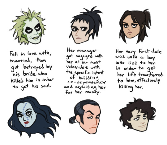
you may think "okay but why is that necessary?"
this sequel made the interesting choice of nudging beetlejuice out of the villain role. he's now just a weird ally/deuteragonist...or perhaps even...a protagonist? but that's not enough! why should we as an audience care about him or sympathize with him?
that's where delores comes in. delores is less of a character and more of a plot device. her purpose (besides serving cunt) is to give beetlejuice backstory and be to beetlejuice what beetlejuice was to lydia, only worse. i talked a bit more about it in this post. thanks to her, we now learn that beetlejuice was a victim. not just that, she's also the looming threat beetlejuice needs to justify his marriage to lydia (he seems to be under the impression that this would help him escape delores more easily, but personally i'm not so sure, i think she's more powerful than that.) her return in combination with lydia's return to winter river is what sets his plan in motion.
rory is a pretty self-explanatory villain so i don't think we have to go into that. he wasn't out to kill lydia...but he's a golddigger, so i don't doubt he would've set something up to lead her into having a fatal accident and claim insurance benefits.
jeremy's role in the plot was to make astrid realize that she was wrong about the supernatural, as well as put her in danger in the afterlife, which is the drive lydia needs to turn to beetlejuice for help.
the role of an antagonist is to oppose or be an obstacle to the protagonist's goal. these three are the three obstacles beetlejuice needs to overcome in order to marry lydia.
first, he needs to save astrid as part of the deal with lydia. so he gets rid of jeremy to give astrid her life back. he knows exactly what it's like to be romanced into a death trap. you can tell this was satisfying for him. later, fucker.


then, he needs her fiancé rory out of the picture if he intends to marry lydia. since he knows this guy is a total piece of shit and is lying to her to lead her into the same trap he himself fell into with delores, he simply gives lydia the tools she needs to kick his ass herself. teamwork!


third comes delores. he just needs to survive delores, basically. he tries to pair her off with rory to try and kill two birds with one stone, but the stone that ends up killing them both is the sandworm that astrid summoned, which beetlejuice then guided straight to them. teamwork once again! (beetlejuice and astrid got rid of each other's problems, that's kind of cool)

these three things being taken care of means that beetlejuice can finally marry lydia.............
............except he doesn't. why? because he helped lydia. by bringing her into the afterlife to look for her daughter, he violated code 699. and he did it immediately after signing that contract. hoist by his own petard, this dumbass.


sorry i got sidetracked again. we were talking about boots, right? right right.
beetlejuice, lydia and astrid all walked in each other's shoes.
everything in this movie comes in threes. names, villains, victims, obstacles and pairs of combat boots.
587 notes
·
View notes