#just on a lumi/shade layer so it Looks Good
Explore tagged Tumblr posts
Text
beauty tips to look less like you're actively dying
now of course, if you're following my nutrition tips, you should mitigate the living corpse appearance anyways, but here's makeup, skin, hair, and nail options to keep up the appearance of a normal person
Skin: Using a silicone scrubbie, take off makeup and wash face with an oil cleanser, then wash again with a regular gel cleanser. In the morning, vitamin C serum and then a day cream containing retinol and spf. At night, just petroleum jelly. Cerave sells all of these for cheap and they're recommended by my dermatologist. Use the petroleum jelly on your lips, too. During the day, use carmex chapstick religiously. For your body, use exfoliating body wash and exfoliating gloves. Naturium glycolic acid body wash and bio-lipid lotion are my holy grails. Makeup: You want to look dewy and rested. No matte makeup, it'll settle into your dry skin and you'll look worse. Start with Covergirl trublend in plush plump (or the greenish one if you have redness) to give off the appearance of plumper skin and prime your face. Assuming you have dark circles, you want an undereye brightener. I like Catrice's, you could also layer this over l'oreal's anti-fatigue magic skin beautifier if your dark circles are really bad. No heavy foundation - go for a bb cream. L'oreal magic skin or, my personal fave, wet n wild bare focus skin tint. For blush, avoid pink or peach - you want a shade that'll look natural. Most makeup artists use a red or a berry. If you wear red or berry lipsticks, just use lipstick as your blush, that's what I do with my clinique black honey (which is a great shade for this if you have olive skin). If you're going for red, a great, cheaper option for this would be sheglam colorbloom liquid blush or simply your lipstick like I said. Another berry option that's cheaper than my clinique would be something like wet n wild in my blackberry broke. You'll want a glassy, not powdery highlighter. This can be l'oreal lumiglotion, wet n wild radiance liquid, or an actual highlighter like l'oreal lumi le glass. For powder, just powder your t zone very gently with something like elf halo glow or the catrice blurring loose powder. Do your eye makeup and eyebrows however you want, though I personally recommend learning how to do them properly for your face shape and "animal face type" and learn your color season so everything harmonizes. Set everything down with Milani make it last dewy setting spray. Hair: It needs moisture and volume. A good cheap option is Pacifica salty waves if you don't color your hair and coco peptides if you do. Do a big deep conditioning treatment once a week. marc anthony grow long, l'oreal elvive, or pantene miracle rescue are all good options. Consider oiling your hair, too. research how to do it and what oil to use for your specific hair type. Use a mousse for volume - pacifica makes one that smells like vanilla. You'll scrunch this into your hair when it's soaking wet after your shower. Spritz with a sea salt spray after - ouai is the best, but it's pricy, so feel free to use pacifica's for this as well. Make sure also to trim your dead ends and get a flattering haircut that isn't flat - it'll be easier to hide any thinning with layers, and you won't get the stringy anorexia look. Nails: Get a nail oil, a cuticle remover, and keep your nails trimmed and cleaned, then start wearing press ons (or get gel tips if you can afford it). Bliss kiss nail oil pens are a great option, blue cross cuticle remover, and kiss are cheap, solid press ons. I like the medium length square french, but I was also born in the 90s.
#34t1ng d1s0rd3r#@na motivation#m34nspo#th!nsp0#tw 3d vent#4n@diary#light as a feather#4nor3xia#3d not sheeran#tw ed ana#3ating d1sorder#tw ana bløg#thinspø
70 notes
·
View notes
Text
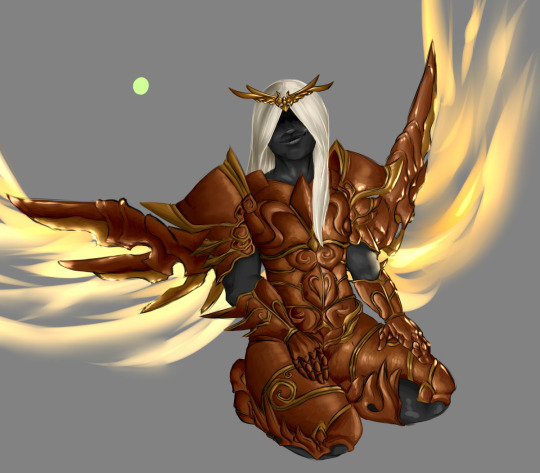
Hey I don't think this ever got posted here, have an Inarius from 2018.
I distinctly remember learning how to shade stuff so it looked curvy in Drawing 2, coming home, listening to stuff by A Perfect Circle (???) at 11 o clock at night, and shading his thighs like my life depended on it. Don't worry about why he's on his knees, admire his shiny wings and pretty copper breastplate instead.
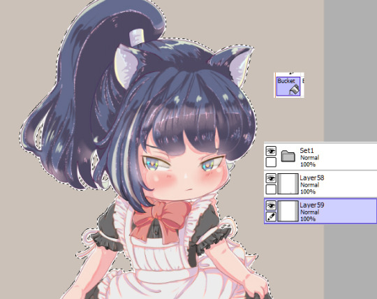
#art#Inarius#if this is on here somewhere#I haven't seen it in a while#Old Art#Fun fact!#His highlights are actually the color of that green dot#just on a lumi/shade layer so it Looks Good#aren't art programs a bucket of fun
15 notes
·
View notes
Note
What is your coloring process? If you don’t mind me asking 🤔
I assume you mean my shading / rendering process. If so it's, a wholeee process alright hahahh,, hhh- It get's a bit complicated when you're talking about rendering specific forms (Skin, hair, fur, clothing, glass/metals, etc.), but the core steps usually remain the same. I've been asked this a lot in the past so I might as well try to go over it extensively now. Fair warning I'm really bad at explaining things but I'll try to be as detailed and coherent as possible, that being said this might get long so hold on- If you have any questions afterward then please let me know!! GEEK'S COLORING / RENDERING PROCESS BELOW THE CUT (with photos to follow along)
- I'm gonna be using practice sketches for base reference, the first is for fur / clothing with my Bear!Otto design to start. The second is gonna be for exclusively skin at the very end- - NOTE: Keep in mind the way I do my rendering is just a mess of combined stuff, but your art program must contain Layer Modes (multiply, overlay, luminosity, shade, etc.) if you're gonna follow step-by-step. The program I'm using is Paint Tool SAI, but there's plenty of other programs that use layer modes just the same!
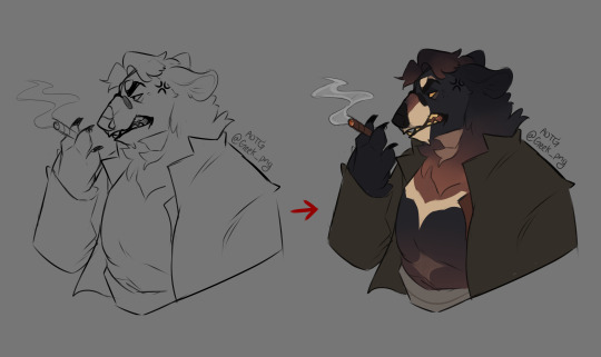
STEP 1: Flat-colors! (I just used a basic marker brush to fill in, keeping the fur, clothing and extra bit layers separate. His fur is a bit dark but we can make it work subtly.)
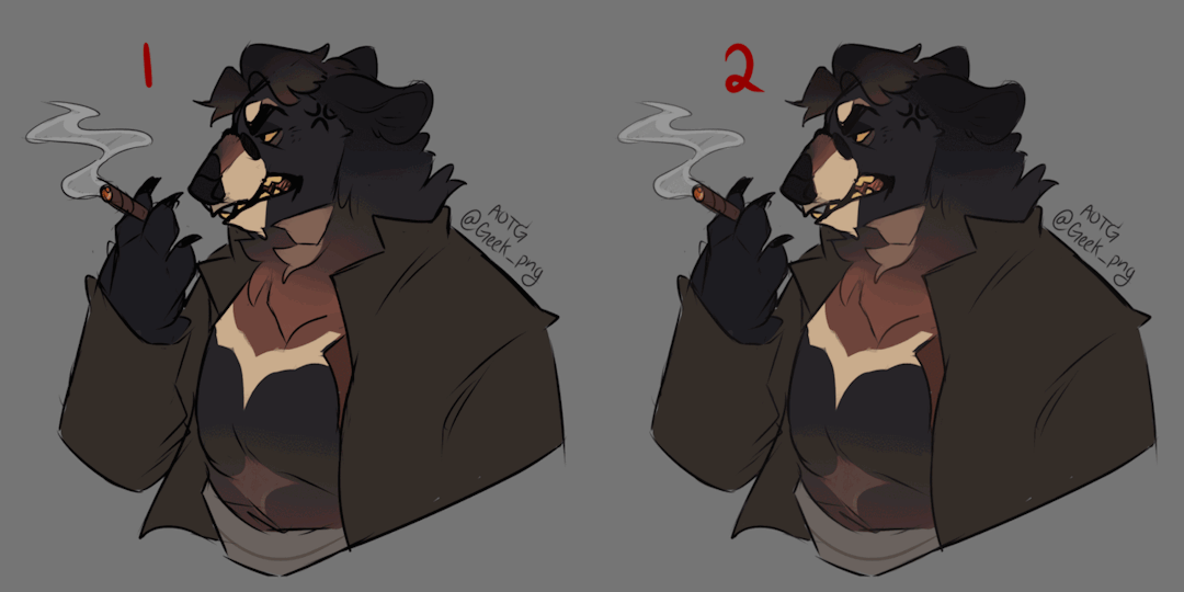
STEP 1.5: Coloring the Line-art! (This step is optional, and can come either before OR after shading, but makes your artwork look much softer in the process. A very quick way of doing this if you don't want to do it by hand is as follows:) 1. Flatten all your color layers and copy them, unflatten by hitting undo a few times. 2. Make a new layer above your linework layer and paste those combined colors onto it. 3. Find your blur tool and gently blur all those colors, then clip it to the linework layer below, adjust opacity/saturation as you see fit!

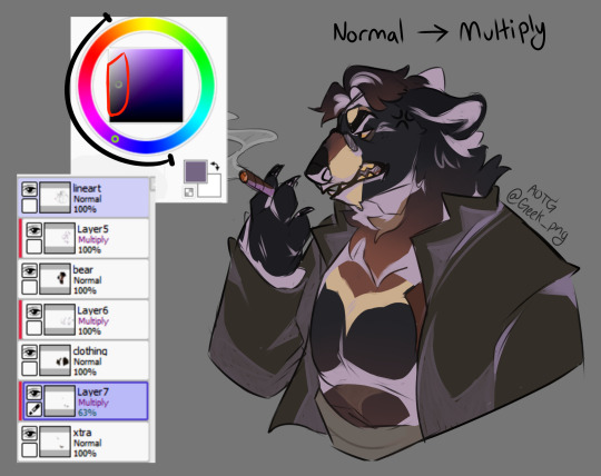
STEP 2: Cel Shading! (Or just the block-shading step, although I combine my cel and blended shading together all in one, I'm separating them for simplicity's sake on this.) [ When shading I use both the Multiply & Overlay layer modes as bases (for multiply I'd use lighter, dull pastels, while for overlay I'd use darker, more saturated colors. Combining them both can give a little bit more realism when doing the lighting effects later on. It all depends on the colors beneath and the effect you want to achieve with whatever atmosphere the artwork is showing! I NEVER go straight black/white for colors, especially while shading, it's literal hell and won't look good, imo. ]

STEP 2.5: Blended Shading! (Same process as Cel Shading except you're gonna get into the nooks and crannies and blend it out! Define where the darkest parts are and fade it using a blending brush and opacity, keep in mind I use multiple layers for this step and stack it a lot, but it's up to personal preference how far you want to go with it. Use both Multiply / Overlay for this bit and experiment with different warm / cool shades!)

STEP 3: Base Highlights! (Using Overlay and a light color to accompany, add some basic shapes of light from whatever direction it's coming from on your piece. Always keep in mind the general location of prominent light, minor sources can be added on after. Blending can be used at this stage, which is what I did for the fur tufts.)
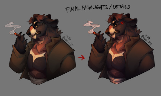
STEP 3.5: Final Highlights / Details! (Now for the fancy shit [part 1]! Keep in mind it's incredibly easy to go overboard with this step and it's entirely up to preference! I usually try to keep it pulled back a bit but for the sake of this example I'm going all out- I basically just added more detail to the fur, highlights on the nose / eye / glasses / girdle using Overlay & Lumi+Shade, and added in shadows & highlighted bits I might've missed.)

STEP 4: Mess Around with Colors / Layer Modes! (Fancy shit [part 2]! Experiment with different color combinations to set different moods for your piece! I tend to lean more towards the oranges / reds / purples, but that's just my personal preference. Light obstruction, rim lighting, anything and everything- Go fucking buck-wild LOL References for certain lightings can come in really handy too!!!) ------- That's it for the basics, but here's an extra tidbit for how I do skin specifically:
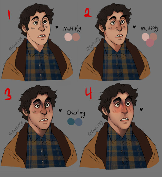
1+2: Same process as above, cel shading and blended over it with warm but pale pastel pinks / oranges. This can work with any skin tone, I don't suggest using cool colors for base shading as it can make the skin look kinda,, dead- 3: That being said I'm using cool colors for the overlay part- It works well for getting the darker areas and for creases / eyebags usually. For darker skin tones I tilt more towards purple rather than blue. 4: Final details, coloring the linework and adding highlights. (I added a lot more blush than I normally do but yeah that's up to you lmao) ----- Hope this gave enough insight on how I generally do my stuff, not a strict guideline or anything but there's the basics as best as I could explain :^) Have any questions? Please let me know!
#art tutorial#digital art#digital art tutorial#how to art#fanart#this took ages for me to put together so I would appreciate reblogs a fuck ton ;;#I hope it's concise enough without being confusing#I tried to make it seem fairly straightforward but when I'm doing it on my own I jump around in between steps a lot#but again it's entirely up to preference that's just how I do my stuff#geek png#geek asks#paint tool sai#alfred molina
227 notes
·
View notes
Text

☆ Day 1 - Prince Zhongli ☆
-> zhongli x fem!reader | royalty!au
-> fluff, conflict
-> warnings: mild cursing, fighting and blood, talk of human selling
-> “pick a prince” masterlist
a/n: day one! how’s everyone feeling about mr. zhongli? personally, i’m rather intrigued 👀 i hope you enjoy! sorry this is posted a little late at night, i didn’t realize how busy this week would be when i scheduled my event!

The library was somewhat of a safe space for you. It was where you ran when the burden of an entire country rested heavily upon your shoulders, giving you an outlet to simply live.
After the slightly traumatizing dinner your father had hosted with your seven suitors, you ran to the library. You knew your mother, who was also rather uneasy about the entire arrangement, was there and that provided yet another layer of comfort that you so desperately needed.
Your mother read stories to you that night- uplifting tales that did at least a little bit to lighten the mood you were in. She read book after book, not once stumbling over her words despite your tears staining the paper and making the words smear across. It was as if your mother had read these books to herself numerous times before, trying to comfort her own mind when she was put through a situation similar to your own.
She didn’t put down her books until you had cried yourself to sleep. Then, your mother gently laid you against the plush velvet of the couch, draped a light blanket over your form, and kissed your forehead, bidding you goodnight and wishing for a better tomorrow.
☆ ☆ ☆
“Um, excuse me?”
You scrunched up your nose and huffed, pulling your blanket closer.
“Princess? It’s well past morning. You may need to get up.”
Who the hell was talking to you?
Albeit reluctantly, you yawned and opened your eyes, sitting up to stretch. Suddenly, you were looking into a pair of amber eyes. They seemed to glow in the dim light of the library, looking at you with slight concern.
“Wh- who’s there?” You mumbled, scooting back on your seat to shy away from the man’s gaze.
“It’s- it’s Zhongli. Just Zhongli. We didn’t see you at breakfast, your father is a little upset.”
“Shit- I missed breakfast?” You were wide awake in an instant.
“Such language is rather unbecoming of a princess, don’t you think?” Zhongli’s smirk gave away his playful comment, and you couldn’t help but laugh a little as well. “Anyways, as far as your father is concerned, I saw you earlier this morning. You weren’t looking too well so I sent you to take a long bath to relax. After breakfast, you showed me the library, which leads us here.”
You sighed in relief, thankful that Zhongli had practically saved your ass from a long lecture. He outstretched his hand and you took it, allowing him to help you stand up fully.
“Why don’t we take a walk through the market? You can tell me more about yourself and spend some time away from the stressful castle life.” Zhongli offers.
“Gods, yes, please.” You agreed, and allowed the polite prince to whisk you out of the castle.
The market was bustling at this time of day. It was early enough for the sun to warm the faces of your citizens, but cool enough to not scorch those who may venture away from the shaded roofs of the market stalls. You held tightly onto Zhongli’s arm as he browsed the goods your kingdom had to offer.
“This is a beautiful necklace, Princess.” He held up a dainty neck piece, the emblem of your kingdom hanging delicately off of a small golden chain.
“Buy it then.” You mused. Zhongli had been window shopping for a while now, and yet you hadn’t seen him buy a single thing he claimed to like.
“Unfortunately, that’s not possible.”
“Uh, why?” You quirked an eyebrow. With how Zhongli acted and dressed, you were sure he’d be able to afford everything in the market twice.
“I, um, seem to lack the funds.”
Maybe not.
“Aren’t you a prince? Shouldn’t you have money?”
“I suppose- anyhow, look at the gems over in this stall. Do you believe they’re real, or are your citizens being scammed by a merchant?”
He was avoiding the question.
You didn’t understand. If he was a prince, then his financial situation should be rather promising, right? What was there to hide? Unless, he wasn’t actually a prince?
No, you shook your head. Your father wouldn’t have invited him to the castle if his background was even slightly sketchy.
Where did he go?
Zhongli had disappeared from the gem stall he was at previously. You looked around the area, trying to scout him out. He should have been easy to find, standing out amongst the rather bland clothes of your citizens, but you saw nothing.
You began getting a little worried. You were dressed down, wearing a cloak and a hood that shadowed your face from most people’s views, but you were still a beautiful young woman. Even your lovely kingdom wasn’t a stranger to crimes.
Pushing forward, you started to make your way through the crowd. You considered just going back to the castle, but Zhongli didn’t know his way back. You had to find him. The only way he could’ve gone without you noticing was forward. Your forcefulness while moving through the market streets didn’t go unnoticed as people began giving you glares, whispering harsh comments as you shoved past. You couldn’t care less, you were on a mission to find Zhongli and go home-
“Shit!”
You cursed as arm shot out and grabbed your bicep, yanking you between two stalls and into a narrow alleyway. Even more hands grabbed at your clothes and mouth, trying to keep you from yelling out.
“You look like you’ve got it real good.” A harsh voice spoke against your ear. You shuddered. A cold object rubbed against your cheek and you felt a contrasting warmth trickle down to your chin. Whether it was blood or the tears you were trying to hold back, you couldn’t tell.
“What’s in that nice little sachel you’ve got there?” Another hand grabbed at the bag around your torso. “I bet you’d be just fine without it.”
He pulled it off of you and threw it to the ground, letting a third man rummage through it. You stayed quiet, afraid to let out even a whimper as the first man pulled the hood of your cloak back. You heard his breath hitch a little bit.
“Now this is a sight.” You could hear the smirk in his words. “The little princess, all alone, with no knight in shining armor to help her. Forget the bag, she’ll go for a pretty penny worth way more than anything in that shitty old thing. C’mon, Princess, let’s get movin’.”
“You’ll have to get through me, first.”
Tears of relief fell from your eyes now at the sight of the very man who had inadvertently gotten you into this situation in the first place. He stood in the entrance of the alleyway, the sun shining behind him as if he were some god, appearing for the first time to come save you. Some broke, secretive, oddly polite god.
The first man sneered. “Yeah? What are you gonna do? Can’t get that dandy little suit of yours dirty.”
Zhongli practically scoffed. “I could deal with you lot without even wrinkling it.”
He rolled his sleeves up. “Let’s see about that.”
He charged at Zhongli, swinging his fist wildly at the prince’s face. Zhongli dodged the punch, stretching his leg out and sweeping the man’s legs out from under him. He fell to the cobblestone beneath him and Zhongli stepped on his chest, pressing his weight onto his body until he was gripping his ankle, begging for a break.
The second man came next, leaving the third, scrawniest man to try and hold you back. While Zhongli was dealing with him, you snapped your head back and smashed into his nose. The guy let go and grabbed onto the definitely-broken cartilage, practically helpless as you swung at his face again.
You backed up from him and ran into someone’s chest, jumping when their arms wrapped around your shoulders once more.
“Easy, Princess.” Zhongli’s deep voice immediately soothed your guard. “I apologize for losing you.”
You turned around. “I lost you.”
“No, no,” He reached in his pocket and pulled out a small bag, handing it to you. “I thought you were occupied looking at the gems, so I snuck away to get this. I didn’t realize you’d go all over looking for me.”
Zhongli placed the bag in your hands and you opened it up. In it, the necklace he had shown you earlier. You smiled at him and held it out to him, turning around so that he could put it on. The feeling of Zhongli’s fingers against your bare neck sent a small shiver up your spine- one you wouldn’t mind feeling again.
“Thank you, Zhongli.” You smiled at him, “But, if you didn’t have any money, how did you get this?”
“Don’t worry your pretty little head about it.” The prince replied. “Come, you’ve had an eventful day. I think tea and a nap is in order.”
He held his arm out for you once more and you took it, leading the way back to the castle. You couldn’t help but gaze at the man through the side of your eye, grateful for the sweet gift.
You quit wondering how he bought it when you noticed that he was only wearing one expensive earring, as opposed to the two he had started out his day with.

taglist: @xenia-cenia @murder-and-mistflowers @osmiumtrash @rebeljustforkicks137 @heisenwurst @writingmi @dilucs-thighs @wiseeggspickleslime @cotton-candy1709 @emerald-smile @luckymuddypaw @mercurysmaiden @Violeteyesofevergarden @darthsokaaa @aaaaalona @lehra @peepeles @hopeless-path @chaiteabeebee @murderisfantastic @janieatlanta @naritecs @a-cutiecatie @hanniejji @optimestick @trashy-mctrash @9ineine @akatherinque @spqcebun @milkxteaa @spooderkat @4everanimesimp @asheseiler @hnpriscilla @m0na-l0ver @welcometomypersonalhell098 @simplysm1le @lumi-ying @y2ndere @2-player-game @craptainlou @myheadcanonz @Piprapie @calicolaaaa @Traveler-Lumine @starrysurprise
☆ users that are crossed out are unable to be tagged ☆
☆ fill out this form to be on the taglist! ☆

#fic blog#x reader#fanfiction#writing#genshin impact#lay writes#genshin impact x reader#event#pick a prince#zhongli#zhongli x reader#zhongli genshin impact#genshin impact zhongli
257 notes
·
View notes
Note
HI is it ok if i ask how you make your art look so glowy??? like the litle dapples of light?? do u have any tutorials you recommend? i love it so much i really wanna give it a go!!!!!!!!!!!! love your art love your blog <333333
aaa thank you so much :)<3 im not really good at explaining my process but i also don't have any tutorial i used to make this apart of my own style ?? so ill try to make a lil one myself :)

this is an already completed piece so adding more lighting to it just completely throws it off lmao but to start off i just start on a new layer and use a colour like this to block in the highlights

next i just set that to lumi & shade in paint tool sai, most software will have similar blending modes! i almost always keep this at 100% opacity for my type of lighting but if ur making it more subtle, lower it!

now, to make the lighitng even MORE intense i duplicate the layer and change the colour slightly, it's difficult to notice here but it's in the next step that this makes a really nice effect.

in this step ive slightly blurred that 2nd lighting layer with a specific brush that doesn't fully blur things beyond recognition (depending on the brush size)


this is a newer thing im doing and it doesnt really work with this piece since it was already completed and had grain overlays over it etc. but the last thing i tend to do is merge those lighting layers together with the original drawing and then blend parts of the edges further into the piece to make it look cohesive :)
im not sure if this is exactly what you wanted when you asked about the dapples of light, but this is pretty much the same process i follow for any lighting, stuff like particles and sparkles etc. :D
5 notes
·
View notes
Text
[Chat: The Jedi Orders Problem Children: Has Been Opened!]
Thing 2: holy shit I forgot this thing existed
Trigger Happy: pff aah yes ye ol good days of tormenting adults
Thing 1: And ignoring our trauma! Quite the experience if I do say so myself.
Quinlan, Use Psychic Touch!: force obi u using grammer in a chat like that gives me a headache
Thing 1: And your lack of brain cells gives me a headache, but we don’t talk about that, do we Quinlan?
Quinlan, Use Psychic Touch!: i- WOW U DIDN’T HAVE TO COME FOR ME LIKE THAT OBES
Fuck Adults: wejdhjk theres nothing like waking up to obi wan just throwing shade like that
Sick of Your Shit: Well I mean… Quinaln was asking for it
Queen: Oh goodness, Garen why did you have to re open the Sith cursed chat?
Trigger Happy: :o
Best Raisin: The Queen has arrived!!
Thing 1: Hi Lumi, honestly should we even question what goes on in Garen’s head these days?
Queen: I guess not, much like Quinlan Garen sacrificed all of his braincells to you and Bant
Quinlan, Use psychic Touch!: what is this? Bullying garen and quinlan hours??
Queen: Of Course
Best Raisin: When isin’t it bullying quinlan and Garen hours?
Trigger Happy: should it be anthing else
Fuck Adults: obviously
Sick of You Shit: Yes
WHEAT: Yup
Acid Puddle: You two are the only ones in this chat without any braincells, so of course we’re gonna bully you
Thing 2: DID YOU TWO SERIOUSL COME ONLINE JUST TO ROAST ME AND QUIN?!?!?!
Wheat: Certainly
Quinlan, Use psychic Touch!: OBI YOUR BROTHERS ARE BULLIES
Thing 1: y’all hear something?
Trigger Happy: wow cant believe obi just murdered quinlan
Quinlan, Use psychic Touch!: quit tellin’ everyone im dead!
Fuck Adults: Its almost like you can still hear his voice
Quinlan, Use psychic Touch!: wow guess ill go and make out with fox now
Thing 1: You do that, Cody’s just pinged me and added all of our new shinies into the 212th chat.
Best Raisin: I’m surprised obi hasn’t adopted them all yet.
Sick of Your Shit: bold of you to assume he hasn’t already emotionally adopted them.
WHEAT: okay that’s fair
[Chat: 212th Comms: has Been Opened!]
[Feeling Glorious has added Firework, Spinner, Comet and Feather to the Chat! ]
Feeling Glorious: Welcome to the unofficial 212 comm lines shines, you’re one of us now. Ranks and regs don’t mean shit here so feel free to refer to us by or names.
Sunshine Brother: Welcome!
The Favourite: Hi!
Grumpy Brother: Oh force theres two of them
Feather: Thanks sirs, but who is who???
Feeling Glorious: Right. Roll Call! @Everyone State your name, pronouns and a fact about yourself.
Feeling Glorious: I’m Kote, or better known as Cody, I go by he/him pronouns and I have used a lightsaber before.
Spinner: :O Really!?
Sunshine Brother: YEAH It was awesome to watch! I’m Waxer, he/him and Boil and I accidentally adopted a young twi’lek girl named Numa as a little sister back on Ryloth
Grumpy Brother: Im Boil, he/him and I got my name because I spilt boiling water over my arm and hand when I was still a cadet n Kamino.
Barley: Barlex, he/they and I once sucker punched General Kenobi in the throat
Comet: !!!
Firework: HOW DI YOU NOT GET DE COMISSIONED!?
Barley: kenobi’s just pretty chill like that
Curlicue: Names Helix, he/him, medic and Ihave dragged our general to medbay more times than I can count
Comet: that’s kinda concerning
Shifter Of Gears: Gearshift, they/them, and I once hid in the actual engine of the Negotiator during a game of hide and seek
CRYStal Clear: Crys, he/him and I dyed my hair blond but it now looks like it’s a goldish yellow
Spinner: nice vod
OverShot: Longshot, he/him I shot the clanker bitch himself in the face
Snaptrap: Trapper he/him and I got my name from how quickly I could both make and detect traps compared the the rest of my batchmates.
Feeling Glorious: We love and appreciate you Trapper
Snaptrap: UvU
Grumpy Brother: don’t appreciate THAT THOUGH
I’m Like An Onion, I have Layers: Peel, they/them and I once peeled and ate an entire onion like an apple without a single reaction.
Snaptrap: it was terrifying
Grog: Gregor, he/him and I’m the 212ths main source of moonshine.
The Favourite: I’m Wooley! I go by he/him pronouns and the general’s teaching me how to knit and crochet!
Feather: holy fuck your precious
Comet: I guess we introduce ourselves now????
Comet: well, im Comet, I prefer she/her pronouns and I own a sniper with comet decals all over it
Feather: I’m Feather, he/they and I got my name from having and I quote ‘feather light steps’ during stealth training
Firework: Right, I’m Firework, she/they and I love to paint!
The Favourite: ! Another artist? YES
Spinner: hye im Spinner he/him and no matter how much I spin I cant get diy for some weird reason.
Feeling Glorious: right, Waxer, you know what to do!
Sunshine Brother: Yessir!
[User: Sunshine Brother: Has changed Feather’s name to: Dreamcatcher!:]
[User: Sunshine Brother: Has changed Comet’s name to: Knock-off Shooting Star!:]
[User: Sunshine Brother: Has changed Spinner’s name to: You Spin Me Right 'Round!:]
[User: Sunshine Brother: Has changed Firework’s name to :Bang Bang!:]
Feeling Glorious: Oh yeah, one more thing
Bang Bang: ?
The Favourite: @Stewed Ginger General!
You Spin Me Right ‘Round: the generals in the chat!?!?!?
Stewed Ginger: Indeed I am Spinner!
You Spin Me Right ‘Round: :HE USES OUR NAMES?!?!? @ Feeling Glorious:
Feeling Glorious: :Yup, he gets sad when we refer to ourselves as numbers:
Stewed Ginger: Right, well I’m Obi-Wan Kenobi, I go go by he/him pronouns and I know over five different languages :)
The Favourite: Hi General!
Snaptrap: Hi general!
Stewed Ginger: Hi boys!
Bang Bang: Uh General, what’s the meaning behind your user, if yo don’t mind me asking?
Stewed Ginger: I don’t mind at all Firework, but its not really creative. My user is just the beginning f my home planet Stewjon and my Hair colour.
Bang Bang: ah thank you sir!
Stewed Ginger: well how about we all meet in one of the rec rooms and get to know each other? I’m sure it will be beneficial for all of us!
Feeling Glorious: Meet you all in rec room 2 shinies!
[User :Feeling Glorious: has closed the chat for :0700: hours!]
37 notes
·
View notes
Note
how did you colour 42’s skin? it looks pretty!
thanks Anon! ^w^
it was mostly through trial & error, and it took a chunk of my time to find out how to color his skin. i did find some brushes & textures that are suited for this, and now i have my own way on how to color a night sky! (or just spacey shit)
(just to clarify, i’m using Paint Tool SAI for my digital drawings, so the following tutorial is for those who have that program)
first off, i made my own brush using the Star Brush Textures from MissMillia in DeviantArt and a Pencil base. then i just scribbled at maximum size (500) to make up the night sky.

it doesn’t look like it’s got stars, but when you take a closer look…

…there are very, very small white specks. these make up the stars in the brush. if that bothers you, we’ll get back to it later, ‘cause we’re making the nebula clouds!
i first used the AirBrush to make up the base cloud, like so:

(oh yeah, i also selected the sky so that the cloud doesn’t go out of bounds)
then i blur the whole thing using the Blur tool!

in here, the color looks as good as it is, but for 42’s skin, i wanted to change the blending mode of the layer i was in. for me, the most suitable blending mode for the nebula cloud(?) was Lumi & Shade.
here’s how it looks like when i changed the blending mode:

now here’s when another new brush comes in. for the cloud borders (and maybe a bit at the center?), i made & used a Nebula brush using these settings. (you can also see the settings for the brush in the photos when it’s selected)

now, while i used it all over the cloud, i didn’t like how it look, so i used the Blur tool again.

there! much better.
you can add more of the Nebula brush at different colors for as much as you like! or if you’re done, get a new layer and use your trusty Pen tool (or any brush that you normally use for drawing) to put white dots around your night sky to add more stars that are a bit more emphasized than the others.

annnnnd we’re done! it’s kinda mediocre now that i think about it, but at least it works!


#jam does art tutorials??#(yep that’s the tag)#(hold up i better tag that other speedpaint from last year that too—)#stars#galaxy#night sky#that was stupid#idk anymore#art#doodle#drawing#digital drawing#digital art#artist#artists on tumblr#inquiries of a fennec#a really nice anon
2 notes
·
View notes
Note
hey i was wondering if i could ask what filters and stuff you use while drawing? im trying to move from traditional to digital art and love your style and how you use colours so i thought maybe i could learn a bit from how you do it! thanks, and i hope you’re having a great day!
First of all thank you so much! I'm so glad you like my style 💜 I would love to show you the process with pictures but my drawing tablet is still broken so I have to explain it as best as I can with words
I always used paint tool sai so I unfortunately can't help when it comes to other programs but the filter effects should be similar in other programs as well I think. So first of all I get down the basic color and make a new layer (set it to clipping group, which means you can only put color over the previous layer, there are tutorials to this on yt but it's really not complicated!) and shade with a color I think would suit the drawing. Most of the time I go with purple tones. I set the shadow layer to multiply, shade or my absolute favourite to make the shadows pop "lumi+shade". It just looks better than normal colours imo. You can always lower the opacity so it isn't too extreme. I color in the lines with another clipping group layer (coloring lines does A LOT in my opinion). When the drawing looks finished I merge all my layers together. Next up I do another layer, set it to clipping group and color in the whole thing with a color I like. Usually it ends up being orange or pink or just sth warm. Depends on the drawing tho of course! I set the layer to "overlay" and all the colors I used previously get a similar tone. It kinda "corrects" the colors for you so it looks more fitting. I actually have no clue when it comes to color theory and the colors I originally pick look pretty boring. The extra overlay layer saved my life tbh.

You can do more filters and try which effect works best for the mood of your drawing! I usually add a luminosity layer or another lumi+shade layer just for some extra glowing! Also you can ofc mix colors, you are not limited to just use only one color for the overlay layer. So now that my colors look more fitting I merge all the layers AGAIN. To finish it off I put the watercolor B texture on the layer. It makes this retro looking texture and I like it a lot!
To sum it up my secrets are the lumi+shade, overlay and luminosity layer modes! I'm sorry that I can't explain it better maybe I can do a tutorial once my tablet is back. Hope I could still help you and good luck on doing digital art 💜💜 it might seem complicated but with a bit of practice it's not too hard! Also yt tutorials on the art program you use work wonders. There are so many things you can do when it comes to digital art so have fun!
3 notes
·
View notes
Note
How did you get the dot effect/texture (?) when you drew Ms Pauling? I’ve been looking for how to do it forever
Hey Im so sorry for taking so long to respond! I’ve been working for like 5 hours a day to get my comic to print so I’ve had zero time for other stuffs but here we go!(I only know how to do it in paint tool sai, and also I just wake up from a nap so I might misspell a lot sorry)

first you draw a thing

then you open a cool dot pattern you’ve found (you can usally find something by searching for screentone on google) Then you go to “layer” and then “luminace to transparency”, that will turn the background transparent

Select it all and copy that shit

slap it on your thing (inbetween the lineart and color layer)

Then you git “clipping group” and I also recomend doing lumi and shade cuz it looks good, but it’s optional.

go down a bit on the opacity to make it look softer and select “preserve opacitcity” and draw over with a color to make it fit better.

use a eraser on low opacity to make that #fade

Then it’s done! this dude looks super shitty but you get it. Im so tired dudes
228 notes
·
View notes
Note
um, can i ask how you color in your drawings? they all look really good and your art inspires me :)
OH!! UHM!! My coloring style is such a mess but djfhdeghI try emulating my watercolor style when i do traditional illustration- which is me adding bursts of color everywhere jsdhfdgGonna use this doodle of witch fury I made!!So first I guess i start with layer layout; I have my sketch (in black lines works best for this style);Note: Yes the colors folder is above the lines! It’s supposed to be there!
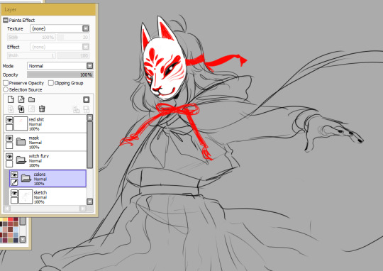
I then set my colors folder to Lumi&Shade
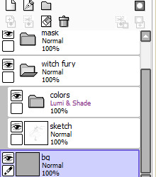
Note: You have to keep your sketch and colors folder inside another folder when doing this, or else the Lumi+Shade folder will also be affected by the background. Which you don’t want! As long as it’s all contained in a folder, it’ll prevent other layers below it from affecting it!From there, I add a base color to the entire sketch/linework (usually the skintone)
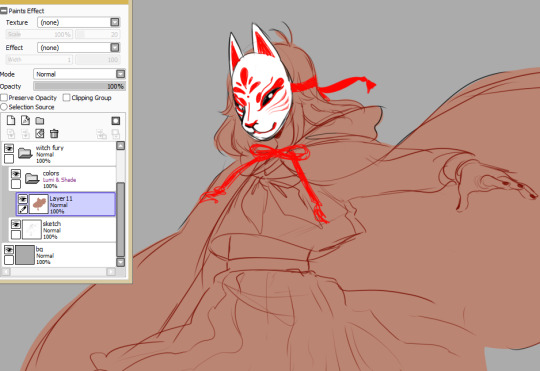
The skin tone is what usually sets the overall tone for the colors, since I usually do all the coloring on one layer and it all blends together.I lock the coloring layer’s opacity (preserve opacity in sai) so the colors dont go outside of the base, and using a custom watercolor brush, I slap on color! I always start with the skin shading. For a sketch like this, it’s not usually too detailed shading. I only ever detail when I plan to refine something. I try to keep in mind the light source.
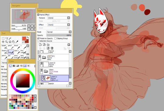
the process is a bit hard to explain I’d have to record a video tbh if you wanted to really see it. But I rely heavily on vibrancy and local colors when I color the skin here. By local colors I mean I use the eyedropper tool a lot to color pick midtones from the lineart itself and the three main colors I’m using (base, a vibrant color, and a darker shading color). I’m still following my light source here!For the rest of the drawing I’m doing relatively that same thing, but I’m also using the mess from my skin coloring process to blend with the clothing colors (and the clothing colors to blend with each other)I start with the shading color first for clothes and then go over it with the lighter color after
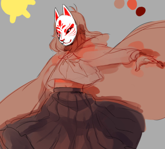
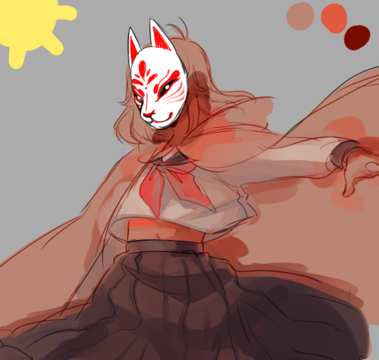
and since I almost always work with a really warm palette (due to working off the base skintones), I’ll often take a really bright or saturated cool color (like a blue or green)and lightly splash it in some of the darkest areas to contrast all these warm tones
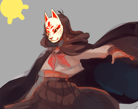
to finish ti all off, I usually add some sharper white highlights and lines on a topmost layer to counteract how soft and blended the coloring is. I also usually lower the opacity of the sketch a bit, so in some places (for example the hands here), I’ll do some quick-but-not-so-crazy refining or outlining to make them more defined
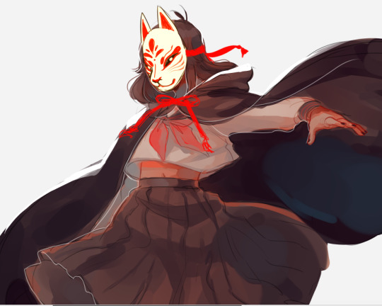
And then I’m done! That’s my coloring process!!
Disclaimer: This coloring style is highly stylized. I developed this style after developing a basic understanding of shading and painting. This style is absolutely great if you wanna make something look pretty or use it to help develop your own style.However!! it’s not good at all if you’re trying to learn how to shade or color, or other basics, since it doesn’t use a lot of technical application. The technical stuff is stuff I already have in my head and learned and I take some shortcuts, so trying to learn how to shade or color from this is not so good if you're just starting out and want to improve ;v; best used for fun!
That aside!!! I’m so happy that I inspire you; getting this ask made me really happy and I hope that this short guide on how I slap colors onto doodles or right before I refine a painting helps!! It’s messy, so it’s not for everyone, but it’s just how I like it! Have a wonderful day and art adventures anon
62 notes
·
View notes
Note
Do you color over your line art? Or do you just color the line art afterwards? I rly love your art, you're a huge inspiration to me
heres two ways i colour lines

lumi + shade i pick a darkish dull colour for the lines and switch the lineart layer to that layer mode so it looks more uniform - downside is there will need to be more adjustmentsthe plain ol picking colour by eye and colouring the lines w/ it is what i use when i have the energy levels, gives the opportunity for colours to pop a bit more - downside: picking the colour combos that look good to u
398 notes
·
View notes
Text
diddly darn lighting essay
im gonna explain some stuff to the danny phantom reboot concept server about how we can do the lighting effects because i want to achieve some similar effects but do it differently so that it looks nicer, spookier, and just generally cooler. i also don’t want it to get lost in the chat. I took a long time thinking about the glowing effects
FIRST, so as you know, once a ghost enters the scene the lighting of the whole place changes dramatically. which is pretty cool and spooky!
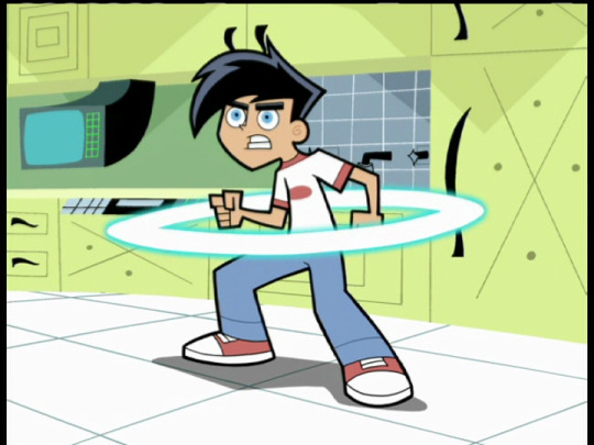


the colors get darker, background changes dramatically
when this happens there’s this bright cyan backlighting
Although i like the blue backlighting, i think having the entire lighting be the same light blue color all over the character might be an eyesore. so what I suggest doing for this is to use the lumi & shade layer (or something similar) for the sake of lighting variety. something like this:


That way you can tell it’s that same good old famous spooky blue lighting of Danny Phantom but it’s not as much eye sore.

I’m not sure if every art/animation program provides this layer effect but if there’s anything that gives the blue color a noticeable saturation while also noticeably illuminating the object, I think it will work! I suggest trying out different layer options. Not only that but make sure you keep the lighting to one side when you add it in, for the sake of having a sense of a light source
SECOND, gloWinG grEeN eYES. its in the theme song, so we have to incorporate it

the show itself doesnt actually show his eyes glowing a lot, typically only when he’s angry. im not sure how expensive it would be for the ghost eyes to have a permanent but subtle glow but it would be hella spooky when the surrounding lighting is dark.

not sure how far you want to go with it but it would be even cooler if surrounding objects were also slightly illuminated by anything close to the eyes, like in this great fanart by @gainfabricsoftener here:


THIRD: the ghost aura. spoooooky
as you know all the ghosts have a subtle white aura around them

this can be achieved by having a dulicate of the ghost’s solid color layer but filled completely with white, layered underneath the coloring of the ghost, and blurred.
Though if I’m gonna be honest, the aura glow in the show feels too small and outline-y instead of glowy and I would prefer to have the ghost auras a bit more softer, wider, and subtle like in these frames of the theme song. feels more spookier:


a comparison
anyways thats all i have to say about the lighting. Honestly some of the things such as the aura and the light blue backlighting are most likely reasons why Danny phantom had a much higher budget than fairly oddparents so idk how expensive it is for everything to be incorporated.
other things that should be glowy include:-ectoplasm because glowing liquids are spooky
-any ghost’s hair that resembles fire
-any spooky ghost-related items
-ghost powers
-like 70% of things that are colored neon green would probably be glowy
it takes a lot of trial and error to get the achieved effects. i dont know if you want to follow my advice or not but feel free to use this as a visual guide. Hope it’s useful. Help Us Achieve Maximum Spookiness
#danny phantom#long post#lighting#reboot discord#If i had full pen pressure on SAI i would make a set of drawings about what the lighting should look like. including how to shade the ghosts
834 notes
·
View notes
Note
Hello Azeher! I was wondering what your coloring process is like? I love the watercolor appearance with it's tones and lighting in your art! It's so soothing and beautiful. Any tips you could share with a struggling artist? Thank you!
Oh, hi! Thank you so much. I guess it depends on what artwork you’re specifically talking about since I tend to shift coloring techniques from time to time. As of late tho, most of my coloring consists on sketching colors and then, on a new layer, trying to clean the best I can. I don’t know if that’s what you mean by “watercolor appearance” xD
As for picking colors a lot of the time it’s intuitive but in general I’m looking for a palette that leans toward gold/yellow. There are certain color tips I’ve learned over time tho, like, golden lighting will always look good with purple shading so when everything else fail try that xD. Also you get neon colors by using strong saturated colors as lighting and making shadows darker than that. Also, if you want a bright color like red to stand out, all the other colors must very desaturated.
To create a fun contrast don’t use opposite colors, like blue and yellow. Yeah, they naturaly look good, but sometimes the result can be too stark so picking a color that is analogous to the opposite color of the one you’re trying to contrast makes things softer but vibrant. Like blue against orange or lime green. Or yellow against purple or cian. Don’t make shadows just darker tones of the base color. And don’t make lighting just a lighter color of the base color. If you’re not sure what colors to pick, select a day time and then look up pictures of that day time. Obseve the color of the light and the color of the shadows. For example, sunset settings are made of orange/yellow lighting and red-ish shadows. But observe colors in a setting individually too.
I also use a lot of layers in low opacity to sketch the colors. I use normal layers or multiply layers or overlay layers or lumi and shade layers. They’re all good.
When I want to be all colorful, I basically don’t pay attention to any of this and try to make colors look pretty together. Analogous colors are good for this. So I’ll add a lot of purple and turquoise on top of blue, or a lot of hot pink and orange on top of red and so on. I just play a lot with colors. I don’t always get good results but you can sketch colors for as long as you want to and if you’re not too impatient to finish, the process can be relaxing.
I dunno if I was of any help xD sorry. I think I’ll do a small tuto.
7 notes
·
View notes
Note
Aishi!! Can you talk about your inspirations for color/ how you learned to color the way you do? How do you pick colors? Does the way you color traditionally have an effect on the way you color digitally? PLEASE TELL ME YOUR SECRETS ;;
ahhh this is going to be long post i think !!!
I don’t really know how to color yet !! i follow my sense of what could look better !! i am not so sure how i will explain !!! but !!!!!!!!!
when i color i prefer to not go with dark-near black colors, i usually use colors that match and complete each other like i use purple/blue/orange/brown/pink to shade anything i colored in yellow, also i use high lights a lot !!! light blue/green/yellow and pink !!! i go with these colors so much !!
anyway here’s some tips i use when i color i hope it will be more helpful for you
first of all i make sure i made new folder and add all the layers to it !!
i do one big folder for everything including the lineart layers (note i keep the eyes and eyebrows in different layer)


now make new folder inside the previous folder and make sure to color all the basic colors !! I already have all the basic colors in one folder so when i am done i go change the colors for the whole group at once
color as canon colors then go to
Filter
and play with settings however you like !! i usually make it a little lighter

there is not so much different

(before and after lighting the colors)
Coloring hair !!
now that he has two colors for his hair !!!
here what i do

for the shading layer i make the mode multiply and if the color i picked is not matching i go to Hue and Saturation and change the sittings till i find a color that go with both hair colors
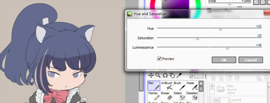
now make the shadow in any place or direction you want !! after you are done add new layer under the shadow layer (this usually above the shadow layer but since it is multiplity i prefer under tho it don’t make any huge different !! just a preference)
pick a light color like light red or blue or purple i chose red because the hair is dark and i want something light !!
make the layer mode (Lumi&Shade)
then go to the brushes sitting and change this sittings
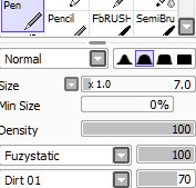
I usually make this brush small because with this settings it is better to be smallest !! it make it like a thread of lights or something ;w;

Here when you are done !! if you think it is dark or need more like you know where to go and change the colors
Filter
change till you get a good result as you want

now add new layer change the mode to Lumi&shade select the skin color and color the nearest parts to the face and play you want to be glowing !!
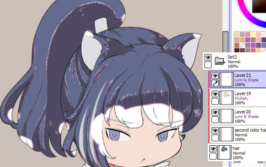
Go to the blur tool and change the setting then blur the color

if you think that too much you can clean the some parts using soft eraser
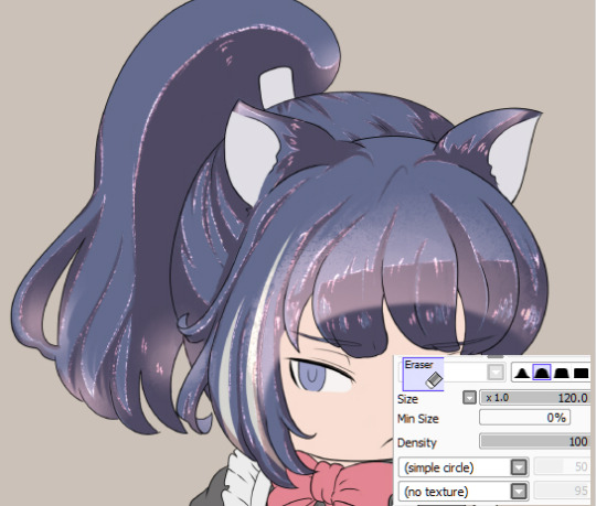
now go back to the blur tool and make smaller size and soften the edges

you can keep it this way or go and erase some parts to make some light effects like this

you can erase the way you want to make it like light reflects or something this step is pretty much depending on you
till here we are pretty much done coloring the hair you can add more light and colors if you want using the old settings
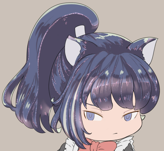
add to smallest places like those hair rolls or corners anywhere you think will fit !! use light colors like i mentioned before
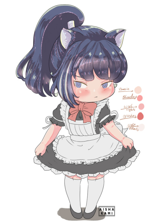
a palette of colors i used for the hair

Can you read my handwriting? ?? NO
sorry it is your problem lol
Skin colors !!
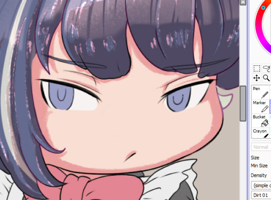
I used the same setting (for both pen and eraser) now shade places you want to be shaded
use the eraser to make small circles on the edge of the shade
like this !!

Add new layer and lighter color to add the highlights on the shadow part
I don’t have specific way to color or pick the colors !! sometimes i go with reds for the skin or change the Hue and Saturation

make a small arrow or ball to draw yourself an imaginary line of light source !! once you know where the light is coming you will know where to shade !! for me i picked very simple direcation for this drawing
-note: this is not necessary but add blushes and lighter color to the skin !!
-the more you select from canon photo the better, keep selecting colors and play with the Hue and Saturation setting till someday (not so far) you will get better understanding of how to pick your colors !! i still pick my colors but i also create my own palette and with time my palette just grow up !!
now add blushes and some light effects “you are not obligated to do this tho lol
Eyes colors’
pretty much i used the same ways to color skin !!
but here
make middle line with the shadow color and had high light color in under there !! Yellow or green are fitting so well with blue/gray or any cold colors !! I usually go with Yellows

-add new layer and color using the basic color of the eye and make it pale
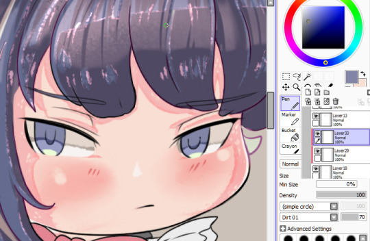
now go in a new layer with mode “Lumi&shade” and make small circles in the middle (pick orange or red or what you like the most !!”

-blur the top part only

-now i add light with soft brush
now go to the line art layer and pick white or very light purple and set the brush on this settings and add small circles to give you more eyes effects !!

now we are done with the eyes
i color the clothes the same way i do with pretty much everything else but here the palette

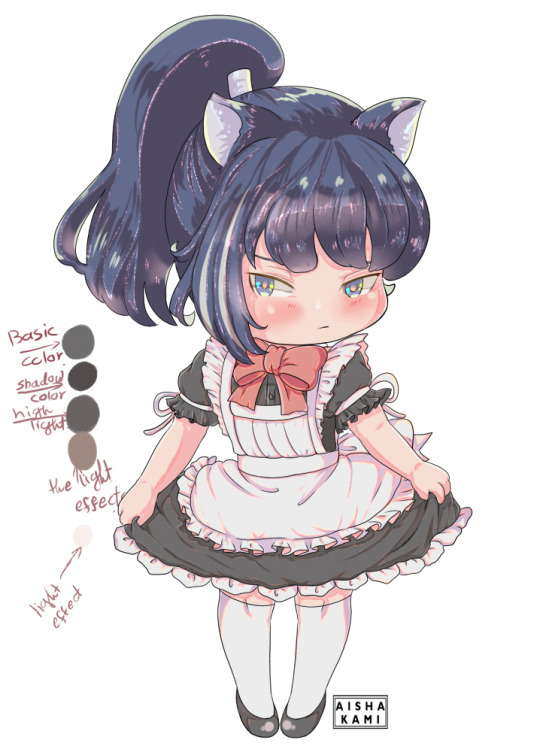
now as you can see or already knew from someone else i colored the lineart to match the colors i picked

now we are finished coloring !! yaaay
for extra tips i learned is you see when i added everything to one group? (i don’t know if you know about this but i will add it just in case you want it)
now click Right+Ctlr to make a selection

got to the selection> press on Increment to expand your selection click many times like 3-5 times
add new layer under the group and fill it with white or any color !!
now we are done ;w; I hope i helped !! if anything needs to be clear please let me know i never did tutorials before

#this style usually take like three days from me to finish#so it is okay to take your time#long post#i am not very good with explaining but i really hope this is helpful !!#okuwho#sorry for mistakes of any kind#i am not pro#i still learning#and finding new stuff#;;;
12 notes
·
View notes
Text


01/05/2022 - "Lone Wolf"
10.5 hours on this, but an additional 2 hrs on that new style coloring
I like this type of bg, it’s relatively low effort but still looks good, but ik it won’t exactly work on other types of art.
Anyway, i redid the initial coloring and lineart bc i wasnt happy w the one here - its kind of pillow shading land and the lineart is flat everywhere, even though i did the ‘pooling corners’ trick.
for the new piece i used the shale brush, but even that still kinda fell flat. i think i need to exaggerate the thicker lines more. i did it on Lumi in red then dup’d it and did the ole blur trick, jus to blend him in with the bg even more.
for coloring: i apprently did all the base colors on 1 layer, which is definitely new. 1st layer of soft shadows. just kind of brushed over the edges and some darker areas, but def a lil on the 30% side. Color burn blend mode. and then the same with light areas, kind of just lightly brushed over on Screen mode.
the hard shadows were a bit tricky, esp for the clothes, but i really love what i did for his tunic. this one is definitely on the 70% side. i really love how i did this. everything in one layer, even the hair and skin shadows. Color Burn blend mode. i also apparently did an additional layer of hard shadows for very specific details that need to be darker than the rest, like shadows directly cast by the clothes, under the chin, the ear, etc. very little details. Color Burn.
a layer for highlights on the fur, hair, and metal. and then bc the whole thing was too purple, i did a whole block of color layer with gradient areas. this was in green overlay to make the piece more blue.
i used a lot of layers to do his scars and bruises, which was p annoying.
to pull the whole piece together, i did the old whole layer of gradient color dependent on light areas, on Linear Burn.
overall i love this piece; i thought the eyes could use work to make it a bit more detailed or refined, and the brows are too large. also i think li couldve been portrayed younger but i couldnt figure out how to do that without making him too skinny or like, making his jaw too fine, losing his distinguishable face shape. so ig this is like,,, 20-22 year old li or smth? as opposed to the original idea of 17-18 yo.
i also think i could get more detailed with the props and clothes, but im not sure how to do that bc im scared of coloring them.
0 notes
Note
I adore your art! Is you don't mind me asking, how do you do that awesome texture and lightening because it's so cool and I wanna try it!
So im just letting this out here, I really suck at tutorials so yeah :] they’res that
Also, I use Sai, so if you dont use that, im guessing this is pretty much useless to you, anyways, tutorial under the cut

So here we got a nice not quality drawing of yours truly to demonstrate

This little wand dude is really good and I use it all the time for almost everything

Use it on all the white space around the drawing, and keep in mind this thing makes things a weird purple color (but its a nice color so its cool)

(I also use this for everything)

You’re gonna want to use it to color in all these weird white spots bc otherwise your drawing is gonna come out looking weird and patchy

Then, make three layers that are ON TOP of the drawing that you did, then set them to either shade, luminosity, or lumi and shade (lumi and shade is my fave rn but other things are used for other effects, for ex: shade makes things darker, luminosity makes them brighter, ect, ect)

Then go to the top of the screen and click selection, then invert, and then increment, and it should end up looking like that ^

Then you get some nice colors of your choice, and I use the default pen for this, (i just renamed it pee because thats funnier in my opinion)

Color in the side of the drawing and blend it in, now you got some spicy shading going on, then add some lines across the drawing in the same fashion (on a different layer though)

Now its time for my favorite layer, the top one >:3c


And voila, you got a pretty nice thing goin on here (also im really sorry if this cleared up absolutely nothing at all because again, i suck at this shit)
25 notes
·
View notes