#just level designer things
Explore tagged Tumblr posts
Text
Thinking about the design of The Imperial City from The Elder Scrolls: Oblivion again. I love Oblivion but it's hands-down my least favourite design of any open world RPG because a lot of its layout defies a lot of what might ordinarily be logical city layout choices when building a city.
Disclaimer: This is mostly me being petty about level design that I recognize does not matter. I realize most of this is likely just due to development constraints and player-centric design choices, and can just as easily be written off. But dammit I'm a level designer who has worked on open world games and in the projects I worked on this is all stuff that would have been flagged so I'm gunna be petty anyway!
So let's talk about the paths into the city.
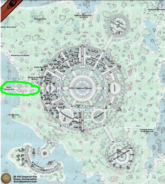
Well....it's the capital of all of Tamriel, it's on an island, and there's just one road leading in and out of it. That road leads over a bridge. Probably the easiest city to siege ever, just capture the bridge and you win. Ezpz.
But also the ROAD itself!!! My god!!!
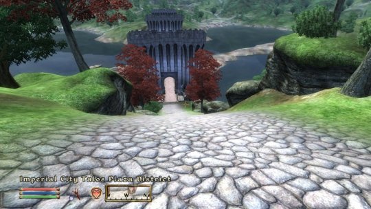
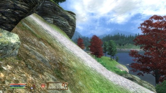
Literally can you imagine all land-bound trade and transport having to navigate down this single 75 degree road to get in and out of the largest city (and capital!) of all of Tamriel. Horses, creatures notoriously good at navigating treacherous vertical inclines.
Madness!!!!!!
The harbour is also incredibly small for a capital. You'd think with one ski-hill road leading to the city they'd use the harbour more, but this thing fits two (2) ships max, and there's almost no room to navigate it them in there.
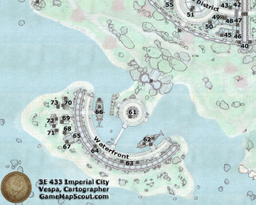
The logical layout would dictate that all goods in the city are stored in the harbour and transported into the city for sale, or brought to market from out of city. Well...
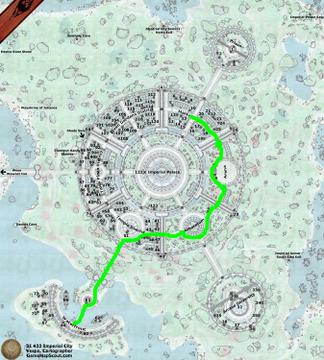
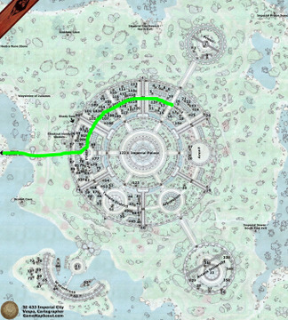
Both of those paths necessitate going to the exact opposite corner of the city in order to deliver the goods to where the trade district is! The absolute furthest possible route!
What's more is that these routes lead through multiple flights of stairs! Good luck driving that wagon full of produce to its destination!
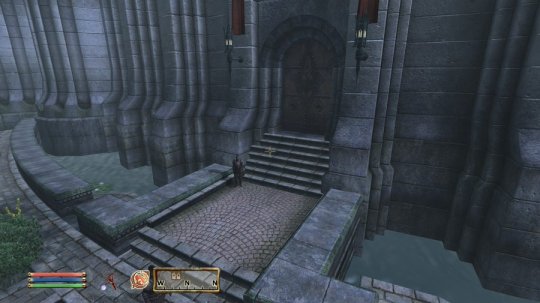
Meanwhile if you trace a path leading from the the Harbour to the ocean you'll discover that the only river that leads to the ocean is shallow enough for a person to walk over, meaning sea liners can't pass through it.
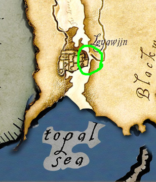
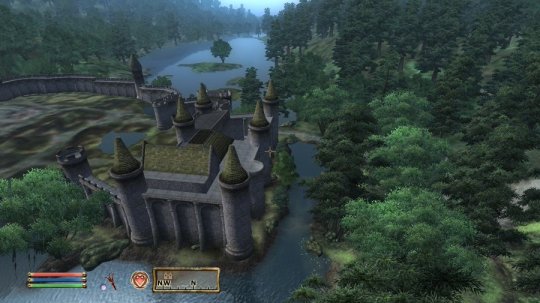
So uh yeah... it's logistically impossible to sail a boat from the Imperial City (the capital of Tamriel) to the ocean around Tamriel and vice-versa, making the fact that it has a harbour at all makes little sense. No wonder there's only ever two ships docked there!
#just level designer things#if I made this at my old job I'd have gotten a stern talking to#game development#gamedev#game dev#gamedevelopment#level design#oblivion#the elder scrolls#tes#tes oblivion#bethesda
532 notes
·
View notes
Text
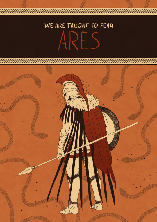
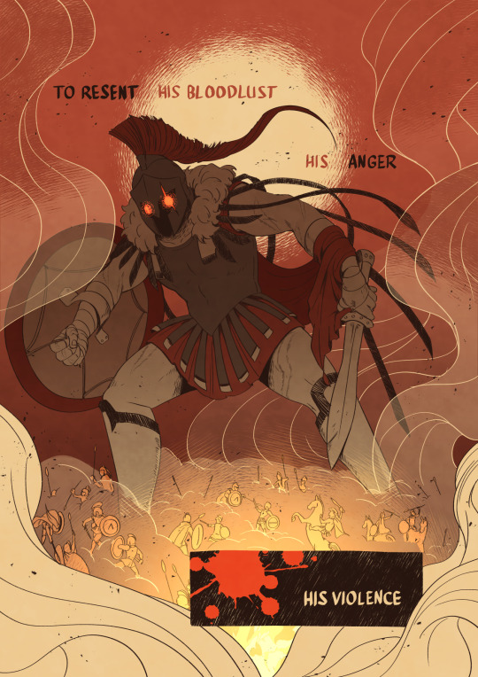
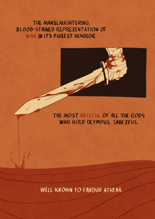
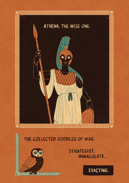
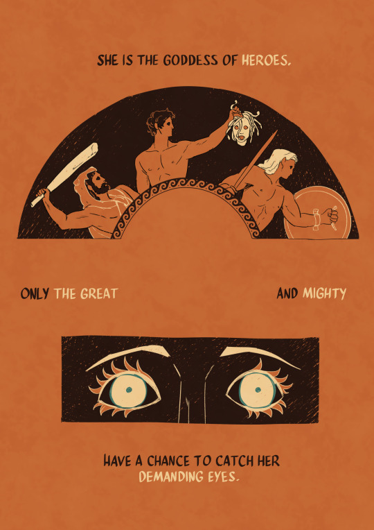
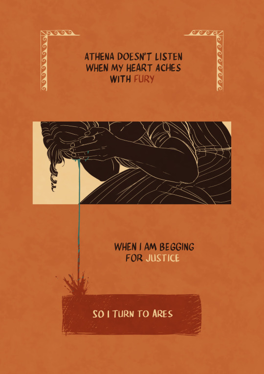
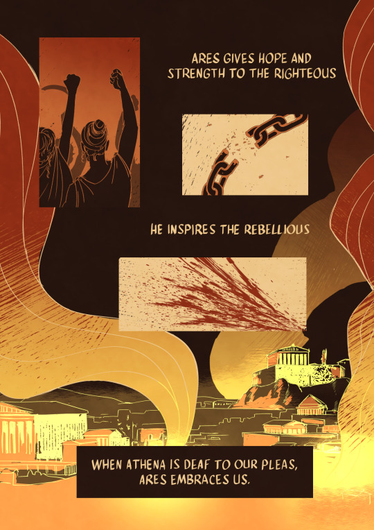
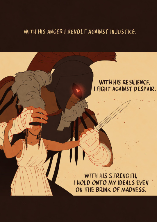
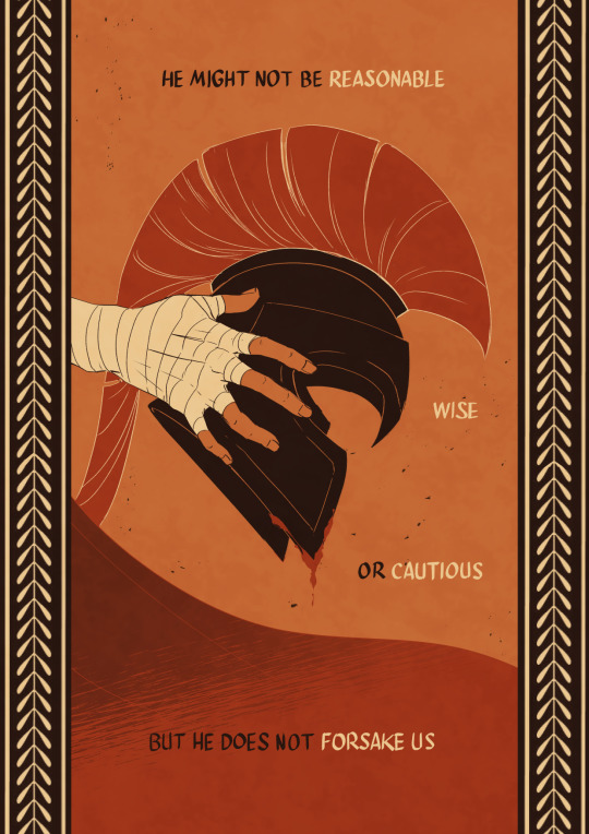
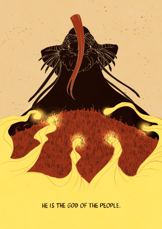
I turn to Ares.
Thanks to Tyler Miles Lockett who allowed me to draw inspiration from his ARES piece for page 2! Look at his etsy page it's SICK
⚔️ If you want to read some queer retelling of arturian legends have a look at my webtoon
#greek mythology#ares#athena#greek gods#dont get me wrong it aint athena slander but it sure is ares praise#on some level at least#man justly accused of bad things deserves some mid praise more at 11#thank you romi for helping me with words though i duly noted you insisted on ares not being cautious rather than him not being careful#romi be like “i want him to care” and honestly good you should say it#also EPIC led to this and i just..... i want to draw some animatics man i just need infinite time now#my long lost love for greek myths just will never stop coming and they dont stop coming and they dont stop coming#i want some vulture design in here for ares but not sure about this one#kochei doodles
99K notes
·
View notes
Text
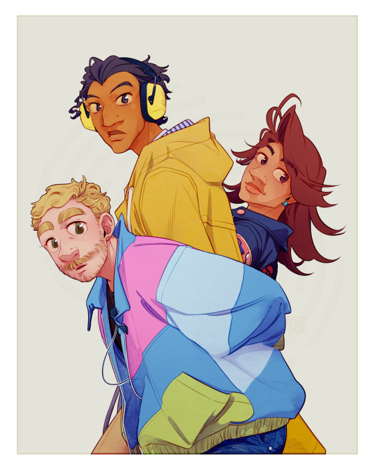
podcast people in my phone
#sherlock and co#s&co#sherlock holmes#john watson#mariana ametxazurra#been messin around with this piece for like over a week now. I think this is just mostly to have a general pointer of their design in my#''proper'' style. literally named this file cover.png in my folders lmao#I feel like it isnt as candycore as the chibi version. but its still at a level of colors Im happy with. thats good for me#love giving john watson the default medium-size v-neck when canonically he wears like exclusively merch tees#(maybe its under the v-neck lets all believe that)#anyways. things are moving! lotsa stuff I cant show anyone but my coconspirators... but Im sitting on. Some stuff#gettin there with work... settin up stuff... being insane in march.... da whole package#gonna be having. a real interesting week soon. we'll see what comes of it!#but for now. I sleep. have a good night lads! look both ways before crossing the street
2K notes
·
View notes
Note
Hey! I love your art ^^
Been meaning to ask, is there a reason for the slight "redesign" for game Vanessa? Or did she just feel like putting lipstick on after becoming Vanny?
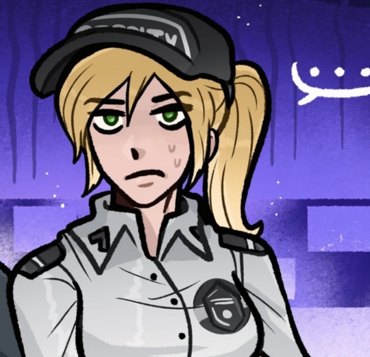

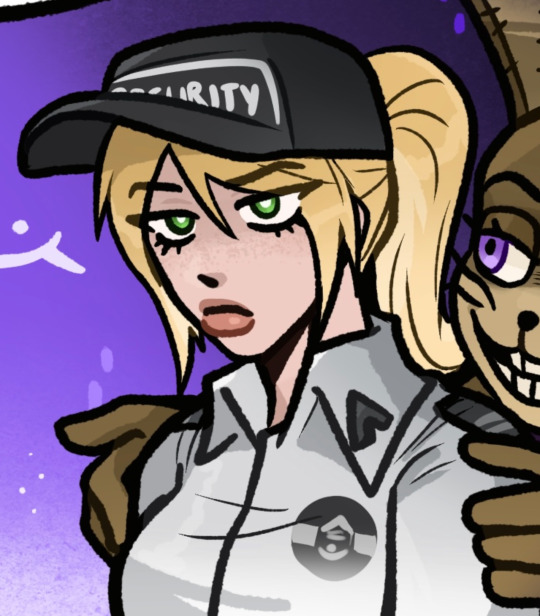
The slight redesign was to differ her more from movie Vanessa
Similar to how Mike and Michael look pretty different, I wanted a similar thing for Vanessa and Vanny, she’s more or less the same but easier to immediately tell the difference
#ask reply#BTW I like the idea she just liked putting on lipstick after being vanny#its cute#the lipstick was based off notes on her in the AR game like dyeing her hair etc#I also wanted to add things I forgot like her freckles#I’m still figuring out a good balance for her design but it’ll level out eventually#TYSM BTW! I’m glad you like my art 💜
2K notes
·
View notes
Text
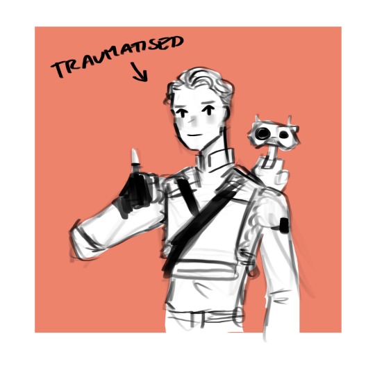
hands you all this cal to announce i’ve FINALLY finished fallen order (by which i mean i finally picked it up again after those couple hours i played a few months ago and then finished the whole game in 2 days lol)
#cal kestis#bd 1#jedi fallen order#jfo#star wars#my doods#anyway HOLY CRAP YOU MEAN STAR WARS WAS ALLOWED TO BE GOOD BEFORE ANDOR (2022-)??????????????? AND I DIDNT KNOW??#i love cal i loved the story i love how cinematic and amazing it looked good lord#i don't think i've ever played a game which gets such an amazing sense of scale across#like all the great temples or fallen starships were just Wow#like bracca ALONE gobsmacked me. seeing all these things i grew up watching in tcw as wreckage was like Ough Wow and THEY FELT SO HUGE#im just. wow!!#and THAT FINAL MISSION HUH. MOST FEAR INSPIRING VIDEOGAME ENCOUNTER EVER#my only criticisms are the awkward navigation/ level design in some areas and maybe the ending felt a bit lackluster somehow#i say somehow bc i dont get how lol#the reason im making this post past midnight is bc i got off work at 10pm and then immediately had to finish it LOL#anyway big heart emojis im very happy i sat down and actually played it finally#i want jedi survivor now LOL unfortunately it costs money and i have a rule i never buy games in release year lol#tbh i never rlly buy games til they're £20 or less
2K notes
·
View notes
Text
Something I think is cute is that - y’know how Raph’s eyes are more on the yellow side?
Well, you know who also has slightly yellowed eyes? Donnie.
While Raph’s are more yellow, I think it’s cute that this is something that they share and I don’t see it pointed out too often?
It’s also something they both share with Draxum and Splinter’s current form (though again, these two have much more yellow sclera than the boys do.)
But yeah, I like that there’s this little detail that ties Raph and Donnie together, even if it’s small.
#rottmnt#rise of the teenage mutant ninja turtles#rottmnt raph#rottmnt donnie#rise donnie#rise raph#there are a few screenshots that look like Donnie’s eyes were colored more white like Leo and Mikey#but the vast majority has his eyes and teeth yellowed a little#not quite to Raph’s level but enough to be noticeable especially when you contrast it to Mikey Leo and April#I see a lot of art on here not giving Donnie his yellowed sclera and it makes me sad a little#bc Mikey and Leo have soooo many things tying them together design wise (mainly their shells)-#so its nice to keep the things tying Raph and Donnie together as well (their sclera + how THEIR shells are both basically just green)#(+ how even when Donnie makes his battleshells he keeps them one color - just like Raph’s shell)#I’m looking too hard into this but Brains and Brawn is a Good Duo#you could also - considering the show’s theme of giving the less ‘human’ characters more yellowed sclera- consider this design decision-#-a way to show that Mikey and Leo are species of turtles more acclimated to humans since their breeds are very often pets (esp Leo)#whereas Raph and Donnie are species that are more commonly just left in the wild#idk I just think it’s an interesting design decision tbh#esp considering you can see this human acclimation from the very start with the boys as well#with how readily Mikey and Leo interact with Splinter#whereas Raph bites and Donnie is completely disinterested#i like when their species has an effect on their characters tbh#like how Leo being the Face Man makes perfect sense since Red Eared Sliders are the most popular pet turtle BECAUSE they’re pretty-#-and better with people than most other species#Mikey too being so gung-ho about people makes sense for these same reasons#as ornate box turtles as well are very popular pet turtles#idk they’re just fun I love these guys#also- I love when people give Raph a huge tail it’s so cute
275 notes
·
View notes
Text
Controversial opinion: Vox's design sucks
...
Because he should be wearing a NORMAL TIE. not a BOWTIE. It would:
Add to his businessman persona
Give a place for that wifi symbol to go that isn't awkward
Be a good opposing design to Alastor's bowtie
Potentially give the idea he's moved away (or attempting to) from Alastor. Especially if they had it that Vox USED to wear a bowtie.
Also, we joke about it but seriously, why does everyone have a bowtie when it doesn't make sense for some characters like Husk--
I rest my case your honors.
...
Rebuttle:
Vox having the bowtie could signify him latching onto his past with Alastor and not being able to move on
#DAMMIT. FOILED BY MYSELF ONCE AGAIN#Oh don't mind me just having a two way debate with myself#We all know the bowtie was just cuz Viv happens to like that on her characters#which we all have a sort of favorite go to design element so can't blame her#(even if on a professional level maybe that shouldn't be the case but I digress. She's fair to live her bowtie dreams)#But think of the SYMBOLISM that isn't actually there#Which fair. This is 100% one of those things fans might look more into than the creator and the creator is justified not thinking it#Bowties are deep and complex now#Vox like a cat or dog not wanting to get clothes put on them when Velvette tries to put him in a normal ass tie is a fun visual at least#Vel: “Vox if you want a more professional look you need to get rid of the bowtie.”#Vox: “No. I refuse. I must prove I wear a bowtie better than Alastor.”#celtrist#cel rambles#hazbin hotel#hellaverse#hazbin hotel design#hazbin hotel critique#hazbin vox#hazbin hotel vox#vox the tv demon
145 notes
·
View notes
Text


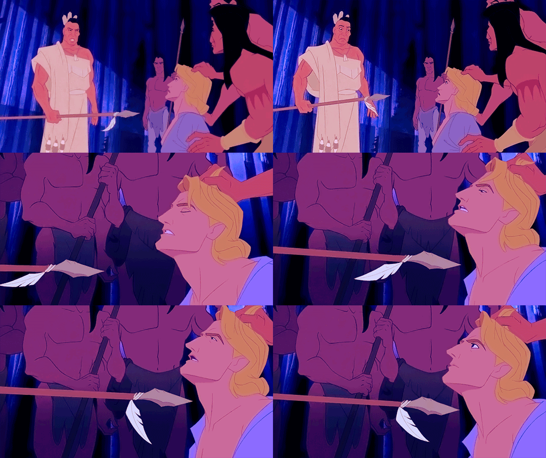


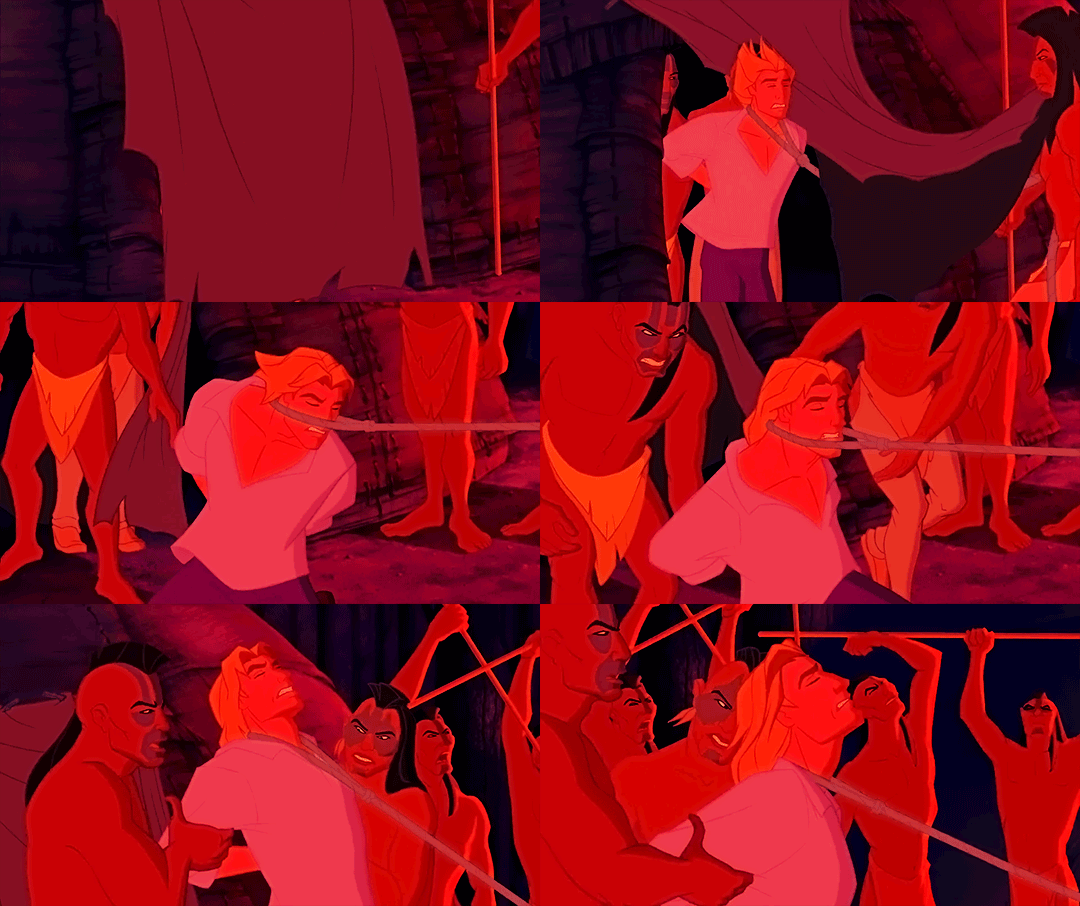


Pocahontas (1995) is a good movie, actually, btw
#yesss. yeesssss. torture the blond man some more.#pocahontasedit#fyeahpocahontas#disneyedit#disneyfeverdaily#disney animation#disneygif#pocahontasgif#disney's pocahontas#disney pocahontas#disney john smith#john smith#pocahontas x john smith#(kinda)#girl's got her priorities right tho look at her grabbing him ass-first in that last gif#most important thing to check#queso*gif#queso*edit#for real tho how do people not love this look at them yanking this twunk around by neck and pulling his hair and everything#and him just taking it like a slut. look: he's got almost a whole tiddy out 80% of the time#he's such a damsel i mean lookit this shit#john pomeroy was doing the Most here and we don't appreciate him enough for it#for real: on an animation level they were doing some insane shit with john's face in this movie#this whole was a Bitch to animate according to the directors and it's partly due to these character designs#john and pocahontas especially#and no wonder: fucking hell there's a lot going on here!#pocahontas (1995)
133 notes
·
View notes
Text

woe mundane monopoly headcanons be upon ye
follow for more of modern au hua cheng’s outfits
#mostly completed this a month ago and then procrastinated the final touches until now lmao#its. so low quality. i also switched to a new brush for lineart and now this is kinda 🥴#i wanted to draw my modern au designs :3#fun facts:#hua cheng has a glass eye but he still covers it with his bangs#modern HC shops at prada btw#MQ is described as looking more like a civil god than a martial one so he has a goth academia type thing going on#FX wears sports team shirts everywhere sorry#mu qing’s mug has 3 different level markers#“fuck off” “i can hear you i just dont care” and “ok what were you saying?”#i think mu qing would hate that sort of mug but feng xin and xie lian keep giving them to him#apologies to anyone who doesnt know the rules of monopoly this is incomprehensible without previous knowledge#so: do i believe these four would actually voluntarily hang out post canon#yes actually. fxmq and hua cheng mutually tolerate each other for xie lians sake#imo after like a LONG time hc could actually be friendly towards fx (in book 2 fx admits how courageous hong hong’er is) or mq (bitch2bitch#but i dont think thatll happen there is way too much resentment that goes both ways#remember that theyve canonically fought multiple times ‼️#tgcf#art#tian guan ci fu#天官赐福#heaven official’s blessing#hualian#hua cheng#xie lian#fengqing#feng xin#mu qing#xianle trio#my art
687 notes
·
View notes
Text
seems to me like zac oyama is repping some experiences of asian american schoolkids, defined by such hits like 'regulate your anger,' 'communicate clearer to deliberately misunderstanding assholes,' and 'perpetual sense of unbelonging in both the american part and the asian part of your life.'
#dimension 20#fantasy high#fhjy#zac oyama#gorgug thistlespring#great stuff! I can't watch that shit for entertainment#the asian american strugglebus... feeling like an alien hahahahahahahahahahahahahaahha#this is just surface level personal experience ofc like maybe I had a very specific version of childhood#oh yeah did i mention the Designated Role you get in school lol that's fun for literally nobody who ever attended school schools suck#but education is good! try not to drop out or at least get geds they help college is a good thing check out crash course on youtube#panic rambling in the tags tonite#my thoughts#talking about my asian-ness makes me so nervous my westernized brain is yelling 'shut up! shut up!'#I enjoy gorgug being rage-ful as a treat#asian things
269 notes
·
View notes
Text
Netmarble can have my money idc just PLEASE LET ME HAVE A WALLPAPER OF HIM


#solo leveling ragnarok#solo leveling#solo leveling arise#sung jinwoo#solo leveling manhwa#only i level up#istg the game's panel drawings are the things that are keeping me sane but also like making me go more insane#the designs are so good i beg of you just please give me your 2d drawings netmarble please#NETMARBLEEEE PLACE THEM IN THE GALLERY WEBSITE#AND MY LIFE. IS YOURS
126 notes
·
View notes
Text
Fernando Alonso & His Relationship With Cards
I'm sure we're all familar with the cards on the back of Fernando's Vegas GP helmet by now, but did you know his relationship with cards goes a lot deeper?
I. Magic Tricks
You've probably seen or heard someone at least mention Fernando's propensity for card tricks. As far as I can tell he was doing them(publically) as far back as 2003 all the way to as recently as 2018. Even once performing a card trick, with a condom and a teddy bear(!??!?!??!!), in front of Valentino Rossi who said "How was that possible?"(x)
But how did this start? According to James Allen, "Fernando admits to having been heavily influenced by his grandfather, a mercurial figure, who taught him magic and card tricks, still one of his passions away from the race track."(x) And I'm not sure the validity of this one, because I couldn't find an actual source, but apparently he once said: "My parents are responsible for the two things I like doing most - driving and magic tricks. They bought me my first go-kart and a magician's kit."
In several interviews he described it as his hobby off track, and that he loved learning new tricks and surprising others in the garage with them! So clearly cards are pretty important to him both as a hobby but also to who he is as a person since they've been with him just as long as racing has.
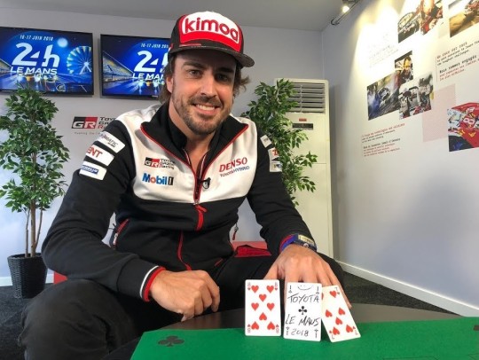
II. Card Symbolism in His Helmets
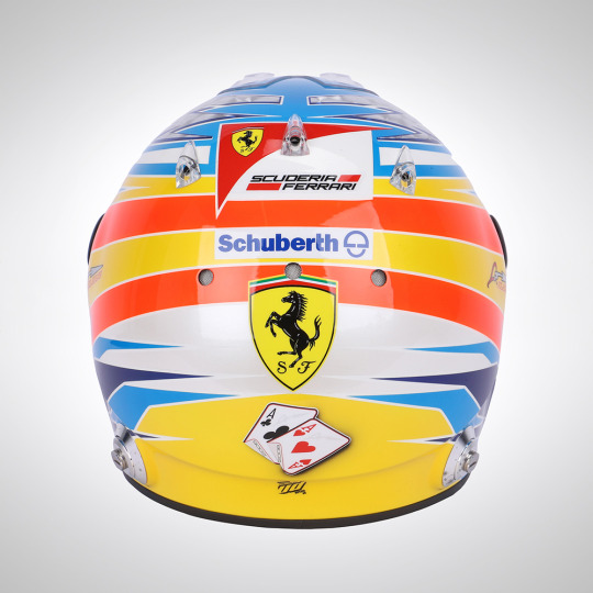
This is the reason I originally made this post, but I thought I should also explain the origins of his card fascination first. As I said, we probably all remember the cards on the back of his helmet in Vegas, but did you know that wasn't the first time he had cards on the back of his helmet?
From 2008-2013, he used to have a pair of cards on the back of his helmets. The symbolisms of the cards themselves as well as the evolution of their design is really fascinating to me! Even more so with the recent development of the card choice in 2023.
Fernando said he wanted to reference his two titles in some way on the back of his helmet and after his friend sent him several ideas, he decided on having two cards(an ace of clubs and an ace of hearts, sometimes pictured with 05 and 06 on them as well), saying: "I picked the cloverleaf [the ace of clubs - Ed] to give me luck, but the only pity is that it doesn't have four leaves!"(X)
2008.


Here's the very first appearance of the cards! They're displayed flat, with the 05 and 06 clearly visible
2009.

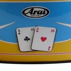
Very similar to 2008, but with a slightly different design, and they're maybe a bit more straight with less shadow?
2010.

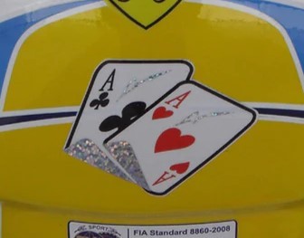
This is the first major change! I was sad they didn't have the years on them anymore, but then I realized they're sparkly to match with his signature lightning bolts on the top of the helmet!!
2011.
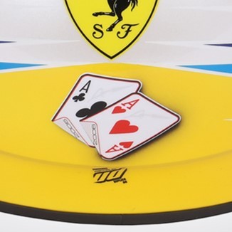
Honestly I'm still somewhat unsure if this is the actual 2011 helmet? It's pretty difficult to find clear photos of the back of helmets from older seasons. It's easiest to find them on replica sites or auction sites so I'm not 100%? But anyways, I like that this has the championship years on the underside of the cards
2012.
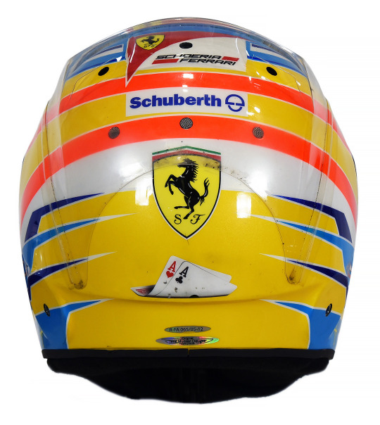

This is when I started getting weirdly emotional about the helmets. Do you see how they've progressed from being a centerpoint to being curled up and sad at the bottom of the helmet? Not listing the year anymore??
2013.
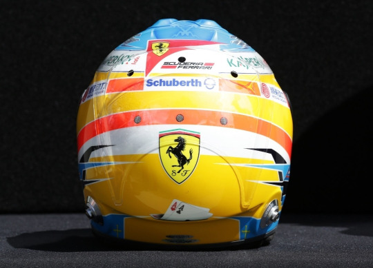
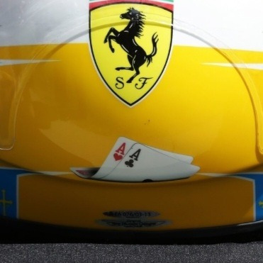
Same thoughts as 2012. And after this season, they cease to exist (just like his ferrari chair in the garage, WOAH CALLBACK), until cards make a reeappearance in his Vegas helmet, albeit in a different form
2013 Monaco(Honorable Mention):
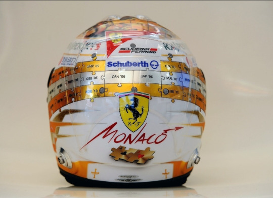
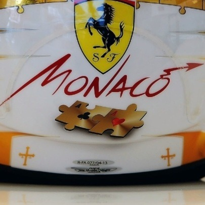
For some reason 2013 helmets were easier to find proper pictures of, so I happened to witness this absolute beauty. The creativity of this helmet genuinely blows me away??? Wanting to keep the card motif, but making sure to incorporate it into the rest of the puzzle piece design?? Mwah! There was another special 2013 helmet but they didn't change the cards at all so I really applaud this one
2023 Las Vegas(The Return of The King):
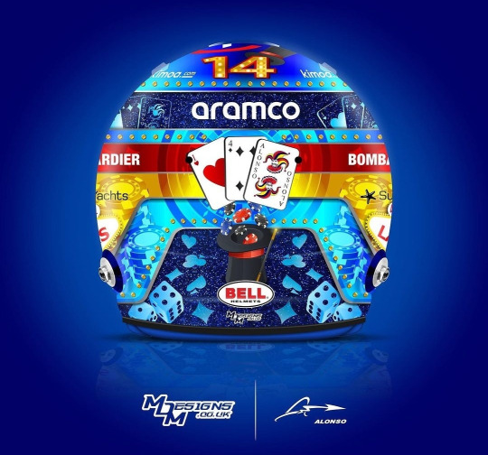
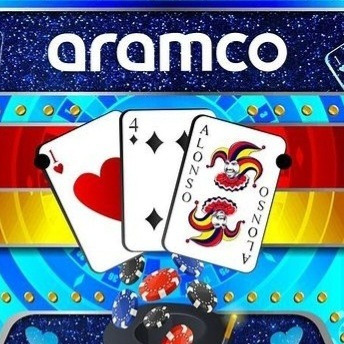
The magnificent return! But look! The cards are different cards! Instead of being two aces, it's now an ace of hearts, a four of hearts(his driver number of course!) and, the, now iconic, representation of himself as a Joker. I literally could not believe my eyes when this helmet was released and I saw the Joker card, what a fucking silly old man....I really wonder if he felt nostalgic having cards on his helmet again or if he didn't think about it all and was just like, "ah cards because Vegas!!!"
III. Why Does This Matter?
*The rest of the post was factual, this is moreso my personal thoughts on the symbolism of the cards/designs
This post spawned from me recently watching the 2010 Bahrain gp and noticing "hey wait a minute...are those CARDS ON THE BACK OF HIS HELMET!?" It's a really tiny detail that's unfortunately covered up by the HANS device pretty much whenever he's wearing the helmet, so it's really difficult to spot! But I became fascinated with the fact that he had cards on his helmet before that recent helmet, and now here we are!
There's something to me about how the design of the cards evolves over the course of six seasons from the cards being front and center to being smaller, more folded up and closer to the bottom of the helmet. As I said, the 2012-2013 ones genuinely made me depressed because it feels, symbolically, like his hopes for getting another Ace are becoming more and more unlikely and falling away until they eventually fall falt and fade away entirely after 2013 and disappear for basically a decade.
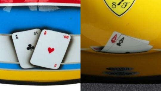
But when they return? They're not the same cards! Instead of representing Fernando's championships, they now represent him as a person, displaying his driver number and his persona of being a Joker!! Though I do think it's interesting he happened to keep the Ace of Hearts, even though he talked more about the Ace of Clubs before. I'm not sure it's actually this deep in reality, but I like to think that it's him not letting his championships(and the lack thereof) define him, but rather letting who he is as a person shine and be the centerpoint instead! But on a sadder note, as @suzuki-ecstar said to me, maybe the Aces aren't there anymore because he's lost all hope for a chance at a third Ace entirely :(

#yes its finals week and im up to my eyes in coursework but instead decided to spend like 5 hours researching and writing this post#nah bcs i actually genuinely put more work into this then I think I have all semester dsfjdskjg#that thing about him using a condom and teddy bear in a magic trick genuinely had me crying with laugher. actual tears rolling down my face#<- HOW!?!? WHAT WAS THE TRICK?? its literally inconceivable to me what he did. oh if only there were pics UGH#anyways!! this post was a lot of fun to make!! i really really love the symbolism and design of helmets so this was a rly fun project#and i also went down a lot of rabbitholes while make this and saw many very weird articles from yore#i feel like i make an equal amnt of deranged posts abt seb and nando but i dont know why nando is gifted w all my well researched projects#<- i.e. chair post. that was the same level of research as this one but at least this one i could find actual sources about....#idk theres smth about the extremely long history of nando's history that evokes research posts like this KLAJSLSKDJ#theres just so much that i dont think I ever really see people discussing! so i must create.#haha what was that joke tag i wanted to make abt my researched posts? I think:#normal posts that catie normally makes in a normal fashion#<- one day ill go back and actually tag posts w that. bcs the amtn of research compared to my actual schoolwork is so unwell#fernando alonso#fa14#f1#formula 1#catie.rambling.txt#we do a little bit of f1
296 notes
·
View notes
Text

#not art (yet!!!!)#preddy good kristen I got goin on in this piece#for some reason my brain isnt letting me do this one. been stalling on it for a good few days. but I intend to break thru it#I need to put this on paper at least once#(its space sweepers. I think it would be funny if the kids are in that universe too but theyre just like off to the side doing their own#thing pretty much unrelated to the main plot. theyre delivery people. theyre all still teens. they get up to shenanigans and then#one day they look up like huh the guy who founded eden fucking died?? when#kristen specifically I got a decent amount hashed out in my brain somehow. she's like an engineered messiah with a grafted engine#along her upper body skeleton that'd let her spontaneously rearrange objects on a molecular level#so she can theoretically knit wounds or cure diseases by thinking abt it very hard#sadly the engine of course takes enormous amount of energy to power. so most of the time in practice she just#has a half-metal skeleton that doesn't do anything. so she's buff as shit on the upper side and one of her punches can break your neck#but her mobility is limited and she sprains her ankles like every other week. her shins have broken like a few times#I genuinely love the way her shoes n braces look in this one its very fun#there are a lot of choices I made in this one that are so fun and also just like. a result of putting them in space sweepers#and thinking to myself here and there hey this would be cool if it harkens back to their canon designs#not riz tho other than being human he is fully exactly like how he looks in canon. hes just like that#hes the navigator and he charts their courses by hand with a school calculator#(also technically their legal counselor since he's sorta responsible for not putting them in traffic control's hands)#drawing this does make me realise a lot of these dynamics are really fun lol. idk if Im gonna ever do anything like proper for this but#at the very least if I draw this the idea will be out there)
61 notes
·
View notes
Text
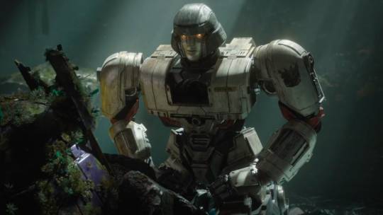
TF One D-16
#poll#maccadam#transformers#smash or pass#request#d-16#tf one#look. listen to me. i want the movie to be good. i want it to be good so badly.#but i simply do not trust it. its giving marvel movie and that has me Incredibly Fuckin Worried#because i do not want this franchise to turn into generic safe crowd pleaser action comedy allergic to genuine emotion generator no. 6483754#i do not want cliche heavy low effort lowest common denominator movie afraid to do anything even slightly weird beyond surface level#like. look. as much as i dunk on bayverse. as much as i voice my distaste for the designs and everything micheal bay has ever done#i respect the hell out of them for letting those robots be fucked up aliens#with weird nasty unfamiliar biology#and for having intense and serious and deathly somber moments#even if they butcher the characterization of some of the bots#cough cough give me your face ill kill them all optimus#im also not crazy about it looking like optimus and megatron come from the same place in the bottom of society#its so much more compelling for megs to come from the very bottom and be hyperaware of how bad everything is#whole orion has more of an everyman position. a cushy library job. not afforded luxuries but not rotting at the bottom#because then they learn from each other. orion piecing together hiw bad things get while megs picks up how in the dark the mid caste is#also genuinely truly if i have to hear bumblebee say 'well that just happened' im walking through the space bridge into a vacuum#welp. that turned into an essay. dont mind me being a hater 💖
121 notes
·
View notes
Text
like I'm not against natlan having a modern aesthetic however it does feel like they went from 0-100 with mavuika's motorcycle. like it's doing too much ya know. what is all this nonsense. we got beating up shit with motorcycles before kaeya's entire god damn calvary
#they should have leaned way more into steampunk/machinery for character designs in fontaine#missed opportunity and i think it would have made the transition to natlan way less jarring#genshin leaks#0.txt#chasca's gun was one thing but this is on another level lowkey it reminds me of that new pokemon game where you ride the motercycle pokemon#or whatever i didnt play it#and i guess its not that new anymore#it doesnt help that mavuika is the most boring 1-dimensional archon we've had <- sorry im a hater#it just feeds more into how it feels like they wanted to make this character sooooo fucking cool#but it ends up feeling like a lot of glitter without substance. or however that saying goes#spectacle without substance? idk you know what i mean
48 notes
·
View notes
Text


oc posting
#undescribed#bonk.png#great god grove#ggg#first literally only exists bc i saw the og image thought post game patty but then realized that i dont think she'd be on good terms with#capochin or (redacted so i dont have to tag spoilers) like that immediately post game so instead ellie in there#second thing is still a work in progress idk if im 100% settled with this design for them very least i need to refine it more to the style#but ive been stewing in like a fake level for reverie but idk if i'll ever do anything more than what ive written#(as in like hand gestures n outlining what happens writing) bc id need to redesign some of the ocs i reworked into it#design notes tho the little heart thing is from an image i saw of an old timey boiler n i thought the little pipes ontop were cute#n heart shape adjacent the fake level takes place instead a hotel n their design is meant to be hiker adjacent#bc hiking is something that also requires safety knowledge (debating whether to give them a little backpack or not)#im still drawing rn just wanted to throw these out
19 notes
·
View notes