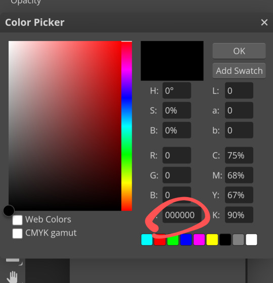
#ive always just used a gradient
Explore tagged Tumblr posts
Visit Tumblr Blog
Explore Tumblr blogs with no restrictions, modern design and the best experience.
Last Seen Tumblr Blogs


Fun Fact
The Tumblr office adopted Tommy, an 11-year-old Pomeranian.
Text


still thinking about it so heres a bunch of stuff
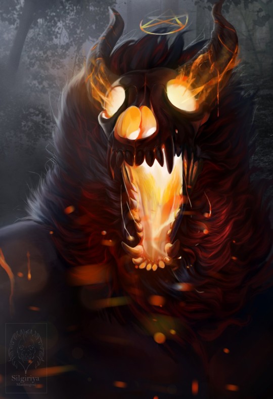
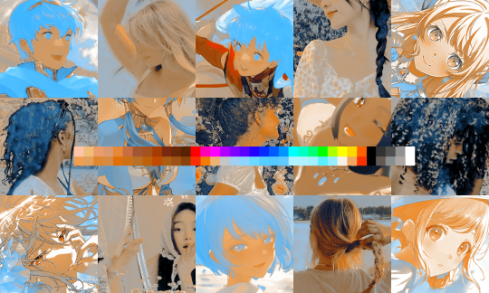
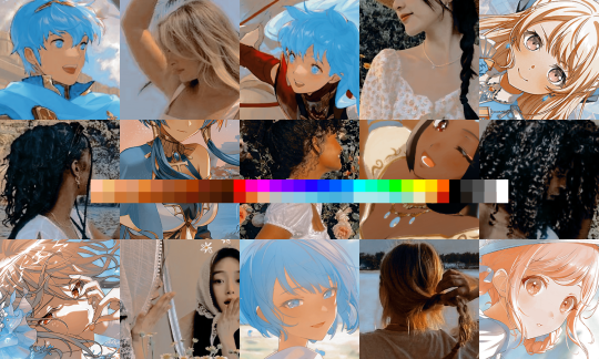
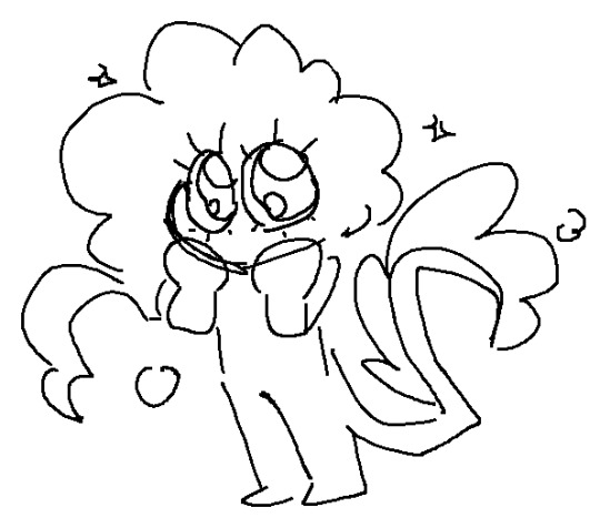
#like everything's colors are placeholders i never learned color theory#like i know “use colors next to eachother or directly opposite on the color wheel” but like#the way everyone describes it makes me feel like theres more to it#and im just too stupid to comprehend it#still like lineless/whatever the rw artstyle is#gradient tool my beloved. i need to mess with it more often#alice n beau live in jcjs superstructure cause its filled with free food (his brain) and a bunch of things to experiment with (his organs)#ive attempted to redesign abs like twelve different times now#i wonder how long this attempt will last before i hate it again#always caught between wanting to stylize to hell and back and wanting to be accurate to the source material#abs is supposed to be like a Really Really Early iterator#so she doesnt have tone modulation or the ability to express much facially and barely looks humanoid under the cloak#which i didnt draw because i couldnt settle on a Look for it#and in her single minded focus to annihilate jcj shes been neglecting herself to explain the motor function errors and also her can explodi#g#oh right normal tags#art#murder drones#rain world#i should invent a tag for this but i dunno what to call it#id love to gossip about all the stuff ive thought up for this au thing but 1. nobody cares 2. i cant talk for that long and 3.#i havent written like half of it down#if i had the confidence to even attempt writing i'd totally do an ao3 fic about this#hi living shifting oil guy/girl/thing i know you're gonna be like the only person to read this far#oh uhh#body horror#tw body horror#i think thats how you do it#probably should've added those first. oops
95 notes
·
View notes
Text
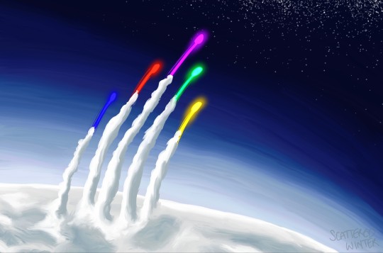
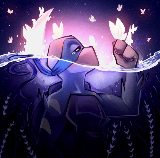
defenders of the universe or whatever
inspired by this and photos of spacecraft leaving earth's atmosphere
#winter's art#RARE ARTIST W I AM SUPER SUPER SUPER SUPER HAPPY WITH HOW THIS LOOKS#ive spent like 2 years looking at rye's green lantern art and feeling inspired by it but i only just now did something about it LMAO#rye if u see this u gotta know im always a HUGE fan of ur work and that piece in particular lives in my head at all times <3333333#anyway i got to use all my favorite brushes on this one <3333 i LOOOOVE the glowy ones theyre so fun to play with#and i had a lot of fun shading the clouds and the gradient in the bg#I LOVE PAINTING SPACE ITS MY FAVORITE THING EVER IN THE WHOLE WORLD RAHHHH RAHH RAHH#voltron#voltron legendary defender#takashi shirogane#keith kogane#lance mcclain#hunk garrett#pidge holt#vld
114 notes
·
View notes
Note
i love ur expressions so much!!!!! Is it alr if I ask for u to share ur drawing process, if u don’t mind!! If you’d rather not that’s fine too :333
I can try!
now this does assume I have a consistent drawing process which I don’t, but ill share what I do most often?
So first of course I have an idea
Then I do some sketchies to figure out what exactly I want the pose to be. I dont always do this except when the pose is tricky and/or im just not being lazy that day
Then I go through my sketching and refining process:
I usually do two or three passes and I try and flip it at least once throughout, to help make sure everything’s balancing. For the final lines I’ll usually make them a medium red that I then set to multiply, but if I plan on coloring the lines later i dont do that and just make them black. This is also the stage when I’m scrabbling about for reference images, here are some of the ones I used here:

I usually hunt down references after I do my initial rough sketch, so I already know what im looking for angle and shape-wise in the references. Now for coloring ill fill in the whole area I’m gonna color with a gray then start putting down flats on clipping mask layers (so they dont go outside the lines)
then for quick and dirty shading and highlights I’ll duplicate the flats, flatten them into one layer, then make them darker and bluer and generally futz with it untill ive got a good shadowed color profile down. I’ll repeat the process but making it all lighter for the highlights. Then ill take both those layers, make them masks, and start painting on the shadows and highlights over the original flats.
then the very final step is the Fussing Stage where I make a new layer or two over everything and start fixing mistakes, adding new colors, adding rim lights, messing with levels, color correcting, adding details like flowers, etc. etc.
this can take a very long time or no time at all, depending on how much effort I wanna put in.
Then I slap a background on it which is usually a solid color or a gradient because im a hack and have no idea what i’m doing and ta-daaaaaa, something kinda okay!
And that is one of the many ways I “fake it ‘till you make it” my way through art!
620 notes
·
View notes
Note
how do you approach designing characters? was wondering since i fucking love your characters and wonder what your thought process is
It depends! usually what happens is I find something randomly while scrolling that i like and build off of that. In other cases I scroll through my character design insp folder and pick up on things I like.
for example with Kaisain:
I always pick a color I want to focus on first, which for him was green. If you notice, most of my OC's have one main color besides brown that I picked to focus on. I also LOVE asymmetrical designs and in the past ive overdesigned characters so i wanted to keep it simple.
Then looking through my character inspo folder, I found these:
the first one is obvious where i pulled the inspo from. I've always liked more skull-like head designs and it was new for me.
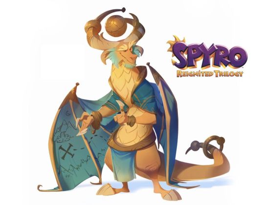
this one i thought about asymmetrical horns and remembered that guy from Spyro because im pretty sure the spyro remake had just come out recently. I also think he was the general inspiration for Kai?
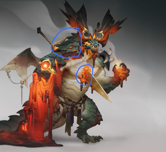
and this one i really liked the huge scales on his neck and wanted to replicate that on the shoulders. The chest part I originally was going to take entirely and have something through his chest but realized it'd be a pain to draw everytime, so i just put a large scar originally.
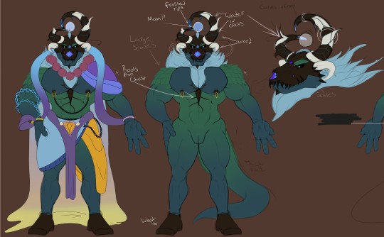
From there once i put the giant scales on his shoulders i thought they looked like large leaves so i went with a forest theme and made the horns wood, which then clashed with the skull so i made that wood also. and with the scar, i thought about the wood parts and made some roots come from it.
Other miscellaneous things:
I love things floating over my characters heads for some reason, and thus the orb
originally a moon, i made the horns freeze over near it to show a temperature drop
i added water between the horns sort of like rivers
i later added white spots to the horns to pull from the white wood horns on the sides
the clothes were just a combination of fantasy outfits i like
the fur/hair reminds me of clouds
When it comes to making refsheets I always try to keep them loose and kind of simple because they're mostly just there for people to get an idea of what i want. A good example of what i mean is the first image where i told the artist they basically had free reign just follow the refsheet as closely as they need and simplify it if they need to.
I also try to only use flat colors because it makes it more accurate later on when other artists are picking colors from it. in Kai's case specifically, i used gradients because.....i just wanted to try it lol.
but yeah if you have specific characters you want to ask about, absolutely go for it i love talking about stuff like this
78 notes
·
View notes
Text
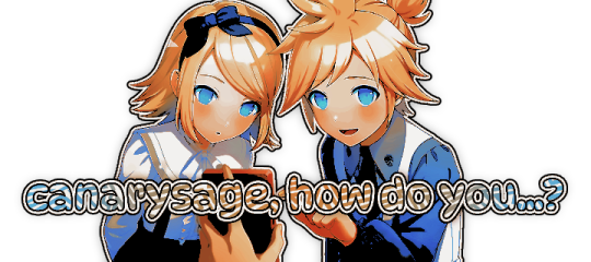
…make a psd look interesting?
aka, how to fuck up a psd no glue no borax. have you ever looked at your psd and gone, damn, this shit doesn’t fuck? happens to the best of us. here are easy ways to spice up your psds so you don’t end up with the editor equivalent of communion bread
for example purposes, i made a simplistic psd to test these methods on. they should work with most psds, but, as always, fuck around and find out on your own for best results <3
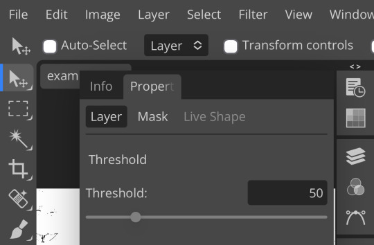
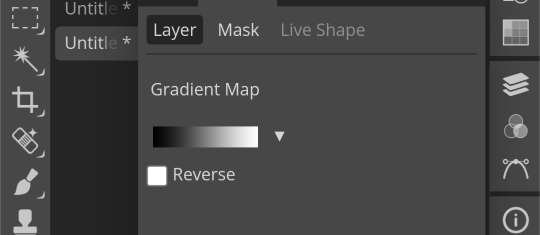
i. threshold + gradient map
this one is an easy way to add specific colors to your psds. step one: add a threshold layer, and adjust it your liking. typically, i set mine to somewhere between 60-40. if you’re making a psd to work on dark skintones, you may want to set it even lower, but if you’re working with, say, pjsk characters, you can go pretty high
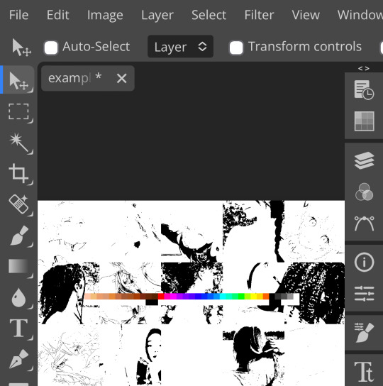
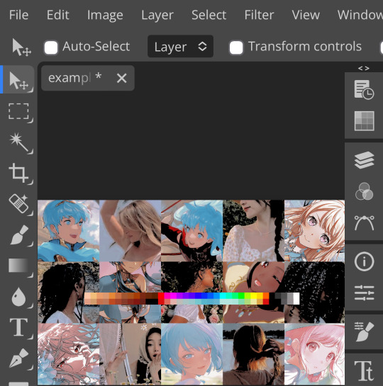
wow flashbang. you can see on my example behind that it doesn’t work super well on irl pictures, and my pjsk images don’t have threshold at all lol. next thing you want to do is set the blending mode of your threshold layer to either multiply or darken—they’re basically the same thing
(psst, if you want to know more about blending modes, check out this post!)
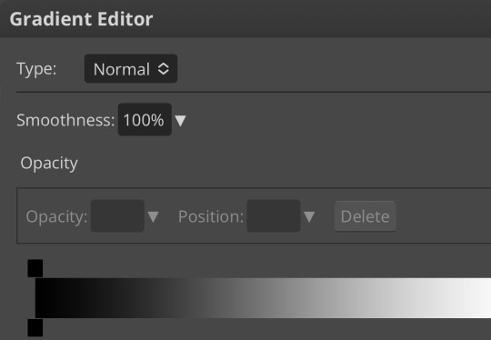
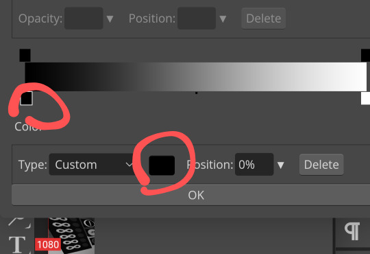
waow crunchy! but still boring right? still boring. not to worry, here’s the fun part: add a gradient map layer, tap it, and go to the slidey icon on the side, which’ll bring up a page like this:
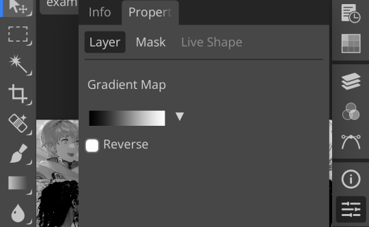
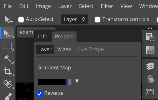
click the gradient in the middle there to edit it. once in, edit the black color to be at about 80-90%, and then change the white color to whatever you like. edit out, and tap the little square next to the text that says “reverse” which should make your gradient look more or less like this:
then change the blending mode on your gradient map to ‘screen’ which’ll axe all the black and just leave your color. now your image looks like this:
boy howdy, isn’t that fucked up! it is more interesting, but if you don’t want to be looking at that abomination, change your color in your gradient map to be darker, which’ll give you something more along the lines of:

…which is much more reasonable. this is a fun way to add color to your shadows slash lineart, and can be a quick and easy way to make a psd look less flat.
ii. noise gradient map
some of you may be thinking, but, canarysage, what the fuck is a noise gradient map? to which i reply: you’re boring. let me show you.
kinda fucked up, right? well, that’s the goal. unfortunately, there isn’t a way to directly edit a gradient map, but you can just click that little button that says ‘randomize’ a couple times until you get something you like! you can also mess with the percentages but i don’t do that because it looks weird

boy howdy, that’s weird looking. not to worry, though. once again, our best friend blending mode is going to come in handy
i typically go to soft light and set the opacity to about 20-30%, but, as with anything, feel free to mess around and do whatever you want. luminosity is also a fun setting for noise gradient maps, just make sure to crank the opacity way down for the sake of my eyes

wow, much better! you can see that the gradient map added a bit of purple coloring and a funky little texture. super cool! thank you, gradient map!
iii. channel mixer
i already have a post on channel mixer and i’m not rewriting all that so if you don’t know how channel mixer works check that shit out but the tl;dr is: ideally, all your channels should add up to 100 (including negative numbers) but that rule can be broken if it looks cool enough. capiche?
iv. color lookup
photopea has a few default color lookups that are pretty easy to use, but i have a couple of presets that i like to add if i’m feeling stuck. to make your own color lookup, open up a psd, and go to file > export color lookup
then save it and open it from your files. when you open a color lookup layer, you’ll see an arrow next to the text saying LUTs—click that and your new color lookup should be there
once you tap that, you’ll get a compressed version of your psd added to your folder. it’ll look something like this:
holy orange and blue, batman. luckily, you can apply blending modes to color lookups just like any other layer—mess around with them until it looks how you want!
waow much more reasonable! i set this one on color and about 55% opacity, but that is really dependent on what your color lookup looks like and how you want your psd to look. remember, there’s no right way to do things!
an additional note: if you want to, you can save the psd you’re working on as a color lookup instead. if it looks too simple or just isn’t turning out how you want, that’s a good way to incorporate it later :3 just follow the same steps as above!
v. no shame in starting over
if you’ve added and taken away, duplicated and removed, fucked around and found out, and your psd still isn’t how you want: it’s alright to just axe it. the edit police aren’t gonna kill you for it, i promise. if you’re worried about wanting it later, just save it as a psd and come back when your brain is refreshed ¯\_(ツ)_/¯
psd-making isn’t an exact art, so, obviously, there’s no real simple solution to making it look how you want. you just have to mess with it and see what you’ve got. these are just my methods of making my psds less blagh, but, obviously, my editing is moderately more deranged than your average editor.
…so that’s how you do it.
101 notes
·
View notes
Note
How do you choose colours for your art?
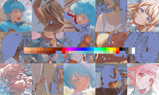
ohhh. it's always tricky for me to explain this.. im still new to all this color biz and I'm still learning. i'll do my best to explain 1. opposites the thing i really really love to do is to use the opposite of a color on a different side of a color wheel

I chose orange, and then I chose blue for the shadow because it's on the opposite side of a color wheel from it. But! Between blue and orange is a HUGE gap that might look awkward. So! I use the color between blue and orange - green! You can see it on a color wheel that theyre between each other, and you can see how I used it mainly on a head as, again, a shadow, and you can see that its neighbor is almost always blue.
It might still look awkward tho. So I chose the color between green and the color that it's the neighbor of, and I try to make them blend by using colors between them, by using strokes, dots, and so on. And by just blending You can also see that I used purple to make the shadows stronger and to make the antennas uhhh more interesting. I chose it because its next to the dark blue.. i'll talk about that later

so basically its just a rainbow i know its something something color theory and you can read about it but personally ive seen a lot of videos and articles about it and it just hasnt really ..helped. yeah i understand that i need to use opposite colors but it still was so confusing!! i look at the canvas and have no idea what to do even though i watched things !! how the hell do i do it!!! huh!! What REALLY made me understand more is that I took a work of an artist that I really love who uses opposite colors STUNNINGLY and then I looked at what colors they used there and HOW. What saturation they usually use. Why and when their blue is actually red on a color wheel, but it looks like blue and how can i do the same. What repeats in their work? Etc. It really helped me, so I advise you to do something similar? Because it revealed a lot to me. Maybe it's not REALLY what the artist does, maybe their process is different, but it doesn't matter tho i still recommend watching some videos on basic color theory if you haven't already. it still isn't useless

again. orange, opposite blue, green between them 2. okay now about the blue that's actually red and other shenanigans

see that blue?

yeag. i love it when it happens. but actually it's almost always unintentional! because what i really did was TAKE ORANGE AND THEN THE COLOR ON THE OPPOSITE OF IT - BLUE!!!!!

And then i made it more transparent!

see that green?

!!! the same thing! it's not green

The color between orange and blue is, yet again. green, so i took it, made it more transparent and yada yada. here's another example

shadow looks like green, but color wheel shows its not green, but actually it is green i just made it more transparent

you get the idea. its the same thing as using the opposite colors, but you make them more transparent 3. if you can use the same color then why not use the same color lol. i like to be frugal

4. neighboring colors here is my first(..almost) attempt to use opposite colors! But i also used colors that are neighbors to each other on a color wheel


it goes lower and lower not only in brightness and saturation, but also in colour! another example

5. gradient maps can be a big changer a) no gradient maps or anything

b) i go here https://yoksel.github.io/svg-gradient-map c) i get a new pic and make it blurry in sai(making it blurry is not a necessary step)

d) i mess around and also put yellow on top of everything. looks much better!

6. Rectangles okay this one is a MESS hahA ... but i often try to make a rectangle . in a color wheel-

and/or in a square!

or somewhere close Another example


if we'll combine them and look at the placement of circles you can see a rectangle!!! that's what i try to do when i choose colors. i love rectangless if you'll look at the colors i picked here(orange purple green) in your art program, you'll see a rectangle again! Also i used neighboring colors biz on the berries. im sure its not how's it called but lol im not a professional i dont see the need to know it

also i never use white. its a super popular rule but still. theres also a rule to not use absolutely the blackiest black buutt idkk i use it for borders usually i also use this thang a lot . oftentimes it helps me realize that i've made the drawing too pale again. maybe if you tweak it you'll see the result you like more, too!

i dunno what else to tell you about.. hmmm. once again i really recommend you to just take the art you really like and look at the colors in your art program using the color picker. Try to find repeating patterns and try do do something similar. That's what i did! i REALLY hope this was useful .... if you have other questions i'll try to answer. and thank you for asking !! i'm really flattered that someone is curious to know how i color... :)
50 notes
·
View notes
Text
✩ ‧₊˚ ✩。FAQ — frequently asked questions by you guys! 🎤

how do you change the colors of your text gradients on your fics?
vegas: i use a website that's called stuffbydavid! there's other websites too but this one is the most easiest (in my opinion). here's a step by step tutorial i did!
where do you get your headers from?
vegas: i usually get them from twitter. you can find some too on tumblr with users like @/stepghost but i usually use twitter. most of my works have headers from the mangas “lady k & the sick man” and “infiltration! on the edge”
how do you color your banners in ómbre?
vegas: i use picsart! you can also use ibis paint i believe. i usually toy around the effects until i find a color that’s just right. here’s a step by step tutorial i did!
do you have a posting schedule?
vegas: mmm not really. i post whenever i feel like it + whenever i have the time / energy. although, i try to post fics near the weekends or close to fridays. headcanons usually around the beginning of the week and drabbles + thirsts whenever.
are your requests open?
vegas: yes aaaand no! you can always send me requests but it’s a 50/50 chance i’ll be able to get to it because i’m always super busy. suggestions are completely fine though! thirsts are also fine, and those take me quicker to write -> example.
who are your favorite characters to write for?
vegas: toji, choso, nanami and sukuna!
do you allow spam liking?
vegas: i do not! please refrain from doing that, i appreciate it though! spam liking can detect to tumblr that im a bot and shadowban / hide my entire blog. i block spamlikers. spam reblogging is entirely encouraged & a-okay! :)
did you get my request? (if they are open)
vegas: i see every request i get! if it’s been a while and i haven’t replied, i apologize. i get tons of ask every day and i try not to overwhelm myself. you can politely ask if ive seen it + remind me what it was because sometimes tumblr eats my asks.
why haven’t you answered my ask?
vegas: again, i have a bunch of asks piled up and i apologize. handling this blog can be quite overwhelming and i promise i’m not ignoring anyone <3 i try my best to answer each ask, even though that’s almost impossible. sometimes i don’t answer specific asks because a) they make be uncomfortable b) i don’t know how to reply or c) tumblr probably ate it or it got lost in my inbox. if it’s important you can ask again, but please be patient with me :’)) if it’s a request / thirst and you constantly ask me about it, don’t do that. constantly spamming me asks anon or not will result in a block.
what times are you most active?
vegas: it depends! my time zone is (GMT - 4). im usually active during the evenings, sometimes during the afternoon.
98 notes
·
View notes
Note
please please please ive always wanted to be a a part of editblr but idk how to even start like with the coloring and the editing so a tutorial or any tips would be greatly appreciated i really want to start making grahlpgics and rentrys but i just don't know how 😞
also i love your stuff !
Heyyyya! So, first of all, I unfortunately don't use PSDs which is most likely what you've been seein everywhere. I'd suggest askin someone else about those bc I dunno 😭
BUT! I can show you how I color mine using photopea.
There's a search (magnifying glass) icon, and you search up "gradient map." For me there are two options, the correct one will gateway to this:
Then, just for practice, here's a color pallette to practice with. For me, it's easier to copy the lightest color first then the darkest one last because you start off with the darkest usually when putting them into the gradient map.

Hex codes for this: 400E2B A61439 018868 FE5C43 FEB17D
(Note: you can find lots of great color pallettes on Pinterest, and add as many colors as you want. It will just be easier with less!)
So now that you have your colors, you press on the gradient map. These two things circles are what you press, the square part of the gradient comes first and then the second thing circled will be accessible.
Once you press it, you can paste your hex code in here:
Then repeat this with the other colors, going down the gradient line as you do!
Here's what the gradient map should look like:
Ofc, when you aren't just practicing, you can order or however you want.
Again, I would ask someone abt PSDs because this isn't the most efficient 😔
Now, for tips on editing. I've gotten asked for a lotta tutorials but they're too hard for me to manage so I'll squeeze some answers into here.
1. For resources, there are a lot on Tumblr. However! You can search up "rentry resources" on Pinterest, and there will be pins that you can click that will take you to plenty of resources. However, if it says to credit when using a resource, obviously do that lmao 😭
2. When it comes to gif graphics, ezgif.com is a go-to. When it comes to putting already moving gifs into a frame and not wanting a background, I usually use the "remove background" feature that can be located after pressing "effects" on the home screen. Now, I wanna make this VERY clear before we continue: color in the background/around your frame before putting the gif behind it. Make sure!!! Make sure that the background is a UNIQUE color compared to the actual graphic. If it isn't, the background remover will remove parts of the actual graphic.
This is where you'll put the color of what you want to be REMOVED from the graphic. You might have to play around with it for a bit though.
As for making the gif graphic that goes into this, I use inshot personally. Since the canvas won't always fit and inshots default background is black, I say try to aim for a black background to remove. If not, make sure that the graphic will fit so that it covers the entire canvas.
Example/walkthrough:
4. You can always make differences if you dislike your graphic. It's okay to take a while and go back, and even restart. You'll see a lotta people here talk about how some ways are easier than others, but honestly just play around because you might find things better for yourself compared to others.
5. When starting out on Editblr, I'd suggest NOT immediately beginning with having requests open. It can make it start out as stressful and drive you away from it. Begin with just making graphics for yourself or of things YOU'RE passionate about. Editing should be more about your enjoyment than having something shiny to show off, y'know? (That was cheesy asf)
ANYWAYS! I HAAAATE EXPLAINING THINGS! (Because I'm bad at it lmao, not in general, you're all good dw❤ /p.) Even I can't decipher what I've said here, but to be fair I wrote this during a meltdown so I get an A for effort.
Also, if you make a promo post, PLEASE TAG ME!!! /NF!!! I'll be more than happy to follow you 😮
#“dont use the same color for the removable background” *PROCEEDS TO DO JUST THAT IN THE EXAMPLE*#im a bad example kids. dont do what i did😭#⛓️┈┈┈•༶ talking
25 notes
·
View notes
Text

Hiii ive been playing roblox games recently and ive seen some very nice unpleasant from regretevator designs & there's a more specific idea i had in mind for them so fuck it im throwing my hat in the ring, random headcanons below
I imagine Unpleasant as like not really actively malicious however she has a remarkable talent for pissing everyone off and due to the elevator's infinitely repeating nature everyone has eventually gotten sick of him. Rolls nat 1s on every single social interaction ever. Guy who is like not really completely awful but deeply uncomfortable to be around for reasons you can't quite explain besides just being kind of rude.
Mostly non-verbal and mute like in canon, in context of the gradient form i imagine it can speak through some way of projection but in human form it's mostly sign language unless they really feel comfortable talking. Stares a lot though.
Thinks Infected is her friend and messes with him 'as a joke' because he thinks he's in on it. Infected is not and hates it immensely.
Absorbs information about modern things from the elevator because Infected's apartment is permanently stuck in the past, mostly from people in it or things from other floors. Xer sense of humor is always just a bit dated and behind what's currently funny, though to Infected it's utter nonsense as it's a bunch of garbage memes that haven't really been invented yet.
Not a fan of like owning cats but does find them fairly cute enough and unfortunately is one of those people who tries to chase them down to hold them. Tried to play with Poptart and ended up absorbing them and was like

Has not and refuses to tell Infected what happened. Also refuses to admit he broke her skateboard because Unpleasant tried to use it and ate massive dirt and broke it clean in half. Master of the "if i just say nothing maybe he'll forget".
All pronouns like in canon and genderfluid, doesn't really change much presentation wise though. I do think it would be funny if the gradient shifted a little though and that was it.
Can and would cheat at games, maybe not through actual hacking (except some garbage cheat clients xe put on Infected's computer) but through absolute unsportsmanlike behavior.
Loves technology and can be mostly distracted by stuff like phones, tablets, or computers. Unfortunately does not use headphones and instead will listen to it on speaker if you don't tell him off about it.
Can kind of just appear in places people would least want to see them. Mostly uncontrolled but always returns back to Infected's apartment.
That's all i have thank you for reading

#roblox regretevator#regretevator unpleasant#unpleasant gradient#my art#regretevator#sorry for gradient posting. some crimes can never be forgiven /ref#um i dont know what else to tag. lol.
25 notes
·
View notes
Note
Thanks for answering! Could you go into how you paint? It's always the trickiest part for me
Hehe sure thing! I even recorded some of it, bc for me personally, i learn a lot easier when it's visualized like that, aha.
So first off, we'll start off with our base!

Personally, I like a lot of gradients and color variations to start off with, but these can be solid base colors of you prefer :3. From this, ALL layers are gonna be merged down into one, no separate layers here yet :D
Going forward, I have a video done here kinda showing what I do :DD. I'll explain below the video in more detail what I do
First the base shadiws and highlights — for the shadows I'll usually pick from the color wheel (a darker, more saturated tone, plus I'll also shift the hue some) and draw right on the canvas. For the base highlights, i'll almost always use a bright orange on whatever adjustment layer makes your color nice and bright and glowy (for PTS it's Luminosity, and for CSP and Procreate I usually use an Add layer).
THEN I DO SOME MESSY BLENDING OUT, nothing pretty yet, just getting some of the colors blended out hehe
Afterwards, the drawing usually looks like this :0 very messy lol
NEXT !!! PAINTING TIME !!! As show in the video, it's allllll about color picking and going over what you've already done. For a lot of it I use a softer brush, letting the colors blend together more softly, and then for other portions I'll use a harder pen for where I want more of the color that I picked to show through. Sometimes I'll draw over the line art all together if I don't think it's needed, or i"ll draw the line art back in after painting over it if I want those lines still :0
And there's just a looooot of drawing over and painting over. The 20 seconds you saw of painting and blending usually goes on for like 3-6 hours, depending on the drawing XD.
After ALLLL of that, I get smth like this

AND this was pretty much just working on leo. Now to work on the background elements >:3c same progress, just for the atmosphere and not the character!

YAY NOW THAT'S DONE !! Now all the paintings done soooooo
Color correction and final touches >:3c no more painting, now there's just a bunch of fun glowy layers we add on top of this heheheeh
AND WE DONE >:DDD
I hope that helped some djejwjww. Tbh, the way I learn the most is if an artist im trying to learn from straight up just streams what they’re doing, but I don't rlly know anywhere i could stream or who would be interested ;w; but I hope this helps enough anyway!
If there are any other questions, I'll be happy to answer! Ive said before I rlly like playing art teacher heheheheh <33
226 notes
·
View notes
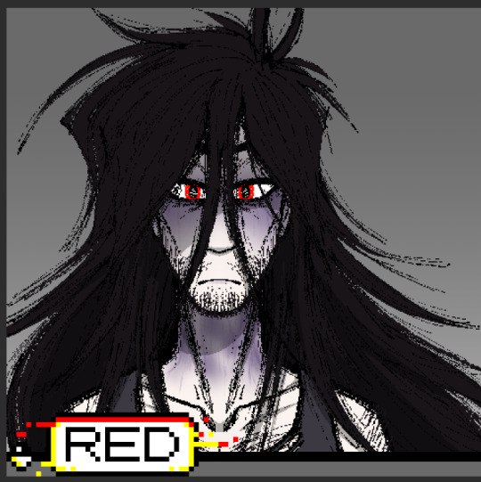
Text

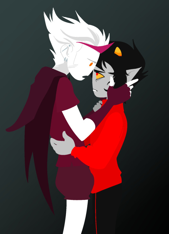
ngl im not like, lineless art specialist, honestly i went lineless fairly recently (like lets say may 2023 when i started drawing art for homestuck), before that i was making art with lineart only, so take my process with a grain of salt lmfao but i hope it clears out some things!
lets dissect the recent dirkkri art ive made:
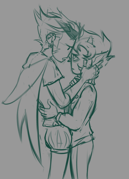
i start out with sketch, as you usually do. depending on how im feeling or how complex the pose/background is, i make it more or less detailed. for more basic poses i might even stick to a simple gesture drawing and go straight into laying out the colors, it really varies a lot. it might even change in the further process, like how i moved dirks shades from his head to be sticking out slightly from behind his arm, clipped to his shirt, because i didnt like how busy the area around the faces looked
one advice i can give is to not spend too much time on the sketch. its job is to guide the laying out of flat colors and thats it! dont make it too fancy, dont get lost in the details - you can add those later on when youre doing the flats. its fine if the sketch is messy, youll fix it in later stages of the process!
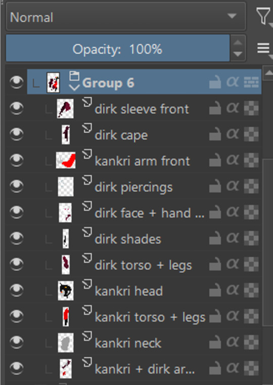
next i do the flat colors! i tackle it one thing at a time - for example with dirks head i started on separate layers with the general shape of his face, then added his facial features, then i drew the hair, then added his neck, the crown, and lastly his piercings. i then merged them all together - you dont need to leave it all separate, best way is to group things together and merge so you dont get lost with all the layers (like how kankris arm on the front is one layer including his sweater sleeve and his hand).
i highly recommend naming your layers - im a little on and off with it myself, but seriously it makes your life easier later on when you spot a mistake and have to shuffle through bazilion layers to find it lmfao, especially when your drawing includes multiple things that overlay on top of each other like in this example. dont be like me and take a second to name them asksks
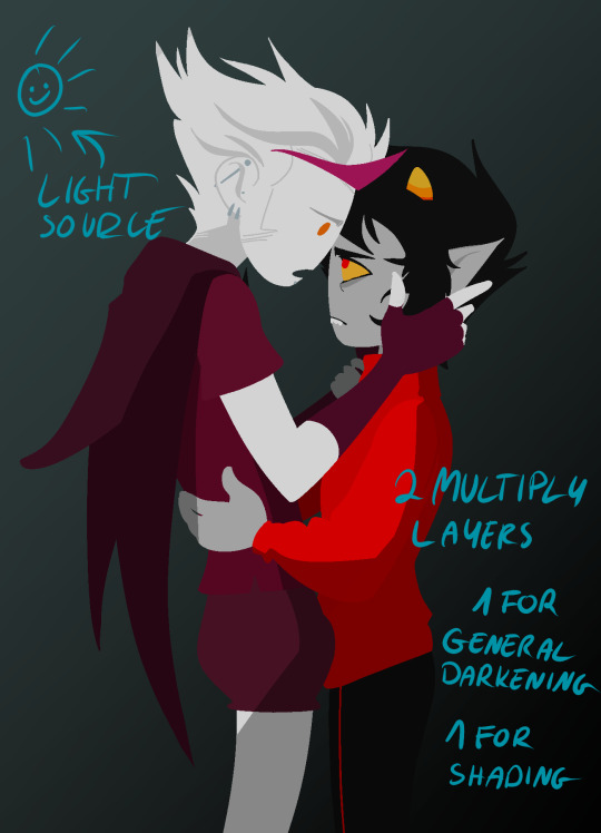
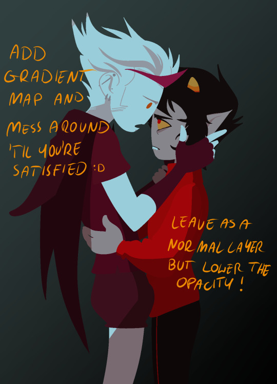
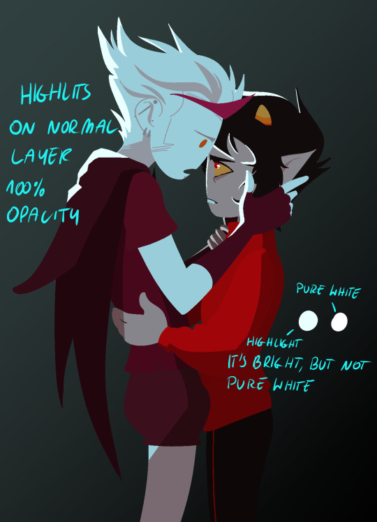
next to the rendering! i sometimes completely ditch this one, just leaving the flats as they are, but when i want a drawing to have more oomph i have some more steps to the process. its pretty simple - shadow, gradient map and highlight layer on clipping masks connected to the flats. in this one i used light gray for shadows (first layer to generally darken the drawing, second for defining shadows). same with highlights - one color.
the real star of the show is the gradient map, seriously, its a goddamn miracle worker. in krita you can add one by clicking on the plus sign to add a new layer and choose "add filter layer", then in the menu open the "map" category and here should be the option of adding gradient map. you can do it on your flats, but its destructive, and on a separate layer you can always change it if you dont like it later on. mess with the colors and tadah! it now looks fancy as shit and makes people think you know color theory!
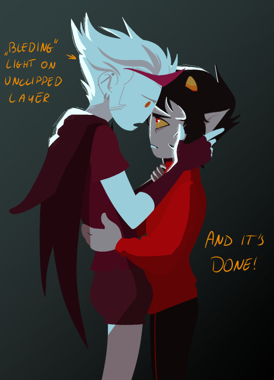

last but not least you can add some bleeding light on a separate layer that isnt clipped to the flats to give it more dreamy appearence! i also added an example of how my layers looked in a group at the end of the drawing process.
and thats it! hope it helps, and have fun drawing!
#ask#drawing process#lineless art#art tips#art process#digital art#hope its at least somehow understandable im really sleepy rn#god i hope i didnt make any spelling mistakes LMFAO#artists on tumblr
65 notes
·
View notes
Note
Hihi! I'm the anon from the MN talk sprite ask I'd love to hear about your sprite genius science haha :-D
Ps to say that I'm a huge fan of your work just in general
first of all THANK U SO MUCH WAAH....... im so glad you like our stuff TvT !!
second !! ill hop to the sprite explanation right here! i'll put it under the cut bc it might get long eheh
and a note: im using csp but this should work with any program! i previously used ibis for my talksprites before remaking them ^^
for my example subject, i'll be using ace! they'll be my best example since theyve gotten more use so far!

quick notes about the background; i always export my canvas as transparent to give the image that they're just a Part of the post/environment. the nametags and gradients are optional, but i feel the gradients help fill dead space and add a bit more to it- the nametags help in emulating the feel of video game dialog too (i dont tend to have the patience to actually make pokemon textboxes because i have to do it manually, so putting this over post text is my next best option.. makes it easier for chattier people, and gives screen reader accessibility as well!)
ANYWAYS, now for the actual Building of the Sprite!

where i usually start is with a base sketch of their neutral expression. i have two for All of the modern/updated talksprites, because i had initially wanted to put them at an angle to add a bit more flavor to them.. ultimately though, i stuck with the symmetrical style for my personal quality of life. i find it easier to work with and add to- i just have to be very meticulous about getting the proportions right is the main thing ^^'
now, from the sketch is the natural next step of Lining shit! and heres where the method of madness starts, because a big part of this entire thing is...

this . im so sorry about this image.
if you look at the layers, you'll see the general order of operations! basically i try to look at it as different Pieces, or Assets. its like a paper doll that you're assembling- the pieces that go behind need to go all the way in the back, then you build up. the back of someone's hair goes behind everything, then their body. then their clothes, then head, face, face accessories, bangs, and finally cartoony emotes on the very top if that's your style.
generally, i try to set my layers up for maximum customization- mixing and matching it the key for making my talksprites as versatile as possible. so stuff like having a base body that you can add changes of clothes too, using clipping layers to add shadows that would go over everything, that kinda thing.
but overall, having layer stacks worked out like this is the MOST important part, imo, for doing these talksprites. when it all comes together, the result is a clean basis for mixing and matching however you might need for both expressions and appearance. i keep everything in folders of Lineart, Shading, and Color as well, just in case i need to revisit or add to something premade later.
speaking of adding- this also allows for you to easily make any future assets for changing appearance and expression! i personally do it case-by-case, as i can't ever anticipate every expression or article of clothing i'd Ever Need. when something new is needed, i'll just make the new thing, and then it's just another piece to have in the mix! it's pretty nice! :D
tip: god remember to name your layers/folders. i used to Not and it made finding the pieces i need so hard. doing this method will result in a LOT of layers. be nice to yourself and name things accordingly!

now focusing in on the most important part of an expressive talksprite, heres the face, and the best way ive found to stack the layers so far. within all of these layers are the pieces of expressions that can make countless matches if you add enough to them. fun!


now the Eyes. the eyes . the eyebrows and mouth are pretty straightforward you just Draw and Color them and boom theyre done. but i want to draw special attention to the Eyes because figuring out how to do these were probably the thing i struggled with the MOST. its a system thats a bit more in depth than just. Doing it. here's what we got though.

the optimal stack for maximum eye expression that ive found? do lines and the coloring for those lines. SEPARATELY.
the idea is to make irises fully round so you can move them around or have wide eyed expressions without any weird cutoff in parts you failed to draw (looking at my old sprites. sighs). but to avoid having to delete or erase anything, the iris folder needs to clip onto the eye whites folder so you dont get stuff like

this . yeah.
and another thing i had to learn the hard way is that if your character has stuff like eyebags or makeup, and this is the reason my "lineart layer" has folders, if that if you put that stuff on the white layer, the irises will sit over THAT as well as the whites, resulting in some annoying little things.

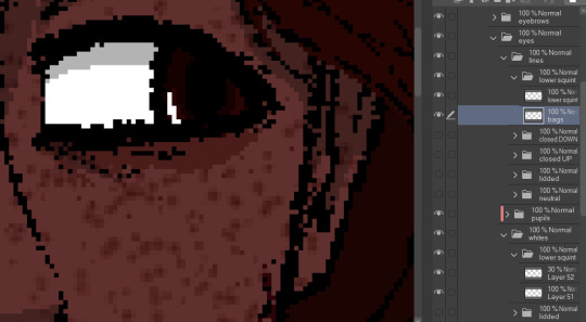
see: ace's eyebags in the whites layer, VS ace's eyebags in the lines layer.
ofc this is unnecessary if you dont add that kind of detail to your own characters- in that case, the lines layers can be as simple as just being lines!
with all that, the eyes more than anything are layers i recommend having properly named. you'll need to have the right whites with the right lines, so being able to find the two pieces with the same names is important! else you could get fun bits like this:

i dont think eyes are supposed to do that.
and generally, that's the most important parts of making these that i'd say! i have a few more tips, but theyre mostly little things that are moreso optional that i'll rattle off real quick-
for shading, i just use solid black shading with a lower opacity (i know, booooo). it's the quickest and easiest way to ensure they're both consistent, and covering everything in the same way. tbh i dont every see shading as necessary for these- but it adds just that bit more of depth and extra visual appeal to it imo
a general rule i use for characters with facial hair, which is Several in missing numbers; beards go with the head base, mustaches should be redrawn with every mouth. when someone with a mustache or stubble is talking, its usually gonna be moving and contorting with the shape of the mouth:


having it be static can range from a little off, to just Weird with more extreme expressions. but thats mostly because my style leans more realistic- if you've got a more toony style, i dont think having a mouth overlapping a mustache a little will be too bad!
this is just because i put a lot of detail into stuff and is SUPER optional, but one thing i do is have two different head bases for whether a mouth is open or closed. the jaw is opening is gonna result in the chin going a bit farther down, as opposed to it being closed! all i did to make it was take the original head base, grab the jaw area, and lower it a few pixels, then filled in the gaps. work smarter not harder
when moving the irises around, i prefer to duplicate the base layer. usually to get things to look right, you'll need to move the irises independently, so its good to just have the original stay as it is because getting it back EXACTLY how it was might be difficult. plus, you can keep the moved ones for reuse later! ^-^
if your art program allows for a universal symmetry ruler, awesome! make sure you know exactly where to put it later to add to your character! and if you use a program like clip studio (like me) where the ruler only applies to one layer; at least for csp, i can put it on a folder and it applies to everything inside that folder, so i just put all the assets in one Big folder and put the ruler there. i dont know every art program, but hopefully that still helps??
if your character has strands of hair that rests in front of their shoulders like ace's wisps or leafs big old strands, draw them as a part of the bangs or put them in the same folder so they properly sit atop everything else!
ace doesnt have any hands yet, but those would go at the very top of the layer stack. heres our lovely assistant for an example!

and for now, thats all i can really think of!
these talksprites aren't ideal for a lot of bodily motion, but for stuff like that, i figure thats where hand-drawn pieces come in. generally, i have these setup to make work on updates a bit easier, as it takes me a while to draw entire original pieces (and i struggle to focus. this is in fact why the blog suddenly went quiet again), but i still want my posts to have that visual flair to them! doing an entire visual of a character from the ground up is a fair bit more work than just. drawing a symmetrical mouth onto a guy, so i've found this whole mix-n-match type of talksprite thing a godsend ^^
anyways !! i hope i explained that well enough- good luck with ur endeavors, and i hope i get to see it!! :O
and please feel free to shoot any other questions my way if you need anything else!! im always happy to explain and help :D
and as a blog teaser for whoever gets all the way down here, a little something for your time... ive hired these three trainers to stare at you


#mn diary#hoping this is comprehensible TuT thank u again anon ur so sweeet auhjndkfdklssnkksldjn#i hope this helps anyone who sees it n wants to try!#hell did something similar for green but exported his assets into some picrew-adjacent site for his own ease of use#so thats also a thing but idk how that works.. i like my methodical madness lol
8 notes
·
View notes
Text
˖⁺‧₊˚✦ ways to make your laptop aesthetic feat. some extensions, websites & apps for students
i created this cause i found some time to finally upgrade and properly personalise my laptop, it took me almost an entire day watching youtube videos, researching for these and setting them up. so... i'm basically posting this for myself lol, but i also feel like sharing cause these are actually really good hehe
i'm using a windows laptop but i think most of these should work on mac too. most of these are free but there are maybe like less than five that require to be paid.
those that are marked with an asterisk (*) are the ones that i'm currently using while others are recommended or alternatives!
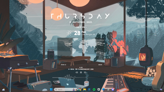
here is what my home screen looks like now:
i. screen saver
fliqlo (ios & win) * flipit (win, an inspired & alt ver of ^) flix clock (mac & web, paid ver comes with colours other than black) aura gradient clock (mac & web) retro anime desk clock (mac) flocus (web) * studywithme (web) note: remember to right-click the file and select "install", then ensure that the wait time (e.g: 5 mins) is less than your "turn off your screen" and "put my device to sleep after" (e.g: both 15 mins) in power settings
ii. tab themes
kluk: a clock tab theme * angry study helper: a tab theme that gets angy at u whenever u open a new tab gratitutab: a minimalistic tab theme that works as a to-do list prioritab: a tab theme that shows priorities that u had set for the day, week, and month
iii. extensions
tldr this: summarizes long docs, websites, articles, etc. with just a click * paperpanda: download research papers by clicking on it, it searches on domains like google scholar, semanticscholar, aodoi, and more * coffeelings: mainly a mood tracker that also saves mini journal entries colorzilla: an eyedropper colour picker * whatfont: click on it and hover on any text to show what font it is * mybib: an apa, mla, harvard, and more styles citation generator * read aloud: a tts reader that supports more than 40+ languages * notion web clipper: creates a website into a bookmark into notion * noisli: lets u listen to relaxing playlist while u study/work
iv. websites
lofi.cafe i miss the office i miss my cafe i miss my bar i miss my library a soft murmur patatap tomato timers animedoro lifeat coolors blush designs untools fontjoy zenpen decision maker museum of endangered sounds future me
v. apps
virtual cottage chill corner notion *
vi. rainmeter skins
mond * lano visualizer amatical * small clean weather animated * ageo sonder * cloudy harmattan note: if you're new to rainmeter, it can be a bit overwhelming, u may check out this short and simple tutorial on it, make sure to read the instructions if you're using complicated skins like weather (may require u to edit in txt), i also highly rec watching techrifle's videos
vii. misc.
wallpaper engine * (highly rec getting from chillhop) my live wallpaper (free alt of ^) translucenttb * roundedtb note: u can disable your shortcut icons to be invisible by right-clicking on your home screen, go to "view", and untick "show desktop icons", this is optional and i would always enable it whenever i'm working and gaming for easier access, i also set the icons to small
64 notes
·
View notes
Note
What would be some inkfish specific ways of showing platonic/romantic affection?
man im super ready to go to sleep right now (half asleep) but i also really want to answer this (i saw it pop up like 5 seconds ago) because super good SUPER GOOD topic i love it VERY VERY MUCH. my thoughts are not going to be coherent on this because ive thought about it varying amounts
first things first color matching is super prominent and important. It's not necessarily even an affection thing, it just marks unity of some kind at its base symbolism. But it is definitely used to show affection either by completely mirroring another person's color (down to the gradient). Typically in a romantic case, people will shift their full-time main color to include that of their significant other's... it's not really color SHARING exactly, but it's such a signifier that the other person is always present in their mind. It's a distinct way to honor somebody to make space in your personal identifying color to include theirs. kind of like the equivalent to tattooing someone's name on you pretty much, just less permanent

topical perfect example. The inclusion of colors like this might be subtle but it's kind of obvious when you see people side-by-side and typically every color in a color gradient that inklings decide to wear has SOME sort of symbolism (even if the symbolism is "i like that color it looks awesome").
Second thing for romantic affection (or platonic if you don't care about being romantic to kiss your besties). i don't think inkfish would kiss. At least not like humans do. They have huge beaks and teeth on their tongues and nothing about that works and on top of all that most of them have some potency of venom. You may ask "okay, surely there's an alternative?" Yeah.
This is kind of a two in one actually because this is kind of a cuddling entry too, but tentacle hugging or "tangling". Granted, this really only works with tentacles long enough to do it with, which is less common with the new cool hip hairstyles that a lot of youngsters like to get, not even getting started with the torn up and sliced styles. But it's pretty similar to holding hands or hugging (both things which inklings ALSO do, but with tentacles it's much more intimate). Holding and tangling tentacles together is very much a stand-in for cuddling, if you get suckers involved it's VERY MUCH kissing. (You even get sucker hickeys in this case a lot of the time.)
Cuddling in swim form is also a whole thing because you can REALLY get tangled with somebody that way. Other minor things? very gentle nibbling with one's beak would be one, which is also a big show of trust because those beaks can tear flesh.
yeah I don't have a lot of ideas or input on this subject but i hope this was something. basically inkfish are a very touchy type and tentacles are a BIG deal. (maybe for this reason it's also common for asexual and/or aromantic inkfish to wear short and/or otherwise wildly cut haircuts.)
92 notes
·
View notes
Note
📷 ✨ 🌸
hii leo!!
📷what's set as your phone lockscreen?
uh well atm i lost my phone (long story) so i have my brother's shitty old phone temporarily and its just a blank black screen bc i use my laptop more often ad my laptop has this pretty gradient thing as its lockscreen.
✨do you have any nicknames?
well i do actually. so many. sam in itself is a nickname, my best friend calls me 'ha', my childhood nickname was 'chachoo' and a few people still call me that despite me absolutely hating it. two friends of mine called me babygirl which... don't even ask me to explain. you call me star! and M ( @blueberry-obsessed ) calls me so many, but mostly professor english, so yeah. lots of nicknames.
🌸best compliemt you've received?
sdfgh this is a tough one bc im the worst compliment receiver ever, but 'bro you'd be such a good boyfriend' has always made me so happy and ive been told that multiple times. any compliemt about my writing too sticks with me for a very long time and keeps me going and uhhh i've been called 'handsome' and it made me so happy so yeah!!
fank you leo! mwah <3
ask game
7 notes
·
View notes
Note
Also against all that, Glitz DOES have a really cool design! I really like the use of a color gradient!
aww ty :) glitz gave me a lot of trouble, i wanted his design to be flashy but not eye searing, but if i didnt do Enough for him hed just be boring, which definitely didnt fit his personality at all! this also wasnt helped by how at the beginning we only knew One of his parents! but designing him was a process... i got a lot of feedback from his co owner (@/8biteyesight) and misc friends and im very happy with the result :) i always like seeing concept art and design processes so if you do to its under the cut
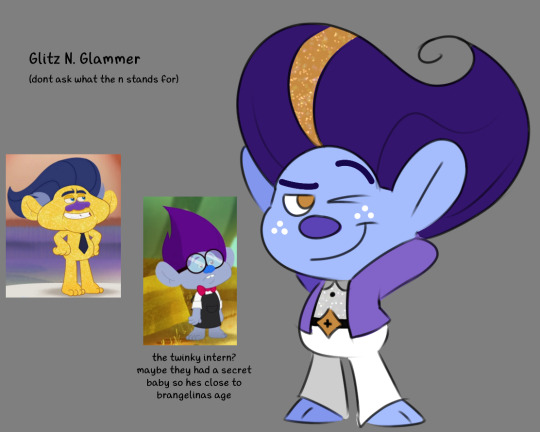
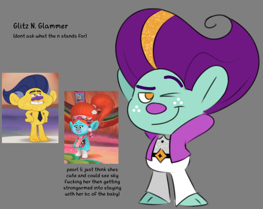
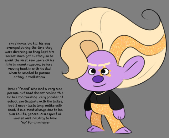
this was the first batch and it was... okay. and obviously the base was still there: we kept the hair, the necklace and the eye star. but he was so BORING, especially his outfit, and he looked too much like nova and, other than the gold glitter, not enough like sky. so then i revisited him:
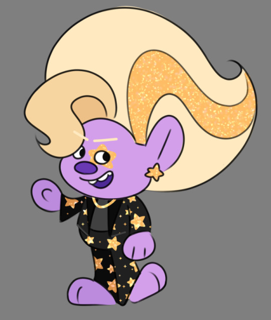
i looked up ways to better incorporate the star theme (he wants to be a star you know, and he has a thing with a moon themed character ive shown off once or twice before so it works thematically) and he INSTANTLY came together way better. the problem was still with the colour palette, and there were a lot of minor tweaks that are really funny looking back on it 😭
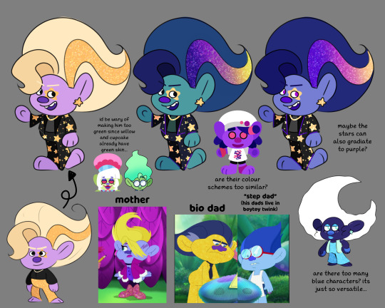
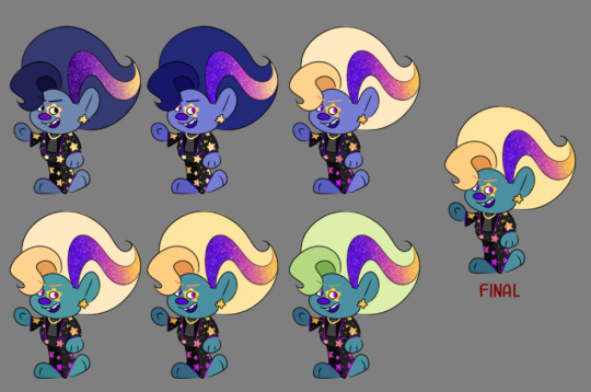
i really liked the gradient, it made it way less harsh, and i think the purple on his suit turning gold closer to the face helps lead your eye, while the purple in his blond hair adds a nicer contrast.
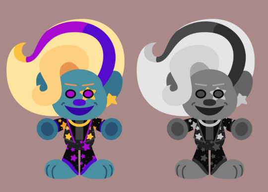
giving him dimples was a last minute decision i did not consult anyone on but im standing by it i think its a really good choice. it adds to the cuteness he banked on as a child actor, and how hes such an innocent, nice boy, hed never do anything to hurt anyone! honest! especially not a woman. definitely not
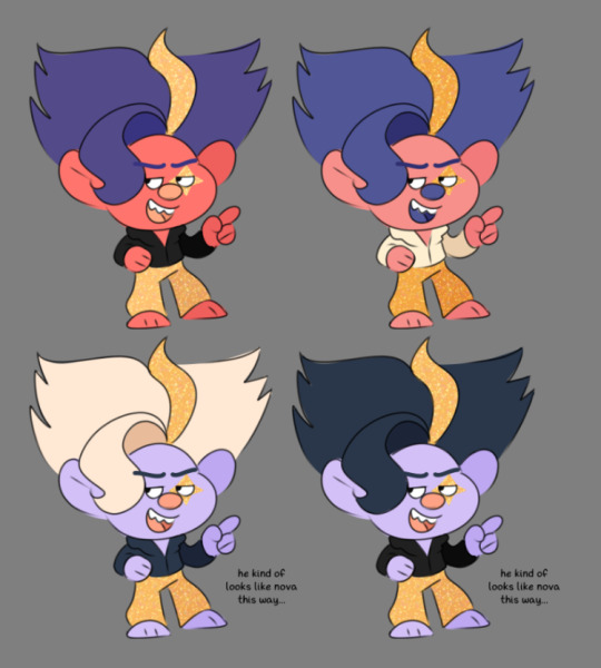
#ask#tdaut#glitz n glamour#will respond to your other ask later its just this one was easier since its all stuff i already had LOL#anyway. i like the first two in specific bc you can tell i just mushed their hairs together 😭#really the fringe on the second one doesnt make any sense with the rest of his hair...#the long swoopy fringe made up of smooth shapes paired with the rest of his choppy spiky hair? what was i thinking 😔
6 notes
·
View notes