#it's so old it uses the old post format editor
Explore tagged Tumblr posts
Text
when i was in my second year of high school i sat next to this guy in history whom i didn’t rlly get along w/until i saw him writing love letters to his girlfriend and offered to fold them into hearts for him. i wonder what he’s up to.
#and now i am thinking abt how the differences in latinx n asian cultural values were probs what led us to not interact#(by 'us' i mean just like the general latinx n asian social halves at school)#like they probs thought i was looking down on them at first (strong asian value of academic achievement)#(also that chinese habit of never speaking your thoughts n feelings aloud bc i will keep all my feelings right here n then someday i'll die)#but like... i guess once i made it clear i was willing to help them (n not just leave them n their grades for dead) the dynamic changed too#i remember my hispanic classmates were often so much more *earnest* and open w/their feelings n affection#like i feel like high fives n dramatic gestures of greeting in the halls btwn classes are kind of obnoxious. you feel?#but once there was that understanding that i wasn't looking down on them i'd get those 'EYYYYYY *HIGH FIVE*' in the halls from them#n like looking back i think it's just a cultural thing bc there was like one asian student who did that but we all were like#'oh yeah. she's Like That(tm). it's not a... *bad*... thing..... (but we all think it's out of place socially n some think it's annoying)'#you ever just think abt cultures different from your own and sit in your baffled state for a while#bc 'we just don't do things like that. we just *don't*.' like not in a derogatory way or anything. just pure bafflement.#like who were the chinese parents who decided that being open w/your feelings (w/your children but also in general) was a no-go#how did we come to value emotional privacy to this extent. there's gotta be a philosopher i can point to#was it you confucius??? i bet it was you confucius#this post has been in my drafts since oct 21 2021 lol i think i should probably release it to the queue now#it's so old it uses the old post format editor#花話
4 notes
·
View notes
Text

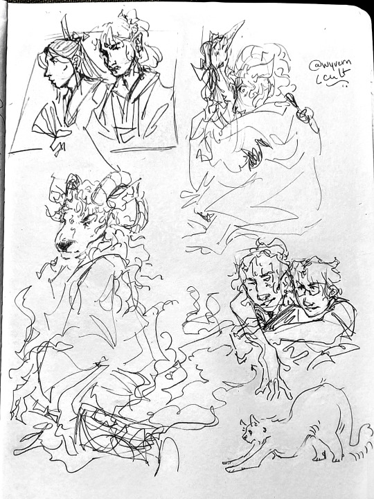
more bingyuan doodles, and sheephe
#bingqiu#bingyuan#svsss#scum villains self saving system#scumbag system#scum villain#mxtx#mo xiang tong xiu#shen yuan#shen qingqiu#luo binghe#the scum villain's self saving system#my art#i've drawn sheep binghe a lot but i think this is the first time i've ever posted one#i might post the others later because i had some i really liked#but they're months or probably even a year old now#also yes i copy-pasted my signature i already put my sketchbook away and was too lazy to get it out and draw another signature BHFNSJD#i'd draw normal bingqiu but i struggle drawing sqq so much everytime..... the one i drew here came out good though :)#the cat isn't anything i just saw a cute kitty i wanted to draw#sorry if the formatting is somehow fucked ? i tried using tumblr's new editor but it's pretty weird for photosets#anyway my favourite is the one above the kitty cat :)
110 notes
·
View notes
Photo

Submitted by Darumi_Spark (Twitter)/DarkRumia (Twitch)
Drew the socks lol
Will draw Father at a later date.
For a bit of background about the Father Mew - it’s one of the Mr. Mews in the Mew Roulette for my stream.
[Image Id: A woman with platinum blonde hair tied back in a ponytail stands above the viewer, looking down at them with her arms crossed and her red-brown eyes glowing while holding a black cat stuffed animal. She’s dressed in a white dress shirt, blue vest, white dress pants, blue dress shoes with a white suit jacket resting on her shoulders. Her necktie is purple and blue, and her socks are barely visible, showing a white and teal diamond pattern with light blue stitching.
The black cat stuffed animal has bright pink eyes, a long dirty blonde wig tied with a blue fluffy hair tie, two miss-matched rainbow arm warmers, and a bright pink tail warmer. Behind her, abstract darkened tall city buildings loom above her, with blue skies and white fluffy clouds circling high above.]
#submission#why the frick do submissions not let me add alt text???#oh wait do submissions use the old post editor? oh this sucks#maybe in the future i'll just download and make it a new post#anyways!!!#twewy#twewy oc#mother twewy oc#twewy parental entities#the mix of her being all super dangerous and threatening and then...father mew#this father mew is the greatest!!#confusion in what to think of this situation is so perfect i love her. i love this#thank you rumia!!!#the extra stitching detailing on the socks is golden i love it#i think i might add that in. as if her socks weren't complicated enough :']#i will try and remember to post some of the mews in the mew roulette from stream because they are adorable#also the submission information goes away on the custom...is that my layout's fault or because this is using an old post format? so weird
15 notes
·
View notes
Text
a heads-up: i don’t have access to the legacy editor for new posts anymore, so every starter / continuation post will be written in the new editor going forward. please use the new editor for new threads with me from now on, so we don't run into any compatibility problems formatting-wise. however, old posts / threads still have access to legacy and i will keep using legacy for those for as long as i’m able to. ♡
#【♞】 ooc.#you can pry legacy from my cold dead hands!!!!!!#tired of this site's BS#i HATE the beta editor : /#it has so many problems for me and kills my writing flow#if you see any new posts from me? rest assured i pulled up an old draft to use the legacy editor and then copy pasted my shit into beta#can you tell i'm desperate#it's annoying but the alternative is#to deal with beta which at times lags; doesn't wanna let me delete words / sentences / paragraphs; fucks up my formatting......Sometimes;#keeps switching to the bigger font; will wrap my text into some ugly grey as if i marked it; etc. etc.#i love how they never fully ironed out the kinks of their new editor before forcing it on ppl truly amazing
7 notes
·
View notes
Note
is there any possibility of keeping the legacy editor as an option? for content creators, the new editor completely ruins the quality of our gifs/edits/art and it's really frustrated to be forced into using an editor that's going to kill the quality of the creations that we spend time perfecting.
Answer: Hello, @junghaesin!
Thanks for writing in. And thank you to everyone else who has shared similar feedback.
So, tl;dr—this is actually a blog theme issue. Your theme is not showing images in posts created by the new editor as you expect.
GIFs uploaded via the legacy editor or the new editor are actually processed the same way. There is no difference in bit depth or in resolution. You can see this by looking at your posts inside the Tumblr dashboard instead (e.g. instead of yourblog.tumblr.com/post/id, go to tumblr.com/yourblog/id).
The reason why you see a quality difference is because posts created by the new editor are treated as text posts by older blog themes. Themes often add padding around all the content of a text post—including any images that appear in it. If your theme presents posts as 540px wide, then in a text post, with that additional padding, the available space for your images is actually less than 540px. As a result, the browser will scale your images down to fit, and when this happens, image quality takes a hit.
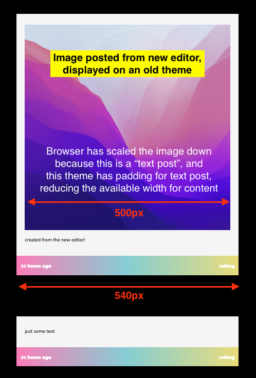
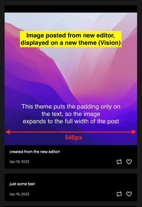
The solution—update to a more modern, up-to-date theme, like Vision or Stereo. Theme developer @eggdesign also built a theme template that works with new posts, that you can build on top of! These modern themes apply padding only to text blocks rather than the whole post, so image blocks receive no padding and are served at their full 540px width, just like the Dashboard. From what we’ve seen, this fixes all of the issues about perceived GIF quality on blogs.
We know. Changing your theme is a lot of work. In the near future, we’re looking into ways to make this transition easier—for example, helping you identify themes that work well with new posts in the Theme Garden. But working with new posts is the way forward—the new posts use a format that opens up a lot of opportunities in the future.
Why can’t you add post types to posts from the new editor? Why not serve new posts as photo posts instead of text posts?
The new editor uses a new post format, called Neue Post Format (NPF). NPF has given us a huge boost in flexibility when it comes to what content can be in posts—remember the time when you couldn’t even upload images to reblogs? Or how old chat and quote posts magically change authors? NPF helped us fix both of these things. It removed constraints—including post types, which limit each post to one specific type of content.
But existing blog themes still need to be able to display these posts. Because NPF posts can include media anywhere (while most of the old post types have a rigid structure for media), it was safest for us to categorize NPF posts as the least constrained post type—text posts. It’s the best we can do to make these posts backward-compatible with existing blog themes.
In lieu of post types, we’ve added an {NPF} theme variable per post that custom themes can leverage. Theme developers must update their themes to take advantage of this new data to retain full control of the HTML output of posts.
You can read more about these decisions, and the Neue Post Format specification, here and here.
Thanks for your feedback, and keep it coming!
With love,
—The Tumblr WIP Team
1K notes
·
View notes
Text
How a billionaire’s mediocre pump-and-dump “book” became a “bestseller”
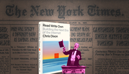
If you'd like an essay-formatted version of this post to read or share, here's a link to it on pluralistic.net, my surveillance-free, ad-free, tracker-free blog:
https://pluralistic.net/2024/02/15/your-new-first-name/#that-dagger-tho

I was on a book tour the day my editor called me and told me, "From now on, your middle name is 'Cory.'"
"That's weird. Why?"
"Because from now on, your first name is 'New York Times Bestselling Author.'"
That was how I found out I'd hit the NYT list for the first time. It was a huge moment – just as it has been each subsequent time it's happened. First, because of how it warmed my little ego, but second, and more importantly, because of how it affected my book and all the books afterwards.
Once your book is a Times bestseller, every bookseller in America orders enough copies to fill a front-facing display on a new release shelf or a stack on a bestseller table. They order more copies of your backlist. Foreign rights buyers at Frankfurt crowd around your international agents to bid on your book. Movie studios come calling. It's a huge deal.
My books became Times bestsellers the old-fashioned way: people bought and read them and told their friends, who bought and read them. Booksellers who enjoyed them wrote "shelf-talkers" – short reviews – and displayed them alongside the book.
That "From now on your first name is 'New York Times Bestselling Author' gag is a tradition. When @wilwheaton's memoir Still Just A Geek hit the Times list, I texted the joke to him and he texted back to say @jscalzi had already sent him the same joke (and of course, Scalzi and I have the same editor, Patrick Nielsen Hayden):
https://www.harpercollins.com/products/still-just-a-geek-wil-wheaton
But not everyone earns that first name the same way. Some people cheat.
Famously, the Church of Scientology was caught buying truckloads of L Ron Hubbard books (published by Scientology's own publishing arm) from booksellers, returning them to their warehouse, then shipping them back to the booksellers when they re-ordered the sold out titles. The tip-off came when booksellers opened cases of books and found that they already bore the store's own price-stickers:
https://www.latimes.com/local/la-scientology062890-story.html
The reason Scientology was willing to go to such great lengths wasn't merely that readers used "NYT Bestseller* to choose which books to buy. Far more important was the signal that this sent to the entire book trade, from reviewers to librarians to booksellers, who made important decisions about how many copies of the books to stock, whether to display them spine- or face out, and whether to return unsold stock or leave it on the shelf.
Publishers go to great lengths to send these messages to the trade: sending out fancy advance review copies in elaborate packaging, taking out ads in the trade magazines, featuring titles in their catalogs and sending their sales-force out to impress the publisher's enthusiasm on their accounts.
Even the advance can be a way to signal the trade: when a publisher announces that it just acquired a book for an eyebrow-raising sum, it's not trumpeting the size of its capital reserves – it's telling the trade that this book is a Big Deal that they should pay attention to.
(Of all the signals, this one may be the weakest, even if it's the most expensive for publishers to send. Take the $1.25m advance that Rupert Murdoch's Harpercollins paid to Sarah Palin for her unreadable memoir, Going Rogue. As with so many of the outsized sums Murdoch's press and papers pay to right wing politicians, the figure didn't represent a bet on the commercial prospects of the book – which tanked – but rather, a legal way to launder massive cash transfers from the far-right billionaire to a generation of politicians who now owe him some rather expensive favors.)
All of which brings me to the New York Times bestselling book Read Write Own by the billionaire VC New York Times Bestselling Author Chris Dixon. Dixon is a partner at A16Z, the venture capitalists who pumped billions into failed, scammy, cryptocurrency companies that tricked normies into converting their perfectly cromulent "fiat" money into shitcoins, allowing the investors to turn a massive profit and exit before the companies collapsed or imploded.
Read Write Own (subtitle: "Building the Next Era of the Internet") is a monumentally unconvincing hymn to the blockchain. As Molly White writes in her scathing review, the book is full of undisclosed conflicts of interest, with Dixon touting companies he has a direct personal stake in:
https://www.citationneeded.news/review-read-write-own-by-chris-dixon/
But this book's defects go beyond this kind of sleazy pump-and-dump behavior. It's also just bad. The arguments it makes for the blockchain as a way of escaping the problems of an enshittified, monopolized internet are bad arguments. White dissects each of these arguments very skillfully, and I urge you to read her review for a full list, but I'll reproduce one here to give you a taste:
After three chapters in which Dixon provides a (rather revisionistd) history of the web to date, explains the mechanics of blockchains, and goes over the types of things one might theoretically be able to do with a blockchain, we are left with "Part Four: Here and Now", then the final "Part Five: What's Next". The name of Part Four suggests that he will perhaps lay out a list of blockchain projects that are currently successfully solving real problems.
This may be why Part Four is precisely four and a half pages long. And rather than name any successful projects, Dixon instead spends his few pages excoriating the "casino" projects that he says have given crypto a bad rap,e prompting regulatory scrutiny that is making "ethical entrepreneurs … afraid to build products" in the United States.f
As White says, this is just not a good book. It doesn't contain anything to excite people who are already blockchain-poisoned crypto cultists – and it also lacks anything that will convince normies who never let Matt Damon or Spike Lee convince them to trade dollars for magic beans. It's one of those books that manages to be both paper and a paperweight.
And yet…it's a New York Times Bestseller. How did this come to pass? Here's a hint: remember how the Scientologists got L Ron Hubbard 20 consecutive #1 Bestsellers?
As Jordan Pearson writes for Motherboard, Read Write Own earned its place on the Times list because of a series of massive bulk orders from firms linked to A16Z and Dixon, which ordered between dozens and thousands of copies and gave them away to employees or just randos on Twitter:
https://www.vice.com/en/article/n7emkx/chris-dixon-a16z-read-write-own-nyt-bestseller
The Times recognizes this in a backhanded way, by marking Read Write Own on the list with a "dagger" (†) that indicates the shenanigans (the same dagger appeared alongside the listing for Donald Trump Jr's Triggered after the RNC spent a metric scientologyload of money – $100k – buying up cases of it):
https://www.nytimes.com/2019/11/21/books/donald-trump-jr-triggered-sales.html
There's a case for the Times not automatically ignoring bulk orders. Since 2020, I've run Kickstarters where I've pre-sold my books on behalf of my publisher, working with bookstores like Book Soup and wholesalers like Porchlight Books to backers when they go on sale. I signed and personalized 500+ books at Vroman's yesterday for backers who pre-ordered my next novel, The Bezzle:
https://www.flickr.com/photos/doctorow/53531243480/
But there's a world of difference between pre-orders that hundreds or thousands of readers place that are aggregated into a single bulk order, and books that are bought by CEOs to give away to people who may not have any interest in them. For the book trade – librarians, reviewers, booksellers – the former indicates broad interest that justifies their attention. The latter just tells you that a handful of deep-pocketed manipulators want you to think there's broad interest.
I'm certain that Dixon – like me – feels a bit of pride at having "earned" a new first name. But Dixon – like me – gets something far more tangible than a bit of egoboo out of making the Times list. For me, a place on the Times list is a way to get booksellers and librarians excited about sharing my book with readers.
For Dixon, the stakes are much higher. Remember that cryptocurrency is a faith-based initiative whose mechanism is: "convince normies that shitcoins will be worth more tomorrow than they are today, and then trade them the shitcoins that cost you nothing to create for dollars that they worked hard to earn."
In other words, crypto is a bezzle, defined by John Kenneth Galbraith as "The magic interval when a confidence trickster knows he has the money he has appropriated but the victim does not yet understand that he has lost it."
So long as shitcoins haven't fallen to zero, the bag-holders who've traded their "fiat" for funny money can live in the bezzle, convinced that their "investments" will recover and turn a profit. More importantly, keeping the bezzle alive preserves the possibility of luring in more normies who can infuse the system with fresh dollars to use as convincers that keep the bag-holders to keep holding that bag, rather than bailing and precipitating the zeroing out of the whole scam.
The relatively small sums that Dixon and his affiliated plutocrats spent to flood your podcasts with ads for this pointless 300-page Ponzi ad are a bargain, as are the sums they spent buying up cases of the book to give away or just stash in a storeroom. If only a few hundred retirees are convinced to convert their savings to crypto, the resulting flush of cash will make the line go up, allowing whales like Dixon and A16Z to cash out, or make more leveraged bets, or both. Crypto is a system with very few good trades, but spending chump change to earn a spot on the Times list (dagger or no) is a no-brainer.
After all, the kinds of people who buy crypto are, famously, the kinds of people who think books are stupid ("I would never read a book" -S Bankman-Fried):
https://www.washingtonpost.com/opinions/2022/11/29/sam-bankman-fried-reading-effective-altruism/
There's precious little likelihood that anyone will be convinced to go long on crypto thanks to the words in this book. But the Times list has enough prestige to lure more suckers into the casino: "I'm not going to read this thing, but if it's on the list, that means other people must have read it and think it's convincing."
We are living through a golden age of scams, and crypto, which has elevated caveat emptor to a moral virtue ("not your wallet, not your coins"), is a scammer's paradise. Stein's Law tells us that "anything that can't go on forever will eventually stop," but the purpose of a bezzle isn't to keep the scam going forever – just until the scammer can cash out and blow town. The longer the bezzle goes on for, the richer the scammer gets.
Not for nothing, my next novel – which comes out on Feb 20 – is called The Bezzle. It stars Marty Hench, my hard-driving, two-fisted, high-tech forensic accountant, who finds himself unwinding a whole menagerie of scams, from a hamburger-based Ponzi scheme to rampant music royalty theft to a vast prison-tech scam that uses prisoners as the ultimate captive audience:
https://us.macmillan.com/books/9781250865878/thebezzle
Patrick Nielsen Hayden – the same editor who gave me my new first name – once told me that "publishing is the act of connecting a text with an audience." Everything a publisher does – editing, printing, warehousing, distributing – can be separated from publishing. The thing a publisher does that makes them a publisher – not a printer or a warehouser or an editing shop – is connecting books and audiences.
Seen in this light, publishing is a subset of the hard problem of advertising, religion, politics and every other endeavor that consists in part of convincing people to try out a new idea:
https://pluralistic.net/2021/07/04/self-publishing/
This may be the golden age of scams, but it's the dark age of publishing. Consolidation in distribution has gutted the power of the sales force to convince booksellers to stock books that the publisher believes in. Consolidation in publishing – especially Amazon, which is both a publisher and the largest retailer in the country – has stacked the deck against books looking for readers and vice-versa (Goodreads, a service founded for that purpose, is now just another tentacle on the Amazon shoggoth). The rapid enshittification of social media has clobbered the one semi-reliable channel publicists and authors had to reach readers directly.
I wrote nine books during lockdown (I write as displacement activity for anxiety) which has given me a chance to see publishing in the way that few authors can: through a sequence of rapid engagements with the system as a whole, as I publish between one and three books per year for multiple, consecutive years. From that vantagepoint, I can tell you that it's grim and getting grimmer. The slots that books that connected with readers once occupied are now increasingly occupied by the equivalent of the botshit that fills the first eight screens of your Google search results: book-shaped objects that have gamed their way to the top of the list.
https://www.theguardian.com/commentisfree/2024/jan/03/botshit-generative-ai-imminent-threat-democracy
I don't know what to do about this, but I have one piece of advice: if you read a book you love, tell other people about it. Tell them face-to-face. In your groupchat. On social media. Even on Goodreads. Every book is a lottery ticket, but the bezzlers are buying their tickets by the case: every time you tell someone about a book you loved (and even better, why you loved it), you buy a writer another ticket.
Meanwhile, I've got to go get ready for my book tour. I'm coming to LA, San Francisco, Seattle, Vancouver, Calgary, Phoenix, Portland, Providence, Boston, New York City, Toronto, San Diego, Salt Lake City, Tucson, Chicago, Buffalo, as well as Torino and Tartu (details soon!).
If you want to get a taste of The Bezzle, here's an excerpt:
https://www.torforgeblog.com/2023/11/20/excerpt-reveal-the-bezzle-by-cory-doctorow/
And here's the audiobook, read by New York Times Bestselling Author Wil Wheaton:
https://archive.org/download/Cory_Doctorow_Podcast_459/Cory_Doctorow_Podcast_459_-_The_Bezzle_Read_By_Wil_Wheaton.mp3
#pluralistic#molly white#books#publishing#dunning kruggerands#crypto#cryptocurrency#a16z#venture capitalism#guillotine watch#this is why we can't have nice things#bookselling#the bezzle#bezzles#web3#blockchain
380 notes
·
View notes
Text
What is going on with cutting posts?
You may have seen some posts floating around lately about the beta editor and trimming reblogs, and possibly found yourself extremely confused trying to figure out what this tangled web of editors, extensions, and add-ons even means. I’ve been on this site for years, and I still find the whole thing terribly confusing.
So this post is my effort to explain everything -- legacy vs beta, New XKit vs XKit Rewritten, editable reblogs vs trim reblogs -- everything. This also doubles as a tutorial for the various methods of cutting posts.
TL;DR
Tumblr is in the process of switching to a new post editor that some old users have opted into, while new users have been forced into it.
The old Editable Reblogs extension does not work with this new editor, requiring people to use a new extension called Trim Reblogs.
Trim Reblogs and Editable Reblogs are not compatible. If your partner uses Editable Reblogs, you cannot cut their posts properly using Trim Reblogs (unless you’re willing to do some tedious and frankly unreasonable workarounds).
The only way for everyone in the RPC to cut their posts properly and efficiently is if everyone moves to the new system and uses Trim Reblogs. Clinging to the old system with Editable Reblogs is actively creating issues for the people using the new system -- some of whom do not have a choice.
Cutting Posts
Cutting posts is the act of removing older replies on a thread when reblogging it. This goes by several other terms, including trimming replies/reblogs or any variation of that wording, but I will be referring to it as cutting posts to avoid confusion with the Trim Reblogs extension, which will be coming up a lot.
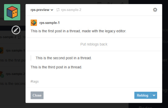
Typically, when cutting a post, you only keep your latest reply and the reply from your partner that immediately precedes it. This means that instead of a thread looking like this...

It would like this:
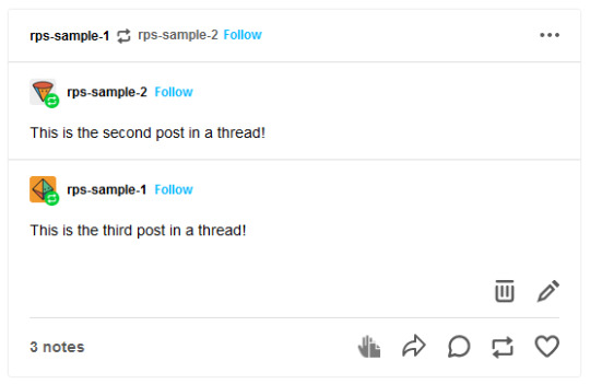
Or like this, depending on the method used:
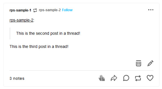
In either case, the first post is gone while the second and third post remain.
Cutting posts is done so that threads aren’t all extremely long on the dashboard. When there’s three short replies like this sample, it’s not that bad. But imagine a thread with twenty replies where each is several paragraphs long. That would require people to scroll and scroll and scroll to get past it. And since the same thread would be reblogged multiple times, your dash might become the same posts, over and over and over again, with only one new addition at the end each time.
Cutting posts is extremely common Tumblr RP etiquette. Many people won’t follow you if you don’t regularly cut replies, due to how irritating the alternative is.
Copy and Paste (Outdated)
Once upon a time, you used to be able to cut replies without any kind of extensions. Unfortunately, those days are gone.
That method worked as follows. You would go to reblog as usual...
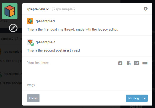
Copy and paste the last reply, putting it in a blockquote (or using any other formatting you like, really), then add your own reply underneath.
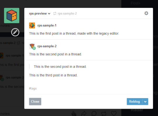
Then you can simply hover over the older replies and click the red X in order to remove them.

And this used to work. But now, the very first post in a thread cannot be deleted -- only later reblogs can. This means that the first post will always stay above the others, no matter how far along in the thread you are.
So since cutting posts can’t be done normally, we have to rely on browser extensions. This is where things get complicated. And also where I need to explain the different editors.
Legacy vs Beta Editor
Every time you make or reblog a post, you are using Tumblr’s post editor to do so. This is the area where you type up your post, add images, etc. Tumblr has been using the same editor for several years now, and it’s called the legacy editor.
However, Tumblr has been slowly rolling out a new text editor, called the beta editor. You may remember the beta editor when it was first rolled out a couple years ago as a buggy, unstable mess -- that’s not the case anymore, and it’s no more buggy than the current editor. For text posts, it’s functionally pretty similar, and even has a few features that some of you might want, such as easy colored text and the ability to make posts non-rebloggable. (Photo and other posts are fairly different, and I know gif makers have some pretty understandable reservations and complaints about it, but I won’t be covering that here.)
Older users have the option to toggle between the legacy and beta editors at will, while new users (starting around November/December 2022) are locked into the beta editor and cannot switch back to legacy.
To check which editor you have, go to make a new text post and look in the top right corner.
If you see either of these:


You are using the legacy editor, with the option to switch between the two.
If you see this:

You are using the beta editor, with the option to switch between the two.
If you don’t see anything at all, you are using the beta editor, and cannot switch.
While the text interface of the two editors isn’t terribly different for roleplay purposes, the methods by which you need to trim reblogs are entirely different. Each requires a different extension -- specifically, a different version of XKit.
XKit
XKit is a browser extension designed to add features and functionality to Tumblr. It includes many quality of life features such as a mutual checker, better tag tracking, queue improvements, ad blocking, more detailed timestamps, and so much more. (It was preceded by a similar extension called Missing E, if you’ve been here long enough to remember that.) And among all of these many features is the ability to cut replies.
The original XKit is no longer in use, having stopped updates in 2015 and being entirely unusable now. However, a few new versions of XKit have popped up throughout the years.
New XKit & Editable Reblogs
A different team created New XKit as a successor to the original, a similar extension designed to restore many of the same features.
New XKit’s feature to cut posts is called Editable Reblogs. It works by adding a pencil button to the left of the post when you reblog.

Clicking that button will break the post’s formatting -- actually changing it to how Tumblr posts used to be formatted -- but allow it to be edited however you wish.

So in this instance, I could simply select the first reply and delete it before adding my new reply underneath.
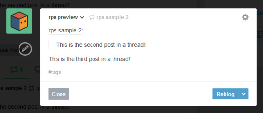
Editable Reblogs is only available if you use the legacy editor. It does not work with the beta editor and does not even appear as an option.
XKit Rewritten & Trim Reblogs
In 2020, Tumblr began to roll out its updated dashboard, which is now permanently in effect for all users. While the new interface looks very similar, the code was actually entirely redone, and behind the scenes functions very differently from the older dashboard. As a result, some of New XKit’s features no longer work as intended -- though a few still do, such as Editable Reblogs.
In response, the New XKit team decided to similarly start from scratch and created XKit Rewritten, another iteration of the add-on with similar features once more. However, not all New XKit features are available on XKit Rewritten, and vice versa. Many people are running both extensions simultaneously to take advantage of features on both.
XKit Rewritten’s feature to cut posts is called Trim Reblogs, and it works completely differently than Editable Reblogs. With this, you first need to save the thread to your drafts with your reply already written.

You’ll see a scissors icon appear along the bottom of the post. Clicking that will open the trimming options, letting you select which previous reblogs to delete.
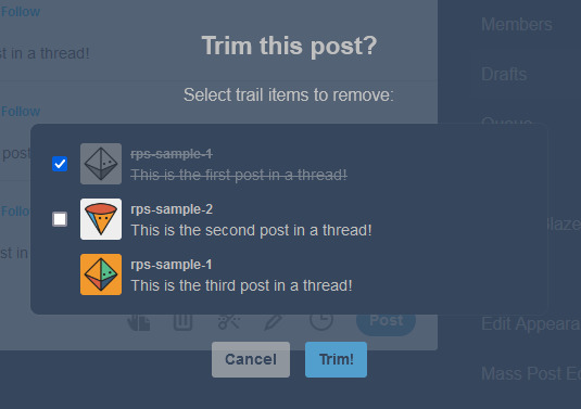
Clicking Trim will remove the selected reblogs.

You can then click post. You’ll note that this method preserves Tumblr’s formatting, as opposed to Editable Reblogs, which breaks it.
EDITED TO ADD: Apparently you don’t need to already have your reply written in your drafts anymore. You can save the post to your drafts without adding anything, use trim reblogs, then edit the post to add your reply. Either works fine.
This method does have two major issues, though. First, if the first post of a thread was created in the legacy editor, then the system gets really buggy and just doesn’t work.
This is what happened when I tried it out. Initially, it seemed to work as expected.
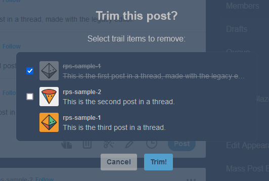

However, when I posted the reply, or simply refreshed my drafts, this happened.

Attempting to trim again simply caused this to repeat. There is no fix for this. This means that for this method to work, both you and your partners need to be using the beta editor.
EDITED TO ADD: You can fix this double posting by either using trim reblogs before adding your reply, or by adding your reply, using trim reblogs as intended, refreshing your drafts, editing the post, and clicking the red X to remove the first of the double postings. I have a better guide here.
The only other alternative is to move the thread to a fresh post when you reply, so that the new first post was made with the beta editor. Then you can cut future reblogs of the post using Trim Reblogs as normal.
However, the other major issue is that if your partner uses Editable Reblogs, you cannot use Trim Reblogs as intended. Let me show you why.
Say I want to reply to this post.

I’ll add my reply and save it to my drafts, as before.
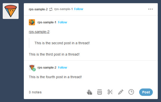
You may have spotted the issue already. The first and second replies are now “combined” so that Tumblr sees them as a single post. We want the post to be interpreted like this, so that I can remove the oldest reply while still keeping the one immediately prior to mine.
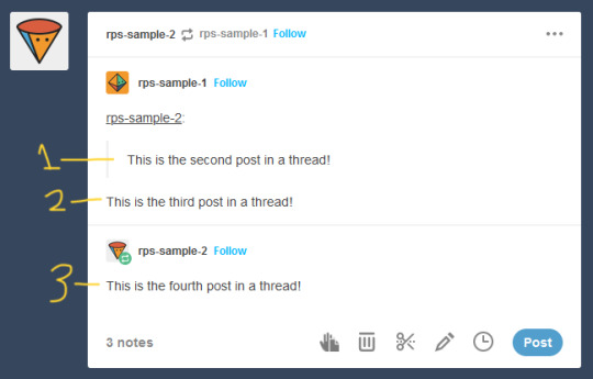
But Trim Reblogs can only see it like this.

When I go to trim reblogs, I can only remove the previous replies as an entire unit. I can’t remove just the oldest reply and keep the one immediately prior -- either it all stays or it all goes.

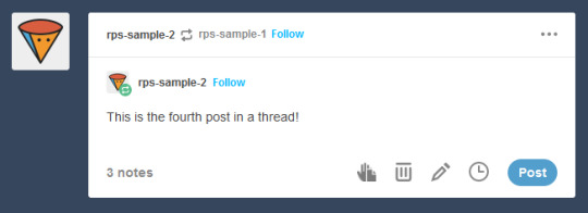
This is admittedly better than nothing. However, most people do want to keep their partner’s previous reply for reference, and just to have on their blog. This means a lot of people using Trim Reblogs simply don’t cut their partner’s posts at all.
You might be able to get around this issue by combining it with the outdated cut and paste method I described above. When saving to your drafts, paste your partner’s last reply above your own, using a blockquote or whatever formatting you like to separate the two.
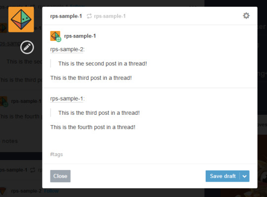
You can then use Trim Reblogs to remove the first post, leaving only your copy pasted reply. The formatting is broken, but it’s at least workable.

However, this will only work if the very first post of the thread was made with the beta editor -- since people using Editable Reblogs have to be using the legacy editor, you’re likely to still run into issues on a lot of posts. Which can again be solved by moving the thread to a fresh post made with the beta editor, but at this point we’re stacking so many issues on top of each other that I really can’t blame you if you just don’t want to bother with any of them.
All of this brings me to...
It’s time for the RPC to collectively switch to the new system
I’ve stuck to the legacy editor myself due to the issues described above -- using Trim Reblogs when everyone else still uses Editable Reblogs is an enormous pain that I don’t want to deal with. Even as I make this post advocating for people to switch, I’m dreading actually doing it, because I know that most of my partners still use the old system and I will have nothing but headaches.
But the thing is, everyone refusing to switch is what’s creating the headaches in the first place. If we all moved to the new system together, these issues would simply disappear, and we would all be able to effortlessly cut our posts using Trim Reblogs without ever having to worry about it again.
The RPC needs to collectively make the switch, for two reasons.
First, Tumblr is going to switch everyone to beta eventually. Refusing to switch now is really just delaying the inevitable -- it’s not a question of if you’re going to be forced into the new system, but when. By switching now, you can go ahead and get used to it and start giving feedback to both Tumblr and the XKit Rewritten team if you find anything buggy or broken.
Second, as I said above, new users are locked into beta, with no option to switch back to legacy. Trim Reblogs is their only option for cutting posts -- and as long as most of their partners are using Editable Reblogs instead, they cannot cut their posts properly. Their only option is to use a series of increasingly ridiculous workarounds that most people won’t understand. The fact that it took me 1500 words just to explain everything should tell you how confusing the whole thing is -- you can’t be that surprised when a lot of people, upon realizing that they can’t cut posts without a whole lot of tedium, decide to just not bother cutting them at all. The best way for everyone to be able to cut their posts properly and efficiently is for everyone to be on the same system.
Yes, the beta editor is different. It has some weird quirks. It will be a bit of a learning curve to get used to a new system of replying to threads. But this is a change that’s going to happen eventually, and is a change that needs to happen for a lot of people to able to cut their posts properly.
(It’s also worth noting that -- assuming you still have the option to switch -- you may be able to toggle between the two systems during the adjustment period. I haven’t been able to test this yet, but I see no reason it wouldn’t work. Use Trim Reblogs whenever possible, and especially for the partners that have already made the switch. But when you get to a reply that it just won’t work for, toggle back to the legacy editor and use Editable Reblogs just for that thread. It’s a bit annoying, but it could be the middle ground needed to help people start making the switch. And once the majority of the RPC is on the new system, then this won’t be an issue anymore.)
#rph#rpt#rpc#editable reblogs#trim reblogs#*my stuff#*my tutorials#this started as a tutorial for cutting posts and led into something else lmao#beta editor
2K notes
·
View notes
Text

✦ Okay, I give in. Let's upload our gifs on the beta editor to prepare for a gif pack page. Resources are available at the bottom, so lets get started !!

So first things first, you can only upload 30 gifs at a time. Now for me, I will always upload as I gif, around every 20 gifs, then upload to the page (this also ensures I don't skip any or have doubles) and keep gifing. That used to mean that I don't have to wait for tumblr to load 300 gifs and die from impatience. For the rest of y'all that means you're going to have to batch upload. I know, I'm sorry.
Note: With the help of @nataliealynlind we discovered that the daily limit is 250 gifs! So if you have more than that, prepare to upload your gifs over the course of a couple days or use a second blog. (imo this is another great reason to upload as you gif! that way you don't have to get stuck at 250!)
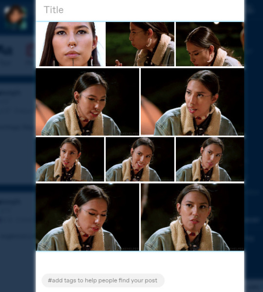
So after you upload your gifs (in this case I only did 10)*, you're going to go to the gear at the top of your post and click it. Then scroll all the way to the bottom where it says Text Editor. This looks familiar, right?
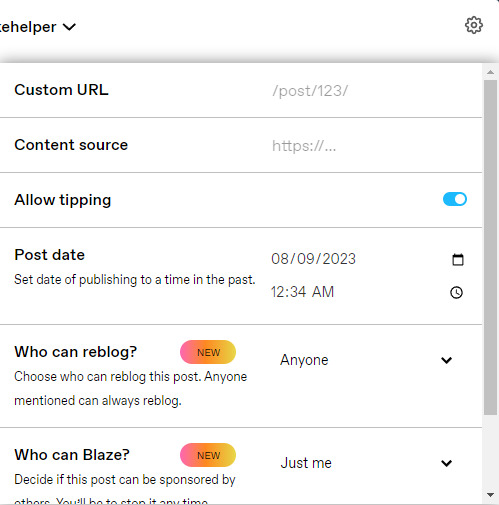
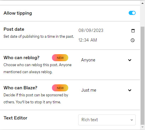
*Note: If you don't save it as a draft first, your gifs will be in .gif format, not .gifv. This means you can skip removing this tag later on, but I'm not sure if gifs that are uploaded but never saved/drafted will later disappear at some point. To be safe, I would save it as a draft. I just forgot at this part tbh
Well the good news is, you only have to change this once! The bad news is, we don't do Markdown then HTML anymore bc Markdown doesn't strip any of the code anymore 🙃 So just change it to HTML

Now it should look like this! Fun!
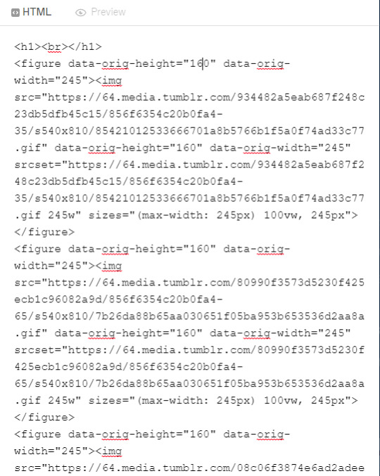
Okay, now we're going to copy that text and take it on over to our new best friend, the HTML Cleaner! So you're going to want to paste it on the right side of the screen. Your gifs should appear on the left side. If both sides have text, that's how you know you pasted it on the left.
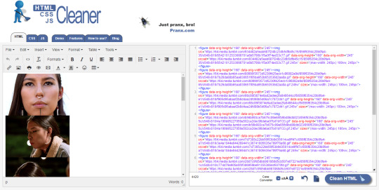
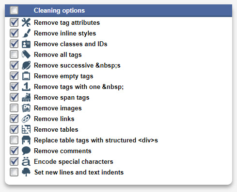
So in order to get ride of all this extra code, it's going to take a couple extra steps. First, you're going to check these boxes on the left hand side.
Now, on the right hand side, you're going to enter these under Find and Replace (copy/paste section below!!). I know you're like, uh what? Where the hell did you get those numbers? Well, I got them from our gif post code!
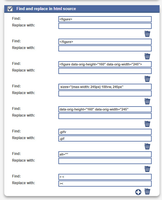


For easy copy pasting:
Find: <figure> Replace: (leave blank)
Find: </figure> Replace: (leave blank)
So after you add the specific widths for your gifs, you're also going to want to add the following:
Find: .gifv Replace: .gif
Find: alt="" Replace: (leave blank)
Find: /> < Replace: /><
NOTE: If your gifs are usually the same size, I would recommend saving these snippits above on your computer's sticky notes or a draft to copy/paste for future uploads! While I do appreciate the viewer traffic, I'm sure coming to this tutorial every time is gonna get old real fast.
After all that, click Clean HTML

And now, your code should look like this! If there's still a space between your image links, just click Clean HTML again and it should get rid of it!

Now your code is nice and clean to put into your gif pages! Not quite sure how to do that? Read the Setting Up Your Sidepage section in this older tutorial!!
Resources
HTML Cleaner
My Gif Pack Page Codes
Recommended Gif Pack Page Codes (tag)
Previous Tutorial (How to upload to a Standard Sidepage)
Barebones Code (for previous tutorial)
#rpc#rph#gif pack tutorial#uploading gifs on beta#rp tutorial#beta editor tutorial#mytutorial#rp guide#me: i'm tired of this (remaking this tutorial every other year) grandpa#tumblr changing posts every five minutes: that's too damn bad!
190 notes
·
View notes
Note
What problems have you had transferring to ao3? (This is genuine curiosity, I like to know practical stuff like that.) It sounds like you're not just going in to edit the Tumblr chapters as HTML, then copy/pasting that on AO3, which is what I do. Or maybe you are and it's causing artifacts? I don't worry about hosting since my images are hosted on my Tumblr blog anyway, but maybe that's bad practice and I'll regret it later?
The site I use for writing strips out the formatting (italics/bold/etc) when I paste into a local text doc or directly into ao3, but DOESN'T strip the formatting when I paste into tumblr. So instead of updating the chapters by going "copy from doc -> paste chapter to tumblr -> post" + "copy from doc -> paste chapter to ao3 -> post", I have to go "copy from doc -> paste to tumblr -> post -> copy from tumblr -> paste to ao3 -> post."
Frustratingly, AFTER i spent two days grumbling about juggling multiple tabs and manually highlighting all the text on tumblr to paste to ao3 and pulling my hair out over the totally unnecessary <div>s that tumblr stuffs into the formatting, THEN I remembered tumblr has an HTML editor and I could just copy/paste from there into ao3's HTML editor. So this will go a lot faster on future chapters.
Yeah, it's bad practice if you're trying to cross-post the image somewhere else (like ao3). Every few years tumblr just decides to change up the formatting on all its image URLs, meaning that anybody who's been hotlinking images from tumblr could, at some point in the future, totally randomly, have every single one of the pics break simultaneously. I've had trouble in the past with old art/comics breaking because the host suddenly decided to delete old pics or disable hotlinking—photobucket, tinypic, imgur—so I wanted to find a host with the lowest odds of doing that in the future. And if the host DOES break my images someday, the images are also backed up on tumblr, so at least I've got that failsafe.
25 notes
·
View notes
Text
✧・゚ A short and easy workaround for Reblogs with Beta & XKit Rewritten

Disclaimer: This also seems to work with old Legacy-Threads when reblogging with the new Beta-Editor bc XKit Rewritten doesn’t work with Legacy. The whole trimming order and process of both combined can be confusing, but it’s important so the post doesn’t get fucked up. So technically, it's also helpful for Beta-Reblogging in general. (video below)
SO, IF YOU WANT TO AVOID DOUBLE-POSTING of your own reblog, do the following:
Hit reblog (make sure you’re using Beta).
Enter reply, whatever.
Safe to drafts.
Remove the first post with Trim Reblogs.
Safe.
Refresh drafts.
Remove your own reply that now shows twice with the Beta-Editor. You will only have one option to remove here, so that makes it easy.
Refresh.
Tadaaa.
In this way you can preserve your partner's reply if you want to, since the blockquote-format won't work like that anymore. So hopefully, reblogs with the Beta-Editor & XKit Rewritten should be easier now for you and your partners without having to move your whole Legacy-Thread to a new post after this measure. I am very nostalgic over my old stuff, so that's a reason why I don't want to do it. If you have additions or experience possible errors, feel free to add them.
PLEASE NOTE THAT THIS WILL ONLY WORK if your partner reblogged their response without any XKit-Extension. Just a plain reblog.
#rph#rpc#beta#editable reblogs#trim reblogs#xkit rewritten#new xkit#legacy editor#tutorial#*mine: edits#[ I just needed a short guide for my horrible brain ]#[ just short; no additional info ]#[ just wanted the essentials to get rid of the double reply issue ]#[ maybe it helps you too ]
463 notes
·
View notes
Note
hey, not sure if you know this, but alt text is an accessibility feature and it's used for image descriptions, not for writing your thoughts in ^.^ hope this doesn't seem rude sorry
ah yeah i've wondered if this was going to come up - the way I use alt text is actually just a continuation of the way I've always used image captions - in the old tumblr setup image captions were short and just would show up under the image when you clicked on them so I got in the habit of putting little bonus jokes/easter eggs in there for my own amusement and for the amusement of folks that happen to click the images, but then when tumblr redid the post editor they got rid of that option and replaced it wholecloth with the alt text, but I still like making the little jokes so for now that's where I've stuck 'em
I do totally get that it's meant as an accessibility feature and that some folks don't jive with how I'm using it, which is totally fine! That said I do plan to keep making my little jokes in the alt text since I really am just making these dumb little shitposts for myself, so if the alt text issue is something you're worried about please do just block me! It's never an insult, catering your dash is 100% personal and I take no offense whatsoever, just the same way that the way i format my shitposts is 100% personal to my own tastes
thanks for reaching out!
#god i really do miss the old image captions every fucking day#but yeah if you don't like it please please please just block me#my blog is a lazy space for me to make shitposts so nothing has ever actually had the correct image captions#mad respect to those that do take the time to caption things accurately but right now my blog ain't one of those spaces#reply
29 notes
·
View notes
Text
Hey you! Yes, you! Learn how to use GZDoom!
Also if you see this post, please reblog it if you think it's good, like I don't think Tumblr's algorithm (that kinda exists) will like it.
Hi, I'm Lynn "WJB" Beck, and I'm here to tell you about an exciting new old game engine that is extremely easy to use for not just making original games, but also mods and animations and stuff!
And this engine... is GZDoom.
GZDoom is an enhanced sourceport of the 1993 first-person shooter, demon-punching simulator and stress-test for pretty much any technology that contains a computer. As opposed to more low-key and/or "vanilla" sourceports like Chocolate Doom or Boom, GZDoom allows for a lot more options, including Build Engine-style voxels, several types of dynamic lighting, and even stuff that was originally exclusive to specific Doom Engine games, like Strife's light RPG mechanics, This means that it can be used to make extremely impressive "total conversion" mods, and even fully original games with entirely custom stuff!
This guide covers how to get started, and a basic overview of how certain things work (get ready to learn about lumps!).
Getting Started
Ok so before you can start Doing The Thing, you need to... install some software! Don't worry, it's only like 4 and they're fairly lightweight.
Go to this website here and download the most recent version of GZDoom. You will need this to actually run your game.
Go here and get Slade. You will need this to import custom graphics and audio, as well as to use text-lumps (which are basically necessary, even if you're making a basic custom level set, and I will explain why further down).
This ZDoom Forum topic is where you can get Ultimate Doom Builder. While there are other Doom mapping tools, UDB is what I personally use, and it's extremely beginner-friendly while also being fairly versatile. It even has a built-in script editor, so you can modify a script and then immediately jump into testing to see if what you've done has worked!
Finally, you need a copy of specifically Doom 2. You could use Doom 1, but in my opinion Doom 2 is better because it has a lot more stuff than the first game, and - let's be real - you'll probably be doing a lot of vanilla mapping to get to grips with the editor before you can start making your big ambitious game (which is what I'm doing over on my modding sideblog, check it out). I'll leave this one up to you. EDIT: I forgot that Freedoom exists. That's also good.
Mounting stuff into Ultimate Doom Builder
Next, you'll need to get UDB set up. This is fairly easy. First open UDB and, as soon as it starts up, go to the top-menu and click "Tools", then go to Game Configuration. Select "GZDoom: Doom 2 (UDMF)" and click "add resource"; using the attached file-explorer, locate the Doom 2 folder on your computer's file system and add DOOM2.WAD to the list of resources, then do the same with gzdoom.pk3 in the GZDoom folder (making sure to switch the "Add Resource" tab from "From WAD" to "From PK3". Click Ok, and you're done!
If you want to put your custom graphics into the game, you simply create a WAD file in Slade, put your graphics in (more on that later) and save it; then when creating a map in UDB, this box will appear:
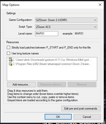
If you click "Add resource" here, you can then select your custom wad and use any assets, code etc. in your map!
How Slade works
This bit is a bit more complex because it deals with multiple file formats and methods of importing stuff, but I'll start simply by explaining textures, flats, sprites and patches.
Before I do that though, I need to talk about Markers. To define images as a sprite, patch or flat, you need to put them between a pair of Markers with specific names, which you can create by clicking the "New Entry" button:

"Empty (Marker)" is selected by default, so all you need to do is name it. The naming format is [LETTER]_START to start a section and [LETTER]_END to end one; S_Start/S_End are for sprites, P_Start/P_End are for patches, and F_Start and F_End are for flats. You can, additionally, further subdivide this by making another pair of Markers inside a Start/End pair with a number after the letter, but I'm not sure if this does anything (my only experience with it is that the Doom 2 wad file does this).
Now to explain how these things actually work! First, sprites. A sprite is an image that represents an object or creature in the game, and a cool thing that GZDoom does is let you use generic PNGs instead of Doom's proprietary GFX format. Sprites use the following naming scheme: a four-letter identifier, a single character denoting what frame of the animation the image represents (the Arch-Vile, which has the most sprites out of any monster in Doom 2, has frames that go from A all the way to Z, and then [, \ and ]), and finally a number from 0-8 that indicates the angle the Thing (that's the technical term for a Doom Engine entity, by the way) is at. Using the Imp as an example:

The "0" angle just means that the sprite should look the same regardless of the player's angle; this is used for items, decorations, the death animations of all monsters (including players), and the two sprites used for Doom II's final boss.
A cool thing about sprite angles is that you can actually make a sprite work for multiple angles; by adding an extra frame-letter and angle-number after the first set, you can do things like have a monster whose left and right walking frames are the same but mirrored by formatting the sprite's name as something like NAMEA2A8 (in fact, the Imp uses this technique for all its sprites apart from its death animation).
Next up, flats! Flats are square textures that are designed to go on floors or ceilings (though you can use them anywhere, including as sky textures!) but lack the flexibility of patch-based textures. You literally just. Import your texture and put it between F_Start and F_End. That's it. That's how a flat works.
And finally, patches. Patches are complicated, but very easy to use when you know what you're doing. First, put your image between P_Start and P_End, then right click it, put your mouse over the "Graphics" dropdown, and select "Add to Patch Table". You will then be prompted to create a TEXTURES lump; click "Ok" with the default settings. This creates a Texture1 lump, and the "Patch Table" (which is just a list of patches, which I will explain soon), alongside P_Start and P_End if they aren't already present (and a dummy texture). Double-click Texture1 to open it, and then select "New Texture" (you can adjust the scale, too):
Once this is done, go to the top-right corner and click "Add patch":

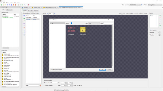
By default, you only have access to any patches you have assigned, but a cool trick I use in my own mapsets whenever I want to modify an official texture is to copy its Texture1 entry from the Doom 2 WAD, then paste it into my WAD's Texture1 and rename it. This does create copies of the constituent patches in your own wad's P_Start/P_End section, but you can delete those and it will still work fine.
Both patches and Flats are limited to 8-letter names, so be warned.
The actual final thing to talk about is converting PNGs to GFX; this is a simple process, but it can cause issues with colour. Basically, Doom has a very specific palette:

While this can look pretty good, on images it wasn't designed for or that use colours it doesn't feature, it can look pretty bad. For example, if I put this random image I made through the conversion process:

Then it comes out looking like this:

All the more cyan-adjacent hues become more blue, it nuked the antialiasing, and some of the gaps in my colouring are now much more obvious (especially on the fifth character's head and legs).
My point is, only do this if you want your mod to be compatible with more vanilla sourceports, or if you want to reduce the filesize. Otherwise, you're better off just using a strict palette when making the sprites and keeping them as PNGs.
Custom palettes are possible, but like. Literally all you do is click "New Entry", select "palette", name it, click the "Import from" button (purple page with a diagonal arrow on the top-middle of the palette-view window), set the filetype on the file explorer to "PNG", and import your custom palette image (which should be square (non-square images get squished and lose some colours) and 16x16 at the smallest, though the images I normally use are 128x128 because for some reason they're scaled up by a factor of 8, even though they display the same when imported regardless of size). You can even test them out or add them to the in-built palette list, which is nice. If you want it to override the default palette when your WAD is loaded, name the lump "PLAYPAL", which is what Doom's palette is called.
Now we get to talk about text lumps! I don't have much to say. Do the "New Entry" thing, select "Text", and name the file. The ZDoom wiki - which I will be linking to at the end - has information on each type, so check those out.
Map making
This is the final main section of this, and I'll try keeping it fairly brief and simple. Doom maps use four main elements; Vertices, Lines, Sectors, and Things. A Vertex is, well a vertex; it's a point in 2D space that acts as a starting or connecting point on a Line. Lines can be either walls or walkover triggers, depending on how you use them. Sectors can be rooms or shapes on the floor, and have properties such as damaging floors, being "underwater" (the player can swim and sound is muffled), or even having different gravity. Finally, a Thing is any entity that isn't one of those, ranging from monsters to player-starts to decorations, plus some complex technical ones I can't even begin to explain.
Useful resources
I am not good with words, but these places are!
ZDoom wiki - covers both regular ZDoom and GZDoom, plus other sourceports like the multiplayer-focused Skulltag and Zandronum. It has guides about ACS and ZScript, two of GZDoom's most useful tools for scripting maps and Things, respectively, as well as the obsolete "DECORATE" language which ZScript incorporates many elements of.
Dragonfly's Doomworks - mapping tutorial resource. I use their portal tutorial a lot whenever I want to put portals in a map.
Doomwiki - good for looking up monster and weapon stats for if you're making custom Things.
23 notes
·
View notes
Text
I hesitate to post this because I know it reads like an ungrateful humblebrag, but...it's funny how when I work on creative projects, I always want a little bit more creative control.
And yet on A Dance of Fire and Ice, a game in which I've been given nearly limitless creative control on the art, characters, lore, story, and presentation (AND has an audience of players who like it)... I don't know what to do and haven't been able to make firm decisions.
There's a few reasons for this I think:
1. I started work on it as a month-long game jam way back in 2015, with limited skills and scrambling to pick what the art direction and theme should be before the deadline.
2. I didn't really understand until now what the structure, format, expectations, and constraints were. I envisioned the game more as an experimental, off-kilter artsy thing. I had intended to give every level a "surreal punchline" kind of like WarioWare. But over time we gave up on that.
I also originally intended the game to not have characters, not have anything resembling character animation or life in it, essentially being a dead and static world. But now I'm trying to undo those old decisions bc it is boring and stale.
If I were working on a visual novel, or card game, or 2D platformer, or TV episode storyboard, I would understand easily what the format and expectations are. There's already an established structure for what those things are. Rhythm game about 2 orbiting circles? A little more open.
If I had known how many years we were going to keep working on the game, I would've set up a guiding pattern for how to create more levels and characters for it. Instead, I only thought of something a few years into the game being out (using Chinese Zodiac animals as the theme.)
3. Because development on the game has been out in the public for about 10 years now, we've changed our mind about a lot of old decisions and now it will take a considerable amount of effort for me to go back and re-do, re-draw, re-establish the art direction and lore.
If you’re unfamiliar with the game, compare this video of a level I worked on in 2015 versus this video of a level I worked on in 2023.
In the first video, the appearance of a memorial statue of a pig sitting on the throne at the end was supposed to be the “surreal punchline.” The level looks like the ruins of some sort of Jack and the Beanstalk sky kingdom, you’re expected to see maybe a Giant or a human at the end, instead the king was literally a pig.
In the second video you can see that by this time we’ve changed course and decided that all the characters in the game will be animals and robot animals anyway. Now the cast of animals is literally “on the game’s box art.” So there’s no reason for the reveal of a pig statue to be a punchline in the old level.
Also, as you can see, there are now characters that move around the screen, which was something I didn’t intend to do when making the old levels and establishing the “lore” of the worlds all being dead and static.
4. I'm envious of (but happy to see) fan work. Ordinarily this would just be fanart and fan speculation, but because our games have Custom Level Editors, fans can literally "do the job better than I can" and show how they would do it, which have been impressive. I regret the old choices I made.
Maybe it's just a "grass is greener" kind of mentality. It's easy to want more creative control on projects where you don't have it. When you are given a big project and you DO have to make it all up from scratch, you kind of find yourself wishing there was a template or a directive or the path could be laid out for you.
15 notes
·
View notes
Text
[October 25, 2023]
image descriptions & the alt text feature
in the past, the alt text feature on tumblr was unreliable. it seems to be better now, so as much as possible, i'm going to start putting image descriptions in alt text (instead of in the body of the post).
some submissions are still coming in using the old tumblr post editor (without the alt text feature), so those posts will continue to use the old format of under-image captions.
message me if this fucks something up! cheers 💛
76 notes
·
View notes
Text

Alright, I know there are four days left of summer technically, but looking at what I have left and what I expect to read in the next few days, I don't expect to finish any more squares, so here we are: my @queerliblib Mega-Queer Summer Reading Bingo Card! I got two bingos total - top row and one diagonal.
Genre fiction: Blackwater by Jeannette Arroyo and Ren Graham
Coming of age: Sunhead by Alex Assan
Comfort Read: Thousand Autumns vol. 5 by Meng Xi Shi
Comic, Manga, or Graphic Novel: Blue Flag vol. 2 by Kaito
Memoir: Out of Left Field by Jonah Newman
Poetry: blank
Queer pulp fiction: blank
Short Story Anthology: Many Hands: An Anthology of Polyamorous Erotica (I'm the editor so of course I read it!)
Print and post QLL fliers: I DID THIS! I printed out four quarter-sheets and last time I went to the library I asked them to put it on the board. I've got three more quarter-sheets and I'll be asking as I go to other branches, too.
Main character shares your identity: I Want to Be a Wall vol. 3 by Honami Shirono
Stonewall Award winner or nominee: blank
Format swap! Fine by Rhea Ewing (I usually read fiction, this is non-fiction, I hope that counts...)
Free space: Snapdragon by Kat Leyh
Indigenous author: blank (to the best of my knowledge none were by indigenous authors but it's also not something I usually check)
QLL book rec: blank (though again, I didn't actually check, oops)
Queer non-fiction: The Secret to Superhuman Strength by Alison Bechdel
Main character doesn't share your identity: Silent Hearts vol. 1 by Jing Shui Bian
Lambda Award winner or nominee: blank
Set in the past: For the Love of God, Marie! by Jade Sarson
Queer picture book: Wolfpitch by Balazs Lorinczi (do YA graphic novels count as picture books? oh well.)
Queer book in translation: Blue Flag vol. 4 by Kaito
Do a subject search for a book: At 30, I Realized I Had No Gender by Shou Arai
Queer classic: blank
Book with a protagonist older than 40: Guardian vol. 3 by priest (he's like. 10,000 years old.)
Set in the future: blank (amazingly, I've read like no sci-fi this summer?? wtf????)
This was a fun challenge, thanks Queer Liberation Library for hosting it!!
(are y'all in the US? have you signed up to access the QLL through Libby yet? because you should - check it out here.)
16 notes
·
View notes
Note
So Flipping Fate is my favorite Underfell Papyrus fic but what is your favorite UF! Papyrus fic?
AH 🥺❣️❣️ First off, thank you so much!! I'm glad you're enjoying Flipping Fate! :D!!!
Secondly, there's no need to apologize- my fav/s are definitely in the list you mentioned, but I'm more than happy to answer again here :]!! My favorite UF!Papyrus fic has GOTTA BE Thunderstruck. Absoluuuutely killer characterisation and development, delicious interactions and writing... I love it dearly 💖
Other notable fics (probably also in the list lololol) include; A Smile from the East and Roadside Attraction. ASftE made me fall in love with UF!Pap back in the old days of fandom, and Roadside Attraction made me adore him once again when I returned.
And since you asked so nicely, here are some more (sfw) UF!Pap/Reader recs that. also may or may not be in the list idk I didn't actually go back and check lol
Becoming Edge is a fic all about finding yourself and your identity through fashion and was instrumental in me doing the same. Really sweet!!! Pastel goth Edge... my beloved.
And speaking of pastel goth- My Soulmate is a Pastel Goth (And Other Concerns) is a enemies-to-friends-to-lovers fic with the added elements of Soulmates ✨! Love me some tempestuous soulmate fic. (Note: this fic also features Fem!Frisk as Sans' soulmate in the bg, so if you're not a fan, that's something to note ^^! Fr//ans isn't quite my thing, but tbh I'm really interested in seeing how things turn out for them here!)
Between a Rope and a Wrench, or; this skeleton is buying a lot of really weird, suspicious stuff but you will help him get it because it's your job and later because you're his friend. (Also, you choose his friendship over the possibility that you may become an accomplice in murder.)
Sound of Blooming... MAFIAFELL 💥💥!!!! It's been a bit since I read it but it's in ny bookmarks so... :3c!
A Home for Mending Souls is actually a UF!Bros/Reader, but it still counts. It's really good!! Healing from trauma! Soft moments! Slowly opening up to one another!
Till it Brews Over is a coffee shop AU where you purposefully misspell the name of your asshole regular, who just happens to be one edgy skeleton.
Also for additional fics that star UF!Pap that I enjoy/have enjoyed:
While I was looking for one of these fics it led me to realise that I STILL haven't read Fight Me! (by MsMk- not be confused with Fight Me! by Little_old_lady, which uses the same premise and is also really good, but it features FS!Sans instead of UF!Pap) Anyway, this is truly a travesty because they're a fantastic writer and I can only assume it got lost in my various open tabs >>"!! [Addition while drafting: I LOVE IT he's so sulky... I'm staring warily at the chapter count though. So much time for things to Go Wrong]
I actually really like UF!Pap in Bitty Hunt- his characterization is very much... reminiscent of that era of fic, but all the scenes with him in it are ones that have been seared into my brain !!
Another new-ish fic that I'm enjoying UF!Pap in is Honey Lemon Tea, which the summary succinctly describes it as "Papyrus finds his Grillby's... in the form of a very plain coffee shop.", and which I will less-succinctly describe it as "Anti-harem with a delightfully mysterious barista, with the obligatory awful gf"
Edit: I cannot figure out why for the life of me but the formatting looks REALLY weird on my end, but in the editor it's fine?? So if it looks weird/out of order to you please excuse this post, it seems to be some Tumblr Fuckery
#i WOULD have included 'Love? I Think Not.' purely for UF!Pap's characterisation but uhhhhhhhhh the fic (and series) is pretty much-#everything but UF!Pap/Reader lololol#i Do live for his relationship w/ Kei in that though. my little heart. i love thems.#anyway i excluded my ns//fw fic recs because uhhhhhhhhhhh this blog is meant to be Mostly sfw but if ur interested (and 18+) you can always#- hop over to my other blog and inquire there LMAO. i have tons#fic recs#doozis fic recs#underfell!papyrus#underfell papyrus#anon#inbox
50 notes
·
View notes