#it's easier to work with your standard text post
Explore tagged Tumblr posts
Visit Tumblr Blog
Explore Tumblr blogs with no restrictions, modern design and the best experience.
Last Seen Tumblr Blogs


Fun Fact
69% of Tumblr users are millennials.
Note
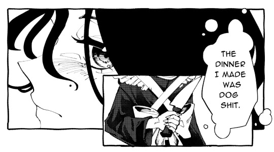
hey dog! sorry to bug you with a coding question, but i'm learning rpg maker mv for a fangame & i'm wondering how you did a couple things. if it's not too much trouble, could you quickly explain some of it? i've scrounged around as much as i can but i cant find what i need so i thought it'd be worth asking directly ^^;
how did you get the players name to show up in the message log? i know theres a plugin that adds the name windows for other characters & i've got that figured out, but i have no idea how to get the players name to show up in the history after selecting stuff
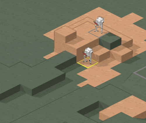
how'd you get the graphic for the route diverging choices to show & play During choices? so far ive figured out that looping the images recreates the visual but then the game doesn't progress, bc its just stuck in that loop...
how'd you disable ( + grey out) dialogue options after selecting them??
how'd you add the fullscreen option? i found a code that was supposed to add a fullscreen option to the optionscore settings but that one just breaks the plugin & i simply Don't know enough javascript to figure it out myself
i'm using all the same plugins that dialtown has so clearly these are possible without extra ones, i just don't know how to do it,, thanks for explaining your pronoun system a little while ago btw! i wasn't the one who asked but your post was super helpful when i was setting it up for myself :D
It's been close to 6 years since I started making DT, and I had to figure out a few solutions to specific issues that cropped up which I've likely forgotten now, but I'll answer what I can remember. I'm also gonna give you some advice and advise you not to use RPG Maker for projects like these.
I basically Scott Cawthon'd DT and forced the engine to yield to my demands because I wanted to use the one I knew best. A few of these solutions are over-complicated because the easier ones (which would've worked in other engines) had to be constructed differently. I'll also mention a few solutions to problems you might not have encountered (but inevitably will if you try to recreate DT.) With that out of the way...
1)

You'll want these settings for the backlog plugin. the \c[x] commands refer to standard name colours. Log special inputs set to true, followed up by this below:
\n<\c[4]\n[1]\c[0]>%1
With \n[1] being the name you want and the number after the first c being what colour you want.
I'll also save you a potential future issue: I'd actually recommend you find the backlog plugin I used in DT's files (located inside the www/js/plugins folder) and use the version I have instead of the official release if you're not already, because I made a small change to fix an error. Basically, it breaks slightly with the plugin that lets you bring up the menu during dialogue because text reloads when you leave the menu and re-enter the text box, causing text to be logged at least twice after you pause it. If you keep bringing up the menu, you'll get constant duplication. I simply added a line of code that tells the log not to have two duplicates in a row. Not a programmer, but it seems works.
2)I did it in a funny way to ensure the engine wouldn't screw it up. Basically, there's 3 steps to the event and it's kinda hard to explain (and would be annoying to reproduce without a lot of trial and error for a beginner.) It's easier if I show my code. The first thing I do is run a common event (you can also just paste this code in and run it from the event) that renders the frames used by the popup, so they're loaded into memory + ready to go.

As you can see, they're set to 0 opacity but now ready to be used. Obviously they have to be on a layer that isn't being used by anything else in the scene (and won't be during this part of the game.) I run this event ahead of time, usually 4 messages before the choice comes up or so, so even slower PCs should have time to get them up.
The 'if head' thing just switches between the files for phone/typegingi's heads. I render each frame on separate layers and toggle their opacity from one to the next on a single frame to avoid flickering (bc RPG maker's renderer is hot trash and I have to work around it. Case in point.)
Step 2 is a second command event that orders the frames to fade in.

One layer is the text (which doesn't move) and the other is the first frame of the little head animation. A switch is also turned on at the end, and this signals the animation to go, which is handled by an event on any map where a choice like this comes up.
The event page that handles the animation itself has 2 pages, one to handle the animation as it goes and the other to handle when it stops (note that you could use one page and simply use a conditional branch. I didn't.)

Set to parallel so it runs in the bg behind normal events. As you can see, every 17 frames, I command one image to fade out over a single frame and another to fade in. It loops perfectly, cycling from middle frame, to left, to middle, to right, back to middle. Finally, when you select any route diverging choice, it sets off a second switch, which activates the second event page and commands the game to dispose of the graphics and then turn itself off.

Basically, it's the same animation but with a twist. The text is faded out over 60 frames and then the same animation is played as before, except the values it fades back into go from 255, to 170 to 85. Each of those commands is also followed by a 17 second fade to the opacity of the next frame. So, frame one renders in one frame at 255. Then seventeen frame fadeout to 170... Next frame renders for 1 frame AT 170, then fades out gradually to 85. Then next frame renders at 85 during 1 frame, fades to 0. This is how i synced the turning animation to fade out convincingly.
At the very end, I turn both of the switches this event page uses off so both event pages don't continue on loop. I also have a check for the first event variable to check if the game should still think the animation is running, as a failsafe. I don't remember if this mattered.
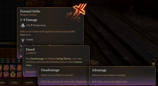
3)It's a function in the YEP Extended Message Pack. You'll see the commands for hiding (temporarily removing) + disabling choices (greying them out) as you scroll through the help list, almost 2/3 down. The thing you have to remember though is that messages that are commanded to be hidden/disabled will STAY disabled unless you turn them back on. So, ANY time there's a possibility to make a choice with a disabled or hidden message, add this plugin command to EVERY selectable choice
ClearChoiceSettings
This will ensure the game doesn't break from having a choice permadisabled. If you use loops or labels to make the game return to a previous choice, make sure the looping point is BEFORE any logic that may disable/hide a choice so it doesn't autoenable everything if the game has to go back.
4)Make a new RPG Maker project, copy the js folder from www/data/js and open the new project alongside your other one. Then check my YEP Option core plugin and follow this path in the plugin editor

This code should work.
On a similar note, I'd also take a look at how my plugins are ordered, if your list is different. I had to meddle with the list to make sure some plugins functioned correctly. This engine is held together with duct-tape and spite, so do what this advice what you will.
Hope this helps!
90 notes
·
View notes
Text
Art Roulette - Get Your Own Artwork :)

Introducing the Art Roulette! A way to get an artwork of your own, or gift a piece to someone special!
How does it work?
It works like this: I am terrible at commissioned artworks. I cannot follow instructions to save my life, so I always wind up with something weird or something completely different. As a result, I usually end up wasting people's time and money, and also creating a piece of art that I am not totally thrilled about, because it doesn't live up to my standards.
I hate the idea of charging anyone money for work that I don't love, which is why I rarely take on commission work anymore.
But I do love creating new art pieces, so I came up with an alternative idea:
I will post a basic artwork with a character, and a brief description of how elaborate the design is. I will also list the prices, which will be anywhere from $100 to $220.
All you have to do is comment down below saying "Mel for Art Roulette!" or "Timebomb foe Art Roulette!"
I will draw a lottery from the commenters, using a randomizer. If you are the winner, contact me on my Ko-Fi within the week. After you make the payment, I should have the full-sized artwork to you in a five-day time-frame.
Please note, this is only for full-color artwork. It's just too time-consuming for me to try and draw 30 random little sketches in one day.
Also, I can't take multiple orders for this; if you are the winner, and fail to contact me via ko-fi within the week, you are out of luck. I will place the names in the randomizer again, and choose a new winner.
This will be ongoing, until I get enough funds to cover the cost of laptop repair. Once the laptop is repaired, the offer will close.
You can still continue to send donations via my Ko-Fi button. Every bit helps.
Also, this does not include a refund option. If the artwork I produce does not meet your expectations, I'm sorry, but you will have to let it go. Once the commission is complete, if you do not want it, the offer is closed.
Once you receive the artwork, you have my full permission to do whatever you wish with it. Share it, use it as your avatar, use it as your background, give the image away to friends and family.
However, you may not claim it as your own artwork, or use it to make money in any way. You may not use it for hateful or derogatory purposes, either.
I reserve the right to re-use any art pieces created in this roulette for my own future projects.
All proceeds will be used towards the cost of my laptop's repair, or possibly for a new laptop altogether.
If you're interested, then leave a comment down below saying, "Mel for Art Roulette," or, "Timebomb for Art Roulette." If you are chosen as the winner, I will contact you on your tumblr.
Payments are only accepted via Ko-fi, as it is easier and safer for both parties to transfer and receive funds. If you do not wish to have the artwork done, simply state so and your comment will be removed from the art roulette post.
Now on to the art pieces.
I am offering 4 2 full-color art pieces.

Piece 1: Timebomb (Ekko and Jinx) in surrealist style. Multicolor subjects. Proportions: head to torso. Background included. Price: $220
PRICE REDUCED TO $150

Piece 2: Mel Medarda in surrealist style. Full color subject. Proportions: head to torso. Background included. Price: $200
SOLD

Piece 3: Jinx in comic book style. Full color subject. Proportions: Head to shoulders. Stylized text background. Includes Vi's and Silco's hands reaching for her, from the top-left and top-right. Price: $140
SOLD

Piece 4: Silco in noir style. Sepia color subject. Proportions: Head to neck. Plain black background. Includes Jinx's hand holding a lighter. Price: $100
All pieces will be digital, and sent to you via ko-fi.
SOLD
Go to my Ko-Fi.
Have a wonderful day, and thank you for the support :)
#arcane#digital art#digital illustration#mixed media#silco#artists on tumblr#arcane fanart#silco arcane#arcane silco#arcane jinx#arcane timebomb#arcane vi#arcane violet#vi#violet#arcane ekko#arcane mrl#mel medarda#ekko#ekkojinx#jinx x ekko#arcane league of legends#arcane league of lesbians
75 notes
·
View notes
Text
Lancer Tactics devlog
I'm gonna try out posting my ~monthly devlog roundup here as well. These suckers are glorified changelogs with anecdotes and gifs galore. Let me know if this is something you like seeing show up on your dash?
Map Editor
Got units able to be placed/deleted/moved in the mission editor
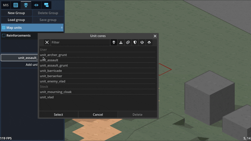
Can paint/remove command zones in the editor
Can paint minecraft-like terrain blocks in the editor

Can paint/rotate multi-tile props in the editor
Can edit unit character sheets and portrait via the editor

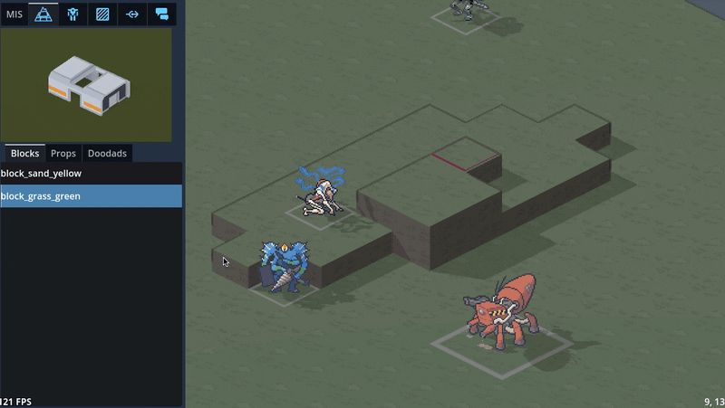
3D maps
Did a bunch of art tests with 3D mech models, provided by GeneralChaos, which we ended up deciding not to go with to keep things simple.

To avoid the can of worms that is animation, we'd have to lean into a static "tabletop minatures" aesthetic which we decided is not a style we want to be stuck with. By sticking with 2D sprites, we avoid falling into a sort of uncanny valley; it's easier to get away with not animating a 2D sprite than it is for a 3D model.
We also experimented with 3D terrain. We decided to make a rule that the visual style for a piece of terrain should match its mechanical effect: obstructing terrain that you can't move through, such as rocks or buildings, will be in 3D, while non-obstructing terrain like trees will stick with 2D sprites.

Hooking up the 3D camera to follow events like movement and attacks did a LOT for making it starting to feel like it's cohering into an Actual Game™
Implemented cover! And an attack preview! Cover works by aiming a ray from the target to the originator (technically to and from each voxel of each, respectively, to handle size 2s shooting above size 1 cover) and tracking all the terrain blocks it hits (how we'll handle non-terrain hard cover TBD). I think I have it working according to Perijove's cover rules manual, but I'm sure there'll be edge cases to work out. This is a case where things are significantly simplified by working in squares instead of hexes; hexes have a lot more possible weird angles you have to deal with.

Re-added what I'm stubbornly calling Combat Popcorn; little bits of text that pop out when you use abilities and attacks.
UI & game screens
Added ability for the engine to show UI that's anchored to the game world via a little word bubble line but also stay on screen as the camera moves around.

Got word bubbles working; you can now write dialogue in the mission editor, hit playtest, and see it work in a mission! (it does actually translate correctly now; this gif is just from a bug I thought was funny)

Got ability effects mostly behaving appropriately again, including muzzle flashes. The easiest way to handle them ended up being NOT billboarding them so they always face the camera (like all other 2D sprites in the game); instead, I put them on a plane parallel with the ground and just spin them around the unit to point at wherever their target is.

Did some work ironing out our tooltip system. The standard in CRPGs these days is this kind of nested labyrinth of tooltops that you see in Baldur's Gate 3:
I Did Not Want to try and figure out how to wrangle that much UI, so we're instead opting to cap the nested tooltips at the second layer. You can lock a general tooltip for e.g. an action and then mouseover various items within that tooltip to get glossary definitions...

...and then instead of having those glossary tips be lockable/mouse-overable themselves, I collect all related terms to that glossary definition and let you tab through them.
Added skin overlay functionality to the portrait maker, enabling textures like scars, tattoos, stubble, and vitiligo to be applied to just the skin and not extend off into space.
Midway through writing this update, Carpenter sent me this gif of the randomization button working! There's a still a bunch of skintones/assets missing and a few are a bit janky, but it was exciting to start seeing the range of these lil freaks (affectionate) that this editor can create.

Mourning cloak license!
This is the one I'm probably most excited about: I did a bit of a content dive and implemented a basic character sheet + all Mourning Cloak traits and equipment. They don't have fancy graphics yet, but the weapons and systems can be added via the character sheet and used in-game.

It took a little under a day, including adding soon-to-be common mechanisms like bonus damage. This is great news in that it means the engine we've been building for so long in the abstract seems to do a great job in handling comprehensive actual game content, and that it looks like we've set ourselves up for success when it comes time to buckle down on churning that out.
I'm sure other licenses will come with unique difficulties (I fear the day it comes time to do the Mule Harness // Goblin CP) but I'm feeling good about it!
Vertical slice?
Taking a step back, the pressing question on my mind has been "when will we have a playable early access build?"
I was originally hoping for Feb/March, but what we've internally been referring to as the "3D cataclysm" has pushed everything back by at least three months, so the target for the first alpha build is now in May. So, ah, thanks for your patience! Seeing things come together, I've become more and more convinced that moving to 3D was the right call.
#lancer tactics#made with godot#godot 4#indie game dev#game dev#lancer rpg#tactics rpg#indie dev#godot engine
294 notes
·
View notes
Note
Hello! I'm thinking of starting an IF story later this year, and am completely new to coding and how to organise a chose-your-own-adventure. I was wondering whether you could share how you organise each route/the story of WTS, please. Love your work!
hi!! if you're overwhelmed by formatting and you're writing in twine, i'd actually recommend writing directly in the twine app. it has a great mind-map aesthetic that can help you visualize things.
but if you're curious as to how i write, i've attached some screenshots below. i believe i've talked about this before, but i'll go over it again because why not?
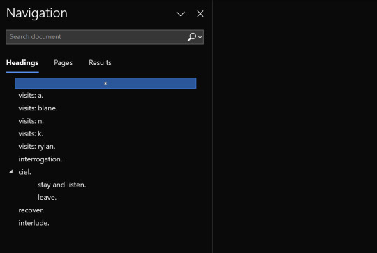
example #1: sections
one of the most important steps for me when organizing a document is having headers. it allows me to jump from section to section, rather than scrolling through for ages trying to find something. it also helps me break the chapter into smaller sections, which makes things less overwhelming for me.
example #2: choices.
in terms of the document itself, i make sure to differentiate texts with various colours to make things easier on the eyes. i also make sure they are visually different. for example, in chapter ten, i wrote my choices in a purple colour and indented them slightly. i also write each line with bullet points, just so i know the text that follows is part of that choice and not general text.
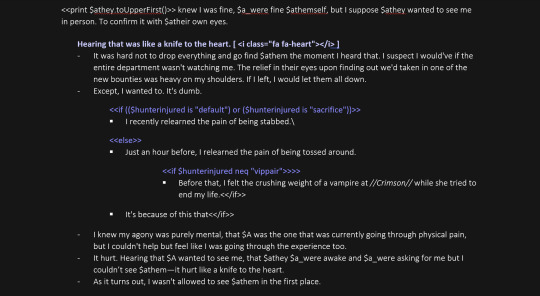
example #3: if statements.
similar to my choices, i colour my "if statements" in a different colour than the general text. i also indent them further than the choices and change the bullet point that it's written on, just so i can further differentiate the two. for those who don't know, if statements act like flavour text, which show up only if you've completed or met a certain requirement prior to the scene. in the picture below, the flavour text reveals itself if you've been rude to Blane seven times or more. otherwise, you get the general text.
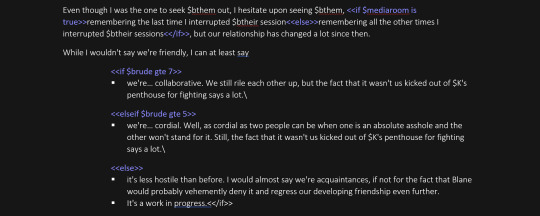
overall: aside from those two formatting decisions, my word document is really standard. luckily, i'm able to keep track of a my branches in my head, so this system works for me, but it goes without saying that it won't be for everyone. as i said at the beginning of the post, if you're more visual, twine (or some sort of mindmap tool) might be useful. hopefully this is (slightly) helpful. if anyone has more questions on this, please let me know! i'm always happy to answer them :)))
p.s. if anyone is confused about all the "<" and ">" symbols, that's just part of my twine coding. i usually copy and paste what i write in word into my code, so this just saves me from typing it.
167 notes
·
View notes
Note
hiii milkyyyy! u’ve been popping out so many manga pages and i’m just so amazed?? i’ve been wanting to get back to manga drawing so can i ask for some tips? like what’s your process and how do you decide the screen tones/sfx/effects/speechbubbles to use? the latter is something i’m struggling with 😭
tyyy 💕
Hi Yudi, thanks for dropping by!
General note: One thing I’ve learned about trying to go for a more manga-esque style is that there’s really no particular way to do it, and EVERY artist does it differently. Everything I do here is a blend of my own style and things from JP artists I admire! However, the most important thing is that panels aren’t meant to be masterpieces but to convey information and get the dialogue going.
This process will be CSP oriented. I’ve made a mini screen tone tutorial (and how to turn on Layer Property) but I did not talk about my own settings ^^ You’re free to do any resolution you want, though I stick to drawing on a B4 template for fun (and imagine that one day my stuff can get published /j). I hope this helps, as I’m still trying to figure my own style and set limits on the details too.
[Process]
Script + Thumbnail
I used to wing stuff for one-pagers, but now I’ve found that scripting and thumbnailing has made my process so much faster. (Omg it’s almost like people make drafts for a reason- @ me cause I hate planning)
There’s no standards of a comic script, and each publisher has their own format. My usual scripts don’t separate pages, since I leave that to the thumbnailing once I do dialogue placement. If trying to imagine panels without seeing them overwhelming, at least get the dialogue down.
The B4 thumbnail template I use is pretty darn big, so it also doubles as the sketching stage. Once the thumbnails are done, I transfer them (screenshot) to a comic file on CSP. Once the set up is done, I do speech bubbles + dialogue first, insert the frames, then get to the line art. Since I don’t think anyone is actually gonna print their works, you’re free to trim your canvas however you want to post online 🫡
Speech Bubbles
Any speech bubble can work and will eventually blend in as the viewer is reading, but I have a vendetta against super flat/digital-looking ones. I made a custom brush for a textured speech bubble pen with line width by adjusting its taper and changing the brush shape. Published manga are a different story, but I like the more organic polygonal bubble shapes from indie artists-
For different shapes and situation… Squares - Narration, Flash/Urchin - Character thoughts/internal monologue, Hexagon - Phone call/text (not a concrete rule but a common pattern)
You can also add emanata (sparkles/symbols) on the bubbles for flairs as you see fit.
Screen tone (Please read the linked mini-tutorial above)
I split my tones into two folders. One specifically for black, and greys.
I first fill in all black areas, the duplicate them. The top layer will be the shadows (remains pure black), and the bottom layer is set to [Opacity 75%] and turned into a screen tone layer with a [frequency of 45-50] (It must always be at a lower frequency than the greys). To add texture, I use a grainy brush to erase bits of pure black on a mask. To show light on the screen tone layer, I use gradient erase on a mask.
For the greys, I split them into three tones (dark grey, medium grey, light grey) all in the same folder so they don’t overlap and it’s easier to fix. I use a [frequency of 75] or any number higher than the screen tone in the black layer. Overall, tones can be as simple and complex as you want, but it’s best to save more detailed tones for important panels. (Planning to change this as I’ve realized how big the B4 canvas actually is, and the frequency doesn’t need to be so high- The size of screen tone is a preference. This example was done on a smaller canvas, so higher frequencies still look less pixelated/small.)
Emanata/SFX
Special effects is whatever the situation calls for! It can to make a blank canvas feel more dynamic, to evoke certain emotions, hint/foreshadow. It’s best used sparingly on important panels you think would be the most important… but how do you get those effects?
THE CLIP STUDIO ASSETS STORE- Or draw/download your own depending on the program (You have no idea- ever since I downloaded too, I can’t unsee them in other works of artists I like 😭) Not used in the example but these are my essentials- You can also find a lot of gems if you straight up search “manga” and see the most popular assets.
Another good place to find comic fonts in general is blambot.com (?). They have quite a bit of free, personal use fonts if you ever need flavour text when italics or bold isn’t enough. (Current font used is Anime Ace 3 Regular BB).
Happy creating and feel free to ask if anything was unclear ^^
29 notes
·
View notes
Note
Since you’re in casting, I’d love to pick your brain a little about selecting actors. I love that Jared is a constantly rising star, but in the most loving way possible, he really isn’t the best actor. 80% of the time when I’m watching him, it feels like I’m watching someone acting. He’s not the most natural Versus someone whose performance I get lost in. That doesn’t mean I’m not going to watch everything he does, and it kind of seems standard for cable network TV (for example, I feel the same ways about Nathan Fillion, David Boreanaz, Matthew Daddario - but it doesn’t make me like them any less). Honestly, the only network TV show they didn’t make me feel that was is Hannibal, and even that was only the leading actors.
I would have assumed that acting ability would be the most important part, but your page has made me realize it’s more than that, and let’s be honest, Vampire Diaries wouldn’t haven’t gotten that far if acting was the most important skill set needed. I’m guessing for the Jared’s and David’s their entire history counts most, but what about for someone just getting hired - the Jared getting the Gilmore Girl’s role or the David getting the Angel role. If they’re acting seems…stiff (wrong word?) what makes a casting director say, ‘you know what, let’s give it to them anyway.��
It’s just such a hard world to break into and I’m guessing there are auditions from people with a little more natural talent, so what makes that final decision?
(Asking as someone who is about to start the audition process)
I think what Jared (and Nathan, David, etc) has doing for him is he acts from his authentic truth. I'll expand on it later in this post. With that said, Jared is a character actor trapped in a leading man role, it's why he's not the "best actor" because people tend to believe that good character actors disappear into their roles by diminishing their screen presence, which you can't do when you're a leading man. You may be picking up on this conflicting issue. Think of Brad Pitt who works best as a supporting actor (X), and struggles a bit as a leading man so he has to throw out nuances and reply more on his raw charisma.
I haven't seen Gilmore Girls but I read Jared was the 2nd or 3rd Dean. Dean was recast because the OG Deans' chemistry with Rory wasn't up to snuff. So that answer your "final decision" question, which is chemistry. David Boreanaz had good chemistry with Sarah Michelle Geller. His chemistry Emily Deschanel in Bones was fine, bordering on good, but it was more fun/odd couple vibe whereas his interaction with Michelle had depth. Whenever Jared and Jensen tell their chemistry audition story in front of the producers, I'm pretty sure they're leaving out that Jared likely had chemistry auditions with other various Dean actors.
My advice on auditions is walk into that room like you’re going to solve their problem.
Most casting directors talk about wanting auditioning actors to "make bold choices" because they believe it will get in touch with their authentic self and therefore, make them a captivating performer. My advice is adjust the text to your authentic emotion so that you're reacting to the events of the story from your internal truth. It doesn’t matter if the story is a sci-fi, comedy, or a period piece drama: if we don’t believe the actors, we won’t care what happens to them in the story. The audience is an incredible lie-detector: the average person has, for their entire life, been storing countless passive data on how normal people react to various situations, so you can’t fool them.
My CD used to say that it's easier to tell the truth on camera than it is to lie because once you believe in yourself, then you're not acting anymore. I don't 100% agree with her but that seems to be what most CDs think.
The more confidently you use yourself as a canvas and let the context of the scene speak through your own emotional repertoire and point of view, the more compelling and interesting you are to watch. The most interesting or captivating actor is the one whose next movement, facial expression, or line reading is unpredictable. That's the difference between Jeff Bridges (unpredictable) and Beu Bridges (reliable).
27 notes
·
View notes
Note
Hi! I’ve been trying to make an introductory post for my WoL, but when I tried doing so freeform it ended up overly long and full of rambling. I’ve searched for templates all over the internet, but the only ones I can find are in the general style of D&D character sheets that include irrelevant information about stats while not properly dedicating space to the actual character traits. I saw the format you used for your OCs, and it seems to be about what I’m looking for. Is there any chance you could provide a blank template along those lines for me and others who might have the same problem?
Funnily, while I keep them all similar, I didn't have a template before now. Also reminds me I need to do some updating and revision on my own OCs, it's been awhile and they can use a refresh for character and plot updates.
I recommend making static pages over posts; easier to track and edit. I am a stickler for organization, so keep my pinned post to the bare basics with links to the profiles and other pages, to keep from stretching the post to a mile long, in part, and to keep the info where it's easily read and relevant. Also because mobile app view won't show one's theme and links, and the pinned post is more likely to be seen and accessible than a sidebar or menu.
I have tutorials on how to set a custom theme (and access full blog features) as well as how to create those static blog pages. Tumblr may have made some updates since, but the gist is the same, and the Help pages have newer details if necessary.
I do urge keeping colors and format simple, accessible, and reader friendly, including screen reader friendly. A row of asterisks or tildes as a separator line are usually individually read out by screen readers, as is the code used to make those fancy hard-to-read gothic letters folks use for "aesthetics." In a lot of my profiles, I split sections with images of the character (which should also use alt text if we're trying to be kind and inclusive, and it's to the point of a profile page anyway).
I think I will put the intro and template here in the post under a cut, and then in a Reply Comment add a link to the Google Doc version, cuz of how Tumblr is about external links. An actual blank copy-pasta is on the GDoc, what's below has some thought processes for each section for guidance.
This a pretty modular template, that can be added to or subtracted from as needed. Move descriptive blocks around as they seem more or less relevant for your OC, substitute things that make sense over things that don’t; this is just a starting point!
I see these as broad strokes; a quick introduction and general overview of your character, meant to give an at-a-glance idea of who they are. It’s handy for other writers and artists, and even oneself for keeping track of some details. I recommend practicing succinct writing here; these blocks should each stay between 100-300 words or thereabouts. Use links to other pages and tags to point toward longer details and stories (and keep them handy for yourself!). It also makes it much easier when you want to revise things when characterization marches forward, or if you want to retcon something entirely.
But these are all just my opinions and ideas on how I approach OC profiles after making them in some form or another for about a quarter century. Make it as long or short as it needs to be, change it up, go nuts, I ain’t your mom, and so on 😉
-
Statistics: The basics; barebones, at-a-glance stat blocks, handy for quick reference. Can be added to or shortened as needed. If a stat starts to word wrap on a standard screen, trim it and move that extra detail to the “Description” paragraph below the list.
Race: (for FF14 fantasy possibilities) Nationality: (or Ethnicity, whatever works. Where are they from, as that helps shape them?) Height: (both feet/inches and centimeters are handy here) Eyes: Build: (I prefer this to weight, as that’s ridiculously variable depending on one’s build, which is more important visually anyway; are they broad, stocky, skinny, muscular, stringy, etc) Hair: (color, type, texture, preferred lengths and styling) Skin: (sometimes I fold scars into here, if there’s nothing too outstanding) Scars: Voice: (how do they sound?) Nameday: Age: (depends on your personal timeline for your OCs, but I recommend an age range over specifics; mid-20s, 25-35, late teens, a little over a century, etc. Less updating and fits with the handwaved time bubble anyway) Disciplines: (what are their main job[s]? The adventuring or professional skills they’ve learned?) Hobbies: Birthplace: Current Home: Occupation: (Their actual day job, different from or part of their disciplines?) Signature Items: (A particular weapon? A piece of jewelry? Always wear a specific coat?)
Description: A very short "immediate impressions" type description; what would someone "on the street" see when meeting/looking at your character on a typical day? Taking some of the info from the stats but then how you want those barebone facts to be seen; is the OC elegant, or rough? Expensive clothes or simple attire? Any particular smells, or sounds? I recommend around 100 words.
Biography: Very brief, general overview of the backstory that led them to the point where they become a story protagonist (adventurer, the WoL, or other roleplay archetype). Don't have to go into great detail, keep it short and simple; it's a blurb that sets up how they got here in broad strokes. I think my longest bio is around 300 words, and it probably shouldn’t go over that here.
To get more details, one can always link to specific stories, or to a tag. I have multiple OCs, so I might make my tags something like "Aeryn Backstory" or "Iyna Lore" or "Punchy History" or some combo thereof (I usually try to keep them consistent though for ease).
Persona: What face do they present to the world? How are they perceived by the public, acquaintances, coworkers, family, actual friends? Some of these answers will be the same, some may change depending on if and how they code switch in various social situations.
From there, what lies underneath the surface? What are some general internal attitudes, traits, feelings?
A hundred words for outward demeanor and another one hundred for innermost self ought to cover the general broad strokes.
Romance: If so inclined, details about the OC's relationship details; sexual and romantic orientations, relationship history, current situations, how they view and approach intimacy (or not!).
Links to relationship tags or stories or art can work well here, too.
Echo: Does the OC have an Echo at all? Is it a "typical" Echo, or do they have some special abilities, some things they're better at than others? How does it affect them, how do they feel about it?
This is another section that may be a free space section to remove or swap to something else relevant to the character.
Hobbies: The stuff outside of work and heroics. Ways they relax, special interests, side jobs, things they enjoy, and so on. This can be an expansion of the listing in the stat block, or you can cut out one or the other to avoid redundancy.
Companions: What’s their chocobo like, or do they have another favored mount? What pet(s) do they have? Are they practically a Disney Princess? Have a familiar? Do they prefer arcane entities? Technological constructs? Or do they eschew companions entirely?
How to find the OC in game: This is where I list things like realm and data center, and addresses for the FC house and personal house or apartment. Not necessary if you don't want folks to go looking.
Links: The links can be scattered through the post in relevant sections, or gathered together here. I tend to put my basic tag for the character, if I have an aesthetic tag for them, their story tags, any links to art references or other miscellaneous items I want easily found for myself and others. I often put this close to the top if a profile is longer and I want those links to be quick referenced.
OOC: Any particular notes one wants to make about the character from a meta perspective. Can also be combined with the Links.
29 notes
·
View notes
Text
WIP WEDNESDAY GAME
Taken from @kedreeva.
It’s WIP Wednesday, time for a little accountability, sharing your work, and getting a kick in the pants.
Here’s how it works:
In a reblog of this post (so people can find you in the notes) or new thread (w/ rules attached) if you want to play on your own, post up to five (5) filenames of your WIPs; not titles, file names.
Post a snippet from one of them. Snippet must be words you wrote in the last 7 days. We’re posting progress here. If you haven’t made any, go make some and come back to play!
After you’ve posted, people can send you an ask with one of your file names. You must then write 3 sentences in that file. If the filename is one you can’t share from (for example, an event or gift fic), write 3 sentences on it anyway, and then 3 more on another to share.
That’s it! You can invite others to join in, or just post. I’ll be searching the reblogs to find people to send asks to!
If you’re reading this, you’re invited!
If you see someone posting a WIP Wednesday Game snippet, send them an ask! Make them write.
file names:
call me cute and feed me sugar
when I see myself, I always know where you are
I'm all yours but you're all mine
a fake cryptid and a real romantic
when you don't believe, that's why you fail
Well, I did "think pink" last week, so it's only appropriate to do all the other DC WIPs I've got going on AO3 this week, right? There's five of them right now, it's just natural! Can't be helped! Totally has to be done!
And just to remind you all, I’m totally cool with people requesting multiple WIPs, but I’d prefer if you sent them in multiple asks! Just a little easier for me that way.
snippet from “call me cute and feed me sugar”:
Tim is pretty sure the date went well, since Kon seemed to enjoy playing with the sensory exhibits, cleaned his plate at the restaurant and finished Tim’s own entrée before going back for dessert, and spent half of the planetarium show star-dazzled and the other half of it making out with him in the back row, and then gave him a goodbye kiss he still hasn’t emotionally recovered from. Like, that seems like a successful date? Or reasonably successful, anyway.
Planning ahead with a side of psychological analysis has once again paid off, Tim is pleased to note. Definitely worth making the fake IDs.
Tim snuck way too many pictures, probably, but it’s whatever. Kon didn’t seem to mind, the times he’d caught him. Now he’s gone and set a standard, though, so he’s not sure what he should do for their next date. He’s got to plan it, obviously; he can’t expect Kon to.
Tim is in his room and already three layers deep into the corkboard he’s planning date options and gift ideas and “is Kon getting enough calories?” math on when Kon texts him, and he stops in the middle of listing the pros and cons of a smart watch as a second-date present to read it.
He may or may not have given Kon his own text alert and ringtone, but that’s his own damn business.
123 notes
·
View notes
Text
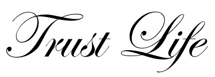
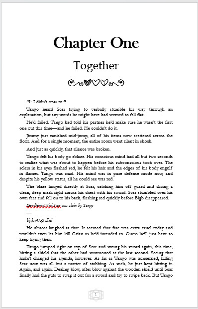
So I just finished binding Trust Life by the absolutely amazing @chaiandsage (Hello, I am ready to be perceived now, I hope that I have done your story even the slightest bit of justice) and I just wanted to make a post both showing it off, and going through what I learned doing this bind because I did a few new things here and want to talk about it.
Also I'm not going to subject you all to this, so most everything but the final product here is going to be below the cut.
(Also so sorry that the photos aren't the best. I am... Very bad at photography, lmao)
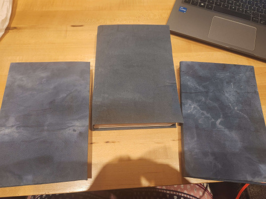
Ok, so let's start off with some of the cool things I learned during this bind. Or, maybe not necessarily cool, but they are things I learned and I think that learning is cool!
First off, I learned how to download and add fonts to Microsoft Word, which while not interesting, does open up a whole world of fonts for future binds. Is it a little late in the game to have found this? Probably. But it is what it is. I actually downloaded a pretty good chunk of different ones, but the fonts I actually used were MF Love Dings for the heart motif dividers, which was a new download, and then a few standard fonts - Edwardian Script ITC for the title pages, Baskerville Old Face for the chapter headers, Book Antiqua for the chapter titles, and good old Garamond for the actual text of the novel.
Here is the divider and the title fonts. I just think they are neat.

Another thing I learned was how to make book cloth! I found these squares of white cotton fabric at a dollar tree and decided to give it a go. The way I did mine was by painting them first (a task in and of itself, and as you can see on the cover, did not turn out super even, but I love them nonetheless) and then I glued down a layer of tissue paper to give it a little stiffness and make it stick to the chipboard easier, it was a super cool process and I look forward to trying it again in the future now that I have done it once and have a better idea of how I can improve in the future
And now onto some of the other cooler parts of the process!
So I had a lot of fun doing the formatting, it's my favourite part of any binding process, I cannot tell you how many fics I have formated that I have yet to print out and actually bind because I enjoy the process so much (the answer is actually 5 that are completely formatted and ready to go, 3 that I am actively in the middle of formatting, 4 projects completed - including this one, which... may technically count as 3, granted 2 of them were gifts for other people - and 3 that I am planning on doing that I haven't gotten to start on yet. Oh, and a 5 part series that I have printed out but haven't actually bound yet. I have a problem, lmao.) As I mentioned, I downloaded a few fonts for this but it just ended up looking so good in the end. Here is what some of the inner formatting looks like (I did just take the screenshots from word, I thought it was easier than getting the pages in the book)

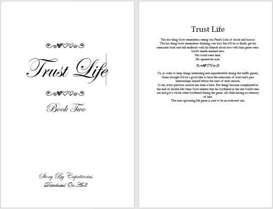
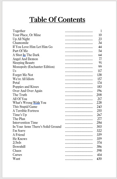
Something else! This was the first time I actually broke a single fic into multiple parts, and I do not regret it. Each section is fairly large on its own, so it would have been a monster all together. I gave them basically the same title pages and such, just used the main stories summary for all of them and copy pasted everything - work smarter, not harder - and kept the same format for the chapters and such. There were 2 obvious spots (at least imo) for breaking things up, those being at the end of chapter 24, and then again at the end of 57, if you know, you know. However, that made the divide be 24 chapter, 33 chapter, 9 chapters. I was a little worried about how that divide to affect the look of the books, but I was pleasantly surprised how well it worked out. Book 2 there is quite obviously the largest part (it's basically double the length of book 1) but book 3 was surprisingly long for being only 9 chapters and I think they look fairly cohesive together. I didn't realize how long the last nine chapters themselves were. The first and third ones are actually about the same size together as book two, which is pretty cool!

When it came time to put together the actual books, I stuck with my tried and true french link stitch, as I find it to be a sturdy stitch, and then used green, yellow, and red card stock for the end pages, I felt it thematic.

I'm super excited to have this as a physical book now, thank again to chaiandsage for allowing me to bind this amazing story and just for writing it in the first place! I read it like twice in the span of a month, and I swear I have read chapter 57 and 58 themselves way too many times to count. Not even going to mention the amount of times I read the last 6 chapters because I just love a good happy ending.
But yeah, I'm really happy how this bind turned out, I still have to put an actual cover in these - which I plan on doing, I have a friend who is going to help me with the cover design when they are free, so there will be an update at some point.
#I genuinely had so much fun doing this#ask any of my friends#i would not shut up about it#fanfiction#traffic smp#traffic light smp#trafficblr#life series#trust life#bookbinding
34 notes
·
View notes
Text
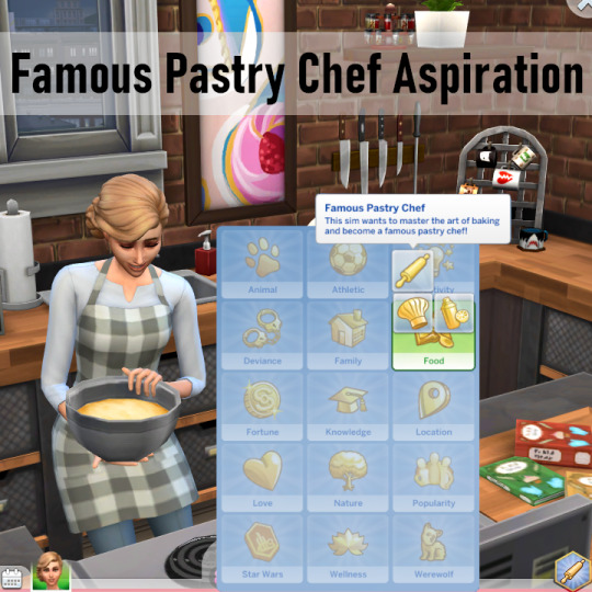
Famous Pastry Chef Aspiration by xbrettface Updated
There was very very little that needed to change in this aspiration. It just needed updating for new added tuning and to mark it as a teen+ aspiration (there's no straightforward way to mark it as young adult and older). and to recognize cupcakes baked in the oven. So I changed as little as possible.
From the original description (also the picture at the top):
Famous Pastry Chef: This sim wants to master the art of baking and become a famous pastry chef! Reward Trait: World-Renowned Baker (Adds Fresh Chef and Unstoppable Fame traits) This sim has earned a place in the Culinary history books! All prepared food is high quality and never spoils! Their fame is immortalized and incapable of fame decay over time. Tips for gaining Fame Points and winning an Award as a Baker/Pastry Chef: I have also included additional information/tips for objectives when you hover your mouse over the text of an objective. 1) Half Baked Watch 4 Hours of Cooking TV Buy a Cupcake Machine Bake 6 Cupcakes Achieve Level 5 Baking 2) Whisked Away Bake 10 Pastries Volunteer at a Bake Sale Research Advanced Cooking Techniques Achieve Level 10 Baking 3) Selling Like Hotcakes ]Earn Gold on 2 Fan Meet & Greet Events Reach Level 8 of the Culinary Career Buy a Bakery (Retail Lot) (If you need a bakery, you can download my Sweets & Treats Bakery lot here!) Become a 3 Star Celebrity 4) Life Is Sweet Earn Gold at a Hosted Charity Benefit Become a 5 Star Celebrity Win an Award at the Starlight Accolades Place a Celebrity Tile in Starlight Boulevard
What I've changed:
I changed how cupcakes are registered--instead of checking using the cupcake making interaction on the cupcake machine, it now checks for making cupcakes (a whole batch, not a single cupcake). It will now register cupcakes made in the oven too.
I added the teen+ aspiration_valid_age_type. Not having that is the main reason it was broken.
I added completion loots to the objectives, for wants and pivotal moments, as is now the standard.
I added a buff to let the game know that the aspiration was completed. I'm not sure why it's in all the aspirations I looked at, but it is, so this one matches those. Maybe milestones?
The reward trait is now valid for reincarnation.
The reward trait is now available for teens.
The reward trait now has a display_name_gender_neutral.
The reward trait is restricted to humans, or available for humans--humans meaning not pets. Probably both. I think a species test became required since the mod was last updated.
I re-used the included icon on the trait, since it didn't have one.
I updated the SImData.
I added comments, since I had to update all the files anyway, and if it does require a full overhaul at some point in the future, they'll make it much, much easier. This time it just needed a little touch-up.
Most of those are things I've done for every aspiration I've updated.
I haven't added wants. I've made so few changes that it didn't feel right to, and xbrettface said they had plans for the aspiration the last time they updated it. Hopefully they will come back and make those changes.
If you've been playing with the aspiration despite it being a bit broken, you can pop the update into your game and keep going with no progress lost. And existing translations will still work (no idea where they are, since they're not linked or included).
Requires Get to Work, Get Famous, and Parenthood.
Download: https://www.patreon.com/posts/famous-pastry-by-120412364
#mine#xbrettface#my mods#but not really#sims 4 mods#ts4#ts4 mods#sims 4 aspirations#ts4 aspirations#adopted mods#mod updates
11 notes
·
View notes
Text

˖ ⚡️ # 𝐰𝐢𝐥𝐝𝐛𝐨𝐥𝐭 is a highly selective & private writing blog feat. 𝐬𝐚𝐭𝐨𝐬𝐡𝐢 𝐚𝐬𝐡 𝐤𝐞𝐭𝐜𝐡𝐮𝐦 of the ( 1997 - 2023 ) pokeani series. inspiration taken from the indigo league, gotta catch 'em live, many to all films, & personal headcanons. playlist.

a majestic tale within THE WONDERFUL WORLD of pokemon. one young boy dreams to be the VERY BEST &. to become pokemon master. through hard trials of fate &. brave determination, crowns him as a TRUE hero &. BORN champion.
★☆ searching far & wide with: hightouch ☆ spookymulti ☆ mfingoak
☆★ team: pikachu ★ victini ★ rowlet ★ oshawott ★ lucario ★ charizard
001. hello fellow trainer! welcome to my blog where i write my beloved little ashy boy. i have enjoyed pokemon since the tender age of five & to this very day, yellow & gale of darkness being my personal favorite games! i have been rping for 15+ years and have yet to get out of this chair. my blog is strictly selective & private, so i will only interact with my mutuals. i will not be responding back to the following messages: want to rp? can we be mutuals? etc. i'm sure you are an amazing writer with wonderful muse(s) but this is my decision to follow, please do not take it personally if i don't follow back, as this is due to comfort & to keep a tidy dashboard. i will end up soft blocking when i deem it necessary: if i find your muse makes me feel uncomfortable all of a sudden, i never found our muses could connect, or if the dash is clogged as i do ghost a lot. i don't have high standards, but there are somethings i do take on direct level when it comes to rping. i won't be following hub blogs as well. if you have sides, i will look through them but they must be pinned in order for me to browse them.
002. i am crossover & original character friendly. however i must have some info of your oc & any verses they have before we can write together. i also need to know what series your muse(s) originate from for better understanding & writing perspective, as this makes my life a whole lot easier to know what we can do during interactions. i would love to partake in any kind of plotting, though i am a very lax role player & it isn't necessary. this goes without saying, but godmodding, metagaming & powerplay is forbidden. there can be some exceptions, but this does not allow you to have full control while we write.
003. please do not pressure me for replies, i work a 40+ hour job in a stressful environment. i also have add/adhd, so i get distracted very easily. i also forget a lot & feel swamped most times. i only write when i am motivated & have enough energy. with all that being said, my inbox & dms are always open for any new interactions. just be patient when & if i am sporadic with them.
004. i won't be writing any nsfw as my muse is plot locked at the age of 10 in canon. there may be dark scenes that may contain death however, as my muse does indeed die a few times during the series. this will be on the most rarest occasions, or may not be present at all. i don't tag triggers, but if need be i can & will. just give me a holler if anything needs to be tagged correctly.
005. length varies to what i can come up with & what my writing partners bring to the table. this doesn't mean you ever have to match up with mine. i enjoy making stories at times & this all ties down to reply speed. format is small text with html color coding. you can format our threads however you like, so long as it is readable. also, please trim your posts for my poor ocd brain.
006. this blog contains multishipping in different timelines and verses. good chemistry & enough interactions are required for any dynamic questions, but never be afraid to ask if you want something planned as i am open for romantic/familial/platonic ships. i don't practice exclusives minus hightouch's dawn but i do with mains.
007. no drama. no hate. no name drops. if i see anything of sort in the inbox or dms, it will be deleted upon arrival. role play is a hobby & for fun, let's keep it that way. so please, do not harass any of my writing partners. if you are wary of someone i interact with however, you may politely inform me. but i absolutely will not tolerate for personal disliking towards another. anonymous asks are forever closed simply for me to focus on threads & in my opinion, i had never found anons enjoyable to answer.
008. my open starters & prompts are available always! you may also continue an answered ask without question. if sending an inbox message for one of his partners, please please specify who you want or i will pick at random. this goes for my starter calls as well. i will be sticking to english dub pokemon names, as this is easiest for me. if you want to know/read about ash, his pokemon and verses you must click on the floating links on my theme. do note: i did not play scarlet & violet very much (the game was just too unplayable for me my b) so like ash, i am unknowing of the paldea region. in a way, that's a win-win tbh. i am not at all associated with the pokemon rpc nor will i write battles. i'm just here to chill & vibe with my favorite son shine. best wishes!
9 notes
·
View notes
Text
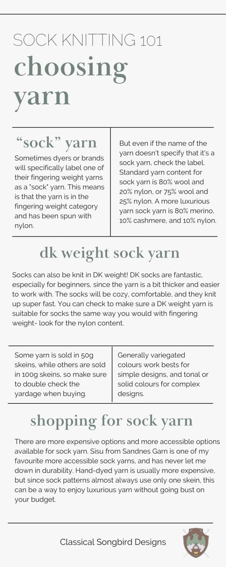
A little infographic for choosing sock yarn for your hand knit socks. You can read the full blog post here.
(Text for the infograph below the cut.)
Sock Knitting 101: Choosing Yarn
"Sock" Yarn: Sometimes dyers or brands will specifically label one of their fingering weight yarns as a "sock" yarn. This means is that the yarn is in the fingering weight category and has been spun with nylon. But even if the name of the yarn doesn't specify that it's a sock yarn, check the label. Standard yarn content for sock yarn is 80% wool and 20% nylon, or 75% wool and 25% nylon. A more luxurious yarn sock yarn is 80% merino, 10% cashmere, and 10% nylon.
DK Weight Sock Yarn: Socks can also be knit in DK weight! DK socks are fantastic, especially for beginners, since the yarn is a bit thicker and easier to work with. The socks will be cozy, comfortable, and they knit up super fast. You can check to make sure a DK weight yarn is suitable for socks the same way you would with fingering weight- look for the nylon content.
Some yarn is sold in 50g skeins, while others are sold in 100g skeins, so make sure to double check the yardage when buying. Generally variegated colours work bests for simple designs, and tonal or solid colours for complex designs.
Shopping for Sock Yarn: There are more expensive options and more accessible options available for sock yarn. Sisu from Sandnes Garn is one of my favourite more accessible sock yarns, and has never let me down in durability. Hand-dyed yarn is usually more expensive, but since sock patterns almost always use only one skein, this can be a way to enjoy luxurious yarn without going bust on your budget.
36 notes
·
View notes
Text
Accessibility within the RPC
How we can make it a better place for everyone. These tips are coming from a accessibility educator and web tester. It's not comprehensive, but meant to give you a crash course. Especially on the most common RPC trends.
General
The more you deviate from standard English writing, the more people are going to be less likely to be able to read and interact with you. People with disabilities, neuro-divergence, or even normal people whose time is limited will be effected with each deviation.
While tools exist to make these things easier to curate someone's experience, their functionality is limited. The large majority of them work by modifying standard English sentence structure. They tend to break or not function properly otherwise.
Some screenreaders for example struggle with all lowercase/uppercase text, double/multi spacing between words, lack of punctuation, etc. They will end up reading the text back in very odd ways.
Color can be make it difficult as well. The themes on Tumblr are varied. Your writing partner could be using these theme and your colored text is nearly impossible to read because of their theme. There are also color contrast issues for people with varying degrees of color blindness.
Accessibility is not one size fits all. Talk with your writing partners about their specific needs.
Tips for a more accessible blog and replies
Look for themes / carrds that are W3G compliant.
Don't use all lowercase text in your replies ( lapslock ).
Don't use all uppercase text outside of well-known acronyms.
Don't put multiple spaces between your words.
Use punctuation in your sentences.
Don't use color in your blog's text.
Use themes / carrds that say what the button/link is for. I, II, III, IV don't really give an indication of what's there. List it out: Rules, Muses, Connections, etc.
Make sure your theme uses at least 16px font sizing. Tumblr's post small font is 13px which is below the standard. The regular font however fits.
Don't make important links or link context like text appear on hover. A mobile device can't see it. Someone who is keyboard only can't either.
Again this isn't comprehensive, but it will give you a start. This is to help be more inclusive with your replies and blogs. This isn't to shame anyone for their aesthetics, but to point out things we can all do to make the RPC more accessible.
What if I like my aesthetics and don't want to change?
That's fine. Just understand it means fewer people can read, process, or comprehend your writing. Better yet if you don't want to switch and instead compromise? Make it very clear in either your rules, pinned post, carrd, etc that you will absolutely switch to regular formatting upon request.
This will help bridge the gap that people with fewer spoons to reach out over this will feel more comfortable doing so.
At the end of the day when we make our replies and RP blogs accessible for those who need it, we make it more accessible for everyone.
49 notes
·
View notes
Note
yoooo how did u make ur user name purple on ao3 that’s so cool !!!
hey, thanks :) explanation under the cut since this ended up being a really long post lmao
I actually changed the link color to purple, and that changed my username too since it's a link!
I did this by making a work skin. To do that, go to "skins" on the dashboard thing on your page:

on ao3 you can use site skins (ie themes, which change how the website looks for you specifically):

and work skins (custom styling for your fics, which will show up for anyone viewing your fic):

you want to go to "work skins" and create a new one. (make sure you're creating a work skin, not a site skin)
give it a name like "linkcolor" and fill in the following: (pastebin for easier copying and pasting)
#workskin a:link {
color: #XXXXXX;
}
#workskin a:hover {
color: #XXXXXX;
}
where "link" is the standard link color, "hover" is the color when someone hovers over it, and "visited" is the color displayed when someone has already clicked on a link before (I made this the same as the standard color).
#workskin a:visited {
color: #XXXXXX;
}
you'll obviously need to fill in hex codes for the colors. you can google "hex color picker" and a color picker will show up so you can easily figure out which color codes to use:

so then after these steps, you'll have something like this:

now you need to create your fic, which you'll do in the usual way, except you need to add the work skin. this is pretty simple, just make sure to add the work skin in the "associations" section:

and then if everything went well it should come up looking like this:

it is very convoluted lmao, the reason I did this is because I wanted to do other stuff with the work skin as well, and I thought this would be a nice touch since I was there playing around with the CSS anyway. you can use work skins to change the formatting of all kinds of elements, not just links (for example you can change the font and color of the title, or create specific styling to apply to some paragraphs in your fic, which is how I made the text boxes in stop the world). it gets a bit more complicated once you get into that stuff though.
you can also use the same work skin for any fic, so once you've created it you can just apply it to all your future fics.
I don't really know what I'm doing here lmao but hopefully this was a clear explanation! also sorry if I included too many details haha, I'm not sure if you already have some knowledge of this stuff or not. but hopefully it's clear how to do it now :)
I would like to make this public so other people can just use it without having to go to the effort of creating the entire skin but there's a notice saying it's not possible to apply to make your skins public at the moment, so that's a shame
#ask#anon#phan#<- since i got a few comments on this in case anyone else was wondering how to do it I'll put it in the tag
10 notes
·
View notes
Note
MTG or YGO?
Long post? Long post!
Are you asking what I prefer? YGO. Are you asking what I think is better? That is wholly dependent on what a person wants out of a card game.
YGO's biggest barrier to entry is the fact that the cards are written in their own form of legalese. I mean this very literally, too. They use "Problem-solving card text" where it makes use of deliberately placed adverbs in effect descriptions to dictate moment to moment interactions. It is almost like learning a new language, and has been compared to learning how to read through legal documents. It becomes comprehensive once you wrap your head around it, and is the reason you can do some properly crazy/funny shit in the game, but wrapping your head around it and understanding what new cards do is a whole thing. Having someone who's played YGO before teach you how to play the game is basically the most reliable way to learn it. It's genuinely a problem.
MTG is, comparatively, much easier to learn. Very low floor of entry, and sequenced in such a way that you can understand basically how the entire game works in a few hours. MTG's complexity 100% exceeds YGO's at the uppermost levels, but the way game comprehension builds on itself is much cleaner, so it feels less obtuse overall.
MTG is mechanically more casual friendly. The current MTG darling format, Commander, is basically a 2ish hour social game where four people engage in a free for all that hinges partially on social politicking. It's typically chill. You also have a lot of assorted 1v1 formats and such. There is likely a "way to play" that will resonate with you, and the games tend to be slowish.
YGO doesn't really have multiple formats in a meaningful way. You can absolutely do group stuff and set informal rules, but the game ultimately hinges on 1v1s. With the frontal complexity of card text, these can and will feel very lopsided and frustrating until you understand what's going on. Once you do know, it's super cool, but getting to that point can feel like a chore. The games are also typically quite fast (maybe 3-6 long turns) and very dense with card interactions and timings. I enjoy it for the way it makes me strategise (or not), but it's definitely a preference thing.
Cost is something where YGO absolutely curb stomps. I can get a whole deck of picked out cards, plus a suite of "staple" (eternally meta relevant) cards, with lots of cool foiled versions and stuff, for like 50-70 bucks USD. You are NOT doing that with MTG. MTG is a stupidly fucking expensive game, where reprints of important cards are rare to encourage market speculation (I am not kidding) and finance bros have an ACTUAL PLACE in the community. There is a reason that casual MTG encourages proxy use. It's fucked. Also, as an aside, MTG's shiny/foil cards are dogshit. Same-y and super prone to curling. YGO foils are extremely good and pretty.
Cost feeds into another issue; set rotation. You can argue merit in both directions with this one, but for the average person with average money to spend, MTG takes another L here. MTG has set rotation. Basically, in the standard 1v1 format, cards that have been out more than 3 years will no longer be playable in that format, and you have to get the new cards. A lot of the alternate 1v1 formats in MTG actually just boil down to "1v1s but you can use cards as far back as X" because... people want to use their cards they bought. YGO doesn't have this. It instead has a banlist, updated every couple of months, that aims to curb problematic card interactions. Ultimately, though, if you buy a thing and like the thing, you can basically always use the thing. (MTG, as an aside, also has banlists for its formats, but it's in addition to the rotation stuff. The fact so many formats are there to ignore X years of rotations is also kinda telling, imo.)
Art direction and flavour are a personal thing. I like both, though I think that YGO's reputation for archetypal/thematic variation and card art quality are well-earned. That'd be wholly up to your preferences.
So yeah, I have a fondness for both games, but I ultimately prefer YGO because I like doing unhinged bullshit in it, I like the art a whole lot, and I like that all my cards are affordable and retain usability in a typical play environment.
30 notes
·
View notes
Text
To all the persecutors who are trying to change for the better:
Hey you, persecutor reading this! Guess what? We see your efforts and we know how hard you’re trying to be a good person and strive for positive change! And we think you’re doing a great job!
We know attempting something like this is definitely not easy. We know how real the struggle is trying to become a better person and cause less harm to yourself and your system! But even the smallest, tiniest steps towards progress is forward momentum! Every single time you choose kindness, you choose gentleness, you choose to be helpful or supportive, that’s positive growth right there! You can witness your development in real time, and that is absolutely worth celebrating!
Have you backslid recently? Regressed? Hurt someone you care about, or found yourself reverting to your old ways? Well, none of these things mean you haven’t been making real progress, and they don’t mean that there’s no hope for you to become a better person! Progress is not linear, and making the occasional mistake does not undo all the hard work you’ve done so far! Please don’t wallow or dwell on your past mistakes - it’s much better to focus on making positive decisions in the future than it is to beat yourself up for making bad choices in the past!
To those with persecutor roles, it can be so hard feeling like you’re not a whole person, feeling like you’re nothing but pain, resentment, bitterness, anger, or sadness. We want to reassure you that there’s so much more to you than the negative emotions you hold onto! Even if you and your system identify with parts language, even as a part you are made up of more than just your pain! We promise that with time, gentleness, self-compassion, and a chance to heal and grow, you may find it easier to let go of your pain and anger in the future! It’s a goal worth striving for, and one we have complete confidence that you’ll be able to achieve! So don’t give up, not yet! We’re in your corner rooting for you, and believing in you every step of the way!
We know that often a persecutor’s intentions are not always bad. They may intentionally or unintentionally harm members of their system as a trauma response, or with the goal of protecting themselves or their system as a whole. Even if you end up hurting your system a lot, for many persecutors, we know your hearts really are in the right place! What matters most is recognizing that harm was done, apologizing with sincerity, and making a genuine effort to treat others better in the future. Remember! It’s okay to make mistakes! Treating others harshly in your past Does Not mean you are doomed to treat others harshly forever!
We care about you and we so appreciate your efforts in your system. Know that you are a cherished and valued member of your system and the plural community just the way you are! We’re sending you love and wishing the absolute best for you in your future. Please do your best to take care of yourself and your system, manage your expectations and don’t try to hold yourself to unrealistic standards! Remember, you got this! And please try to have a fantastic day!

(Image ID:) A pale orange userbox with a cluster of multicolored flowers for the userbox image. The border and text are both dark orange, and the text reads “all plurals can interact with this post!” (End ID.)
#multiplicity#pluralgang#plurality#actuallyplural#system positivity#plural positivity#plural pride#system pride#persecutors#system persecutor#long post
70 notes
·
View notes