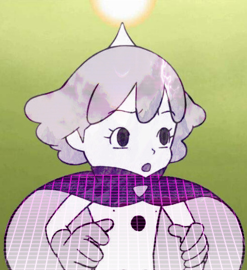
#it looked a whole lot better when i was working on it on gimp :(
Explore tagged Tumblr posts
Visit Tumblr Blog
Explore Tumblr blogs with no restrictions, modern design and the best experience.
Last Seen Tumblr Blogs


Fun Fact
When “GIF” was named word of the year in 2012, Oxford Dictionaries U.S.A. credited Tumblr for pushing the word.
Text
Lab Rats characters as colognes

Donald Davenport ➡️ Angels' Share (Kilian Paris)
One of the classics. There are polarizing views regarding Donald, and while he did do some things that I didn't like either, looking back, I can honestly say that I still hold him in a positive light--which is why I chose a pretty great scent to represent him.
The main accords of woody and warm spicy, as well as the top note of cognac and middle notes of cinnamon and oak, says Donald. Like, this man would probably smell like that.
Add to that the beautiful bottle design? So rich and executive?
Yeah. Definitely Donald.
The vanilla at the base gives the cologne (perfume?) some sweetness, too. Donald can be like that. He's egotistic most of the time (let's just be honest), but he had lots of sweet moments with his wife and little ones throughout the show.
That's why I think he would be Kilian's Angels' Share.
Tasha Davenport ➡️ Baccarat Rouge 540 (Maison Francis Kurkdijian)
The king of all EDPs--matched, of course, with the queen of the castle. I don't have this scent (a 2.3 oz bottle can cost $250+ 😭), and I haven't gotten to try it through a sample spray, but I've heard it said that this has a sweetness to it, just enough.
That trait is similar to Tasha because while she can be sweet and warm, those things have a limit. She was never cloyingly sweet, never permissive and lax in disciplining Leo, but she wasn't sharp and cold to him, either (interestingly both in their universe and the parallel one). She was just perfect.
Tasha is also this perfume in that they call attention. I mean, honestly. Tasha is just gorgeous. Hot take, but I don't think there's ever been a Disney TV mom as beautiful as her.
In the same vein, there are SO many fragrances out there trying to dupe BR540. While a few had gotten close, collectors still spend money to get the original - because there's nothing quite like it.
So, yeah. Mama Davenport is definitely the Baccarat Rouge 540.
Douglas Davenport ➡️ Replica By the Fireplace (Maison Margiela)
This scent isn't for everyone, but it is for me. When you spray this on a tester or just out in the air, you will smell campfire. The smoky scent, I'm guessing, is brought about by the clove oil and the guaiac wood. I hate the smell of smoke, but what saves, and even endears, this scent to me is the vanilla note that comes and stays.
Some people had described it like smelling campfire with marshmallows being roasted over it. I used to think that, too, but the more I think about it, I just pick up a comforting sweetness that isn't necessarily marshmallow.
That represents Douglas well, I think. There had always been a bit of a wilderness feel to him, something a bit rough around the edges, you know? But, once you get to know him and once you understand the new person he's become, you realize that he's actually kind and sweet, though begrudgingly.
Adam Davenport ➡️ Spicebomb Night Vision (Viktor&Rolf)
Chose this for the very shallow reason that this is probably one of the sexiest colognes I've ever smelled in my life. It exudes strength, magnetism, comfort. It...It's just attractive.
Obviously, Adam himself is not lacking in the looks area. He's a very handsome man. But I also chose this specific flanker to represent him because of how the bottle looks. You can't really see it on the board, but the bottle both in the complete pictures and real life has a dark green "glow" at the bottom. It's just so cool.
Though Adam is very childlike, he has a lot of moments that shows a cool side to him. In particular are the several moments when he would actually stand up and protect his siblings.
That's why this cologne is for him. (Side note: Also, I really do think Adam would own this scent.)
Bree Davenport ➡️ Uomo Born in Roma Yellow Dream (Valentino)
First off, I am of the personal opinion that Valentino has the best perfumes and colognes in the designer category of the market.
Now, that said, Uomo BIR Yellow Dream is definitely one of my favorite colognes out there. It opens up bright due to the pineapple and mandarin orange notes, deepens just a little due to the spicy notes that follows, and continues sweet because of the vanilla at the base.
It matches Bree, I think, because she definitely had moments where she brought the light into an otherwise bleak situation. And once upon a time, she was one of my favorites before they turned her into the Disney stereotype of a teenaged girl. She was complex, very relatable to girls who had grown up around boys.
The scent matches her, too, due to the bottle. It's probably got one of the better designs out there. Like Bree, it's beautiful and pretty stylish.
Anyway, that's why I think she would be Uomo BIR Yellow Dream if she was a scent.
Chase Davenport ➡️ Light Blue Pour Homme (Dolce&Gabbana)
D&G's Light Blue Pour Homme is definitely one of the modern classics. It's one of your well-loved summertime scents that comes across as refreshing (because of the citrus notes) and relaxing (because of the green notes). I didn't know this 'til I looked it up, but apparently, it has incense at the base? Which now, thinking back on it, I get, because even though this is fresh and cool, there is a depth to this - a smokiness, if you will - that does draw you in.
Chase matches those descriptions well -- the original LR Chase, at least. He was a bright guy whose concern and priority in life were the safety of others, his family, and the planet. Chase had a good heart, and pre-S4, I don't think I ever remember him acting unreasonably selfish.
He was the youngest of the trio, but he had his head on straight and actually cared about things that mattered. He was refreshing.
Unfortunately, I also chose this scent for Chase because he and the perfume version of this have something in common as far as my relationship with them. Ugh, I loved Light Blue when I first came across it. I loved it when I was first gifted it!
But sadly, I've fallen out of love. I still think it's a classic, and I will continue to use it because there are times when it's the perfect scent for the occasion, but...the notes are often coming across as wrong to me.
Personally, Chase had started hitting the wrong notes, too, as the show went along and eventually transitioned to the spinoff. I'm not happy that the writers did that, because they turned him into someone I didn't like anymore.
But hey. Like I said, he still has times when he's pretty cool to me.
Leo Dooley ➡️ Sauvage (Dior)
Saved the best for last.
Y'all ready?
Okay. I know I could have chosen a niche fragrance for my baby because there is no one else quite like the L-Doo. But, I gotta match my absolute loves with each other.
So, I mentioned that V&R's Spicebomb Night Vision is one of the sexiest colognes I've ever smelled - and that still holds true! However, this cologne? Honey. He's got everything. He's sexy, he's cool, he's deep. He can hold an intelligent conversation. He's manly, but comfortable to be around.
He's a gentleman.
I'm not gonna talk too much about notes because this thing has about 1034872 different notes in the middle alone (7, to be exact, but you get the point). But, I will bring out three: bergamot from the top, lavender from the middle, and cedar from the base.
It's no doubt that Leo's full of life. He has a sunny personality (bergamot), and his humor is just off the charts. Easily one of the funniest characters in the show, if not the funniest.
He's also a constant, a stabilizing force in the show (cedar). I can honestly say that in terms of growth as a character, he didn't have much of it (Douglas takes that crown), but he was still a dynamic character that you can depend on.
He stayed true to who he is: sarcastic, sweet, caring, protective, clumsy, smooth, smart - the list goes on. And the show needed that. Needed him and Adam being constants, because everybody changed so much over the next few years, and not necessarily in good ways.
Finally, lavender, for the simple reason that who he was during the course of the show, the stability he offered as a character, gave me comfort. He's forever going to be one of my TV babies :)
Anyway, before this turns into a full blown essay, Leo is Dior's Sauvage just for being the best.
Okay. Mighty Med's next!
#rip the image quality#why does it look like THAT??!#it looked a whole lot better when i was working on it on gimp :(#whatever#random fandom stuff#Lab Rats#Donald Davenport#Tasha Davenport#Douglas Davenport#Adam Davenport#Bree Davenport#Chase Davenport#Leo Dooley#some boards of sorts
15 notes
·
View notes
Text
'CLOSER, [kinkpril day 1 - leather and latex]
-GOTHAM!VILLIANS X READER-

⋆ Characters ↬ Victor Zsasz, Tabitha Galavan
⋆ 𝐒𝐘𝐍𝐎𝐏𝐒𝐈𝐒 ; gotham villains and there affinity for leather and latex ;)
⋆ tags/warnings. GOTHAM!villains x female reader. Day 1 of gotham tv kinkpril! How this works is each day I follow the prompt list; and pick gotham characters who I personally think would resonate with said kink. SMUT!!! PURE PORN. S&M undertones! Hard kinks. Warning for leather, latex, and bondage obviously.

𝑉𝐼𝐶𝑇𝛰𝑅 𝑍𝑆𝐴𝑆𝑍
♫ “You let me penetrate you, You let me complicate you” Closer by Nine Inch Nails
Victor's done just about every weird kink in the book. If it's sadomasochism...he's all for it. Don't get him started on the knife and gun play- because he won't stop. Ever.
But perhaps his favorite kink is leather, above all. And he didn't even know it, until you suggested it to him.
Yes, he's been around the block. But your his girl; his lady; he's going steady with you. It's different when a person who you love asks you to try something new.
I'm telling you; it's like a whole new world opens for him. If he wasn't absolutely nasty in bed before, he is now.
There's just something about seeing you dressed in the shiny black material that gets him hot and bothered. One glance at you and your ass in the latex and he's hard and ready. He'll look at you like a man starved- practically panting. He makes jokes about it.
"Well hello there, hot stuff." His low sarcastic voice is drawling, immediately pulling you into him possessively. He's not letting you go tonight.
He might flog and slap the fat of your ass with his gun. Sorry reader.
God, it just fits into his aesthetic so well. You look like one of his zsaszettes. You look like you're meant to be his. Like he owns you. Every inch of you.
If he could turn you into his own personal gimp he would. He can't help but shove his hand over your mouth to stop your whines, your back pressed against a wall, as he thrusts roughly up into you. He keeps eye contact the entire time, letting himself violate you.
Or, even better- he'll take you from behind, getting a view of how your pussy sucks him in, base of his dick slapping into your wetness. He'll feel the leather on his V-Line and he'll only grip you tighter.
He wants to cut the leather bodysuit off of you with his knife. He'll make sharp lazy cutouts while you suck his cock, highlighting your cleavage. He'll trace the blade down your jaw. He's murmuring low growls and numerous nicknames while you suck him off. He likes the way your sloppy spit shines against the material.
"How's it feel sweetness? Gonna be a little slut for me?" His voice is uncharacteristically low, groaning out the words as he's lost in pleasure. His head is rolled back, and you'll have to grind yourself onto the floor for the friction he withholds from you.
Despite the spur-of-the-moment degrading, you'll get numerous playful pecks during aftercare. Lot's of "I love you's". You better say it back and he'll take you out for icecream afterwards too.
You'll have to buy another bodysuit, the other one has been cut to shreds. Oh well.
𝑇𝐴𝐵𝐼𝑇𝐻𝐴 𝐺𝐴𝐿𝐴𝑉𝐴𝑁
♫ “You can have my absence of faith, You can have my everything” Closer by Nine Inch Nails
Like Victor, she's no stranger to experimenting. In the bedroom or...otherwise. So what she's tortured a man in a gimp suit before? It's fun.
Unlike Victor...she's more hesitant to open up to the idea of S&M sex if she genuinely loves you. She's been conditioned to believe torture is fun, yes, but for her. Not for you. It's not her first reaction to hurt her partner.
Once again, you'll have to suggest it. She might huff a little bit, tease you with a semi-playful smile, but that's all she'll think it is. Just jokes.
For a woman who threatens to punish you quite a lot, she never does follow through. You'll have to change that.
You'll be making out, her hands traveling up your waist and into your hair, where she hungrily nips at your neck and lips. Her own leather clad gloved hands will make you shiver, the cool material eliciting a whimper.
Okay, she thinks. What the hell. She...doesn't mind that at all.
The two of you will start off slow. Latex bodysuits, gloves, blindfolds. Reminds her of putting Aubrey James's head in a box. She gasps and chuckles.
Before the both of you know it, you two are drunk on this. It's a power dynamic, it's a stress reliever for her. It reignites her passion for pain after Theo, and god does it feel good.
You two continue to go further and further. She'll catch your wrists or neck with her whip, and you'll feel the burning sting to your hands and throat send a warmth into your pussy. When she's feeling particularly annoyed, whether it's at Barbra's antics or Ed's or Butch's...good luck. You might get a whip to the ass just so she can see you jump and her mark form after.
Que the choking while she straddles you, scissoring you raw. She'll pull the whip tighter and tighter until she cums, heavily panting and watching you mewl. She loves seeing your pretty eyes light up in horror.
If she busts out the strap-on, good luck. She won't show you mercy until your pleading her to stop from the overstimulation of getting your brains fucked out. She'll grin at you, hitting the sweet spot in your cunny over and over again.
"There you go... good girl." She'll preen at you, and her words are mocking. Her face is bright as she watches you squirm underneath her. You might catch her fingering her own creamy pussy as she tightens the whip around your neck.
Like Victor, expect aftercare. Tabby's is a lot less nonchalant though. She'll cuddle into you like a cat, snuggling her face into the crook of your neck. The sweat will stick to the leather, and you two will be almost glued together under the sheets.
Lots of kisses on your forehead, cheeks, and cleavage. She'll even apologize if she went to far.
You should tie her up next.
#gotham#x reader#gotham x reader#batman#batman rogues#batman rouges gallery#batman x reader#gotham villains x reader#dc comics#victor zsasz x reader#victor zsasz gotham#victor zsasz#victor zsasz x reader smut#victor zsasz headcanons#gotham victor zsasz#tabitha galavan#tabitha galavan x reader#tabitha galavan x reader smut#kinkpril#gotham kinkpril#tabitha galavan smut#tabitha galavan gotham#gotham villians#gotham villains smut#gotham villains
125 notes
·
View notes
Note
how do you make your art? its got a distinctive style, is it like 3d modeling or just specific painting style?
Oh! It's not painting, while I'd love to paint that well (I am trying to get better at lineart by doing it every day I remember to this year) the main area of my expertise is photomanipulation.
More specifically, I use GIMP and a lot of editing on the colors (Tweaking the Color Balance especially works wonders for that synthwave-y look) and lots of layers and crying.
I get my sources for said photomanips from either A) Public domain images from places like Wikimedia, B) Stuff from stock art sites that're basically interchangable for that purpose like Pixabay or C) Images I've made myself, usually from my own photos or DAZ3d.
DAZ is a 3d program, but more a poser-y program than a full 3d making one like Blender (Which I've never been able to grok), but the thing is a lot of its models can be made to do some really wild stuff when you blend multiple different morphs, shaders and items of clothing that were never meant to go together. Basically a similar philosophy to my photomanips but its own thing.
And these work really well for my photomanips. Doubly so when you remember that I can actually repose the characters and make images of them from multiple angles, which is the biggest weakness wrt the other photomanips I do.
I'll also mention, while I defend AI imagegen (due to my deep hatred of IP-law-brainrot, my feelings that the issues it brings up are far deeper and better addressed by other means, and the people I see actually doing good stuff with it), I don't actually ever use it in these.
Mainly because, well, I like to share my stuff and not get constant shit for it, and given the whole moral panic and the amount of bans of it on notable artsites, you see the problem with it.
Plus as a sidenote, it doesn't actually work the best for the way I do photomanips due to how, at least in its default state, it's not the best for cutting stuff out of or adding stuff to semi-harmoniously due to how it works, but that's its own discussion...
7 notes
·
View notes
Note
hi! do you have any tips for making good quality screenshots in ts4?
Hi! Let's see what I can come up with..
LIGHTING/GRAPHICS MODS Easy to use/install, lighting mods can change the look of your game drastically with little effort! I use a few:
no-glo
no-blu
graphicsrules override
I use this camera mod too, much less drifty...
Softerhaze makes some bomb ass lighting mods too.. I just switched from twinkle toes to sunblind and I am in LOVE - gamechanger lemme tell you.. so pretty! LOOKIT!!

RESHADE I'm still using g-shade at the moment but after recent events, I'll probably end up switching back again when I can be arsed. The effects you can achieve with reshade presets are amazing tbh.. and it's real fun to mess around with and create your own! Tho lots of people have made awesome ones if that's a bit much for you. If your PC can't handle it all too well you can always just switch it off until it's time to take screenies as well.
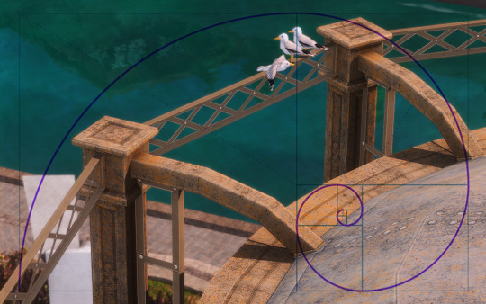
COMPOSITION Kinda hard to explain but basically, composition is what's in your frame and how you line it all up. I'd recommend reading some photography guides to get the gist of the concept.. but honestly, the more you mess around the more you'll get the hang of it. I've always loved photography and sims screenies really aren't so different. If you use reshade there's even some templates for thirds/the golden ratio etc you can slap on top for practice. Personally I don't use 'em cos I prefer my own judgement (that sounds rlly obnoxious but we're rolling with it). I found a template to show you what I mean! (ngl I was stoked that the first screenie I thought of for being a good eg. almost perfectly fit into this golden ratio shit LOL) but let's keep in mind how long I scooted around to get a good shot of this.. pretty sure I deleted about 10 other failed shots of this but shhhh, it's trial and error!
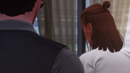
ANGLES/FOCUS The way you take a shot and how you angle it can change the whole feel of the image. For example.. in this image I tilted down and bit and filled over two thirds of the shot with the man, he's a big character and quite an intimidating guy so I think it helps get the idea across without pointing it out (at least I think so but idk I could also be talking outta my ass)

Similarly in these two shots below.. the first with the guy on the left gives the feel that he's in control here. The "camera" is tilted above him slightly and he's all up in your face, making the woman look much smaller in comparison. BUT! If you flip around to the second image, tilt down a bit and switch the focus to her, it makes him look more insignificant and less in control. I hope this makes sense??
EDITING/PHOTOSHOP ACTIONS ETC Personally I don't use photoshop actions but there's plenty out there to do the work for you! I think Intramoon? maybe.. has made a few but idk, you guys feel free to jump in with any suggestions! You can also smooth, fix stuff, change the mood/lighting, all sorts.. my advice on this is patchy at best tbh cos I just faff around until I see what I like lmao.. which leads me on tooooooo...
FUCK AROUND AND FIND OUT Lol.. but seriously! I don't know what I'm doing. I've never taken any classes or read up on much, I always just jump in and see what happens. Fuck around with reshade, fuck around with camera mods, fuck around with composition/focus, fuck around with photoshop or gimp or w/e.. just mess about for a while and have fun! I promise you'll get better.
#ts4#?#uhh what do i tag this as#tips#!?#screenie tips!?#extra#lmaooo#being asked advice is always wild cos i'm like uhhh ?? idk how i do stuff i just do it without thinking#which is annoying cos if you ever wanna replicate smth you can't remember how 😂🙈#pls take my advice lightly cos i ain't an expert nonny but ty for asking#<3
202 notes
·
View notes
Text
Throwback Not-Thursday (2012 v 2024)
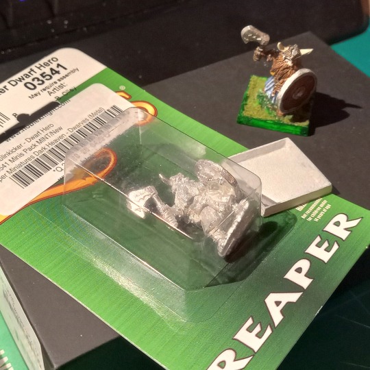
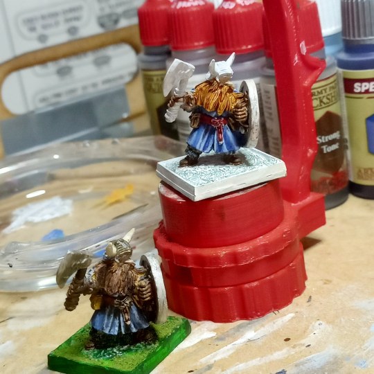
Gerrin Goblinkicker, Dwarf Hero (sculpted by Bob Olley)
This was the last figure I painted before starting up again in 2020.
I'm known to be insufferably/irredeemably stuck in the past, so unlike normal people who might strip and repaint their earlier figures, I painted a whole other copy. This dwarf figure is still in production, so I didn't need to wrangle one from eBay at stupid prices. I even happened to have a matching base (they had come in a 3-pack and I still had the other 2—these are discontinued).
On the old version the middle of the shield is just off-center if you look at the model from that corner and it just feels like something is wrong. For the new version I decided to place him along the diagonal of the base instead of the side. I think this way it is clearer which direction he's facing—though it's actually the feet that are aligned to the diagonal and not his face, so it's still kind of off.
I considered painting a whole pattern onto the shield instead of leaving it plain wood, but I didn't want it to be too different from the old version, so I just changed the shield boss to brass/bronze for contrast.
I had placed him too far forward too; I think I was trying to center the feet on the base instead of the figure overall.

I used the same static grass from a plastic film container of it that I got from somebody. I have no memory of where it's from and this is the only figure I have that uses it. I wonder if it's from 2000/1 when I'd just learned to paint, since a pinch of grass on the base appears to have been typical on Warhammer figures from that era. Maybe I used it on Battletech figures I painted for my classmates at $5 a pop. Anyway, it sits on a bed of green stuff instead of a thick layer of PVA glue (which shrinks so you'd need a lot of it to fill up the hollow base, but that's how I did things back then. didn't know any better).
Recipes
The base blue paint on the old model was Ral Partha's Dragon Blue (highlights in Sky Blue). I still have the Dragon Blue pot and wanted to use it but the paint doesn't stick to the primer anymore so I guess it's dead. It's a bit drowned in black wash on the 2012 model, and here's what I did on the new one:
Speedpaint Beowulf Blue (as you do because, you know, vikings). I didn't shake it enough so it came out a bit purple
Thin layer of Ultramarine Blue
Wet blend Wolf Grey into Ultramarine for first highlight
Gorgon Hide for second highlight
The green base was a bit trickier since the Army Painter Warpaints do not have a match for it (maybe the new Fanatic line does, dunno). But I made it work with a solid coat of Greenskin and then Speedpaint Shamrock Green (the latter of which is a decent match).
P.S. The old Ral Partha Bronze paint is really more of a brassy color. It's not orange-ish at all.
Bonus: Super-black background tutorial (kind of)
When you take the photos, use a sheet of black velour / flocking as the backdrop; Green Stuff World sells these in various sizes but the material is originally used in other things that need to be super dark, like telescopes, so you can probably find it in places where astronomy stuff is sold.
You'll never get all the dust and speckles out of it with a tape roller so just remove as much as you can.
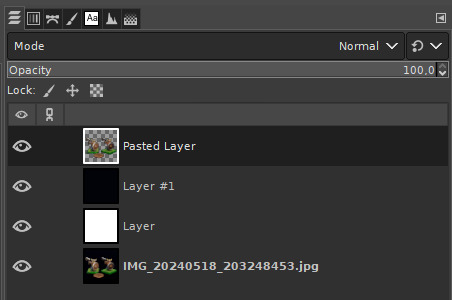
Editing the pictures—I use GIMP:
(Optional) Crop your image. You can do it now, or at the end like I do.
Adjust levels and do color corrections as needed.
Fuzzy select the black area around the figures. 10% tolerance worked for me, but go lower if the figures are dark. You want to avoid picking up parts of the miniatures.
Invert the selection.
Copy and paste to a new layer and put it at the top. This layer will be transparent and contain just the figures and a lot of dust speckles.
Create a new white layer and put it under the transparent layer. Now you can see all the speckles against the white background.
Clean up background with eraser tool.
Hide the white layer and create a black layer. (Or just put the black layer above the white one.)
Clean up any stray dust with eraser tool.
If fuzzy select was overzealous and took out too much (you can flip the solid layers on and off to check), copy/paste those areas back in from the original picture.
#miniatures#fantasy miniatures#reaper miniatures#dwarf#photo editing#miniature painting#mini painting
15 notes
·
View notes
Note
hi! i love the netflix previews and sc replicas you did for NEUD. i was wondering if there was any specific site or software you used, or if you just did them manually? i have to do something similar for an assignment for an assignment and yours just look so good 😅
Thank you!!! They're really fun to make!
So my answer is not a very good answer. I made them all without spending any money, so there was a lot of work arounds.
I basically found images of Netflix homepages and screenshots templates on Google and used my computer's default gallery editing to crop out the major parts. I saved each component as separate .png files. So, I ended up with a .png file of the back button, the progress bar along the bottom, the trending shows on the preview screen, etc.
These were some of the little parts I carved out of a whole screenshot (you're more than welcome to just download these straight from this post if you want to follow me deranged method).


I used Canva after that. I uploaded pictures for the "show" mostly from unsplash and just kind of cobbled everything together. Canva also had a few good photos for free, but I usually turned to unsplash.
I couldn't make the .png files transparent (I probably could have in gimp) and they had big black backgrounds boxing them in. I worked around this by using darker images as the still from the shows.
You can see in this one from NEUD when I included the back arrow, there's still a black background to it if you look closely. The progress bar at the bottom is also supposed to be transparent, but I figured that no one would really notice it was wrong.
But in this one I did for another project, Angel, I used darker images to hide the black backgrounds.

From there, it's just a lot of messing around with text and finding the right font/style and blacking out the parts of the original screenshots you don't want (I had to lay black rectangles over the original episode titles in the progress bars so that I could lay down my own text)
For the preview screens, it was way more frustrating and time consuming. All of the buttons on the previews were manually put in. The side bar and trending bar were manually put in.
I know that people make templates to do this a lot easier/better in Photoshop. But I don't have access to Photoshop, and I didn't really care so much that I wanted to go through the hassle of buying/installed/learning PS.
It does take me a very long time to do it this way and there are a lot of limitations, but I'm wayy more comfortable using Canva than other softwares like gimp. My background in graphic design is more of "making posters for school events."
4 notes
·
View notes
Text
An explanation to my Discord profile picture.
Alright, so my Discord profile picture has been pretty much the exact same ever since I got Discord way back in 2017. When I do change it, it's to a recolor of the same picture. So, what is my profile picture?
It's this. A screencap of an anime called Kaiba. I wont do an explanation of what the anime is about, but basically it's my favorite anime so I just started using it as my pfp on Discord and it's basically just kind of become my thing. I would like to just to just double mention that the original screen cap is not drawn by me, it is from the anime Kaiba directed and created by Masaaki Yuasa so please go give it a watch.

The oldest edit I have still on my computer is this one here where I basically tried making a "retrowave" type pfp. At the time I never really liked it, and looking back on it I really don't like it because I've gotten a lot better at making these things.

That said, I did add to that specific picture right after this and removed the background to replace it with the original Kaiba background which does look better.
I tried making a Pride pfp not long after and it turned out pretty bad.
My very first Christmas pfp in 2018 was...well it was not good if I'm being honest.
My first official recolor that I have wasn't until 2020. That's when I decided to recreate the outline of the original drawing so I could do my own thing. The colors I used for this come from Kamina from the anime Gurren Lagann.
The next one I did after Kamina was Stocking Anarchy, a character from Panty & Stocking, another one of my favorite anime.
Next up is Halloween of 2020. This would be the first Halloween pfp I have saved, and probably ever made. It is just a jack-o-lantern. The concept of it I think is pretty clever, but the actual execution just didn't work. Maybe I can do it again another year and make it better.

And after Halloween comes Christmas, this being the second Christmas pfp I have means it has to be better....right? I had a whole year to get better. You can decide that.
This next one isn't one I did, it's actually one a friend of mine did for me. It's just the normal Kaiba picture, but they made him a cat boy! I actually do come back to this one from time to time.

Ok so shockingly, for 2021 I didn't really have any new pfps, at least none that I saved, so we're jumping right into Halloween 2021. It's Dracula and I actually really like this one. This I think is when I think I can see a change in myself getting better at making these, and graphic design as a whole.
Christmas 2021 was also really good, it's a gingerbread man! Has texture and everything. Also one of my favorites I've done.
I eventually decided to upscale the original Kaiba picture, remove the background, and leave just the outline and was left with this.

I was then able to do cool things like this Nonbinary Kaiba. I did this when me and a bunch of friends in a server were doing similar pfp.
One that I really love is this "real" Kaiba that I made. I usually use Paint.net to make all my stuff be that YouTube thumbnails or these profile pictures, but I decided to try out Gimp just for this one specific pfp to get the warp tool and I think it worked out.
I'm not going to show all of my pictures, but I do want to leave it off with this years Halloween pfp. It's Sally from The Nightmare Before Christmas.
With that being said I'm going to go ahead and leave a screenshot of the folder that hold all of my Kaiba pictures just so you can see the rest of them that I didn't show here. It's funny how this little joke of a profile picture has unintentionally been helping me better myself at graphic design.
#Discord#Kaiba#anime#profile picture#Gurren Lagann#Studio Trigger#Gainax#Masaaki Yuasa#panty & stocking with garterbelt#Halloween#Christmas#gimp#paint.net
2 notes
·
View notes
Text
How I made my assets with GIMP - By RPG.
I will show how I created one asset (using similar methods to create the others) in GIMP, and how I used detail to create depth within the asset.
Here are the steps:
First, I decided to set the resolution for this asset pack at 64x64; a suitable, but small resolution.
I did this by making another canvas, and setting the resolution at just that:

After, I went straight to configuring the grid size, gridlines and spacing for my asset. I did this by going to "Image" then "Configure grid":

When the prompt opened, I decided that I wanted to have the horizontal and vertical spacing at 1; meaning for every 1 pixel within the 64x64 resolution, there would be a block:

To display my configured grid, I went to "Show" and then "Show Grid":

Now my canvas looked like this:

Immediately, I decided to add an "alpha channel"; a layer of some sorts that lets you take away the background. This was important because I was working with lighter colours and its harder to see them with a white background.

Using the fuzzy selection tool, known otherwise as the magic wand tool, I removed the background.

Now, to place the first pixel.

I started with the basic shape of the asset, which was supposed to look like a court document:

Then I started bringing depth into the equation:

And then I started placing text:

I finished up with the text on the side, shaded it to give it depth and decided to add a stamp and more ingrained lines; to check if everything was good, I took away the grid.

Everything looked good, but for the stamp I decided to give it some more depth during the creation of this asset so that's what I went with.
And the final product was done!
A reflection:
Overall, creating the assets was done with relative ease; however, there was one issue which I encountered just before producing the assets, and this was the fact that I had started them off on Photoshop but then transitioned to GIMP. This was because I found that Photoshop's grid formatting wasn't very concise for getting the right spacing for each block; and this is something that GIMP had that was better, the fact that I could change the spacing horizontally and vertically without the need for changing gridlines.
Another issue I encountered was with asset creation was the fact that Photoshop's magic wand tool relies on tolerance levels to get rid of background; testing Photoshop to see whether or not it was good for pixel art found me making an example and then seeing if some of the pixels disappeared in the process of removing the background, this turned out to be a thing and when I removed the background and some pixels had either faded or just completely went. GIMPs fuzzy selection tool worked a whole lot better with removing the background around the actual pixel art itself and I never encountered any pixels fading out.
One way I counteracted both issues with Photoshop was to see if any other programs were to work well with pixel art creation; and I was surprised when I found out that GIMP could be used for it, because I had only really known it for being a program that you could edit textures on for games. If given the chance, I would've used Aseprite; but because it is payware, it would've required me to be able to properly invest in it.
RPG-7
0 notes
Text
diary234
5/6/2024
monday
guhhh
slightly, gently, exhausted by today. but i did it. i got ableton onto the computer, a bunch of the old plugins, some new ones (maybe too many) and then one that will replace an old one and is an updated version. yayyyyyy!!! i also started personalizing the computer but i don't know.. idk what background to use.
but that's easy, or like, hard in a fun way. i'm on the old computer still rn, just cuz. idk. i'm not settled in yet. it really is a lot like moving. i got a whole zone set up. now i need to get some other zones setup.
those zones are gonna be i guess visual art stuff, so i need to dl gimp and some of the plugins for that. but not a ton really. i should also grab my font folder cuz there is soooo much in there #lol #hoarderz.
i also worked on some songs in ableton, today. because i found out why some stuff on this pc sounded weird... a dumb dolby thing has been on and i never went looking for it. how stupid of me but whatevs. it lead to the bass being more present and the high end more smothered kinda, so a lot of trebliness was lost. this is ultimately okay because the new laptop is actually so much better it's insane. i can like, actually listen to the song as it is being rendered live in ableton, and then act accordingly. like actually. like oh my god it makes everything so much easier and better and like wow oh my gosh this makes mixing so so so easy and not time consuming and not a hellish chore and like wow my life is actually better now so my gosh i am happy. just exhausted too.
anyway, i am reading some violence jack and then going to bed. it's funny how much of this is about what happened immediately after the earthquake, i wonder when the man himself shows up.
since i need to wake up early tomorrow, for worrrrkkkkkkkkkk,
i should call it here and say:
byebye!!!!!!!!!!!!!!!!!!!!!!!!!!!!!!!!!!!!!!
1 note
·
View note
Note
Can you list anything you unironically like in the games (and cartoons and comics) that you don't like?
I won't bother mentioning music, since that goes without saying and is to be expected for a Sonic game... unless you're Chronicles.
Sonic Adventure 2 (mixed gameplay-wise, annoying story-wise) - While I prefer Sonic's SA1 levels for a number of reasons, I still think his and Shadow's gameplay in SA2 is fun on its own merit. I also don't mind the treasure hunting gameplay returning or how big the levels are this time around, since Knuckles and Rouge are still fast and not '06 levels of slow. It's mainly the gimped radar that creates the unfortunate domino effect of making them a problem.
- Introduced Rouge, one of my favourite characters for how playful she is and how she's a lot more nuanced and intelligent than you'd expect.
- Some genuinely good scenes, like Eggman's trap on the A.R.K and Sonic escaping from the G.U.N. helicopter.
- Had some good ideas going for it, like the Pyramid Base and the Biolizard as a scientific monster instead of an ancient one.
- Despite my thoughts on the backstory itself (or rather, its execution), Shadow has enough depth and subtle qualities and occasional unintended hilarity to stand out from the typical dark rival characters you see in media.
- The Last Scene's music in particular is one of my favourite cutscene tracks in the series.
Sonic Heroes (mixed gameplay-wise, loathed story-wise) - The gameplay is fun when you're not being screwed over by repetitive combat, overly long levels and/or ice physics.
- Boasts some of the most consistently Genesis-worthy environments in the 3D games, up there with SA1's and Colours'.
- The in-game dialogue that isn't the same tutorial drivel repeated ad nauseam can be interesting, funny, etc.
- Reintroduced the Chaotix, which provided me with another character I quite like in the form of Vector.
- Bringing Metal Sonic back in full force and front and center in the plot after a long absence (not counting cameos and the like) is a perfectly fine idea. Just... not like this.
Sonic Battle (decent yet repetitive gameplay, mixed story-wise) - Emerl's arc is compelling, and it earns the emotional weight of having to put him down at the end.
- While some characters are iffy (read: Amy), other characters are extremely well-handled. Shadow is probably the prime example.
- Gamma's belly dance healing animation is fucking hilarious.
- When I was young, and the game was first announced, I was really excited about being able to play as Chaos. This proved to be my downfall when it turned out he was arguably one of the worst characters in the game due to being slower than me during the writing process, but I still recall that excitement fondly.
Shadow the Hedgehog (comedy classic) - The sheer amount of legendary stupidity this game has going for it makes it practically impossible to actually hate. It helps that it's not quite as white-knighted on the same level as '06... usually. You know you're in for a unique experience when you hear a gunshot every time you click something in the menu.
- By extension, Black Doom never gained an unironic fanbase like Mephiles/Scourge/Eggman Nega did, which means I'm a lot more willing to take Doom's dumbass brand of villainy in stride. He even has a unique design... a terrible one that rips off Wizeman granted, but alas, even that is a step-up from Fridge Shadow and Bumblebee Eggman.
- Despite being... well, Shadow the Hedgehog, some of the environments would fit right in with any other Sonic game, like with Circus Park, Lava Shelter, and Digital Circuit. Even the Black Comet levels look pretty cool.
- This game understands amnesia better than IDW does.
Sonic '06 (what do you think?) - The obvious one: Shadow's character was handled pretty well, even if it came at the cost of everyone else being a dummy and being forced to interact with Mephiles.
- Like SA2, there are some good moments, like the Last Story ending sequence with Sonic and Elise.
- In the greatest form of irony ever, I like Solaris as a concept and design(s), and its backstory has potential to serve as a parallel with Chaos without being a complete ripoff. Iblis sucks, Mephiles sucks, but I'm fine with Solaris.
- Introduced legendary characters like Sonic Man, Pele the Beloved Dog, Hatsun the Pigeon, and Pacha from The Emperor's New Groove.

The Rivals duology (apathetic outside of Nega-related grumbling) - There were some cool zone ideas in both games that were sadly let down by the restrictive and limiting gameplay. I particularly like Colosseum Highway for thus far being the only full-on Roman level in the series instead of merely having a couple minor hints of Roman, and Meteor Base for the unique scenario of the space station being built into an asteroid. These level concepts and others deserve a second chance IMO. (At least Frontier Canyon got a second chance in the form of Mirage Saloon, amirite?)
- Ifrit has a better design than Iblis. Not saying it's amazing, but the Firebird motif it has going on is a lot more interesting for a fire monster than the Not-Chaos schtick they had with Iblis.
Sonic and the Secret Rings (a very frustrating gaming experience) - Erazor Djinn, A.K.A. Qui-Gon Djinn, A.K.A. Dr. N. Djinn, A.K.A. I'll Take It On The Djinn, A.K.A. Not From The Hairs On My Djinny Djinn Djinn, is one of the best villains not associated with Eggman in the series. He's a Mephiles-type character done right, and there's actual weight and reason to his actions, however sinister or petty.
- I don't have strong opinions either way on Shahra as a character, but the Sonic/Shahra friendship is sweet and well-handled.
- The ending is one of Sonic's greatest moments. The sheer contrast between how ruthlessly he deals with Erazor and how comforting he is towards Shahra speaks volumes... Still gonna make fun of the mountain of handkerchiefs though. (Before anyone lectures me, I understand the significance of it and can even appreciate it from that angle... doesn't mean I'm not allowed to poke fun at it. :P)
- Another game with some redeeming environments. I love the aesthetic of Night Palace, and Sand Oasis looks gorgeous too.
Sonic Chronicles (my personal least favourite game in the series) - Uh...
- Um...
- Er...
- I like Shade's design?
Sonic Unleashed (overrated game and story IMO) - The obvious two: the opening sequence and the Egg Dragoon fight deserve all the praise they get.
- Seeing Eggmanland come to life was an impressive moment to be sure. While part of me does feel it didn't quite measure up to what I had in mind (ironically, the Interstellar Amusement Park ended up being closer to what I had in mind), it still looks badass and works well for what it is. I also don't mind the idea of it being a one-level gauntlet... key word being idea.
- Obviously, the game looks great. Not a fan of the real world focus (real world inspiration is fine, but copy-pasting the real world and shoving loops in it is just unimaginative), but it can't be denied that the environments look good.
- This game pulled off dialogue options a lot better than Chronicles did, since they didn't rely on making Sonic OoC.
Sonic and the Black Knight (just kind of boring all around) - Despite my gripes with the story (Merlina wasn't nearly as fleshed out as her unique anti-villain status deserved, which ends up severely undermining the ambition of the plot in more ways than one, and the other characters go from being useless yes men for King Arthur to being useless yes men for Sonic), I will admit it provides interesting insight into Sonic's character.
- Like '06 and Secret Rings, the ending is very nice... well, aside from Amy being an unreasonable bitch ala Sonic X at the very end.
Sonic the Hedgehog 4 (apathetic) - The admittedly few new concepts sprinkled within had promise. They may not have been as fleshed out as they could have been, but level concepts like Sylvania Castle and White Park, bosses like Egg Serpentleaf and the Egg Heart, and story beats like the Death Egg mk.II being powered by Little Planet, all could have been brilliant had they been better executed.
SatAM (apathetic outside of SatAM Robotnik-related grumbling) - I'm not a fan of the environments on the whole due to them looking too bland or samey, but there are some exceptions that look pleasant or interesting, like the Void.
Sonic Underground (apathetic) - The character designs make me feel better about myself.
- Does "large quantities of unintentional meme material" count as a positive?
Sonic X (mostly apathetic outside of Eggman's handling) - Helen was a better human character and audience surrogate in her one focus episode than Chris was throughout his entire runtime.
- Actually, most of the human characters not named Chris were legitimately likable. Including everyone in Chris' own family not named Chris. Hilarious.
- Despite arguably having the most Chris in it, I actually don't mind the first season that much, partly due to slight nostalgia from seeing it on TV when it was new, but mostly because Eggman actually acted like a villain for the most part, and certain other characters weren't quite as flanderized yet. It's season 2 and onwards where things started going off the rails IMO. (Incidentally, Helen's episode was part of season 1...)
The Boom franchise (apathetic) - Along with Chronicles, the games provide yet more proof that just because someone isn't SEGA/Sonic Team, that doesn't mean they're automatically more qualified to handle the series.
- The show had some good episodes here and there, and Tails' characterization was probably the most consistently on-point out of the cast.
- Despite not exactly being favourite portrayals for either character, even I'll admit that many of Knuckles and Eggman's lines in the show on their own were genuinely funny.
Archie Sonic (pre-reboot is mostly terrible, post-reboot is mostly... bland) - Whenever I doubt myself as a writer, I think back to Ken Penders, and suddenly I'm filled with a lot more confidence.
Sonic the Comic (apathetic) - Fleetway isn't a comic I tend to recall much of aside from how much of a loathesome cunt Sonic is, but IIRC, Robotnik's portrayal is pretty good. Different, but good.
IDW Sonic (stop pissing me off, comic) - Putting their handling aside (and being too obviously "inspired" by MGS in the latter's case), Tangle and Whisper are good characters IMO.
- Same goes for Starline, before he was killed off-screen and replaced with Toothpaste Snively.
- Execution aside (noticing a pattern?), the zombot virus was a fine concept on its own and an interesting new scheme for Eggman.
- I get to remind myself that I've never drawn scat edits and posted them publicly on Twitter.
#Crusher's Asks#Opinion#Sonic the Hedgehog#Sonic Adventure 2#Sonic Battle#Shadow the Hedgehog#Sonic the Hedgehog 2006#Sonic Rivals#Sonic and the Secret Rings#Sonic Chronicles: The Dark Brotherhood#Sonic Unleashed#Sonic and the Black Knight#Sonic the Hedgehog 4#Sonic SatAM#Sonic Underground#Sonic X#Sonic Boom#Archie Sonic#Sonic the Comic#IDW Sonic
34 notes
·
View notes
Text

Cute&Cozy Bedding
by Danjaley
https://modthesims.info/d/518570/cute-amp-cozy-bedding.html
Warning!
Don't clutter up your real live babies' cribs. This is dangerous. Blankets and toys can cause suffocation. When providing for a real baby, please seek real advice
———————————————————
The Blankets
I think the reason why there is no custom cover blanket out there (that I know of), is that the child is sitting waist-deep in it, when awake. I don't have the ultimate solution to this either. The best thing I could think of was to enable live-dragging. So you can just drag the blanket off the child in livemode when it wakes up. Of course the blanket will stick out of the crib then. As I said, it's not the ultimate solution. Please note that although the blanket is live-draggable, it is NOT storeable in inventory.
There is one version for toddlers and one for babies, each opening on the correct side, being in the correct position and shaped to aviod clipping. Like my sledge, it works better with the unwrapped baby. The wrapped baby cuts through it's blanket slightly, when breathing.

The Pillows
The pillow is not draggable, because it comes with lots of slots for additional cuteness. Depending on what you put there, and in which order, you might not be able to use them all at once, but anyway they are meant for choice, not for suffocating your little ones (see warning above)
⚠️ I found that sometimes it's easier to place the deco first, and then move the whole construction into the crib. The M key is really useful here. Please also keep in mind that there is still the teddy-slot attached to the crib.
Again there are two versions for babies and toddlers. It was not just a matter of turning it 180 degree, as I optimistically imagined...
Technical
All four objects are found in buymode under:
Sort by Room/Nursery/Furniture
Sort by Function/Kids/Furniture
(see website for prices linked above)
More Information
You can see the presets and channels on the picture attached. I want to add that what looks like distorted texture on that image is actually the drapery of the blanket.
Credit
Posted by Danjaley on ModTheSims
Screenshot Credits: Everything on the baby as usual by the wonderful QuizicalGin.
Mouse: Free Store Set Harvest Bounty
https://store.thesims3.com/setsProductDetails.html?categoryId=&scategoryId=12204&index=0&productId=OFB-SIM3:18280&pcategoryId=12858&ppcategoryId=12203
Additional Credits:
Thanks to the creators of Sims3PE&OC, Milkshape, Blender, Gimp, and their various plugins.
Download:
babies-
https://chii.modthesims.info/getfile.php?file=1407553
Toddlers-
https://chii.modthesims.info/getfile.php?file=1407554
———————————————————
I do NOT take credit for this mod!! All credit goes to Danjaley and the others who helped her!
I just wanted to spread the post around to allow more people to see it!

#the sims 3 cc#sims 3 cc#4t3#thesims3#s3cc#sims3functional#ts3 scenery#sims 3 screenshots#sims 3 download#the sims 3#ts3 edit#ts3#ts3 gameplay#ts3cc#ts3 family#sims 3 mods#sims 3 blog
57 notes
·
View notes
Text
Art Advice #4 - A Beginner’s Guide to Digital Art
Hi all!
This weeks entry into my Art Advice tag, where I offer various advice for artists of any skill level, is about digital art! Now, I am by no means an expert at digital (I’ve been doing it for nearly 8 years at this point and that is almost entirely self taught), but I have picked up a few pointers in that time which will hopefully help anyone just starting out!
(this blogpost is a little over 2000 words long btw)
A Beginner’s Guide to Digital Art
I know that the world of digital art has changed drastically in the 8 odd years since I started, but I’d still say that some of the options I started out with will be just as good for anyone who’s starting out now!
As always, I’ll be splitting this into sections to make it easier for you to navigate this post!
Part 1 - Equipment/Hardware
There are a lot of drawing tablet options on the market at the moment, and I’m not going to pretend that I know anything about half of them lol. But I think for a beginner, don’t worry about going for the most expensive option, even if the reviews are really good or your favourite artist uses it, especially if it is way above your budget!
An important thing to know is that there are two types of tablet. One is the plug-in kind. These are essentially a pad which you plug into your laptop or computer and draw on that whilst looking at the screen (they basically work the same way as a plug in mouse works). The other kind is the screen variety, which is a lot more like what most of us know as ‘tablets’ nowadays. And you draw directly onto the screen.

(a plug-in vs on screen tablet, both from Wacom)
Now, as for choosing between these, it is honestly a personal choice. But I’d say if you’re just wanting to try digital and you’re on a budget, a plug-in tablet can be really useful since it gets you used to the mechanics of what digital is like, and they are often significantly cheaper than the screen alternatives. I would say that plug-in tablets are a big learning curve, especially if you’re used to doing traditional stuff, but I do know a lot of professional artists who still use this kind of tablet when doing their work, so if it’s something you can get used to I would definitely consider it! Also, they’re often a lot more portable than some screen tablets! The first one I had was a Huion (a model so old that I can’t even find a link to it now lol), and I also know that Wacom are a well known brand that do some decent plug-in tablet. I’d recommend you do your own research on other brands and options, though!
Screen tablets are often a lot more expensive, but if you’re used to traditional art, they are a lot easier to get a handle of! But I know if you already have something like an iPad, or other general use tablets, then they offer apps that you can use to draw on (as well as things like the Apple pen, or other stylus’). The big difference between using these general tablets and ones specifically designed for drawing is pretty much purely a personal choice. I personally prefer the bigger screen of my XP-Pen tablet, along with a special screen protector that removes the shininess of the tablet screen and makes it feel more like ‘paper’ over when I used a general use tablet it draw. But if you already have an iPad, or something similar, then it’s honestly a really great starting point!
I think it’s important for me to mention that you don’t need fancy equipment to be an artist. The incredible Elicia Donze has revealed countless times how she has very basic equipment but still manages to produce the most stunning artworks! All you really need is some kind of drawing apparatus and a lot of patience lol! Getting good at any kind of art takes a lot of time and effort, but I would definitely say it’s worth it when you’re able to look back at your progress!
Part 2 - Software/Drawing Programs
Much like with the hardware discussion, choosing which program to use is entirely down to personal preference. I personally have never really liked Photoshop purely because it’s really complicated, but I know so many artists swear by it.
I think the main aspect to consider when you’re starting out is whether you want to pay for a program. Software like Photoshop, Clip Studio Paint and Procreate are some of the popular ones I hear about a lot of people using, but all require you to purchase or subscribe to them. So if you’re young or on a very tight budget, I’d honestly recommend the free alternative versions of these, such as Krita (Krita is quite a large program, but it has a lot of really awesome features and is very similar to Photoshop!), Gimp (this one is similar to Krita, but has slightly less options, I’d honestly recommend Gimp for anyone who does photo editing though!) or FireAlpaca (this is the one I use, by the way and it’s a pretty simple program, but has a lot of fantastic features and is perfect for how I work!). These don’t have as many features as some of the paid alternatives, but I honestly think all you really need to start digital art is some kind of ‘canvas’ and set of brushes!
Another great free program for beginners I’d recommend is MyPaint, which is great for doodling and just getting used to how digital art feels in comparison to traditional! It also has a bunch of ‘traditional style’ brushes, to make it look like charcoal or watercolour (which I’m sure the paid alternatives have too, but it’s always better when it’s free, I find lol...)

(this is an example of a drawing I did on MyPaint using the ‘charcoal’ effect brush!)
Most of the sites are pretty self explanatory, with sections dedicated to different brushes (I’ll go into the types of brushes later on in this post btw!), adjusting brush size, shape and opacity, a colour wheel, etc. You also have a section dedicated to ‘layers’ (another thing I’ll go into more detail later), and various ‘filters’ and editing options and effects you can add to your work to make it more interesting!
I’d really just recommend playing around with programs until you find your one!
Part 3 - The Pros of Digital Art!
I realise this section should probably earlier in this blog post lol, but I kinda wanted to go into what digital art can achieve in comparison to traditional art, and how beginner artists can utilise this!
I definitely didn’t take advantage of certain aspects of digital art when I first got into it, and they’re things that would have definitely made my life a whole lot easier lol!
Digital art allows you to tweak drawings as you do them. So if you accidentally drew the eye too far to the right, then you can easily move it to the right place. (I usually do this by selecting whichever area is wrong, cutting it out and then pasting it into a new area... And yes, there is probably a better and quick way of doing this but...I haven’t found that way yet lol...). And I honestly think that this has allowed me to look a lot more at a reference image in order to figure out where I’ve gone wrong with a drawing! Whereas with traditional art, I usually spend so long trying to get an eye right, that even if it’s slightly in the wrong place, I don’t want to completely redo that section. Digital allows you to completely rub out sections without leaving indents, which is honestly such a saving grace!
Another pro of digital is the Undo/Ctrl Z function! This means you can easily go back to before you made a major mistake with just a click of Ctrl Z... Though I have to say that this function has honestly ruined traditional art for me... Oh what wouldn’t I give for a real life Ctrl Z... But yeah, this is a great part of digital art and definitely something you will grow to love lol!
Another great thing about digital is that it allows you to flip and turn a canvas as you’re drawing on it. I spent a lot of time trying to turn my tablet around in order to draw certain parts of a piece before I realised you can turn the canvas itself without having to move yourself or your tablet!
Layers are another part of digital that can be super useful, and I have to be honest but I don’t really use them a lot. I know a lot of artists create layers for every section of their artworks (so, one for the linework, one for colouring, a separate one for the background, etc etc...). And there’s something really great about being able to paint without worrying about smudging into a previous section of the painting. This works well for my work since I do a lot of bright backgrounds. I also often create a lot of ‘versions’ of my works, so it’s useful to be able to change the background without affecting the main figure of the piece! (I have to say that I often work in one big layer when I’m doing paintings, just because I like how it feels more like ‘traditional’ art that way, but layers are such a brilliant tool, and definitely something you should play around with!)
The eyedropper tool is another one that is really useful! Although I never colour pick from my reference photos, I know some artists find this useful when they were just starting out (especially if you’re not sure what colour to make shadows or how to mix skin tones, etc etc). The eyedropper basically means you don’t need to mix your colours every time
Part 4 - Just some other things I wish I had known about when I was starting out lol...
This last section is just dedicated to a few things that I would have liked to have known when I was just starting out all those years ago.
First one is fluffy/textured brushes!
I spent most of my art life from 2013 until 2016 using ‘round’ brushes which are notoriously hard to blend with, so I’d recommend either downloading some fluffy/textured brushes (DeviantArt was where I got mine from a few years back, but there are probably other places you can get them for free too!) to your program of choice, since most of the programs I’ve used haven’t had fluffy/textured brushes as pre-set.
I may make another post about how I blend in my artworks if that’s something people would be interested in?
(this is an example of textured brush blending vs round brush blending... I usually opt for round brushes for rougher blending styles and the textured brushes for more smooth and ‘realistic’ blending... for a lot of pieces, though, I use both brushes (the round brushes are good for details!) in the same way that you use different sized brushes for real paintings!)
The next thing I wish I’d discovered earlier is the Brush Stabiliser option. Some programs may do this automatically, but the one I use (FireAlpaca) requires you to manually change the amount of stabilising you have on your brush. This is particularly useful if you want to draw neat lines or straight lines (the stabiliser essentially slows down the ‘ink’ as you’re drawing). I only recently started using the stabiliser, and although I still like having it mostly turned ‘off’ for doing sketchy work, it does make doing line work a lot easier, and also gives pieces a more polished look!
Next advice is to explore all the options you can in whatever program you use!
I feel like with certain programs, you can get overwhelmed by choice and you end up just using a few of the functions. But I’d really recommend just playing around with these programs, trying all the filters and editing options to get used to how the program works. You can often find interesting ways to adjust your artworks this way! In a way I’d recommend this way of working more than finding tutorials made by other people... Unless there’s a specific function you want to learn how to do, just having fun with digital art is a major part of it’s appeal to me!
~
There are probably a lot of other options I could go into, but this is already over 2000 words long, so I’ll leave it here for now lol! (I may do a part 2 though so... keep a look out for that!)
As always, if you have any questions to things I’ve said here, or are just looking for more advice, don’t hesitate to message me!
And if you like my work on here (art & blog posts) feel free to support me on my Ko-Fi! <3
#art advice#digital art#art advice for beginners#digital art for beginners#artist advice#digital art tips#artists on tumblr#just want to say again that i am not an expert at this at ALL lol#i just want to offer some really basic advice to anyone interested in starting out with digital!
101 notes
·
View notes
Photo
so @okelli said they wanted a more in depth tortilla so ya gorl is here to deliver. here you go. click this link. that's it. that's the tutorial.
ok i'm done trying to be funny. i've chucked this in here under a cut, but please keep in mind, this is not a professional tutorial. i am in no way an artist/professional/the be all and end all/guru/god; this is just my editing process. so you don't need to follow it exactly to the t. you're more than welcome to change any processes and do your own thing. i know there are some more technical and frankly better tutorials out there by other simblrs that go really into details and what have you which are really helpful (and i do encourage everyone to go check them out), but please keep criticisms close to your heart bc i reiterate; i have no fucking clue what i'm doing. but let's get started bc this bitch gon be long.
what you're going to need:
photoshop or some other editing program. i personally use ps cc 2019, however gimp will probably also work
reshade; however whatever version you use is up to you. again, i use 4.6.1.
google is your best friend and mine
a screenshot of your choosing w some slick lighting
a lot of patience
for images where the resolution isn’t clear, click here for full size.
step one:
open up your screenshot in your editing program of choice. i have picked this screenshot for the purpose of the tutorial bc of the spicy lighting. also did i spend an hour building this for the purpose of this tutorial? i cannot confirm or deny these suspicions, but we're usin it ok. for this picture i used @intramoon‘s alethiology reshade preset bc it’s my fav atm. you can find it here.
step two:
apply your colourgrade. i used the sonder actions by again @intramoon bc this tutorial is sponsored by asia. i’m not going to go too in depth here, bc this differs from screenshot to screenshot. i’m only mentioning it bc it’s fairly important to the next step. adding the colourgrade turned my screenshot from what you see above to this.
as you can see, the colours are now slightly more muted and there’s more of a green hue to it.
step three:
depending on the colour scheme you’re going for with the screenshot, you’re going to want to pick a colour that compliments it. since my screenshot is still quite warm toned, i chose #fff4d8 which is a pale yellow. you’re going to want to take this onto a soft brush (they come with photoshop so if you’re new to using ps, it’s a default, you don’t need to download anything). i’ll include a screenshot of what it looks like.
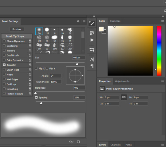
before painting anything, what you’re going to want to do is create a NEW layer. you can do this by either pressing shift + ctrl + n or by clicking layer in the menu bar up top, selecting new, and then new layer.
on your new layer, with the colour and brush selected, what you’re going to do is paint over the areas that are already highlited by ea lighting. for example, my screenshot ended up looking like this.
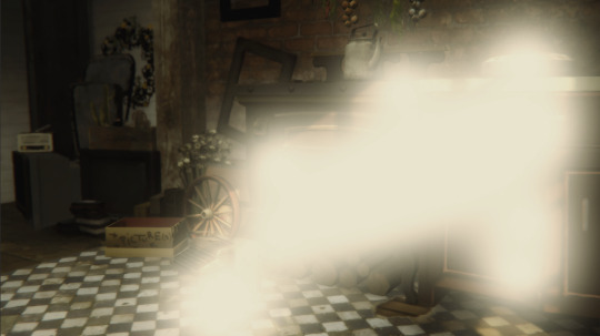
looks pretty messy, but that’s ok bc we’re going to change the blending mode to overlay as seen below. obviously this made the lighting look slightly too intense. dw this is not how we leave it.
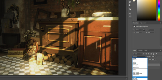
i also change the opacity to suit the image. i set my opacity to 50% and this is what it ended up looking like.
i added in an extra step that i only use occasionally for this tutorial, and basically that extra step is going in with a soft WHITE brush and taking it to the areas that look extra glowy - i.e. the typewriter, the pie and the counter handle. this is what mine looked like. this needs to be again done on a new layer, so make sure you ctrl + shift + n or select a new layer in the menu bar.
again changing the layer to overlay, and changing the opacity. this is what my settings looked like.
again, please refer to the full size image folder, however for those lazy like me; opacity is at 65%
step four:
on your main layer of lighting overlay (if you didn’t add more like i did it should be your only one), you will want to add a layer mask. this can be done by clicking this little button here

once you’ve done that, it should add a white box on your layer and look like this

because the colour has lightened some of our shadows, and depending on how deep you want your shadows to be, you’re going to want to click onto the white layer mask and with a soft brush set to the colour black, you’re going to want to draw over the shadowed areas that you want to deepen again.
for reference these are the areas that i went over. and my layer mask now looks like this

step five:
creaTE A NEW LAYER!!!!!! this time we’re going in with shadows. pick a dark grey colour (or black, your choice. i prefer dark grey), i used #1c1a18 and paint over the areas where you want to deepen the shadows further again.
this is what mine looked like
set that to soft light and change your opacity (don’t use overlay this time, it’s too harsh on the picture).
my picture now looks like this:
subtle changes make a world of difference.
step six:
FIND A LIGHT RAY!!!! i mentioned in the ask i published that i particularly like using this one i found on google, and i did use it for the purpose of this tutorial as well.
pop her on your picture and change the positioning. positioning can be changed by pressing ctrl + t and either flipping/rotating (which can be done by right clicking on the texture and selecting flip horizontal etc) and dragging the corners. if you’re dragging the corners to make the texture smaller, maKE SURE YOU’RE HOLDING SHIFT DOWN WHEN YOU’RE DRAGGING SO THE DIMENSIONS STAY THE SAME. with the positioning, make sure you’re putting the light areas of your texture where the light source is coming from. it’s really important to have a basic understanding of light and shadows. i flipped mine horizontally and made the texture smaller as well as rotated a little.
set her to screen and change you’re opacity.
boy i’m sounding like a broken record lmao, but my picture now looks like this.

starting to look kinda nice right?
step seven:
download this video. open it up in photoshop and make sure you have your timeline window on. if you don’t and don’t know how to change it, up the top, select WINDOW and make sure there is a tick next to timeline which is near the bottom of the drop down. once you’ve done that, click ANYWHERE along the little timeline that has shown up and it gives you a frame for the dust texture. it should look something like this. (the red is bc that little blue and red guy is important)
press ctrl + a on your keyboard to select all and copy that motherfucker. past her on your screenshot, set her to screen and play with her opacity again.
if you’re unhappy and feel like it’s too busy, you can go back and add a layer mask and using that same soft black brush, erase problematic areas the same way we did in step four. mine ended up looking like this.

NOW THIS PART IS OPTIONAL!!!!!
using the colour fill or paint bucket tool, i went in on another new layer with another pale yellow (#e4dcb1) and filled in the whole image. i set that to COLOUR and put it on a clipping mask RIGHT ABOVE the dust texture. you can add a clipping mask by right clicking and selecting set clipping mask. it now only applies to the layer directly below, which is our dust layer. i only did this because the white was too harsh (lol) and i wanted the dust to blend a little better with the surroundings.
finally step eight:
again optional, but if you like the vintage look like i do, select the layer with your screenshot and using the noise v2 action by @intramoon (hi again asia) in this set, add some noise. it creates a duplicate layer, which you can then play with the opacity of to set to your desired strength.
once you’ve done that, you’re basically done!!! this is what my screenshot ended up looking like by the very end.
that concludes our spicy lighting tutorial. i hope you were able to do better than i do on a good day. enjoy!!!!!! if there are any parts that you need clarification on, please feel free to yell at me and i’ll see if i can help lol
#ts4 tutorial#s4 tutorial#editing tutorial#the sims 4#s4#ts4#ts4 screenshot#s4 screenshot#ts4 edit#s4 edit#i tried#it's long#i got lazy#i'm sorry
816 notes
·
View notes
Text
It took me longer to get around to this than I wanted, but anyway, here’s how things have gone with me in Granblue from around Valentine’s up to now.
TL;DR: I got a whole bunch of extremely cool new stuff, but I keep circling back to ‘Elmott’s really good [and cute] and I want to gush about him like an annoying door to door salesman’ :)
I’m not gonna bother listing out most of the random gold moons and summons and stuff I got, aside from the important ones, and I can’t remember exactly which banner I got certain things from, but anyway, here’s what I remember.
Firstly, I might have mentioned it in my last GBF post here, but I got Miranda from the max skill level weapon scamcha. I can’t even remember the details of that, but I think I did it because it had Valentine’s Vira’s weapon on the list, or maybe it was just because I’m an Agni player and there were some gacha weapons on there that would have benefited me a lot.
Either way, I don’t think Miranda was my main target, but I’ve been extremely pleased with her since then. I’ve had a lot of fun doing an Ultima Staff team with Neko/Warlock MC, Elmott, Miranda, and C-Altair. It’s actually a surprisingly solid team comp that doesn’t even feel overly gimmicky.
Anyway, I ended up skipping the Valentine’s banner [aside from the free pulls] since by that point I had decided to commit to sparking Lich and maybe also Fediel for the anniversary. Which was a shame, since all of the new Valentine’s units looked neat, and V-Vira seemed like she would have been really nice to have since I’m basically a fire main at this point.
Then I proceeded to get her from one of the daily single pulls on the random 3% banner after she came out, where she wasn’t even on rate-up, lmao. I vividly remember that I was still half-asleep in the morning while logging in to do my daily pull, and I spent a while genuinely wondering if I was still asleep when that happened.
So yeah, I somehow ended up getting her, so now she’s another tool I have for when I start breaking into actual high-end content with my flame team. I haven’t actually used her much since then, but she seems very fun. It’s always nice to get more defense-oriented fire characters who aren’t super gimped in one way or another. I hope her Grand version’s upcoming 5-star uncap takes some notes from how her Valentine’s version works, since it feels like the best version of the Aegis Merge archetype that we’ve gotten thus far.
I also got Benjamin from a suptix in early February, but I may have mentioned that before. Anyway, even if he’s maybe not the super optimal character for this set-up, he lets me do a full chain every turn with my earth team of Rising Force, Benjamin, Satyr, and Monika. Which is really strong and mostly self-sufficient, although it can be a little boring, lol.
Then we get into the anniversary stuff. To start with, I got a dupe Y-Ingwie from the first anniversary scamcha, along with SSR Farrah and Juri.
Around the middle of the month I decided to use my annitix on H-Vane, after a lot of deliberation. I might have been better off getting someone like S-Shalem or Y-Izmir, but for one thing I think Halloween units are probably more annoying to get in the long run, but I also just like Vane more, lol. Even if he’s probably better off staying in the back-line.
I got a whole bunch of random gold moons and stuff along the way in my free rolls and stuff, but in terms of new stuff, I got Azusa, Abby, and L-Arulumaya from the first flash gala we had. I was tempted to use my spark here since I really wanted S-Medusa, for similar reasons to V-Vira, and Yuni would have been nice as well, but I decided to save since I would have ended up with more of a discount on the second flash gala.
So then on that second flash gala, I ended up getting [including my roulette pulls] Grand Lancelot [!], LanVane, and then I sparked Lich. Oh, and also like with V-Vira, I somehow ended up getting S-Medusa on this banner even though she wasn’t on rate-up anymore, lmao.
I also haven’t had much time to use S-Medusa yet since I want to wait until I can uncap my fire Opus weapon to go all in on skill cap, but I’m quite excited for when I get around to setting up a dedicated skill damage team and grid. I have more or less all the tools for it now, and all the characters. I haven’t spent bars on my two S-Kumbhira spears, but I’m not in a hurry to.
Lancelot was a surprise, but at least it helps lessen the sting from when I sparked on his banner and didn’t get either him or earth Satyr. At least now I have both of them, one way or another, lol. It’s good to get more good water units, though. I know he has some annoying restrictions, but I have the right sort of characters to help enable him, so he feels really nice to have. It was a little awkward, though, since I had just switched over to using a water staff team because I made an Ultima Staff for my fire team, lol.
I started using Skyleap for the anniversary to get the extra crystals from the log-in bonus [though I’m gonna keep using it since it’s a good source of class points and stuff], and I ended up getting Dark Sarunan with the special Skyleap SSR ticket thing.
Between then and the premium gala where I planned on sparking for Fediel, I randomly got Ewiyar [the character] and Light Silva.
I think this probably happened pretty early in the roulette, but anyway, the grand ticket from the anniversary event thing got me a Rein dupe. Which kinda stung, but honestly it was probably the most helpful grand dupe weapon I could have gotten, lol. I ended up barring it and my existing copy, which at least means now I’m not dependent on C-Altair to get a good crit rate. It’s not 100% even with double Agni, but when I have the resources for it I plan on barring Gangsta Knife, which will round out the crit rate, along with giving enmity and garrison. The Rein fists also give a fair amount of DATA, which is very nice for stuff like my staff team which doesn’t have much innate DATA.
Then the first premium gala rolled around, along with the second scamcha. I got it partly to fund my Fediel spark and partly to try and lucksack her on it, but I just got a G-Narmaya dupe, lol.
As for the banner itself, I ended up sparking on it, and it ended up being pretty crazy, lol. Along the way, I got:
-Nezha
-Water Sturm
-Azazel
-Grand Wilnas [!!!]
-Summer Tabina [!]
-SSR Cucuroux
-SR Jasmine [how did I not have her by now, lmao]
-Cain
-Belial [!!!!!!!!]
-Fire Anthuria
-Summer Meg [!]
And then I sparked Fediel.
It would have been nice to lucksack Kumbhira, but Fediel was my main target, mostly since I finally want to just get the Lich/Fediel combo over and done with.
That’s a lot of new characters to get from a single spark, on top of the random gold moons and stuff I got, but I’m still surprised at how high value some of the stuff I got from it was.
For one thing, Wilnas ended up being the third fire unit this year who I had to skip, only to then luck my way into later on, which feels like the game’s way of convincing me to keep committing to being an Agni lord no matter how much the fanbase shits on it, lmao. It’s also worth noting that I also got my first copies of Michael and the Shiva summon recently, so things have lined up really well for me when it comes to my fire team. Which does make me sorta regret not annitixing Y-Izmir, but honestly I think I have enough options at this point that I can get by without her. It does also make me want to get Anila at some point, though.
Over the course of the roulette, the other somewhat noteworthy summons I got were Bonito, a dupe S-Mandrake, Titan, Grand Order, and enough Rose Queen dupes that I can probably fully uncap her. But mostly I’m still just surprised that I managed to randomly get Belial, lol. I was honestly planning to have to sierotix him like I did with Bubs. At least now I feel retroactively justified in using my free T3 ticket from last summer on G-Narmaya instead of him. I haven’t used any stones on him yet, though, since I’m waiting until I have the materials for his 4-star uncap. But I’ve already got him on all my grids.
Anyway, I’m not done sliming them yet since it’s kinda agonizing to do it outside of magfest, but I’ve used Lich and Fediel a fair bit [along with S-Tabina], and they’re definitely strong, but I feel like they rely pretty heavily on you also having a developed dark grid. It’s at least a real stark contrast to my fire team, where arguably the characters aren’t as strong, but I have a lot more power in the grid due to the grand weapons and stuff I’ve barred, so my fire team feels way stronger. Like, even with one of Lich’s weapons in my dark grid, and one Avatar staff, I can only hit like 1.5-2 million on my charge attacks even when Fediel’s buff is up, unless I have something else like Freyr buffs going on. Lich’s end of turn nuke also only hits for around 2-3 million or so.
Which, compared to my fire team hitting 3 million charge attacks [with Elmott being my only real source of CA buffs], and Elmott’s double nuke hitting for over 2 million without any skill cap buffs in my grid, feels almost disappointing, lmao.
They definitely provide an insane amount of defense and utility, though, which I appreciate. One of the main reasons I caved in and got them is because I didn’t like feeling obligated to play enmity, so having a super tanky team that doesn’t feel like it’s constantly on the verge of death is nice, even if I have a lot of work to do with my grid before it can reach it’s damage potential.
I think for most content I probably won’t actually use S-Tabina as a character, but she does help Lich and Fediel do more skill damage, and if I ever go Hades then her weapon would be nice to have.
I haven’t tried S-Meg yet since I haven’t bothered doing her fate episodes, but she’s also really nice to have. I’ve always felt that I had the least amount of dark characters compared to other elements, so in general it’s just nice to get some good limited dark units in addition to my spark targets.
Also, while I remember, I don’t care about most of the random gold moons I got, but I now have enough copies of fire Illnott’s gun to fully uncap it [one or two came from event SSR tickets, I think], as well as earth Nemone’s axe, which seems nice to have if I ever go Titan. Which I guess I have most of the resources for aside from the bars, since I have one copy of Titan itself, along with the weapons from Eugen, Golden Knight, Cain, and Leona. I also got a dupe of F-Siegfried’s sword, which will be nice to have if I ever have enough bars to justify building an actual Agni enmity grid. Which I’m not very motivated to do since I don’t like enmity and my fire grid already feels very strong, but still.
Then after that I threw like 40 rolls on the second premium gala to try and lucksack Y-Silva, but I just got the Lu Woh summon, lol. I kinda regret it, but I should still be able to spark for summer anyway.
I guess Y-Silva is probably gonna be my main spark target for summer, unless a new summer or grand character comes out that I want, but it’d take a fair bit to make me prioritize someone else over her. I finally have Wilnas, and she’s basically designed to enable him, which is why I threw some summons to try and get her in the first place.
With that being said, I do think that Elmott is actually a very good substitute for her. He’s not quite as good at specifically boosting Wilnas’ DPS like she is, but he provides similar CA buffs and a weaker uplift, along with dispel/skill damage spam. In a funny way, it feels like S-Medusa and Y-Silva are like if you took the dispel/skill damage and CA buffs/uplift parts of Elmott’s kit and split them off into two separate characters. They’re stronger at those specific niches than he is, but he packages those different things into one character. He’s also better than S-Medusa for dispel spam in most cases because he can double-activate it and doesn’t require as much ramp-up, and Elmott’s access to CA reactivation can be quite useful in it’s own right, especially since it gives Wilnas a bit more meter.
Basically I just want to preach about how much I like Elmott, and why I used the free perpetuity ring they gave out on him, aside from the fact that he’s cute, lmao. I honestly think he deserves his current place on the tierlist, even though I’ve seen people object to him being on the same tier as Athena and S-Kumbhira. I could see him getting knocked down a tier, but it’s also worth noting that he’s an extremely good Guild Wars character, on top of his value in other content. His reactive dispel spam is like tailor made for GW [just look at how Dark Cassius was the MVP of dark GW solely because he has a worse verseion of Elmott’s dispel spam, and that’s basically all he provides, lol], and if you don’t have a full team of unworldly charge attack characters to OTK with, then his teamwide CA buff passive is really good to help boost your damage, especially with the Freyr key, and he also provides some attack and CA buffs when he charge attacks. He also gets CA reactivation [which doubles the buffs from his charge attack] if you need to press an extra button.
He also seems genuinely good for certain HL raids due to his dispel spam, CA reactivation, and CA buffs. Viking also makes the uptime on his buffs more manageable.
I need to do more experimenting with it, but with my team of Viking, Elmott, Miranda, and Wilnas, I’m able to get Wilnas to charge attack roughly once every three turns. Maybe four turns in longer fights, but we’ll see. I’m pretty sure that with Y-Silva you can get it down to a charge attack with him every two turns, but I think that also requires an extra source of charge bar gain or something, and at that point you might be investing too much into enabling Wilnas and missing out on other utility you need. Which loops back into why I think Elmott being a jack of all trades is useful, lol. Same with Miranda, actually.
Whenever we get our next suptix, I’m probably gonna get Sylph. Which I was planning to do anyway, but now that I have both S-Medusa and Wilnas, she seems even more useful to have.
So yeah, even though I put so many resources into sparking Lich and Fediel, I ended up being more interested in how my fire team’s turned out, lmao.
I even managed to get Anthuria, so I might end up sparking Aoidos from the classic gacha when we get enough free summons for that, so I can set up a meme fire hype team. Which wouldn’t be very optimal compared to my other options, but it sounds fun.
Hopefully now I can just commit to saving for a summer spark, but we’ll see how that goes, lol.
#murasaki rambles#granblue fantasy#you are not immune to elmott propaganda#anyway lich and fediel are neat I guess :V
2 notes
·
View notes
Text
Just watched the episode and I’m going to have a lot of thoughts for you, most of them probably bordering on incoherence (LOL) so this is your last chance to nope on out of this post because I’m going to go ahead and put everything else behind a cut to save the eyes that do not want to see any spoilers at all. Unlike mine, that very much wanted to see but in a lot of cases? Could not see shit, but I digress.
Shae’s stream of consciousness coming at you in 3-2-1.
First of all, can I saw how good it is to have my show back again? Like, no. I don’t quite have Season 5 levels of excitement about the new/last season, but it is definitely nice to have all these characters back.
So all these thoughts of mine. Okay. Bear with me because there be a whole lot of them, lol.
My immediate impression as the episode opened was WHOA. Such a cool shot of Daryl with one light wing, one dark wing (representing the two sides to Daryl maybe--the man of honor versus the man he was raised to be, hmm?) looking out over some dark vista of something. Seriously. It’s dark. My room is also dark at the moment and still I was squinting to see. To make out what I’m “looking” at. I really, really hope the rest of this season isn’t this hard to make out.
Is that a tank? Kinda sorta a callback to Rick’s first episode? If so, cool. If not, well. Us fans have always put way more thought into things. For real. Change my mind.
Holy intense eye contact, Batman! Daryl Dixon has literally never looked at anyone--not BethusConLeah--in quite the same smoldering way as he looks at Carol. It’s next level. I don’t know why people be fooling themselves into thinking different.
Let’s see. I can make out--besides Daryl, Maggie, and that face mask dude I already forgot the name of--Kelly, Magna, Jerry (who’s that with him?), and Carol. Sorry. My world, like Daryl’s, inevitably narrows to Carol. She’s loking fierce and fine AF per usual.
Was that Rosita I noticed rewinding to relive Daryl eye-fucking Carol?
I’m guessing this is the army base they talked about in 10C.
That Walker perking up like “I smell food--pancakes and bacon and oohhhh” has me giggling inappropriately right off the bat. WTF.
Look at all my fabulous ladies tiptoeing through that Walker minefield. And Carol spotting that gun that might be useful right away. Listen, if you don’t think her mind ain’t always ten steps ahead of everybody else’s, you’d be wrong.
So. Are these Walkers just so old and feeble not even the call of fresh meat attracts them? Because just tiptoeing through their midst without the knockoff Lady Gaga meatsuits or skin masks has never really worked before that I can remember.
I just want to see most of this season. Is that really too much to ask? Don’t X-Files and Game of Thrones us, Angela. Please and thank you very fucking much.
Okay. Is the one drop of blood thing making anybody else have 28 Days Later vibes? Kinda? Sorta? No? Just me? Okay then. Carry on.
Wait a minute, though. How they be explaining how Daryl keeeps acquiring all these new tats all the time? Hmm? It’s like they just quit giving a shit about continuity in these latter seasons.
I mean. Do Walkers sleep now? LMAO. What is this? I guess they’re constantly evolving?
There’s my baby Lydia. Love my smol bean.
Alright though. I love to see the ladies of TWD kick some ass. It’s very gratifying. Gimps would never. Thank you, Angela.
Clever, resourceful, calm and collected, quick thinking Carol to the rescue! Seriously. Her haters must be withering away inside with absolute envy.
Hey, ya’ll. Remember when Carol was still mastering her sharpshooting skills at the Prison yard and shot at Rick’s feet? Her little “sorry, sorry”? LOL. If Rick could only see her now. Wait. He already knew what so many of his stans refuse to acknowledge--Carol=ultimate survivor and true savior to the group many times over.
Maggie’s got herself a gun, too. Go my badass girls.
Of course, Carol’s got everybody’s back. Of fucking course, Daryl’s got hers even when everybody else seem frozen in some kind of awe or stupification or something. Microcosm of the whole damn show right there.
Carol’s like “here’s your knives, love of my life.”
Eh. Maybe that’s just me.
Nah. She’s totally thinking it, too.
YAS! YAS! Norman Reedus and Melissa McBride with the top billing. How very far my babies have come.
Listen. I miss all the characters we’ve lost. Absolutely. But I love the ones that are still with us, that have been with us for so very long so hard. Whether I love their stories or decisions or not.
Is that THE Alexandria sign? That sign’s been through some shit.
DOG! Daryl kneeling to embrace our Grimes babies has me all up in my feels. And how cute is Dog getting all excited and making sure he’s the first one there to welcome back, Daddy?
Hershel is literally just as puppy dog cute as Glenn ever was. Really some Grade A casting.
What did Maggie call Mr. T? Ducky? Dougie? Sometimes with Maggie? I really cannot tell. Anyway. He’s Mr. T. for me until I find out differently, probably through rewatching with close captioning, lol.
Maggie’s got more people. So. Some new redshirts to sacrifice for plot purposes. I don’t know if I should bother learning their names or not.
I seem to remember Meridian being mentioned in one of the episode synopses.
Sophia’s hair tie around Carol’s neck will never fail to be an emotional throat punch. My heart.
“They come at night and by the time you see them, you’re already dead.” Welp. Guess that means we ain’t seeing shit for at least this first third of the season, lol. Very horror-eque though.
“You’re leaving to fight ghosts.” Aaron, to Maggie. So I see Aaron’s the type to get the hell outta Dodge when the Boogeyman comes calling, hahaha. Least he was. In the old world.
Rosita’s pissed off expression at Gabe’s decision to volunteer for the so-called suicide mission gives me life.
My baby Carol is tired AF of suicide missions. You can tell. Also? Methinks she has something to prove to Daryl here. Or at least feels like she does.
Dog with his little tactical vest. I love it.
I guess I get why they had Carol and Rosita stay behind. They had to more evenly split up the badassery to make things more fair and balanced, lol.
Okay. So Negan’s definitely earned everybody’s disdain. But they’re being woefully short-sighted by not at least hearing the dude out. Isn’t he at least native to the area?
“That is God telling us to turn around.” I’m actually on Negan’s side with this one, but Gabe answering him with “I’m pretty sure he would have run that past me first” has me howling with laughter. Father Gabe has gone straight up savage in these last couple of seasons. Rosita’s influence, perhaps?
I see what Angela is doing. Trying to make Negan the voice of reason. In this particular case? It’s kind of working. I’m still ultimately on Maggie’s side with this though BECAUSE GLENN.
Imagine showing up to work and unironically dressing like a storm trooper every day. Excuse me while I LOL.
Even in the ZA, there’s bullshit paperwork.
“Pumpkin colored spacesuit.” Good one, Ezekiel.
LOL forever. I love Princess.
“Michonne. Our Michonne shut people out of Alexandria for years.” Timely reminder that choices aren’t always perfect. Neither are people.
WTF is reprocessing? Sounds ominous. LMAO at Eugene’s “Okay. We gotta go.”
What in the actual hell with all those bagged, squirming undead? Creepy AF in that subway tunnel.
Should I just go ahead and call that the Easter bunny? We’ve had some version of it pop up since Season 1.
Is it stubborn pride with Maggie or what? Why go through with something when all signs point toward the wisdom of stopping? You can argue that she’s acting similarly to Carol last season, but there’s a huge difference here folks. Carol did her damndest to Lone Wolf that shit and minimize the danger to those she loved. Maggie’s straight up enlisting those she “cares about” to carry out her mission of revenge or vengeance, what have you. Let’s see if she gets near the amount of hate for it. Personally, I don’t blame her for her feelings one bit. They are valid. But her knowingly drawing the others into the game? That’s my sticking point. That’s how she and Carol differ, even if some people refuse to see or accept it. Anyway. Hopping right on off my soapbox.
“Why don’t you get up on your little tippy toes and try?” Omigosh, I’d dying. When I tell you I about passed out with laughter, I do not exaggerate. I should hate Negan forever and I do. Really. But I adore JDM and he frequently makes me LOL. He’s made Negan entertaining if not completely redeemable since Angela took over and more layered so I say kudos.
He has a point about Maggie playing dictator. Damn you, show, for slanting the writing just that smidgen that makes Negan make sense over his victim. I guess, though, it’s better this way. Gives both characters more shades of gray.
“He’s a dick but he makes sense.” I feel like this is Angela calling us all out when we dare to harbor any lasting resentment toward Negan for what he did to Glenn.
Speaking of--Negan. You deserved Daryl’s punch to the mouth. You just went a bridge too damn far.
“Keep pushing me, Negan. Please.” Warning shots fired, Asshole. You better watch yourself around the Widow Rhee.
Have I mentioned how much I love Princess? Her shipping the Commonwealth guards is killing me, lol. I can’t wait ‘til she meets Carol and Daryl. She’s going to have their number in two seconds flat.
I like Ezekiel and Princess as a duo. I’m not saying romantically necessarily. I just like them in scenes together because they’re fun. There’s sort of a protective indulgence Ezekiel seems to telegraph whenever they’re in scenes together. Like he’s like don’t hurt this one. I don’t know. For all these words I’ve written, I can’t quite find the ones to adequately describe what I mean.
The wall of the lost gives me such Battlestar Galactica feels. What sad thoughts it inspires.
Eugene in that Commonwealth gear. Omigosh, lol. So did they just sneak up and take Princess’s little Commonwealth ship’s gear when they were sneaking off on their own to have a quickie?
Princess finding that note for Yumiko on the wall actually gave me chills. Yeah. I’m easy. Just the suggestion of someone getting reunited with lost family gets me all up in my feels. Yumiko saying “I have to stay”? I felt that.
Oh no. Dog ran off! Somebody protect my favorite fictional puppy. Of course, Daryl goes after him. He’s always been the sweet one. Merle said it.
Eh. Negan taking Maggie’s hand at the end there would have smacked too much of Negan Sue and Maggie’s biggest plot of the season would have been prematurely dealt with so I get why they did what they did. But c’mon. It’s not really that big of a cliffhanger, is it?
Okay, so Angela calls those sleeping beauty Walkers “Lurkers” and I get it. Apparently they’re a bigger deal in the comics, but I really don’t remember seeing them all that much on the actual show. Somebody jog my memory.
Of fucking course, you can actually see what’s happening in the inside the episode clips. I wish we could choose to view the episode with that lighting because some of us be blind. And this time I mean in the more literal sense. Not the figurative one.
Anyway. I’m going to stop trying to write a novel for ya’ll and move on to better things. Like maybe a nap. Maybe some early dinner. I don’t know. I’m tired AF and need a little recharge.
Before I go, though? Overall impression of the episode? I liked it. There were parts that I loved (all the ladies being badass, every second of Carol, Daryl reuniting with the Grimes babies and Dog, all things Princess, some of Negan’s one-liners about had me busting a gut, Rosita serving looks, Kelly and Lydia getting to be badass too) and parts I didn’t love (not being able to see a damn thing, Angela trying to tip the scales in Negan’s favor, not enough Carol or Aaron or Rosita, no reunion between Aunt Carol and the Grimes babies even though that picture floating around suggests it was at least shot, not being able to see a damn thing, all the Alexandria people playing follow the leader for Maggie when she’s been gone 6 years and Daryl’s right there--hell, even Father G deserves the honor over her because it’s obvious they’re not exactly on the same wavelength anymore).
I don’t know about anybody else, but I’m just glad to have our show back.
Later, lovelies.
#The Walking Dead#Season 11#spoilers#TWD spoilers#things that make me smile and cry#and giggle and giggle
14 notes
·
View notes
Text
Put On Your Raincoats #38 | The Devil Inside Her (Colt, 1977)

This review contains mild spoilers.
After being unmoved by Zebedy Colt's The Farmer's Daughters, I was surprised by how much more I enjoyed The Devil Inside Her. It's probably not much more forcefully directed on the whole, and contains some of the same unpleasant content as the other movie, but couches it in subject matter much more conducive to this style. The movie takes place in New England, 1826. Terri Hall, a farmer's daughter, longs for a handsome farmhand, played by Dean Tait. Their strict father, played by Colt himself, doesn't take too kindly to this relationship, and tries to put an end to it by flogging her. His other daughter, Jody Maxwell, in a fit of jealousy, prays to the devil, played by Rod Dumont (first seen in KISS makeup and working his genitals like he's making hand pulled noodles), who then descends upon the family and tries to bring them under his influence. Because this is a '70s porno, this happens through a number of sex scenes with varying degrees of consent, with the devil having his way with different members of the family while disguised as their loved ones, usually with cat eye makeup to clue the audience in.
Now, if this sounds just a little bit like a certain witchy movie from a few years ago, I will suggest that this would make a pretty good double feature with Robert Eggers' The Witch, as both families depict a puritanical family under attack by hostile supernatural forces they're completely unequipped to deal with. (While the onscreen content in this film is obviously more unsavoury, the conclusion it reaches might be a bit gentler. "Love of God cannot be so oppressive that one forgets pure love and honest desire.") While this movie is not up the technical standards of that other movie, its low budget does give it certain advantages, with its forest environment providing a certain immediacy and sense of isolation a more polished production might not be able to conjure. (This also makes it easier to excuse that the movie isn't a terribly convincing depiction of the period, with characters wearing bellbottom jeans or dressed like they raided L.L. Bean. Inconsistent costuming is beside the point when you feel like you're really alone in the forest.) The filmmaking, while not particularly sophisticated, does apply its lo-fi stylization where it counts, peaking with a climactic satanic orgy that hits us with a barrage of red filters, canted angles, gimp masks, an upside down lady, glam rock makeup, capes, afro wigs, slow motion, and Annie Sprinkle throwing herself into the action with abandon.
This is not a lot more polished than The Farmer's Daughters, but with its slightly longer runtime, you can see it build some kind of arc, both narratively and stylistically, instead of the two act structure and handful of editing tricks during the climax of the other movie. Colt also seems to have a better handle on the light but ominous folk horror atmosphere here than on the roughie sleaze of the earlier movie. (As for the farm theme, I understand Colt owned a farmhouse and shot his movies nearby, which likely explains things. Of course, he plays off this theme with a scene of Maxwell spending quality time with an unshucked cob of corn. All I could think of during this scene was Gerald Ford's lesson from the campaign trail in the year prior to when this movie was made: "Always shuck your tamales.") And I think the casting goes a long way in making this work, with the more clean cut looking Maxwell playing the "bad" sister and the more unusual looking Hall playing the "good" sister. Hall, with her narrow face, raccoon eyes and wispy presence, looks like she'd be entirely at home in a giallo or ghost story and as such is a pretty effective lead for this movie's folk horror stylings. Is there a movie where she walks down corridors in flowy white robes while curtains flutter in the wind? This merits further investigation.
5 notes
·
View notes