#it just redirects me to the like mobile layout
Explore tagged Tumblr posts
Text
why cant i access my actual tumblr page anymore like poorlittlevampire dot tumblr dot com
2 notes
·
View notes
Note
i rlly like ur composition, i wanna know about your process :D
thank uuu !! yeah so like. composing a scene for me generally begins with a vague idea that i want to get down as quickly as possible- and for me that usually starts with finding a setting. I knew that i wanted to draw a) a group of roomates gossiping in a crowded kitchen and i wanted there to be b) one figure in the extreme foreground and c) lots of plants. i do use some tools to figure out perspective, mainly the csp perspective ruler. Usually i start by finding a picture i like similar to the vibe im going for- but instead of referencing anything else- im purely interested in perspective. sorry to anyone who is shocked i dont generate all of my perspective purely by myself- i can draw in perspective fairly well but i struggle to make straight lines and this is easier to make grids with than the line tool lol ^_^ i try to use it kinda more like spellcheck on typos than like something to fully rely on. this is the video i learned this trick from:
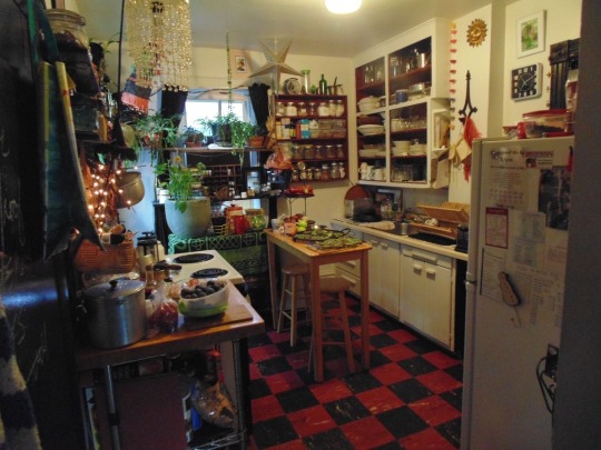
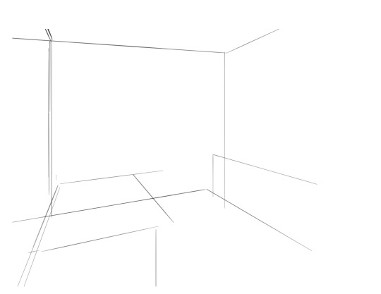
i saw the left photo and realllly loved how the cabinets alligned with the wall- so i used my ruler tool to draw out my inital plotted points from the image- basically the linear movements i was most interested in and then i turned off the image layer and worked with those lines and the ruler tool to move on. eventually i had this:

which was enough for me to put my characters in for the inital round. if you notice- i made a looot of further adjustments as i go on. this sketch is not a final layout, its so my characters have somewhere to be! i cannot draw someone standing on a floor if theres no floor, nor leaning on a table that doesnt exist. i can’t draw my characters without a background, but i also cant finish my background without accounting for how my characters can comfortably exist in it!!

this was the like.. very basic start. i knew the positions of two characters- but i needed to change a lot not only to fit them better but to allow for the other two figures i had planned.
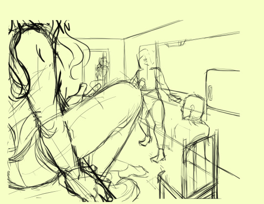
okay.. a little better. i widened the kitchen, closed the fridge door.. added a chair and fit in all the figures.. but this is waaay too dramatic. only two figures are actually interacting- and they are at wildly different energy levels!

this is where things started to make a little more sense characterwiss, so i was ready to refine backgrounds and figures and unite the two.
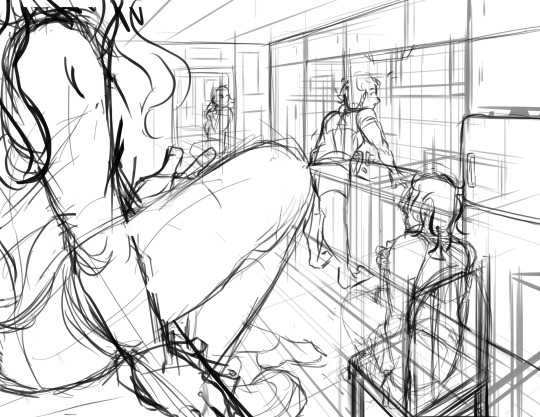
inital base sketch. much better layout.
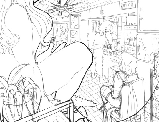
okay- this is where im getting my footing but things seem.. really really off. You can see me working on my framing here- theres some good linear movement from left to right here- but not vertically. It’s hard to notice the figure in the far back, so i need to redirect the viewers eye to move upwards as well!
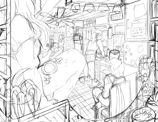
this is where i decided to zoom out, add an interesting vertical element to the left of the image and make it clearer whats happening in the foreground. i had to account for some stuff by adjusting the cropping, but i paid attention to that as well.
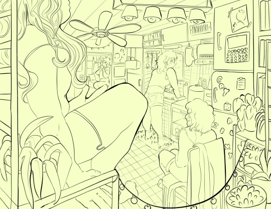
annnd- thats what a clean sketch looks for me! i have all the elements of my scene accounted for, and things are clean enough to read.
the next step for me would be transfer! essentially- I print the image of my sketch out, resizing and taping pages together so my sketch matches the size of the paper i want to paint on, and then i use a lightboard to transfer my sketch with pencil onto my paper. Then i refine the sketch a few times on paper before stretching my watercolor paper (essentially just prepping for painting) and inking with a brush and colored ink before going in with watercolor, gouache and ink, then usually finishing with marker, colored pencil, pastel and ink. it’s a lengthy process but a lot of fun lol. but sketches for me can be like.. 15 layers of different roughs until im happy with just the sketch. there were more images but im on mobile and theres a 10 image limit 😭😭 im a bit masochistic but i believe that if i dont have a good sketch i dont have a good painting!!
102 notes
·
View notes
Text
(Happy Saturday! Today's housekeeping is rather hefty, so let's get right into it.)
(I'm sick again. Yes, really. For the third time in as many months. And for unrelated reasons. This week's ailment is a perpetual, very sore throat. Not exhausting so much as very annoying so we'll see how my concentration levels hold up.
My work/life balance is getting shifted around next week. That sounds more dramatic than it actually is lol. Point is, I'll either have way more or way less free time soon. Won't know 'til it happens so we'll see how the ol' update schedule goes. ¯\_(ツ)_/¯
Tumblr is trying very hard to be pre-Musk twitter, and that's messing up the story's archives. Okay, this is the big one. So as you've probably noticed, Tumblr has been going hard on copying Twitter's layout this past year. Some of them - like adding polls - are great news for us! And then you get the changes to the app layout and the toolbar and this tumblr live shit and good lord just stop. What worries me most is the website trying very, very hard to pivot away from custom blog themes. Most links redirect to the in-dash browser, asks can no longer be sent from people who are logged out, and if you try to read a blog without an account it eventually cuts you off and tells you to sign up. For a webcomic - even a silly, informal one like 8.30 Poll - this is very bad. It's impossible to view the story chronologically when on mobile, and posts with polls in them are set in stone so I can't even manually go back and add in links to each update. If custom themes really are getting removed then these problems will extend to desktop as well. In short, I need to find a way to back up or mirror this story. We're not moving sites because we can't. There isn't another platform out there that has all the features necessary to run a story like this (besides maybe /tg/, but I'm not prepared to run this there lol). So instead I ask how I should go about backing this up. A plain .pdf with the text and images? The animations wouldn't work but it'd be easy and accessible. A HTML5 archive (similar to the Ruby Quest ones) would be more time consuming to put together and would be incompatible with screen readers, but would improve the pacing and allow for animations. Either way, we're almost at a hundred updates so if ever there were a time to start thinking about it, it's now. 'Cause the longer I wait the more of a pain it's going to be to maintain if/when tumblr shits itself.
...And that's about it!
Thank you as always for reading, and for your patience. Can you believe this thing's been going for six months now? Wild.
Will see you all on Monday, barring unforeseen bullshit!)
8 notes
·
View notes
Text
Interesting development tonight while trying to make Tumblr work a bit better on my phone while my tablet doesn't want to work with it -I figured out how to fix my blog URL from redirecting to in-dashboard view (tumblr.com/[user URL]) on my mobile browser, regardless of which URL format I use ...and I believe it's a workaround for the issue of Tumblr's login wall popping up in blog-view even for people who have chosen in their settings to keep their blogs viewable to everyone by being able to have your blog work in [User URL].tumblr.com format on mobile.
For anyone who wants the ending point first before the context, TL;DR -it has to do with THIS. If you're curious or need the visual of what exactly the difference the "Use Default Mobile Theme" setting makes, and why it might be a problem, context follows:
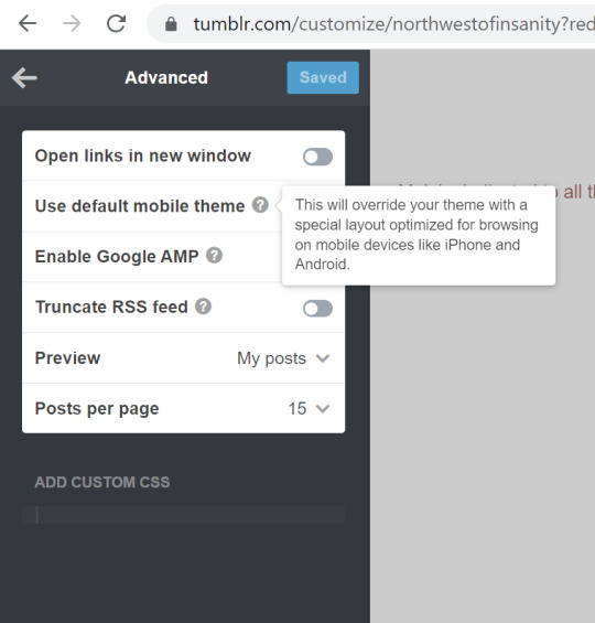
So, for about a year now, the picture below is how my blog -and most other users' who use the basic Tumblr theme instead of a custom blog -comes up on a mobile browser:
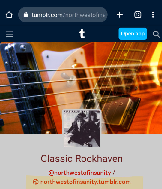
It displays under the dashboard header, like I opened it from a post, and the URL stays in the dash-view format - tumblr.com/[user URL]. I could tap on the highlighted, second link for my blog page I had enabled with [user URL].tumblr.com, and it would *still* revert itself into dash view, and the previous URL. Also, this rendered my blog unviewable to anyone without an account, as the login wall would pop up in short order after loading -and I do in fact have friends who I occasionally share some of my Tumblr posts with, but they do not have or want to make an account. (Yes, you may ask me "why not just go with a completely different custom theme so that it has to load properly?" -Well, I do have "custom theme enabled" selected -as one known step for allowing public view -but I stick with the "Official Tumblr Theme" because I like the simplicity and accessibility of it, and I've had a lot of menus not display right or be confusing to find on other people's custom themes, and while it's their choice to use what they like for their own blogs, I want *my* blog to be accessible and easy to navigate, for my own sake as well as anyone else. And it's not like this has always been a problem with my blog theme, right? So, why should it be?)
But then I also realized that I have a few users I follow using the Tumblr official theme for at least their mobile site who still had it loading the way it used to for me, and switching properly to [user URL].tumblr.com, and bypassing the login wall as far as I could tell. Now that I've finally figured out how to switch back after what changed about a year ago, when I tap on that second link on my phone browser, it looks like this:
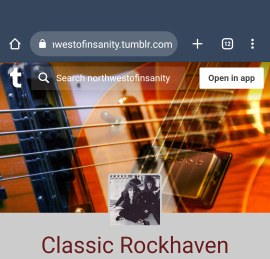
Look! It's the proper URL with the blog search bar at the top. I can share my own posts with my friends who don't have a Tumblr account, and they can *see* it without the login prompt blocking it up if their using a phone. Better yet, I haven't quite figured out this part, but ever since "featured tags" became a thing, my phone mobile browsers won't let me search anything other than featured tags on the search bar in tumblr.com/[user URL] view -I could tap "enter" all day after typing it in, and it just doesn't register or go anywhere at all, and I've yet to get any answers from help requests on that... (Note: I can search blogs on in-dash view just fine on desktop -that's only a glitch on my phone). But that search bar at the top in the proper URL view works like a charm for anyone lucky enough to be dealing with that same glitch, and is so much easier than having to manually type in search or tag URLs for non-featured tags.
So, that brings us to what changed:
I started digging through my blog and theme settings for *anything* that would possibly fix this, and was even about to resort to switching to a custom theme with the simplest layout possible if necessary (Again, I've had the "custom theme enabled" toggle on for as long as it's existed, as a known step for bypassing the log-in wall despite also allowing public views on blogs.) Then, I finally noticed an "Advanced" panel on the very bottom of the editing tray that led me to the solution
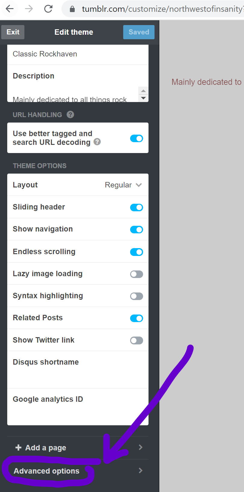

The toggle for "Use Default Mobile Theme" was enabled on my advanced settings -something that did not exist when I designed my blog in 2017. (And aside from a minor tweak to my blog description, that theme has remained the same from that very night forward). As it states, "This will override your theme with a special layout optimized for browsing on mobile devices like iPhone and Android". What it doesn't say is that it will ALSO override the switch to [user URL].tumblr.com, and keep your blog opening in in-dash view on mobile browsers, regardless of your other view settings. As soon as I found that and toggled it off, one of my greatest headaches with using Tumblr on my phone over the last year was cured.
Now, I still can't navigate easily on other users' blogs who have that enabled, whether by choice, or by not knowing how to fix this issue, but again -their blog, their choice. Throwing this out there for anyone who's been as perplexed by this as I have been and might not know you *have* a choice.
#tumblr troubles#tumblr problems#tumblr mobile web#i cannot tell you how much this has been driving me crazy!#hope this helps someone
2 notes
·
View notes
Text
Yeah, this is a "feature" of the new dashboard-style blog view. Scroll too far, or even try to click on a post, and Tumblr will force you to log in. It's not just a mobile issue either—the desktop site does the exact same thing! You can't even send anonymous asks, a feature explicitly not tied to accounts, if you aren't logged in! It's ridiculous!
Thankfully [url].tumblr.com blog views don't do this... but not every blog has it enabled. New blogs, and blogs that used the default Tumblr theme during the rollout, now force everyone to use the new view by default. (If this might be you, please turn on "Custom theme" in your blog settings as above! You don't have to actually choose a theme, it's just flipping a switch.) Which sucks, because even logged in, the new view lacks basic features like pages and default-visible timestamps.
So, what can you do about this?
Enable a custom theme for your blog(s), so readers can dodge the login wall
Disable "use default mobile theme", so mobile readers can dodge it too
Access tumblrs via [url].tumblr.com so you don't get login walled
If you're technologically savvy, use uBlock Origin and add ||assets.tumblr.com/pop/js/modern/async-login-wall-*.js$script,redirect=noop.js as a filter to prevent the login wall from appearing at all—but you also have to disable the filter every time you need to log in, so it's a hassle
AKA a bunch of individual-level workarounds that do nothing for occasional readers. Be familiar with the site already or sucks to be you, I guess!
This is a terrible state of affairs. Tumblr's biggest strength is flexibility. Blogs can be anything from reblogging for friends to making original posts to writing longer-form content for off-site audiences. Why is Tumblr now trying to control the relationship between blogger and reader? It can't compete with bigger sites like Twitter and TikTok on ensnaring users in a toxic ecosystem, so why is it trying to? Why is a site that relies on being a more pleasant alternative making the potential-new-user experience worse?
My understanding is that Tumblr's paths to profitability rely on user contributions and goodwill. Right now, @staff, shenanigans like these and the recent app layout changes are making me seriously reconsider my ad-free subscription.
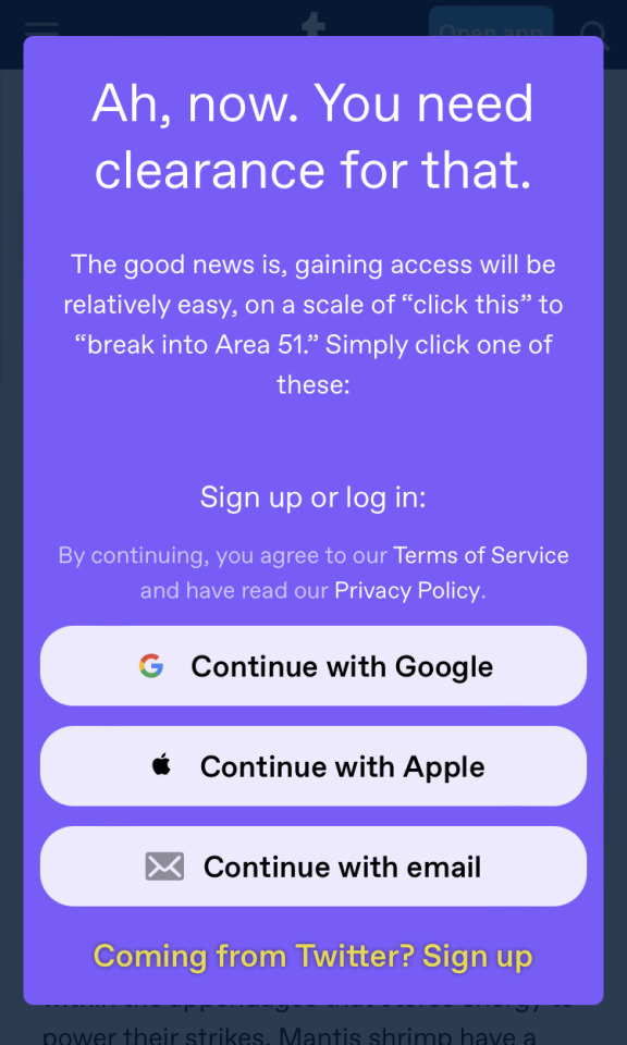
I don’t know if I’m late to the party here noticing this, but @staff what the actual hell is this. This is what I get when I click on the link to my own mantis shrimp post, shared on Twitter. I can see the first half, and then I get forced to log-in to keep reading.
I write a free blog on your free platform, and you’re using link sharing on mobile to try to force people to sign up? Not only is this absolutely not okay - this isn’t a paywalled site and my content isn’t subscription only - but it really fucks me over as a science communicator who relies on posts being shared easily to disseminate information.
This is absolutely not okay. I’ve used this site for eight years to do for science outreach and loved it. This choice leaves a really nasty taste in my mouth.
#HATE this.#tumblr is increasingly only usable on desktop#and I don't need ad-free there. that's what ublock is for#I'm only paying because staff earned enough goodwill and that could change very rapidly indeed#tumblr meta
28K notes
·
View notes
Text
Tumblr Clients to Use Other Than This Shitty App (but honestly thoooo...)
This is a long list and it's mostly me rambling about features that stood out to me. Also, going through these, no client here is going to completely replace the desktop or the app for most people. All of these clients have something up with them that, at least for me, hasn't made me stop using official tumblr options. Even the option I actually recommend to use is still just the official tumblr app while on desktop it's best to just use dashboard unfucker and xkit rewritten.
Think of these as companion apps for the most part.

Desktop
Washboard.ws: Browser || Free
Idk if anyone still remembers washboard?? I remember it being the first tumblr client I've seen people talk about back in the day... and, boy, does it still feel like it's back in the day.
It's a bit old feeling since it still using the older tumblr dash layout and I think some features don't work correctly like search not working and trying to reblog or like a post gives you an error. Their blog hasn't been updated in 2 years and the site feels like it hasn't been updated in 7 so while it's up and running, it's not very functional anymore. I just had to mention it because I appreciate it so much.
My Pros • Dashboard Views - List (Blockquote/Old Tumblr) • Viewable Posts - Text Only, Text w/ media, Photos, Videos, Audio • Posting - Redirects to Tumblr • Reblogging - Queue, Draft, Private, Schedule • Side Blogs - View, Reblog • Search Support - Clickable Tags Only • Messaging Support - Ask (redirects to tumblr) • Save Tags • Filter/Blacklist My Cons • Feels like 2009 bc of old dash design • Reblogging is broken • Liking is broken • No search bar


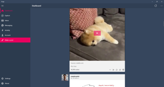
Ouga: Windows Desktop app || Free/OTP - $4.99
One of the desktop apps I've used for quite a while. It's ok, it feels better than Tumblast and 6tum (which isn't on here bc it doesn't work right and I've already made an exception for washbaord) to use but I've also had more crashes than Tumblast. Still, to me, it's the better working and easy to understand client on the windows store.
My Pros • Dashboard Views - List • Viewable Posts - Text Only, Text w/ media, Photos, Videos, Audio • Interruptions - Banner/Footer Ads • Posting - Queue, Draft, Private, Schedule • Reblogging - Queue, Draft, Private, Schedule • Side Blogs - View, Reblog, Post • Search Support - Bar, Clickable Tags • Messaging Support - Ask, IM • Download Support - Images, Videos • Filter/Blacklist • Activity Feed • Multi Account • Add Tags to Posts My Cons • Interruptions - Dashboard Tumblr Ads, Banner/Footer Ads • Crashes sometimes

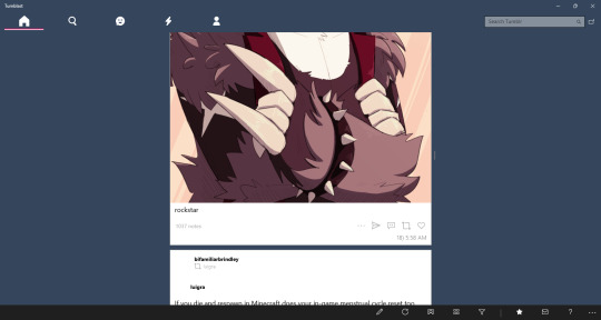
Tumblast: Windows Desktop app || Free
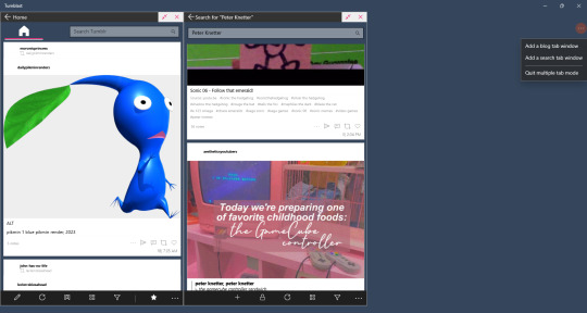
So/so about this one. It works enough to make a post, reblog things, like stuff, but I think it's a little bit more clunky than Ouga. I do like this one feature that let's you have multiple tabs open. It's not a well working feature that sometimes crashes the app and searching tags don't always show with this enabled, but you can do it.
My Pros • Dashboard Views - List, Blockquote • Viewable Posts - Text Only, Text w/ media, Photos, Videos, Audio • Posting - Queue, Draft, Private, Schedule • Reblogging - Queue, Draft, Private, Schedule • Side Blogs - View, Reblog, Post • Search Support - Bar, Clickable Tags • Messaging Support - Ask, IM • Download Support - Images, Videos • Filter/Blacklist • Activity Feed • Multi Tabs • Add Tags to Posts My Cons • Look/feels like it was made for windows 8 & 7 mobile.. it came out for windows 10 • Searching bugs out sometimes • Can feel clunky • Icons aren't showing right now

Tumblesocks (updated fork): Emacs app(?) || Free
.... i....... tried.
I know I put this off for most of the month bc I had a feeling it'll be a bitch in a half to do (and I was right) but I didn't know I'd spend 3 days trying to get this client to work. Emacs itself was difficult to work with even though I went the simple way and the gnu install.
I tried this out in Windows. Got frustrated. Actually fucked with Linux. Got more frustrated. I'm pretty sure Linux users are probably like "this is so easy" and that's fine but there's a reason I hate Linux and I'm not cut out to test out Emacs. I'm sorry.
If you're interested I still have the links above. Gargle's fork is probably the best to use since it's said to fix a lot of things. But I absolutely invite anybody to reblog this or send me an ask explaining how to get this shit running in the most hand holdy way.

As far I can find, there isn't a client app for macos. I closest I saw was an app called MenuTab Pro for Tumblr which everyone was saying doesn't work (anymore?). From the looks of it, it would've fallen under "viewer" for me so I most likely would've skipped it anyways.

Android
Tumblr (revanced): Android || Free
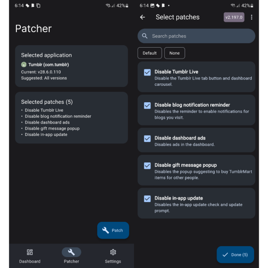
So this post was made awhile back before tumblr was supported by the revanced community. I'm excited to see that, while I was testing all these clients out, some people have made tumblr patches for revanced!
There are very little patches right now. Most importantly the tumblr live icon is now gone and ads are supposed to also be gone but that sims a bit more finicky. It only says that dashboard ads are disabled and sometimes it feels like they are but then they come back in full force so you'll have to force close the app in settings and then they're gone again for awhile. The same with blaze post as it feels like they've also been disabled until it doesn't.
Even though these are early patches, it's still the only option I would replace the original app with. It's not a client so you still have to deal with Official Tumblr App Bullshit™ but you also get all the expected or good features of the tumblr app that some of these clients don't have. I would like to see more patches like hiding the badges or fixing how the disable ads patch work but it's still better than nothing.
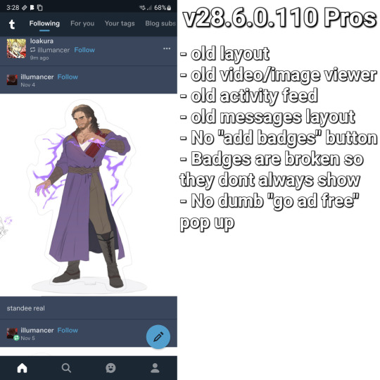
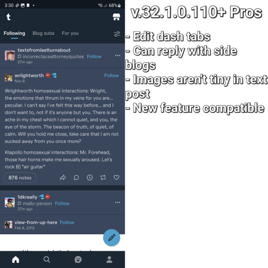
This bit is long, sorry, but I wanna add it's worth picking between 2 versions of the tumblr app depending on how you like the layout. v28.6.0.110 (the version I use) has the old layout and some problems that come will it like tiny images in text post, not being able to reply with side blogs, and sometimes some things just stop... working at times? While any version after that will have the new layout what comes with it: tumblrmart icon, changed activity feed, new video/photo view. I love the old layout over the new one so I stick with v28.
Both versions have their goods and bads and is why I have 3 versions of tumblr on my phone. Using app cloner (better options are behind an otp. don't get the sub, it's not worth it) you can install different versions and see what you want.
My Pros • It's still the Tumblr app so everything you like is all here • No ads! (sometimes) • Tumblr Live icon is gone <3 • Am able to test out newer features that are actually useful and interesting (like collections and interacting from side blogs) My Cons •Blaze posts are still present at times • It's still the Tumblr app so almost everything you hate is still here • Badges are still visible as well as version newer than v28.6.0.110 will have the "add badges" button on your blog • Annoying pop ups like going ad free or whatever are still a thing if you're using any version with the new layout • Breaks like "but wait! there is more" and "check out these x" are still here • TumblrMart icon is still at the top corner on the new layout

TeeHub: Android/iOS || Free/Sub - $1.99, $3.99, $5.99/OTP - $8.99
TeeHub is no longer on either app store. You can download the latest apk and modded apk here
While this has become my new favorite android tumblr client, the free version of this app feels so limiting and the paid version don't feel that better. I'm still happy that they added the one time payment option because I'm tried of subscriptions but stuff like not being able to see text only post at all, problems with posting, and no filter feature is so annoying to me.
Currently, TeeHub, on the tumblr side of things, feels lacking but also on the same level as Tumbletail for Android. There is an OTP of $8.99 and 3 sub options of $1.99, $3.99, and $5.99. If you like this and want to support it getting better I'd say just do the OTP because while the pro features aren't anything important, paying 9 bucks once feels more worth it than paying around 50 by the time the month is over.
TeeHub is only my favorite android client right now because it looks nice. If Tumbletail fucking updated their app so you can post in the paid version and it didn't look like shit it'd be a different story.
My Pros • Dashboard Views - List, Grid • Viewable Posts - Text w/ media, Photos, Videos • Posting - Queue, Draft, Private, Schedule • Reblogging - Instant • Side Blogs - View • Download support - Images, Videos (paid) • Multi Account (paid) My Cons • Interruptions - Popup Ads(? they said there's ads but i couldn't get them to popup even on a separate phone soooo) • Subscription • Can't view text post • Can't post/reblog to side blogs • Can't post/reblog to queue, draft, schedule, or privately • Can't add tags to post • No search function • No filter/blacklist support • Posting videos/photos aren't working right now

Tmdroid: Android || Free
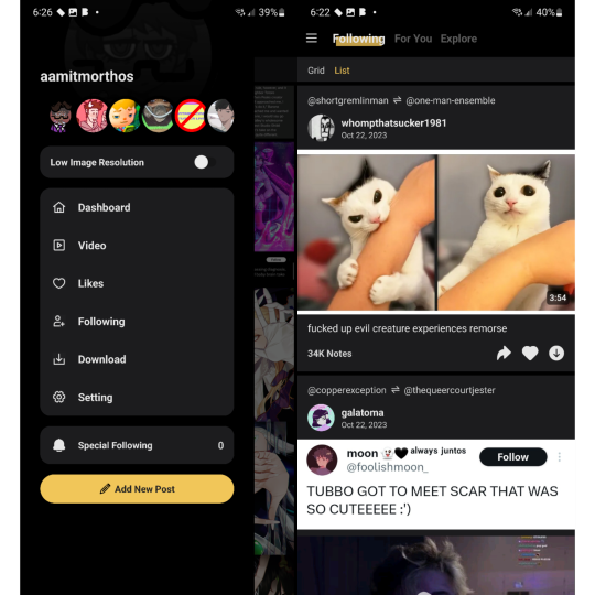
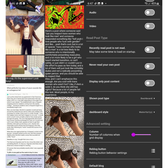
This one I love what they're trying to do I just think it needs more time in the oven. Some of my problems with this that aren't in my cons list are some of the dashboard settings in carousel view aren't available in waterfall view (the view I use in the image) and text post specifically don't have a square around them to separate them from other post. It's not that bad when it's a text post sandwiched between images but when there's text posts in a row, like in the image, it all looks like 1 text post.
They do have a blog and this app does get updates so I've been keeping an eye on this. They seem to be very open and accepting to feedback unlike someone else on this list and that's really fucking cool.
My Pros • Dashboard Views - List (Waterfall), Grid (Columns), Carousel • Viewable Posts - Text Only, Text w/ media, Photos, Videos • Reblogging - Queue • Side Blogs - Reblog • Download support - Images My Cons • Weird UI • Unresponsive UI • Limited or clunky side blog support • Can't make posts • Can't reblog to draft, schedule, privately • No search function • No filter/blacklist support

Tumbletail (Lite): Android/iOS || Free/OTP - $1.99
*screaming and crying* I feel like... a disappointed parent. Except I'm not disappointed. I'm mad.
This was my favorite client all the way back in 2012 when I was forced to use an iphone 3gs. I loved the way it looked, the text post were easy to read, it was smooth to use, it had a tag history that made reblogging & making post easy for me who ran an acnl blog, had really good settings to mess around with.... Y'all... so much of this is just not on the android version.
And it fucking pisses me off lol. There's no reason for the android version to look so ugly, to be lacking in settings & features, to not give paid uses the ability to post when you can on ios?
While the android version of this app is usable, moving from the ios app to android and seeing how lacking it was comparably and seeing people give feedback to cathand (who did have a blog) but they went unanswered while the ios version still got updates... The ios versions aren't perfect but it's a much better experience than the android apps. And I'm a bit mad about that.
My Pros • Dashboard Views - Grid, List (change thumbnail size to huge) • Viewable Posts - Text Only, Text w/ media, Photos, Videos • Reblogging - Queue, Draft • Side Blogs - View, Reblog, Post • Search Support - Bar, Clickable Tags • Download Support - Images, Videos (via video player options) • Multi Account (paid) • Tag History • Add Tags to Posts My Cons • Interruptions - Banner/Footer Ads • Can only make post in the ios app??!?!?!?!??? • Polls are viable as text posts but are broken • Looks cleaner on ios • Non photo/video post could be better formatted • Text posts contents are too large and you can't zoom out to see everything • Photos/Videos made using the new text editor (Text w/ media) are seen as text posts • ios version have more features/settings • Only posts uploaded as photo/video (not text w/ media) will have clickable tags • No filter/blacklist support
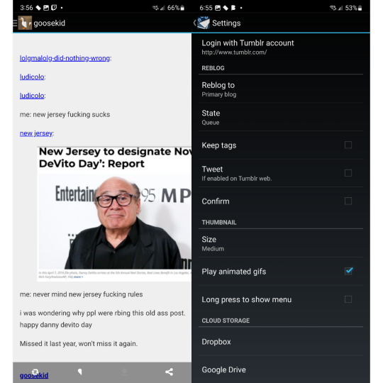
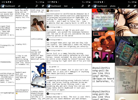

Violet: Android/iOS || OTP - $0.99
Violet is a weird on. I want to see it get better but I also don't recommended it. It did get a price cut to $1 so, ya know, but I think as a client it's not good. As a viewer, it's usable. I don't like the carousel view I'd rather have a normal dash. Stuff like posting and searching aren't a thing and reblogging isn't as featureful as I wish.
This works best in the way we heart it and instgram do, not like tumblr does.
My Pros • Dashboard Views - Carousel • Viewable Posts - Text Only, Text w/ media, Photos, Videos, Polls • Reblogging - Instant • Side Blogs - Reblog • Download support - Images My Cons • Account login troubles • Polls redirects you to tumblr • Can't make post • Can't reblog to queue, draft, schedule, or privately • No search function (tags open tumblr) • No filter/blacklist feature
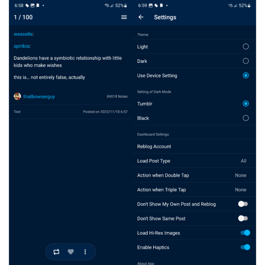

iOS (mostly the iphone bc i dont have a tablet)
Tumbletail (Lite): Android/iOS || Free/OTP - $1.99
yes we're back again bc ive been yelling about this for years but i"ll make it quick
Had this app since 2012 and I still recommended using it along side the tumblr app. Mostly because of how tumblr works today with their restrictions and inclusion of a filters list.
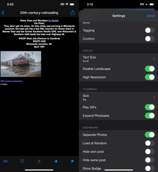
While text post in the dash view looks better than on android to me, open a text post the contents are so small but they fit the screen. I know the image shows that I have text size small but that's only because it doesn't change anything that I can tell so I left it alone.
My Pros • Dashboard Views - Grid, List (change thumbnail size to huge) • Viewable Posts - Text Only, Text w/ media, Photos, Videos, Audio • Posting - Queue, Draft • Reblogging - Queue, Draft • Side Blogs - View, Reblog, Post • Search Support - Bar, Clickable Tags • Download Support - Images • Multi Account (paid) • Tag History • Save Tags • Add Tags to Posts My Cons • Interruptions - Banner/Footer Ads • Polls soft crashes back to dash • Hard crashes a lot more than on android • Dash view only shows media and text post separately • Quote, Link, Chat, & Audio are sorted as Text Post since you can't view different types of posts like on android • Photos/Videos made using the new text editor (Text w/ media) are seen as text posts • Only posts uploaded as photo/video (not Text w/ media) will have clickable tags • Can't post videos • Can't download images and videos from Text w/ media post • Searching by clickable tags is broken • No filter/blacklist support
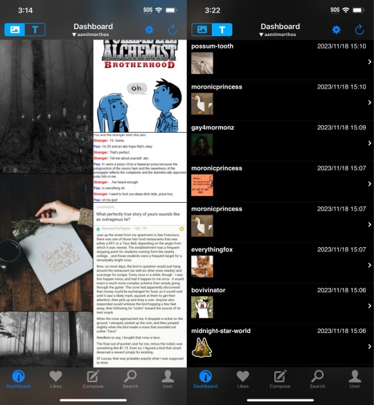

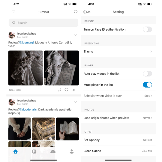
Tumbot: iOS || Free/OTP - $4.99
This is the most fine and normal client on ios so far and I honestly really love it for that. I found the only big problems I had was I couldn't post anything, you can't add tags when reblogging content, and that you couldn't reblog to queue. As a primarily queue user, that's annoying.
I think the best way to describe this app is "chill". If I was able to make post and use queue/draft this would be my replacement app.
My Pros • Dashboard Views - List • Viewable Posts - Text Only, Text w/ media, Photos, Videos, Polls • Reblogging - Instant • Search Support - Bar, Clickable Tags • Multi account support (paid) • Download support (paid) My Cons • Interruptions - Banner/Footer Ads • Dark mode paywalled • No side blog support • Can't make post • Can't reblog to queue, draft, schedule, or privately • Can't add tags to reblogs • Crashes sometimes • No filter/blacklist support

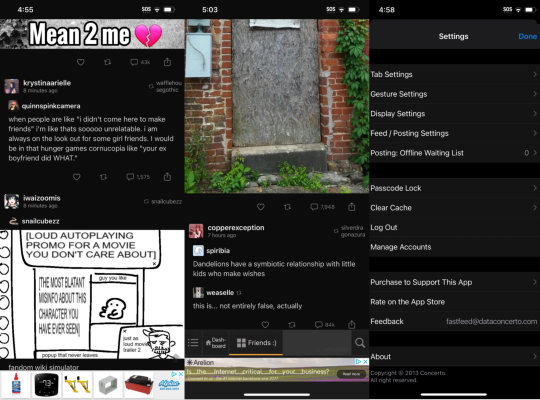
MultiTab T: iOS || Free/Sub - $2.49, $5.99
MultiTab have old pricing structure list that is still up on the apple store page but is not longer effective since the subscription model was added, sadly.
Another app I would actually buy if they didn't only have fucking subscription options.
Compared to Tumbot it kinda feels less clean to me. Idky but it looks a bit clutter or busy even if you only have one dashboard tabs open. I also think post not having a boarder or a different background from the background isn't helping either.
But the way this app handles reblogging is so good and the custom dashboards that I've been wanting on this damn site for years is here but pretty limited. I'm sad that even paid users have a pretty small limit for how many people you can add to a "feedset".
My Pros • Dashboard Views - Grid, List • Viewable Posts - Text Only, Text w/ media, Photos, Videos, Audio, Polls • Posting - Queue, Draft, Private, Schedule • Reblogging - Queue, Draft, Private, Schedule • Side Blogs - View, Reblog, Post • Search Support - Bar, Clickable Tags • Download Support - Images, Videos (paid) • The most features/settings I've seen so far • Best reblogging menu I've seen so far • Multi Account (paid) • Multi Tabs (Customizable - 5 - free | 20 - paid) • Tag History • Save Tags My Cons • Interruptions - Banner/Footer Ads, Popup Ads • Subscription • Polls are viable but can't vote • Doesn't show or explains everything a premium subs gives you • Holds to reblog doesn't show all side blogs • Dashboard Feeds are limited even if subbed • Adding blogs to custom feeds don't always work correctly • No filter/blacklist support
#tumblr#tumblr app#tumblr update#tumblr client#tumblr alternative#<- but not really bc it's still tumblr but ya know what i mean#washboard.ws#ouga#tumblast#tumblesocks#revanced#teehub#tmdroid#tumbletail#violet#tumbot#multitab t#fastfeed
25 notes
·
View notes
Text
somebody complained that my dreamwidth layout is completely unreadable on mobile so i tweaked its layout a little to make it ~responsive~. i just checked my tumblr layout and yeah it has the exact same issue. uhhh. i guess i will fix that too. slowly. (can you even look at a tumblr on the web on mobile or does it aggressively redirect you to an app? idk)
i mean i don't think anybody following me is one, but psa to reddit & twitter refugees: yr tumblr is by-default only visible in the weird dash view, which makes it incredibly difficult/impossible to use for users without tumblrs, and also makes it impossible to like. have pagination so that it's possible to backread. if you go into 'blog settings' -> 'custom theme' and enable a custom theme that makes the {username}.tumblr.com url work for people who are not logged in
i have not been enjoying the slow death of the web in favor of a million logged-in-only, phone-only, walled-garden apps
1 note
·
View note
Text
Power BI certification Microsoft course | Top Ten features In Decomposition Tree
Decomposition tree is AI visualisation in Power BI. We all know that is used for Root Cause Analysis Decomposition Tree is the best visualisation and each has a lot more capability. So, in this session I’m going to talk about top 10 features for decomposition tree.
The features are conditional supporting drill through support. Sort capability, responsive design, cross highlight support, easy access by keyboard shortcuts, improve behaviour of filtering, improved scrolling behaviour, then include exclude feature and pinning the visual as dashboard. So, this is the first feature that has been applied to the decomposition tree.
Now let me go to the second feature. Now decomposition tree supports drill through feature as well. So, when you click on drill through and click on apply drill through it will redirect. Due to the second page like this so that means that decomposition tree is supporting drill through future as well. Now sort capability we can we can apply sort on our decomposition tree visualisation. For that you just need to select your visualisation click on ellipsis and you will be having an option sort by. So based on the different column you can apply sort. I applied this sort on the year column. You can apply sort ascending and descending over here. So, this is the third important feature of decomposition tree. Now let me talk about fourth component that is responsive design. So, this visualisation is responsive so even for the mobile layout it will automatically set. Is position based on the provided space over there. The fifth feature over here is cross highlight support. So, let’s say for an example when you click on any of the bar over here, it will automatically cross highlight the other visualisation over here. So cross highlighting is supported at this moment. Now the 6th feature is improved. Behaviour of filtering
The other visualisation, the 7th feature is easily accessed by keyboard shortcut. So, these are some keyboard supports which is supported at this moment. So, this was the 7th feature. Now let me move over to the eight feature that is improve scrolling behaviour. Now let me move on to the 9th feature. So, nine feature is that when we click on when we right click on everyone, we would be having an option include, exclude and sure as a table option. So, these are the actual options that has been. Very useful for this decomposition tree. And one last thing is that now pinning the visualisation in the dashboard is also supported.
So, in this session we have discussed about the
conditional formatting
drill through support
sort capability
responsive design
Cross highlight support
Easy keyboard access
shortcuts
8. Improved behavior of filtering
9. scrolling
10. Include, Exclude

Microsoft power bi certification course online
With Microsoft Power BI training from Durga Online Trainer, acquire new abilities. You may achieve your goals fast and build confidence with the aid of our hands-on, guided learning approach. Join Microsoft power bi certification course online by Durga Online Trainer with low course fee.
You can also join online classes-
best clinical sas training institute in india | sas certification course online in india | Power bi online training course in india.
0 notes
Note
hey adam! unfortunately the nsfw flag (or whatever nonsense) that tumblr has you marked for keeps redirecting me back to the mobile version of your blog :( so no custom blog layout or pages or links :( :( so, I'm not sure if you had links out (eg to a weebly or toyhouse or other portfolio of ur ocs) on a custom blog layout. well, even if you don't have an OCs page, maybe you could share any OCs you made or did a lot of work on when you weren't on tumblr?
Oh that's what it is huh? I thought I had the NSFW tag removed from my blog... oh well.
Hmn P= OCs, yeah I can do that!

[Art By: Sleepingwoolf]
I've been slowly working on these guys, mainly the first two, and their setting. From left to right, they're Chelsea, Mil, Gene and Hazel. They're kathden (literally: cat people) and ki (dog), the human-analogues in their world, a post-post-apocalyptic setting with a strong focus on trains/trams and plants. Mil works on the lines, Chelsea comes from a very traditionally religious family but manages to get a 'acceptably feminine' job working for him, Gene and Hazel are girlfriends and old friends of Mil. Chelsea and Mil end up having an affair in which she starts to breakout into the world a bit more.
I want to write a full novel for these guys, but their world has a long way to go regarding development, and I need more writing practise in the mean time anyway.

[Art by me.]
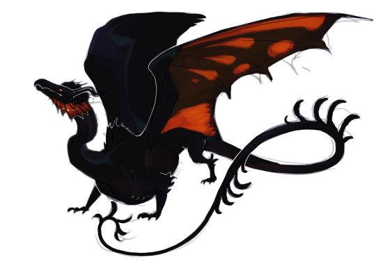
[art by me]
I've also been working on a shorter long form story about this guy, Taran, a shapeshifting black dragon enslaved to a kingdom, it's... not gonna ever be posted fully to Tumblr cos it's fully intended to be an erotic piece, but the summary is that he's getting older and the king wants to ensure he, the king, has a replacement/more dragons, and has assigned a young human woman to Taran for him to transform into a dragon for that purpose, they become friends fairly quickly, and in the process of carrying out the king's wishes fall in love. It's a slow-paced transformation-kink story with a happy ending.

[art by me]
I also adopted this guy, and now my partner and I have a whole bunch of leather wearing dino-bros. Petroc is a challenge to me to have a character involved in kink artwork who is NOT explicitly sexual himself, so tumblr may actually see some more of this guy!
He doesn't have a full blown story yet, but I can tell you he's an estranged father slowly getting back in contact with his daughter after she initiates contact against the wishes of her mother, he has a seedy history and a seedy present, mostly just to make ends meet. He's the only one of the bunch, so far anyway, to be a cyborg, after getting injured in an accident.
I've been doing a lot of comms and very slowly cranking back up my passion for OCs, I'm honestly still kind of 'getting over' Proxy =P which I still love a great deal and I wish I could find that sort of passion for any of my other projects--I say this like I don't know that just investing the time won't bring that together. Most of my stuff was heavily NSFW for the longest time, and... okay so it still is... I enjoy that... but I'm having a good time with SFW illustrations now too, which is one of the main reasons I felt semi-comfortable coming back to tumblr, as I'd actually have stuff to post.
Mil's setting is the one I'm most interested in, I felt very detached from it for a long while, with no real clear image of what I wanted the setting to be like, and all the art I have of it so far is different, but I'm really starting to get a feel for it, and while more research is needed, I'm feeling better about wanting to depict their world myself, or buy art for it, and even story fragments are revealing themselves to me--sadly Hazel and Gene don't look like they're going to be the major players I thought they were, but eh, there's still plenty of time for them to come into their own.
1 note
·
View note
Text
Go send your feedback to the @wip blog about Tumblr recent interface changes!
In this post , staff announced that they’re changing the post layout / footer on desktop, and as you all noticed: It looks whack, the buttons are too spaced out, the reblog and like buttons are reversed, and overall, its just not a good design. It looks like they wanted to make the desktop look like mobile, but the post says the post design is also “coming to the mobile version” so ??? Next: I talked a lot about it, but I’ll say it again : Some tags are “broken” in the sense that when you click on it, you are no longer able to access the tagged page of certain tags. For exemple, when you search “suicide prevention” and then you click on the tag under a post, you’re supposed to be redirected to this page https://www.tumblr.com/tagged/suicide%20prevention and from there you’re able to see how many people follow the tag. (Because yes, you can follow tags.) However, it is no longer the case, so if you click this link, you’re immediately redirected to the main search instead,aka https://www.tumblr.com/search/suicide%20prevention And its not supposed to do that. Go ahead, try it out. The same thing happen with #girl and many horror related tags like #blood, #bones,#body horror, #eye trauma, #gore ... The tags have not been nuked or banned : They’re still functionning properly when used to post content, theres no shadowban, its only the tagged page that has an issue. (Probably due to the banned ios tags situation back then, thats when certain tags started to behaves strangely to me regarding the tagged page) And finally: The new search bar. Staff said they’re rolling out a new interface for the search bar on desktop. The issue here is that they took away features, such as: blogs affiliated to the searched term no longer appear under the search bar like before (which sucks for exposure) , There’s a fourth collumn of content missing, which means that everything has been squeezed awkwardly on the left. On the screenshot that I found, there seem to have a lack of related term suggestions that appeared as well under the search bar. So yes, if you have something to say about these changes, you should send an ask to the blog @wip (their inbox opens on monday :) If you want to see illustrations about these issues, please refer to my other post right here
7 notes
·
View notes
Text
The Obey Me! Boys and a Blind!MC
**MC is considered to have NLP (No Light Perception) and is classed as having total visual impairment / total blindness.
**O&M (Orientation and Mobility) skills are skills that aid in safe and effective travel for the blind, which includes cane skills and independent travel.
Lucifer
He is incredibly surprised to have pulled someone like you into the Devildom, especially considering how dangerous the Devildom is to the able-bodied human. He gives you a double-take and glances back at Diavolo once or twice to make absolute sure that is the right human. Diavolo gives him a thumbs up. Lucifer can already feel a stress headache.
Likely the most courteous of his brothers in consideration with your disability. Unlike his brothers, he does not ask inappropriate questions (ex. Can you see this? How about this? How about now?) and is content to leave things as they are.
The first week, nearly everything you do gives him a heart attack. Your cane misses a fire hydrant, and you end up stubbing your toe on it. You forget where the table ended when you pick up something, and you smash the back of your head against the underside. You leave something in the middle of your room, trip and fall in the middle of the night while cursing, and within moments he is bursting through the door. By the end of the week, he is a sleepless, exhausted mess.
As one of the prominent members at RAD, he is responsible for what documents you receive and in which format you receive those documents. You have to explain to him that simply placing Braille where the letters would normally be on a worksheet isn’t exactly as doable as he thinks it is.
Being the proud bastard he is -- and after developing feelings for you -- he is somewhat perturbed that you prefer his idiot-brother Mammon to be your guide whenever they go out to places. He does take the pleasure of explaining visual cues of the places they go, however.
Mammon
He is both surprised and disgruntled that he has to take care of a human that isn’t able-bodied. Assumes that you’ll be even more trouble than your worth. Does a few things (i.e. offensive, stupid things) like wave his hand in front of your face and do weird things in front of you just to see if you’ll react. Given that his complete lack of subtlety and the fact that you can very much feel his arm waving in front of you, you scare the living hell out of him by grabbing his arm.
As brash and rude as he was, however, he does an okay job of orienting you to the House of Lamentation. But that might also be due to the simplistic layout of the halls. The places that you really need to know -- like the path to your room from the door and the path to the kitchen and dining area -- are easy to memorize thanks to his efforts.
Like Lucifer, nearly every blunder you make gives Mammon a heart attack (for fear that Lucifer will kill him if you die). He doesn’t really understand what can and can’t kill a human, but it doesn’t take long for him to realize that slipping and falling face-first into carpet isn’t exactly life-threatening.
As he begins to develop a crush on you, he becomes more and more possessive about who gets to guide you around. He was your first guy and first guide in the Devildom, after all. You eventually feel comfortable enough with him as a guide to fold up your cane while you walk with him, trusting him completely.
Leviathan
He expects you to look like one of those blind girls in anime and is surprised to see the near-complete lack of trademark features. You have no cataracts or anything of the sort that would promote the appearance of milky-white eyes, and you’re rather capable on your own once you become acquainted with the layout of a place. Because of this -- and also because he is a massive weeb -- you can feel the weight of his stare when you do the most habitual things. You call him out the fifth or sixth time you catch him watching you take out the trash.
It takes a little while to realize the extent of your blindness. Your proficient independence skills, good O&M (orientation and mobility skills), and spatial awareness skills throws him off for a bit. He is only convinced when he accidentally makes you walk face-first into his door.
Despite your rocky introduction, you two eventually bond over anime. Levi puts on the audio description when it’s available. When it isn’t he’s more than happy to explain the visuals to you, especially when it’s his fortieth time rewatching TSL.
As he develops a crush on you, he begins to make more and more excuses for you two to watch anime together, even if it isn’t new or the kind that he would want to watch. He takes note of your likes and dislikes, taking the approach much like he would a boss in a dungeon, and copes with his feelings that way.
Satan
Next to Lucifer, he’s definitely one of the most respectful in the group regarding your condition. He takes it upon himself to read as much as he can about your condition and blindness in general, his initial interest more scholarly than anything. The first few weeks that you know him are filled with questions like: So, can you see light? How much light can you see? Can you see figures or shadows at all? What was it like when you had more vision?
He feel regret after threatening you when you refused to make a pact with him. Aside from the fact that he just threatened a blind (and in his opinion) helpless human, he also severely damaged a friendship between the both of you. He makes it up to you in his own way afterwards by acquiring a number of audiobooks and Braille books for you to read.
Given his insatiable thirst for knowledge, he is also very, very interested in how you can read Braille and how you take tests without sight. After learning that you sometimes prefer requesting a scribe to take longer exams, he immediately tries to sign himself up as a student scribe at RAD. As you are one of the only students at RAD with a visual impairment -- and perhaps the only one -- you are surprised and also not surprised to see Satan waiting in the exam area for you, your exam evidently in front of him.
As his feelings develop for you, they take the form of finding reasons to take you out to library dates, accompanying you to various stores for accessible equipment, finding and acquiring various reading materials for you, and generally just inserting himself whenever possible under the pretense of being a fellow book-lover.
Asmodeus
He’s preoccupied more with the fact that you have such a plain taste in clothing than he is about your blindness. Even after standing by the principle that comfort is ultimately more important than “making a statement”, he takes it upon himself to get you at least enough clothing for a decent capsule wardrobe. Cue being dragged around the Devildom’s boutiques all day as he dresses you up in various outfits, undresses you (his favorite part), and ultimately entertains himself the whole time while you suffer.
He’s fascinated by the tactile guides that you use to do your makeup (on the rare occasion that you bother to do so). After watching you a few times, he gets you up to date on the latest makeup trends and does his best to explain the visual effect of each. Your interest in his hobby makes him happier than he would admit. It sparks a routine of doing your beauty regimen together almost every night, with Asmo being more than happy to make you his guinea pig for products.
Makes you touch his face right after learning that you’re blind, which is an awkward experience. Your first reaction to pull your hands back and startle offends him, as he (wrongly) believes that that’s what you do when you meet a blind human.
As he develops feelings for you, he gets somehow even more touchy, much to the irritation of the rest of his brothers. While he never quite makes the first move in the way of taking you to bed, he does take as many opportunities to touch and explore you as much as possible, no matter what the circumstance may be.
Beelzebub
Despite that fact that he would very much like to eat you, his impression of you as a cute, helpless little thing deters him from doing so. Given his impressive height and stature, he sees you as smaller than you really are and treats you accordingly. He takes the time to redirect you when he sees you wandering in the halls, often without many words or any explanation as to why, and he tends to act as a human shield for you in RAD to prevent you from being caught up in the crowd.
When Mammon isn’t there to be your guide, he’s definitely your second choice because of his sheer size. Similarly, you eventually become comfortable enough with him to fold up your cane when he guides you, as your impression of him has devolved from “big, scary demon” into “scary but gentle giant”.
Stands up for you when other students begin making fun of you for your disability / wondering if you’re only faking, given that you don’t fit into the able-bodied person’s idea of what a blind person should look like. Beelzebub catches wind after a few weeks, and after a rumor of certain hospitalized demons, the bullying ceases.
Connects with you through food. While you’re pretty sure that having no sight doesn’t make much of an impact on your ability to taste food, Beel seems to think otherwise. He tends to hand-feed you whatever it is that he’s eating at the moment, often surprising you. You figure it’s Beel’s choice of love language, given that he that he tries to feed his brothers anything and everything when they feel upset.
Likewise, he often chooses to team up with you on dinner duty to both make things easier for you and to sneak more food because you can’t see him. When you feel less servings than there should be in the pot, however, you know damned well who ate the rest.
Belphegor
Upon first meeting you, he’s very confused as to how exactly you found his prison in the attic. Then again, it’s not like he cares exactly who lets him out of his prison. Because of that, he thinks it’s much easier to fool you into thinking that he’s human.
He feels extreme remorse after killing you, knowing fully that he used your trust against you and that he took advantage of your disability. It takes a long time for you to get comfortable enough to be even with the same room with him, given that he quite literally murdered you in another timeline. When he does somehow manage to regain your trust -- after many attempts and efforts on his part -- you two end up falling asleep together.
Becomes just as protective over you as Beel is, essentially taking notes from his twin. As his feelings develop towards you, he shows it in his own way: namely by allowing you to touch his massive tactile collection of comforters, blankets, and pillows. How exactly he stuffed so many bedsheets and pillows into one room is ... impressive.
Note:I am aware that this does not speak for all blind people because there are varying levels and very, very many causes for blindness. These are based on my own personal experiences.
#obey me#obey me shall we date#obey me!#obey me lucifer#obey me mammon#obey me satan#obey me levi#obey me leviathan#obey me asmo#obey me asmodeus#obey me beel#obey me beelzebub#obey me belphie#obey belphegor#i didnt really see any headcanons for disabled mcs so#here we are#obey me hcs#obey me hc#obey me headcanons
220 notes
·
View notes
Note
Hi! i just got a tumblr account very recently (but i’ve been reading stuff in the vikings fandom basically since the beginning of covid lockdown last year when i started the show, but anyways lol). i really love your writing and i was wondering if you had any tips about starting up a page or anything? i love writing but i’m much more used to the wattpad layout, and i also love editing photos/videos but i’ve always been on insta for that. on both of thsoe platforms there isnt really much of a fandom for vikings though, which is the main reason i joined/got into tumblr. i’ve never worked on here before so i just wanted to ask if you have any advice for me. thanks so much for your time! sorry this is so long!
Hey love!
First of all, welcome!! The series may be over, but the fandom is super active! And we love new members!
Tips for Tumblr? Let me see...
Well, first of all always save your drafts away from Tumblr. You can have them saved on Word or use Google Drive for saving your documents, but do not trust Tumblr drafts to keep your work and do not write directly on Tumblr post editor to avoid losing your time and effort if the site updates all of a sudden!
For editing and gifing, take note of the size limits for Tumblr images. Some images and gifs can be rejected if not inside these limits and the editor won’t always say what’s the real problem haha.
About mobile and web apps, take note that their codification is different which means, posts edited in Mobile sometimes won’t be possibly editable on the web and vice versa. So, choose your favorite version and stick to it (I love the web, more features available, fewer errors...)
Over anything, ignore the haters. They’re not numerous in our fandom and the few who exist are nothing but attention whores: ignore them, they’ll search for attention somewhere else XD
If you already have a Wattpad profile active, feel free to link it for us! Shout your work out, love! There are lots of Wattpad readers around that will love to know you’re here too!
Tag your work and respect warnings, This one is always good to remember cause tagging your work will help it to spread around (the first 5 hashtags you put on every work will settle it on the searches for those tags helping you to appear around) and the warnings are super important to avoid people from being surprised by triggering content in our fictions. Since we don’t have a block exclusively for warnings - like Wattpad offers - it’s always good to remember to place these warnings before your work starts. :)
If you chose the web version of the platform, remember to use the “keep reading” bar whenever is possible! The web posts can be very long and believe me, in the mobile version, the longer posts become a real nightmare for the users who’ll have to scroll down a lot of touches before reaching the end of our posts. The “Keep Reading” bar feature adds a cut on your post that allows the user to jump your post easier since it appears like a small post on their dashboard and the ones who want to read you will be redirected to your post by clicking on the bar allowing them to have clean access to your content without the many other things their cellphone has to load to read on their dashboard.
Ah! Important one! Prepare a Masterlist post! Whenever you post a new piece of work, put the link for it on your masterlist and save your masterlist as a link on your blog’s subtitle so it will be easier to reach it! New readers will search for your masterlist whenever they like your work, trying to reach more of your fiction without having to scroll down through your whole blog. And also, it helps recurrent readers to find that particular work of yours they love so they can read again or reblog or even show the links and recommend you to their mutuals! Here is mine, as a sample, if you need :) (LINK)
Count on me s2 If there is anything I can do to help, feel free to contact me! It will be a pleasure to answer your questions and help you integrate into this amazing community we have here!
All the love!
10 notes
·
View notes
Text
I Walk in Madness
Nobody has or can have all the information, but they have the requisite amount of information and agony in combination to believe they accurately see the entire thing. I don’t and can never have all the information, but still I must have an opinion that seems binding or confident. The information I selected and pressed into an opinion is now my special soul, and defines me. It must be released and time-stamped to show that at one point, I made this all-encompassing definition, which is a summary of my self and the window of all my beliefs hereafter. Elevate yourself to say, “I no longer wonder.”
I have made myself publicly available; all that the community asks of you is that you participate. To not participate is to disrespect those who put all of their time, effort and mental filaments into the ideal of community. Such a reclusive impulse should be modified swiftly but in the most holistic way if possible, it is not helpful for others. It is not helpful for you. It is, at heart, cowardly, as it turns away in fear from the difficulties involved in building a resilient, healthy and just community. It courts isolation as a comfort, when in fact voluntary isolation is the fortification of unhealthy habits and delusional or paranoid thought processes which precariously redirect the lost person away from the tough but rewarding civic duties necessary to building a fact-driven social network. If I am lonely at night, the solution is to participate. Though I walk in madness, I end up at the voting booth. A discussion takes place in which everyone pretends to know how recycling works; one inches towards integration. Recipes are shared, and an evening passes with an attempt to perfect avocado gazpacho.
I love traditional open-toed sandals. Making the body more vulnerable to the elements of the outside world shows a general dissipating apprehension. Though current events inevitably fade in relevance and thus sustained public attention, their emotional immediacy and rousing thrust are exceptionally good at forcing the under-opinionated to participate and commune with others. Opinions always coalesce under the pressure of current events, and since current events are established and projected much more widely and much more often in this era, it follows that one should have more opinions, and participate more. Of all the methods I’ve tried, the most effective and least artificial toner I’ve used is two tablespoons of rose water mixed with 1 cup of filtered water. The rose water I use is a brand from Lebanon and you can probably find it in a local middle eastern grocery store. Having a very public life no longer makes me uneasy!
I published the post and I was feeling satisfied, though very likely no other person would see it. My only patron appeared to be a woman in her early 40s with hard bangs and a diamond choker smiling in her icon’s bubble, with arm around a presumed husband and the suggestive text “Be Kind” pegged in lower left corner in hot pink with white outline. Miscellaneous background details in the icon, particularly a hanging silver streamer, communicated that at the time of the photo this woman had been at a New Years party. Her silent interpretation of my persistently scarce content was eager musing territory for me when her icon focused my attention in the midst of a wild scroll, or when her face and militarized endorsement of kindness intruded with the elegance of a twirling maple samara upon my mind during a bout of fear-walking. She made no effort to contact me, had no posts of her own or even personalized layout style, and yet she hypothetically watched me. Of course it was pointless on her end — my posts were designed solely for the tactical misdirection of algorithmic spectres, conceived and published only in order to convince those supra-wiggly archivists of instinct that I was overwhelmingly a different person. I did not want even the smallest gleak of truth to land online. This “lost mind” plan even extended to my video watching and digital window shopping maneuvers, though in the case of the former it was impossible to totally restrain myself from a true curiosity and craving to pursue certain videos. This lack of impulse control expanded even more robustly when porn entered an afternoon; it was insurmountable to search and watch against the specific desires and images I knew would satisfy me the most. Yet I tried in rapid toe dips, once spending eleven minutes on a video of a nude bodybuilder shot-putting a collection of corns and lettuces into a wall, and with no o-face to conjure.
“I walk in madness” was both my unorthodox phrase of meditation and most important sentence of self-parody. When walking around at night in a certain state, I would now and then repeat to myself, “I walk in madness.” After this I would laugh and say, “that’s dramatic.” Self-parody swooped in to dehydrate the potential mirages, delusions. But no other summary was as accurate — literally I walked in madness. From the habits of my mind, a complex system had emerged and, quite simply, enveloped my unhinged ass. I had strobe-nurtured my preferences for “the best way to think” over the last several years, so that now I was only sufficiently energized when mentally combining (1), an act of making fun of myself for feeling out of sorts, with (2), an earnest attempt at my own healing. This perverse combo made me feel very aware but rarely good. And when these thought commands then marinated in the head to a fully abusive gush, there was one more thing to consider. What was the source of that powerful sensation that took me over when I went walking alone and without a plan at night? What was it in the body that prodded me along that highly nummy snack trail of mini-catharses? What was the source of those tiny pecks of transcendence that scattered down the back of the neck when nearing the production of an abyss? That is, I did not only walk in madness because I had to, but also because it had become fun. It raveled me on a line leading to some other connection, a connection which was not to The World. It promised recognition of and commune with everything that did not matter or had not ever been confirmed to exist.
These areas were very important to pay attention to — I had ignored them for the majority of my, to be acutely real, goofiest years, it was important to know everything that was possible. This was my routine. I walked with glamour in circular patterns around less populated city neighborhoods at night, always listening to music that accentuated a spike in insane flavoring. I only chose music that had the strength to combine halo and blurred hole, it was always music that floored my sensation to its final speed. I knew I was so lucky to have built-in machinery that let me expand all of my reserves through music. It was my only advantage. It made me proud to turn inward. If my skill was extreme sensitivity, it could only flourish in its most insular and native format.
But I desperately needed new songs to fill me up, and over-listened as a resting state. I over-listened, and a night out, i.e. the sustained advancement of nightlife over several hours, was an exhausting condition for me. In a bar, I was penetrated by the old song I had heard over two thousand times before, but which now had been remixed in a contemporary style wherein synth stabs commanded by creatine hands had replaced what was once very clean, antiquated AOR guitar strumming. The popular song I had highly ignored for the length of my life, and which hearing did not provoke outrage (or even flashback to wedding dance floor) but instead perpetual indifference in me, had been updated using the most cutting edge technology to produce aural depths not possible with the recording equipment available when the song was originally produced, and which now plunged the emotions much further down and much harder. The original voice was now placed in a melancholy minefield of hysterically deep bass and plummeting, omnidirectional dynamics and, when the remix passed through the tequila that I was allowing to patrol my body, it replicated itself with viral menace to produce in me the extraterrestrial threat of a single tear.
In this instance of a night out, Rob had invited me to this bar and party that I had never been to before. Where I had expected to see more of his friends or even the endless hallway of acquaintances he seemed to be able to mobilize at random, instead I only saw Gail, revealing the conditions were such that Gail and I were the only people Rob had invited to the event. There I stood under the song, almost leaking with melody-induced sentimentality or globular nostalgia mucus. I looked across at Gail who was leaning on a wall, who did not seem to be able to observe me after our initial greeting when I arrived at the bar. She appeared to not take in much information when moved from location to location, and when looking in her eyes I did not ever get the sensation that enormous perspectival changes were part of her social rhythm. A common conclusion from a young person would be that she was fried, but whether as a condition of drugs/alcohol/trauma or some combo, there had not been any stories shared on which to focus a rock hard drama-horny eye. Though I yearned to know what details flanked the long road leading to her hellscape, I realized it was unjust since I wasn’t prepared to present the full set of demonic coordinates that had led to mine. How can one appeal with another story of lost sleep? “Awake all night” is not the story anyway, yes we know, please make your complaining entertaining. I was in the heart of the club, I understood it was not the moment to emerge brumal vapors in the form of uninteresting plot points excerpted from my very personal checklist of booboos. “Oops,” the convicted serial killer said when the public did not like the realistic paintings he made of his victims while in jail. Gurn: it was possible for the public to see horrifying paintings made by a serial killer.
Several screens around the bar played the same music video, which the dance floor area magnified via projection on the wall, so that, in the most emotional part of the bar, emotion was keyed up considerably by the illusion of entering the world suggested by the song. Rob and the bartender were near cheek-to-cheek, taking turns cocking their heads to the side so the voice of the other could enter the ear successfully over the newest Chicago house-derived, 80s-synthpop-infused rap song scorching the lair. Gail stayed against the wall, looking around but appearing totally comfortable, a woman in her 60s drinking a High Life surrounded by a different generation, I was moved. Being young is incredibly dangerous. The bartender poured Rob and himself shots and they downed them together.
Snippets of Gail’s circumstances had reached me, I knew she had been living with her son in Texas but now was essentially homeless, that Rob and Q.C. had met her at a goth club where she was hanging out with a much younger woman named Lillian. Lillian would often be run into at the goth club or other clubs and bars, flirting with Rob and Q.C., and though she was definitely younger than Gail, she wore enough makeup to sufficiently alter minds and, with the support of moody bar lighting that left certain preferred corners in medium darkness, had an age that was unrecognizable. “My instinct tells me she’s at least 35,” Rob had suggested after explaining to me the situation and after a long silence in which I didn’t respond or engage at all with what he had just said. The pause had felt uncomfortable and also unnatural after such bulbous gossip so he apparently felt it important to break the silence with this one more detail of her estimated age. I knew it would make both of us more comfortable if I said something in response to the story of Gail and Lillian but I didn’t, in the end, have anything to say, and so Rob told me he thought Lillian was at least 35, and I responded, “oh.” Lillian and Gail were good friends and Lillian would often bring Gail along to the goth club; Gail did not dress on theme. Eventually Rob learned she lived in her car and he invited her to stay with him for an unspecified amount of time. Inevitably this increased my estimation of Rob’s worldview. When he would decide once again it was time to throw trash from the neighborhood off the 2nd floor apartment balcony — for instance a decommissioned flatscreen or legless American Girl doll — Gail, watching through the open door from the beige velvet couch, would laugh once.
Rob concluded his interaction with the bartender, turned to me and explained the bartender was hot and straight, and when the bartender worked the weekly gay night they held at the bar, he would appropriately enhance his image in honor of the conventional gay male eye — pouring himself into a tight black tank top that demonstrated his tactful chest hair and relevant bicep gains was the respectful thing to do. “I’m going to dance now,” Rob said as a commanding female voice shook the establishment with its first notes.
I wandered over with him but stuck to the doorway that connected the bar area to the dance floor, watching as he threw himself, alone, into the writhing environs, quite clogged with personal freedoms. The mass of dancers sang the chorus of the song all together, the subject matter concerned a protagonist that felt jealous and sad to see their long pined after crush dancing with another girl. In fact the protagonist likely never had a chance with the person who was their crush but had built up a dream narrative in which their idealistic love with this person was nearing possibility. In the midst of such crushing circumstances, the protagonist, now left alone and heartbroken at some event they likely attended simply to engage further with their crush, has decided to dance through their loneliness despite it all, even if it will only enliven them for a moment, and for the length of the song. Rob danced “with” almost anyone he turned his body towards. Some people engaged, dancing back, and others stealthily maneuvered away. At some point it was discernible that he no longer had on shoes or socks. A girl very much liked that, drawing her friend’s attention to the fact, then touching Rob on the arm, saying something inaudible. All three laughed. I stood and watched, occasionally pinged by passing bodies gunning for the most emotional part of the bar. I watched the video on the projection screen. The female vocalist danced specifically, had short pink bowl cut hair, conveyed well-lit and accessible agony. Several bar dancers unmistakably entered a sub-orgasmic flehmen response. My left shoulder reflexively darted front and back — a significant space-grabber had brushed me by on their way to the dance floor. It was eventually revealed to be Gail. I watched her scream “YAHHHHHHHHHH!!!” as she launched herself into the crowd.
5 notes
·
View notes
Text
caffeinatedcapi said: Saw the gif first and thought you wrote “Bunny Hunter” XD And for links, idk if I’m just blind, but I’ve had trouble finding the inbox link, so I usually have to type “/ask” into the url. And the links you do have feel a bit cluttered? Maybe for like Oscar’s & your RP blog, maybe have a link for “related” (or a better name; I can’t think of one rn) with other links on a page in there caffeinatedcapi said: And tbh, this is a personal thing, but gifs/moving bgs on blogs can give me a headache or even cause a small tick attack (stim attack? I haven’t been diagnosed w anything and don’t know what to call it) if I’ve been having a high-stress day or am already overstimulated. Just mentioning it in case there’s other followers with the same problem.
@caffeinatedcapi
((lol went from “Booty” to “Bunny” huh XD
((Ahh- these are all valid points! You’re not the first to mention having trouble finding the askbox- Personally it looks like it’s more of a pc issue as app and web view on mobile will place my ‘Ask Me Anything’ tab to be first. While the tumblr layout chose will place the default tabs last.

The thought of it being overly cluttered did cross my mind before but haven’t been able to decide on the route to go about it. Probably could use the ‘Index Blog’ to help with some of that. (a page of redirected links.)
Far as background- yeah, it’s been long overdue for a change- bg gifs is such a myspace age and lazy me hasn’t been able to settle on something better =w=; You’d think with a graphic design degree I could do better but truthfully I suck when it comes to designing my own stuff cuz I can never settle to one thing- then I give up and go back to the initial idea.
2 notes
·
View notes
Text
BBHMM, OR HOW TO DEAL WITH THE DEADBEAT CLIENT
You’re a fucking freelancin’ badass, with a semi-steady flow of work, and you’re living the dream of doing **insert best/fave thing here** , and getting the money from your biggest fans. Can’t be better, right? Well, one of things you were probably not informed about is what happens when the dream sometimes becomes a financial nightmare. 30 day waits for payment. Invoices and reminders. Anxiety waiting for that check. Clients that don’t seem to care that you’re eating peanut butter for breakfast, lunch, and dinner while your payday is delayed in a death spiral of perpetuity. Getting stiffed sucks, and you gotta keep the lights on. How can you keep this bullshit at a minimum? I’m not a financial expert, but I’ve eaten a fair amount of shit trying to get money from clients that have a sense of urgency about everything except paying me. There’s a ton of info about this online, but hopefully my lewd voice in the choir is helpful. (Samuel L. Jackson voice) LET’S GET YOU YOUR MONEY, MUTHAFUCKA. FROM THE BEGINNING
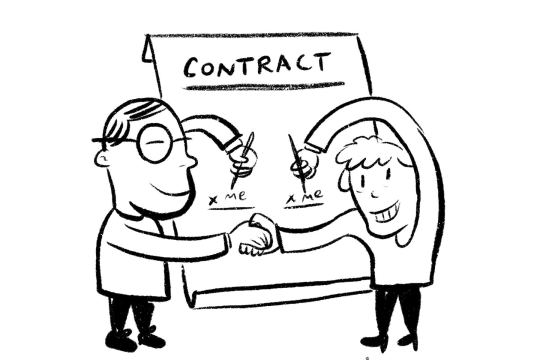
Make sure that you get everything down in writing. Have a statement of work or a contract that states your scope of work, your fee, deadlines, usage restrictions, deliverables, and any notes about late fees, payment timetables, and billable expenses. (Example of a statement of work).
Make sure that a client knows that you can’t begin work without acknowledging these terms. They should return a signed copy of this document, or acknowledge its terms via email. Sometimes there’s a rush situation and you may be pressured to dive in. It’s still a clients responsibility to make sure everything is taken care of on paper, to protect you and to ensure that they are also in the best position to get the best from you.
If they “politely” ignore the contract, then reiterate the terms in a follow up email, with a polite call to action (ex: “Hi! I’m just making sure that we’re on the same page about what the scope of this project is all about. I going to be [**rates, usage, time, deliverables, expected expenses, payment expectations here**]. Is that correct?). It’s important to get this down on the front end. Depending on your state, this counts as a legally binding statement.
NOTE: Try to get an upfront deposit if you can. 30-50% is normal, and this is also a test of whether the client will be good for it after all is said and done. This is also an incentive to put your best foot forward. Some clients will balk at this, but if the early “what is your rate?” convo suggests this is a possibility, go for it. This also depends on the industry. This is almost impossible with editorial, and though I’ve heard mixed stories in publishing, it’s hard to get an advance or deposit unless you’re doing a full book. Large corporations often have a convoluted accounts payable system that pretty much guarantees money will be slower than human evolution. The best results I’ve had are with small, dynamic businesses and individual clients. Once they confirm the terms, then you can begin scheduling and first steps in a project. FAST FORWARD TO PROJECT COMPLETION
INVOICE IMMEDIATELY. Seriously. Do NOT delay this. Most clients are not going to remind you to send one after you’ve finished a project, and you are ultimately responsible for this. (example invoice). Include the basics: your business name your contact info and address the client’s info and address an invoice number total due
Don’t forget an invoice number- accounts payable folks have a hard time placing your invoice in their system without one, and you don’t want to delay things because of a technicality. You can use a simple numbering convention: I use my initials and a double digit combo (ex: DD01). Also, if you haven’t gotten an EIN, get one from the IRS. WHEN YOU APPLY, ONLY GO TO THE .GOV IRS LINK. SCAMS ARE A-PLENTY AND I WANT YOU TO AVOID TEARS THO. An EIN is great, because it can be very compromising to keep putting your SSN out there, and in some cases an EIN can get you paid faster. You should itemize your work in the invoice, similarly to how you would find items on a receipt (ex: 1- Illustration for “client and application”, **brief description** = $THIS AMOUNT.00) Write amounts in dollars and cents. Instead of “$3000”, write “$3000.00”. Again, this helps your client or client’s accountants process your payment a touch faster, and saved time counts. Include a line with a total of your billable expenses. These are items that you HAD TO purchase to finish your work. Make sure you keep your receipts, and make a PDF slideshow with scans of those items for transparency’s sake. Send that PDF with your invoice. Finally, include a line that is the grand total of EVERYTHING. Put that total in BOLD PRINT just to make sure that it’s clear what the client owes. If necessary, you can include direct deposit info. This includes your routing and account number. This way, you give the client another way to pay you, and you can fight off the delay of waiting for a paper check. Even though it’s assumed in many places, make it clear that payment is due NOW. From the moment you send the final invoice out, the onus is on the client to pay up. They should confirm receipt of this, but if they’re slow after a day or two, give them a quick email reminder. NOTE: If you have a client’s phone number, keep it handy. This will come in handy later. FAST FORWARD TO A FEW WEEKS LATER AND YOU HAVEN’T BEEN PAID YET
Either way, you’re waiting (and hopefully pursuing other work!) for money that you need. The timeframe for a reminder varies. Some people will drop a friendly note after 15 days. I tend to be a bit generous, and will wait until 10 days before the invoice is late. The email is friendly, and assumes good faith. Something like: “Hi! I just wanted to touch base about the payment for this invoice. Is there any progress on this? Is there anything I can do to assist with this? Please note that you will be 30 days late on (date here). If so, then a (late fee percentage) will be added to the final amount due.” The key is to emphasize some kind of fiscal penalty. People don’t like to spend more money, so you’ll, at the very least, get a response to let you know that things are being processed. You may also get redirected to an accounting department. If you get a number or an email to them, HOLD ON TO THIS INFO. Hopefully, at this point, the client gets the push to make good on payment. FAST FORWARD TO 30 DAYS AND NO PAYMENT
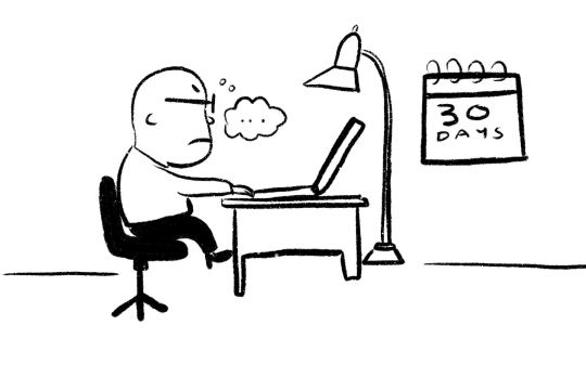
At this point, you are apprehensive because no one wants to wait to be able to pay bills, eat pizza, and enjoy their own Netflix account. The dynamic changes now, because this is the day that the client has to pay you before it’s late. Tomorrow is late. In some states, you have legal recourse to pursue payment (In NYC, the default timetable for freelance payment is 30 days). You should email your client reminding them that payment is due today. If you have their number, call them as well to reinforce this message, but emails are important now. Each email you send is a recorded effort to receive payment, and they are timestamped for posterity. Note that a client may have already sent a payment out, but the check is transit. Also, calling/emailing an accounts payable department will reveal that a payment has been made and it will be in your bank account in a few business days. Get confirmation of this before you continue. AFTER THE INVOICE IS 30 DAYS LATE
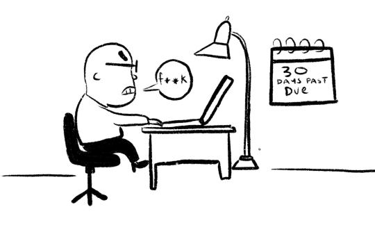
Clients need the benefit of the doubt, but it’s their responsibility to pay you now. After 30 days, you have “permission” to increase the frequency of your correspondence. During the first 10 days of being late, I will email and call every other business day (Monday, Wednesday, Friday was my model, but it may differ for you). Afterwards, I will check in once a day. This may seem excessive, but persistence goes a long way. You may get an exasperated response, but don’t stop until you get a confirmation of payment or a layout and timeline of the payment. If you have a contact within a company, use them as your ally within an organization. It’s easier to get things moving with someone on the inside, and pressure on them will translate to pressure elsewhere to get you to stop asking for your money. Be professional, but direct. They owe you, and any further delay will result in additional fees, and possible collection action (including legal action to collect). If you have a number for accounts payable, hammer them hard. They will be probably be your last line of communication, and you’ll need to get an email to reach them again, an employee name to refer to, and a timeline for payment.
SIDEBAR>>> NYC CREATIVE PROS AND THE FIFA ACT

If you live in NYC, you have an additional resource: the city government. The NYC Department of Consumer Affairs (DCA), and The Office of Labor Policy and Standards (OLPS) have a complaint form that you should fill out as soon as the client is over 30 days late. The Freelance Isn’t Free Act (FIFA, passed in 2017) is very clear that what your client is doing is ILLEGAL, and the city will assist you in gathering materials to make a case for nonpayment. Fill the complaint form out, be very specific about your client and any related contacts. Note, they are not legal representation as much as they’re navigators who will help you find legal counsel and resources needed to file a claim in court. Remember when I said to get everything in writing? That’s important. It may be a bit of work, but find every email thread related to your freelance gig. If you’re doing this on your mobile, open the thread. Go to the first message. Find where the “print” option is. You’ll be taken to a preview window. Look for the “download” button. This is really easy with Gmail. You can basically save the entire thread as an organized PDF, with messages in chronological order
Do this with every gig-related email attached to the overdue payment. Save these PDFs to a folder. Create sub folders that can put this correspondence in context, like chapters (ex: one folder is “Beginning of Job”, another “Job in Progress”, another “Invoice/Payment Requests”). This will make it easier to navigate everything. Include the PDF folder (zipped) with your complaint folder. OLPS will take a sec to get back to you, since you’re not the only person in NYC that gets stiffed. After about 5 biz days, give them a call. This can help you get ahead of the pack. You will receive a call from an OLPS office case manager who will confirm your info. They will ask if you’ve been paid. If yes, then you can thank them and call everything off. If not, they will send a certified letter (WITH AN OFFICIAL ASS LETTERHEAD) to your client, reminding them that they’re late. They have 20 days to respond to this- if they don’t, then they will basically be on the hook to go to court for a nonpayment case. You’ll have to either get a lawyer to rep you, or you can rep yourself, but the client is on the hook to prove they don’t owe you. Since you already have a record of your interactions, this will be very difficult for them. It should be noted that clients tend to get reallll antsy when the government says that they owe money. They’ll probably contact you directly. Keep up with these responses. Each email builds out the timeline of your case, and is fodder for the cannon. At this point, they usually pay up. DISCLOSURE: I’ve never had to go to court, so you may need to look elsewhere for advice. This may be a good place to start. SPEAKING OF DOCUMENTATION- I forgot to add that you should record your calls when speaking to clients that are late. ACR is a free app that allows you to record your calls. Make sure recording is legal in your state, and always let clients know that the call is being recorded. You can borrow the “for quality control purposes” line if you’d like. Sometimes people will try to circumvent documentation by using the phone. Don’t let them weasel out of that. LASTLY, this is specifically related to NY. The parts about documenting your correspondence are universal, though. Wherever you are, a vital part of making a civil case is piling on the material against a deadbeat. Be vigilant and persistent. I would suggest looking into whether there is a state govt. entity that you can go to about civil cases, and also look up if there are any local volunteer/low cost lawyers in your area.
The FIFA Act has been a gamechanger in giving freelancers more power to get what is owed to them, and my hope is that other cities follow suit, or organize to get similar legislation for this purpose. SIDEBAR AGAIN>>> LAWYERS
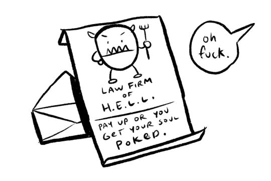
Another way to get a client to pay up faster is to lawyer up earlier. After 30 days, you should see what your options are. If you can afford it, you can consult with a lawyer and get a pro opinion about your case. They may be able to send a stern letter to your deadbeat client (WITH AN OFFICIAL ASS LETTERHEAD) prompting them to pay or else. Like with a government agency, people don’t like surprises from legal. They will probably pay up quick, but if they stick it out, then you can file a claim and take them to civil court. This will be costly for you and your client, so nonpayment usually gets resolved before this happens. If not, know that if a court rules in your favor, the client will have to pay you and cover your legal fees. My experience with lawyers is limited, and I would suggest looking elsewhere for particulars. Also, keep in mind how much you’re owed. A $300 case may not be worth as much squeeze as a $3000 or $30000 one. If it’s a low ball sum you’re owed. You may have an easier time calling it a loss and moving on.
EDIT: I’ve been told that contingency fee lawyers are out there that don’t collect fees until after an event (like you winning or losing a judgment for example), but they’re kinda like unicorns for freelancers and tend to take on bigger cases. It doesn’t hurt to see if any are out there anyway!
NEW!>>> COLLECTION AGENCIES
So, you may want to seek help through a collection agency. They have the time and resources to call, mail, and chase money when you’re trying to focus on good clients that pay on time and are depending on your A game.
The good news is that most are contingency fee based. That is, they won’t collect anything from you until they get the money from your client.
The down side? They can take anywhere between 18-40% of what your client’s debt is. Note that I didn’t say WHAT THEY COLLECT. If your client owes $100, and the contingency based fee is $30, an agency will take $30 even if they only get $60.
Also, based on a lawyer friend’s input, if your collection agency is legally shady, you may be indirectly on the line if your deadbeat client decides to sue said agency. Also your payment, connected to the collection agency and your client’s legal battle, will be held in indefinite limbo.
So do your homework and weigh your options before taking this route.
FAST FORWARD TO 60 DAYS Fortunately, I haven’t had to do this, but you can start pursuing legal action to get your money. Check on state laws to make sure this is the case, as well as the particulars about filing a claim. By this time, you should hopefully have a lawyer or some legal counsel at your disposal. If you don’t, then look up the laws of your state and local area to see where you stand if you have to rep yourself. Remember that as long as you have written acknowledgment of your terms of work and written acknowledgment of your invoice, things should lean in your favor. THE END
HOPEFULLY this has been helpful. The best parts of freelance (independence, flexibility, control, and self-prescribed wages) are often at odds with the pitfalls (feast-or-famine dynamics, wearing of all of the hats, taking all of the risks). It can feel like robbery when you put your blood, sweat, and tears into a project only to have an empty bank account as thanks. Some of this info is boilerplate, and some is from direct experience. If any of this relates to you, and you were able to get closer to your hard earned scrill because of this, I can die happy(er).
GOD SPEED AND GET PAID, GODDAMMIT!
ADDENDUM: One of the things that I didn’t emphasize enough is that doing this will be emotionally draining. Unless you are a robot or a stone cold Type A business beast, it will strain you. Make sure that you’re taking care of yourself mentally.
If you have a partner or family, make sure to take the help and support they provide and don’t turn your money issues into a personal issue with them.
Also, doing this requires energy. It will feel like a part time job, and even if there are late fees that factor into what you get paid, this will largely be unpaid labor.
Persistence is key, but I’m not going to pretend that it’s not hard or that you won’t have other obligations that make keeping up the effort difficult. I’m lucky in that my girlfriend and I have a relatively low-expense lifestyle, and no dependents, and we’re both fairly flexible because we both freelance full time, and that we had a bit of financial padding saved to weather the storm. Mileage will certainly vary.
Edit: Tumblr is weird about making links visible, so I put them in bold body font for you to find them easier.
572 notes
·
View notes
Text
white-rxse -> 0mni-p0t3nt
just wanted to let y’all know whats up. my profile pic will be temporary for pride month and because i can’t find one i like. i’m going to mass-edit some tags now and update you all on that too.
the tags page i used to have is now hidden temporarily cause i need to collect all my tags and add them there when i have the motivation and time. there have been visual changes to mobile and desktop layout, you may check them out if you wish.
other than that, if you do go to my old url, i have a redirect theme set up in case you do forget my new url, dont fret! there’s a way back to me, lol
1 note
·
View note