#instead of right click duplicate tab
Explore tagged Tumblr posts
Text
they really are not teaching the younger generations how to use computers. there's one girl on my team and she's great, she really is but watching her using a computer makes me want to SCREAM because girlie!!! there's an easier way!!!
#to open a new instance of an already open website she'll copy the address open a new tab and then paste the url and edit it if needed#instead of right click duplicate tab
18 notes
·
View notes
Text
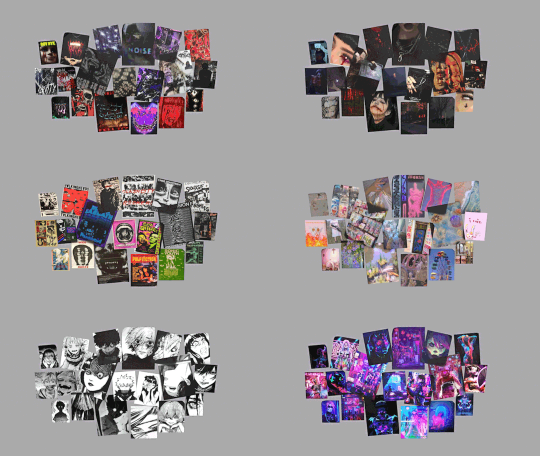
4t3 Conversion of Grouped posters by @cosmiccs4 + Recoloring PSD with tutorial
8 non-recolorable presets
1024 textures
Included PSD for retexturing (tutorial how to use under the cut)
113 poly, all LODs
Shiftable
Price - 5§
BGC
Compressed package
TOU, Ko-Fi

DOWNLOAD | ALT | SIMBLR.CC
Tutorial: How to use my PSD for retexturing
You need:
Photoshop with .dds plugin
My retexture PSD and package file of posters
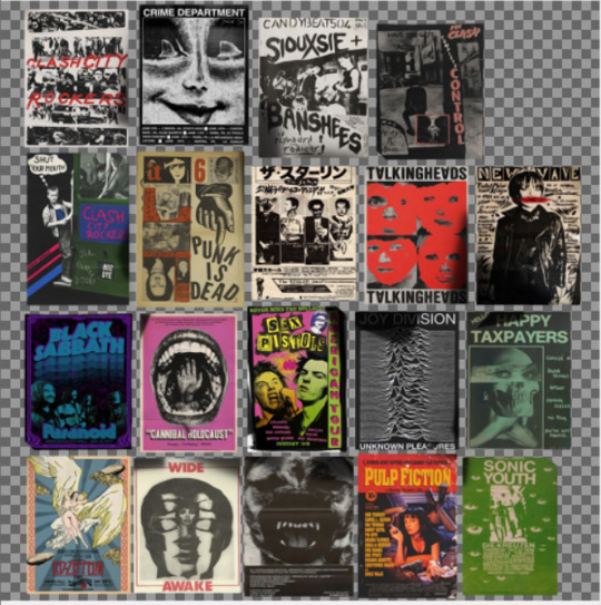
19 pictures to your liking, preferably vertical
TSRW
Sims3Pack Multi Installer and Compressionizer
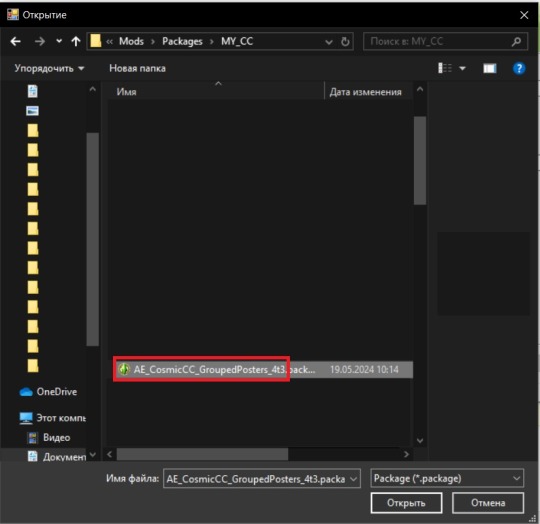
Step 1: Open my PSD file, open your images:
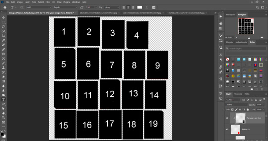
Step 2: Select (Ctrl+A) copy and paste to posters file (Ctrl+C, Ctrl+V) first of your images :
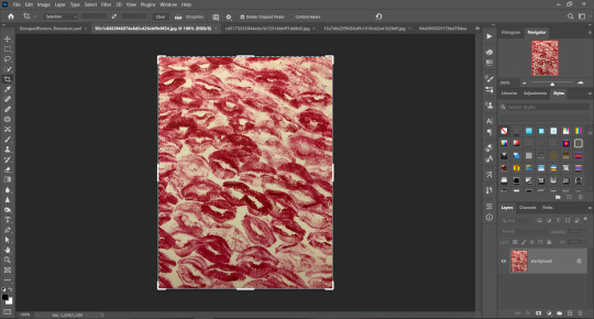
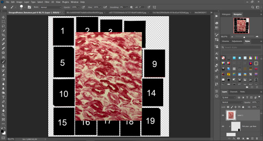
Step 3: Choose where you want to put it, for reference you can use one of the presets:
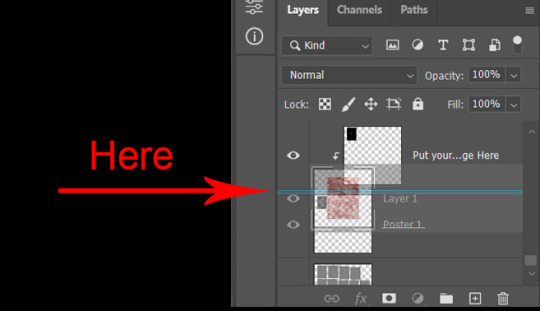
Step 4: After you decided with placement of your image. Move its layer in the Layers tab between "Poster x" and "Put your image here" layers, it will create a clipping mask, which allows the picture to be fit within the poster without cropping. Hide or delete "Put your image here" layer.
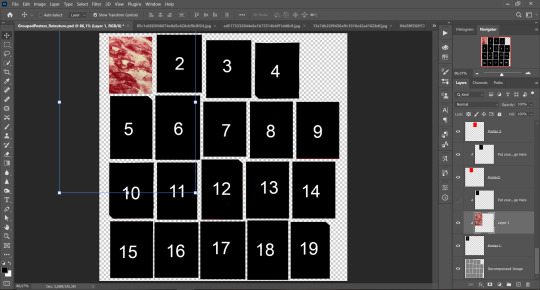
Step 5: Use Transform, Free Transform and Move tools to resize the image by your liking:

Step 6: Repeat the Step 2-5 with other 18 images:
*vibes are totally random, all images from Pinterest*
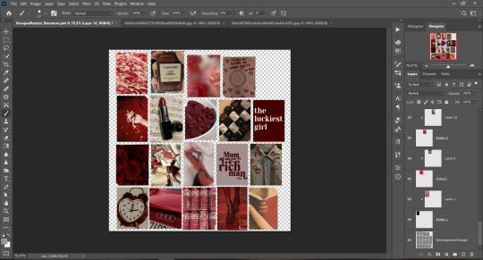
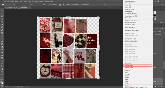
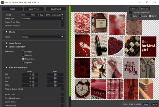
Step 7: After you've done, delete all the "Put your image here" layers, if you didn't it before. Right-click on the Layers tab and press Merge Visible (Shift + Ctrl + E). Now press Save As (Control + Shift + S) and save your image as .DDS with this parameters (2nd picture):
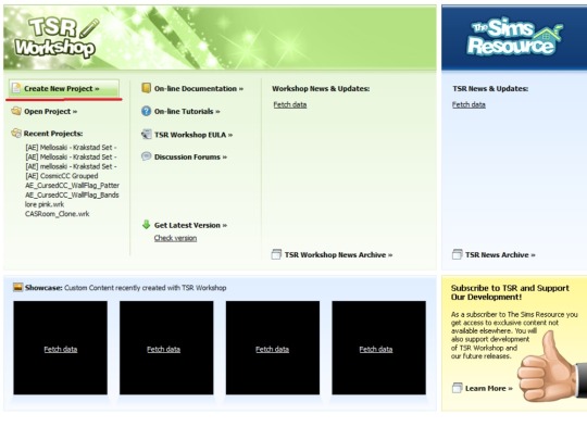
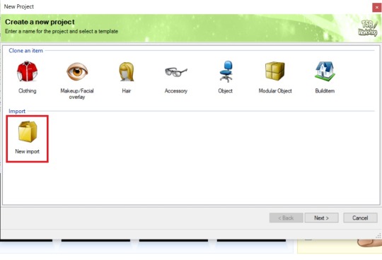
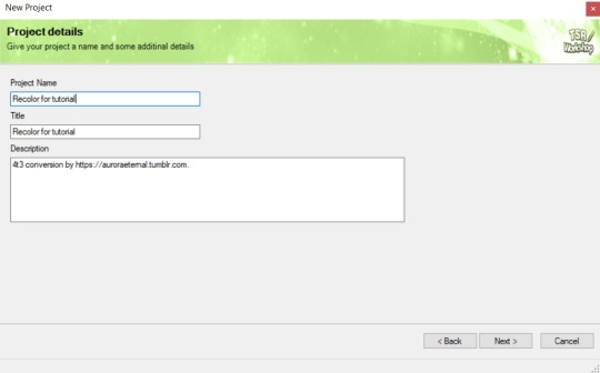
Step 8: Go to TSRW. Press Create New Project > New Import, and select package with my posters. Give for your recolor unique Title and Project name, otherwise it will override original posters:
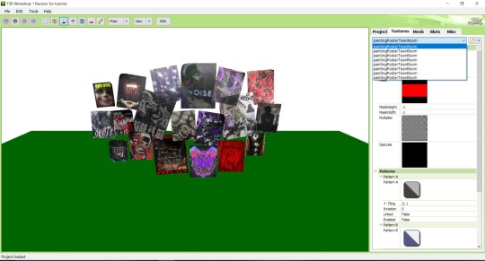
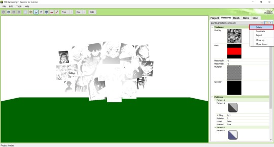
Step 9: In Textures tab go through all the presets except the first one and delete them. Then go to Edit > Project Contents and remove all the textures of removed presets. Its pretty common when someone make retexture of TS3 mesh and leave that unused textures in file, which leads to increasing its size:
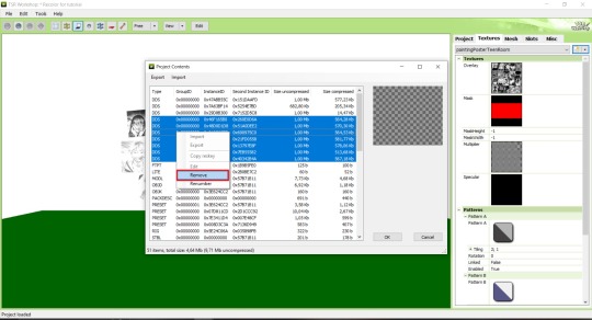
Step 10: Press Edit button next to the Overlay tab. Then press Import button and select your retexture. Press Done and when this pop-up appears, press Yes:
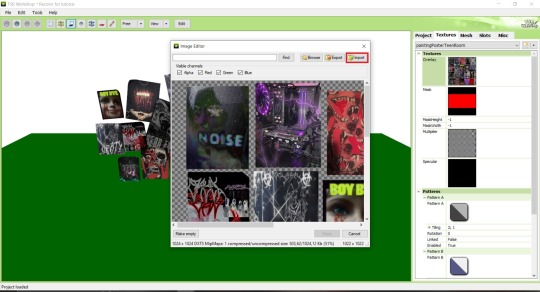
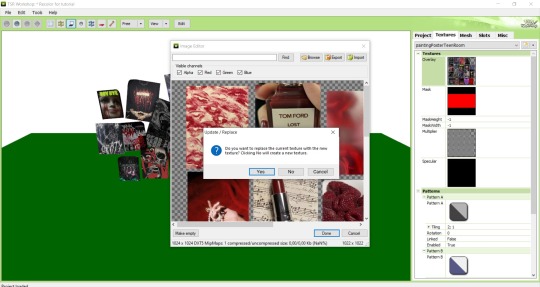
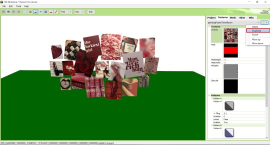
Step 11: If you want to add more presets press Duplicate and reapeat Step 10, but instead, when pop-up about replacing the texture appears, press No.
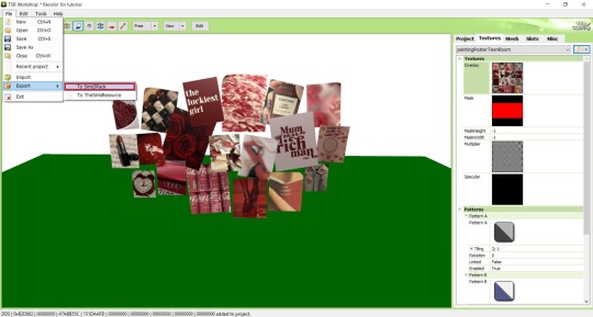
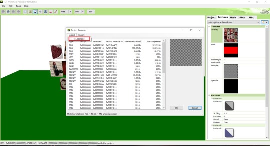
Step 12: After you've done, press File > Export > To Sims3pack or Edit > Project Contents > Export > To .package. If you choose the first method, convert your Sims3pack to Package and in both cases run it through Compressionizer. Test your recolor In-game, make thumbnails (if you want to share it) and have fun!
For those who read this tutorial to the end, click HERE to download this recolor.

@pis3update @xto3conversionsfinds @wanderingsimsfinds @kpccfinds @simfluencer-network @sssvitlanz @simblrcc-site
855 notes
·
View notes
Text
𓈒༷♪˚.✧ How to make a mockup like this for smaus, ocs, etc. (step-by-step tutorial ☆ no Photoshop, easy, free) (requested by @lovebittenbyevans) ✿
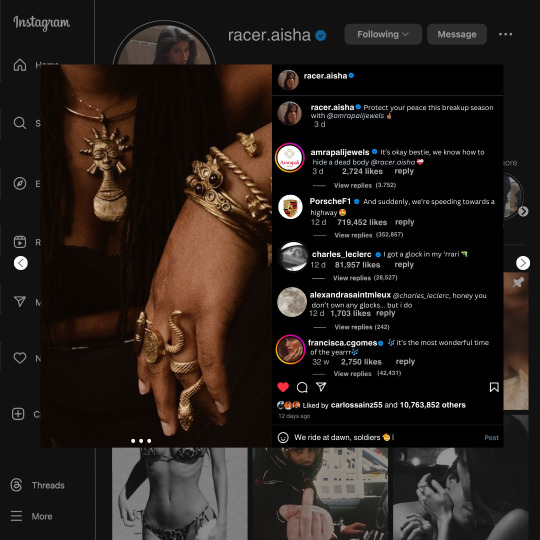
guys this took me two hours to make and you could probably get this done in like, 30 minutes :) I hope this is coherent <3 Please look back this image for comparisons, if my explanation is not well explained, etc.
first of all, if you dont already have one, make a free canva acount. once you're signed in, hit the purple "create design" button on the sidebar. A pop-up will appear with different design template options. For this design, we want the dimentions to be 1080 x 1080, so you can either make a custom size or choose the instagram post (square) template by either searching or scrolling through the list.

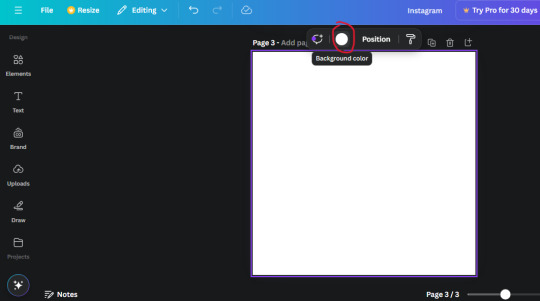
2. Now you have a blank page. Zoom in with the slider at the bottom of the page if you need to (Mine is currently zoomed in 41%). Click on the page and change the color to an off black (hex code #111111).
3. Now that the color is changed, click the "elements" tab and search "line". Click the shape and it will add it to the page automatically. These line are particularly hard to navigate and hard to get it at the right angle and length so this part might take a little longer than the rest.
4. stretch it from top to button and turn in a 90 angle so its straight on the left side of the page. Change the color of this as well to a grey tone (hex code #2F2F2F).
5. Now we'll add the Instagram logo. Click the "text" tab then click the purple "add text box" button. Write "Instagram" in the box and change the font to "apricots". This is the closest font I could find that resembled the logo font but if you find a better one, feel free to use that instead. Make the font size 19.3 (you can do this manually or do it in the text options). Change the color to grey color (hex code #707070). Add it to the upper left corner of the page like this:
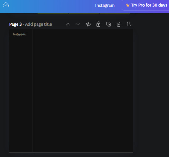
6. now we're adding icons and a menu inside the border we just made. Click the "elements" tab again and search for "instagram home icon" and add the element by sketchify to the page. Click the home icon, an options icon with pop-up above the page. Look for the "Position" button and click it. Scroll to find the advanced options and you can manually type in the width and height at 26.6 and 28.7.
Move it inside the border, under the logo (photo below). Change the color again (the hex code is #707070).
7. Open the text tab and add a text box. Change the font to Canva Sans and write "Home" in the box. Change the font size to 18.1 and align with with the house icon. It will look something like this,
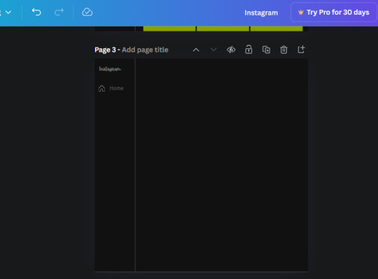
8. Go into the elements tab again and search "instagram search icon". Scroll until you find the one by sketchify and add it to the page.
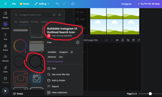
9. Shrink it so the W and H is at 36.6 and 31.3. Move it below the home icon until a purple "67" pop ups and aligns under it. Change it to the same color as the Home text and icon (#707070). Go ahead and Duplicate the the "Home" text box and clicking it and a pop-up will show up then edit the text so it says "Search" and align with the searcch icon we just added.
10. You know the drill. We are continuing to search up more icons in the "elements" tab. Search "instagram compass icon" and choose the one by sketchify (are u seeing the pattern?). Add it to the page and change the width and heigth to 33.1. align it under the search icon just like how we did before and change it to the say colors as the other icons.
11. Do the same as before and write "Explore" in a text box and align it with the icon. We're doing the same thing for all of these.
We'll be using the same search prompt for all of these icons so just change the type of icon you're looking for like we've done before hand. Next look for the Instagram reel icon and add the outlined one by sketchify and change the W and H to 31.2 x 30.9. Change the color to the ones we've used before, align it underneath the icons above and add your text ("Reels").
12. The next icon is an outlined, "sent" one. W and H is 31.1 x 27. The text will say "Send". Then an heart outline by sketchify; W and H is 34.2 x 29.1 and the text is "Likes". Next is the "create" outline icon by sketchify, W and H is 36.8.
(p.s if you are struggling to align the icons and text correctly, shoot me a message and I'll send you the X and Y positions ;D)
If you followed it through, it should look like this,
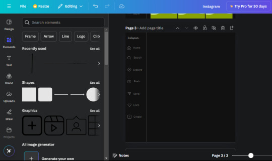
13. Now onto step 13, we'll be adding the Threads logo. You don't have to add this but to make it look more like the actual website, I will be adding it. Open the "text" tab and add a text box. Write an "@" symbol in the box and change the font to Nanum Sqaure and the size to 24.9. Add in the bottom corner below all the icons we just added to our page. We need another text box now (Color is still #707070), write "Threads" and align it to the "@" symbol.
14. We're adding another icon now. Search "Instagram menu icon" and find a wireframe menu icon by sketchify. the W and H are 42.5 x 24.6. Add a text box that says "More". It will look like this:
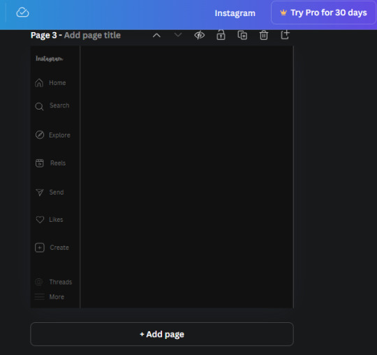
We are a quarter way done now :D
15. Search in the elements tab "circle frame" and look for the one with a little border around it.
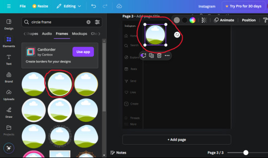
At first, the circle will be green and inside the circle will be white. Change the white to color of the background of the page (hex code #111111) then change the green to a grey color (#8D8986).
16. Add a new text box, change the font to Canva Sans and the size to 22.8 and the color is white. I just wrote "user.name" in the box. the W and H will be 153.3 x 35.7.
Enter the "elements" tab and search for a blue checkmark and find the icon by Victor Aguiar. The W and H is 28.1 by 28.
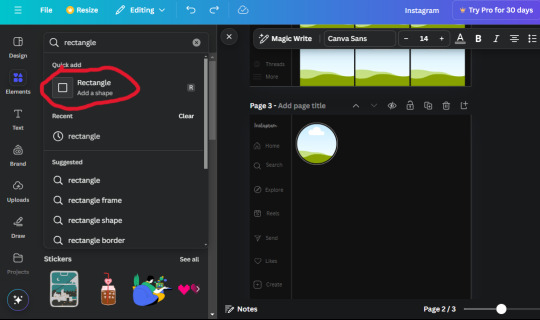
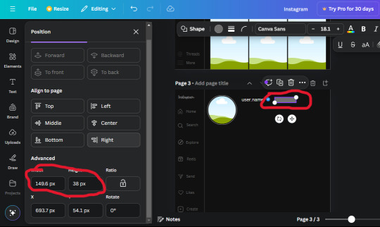
17. Search in the search box for a rectangular shape and add it to the page. Place it next to your username and checkmark icon and make the W and H to 149.6 x 38. Add another and place it next to the other rectangle shape. the W x H is 111.4 x 36.7.
Change the color of both boxes to #2F2F2F. Add a text box and write "following" then change the W and H to 82.6 x 21.8 and fit it inside the first box. Add a second text box and write "message" in it then change the W and H to 77.8 x 21.8. Change both text colors to #7A7A7A

18. Add another text box. Write "<" and turn it upside down and place it beside the "following" text inside the rectangle. Adjust the size as you need to. I also like the round the corners to around 8 so its not so pointy and square.
19. Add 3 new text boxes. Write the amount of posts, the amount of accounts you're following and the amount of followers your have. Write "20 posts", "30 following" "40 followers". Bold the numbers and change the text W and H to 116.4 x 32.7. These are just place holders that I use.
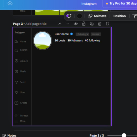
20. Open the "elements" tab again and search "frame". Choose the first one.
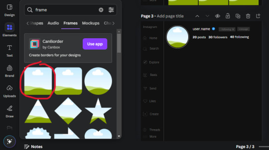
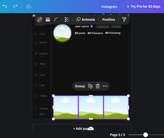
We want the height and width to be 268 x 252.4. Place it at the bottom of the page but we want some space between the frame and the page.
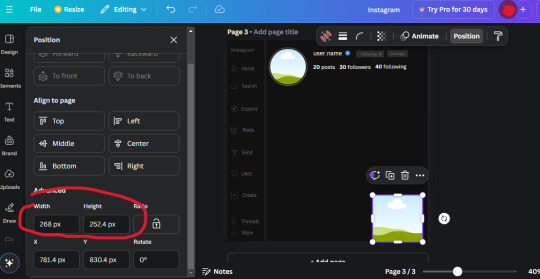
Now we'll duplicate the frame we just placed (the icon between the comment and trash can on the pop up above the frame). Place it next to the previous frame but we want to leave a bit of space between them like this:
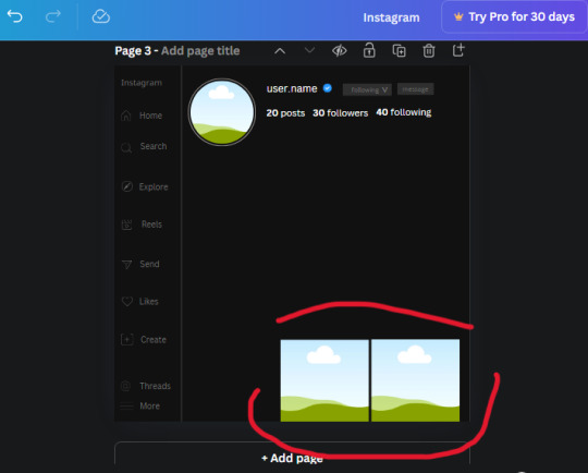
If its a little wonky, don't worry. You can always adjust it so it looks right.
Duplicate the frame again and place it next the second frame you just placed, same distance between. Make sure they're even. Now we have a row.
Select all three frames and duplicate them. Move them above our original frames but leave a little space between them.
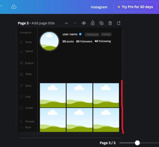
Again, if they're uneven, adjust them as you need to.
21. Select the line again from the elements tab. Stretch starting from the top frame to the last frame and make the color grey (#2F2F2F).
Because the line is stupid hard to navigate, use something like a text box to mark where you want it to end like this:


Delete the text box and the line with be where we want it.
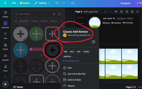
22. On to the highlight reels. Seach for "add button" and find the one by Barudak Lier.
Change the heigh and width to 81.1 and move it above the border.
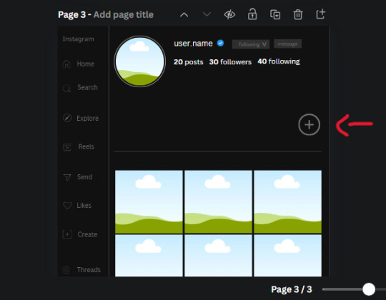
Search for circle frames now and add this one to the page (The same one we used for the pfp), change the width and height to 85.4 and move it next to the add button. Since this is a generic, blank template, I add about 4 of these highlight frames but you can do however many you want. You can change the border color to a gradient or leave it grey.
Add a text box now. The font will be Canva Sans, the size will be 18.1 and the color will be white. Change the text to "Add" and place it under our add button. Make more of these text boxes to place under the circle frames. Depending on which frame its under, write "Highlight 1", "Highlight 2", etc. etc. or you can give them different names and such.
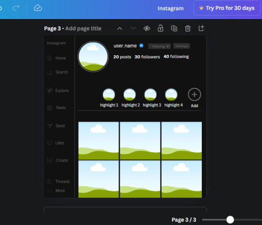
23. Add another text box, write "name" and bold it, change the size to 19.1 and the W and H to 69.2 x 28.8. The font will be Canva Sans and the color will be white. It will go under the amount of posts, followings and followers.
Add another box. The font is Canva Sans, font size to 20.1, the W and H is 40.8 x 31.3 and the color is white as well. This is our "bio". Place it under "name".
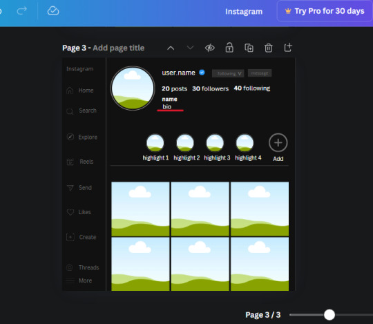
Yay!🎉🎉🎉 You're halfway done!
24. Search for a shape in the elements. Look for the rectangle again and add it. Change the width and height to 460 x 760.4 and the color to an off black/grey color (#191919), placing it like this:
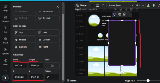
Get the same kind of square frame we used before to make the profile grid and make it the same size as the rectangle we just added. Place right up against the rectangle like it's its other half. Add another line like before and span across the upper half of the black rectangle as a border then add a circle frame inside the border.
Add a text box, "user.name" and align it with the frame. The text is white and the W and H is 111.5 x 25.9
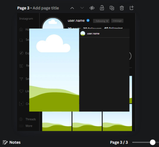
25. Add more circle frame along the inside of the rectangle to resemble the comment section. Make sure the W and H of the frames are 46.1.
Add more text boxes that align with the frames you just made and write "username" again and bold them. Add even more text boxes that align with the usernames and write "comment". These are place holders for when you decide to use this template.
Add another rectangle on the lower part of the rectangle and make the color black. and search for "instagram heart icon", "instagram comment icon" and "instagram send icon". Make sure the lines are thick. Find the heart icon by sketchify, and the the comment and send icon are by Mirazz Creations. Make the lines white and make sure the W and H are the following:
Heart icon: 38.7 x 32.9
Comment icon: 35.2 x 35. 8
Send icon: 35 x 32
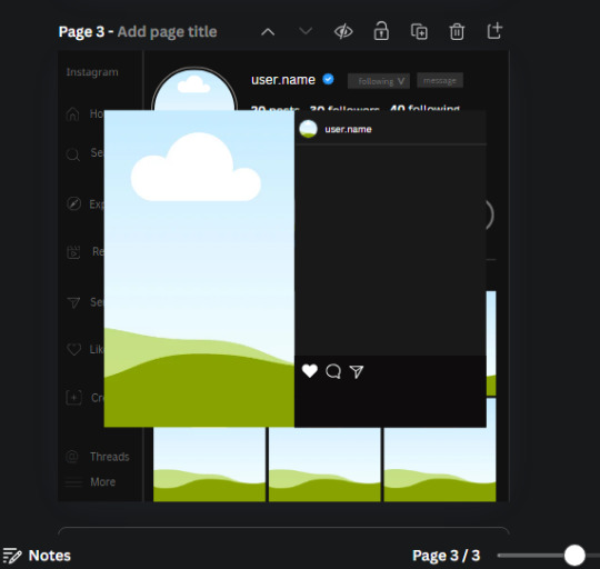
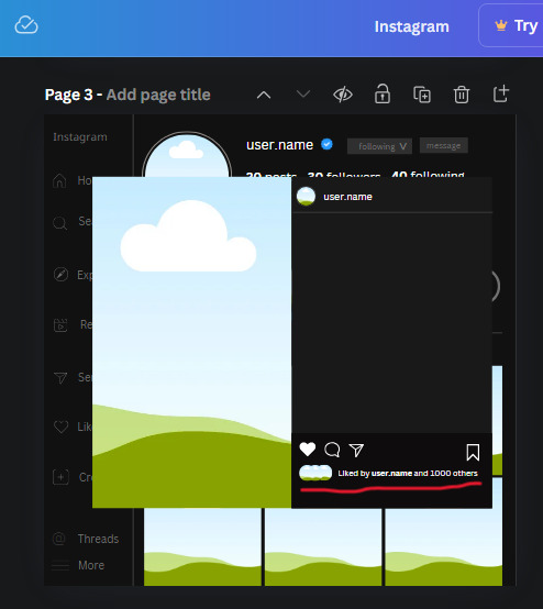
Next, look for "instagram bookmark icon" and find the one by Adricreative. Change the color to white and the W and H to 29.7 x 40.2. Move it to the other end of the rectangle.
26. Now add three circles frames and change the W and H to 37.2. Move them below the heart icon and have them overlap each other some. Then, add a text box and write "liked by username and 1000 others". Change the font size to 13.6 and change the font to Canva sans. the color will be white. Align this with the three overlapped frames.
27. Look in the elements tab for an emoji icon and choose the one by Soni Soukell from Noun Project. The W and H will be 32.8 and the color is white.
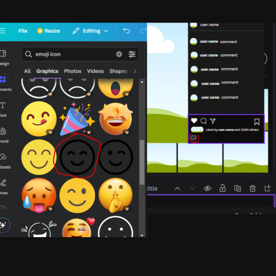
Now add a another text box and write "Write a comment". The color will be white, the font size will be 14.2 and align with the emoji icon you just placed.
Search for "next arrow button" by Pixeden and make the W and H 42.8 then add it to both sides of the post.
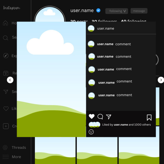
And you're all done with your template! All that is left to do is fill it but before doing that, duplicate the page so you always have an extra blank mockup if you want to use it again.
To fill the frames, upload an image (or use a Canva stock photo), drag and hover it over the frame and it will fill the frame.
Hope this was helpful and you you successfully made one :D <3
#requests#text#smau#template#mockup#moodboard#instagram#instagram moodboard#instagram mockup#graphic design#canva#psd#free tutorial#tutorial#instagram au#social media au#free psd#photoshop#resources#fanfiction resources#graphic design resources#graphic design tutorial#psd tutorial#photoshop tutorial#au#au ideas#mockups#digital design#digital design tutorial
93 notes
·
View notes
Text
how to make neon signs in inkscape!
I lost my mind and spent a large amount of hours yesterday perfecting my methods and figuring out how to do this, so if you're interested in making something like this:

here's how to do that!
step 1: cover your workspace in a dark grey rectangle, and lock that layer down.
I've been using 80% or 90% grey - you want this so you can see your neon effect, but you don't want it entirely black at this stage, or you won't be able to see your shadow layer.

step 2: create some text!
pro tip: rounder sans-serif fonts look the best for this, because think about what a neon sign is made of - it's tubes, bent into shapes! so if your font or design looks too sharp and pointy, it'll feel unrealistic when you make it neon.
(this is, of course, a perfectionism thing on my end, so feel free to ignore any and all rules in order to make the thing that you want to make. as with all art, you can do whatever you want forever!)
bonus pro tip: if you, like me, have over 1400 fonts installed and programs tend to lag when you browse through all of them, nexusfont is a great free software that lets you sort your fonts into categories, search them, and preview what any text looks like in different fonts! I love it. it is my best friend
now I'm going to do this with a few different fonts, so that you can see how it works with them. so today, I'm picking Futura Round, Harlow Solid Italic, and then to challenge myself, Beauty School Dropout and Block

make the text white, and also select the text and go to Paths -> Object to Path, because some things don't work right if they're not paths.
let's start off easy with Futura Round!
Step 3: duplicate your text layer
now bear with me here. but you need to take the text you're working with, and either right-click duplicate or copy/paste the layer until you have seven total copies of the text you're working with.

arrange them like this, making sure the top one is the first layer on the list (and so on), and then in the layers tab, label them like so:
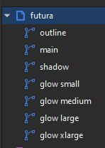
pro tip: if you don't have the layers tab open, go to Objects -> Objects and Layers, and that'll pop it right up
Step 4: blur time!
switch to the Fill and Stroke tab, and make these changes to the paths:
glow small: 15% blur, 100% opacity
glow medium: 20% blur, 90% opacity
glow large: 50% blur, 70% opacity
glow xlarge: 70% blur, 70% opacity
your workspace should now look like this:

this is good!
pro tip: these numbers are just loose guidelines! at the end, mess around with everything to make sure that the glow looks right to you! nothing is an exact science
Step 5: shadow and outline
for the shadow layer, make it solid black, and then change the opacity to 50%
for the outline layer, we're doing something fun and weird. so right now it's a fill object, but we want it to be an outline instead! so let's hit the X in the lower left to make it empty, and then shift-click on...for the sake of this, let's say blue. to make our nice blue outline.
now's the weird part
now. use the align tool (Objects -> Align and Distribute), select the outline layer and the main layer, and align them so the outline text is exactly centered on the main one.
then go to Paths -> Path Effects, and when the tab opens, select just the outline layer, then click the drop-down arrow in the Path Effects tab and select Offset
here's our goal right now:
we want to offset the outline until it fits inside the text underneath it, and also mess with the stroke layer settings until you have a nice thick outline that doesn't overlap itself.
mess around with the plus and minus buttons. there are no exact numbers here; you just have to know when it looks good! but for me, the settings were a -0.34mm offset, with a stroke width of 0.700mm
this is roughly what you want it to look like:
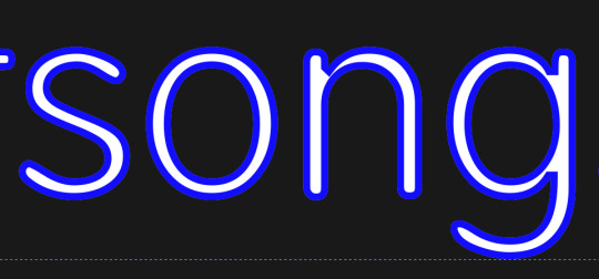
now, with the outline layer still selected, blur it out just a bit until it looks fuzzy, and like the white center is a highlight rather than a separate layer. for me, the right number was about 8.3% of blur, to get a result like this:

Step 6: layering and changing colors
okay! at this point your work should look something like this:

you now want to select every layer except the shadow layer, and use Align to center them all on top of each other.
pro tip: make sure to untoggle "move/align selection as a group", otherwise this will not work.
you should now have something that looks like this, with the shadow layer sitting all by itself somewhere off to the side
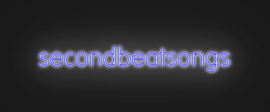
now's the fun part: colors!
since we've decided that this neon light is going to be blue, it's time to change the glow to reflect that!
here's what it looks like when you change all of the glow layers to be that same, #0000FF blue as the outline layer

and here's what it looks like when you take the glow small layer and make it just a bit lighter (#4343FF) using the stroke and fill tab

in general, mess around with the layer colors until you like how they look! I find that it generally looks better if the glow small layer is a bit lighter, and the glow medium layer is as dark as the original color. everything else is fair game.
also the main layer can stay white (if you want it to seem very bright), or you can make it a very very light blue if you want it to be a bit more subdued.
Step 7: final steps
take your sad, neglected shadow layer, and move it slightly up and to the right of your main layer, so that it works...well, basically like a drop shadow.
then take your original rectangle, and switch it to 100% black.
now. gaze upon your masterpiece

that's a good neon sign if I've ever seen one.
but now. now's when we lose our minds
Steps 8-??: perfectionism and nonsense
so let's move the Futura one aside (and hide it! inkscape lags if there are too many blurry layers visible at once, so hide anything you're not using!), set the rectangle back to grey, and move on to Harlow Solid Italic.
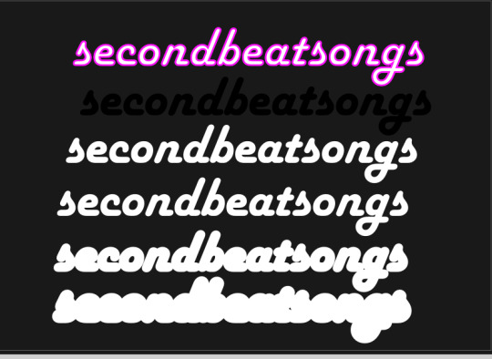
I've sped through a few of the steps here (out of order) so you can see what I'm doing. I've added outlines to the large glow and xlarge glow, and bumped them up a bit so they'll have a larger glow area in general
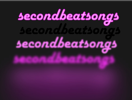
this time I've made the large glow a little bit lighter than the xlarge glow and medium glow, and made the main layer a very pale pink instead of just white. I also blurred the outline layer just a bit more, because this font needed a bit more fuzz to make it look good.

hell yeah. this rocks.
now, one detail for perfectionism: in neon signs IRL, if you look closely, there are wires attaching them in the back, often connecting each letter to the next. so...let's do that!
get your pen tool, set it to spiro path, and then make little droopy lines connecting each letter.
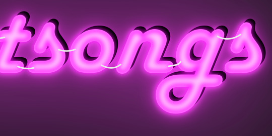
make these thin, 100% opacity, and a very light (almost white) grey color. then group all of them together, and move this group under the small glow layer
pro tip: some of the cords might go mostly through the shadow layer. if this is the case, just put the cord group one layer above the shadow layer instead, and then it'll be fine. but you might make the cord color a pale-greyish pink to make it look like there's glow hitting it.
ultra advanced technique: duplicate the cord group, make it black and 50% opacity, position it slightly up and to the right of the original, and then move it one layer below it. you've got cord shadows babey!
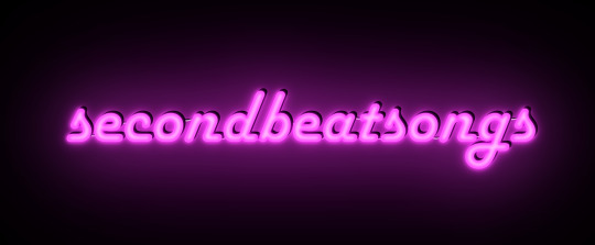
lookit that. stare at that beautiful perfection. I love it. this brings me joy.
and now: the one that will be the most work
let's gooo Beauty School Dropout!
this one I'm using as an example for what to do with a font that's a bit too pointy to look realistic

this font is really fun and bendy, but the ends of the letters are flat instead of rounded, and the corners are a bit too sharp. so...let's fix that!
now, there are several ways we can do this (after doing Object to Path ofc).
one way is to edit the path yourself, going slowly, and making sure everything is perfect, editing the nodes individually.
or, you could select the text layer using the node tool, then click the button in the top bar labeled Add Corners LPE, and then drag the little circles and triangles around to smooth out the corners
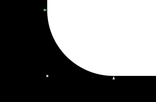
I've decided to do the LPE method, but the problem here is that if you apply the LPE effect before making sure all of the corners look good nodes-wise, it's hell to try and fix it. so before LPE-ing, look at all the spots that you're going to apply the effect, and make sure each has one point at each sharp corner, with no weird overlapping bits. okay? okay.
also for the line beneath the text, it looks like it's made up of a bunch of different segments

and since I want to keep this line because I think it looks cool, we're going to have to deal with that, and make sure that it's all one solid piece, otherwise the outlining won't work. so I've gotta delete all the extra segments, and then move the points on just one of those segments until it's the full original line width, before rounding those corners as well.
basically I've got my work cut out for me here, this will all take a bit.
...aaand an episode and a half of Supernatural later, here's this!

look at how nice and round that is! perfect for the rest of the neon process
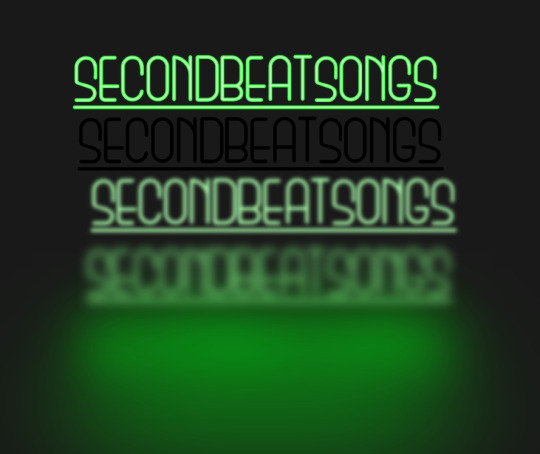
and with cords, shadows, layering, etc

hell yeah.
more things: it's block font time
let's make an outline-style neon sign!
my seven layers:

for all but the last two, I've not used the fill option with them at all - I have simply used the stroke outline.
now don't be worried! the stroke-to-path still works just the same way even using an outline to begin with! so it's easy to get an outline of an outline, and do the offset thing just like you did before
however, because this font is more complex-looking, there will probably be some errors when you offset it

for example, it didn't fully outline the second half of the Os, so I just copied the left halves, mirrored them, and replaced the right half with the complete left half
pro tip: keep in mind that you have to re-apply the offset to any bits that you add to the outline layer!
doing the same steps as last time, editing the glow blurs as I see fit, once again we end up with beauty and perfection.

another thing you can do: turn off the lights!
I'm going to use Beauty School Dropout and Harlow for this, but after making your beautiful neon signs, here's how to make it look like a turned-off sign, for if you want to make...idk, a gif of a light turning on and off, or a burned-out sign, or something like that.
so start with (ideally, duplicated copies of) your neon signs:
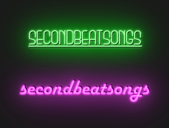
and then simply delete every glow layer, change the outline layer to 90% grey and your main layer to 70% grey, change the cords' color to a darker shade of grey than whatever it already is, and lower the opacity of the shadows by about 10-15%.
doing that, you end up with this

bam! lights turned off!
last thing: logos and other stuff
you can make neon signs with images as well as with text! the steps are essentially the same, though you may have to do more editing to make it look good, and use simplify on the path if it's too detailed.
and if you're using anything besides an .svg, you first go to Paths -> Trace Bitmap to turn your image into a vector! but unfortunately I've already used 29 images in this post, so here, just look at this Keith Haring thing I made as an example:

is it messier than the text? yeah for sure. does it have some pointy bits I could smooth out more? definitely. but, I've watched three episodes of Supernatural today, and that is more than enough time spent on this. so this is what you get.
but yeah, that's how I make neon signs in inkscape! I used to do it in GIMP, but this works much better, and looks so nice and clean! <3
(man, graphic design really is my passion)
#tutorials#inkscape#reference#neon#graphic design#tbh this is definitely for my own reference too because I know I will eventually forget this process#but I want it to also be useful to other people#so here!#inkscape tutorial#enjoy#graphic design is my passion#tutorial
136 notes
·
View notes
Note
How are you so good at ikeaframe/orbiter fashion... share some tricks on how to get pieces to get into position you want, most versatile decoration pieces (that can be used in many different ways, what are your favorites?); on a less serious note, how to farm all this standing for all the zariman wall panels ;A;'
So, quick disclaimer: I play Warframe on PC and have never played on console, so all of my answers will be oriented to PC controls.
Edit: This got quite detailed, so I may wind up making this a multi-part Thing.
Positioning:
Understand the anchor point; this is the point on an object that cannot pass through other objects and around which it is oriented. To find it, select an object and right-click to orient it; where the 3 different orientation guiding lines fall is an object's anchor point.
Understand orientation; if you hit Tab to turn on advanced mode it will show this, but I'll put it here for good measure. There are 3 planes of movement: up-down, left-right, and forward-backwards. R controls the orientation marked by the red arrow, F by the green arrow, and X by the blue. (If you have selected an item with your mouse, you can also hold X to 'push' an object, but I don't use this often as the direction and depth can be hard to predict.)
Grid and angle snapping are your friends! They're going to make your life a lot easier when you need to place objects at consistent distances, angles, etc. Now that you can angle things by degrees of 1 or 5, it's a lot easier now to make small adjustments without having to turn off angle snapping. Also: one way to ensure consistent distancing is to choose another feature (e.g. lines on the ground) and use that as a reference point. This is something that I use a lot especially when decorating my clan's dojo.
Using F to duplicate objects, and using C/V to scale them up/down will help when placing multiples of the same object so they will be the same size and orientation. It's also a time saver so you don't have to size and orient every single object you place. (If you're going to scale something all the way up or down, just hold R and use your mouse to quickly get it to size.)
Using Z to change how you can orient objects. 'World' will orient the object in relation to how it's been placed. 'Local' will orient the object based on its anchor point. (If this doesn't make sense, I encourage you to experiment to understand the difference!)
Sometimes, even when using grid and angle snapping, things won't quite line up right. That's when you want to turn off grid snapping to make small adjustments. Ideally, you would hover your mouse over the object and then hit R to turn on constrained movement. When doing this, I suggest only adjusting one plane at a time (R, X, F); for example, moving it left or right, then saving it to lock in that adjustment before trying to move it up/down or forward/backward.
If you've moved an object and dislike the result, instead of saving it, hit Esc. It will put the object back to where it was before you messed with it.
Experiment! Sometimes redzones will get in the way, but you never know what areas are available to be decorated until you give it a shot. Rotate objects every which way to see the different sides and features; for example, I had no use for the Entrati Serpentine Chair until I realized that I could use the underside to decorate the walls.
Sometimes an object just won't behave the way you want it to; if it's a symmetrical object, try turning it around. This is a big one when you're trying to get 2 objects to touch, but the anchor point is getting in the way. In the case of the Zariman wall panels, if you look at it from the side you'll notice that one side bevels out, while the other is completely flat; I put the curved side down, which is how I was able to have that nice flat, flush wooden flooring and on the ceiling.
Hopefully you find this helpful; I also suggest looking up tutorials on YouTube! They were especially helpful in making me understand how anchor points and orientation work, since they also have visuals for you to accompany the explanation.
I'll make another post addressing other parts of your questions :)
38 notes
·
View notes
Text
Tidbit: Placronym Pixelation

So you got this fresh placroynm that you don't want engraved with a sophomoric name? Not a problem. You can reject that stupid shit with a pixelize/pixelate filter.
Photoshop
First, you will have to make two more duplicates of your name text layer, so three text layers in total. One for when it's first displayed, one for the first frame of pixelation, and one for the second frame.
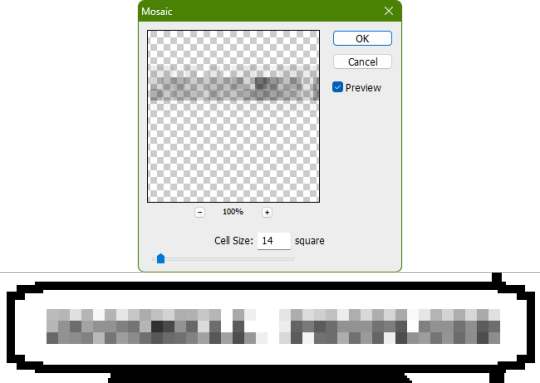
With your first duplicate layer selected, go to Filters>Pixelate>Mosaic..., which is a terrible name for it, but hey, I'm no Photoshop developer. Set the cell size to 11.

For the second duplicate layer, set it to 14.
GIMP
Pretty much the exact same steps as in Photoshop, this time the filter is located under Filters>Blur>Pixelize...


I would suggest right-clicking on the text layer and choosing Composite Space>RGB (perceptual) instead of the default (Auto), or going to the top-right corner of the Layers tab and switching the group of blend modes from Default to Legacy. Basically, doing so will make the semi-transparent pixels as dark as they are in Photoshop, otherwise they will appear too light.


Check out the read-more link below for bonus information on easily animating the name being typed out in Photoshop.
ADDENDUM
Typing animation (Photoshop)
Photoshop's frame animation timeline makes doing this a breeze. First, add a layer mask to your text layer. This will add a white box next to the layer's thumbnail.
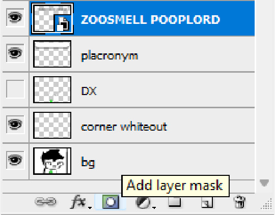
With that layer mask selected (click on it and it will be highlighted in the layers tab), use the marquee tool to make a rectangle selection around the text, then use the paint bucket tool to fill it in with the color black. This will make the text invisible until the layer mask is moved.

Go to Window>Animation if you do not already have the animation timeline open. Click on the little sticky note icon to duplicate the first frame. In newer versions of Photoshop, you will probably first have to click on a button that reads "Create Frame Animation", and the duplicate frames button icon is the "+" in a little square.
Making sure you still have the layer mask selected and not the entire layer, use the move tool and arrow keys to move it all the way to the right, revealing the text on the second frame you've just made. Don't move it too far off now.
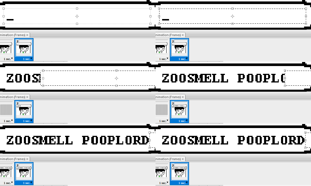
Move the typing cursor layer to the right as well, except you don't have to move it all the way at the end, only where it will be last seen.
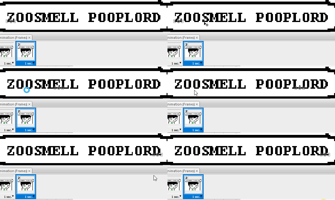
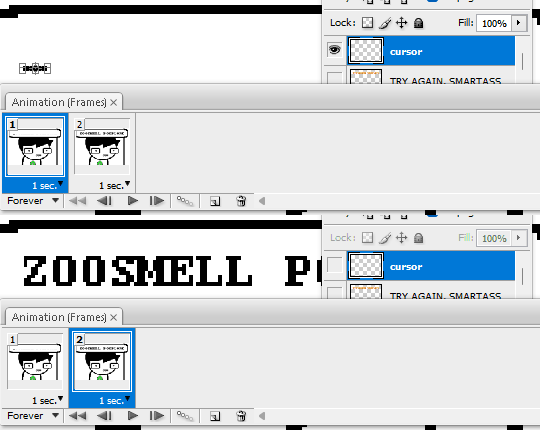
Make the typing cursor layer visible on the first frame, and not visible on the second.
Select the first frame the animation and click on the tween button. This will add all of the frames in between the first and the second one for you. Make sure you only have "Position" checked under "Parameters". For the numbers of frames to add, here's a neat trick for finding the right amount: count the amount of letters in the name. "ZOOSMELL POOPLORD" is 16 letters, so add 16 frames.
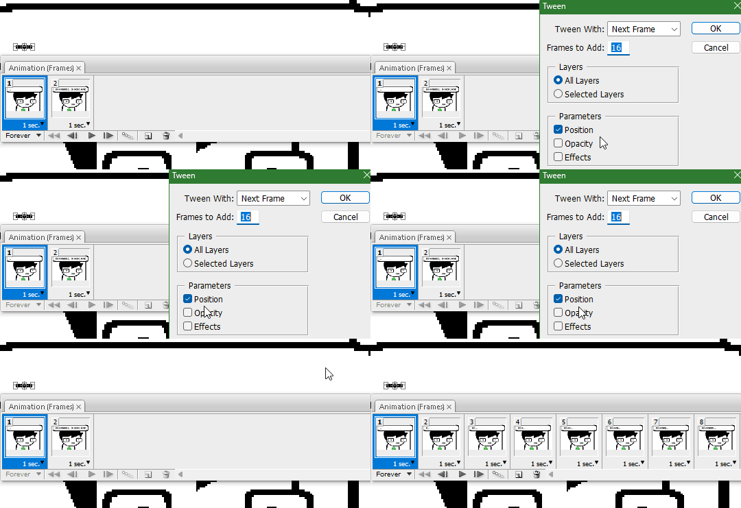
Most of the work is already done, though there might be a couple frames that will need some minor tweaks. Just use the move tool and arrow keys again to finetune the layers' positioning.
This is why it was important to not move the layer mask too far to the right away from the end of the text. Tweening the position spaces it out linearly, evenly, so the farther away the end goal is, the more space each frame will use. Thankfully the font this panel uses is mostly monospaced, and I got a little lucky with my positioning, so I needed to only adjust three or four frames. Way less tedious than having to create each frame of animation myself, at least.

To change the frame delay (the time duration each frame takes up) of the newly created frames, click on the first frame you want to retime, hold down the Shift key, and then click on the last frame. This will make a selection spanning all frames in between. Click on the little dropdown arrow and select 0.1 seconds (100 milliseconds).

Here's the original panel:
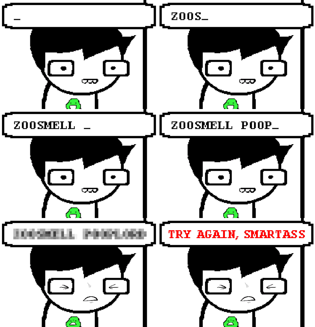
And here's my recreation:

Here's the PSD, too.
76 notes
·
View notes
Text
I used Tumblr's feedback function about the recent changes. But, fuck, it was hard to get it short enough. It had to be under "5,000" characters--but the system's broken so it required me to get it to around 4,700. I don't think the short version makes as much sense, but I'll provide it under a cut. And I'll follow with a long version.
You want to drive engagement: that means being more fun than nuisance.
We hate snoozing Live. Disrespecting users' preferences and giving busy work means you'll never convert us to Live users: you've only built resentment.
Some users turn off push notifications for being annoying. What does Tumblr have that requires urgency? A friend who needs a ride to the ER is not asking on the fun meme site. When you push notifications, it's your decision to get my attention, instead of my choice. There's no way to spin this as a positive.
The persistent banner in "Activity" warning that notifications are off, is a rude reminder that you feel entitled to my attention. Your intention to SPAM users like me is worse, but we're the kind of users who are also motivated to click “Report Spam” to hurt your domain score in retaliation.
Users hate algorithms. Most users turn off “in your orbit” etc. They made your site harder to use--it's confusing and awkward to see posts of unexpected origin. I had a look at the separate feeds, but I haven't used them again. The chronological feed is more appealing.
Users don't want your vision of condensed reblogs. You'll destroy popular memes that only work in the current format, such as the speech bubble gag. You will lose users if this humor is tough or impossible. 2 better ways of rolling this out: 1. Offer it in the editor, like polls. Users will choose when threaded is better. 2. Offer a toggle on posts. This allows threads to be viewed when it makes sense.
Users like duplicate reblogs. This is social bonding, unique to Tumblr. duplicates show which mutuals share your tastes. The joke about seeing the same post shared by 5 mutuals is endearing, not derogatory.
Be more thoughtful with your ads. You have a lot of LGBT users. Why show ads from a hate organization like Chik-Fil-A ads? It's very offputting.
Don't "fix" the things you do well; improve where you're doing poorly.
Search needs work.
Users who remove their blog from search are confused when they can't use the search bar inside their blog. They turn on favorite tags which can't be used in that case. It would help to have an option to enable search only from within the blog.
Search is inconsistent. I can type a whole post from days ago, with no results. It's not clear why some posts aren't searchable.
I want duplicates in my feed, not search.
Sometimes I lose a post after an accidental refresh. An option to search blogs I follow would help.
Add search to the follower/ing lists. And if you follow someone called 1Funny1 now, it would help to know that they were NotJoking8 when you followed last year.
Fixing search might seem low impact. But it's probably the one thing that will stop users from calling the site broken. That will encourage new users to join.
We want a "mutuals" badge. You're mimicking the worst parts of social media, but we love friend lists. An indication of who's a mutual is helpful. It should increase engagement as well!
Your hate speech policy needs improvement. The bar to remove LGBT-phobic content is too high. The "mundane political speech" has deadly consequences. Allowing LGBT-phobic content if it's "not extreme" normalizes attacks on our human rights--you're influencing public policy by treating these ideas as if they're civil, despite the harm. And we deserve a place to escape the hate.
Next, there are better ways to spotlight content. You could build a tab for curation. 3 kinds: 1. Official Tumblr Curators 2. Sponsored Curators ($), and 3. User Curators. Users should be able to select which type they see at any time. This should include categories for browsing, and search. They should highlight bloggers, especially creators. This allows users to find new content organically, instead of being forced--this is a marketable feature.
For revenue: Editor+. A robust text editor that matches Google Docs, etc, with unique Tumblr enhancements, like a way to favorite gifs and emojis for faster use, and a meme generator--something that fits the most common meme formats but allows quick insertion of text and graphics. Those exist elsewhere, but integration is convenient. That means value to the user.
You should also leverage the Marketplace better. Gifting would be great for digital products. Send DoorDash gift cards, or gift an online watch party or music through Tumblr. The Marketplace is a lot more appealing if it can include useful services.
Closing thought: after a bonus at work, I was about to go ad-free. But the announced changes will be more nuisance than fun: I can't imagine staying here if you make the site unusable. These are obvious errors that will decrease your userbase, and it's surprising that you didn't immediately realize this.
14 notes
·
View notes
Note
📻 + Tabs and Cory
I don't start shit, but I can tell you how it ends Don't get sad, get even -Vigilante Shit drop a 📻 + names for a short drabble or collage inspired by a song lyric from T.Swift.
Some say imitation is the sincerest form of flattery.
Some clearly had never been to a gathering catered by Betty’s Delicious Snacky Morsels.
“They know that abbreviates to BDSM, right?” Tabby flipped the business card over, examining both sides as if checking for confirmation of the joke. Instead, she only found more contact details for ‘Betty’, the cartoon logo promising a warm granny type with apple pie fresh from the oven.
“Rule number one when picking a business name.” Cory took her own sample of the card, studying it with considerably more grace than her companion. “Always check the initialisms.”
“Also check if you’re going to get caught out trying to steal our menu.” A couple of other guests passing by cast confused looks, then chose to scuttle on faster from Tabby’s storm-cloud face. “It’s almost identical to what we had at that engagement party last month, if they’d ordered their duplicates from Wish or some other drop shipper.”
While Tabby was a second away from stomping on the ground akin to Rumpelstiltskin, Corinne laid a calming hand on her shoulder. “I understand it’s frustrating, but word of mouth will deal with it. Between us and the other good caterers out there, Betty won’t pick up repeat customers.”
“Cory, she even stole our ice luge.”
-----
When the premises of Betty’s Delicious Snacky Morsels suffered a catastrophic loss of power, the insurance claim processor spent some time assessing the file, wondering how electricity failed to reach only the freezer containing an ice sculpture of… the woman blinked, took off her glasses, cleaned them, and read the screen again. An ice… luge… of a phallic nature. A quick Google search showed a similar design from an engagement party posted all over Instagram, the small catering company who designed it tagged in the comments. A company that was definitely not Betty’s Delicious Snacky Morsels, solely owned and operated by Chad Carmichael.
The woman clicked the declined button and moved on to her next claim.
3 notes
·
View notes
Text
Top 10 Excel Tricks You Should Know
Excel is a versatile tool widely used for data management, analysis, and visualisation. As part of the Microsoft Office suite, Excel is indispensable for students and professionals, offering a platform to organise and process information efficiently. Its ability to perform calculations, create charts, and handle large datasets makes it an essential skill in academics, business, and everyday problem-solving. If you want to enhance your skills, learning these 10 tricks will make your work easier and more efficient.

1. Use Pivot Tables to Summarise Data
Pivot Tables help you quickly summarise large datasets. Instead of manually calculating totals or averages, you can use this tool to analyse your data with a few clicks. For example, if you have sales data for different regions, a Pivot Table can display total sales by region in seconds. Mastering Pivot Tables can give you an edge in any Excel course, as this feature is highly valued in data analysis.
2. Split Data into Separate Columns
When you have combined data, like full names or addresses, in one column, you can split it into multiple columns using the “Text to Columns” feature. Go to the “Data” tab, click “Text to Columns,” and choose how you want to split the data, such as by space or comma. This trick is especially useful for cleaning datasets before working on projects or assignments.
3. Transpose Rows and Columns
Need to switch rows into columns or vice versa? The transpose feature saves time and effort. Copy your data, right-click where you want to paste it and select “Transpose.” This simple trick is handy for reorganising data layouts.
4. Apply Conditional Formatting
Conditional Formatting highlights cells based on specific criteria. For instance, you can make all cells with marks above 90 turn green. Select your data, go to “Home” > “Conditional Formatting,” and set your rules. This trick helps you visually track trends or patterns in your data.
5. Remove Duplicate Data
Removing duplicates makes sure that your data is accurate and free from redundancy. Highlight the relevant column, go to the “Data” tab, and click “Remove Duplicates.” This trick is essential for students dealing with multiple datasets, such as when merging survey results or reports.
6. Use the IF Formula for Logical Conditions
The IF formula allows you to create logical conditions. For example, you can use it to check if marks are above a certain threshold and assign a grade accordingly. The formula format is =IF(condition, value_if_true, value_if_false). Learning this formula in an advance Excel course will help you automate repetitive tasks.
7. Leverage VLOOKUP to Find Data
VLOOKUP (Vertical Lookup) is useful when you need to search for data in a table. For example, if you have a list of student IDs and want to match them with their names, VLOOKUP can retrieve the relevant information instantly. It is an invaluable tool for assignments that involve cross-referencing data.
8. Use Filters to Simplify Data
Filters allow you to display only the rows you need. Click on the “Data” tab, select “Filter,” and use the dropdown options in each column to sort or filter your data. Filters are perfect for students working with large datasets, enabling them to focus on specific categories, such as filtering out overdue tasks.
9. Combine Text with the CONCATENATE Function
The CONCATENATE function merges text from multiple cells into one. For instance, if you have separate columns for first and last names, you can combine them into a full name using =CONCATENATE(A1, “ “, B1). This trick is particularly useful for creating clean, professional datasets.
10. Lock Cells with Absolute References
You might want specific cell references to remain constant when working with formulas, even when the formula is copied. Adding a dollar sign ($) before the column and row (e.g., $A$1) locks the reference. This trick prevents calculation errors, making it a fundamental concept covered in any Excel course.
Why Should You Learn These Tricks?
Mastering these Excel tricks will help you work smarter, not harder. These skills are invaluable for students in any field, from managing complex datasets to automating repetitive tasks. By enrolling in an advance Excel institute like ESS Institute, you can gain practical experience and build expertise in advanced features that will make your assignments and projects stand out. These tips are just the beginning. If you want to become proficient and gain an edge in academics or your career, it is time to invest in learning Excel.
Explore an advance Excel course at ESS Institute to unlock the full potential of this powerful tool!
0 notes
Text
tutorial nobody asked for #2 - "my game won't save the sim i altered" what if i told you that i just found the solution to that
getting that out of the way - your save is most likely corrupted and that's why CAS isn't saving anything, this won't fix the corruption but it'll work around it (or at least it's what worked for me)
1 - press ctrl + shift + c and type "cas.fulleditmode"
2 - hold shift and click on your sim and then click "edit in cas", if this option doesn't show up, try doing the first half of the first step but type in "testingcheats on" instead of "cas.fulleditmode" and try again
3 - when you're on cas, edit what you need to edit or just skip editing if the changes do appear on cas but not in live mode
4 - you see this little button here (top right)? click it

and then you save to your library (bottom right)

after doing that, you're gonna click the check to leave CAS and save changes*. (will explain later)
5 - after that, you're gonna hold shift, click on the sim and click "modify in cas" again.
open the gallery (you don't need to be online)

enable "include custom content" if needed (edit: i forgot to add this step but after opening the gallery, you click the "my library" tab. It's on the top part of the window)


little example just to illustrate, these are my sims, you're just gonna choose the latest household

and then you're gonna click that little button on the bottom right (if it appears grayed out, just exit cas, repeat the first step and then go back to editing the sim in CAS)

your household is gonna appear duplicated.


you're gonna delete the OLD version of the sim you've altered. Because i only altrered augustine (pigtails), i won't delete kuroi (red hair)
after that, just press to save and exit cas. The game will read the new sim as the same sim you deleted as they have the exact same name and same information and everything.

[*] = the reason why you have to save and exit cas before merging the households is simply because it's what i had to do to make it work and i don't know if it'll work if you just do all of it without exiting before placing the household, but feel free to try and tell me if it works! it'll save a lot of time, so i'll gladly add this correction to this post.
note that this was what worked for me, i hope it'll work for you, i'm not sure if it'll work for every case of corrupted save file.
1 note
·
View note
Text
2021 Ultimate Digital Life Planner by The Daily Planners + FREE Guide
The FREE guide is being updated. Check back again next time. Don’t want to wait? Grab the old version instead.
This post contains affiliate links. If you take action (i.e. make a purchase) after clicking my affiliate links, I’ll probably earn a few bucks which will help keep this website running or just to buy a cup of coffee. You know I only recommend products that I actually use, love and trust, right?
Hello friend!
Another planner feature and this time it’s from The Daily Planners. I am grateful to receive this 2021 Ultimate Digital Life Planner that shows a tropical, fun look rich in terracotta and a warm color palette.
It’s the real ultimate planner and so I created a FREE ultimate guide to help you easily navigate through the planner and its pages when you purchase it.
The FREE guide is being updated. Check back again next time. Don’t want to wait? Grab the old version instead.
Tools and Resources
Any note-taking apps (such as Goodnotes or Noteshelf)
iPad Pro 4th Gen 12.9”
iPad 7th Gen 10.2”
Apple Pencil 1st Gen
Apple Pencil 2nd Gen
Paperlike matte screen protector
ESR standing case for iPad Pro 4th Gen 12.9”
Details
Cover
2 Index pages for navigation throughout the document
Clickable tabs seamlessly throughout the document
Links to video tutorials
Dated December 2020 - December 2021 Daily, Weekly, Monthly spreads
5 notebooks that can be customized with the 50+ templates included in this planner
Undated Daily, Weekly & Monthly planner pages
Includes 57 stickers (not pre-cropped, including a tutorial on how to crop)
Matching Hex Color Codes
50+ Extra Templates
15 Different Paper Templates
1 TXT file that contains the link to a special download page with tutorial videos and a password to access the page
1 ReadMe file
amzn_assoc_placement = "adunit0"; amzn_assoc_search_bar = "false"; amzn_assoc_tracking_id = "kymmiejournals-20"; amzn_assoc_ad_mode = "manual"; amzn_assoc_ad_type = "smart"; amzn_assoc_marketplace = "amazon"; amzn_assoc_region = "US"; amzn_assoc_title = "Recommended for Digital Planning"; amzn_assoc_linkid = "d32590cf1ecfb8dc160183928b74faf4"; amzn_assoc_asins = "B085M7V9RF,B08N5NZ4F5,B07VDS21DS,B0876P8VHN";
2021 Ultimate Digital Life Planner
Cover
Don't you just love the terracotta colors and the little details on the cover of the planner?
Extra Templates
There are 50 different templates to play with. You can replace, add, or duplicate each to your liking.
Index
The Index or Table of Contents is very helpful to navigate easily between pages. Click the upper ring binder to access the Index page.
Stickers
Free stickers too! Although it's not included in the main PDF. However, these are located in a separate Google Drive folder, this is to avoid any performance issues on the PDF.
Journals
There are 5 journal notebooks you can totally customize. Use any 50+ extra templates or from the 15 paper layouts to create your own journal notebook inside the planner.
amzn_assoc_placement = "adunit0"; amzn_assoc_search_bar = "false"; amzn_assoc_tracking_id = "kymmiejournals-20"; amzn_assoc_ad_mode = "manual"; amzn_assoc_ad_type = "smart"; amzn_assoc_marketplace = "amazon"; amzn_assoc_region = "US"; amzn_assoc_title = "Recommended for Digital Planning"; amzn_assoc_linkid = "d32590cf1ecfb8dc160183928b74faf4"; amzn_assoc_asins = "B085M7V9RF,B08N5NZ4F5,B07VDS21DS,B0876P8VHN";
2021
The 2021 tab or the Year in a Glance lets you add the important holidays and other occasions on the page for easy tracking.
To Do
Make a list of everything!
Project
Perfect if you have projects in school or just at home. For example, I have a project called #getplannerfeatured, and I use this to track my progress and timeline.
Organizer
Include a lot of photos in this page for inspiration. You don't have to follow each format, you can remove the lines by using Pen tool in white to remove the lines and create your own boxes or layouts.
Meeting
Include each agenda discussed in your meeting. This is perfect for those who are working or studying. You can also put important words mentioned in the meeting. For the Location, you can put "Zoom" if it's an online meeting.
Goals
The Goals tab on the top redirects you to the Daily Goals page, but if you want to access the Weekly and Monthly, then you can click on the lower binder to see the Extra Templates.
Tutorials
You will find lots of tutorials and tips & tricks from Tess not just about the planner but on Goodnotes too.
amzn_assoc_placement = "adunit0"; amzn_assoc_search_bar = "false"; amzn_assoc_tracking_id = "kymmiejournals-20"; amzn_assoc_ad_mode = "manual"; amzn_assoc_ad_type = "smart"; amzn_assoc_marketplace = "amazon"; amzn_assoc_region = "US"; amzn_assoc_title = "Recommended for Digital Planning"; amzn_assoc_linkid = "d32590cf1ecfb8dc160183928b74faf4"; amzn_assoc_asins = "B0876P8VHN,B08VMZ4RTY,B07YTHD64R,B07QYYSDMP";
Finances
This is where you put your overall finances - savings, expenses, revenue or difference
Budget
Monthly Budget helps you track all your unexpected expenses and identify the things you don't or won't really need.
Expenses
I'm not really fond of tracking my expenses because I know it'll always be too much or over the budget but I don't have a choice - I just have to track it so I won't go into debt. 😂
Savings
Track your earnings and your cash flow. You can also track your savings for when you want to buy the new iPad Pro or Macbook Pro.
Shopping
Track your shopping list here so you won't have to go over the budget.
Package
Tracking happy mails? Then this is the perfect page! Although since I shifted to digital planning, I don't really have happy mails anymore - maybe happy emails or downloads?
amzn_assoc_placement = "adunit0"; amzn_assoc_search_bar = "false"; amzn_assoc_tracking_id = "kymmiejournals-20"; amzn_assoc_ad_mode = "manual"; amzn_assoc_ad_type = "smart"; amzn_assoc_marketplace = "amazon"; amzn_assoc_region = "US"; amzn_assoc_title = "Recommended for Digital Planning"; amzn_assoc_linkid = "d32590cf1ecfb8dc160183928b74faf4"; amzn_assoc_asins = "B0876P8VHN,B08VMZ4RTY,B07YTHD64R,B07QYYSDMP";
Charts
Charts page is another paper template that you can use for expenses or lists.
Monthly
The Monthly page is clickable to Weekly and Daily. You can easily access each month by clicking on the Right side tabs. Use this page to easily track your appointments and occasions for the whole month. You can also track your bills and subscriptions here so you'd know when to pay or add your project deadlines and meetings.
Monthly Overview Goals
The Monthly Overview page is right after the Monthly spread or just before the Weekly page. You can put your ideas and priorities for the whole month on this page. Remember to add a lot of visuals - photos and stickers so you won't have to fill every box in case you can't.
Weekly
You can use Weekly Planner to track your meals or menu for the week. Write the ingredients or recipe in the bigger boxes. The top 3 boxes can be used for your top 3 priorities this week.
Daily
The Daily page contains a calendar that is clickable to Weekly and Daily. You can use color blocks to track your schedule. Add stickers or photos for your Mood and Activity.
Braindump
You can access the Braindump page every after the last day of the week. Make your braindump page beautiful by adding visuals such as photos and stickers. Focus on what you want to achieve for next week or what you can improve on.
Health
The Health section focus solely on the activities that make you feel good physically without feeling any guilt. Track your workouts, runs, dance class, yoga, stretching, water intake, sleep, meals and add memoji to the Notes boxes.
amzn_assoc_placement = "adunit0"; amzn_assoc_search_bar = "false"; amzn_assoc_tracking_id = "kymmiejournals-20"; amzn_assoc_ad_mode = "manual"; amzn_assoc_ad_type = "smart"; amzn_assoc_marketplace = "amazon"; amzn_assoc_region = "US"; amzn_assoc_title = "Recommended for Digital Planning"; amzn_assoc_linkid = "eb3ede4d4018c32e19b9aac81c18ed5f"; amzn_assoc_asins = "B078WLS15K,B08N5NZ4F5,B07PZSNH8G,B086RSPTKS";
Intentions
Weekly Intentions page serves as a guided-journal page where you can put which habits that make you feel good, what you like to see manifest this week, what limits you the most right now and how you can change it, write your mantra, describe the person you want to be this week and positive affirmation.
Gratitude
This is super helpful for your personal growth. You have to be appreciative even with the little things - like how your food has been properly prepared by chefs or crew in fast food, how people you don't normally notice makes your life easier and so much more.
2021 Goals
Track your most important goals monthly and add the things that hinder you to accomplish it so it'll be easier for you to focus on each goal. For example, you have 3 goals but you are having difficulties finishing them because of a low budget or maybe time constraint - these are what you call roadblocks that prevent you from achieving your top goals. Identifying your roadblocks will help you focus more on what needs to be done.
Vision Board
Add a lot of photos here. Your vision board should look engaging and encouraging!
Reflection
Reflect on the things that made you happy or cry for this week and use that to improve yourself and be prepared for the next week.
Affirmations
Add your daily mantras or powerful and positive quotes that will help you turn a bad day into a great one!
Recipes
Be your own chef by utilizing this Recipe page. Browse the internet for recipes or ask your mom's special recipe and put it here.
amzn_assoc_placement = "adunit0"; amzn_assoc_search_bar = "false"; amzn_assoc_tracking_id = "kymmiejournals-20"; amzn_assoc_ad_mode = "manual"; amzn_assoc_ad_type = "smart"; amzn_assoc_marketplace = "amazon"; amzn_assoc_region = "US"; amzn_assoc_title = "Recommended for Digital Planning"; amzn_assoc_linkid = "eb3ede4d4018c32e19b9aac81c18ed5f"; amzn_assoc_asins = "B078WLS15K,B08N5NZ4F5,B07PZSNH8G,B086RSPTKS";
Cleaning
Cleaning doesn't only apply to tangible items, you can clean your cloud storage, your debts, your To Be Read shelves, your unused planners, or just try to clear out your mind.
Habits
Create and maintain a good and healthy habit. You can track your water intake, stretching, exercise, or a minimum of 8 hours of sleep and reward yourself when you complete your goal.
Mood Tracker
Mood tracker can be really vague but you can make it fun by putting your own legends or mood colors.
Birthday
I enjoy writing down my family and friends' birthdays. This reminds me to greet them on their special day when life gets busy!
Undated
Use these Undated pages - available in Daily, Weekly, Monthly for extra entry.
Lined Paper Templates
Different Lined paper templates to choose from to help you write anything under the sun.
Grid Paper Templates
Graph or Grid paper template to help you track anything!
amzn_assoc_placement = "adunit0"; amzn_assoc_search_bar = "false"; amzn_assoc_tracking_id = "kymmiejournals-20"; amzn_assoc_ad_mode = "manual"; amzn_assoc_ad_type = "smart"; amzn_assoc_marketplace = "amazon"; amzn_assoc_region = "US"; amzn_assoc_title = "Recommended for Digital Planning"; amzn_assoc_linkid = "d32590cf1ecfb8dc160183928b74faf4"; amzn_assoc_asins = "B0876P8VHN,B08VMZ4RTY,B07YTHD64R,B07QYYSDMP";
Dotted Paper Templates
Dot paper to help you with your journaling
Party Planner
Who says party planning isn't a thing or only for occasions with guests more than 50? You can host your own intimate party with family and friends. Host a dinner night or game night - make it fun!
Menu
This page makes me crave for yummy food! Track your menu for the week, your ingredients, and maybe write some adjustments to the recipe.
Hex Color Codes
Definitely one of my favorite pages, the Hex Color Codes provided by Tess to match the planner. You can use this to add colors to your handwriting, shapes, texts, color blocks, lines and so much more! I intended to hide the code to protect the seller's rights.
Milestones
There are a lot of things you should celebrate and this Milestone page is perfect for it. You can track your social media follower count, your online course progress, how many referrals you made, how many sales you made on your side hustle and so much more!
2021 Health & Fitness
It's time to get fit and stay healthy! Track your weight improvement and challenge yourself by tracking your work out days vs cheat days.
Passwords
Well, there's nothing wrong with putting your passwords here as long as it's not your bank pin code or social security ID! Maybe, you can add your social media accounts' password or even the password to every freehub or resource on your fave planner website.
Activities
Track your activities here and your schedule for the week.
amzn_assoc_placement = "adunit0"; amzn_assoc_search_bar = "false"; amzn_assoc_tracking_id = "kymmiejournals-20"; amzn_assoc_ad_mode = "manual"; amzn_assoc_ad_type = "smart"; amzn_assoc_marketplace = "amazon"; amzn_assoc_region = "US"; amzn_assoc_title = "Recommended for Digital Planning"; amzn_assoc_linkid = "d32590cf1ecfb8dc160183928b74faf4"; amzn_assoc_asins = "B0876P8VHN,B08VMZ4RTY,B07YTHD64R,B07QYYSDMP";
To Read / Watch
Add your favorite shows, movies, new series to watch, books to read, currently reading, to be reviewed. You can also write the names of the books on your wishlist!
Daily Intentions
The Daily Reflection will help you focus on the things that you either want to improve or change. This page will help you identify how you handle difficult things.
2021 Self Reflection
Write your reflection before you say goodbye to 2021. Write your struggles and victories for the year and how you were able to overcome the challenges. You can also include all the things that made you cry or smile! Things you've learned, people you've loved, everything that made you feel proud of yourself.
2022 Vision Board
Decorate your 2022 Vision Board ahead of time!
Other Pages
2022 Monthly List Page
Blank Vision Board
Monthly Goals
Weekly Goals
Blank Spread White & Colored
2020 Self Reflection
amzn_assoc_placement = "adunit0"; amzn_assoc_search_bar = "false"; amzn_assoc_tracking_id = "kymmiejournals-20"; amzn_assoc_ad_mode = "manual"; amzn_assoc_ad_type = "smart"; amzn_assoc_marketplace = "amazon"; amzn_assoc_region = "US"; amzn_assoc_title = "Recommended for Digital Planning"; amzn_assoc_linkid = "d32590cf1ecfb8dc160183928b74faf4"; amzn_assoc_asins = "B085M7V9RF,B08N5NZ4F5,B07VDS21DS,B0876P8VHN";
Links
The Daily Planners on Instagram
The Daily Planners on Etsy
Get the 2021 Ultimate Digital Life Planner for 50% off, use discount code KYMMIE50
Use discount code, KYMMIE10 for 10% off on any The Daily Planners’ products
Notes
The fonts and graphics used are separate purchases and not included in the planner
feedback
What do you love most about this plan with me post?
Any questions or suggestions about this blog post?
Get access to Freebie Library!
1 note
·
View note
Text
10 Mac Shortcuts Actions you’ll Use
Apple added some shortcuts while the update of macOS Monetary for MacBook to make workflow easier and smooth.
You can still edit some and decide how you want to use them. Trips and tricks are supposed to make life easier while saving yourself some time. Apple takes great care in offering a polished, user-friendly experience across all of its devices.
Macs are no different. However, with a computer capable of so much, clever techniques and shortcuts are certain to sneak through and go undiscovered.
Tricks and tips:
Activate Spotlight for Searching
Press Command + Space to bring up a helpful search interface that will help you discover files on your Mac. You can easily search for a file, search for a website and choose from which browser you want to search with. Covert currencies, from rupees to dollar. And can do basic maths Calculations like (8787*55) and (57687/54).
Switch Between Apps
Press Command + Tab to switch between your open apps. To cycle between the open apps, hold down the Command key and then hit Tab.
When the app you want is highlighted, let go. Similarly, if you want to close an open app directly from the desktop just press Command + Tab and then press the Q key to close an application.
Hot Corners
When you move the cursor to a corner on the screen, you may utilise it as a hot corner too fast to start actions. If you haven't tried Hot Corners yet, you should do so.
When your mouse hovers in a given location, you may perform things such as activating Mission Control, revealing the desktop, and more.
System Preferences > Mission Control > Hot Corners is where you set them up.
For example, the screen saver will start, when your pointer moves to the left-right corner and when you move the pointer to the top-right corner, the screen will lock. The bottom-right corner is set as Quick Note by default.
When setting up a Hot Corner, hold down the Option key if you wish to use Hot Corners but don't want to activate features accidentally. The Hot Corner will not activate after that until you hold down the Option key.
Hide a window
To hide a window in the background just press command + H and it will be hidden in the background, but you can get back to that window by clicking on the icon of that application or by pressing command + Tab.
And if you want to hide all the windows except the one you’re working on right now then just simply press Option + Command + H.
5) Switch Between App Windows - If you have numerous windows open for an app like Safari, you may switch between them by pressing Command + Tilde (~). If you have numerous desktops, you can rapidly switch between them by using Control and then the left or right arrow.
Quickly Open Folders
hold the command and press down the arrow key to open a folder in the finder or on your desktop. And press the command + Down arrow to go back.
Instant File Delete
To delete a file and skip Mac's Trash Can, which saves files before deleting them, selects the file and press Option + Command + Delete at the same time.
Produce an Auto Duplicating File
To create a duplicate file when you right-click on a certain file, go to "Get Info." and then check the Stationary Pad box.
It will open a replica of that file every time you access it, which is useful for templates and related file types.
Emoji keyboard
This speedy Emoji keyboard shortcut will help you discover the proper Emoji no matter where you're typing, thanks to a new set of Emoji coming to macOS later this year. Find any text box, click inside it, and then press CTL + CMD + SPACEBAR to bring up the Emoji keyboard. A little window overlay containing a collection of Emoji characters displays. Enjoy!
Moving files using the Option key
You may copy a file in Finder by right-clicking it or pressing CMD + C. But what if you only wanted to relocate one copy of the file? Instead of using CMD+ V to paste, you may use the option key (i.e. CMD + OPT + V) to transfer the files. Very useful!
1 note
·
View note
Text
Week 6 Dancing Girl - 2
Keywords: Layer mask, type tool, shape tool, layer opacity vs. fill
Layer Mask
layer mask in a non-disruptive way to conceal some pixels on one layer/group.
You can create a layer mask by clicking the mask icon at the bottom of the layer panel -> a circle in a square
Add a mask that shows or hides the entire layer?
Click the New Layer Mask button in the Layers panel to create a mask that reveals the selection. Alt-click (Win) or Option-click (Mac) the Add Layer Mask button in the Layers panel to create a mask that hides the selection. Choose Layer > Layer Mask > Reveal Selection or Hide Selection.
Add a layer mask that hides part of a layer?
In the Layers panel, select the layer or group. Select the area in the image, and do one of the following: Click the New Layer Mask button in the Layers panel to create a mask that reveals the selection. Alt-click (Win) or Option-click (Mac) the Add Layer Mask button in the Layers panel to create a mask that hides the selection. Choose Layer > Layer Mask > Reveal Selection or Hide Selection.
To directly edit layer transparency, do the following and create a mask
In the Layers panel, select the layer. Choose Layer > Layer Mask > From Transparency.
Photoshop converts transparency into an opaque color, hidden by the newly created mask. The opaque color varies greatly, depending upon the filters and other processing previously applied to the layer. This technique is helpful for video and 3D workflows.
Apply a layer mask from another layer
To move the mask to another layer, drag the mask to the other layer. To duplicate the mask, Alt-drag (Win) or Option-drag (Mac) the mask to the other layer.
we'll use the second method to hide some parts of the color stripe. Lowering the transparency of the color stripe layer will help you identify the edges.
We need to hide the girl's right foot. Use the pen tool to select the right foot.
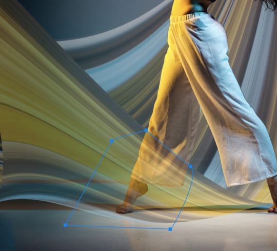

Pen tool
Ctrl + enter
Cmd + return

Now, we've done the swoosh thing. We can move on to add some text to our design.
Type Tool
Choose the Type Tool with a "T" icon. Click to create a point type
Type in "DANCE" in uppercase and choose a font
Edit the font size and weight.
Create another point type and type in "FOR THE NIGHT" in uppercase and a smaller font size.
Increase letter space for "for the night"
---------------How to increase letter space?
select all the text, hold Alt (Win) Opt (Mac) and hit -> arrow
Move them to the top left conner.
Shape Tool
Different from all the other layers we've dealt before, the Shape Tool creates vector Path instead of Raster elements composed of pixels.
Once we have a shape, or to put it in another way, a path, to edit like pixel layers, we need to right click on the path layer and rasterize it.
The shape tool is actually a tool group. By default, the icon is the rectangle.
You can change the fill and stroke styles from the control panel on top of your screen.
Now, you can add a box for your title "DANCE".
Layer Opacity vs. Fill?
When you look at your layer panel, you'll notice that you have two options to lower down the transparency of your layer: Opacity and Fill.
-----------------What is the difference?
Opacity will control the opacity of both the layer and layer effects.
Fill will control the opacity of the layer, but not layer effects.
Let's add a light strip to practice.
Create a long rectangle, double click on the layer tab area to add a outlow effect.
Change the perimeters to make the light strip look natural.
Lower down the fill to 0, and now you'll have something similar to my sample.
0 notes
Text
*PLEASE NOTE* While making this part of the tutorial and reviewing the earlier parts I realized I messed up. "Shift" + a is the add instead of ctrl + a. I edited the first post but obviously the reblogs are still wrong.
if only it was 2013 and you could edit reblogs

ok now we are Shift + a while hovering overover the top menu (donut) and adding a Mesh -> cylinder for our springle

hmm seems fine.

jk, then tab -> edit mode, I hit "/" see only the sprinkle and shrank it down really small. Then I double left click the top and ctrl + b to bevel (scroll to add more loops). double left click the bottom and ctrl + b to bevel again.

sprinkle now very small. press / to reveal other objects.

Geometry node: instance on points added

while I had the geometry nodes window open I click and dragged the Cylinder over to it and it made its own box. helpful.

Geometry -> instance. now it looks like that.

went back into edit mode and selected the entire sprinkle and rotated it with R so it is now horizontal.

I added this rotation thing and now the sprinkles are swirling around like a vortex

Added Rotate Euler, selected Local, then added Random value and turned the "Max" values to 1.0, 0.00 and 9.00. now they are sprongle

briefly disconnecting instance on popints so we can do other stuff

fr fr we are weight paint. Press / to only see the frosting and hide all other objects

add a new group on the side by pressing + (in the vertex menu that looks like a little square). its name by default is group.

hit Numpad 7 so you're at the very top looking down. make brush real big and weight to 1.00 and click the top so its red. this area is where the sprinkles are allowed to be.

change weight to 0 and remove all color from beneath the frosting. Ok now hit / and tab -> object mode.

back to geometry nodes. drag empty circle to Density.

over on the right hand side "Density" has now appeared with a value. Press the little button next to it.

Now we can select our thing that we made a second ago called Group.

things have been changed, the "Distribute points on Faces" was changed to Poisson Disk and the Density was plugged into Density factor.
distance min between sprinkles is .05m.
ok time for making new sprinkle

selected cylinder in menu and pressed / so we're only looking at the cylinder. rename cylinder springle

shift + d to duplicate sprinkle, right click to leave the new sprinkle in place (this will make it overlay the first one). In menu, this is springle.001. select springle.001 in menu and tab -> edit mode

select all the vertices to the right. g then x to pull them towards the x axis (or just pull it by eye)

ctrl+ r to make a loop cut

move the loopcut slightly to make a bend

ctrl + b to split the loop and even it out a bit

press a -> center the springle
tab -> object mode

shift + d the original springle again to make springle.002 and right click, then select springle.002 and tab -> edit mode. select the left side of the springle and drag to make it smaller. make sure its centered like before, for sanitys sake. tab-> object mode once its done

shift + d the original springle again and make springle.003. select one side and press r then z to rotate one side

ctrl+r to add a loop cut. move the loop so that the sprinkle is at an angle.

ctrl + b and scroll to add more loops all at once to make this nice curve.
the donut tutorial is too long so heres the abridged version
thought i would put my money where my mouth is and make my own donut tutorial. google blender donut tutorial if you want to see the original i dont need to give that guy any views lol.
left click new file

select box, press x, delete

Ctrl+a -> Mesh -> Torus

In the torus menu make the donut littler
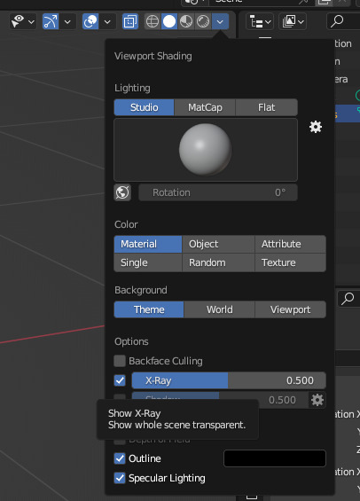
left click the arrow at top right, check X ray box

left click this at top of screen. it will make a ring around your cursor when editing. see later on.
tab -> edit mode, numpad 1 to go to front view
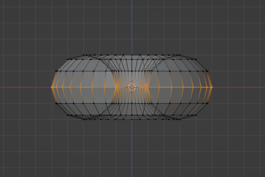
double left click to select the middle line
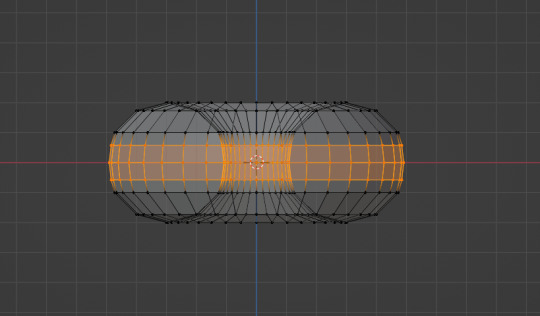
ctrl + b to make more lines
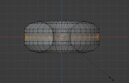
double left click the middle line and hold S. scroll the mouses to adjust how much the nearby lines are changed

tab -> object mode, right click donut, left click Shade Smooth in menu
tab -> back to edit mode
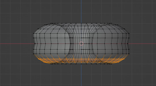
used ctrl + b to add more lines at the top and bottom


left click and then use g to drag random vertices to shift parts of the donut and make it look authentically uneven (tm). scrolling while holding g makes the circles bigger and allows me to drag more vertices.
middle mouse button to rotate, shift + m button to move view to help see all around the donut

tab -> object mode, look at the beautiful donut
ok back to tab -> edit mode
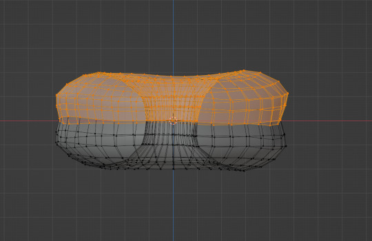
numpad 1 for front view. drag left click to select the top half of the donut. shift + d to duplicate. right click to cancel move (when something is copied, "g" or "move" is automatically performed after that to move it)

press P, left click selection. you have removed those vertices from your object and made them a new object, see in viewer:

the duplicate object is named .001
tab -> object, select torus.001, tab -> edit.

click these buttons. this will make the vertices magnetically attach to the nearest object when you press g and move them.

left clicked the arrow at the far top right and hit random under color so i could see the difference between the frosting and donut
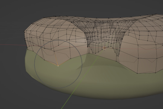
left click vertices and press g to pull them down to form a wave pattern around the donut. hold middle button to rotate and be sure to get all angles

just keep going

click 3 vertices in a row and drag them downwards to make a drip

each drip is about 3 extrudes long. g used to grab the vertices afterwards and shape the drip.

click the little wrench on the side for modifiers, torus.001 is listed at the top (aka frosting)
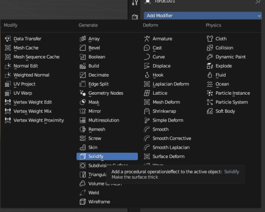
left click add modifier, click solidify
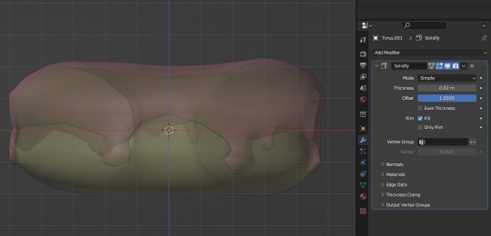
change the thickness to .02m (or whatever else looks good) and offset to +1.0000

left click add modifier, click subdivision surface

now things are smooth
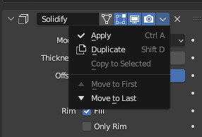
apply solidify using this arrow. then apply subdivision.
tab -> sculpt mode
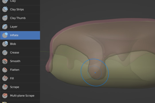
left click the lil inflate brush, uses on the tips of the drips to make them bulbous.
ok, to be continued.
32 notes
·
View notes
Photo

HOW TO: Make an Animated Google Search Overlay
A few people have asked how I did the effect in my pinned post and this set. So, in this tutorial, I’ll show you how to do this typing animation and give you a download to a template I made for the overlay! Disclaimer: This tutorial uses Video Timeline and assumes you have a basic understanding of gif-making in Photoshop.
PHASE 1: THE BASE GIF
I’m not going to show how I made this gif, but if you need any tips on basic gif-making, I have my full gif tutorial here. Instead, here are some tips for making a gif with this effect:
1.1 – Make your gif 540px width, especially if you’re using my template. My gif is 540x400. 1.2 – Use more frames. If you have a lot of characters in your search bar text, you’ll want to make a longer gif (i.e. one with more frames). The gif I made above was only 50-ish frames, so I doubled them and reversed the duplicates so it would play like a boomerang. That gif is a total of 98 frames 😅 1.3 – Have a “feature color” aka choose one color to make pop and make it the same as the overlay. Also, lots of contrast is especially ideal when you have an overlay set to Difference/Exclusion. (Check out the color tutorials on @usergif if you need help making your colors pop!)
PHASE 2: THE OVERLAY
2.1 – Download my template if you’re doing this layout I made this template myself, so all I ask is that you don’t claim it as your own and that you give me proper credit if you decide to use it! Get the PSD with the transparent background here!
2.2 – Download the font Karla (optional) The font I used for the search bar is Karla, a Google Font. It’s not THE Google Font, but I like the way it looks — which is more important to me than accuracy for this part. Here’s the Google Font link. 2.3 – Import the overlay You can either drag the whole folder onto your gif from tab to tab or right-click the folder, select Duplicate Group, and select your gif as the destination document. Just make sure this overlay group is above your base gif! 2.4 – Set the overlay blending options If you’re using my .psd, all the settings are already in place! If not, to get the metallic color effect, simply set the overlay to Difference:
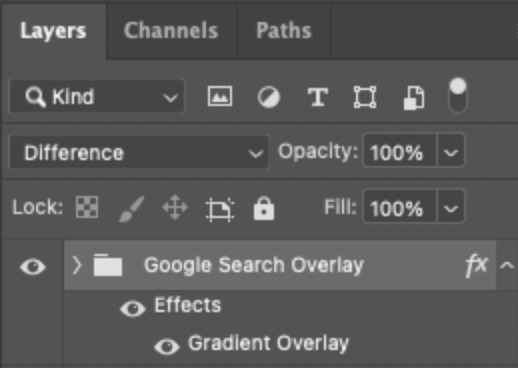
Then, add a gradient overlay that matches your base gif feature color. Here are my settings:
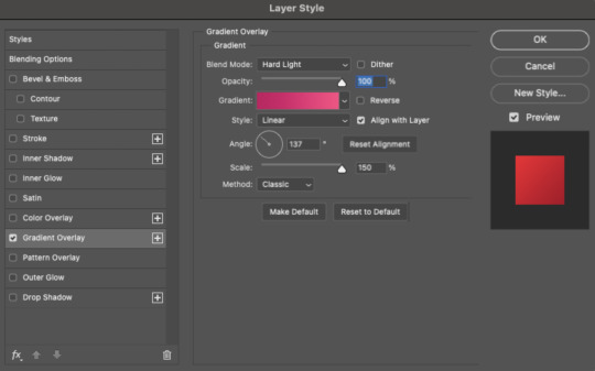
PHASE 3: THE TYPING ANIMATION
*Anakin Skywalker voice* This is where the tedious stuff fun begins...
3.1 – Add your full text Create a text layer with the full text you want in the search bar! Here are my text settings: — Font: Karla Bold — Size: 26 pt — Letter Spacing: 25
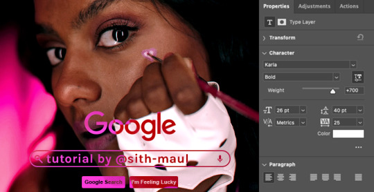
3.2 – Create a layer mask This is how we’re going to create the typing effect without typing a new layer each time. You can add a layer mask to your text layer, use the Marquee tool to create a box around all but the first letter of your text, then fill the box with black to erase it. Now, all you can see is the first letter ‘t’

Btw the reason we wouldn’t use keyframes for something like this is because we want each letter to appear in a flash, not with a smooth, sliding reveal like a fade transition. 3.3 – UNLINK THE LAYER MASK This is super important so you can freely move the layer mask with each letter. Just click that chain so it disappears!

3.4 – Trim the text clip SEVERAL times When I say several times... I’m not joking lmao:

Btw, you can click these images to view them at full size and zoom! Now, this part is a little tricky for me to break down into steps, but here are some key tips: TIP A – Trim, Move Layer Mask, Repeat To make it as easy as possible on yourself, the best method is this: — Start with your original text layer (pre-trim) with the layer mask only exposing 1 letter — Move the playhead (red vertical line with the blue arrow) to the spot you want to trim (see Tip B) and click the scissor icon to split the clip — On the copied layer, move the layer mask (white box in the layer panel) to the right to expose another letter. Make sure your layer mask is unlinked (See Step 3.3)! You can see my layer mask moving by the dotted lines in the gif below. — Move the playhead the same amount of spaces as before and trim again: you should now have the original trimmed clip (first letter) and a second trimmed clip (second letter) — Repeat until you’ve done all the letters AND the spaces
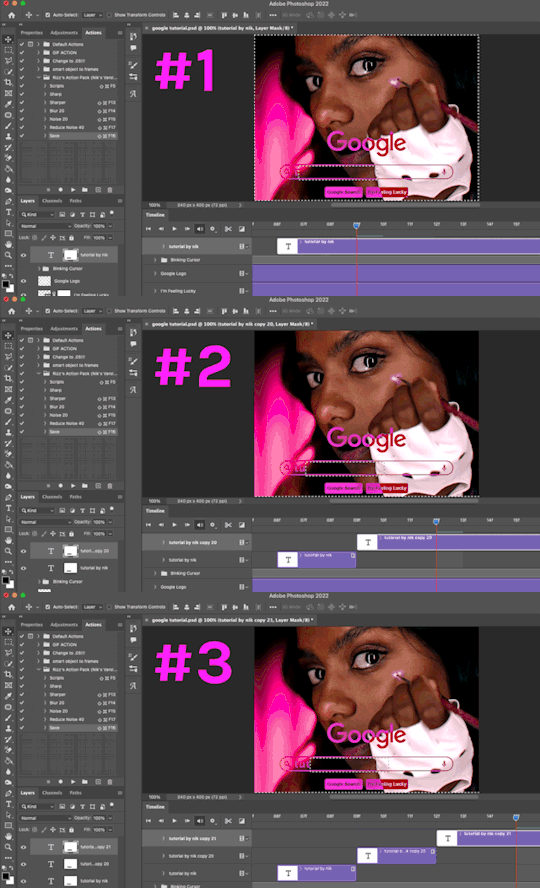
TIP B – Make your trimmed clips about 0.03 seconds long. I’ve found this works well for me, especially because I’m working in Video Timeline. It reduces the amount of duplicate frames I get because, for whatever reason, Timeline pauses every 0.03 seconds (at least for me when I click the forward button). In the section above the pink line (image below), you can see I started with my full text clip. Then, under the pink line, you can see how I used the scissor/trim tool to clip them each to a duration of 00:03.

↑ Note: That screenshot is zoomed into the Timeline 100%. The other screenshots are zoomed out which is why the clips look bigger here. TIP C – Your text shouldn’t start at the very beginning. Give yourself some space to let the cursor blink a few times, just like when you pause while typing on a computer. Where you start your typing animation is up to you! In the image below, you can see the first small purple block starts about 1.06 seconds into the gif:

TIP D – Backspace I’m sure you’ve probably figured this out already, but to get the backspace effect I have in my gif, you just move the layer mask to the left to cover the letters you want to “delete.” Then once they appear “deleted,” just edit your next text layer clip with the new word you want to replace it with! (In my gif, I deleted “nik” and replaced it with “@sith-maul.”) Here’s what the gif looks like without the blinking cursor animation:

Now that’s all explained, you basically do a similar thing with the blinking cursor! But no layer masks are involved :)
PHASE 4: THE TEXT CURSOR ANIMATION
4.1 – Create a text layer with just a vertical line like this one → | I’m using the same Karla typeface as before, but thinner. Here are the settings: — Font: Karla ExtraLight — Size: 26 pt
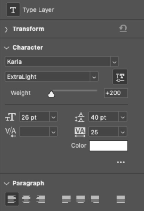
4.2 – Trim, Move, Repeat (Letter Version) This step will be super easy because each cursor clip that follows a letter will be the exact same duration as the letters you’ve already done: 0.03 seconds long. Take a look:
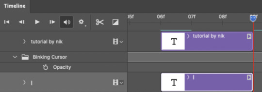
For each letter you reveal, move the text cursor so it’s slightly to the right of the letter, like this:

Do this for all the letters and even the spaces! 4.3 – Trim, Move, Repeat (Blinking Version) This type of text cursor is slightly different because: — These clips are “slower.” The reason is that the Letter Version cursor goes too fast for the Blinking Version. So I doubled the duration of the blinking cursor to 0.06 seconds! — There are spaces between these clips that are the same duration as the clips themselves: 0.06 seconds. — This text cursor starts at the very beginning of the gif and continues after the text is finished “typing,” directly after the last Letter Version cursor. Just add however many blinking cursors you want to the beginning and end of your gif, skipping over the parts where you already did the Letter Version! Here’s how it looks in the Timeline at the beginning of my gif:

Here’s how it looks in the Timeline at the end of my gif (note: it continues directly after the last Letter Version cursor):
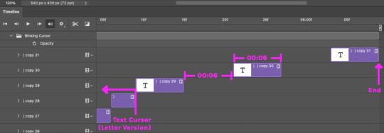
Here’s how the blinking cursor would look at the same speed (0.03) as the letter version:

Here’s how the blinking cursor looks at double the duration (0.06):

PHASE 5: EXPORT
That’s it!! Just convert from Timeline back to Frames and export your gif! As always, I recommend checking your frames when you convert from Video Timeline back to Frame Animation — just in case you may have gotten any duplicate frames. Again, if you want to know more about that process, my full gif tutorial is here! And ta-da, here’s the final gif!

And that’s it! I really hope this makes sense because I’m not really sure it does 😅 But if you have any specific questions, my ask box and DMs are open! <3 Also, check out these gorgeous recreations of this effect from @steverobin (Keke Palmer set) and @jakeyp (Jake Peralta set)!
#gif tutorial#completeresources#allresources#userelio#userannalise#usershreyu#useryoshi#useralison#uservalentina#userkosmos#usernums#tuserkay#userk8#tuserabbie#uservivaldi#userstar#usersole#resource*#gfx*#google*#this tutorial is long overdue oops lol
2K notes
·
View notes
Text
Tidbit: Persnickety About Posters
If you want to avoid overly dark or blurry posters in your fan adventures, then follow my lead:
1) Download JPEG off of Google Images.
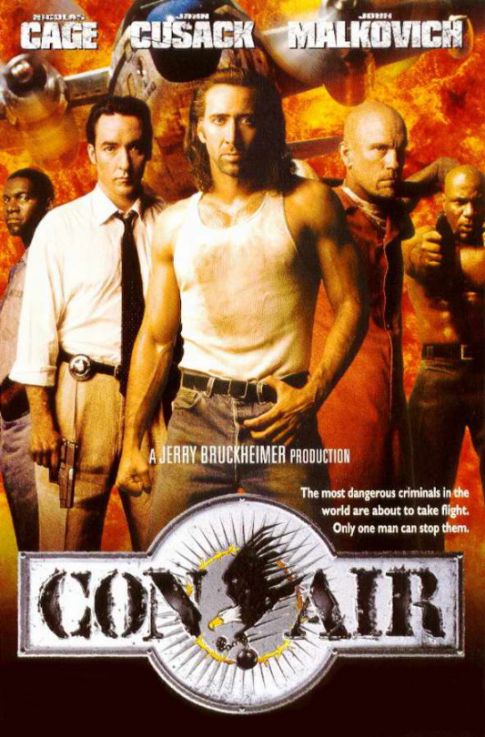
2) Import, scale down, and skew/shear it. Use an interpolation method such as Bilinear or Bicubic Sharper. Doing both transformations at once is better than repeatedly transforming the image (i.e. resizing it, applying the transform, and then skewing it), as it helps prevent the image and edges from becoming too blurry. This will be important later.
You can hold down Ctrl + Shift to constrain the Move tool along a single axis so it won't go out of alignment as you're skewing it. If you don't see the Transform Controls by default, enable it in the tool options bar at the top, or go to Edit>Free Transform.
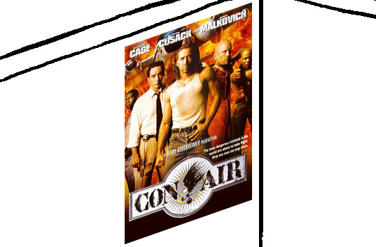
3) Desaturate it. Desaturate means to turn color grayer, until it becomes black and white.

4) Adjust the brightness and contrast using the Levels adjustment tool. It's much too dark as it is! In Photoshop, it is located under Image>Adjustments>Levels..., but I recommend creating an adjustment layer from the bottom of the layers tab instead. Doing so will allow you to make edits non-destructively, meaning you can go back and change any parameters until it looks right.

You could use a Brightness/Contrast adjustment with "Use Legacy" enabled instead to achieve a similar effect, but it won't clip the shadows and highlights as easily. You would have to create an additional duplicate adjustment and turn the brightness and contrast way down on the first one to do so. It's somewhat easier to use but less efficient than Levels in this case.
5) Apply a simple sharpen to the image as it is still too blurry for our purposes. In Photoshop, it is located under Filter>Sharpen>Sharpen... Do not use any other filter, such as Unsharp Mask, unless you absolutely have to in lieu of a basic one. If you must, turn down the radius a bit and the threshold all the way to 0.
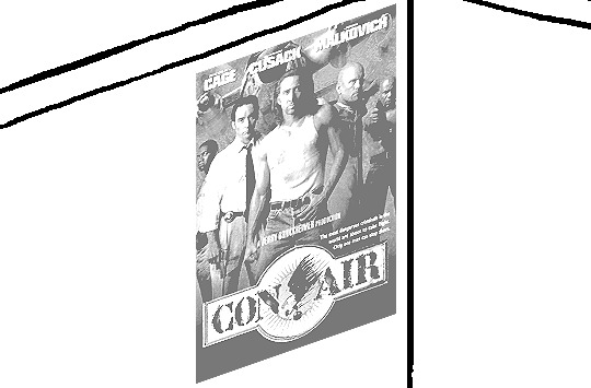
6) Make a selection around the image. Ctrl + left click on the layer's thumbnail to make a selection around it. Doing it this way makes it inherit the level of transparency any pixels have. If you can't, use the Magic Wand tool with "Anti-alias" enabled to select the transparent area outside, then invert it using Shift + Ctrl + I, or go to Select>Inverse.
Create a new layer above the image, then go to Edit>Stroke... and add a black stroke with a width of 2px located Outside. Leave everything else at the default. Doing it this way will create a stroke with anti-aliasing based on the selection you made. This should generally turn out pretty sharp if you follow my advice from Step 2. If you had used the Stroke Effect available from the Blending Options' layer styles, it will always result in a very smooth outline instead. You do not want this.
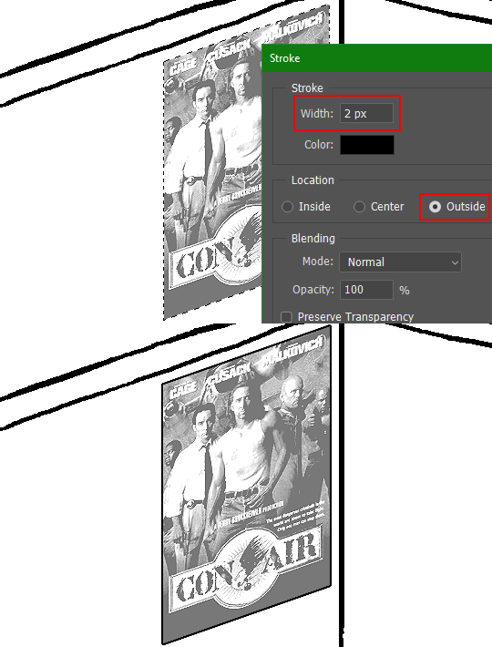
Voila, and Bob's your uncle, you're done!

The instructions above are Photoshop specific, but it should still be pretty software-agnostic. Here is the recreation PSD, and below the read-more link are additional notes, such as transferring the steps to something like GIMP.
ADDENDUM
You may be questioning why I deliberately made the stroke anti-aliased. "Isn't that an MSPArt cardinal sin??", I hear you clamoring. Well, my dear readers, let me briefly elucidate you on why your ass is wrong. Exhibit A:
The clearly semi-opaque pixels that can be found in every poster outline, which is especially pronounced here in the Little Monsters poster. I can also see that Hussie actually created a stroke on the same layer as the poster and merged it down into the white background like a dumbass. I omitted this in step 6 for the sake of convenience (and also the fact that you can't add a stroke to a smart object in Photoshop without rasterizing it first).
He had to use the magic wand tool in order to extract it from the layer for this panel, and then fill it in with the paint bucket tool. I can even tell he had the color tolerance set up very high on the magic wand to grab all those near-black and very light gray pixels, AND he had anti-alias enabled and the tolerance on the bucket tool set to be at least higher than 0 to tint similar colors. Exhibit B:

I also didn't address exactly how to desaturate something in Photoshop. Honestly it was because I was feeling pretty lazy. I would have had to rewrite step 4 to not include redundant information about adjustment layers. You can add either a Black & White adjustment layer or a Hue/Saturation one and turn the saturation all the way down to 0. The resulting tones will be slightly different from each other but I'll explain why that is in another tutorial.
Speaking of another tutorial, read this one if you believe this post is missing the step of using a posterize filter.
Now onto applying some steps to GIMP.
RE: step 2) In GIMP, there is a dedicated Unified Transform tool separate from the Move tool, unlike in Photoshop where both features are combined into one. This is how you scale and skew (AKA shear in GIMP) both at the same time, among other things such as rotating.
You'll also find that instead of any interpolation methods labeled "Bilinear" or "Bicubic", there are only ones named "Linear", "Cubic", "NoHalo", and "LoHalo". Basically, Linear and Bilinear are the same, so are Cubic and Bicubic, naturally. I guess NoHalo would be similar to Bicubic Smoother and LoHalo would be kind of similar to Bicubic Sharper as well. It's not an exact 1:1, though.
Honestly it doesn't really matter what you use to reduce the size as long as it isn't None/Nearest-Neighbor. You're going to have to sharpen it no matter what. This applies to Photoshop as well.
RE: step 3) Go to Colors>Hue-Saturation... and repeat turning the saturation down to 0, or go to Colors>Desaturate>Desaturate... and select the Lightness (HSL) method.
RE: step 4) Go to Colors>Levels... or Colors>Brightness-Contrast... The Brightness-Contrast adjustment tool already functions almost exactly like in Photoshop with "Use Legacy" enabled.
RE: step 5) In GIMP 2.10, the developers squirreled away the basic Sharpen filter, making it inaccessible from the Filters menu. To use it, hit the forward-slash (/) key or go to Help>Search and Run a Command... to bring up the Search Actions window and type in "sharpen". Select the option that just reads "Sharpen..." and has a description of "Make image sharper (less powerful than Unsharp Mask)". I find that using a sharpness value of around 40 to be similar to Photoshop's sharpen filter.
RE: step 6) Instead of holding down Ctrl, you hold down Alt and click on the layer thumbnail to make a selection around it. Make a layer underneath the image this time since there isn't an option to place the stroke outside the selection rather than the middle. Go to Edit>Stroke Selection... and create a stroke using these settings:

I recommend keeping anti-aliasing disabled however, as GIMP produces lines that are a little too smooth for my taste.

With "Antialiasing" enabled
Without
If you're using a program that doesn't have a stroke feature available, you could draw a straight 1px thick line across the top of your poster, duplicate it, and move it down 1px. Merge them together, duplicate it again, and move it all the way down to the bottom of the poster. Then repeat the exact same process for the sides. I used to do this before I even knew of the stroke feature, haha.
Another reason I had to do it this way was because my dumb ass did the thing I said not to in step 2, scaling down the image with the scale tool, and then shearing it separately with the shear tool. This caused the edges to become too blurry to be used for a stroke automatically. Oh well, live and learn.
144 notes
·
View notes