#incredibly made tho
Explore tagged Tumblr posts
Text
self care is NOT rewatching the whole of jujutsu kaisen just to feel something.
#it works. i feel something. and that something is PAIN AND DESPAIR#boi oh boi does this anime hurt#also the stsg 'at least curse me at my end' scene immedietly into yuta putting riko to rest while gojo watches? FOUL#that man probably went home and cried so hard megumi and shoko had to stage an intervention#jjk s1 is mildly funny but also quite sad#jjk 0 is Devastating#and jjk s2 is just one big tragedy that just makes you lose any joy quicker than yuji loses his sanity bro#let alone the following manga arcs....#yikes#incredibly made tho#but ow#jjk#jujutsu kaisen#ace rambles
7 notes
·
View notes
Text
We're going into 2025 soon and I can honestly say I'm looking forward to another year with this fandom. Genuinely one of the best fandoms I've ever been in and you guys have made the past few years wonderful. There is so much creativity and joy here and we're all vibing and thriving. So, here's to another year with the DCA. May those funky robots share with us more whimsy and joy.
#i'm rambling but i mean it#i'm also incredibly sick atm#but that's alright#i'm just here to hang out#seriously tho#i've made some amazing friends that i adore#you guys are the best#where are my besties?#come gimme a kiss
265 notes
·
View notes
Text

honey you got a big storm coming inspired by Jordan Peele's NOPE and particularly this poster design
(prints)
#ITS DONEEEE#this composition has been rattling around in my brain for MONTHS#AND I FINALLY SAT DOWN AND ACTUALLY MADE IT#MAKING MY WAY THROUGH MY ART LIST BABYYYYY#guys arenas are actually kinda fun to draw#ive done three arenas and a ballpark now#*owen wilson voice* wow#anyways that sky hurricane was an absolute nightmare for the longest time#and then i figured out what i was doing and it became fun but oh god it took so incredibly long#worth it tho#carolina hurricanes#hurricanes#hockey#hockey art#nhl#my art#canes
252 notes
·
View notes
Text
why Aurora's art is genius
It's break for me, and I've been meaning to sit down and read the Aurora webcomic (https://comicaurora.com/, @comicaurora on Tumblr) for quite a bit. So I did that over the last few days.
And… y'know. I can't actually say "I should've read this earlier," because otherwise I would've been up at 2:30-3am when I had responsibilities in the morning and I couldn't have properly enjoyed it, but. Holy shit guys THIS COMIC.
I intended to just do a generalized "hello this is all the things I love about this story," and I wrote a paragraph or two about art style. …and then another. And another. And I realized I needed to actually reference things so I would stop being too vague. I was reading the comic on my tablet or phone, because I wanted to stay curled up in my chair, but I type at a big monitor and so I saw more details… aaaaaand it turned into its own giant-ass post.
SO. Enjoy a few thousand words of me nerding out about this insanely cool art style and how fucking gorgeous this comic is? (There are screenshots, I promise it isn't just a wall of text.) In my defense, I just spent two semesters in graphic design classes focusing on the Adobe Suite, so… I get to be a nerd about pretty things…???
All positive feedback btw! No downers here. <3
---
I cannot emphasize enough how much I love the beautiful, simple stylistic method of drawing characters and figures. It is absolutely stunning and effortless and utterly graceful—it is so hard to capture the sheer beauty and fluidity of the human form in such a fashion. Even a simple outline of a character feels dynamic! It's gorgeous!
Though I do have a love-hate relationship with this, because my artistic side looks at that lovely simplicity, goes "I CAN DO THAT!" and then I sit down and go to the paper and realize that no, in fact, I cannot do that yet, because that simplicity is born of a hell of a lot of practice and understanding of bodies and actually is really hard to do. It's a very developed style that only looks simple because the artist knows what they're doing. The human body is hard to pull off, and this comic does so beautifully and makes it look effortless.
Also: line weight line weight line weight. It's especially important in simplified shapes and figures like this, and hoo boy is it used excellently. It's especially apparent the newer the pages get—I love watching that improvement over time—but with simpler figures and lines, you get nice light lines to emphasize both smaller details, like in the draping of clothing and the curls of hair—which, hello, yes—and thicker lines to emphasize bigger and more important details and silhouettes. It's the sort of thing that's essential to most illustrations, but I wanted to make a note of it because it's so vital to this art style.
THE USE OF LAYER BLENDING MODES OH MY GODS. (...uhhh, apologies to the people who don't know what that means, it's a digital art program thing? This article explains it for beginners.)
Bear with me, I just finished my second Photoshop course, I spent months and months working on projects with this shit so I see the genius use of Screen and/or its siblings (of which there are many—if I say "Screen" here, assume I mean the entire umbrella of Screen blending modes and possibly Overlay) and go nuts, but seriously it's so clever and also fucking gorgeous:
Firstly: the use of screened-on sound effect words over an action? A "CRACK" written over a branch and then put on Screen in glowy green so that it's subtle enough that it doesn't disrupt the visual flow, but still sticks out enough to make itself heard? Little "scritches" that are transparent where they're laid on without outlines to emphasize the sound without disrupting the underlying image? FUCK YES. I haven't seen this done literally anywhere else—granted, I haven't read a massive amount of comics, but I've read enough—and it is so clever and I adore it. Examples:


Secondly: The beautiful lighting effects. The curling leaves, all the magic, the various glowing eyes, the fog, the way it's all so vividly colored but doesn't burn your eyeballs out—a balance that's way harder to achieve than you'd think—and the soft glows around them, eeeee it's so pretty so pretty SO PRETTY. Not sure if some of these are Outer/Inner Glow/Shadow layer effects or if it's entirely hand-drawn, but major kudos either way; I can see the beautiful use of blending modes and I SALUTE YOUR GENIUS.
I keep looking at some of this stuff and go "is that a layer effect or is it done by hand?" Because you can make some similar things with the Satin layer effect in Photoshop (I don't know if other programs have this? I'm gonna have to find out since I won't have access to PS for much longer ;-;) that resembles some of the swirly inner bits on some of the lit effects, but I'm not sure if it is that or not. Or you could mask over textures? There's... many ways to do it.
If done by hand: oh my gods the patience, how. If done with layer effects: really clever work that knows how to stop said effects from looking wonky, because ugh those things get temperamental. If done with a layer of texture that's been masked over: very, very good masking work. No matter the method, pretty shimmers and swirly bits inside the bigger pretty swirls!
Next: The way color contrast is used! I will never be over the glowy green-on-black Primordial Life vibes when Alinua gets dropped into that… unconscious space?? with Life, for example, and the sharp contrast of vines and crack and branches and leaves against pitch black is just visually stunning. The way the roots sink into the ground and the three-dimensional sensation of it is particularly badass here:

Friggin. How does this imply depth like that. HOW. IT'S SO FREAKING COOL.
A huge point here is also color language and use! Everybody has their own particular shade, generally matching their eyes, magic, and personality, and I adore how this is used to make it clear who's talking or who's doing an action. That was especially apparent to me with Dainix and Falst in the caves—their colors are both fairly warm, but quite distinct, and I love how this clarifies who's doing what in panels with a lot of action from both of them. There is a particular bit that stuck out to me, so I dug up the panels (see this page and the following one https://comicaurora.com/aurora/1-20-30/):

(Gods it looks even prettier now that I put it against a plain background. Also, appreciation to Falst for managing a bridal-carry midair, damn.)
The way that their colors MERGE here! And the immense attention to detail in doing so—Dainix is higher up than Falst is in the first panel, so Dainix's orange fades into Falst's orange at the base. The next panel has gold up top and orange on bottom; we can't really tell in that panel where each of them are, but that's carried over to the next panel—
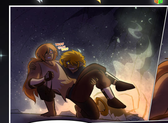
—where we now see that Falst's position is raised above Dainix's due to the way he's carrying him. (Points for continuity!) And, of course, we see the little "huffs" flowing from orange to yellow over their heads (where Dainix's head is higher than Falst's) to merge the sound of their breathing, which is absurdly clever because it emphasizes to the viewer how we hear two sets of huffing overlaying each other, not one. Absolutely brilliant.
(A few other notes of appreciation to that panel: beautiful glows around them, the sparks, the jagged silhouette of the spider legs, the lovely colors that have no right to make the area around a spider corpse that pretty, the excellent texturing on the cave walls plus perspective, the way Falst's movements imply Dainix's hefty weight, the natural posing of the characters, their on-point expressions that convey exactly how fuckin terrifying everything is right now, the slight glows to their eyes, and also they're just handsome boys <3)
Next up: Rain!!!! So well done! It's subtle enough that it never ever disrupts the impact of the focal point, but evident enough you can tell! And more importantly: THE MIST OFF THE CHARACTERS. Rain does this irl, it has that little vapor that comes off you and makes that little misty effect that plays with lighting, it's so cool-looking and here it's used to such pretty effect!
One of the panel captions says something about it blurring out all the injuries on the characters but like THAT AIN'T TOO BIG OF A PROBLEM when it gets across the environmental vibes, and also that'd be how it would look in real life too so like… outside viewer's angle is the same as the characters', mostly? my point is: that's the environment!!! that's the vibes, that's the feel! It gets it across and it does so in the most pretty way possible!
And another thing re: rain, the use of it to establish perspective, particularly in panels like this—

—where we can tell we're looking down at Tynan due to the perspective on the rain and where it's pointing. Excellent. (Also, kudos for looking down and emphasizing how Tynan's losing his advantage—lovely use of visual storytelling.)
Additionally, the misting here:
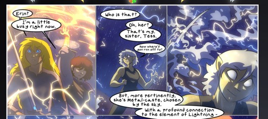
We see it most heavily in the leftmost panel, where it's quite foggy as you would expect in a rainstorm, especially in an environment with a lot of heat, but it's also lightly powdered on in the following two panels and tends to follow light sources, which makes complete sense given how light bounces off particles in the air.
A major point of strength in these too is a thorough understanding of lighting, like rim lighting, the various hues and shades, and an intricate understanding of how light bounces off surfaces even when they're in shadow (we'll see a faint glow in spots where characters are half in shadow, but that's how it would work in real life, because of how light bounces around).
Bringing some of these points together: the fluidity of the lines in magic, and the way simple glowing lines are used to emphasize motion and the magic itself, is deeply clever. I'm basically pulling at random from panels and there's definitely even better examples, but here's one (see this page https://comicaurora.com/aurora/1-16-33/):

First panel, listed in numbers because these build on each other:
The tension of the lines in Tess's magic here. This works on a couple levels: first, the way she's holding her fists, as if she's pulling a rope taut.
The way there's one primary line, emphasizing the rope feeling, accompanied by smaller ones.
The additional lines starbursting around her hands, to indicate the energy crackling in her hands and how she's doing a good bit more than just holding it. (That combined with the fists suggests some tension to the magic, too.) Also the variations in brightness, a feature you'll find in actual lightning. :D Additional kudos for how the lightning sparks and breaks off the metal of the sword.
A handful of miscellaneous notes on the second panel:
The reflection of the flames in Erin's typically dark blue eyes (which bears a remarkable resemblance to Dainix, incidentally—almost a thematic sort of parallel given Erin's using the same magic Dainix specializes in?)
The flowing of fabric in the wind and associated variation in the lineart
The way Erin's tattoos interact with the fire he's pulling to his hand
The way the rain overlays some of the fainter areas of fire (attention! to! detail! hell yeah!)
I could go on. I won't because this is a lot of writing already.
Third panel gets paragraphs, not bullets:
Erin's giant-ass "FWOOM" of fire there, and the way the outline of the word is puffy-edged and gradated to feel almost three-dimensional, plus once again using Screen or a variation on it so that the stars show up in the background. All this against that stunning plume of fire, which ripples and sparks so gorgeously, and the ending "om" of the onomatopoeia is emphasized incredibly brightly against that, adding to the punch of it and making the plume feel even brighter.
Also, once again, rain helping establish perspective, especially in how it's very angular in the left side of the panel and then slowly becomes more like a point to the right to indicate it's falling directly down on the viewer. Add in the bright, beautiful glow effects, fainter but no less important black lines beneath them to emphasize the sky and smoke and the like, and the stunningly beautiful lighting and gradated glows surrounding Erin plus the lightning jagging up at him from below, and you get one hell of an impactful panel right there. (And there is definitely more in there I could break down, this is just a lot already.)
And in general: The colors in this? Incredible. The blues and purples and oranges and golds compliment so well, and it's all so rich.
Like, seriously, just throughout the whole comic, the use of gradients, blending modes, color balance and hues, all the things, all the things, it makes for the most beautiful effects and glows and such a rich environment. There's a very distinct style to this comic in its simplified backgrounds (which I recognize are done partly because it's way easier and also backgrounds are so time-consuming dear gods but lemme say this) and vivid, smoothly drawn characters; the simplicity lets them come to the front and gives room for those beautiful, richly saturated focal points, letting the stylized designs of the magic and characters shine. The use of distinct silhouettes is insanely good. Honestly, complex backgrounds might run the risk of making everything too visually busy in this case. It's just, augh, so GORGEOUS.
Another bit, take a look at this page (https://comicaurora.com/aurora/1-15-28/):
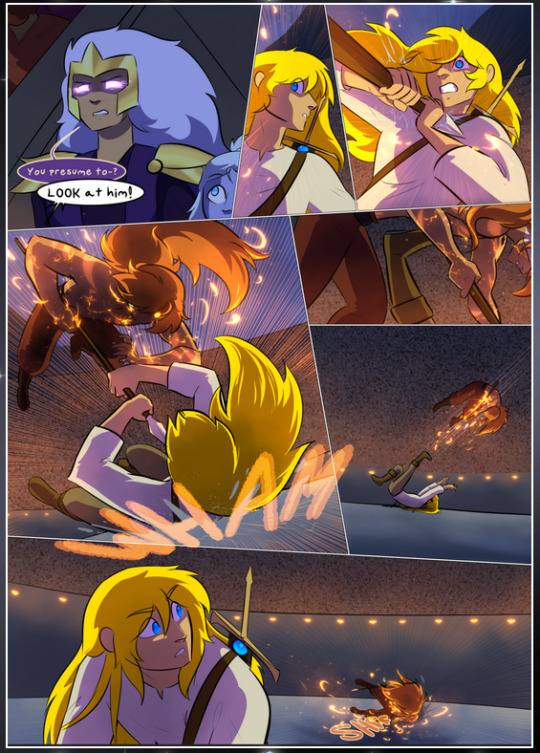
It's not quite as evident here as it is in the next page, but this one does some other fun things so I'm grabbing it. Points:
Once again, using different colors to represent different character actions. The "WHAM" of Kendal hitting the ground is caused by Dainix's force, so it's orange (and kudos for doubling the word over to add a shake effect). But we see blue layered underneath, which could be an environmental choice, but might also be because it's Kendal, whose color is blue.
And speaking off, take a look at the right-most panel on top, where Kendal grabs the spear: his motion is, again, illustrated in bright blue, versus the atmospheric screened-on orange lines that point toward him around the whole panel (I'm sure these have a name, I think they might be more of a manga thing though and the only experience I have in manga is reading a bit of Fullmetal Alchemist). Those lines emphasize the weight of the spear being shoved at him, and their color tells us Dainix is responsible for it.
One of my all-time favorite effects in this comic is the way cracks manifest across Dainix's body to represent when he starts to lose control; it is utterly gorgeous and wonderfully thematic. These are more evident in the page before and after this one, but you get a decent idea here. I love the way they glow softly, the way the fire juuuust flickers through at the start and then becomes more evident over time, and the cracks feel so realistic, like his skin is made of pottery. Additional points for how fire begins to creep into his hair.
A small detail that's generally consistent across the comic, but which I want to make note of here because you can see it pretty well: Kendal's eyes glow about the same as the jewel in his sword, mirroring his connection to said sword and calling back to how the jewel became Vash's eye temporarily and thus was once Kendal's eye. You can always see this connection (though there might be some spots where this also changes in a symbolic manner; I went through it quickly on the first time around, so I'll pay more attention when I inevitably reread this), where Kendal's always got that little shine of blue in his eyes the same as the jewel. It's a beautiful visual parallel that encourages the reader to subconsciously link them together, especially since the lines used to illustrate character movements typically mirror their eye color. It's an extension of Kendal.
Did I mention how ABSOLUTELY BEAUTIFUL the colors in this are?
Also, the mythological/legend-type scenes are illustrated in familiar style often used for that type of story, a simple and heavily symbolic two-dimensional cave-painting-like look. They are absolutely beautiful on many levels, employing simple, lovely gradients, slightly rougher and thicker lineart that is nonetheless smoothly beautiful, and working with clear silhouettes (a major strength of this art style, but also a strength in the comic overall). But in particular, I wanted to call attention to a particular thing (see this page https://comicaurora.com/aurora/1-12-4/):
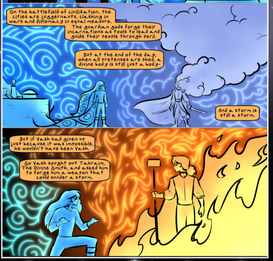
The flowing symbolic lineart surrounding each character. This is actually quite consistent across characters—see also Life's typical lines and how they curl:
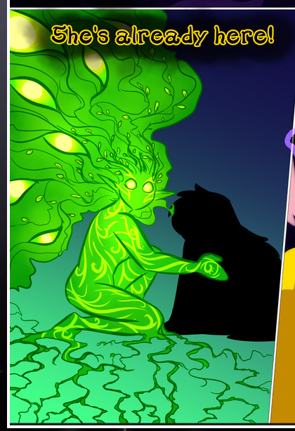
What's particularly interesting here is how these symbols are often similar, but not the same. Vash's lines are always smooth, clean curls, often playing off each other and echoing one another like ripples in a pond. You'd think they'd look too similar to Life's—but they don't. Life's curl like vines, and they remain connected; where one curve might echo another but exist entirely detached from each other in Vash's, Life's lines still remain wound together, because vines are continuous and don't float around. :P
Tahraim's are less continuous, often breaking up with significantly smaller bits and pieces floating around like—of course—sparks, and come to sharper points. These are also constants: we see the vines repeated over and over in Alinua's dreams of Life, and the echoing ripples of Vash are consistent wherever we encounter him. Kendal's dream of the ghost citizens of the city of Vash in the last few chapters is filled with these rippling, echoing patterns, to beautiful effect (https://comicaurora.com/aurora/1-20-14/):
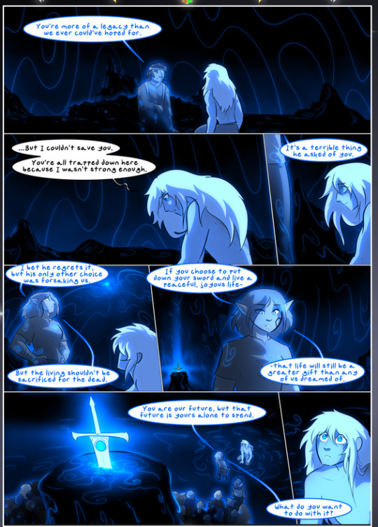
They ripple and spiral, often in long, sinuous curves, with smooth elegance. It reminds me a great deal of images of space and sine waves and the like. This establishes a definite feel to these different characters and their magic. And the thing is, that's not something that had to be done—the colors are good at emphasizing who's who. But it was done, and it adds a whole other dimension to the story. Whenever you're in a deity's domain, you know whose it is no matter the color.
Regarding that shape language, I wanted to make another note, too—Vash is sometimes described as chaotic and doing what he likes, which is interesting to me, because smooth, elegant curves and the color blue aren't generally associated with chaos. So while Vash might behave like that on the surface, I'm guessing he's got a lot more going on underneath; he's probably much more intentional in his actions than you'd think at a glance, and he is certainly quite caring with his city. The other thing is that this suits Kendal perfectly. He's a paragon character; he is kind, virtuous, and self-sacrificing, and often we see him aiming to calm others and keep them safe. Blue is such a good color for him. There is… probably more to this, but I'm not deep enough in yet to say.
And here's the thing: I'm only scratching the surface. There is so much more here I'm not covering (color palettes! outfits! character design! environment! the deities! so much more!) and a lot more I can't cover, because I don't have the experience; this is me as a hobbyist artist who happened to take a couple design classes because I wanted to. The art style to this comic is so clever and creative and beautiful, though, I just had to go off about it. <3
...brownie points for getting all the way down here? Have a cookie.
#aurora comic#aurora webcomic#comicaurora#art analysis#...I hope those are the right tags???#new fandom new tagging practices to learn ig#much thanks for something to read while I try to rest my wrists. carpal tunnel BAD. (ignore that I wrote this I've got braces ok it's fine)#anyway! I HAVE. MANY MORE THOUGHTS. ON THE STORY ITSELF. THIS LOVELY STORY#also a collection of reactions to a chunk of the comic before I hit the point where I was too busy reading to write anything down#idk how to format those tho#...yeet them into one post...???#eh I usually don't go off this much these days but this seems like a smaller tight-knit fandom so... might as well help build it?#and I have a little more time thanks to break so#oh yes also shoutout to my insanely awesome professor for teaching me all the technical stuff from this he is LOVELY#made an incredibly complex program into something comprehensible <3#synapse talks
785 notes
·
View notes
Text
mods r asleep post humanized 4x


finished catching up on tpot it was peakkkkkk but i am so scared of one. also working on little clay and felt dolls of 4 x and 2
#bfb#battle for bfdi#tpot#4x#bfb 4x#bfb fourx#four bfb#4 bfb#bfb 4#bfb four#guys do u put bfb before or after the character#x bfb#bfb x#four tpot#4 tpot#x tpot#four in tpot12 saying “nope .... see ya” was so high pitched and quiet WHAT was going on with him. the eye was so funny tho giggled#x with freckles bc of his interest in gardening. 4 with blue patches bc he was the desert and i want to note that#i love the designs i made for them theyre so cute 2 me#4s hair is so hard to draw tho. i cant make it look right#wait ive literally been thinking so much about character comparisons i have to mention it#4 is so obviously alien. he acts so super odd and he appears so unnerving. i feel like he always has wider eyes/smaller pupils#hes always so STARING at things. he is so obviously alien (bc he literally is in this world i think)#2 is also an alien. its in his name AlgebrALIEN. but he is so much more human im obsessed with him#like he laughs so much more he has much closer friendships with the contestants he even makes huge efforts to assist in fixing interpersona#problems and stuff. he is so kind and compassionate and can be super comforting. he is so incredibly human despite being an alien#THTA IS SOOO INTERESITNG AND FUN 2 ME !!!!!!!!!! 4 has loved bfdi and the idea of hosting for years and his goal is to Host but 2s is more#in line with making a point he is what he is bc he wants to be like that. hes a host bc he decided to be not bc someone else told him to#also the recent robot flower arc and the parallels im drawing between her and bot (iii).#bots “i will never be who you want me to be/who you built me as” vs robo flowers “i have to be who you want me to be/who you built me as”
166 notes
·
View notes
Text
hai everypony hav human maid charlie with his nose ripped off Lol
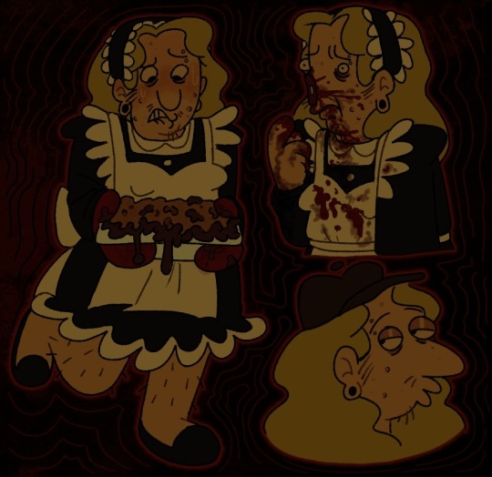
gore was actually rlly fun 2 draw
#smiling friends#adult swim#smiling friends fanart#human designs#charlie dompler#ougghhhhh drawing this made me feel like i was back in 2020 with the maid dress shif#charlies rocking it tho!! 🙄🙄#need him incredibly bad#just kidding#unless#loooool iokes again#loool#ALL FUN AND JOKES! 🧐#🤗😊#fanart
265 notes
·
View notes
Note
Omg I loved your herald viktor epic line idea I’ve been thinking about it nonstop. If u have time and energy id love to read it sooo much ❤️❤️
Since the Ithica Saga dropped last night my brain has not known a single moment of peace. "Would You Fall in Love with Me Again" is just so insanely perfect for a Machine Herald Viktor x Reader AU it makes me physically ill. Like, seriously:
I am not the man you fell in love with
I am not the man you once adored
//
Would you fall in love with me again
If you knew all I've done?
The things I cannot change
Would you love me all the same?
//
Would you fall in love with me again
If you knew all I've done?
The things I can't undo
I'm not the man you knew
Viktor is so Odysseus coded it is PAINFUL. The pain of sacrificing so much of himself to survive. The regret of everyone he's had to leave behind, to betray. The ghosts of his legacy haunting his mind. All for his goal, the one thing he knows he's meant to do with every fiber of his being. Nothing, neither magic nor gods, will stop him from fulfilling that dream. He will not be the same once all has passed, and he will never regain all that he's lost. Can the person who loved him the most as he was before still love this version of him?
And the reader's answer...
I will fall in love with you
Over and over again
I don't care how, where, or when
No matter how long it's been
You're mine
Because what you loved about him is deeper than any of the ways he's changed. It's something at his core, in his soul, in the light of his eyes, no matter how tired they may seem now. It's your first kiss, it's the sound of his voice in your ear, it's the curve of his lips when he smirks, it's the way he looks at you like he falls in love all over again every day you're with him. Time may pass, and the world may change, but not this. Never this.
He is yours just as you are his, and that is the one thing that will never change.
#I still can't believe Epic is over... I dont think a musical has made me feel this way in a REALLY long time#Ive listened to the whole concept album like 30 times the odyssey has always been one of my favorite stories#and the way jorge told it... all the love that went into it... you really feel that in every song#a perfect balance between accuracy to the original tale while still making it entirely his own creation#i will never shut the fuck up about it it is UNDOUBTEDLY the best adaption of the odyssey out there#i do wish there would have been a song/a scene/a line with Argos tho#(if you're unfamiliar Odysseus had a puppy before he left for war and the dog waited for his return all these years)#(when he returns to the palace he disguises himself as an old man but Argos immediately knows its him)#(he licks his hand and wags his tail one last time before passing away having finally seen his master again)#that part always got me#I think there would be an INCREDIBLE parallel to write about Viktor and Rio...#anyway yall tell me if you want to hear more of my rambles on this because i cannot stop thinking about it#youre extremely valid anon#arcane#viktor arcane#viktor x reader#epic the musical#the ithica saga#epic odysseus#anon ❤#rant#mine#machine herald Viktor#epic au
53 notes
·
View notes
Text
I know I've said it before, but I think this upcoming episode is going to be so interesting, even if we don't get Queer Eddie OR BT Bones (neither of which I'm fully convinced are going to happen on Thursday), & it's really for this one interesting phrase that Ryan & Oliver have both used.
They have both mentioned "rose-colored glasses" when it comes to Tommy & Shannon, and I would argue that they each have to reckon with these relationships before we can have any movement towards Buddie.
Eddie thinks that Shannon was the love of his life, that he failed her and has to carry that guilt with him for the rest of his life. I believe that Eddie placing Shannon on a pedestal is partially what's stopping him from realizing his queerness (along with the catholic guilt and repression, but a lot of that is also tied up in Shannon & their failed marriage.)
Buck's convinced that his big feelings last season were all about Tommy, and I'm not saying that some of them weren't, but I don't think it'd be too far of a stretch to say that he figures that he's in this relationship now and that obviously everything is fine now. He figured out this part of himself and he's dating a man and that means everything is Fine and he absolutely does not need to do any further digging or searching or learning, despite the fact that he and Tommy don't really seem to like each other all that much, nor do they seem to be all that compatible.
Buck has to reckon with the fact that realizing his bisexuality and immediately jumping into a relationship with a man that he wasn't even sure he wanted (his speech at the coffee date) might not be the solution to all the problems he's had, and Eddie has to deal with the fact that Shannon was not perfect, that what she did was not the same as what he did, that she's responsible for her own actions and that this romanticized vision he has clung to of their lives is not real and is not consistent with the actual relationship that they had.
There's a Divorce Arc this episode - which I'm begging does something with Eddie - and an uncomfortable truth learned about Tommy's past; it's not completely out of left field to assume that the Rose-Colored Glasses come off this episode.
And the fact that it's happening for them BOTH, at the same time? In the relationships that I think are the biggest obstacles to them realizing/accepting their feelings for each other???
I'm never fully convinced they're actually going to go there with these 2, but it will be SO interesting to see how this episode plays out, regardless.
#911 abc#eddie diaz#evan buckley#buddie#anti bucktommy#anti tommy kinard#anti bt#this is like the least haterish thing I've ever said about BT but I'm tagging it anti anyway I cannot handle being yelled at lol#911 speculation#8x06 speculation#buck x eddie#i think facing the Shannon of it all will lead to getting Chris back & then realizing he's queer so we're so close!#I think we are really getting into the Queer Eddie arc#I just don't think it's coming at us next episode#I'm more than happy to be wrong tho#if we get Gay Eddie & BT Bones both nex episode I will be ECSTATIC#literally never seen a happier girl than me on thursday night lol#They're going to have to face these relationships anyway so that's not really a surprise#but them both doing it at the same time??? & then having a moment of silently supporting each other bc their mere presence is enough??#at the end of an episode that seems to be all about calling back the past?#“baby in a pipe”/kid down a well“/divorce/s1 plot#it's all just so incredibly interesting to me#I can't remember if I've made a post about this before or not but I'm saying it again 😤
64 notes
·
View notes
Text
One of my favorite parts of phase 2 (and indeed one of the few moments I resonated with IDW Prowl) was when the neutrals were coming back to Cybertron and Prowl said that he refused to let Autobots be pushed aside and overruled after they were the ones who fought for freedom for 4 million years (the exact wording escapes me atm).
And I mean, that resentment still holds true even once the colonists come on bc like. As much as it's true that Cybertron's culture is fucked up, and as funny as it can be to paint Cybertronians as a bunch of weirdos who consider trying to kill someone as a common greeting not important enough to hold a grudge over.... The colonists POV kind of pissed me off a lot of times, as did the narrative tone/implications that Cybertronians are forever warlike and doomed to die by their own hands bc it just strikes me as an extremely judgemental and unsympathetic way to deal with a huge group of people with massive war PTSD and political/social tensions that were rampant even before the war?
Like, imagine living in a society rife with bigotry and discrimination where you get locked into certain occupations and social strata based on how you were born. The political tension is so bad there's a string of assassinations of politicians and leaders. The whole planet erupts into an outright war that leads (even unintentionally) to famine and chemical/biological warfare that destroys your planet. Both sides of the war are so entrenched in their pre-war sides and resentment for each other that this war lasts 4 million years and you don't even have a home planet any more. Then your home planet gets restored and a bunch of sheltered fucks come home and go "ewww why are you so violent?? You're a bunch of freaks just go live in the wilderness so that our home can belong to The Pure People Who Weren't Stupid And Evil Enough To Be Trapped In War" and then a bunch of colonists from places that know nothing about your history go "lol you people are so weird?? 🤣🤣 I don't get why y'all are fighting can't you just like, stop??? Oh okay you people are just fucked up and evil and stupid then" ((their planets are based on colonialism where their Primes wiped out the native populations btw whereas the Autobots and OP in particular fought to save organics. But that never gets brought up as a point in their favor)) as if the damage of a lifetime of war and a society that was broken even before the war can just magically go away now that the war is over.
Prowl fucking sucks but he was basically the only person that pointed out the injustice of that.
And then from then on out most of the characters from other colonies like Caminus and wherever else are going "i fucking hate you and your conflicts" w/ people like literal-nobody Slide and various Camiens getting to just sit there lecturing Optimus about how Cybertronians are too violent for their own good and how their conflicts are stupid, with only brief sympathetic moments where the Cybertronians get to be recognized as their own ppl who deserve sympathy before going right back to being lambasted.
Like I literally struggled to enjoy the story at multiple points because there was only so much I could take of the characters I knew and loved being raked over coals constantly while barely getting to defend themselves or be defended by the narrative so like. It was just fucking depressing and a little infuriating to read exRID/OP
#squiggposting#and like dont get me wrong barber wasnt trying to make cybertronians the bad guys or whatever#it's just a problem with his writing where like. he has A Message he wants to send#and so he uses the entire story literally just for The Message even if it involves bullshit plotlines#or familiar characters ppl were reading about for the past decade being shit on by OCs made up to fill a new roster#like barber's writing tends to lean way too much on a sort of lecturing tone#without giving proper care towards including moments where characters get to like. fucking express themselves and share their side#sort of like how barber couldnt be bothered to write pyra magna and optimus actually talking to each other during exrid#and instead during OP ongoing pyra is suddenly screaming about how OP is unteachable#even tho she never even tried to teach him bc she and OP never interacted bc i guess barber couldnt be bothered#he just needed someone to lecture OP so fuck making the story make sense or like letting OP get to say anything in defense#this is the infuriating part of barber's writing bc i think he has incredible IDEAS and was in charge of the lore i was most interested in#but most of the time his execution sucks and he's basically just mid with a few brilliant moments occasionally#or like he has a message about the cycle of violence he wants to convey#but his narrative choices trying to convey that theme made his story come off as super unsympathetic to the ppl who suffered#to the point where barber actively kneecapped some scenes that couldve been super fucking intense and emotional#in favor of the characters lecturing each other or some stupid plot to criticize OP#that time in unicron where windblade screamed about how this is their fault and then arcee replied that her planet is build on coloniation#shouldve happened more often than literally the last series of the ocntinuity. like goddamn stfu about your moral superiority#when your own sins are right fhere lol
227 notes
·
View notes
Text
thinking about kab and the thing about her i think is she knows just enough to keep herself safe Generally but not enough to really predict what would happen should something more... complicated??? unforeseen??? idk whats the right word to use but something not covered by someones reputation and/or vids happen, believe it or not this also affects her view of clownpierce (we'll get to that)
for example, mapicc has a reputation for being an violent, angry, & impulsive guy and nothing else which makes sense but is incredibly surface level and something that only really works if you dont have a lot of experience working with him
another is reddoons, his betrayal after the base incident while shocking is not unforeseen but his reputation as being a guy whos seen as being a reasonable person whos fairly loyal to his team made it seem like something he wouldnt do even tho it absolutely is
regarding how it affects her view of clown, since he isnt perfectly aligned with his reputation she instead pivots in the complete opposite direction and forgiving basically every crime he does even tho hes something much more mild and complicated than either his reputation or her view of him will ever be (think madonna-whore complex which is especially obvious when it comes to kabs vs woogies view of him)
another side effect of this Just Enough amount of knowledge aside from being blinded by her own expectations is that it frustrates ppl who think shes oversimplificating things (like me and seemingly several other tumblr users as well) especially when she claims that shes objectively correct and the smartest in the room at any given moment
how this roughness in her analysis affects her in the server still has yet to be fully seen but we do still have at least a couple months until the end but 'til then shes just gonna keep stumbling as more and more complicated situations pop up as is typical in lifesteal to happen and eventually shes gonna have to learn to adapt or else she'll be suffering the consequences one way or another
#mine.txt#analysis#ig. this is very rough tho and is more just thoughts than anything#but i wanted a tag so i can get back to this later to see how right or wrong i am#another thing that affects this is the cc/c divide which is something she likes to take control of#one of the ways it manifests is that she likes to go in and out of it frequently which can be incredibly distracting#esp if youre someone like me who wants the lsers to just. be themselves and get immersed in whats happening around them#and it doesnt help that her and her character can have Very different feelings on a situation#basically the cc/c divide or at least how kab likes to use it affects the way she acts because shes got an idea in her head already#of what to think of the other ppl in the server which makes her inflexible when unexpected things come up#as opposed to when shes just being herself reacting to things#which is unfortunate but i think reflects on how outsiders vs insiders view lifesteal#the reality vs expectations of the audience are so incredibly different esp if you only watch the vids#so much so that while watching kabs vid my initial reaction was that she wasnt as big a ls fan as i originally thought#then realized no this seems like the exact sort of thing id expect from someone whos only seen the vids; particularly of the pvpers#(specified pvpers cause only watching the pvpers vs other kinds of players on the server are Very different experiences)#tho the thing about kab is she Does have insider knowledge!#.... mainly from ppl who dont log on a lot (ash and clown and maybe squiddo)#so naturally thats gonna give her a biased view of how the server works one way or another#the exception to this would be zam telling her about eclipse federation but i think either she doesnt know or severely underestimated#just how much lying; manipulation; keeping secrets; and yap sessions built on incompatible motives and morals happened#that made s4 the way it is not only in game but outside of it as well#''we're at our best when we hate each other irl'' - reddoons according to zam
54 notes
·
View notes
Text
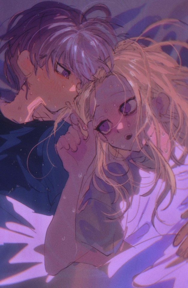
A highly feverish Yuma and Makoto 🌡️ (39.05 c)
This was an art trade I received from BBQchap0 on twitter ✨
Small Rambling below
original and copy, same body, same mind, same frail immune system (they often get sick at the same time)
The 2 worlds greatest minds are going to have to take some time off working today. They’ve unfortunately both been afflicted by a sudden spiking fever and can hardly move. As they lay in bed, fatigued, aching, and sweating through their clothes, they could only struggle to try to help themselves.
This is such an attractive piece. I think I’m in love...
I could go on about this but, I'm literally about to combust 😳💦
In shorter words:
This is the most lovely art trade I have ever gotten and one of the most gorgeous pieces of art I've ever gotten in my entire life.
I cannot praise it enough, this belongs in a legit art gallery... I'm so honored to have gotten something this pretty I could cry...
💕💦(┬┬﹏┬┬) 💦💕
HOW did they make these disheveled sick boys look so BEAUTIFUL??? I can legit FEEL their struggle, its too good I could die
What a vision…makoto's uninterested yet tired expression...yuma with the thermometer in his mouth as his clone weakly assists him...and those glorious skin flush tints of red and pink coupled with the beads of sweat and messy hair…
AND THOSE COLORS…
Yeah. I’m not normal 🫠
Its…perfection
#whumpcode#not mine#art made for me#rain code#rain code spoilers#yuma kokohead#makoto kagutsuchi#makoyuma#illness whump#fever whump#also no im not back i just wanted to share#I don’t often say this about an art piece#but this is DELICIOUS i want to devour this#now this is a 5 star meal right here#first time art makes me feel some kinda way o///o#its that powerful and I cannot AVERT MY GAZE FROM IT#I AM ATTRACTED TO THIS ARTWORK#NEVER IN MY LIFE HAVE I SEEN SUCH BEAUTY#TRULY A SPECTACLE OF THE AGES#I cannot get over it#i am very normal about this image#and the artist says they don’t mind trading w me again sometime#WITH QUALITY LIKE THIS SIGN ME TF UP#tho my art is scrap compared to this majesty#it almost feels unfair… 😅#i am not worthy of this kind of art help#this piece is incredible and should be seen by everyone
63 notes
·
View notes
Text
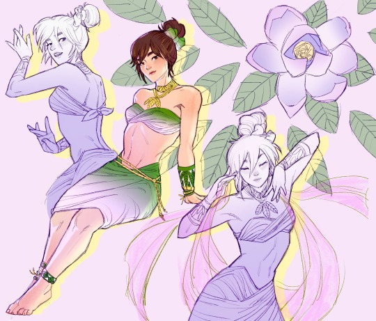
my new OC: cempaka!
she is based on the story/universe that my friend @haydardotjpg's OCs indra and yuwei exist in! pls go checkout haydar's art he is amazing!! his ocs can be found more easily on his ig but if you're lazy this is his oc indra (cempaka's one-sided love interest) and yuwei (indra's fated lover)
also, cempaka means "magnolia" in malay!! (she gets a flower name bc my name is lilly which is also flower c:)
bonus first iteration under the cut!
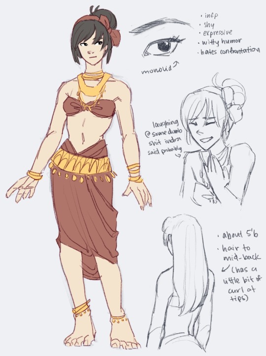
i accidentally had "poinsettia" flower in mind when i did this iteration instead of an actual magnolia, hence the color scheme. but yeah, this is as self-insert as it gets LOL like she's literally MEEEEEE but still very different and i love her as she is <3
#my art#original character#oc#oc art#art#im in love with her actually#she has 4 brothers all named after flowers#mawar kekwa orkid and melati#not me using google translate literally on the fly i hope im not being culturally insensitive 😭#but anyway they lost their parents at a young age so she was raised by her brothers#shes the youngest by far tho by like 9 years from her next closest brother#mawar is the oldest hes like 40 a very important Leader Of People so he is not very present in her life#kekwa is a doctor and 38 and he travels often for work so he is also not very present but he visits sometimes#orkid and melati are twins theyre both 30#orkid is a scholar and on track to being a professor at a prestigious uni#melati is traveling the world doing soul searching#cempaka is 21 she is literally a baby and her brothers send her back money but shes mostly alone#so she joins a traveling dance troupe and she gets really good at dancing#she meets indra while on the road dancing and performing and she is SMITTEN#like shes just head over heels in love with this man because hes so warm and inviting and he fills a void in her life#he makes her feel so incredibly seen and not alone and the feeling is addicting she cant get enough#ok idk most of the details bc i havent read haydars full story BUT#basically to my understanding yuwei and indra are separated for a while#and cempaka knows up front that indra is in love with yuwei like hes very honest with her about this and she appreciates it#but she still wants a chance because indras the only person in the world that has ever made her feel truly seen and loved#so she tries to be with him to ease her loneliness but it breaks her heart whenever he misses yuwei openly#also AGAIN listen im trying to basically write fanfic for a story that doesnt exist LOLL#HAYDAR IF YOURE READING THIS PLS WRITE UR STORY LMFAO
88 notes
·
View notes
Text
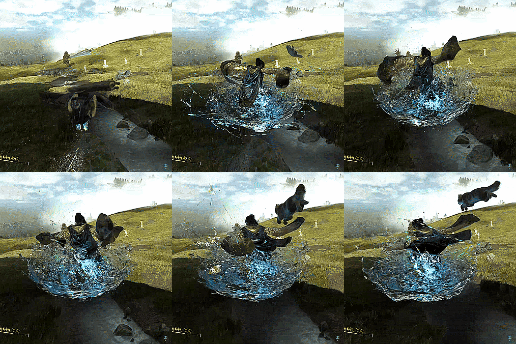
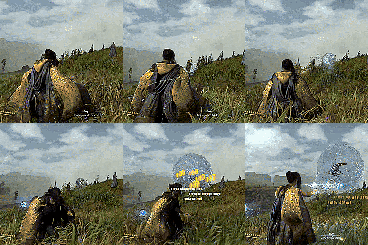
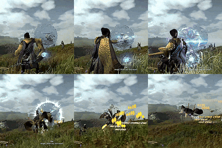

Forspoken + Tanta Prav’s magic
#she was my favorite until we inherited olas’ power#olas has the best magic don’t @ me#prav has the best cloaks tho 🥰#and prav’s magic is still incredible to witness#she can control gravity like ‼️‼️‼️#she made a giant bubble of water and put it in the sky above her castle#and the bubble REMAINED even after she died like….WHAT#rip tanta prav thanks for snitching and telling me who my mom was 💙#forspoken#frey holland#alfre holland#tanta prav
133 notes
·
View notes
Text
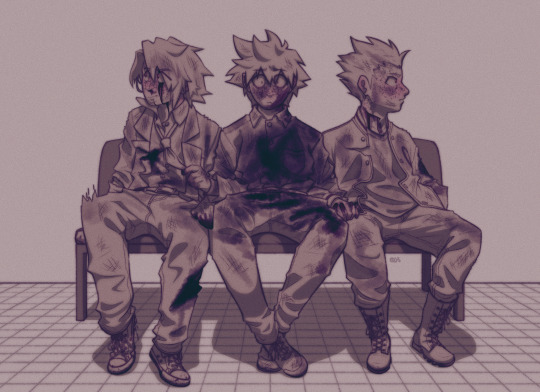
waiting for the news
#qkdraws#id in alt#blood#hm ! wonder where mob is.#i wonder where all that blood on ritsu came from too !#no this isn't mcd btw dw. mob's fine.mostly. probably. like 10% fine#onceagain this is Not mcd please don't talkabt ur hypothetical of mob dying in the tags i cant handle that. ill start crying on you#ritsu kageyama#mp100 ritsu#teruki hanazawa#mp100 teruki#shou suzuki#mp100 shou#not tagging mob cuz he's technically not here.he haunts the narrative of this image tho#could not for the life of me figure out the colors here and the lighting made it look ugly#so i settled for smth simple instead.sorry#teru is twisted around ritsu's arm for the both of them honestly. grounding ritsu and himself#ritsu is so Not grounded rn.he is not fucking present man#he is dissociating Incredibly hard#but teru and shou being there is comforting
75 notes
·
View notes
Text
I think my ideal career is "decorative artist". Pay me a living wage and give me healthcare to sit and weave and sew in public for people to gawk at. Don't make me do marketing or learn SEO or try to set up a tiktok. I want to be hired like a Renaissance artist by a rich patron but with like. PTO.
#my posts#i did enjoy volunteering at the living history farm and spinning wool#the weather and the fact that it was volunteer made it incredibly temporary tho#until that day comes you get to see me do it for free here on tumblr dot com
30 notes
·
View notes
Text
i wish the trans nova cosplayer everything good and kind in this world <3
#andro talks#thats incredibly brave#sorry i mistook you for gauss idk any of the nova skins :'D#fantastically made tho!!!
52 notes
·
View notes