#im using it to experiment on this new coloring style
Explore tagged Tumblr posts
Text
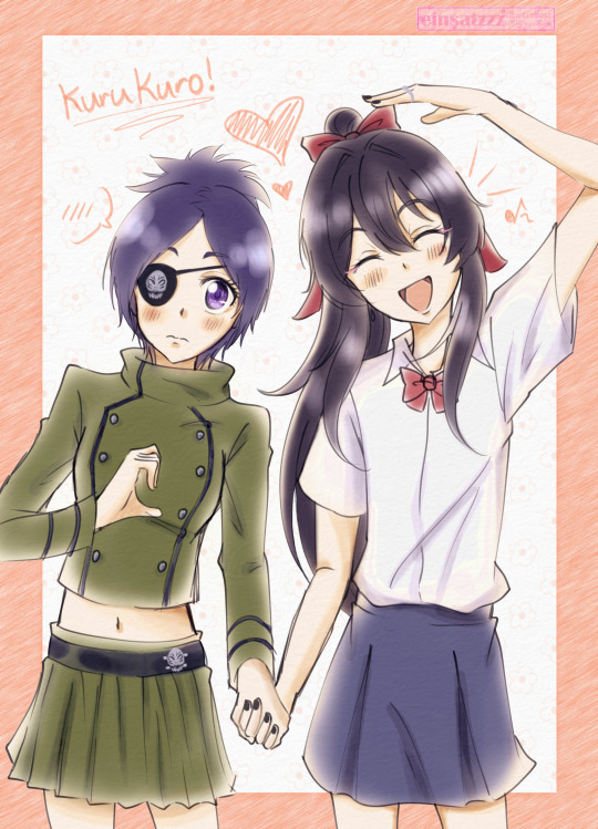
KHR Rarepair Week Day 5 - Opposites Attract - Kurumi/Chrome (KuruKuro) 🥺💖✨base ref
#khr#khrrarepairweek#khrrarepairweek2024#khr oc#khre#oc#einart#dokuro chrome#chrome dokuro#ninomiya kurumi#kurukuro#kurumi/chrome is so cute awawawawawa 🥹💖💖✨#one of the brushes i used is called yu//ri watercolor hahajgsfhadvf#it's so nice to use i wanna learn how to use it better and tweak the settings a bit more#im using it to experiment on this new coloring style#einhighlights
31 notes
·
View notes
Text


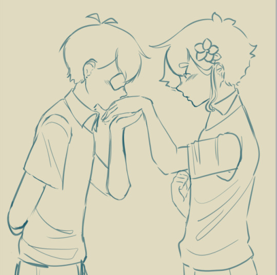
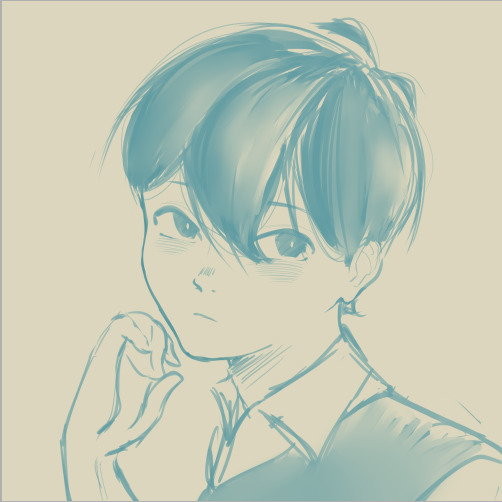
Little doodle dump !
#first two are me experimenting with shit#bet you can guess what movie i went to see right before i drew that first image#drawing#digital#art#omori#omori basil#omori sunny#omori sunflower#trying new coloring style with the first two & trying new art style with the last two !#i should really try to do more reference art studies#i really just need to use references more tbh#im incapable of referencing shit
59 notes
·
View notes
Text

beware my wine rants
#hi im back and experimenting#ive had the gnarliest art block for the past like month and a half sorry! i made this to try to break out of it#for more context this happened on the night we got drunk and watched spiderman 2 (2004) and i looked up the soundtrack afterwards#and fell down a rabbithole bc switchfoot is on it#my dad used to listen to contemporary christian radio (probably still does) so i heard a lot of the more popular Christian hits of the 2000s#also christian stations will play what the fuck ever sometimes if a song can be read in even a little bit of a christian way#idk how christian the fray is (ig they did make 'you found me' but.) but ive heard 'how to save a life' on christian stations#and theres plenty of like. really lowkey christian bands. like switchfoot! and relient k!#most ppl alive in the 00s have probably heard 'dare you to move' just in nature. and christian stations loved that one#newsboys is on that spectrum somewhere i think. they did 'belly of the whale' for the Jonah a veggietales movie#and the dvd bonus features include the music video for that plus the video for 'a million pieces' which doesnt feel overtly christian to me#anyway! i hope everyone likes this vertical format! and the coloring. im still trying to adjust my style for that part#when csp says 'brightness' it does not nean 'color value' which is an issue for my new method#but yknow its a learning curve#furry#queer artist#smth smth#queer comics#trans artist
36 notes
·
View notes
Text
rememebred everyones kh3 outfits and now im annoyed again
#twilight town people you were robbed so hard.......#its like. roxas in his normal outfit...this is fine its iconique i wish he got new threads but again this is acceptable anyways#the classic kingdom hearts look#xion. the black and ehite look is cute and while similar in style to kairi is different enough to be her own style and the colors are ones i#i associate with her...needs more classic khness but im fine with the results either way#axel..............................i discovered the shirt under the vest is like. a deep deep DEEP like maroon??????? and plaid of course#i think????? cant fucking tell either way it just looks like hes wearing different shades of black. similar in style to his old bbs outfit w#with enough org13 influence to be like yeah hes older with new experiences but hes still the same#HOWEVER. the all black look is simply lazy. like. u gave him a whole ass color palette in bbs and then refuse to add even a HINT of color#like im not saying make his outfit bright and colorful like in bbs and i admit axel in black is more recognizable than anything but like#come on not even a scarf as a call back? nothing to tie him back to who he was? nothing to be like yeah hes grown as a person? hes different#but still the same? LAZY. like come on what the fuck. ZERO of the classic kh style too its just a guy in modern wear i hate it#like congrats you made a man with flaminr red hedgehog hair look normal#he was so right for wearing the organization cloak until the end#AND THEN ISA??? its like. isa is what axel could have been. give him a little more blue instead of black AGAIN and its like yeah this is#this is saix who used to be isa who used to be saix etc like that is a man whos life experienced has changed him but he still remains the sa#same deep inside. now get rid of the fucking BLACK..#dont even get me started on the twilight trio what the hell literally ZERO of their previous personalities theyre all wearing fucking black#none of that old 2000s teenager energy its again LAZY. i hate these designs so much all of them everyone literally why#i have lamented abt riku so many times too but this time its abt the colors like literally who is that and where is rikus yellow#AND KAIRIS.........GIRL WHO IS THAT!!!! SHES TOO COZY!!!!! WHAT HAPPENED TO THE TOMBOY LOOK OF KH1 AND THE SPORTY LOOK IN KH2#'its cuz shes older 🙄' NOT BT MUCH?#i appreciate kairis scenes with axel bc its the closest wr get to her normal personality when shes not acting as a character crutch for sora#but again CLOSEST bc i still think shes too like. soft? literally whereee is her fire where is it where is the girl that swuared up againstx#that squared up against saix wheres the girl that jumped off a balcony to fist fight heartless when she didnt even have a keyblade#girl where#theres no fire under her!!!!!#fucking hell#im annoyed abt everything now#michi tag
4 notes
·
View notes
Note
Im really torn between the fact that my favorite set of all time Will be seeing the light of the day again ( lorwyn) and my gut feelings of how It Will be fucked up by the new superbland mediocre art style and the real world politic agenda ( not so) subtly pushed in late sets, in a CARD GAME. We want to see stories of faeries, kithkins, elves, goblins, Giants,merfolk and cinders in their beautiful fantasy setting, no trans they/them faeries that think they're kithkins
Two points:
1) When returning to a world, we’re very cognizant of the aesthetic of the world. We understand returning to Lorwyn requires embracing what made people love it the first time around. Obviously, there will be updates, as the game has evolved much since our first visit, but we’re very aware of the need to recapture the plane’s essence.
2) For far too long, fantasy, as a genre, was used as a way to reflect the worldview of those in power. It leaned into stereotype and reflected how the privileged wished the world was. Modern fantasy is more reflective of the actual world, which includes the wide variety of life experiences that exists.
Trans people, people of color, and women playing a larger role, are all part of modern fantasy because they’re all part of the actual world, and it’s important that our stories and world building be reflective of that.
“I want to return to a time where we could ignore the existence of certain elements because I was happy living in that ignorance” is not an excuse to deny real people and their real life experiences.
Entertainment is at its best when it lifts everyone up and isn’t used as yet another means to ignore certain people’s reality.
2K notes
·
View notes
Text
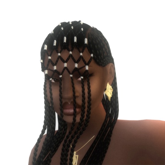
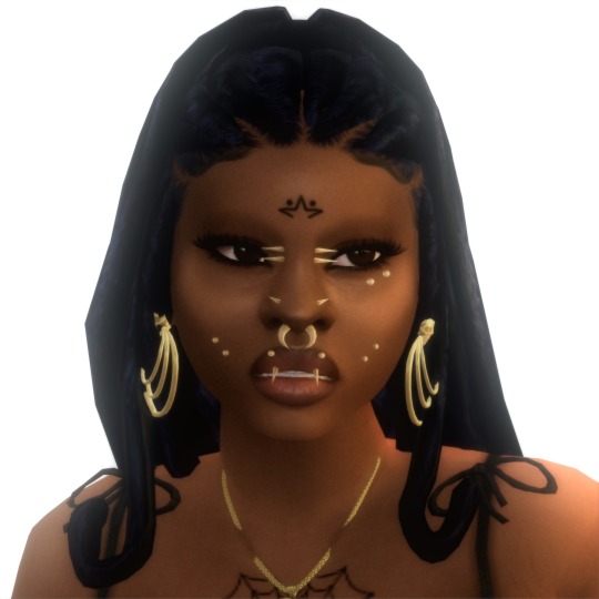
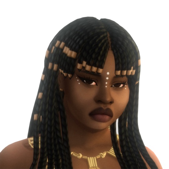
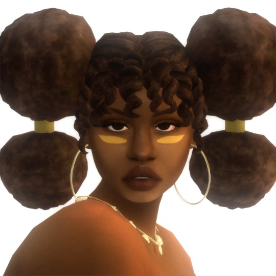
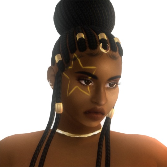
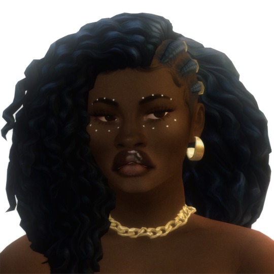
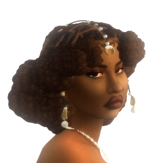
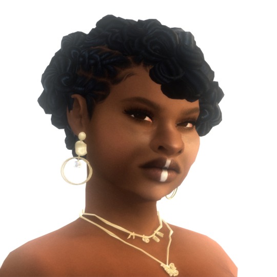
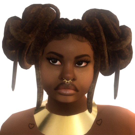
afrofuturism🪐
☆ one ~ solange hair by darknightt (tsr warning) ☆ two ~ loretta hair by @simtric ☆ three ~ bahati braids by @sheabuttyr ☆ four ~ isonoe hair by octetsica ☆ five ~ binah braids by @sheabuttyr ☆ six ~ cornrows & curls hair by @leeleesims1 ☆ seven ~ indie hair by @sashima ☆ eight ~ loc petals by @shespeakssimlish ☆ nine ~ mnemosyne hair by octetsica ☆
mini dedication essay to black simmers and ts4 creators below! pls read if you have the chance! <3
this edit is a small homage to afrofuturism and the various unique black hairstyles (and especially the black creators of most of these hairs) that i have downloaded and admired over the years! some of these are old and some of these are new.
to me, afrofuturism means constantly honoring/reclaiming/challenging the past while constantly creating/dreaming of a better society/world/future. a society/world/future that embraces and empowers all of our differences, ingenuity, aspirations, and unique lived/cultural experiences. a society/world/future that does not limit us through the various systems of marginalization and oppression (racism, homophobia, transphobia, fatphobia, sexism, xenophobia, ableism, classism, colorism, etc.) that often affects how we, as black people, live today.
blackness is so diverse and intricate yet it's always been a struggle to find my culture within a game that's known for being so limiting, bland, and extremely eurocentric when it comes to hairstyles, clothing, food traditions/events, etc. black simmers have always had to figure out how to make this game more inclusive and make it resemble either more like how our ancestors lived, how our current lives are, or how we would want our lives (and even our children's lives) to look like in the future no matter how dystopian the real world look and feel now. fortunately, these hairs and their uniqueness bring a huge sense of culture and style to this game. they have always inspired me and made me feel extremely proud to a part of the lovely african diaspora (and the ever-growing black simmer community).
in a way, being a black simmer and cc creator usually means that we are often digitally creating our own worlds as afrofuturists to varying degrees (whether we know it or not) every time we open our game, make our sims, make houses, and/or make black cultural cc. also, now i know that cc making is not easy to do and is extremely time-consuming so this post is also just me giving all black cc creators especially those who create for free their well-deserved flowers! here are some other black cc creators who created cc that have greatly impacted my game since i first started playing sims 4: @/leeleesims1 @/simtric @/hi-land @/yuyulie @/sims4bradshaw @/ebonixsims @/xmiramira @/sheabuttyr @/qwertysims @/oplerims @/sleepingsims @/shespeakssimlish and so many more im forgetting probably (im too shy rn to tag ppl but i greatly appreciate y’all fr i hope y’all telepathically get this message somehow 😭).
last but not least, i am hoping that this inspires somebody to keep creating or start creating regardless of what they think their skill level is! somebody will absolutely fall in love with your work and/or your art/work will 100% change someone's game forever <333
#ts4#sims 4#the sims 4#black simblr#black simmer#ts4 edit#🪐#🪐 black hair#soleil jones#xolani souza de oliveira#angela evans#leona morrison#chantelle diang#ayesha solomon#nylah rivers#nykhor chantelle diang#dove adeyemi#something to end black history month with!#i really hope my essay make sense 😭😭😭#i planned to this last year but hated the pictures i took so i scraped it and redid it#i couldn’t thank enough to all the black cc creators before me and hope to help/inspire new black cc creators 🙏🏾#this is also kinda the updated version of my for the culture post…i made sure to include some familiar (but updated) faces 😭☝🏾💗🙈
2K notes
·
View notes
Text
MYSTERIOUS GUARDIAN PODS: COMIC


mysterious guardian pod fanfic {please go read it !!}
big crazy gift for the silly green wolf boy , @neo91502 !!
boy is obsessed with pokemon lately but i realized i forgot to upload this so im doing it now before i forget again lalala
in short, i needed to do create a short comic assignment in order to practice more with greyscale / monochrome comic coloring styles since i lack any in my actual work due to difficulty seeing grey tones. yet i was struggling figuring a story with my own characters so i began to ponder... what if i did of my friend's ocs...?
AND SO MY BC IM OBSSED WITH SMG9 AND 10 I WENT AHEAD AND DREW THEM MUAHAHHAHA UGIHJVREDCSYGHJFE /HJ
i've shown and explained to neo concepts i've had when i first read the fic and even created a scenery concept for fun of smg9 in which i eventually used as reference for the comic huoifedch

{ bad quality bc discord decided to downgrade the quality and make them webp istfg i will murder whoever made that new decision like wtfreak bro WHY... }
i had concepts for when smg3 met smg10 too and used that for the comic too! overall i had such a positive experience and keeping the boy slowly updated as i worked on this throughout all month of february iohkjgedcs also an excuse to draw mario and smg4 teehee
now i go back to drawing more comics bye byeee
pspsps u should totally check out the other pieces of work i did of smg9 and 10 bc i love them so very much trust im so very normal about them i haven't like cried a baby thinkin of angst of them nooooooo /hj /silly
#tsb official#smg4#smg4 fanart#smg4 comic#smg4 ocs#smg9#smg10#smg4 mario#ah yes tumblr is a thing yes omg#college and my comic final is takin over my life i apologize for the inactivity guH....
238 notes
·
View notes
Text
DTIYS RESULTS!
Honestly this was super hard to decide 😭😭 I ended up adding more honorable mentions slots and I’m still tempted to add more cuz you all did rly rly amazing! I wanna thank all of you for participating this was a super fun experience, now, with that said...
In first place we have @carrotkicks with their absolutely stunning piece! :)

I fell head over heels for the composition its really really unique and it works wonderfully! Their colors were gorgeous and very well balanced, they rly took the prompt and made it their own and it worked wonders :)!
In second place we have @j11nko with this absolute banger of an art piece!

OOO where do i even start, the lighting i think takes the cake here, completely made it look like they were bathed in gold, made the ambiance of it rly rly stand out, Cins coloring style has a way to make things rly look more vibrant and it showed especially clearly here :)!
In third place we have @afraid-of-the-deep-sea with this piece that had me staring for a solid ten minutes straight

His use of texture and the symbolism was SPECTACULAR are you SEEING THIS IM SICKKK, once again a VERY unique piece that rly took ownership of the prompt, absolutely stunning, the colors were wonderfully vibrant and the whole thing has a way of sticking to you, amazing job
In fourth place we have @maractius with this beautiful piece right here

ARE YOU SEEING THAT USE OF COLORS OUGHH, the coloring and rendering is insanely good, and their expressions are soso strong, literally obsessed w this, the way theres not a single stretch of canvas that isn't occupied in some way without making it look cluttered is rly rly interesting and well done, and the subtle shift in perspective is just the final detail that makes this an insanely good piece
And finally in fifth place we have @candiedfright ! With this absolutely lovely piece

Ouuu this is so pretty 😭😭 the way they arranged the piece gave it a rly strong sense of depth, which in turn makes this piece feel like something ripped straight out of a movie, the way they handled shading only adding to it, SUCH a gorgeous job they did amazing
Now! Onto Honorable Mentions! :)
In honorable mentions we have @tedlebred s stunning piece

Are you seeing that RENDERING OMIFHE obsessed, i love the way they implemented the flower details in their hair and their decision on the change of the setting, turning the prompt into a photograph and making the text into part of that new setting was a super clever choice that rly made their piece stand out :)
We also have @spiderbends with this rly wonderfully soft piece!

The change in pose was so fun and so well done, that coupled with the change in expressions to ones much softer completely changes the vibe of the prompt and turns into something you could almost call playful! Taking the text from something confrontational to something teasing, rly rly lovely job!
Up next we have @seukorei with this lovely piece!

Once again we have a change in pose that works beautifully to change the tone of the prompt, the shading and the colors chosen give this piece an almost melancholic atmosphere that manages to also be incredibly soft, truly wonderful job once again :)
And for our final honorable mention we have @lotus-pear ! With this pretty number

THE POSEE, ouuu you guys r killing me w these pose changes! The new closeness of the two characters gives it a much more intimate vibe, coupled w their expressions it does a lovely job at emitting a sense of trust and comfortability between them thats just rly beautiful to see! Rly love job
Aaaand that abt wraps things up! I wanted to add more honorable mentions but i already added more than i was intending to 💔💔 choosing at all was rly rly hard
I wanna thank everyone once again for participating this was truly a rly nice experience and you guys did an amazing job! :)!!
394 notes
·
View notes
Note
What has been your favourite art piece you have drawn? And your favourite character u have drawn?
AUGH I LOVE THESE QUESTIONS BUT IM SO INDECISIVE SO IM GONNA SHOW SOME OF MY FAVORITE WORKS ACROSS DIFFERENT MEDIA

This was my first creature art for the roblox game i’m helping on called Legends of Pandora, and it taught me a LOT about how to translate colors into my style


This was my first ever painting commission, and was the first time i’ve ever used gold foil and textures for paintings. Unfortunately I kinda got scammed with it, but the experience was still pretty awesome. I think the final products still looks pretty great in their room too!

This is one of a whole group of sculptures I made for my senior show for highschool! I graduated last summer, and wanted to try something new so I decided to go all out. I did sculpts, felting, and some wire art, but this cheetah is by far my favorite.

THIS WAS MY FAVORITE ART TRADE IVE DONE SO FAR!! I pushed myself a LOT with this one, I made a rendered piece with a dynamic pose, I actually tried a background for once, I tried drawing water for once, I used layer modes like multiply and lighten and stuff, and I even used a noise screen for it! This was a fun challenge

These were from a batch of my first time using Ink and paintbrushes andAHHH I honestly loved it. If i had the money for my own supplies, I’d absolutely use this again!!

THIS WAS MY FIRST 3D ENVIRONMENT!! I MADE THIS TWO WEEKS AGO AND I AM VERY PROUD!! I modeled EVERYTHING! Except the water but I taught myself how to set up the nodes for it!
AAANNNDDD my favorite character will always be Piper or Bentley, who belong in the same universe but aren’t directly connected (Piper knows Bentleys brother instead) She’s a goofball and I adore her, and all of the characters I made around her, Bentley and Maddox. Here’s some art I found on my phone.


The last one is terrible quality but i have no clue how to find the magma page i drew it on so oops. If you click on it it helps!
Also also if you meant character as preexisting character from some sort of media haha oops, i ran out of image space. I don’t often draw characters, but it’s probably art of Hancock from Fallout, who I used to teach myself new shading methods. Can you tell I try a lot of weird/random things and end up getting happy with how they turn out?
#art#design#wings of fire#dragons#oc#uhh what else do i tag here#idk#ramble#art dump#painting#traditional art#digital art#blah blah#it’s midnight i should go to sleep#verrix speaks
50 notes
·
View notes
Note
I'm sorry if this is too personal but did you had/have any art trauma caused by art teachers in school? And by trauma I mean some aversion to try learning one thing, because art teacher was just a dick. I have something like that with shading and it still holds after 6 years as a adult and I want to break it, but I cannot force myself to try it again and this holds my proggres as a ,,artist" and that's make me smad. I'm sorry once again if this is too personal or too hard to answer
Yup I did! Tho idk if I can call it "trauma" tbh
Oop I kinda went on a rant sorry lol
I studied ceramics in uni but I did have nude art classes and classes that required detailed art projects.
Although most of my uni time was wasted thanks to covid, I did get harrassed by a few of my classmates and my teacher in my last year.
My classmate had said that my art level wasnt good enough to be in this uni and my teacher yelled at me in the middle of class for like a week or two because I refused his ideas for my projects (he had given me the ok on the design before he changed his mind 180 and started pointing and laughing at me with my classmates while i worked on my ceramic project)
I eventually had to give up resisting because I wanted to pass the class and let him do whatever he wanted. (He legit just put clay on top of my design, smoothed it out and that was it in fact here is the design he gave me the ok to, the middle of my project and the way he stopped me)
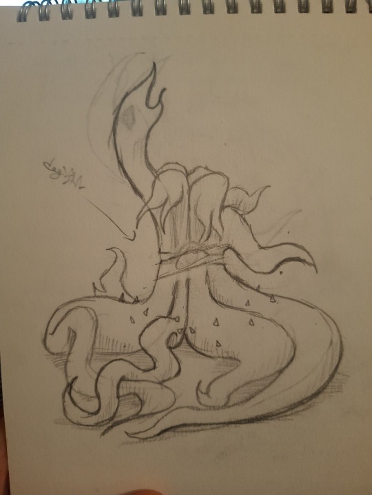
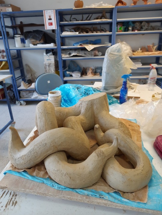
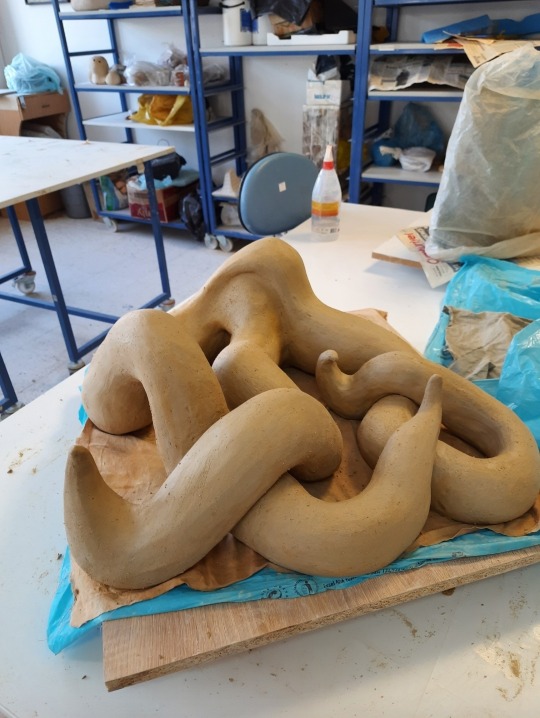
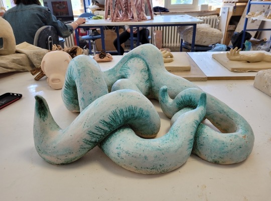
After this I basicly didnt do anything more for his class, minimum effort. My days in Uni weren't all bad thank god but I was extremely unmotivated.
After I graduated, I didnt really draw or create much until my love for drawing rekindled with Cult of The Lamb! I love this game and Narilamb too much lmao-
But as for something similar to your experience I would say that I used to play the bass and electro guitar in highschool and we had to perform one day which I chickened out from that resulted in the music teacher getting angry at me. I dont play the guitar anymore :/ But my love for music hasnt died and I am using my love for art diffrently!
I would say that even if certain experiences deviates you from some topics, branches of art or people, dont let it kill your whimsy and ideas. You can always try out diffrent things to find something fun like diffrent styles of drawing, shading or no shading, diffrent mediums like digital or traditional, new or old techniques, weird colors or designs. You can always try out whats popular to see if you like it or not as well. You can also consume a lot of art media, educational or entertainment.
There is so many creative things you can try out, you dont have to be stuck on the past and that one shading idea your teacher tried to teach you ır tried to force onto you. I think you can go back to it after trying out many diffrent things to see if it was the technique or the teacher that ruined it for you.
If it was the technique, there are many MANY diffrent ones that you can enjoy!
If it was the teacher, Im not a therapist so idk what would be the right thing to say but healing takes time, sometimes the things people say never leaves you and sometimes you forget it 5 minutes later. You are a person with the ability to change, learn and grow. The only thing that is in your way is your 'will'. If you are willing to change, even if takes a long time, you will change! But if you dont want to, then no one can force you.
Healing and moving on is hard but not impossible. Dont let an asshole teacher get in the way of your growth ❤️
42 notes
·
View notes
Text
Donkey Kong Bananza Talk: Kremlings & King K. Rool
Its about damn TIME, its been 11 years since a new entry in the DK Series and im THRILLED to see its taking the 'Mario Odyssey' route of Open world platformer experimenting with a new concept (I.E: Destructible environments).
Its unfortunate that Kremlings and by proxy, King K.Rool, are still absent as usual (Now more than ever would suit them well as a proper antagonist). Not to say I don't like the current cast of characters we can only assume are the bad guys (More Monkey=Good),But it always feels bittersweet every time the Kongs are fighting some more nondescript villains when there is a whole group of bad guys with built up context and lore right there! (Obviously the main reason is most likely them being tied up in Legal papers, Rare is with Microsoft, so its increasingly unlikely we'd see anything of K.Rool outside of his appearance in another Smash Bros game).
At the end of the day, More Donky Kong is what I like, regardless of weather or not Kremlings are involved...
However...
I noticed something interesting in the trailer for the recently announced Donkey Kong Bananza.
There is a consistent prevalence of these Crocodile lookin guys in the trailer. All of them are pretty blink-and-you'll-miss-it but its there. Call it Cope or something but it leaves the door open for Kremlings, or at least some 'Nintendo Owned Kremling-Like creatures'.
Ekzibit A.1

The first one we see is this stone statue guy, clearly some Croc vibes going on with the carvings.
Ekzibit A.2

The same stone guy, after the outer layer is shattered, revealing a gold skeleton with again, more croc features. Specifically the skull. It keeps its Club weapon even after the stone is shattered.
Ekzibit B

Another Stone Croc, made of a different matterial (Some sort of iridescent stone). this time in water and wielding a different (red) Club weapon.
Ekzibit C.1

More Crocs, this one lacking its Club, red in coloring, and covered in Spikes. DK uses the smaller enemy to break its outer shell rather than a basic attack.
Ekzibit C.2

Another Golden skeleton with Croc features, It also shows that the outer shell is made up of wood based on the shape of shrapnel resembling that of Woodchips in texture.
Ekzibit D

A Very large Totem Pole esque statue of multiple different Crocodile stacked on top of the another. Each layer a different material (Bottom:Clay or soft stone, Middle: An iridescent Stone, and Top: A Matte metal).
It wields an equally as large club/mace and has several of the golden skeletal limbs sticking out to facilitate movement.
Ekzibit E

A large group of Stone Crocodiles lined up behind what is assumed to be the Bad Guys of the game. The flying enemy in the back doesn't seem to match the 'Crocodile style' of earthenware.
Konclusion
Theres something to do with Crocodile like creatures in this game, weather or not they're proper Kremlings is 100% Speculation considering we only have two and a half minutes of footage to work with, and they wouldn't show off everything in one go.
My Crackpot theory is that these are some Dead Kremlings that have been 'resurrekted' from the dead by vengeful spirit 'Nekromancer Von Rool' Uncovered and dug up by the mining operations of Ingot Isle, they seek revenge for the disturbance of their resting place.
My Source for this theory? Any sort of backing evidence?.. None, I made it the fuck up. it would be SO FUCKING COOL!
Thank you for listening to my Ted Talk
#donkey kong#nintendo#dk#dkc#Donkey Kong Bananza#kremlings#k. rool#king k. rool#theory#Bad Theory#Please See my Vision#Im crying and throwing up
18 notes
·
View notes
Text

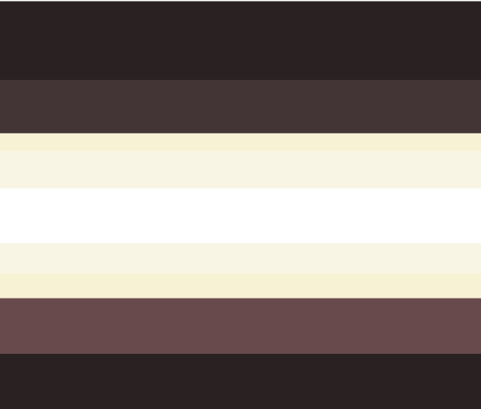

Actorgenic - is a system… a. …which one of origins can form due to creating new prsonality, "being" and non-existing person, impersonating, faking identityy+more b. …who faked having "different personalities" "different identtities", not really same as faking being a system! This can be caused by havingn o knowledge what is a system termin are c. …failed tulpamancy which turned into traumagenic system due to specific reasons d. …system who likes wrong terms like "personalities", "alter-ego" instead of alter, headmates. Probably its host which arent respecting their headmates e. etc simmiliar to this above
Actorgenic systems does not have amnesia(only emotional) or have but specific types of it and simmiliar to median system, fakegenic system or impostergenic system by description and meaning, not same experience and origins Oftenly these systems can have currently fronting headmate confused who are they, thinking they are host or main fronter and etc Or host, who is mimic, actor, chameleon or etc role and likes to pretending being other alter and others situaitons which can leadto situation where fornetr is confused who are they and they believes they are THIS alter Or others situations, thats can confuse the system Hosts of these systems dont mind their alters being called one of their personalities athought their headmates would mind, sometimes they are really believes that they are one of their headmates or confused who are fronting right now actorgenic can be traumagenic or endogenic system or both and can also be shortly described plural singlet, not same as median system! They have really chaotic relationships between host/main fronter and headmates and more problems
termin coined by me, flag by me i cant find anything that can describe one of my system origins or multiple possible origins for us, this is probably my personal experience btw some definitions are simmiliar to describe us but can not fully describe us, i just made it easier to portray and just add simmiliar definitions and its still can confuse some can fall under many definitions
colors and term name meaning the first concept is og and it whats first became in my head but then after designing i realised it almost looks like existing flag of gender identity the second i tried to remake, prbly nothing rly changed but i cant really judge this colros is what i associate actors with idk i also have red stripes version the symbol is a moon phases ik its bad prbly at first i wanetd to do mask, but i couldnt find idea for "face" and it would show wrong the symbol, then decided to do without "face" and it looked like shield. i also wanetd to make as "time" and then i made moon+mask version, still not what i wnated symbolize And it wast eh reason why moon phases, the moon symbolise "same, but different" and moon phases are really connected with most of cultures, the new moon and half moon, for example, are same for earth, but not for people beliefs, "same for myself, different for others" its dont really related to real actors and theatre, also dont related to actors(as role for some systems alters)
while writing this i got many problems with having any style and decided to dont tell our whole experience at all :f
btw it happened long time ago and im SURE its one of my reason why my system is formed im traumagenic nondisrodered system also , i have traumas which i dont rememebr(parenst told me)+some traumas i remember
#system#flag#plural#microlabel#endo safe#plural system#plurality#actually plural#pluralgang#plural community#multiplicity#system stuff#traumagenic#term#micorlabel#coined term
20 notes
·
View notes
Note
Do you have any headcanons for Kickinchicken x Female reader (Cartoon & Big Bodies)?
(I'm CRAVING more KC x Reader hcs) (there aren't enough and it makes me sad )
AAAAAAAAA its been a while since ive had any thought about kickinchicken, and sadly, ive gotten over him now😭 (a long time ago, actually) But i know u guys love him sm more than i do so I'll give him some thoughts. Note: some previous posted headcanons that i had while i was brainrotting with poppy playtime might repeat here, but im too lazy to go back and check on that post so here ya go. [Those 'x reader's i made might have a mention on this too] i might refer the reader as "you" or "her" but either way, its the same lol, idk why i keep switching povs T-T
KickinChicken x Fem!Reader headcanons!
Cartoon version:
[Imagine: Reader is any animal you like. The Smiling Critters is a show and all the times you are living is when a child is watching you on-screen]
Kickin often ruffles/pats reader's fur/feathers/head whenever the reader successfully did something
Kickin instinctively goes to the reader's side whenever the critters are preparing to [inhale catnap's bad breathe] sleep
The reader is sometimes the storyteller of the group during sleepovers. Kickin lays on his stomach, rests his chin on both of his palms and watches you read with dreamy eyes
Kickin is prolly the most flirty and pun enjoyer of the group. If someone actually had a counter against his flirt, he would be flabbergasted. You did this more than thrice in the show (dw, these are all child-friendly flirts)
Catnap sometimes fights you whenever you want to tell a story while Catnap wants to make the othe critters sleep. Kickin cheers at you and says "Fight! Fight! Fight! Go y/n, go!" Which makes the situation worse (he receives numerous bombastic side eyes) Dogday and Hoppy interrupts tho
You and kickin are the most sarcastic couple duo of the group. He makes you laugh, you make him laugh, "Ew. You guys are making us cringe" says hoppy. Others nodded in agreement.
Dogday is your best man and woman in a wedding episode "Wait, when did that hap--" (pickypiggy)
S i d e w a l k r u l e 👑 (also applies to episodes with dangerous adventures)
You guys share each other's food. And sometimes with Pickypiggy if you two didnt have any food with you
When you guys are chilling, he likes to nestle beside you, bird style✨ He also loves the cuddles and pats you give him (and your attention too, he's an attention seeker)
Despite his confident and brave attitude, he is actually the first one to cower and run whenever the group faces danger, but when you're with him, he pauses from running and decides to shield you from danger (which is most often a boulder in one of the smiling critters' adventures) you get squished, tom and jerry style
His blanket is (your favorite color x color and pendant shape) while yours is yellow with red star pattern
He likes to show off along with his "shades of coolness" that he brings out magically from his 'pocket'. (Typical cartoon character) You match him with your own (favorite shape) shades
Kickin once asked a commission for Crafty to draw you and him together under a tree. The unicorn bought new crayons with over 100 after that
Bigger Bodies version:
[Imagine: reader is the player. Depends on you whether the player/reader is an ex-employee, an orphan that was adopted til adulthood, or random person wandering.
KickinChicken breathes Yellow Smoke, which can calm down any living thing nearby; children, adults, and the reader. It also has a dreamscape-like effect (like what Catnap did in the game). For the BBI experiments and living toys tho, it will slow them down as if the smoke has a "freezing" effect. Some will sleep when theyre weak enough, but this smoke cannot completely combat CatNap's red smoke.
BBI KC (this will be what i will refer him to as to not to be confused with the cartoon one) doesn't like it when the reader goes out on her own
If you chose the reader/player to be an ex-employee; BBI KC will recognize her as the caretaker who showed genuine care to him even as an experiment. As a result, he has a small childish crush on her but set it aside because of survival. (He still has it tho)
If you chose the reader/player to be an orphan; BBI KC will recognize you as one of his old playmates when he was still "alive". He was very protective of you after you encountered him in the factory.
If you chose the reader/player to be a random explorer; he spared you and took interest in your offer to bring him to the outside world. He admired your determination to go back home alive and your luck to deal with the shittiest toy factory in the world. You two worked together to solve puzzles and activate the power switches etc.
When the two of you got outside of a building, you took the opportunity to fly with BBI KC and explored every bit of PlayCare (specifically, after BBI Dogday's chase sequence) You loved grabbing on BBI KC' s talons as he flew up. You had the impulsive thought of leaving it all behind by flying up to the entrance of the cable car but Ollie called before you can even tell BBI KC to do so.
When BBI KC rests, you snuggle up to his chest and he chirps in a hoarse voice. He will also exhale some yellow smoke to prevent enemies from getting closer.
He tries his best to be with you at every second but there are times when he cant (like sneaking into vents or the School)
He hugs you with his wings to keep you warm.
Whenever you're scared, BBI KC always says pleasant things to boost your confidence up. He doesnt like it when y/n shakes in fear.
He got extremely violent with CatNap. Especially that one time when he was about to eat your head.
He has bird instincts to pick up random stuff and pile it near you whenever you're at rest. (he's like building a nest)
If there was food in the game, BBI KC wouldve gotten you lots of it.
He likes playing with your grabpack and often high-fives with you whenever you two activated a generator
He hates ollie the moment interruptor
Uhh i think thats all for my hc lol, hope u enjoy it even tho its kindaaa not really good but not that bad either
#poppy playtime#poppy playtime chapter 3#kickinchicken#smiling critters#headcanons#siren screams#kickinchicken x reader#x reader
48 notes
·
View notes
Text
Arcane Episode 6 Immediate Thoughts
Spoilers
-Give me the doomed Jayvik content, I'm ready. Jayce is an off the wall murderer hell bent on destroying Arcane and Viktor is the new Herald of the Arcane.
-Viktor is a full on magical girl transformation dimension. The floating and glowing, start patterns, glowing hair.
-Huh
-So Viktor is straight up God?
-This Caitlyn training scene is dope
-OOOH they're gonna go to Viktor to cure Vander. Thats a cool way to tie all these stories together. I wonder if any of them will recognize Viktor. Did Caitlyn or Jayce tell Vi about him?
-Look at Jinx's face, she does not give a fuck about Vi and Hucks stand off.
-Man the council didn't know shit, Viktor should have been in charge this whole time.
-Man Jayce is gonna show up and destroy it. 🥺
-HAHAHAHAHA VIKTOR IS SO JESUS, the long hair, the robe, the staff.
-Viktor has his original eye color in the Hexcore universe.
-cookie
-Even Jinx knows Viktor is a straight up snack.
-Fortune cookies are canon? What Americanized Chinese food restaraunt is Jinx going to? Is there a Panda Express in Zaun?
-Viktors Steel Oasis is realized
-Oh hey it's the kind of plant that he experimented on the hexcore with
-So is this real Sky and we were all wrong in thinking the Hexcore was just using her image?
-Does this take several days? How long is it taking Jayce to come to the undercity? He seemed in a hurry when we last saw him.
-I don't care if these animatic style visuals are the result of a mismanaged budget. Arcane's 2d music video style visuals are so good when you aren't being told they are just for cost saving.
-"We"
-This is nice, this is what I wanted for Thor and Loki
-Singed has a Vander tracking compass. Like the Vampire compass in Vampire Diaries.
-Does Caitlyn know the Herald is Viktor? How will she react?
-Ooh the Singed-Viktor reunion!
-Why is Viktors voice more metallic than before?
-"Evolution has a destination" I mean technically no, you're a scientist Viktor c'mon. Thats a common misconception.
-GLORIOUS EVOLUTION MENTIONED
-And he had the voice distortion when he said it, this is the desire of the Hexcore not of him?
-Is Viktor dating a ghost?
-OH DAMN, the Caitvi reunion is a violent one. Not looking good for the Caitvi stans, or the future of this ship. They're doing a Catradora.
-Caitlyn is a dictator who is offended by being called a mongoose, and by her ex-gfs new style. Be glad she didn't get bangs Caitlyn.
-"Cupcake"
-Ambessa eating an entire raw meat hunk with her hands.
-Oh damn, the betrayal.
-HOLY SHIT JAYCE, ITS HAPPENING, IM NOT READY!
-The music, is this the start of the inevitable end of a three episode arc music montage fight scene that cuts between the plot points while a pop-rock song plays?
-SPIT ON HER
-Oh no, this is the sweet conversation that happens to make everything happy so they can rip it away by killing one of the characters isn't it? Is Isha gonna die soon?
-OH, the Caitvi reveal! Caitlyn did a good! Nice. All it took was to be in her ex-gfs presence one more time and she completely flipped. Poor Maddie.
-The blind fold is kinda kinky tbh
-is Caitlyn gonna see Jayce? Will they talk? Has Caitlyn seen Viktor?
-Now Jayce has a leg brace, my how the turn tables. I little ableist maybe that a leg brace is used to show who is powerless in the dynamic but still.
-I wish we knew more about what Jayce went through, or how long the time skip is, to have context. C'mon writers what was it?
-Once again Jayce is about to nuke a child with the Hex Hammer
-Is Jayce gonna come be healed?!
-The come to Jesus music when he goes to meet Viktor.
-Viktor is the Avatar, or a Jedi
-Caitlyn will be saved by Jinx! Will this cause another snap change in her alignment. Who knows!
-Its honestly shocking this is the first time someone has tried just grabbing her uber long hair in a fight.
-JAYCE NUKED VIKTOR!
-IS HE DEAD! MY BLORBO! JAYCE YOU BITCH!
-UNREAL
-Vander is crying lava?
-No Viktor Jayce is the reason your commune failed.
-Jinx crying on the floor after being struck by a loved one like when she was a child.
-Aw this is cute
-Isha better not die, don't you dare show. Don't you DARE.
-They did!
-They killed Viktor and Isha in one episode, Now Caitlyn is just chill with both Vi and Jinx, why. Awful. How dare they. First genuinely bad episode.
Final thoughts: AAAAAAAAAH! I'm actually mad. They killed Isha, they killed Viktor. Both in dumb and unnessecary ways. Jayce's motivations have not been explored in any depth or meaningful way this season which would justify the story move. I was fully ready to call this a flawed but good show till the second half of this episode. I think this arc release will genuinely divide the fandom. Beginning of the end. Oof. Sorry boys. Arcane is Fumbled.
Let me in the writers room, I just wanna talk.
#arcane#arcane league of legends#viktor arcane#jayce talis#arcane season 2#arcane spoilers#arcane jinx#vi arcane#arcane jayce#arcane season two#arcane series#arcane season one#arcane discussion#Serious how dare they#Viktor better be revealed to be alive#The disrespect#He is a Lore character in league and this is a prequel#how could they kill him#he never even looked like his pony toy =(#Ok maybe this is just before he turns fully machine#but still.
25 notes
·
View notes
Text
So i ve done the main story in infinity nikki and im gonna stop playin now, before i squeeze the game dry of content and have nothing (new) to do on release.
Time for a lil review/thoughts post
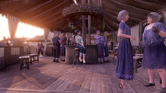
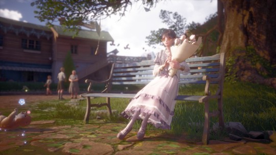
I m not gonna review every single mechanic in the game, simply things that stood out to me or that i wanna talk about. I also wont add more images, i kinda want ppl to see the world for themselves... i ll share more when the game comes out tho.
There s a lot of text under this. Tldr, i like the game i think it's a solid, enjoyable experience with a good gameplay loop, the story isn't for me, and i'll keep playin of course. And u should try it too if ur device wont blow itself up tryin to run it.
Dress up
The bread and butter of Nikki games... it's good as usual. Game doesn't shy away from long skirts or coat tails or complicated ballgowns just cuz nikki can run and jump and dash now and i'm very happy bout that. There's some clipping issues once in a while, but it's nothing major and the clothes we do have in the game are lovely. There s an evolution system for some of the sets, which makes em a diff color.... usually they can evolve once, but i saw Three extra evolutions for one of the UR sets and that scares me. Bcs to evolve them u have to craft the suit again. So u have to pull 4 copies of a suit to max it out..
Combat
Game's definitely succeeding in its quest for being cozy. There's no real stakes, combat isn't difficult in the slightest but i do welcome it- super simple but it's pretty fun regardless. The boss fights were surprisingly creative and fun for what they are, it's just unfortunate that you have to do them more than once or twice (crafting mats)- but they do change what the boss does so it's different depending on what mat u are farming for... and u can claim double or triple or however much stamina u got-le of the mat after u complete it once. So that s rly nice.
Exploration
I actually think it's really really good. Again this isn't a difficult or complicated game, not yet i guess... but with the major goal being "get new clothes" and "take pretty pictures maybe", the open world feels actively engaging to participate in. There's collectibles everywhere, little challenges you can do that are diverse but quick, styling battles, collecting everythin from animals fur to bugs to fish, and allll of this brings u closer to that never ending goal of woo more clothes.
However even if a challenge doesnt give you a blueprint, it's still just. Really Nice to exist in this world. It's very whimsical, as expected of Lilith, and the world has a combination of realism and cartoon artstyle that is just soso appealing to me. It's genuinely how i would've imagined miraland to look in 3d. Shame it's not the same miraland we know..
Story
Hmm... silly is one word i could use for it. Cute also. The story isn't doin anythin bad per se, and i did start skippin dialogue near the end w the pieceys because i want to keep at least Some part of the story for the game's release... but i get the gist of it, and it s just not my thing.
It feels like a story made for children, and it definitely would get a G rating. Easy and simple to follow, there's moments of tension or sadness sure but with the antagonist bein a literal babie lookin cutey fairy with a grown man's voice, or the creatures that i'm interacting with are a bunch of. Fuckin weird lookin big eyed balls of fabric that look closer to plushies than somethin Alive... it's all so silly and dramatic sometimes i can t help but cringe.
Part of it is a me problem, if u just open ur heart and free urself from the cringe the story is fine. It's just a little too kiddy for me and i so desperately hope it won't stay like this forever. My prayers might be answered though, there's a whole war beyond the borders and we have refugees around... shit's lookin bad for Umbrosa.
Other things i noticed that i liked:
The effect on nikki's skin when it's raining, she actually has water dripping down her face... its so cool
Momo capes are actually kinda neat ngl. Especially cuz the fucker follows u around everywhere, at least i can bedazzle him
Npc models look really good im a fan. They do suffer from "everyone is very beautiful" syndrome, which makes some of the npc villains look/sound ridiculous, but they have kid-teen-adult-elderly versions of models (i never see teen models in these games! Its cool!) And some body variation. The grandmas look so lovely i cry
The dark skin tone is really dark, and it looks quite nice and natural.
The lighting engine in this game is just rly good in general. God bless UE5
The edges of the map where there s forest, which u obv cant go thru, the forest is made to be darker, thicker.... i m a huge fan of this idk y. It's not just *invisible wall in front of an open field* nopee cant go there lets explore that area later tee hee. And it looks good to boot.
Camera function is p robust, has more options for changin brightness/saturation/contrast etc which i feel Shining Nikki lacks.
Some of the creature designs are so good man i looove themm <3.... the pieces are awful tho. Ok creature design is a hit and miss sometimes but the stray hatty? Peak. All the weirdy fashionable animals? Peak.
Bein able to quick switch thru ur saved sets while in the overworld is real neat
Oke that was it. Bye
#infinity nikki#if i was a reviewer i d put more effort into the presentation of this game but#im not and its 4 am so
25 notes
·
View notes
Note
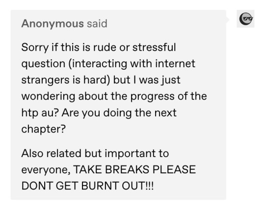
I was wondering if you had an estimated date of when you will post the next HTP chapter?
Like, leaving us on such a cliffhanger must be a crime! It cant be legal!
Anyways, while I wait for it, Ive decided to copy paste every chapter into a doc and mark it up color code style for all my over analyzing needs. It took me an hour but it was worth it.
Have a good week and take care :)
(This is meant to be genuine, not mean or passive aggressive, just so you know. While I indeed am anxiously awaiting Chapter 10 by highlighting the chapters on a doc like that one photo of a bible page that’s highlighted with different colors. This isn’t meant to be mean or pressuring, take your time and take care of yourself)
⬆️(Ah poo, Im an over thinker
hey there, no worries y’all- i love seeing my reader’s enthusiasm and it’s reassuring to see continued interest in the series. i’d been hoping to have BOTH of the final ‘from eden’ chapters done before summer. but i have to admit, progress on the next chapter hasn’t been as forthcoming as i’d expected, for a couple reasons.
the first is health-related. not to be too TMI, but i recently got diagnosed with crohn’s disease. my symptoms started ages ago but have really ramped up in the last couple months, and the diagnosis was a lengthy and involved process (started the hunt back in november, presumptively diagnosed after a colonoscopy in feb, definitively diagnosed when biopsies came back over spring break) and even when i was simply waiting for results, it occupied a lot of my mental capacity. and ofc it happened to line up with me turning 26 and needing new insurance, which has caused lots of delays. anyone dealing with the american health care system while chronically ill will tell you it’s a frustrating, exhausting process. as of right now, i’m still waiting to start treatment 🫠
but honestly, even more than that, the biggest thing stopping me from writing is… me? 😂 so there’s this thing that happens after i post a chapter that’s like… decision paralysis? except it’s just that sometimes, i literally can’t bring myself to start the next chapter. it’s like, i have this unfounded fear that all my writing up until this point has been some magical fluke out of my control, and i’m not capable of ‘pulling it off’ again. i guess you could call it a form of imposter syndrome (which i already encounter enough in my vet school life). it gets worse after posting something that was a particularly massive undertaking or was insanely well-received bc i’m scared i won’t be able to top it- even though the impact of storytelling is supposed to be cohesive, and it’s unrealistic for every chapter to be ‘bigger and better’ (what does that even mean?) than the last one because they serve different purposes at different points in the story. i know this, rationally, but that doesn’t stop the irrational fear of failure from making me avoid writing.
i’m not sharing this to make excuses or garner sympathy, or fish for compliments, and certainly not to make anyone feel guilty for asking about updates. i just feel like maybe this will resonate with anyone who has the same experience. and also to share hope, because despite how often this feeling rears its ugly head, i’ve still been able to push through and get back to writing- and i’m always very happy with the result. sometimes it just takes longer than i’d like (pro tip: writing on ur phone is less intimidating, tho it’s more of a pain). but in any case, the next chapter of ‘from eden’ is well underway and i still hope to have the series done before summer’s end^^
#hels to pay au#HTP ask#wow that’s WAY more rambling abt my personal life than i typically do#but NEVER FEAR i wouldn’t leave y’all on that cliffhanger forEVER i’m not THAT cruel <3
59 notes
·
View notes