#im trying out new art technique !!!
Explore tagged Tumblr posts
Visit Tumblr Blog
Explore Tumblr blogs with no restrictions, modern design and the best experience.
Last Seen Tumblr Blogs


Fun Fact
If you dial 1-866-584-6757, you can leave an audio post for your followers.
Note
love scrolling through your blog like it's the daily newspaper thank you for your services
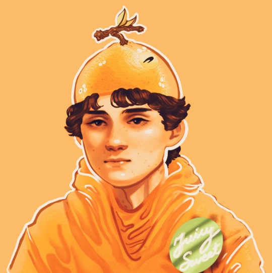
Thank you so much for your support have this fruity twink as a token of my appreciation
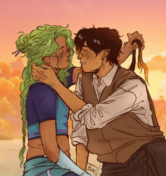
#this started out as a study bc oscar has the hardest face to draw right next to charles for me#he's got very subtle but very important little facial features that i just can't seem to get right#I'll keep trying tho bc i wanna do more carcar#my art#asks#oscar piastri#digital fanart#op81#formula 1#f1#mclaren#this will probably flop like the last one but im trying a new coloring technique so I'll keep experimenting
240 notes
·
View notes
Text
Sneak peek update on the thing i said I was working on like a month ago,
(I got a little busy but its okay (im still busy))
#theres a lot wrong with this but like.....#ive come so far 💔#plus im trying. a new technique#ALSO IGNORE HOW ROUGH MOST OF IT LOOKS#ILL SMOOTH IT OUT LAYER I PROMISE#gt#g/t#giant/tiny#art#sfw g/t#doodle#size difference#gt artist#my ocs#my oc art#wip#animation#oc animation#oc animatic#g/t animation#g/t ocs#gt ocs#gt oc#giant#tiny#oc: jone#oc: randall
176 notes
·
View notes
Text
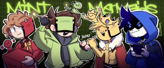
that pb was super fun to watch, doodled my favorite team again
#they are all fruitberries :]#yeah im trying a new shading technique :D#and it turned out pretty ok#mcyt#mcyt fanart#fruitberries#fruitberries fanart#princezam#princezam fanart#wolfeei#wolfeei fanart#sneegsnag#sneegsnag fanart#pandora's box#pandora's box fanart#art#artists on tumblr#minecraft#hbg#hbg fanart#mcsr#lifesteal fanart#lifesteal#lifesteal smp#lssmp#llifesteal fanart#mcytblr#mcytumblr
226 notes
·
View notes
Text
where would we be without old man yaoi
#genshin impact#genshin#zhongli#baizhu#zhongzhu#YEAHHH YEAH YEAH#im ill about them. insane in the head#trying out some new coloring and 'rendering' techniques... hope its as cunty as i think it is#about to get better at art drawing these hags lol#my art
1K notes
·
View notes
Text
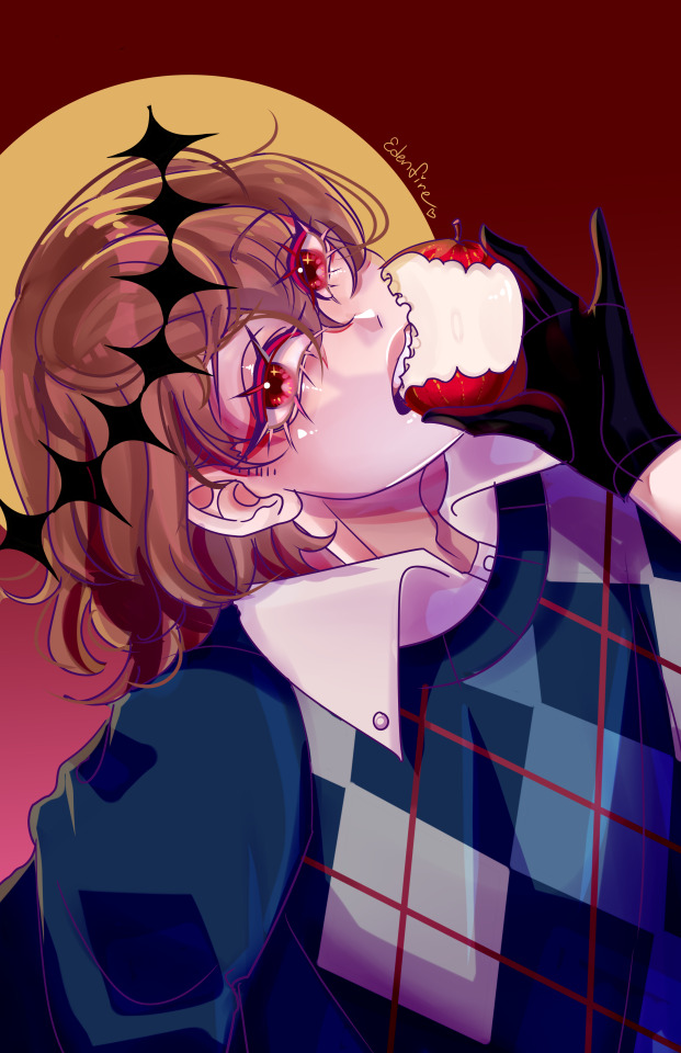
✨️🌟 he is looking at akira 🌟✨️
been working on various projects and I've been missing my boy;;;; so ofc I had to doodle up something quick for him🥰💗💞
also just assume that every piece of art I create includes implied shuake lol
#implied#shuake#goro akechi#persona 5#p5#idk why i keep drawing goro with apples lol#something about religious imagery and sin#also theyre red#i was trying out some new techniques and im not sure how i like them;;#idk how i feel abt how this turned out tbh#also if you get the reference in the caption im kissing you rn#♡♡♡♡♡♡♡♡#shitty#(< that's my art tag)
76 notes
·
View notes
Text

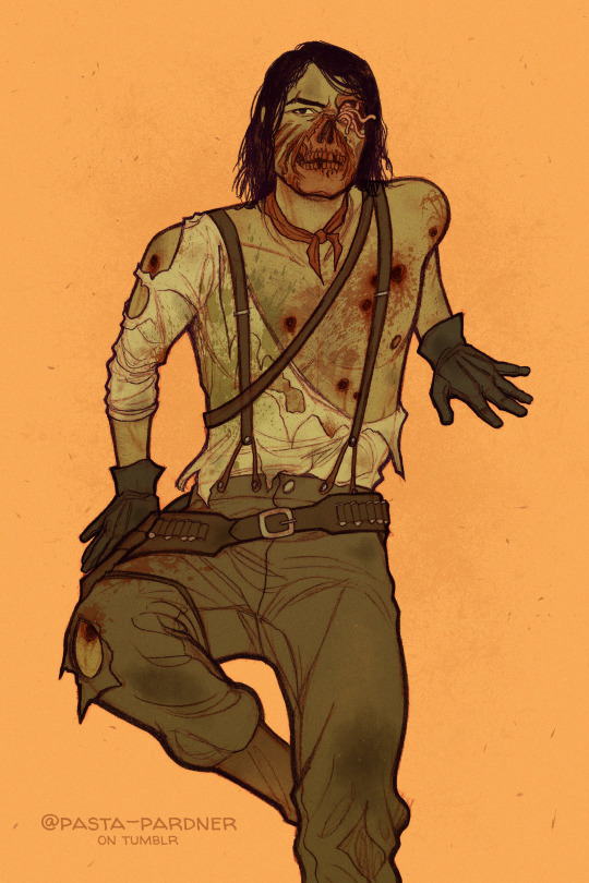
undead nightmare pinups
#john marston#red dead redemption#red dead redemption: undead nightmare#red dead#jawnbie tag#artner#rdr:un#its that time of year again! i gotta draw jawnbie content#(im still soooo hung up on the lack of fan content for a non-canonical zombie dlc that came out over a decade ago. sue me.)#some pinups bc lately I've been trying to improve my anatomy skills#and also bc if i dont sexualize this man.. who will??#he is my handsome hunk of swiss cheese.#if ur expecting me to be consistent in the way i draw him and his gore... dont. lol.#looking back at this im realizing i forgot to add a few of the injuries i put on jawnbie in previous drawings#and we're just gonna roll with that#enjoy! as always: comments are appreciated#bc i spent a lot of time on this and im trying out some new art techniques#ask to tag#art#🤠#howdy halloween#pardner posts
215 notes
·
View notes
Text

made it another year!
#happy birthday to me!#im 22 now!#wanted to try out some new coloring techniques#blacked out#woke up to this#and i am NOT complaining#oc#art#originalcharacter#originalartwork#sketch#character design#self portrait#birthday art
201 notes
·
View notes
Text

I adore them still
#magpod#the magnus archives#oliver banks#mike crew#tma#terminal velocity#i was trying out a new technique im a little nervous about it oof#my art
34 notes
·
View notes
Text

(oc) winds
#*fighting through my sleepiness to make this BHJERFHJEBRF#im trying out new art technique !!!#and decided to draw my oc boy 🥺🥺🥺#who i missed dearly#Sorry that its not any fandom related thing !!!#but i needed to self indulge (non-pink self indulgence) after the hard week i've had BJHBHERFBHJERF#i cant wait to rest omg....#orpheus gray (oc)#ocs#my ocs#original characters#my original characters#art#mine#my art#orphy my beloved.....#im sorry baby i need to draw u even more often ur gorgeous....
28 notes
·
View notes
Text
the final commission in the set for @tsotc of the lovely couple Cyrus (he/him) and Phitsamai Wongsuwan (sy/hyr / she /her) ! first time in all my couch-drawing years drawing a chaise lounge [poses]
#ffxiv#fanart#commission#i was admittedly fighting for my life over those scallopped ruffles cause i was trying a new technique#but they came out better than i imagined so i am very excited about that aspect#also every time i make a big piece of art im always scanning my eyes for where in a small tucked away corner did i forget a specific spot#whether it be for details or coloring cause it feels like i always forget Something even if its super minute#but i think theres nothing here. a first for my tiny eye behavior#gotta be like top 3 commissions ive done thouhgh cause i got to draw flowers a couch ruffles AND love? the rylan package...
16 notes
·
View notes
Text
i know the year isnt over but im already trying to figure out what my new years resolutions should be so I can plan. and actually do them (I did nottt do them all this year and ik like 2 of them were unrealistic but it makes me Sad) now that I have a car which was kind of my Big One for this year. i found a place in town that has sewing/clothes making classes and ive always wanted a sewing machine but also hesitated buying one bc what if I do it wrong and Break It and i spent So Much money on it :( they also offer art classes and ive never taken formal classes so...I might perhaps...look into that tomorrow more (they dont have prices on the website so id have to stop and ask so i know how much to save + if they would be willing to teach me on whatever machine I end up buying, or if they have ones there, but i do want to buy one at some point, maybe as an xmas gift or bday for myself) I think that would be a really cool thing to try !!
#i HAVE made clothes before/customized them but hand sewing takes SOOO LONG#also for the actual art classes..i mean stuff like Painting Painting#i will probably never be able to afford college but cute lil local classes? could be fun...and i could learn new techniques like#Classic Real painting stuff...ooo i want to...but im also kind of anxious abt it#i mean right now i am trying realllllly hard to distract myself im so anxious i could throw up but thats the American El*ction experience#unrelated to my thoughts abt fun classes. but like. truly#i cant even just go to sleep and stop worrying abt it bc im working late#bc i was out all morning and then napped when i got home :( im forcing myself not to check results every 2 seconds. hate it here truly#sanchoyorambles
1 note
·
View note
Text
Drawing Likeness: with Tem!
okaay since a few people actually showed interest in me sharing a bit of what I've been doing to figure out how to really capture likeness, specifically Temuera Morrison, I figured id do my best to write it out
I am also going to entice you with some of my recent clone art! (oooh some of it is unreleaaasedd)


I am putting the whole thing under the cut because I have a feeling its going to be long:
Read more!!!
a couple disclaimers before we start
-This is not some definite post about how everyone should be drawing clones, nor is it in any way claiming that this is the right way. This is just my musings as I stare at a mans face for way too long and try to replicate it
-I am inexperienced. As kind as you all are to me, drawing real people is relatively new to me, capturing a persons identity through their features is difficult for anybody, and I am no different. I have watched many a video on likeness and had my share of classes, but If im being honest, i rarely put it into practice successfully. So there'll probably be errors in this post or things i will come back to in a few months and wish I had said/done differently
ANYWAYs you guys get my vibe im just here to ramble and today we are rambling about mr copy paste. I am doing this for Law, my clone boy, because I plan on delving further into oc fanart and I want to put effort into representing him correctly!
SO LETS BEGIN
Before even deciding what specific pose of a person I want to draw, I tend to grab a bunch of references and compile them like so

(all of these can be found on my pinterest)
Why so many? Well, we are about to delve into facial features, so when we are dealing with photos we have to take into account that there are an abundance of circumstances that will influence how a persons face will appear, some of these include:
focal length: All of these are taken on different devices, and focal length can play a big part in distorting faces
age will play a part, your face changes a bunch throughout your life!
lighting, while not as major, can muddy the waters and make it difficult to interpret facial planes and features
SO, to make sure we get a proper grasp of what's really going on, I like to make sure we have lots of options to compare and contrast with.
Next up! What I like to do is block out the main facial features with colour on different layers, the features I block out usually are the general face shape, eyebrows, eyes, nose and lips. But what you are looking for is the defining features of a person, so that could include other things! Maybe a scar, or some particularly prominent cheekbones.

I dont have any rhyme or reason when it comes to picking my colours, all that matters is you can see all the shapes clearly.
Now I may be biased, because Ive been staring at these for 4 hours, but notice how it still looks like Tem? :D
Anyways, now we can break these parts down, and you'll see what I mean about compare and contrast:

We'll start with isolating the facial shape, putting all these next to eachother you'll notice they arent exactly the same (partly because of my shoddy work) But the distinguishing features run through each shape! Namely the very soft rectangular shape I sketched out in the bottom right there. Along with his soft, wide jaw structure.
I did the same for the rest of his features!


You'll notice I highlight the prominent shapes and ratios,
When drawing anything, it is important to start from the very base shapes and build up.
When drawing something you want to look like someone, those shapes relative to other shapes is what makes it look like them.

I didnt use the same technique with his eyes and lips, but I wrote out some helpful info for them! More importantly for his eyes.
When drawing eyes, I find the most important part is where exactly I draw the creases, (along with the overall shape of the eye itself) it is important to understand where those will present themselves with hooded eyes.
NOW, with an understanding of his facial features in place, lets take a detour to colours:
before I start, a couple things to note:
-Temuera morrison versus the clone troopers in the animated shows:
While I love the animated shows they don't exactly stay close to their source material. Im going to link here to an excellent post discussing whitewashing specifically in relation to the clones.
Temuera is Māori, of Te Arawa (Ngāti Whakaue) and Tainui (Ngāti Maniapoto, Ngāti Rarua) whakapapa, and also has Scottish and Irish ancestry.
The Māori people are the indigenous Polynesian people of mainland New Zealand (Aotearoa). Māori originated with settlers from East Polynesia. Māori people often vary in skin tone, Skin colour doesn't determine ethnicity. There's often a correlation but it's not a requirement.
But that is a tangent! What we are aiming for is to stay true to Temuera.

Bringing back my reference photos from before, Ive colour picked a buncha values and theyre all over the place. Why doesnt this work?
Similarly to earlier, you have to take into account the photos themselves. Many things like lighting, colour grading (when it comes to filmography) and makeup, can alter how a skin colour presents in photo.

You can attempt to get true to life by swatching from certain places on the face. Here I've tried to pick some photos with good lighting, and I've also tried to avoid overly lit/shaded areas.
Tem has a very warm, tan skin tone, Instead of colour picking I tend to try and replicate it myself, but I do often bring in references to make sure Im staying true to the source!

a brief intermission to talk about colour theory, something I myself struggle with alot. Often, when putting in flat colours without a background, I will forget to make sure the colours i intend to use will work with the skin tone i have picked! (something that is apparent in older works of mine, not just in relation to clones, but in general, the colours I end up with stray largely from their original sources and it is something I am doing my best to keep in mind and improve in! Although I don't think i am nearly experienced enough in the topic to say I have succeeded yet lol.)
anyways back to Tem :))

Now we can put all of that into practice! Things to keep in mind when drawing out a piece next to a reference like this:
the distance between the eyebrows? how far down his face does his nose go? Basically just, in relation to eachother, where do all those shapes we found earlier, sit?
The screenshot above is from before I did it myself, but instead of directly tracing from the reference, a handy trick I use it to complete your sketch first, and then overlay a traced version to see where your inconsistencies are! Alternatively, you could move your sketch over the image, but I didnt do it that way so!! uh!! im sure it works exactly the same!!!!
When it comes to a final illustration, or any sketch that isnt a direct study, of course you can push and pull and stylise! You'll see below that I'm not exactly 1:1 to my reference photo either.
The important thing with stylisation, or at least my own personal understanding of stylisation is that you need to thoroughly understand the thing you are stylizing! "You need to know the rules to break them" and all that. While shapes, lines and rendering can change, when it comes to drawing someone, and making it look like them, you have to make sure to keep their core features true to source. Caricature can capture a persons vibe whilst drastically exaggerating features, but it will only look like them if you KEEP THOSE FEATURES!!!! SHAPES!!! AHHH!!
But that is just my perspective on the discussion of style versus realism, please dont take is as Law, I dont know what Im on about half the time!!
anyways, after fixing your sketch, add local colours!

I rexified him because why tf not! But this is where you can go crazy with that clone personalization!

And then here is a very very barely rendered version (if you guys want me to explain how i RENDER that would need to be a completely different post, and I havent had anyone ask about it yet so who knows! maybe one day) But I digress, hopefully you learnt something new through my ramblings! It has certainly helped me organize my thoughts and I have also found some areas I would like to focus more on in the future to improve my own art!
TLDR: In order to understand an object, be it a face or a building or literally anything, you have to break it down to its simplest forms, understanding LARGER shapes will help you immensely in the long run
If you guys like this sorta content do let me know! I'd be down to do similar things for armor/anything really, I am very anti gatekeep so really anything at all you want to know! Send me an ask :))
also if you see a spelling mistake.. i don’t know how that got there
#can you tell im nervous#i’ve never done anything like this BEFORE SPARE ME PLEASE#star wars#star wars fanart#digital art#my art <3#digital aritst#the clone wars#clone trooper#temuera morrison#tutorial#soulars yaps#soulars tutorial
481 notes
·
View notes
Note
hi! i am not sure if you will have good advice for this but your photography guide made me think about this issue. i grew up quite poor (school supplies were a struggle every september) and now as an adult i am not as financially stable as id like. this has made me very scared to use any art supplies because im always thinking that im wasting them on not good enough projects or not good enough skills or similar thinking. however that leads to me having supplies bc of gifts and whatnot (ie watercolor paper) but not using it out of anxiety. do you have any advice? thanks!
There are two ways that I go about getting over this kind of issue:
Get out the supplies right now and start making any marks. Cut a piece of watercolor paper in half. Draw a line down the center of a page in grease pencil. Do anything to just start using it to get over the "can't open it, must save for special occasions/projects" mindset. Once you've broken the seal on a first use, it's a lot easier to use tools or notebooks or paints a second time.
Plan projects for yourself like they're assignments. Give yourself a deadline and materials list, write it up like a school assignment sheet, and then do the assignment.
And, if it helps to think of it this way: you're likely hesitant to use your materials because you don't want them "going to waste," but at the moment they are being wasted because they aren't being used.
It is solidly my opinion that art supplies used for art are never wasted; not all "art" is meant to be kept and a part of the process of creating art is practice, which should lead to massive piles of clumsily made, "bad" art that you wouldn't want to hang up on the wall but is nonetheless a part of the process of making art that you'd want to hang on the wall.
You may be looking at the watercolor paper and thinking "I shouldn't break into this because each piece of this paper needs to be something special to show that I value this gift" but you don't get better at painting with watercolors if you use them on printer paper. You need to use the paper (and the paints, and your brushes) to maintain and improve your fluency with the medium.
Many people are hesitant to "waste" sketchbooks or good paper or canvas or expensive paint because they think they are throwing away the good things they *could* make if only the had the perfect plan and create the perfect piece of art with each page and each new tube.
But these things are consumables. Your sketchbook is not a guitar, and it is not a finished song, it is a set of strings. The lovely watercolor paper is a gift for you to make art with, but it is also a gift for you to *practice* making art with and the practice is just as much a part of the gift as a finished artwork would be.
So you're not wasting it if you just get out your paper and start painting with no plan, or if you "mess up" a piece, or if you just use the paper for practice.
So, if you're trying to get yourself to use watercolor paper specifically, I have an assignment for you:
Watercolor Thumbnails Assignment
Materials: Watercolor paper, 2 colors of paint (your choice), Hard pencil Tools: Ruler, Small and medium brushes, Palette
Instructions:
Using your pencil and your ruler, divide the page into 10 equal rectangles.
Visit this website and click the "surprise me" button. Select 10 artworks to create monochrome thumbnails of. (you can click as many times as you need to, but the goal here is to do thumbnails of art that you aren't familiar with rather than seeking out art that you know well for this assignment)
Reproduce each of the images as a monochrome thumbnail in the ten rectangles you've marked on your paper. You don't have to mix a unique color for each rectangle, but you should mix a few different colors and use only one for each rectangle. For instance, if you are using green and yellow paint, some images should be yellow, some should be green, some should be green-yellow, some should be yellow-green.
Purpose:
To use your materials
Work on achieving different values with single colors by layering or diluting your paint.
Composition study
Time Limits:
Once you have collected your ten images and have your station set up, you should take no more than one hour to complete your thumbnails.
Due Date: July 20th 2024
___________________
If you are not familiar with watercolor, here's a good video on some of the basic techniques for painting with watercolor:
And this is a good example of a monochrome painting done in watercolor; if you want, you can watch the video and use it as a tutorial to practice getting a feel for monochrome painting.
youtube
Use this assignment to practice! Make use of the gift that you were given by familiarizing yourself with the medium and thinking about art and working in color.
I'm going to play along too and will reblog this post with my thumbnails on July 20th - anyone who wants to join in is welcome to do so as well.
And everyone please remember: time and materials spent doing something you love or practicing a skill you enjoy are never wasted. Even if you don't end up with a "good" finished product, you have learned something and that, in itself, is valuable.
268 notes
·
View notes
Text
Strawhats with a Lolita member

Summary: The straw hats just boarded into a new island. But, not like any others. This island was all white and black. Until they met you. The reader also has Daki's demon art technique. This was the request REQUEST are open (IM BEGGING) word count: 1.6k

The straw hats first met you on a gloomy island. Due to the lack of vibrant colors, everyone's in formal and dark clothing. Everyone except you. Your background was a blur. You grew up on the other side of the island and only come to the town when you need something.

Today was always the same. You wore your tall heels and grabbed your ribbon bag. You looked at your mirror one last time to check your makeup and fix your black and pink hair.
You leave your pastel house and start walking to the town. Your frilly dress bounces on every step you make, along with all the little decorations and the big ribbon on your back. Your creamy stockings hug your smooth and perfect thighs. Your parasol, walking beside you, waiting to be opened and used.
The walk to the town was short. All kinds of animals surrounded you. Hostile or not. You were an eye candy on the gloomy island, the only one with colors and a devil fruit.
You looked at the harbor. A ship has arrived. The Jolly Roger is a skull with two crossed bones underneath and a straw hat on top. You looked back at the market, trying to find people standing out.
You opened your parasol and took out your creamy fan, holding it below your eyes. There, you saw a young man with a straw hat, the captain, you presume. Next to him was a girl with tangerine hair and a man with curly eyebrows. Your island doesn't often get visitors. The last time someone came, they never went back to the sea.
There is a saying if you offend the island and do something wrong. At night, sashes will wrap around your body and slowly absorb you.
"Hey! I've been trying to call you for the last 5 minutes." The voice whined. You snapped out of your thoughts--making a little sound, and you looked at the man. He looks like a plank separated by its group.
"What's your name, and why are you the only one glowing?" the tall, lanky man asked.
"Y/n…" you quietly muttered. The fan was a great asset today. Covering your pink blush and trembling mouth.
"Hm…do you know anything about t-" "Luffy! Stop running a- A LADY~"
"Oh, uhm…" You were starting to get uncomfortable. Today was just supposed to be like yesterday and the day before. While the two were busy fighting among themselves, you had run off and went to one of the instrument stores.
There, you saw a tall man's back. He had an afro and, by the neck--an orange scarf. He also had a gold top hat and a cane on his side. The tall man turned around and, to your horror, a skeleton. Before it could open its mouth, your devil fruit accidentally activated, and your sashes were wrapped around the skeleton, ending it with a ribbon.
You gasped and mumbled a quick sorry, then left the store. Today has been unpleasant. You left the town while holding your mirror, making your hair and makeup look good. When you were away from the townsfolk, you used your fruit and made your ribbons carry you.
Various thoughts entered your mind. But the forest was calming you down. You looked around you-- and a woman with sunglasses and a bag stepped out of the shadow.
"That was an interesting ability, miss." The lady said.
You looked at the mysterious woman. Her clothes and accessories fit her. "Oh, uh, thank you!" You answered cheerfully.
"I saw a house on the other side of the island. It was hard to ignore it, especially the color the owner chose. With all the evidence I gathered, you were the legend the people were discussing. Ribbons and sash?"
You tilted your head to the side and asked, "How do you know?"
The woman chuckled and answered, "I saw what you did to my friend Brook. I asked the locals about the ribbons. They said that pirates only left their clothing behind, no bones or skin," she continued, "I must say what you're doing here is heroic. But don't you get ever tired from the lack of color?"
I left my ribbon vehicle and finally spoke, "This place wasn't white and black. It used to be full of color and life. One day, I was exploring the forest all by myself. I never made any friends. They said my style was too childish. My friends were animals, and I was hanging out with them. One of the red pandas gave me a strawberry. Instead of its usual dots, it got replaced with tiny carved ribbons. I ate it since my friend gave it to me. It tasted weird, and I passed out. When I woke up, the island had no color except for me. I want to help my people first."
The woman said, "Have you never thought you were the problem?"
I gasped. Me? What did I ever do?
"I'm not saying that you are. But what if? Me and my crew are going to depart tomorrow. I could show you around the ship. All your belongings are in the Thousand Sunny."
"I- can I at least check the ship first?"
Now, here you are in front of the Thousands Sunny. You entered the big ship, holding your fan just below your eyes. There was no one, and the only light source was on the second floor towards the back of the ship.
"Oh, by the way, my name is Nico Robin. You can call me Robin."
After the tour, you find out the men sleep on the first floor while the girls sleep on the second floor. Speaking of sleep, the crew arranged your corner neatly. You had your vanity and a lot of picture frames. Your bed also had a lot of frilly and curtains, and the wardrobe filled with Lolita and Victorian dresses.
"Let's go to the last room. The dining room." Robin said.
There, you two entered the room. All of the straw hat members except Robin were eating happily.
"I'll introduce you to all of them. The man with the straw hat is our captain, Luffy. The girl with the orange hair is our navigator, Nami. The guy with the long nose is our sniper, Ussop. The guy wearing a suit is the ship's cook, Sanji. The reindeer is the ship's doctor, Chopper. The tall man is a cyborg and is the crew's shipwright, Franky. The skeleton, the guy you packaged neatly, is the musician, and his name is Brook. Lastly, the Fishman is the helmsman, and his name is Jinbei. Let's eat with them."
You walked behind Robin, your fan still in front of your face.
"Oh, it's you!" Nami yelled. "LADY~" Sanji shouted.
You winced from the roaring noise and instinctively opened your umbrella to avoid them. Robin noticed you shifting and held your hand, then closed your umbrella. Sanji served you food, and you sat on the counter.
That night was lovely and fun. The crew, even though it looked chaotic at first, was pleasant. Everybody's different personalities make you fit in like the last puzzle piece. The ship made you feel needed. It made you feel wanted.
You left the dining area and stared outside. In front, you could see the vast ocean. But if you look back, you can see your colorful island. Colorful island?
Was I the problem all along?
"So, do you accept my offer now?" You look beside you to see Robin also staring at the island. You closed your umbrella and shifted your body, staring at her.
"I do."
The next day, you woke up in your bed. Last night was a bit of a blur. Luffy was cheering that someone new joined, and all the crew were doing whatever. You went to the girl's room and immediately passed out.
You stood up and looked at the mirror, observing the heart-shaped beauty mark below your right eye. You took out some new clothes, a white dress stopping at your thighs. You also took a pair of socks that reached your knees and arm warmers, stopping at your shoulders.
You look at the room Nami and Robin, sleeping peacefully.
After showering, you went to the girl's room and put your hair into pigtails, using two large ribbons as hair ties.
You finally left the room and went down to the first floor. There, mostly all of the straw hats were chilling.
"Are we leaving now?" You asked
"Yeah, the log post finally worked, and we're now going to the next island," Franky replied
You stared back at your island, slowly drifting away.
"I hope the animals will be--"
"I saw some marines just east from here," Zoro yelled from the top nest.
The next thing you knew, cannonballs were being launched at you.
Half of the crewmembers were still asleep. The only ones awake were Sanji, Zoro, and Jinbei.
"Don't worry. There are only two ships. I can handle it." You said.
The three looked at each other and nodded. Then, all went back to work.
You used your ribbons and stretched them to make them larger and larger. You wrapped the two ships like a present and ended it with a large bow.
You turn your gaze toward the direction of your island, feeling a sense of loss as it disappears from your view. However, the presence of your friends by your side gives you a glimmer of hope and comfort. It's hard to adjust, but having friends nearby makes it peaceful.
A/n: OMGG I FINISHED IT IN A DAY!! I STARTED ON 11 AM AND FINISHED AT 3 PM I AM SO SO HAPPY!! I LOVE THIS REQUEST SO MUCH SINCE I WANTED TO DRESS LIKE LOLITA BUT NEVER GOT THE CONFIDENCE. ANYWAYS TY ANON!! I LIKE BEING A WORKAHOLIC
#fypfypfypfypfypfypdypfypfypfypfypfypfyfpfyfpfyp#tumblr fyp#x reader#fluff#gn reader#one piece#one piece live action#angst#Luffy x reader#Zoro x reader#Nami x reader#Ussop x reader#Sanji x reader#Robin x reader#Brook x reader#Franky x reader#Chopper x platonic reader#Jinbei x reader#Monkey D Luffy x reader#Roronoa Zoro x reader#Vinsmoke Sanji x reader#Nico Robin x reader#cutty flam x reader#Cutty Flam x reader#luffy x reader#zoro x reader#nami x reader#ussop x reader#sanji x reader#robin x reader
249 notes
·
View notes
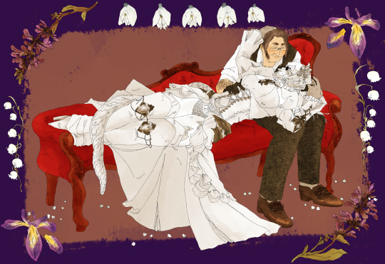
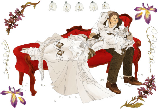
Note
What art program do you use? sorry if you already answered something like this but im so mesmerized by the techniques you use in your art.
Thank you. No need to apologise; I don't mind answering this question because it's an excuse to walk through my latest image!
The concept for this piece is based on being perceived online through interpretations of posts and artwork, yet how artificial this can be. The relationship the viewer forms is more with the narrative of the work, and any insight into the artist through this feels highly awkward to me, which is precisely what I want to explore with this piece.
In this example, I wanted an attractive sitter to look like someone out of a new romantics music video or like an Enya video, because this genre and era of media is very aesthetically pleasing and nostalgic for me. I hold it as an unobtainable ideal— a hauntology. So, as wonderful as it is, it equally feels shameful and perverse because it's an aesthetic object of desire that I am contriving.
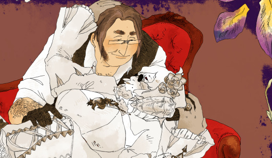
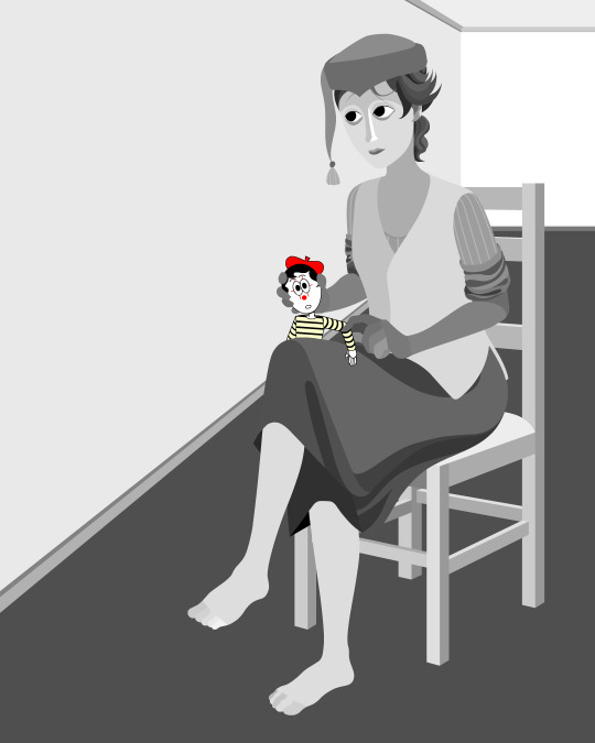
The sitter is holding one of my cartoon characters, Lauren Ipson, the protagonist of my Ersatz world project. A trope in writing is when a character acts as a self-insert of the author, and I'm conscious to try and avoid that with Lauren. I try to write Lauren as dry and sardonic yet also fun, dramatic, and friendly. I don't think of these as personal qualities of my own, but I imagine personal qualities bleeding into fictional characters is inevitable.
Yet Lauren Ipson feels much more alive a character to me compared to any attempt at self-portraiture or self-expression that I've done, which is very little because I'm not interested in constructing a perceivable identity. (I'm aware this text itself can be interpreted as self-expression; however, to me this is just another construct.)
So Is the sitter meant to be me, controlling Lauren? I'm definitely baiting the viewer to think this, and you can interpret it that way if you want, but really I don't think of the sitter as me at all. My intention is to show how it's all a facarde. The sitter is basically just as much a doll, a puppet, a mannequin as Lauren Ipson is, if anything more so.
There's a deliberate irony between Lauren's cartoon rendering and the sitter, who I wanted to render with more detail and evoke a modernist style. I'm inspired by Hans Bellmer and Dorothea Tanning with their work with dolls. However, despite that implied visual hierarchy, the more detailed sitter shares a similar, stilted vector construct to Lauren. They're both born from vector drawing after all. And it's further undermined with the way Lauren the doll looks directly at the viewer, as if she's alive, while the sitter looks to the side with a blank, almost dead-in-the-eyes expression.
Anyway, with that in mind, almost all of my work starts as a thumbnail sketch. Although I often draft digitally and am fine with doing that, I feel more confident doing it freehand on paper. Digital rendering feels more like a refinement process to me. Funnily enough, although I often prefer to sketch with physical materials, I'm anxious of refining or rendering with them.
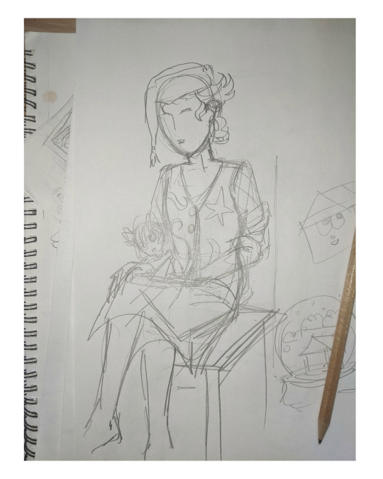
I like my designs to be very direct and conceivable, so a solid silhouette, pose, negative space etc. I often create a quick digital sketch with this in mind, either by tracing or referencing the thumbnail, although sometimes I skip this step and go straight to the rendered drawing. The aim is to establish a visual guide, dividing the drawing into various shapes for digital airbrush rendering later on.

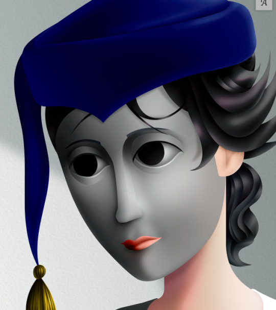
With this composition, I made a second draft with more attention to details such as the face, hands and feet. Sometimes I'll use photo references if I'm struggling with posing or anatomy. These drafts are often blue because it's easier to render the black linework over a transparent blue sketch.

The chair took some time but was relatively simple to render. It uses the line tool set to magnetic anchor point, following two-point perspective vanishing points. I like two-point perspective because it feels sort of digitally native to me to have these impossibly perfect vertical lines. I also know the horizon line should be at eye level or something, but I just like the idea of the top of the chair to be perfectly horizontal.

Here I'm drawing the final rendered form. I use the stroke tool with it set as smooth as possible. Often I'll redraw lines over and over if it means getting certain curves to look right. Once the lines are drawn, I'll fill them in and remove the stroke, leaving just the solid vector shape. The shade of grey I use is done to simply denote the shape. It does not represent any kind of shading or anything; in fact, when I bring it into Photoshop, all these shapes are set to the same shade, but if I had that here in Animate as I'm drawing, it would be impossible to see what I'm doing. The red background is just for clarity.
Once it's all drawn, I'll make sure every shape is clean, overlapping nicely, and divided into its own layer. A composition can often be comprised of hundreds of separate shapes.
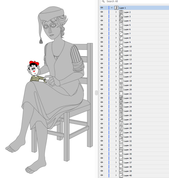
Each shape will be its own layer in Photoshop, which will operate as a clipping mask. The clipping masks act like masking tape or shielded off areas for soft brush opacity rendering, similar to the soft atomised rendering from an airbrush, just done digitally.
I follow very rudimentary painting techniques of simple shading, lighting, and bounce-back highlights. I follow a simplified Grisaille technique, focusing on strong values in greyscale before adding a wash of colour with a color gradient map set to layer style color. Sometimes my values can be a little off, but as long as the values are all consistently acting together, I can correct them with transparent washes or color curves. If the greyscale looks harmonious with all the forms clear, colour will likely work.
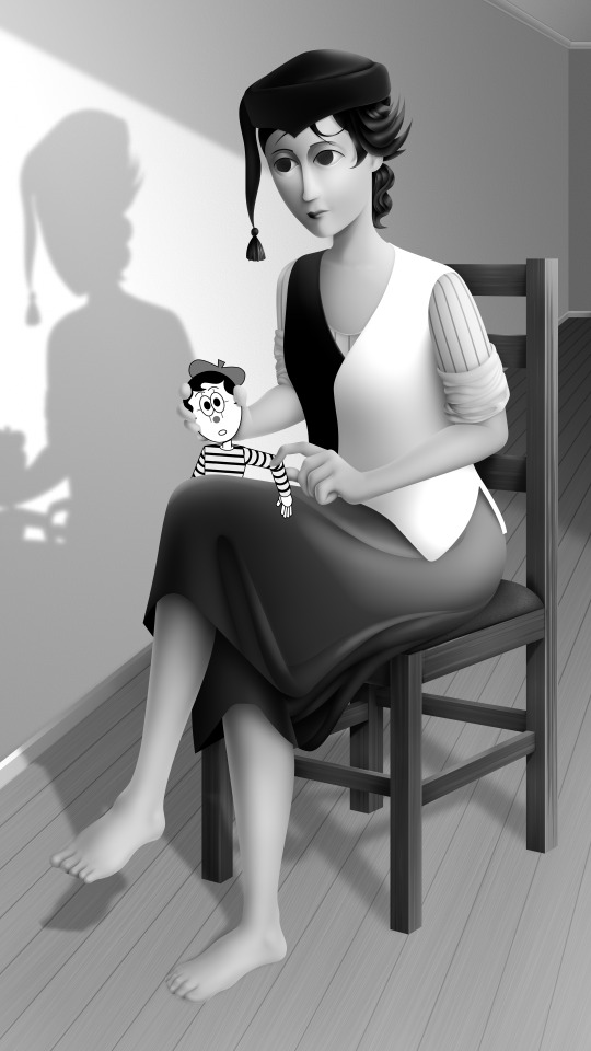
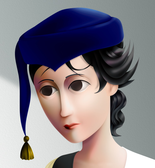
Proper digital painters will say this is an amateur process, with results that look mechanical and stiff, as colours in the real world all bounce together off different surfaces, resulting in colour harmonies. However, I don't mind the inharmonious nature of the colours, as I find the values give the composition enough harmony. I'm working digitally, so why go to all the effort to make it not look digital? It's interesting to me to have the red chair look blindingly red, the green skirt look blindingly green.
Colours can look boring without some form of harmony though, so I will add in blue-greens with the darker areas, more turquoise greens towards the highlights.
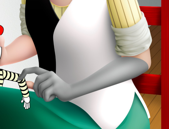
Skin tones are far more complex, however, as it's something that's more informed by realism. This is why kigurumi dolls with their plastic flesh look so artificial to the eye, because we're familiar with how light passes through flesh and skin and all the subtleties of colour that it picks up. This piece is the first time I've explored flesh tones, as typically I avoid all this by rendering skin as grey porcelain.
I needed to really up the contrast, with shaded areas becoming purples and highlights verging on washed out. Areas with more blood, like feet and cheeks, appear more orange and red. Areas closer to bone and cartilage, like the bridge of the nose, can look almost blue and green. Exploring these colour values and tints in the aim of natural tones was fun to do, and ironic given how blank the face is.

Although in the moment I feel very much like I'm rendering a realistic reality, when I step back, I'm reminded how stylised and unrealistic the painting actually is. It looks kind of insane, like everything is so uniform and overtly saturated. It doesn't feel present in a real space, despite the shadow and form implies one. But I'm not consciously thinking of these things, of style, as I'm working. To me, it's a process of world-building and problem-solving.
127 notes
·
View notes
Text

I have some new art for y'all! I drew Postal Dude based on Head from the 'A.D.I.D.A.S" mv! Im trying out some different techniques for my digital art so some bits look a little off, but I'm overall very proud of it!
The reference pic
#korn#korn band#korn fandom#korn fanart#postal#postal game#postal dude#postal 1997#postal 2#postal 3#postal 4#postal brain damaged#art#digital art#postal fanart#postal dude fanart#fanart#hyperfixation#i love combining my interests#this song gives off so much Postal Dude energy#ADIDAS#my pookie
69 notes
·
View notes