#illustrating from a text in that in order to communicate the the idea visually you have to be both non literal and directly relsted to that
Explore tagged Tumblr posts
Visit Tumblr Blog
Explore Tumblr blogs with no restrictions, modern design and the best experience.
Last Seen Tumblr Blogs


Fun Fact
Women make up for the other 50% of Tumblr’s audience.
Text
ough
#this is specifically abt thomas in medieval art obviously but it does really articulate something I've thought a lot about wrt#illustrating from a text in that in order to communicate the the idea visually you have to be both non literal and directly relsted to that#choose an interpretation/frame of reference through which to do the translation from text -> visual as much as one would between languages#& how much illustrating things one way or another amounts to a view or even an analysis of the text that will change what other people#get from it#thoughts#^ from 'doubting thomas' by glenn most
58 notes
·
View notes
Text
Social Media Graphic Design Trends You Need to Know
Social Media Graphic Design Trends You Should Follow

The industry of social networks develops with such force that each brand aiming to be noticed and reach the audience needs to constantly monitor the processes of social media graphic design and its latest trends. Good graphic design does not only improve the picture but also significantly helps communicate the brand message. This post explains the social media graphic design trends that you should be aware of in order to keep going in 2024.
Progression of Graphic Design in Social Media
There is no doubt that Social Media Graphic Design has grown over the years. Thus, has transformed, from a few still images to moving images and videos, how brands showcase their images on social media platforms. As we enter the year 2024, it is imperative to focus on the social media trends for future reference.
Trend 1: Minimalistic Design
The trend of social media graphic design embraces minimalism more than any other style. Simplistic lines, plenty of negative space, and very few colors represent this school of design. Minimalistic design aids in the communication of ideas clearly and without excesses that may distract the targeted audience.
Advantages of Simple Design:
Promotes the ease of reading and understanding
Builds a clean and contemporary image
Assists in emphasizing the main message
Trend 2: Bouncy Typography:
Bouncy typography has become an effective graphic design for social media. Full, bold fonts, especially those with a sans-serif typeface, convey the message with a lot of power, even when the detailed images are not provided. This trend is very appropriate for those brands that do not avoid striking messages and focus on certain aspects.
Suggestions for Effective Use of Bold Type:
Select typefaces that embody the character of your business.
Employ color differences to emphasize the text.
Use bold fonts with simple designs.
Another Trend: Motion Graphics
The use of animated graphics and motion graphics is on the rise on social networking sites. Such elements are more effective in getting attention than still pictures and they relay information more effectively by displaying images rather than words.
Types of Animated Graphics:
Logos that move
GIFS and small videos that play over and over again
Infographics that allow the user to take part in activities
Trend 4: Genuine Picture
The concept of ‘authenticity’ is on the rise and gaining more acceptance in the graphic social media designs. Overly edited and dramatized images are less appealing to audience, as they prefer more of real and ordinary looking shots. This is because, authentic imagery helps in enhancing one’s audience and building their trust and even a real relationship with them.
Ways of Incorporating Authentic Imagery in Your Designs:
Put real snapshots of your team, products and customers
Post raw contents
Promote and use users’ contents to your social networks
Trend 5: Illustration Design
Use of customized illustrations integrate a very personal and distinctive element on social media graphics. The designs can easily be created to suit the brand and are very useful in enhancing the visibility of the content.
Benefits of Using Customized Illustrative Designs:
Improves the distinctiveness of a brand
Gives room for design creativity
Captivates attention using great works of art
Trend No 6: Data Visualization.
In the wake of the growing volume of information being shared over the social networks, data visualization has become a significant trend. Infographics, images, and illustrations are an effective way to present data as they are visually appealing and easy to understand.
Essential Elements Of Effective Data Visualization Techniques
Use color coding to f accentuating important facts
Present difficult concepts using appropriate and simple visuals
Text and visual images should be incorporated in presentation to aid understanding
Trend 7: Social Media Templates
The use of social media templates for posting is more practical as it helps in being uniform on all the posts. This makes the design process easier and helps in creating a uniform design for the brand.
Advantages of Social Media Templates:
Saves time and resources and money
Brand consistency and promotion are assured
Different campaigns can be fitted in easily
Trend 8: Content that allows two-way interaction
Interactive content is a form of content that is incredibly engaging whereby it calls for audience involvements. This trend comprises of such elements as polls, quizzes, interactive stories which serve entertainment purposes but also help in doing research on the audience preferences.
Forms of Interactive Content:
Infographics with some clickable elements
Interactive videos
Slightly healed Polls/surveys
Trend 9: Gradients
Color gradients help to make social media designs more interesting and have added depth. This trend is defined as the use of two or more colors blended together to form a gradient that can be used in backgrounds, text, or even overlays.
Tips on how to use Color Gradients:
Pick hues that blend well with your brand color schemes
Incorporate gradation colors to accent important aspects of your design
Try out various gradient styles to achieve more interesting results
Trend number 10 – Augmented Reality (AR)
Augmented Reality (AR) has emerged as a revolutionary tool for the social media graphic design industry. With the use of AR filters and effects, users’ engagement increases and their experience becomes more captivating.
Uses of Augmented Reality in Social Media:
AR branded filters in Instagram and Snapchat
Virtual product try-on facilities
Participatory AR games and contests
In Conclusion
For any brand that is serious about drawing and holding audience attention, it is necessary to keep up with the current trends in Social Media Graphic Design. Whether it is the minimalistic design or the use of animated graphics and augmented reality, such trends are able to help you cut through the clutter that is social media.
This enable such trends to create content that is more likely to generate likes and shares but also to reinforce the brand.
Sprak Design has been doing creative designs for years. Ours is a company that has adapted to the changing trends over the years. We are able to provide creativity as we transform our story and the way of doing things depending on the market. For more information, feel free to contact us.
View source link
0 notes
Text
From Storyboard to Screen: The Intricate Process of Animation Creation
1.What is the concept of animation?
Animation is a method of creating the illusion of motion by displaying a series of individual drawings, paintings, or illustrations in rapid succession. This can be achieved through various techniques, including traditional hand-drawn animation, stop-motion, and computer-generated imagery (CGI). The core principle relies on the persistence of vision, where the brain perceives a sequence of images as a continuous motion. Animation is widely used in film, television, video games, and online content to bring characters and stories to life, engaging audiences with visual storytelling and creativity.
2. Why is animation important?
Animation is important because it brings ideas and stories to life in a visually engaging way. It enhances communication, making complex concepts easier to understand. In education, animation aids memory retention and motivation. In entertainment, it captivates audiences with creativity and imagination. Additionally, animation fosters emotional connections, allowing viewers to empathize with characters and narratives. It also serves various industries, from advertising to video games, enhancing brand storytelling. Overall, animation is a powerful tool for expression, creativity, and connection across diverse platforms and audiences.
3. What are the 5 main methods of animation?
The five main methods of animation are:
1. **Traditional Animation**: Hand-drawn frames on paper or cels, creating a sequence of images.
2. **2D Digital Animation**: Created using software, allowing for more flexibility and efficiency in producing animated content.
3. **3D Animation**: Involves modeling characters and environments in a digital space, providing depth and realism.
4. **Stop Motion Animation**: Objects are physically manipulated and photographed frame by frame to create the illusion of movement.
5. **Motion Graphics**: Combines graphic design and animation, typically used for text and visual effects in multimedia projects.
4. How to create an animation?
To create an animation, start by defining your concept and storyboard. Choose an animation style (2D, 3D, stop-motion, etc.) and gather your tools, such as software like Adobe Animate, Blender, or After Effects. Design your characters and backgrounds. Create keyframes to outline the main movements, then fill in the in-betweens for smooth transitions. Add sound effects and music to enhance the experience. Finally, render your animation and export it in the desired format. Test and adjust as needed before sharing your work.
5. How to animate on PPT?
To animate on PowerPoint (PPT), select the object you want to animate (text, image, etc.), then go to the "Animations" tab. Choose an animation effect from the gallery, such as "Fade," "Zoom," or "Fly In." You can customize the animation duration and start options (on click, with previous, or after previous) using the "Timing" group. For more effects, click "Add Animation" to layer multiple animations. Use the "Animation Pane" for precise control over the order and timing of animations. Finally, preview your animations to ensure they appear as desired during the presentation.
Visit: VS Website See: VS Portfolio
0 notes
Text
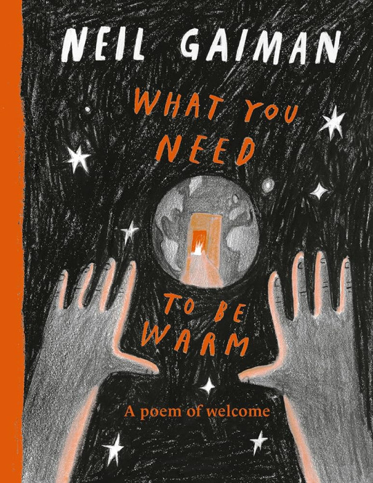
Book Review: What You Need to Be Warm by Neil Gaiman
What You Need To Be Warm
Written by Neil Gaiman. Illustrated by Yuliya Gwilym, Nadine Kaadan, Pam Smy, Daniel Egnéus, Beth Suzanna, Marie-Alice Harel, Petr Horácek, Chris Riddell, Bagram Ibatouilline, Benji Davies, Majid Adin, Richard Jones, Oliver Jeffers, Oliver Jeffers, and Benji Davies.
Genre or Category
Poetry or Novel in Verse
Target Age Group
PreK-6th grade
Recommended for ages 4-8 years, Preschool to 3rd grade
Format
Physical, print
Summary
What do you need to stay warm? Everyone has their own definition of what it means to be warm, including the means of staying so. In the wake of civil unrest and tragedy around the world, Neil Gaiman provides a poem of welcome, which has been illustrated to show the different facets of humanity in moments of vulnerability.
Justification
This book was chosen because it fulfills the category “Poetry or Novel in Verse.” What You Need To Be Warm is a book featuring a single poem that is divided into twelve stanzas, which is written in free verse. Although it hasn’t received any awards, it does have glowing reviews from multiple literary review publications, such as Publishers Weekly, Booklist, and School Library Journal. There are also many notable illustrators, including those with less notoriety, that collaborated with Gaiman on this book, which showcases a variety of art styles. Most importantly, this book was created to benefit the UNHCR, or UN Refugee Agency, which is dedicated to saving lives, protecting rights, and building a better future for people affected by conflict and persecution.
Evaluation
For this review, I will be evaluating illustrations, theme, and mood.
Illustrations
What You Need To Be Warm is an incredibly emotional picture book that captures the essence of belonging in the midst of tragedy. In that sense of belonging, it also incorporates different aspects of warmth, such as body heat, warm food and beverages, fur, and textiles. In order to capture the feeling of warmth, including turmoil and loss, the illustrations gravitate towards a selection of colors that are representative of this. The only colors used in these illustrations are black, grey, white, and orange.The monochromatic scale ranging from black to white creates a sense of emptiness while the bright orange illuminates the pages and draws attention to the objects of warmth in question.The illustrations themselves also vary from artist to artist, which captures desires of a more simple time versus the current, more bleak reality.
Theme
Although this picture book addresses multiple societal issues in its visuals, the stanzas of the poem itself go on to discuss what it means to be warm and what it means to belong. These ideas are expressed both through the text and in the illustrations, which both mention and show family members, friends, and communities. Outside of the poem, the thirteen illustrators that contributed towards the visuals in the book provide their own interpretations of the stanzas that they were assigned, which provide a diverse range of understanding and recognition of these concepts.
Mood
The mood of What You Need To Stay Warm can be challenging to articulate, because it attempts to create balance between tragedy and hope. What sticks out the most is its sense of nostalgia, which yearns for when we were warm and the lives we lived previously. In one way, the mood is melancholic because of how it approaches subjects like war and displacement. In another, the mood is hopeful because of how it addresses goodwill and kindness amongst strangers. It is also incredibly sobering. These moods are dictated by illustration and the poem itself, which has been interpreted by so many different people.
References
Gaiman, Neil. (2023). What you need to be warm (Y. Gwilym et al., Illus.). Quill Tree Books.
Gaiman, Neil. (2023). What you need to be warm [Cover illustration] (Y. Gwilym et al., Illus.). Quill Tree Books. https://www.harpercollins.com/products/what-you-need-to-be-warm-neil-gaiman?variant=41073292312610
0 notes
Text
Mastering Culinary Creativity: A Comprehensive Guide to Crafting the Perfect Recipe Template
In the realm of culinary artistry, a well-structured recipe template serves as the blueprint for crafting mouthwatering dishes. Whether you're a seasoned chef or an enthusiastic home cook, having a reliable recipe template can elevate your culinary creations to new heights. In this comprehensive guide, we'll delve into the essential components of a recipe template, explore different styles and formats, and provide valuable tips to help you streamline your cooking process and unleash your creativity in the kitchen.

Understanding the Importance of a Recipe Template
A recipe template acts as a roadmap, guiding you through the cooking process with precision and clarity. It serves as a vital communication tool, allowing chefs to convey their culinary vision to others effectively. With a well-designed template, you can organize your ingredients, list precise measurements, outline cooking methods, and provide helpful tips and notes. Whether you're cooking for yourself, your family, or a large gathering, a structured recipe template ensures consistency and reproducibility, enabling you to recreate your favorite dishes with ease.
Components of an Effective Recipe Template
Title: The title should be descriptive and enticing, giving readers a glimpse of what to expect from the dish. It should be concise yet informative, highlighting the key ingredients or the dish's unique selling point.
Ingredients: List all the ingredients required for the recipe, specifying quantities and measurements accurately. Organize the ingredients in the order they will be used to streamline the cooking process.
Instructions: Provide clear and concise step-by-step instructions for preparing the dish. Break down each step into manageable tasks, using simple language that's easy to follow.
Cooking Methods: Specify the cooking methods and techniques required, such as baking, sautéing, grilling, or simmering. Include cooking times and temperatures to ensure optimal results.
Serving Suggestions: Offer serving suggestions or garnishing ideas to enhance the presentation and flavor of the dish. This can include pairing recommendations, sauce suggestions, or optional toppings.
Nutritional Information: For health-conscious individuals, including nutritional information such as calorie count, macronutrient breakdown, and dietary considerations can be invaluable.
Exploring Different Recipe Formats
There are various formats for presenting recipes, each catering to different preferences and cooking styles. Some common formats include:
Traditional Format: This format presents the ingredients and instructions in a linear, text-based manner, with each step listed sequentially.
Visual Format: Visual formats incorporate images or videos to illustrate each step of the cooking process, making it easier for visual learners to follow along.
Interactive Format: Interactive recipe formats may include interactive elements such as timers, conversion tools, or built-in shopping lists, enhancing the user experience and functionality.
Tips for Crafting the Perfect Recipe Template
Be Clear and Concise: Use simple language and avoid unnecessary jargon or technical terms. Be mindful of your audience's cooking skill level and adjust the complexity of your instructions accordingly.
Test and Iterate: Before finalizing your recipe template, test it multiple times to ensure accuracy and consistency. Solicit feedback from friends, family, or fellow chefs and make adjustments as needed.
Include Visual Elements: Incorporate high-quality images or videos to complement your recipe instructions and provide visual cues to aid comprehension.
Make it SEO-Friendly: Optimize your recipe title and description with relevant keywords to improve search engine visibility. Use descriptive titles and meta tags, and consider incorporating popular search terms related to your dish.
Personalize Your Template: Add a personal touch to your recipe template by sharing anecdotes, tips, or variations based on your own culinary experiences. This helps to establish a connection with your audience and makes your recipes more engaging and relatable.
youtube
Conclusion
A well-crafted recipe template is a valuable tool for any aspiring chef or home cook. By following the guidelines outlined in this guide, you can create recipes that are not only delicious but also easy to follow and replicate. So, roll up your sleeves, unleash your creativity, and start cooking up a storm!
0 notes
Text
The Ultimate Guide to the Web Application Vs Website: The Best Fit For Your Business
Websites are often more static and geared towards giving information and exhibiting material, whereas web applications are interactive and dynamic and enable users to conduct tasks and engage with content.Internet resources and web-based software include encyclopaedias like Wikipedia and news networks like CNN. Choosing between a website and a Web Application requires careful consideration of your needs; go with a web app if advanced features and user interactions are desired, while a Web apps is more appropriate for straightforward information display.
What Is A Web App?
Only a web app may be used in Chrome or another browser, and it can process your requests and carry out your orders in real-time by communicating with a web server. You undoubtedly use at least one online app daily; Gmail is the most precise illustration.
Web apps are adaptable, feature-packed, and interactive. They need far more advanced technology and have a much more intricate structure than a webpage. The development cost is essential when deciding between a website and a web app. Keep reading since we'll return to this idea shortly. The need for rapid response and optimal functionality distinguishes web applications. No matter how many people use the app simultaneously, a web app must instantly reply to every user's instruction. It is also crucial for live content revisions.
⦁ Intricate workings of business logic, often on both the system's front (user interface) and back (server) end.
⦁ Interoperability with other enterprise software and external services.
⦁ Services for managing and storing large amounts of data in the cloud or on-premises.
What Is A Website?
You have entered a web page. The website may be found at www.digiteum.com. We utilise it to inform guests about our offerings, ethos, case studies, and history. Links, menus, page navigation, services and a built-in contact form are all accessible to you, Live chats, contact forms, and downloadable material are the only interactive elements websites can typically offer. Stores that lack the most fundamental eCommerce functionality (basic shopping cart, order, payment, etc.) are uncommon.
Difference Comparing a Website to a Web Application
Web applications are distinct from Website development because they are treated more like standalone software than static pages. However, the website is more than just a single page. Website may be a collection of pages that includes a lot of text, video, audio, and visuals. The web app's features are sophisticated, whereas those of the website are simpler. Most online applications need authentication, although visiting the website does not require it.
Authentication
Individuals are authenticated and granted access to a protected area by providing their credentials. When dealing with private information provided by users, this function is essential. Let us examine the significance of authentication in modern web-based software and services.
Domain Names - Websites designed to educate their audience often do not need users to sign in. Even though they may be allowed to register but they are granted restricted access to it.
Authentication is often needed while using a web app. Firstly, their functionality is extensive and intricate; secondly, they include human input and data. Web app authentication is helpful since it helps stop hackers from accessing sensitive data.
Conclusion
Consider the system's intended use and level of complexity while deciding between a Web Application Vs Website. Get your website developed at Infowind to offer your services to the clients Pick a web app to provide your service digitally.
0 notes
Text
The Role of Feedback In Graphic Design Internship
Beginning a graphic design internship is like entering a realm of limitless creativity, where your mind becomes the brush, and the canvas is ready to be painted with creativity. Feedback emerges as a guiding star in this fascinating journey, illuminating the road to mastery and innovation. Join us as we delve into the enthralling world of graphic design internships, focusing on Spectrics Solutions, a renowned software development firm based in the dynamic city of Ahmedabad, India. Likewise, Spectrics Solutions invites prospective designers to go on a transformative journey with their varied choice of internships, including the dynamic environment of Graphic Design.
How to Navigate Your Graphic Design Internship
What is Graphic Design? Starting a creative graphic design internship is like embarking on a creative journey, with every stroke of the design brush promising growth, learning, and self-discovery. One thing shines out as a guiding beacon throughout this extraordinary voyage - feedback.
Additionally, feedback becomes your compass as you explore the enthralling world of graphic design, guiding you towards mastery and innovation.
Let's explore the critical role of feedback in your Graphic designer internship, focusing on Spectrics Solutions, a renowned software development company in Ahmedabad, India, that offers immersive internships in various industries. Thus, including the dynamic world of creative graphic design.
A Comprehensive Guide to Demystifying Graphic Design
Graphic design is a dynamic and adaptable subject that shapes visual communication in various sectors. In addition, graphic design is the art of generating visual content that engages, informs, and captivates audiences. It ranges from advertising and marketing to web design and branding. So, let's go into the essence of graphic design:
Visual Communication
Graphic design fundamentally communicates messages, ideas, and emotions through visual aspects. Text, picture, colour, and layout are combined to create visually appealing and effective communication.
Key items
Typography (font selection and arrangement), imagery (pictures, illustrations, icons), colour theory (choosing and combining colours), and layout (ordering items on a page) are all parts of graphic design.
Impact and Purpose
Graphic design can help to improve brand identification, communicate information, provoke emotions, and influence decisions. Moreover, a well-designed artwork may leave an impression and establish a solid visual identity for your graphic designer job description.
Graphic Designer Roles and Responsibilities
Conception: Graphic designers brainstorm and conceptualize ideas to communicate a message or solve an issue visually.
Invention: They create visually appealing layouts, images, and graphics using design software to bring concepts to life.
Branding: Designing logos, business cards, letterheads, and other visual assets helps graphic designers create brand identities.
Marketing Materials: To advertise products or services, they develop marketing collateral such as brochures, posters, banners, and social media graphics.
Web Design: By building visually appealing and user-friendly interfaces for websites and applications, graphic designers contribute to web design.
Print Layout: They create print items such as periodicals, newspapers, flyers, and packaging.
Must Have Graphic Design Skills
Creativity: Thinking beyond the box to generate unique and visually appealing ideas.
Typography: How to select typefaces, organize text, and produce aesthetically pleasing type combinations.
Colour Theory: Knowledge of colour psychology and the ability to successfully pick and combine colours.
Software Proficiency: Knowledge of design software such as Adobe Creative Suite (Photoshop, Illustrator, InDesign) and others is required.
Communication: Comprehending customer requirements and delivering design concepts through practical communication abilities.
Graphic Design Programs
Creating eye-catching advertisements, banners, and promotional materials.
Designing user interfaces, websites, and mobile apps that provide the best possible user experience.
Creating logos, business cards, and other visual assets to build a company's identity.
Layout design for magazines, books, newspapers, and other printed goods.
Creating visually appealing packaging that reflects the spirit of the product which appeals to the target audience.
Creating visuals for books, websites, animations, and other projects.
Making the Perfect Graphic Designer Resume
Your journey to building an engaging graphic designer resume based on the graphic designer job description begins with striking a balance between emphasizing your aesthetic skill and highlighting your technical expertise. As a graphic designer, your graphic designer resume serves as a blank canvas on which your abilities, experience, and creativity can come together to make an impression.
Begin with a brief, professional summary that captures your design philosophy, main strengths, and passion for visual storytelling. In addition, highlight your years of experience and your area of expertise, such as branding, web design, or artwork.
A portion devoted to your technical abilities is essential. List your knowledge of design software, such as Adobe Creative Suite (Photoshop, Illustrator, and InDesign) and any other applicable tools. Mention your knowledge of UI/UX design, responsive design, and other technical elements.
Your resume should include a sample of your portfolio. Likewise, include a link to your online portfolio or a few design samples that show your versatility and creativity across multiple mediums.
How Feedback Improves Your Craft
Refining Methods
Feedback provides a new perspective that allows you to improve your design skills. It can help in identifying areas for improvement, whether it's understanding complex design tools or honing the balance of parts in a composition.
Embracing Innovation
Constructive criticism pushes you to look outside the box. Moreover, it encourages yougraphic designer resumee boundaries of your creativity.
Developing Adaptability
The world of graphic design is fast-paced, with trends changing at breakneck speed. In addition, feedback lets you stay current and embrace new design ideas. Hence, ensuring your work remains relevant and compelling.
Developing Resilience
Whether positive or negative, receiving feedback increases resilience and fosters a growth mentality. So, it encourages you to embrace challenges, see setbacks as stepping stones, and always strive for perfection.
Your Graphic designer internship will take you on an adventure of self-discovery, creativity, and skill growth. And this guide is the answer to "What is Graphic design?" In addition, allow feedback to guide you as you embark on this beautiful voyage. Accept it as a powerful instrument that fosters your development, hones your skills. Lastly, it accelerates you toward being a skilled and imaginative graphic designer.
#what is graphic design#graphic designer resume#graphic designer job description#Graphic designer internship#creative graphic design#Graphic Design Internship
1 note
·
View note
Text
There are 6 abilities a graphic designer must possess to have a successful career
If you have a passion for art, technology, and communication, pursuing a career in graphic design is a fantastic choice. With design playing a vital role in every industry, short term graphic design courses in Pune provide abundant prospects to embark on a multitude of fresh and exhilarating projects
In your daily life, you may have seen a lot of imaginative book covers, motivational images, and interactive posters. Collectively, these are graphic designs. In other words, graphic design refers to any type of communication that makes use of images or drawings and can be produced by a graphic designer. Graphic designers experiment with letters, colour, patterns, images, photos, and information to produce appealing and cutting-edge visual designs.
To produce business logos, product packaging, computer interfaces, and other visual communication pieces, every sector today needs a graphic designer. There is a need for graphic designers in the advertising business as well as in print and digital media corporations, IT firms, FMCG companies, the financial sector, and numerous other overlapping industries.
For those who want to join this rapidly expanding business and satisfy the rising demand for qualified workers, graphic design courses are offered. However, it would be beneficial to learn a little more about the numerous essential abilities of graphic design before enrolling in a training programme.
1. Originality
It may seem obvious: be creative. Every field where you have to come up with something fresh calls for some kind of originality. However, creativity is sometimes misconstrued and even mistaken for the capacity to paint, draw, or sculpt. You need a creative attitude if you want to work as a graphic designer. By doing so, you'll be able to master practically all phases of the design process, from coming up with original concepts to creating fresh designs.
2. Knowledge of typography
Making different typefaces entails having a thorough understanding of point size, tracking (the distance between all characters used), kerning (the distance between two particular characters), and leading (line spacing). A crucial component of any graphic designer's skill set is their knowledge of typography.
3. Understanding of Page Layout Creation
The look and feel of a printed page are the main concerns of page layout. This covers the agreeable style-sheet, pictures, and text alignment on a page.
4. Understanding of interface design
A graphic designer today must also consider website layouts and user-interface designs to improve the interactive experience given the growing use of the internet, mobile devices, and social media.
5. Software Knowledge
Without having a solid understanding of at least Photoshop, Illustrator, and InDesign, it is doubtful that you will become a graphic designer. Therefore, it's crucial to enrol in a school that not only imparts knowledge of the fundamentals of graphic design but also equips you with a solid understanding of the tools used in the field.
In order to become a graphic designer, you must understand how to use each tool properly. A graphic design education can help you develop the necessary skill set and advance your profession.
6. Effective Communication
An essential talent for a graphic designer is communication. The "effective visual conveyance of an idea or concept" is what graphic design is, to put it simply. Consequently, the primary function of a graphic designer is to facilitate communication. Even before you begin developing, you will need to work closely with your clients to better understand their needs. Additionally, you will regularly work with your team, account managers, and a huge number of other people.
0 notes
Text
Hybrid Forms: Illustrating and designing the cover
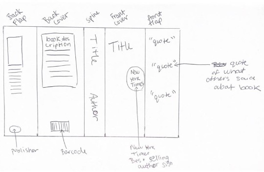
Before starting to illustrate the final product, I made a rough plan of what I will include. This was not necessarily the final design, just a rough idea of what I need to have in each page, such as a publisher logo on one of the flaps and quotations, the kind of thing you expect to find on a book.
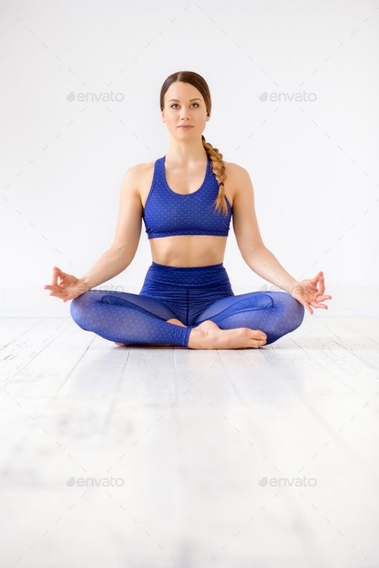
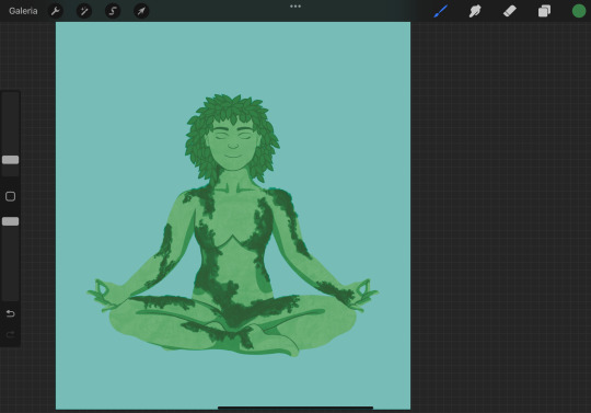
I decided to start off with the front cover, so that after that I can organically design and make decisions based on what I created for the first page. I started by drawing a meditating lady, and used the stock image below as my guideline.
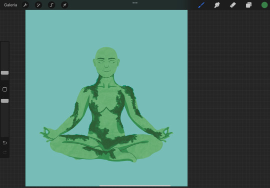
While I followed the reference I used the symmetry tool in order to make her perfectly symmetrical with the exception of the crossed legs, so that it looks very visually harmonical. I made her green to emphasize the mother nature look and added hard shadows to make it a modern sleek look but there is texture since she is supposed to come from nature which has a lot of texture. My intent was to achieve a polished, upgraded version of the illustration I made in the workshop.

I changed the colours as I felt the background was too green leaning, and I wanted a strong but soft blue in order to transmit calm. I used a textured brush to moss to her as I felt it would make her more visually interesting than just vines.
I added her hair by making it out of leaves just like the original drawing I did in the workshop. I drew a bundle of leaves and duplicated them until it was a halo of leafy hair.
I added a hill under her and roots to show her grounding through meditation. I added more texture to the sky to make it look painterly and soothing. Continuing to pull from the drawings in class, I added blooming pink flowers as it again communicates her emotion, as well as being reflective of her giving life to things - a mother. It also adds a nice contrast and a third accent colour that makes the whole piece more eye catching.

I played with what I had and drew a tree silhouette as it is part of the drawing but should not take the focus from the lady. This give a nice framing to her and adds interest to the piece without taking from her. The paler colour fo the tree silhouette also allows the text of title that I inserted to pop out more against the background and be more legible. Overall, I liked the ideas I was playing with but there was something about it that felt off - it was not giving me book cover vibes. It was looking more like a poste that stands by itself, and feels a bit flat too overall, partly due to the tree silhouette removing some of the 3 dimensionality from the figure. I could not figure out what was missing so I left it to rest and returned to it the next day.
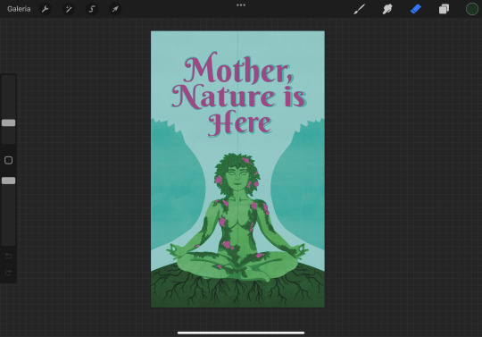
The next day I came to the conclusion that what was bothering me is that it was not giving the polish and refinement that I intended with this cover, as it should want to attract a side of the public that would want to purchase it just to display it on a shelf. I realised that part of this refinement was not coming due to the overuse fo textures, from the one on her skin, to the moss and the one in the background and hill. I scrapped all of them, moss included, and substituted the moss for vines that still insinuate she is one with the nature, but it looks less overwhelming to the eye. I made the blue a slighter deeper more saturated in order to catch the eye better, and also changed her tone of green to be in balance with this new colour.
I added back the tree, this time the shape more flowy and less detailed, and with a much fainted contrast with the background in order to distance it from the figure. I also added tree branches to make her seem like she is the tree itself. Because of the business of the branches I added a light shadow to the title to try to make it stand out more.

From this last addition of making her into a tree, I also realised the trunk did not need to be there at all, as she is the trunk, the stability of that tree. This imagery also alludes to the mother’s role in a family and how she is many times what gives stability to the family. By erasing the trunk it draws the focus again to her. Even though I just removed all of the texture, I realised now that it was lacking too much now, so instead of adding too much texture like before I should pick one spot only. I decided to add it to the main background colour and it added the relaxing painterly texture I wanted it to have initially, without taking from the piece’s polish.
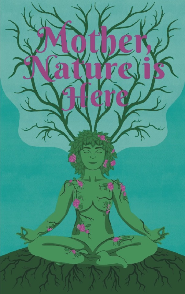
The title was still a bit lost against the branches, so I added an outline to it. It however made it look cheap and unharmonious with the rest of the piece. I also realised here that the font is part of the issue here and I had to change it to something more mature that reflects the adult themes of this book. Choosing a serif font could also make it more professional, academic looking (a doctor is supposed to be the author of this book) and make the book feel more reliable.
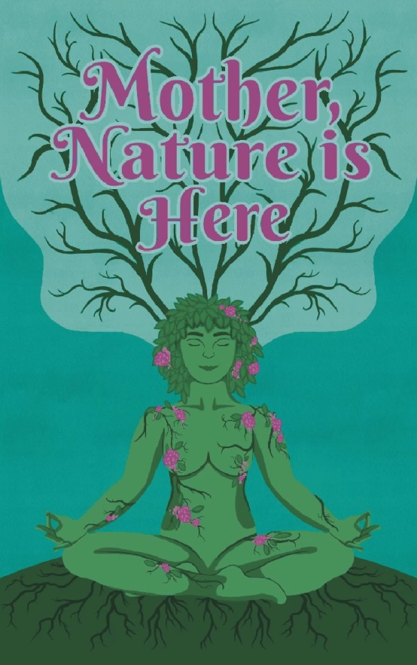
Changing the font gave it a sense of maturity that was lacking from the cover, and I was a lot more content with this result. I went ahead and added a subtitle and the author’s name, making sure to include Dr in it to add authority and reliability to the book. The title was still getting a bit lost in the branches so I added a slight light pink shadow to it by duplicating the title and putting it behind the main title. To make the title less lost I also toned down the saturation of the branches to make it bleed more into the background.

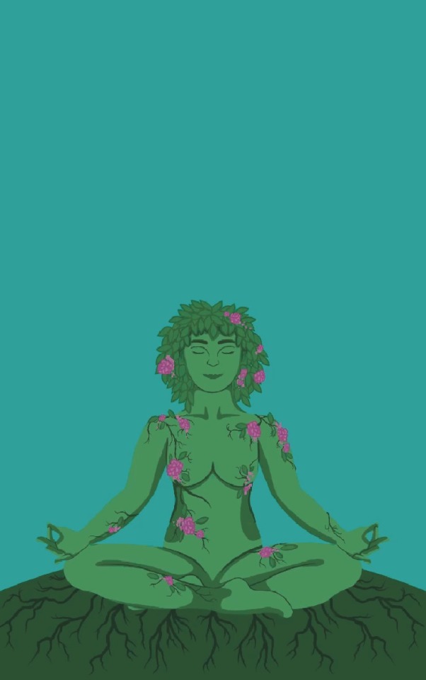
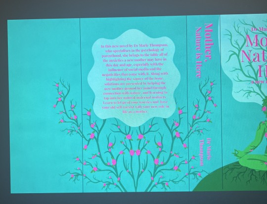
With the front cover mainly complete, I brought it into photoshop where I would be able to edit it more thoroughly using the healing tool. I started by making the front flap, and used the content aware fill for a base of what it woill look like. I want the whole cover to flow, and there to not be any illustration interrupted suddenly. The fill however predicted the shapes a bit off and non geometric. I also felt like the title was not standing out quite enough yet, so I further faded the branches behind it and got it to finally stand out enough. I also included the new york time bestselling author in a circle that looks like a sticker, just like many books have it as a sticker.

I used a simple brush tool with the right colours to make the shapes inside the front flap continue the ones on the cover. I used high streamlining so that the shapes would come out nice and smooth. If I look at the front flap by itself, the shapes that bleed into it look very gaphric aand pattern like, which I liked, so I decided to add one more shape on the right side in order to make it look intentional.

I replicated the shape of the tree, which made it look like there are more trees outside what the dust jacket covers. I also realised that the shapes gave me dynamic negative spaces perfect to insert the quotes, which I created using very flaterring lanugauge. I made them come from several sources, from media outlets to other authors and other doctors, which would give credibility to the book.

For the Back cover I knew there would be a significant amount of empty space as the description of the book won’t take over the whole page, so I decided to add another tree. I went back on procreate and I edited the same flowers I put on the lady on the tree to make it more interesting.

I added the text in a bok in a very geometric, flowy shape that is in the3 style of the other blobs of colour, however made it geometric. I chose this shape as it slightly resembles a flower, adding to the whole nature theme. The spine was still empty, so I decided to make the tree spill over onto the spine as it adds a nice feminine accent that will make the spine stand out against other books. This created these two nice negative spaces that perfectly fit the title and the author. However when I looked at everything as a whole, the tree was not balanced anymore as it ended before the back flap, so I made it completely symmetrical and allowed the branches to also adorn the backflap. This again would add a nice feminine touch to the back flap. I just had to add the text about the doctor and pick out a stock image of a professional lady, as well as a publisher and bar code.
0 notes
Note
With the latest bp album dropping today and seeing that nothing has changed the last two years, I’m curious if you can help me understand why I find it all so….mediocre. I can tell that part of it is the effect you’ve brought up with Hybe of too much money smoothing out all character. I also feel like this is a case where keeping the same collaborators has meant doing the same song with tiny changes 5 times, unlike a lot of other groups where they still have variety while keeping a more consistent overall identity. But they feel very bland in a different way than hybe groups do, and I can’t put my finger on why.
nothing blackpink does has a concept.
well, that's mildly facetious: their concepts are 'what if we were cool and influencers and most importantly GIRLS', and that's a non-entity at this point. visually, none of that means anything and all of it is indistinguishable from each other.
i think this is a great question to illustrate exactly why spectacle (the form) is not as simple as slapping together the most bombastic set pieces and ideas you can think of and calling it a day. in order to make good spectacle, you have to put just as much work in as you do with any other type of art. your ideas have to be grounded in a visual logic that drives the entire world you create: sets, costumes, lighting, even text and sound all have to be interlinked, to communicate with each other.
since it's also on everyone's minds right now, let's use nct 127 as an example. specifically, let's use 2 baddies and sticker. both of these mvs superficially carry the same basic visual ideas: there's very bright and highly saturated colouring and a lot of neon, there's a car, and there's a lot of highly decorated costuming. but each of these mvs have highly specific themes and concepts in which they ground both these more general principles.
sticker draws a direct comparative between the old west and the aestheticized neo(n) techno future that has a basis in science fiction and techno orientalism, and within that comparative there's a line drawn between hackers and cowboys, as figures that operate outside of the law on their own moral codes. throwing in the lowrider is another connection to operating outside the law, as lowriders can only be created via modding/customization and the mods themselves are technically illegal. one can pick apart several different meanings from sticker however they desire, but my point is here that the concept has a context and logic. the imagery and production design are all based around that specific theme, and the styling is uses very obvious markers from cowboy/western fashion to further drive the point home.
and 2 baddies. oh there are some LAYERS to 2 baddies. firstly, one of the main visual motifs is geometric art deco style patterning, which is an arts and design movement that started in the mid 1920s and continued up until around the 40s. this movement did not just impact visual arts, but it also heavily impacted commercial and industrial design, which included both architecture (famously, the chrysler building) and, very notably: cars. this era is the boom of the automobile and the art deco movement in particular produced some of THE most beautiful cars of all time, including:
the bugatti aerolithe
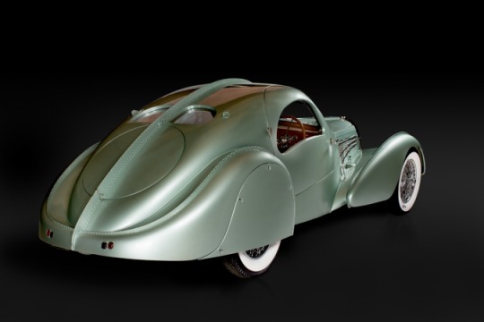
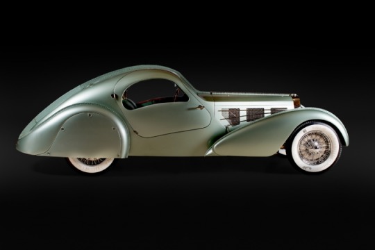
the delahaye 177 rs
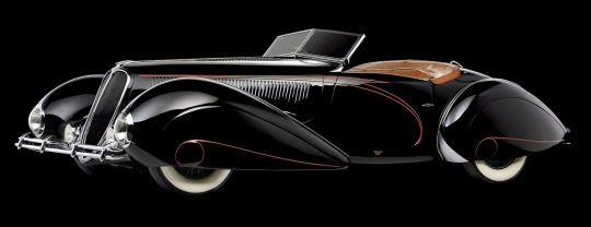
the delahaye 165 cabriolet

and one of my personal favourites, the phantom corsair
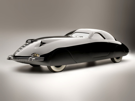
you know who else was designing cars in the 1930s and 40s? porsche:
the porsche type 12, 1931

the porsche 356 no. 1, 1948

and just as an extra fun lil detail, in the chorus of the actual song, there's a sample of a vintage car horn (it's right after the line 'don and manner'), which is the horn of a ford model a, which was ford's second model that replaced the model t, the car that popularized driving. and when was the model a produced?

and like with sticker, the styling draws directly from the clothing associated with concept, as it has very distinctive visual signifiers. we haven't seen any of the stages yet but i'm willing to bet that most of the styling is going to be based around motorsport gear. this goes across the board for pretty much every 127 styling: it is very obvious which era a performance is from just by looking at the costumes, because they use those very distinctive unified visual signifiers.
now, can you do this with a blackpink cb? name me a significant visual difference between any of their mvs. any of their stylings. all their mvs are colour graded the same, they reuse the same general imagery, there's no coherent theme holding anything together, and all their outfits are typical heightened kpop girl group. using just pure bombast works once or twice, but like as we've seen with their music, when you reuse the same imagery over and over again it loses impact. there's no spark. it gets boring.
#also all of their choreography is the same. sorry#another important thing to note here is that keeping the same collaborators does not always mean that you always produce the same work#sm works with a lot of the same people across different groups + cbs and almost never produces anything with the same degree of 'sameness'#if you are working with the same people constantly and you are producing the same thing every time:#someone or all people in that creative relationship are bad at their jobs. that's the truth#kpop questions#blpk w#nct w#for all they have the life sucked out of them bts does actually switch up their concepts enough that it does make each era distinct#blackpink has not done that a single time. their concept is literally 'we are blackpink'#why do you think they say their name so fucking much in their songs. bc there's nothing else that makes it distinct#groups build identity through numerous different ways but it's always a combination of: the idols faces/voices#choreography/movement styling and music type#when you switch concepts frequently but keep specific throughline threads THATS how you establish signifiers#without making people bored#sure by making everything the same all the time we all definitely recognize blackpink. but like. that's not interesting to keep watching#text#answers#listen. i dont think its gonna happen BUT if we see 127 in like. glitzer 30s-40s suits im going to YELL#i'm hyped for the 2 baddies era bc i love any time i get to flex my car knowledge and SPECIFICALLY my art deco car knowledge#literally one of my favourite things ever i can look at these cars all day#back home i used to go to car shows all the time. a well designed car is one of the most gorgeous pieces of machinery#i have actually seen a real ford model t. i think it was from 1914? a guy in my hometown had one#it's so funny to me bc theyre going to have to change the '2 baddies 1 porsche' line for music shows bc its a brand name?#like cix had to change ferrari to 'mercy' for 458 (hilariously - another cb literally about a car)#the classic 911 design was first introduced in the 1960s so it is technically outside the scope of being an 'art deco car' BUT#it very clearly takes inspiration from some some of the shapes that were floating around at the time like with the aerolithe#AND porsche was experimenting with that shape with the type 12#it just took a couple extra decades for them to finally get there. close enough imo
30 notes
·
View notes
Text
Designing Booklets That Convert: A Step-by-Step Guide Img URL:
A guide to designing booklets that works: step-by-step
In the highly competitive world of businesses today, a well designed booklet can serve as a strong marketing tool. It is an asset that can be touched and brings out your brand, calls attention to your products or services, and also motivates prospective clients to take action. However, it requires
more than mere beautiful graphics for it to be a really converting booklet.
Sprak Design is here to help you with the process of making a booklet which not only looks appealing but also brings results. So, let’s go through the main steps one by on
1. Establish Your Objectives
It’s important that you outline the intentions behind the booklet design before making any designs. What do you hope will come out of this? Do you want people to recognize your brand more, get potential clients or market a certain item or service? The aim you have will determine how to make and arrange what you want in the book.
2. Get Familiar with Your Target AudienceUnderstanding who you are trying to appeal to is key in ensuring relevant contents for your booklets. Try looking at things like their age brackets, hobbies or even frustrations they may be experiencing in life. This information will guide on what kind of words and graphics would best convey your message to the audience.
3. Create a Story that Sticks
A good narrative is all about what your brand or product stands for; consequently, crafting it would mean creating effective booklets. Be sure to incorporate a unique value proposition that elicits an emotional response from potential customers in order to provide lasting memories and convince them more easily.
6 Creative Booklet Design Ideas for Your Inspiration
4. Select the Suitable Format
The goals you have in mind and how much material you are going to use will determine what kind of format you choose for your leaflet. There are many things one should consider, including how much information has to be put across, who would be interested in the publication and finally, availability of funds. Tri-fold brochures as well as bi-folds and gatefolds are some of the most typical formats used.
As your source of inspiration, here are creative booklet designs.
5. Clarity and Readability
No one wants to pick up a booklet that has a lot of clutter or is difficult to read. In almost all designs, it should be noted that the clarity and readability come first. Hence, ensure a clean layout, use legible fonts and leave sufficient white space.
6. Use High-Quality Visuals
Visuals are a great way to attract attention and deliver your message effectively. Therefore, make use of images, graphics and illustrations which are directly related to your brand in order for them to speak to those who belong in that target audience.
7. Write Motivating Advertisements
The wording of your booklet should consist of short, useful and interesting words. Make use of eye-catching titles, unambiguous subtitles and dot-points to divide the text into smaller bits that are easier to read.
8. Have a Power-packed Call to Action (CTA)
A strong call-to-action (CTA) must be included in your booklet that will push readers into taking their desired steps; this can include going through your website, contacting your sales department or making a purchase.
9. Thoroughly Proofread
Your name can be ruined by typographical mistakes and grammatical mistakes. In order to accomplish this, make sure your booklet is free of any errors.
10. Seek Feedback
Solicit feedback about the booklet from colleagues, friends or relatives before making a final statement on a matter. This way, you can identify improvement areas and make sure the booklet actually achieves your aim
.
With Sprak Design, you will get a publication beyond your expectations. A carefully chosen designer will accompany you through every stage because they know how important it is to create a brochure that looks great, communicates well and has an impact.
Sprak Design can help you create a booklet that exceeds your expectations. Our team of experienced booklet designers will work closely with you to understand your goals and develop a booklet that is visually stunning, informative, and effective
Contact us today to discuss your booklet project.
For booklet project discussions, contact us on the day of your choice.
Extra hints:
Adhere to uniform branding: The design of your brochure should reflect the style of your brand as a whole, including color schemes, writing style and visuals.
Be brief: Everyone has a lot to do nowadays; make it easy for people to read through your booklet.
Trial run your booklet: Have a small group that will help you get an idea on what needs changing before making large orders.
Think about electronic booklets: Alongside physical ones, think about creating an online version that can be distributed digitally.
Read More:https://maps.app.goo.gl/65YgVde9jDsE3Wcy7
0 notes
Text
The Art of Animation: Enhancing Storytelling in Microsoft PowerPoint Presentations
1.What do you mean by animation?
Animation is the process of creating the illusion of motion by displaying a series of individual drawings, paintings, or illustrations in rapid succession. This technique can involve various methods, including traditional hand-drawn animation, computer-generated imagery (CGI), stop-motion, and 2D or 3D modeling. Animation is widely used in films, television, video games, and online content to bring characters and stories to life, engaging audiences through visual storytelling and creativity. It combines art, technology, and narrative to evoke emotions and convey messages.
2. What is animation in MS PowerPoint?
Animation in MS PowerPoint refers to the visual effects applied to text, images, and other objects on slides to enhance presentations. It allows elements to appear, disappear, or move in various ways, such as fading, sliding, or bouncing. Animations can be customized in terms of timing, order, and duration, enabling presenters to emphasize key points, create dynamic transitions, and maintain audience engagement. Users can access animation features through the "Animations" tab, where they can choose from predefined effects or create custom animations to enhance their presentations creatively.
3. What is an animated presentation?
An animated presentation is a visual communication tool that combines graphics, text, and animations to convey information in an engaging manner. Unlike traditional slideshows, animated presentations utilize motion graphics, transitions, and effects to enhance storytelling and capture the audience's attention. They can be created using software like PowerPoint, Prezi, or specialized animation tools and are often used in educational, corporate, and marketing contexts to present ideas dynamically and memorably. These presentations aim to make complex concepts more understandable and retain audience interest through visual stimulation.
4. What is design in animation?
Design in animation refers to the process of creating the visual elements that will be animated, including characters, environments, and props. It encompasses style, color, shape, and overall aesthetics, influencing the mood and narrative of the animation. Effective design ensures that these elements are not only visually appealing but also functional, conveying emotions and actions clearly. Designers work closely with animators to ensure that all elements are cohesive and enhance storytelling, contributing to the overall impact of the animated piece. Ultimately, design is foundational in shaping the viewer's experience and engagement with the animation.
5. What is the basic principle of animation?
The basic principle of animation is the illusion of movement created by displaying a series of individual frames or images in rapid succession. This technique relies on the persistence of vision, whereby our eyes and brain perceive a sequence of images as fluid motion. Key principles include timing, spacing, and the use of keyframes to define motion. Additionally, techniques like squash and stretch, anticipation, and follow-through enhance realism and character dynamics, making animations more engaging and believable. Overall, effective animation combines artistic creativity with technical understanding to bring static images to life.

Visit: VS Website See: VS Portfolio
0 notes
Text
Jeanne, Vanitas and Agency
From the little I’ve dipped my toes into it, the VnC fandom seems pretty heated regarding Jeanne as a character. In drastic situations, I’ve seen accusations of misogyny based solely on someone’s comments on their feelings about Jeanne... a single character. And while yes, critiques can certainly be rooted in misogyny (must women be strong all the time? must they be submissive?), I think it’s important to consider not just the character herself, but how the story treats her and why we’re making the critiques we are.
Given that points of view in the fandom are so polarized, I’m going back to canon--to the text itself--to orient this essay. In particular, I’m going to focus on the point of agency--the freedom to make one’s own decisions about one’s self and one’s course of action. This goes beyond just Jeanne’s background as a borreau, trained to fight and follow orders. Agency is also consequential in her relationships with other characters and with the story as a whole.
(Content warning for discussion of abuse dynamics, and brief mentions of sexual assault.)
--
It’s natural to start off with Jeanne’s first appearance in the story: alongside Luca, she’s introduced as a new agent of conflict with Noe and Vanitas’s budding alliance. In fact, she is the one who initiates the physical altercation with Noe and Vanitas, while Luca is still trying to talk them into giving him the Book of Vanitas:
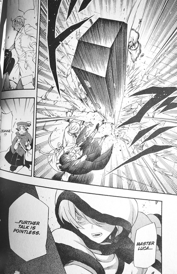
Aesthetically and conceptually, she’s introduced as an active element of the story. At this point, the “forced kiss” scene during the initial fight seems more like a fluke, a comment on Vanitas’s personality (and willingness to do despicable things to get what he wants) rather than Jeanne’s.
That brings me to why I found it so jarring when colored art of her that was subsequently revealed: that agency fell away to portray a visually more passive air.
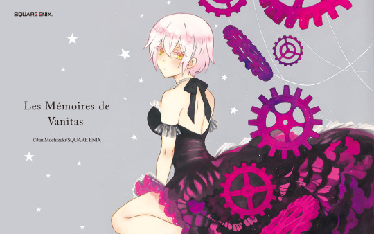
In the existing full-color art we have of Jeanne, she’s more static in her environment, looking towards the viewer but with a face that looks rather blank, even meek. Specifically I want to point out this wallpaper, which I obtained from the official site fairly early on in Vanitas’s serialization (December 2016), in contrast to another piece of official art that was released of Noe and Vanitas with Memoire 11, around the same time:
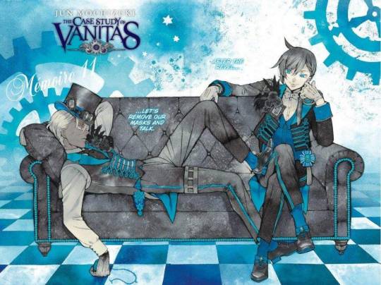
In both cases, the characters are posed intentionally, rather than actively doing something. And, they’re aware of the viewer’s gaze to some extent. However, Jeanne has her back turned to the viewer, and her expression is more idealized and ambiguous. Meanwhile, Noe and Vanitas are rather assertive: their expressions are more intentionally focused, and they seem to know their situation in the artwork. Jeanne is simply passive, very nearly objectified.
...Yeah, maybe this is just my art background speaking. But I also notice something similar happening in other official colored pieces of Jeanne, such as the cover of volume 4.
By this point in the story, lack of agency has become an even more significant element in Jeanne’s character arc: we learn that she’s been cursed. Not only is she unable to speak of the curse, it’s also in direct opposition to one of her primary character motivations, to protect Luca and those she cares about. Due to her uncontrollable urge to kill and drink blood, Jeanne fears that she’ll unintentionally hurt the very people she’s trying to protect.

Jeanne’s involvement with Vanitas also unfortunately comes with a sacrifice of her own agency. Seeing that she’s been cursed, Vanitas demands that she drinks blood from no one but him in exchange for keeping her secret. He further establishes her sense of reliance on him by promising that if he ever does see her lose control, he’ll kill her (so that she doesn’t harm Luca). Whether he’s simply a smitten 18-year-old who doesn’t yet know how to conduct healthy relationships, or whether he’s crafty and intentionally drawing Jeanne in further--or even whether it’s a mix of both--this idea of Vanitas’s control over her is reflected in the cover art for volume 4.
At this point, considering the literal events of the story, Jeanne’s passiveness is not only visual, but symbolic. In this illustration, Vanitas’s hand is grabbing Jeanne by her bow, and functionally by her neck: she’s being dragged along against her will, with little means of escape. And she looks at the viewer with a surprisingly similar expression to the previous illustration: one that communicates little say in the situation.
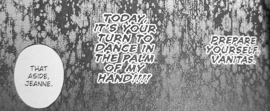
This matches up with their literal relationship in the story itself. Knowing she’s cursed, Vanitas is establishing her exclusive reliance on him, in exchange for keeping important secrets from others with whom she’s close (i.e. threatening to drive a wedge into their relationship). He’s already pushed himself upon her physically with clearly no warning or enjoyment from her. Yes, he’s been kind. And when Dominique trails Vanitas and Jeanne on their date, she notes that Jeanne is “terribly weak against any sort of kindness.” But in spite of some more “cute” and candid moments, the overall dynamic between Jeanne and Vanitas is far from genuine kindness. Returning to how Vanitas garnered an edge over her in their initial fight--with taunting, carefully chosen words--I would phrase it more as that Jeanne, a borreau trained to kill and inexperienced with matters of feelings, is particularly susceptible to emotional manipulation. (There’s more than a little irony in this internal comment from Jeanne, at the beginning of her date with Vanitas:)
Jeanne’s relationship with Vanitas becoming important isn’t, in isolation, inherently an issue. In most cases, it’s fun to see how a character who usually appears unshakeable is rounded out when we see them at their more vulnerable times. What makes me feel squicked out and worried on Jeanne’s behalf is how it’s executed, considering how it works in opposition to how she was introduced as a character, and how Jeanne and Vanitas’s relationship harkens back to known dynamics of abuse.
In other words, my discomfort is not at Jeanne herself for falling for Vanitas and his tactics. It’s at how she’s introduced with a promise of agency in her own story, and that agency is subsequently taken away in how she’s portrayed in official art, and in plot points as the story progresses. It’s at how their relationship begins to fall into a harmful template perpetuated by rape culture, where a man forces himself upon a woman at first, but she is shown to eventually enjoy those advances even when unwanted. I had high hopes for Jeanne as a character developed with her own agency, motives (and yes, for cool fight scenes that WLW like me can admire), and so far, Vanitas’s effect on her has threatened to overshadow these. This is where I think sections of the fandom throwing accusations back and forth of each other being misogynistic, on the grounds of criticizing Jeanne and her relationship with Vanitas, fail to see the wider issue.
Of course, eliciting this sort of discomfort may even be the whole point. Jun Mochizuki is known for putting her characters through tragic and painful situations, and her previous work Pandora Hearts is rife with unstable, imbalanced, and otherwise less-than-perfect relationships. But even without this background knowledge, a decisive scene that convinces me of the intentionality of this purpose is one I’ve written about before: Jeanne’s internal fantasy as she’s left unattended by Luca and loses herself in a storybook.

Here, Jeanne fantasizes about being the agent in her own story, a position that, the art reminds us, is often occupied by a male character such as a prince. Ultimately, this progression looks innocent and could serve to remind us of Jeanne’s more vulnerable, innocuous side. But including it here in the story could also serve as foreshadowing, a contrast to what Jeanne’s situation is like for her in reality. (If you want to read more on this panel specifically, my analysis is in the source link of this post!)
Essentially, critiquing Jeanne as a character requires more nuance than simply judging her individual characteristics. It’s necessary to also take into account the way that the story treats her and her relationships with others and other forces in the story. Not just is she allowed to be soft and emotional, but what consequences does this have for her, and how do the story elements lead the reader to feel about her being soft?
Personally, I think she’s very likeable as a character--her situation just seems unfair, and I feel like she deserves so much better than Vanitas and his schemes. I mean, she could easily destroy him with her gauntlet, and he knows it! But, then, it’s Jun Mochizuki. We should probably expect to be feeling pain and pity for her characters. Still, the relationship between Jeanne and Vanitas has always kinda rubbed me the wrong way, and I think this pretty much sums up why.
102 notes
·
View notes
Photo

Book Review: The Art of Protest: Creating, Discovering, and Activating Art for Your Revolution by De Nichols, illustrated by Diana Dagadita, Molly Mendoza, Olivia Twist, Saddo, and Diego Becas Big Picture Press
Summary: From the psychedelic typography used in “Make Love Not War” posters of the ’60s to the solitary raised fist, some of the most memorable and striking protest artwork from across the world and throughout history deserves a long, hard look. Readers can explore each piece of art to understand how color, symbolism, technique, and typography play an important role in communication. Guided by activist, lecturer, and speaker De Nichols’s powerful narrative and stunningly illustrated by a collaboration of young artists, this volume also has plenty of tips and ideas for creating your own revolutionary designs. This is a fully comprehensive look at the art of protest.
My Thoughts: Within these pages, young readers will find a treasure trove of information about artivism, which according to De Nichols, “combines activism with the power of visual, performative, and experiential art in order to seek positive change.” There is a lot of information, but activities are also proposed along with guidance so that young readers can get started with their own work.
De Nichols is someone who works in collaboration with others and often works to connect people who are seeking the same goals. This book is another piece of artivism done in this communal way. Multiple artists worked to create the visuals that do a fabulous job of supporting the text. The design of the book is out of the ordinary and is reminiscent of protest signs and people using easily available materials to create quick public art. The cover is made of two thick pieces of cardboard and the sewing is visible as there is no spine. Though there are many contributing artists with a variety of styles, they did keep to a similar palette so there is some continuity in that way.
Nichols speaks to how powerful art can be in response to causes that are important to people. I really appreciated the timeline of protest art that highlights protests around the world. There is also a section that explains the use of symbolism, color, and looks into communicating via visual versus verbal language. Readers learn a lot about design elements, but all through the lens of activism and using that design purposefully to create change.
Another portion of the book features youth activists and how they are making change happen right now. It’s encouraging to see the many examples of youth leadership in our world today. It offers proof that young people can really communicate their message in incredible ways using things as simple as sidewalk chalk and posters or more complicated means like technology.
Recommendation: Get it soon especially if you have an interest in youth activism. There are many examples and ideas to inspire folks and give them hope for change.
Pages: 80 Availability: On shelves now Review copy: Final copy via publisher
Extras: De Nichols TedTalk
6 notes
·
View notes
Photo

Three Women designers and their influence on contemporary typographic design

Paula Scher is one of the most influential graphic designers of recent and has worked for the design firm Pentagram since 1991. Her designs can notably be seen in the Public Theatre logo and its promotional material. Her poster for “Bring in ‘da Noise, Bring in da Funk” was groundbreaking, it helped to shift the perception of the Public Theatre and its shows. She used typographic design to express the feeling of the show by displacing text that fills the entirety of the poster. It strikes the feeling of rhythm within a tap dance and is filled with life, just like New York. This design really put Paula Scher on the map and was such an influential design that Paula herself admits (to her dismay) that everyone began to imitate the design.
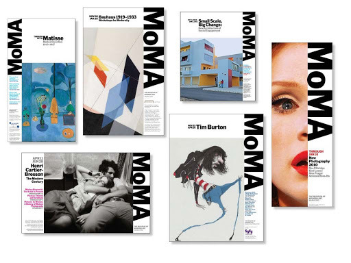
When speaking about her work for MoMA, she touches on the difficulty they faced in creating consistent designs for their promotional material. Scher managed to align this to the lack of communication between departments at the company and suggested a structural overhaul for creating more consistency within the brand. The outcome was an adaptable design template that could be used across a variety of marketing materials along with a new Art director at the helm. An innovative and game changing direction for MoMA that really speaks of Scher’s brilliance.
“sometimes it’s not the design, it’s the people” (99U, 2012)
Scher has also worked on larger scales creating environmental graphics for interior and exterior buildings. The aim of these was not only to be a purposeful design for navigation but also to create a sense of a place. This idea reminds me of Otl Aicher’s stick figure designs for the Olympics’72 where the iconic bathroom figures originated in order to create an inclusive signage system for multitudes of languages.
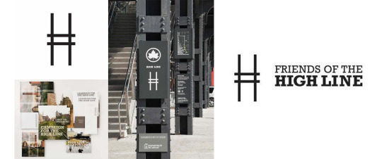
Scher played an integral part in bringing about The New York High Line Logo and its fruition as an attraction. The logo itself was a simple letter ‘H’ derived from a font used in British railroads and was altered to resemble the look of track lines. Scher says the design was easy and she was originally surprised the project became a reality due to its huge fundraising goals.

I recently watched Scher’s episode on Netflix’s Abstract. It was incredibly insightful to listen to her speak about her design process and the importance of the use of language in conveying your message about a design.
"Designing the logo isn't the hard job, it's persuading a million people to use it" (Netflix 2020)
Scher says her most brilliant ideas come to her in the back of NY taxicabs, the process is “allowing my subconscious to take over so I can free associate. You have to be in a state of play to design, if you aren’t in a state of play you can’t make anything.” (Netflix, 2020)

Gail Anderson is a New York based Graphic Designer who was mentored by none other than the iconic Paula Scher. Anderson’s work spans from its beginnings in the late 80’s working at the Boston Globe, to working for Rolling Stone Magazine where she helped define its definitive style during its peak years. A job that offered less money but she felt was an opportunity of a lifetime has reminded her throughout the years to keep on challenging herself even if a job sounds a bit scary or unknown.
“-had I not done that (taken the Rolling Stones job) - I would have been kicking myself because it was this golden moment at the magazine that I got to be part of.” (AEF, 2019)
After 14 years Gail moved on to work with SpotCo. creating iconic promotional posters for very well known Broadway and Theatre productions where the focus was on creating designs that help give an overall sense of a show.
“we are trying to provide an emotional promise - you’re not framing a scene or a moment” (American Theatre Wing, 2013)

Her most current endeavours are with her own design studio, Anderson Newton Design (AND) and as a faculty member at her old stomping ground of the School of Visual Arts. Throughout her years in the design industry she has created a variety of design based books with co-author Steven Heller all about illustration, design and typography and was the first woman of colour to achieve the American National Design Award of Lifetime Achievement from the Smithsonian Design Museum in 2018.With over 30 years of design work under her belt, there is no doubt in saying that Anderson has had a great influence on contemporary typographic design. A self confessed design book hoarder, Gail has been scrapbooking her own magazines from a young age and found her calling through her curiosity of illustration and type design within these publications. Gail preaches the importance to a designer of being aware of the world around them and not just what is in front of them whilst scrolling on a screen. A sentiment we can all certainly learn from.

Jessica Hische is a letterer and occasional type designer based in San Francisco. Her hand lettering has become well recognised and can be seen in a variety of her high profile client work throughout the years from Starbucks, Penguin, Mailchimp and The Washington Post.One of Jessica’s most well known projects was her drop cap series for Penguin Random House. Here her hand lettering mixed with an illustrative look allows her distinctive style to shine. The designs are minimal and yet each letter standing alone subtlety tells a story about the theme of the book.

She has become so well known for her lettering work that Hollywood eventually came calling. Director Wes Anderson commissioned a custom font for his 2012 movie titles of ‘Moonrise Kingdom’ a film focused on 2 kids adventures in a small New England town. Hische created a custom font titled ‘Tilda’ just for this purpose. Derived from the Edwardian Script typeface but a little less formal and with influence from the titles of La Femme Infidele. Hische created an elegant, cursive and almost fairytale looking typeface that had a hand written feel to it. The type itself became a huge part of the identity and branding of the film.
“- if you think about New England in the ’60s… it’s not like most places would be staying on top of the most current trends in type - So, using something from the ’40s made sense to me. If you think about a small, conservative New England town, lord knows all the printers and designers in town are probably still using type from years ago.” (Landekic, 2014)

References below
Paula Scher Section
99U (2012). Paula Scher: Do What You’ve Never Done Before. YouTube. Available at: https://www.youtube.com/watch?v=zwekunL3dFA [Accessed 16 Oct. 2019]
Netflix (2020). Abstract: The Art of Design | Paula Scher: Graphic Design | FULL EPISODE | Netflix. YouTube. Available at: https://www.youtube.com/watch?v=LCfBYE97rFk [Accessed 31 Mar. 2021]
Williams, M. (2019). Paula Scher exhibition looks at graphic design in the public sphere. [online] Creative Review. Available at: https://www.creativereview.co.uk/paula-scher-public-theater-design-mcr/
pentagramdesign (2019). Paula Scher — Pentagram. [online] Pentagram Available at: https://www.pentagram.com/about/paula-scher.
Cowan, K. (2019). Paula Scher on falling in love with typography, timeless identities and what it takes to become a great designer. [online] Creative Boom. Available at: https://www.creativeboom.com/features/paula-scher/
Gail Anderson Section
Narang, P. (2020). Women in Design: Gail Anderson. [online] Smith Design. Available at: https://smithdesign.com/blog/women-in-design-gail-anderson/ [Accessed 31 Mar. 2021]
American Theatre Wing (2013). Art Director. [online] www.youtube.com. Available at: https://www.youtube.com/watch?v=GE0KOFJuNNc [Accessed 31 Mar. 2021]
AEF (2019). Episode 11: AEF Industry Conversation with Gail Anderson. [online] www.youtube.com. Available at: https://www.youtube.com/watch?v=RmLb9EMKO1k [Accessed 31 Mar. 2021]
Esposito, E. (2019). Designers who inspire: Meet Gail Anderson | Inside Design Blog. [online] www.invisionapp.com. Available at: https://www.invisionapp.com/inside-design/meet-gail-anderson/
archives.sva.edu. (2014). SVA Archives. [online] Available at: https://archives.sva.edu/blog/post/first-look-gail-anderson [Accessed 31 Mar. 2021]
Jessica Hische Section
Wood, A. (n.d.). Jessica Hische, Letterer & Illustrator. [online] wayswework.io. Available at: http://wayswework.io/interviews/jessica-hische-letterer-and-illustrator
Butler, A. (2014). interview with letterer jessica hische. [online] designboom | architecture & design magazine. Available at: https://www.designboom.com/design/interview-jessica-hische-03-31-2014/
Landekic, L. (2012). Moonrise Kingdom. [online] Artofthetitle.com. Available at: https://www.artofthetitle.com/title/moonrise-kingdom/
8 notes
·
View notes
Text
The imagery of BBC ‘Dracula’: mythology, alchemy, literature. Part 3

Part 1.
Part 2.
Alchemy
Consideration and analysis of alchemical images in any modern text always encounter the same problem: unlike mythological or literary images and symbols, alchemical ones do not have their own ‘vocabulary’ which authority the researcher can rely on. Simply because the meaning and significance of alchemical texts were deliberately obscured by their authors in order to make complex and potentially dangerous knowledge inaccessible to the layman. However, some key elements of alchemical philosophy and theory – thanks to C.G. Jung and his school – can still be tried to be seen and analyzed. According to the Jungian theory, alchemy is primarily about transformation, change, as well as the connection between the external and the internal, the spiritual and the physical, the ordinary and the magical.
Based on these ideas, I chose among the many alchemical images used in Dracula, those that I want to talk about in this article.
It is color, blood, and metamorphosis.
Color
The symbolism of color in alchemy is complex and diverse, but the most important for it is the visual ‘orchestration’ of the main alchemical process – the creation of the philosopher's stone, or the Great Work.
Based on the logic of the study of Jungian philosophers and psychologists, I propose to consider it here as a metaphor for the development of the spiritual principle and the passage of a person on the path of self-improvement.
Black
The first color that we encounter in the story of Dracula is not red, as one might expect. Anyway, that's how it happens in the BBC film. In the same Bram Stoker's Dracula by F.F. Coppola, the Count initially appears before us in the first scene in red, not to mention the red skies and the spill of scarlet blood in the prologue. In BBC Dracula, at the beginning of the first episode, there is practically no red. But quite a lot of black.
In the alchemical tradition, the black color is associated with the original matter that has not undergone a transformation, the very basic material from which everything comes, a universal dough that can take any form when touched by the spirit. In the alchemical narrative, this is a matter before purification, primitive chaos.
I would say – psychological infancy.
What does Dracula look like appearing on the stairs in front of Jonathan Harker the first time they meet?
This is one of the most interesting things about the BBC film. Contrary to the expectations of the audience, taught by ‘vampire’ stories and tuned in to the perception of a certain aesthetics, Dracula's clothes are not black.
No black cloak, no raised collar, no grim Gothic aristocrat. Before Jonathan appears a nondescript old man in a dress of either gray or brown. Strictly speaking, it is hardly possible to determine the shade of his clothes at all (there is a hint – surprisingly, the printed fabric of Dracula's robe resembles the color and texture of the stone walls of the castle, forcing the viewer to ask himself at the beginning what is hiding behind this hardened shell?). This uncertainty is all the more interesting because the more time passes, the more not only the face and figure of the Count will change, but also the color and style of his clothes.

For the first time, black appears at dinner, during which already pretty shabby and emaciated Jonathan asks Dracula if there are living people in the castle besides them. In this episode, the Count is completely dressed in black – the only bright spot in his suit is a white collar, reminiscent of a colorata. Dracula casts a mocking glance at Johnny and replies, ‘No, Jonathan, there is no living here.’
And this is absolutely true. At the level of the plot, because Dracula is not alive, but at the symbolic level – because he is at the stage of ‘black earth’, completely belonging to mortal matter, not spiritualized and undeveloped. It does not even have a voice yet and it does not realize that it needs transformation.
After several episodes and dramatic moments, in which darkness and blackness from different sides show the nature of what is happening in the castle and with the Count himself, after Harker, exhausted, almost drunk down and destined for destruction, comes to his senses in the basement, finally appears the cloak.
This is a new form of manifestation of black – because it is no longer an amorphous color that appears here and there (among the many moments of black color appearance, the cloak also flickers, but as the robe of a dead man rising from the grave, and neither Jonathan's attention nor the viewer's one lingers on it), but the attribute of the object with which the hero interacts, the object that is this hero`s distinctive feature.
Even more. Pay attention to how Dracula puts on the cloak. In addition to the Count's inherent desire to show off and produce a stunning effect on the trembling victim, in this movement – a cloak thrown over his shoulders, fluttering like wings – there is a hint and a premonition of black not as chaos, but as the beginning and the dark night of the soul.
In the meantime, it is a cloak that covers the secret of something that has already arisen and is slowly ripening inside. This is confirmed by the red joined to the black – the lining of the cloak, symbolizing both blood and the next stage of the Work, called by the alchemists rubedo.
But this is still a long way off.
First, you need to put the original matter in the crucible and let it heat up.
This process has already begun in the castle. The interaction between Dracula and Jonathan, which we considered earlier, can also be considered from the point of view of the alchemical Work – the result will be the same. There is evidence that the combination and mutual influence of these two ‘substances’ have done their job in the color scheme of the same scene on the roof. First, Dracula, putting Jonathan on the sunlit part of the roof, lies down next to Harker, spreading his cloak – with the red lining up, and then, surrounded by golden rays (not yet reaching for Dracula), they engage in a dialogue about the sun, which at this time of year, according to Dracula, sets behind the second highest mountain peak and should be quite red.
Everything is ready for the next stage of transformation, which takes place in the convent.
We will not delve into the symbolism of the monastery, just note that it represents two key things for alchemical metaphor: the hermetic space (crucible) and since in this case, there is a nunnery, the habitat of the anima.
What happens when Dracula appears in the monastery?
According to the alchemical tradition, in order to begin the process of transmutation, it is necessary to put the primordial substance (dark matter) into the fire.
Remember what Dracula does when Agatha invites him to ‘step out of the shadows’?
He knocks over the lamp. After that, a man covered in red appears from the black skin of the wolf.
Red
Since the moment Dracula entered the monastery, a lot of blood appears in the film. For comparison – during the entire stay of Jonathan in the castle, there was almost no blood on the screen. Despite the fact that then the Count was actively feeding on Harker and was clearly experimenting with ‘brides’ in the basement. And only when the story went beyond Dracula's inner world, and (to use the same alchemical terminology) Dracula's ‘shell’ cracked, the streams of blood literally filled the visual plane of the text.
This continues throughout the second episode, and here it is important to pay attention to the fact that in parallel with the ‘blazing’ of red in the guise of Dracula, white begins to appear over and over again (a white shirt in combination with a black vest in interaction with Agatha – by the way, in contrast to a tightly buttoned black cape or a tuxedo in communication with the passengers of Demeter in reality) until it ends with the visual dominance of a white blouse before the hero`s being confined in a sealed box for the further process.
The white color symbolizes the albedo stage – the last before the appearance of the magisterium, the philosopher's stone. We'll come back to white later, but for now, let's continue with red.
After the awakening of Dracula in the twenty-first century, red becomes the main color, and at first glance (as, indeed, in the second episode), it seems that this is due to the desire of the creators to portray the hero as a bloody killer. At a certain level, this is true. At the plot level, red is associated with Dracula's attack on victims and blood. But on a symbolic one, everything is more complicated.
This is best illustrated in the scene at Bob's house. From the point of view of storytelling, it is difficult to imagine an episode in which the inner content would be conveyed so accurately, succinctly, and voluminously using different, complementary tools.
Look. When Dracula enters the house, both the hallway and Kathleen's bedroom are immersed in deep red. At the level of the plot, it, of course, means the predatory nature of Dracula and his desire to devour Kathleen the same way he devoured her husband. At the same time, note that there is a lot of red at the beginning of the scene, but it does not dominate, does not absorb all other colors. There are gold, blue, gray, navy blue mixed with it. A bit black, there is white and others. But as Dracula first conducts a conversation with Kathleen, and then switches to Zoe who came after him, red becomes more and more, and when Zoe enters the house, there are simply no other shades left.
And here is the most interesting thing. Dracula bites Zoe, and she ends up in his head, in his ‘mind palace’. Speaking about this scene, it is usually indicated that the image of Dracula's ‘mind palace’ is presented in a deliberately ‘vampire’ aesthetics, which emphasizes, again, his predatory nature. But if we look at this scene from the point of view of the alchemical metaphor, we see a lot of red and an almost complete absence of black.

Black, chaotic, primitive matter almost receded, practically disappeared, remaining in the background as dark spots and tree trunks – ‘rods’ (the very frame, without which incarnation is generally impossible), and everything else is red. Looking down, Zoe sees a red liquid, and the first thought that arises when we are looking at it: it's blood. Well, it is, indeed. But it is also a visually shown onset of a new stage of the Work, the rubedo stage, at which the old solutions no longer work, and new ones have to be looked for.
Part 4.
11 notes
·
View notes