#ignore the compressed jpeg
Explore tagged Tumblr posts
Text

average elpowell listening activities
#i am a fan i am a fan i am a fan#elpowell how could i ever doubt you#ignore the compressed jpeg#op#emerson lake and powell#elp band#<- kinda??
3 notes
·
View notes
Text

hi
88 notes
·
View notes
Note
So just gonna like... ignore everything that was explained to you about how Tumblr stores images because you're butt hurt that the person you were harassing didn't hold your hand and pat you on the back and tell you that all is forgiven. How mature.
Nightmaretour? Is that you?
I said that this case was closed. Yet you asked me.
Regardless of who you are, since you just had to open this wound up once more, fine. We'll humor you.
nightmaretour was right that about how tumblr stores images.
I should've explained that clearly and we deeply apologize with not thinking straight. Again, this whole situation destroyed a whole bunch of braincells.


That said, he was wrong that the original size of the picture was smaller than it actually was. And believe me, we have evidence to prove it.
is-it-ai-art and I were testing to see if tumblr was hi-rezzing images or not, especially if the image was low quality.
To test that theory, he used my plant image:

Here it is as an icon:

And here's the icon image blown up to 512:

Now, we'll compare it to crippled-peeper's image.
Here's the icon image:

And here's the icon image blown up to 512:

Notice the lack of jpeg artifacting and fuzziness.
Yes, I know the files are pnjs, but the point stands.
And if you still do not believe me for some bizarre reason, perhaps this video would help:
The proof is as clear as day. The full image file has not been artificially inflated, because it's original size is already bigger than the 512.
It's right there in the code.
If that's not enough you can also check out this video.

So nightmaretour, if the anon even is you, maybe you should learn what jpeg compression artifacting actually looks like because right now you look like a smug idiot.
In the meantime, I'm going to close this case permanently, because that's what this case was, is, and should be. CLOSED.
Any future anon or user that tries to ask me about the plant profile pic will get blocked, reported for harassment, or ignored.
We're done here.
14 notes
·
View notes
Text


progress for today! mainly tedious invisible/subtle shit. i segmented her arms and legs in preparation for posing, studied the textures on a few sonic models (sonic r tails, gamecube sa2 shadow, heroes rouge), created a texture separately and shifted the palette a bit, applied said texture (sooooo shittily. ignore the fucking jpeg compression transferring files from my ipad to my phone to my laptop sucks ass and i fucked up okay. also i still dont get uvs or textures despite the studying), and modelled new wheels.


im not totally set on this yet but for now i've changed her skates into real normal skates with an almost sensical rail attachment system akin to like joycons or something. im super conflicted abt this cause on the one hand i think it's cooler and suits her better all around, but it breaks my immersion so bad to imagine her traversing super varied terrain in these, and why the fuck am i making her design MORE complicated im so screwed. on the other hand the nonsense sphere wheels were getting to me so bad i couldnt stand them any more, extreme gear is so fucking hard to designnnn i couldnt understand it at all, and the floaty sci fi shit of ex gear also clashed with her 1920s paperboy/aviator shtick, but the all-terrain-ness and speed and pre-established-ness or of ex gear is soooo alluring. idk man idk
to do next: unfuck textures (again. differently this time), make ribbon (im thinking just a transparent texture is the way to go this time, i tried modelling it a couple times today but it's just way too small), make hand poses (rock, paper, scissors, gun), pose.
i think we're closer to the finish line than the start now..........

#rambles#3d adventures#goddd i need to find some program for making pixel art textures trying to do this shit in procreate killed me#gif warning#flickering lights#tw flickering#srry idk whats up with that. i couldnt get the gif to Not do that#oc posting#squabble the pigeon
16 notes
·
View notes
Text
STOP USING RAR
rigorous discussion about comic book file formats ensuing on the manga piracy subreddit last night. I've taken the side that CBR is flawed and the only reason people continue to use it is because they're unfamiliar with the spec. there isn't a lot to know about this subject because there's very little public facing information surrounding the creation of these file formats, which originated with a program called CDisplay (that is now dead, sort of, which is a shame for how influential it has been), but at the same time, the practical information that we have available from using them is very straightforward: CBZ, CBR, CB7 and so on are different file extensions for zip, RAR, or 7z archives respectively. that's essentially it. the extension does a lot to obfuscate to most people that the "obscure" manga format they downloaded from some shady pirate website, is literally just a folder of images that has been compressed, and it's trivial to rename the file and inflate it to see its contents individually (there's a neverending stream of stupid questions relating to this).
imo this variety of options does more harm than good, because you see, the pages, the images (jpeg, gif, png, though some readers also support webp), are already as compressed as they can be, so the efficiency of the program used to create the archive does not matter – if you've ever tried to zip a folder made up only of videos or images and saw that the file size barely shrinked, if at all, that's because ironically, these file formats are already pretty damn efficiently compressed. often the compression step of the archival process is completely disabled because it only slows the time it takes to open the finished archive.
so as a format intended for media distribution, specially often bootleg, user contributed distribution on the web, you'd think CBZ should be the ubiquitous standard, as zip, regardless of its compression efficiency compared to newer algorithms, remains the standard compression utility, it's installed on literally every machine that can display images, including ones with more restrictive software limitations.
but for some reason some fucks keep sharing archives made with 7zip and WinRAR!!!! which is like. idk. it's like purposefully sharing someone's music in much more convoluted notation from what everyone else uses when there's no practical benefit to do so, and continuing doing it after someone has asked you not to and told you that is not standard. it's proprietary software that is not even useful for what people typically use it for (distributing already compressed media online!), cuz you don't get any benefit from it, it just limits the type of devices and number of hoops you have to jump through to open it. it's one of those salient points about how even mild tech illiteracy and ignorance about pernicious licensing in popular freeware software can have meaningful repercussions to media preservation. Windows users not knowing know they don't need to install an external utility to compress files has popularized CBRs to the point I've had to argue with people that wrongly assume they're the standard used in digital comics publishing.
#you have to rely on the author's blessing to extract rar files#so it's considerably more difficult to develop anything that deals with rar archives in an OS agnostic way
8 notes
·
View notes
Photo
I'm pretty suspicious of this.
First, while it pretty clearly looks designed to have each color band be the same size, there are multiple locations (for example, around #4 from the left) that are the width of two color bands, but have the exact same pixel color (hex code #ca70f6 in this case).
This also speaks to my second point, other technical issues. The image is a JPEG, which uses lossy compression guessing at what humans will be able to see. You wouldn't want to do a hearing fidelity test over a phone line, for example. In addition, I see the post is from 2015, and monitors have changed since then, so the number thresholds wouldn't necessarily hold.
Third, moving into the claims involved, 25% sounds way too high to me. At that level, even accounting for things like "It only presents in people with two X chromosomes and they are more likely to be ignored by doctors," it shouldn't be at all difficult to pin down, while the research I've seen all demonstrates minimal effects, suggesting either a small percentage of the population or it doesn't really impact vision to a serious degree. This 2019 paper says that the genes might be fairly common, but still had a lot of difficulty measuring an effect (https://vision.psychol.cam.ac.uk/jdmollon/papers/JordanMollon2019Tetrachromacy.pdf) For a less scientific case, consider the XKCD color survey in 2010. One finding was that self-identified men and women did not have a statistically significant difference in differentiating colors. If you believe this post, then there should have been an easily-measurable effect from the tetrachromatic population (https://blog.xkcd.com/2010/05/03/color-survey-results/).
Fourth, on the topic of sources, the source here appears to be a LinkedIn article, which is a bad sign to start with. The paper it cites is from 2001, which is strange next to the language about this being "recent", and also makes it odd that further studies like the one I posted have had such difficulty measuring an effect.
Finally, as a fifth, anecdotal point, I easily saw 37 colors, and according to one of those data-selling DNA companies, I have XY chromosomes as I would expect. That doesn't fit with any of the studies which are pretty confident that the mutation is only possible for people with only X chromosomes.
I'm sorry to be down on this. It's a fun idea, but I'm not buying it.
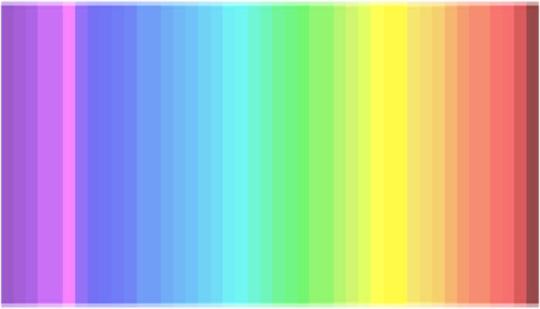
25% of the people have a 4th cone and see colors as they are
Given the sudden interest for the color of dresses and vision, here some of the fascinating findings we did recently.
The color nuances we see depend on the number and distribution of cones (=color receptors) in our eye. You can check this rainbow: how many color nuances do you count?
You see less than 20 color nuances: you are a dichromats, like dogs, which means you have 2 types of cones only. You are likely to wear black, beige, and blue. 25% of the population is dichromat.
You see between 20 and 32 color nuances: you are a trichromat, you have 3 types of cones (in the purple/blue, green and red area). You enjoy different colors as you can appreciate them. 50% of the population is trichromat.
You see between 33 and 39 colors: you are a tetrachromat, like bees, and have 4 types of cones (in the purple/blue, green, red plus yellow area). You are irritated by yellow, so this color will be nowhere to be found in your wardrobe. 25% of the population is tetrachromat.
You see more than 39 color nuances: come on, you are making up things! there are only 39 different colors in the test and probably only 35 are properly translated by your computer screen anyway :)
It is highly probable that people who have an additional 4th cone do not get tricked by blue/black or white/gold dresses, no matter the background light ;)
(x)
379K notes
·
View notes
Text
Upload Your Album on JioSaavn in 2025: Common Mistakes to Avoid
If you're an independent artist or a music producer looking to make your mark in the industry, you need to distribute your music on major streaming platforms. One of the best platforms for artists in India and beyond is JioSaavn. When you upload your album on JioSaavn in 2025, you get access to a massive audience, potential revenue streams, and valuable insights into your listeners. However, many artists make mistakes during the upload process that can impact their music’s visibility and reach. Whether it’s poor audio quality, incorrect metadata, or lack of promotion, these mistakes can prevent your album from getting the attention it deserves. To help you avoid these pitfalls, here’s a detailed guide on the most common mistakes artists make and how you can ensure a successful release.
Mistake 1: Uploading Low-Quality Audio Files
Why Audio Quality Matters
One of the biggest mistakes artists make when uploading music to JioSaavn is not paying attention to audio quality. Streaming platforms prioritize high-quality music to maintain a great listening experience for users. If your tracks have low bitrate, background noise, or distortion, listeners are more likely to skip them.
How to Fix It
Always record and produce your music in a professional environment.
Use lossless or high-quality compressed audio formats such as WAV, FLAC, or 320kbps MP3.
Work with a professional sound engineer for proper mixing and mastering.
Listen to your tracks on different devices before uploading to ensure consistency.
Mistake 2: Incorrect Metadata and Missing Information
The Role of Metadata in Music Discovery
Metadata includes crucial details such as the artist name, song title, album title, genre, and release date. If you enter incorrect information or leave fields blank, it can affect your album’s discoverability on JioSaavn. Mistakes in metadata can also lead to your music being listed under the wrong artist profile, which confuses listeners and reduces your chances of getting streams.
How to Fix It
Double-check all metadata before submitting your album.
Ensure your artist name matches the one used across all streaming platforms.
Select the correct genre and sub-genre to improve searchability.
Add accurate track titles and avoid unnecessary symbols or typos.
Mistake 3: Using Poor-Quality or Unprofessional Cover Art
First Impressions Matter
Your album cover is the first thing potential listeners see before clicking on your music. If your artwork looks pixelated, poorly designed, or unprofessional, it can turn people away. JioSaavn also has specific requirements for cover art, and failing to meet them may result in delays or rejection.
How to Fix It
Use high-resolution images (at least 3000 x 3000 pixels in JPEG or PNG format).
Avoid blurry, pixelated, or heavily watermarked designs.
Ensure your artwork reflects the theme and mood of your album.
If you're not skilled in graphic design, consider hiring a professional designer.
Mistake 4: Not Promoting Your Album After Uploading
Why Promotion is Essential
Many artists think that once they upload their album on JioSaavn in 2025, their job is done. However, music doesn’t promote itself—you need to actively market it to reach your audience. Without promotion, even the best songs can go unnoticed.
How to Fix It
Announce your album release on social media platforms like Instagram, Facebook, Twitter, and YouTube.
Create short teaser clips or behind-the-scenes content to build hype.
Submit your songs to playlist curators on JioSaavn and other streaming services.
Engage with fans by responding to comments, hosting live sessions, and encouraging shares.
Mistake 5: Ignoring JioSaavn’s Artist Tools
Making the Most of JioSaavn’s Features
JioSaavn offers several tools for artists to track their performance, analyze listener demographics, and optimize their reach. Many artists fail to take advantage of these tools, which means they miss out on valuable insights that could help them grow their audience.
How to Fix It
Sign up for JioSaavn Artist Insights to monitor your streams and audience data.
Use analytics to understand which songs are performing best and why.
Adjust your marketing strategy based on listener engagement metrics.
Mistake 6: Releasing Music Without a Strategy
The Importance of a Release Plan
If you release your album randomly without a proper plan, you might not get the best results. Many artists rush their releases without setting up pre-release marketing, scheduling their drop at the right time, or planning for post-release promotions.
How to Fix It
Set a release date at least a few weeks in advance and start building excitement.
Submit your album early to ensure it gets approved on time.
Collaborate with influencers and bloggers to generate buzz.
Plan a launch event or listening party to engage with fans.
Mistake 7: Not Understanding Copyright and Licensing
Protecting Your Music Rights
Many independent artists upload their music without properly understanding copyright laws. If you don’t have the rights to a beat, sample, or instrumental, your music might get taken down due to copyright claims.
How to Fix It
Only use original compositions or properly licensed beats.
Register your songs with a performing rights organization (PRO) to protect your royalties.
Read and understand JioSaavn’s content guidelines before uploading.
Mistake 8: Expecting Instant Success
Patience and Persistence in the Music Industry
Some artists get discouraged when they don’t see immediate results after uploading their album. The truth is, building an audience takes time, and streaming success doesn’t happen overnight.
How to Fix It
Be consistent in releasing and promoting music.
Engage with your audience and build a loyal fanbase.
Network with other artists and collaborate on projects.
Focus on creating high-quality music rather than chasing quick success.
Conclusion
Uploading your album on JioSaavn in 2025 can be a game-changer for your music career, but it’s important to do it the right way. Avoiding common mistakes like poor audio quality, incorrect metadata, lack of promotion, and ignoring artist tools can help you achieve better results. The key to success on streaming platforms is attention to detail, proper planning, and continuous promotion. Take the time to optimize your album upload process, engage with your audience, and make the most of JioSaavn’s features to maximize your reach.
Have you ever made any of these mistakes while uploading your music? Share your experience in the comments and let’s help each other grow! 🚀
Related Articles:
For further reading, explore these related articles:
Upload Your Album on JioSaavn and Earn Money
How to Upload Your Album on JioSaavn as an Independent Artist
Why JioSaavn is a Great Platform for Independent Artists
How to Upload Your Album on JioSaavn with No Upfront Fees
For additional resources on music marketing and distribution, visit DMT Records Private Limited.
0 notes
Text
How to Optimize Website Performance | Sky Era Technologies Pvt Ltd
How to Optimize Website Performance | Sky Era Technologies Pvt Ltd
Boost your website’s speed and user experience with expert tips from Sky Era Technologies Pvt Ltd. Learn actionable strategies to optimize website performance and improve SEO rankings.
Introduction
Let’s start it—no one likes a slow loading website. In today’s fast-paced digital age, your audience wants speed and efficiency. If your website doesn’t loading faster, audience bouncing off faster than a superb all on a hard floor. But optimizing your website performance isn’t rocket science. Let’s dive into how you can make your site load faster and perform better.
Understanding Website Performance
What Is Website Performance?
Website performance refers to how quickly and efficiently your website loads and functions for users. It’s the backbone of your online presence—slow speeds or frequent discontinuity can drive users disappeared.
Key Performance Metrics
Metrics like page load speed, time to first byte (TTFB), and overall responsiveness measure how well your website performs. They are vital indicators of user satisfaction and search engine rankings.
Importance of Website Optimization
User Experience (UX)
Think about it: Have you ever waited more than a few seconds for a site to load? Neither have your customers. A fast site equals happy users, and happy users are more likely to stick around and convert.
Search Engine Rankings
Google loves speed. Faster websites are ranked higher on search engines, giving your site the visibility it deserves. Speed isn’t just a luxury—it’s a necessity.
How to Optimize Website Performance
Optimize Images
Images are often the biggest offender behind slow load times. Compressing and resizing them can significantly reduce their impact.
Choose the Right Format
Use formats like webp or optimized JPEGs instead of heavy PNGs. Not every image needs to be ultra-high quality—find the balance between quality and performance.
Enable Browser Caching
Browser caching allows repeat visitors to load your site faster by storing some files locally. Setting an proper ends period can make a huge difference.
Minimize HTTP Requests
The fewer resources your site loads, the better. Combine CSS and JavaScript files and reduce the number of plugins to lighten the load.
Use a Content Delivery Network (CDN)
A CDN distributes your website data across multiple servers worldwide, reducing the distance data has to travel. The result? Faster load times for everyone, everywhere.
Optimize Server Performance
Your hosting provider plays a big role in performance.
Use Faster Servers
Consider upgrading to SSD-based servers or VPS hosting for quicker processing speeds.
Upgrade to HTTPS
Not only does HTTPS improve security, but it can also enhance your SEO and instill trust in your visitors.
Reduce Redirects
Unnecessary redirects slow down your site. Audit your website and eliminate redundant redirections.
Implement Lazy Loading
Lazy loading ensures that images and other resources load only when they’re visible on the screen. It’s a great way to prioritize critical content and improve load times.
Tools for Monitoring Performance
Google Page Speed Insights
Google’s own tool analyzes your website and provides actionable recommendations to boost speed and performance.
GTmetrix
GTmetrix offers a detailed breakdown of your site’s speed issues, including recommendations for improvement.
Lighthouse
Lighthouse, a tool integrated into Chrome, helps you audit performance, accessibility, and more.
Common Mistakes to Avoid
Oversized Images
Large, un-optimized images are one of the biggest performance killers. Compress them before uploading.
Ignoring Mobile Optimization
With the majority of users browsing on mobile devices, a responsive design isn’t optional—it’s mandatory.
Conclusion
Optimizing your website performance isn’t just about making your site faster—it’s about creating a better experience for your users, improving your SEO, and boosting your conversions. By implementing the strategies above, you’ll have a website that’s not just functional but exceptional.
Website performance optimization is more than just a technical exercise—it’s a commitment to delivering a seamless experience for your users. By focusing on faster loading speeds, smarter resource management, and user-friendly practices, you can elevate your site’s performance and create a lasting impression.
At Sky Era Technologies Pvt Ltd, we understand the importance of a well-performing website. With the right strategies, tools, and ongoing maintenance, your website can become a powerful asset for your brand. Remember, a faster website isn’t just about technology—it’s about better serving your audience. Let’s optimize together!
FAQs
1. Why is website speed important? It impacts user satisfaction, SEO rankings, and conversion rates.
2. How do I compress images for my website? Use tools like TinyPNG or online compressors to resize and reduce file size without losing quality.
3. What is a CDN? A Content Delivery Network improves site speed by distributing content across multiple servers globally.
4. How often should I monitor website performance? Regularly—ideally once a month or after major updates.
5. Does HTTPS improve website speed? While its primary focus is security, HTTPS can enhance performance when combined with HTTP/2.
0 notes
Text
Les erreurs à éviter lors de la conception graphique d'une carte de visite numérique
Introduction
La conception graphique d'une carte de visite numérique est un élément crucial pour toute entreprise ou professionnel qui souhaite se démarquer dans le monde numérique. Une carte de visite créer carte nfc numérique bien conçue peut attirer l'attention des clients potentiels, transmettre une image professionnelle et aider à renforcer la marque. Cependant, carte de visite sans contact il est important de connaître les erreurs courantes à éviter lors de la création d'une carte de visite numérique afin d'obtenir les meilleurs résultats possibles.

Dans cet article, nous explorerons les erreurs fréquentes commises lors de la conception graphique d'une carte de visite numérique et nous vous fournirons des conseils pratiques pour les éviter. Que vous soyez un designer graphique professionnel ou une personne qui souhaite créer sa propre carte de visite numérique, ces conseils vous seront utiles pour créer une carte attrayante et efficace.
Les erreurs à éviter lors de la conception graphique d'une carte de visite numérique 1. Ignorer l'importance du design minimaliste
Une erreur courante lors de la conception d'une carte de visite numérique est de surcharger le design avec trop d'éléments visuels. Il est essentiel d'adopter une approche minimaliste en choisissant des couleurs simples, des polices lisibles et en limitant le nombre d'informations affichées. Un design épuré permettra aux destinataires de la carte de visite numérique de se concentrer sur les informations clés et facilitera la lecture.
2. Utiliser des images non optimisées
L'utilisation d'images non optimisées peut ralentir le chargement de la carte de visite numérique et rendre l'expérience utilisateur frustrante. Veillez à compresser les images pour réduire leur taille sans compromettre leur qualité. Il est également préférable d'utiliser des images au format JPEG ou PNG, qui offrent une bonne qualité tout en étant optimisées pour le web.
3. Ne pas utiliser un design responsive
Avec l'utilisation croissante des smartphones et des tablettes, il est essentiel que votre carte de visite numérique soit compatible avec tous les appareils. Assurez-vous d'utiliser un design responsive qui s'adapte automatiquement à différentes tailles d'écran. Cela garantira une expérience utilisateur optimale, quel que soit l'appareil utilisé pour consulter la carte de visite numérique.
4. Oublier d'inclure les informations de contact essentielles
L'objectif principal d'une carte de visite numérique est de fournir aux destinataires vos informations de contact. Il est donc essentiel de ne pas oublier d'inclure ces informations clés telles que votre nom, votre adresse e-mail, votre numéro de téléphone et éventuellement votre site web. Assurez-vous que ces informations sont clairement visibles et faciles à trouver sur la carte de visite numérique.
youtube
5. Utiliser des polices illisibles
Une autre erreur courante est d'utiliser des polices complexes ou illisibles sur une carte de visite numérique. Optez plutôt pour des polices simples, lisibles et adaptées à la taille de l'écran sur lequel la carte sera consultée. Évitez également d'utiliser trop de polices différentes, car cela peut rendre le design confus et peu professionnel.
6. Ne pas tenir compte de l'accessibilité
L'accessibilité est un aspect important de la conception graphique d'une carte de visite numérique. Assurez-vous que les couleurs utilisées ont suffisamment
0 notes
Text
5 Common Web Development Mistakes to Avoid

Introduction:
In today’s digital era, a well-designed website is crucial for any business or company. It’s your online storefront, your online presence, and sometimes, your first impression. But with so much to consider during website development, even seasoned professionals can fall into common traps. This blog post will explore five common web development mistakes and guide you on how to avoid them, ensuring your website delivers an optimal user experience.
5 Common Web Development Mistakes:
1. Ignoring Responsive Design:
How individuals connect to the internet has undergone a significant transformation. In 2022, more than 58% of worldwide website traffic was attributed to mobile devices. If your website isn’t responsive, meaning it doesn’t adapt its layout to different screen sizes, you’re losing a large chunk of your potential audience. If Users on smartphones and tablets are met with clunky interfaces, unreadable text, and frustrating navigation, it will lead them to bounce off your site quickly.
Solution: Choose responsive design techniques from the get-go. Implement CSS media queries to adapt layouts, fonts, and images according to screen size. Use frameworks such as Bootstrap or Foundation to simplify this procedure.
2. Lack of Hierarchy:
A website without a clear hierarchy is like a cluttered room; it’s overwhelming and difficult to navigate. Information should be presented to guide users towards the most important content. This means using headings, subheadings, bullet points, and white space to create a visual hierarchy that directs the user’s eye and helps them understand the importance of different elements.
Solution: Plan your website’s information architecture carefully. Group related content together, utilize clear and concise headings and leverage white space to create visual separation.
3. Unclear Navigation:
Imagine entering a store where you need help finding the exit or the products you’re looking for. A perplexing navigation system can deter website visitors. Aim for a straightforward, intuitive navigation menu that enables users to locate desired information swiftly and effortlessly.
Solution: Limit the number of navigation options to the most essential ones. Employ clear and concise labels for every menu item. Ensure consistency in placement and design across all pages.
4. Using Unoptimized Images:
Images are powerful tools for enhancing your website’s visual appeal and storytelling. Nevertheless, oversized and unoptimized images can considerably hinder your website’s loading speed. This not only frustrates users but also hurts your search engine ranking.
Solution: Compress images before uploading them to your website. There are many free online tools and plugins available to help you achieve this. Consider using alternative image formats like JPEG or WebP, which offer better compression without sacrificing quality.
5. Ignoring Browser Compatibility:
While most users stick to a few popular browsers, it’s important to ensure your website functions properly across different browsers and devices. Inconsistencies in layout, functionality, or styling can lead to a negative user experience and lost conversions.
Solution: Test your website thoroughly on a variety of browsers and devices during development. Utilise browser developer tools to pinpoint and resolve any compatibility issues. Consider using cross-browser testing services to streamline this process.
Conclusion:
By avoiding these common mistakes, you can create a website that is visually appealing, user-friendly, and effective in achieving your goals. Remember, a well-developed website is an investment that pays off in the long run, attracting visitors, converting leads, and enhancing your online brand reputation.
CodeAroma Technologies is the best web development company in Ahmedabad, Gujarat. Contact us for the best web development services in Ahmedabad.
0 notes
Text
Creating a Mobile-Friendly Multi-Level Marketing Website on WordPress

The Importance of Mobile-Friendliness
In today’s digital world, having a mobile-friendly website is no longer optional; it’s essential, especially for multi-level marketing (MLM) businesses. With more people using smartphones and tablets to browse the internet, your MLM website must offer a seamless experience on all devices. A mobile-friendly site improves user experience, increases engagement, and boosts conversion rates.
This article will guide you through creating a mobile-friendly MLM website on WordPress, ensuring that your visitors enjoy a smooth and accessible browsing experience, whether they’re at home or on the go.
Why Mobile-Friendliness Matters for MLM Websites
Mobile-friendliness is crucial for MLM businesses for several reasons:
Increasing Mobile Users: Statistics show that over 50% of global web traffic comes from mobile devices. Ignoring this trend can result in missed opportunities.
Better User Experience: A mobile-friendly site provides a better browsing experience, leading to higher engagement and lower bounce rates.
Improved SEO Rankings: Google prioritizes mobile-friendly websites in its search results. A mobile-optimized site can improve your search engine rankings, making it easier for potential distributors and customers to find you.
Step 1: Choose a Responsive WordPress Theme
The first step to creating a mobile-friendly MLM website is selecting a responsive WordPress theme. A responsive theme automatically adjusts its layout and design based on the screen size of the device being used.
Recommended Responsive Themes:
Astra: Lightweight and highly customizable, Astra is ideal for MLM sites. It works well with popular page builders and offers several pre-built templates.
OceanWP: This theme is known for its flexibility and responsiveness, making it suitable for any type of MLM website.
Divi: With its drag-and-drop builder, Divi allows you to create stunning layouts that look great on both desktop and mobile devices.
Tip: When selecting a theme, ensure it includes mobile-specific features like mobile menus and touch-friendly buttons.
Step 2: Optimize Your Content for Mobile
Creating mobile-friendly content is just as important as the design of your site. Here are some best practices for optimizing your content for multi level marketing website wordpress.
Best Practices for Mobile Content:
Keep Text Short and Concise: Use short paragraphs and bullet points to make your content easily scannable.
Use Clear Headings: Utilize headings and subheadings to break up text and help users navigate your content easily.
Incorporate Visuals: Use images, infographics, and videos to convey information more effectively. Ensure that visuals are optimized for fast loading on mobile devices.
Call-to-Action (CTA) Buttons: Make your CTAs large enough to be easily clickable on mobile screens. Use contrasting colors to make them stand out.
Step 3: Enable Mobile-Friendly Navigation
Mobile users require intuitive navigation to find information quickly. Implementing mobile-friendly navigation ensures that visitors can easily access the pages they need.
Tips for Mobile Navigation:
Use a Hamburger Menu: A hamburger menu collapses your navigation into a single icon, saving screen space while still providing access to important links.
Limit Menu Items: Keep your menu items concise and prioritize the most important pages, such as your “Join Now” or “Products” page.
Include a Search Bar: Adding a search bar allows users to quickly find specific information, enhancing their experience on your site.
Step 4: Optimize Images and Media
Large images and media files can slow down your website, especially on mobile devices. Optimizing these elements ensures faster loading times and a better user experience.
Image Optimization Tips:
Use Appropriate File Formats: Use JPEG for photos and PNG for graphics with transparency. Consider using WebP for better compression without sacrificing quality.
Compress Images: Use plugins like Smush or Imagify to automatically compress and optimize images for faster loading times.
Responsive Images: Implement responsive image techniques (like the srcset attribute) to serve different sizes of images based on the user’s device.
Step 5: Test Your Website’s Mobile-Friendliness
Once you’ve made your website mobile-friendly, it’s essential to test its performance across various devices. Use online tools to assess how well your site functions on mobile.
Tools for Testing Mobile Friendliness:
Google’s Mobile-Friendly Test: This tool analyzes your website and provides suggestions for improving mobile usability.
GTmetrix: GTmetrix tests your site’s speed and performance on mobile devices, giving you insights into areas that need improvement.
BrowserStack: This platform allows you to test your website on real devices, ensuring that it looks and functions as intended.
Step 6: Monitor Performance and Make Adjustments
After launching your mobile-friendly website, it’s crucial to monitor its performance regularly. Gather user feedback and make adjustments as needed to improve the mobile experience.|
Key Performance Indicators (KPIs) to Monitor:
Bounce Rate: A high bounce rate may indicate that users are not finding what they need. Analyze your content and navigation to address any issues.
Session Duration: Track how long users stay on your site. Longer session durations suggest that visitors find your content engaging.
Conversion Rates: Monitor how many visitors are taking action, such as signing up or purchasing products. Low conversion rates may signal the need for better CTAs or clearer messaging.
Conclusion: Embrace Mobile for MLM Success
Creating a mobile-friendly multi level marketing website wordpress is essential for reaching and engaging today’s audience. By selecting a responsive theme, optimizing content, and ensuring intuitive navigation, you can provide a seamless experience for users on any device.
FAQs
1. What is a responsive WordPress theme? A responsive WordPress theme automatically adjusts its layout and design based on the screen size of the device, ensuring an optimal viewing experience on both mobile and desktop.
2. How do I test my website for mobile-friendliness? You can use tools like Google’s Mobile-Friendly Test or GTmetrix to assess your site’s performance on mobile devices and receive suggestions for improvement.
3. Why is mobile optimization important for my MLM business? Mobile optimization is crucial for improving user experience, boosting engagement, and enhancing search engine rankings, ultimately leading to higher conversion rates.
1 note
·
View note
Text
what's even more wild is that there was another file format, JPEG XL, which could've actually become the one-image-format-to-rule-them-all. Some of the improvements over the existing JPEG format include lossless compression mode with smaller filesizes than normal lossy JPEGs, animation, transparency, HDR and multithreaded decoding, while also being fully backwards-compatible (i.e. they'd be rendered as normal JPEG files in software that didn't have compatibility with the new features).
So many big players in the tech industry were on board. Facebook, Intel, Adobe, Nvidia and Shopify were all working on implementing support for it into their products and services. KDE, the open source community behind Krita, Kdenlive, and the plasma desktop environment for Linux (the same one SteamOS uses in desktop mode) already had their implementation ready to go and integrated into their software. Media companies like The Guardian were also pushing for its inclusion in Chromium. There was pretty much universal support for the format across the board...
Except Google, who dropped what little experimental support for the format was in Chromium, and straight-up ignored all feedback from those other organizations asking them to make it a permanent feature rather than dropping support entirely. And it's pretty much entirely because it was in competition with webp (the manager at Google behind the decision was one of the co-authors of the webp format) and AVIF (which Google is pushing as their preferred successor to webp).
The wildest part is that even other engineers at Google were like "this is a bad idea. why are you doing this?" in the bug report discussion regarding this!
me when i meet the person who created webp files

98K notes
·
View notes
Text
Common Mistakes to Avoid in Image Optimization
Online Image optimizer is a crucial step in enhancing website performance and user experience. When done right, it can significantly improve page load times and overall site speed. However, many website owners make common mistakes that can hinder their efforts. In this article, we'll discuss these mistakes and how to avoid them.

Ignoring Image Size: Large images can significantly slow down your website's load time, especially on mobile devices with slower internet connections. To avoid this mistake, always resize your images to the dimensions needed for your website. You can use tools like Adobe Photoshop or online tools like PicResize to easily resize your images.
Not Using Compression: Compression reduces the file size of an image without significantly affecting its quality. Failure to compress images can lead to longer load times and higher bandwidth usage. Tools like TinyPNG and JPEGmini can help you compress your images effectively.
Using the Wrong File Format: Choosing the right file format is crucial for image optimization. JPEG is ideal for photographs, as it offers a good balance between image quality and file size. PNG is better suited for graphics and logos, as it supports transparency and higher image quality.
Neglecting Alt Text: Alt text is important for SEO and accessibility. It describes the contents of an image to search engines and visually impaired users who use screen readers. Always include descriptive alt text that accurately describes the image.
Overlooking Image Titles and Descriptions: Image titles and descriptions are important for SEO. Use descriptive titles and relevant keywords in your image filenames and descriptions to improve your website's search engine rankings.
Using Too Many Images: While images are important for engaging users, using too many can overwhelm your website and slow down its load time. Be selective about the images you use and optimize them properly.
Not Leveraging Lazy Loading: Lazy loading is a technique that defers the loading of non-essential resources, such as images, until they are needed. Implementing lazy loading can significantly improve your website's load time and user experience.
Ignoring Image Sitemaps: Image sitemaps help search engines discover images on your website. Ignoring image sitemaps can result in your images not being indexed properly, leading to lower visibility in search engine results. Always include image sitemaps in your website's XML sitemap to ensure that your images are properly indexed.
In conclusion, online image optimizer plays a crucial role in enhancing website performance. By avoiding common mistakes such as ignoring image size, not using compression, and neglecting alt text, you can ensure that your images contribute positively to your website's user experience and SEO. Remember to always optimize your images for size, format, alt text, and SEO best practices to improve your website's overall performance.
HawkPing tools and services can help you optimize your images effectively, ensuring that they enhance your website's performance and user experience.
1 note
·
View note
Text

made uhhhhh pro-palestinian jet because he's the colors of the palestinian flag. ignore the compression i accidentally saved it as a jpeg
1 note
·
View note
Note
hi jojo, i wanted to ask how you corrupt/datamosh art to get genuine glitches … i think the way computers rip apart jpegs or pngs is both beautiful and gives an interesting look into how they process information. seeing something you carefully constructed by hand be reduced to seemingly arbitrary fragments of data is humbling. i didnt even know this was a thing you could do til i saw you do it (i forget when, i think it was with one of your rainer paintings?)
HI OLIVER!! thank you so much for giving me the opportunity to talk about databending because it's something i adore unabashedly. it's an amazing technique to use whenever you wanna make some Crazy Stuff. i personally use audacity to databend—this is a pretty common method, but i'm gonna make a mini-tutorial about it anyway because it's FUN, and because the process is actually really simple!
Here's the image I'll be imploding for this demonstration. I chose it because it was like the first file in my pictures folder, and because it's a good image.

STEP 1. Prepare your image! It has to be an uncompressed image format such as .bmp or .tif, because compressed image formats (such as .png or jpg) are generally too volatile to work with due to the nature of their data. I opened this image in Paint, saved it as a 24-bit Bitmap, and named it FREAK.bmp, because that's what it is.
STEP 2. In Audacity, go to File > Import > Raw Data. Open the image you prepared, and use these settings to import it:
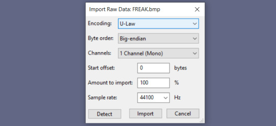
You'll get this image as raw audio data, which I recommend you do NOT play. It will be very loud and abrasive, so probably keep your volume down in case you accidentally play it.

STEP 3. Start messing with the audio! You can use basically anything in Audacity's effects menu for good results, though I tend to favor Bass and Treble, Echo, Invert, dblue Crusher, and dblue Glitch. You can also copy and paste portions of the audio data in different places, and even import other audio to play alongside the data.
Try not to edit the very beginning or very end of the audio, as this might end up corrupting the image header, and it won't be readable as an image anymore. Don't shy too far from them, though; if you avoid them too much, the top and bottom areas of the image will remain unchanged. The positioning of the audio data is surprisingly straightforward, so with enough practice, you can approximate what portion you'll be editing with relative ease.
This is definitely the longest part of the process, since it can take a lot of trial and error for good results. At the start, I recommend doing little portions at a time to get a sense of what exactly your edits are affecting. Try a lot of different things, and remember that Audacity lets you undo things easily and infinitely!
STEP 4. Once your audio is sufficiently screwed, go to File > Export > Export Audio. Use these settings to export it:

Make sure to replace .raw with .bmp, or whatever image format you used.
STEP 5. Enjoy your image! Here's what I ended up with.

For the record, I messed with the audio a LOT here. You can get much more subtle—or much more severe results—depending on how much or how little you alter, or how you alter it. Here's another databent picture, which I made by putting a 3 second clip of "Kiss Me Thru the Phone" over the image data.

It's so interesting seeing a song be reduced to something so arbitrary in an image format. It's equally interesting seeing something as arbitrary as audio waveforms becoming a semi-coherent image, ignoring the Soulja Boy-induced scar in the center. It always makes you wonder how it works. If you sang at just the right pitch, could it became a photo of a sunset? What if it became a portrait of someone you've never seen before, or someone that doesn't exist at all? That's obviously impossible, but there's this strange sense of wonder about it anyway. It still seems plausible, because the data that constitutes an image is generated in such a way that there exist infinite, arbitrary combinations—combinations which might just be coherent to us, if a billion different binary stars align.
The way this data is stored isn't arbitrary at all though, even if it looks that way to us. Audacity's audio waveforms are only one way to visualize this raw data. Here's FREAK.bmp, but visualized via plaintext rather than audio data.

Computers just seem so magical sometimes. The raw data is incomprehensible to our eyes, but they can read it for us and transmit exactly what they see. As long as you keep the proper headers in place, it'll still read this data as a picture, as perceivable pixels, no matter how nonsensical it otherwise looks to a human.
It's interesting to think about databending in terms of glitches. The results are often very similar to glitches that might organically manifest, but the process is entirely intentional. It usually takes some effort and intent to get a "good" result from databending, but glitches and corruption are entirely void of human intent. They just happen, arbitrarily, for any number of reasons.
If something's just a little out of place, you might get a huge, jarring stripe slashed across the image's center—or you might break the image entirely, if it's out of place a little too far to the left. You'd never be able to tell the difference yourself, but a computer certainly can. But to a computer...

... these images might as well be identical.
#in conclusion: i like when images are wacky!#also this isn't entirely related but i recently rewatched this video about how sprites are compressed and read in gen 1 pokemon games:#https://youtu.be/aF1Yw_wu2cM <- go watch it if you wanna see more things reduced to data AND how it works. it's COOL
206 notes
·
View notes
Note
An idea: compressing images and videos a bit that haven't been seen in years. Not in terms of jpeg compression, I mean literally compressing the files in an archive and extracting them at request-time. It taking a little bit longer to retrieve is worth the reduced file size for files that aren't being accessed often.
Actually you probably do this already, so ignore me if that's the case.
The major costs of Tumblr are just storage and access CPM, right? Would optimizing the way posts are stored and compressing the data more efficiently significantly cut costs?
no... i believe the biggest cost of tumblr are the (extremely small number of) people working on it. maybe after that is bandwidth and then storage and then compute power? it's been a little while since i've looked at that breakdown though, so i could have that mixed up.
regardless, yeah, yet another reason we invested a lot of time in the Neue Post Format was to save on storage costs and compute costs -- it's cheaper to compress, store, serialize, and deserialize, than our old post format.
but the thing that really takes up the most space are images and videos anyway, that's probably like 95% of our storage. at one point we had the biggest Amazon S3 storage bucket in the world (i don't know if that's still true).
58 notes
·
View notes