#i'm trying something with the lineart... i think it looks nice
Explore tagged Tumblr posts
Text

smile smile~
#mari ohara#ohara mari#love live#aqours#love live sunshine#llsif#llsifas#love live art#a redraw!!! from the anime#i'm trying something with the lineart... i think it looks nice
150 notes
·
View notes
Text
✧.*100 follower celebration type thing*.✧
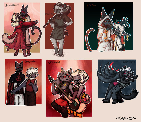
So, to celebrate 100 followers on tumblr, I decided to draw some fanart for people. This community is so sweet. Every one of these artists has inspired me in some way.
I'm really sorry for those I haven't made art for. I may make a part 2 one day for those I missed. Who knows.
This was a really nice way to try out different art styles while mixing them with my own.
Apologies for all the link later on. Want to explain the creative process a bit for those interested cause I put way too much effort into it to not mention.
Close ups below cut:
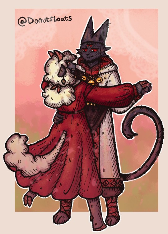
@donutfloats
Your arts so cute and soft, I love it. You have a great way of just expressing love through your art.
I was inspired by 2 of your pieces for this, the main one being the 3rd image for this post. The lambs dress is so pretty, I just knew I wanted to draw it flowy and dancing, and the second image I used is this post for the rendering style.
✧.*-----------------------------------------------------------------------*.✧
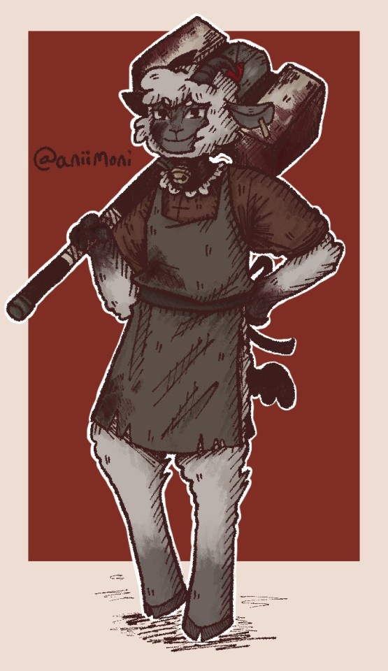
@aniimoni
I really like your artstyle. The monochrome colours are delightful, as with the way you do lineart. while making this, I was thinking this is the perfect style to meld with mine.
I was inspired a lot by the axe and hammer drawings in this post. As a hammer lover, I decided to combine the 2 together.
✧.*-----------------------------------------------------------------------*.✧
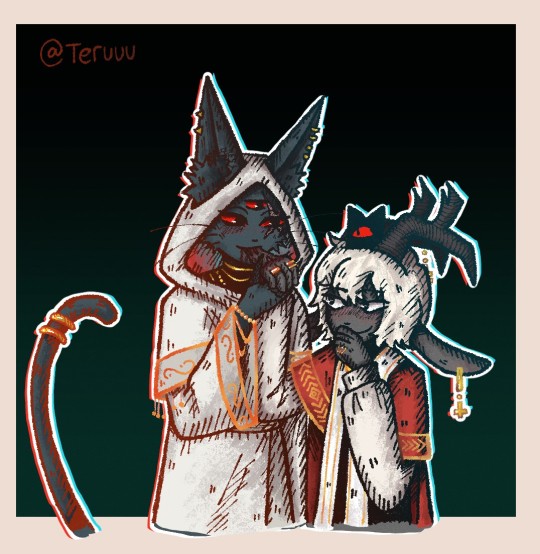
@teruuu
Something about your style is mischevios. Your rendering and lineart are just wonderful as well. You have a very distinctive style that matches mine quite well, i think.
I feel compulsion of the flesh Lamb and Narinder would give each other kisses on the hand but take a bite at the same time. They freaky like that. Based my rendering around this post and the previous draw you character here, I did. These are fun designs to draw.
✧.*-----------------------------------------------------------------------*.✧
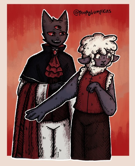
@poopylumpkins
I really like your vampire au something about it really spoke to me as a afab non-binary.
Lamb deserves to wear their own clothes and something about narinder helping with their makeup convinces me he'll help out.
if you're curious, i colour picked the background and shading from this post
✧.*-----------------------------------------------------------------------*.✧
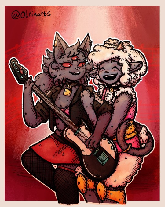
@olrinarts
This was a really fun style to draw. Something about how you draw these 2 is delightful. Love yuri narinder's eyes in particular.
Rock god yuri. What more can I say these are really good designs. Showed them to my friend, and they loved them.
Decided to have them dueting, while Narinder can't sing lamb can always pick up that role.
Used this post for the background and shading colours, and this is a kinda basis for the pose.
✧.*-----------------------------------------------------------------------*.✧
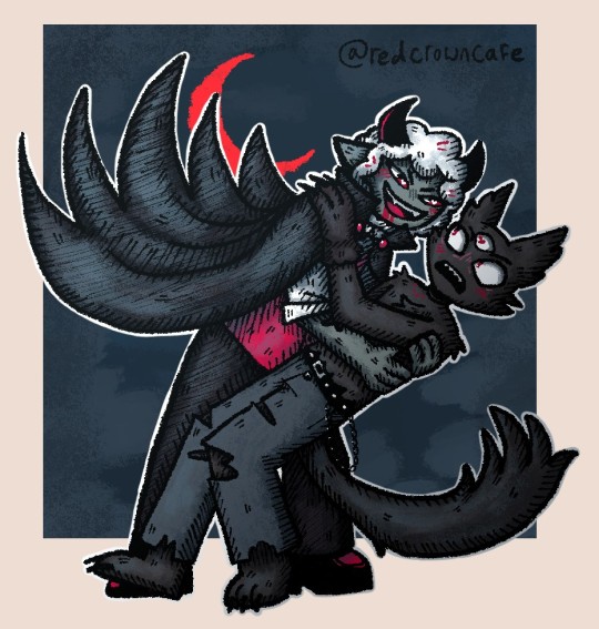
@redcrowncafe
Really love you fic and art. I like to see the fic brought to reality through all the comics and art, which has a very pleasing look to the eye.
I have never struggled so much with an art style, fun challenge, but very different to my own.
Wanted to draw their Halloween costumes from this post. Lambert would definitely get too into the vampire costume and bite Nari at some point probably.
✧.*-----------------------------------------------------------------------*.✧

@joffyworld
Just wanna say thank you so much for the reblogs and kind words. It gives me a lot of confidence in my work and is a genuine brightness in my day.
I wasn't sure what to draw you, so I thought I'd just show you a pic of my new one who waits figurine, that arrived recently. Its a little weird, I think an earlier design but cool none the less.
✧.*-----------------------------------------------------------------------*.✧
251 notes
·
View notes
Note
Hello! i absolutely adore your art and agree with your sonic opinions, you're overall one of the best sonic blogs out there. May i ask how do you plan out and draw your comics? How do you choose the formatting of panels themselves, the composition, the dialogue and so on? From A to Z, please! I apologize if this ask might be inconvenient, but i'm curious because i love your comics and have attempted to draw a sonic comic myself that failed miserably.
Typically the first step I will take is to just rough it out in a sketchbook, because I find it much faster and when working digitally I feel more pressure to make things look nice. This is where I start thinking about paneling and composition. It doesn't look perfect or cohesive at this stage, but at least now I have a rough idea presented with barely legible scribbles that don't make sense to anyone but me.
For paneling, large panels linger more, and small panels indicate quick succession. This is the most important rule I personally follow when making panels. It affects things like comedic/dramatic timing and how the reader will be guided through your comic.
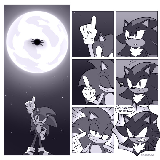
It's important to vary up the composition when it comes to dialogue scenes where not that much is happening. The shot-reverse-shot format works, but remember that once you have an establishing shot and the reader knows where the characters are, you can get creative. I like to do close-ups where not everything is shown to create a sense of vagueness around what emotion the character is feeling.

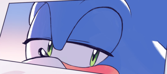
Don't do this too excessively unless you're trying to create a claustrophobic feeling - let it breathe with a medium shot or long shot after!
In film-making, there's a rule called the 180-degree rule that basically states that in a two-character interaction, there is an invisible line drawn between them. The camera does not cross this line and stays on one side. This basically keeps the characters on one respective side of the frame at all times to avoid confusing the viewer.
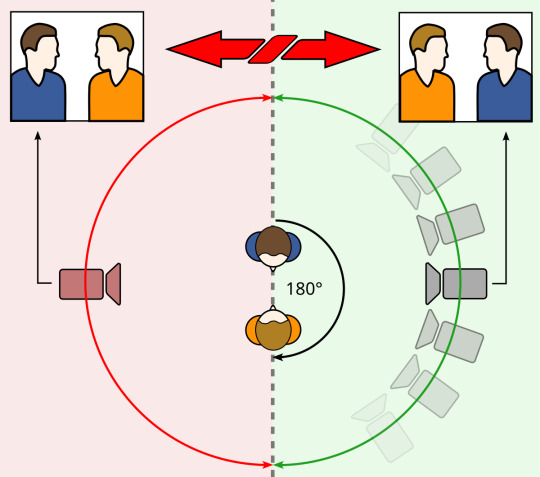
This is by no means something you have to follow for comics, but if you want to create something that is easier to follow, it's a good rule of thumb that I consider when drafting! It can also be broken depending on the effect you're going for.
Once I have a draft, I'll typically go into editing and changing things that don't work quite as well as I'd like. This can be done by yourself or you can get it revised by a friend, like I do!
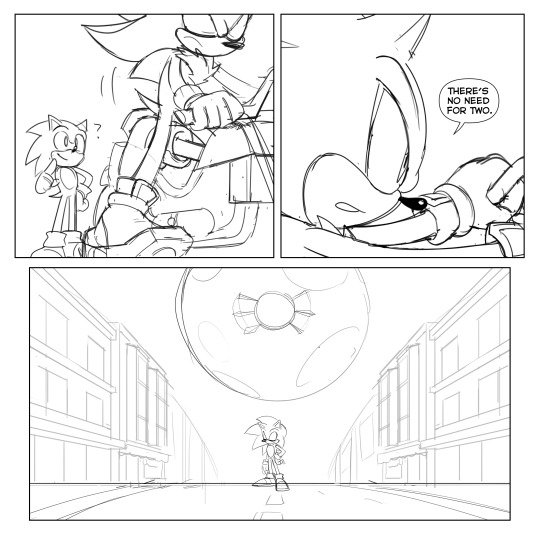
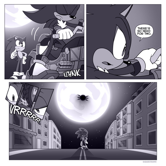
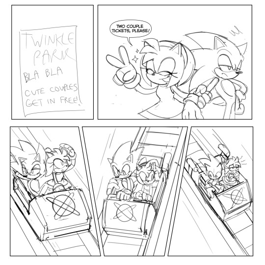
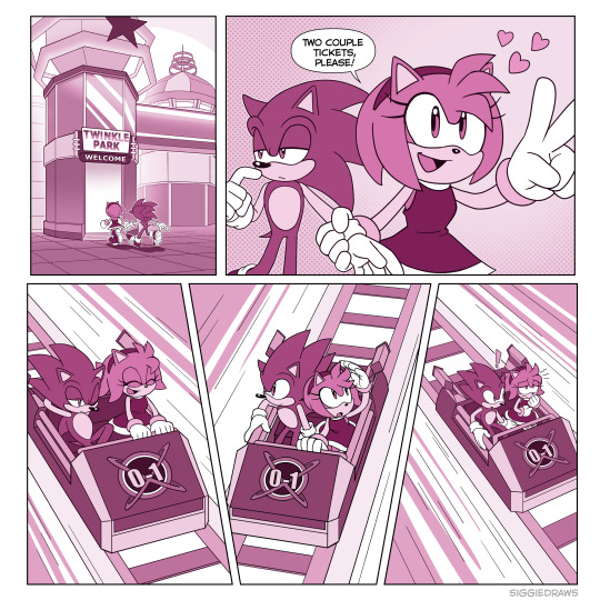
After the draft is finished, I'll get to lining and colouring. To be honest, it's not something I can teach so easily, but rather something that takes a lot of time and practice to learn. I typically draw the backgrounds with thinner lineart so that the characters stand out. Same deal with colouring - the characters stand out from the background colour-wise. There are multiple ways to do this, but for example, here I made the background have less colour contrast than the characters and stick to an orange-ish tone, while the characters are different colours from the background.
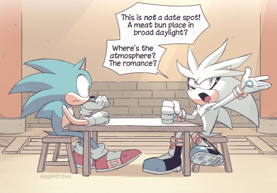
For speech bubbles, generally the words should fit the shape of the bubble to the best of your ability. The line spacing should be as close and compact as possible without touching the lines above or below. This is to save space on the page so that speech bubbles don't take up a majority. The tail of the bubble should point towards the character's mouth.
Avoid tangenting! This is when the very edges of two different things touch each other. It creates a flatter effect so you want to avoid it as much as possible.
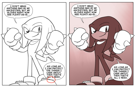
That's about all I can think of right now. Hope this helped!
#tbh i have also dropped comics before because it was too hard to get it to work#they take a lot of time and dedication#but you shouldn't give up!#ask#tutorial
76 notes
·
View notes
Note
I just want to say I love how you do your lineart, it looks so good! ahhhhhhhh!!
I'm gathering a lot of advice about the topic of lineart and I just wanna know how you get it to look like that? My line weight is getting better but the drawing itself just comes out a bit.. weird.
Thank you so much! Lineart is probably the thing I've been working hardest on as I am not a lineartist (and still struggle a lot) but it's something I really need to get better at for my job. UM there's honestly so much that could be said on the topic of lineart. Big things for me are:
Weight -> Use line weight (aka thickness) to describe form, lighting, contact and scale. Thick lines imply shadow, contact and nearness-to-camera. Thin lines imply tension, recession and light.
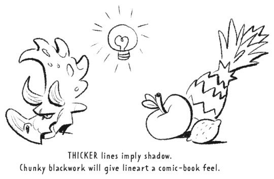
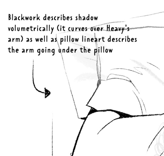
Straights vs Curves -> Use straight lines against curved ones for maximum interest. This is partly a character design thing but as we're using lines to describe our characters it's worth mentioning :)
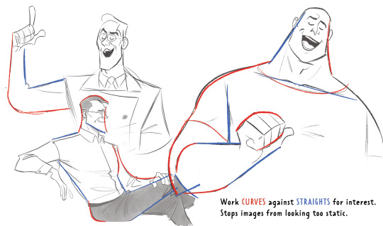
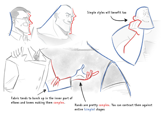
Complex vx Simple -> Use complex lines against simple. Faces are always complex so therefore the backs of heads should always be simple. Chests are quite complex so backs should be simple. Dorsal sides of the arms are complex (Delt, tricep, bicep) whilst the ventral side is more simple (tricep...mainly) etc.
'Think in Ink' -> Lower your sketch layer almost to 0% opacity so you're not getting hung up on how nice/energetic your sketch look and instead are approaching the piece from an ink mindset. BUT it's digital! So if there's something in your sketch that you like just bring it forward (copy and paste) into your ink layer. I sketch and ink with the same brush so I can use this workflow
'Confidence' -> small hesitant feathery lines will look nervous compared to big swooping lines. Less is always more. I'll redraw arms/limbs until I can get the appearance that it was done in one brush stroke. Again it's digital so you can erase to cheat this look : )

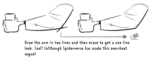
MISC 01: I always hear 'draw from the shoulder'........meh............it's digital so draw from your wrist...it's fine honestly. If we were working at A1 in a life drawing class then we could get some shoulder action going but most of us are hunched over 16inch tablets. I think this advice aims to pull people away from feathery-nervous lineart honestly which you can improve on without relearning how to draw from your shoulder.
MISC 02: For a 'smoother' look do your lineart at a larger canvas size than you need. Once I'm happy with a sketch I usually double the canvas size and do my lineart then.
MISC 03: In PS (at least) anti-aliasing goes funny at any zoom level that isn't in the 5 times table. So try not to look at your canvas when you're zoomed in to 87% or 71.39% or something crazy. Just stick to 25%, 50%, 75% and 100% if possible.
UNFORTUNATE TRUTH: Lineart is incredibly based on raw draughtmanship I've discovered. When you're working with colour you can hide a lot in rendering (shadows, highlights) or post-processing (depth of field) but in lineart all your mistakes are just...there for people to see. There's ways round this...which I use A LOT. 'Flourishes' (I use 'flourishes' to mean over-confident lineart where it veers particuarly thick or particuarly thin in contrast to your approach in the rest of the image) can sort of trick people into thinking you're more confident about an area than you actually are.

As well as leaving 'breathing room' within your lineart instead of actually...resolving the area. I do this the most around the face and hands.
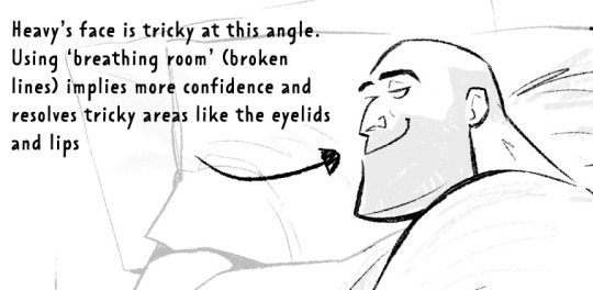
Hopefully some of this helps? Honestly there's a lot of deep dives that could be done into indivudal things and there's also the massive caveat that all of these are 'guidelines' and not strict rules. I also favour a more...concept-arty? animation-y? storyboard-y? look to my lineart which favours flourishes and breathing room for a incomplete/work-in-progress feel which would make methodical colouring (ie: for a comic or something) a pain.
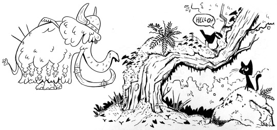
Keep up pratice is the main thing and doing studies of artists who you like that have great lineart - you'll pick up draughtmanship skills along with the lineart studies. Here's some of my lineart from a year or two ago...it varies between very 'standardised' (which makes it difficult to read volumes and to be honest, it's boring) and 'TOO EXCITING' (which...also makes it difficult to read volumes and for the eye to rest).
I'd like to share my brushes at some point as I've found 3 that I really like and use for everything more or less. I discovered that a shocking low amount of people use PS on tumblr (shocking to me I guess as i'm so used to PS being the standard) and everyone seems to use Procreate or Clip Studio Pro...so I want to check that the brushes are Procreate compatible at least before I share!
#sorry if none of this makes sense. im on day TWO of a hangover...kill me now#asks#art tutorial#tutorial
755 notes
·
View notes
Text

Привет, Человек-мотылек!
My aunt introduced me to Astonishing Legends a couple nights ago, and so far I really like the podcast it's great, I watched all of the Mothman ones so far (that I knew of, I found out this morning there's a part 5) and while listening started drawing this lil fella.
I thought the whole thing was super interesting, I loved all the tangents, and most interestingly I tried to look into the 2013 show they mentioned, following the similar stories in Dalnegorsk. They mentioned it being entirely in Russian and hey, whaddya know, I'm trying to learn Russian anyways and figured it would help since I'm already interested in this topic and it would keep me engaged. Couldn't find it (I searched as well as I could, maybe I was using the wrong keywords, I couldn't find it in their show notes sadly, if you happen to know about it/have a link or something I would be thrilled to know) but I did make this art so! That's cool! I wanted to make him a little more detailed but also wanted it to kind of speak for itself? So I stuck with this.
Because I drew this up while listening, I very much took after the descriptions I was hearing with this design. He's kind of like a bird-man?? In a lot of the descriptions??? So I tried to combine bird and moth traits here. I love the neck fluff, any day I don't have to draw a jawline is a good day in my book, and I believe as they were going through the Dalnegorsk story one account mentioned bird-like feet with one toe on the back. Originally I actually skipped that, but it came up as I was doing the lineart so I went "oh that's a neat detail," and yeah, it looks better. At like the very end I gave him a second pair of little mothy arms on his back because they're cute and I figured moths have six legs Mothman can have four arms. Every description I saw specified big muscular legs, not skinny bird legs, So of course, I did my best.
Definitely in the Dalnegorsk part, they mention he just, gave them a sad look and it compelled them to back off, which didn't do much for the art in truth, but I found that very very interesting and sort of entertaining to think about. You got this big scary bird fella and instead of attacking them or scaring them he just pulled at their heartstrings, because he could.
Also complaining about folks exploring the mountain was kinda funny
Admittedly, I have a very love-hate relationship with drawing bird feet, because on one hand they don't come very easily to me, but on the other, they look really cool and I enjoy when they turn out good. This is one of those cases, at least in my opinion, where I do think they look nice.
All in all I love how this turned out, very big fan. Regarding the Russian up top, I also saw Молерот used for Mothman as it's shorter, but looking for more context almost everything I did see using it was Fallout-related, so I figured I'd just use Человек-мотылек as it at least seems to mostly bring up stuff about The Mothman Prophecies and some other stuff at least somewhat related to him. Not that the Fallout stuff isn't, I suppose, but that feels more like an offshoot in my mind.
If you have any tips (or learning resources that don't involve me paying for a subscription I'll hardly use- books, free stuff, etc) I'd be thrilled to hear it. So far I'm not having too hard of a time, though, the hardest part is the special characters so far but otherwise I'd say I'm doing well by my own standards.
34 notes
·
View notes
Note
I LOVE YOUR ART!! <3
I'm sorry if this bothers you but is there any tut for lineart?
Have a nice day!
hello!! no there isnt, but i can talk about it quickly!
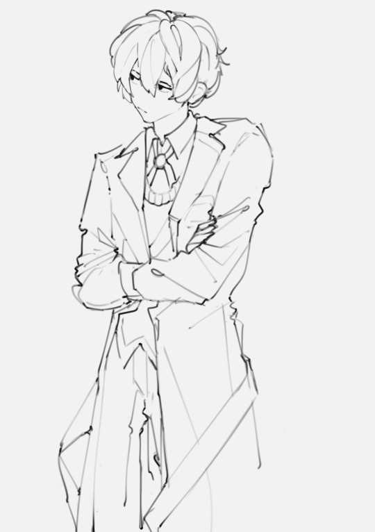
Let's talk about how I did the lines for this dazai drawing below:
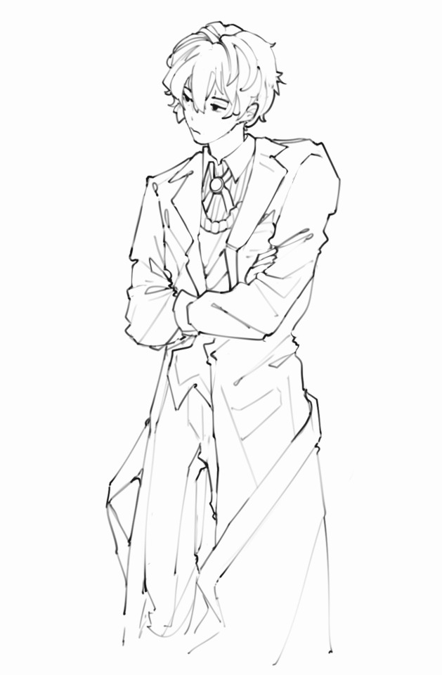
I acutally don't do lineart, I just clean the sketch 😭 All my lines/sketches are done using the regular hard airbrush and just erase using that same brush to create different line widths.
First, let's talk about pen pressure and line width. To create depth, I like to make certain parts of the lineart "heavier" in pen pressure:
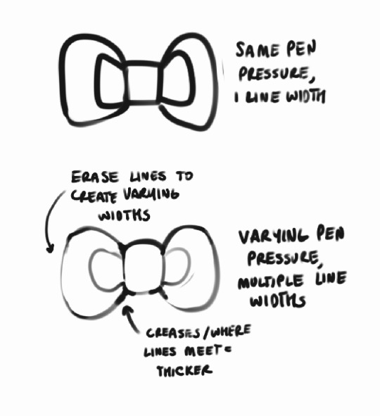
You can see in the lineart above that stuff like where the hair meets other roots, creases in the jacket, etc. all are heavily lined, while other stuff is left more detailed. I think it helps draw the eye in to parts you want to focus on?? just something I've picked up from habit and i liked it so i kept doing it hahsdh
I usually just start with a really rough anatomy sketch, and make a new layer to start the actual drawing:
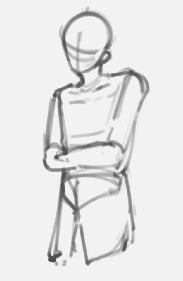
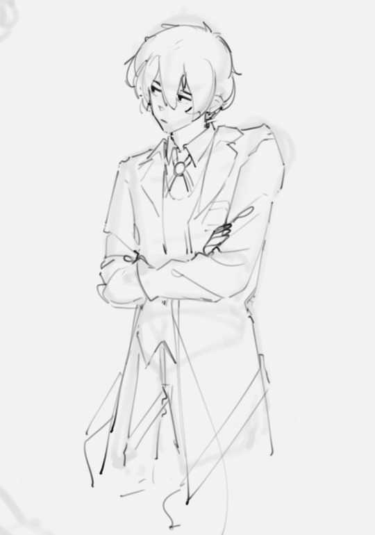
Looks nothing like the finished drawing (or my usual style), right?? And like, yeah that's normal, at least for me. I approach lineart as a way to refine something I've drawn into my own style, it doesn't just like. pop straight out as soon as I start doing lines 😭 (also probably why my art looks so inconsistent lmao)
Then from there I refine the sketch! Because of this, I'm working all on one layer, by erasing and redrawing portions of the sketch using that like pen pressure variation technique:
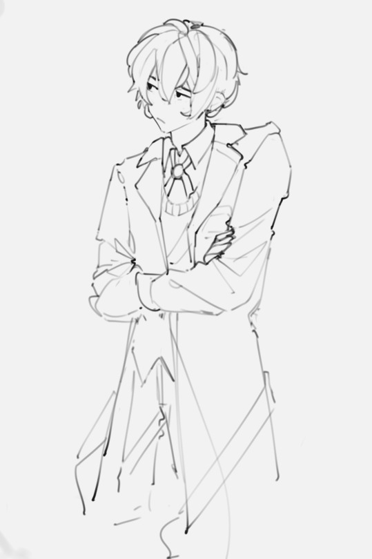
Usually I just make a mental note of how something looks, erase it, and redraw it. At this point I'll also start adding more detail or fixing posture/anatomy etc. as I go to make something closer to what I want.
Eventually this refines into what you see as the final lines!! Because this process is probably not the best. it takes me a long time to sketch, but I actually really like cleaning the lines! I find it refreshing to put so much detail in them :D

This is probably an incredibly wrong process in professional work, but I'm self taught and this is just what I enjoy doing :D I wouldn't recommend really doing this if you're trying to sketch quickly, but it's just what works best for me!
Happy sketching!
223 notes
·
View notes
Note
How do you create such distinct and recognizable faces for the cats while keeping your style and good anatomy? It's so impressive 😫
I've heard a lot of nice comments about my art style (which I really appreciate - thank you!!) and I assume a lot of newer artists struggle with coming up with their own style This is just about my own personal experience and I'm sure it won't be the case for all if not most - but the style I have now is not something I consciously picked (maybe I've talked of this before already?) but more like a slowly built collection of traits in my art that I've enjoyed or what have felt comfortable or pleasing to me. Like the brush I use, I didn't pick it to have a "distinct style" but because I recognized from other people's art that a textured brush for lineart looks really pleasant, and I've always liked drawing with pencils irl as opposed to painting or other means so I wanted a brush that mimicks that feeling. I used to try to keep a consistent style when it comes to eyes or such when I was a teen but the types of eyes I draw right now are a result of me venturing in different directions based on things I've loved seeing from others and what kind of different feelings or personalities they convey. I think partly what makes my art recognizeable atm is the proportions and shapes in my art - which are also not something I consciously picked to keep, but something I found over time looked cute or cool or pleasing, so I kept drawing things that way.
So don't worry about finding a unique or recognizeable style! It will come to you as long as you have things you really enjoy about creating art (and as long as you allow yourself to experiment with new things here and there)
52 notes
·
View notes
Note
Do you have any tips or tricks on how to start a comic like this? Or even just how you got started?? I've had my own au for years that I so badly wanna put out into the world but I've been struggling with finding a good way to start it!!!!
Hm!! Ok!! This is a tough question with many different answers even just from me. I'll do my best to answer tho!! 😮
The main bit of advice I want to give, and which I think is vital to anyone creating anything:
☆ Know yourself.
When looking up advice for creating, people love to tell you that by doing things a specific way is the best and only way to go. Often advice of this sort has solid points, you should plan ahead, you should have easy character designs, buut... You don't have to.
I do not work well with outlines or scripts. I dislike sketching. You'd think that'd make being a long form comic artist impossible for me, but nope.
I know theres things I cannot do, so I've put all my practise to what I can do. My lineart style allows me to almost skip sketching completely, my scripts are more of an A to B structure than law. I improv 90% of the time when making pages. It's kinda like dnd with myself.
I would absolutely not reccomend what I'm doing to others, but I know it works for me. People can tell me I'm doing it wrong but its either wrong or no comic at all, SO. Suck it. 👍
Er. Rambling now.
My point is, figure out what you can and cant do, and do your best to give yourself the ideal work enviorment and process.
☆ Deal with being overwhelmed
Making just a few panels and suddenly realising its gonna take years to get anywhere is SO demoralising. It's gonna happen and its gonna happen again, and again, and—
But continuing with the earlier advice, you gotta ask yourself what would help you. Are you willing to sacrifice quality? Do you just need a break? Maybe you're like me and like to include smth you love in every update so you'll have something to get excited about making.
That feeling of overwhelm is trying to tell you something, so figure out what that is so it wont end the project for you.
☆ Start it
You wont like what you make when starting. I've never heard of an artist who has.
I'm not saying start this instant, not everyone is as into improv and flailing around as me. But I will say you'll never feel ready. Figure out the minimun of what you need to start and do it. Show friends first if youre afraid to post.
Also where to start? Well sure there's lots of good advice online about that, but you can also just doodle random stuff until you feel like diving deeper. That's what LV started with, just Twi and Wild hanging out with animals and some headcanons. It may not be the most tightly written work but theres beauty in the humanity of a mess.
☆ Extras
A "failed project" or "forgotten WIP" is only a failure if you let yourself feel that way. Yea it can be a hauntingly strong feeling thats hard to deal with... But it can be beaten. WIPS are proof you tried and not everyone can say they have.
Lv is far from done and I have no intention of dropping it, but because the journey has been so nice I'd satisfied even if I had to call it here. Its smth that helps me with the overwhelm... What I've made is beautiful even now.
Comparing yourself to others is gonna rip your heart out. I love that theres other links meet aus out there and hope the best for those artists but I caNNot follow any of them or I'll crumble to dust.
So Uhm.
Basically. Have fun and be yourself. 👍
Ps. Readability is basically the most important thing for a comic artist to pay attention to, that and not destroying yourself with details and rendering. 🙌 Good luck out there!
#Ask#I love discussing stuff like that but it always ends up so rambly and long ahsjjdjr#I hope I said at least smth slightly concrete
84 notes
·
View notes
Note
hello!! I’m the one who asked about the anatomy (idk how to reply to asks and stuff)
basically I know some artists use anatomy for their drawings so I was asking if you also used anatomy for your cookie run drawings and what would that usually look like for you?
something like this vv
hopefully I’m making sense 🙃
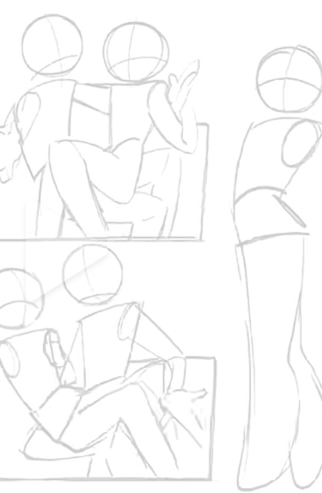
OH, you mean like how do my sketches look! ...I think? (´・ω・`)? You can correct me if I'm wrong asdfghj But if I'm right on the money, here's my sketches for the langue de chat comic, one of the roguefort panels, and a drawing I made for my friend on new years :P

I've been using this brush nowadays to sketch since it has a similar feel to the brush I've been using to line :D For simple sketches like the first part of the langue comic, I tried to keep it fast and simple whereas the second part of the comic, I take more time to make sure it looks right! It's because that part is, what i refer to as, the "money shot". It's the one people are gonna look at the most so I gotta make sure it looks nice, y'know what I'm saying?
The above examples are just one sketch to lineart drawings, however. Sometimes I do another sketch to make thing clearer to me and closer to what I'm trying to get the drawing to look when I line. I do this all time with commissions such as this one! The one on the left is the first concept and the one on the right is the second one that I sent to the client to approve.

Hope this answers your question! uwu
67 notes
·
View notes
Note
thoughts on the skeith? or elephante? whichever isn't in your queue yet
(The Skeith review can be found here.)
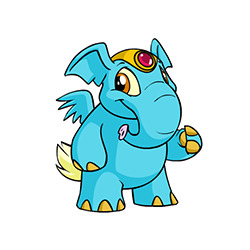
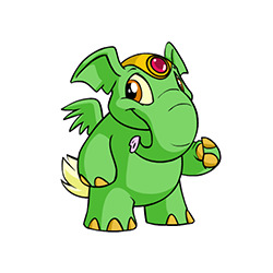


Ironically, despite its incredibly original name, the Elephante is actually not just a regular elephant; it's bipedal, it has small semi-vestigal wings/a fluffy tail, and it has a fancy headpiece with a gemstone in it. I'm not always big on "default" clothing on Neopets, but the hats here actually look pretty nice and are passable as fancy jewelry that anthro characters could potentially wear.
Color-wise, the default Elephante colours are mostly solid, though the toenails, hats, and tail break things up a bit. I do wish the default colours had more cohesion—like the gemstones matching the base color instead of always being red—and the pink snout feels ever-so-slightly out of place, but otherwise they look fine.

Elephantes definitely benefited from customization. Their lineart was cleaned up considerably, which helped fix some of the jankier elements like the wings and legs. Another big benefit of customization is the ability to remove the default clothing, which is always appreciated.
I also like the change in expression—the old Elephantes always felt a bit weird, like they burned down the house while you were gone and now they're trying to act normal while they figure out how to break the news to you.
Favorite Colours:
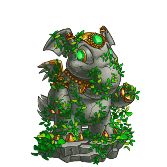

Relic: The relic Elephante just released earlier this year, and I gotta say, I really like it. The base is nicely shaded and textured with plenty of cracks, and it's then complimented by beautiful bronze metal accents. The body is also covered in leaves, which match the green of the eyes and hat, which are slightly lighter to make sure they pop. Great stuff. The base also looks great with just the little bit of bronze around the iris.
My only minor issue is that the amount of plants feels just a smidge too much. They are removable, but it's an all-or-nothing situation. I wish the ones on the body were separate from the ones on the base—especially because that could open non-relic Elephantes to wearing them.

Candy: Peppermint swirls aren't technically anything too fancy, but the sutble texturing here is great and really makes it look like hard candy. I also love how the stripes properly fit with and conform to the body shape, which is something a lot of Neopet colours forget to do. Also, the extra little peppermint in the hat is absolutely perfect.


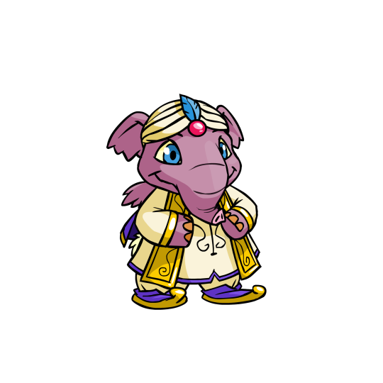

Royal: Neopets evidently decided to take the "Indian elephant" idea to its logical conclusion by giving the royal Elephants things like sari wraps. Granted, I'm not sure what region India would be considered in Neopia, but hey, it's a fun concept and it looks beautiful. Between the two I think I like the royal girl more just for the palette, but both are solid.
UC/styled versions also exist. These versions obviously have more personality, but thankfully the converted designs are pretty spot-on save for the strange lack of fingernail polish.


BONUS: The zombie Elephante is shockingly gory for Neopets all things considered, only rivaled by the zombie Jubjub. Exposed skull, giant gaping wounds, stitches, ripped ears and wings—you name it. It looks fantastic and properly undead, and the whole thing is nicely drawn and shaded. It comes with clothing but the base itself is also solid (it's a bit strange that the skull is considered a wearable, but it's a play on the normal hats so I suppose that's why).
My only issue with it, and the reason it's a bonus, is that the expression is WAY too cheerful. The irises needed to be way smaller, less focused, or just plain missing, and the mouth looks too smile-ly. If it had a slightly more haunted expression it would've been perfect, but as is, it's still pretty good.
31 notes
·
View notes
Note
hi let me preemptively apologize for going insane in your inbox but oh my god your art! the drawing of nikolai bloody is killing me specifically the headshot of him looking to the side. his expression! he looks like a misbehaving puppy. like if he's casual enough maybe no one will notice the guy with his face bashed in and scold him about it. long incoherent ramble but what I'm trying to say is your art is awesome and I'm obsessed :)
We don't accept apologies for being feral here, in fact we encourage being feral about the things we love 🫡
No but for real thank you for this <3 I say it all the time but comments like these make me so happy, legit the first thing I saw after waking up and damn what a nice thing to see !! Means a lot that you took time out of your day to leave this in my inbox !!
Something about Nik being so casual about beating up a guy and coming home covered in blood right ?? Another day at the office, another arms deal that require a more handsy approach. What a man 😌
Oh also I think some people wanted to see the lineart so here, have it as a little bonus

#ask#nekro yapping#I may or may not be working on a follow up#that involves Price#but#yeah we'll see#I have ideas#this is just delicious#thank you so much for this <33#nothing better than Nik covered in someone else's blood#mwah#lovely anons get a little kiss on the forehead
10 notes
·
View notes
Note
I LOVE YOIR DRAWING. I WANT TO MARRU IT.
On a serious note, I really do love it! Everytime you post with a drawing I unconciously zoom in on every part, trying to analyze it. How do you make everyone look so handsome???
If it's allowed, would it be okay for me to ask on your drawing process? And I guessed your pen was the su cream on csp or at least something pencil like. And maybe you color with something similar to the round brush from procreate..? High chance I'm wrong though!
Again, sorry if the ask is too personal! It's okay if you don't want to answer, I just want you to know that your drawing is VERY cool!
Aww, you're too nice! Don't worry about it's not personal at all. Thank you for the kind words <3 It flatters me that you take your time to appreciate the details of my drawings :3 My drawing process it's really simple actually (bc I'm lazy lol). I usually don't... make lineart? I just use the sketch as my lineart lol, even in big, detailed drawings, I like the messy lines better. Next time if i have a step-by-step process I'll share it for sure! You were pretty close with your guesses actually, i use Clip Studio Paint and my lineart brush is this one:
Sadly, my coloring brushes have been deleted from the store since i downloaded them so I don't think I can share them with you, but you can just find any watercolor textured brush and that'll be fine! Hope this helps you hehe, thank you for asking so kindly! Have a great day <3
65 notes
·
View notes
Text
Current digital art process!
Acting on @shkika 's request because making my redraw for this post actually ended up giving me more confidence in my digital art process! As such, I'm gonna use it as a reference. And if this walkthrough of sorts turns out nice, I might do it again as my process evolves!
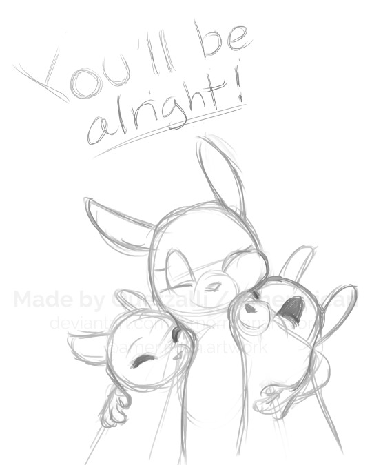
I started off with a quick sketch of sorts, trying to focus both on movement and volume, and get the general idea of where each element is located. I edit the image dimensions and placement of things a lot in this phase, as my ideas often tend to change once I actually begin drawing them. In this case, as I got it down, I decided I wanted it to look like some cheesy animal motivational poster, so that influenced where the text was.
From there, I began to clean and sometimes edit the sketch, mainly by thickening the lines to make the shapes more definite, and erasing what wasn't necessary and interfered with other parts. Volume is one of my biggest focuses in my drawings, so I try my best to get the volume of each character at least hinted at with the lines. This is something that will probably remain in my process for a while, as I quite dislike doing separate lineart and like the messy, sketchy feel anyway.

I also wanna mention, in addition to having references and such in other windows, I've recently begun having a second mini window of my current drawing off to the side so I can see what it looks like overall more easily, regardless of how much I zoom in on and flip the main window. It's quite helpful!
For reference, this is what the final sketch looked like:
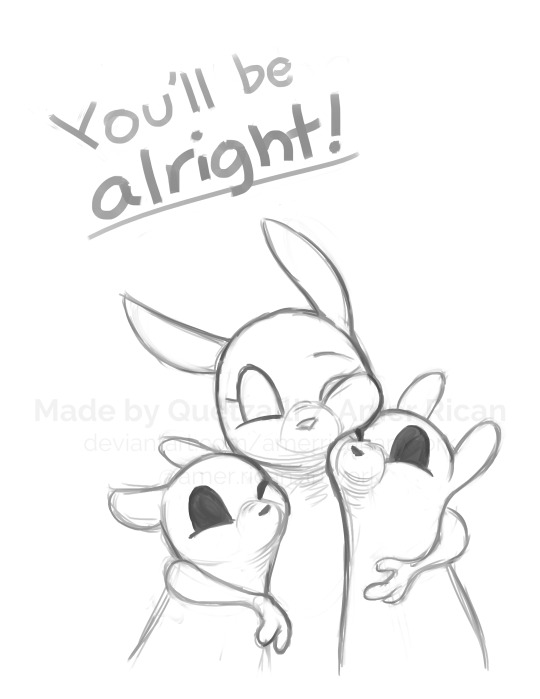
Then, I went on to add the flat colors. Another tip: I almost always set my sketch layer to "Lumi & Shade" because I think it makes the line colors a lot richer, but since it's based on what colors are underneath, it colors the lines a lot more individually than changing the sketch color as a whole. Here's some comparison to a version without the effect (left):

Then, I add some shading using a (really nice) marker brush. This is honestly one of my favorite parts of the process, just trying to carve out all the volumes, especially since I usually use a pretty blue color for shadows!
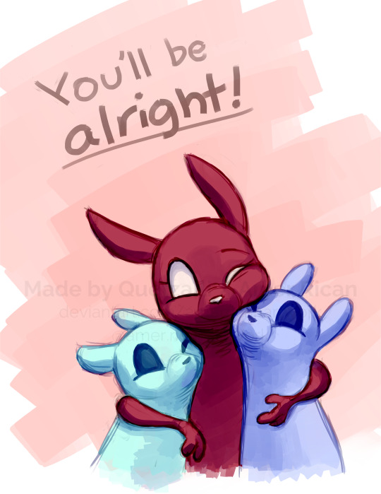
Sometimes, I honestly just leave drawings finished at this step, because I adore the sketchy look so much, and because I really don't like the tediousness of more realistic rendering in the painting process; from what I've seen/experienced, it often involves having to basically paint the entire image over again, which I've realized I find REALLY boring (and is also why I clean the sketch instead of making a new lineart layer). As such, one of my hopes is to reach a point where I could almost completely avoid having to clean up the image in a traditional painting method, instead being able to lay down lines and colors so well that they convey nearly all the volume necessary on their own, still have that sketchy appeal, yet also look finished and professional.
Alas, I did do a bit of clean up on this image, but I think it still turned out alright!

Here's the finished drawing! I'll have to practice with this process a bit more to truly solidify it as my digital go-to, but nonetheless, I think this came out adorable! Thanks again shkika for the ask, and thanks to @mintscampi for the sweet prompt! I hope you guys like it!
#art#artwork#artists on tumbr#digital#digital art#digital artwork#painting#digital painting#process#painting process#art process#tutorial#fanart#rain world#slugcat#rw slugcat#slugpup#artificer#rw artificer#quetzalli draws#quetzalli's notes
100 notes
·
View notes
Note
hi uh-
You seem to know how to render so I was wondering if you could possibly give me tips? :'>
Love your art btw it is 🤌🏻🤌🏻🤌🏻🤌🏻
Aaa thank you! Rendering is not something i consider myself particularly good at and i'm still trying to learn, but here's some things i picked up!
Shapes! Edges! Have a balance between smooth, nicely blended areas and really sharp and shaped areas
So imagine you're doing lineart or a sketch. Places where you would put lines (eg. cheekbones, wrinkles etc) are really good places to have some sharp edges. I like to make things smoother and more blended in places where there's more skin.
Undertones!! I color the entire thing in one color (i looove working with green and blue here, but i also play around with different colors as well) and then i build on from that.
DON'T ZOOM IN TOO MUCH. Focus on the big picture. Zoom out and see if the shapes are visible, if your picture is recognizable and doesn't look muddy. It's nice to have distinct light and shadows.
Block things out first and then do details later on. But you don't have to dwell on them too much, it's up to preference really! I usually find that my art looks really weird if i render too many details
Use references, see how light, shadows and colors interact! References are great i love them 10/10 no notes.
If you're rendering a face, know about the planes of the face. This will really help you out, also ties really nicely with the edges and shapes thing. Another thing i love to do is feel it out myself. I just drag my fingers across my face and try to understand how it works, where the bones are, how the skin "wraps" etc!
Don't use too many brushes, it will just look messy and cluttered and out of place.
These are the ones i can think of rn. Most of these are up to preference really and won't apply to every situation or drawing. But yeah! Just experiment, really! Try new things! Have fun with it as well :D
25 notes
·
View notes
Note
👌🏽
(So you're the winner of the fastest to like my post. Like holy fuck, the speed in which you like things is insane. It's so funny to me posting something and within seconds, your face is the first one I see liking the post. It's really nice. It makes me feel good inside, you know? Don't think I don't notice it. When you've said a comment about my posts on one of the discord servers I'm in, it's like an honour coming from you. Because my eyeballs are not worthy to grace your art.
Like, I see your Zoroark blog. I wait in anticipation for when you update. It doesn't happen often. But when it does, it's good. Also, how dare you tease me with all of those future items things???? You do realise I'm going to be theorising about them all and trying to piece it all together???? I already have some ideas. Like, is that pink hand next to Mr. Man in that one 👀 post a mew??? I'm trying to think of pink Pokémon and my mind is blank. How dare you make me theorise. How dare you.
The way??? You draw characters???? Like, holy shit which god died and gave their artistic talent to you??? Just the way you draw expressions and just the general feel of each post is excellent. Also, your lineart. I just really like it. Like, I cannot with line weight but you seem to make it your bitch. I'm just in love with it. Also, you cannot make Kaine's human form look like that and not make me swoon over it. Daddy sorry.
Jokes aside, I am hyped about what your blog has to bring. Fuck, you may only have a few post with Kaine, but he has caught my attention and I am so ready for more of him. Moody characters are also another favourite of mine because you know it's gonna be extra special when they finally show a faint smile.)
8 notes
·
View notes
Text
Reflecting
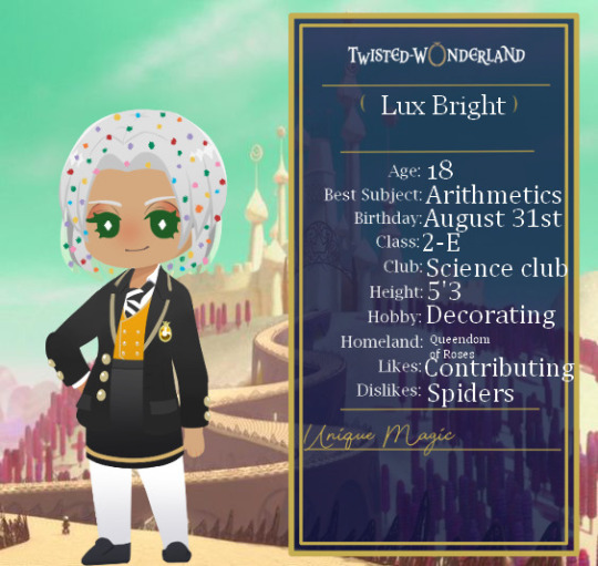
I have come to realize that over the course of the past 3 years I have redesigned this dorm over and over again. From the logo to the uniforms and characters. At first I felt bad for doing this, all I wanted to do was improve as much as I could with a concept like a fandorm. But as I looked back on my artwork from the past 3 years (HOW HAS IT BEEN THAT LONG ALREADY?!) I look at each year in a different light.


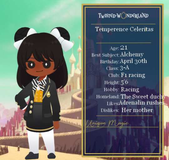
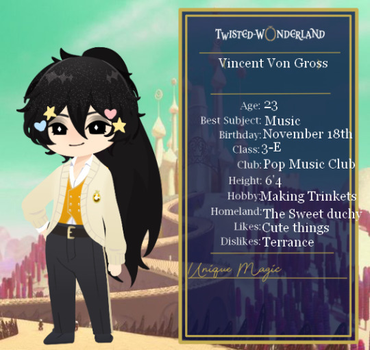
2022 Dulcisregnum (or what I now call smores dulcisregnum) was my first attempt at creating a fandorm. At the time I thought it had to be by the book and in line with the villian it was twisted on to a T. But I wanted to change it, while it was good and I was very proud of it for my artistic level at the time, it did not look like a dorm inspired by king candy.


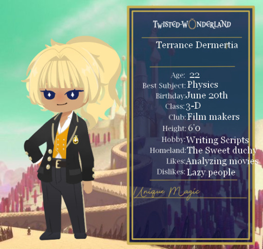
Designing 2023 Dulcisregnum was different but getting more creative and trying something different made me happy, especially with character design. Even though my ocs strayed away from the designs of the characters that they were twisted from it felt nice to see them become more original. I was going to leave the dorm as is until, firealpaca created new brushes and my art style changed drastically (well lineart wise).


In 2024 I never expected to push myself as hard as I did to remake characters new designs and decently detailed bios but without the friends, I have made in the past year I don't think that I would have actually done it. This version of the dorm is the version I have grown VERY attached to despite the weird lore and backstories I have created for these characters and I don't want to let them go. But as the new year arrived I feet the strong urge again to redesign. I know what I am capable of and I want to harness it, SO I plan to take a page out of Snow/Racing Miku's book and redesign the dorm again. The character backstories (from 2024 continuing forward) will stay the same!
I know this may seem weird but its something I want to do, like a creative time capsule of sorts. For 2025 the visual theme of the dorm is going to shift towards Vanellope as her own determination and ambition is something I think we need in this coming year.
I'm gonna stop yapping now ::3

5 notes
·
View notes