#i’m not doing much i’m just changing composition and redrawing some parts
Explore tagged Tumblr posts
Note
hiii! i really admire your art skills. and the fact that you improved so much in just 6 months is inspiring! do you have any tips on how to improve? i'm 26 and i want to improve but i feel like ive neglected my art for so long and now it's too late. :(
THANK YOU SO SO MUCH OMG ?? oh man i’m so bad with feeling and gratitude but this seriously means more than i can express so i worked really, really hard on narrowing down my best tips! so here’s
Eli’s Top 5 Rules To Be a Totally Cool Awesome Badass Artist In As Long As It’s Going To Take (In Order) :
Most important rule of all is it should be FUN. be disgustingly self indulgent, draw what you want and LOVE, not what you think you should or what everyone else is, or how everyone else is! don’t vibe with doing sketches first? hate lining? despise complicated painting styles? find shortcuts, don’t do them!!! if you’re doing digital maybe draw your sketches traditionally first and scan them/take a photo to draw over, try a lineless style, cel shading, or mixing mediums, the options are endless! this is where your “style” will come from. all “style” is, is an artists shorthand.
You are your only competition. never compare your progress to anyone but your past self, it’s not a race in terms of how good you are at X age after X amount of time spent practicing. i saw it illustrated in this comic a few years ago (that made me cry at the time, because i hadn’t started drawing yet) as seeing your skills as a beautiful potted plant- just because some people are walking around with theirs fully grown and thriving, doesn’t mean your little sprout will stay small forever. just be patient, keep watering it, and eventually, it’ll be a beautiful flower all your own. ❀
Use references Obsessively. this includes tracing! (ethically) there’s a ton of resources out there, redraws of frames from movie or shows are great too! play around with it, try using the perspective but change the style or turn it into a character au for a fandom you love. (this is part of that first tip!) mashing together images past the point of original intelligibility is acceptable as well. the goal isn’t to obsess over accuracy or stop using references altogether though, just to use them differently over time.
Inspiration/motivation won’t be gone forever. don’t force yourself to practice drawing, or you’ll end up resenting it altogether. i’ve had my tablet and pencil since january but i say 6 months bc there were two (almost three) entire months where i had no inspiration and just did Nothing. take time to consume new media for ideas or look at what inspires you instead! keep folders of the things you find most appealing to pull up when you need them. art can be a freeing escape if you allow it to be!
Look at art you admire and think about Why you admire it. why does it look good, what catches your eye most? is it the colors? the lighting? the shapes and perspective? the varied line thicknesses or the overall layout composition? everything can be broken down into components, hone in on the ones you like most and try to emulate them. we’re all just flowing down the stream of shared inspiration together. :)
bonus digital art tip: you will always need more layers than you think you do. give each element its own layer like it’s the most introverted mf you’ve ever met, i swear on everything good in this cursed world you will thank me later. layer/item selection and transform are your best goddamn friends for life.
there’s also a lot of art related posts in this tag and on my art twitter ♡ thank you endlessly again and good luck on your journey!!
#art tips#art advice#anonymous#love me#i just know i'm forgetting sth#and i'll kick myself when i remember later#but i Think that's everything#that's helped me most at least!#i hope it can help you at all#it's never too late ♡
96 notes
·
View notes
Photo
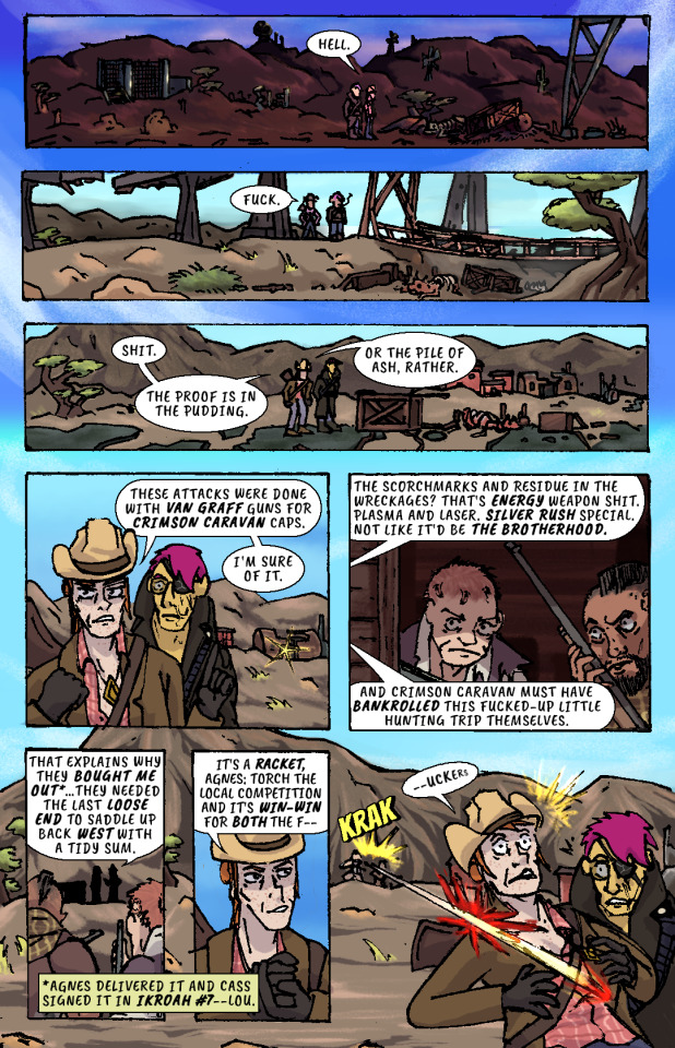
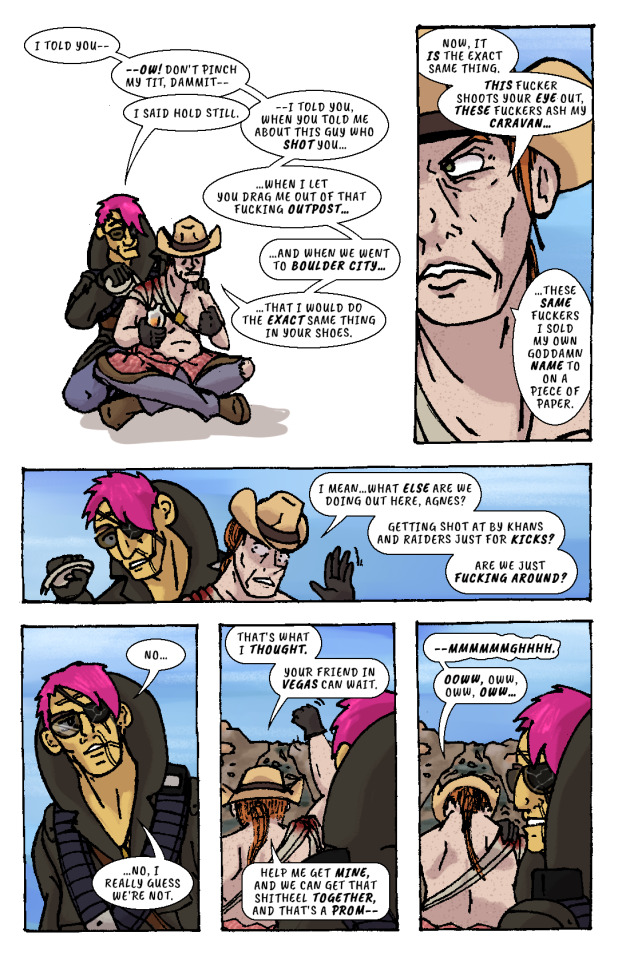
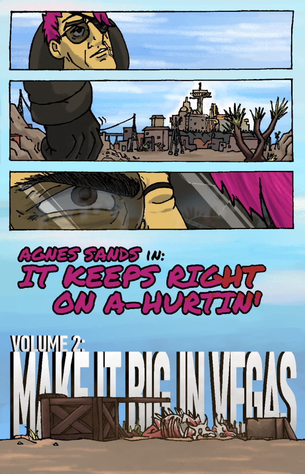
Whiskey river, take my mind, don't let her memory torture me. Whiskey river, don't run dry, you're all I got, take care of me. —“Whiskey River,” Shotgun Willie (1973)
It Keeps Right On a-Hurtin’ #15 - Vegas Outskirts
Collaborative Issue! Guest Colorist: @malpaislegate / @socksual-innuendos
Archive Links
«« First | « Previous || Next » | Last »»
Read IKROAH on Archive of Our Own
Notes / Original Pencils / Transcript:
Notes:
MAN that’s gotta hurt!! Volume 2 kicks off with a bang, literally if you count the gunshot and honorifically if you count Socks’ knockout color job on this issue. Look at those lovingly rendered bullet wounds!! Muah!!!
It’s been a relief having a month off from the comic as I handled a bunch of other things but there’s a lot to look forward to in Volume 2, as you can probably tell from that very forboding fist clench at the end there. Will Agnes and Cass get the revenge they’re looking for? Can they make it big in Vegas? Will it keep right on a-hurtin’? Find out next ish as Cass leads Agnes to meet the first of their new “friends.”
Original Pencils:
The pencils for this issue are like an autopsy report of all the things that can go wrong with your art if you don’t plan ahead and pay attention. Listen, friend, to my tale of woe, and learn from my mistakes so they don’t become yours!
First, you can see a lot of places where there’s floating objects, empty backgrounds, and incomplete heads. Part of this is because I always intended to just copy and paste repeated elements across each panel instead of drawing them multiple times, but other times I was forced to just because of my lack of planning. The top three panels on page two, for example, required me to draw the background I’d use for them on a separate page.
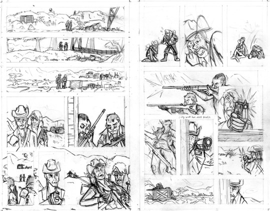
Second, you can probably tell that I actually had to flip the two raiders around in the final lineart because I forgot to keep the hands their were holding their guns in consistent—and since I couldn’t flip the middle panel on the second page without ruining the composition, I decided to flip all of their other appearances so that they’d be lefties. I doubt you even can seamlessly wield those particular guns left-handed.
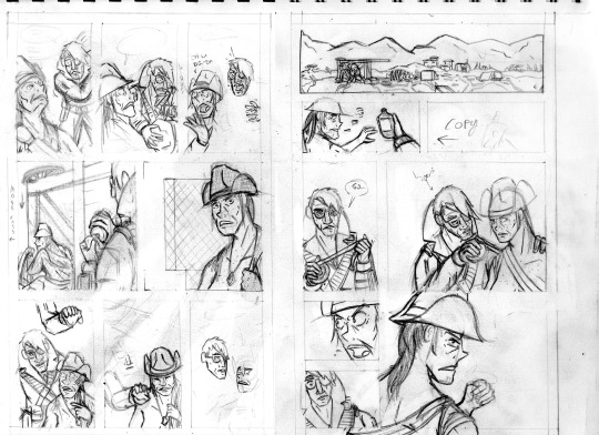
Third, the size of the cart that Agnes and Cass are kneeling behind changes CONSTANTLY and is dramatically oversized from the third page onward. After inking these pages, it took a lot of work to correct the inks and shrink that cart in each panel, but fortunately it came out looking good.
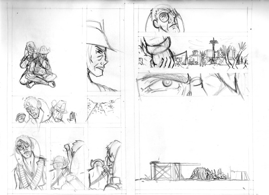
And finally, I completely redrew the second panel on the fifth page because it wasn’t until I had already handed he pages off to my colorist that I realized having a second profile shot of Cass so soon after a first one was just...redundant and lazy-looking. So I went back to my sketchbook and whipped up a much more unique, striking angle (I also just wasn’t satisfied with the quality of my art on that panel, so I’m very glad I redrew it). But again, my failure to plan ahead bit me in the ass and my redraw attempt wound up taking up a lot more space than I thought it would, so after inking it I had to basically surgically remove it from the other inks.
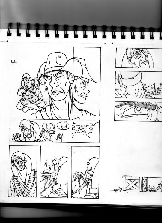
I’ll be honest with you folks: part of the reason that I work in such simple, thick, high-contrast lineart is because it’s very easy to make corrections and adjustments with stuff you could technically color in Microsoft Paint.
Transcript:
EXT. SOMEWHERE IN THE MOJAVE, morning. AGNES SANDS and ROSE OF SHARON CASSIDY stand over the wreckage of a caravan, scattered over a dirt road.
CASS: Hell.
EXT. SOMEWHERE ELSE IN THE MOJAVE, midday. Looking over a second wrecked caravan, at the bottom of a ditch.
CASS: Fuck.
EXT. PRE-WAR HIGHWAY OUTSIDE OF VEGAS, mid-afternoon. AGNES and CASS survey a third wrecked caravan.
CASS: Shit. The proof is in the pudding. Or the pile of ash, rather. These attacks were done with Van Graff guns for Crimson Caravan caps. I'm sure of it.
As CASS explains her theory to AGNES, a short distance from the caravan two RAIDERS peer at the two of them from inside a barn at a ruined farmstead. They have snake-bite tattoos on the sides of their shaved heads and are holding rifles.
CASS: The scorchmarks and residue in the wreckages? That's energy weapon shit. Plasma and laser. Silver Rush special. Not like it'd be the Brotherhood. And Crimson Caravan must have bankrolled this fucked-up little hunting trip themselves.
The RAIDERS move out from the barn, sneaking up on two passers-by who’ve stopped at the caravan wreckage.
CASS: That explains why they bought me out...they needed the last loose end to saddle up back west with a tidy sum.
(NOTE: *Agnes delivered it and Cass signed it in IKROAH #7—Lou.)
CASS: It's a racket, Agnes: torch the local competition and it's win-win for both the f—
SFX: KRAK
A gunshot rips out from one of the RAIDERS’ rifles and sears across CASS’ shoulder.
CASS (gasping): —uckers.
CASS slumps down beneath the overturned caravan wagon on the road, clutching her shot shoulder.
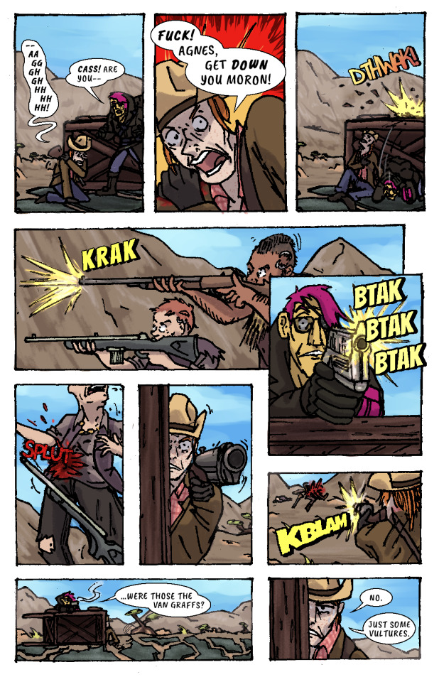
CASS: —Aaggghghhhhhhh.
AGNES: Cass! Are you—
CASS: Fuck! Agnes, get down you moron!
AGNES ducks behind the cover of the wooden caravan wagon just as another gunshot splinters the top lip of it.
SFX: DTHWAK!
The RAIDERS advance on CASS and AGNES’ position, firing at them from off the road.
SFX: KRAK
AGNES leans over the top of the wagon with her pistol, returning fire.
SFX: BTAK BTAK BTAK
AGNES lands a shot right in one of the RAIDERS’ guts, and she drops her weapon and falls down.
SFX: SPLUT
CASS, leaning out the side of the wagon, takes as careful of aim as she can with her shotgun by holding it with her good arm. Trembling, she fires, connecting with the other RAIDER.
SFX: KBLAM
The would-have-been RAIDERS are dead.
AGNES: ...were those the Van Graffs?
CASS: No. Just some vultures.
CASS leans back behind cover to sit against the bottom of the overturned wagon again, wincing from her shoulder injury.
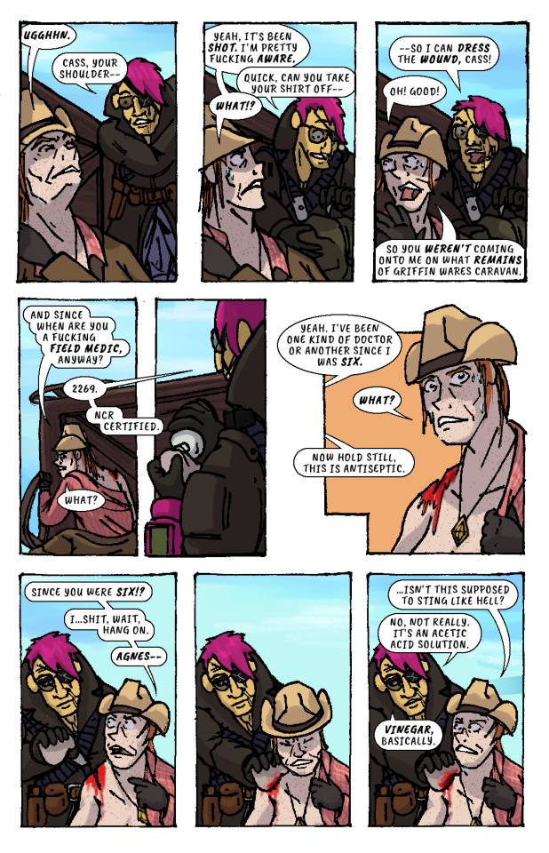
CASS: Ugghhn.
AGNES (slipping off duffel bag): Cass, your shoulder—
CASS: Yeah, it's been shot. I'm pretty fucking aware.
AGNES (unzipping bag): Quick, can you take your shirt off—
CASS: What!?
AGNES: —so I can dress the wound, Cass!
CASS: Oh! Good! So you weren't coming onto me on what remains of Griffin Wares Caravan.
CASS starts removing her shirt while AGNES produces a bottle of something from her duffel bag, and dampens a rag with its contents.
CASS: And since when are you a fucking field medic, anyway?
AGNES: 2269. NCR Certified.
CASS: What?
AGES: Yeah. I've been one kind of doctor or another since I was six.
CASS: What?
AGNES: Now hold still, this is antiseptic.
CASS: Since you were six!? I...shit, wait, hang on, Agnes—
AGNES pressess the rag onto CASS’ shoulder wound, and CASS winces instinctively. But, confusingly, there isn’t any pain.
CASS: ...isn't this supposed to sting like hell?
AGNES: No, not really. It's an acetic acid solution. Vinegar, basically.
AGNES begins cleaning the wound with the rag.
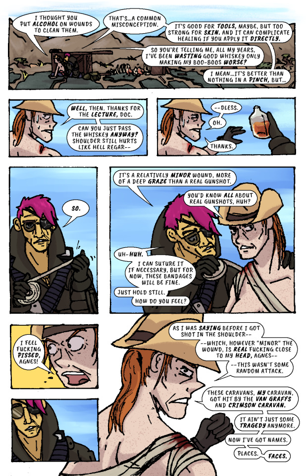
CASS: I thought you put alcohol on wounds to clean them.
AGNES: That's...a common misconception. It's good for tools, maybe, but too strong for skin. And it can complicate healing if you apply it directly.
CASS: So you're telling me, all my years, I've been wasting good whiskey only making my boo-boos worse?
AGNES: I mean...it's better than nothing in a pinch, but...
CASS: Well, then. Thanks for the lecture, doc. Can you just pass the whiskey anyway? Shoulder still hurts like hell regar—
AGNES hands her the whiskey bottle. She’d already gotten it out.
CASS: —dless. Oh. Thanks.
AGNES unspools a roll of bandages in her hands, then begins wrapping it over CASS’ shoulder and across her chest..
AGNES: So. It's a relatively minor wound, more of a deep graze than a real gunshot.
CASS: You'd know all about real gunshots, huh?
AGNES (unfazed): Uh-huh. I can suture it if necessary, but for now, these bandages will be fine. Just hold still. How do you feel?
CASS: I feel fucking pissed, Agnes!
AGNES recoils, taken aback slightly.
CASS: As I was saying before I got shot in the shoulder—which, however "minor" the wound, is real fucking close to my head, Agnes—this wasn't some random attack. These caravans, my caravan, got hit by the Van Graffs and Crimson Caravan. It ain't just some tragedy anymore. Now I've got names. Places. Faces.
AGNES resumes bandaging CASS.
CASS: I told you—ow! Don't pinch my tit, dammit—
AGNES: I said hold still.
CASS: —I told you, when you told me about this guy who shot you...when I let you drag me out of that fucking outpost...and when we went to Boulder City...that I would do the exact same thing in your shoes. Now, it is the exact same thing. This fucker shoots your eye out, these fuckers ash my caravan...these same fuckers I sold my own goddamn name to on a piece of paper. I mean...what else are we doing out here, Agnes? Getting shot at by Khans and Raiders just for kicks? Are we just fucking around?
AGNES finishes bandaging CASS, then leans back, pensive.
AGNES: No...no, I really guess we’re not.
CASS: That's what I thought. Your friend in Vegas can wait. Help me get mine, and we can get that shitheel together, and that's a prom—
CASS raises her arm to shake her fist as she speaks, straining her shoulder injury.
CASS: —mmmmmmghhhh. Ooww, oww, oww, oww...
CASS grabs her shoulder in pain while AGNES looks off in the distance and stands up. She looks out towards the horizon—towards VEGAS, and the pre-war casinos and hotels that still gleam and glitter in blinding sunlight.
Her fist clenches. Her brow furrows. Her body tenses, all over, staring at that city, that place.
The caravan wreckage remains alone on the highway, brahmin bones long picked clean by scavengers.
AGNES SANDS IN: IT KEEPS RIGHT ON A HURTIN’
VOLUME 2: MAKE IT BIG IN VEGAS
180 notes
·
View notes
Photo
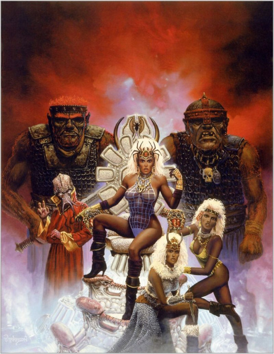


Queen of the Spiders Re-Covered
We decided to try our hand at a combined redesign, where each of us picked a character in the same picture and redesigned them. And we thought this image, the cover of an old Dungeons and Dragons adventure called “Queen of the Spiders” would be a good candidate (blame for throwing it at us goes to @theoldhack).
This is where the infamous drow race is introduced, where I guess they were just... evil women of color. 😬 Unfortunate. We decided to make them purple-skinned like they are in more modern lore.
At first, Icy thought the “queen” in the title referenced the lady in the middle there, but it’s actually one of the names for Lolth, the spider goddess whom the drow venerate, so.... We’re sure the drow on the cover are important mini-bosses somewhere in the adventure, probably, maybe.
Full write-up and close-up images under the cut.
What’s-her-Face on the Right
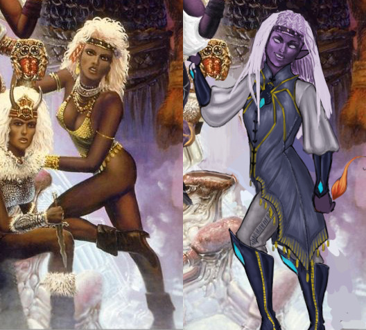
Just gotta say that it’s a huge pet peeve of mine when (usually male) writers write a matriarchal society as, air quotes, “sexually liberated,” otherwise known as “an excuse to draw them in lingerie because I can’t imagine women’s bodies not catering to me personally in any scenario, while still drawing men in full body armor.” Thanks for coming to my TED talk.
Okay, so.... I’m not sure what she’s supposed to be... besides a swimsuit model, which maybe the drow do have. Is there a quest where the players go to the underground beach to play underground beach volleyball? Cause if not, why is she like that???
I decided to make her a mage (this was a 1st edition book, so that’s all we got). I ended up changing.... everything, really. I think the only thing I didn’t change was her nose shape. It’s not my fault though, the redline for her original pose was an unsalvageable eldrich nightmare.
I gave her a more confident pose, more comfortable magic-user-friendly clothes (with the spider motif, cause spider god), and even different hair. The original hairdo just wasn’t doing it for me. I wanted her to look cool enough to have her own illustration in the book. She even has a little magic flame (mostly cause I didn’t know what to do with her hand lol)!
Her hair didn’t quite turn out how I wanted it to, but overall, I think it’s a good redraw. She’s got lots of fun shapes, an actual color scheme, and an attitude. What else do we need?
-Icy
Queen/High Priestess Crotchleg
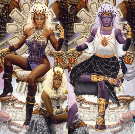
The composition was so awful that I had to actually largely re-do it by changing the third lady’s position from right to left and recreating large parts of the throne... some of which ended up covered by the main drow’s dress anyway (probably for the better).
Speaking of which, boy was she hard to fix without just throwing everything away and starting over! First of all, the way she sits on the throne seems like a product of an alien who never experienced what a chair is... which might also explain the throne’s uncomfortable-looking design. I actually ended up giving it a bigger seat and more lumbar support.
The pose, of course, got changed to something less concerned with showing off her immaculate Brazilian and more with looking comfortable and intimidating in the authority position. I also noticed her neck was disturbingly short, so I moved her face a tiny bit up. Now her spider crown is more of a tiara than a hat. And she got a golden choker to match.
A lot of questionable physics of how she actually sits got covered up by roomy, relatively simplistic clothes I gave her. Maybe I’d consider something more elaborate if the rest of the painting didn’t require so much fixing. What matters is that it’s not a painted-on swimming suit anymore. I’m overall satisfied with the design of her top and the spiderweb skirt. Hopefully the golden spider jewelry (the legs are thin chains!) gives it some regal feel.
The original shoes were quite stylish, but looked neither comfortable nor matched the fashion sense I went with for the character (also didn’t match the angles at which I redrew legs). So I ended up giving her sandals with golden ornamentation, matching her gauntlets. Sorry not sorry for half-assing the legs. One has to prioritize while on a deadline*.
I’m generally happy with the results, considering the sheer scale of changes we had to apply to have it meet BABD standards for positive example.
~Ozzie
*Icy sobbing in the background
#redraw#redesign#stream redesign#character design#costume design#Dungeons and Dragons#fantasy#drow#RPG#tabletop#evil is sexy#image#D&D#DnD#bikini armor battle damage#bikiniarmorbattledamage#BABD
268 notes
·
View notes
Note
I really love the way you draw anatomy - you are literally perfect. Would you mind one day if you make a simple tutorial on how to draw anatomy, particularly hands and just keeping things in proportion. Sorry if this sounds like a demanding ask - u can definitely decline or not answer no offence taken x
First of all, thank you so much! <3 I’m so happy to hear that you think my anatomy looks good. I’m not sure if I can teach you anything, but I’ll try! And sorry it took me so long to reply.
I wouldn’t call this a tutorial, more like an outline of what I usually do (maybe with some tips here and there). Hope it’s at least a little bit helpful 🙏
I’ll start with how I draw the hands. Well, as you’ve probably seen on my previous post about this topic, I used to have a hard time with hands because I didn’t understand the logic behind them + my only reference was my own small and blobby hands. Practice helps a lot, but imo mostly because as you draw more hands, it becomes easier for you to break them into simpler shapes (this is important!) and imagine them in 3d in your head or as you draw.
When I draw hands, I start with a rough sketch. Basically I just draw a fingerless block first. It’s a bit illegible right now, but bear with me.
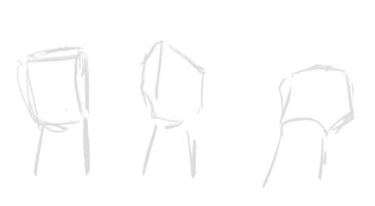
After this I add fingers. Once again, they’re all broken into shapes: a finger is just 3 short tubes connected to the block we just drew. Sometimes some parts of the “tubes” aren’t visible because of the perspective of the hand, sometimes you can clearly see all of them. As I already said, it’s all about learning how to imagine these things in 3d.
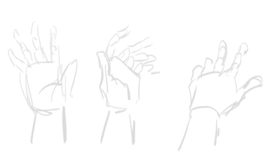
Since my sketch is so rough, I tried to make the shapes more clear here. I hope it makes sense.
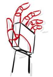
After the sketch is done, I basically just… draw hands. Remember that this is skin and meat, there are going to be folds (??? Idk if this is the correct word) and stuff. And nails, oh nails… I scream when I remember the times when I used not to draw them lol They help to convey the perspective and the angle of the fingers, so for me it’s better to have them than not. I’m not drawing them the exact correct way, though, but still.
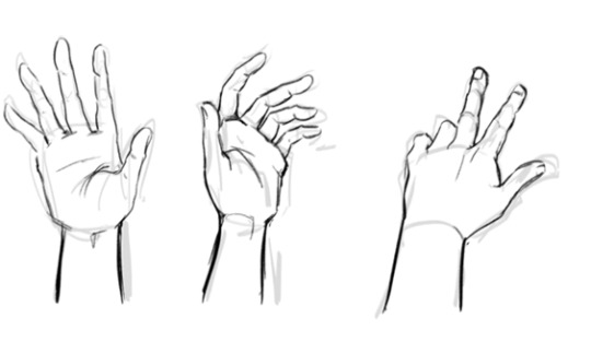
And once again, it took me a long time to start drawing hands more or less properly, and I still fix them all the time. For example, a thumb of the first one on the left is too short. In fact, I’d make all the thumbs bigger…
So yeah, something among the lines. It’s not perfect, but this is the basic idea of how it works, at least for me.
About proportions… Well, I’m one of those artists who like to make 1000000 sketches before I move on to the inking phase, it’s just more comfortable to me. This way, I give myself more control of the pose and proportions and have a lot of time to adjust and fix whatever feels off to me. Many good artists don’t do that because they don’t really need it.
First, I make a very quick sketch just to grab the “feel” of the pose I’m going for, plus it helps with the overall composition of the drawing. It isn’t detailed at all, so it takes about 5-10 minutes to draw, even less if I’m confident about what I want and don’t try to find the pose that would work the best. At this stage I try to keep the proportions in mind, but I don’t think about them too much.
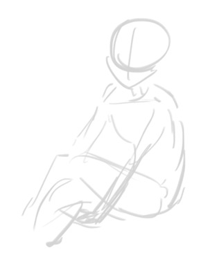
When I’m more or less satisfied with the basic idea, I draw my first sketch. At this stage I’m err building the body. There are a lot of ways to do that, I’m drawing something similar to a mannequin that is made out of meat. Oh no, that sounded horrible…
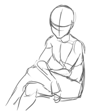
As you can see, this time I pay more attention to proportions and sketch all parts of the body properly. I make sure that both arms are the same length, both legs are the same length, that the shoulders are on the same level, stuff like that. At this stage I don’t think about the character, just about the body: I’m trying to make it make sense lol
Also you might’ve noticed, but I changed the position of the arms on this sketch because my initial idea didn’t really work (I tried to sit in the same pose and it was uncomfortable lol)
And then I draw yet another sketch. Sometimes this can be the last stage and I ditch the inking altogether and just colour this sketch instead, but more often than not it looks too messy and I have to make another sketch… (This is also where Katsu usually tells me to chill because we were planning to draw something simple and quick and I’m already making it complicated lol)
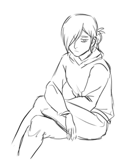
Here I’m adding more details, like face, hair, clothing, anything else that I need to sketch before inking/colouring. After this sketch is done, I look at it again and see if anything looks off. If it does, I try to fix it, adjust it, sketch it again, whatever works and whatever makes my sketch less stiff and more proportional. It doesn’t have to be super realistic proportions-wise though.
Things that I pay attention to when I check the proportions on my drawings:
Shoulders: they should be the same size (although the perspective can create a distortion, but this is a whole other can of worms) + ideally they should be able to fit two heads in them length-wise.
Arms: I check if they’re the correct length (the hand part should start ~at the crotch level). If the arm on the drawing is bent, I try to visualize how it’d look like if they were straightened up. If it’s difficult to imagine, I just sketch it.
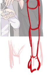
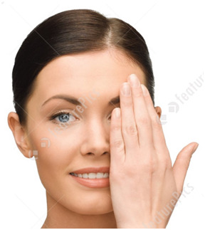
Oh, and the size of hands. I always check if they’re the correct size by comparing them to a face of the character: they should be about the same size (of course some people have larger hands and some of them have smaller hands).
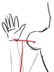
Legs: same with arms, I try to make sure they are not too long and not too short. Also, when drawing arms or legs, you can draw this thing. The shoulder/hip and the hand/foot have the same distance from the elbow/knee. This… sounds confusing, I hope it at least looks understandable lol
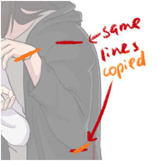
There are a lot of ways to check if everything is correct: sometimes I just put my fingers on the screen to check if all of the lengths make sense lol and sometimes I draw these lil lines to check if the lengths of the parts that are supposed to be the same match.
If your drawing looks off, just create another layer and sketch the body (the meaty mannequin thingie) over it again. It might help you see some obvious mistakes if there are any. Some people might say it’s too much work, I call this practice lol
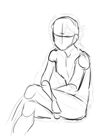
There are instances when I redraw some parts of the body completely. There are situations when it’s easier to do it all over again than to fix the existing sketch.
Another thing that I do is flip the image as I draw. Not very often though, you need not to get used to the flipped version of your drawing, it should be somewhat new to your eyes, this way your mistakes will be more visible to you. At least I think so…
It also helps to pay attention to details as much as you can, they make a huge difference. I still have a lot to learn about how the abs work, but like a year ago I knew nothing about them aside from “err I think there are 6 or 8 of them?? And they start below the boobs” (my boobs were also more square). After I started drawing them more often and learning how they actually work, my drawings changed accordingly. I think the right one is at least slightly better haha
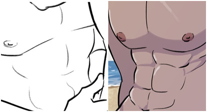
So yeah, this is more or less my process. It isn’t necessary to draw 10203100 sketches and to go through all these stages, but I personally feel much more comfortable doing that because this way I can be sure that I would’ve noticed if there was a major fuckup somewhere.
To be honest, if we’re talking proportions, this image is literally the only thing you need to know.
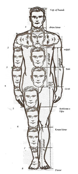
Just keep in mind how many heads are in the human body length, how many heads can fit inside one’s torso, etc. Compare body parts to each other accordingly. Just make a habit out of checking if the proportions on your drawings are correct: make a shoulder bigger, make sure that the legs are the same size. It might be too much at first, but it’ll literally become a subconscious thing very soon, and you won’t have to actively think about all of this every time you draw. I google this image from time to time just to make sure that I’m fixing everything correctly lol
You don’t have to be exact with these proportions, but they still need to have some logic behind them. Like here, if we look at Osomatsu, who is clearly very stylized, we can still see that his body is proportionate. His shoulders are too small for his head, and his body surely doesn’t have 8 heads in its length, but he still doesn’t fall apart because there is logic behind his stylization: his arms are still long enough for him to put his hands in his pockets; they aren’t too long or too short. Hope that makes sense…

Sorry for the long read. Once again, I hope it was somewhat helpful or at least interesting. If you have any more questions, please feel free to ask!
Although I’m still learning myself of course, so there are things that I probably don’t know or forgot to mention…
92 notes
·
View notes
Note
Hello! May I ask how you draw? I'm currently learning how to myself and would be highly interested into a step to step process by you! Like from sketch to the done thing (no color necessary)
Hello there!
I dunno how I feel about showing how I work/giving advice to someone who’s learning (and I say it as a pro artist who went through years of traditional art education) because when I do the illustrations you see here on my tumblr I BREAK THE RULES you’d learn though life drawing routine, and give in to bad habits, and my methods are rather unplanned and chaotic which makes it difficult to pinpoint significant stages. But I used my portable potato to take some photos during working on my last piece, so I’ll throw it here with a bit of an explanation of what’s going on.
Before I begin - and because you’re about to look at a mess of a WIP - I’d like to give you some general advice that generally makes life easier when you draw (again, things that I learned in traditional arts education - another artist might advise you the complete opposite, dunno!)
Work holistically. Forget them satisfying-to-look-at clips on instagram showing someone produce a hyperrealistic portrait starting from an eye, with each and every element emerging being finished before they proceed to another part. It takes a lot of talent, yes, but these are ppl redrawing a photo in a kind of a mechanical manner. Most artists don’t work this way. Especially if you’re working without a reference, or if you’re doing a life drawing - your process will be layering and changing and finding what works best to give an impression of what you’re drawing rather than reproduce the exact image, and your artwork is likely to look messy most of the time.That said: don’t start with the details. Don’t spend too much time on a particular part while neglecting others. Your goal is to keep the whole piece at the same level of ‘finished’ (even though it’s unfinished - do I make sense?) before you’re confident that everything is where it should be and proceed to the details. So sketch out the composition first. See how things fit, what’s the dynamics. You’ll save yourself from limbs sticking out from the frame, odd proportions etc etc.
Because it’s a game of relationships between different parts of the picture/scene. I ask you not to worry about finishing a single element before laying out the rest because you’ll find that said element will look different once the other part appears! For instance - you might think that the colour you picked for a character’s hair is already very dark. But once you’re done with the night sky background, you’ll find that it’s in fact too light, and doesn’t work well with the cold palette. You’ll have to revisit different parts of the image as you go to balance these relationships and make the picture work as a whole.
Give an impression of something being there without actually drawing it ‘properly’- because details are hard, mate. You’ll see that my lineart usually has hardly any, and my colouring is large unrefined stains, but the finished thing looks convincing. Like, fuck, I can never focus on how Crowley’s eyes are really shaped. So I just turn them into large glowing yellow ellipses crossed by a line, and heard no protests so far.
Don’t panic if you messed up (you probably didn’t anyway). It might turn out to be a completely unnoticeable mistake - because, remember, things work together to balance each other, so another finished off prominent element will probably drown that badly placed line that looked so visible and out of place a second ago.
It might not look good before it’s finished. I’m mostly immune to it after years of drawing, and my recent illustrations all follow a specific method (ykno, my sunset glow effects and all that) so I can kinda predict the next stage. But I do my linearts on a specially picked crap paper, I don’t bother erasing the smudged graphite, and it looks messy af until I make the background white in Photoshop. Conclusion: you might have a moment of doubt as you work through a piece, but try to break through it - I often suddenly start to like what I cursed a minute before! - and try to finish it even if it’s meant to be bad. This way, looking through your past pieces, you’ll see the progress. And trust me, I can’t even look at my art from literally three months ago. It’s normal.
Now, pics! The sketches are paler in real life, but I increased the contrast a little so you can see something.
1. Laying out the composition!
I wanted to just show them kissing, but I got carried away due to some Art Nouveau inspiration. As you might have noticed, most of my illustrations are quite self-contained (ykno - they look like a sticker on a plain background). So I wanted a tight swirl bordered by Aziraphale’s wings creating a sort of rounded, yin-yang like bubble around them. Consequently I made the whole composition revolve around their heads.

2. Adding more details to the sketch. It’s messy af. It will be messy until I’m done. It’s fine.
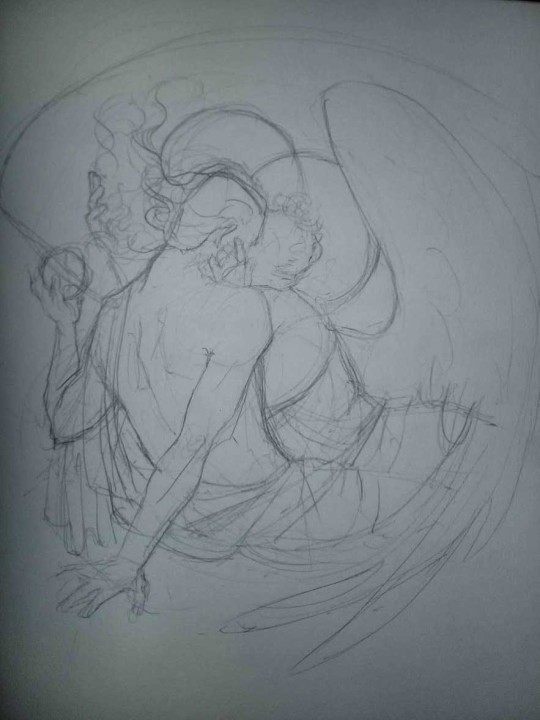
3. These are the fineliners I use for the linearts! They are made by Uni-ball and come in light and dark grey. I also sometimes use the guy on the left - ‘Touch’ sign pen by Pentel, when I want more brush-like, wider strokes. I work in grey because when I scan it and do my usual boring trick with sunlight highlights - which is an Overlay mode layer in Photoshop - the highlights ‘burn out’ the lines too and make them vanish a little, and the lighting effect gets more striking. I also like to use the light grey ones to make something look pencil-y without actually using pencil, because pencil fucking smudges.
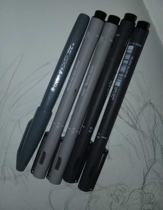
4. It smudges! So because I am right handed, I start inking from the right hand side, no matter how tempted I am to do their faces first.
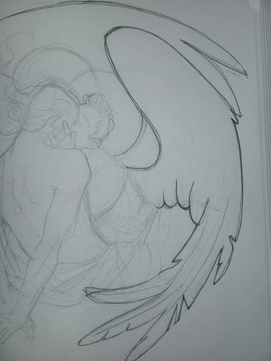
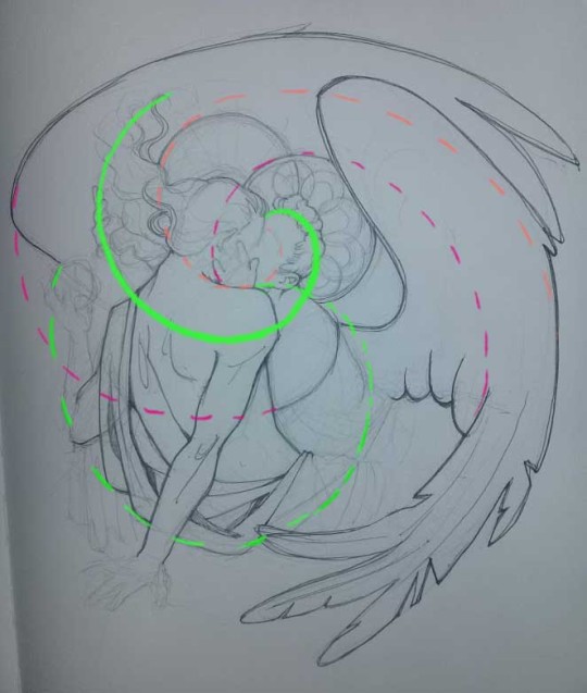
5. You can see the composition directions here. I made it intuitively, but ofc some ppl actually use grids etc to lay out their drawings.
6. See how pale ans thin the lineart was at first? I kept adjusting it as new inked parts were appearing. It starts to look nice and consistent now!
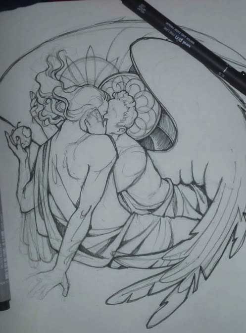
7. Finished lineart? There are some mistakes which I later corrected in PS. Notice that Aziraphale’s face has hardly any details on it - I tried to make the drawing suggest his expression rather than risk overdoing it.
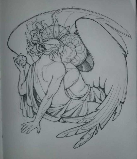
8. Photoshop time!! You can totally do what I did here even if you don’t have a graphic tablet. I used Curves tool to enhance the lineart, then Quick Selection Tool to select the background around around my sticker-like piece and filled it white (on a new layer ofc). I keep this white layer on top of the layer order so it works as a mask as I colour. I decided I did not like the hatching shading underneath Aziraphale’s halo, so I erased it with a Stamp tool (because I wanna keep the textured grey fill my crap paper naturally gives me!). It’s done roughly but won’t be visible once the thing is coloured.
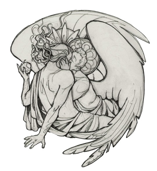
9. And the reason why I keep the grey shade instead of easily getting rid of it by using Curves/Levels is because when I set this layer to Multiply mode and colour underneath, it gives me this nice desaturated look like from an old cheap paper comic page. It works as a natural filter! But of course I can’t do bright colours this way, so all my glowing highlights happen ABOVE the lineart layer - on a separate layer in Overlay mode!
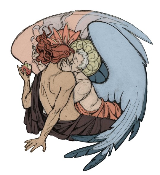
Finished thing here!
_____
Commission infoBuy Me a Coffee - help me with my transitioning expenses!Prints and stickers and things on my Redbubble!
#ask the buckwheat#long post#tutorial#drawing advice#drawing tutorial#good omens#ineffable husbands#good omens fanart#good omens art#my illustrations#doodles#toastedbuckwheat
1K notes
·
View notes
Text
Filled It With My Feelings Text Translation
Sorry it took so long, but I finished the text translation of Filled It With My Feelings, the Senyuu 10th anniversary book! I didn’t translate the Season 1 Episode 1 redraw though because I’m sure we can all recite what happens in there by heart at this point.
As it’s an illustration book, the translation is meant to be read along with the pictures - you can purchase the digital PDF of the book at hiaruron.booth.pm/items/2329424. You should be able to purchase it through PayPal or some international credit cards.
I’ve included the text under the cut, but you can also read it on the Google Docs here.
Please note I do not give permission to anyone to use this translation for scanlations. There’s a reason why I’m posting this as a text translation rather than as a scanlation - it reads perfectly fine along with the raw book.
However, feel free to use this for text-only translations to different languages, just send me a message about it.
Page 1
Title: Filled It With My Feelings 10th. senyu.
Page 2
<no text>
Page 3
[Panel 1] SFX (Slime): *squeak* SFX (sword): *slam*
[Text Paragraph]
The story of Senyu first arrived on Tuesday, February 23rd, 2010 at 12:39 PM. Naturally, at that point, the name “Senyu” didn’t yet exist - a email was sent to my inbox entitled “A discussion about a new project.”
It was a rather vague email with few details, but at the time, I was working as a day labourer in a certain distribution centre in Tokyo’s Ota Ward. As I hauled around boxes, my days were filled with uneasy thoughts of my future- I gave up on becoming a mangaka, I started work at an anime company but I quit there too, what am I going to do from now on? So I pounced on that vague email- Maybe this will shine some clarity into my life!
Senyu. was the product borne out of that email, and to my great appreciation, it really did shine clarity into my life. My future, which had been dark and uneasy, was illuminated bright by the light of Senyu. I would like to say that was why I made the protagonist’s name “Alba” - which means dawn - but unfortunately, that isn’t the case. I only learned the meaning of Alba’s name later - it was a total coincidence.
Anyways, a lot has happened, but it’s now Senyu’s tenth anniversary.
Thank you very much. I never thought that I could continue for this long. This is all thanks to all of you, for supporting me all this way.
Senyu. is a part of my life at this point - I don’t plan to end it any time soon, so I will be counting on everyone for their continued support.
Haruhara Robinson.
Page 4
Alba
While this may be obvious, the character I’ve spent the most time with in this work no longer feels like a mere “character” to me.
He had a beta design with bangs. But since I thought he might seem more cheerful with his forehead showing, I settled on his current design. I intended to give him a haircut that was similar to characters like Kirimaru, but my lack of artistic skills at the time ended up giving him a hairstyle with a bizarre composition.
I struggle now with how to draw his hair well.
Hero Symbol
I’ve always liked the idea of accessories that had the symbol of a hero, so wanting to have the same concept in my own work, I did my best to think up a design. I was really happy when it came out as merch.
Page 5
Ros
His backstory is really something!
I feel like he carried the entirety of Senyu’s serious plotlines on his back. I thought of Senyu. as like a story that uses the protagonist Alba to give the completed story of Hero Sion a happy ending?
There were times when I was drawing things out that I thought, He feels kinda pitiful? But then in the story, Ros says, “Don’t judge people as pitiful by your own standards,” so then I thought, I-I’m sorry.
His equipment at the start was supposed to be like a machine that let him whip around his heavy sword like it was nothing, but everything ended before I explained any of that.
Page 6
Rchi
At the start, I just thought of her as a cute little girl. But gradually, she grew darker and darker, and by now, the dark aspects of her personality are a part of what makes her unique as a character.
Her hair accessory often disappears. Near the start, there was the explanation that it was confiscated when they were arrested, but beyond that it’s just because I forgot to draw it.
There was an explanation for why she was naked under her cloak during her first appearance, but I’ve forgotten it. I believe it was because since she was camping outside, she washed herself outside as well but her clothes were blown away by the wind - so she wrapped an old cloth around herself…?
Page 7
Foyfoy
The name “Foyfoy” was decided by an audience poll. At first, I was planning to make him Chinese-inspired, but before I realized it that concept had disappeared. His mark is leftover from that original idea.
Foyfoy’s hairstyle is one I drew often when I was a student. I often gave rivals or secondary main characters this hairstyle.
I’m glad I could draw a design like this in an official work.
Page 8
Alles
A character drawn specifically with boobs that a Haruhara who was too embarrassed to draw boobs drew because “I can’t run from boobs!” The reason why I stopped drawing her midway through isn’t because of my embarrassment, but because I wasn’t used to drawing them, so since I never practiced it, I forgot how to.
Princess-chan
TL: This is written with the kanji for “Princess” rather than the katakana for “Hime” as her name is usually written.
She was meant to be a cute, elegant girl, so it shocked me when she immediately ended up as a violent character from her first appearance.
Since I hadn’t decided on a name for her, in the anime her name was listed as ???. I caused trouble for the anime staff.
Page 9
Rudolf
I can’t help but feel that eldery soldiers are cool. When I was doodling for fun, I often drew eldery soldiers.
Himendam
I thought of a development where a cute girl pops out from a nice big suit of armour, so I created the Himendam.
At the time, I thought, “This is a pretty unusual development, it’s great!” but now that I think back on it, it’s actually pretty common.
Slime
The first monster to appear. The first monster you fight should be a slime! Slimes should be blue! I’ve been influenced by Dragon Quest in that way.
I had this child of mine show up as your standard old monster in order to increase the impact of the panda who would show up right after.
Page 10
Minister
While I honestly have no idea why the minister is always standing next to the king, usually that’s the case in RPGs, right?
So I had him stand next to the king in the same way. I feel as though his overall image is influenced by Magical Circle Guru Guru’s Kaya. While I hadn’t realized it while designing him, Kaya’s design affected me unconsciously.
The King
His whole thing was “a super serious old man that makes a stupid face during funny scenes,” but before I realized it, his stupid face became his default expression.
He just may be the nastiest character in the series, considering he wrapped up the entire world in his schemes for his own personal desires.
Mob Characters
The mob characters in my work tend to have this face. I like how they tend to make cutting comments while having non-descript faces.
Page 11
Suit
When Ros’ design went from complicated equipment to this thing, I was shocked at how much easier it was to draw.
I think this thing was what triggered me striving for easiness in my work. Can I blame everything on this thing instead of me?
Just kidding, it’s all my fault.
Fake Foyfoy
If you don’t make careful enough observations, you can’t make a perfect disguise, and you end up in an idiotic costumed-character-like disguise. I wanted to use this plot device a few times more after this, but I didn’t have any chance to use it at all.
Mii-chan
Haruhara happens to have had a stuffed animal for as long as he can remember, and he still has it since he’s never been able to throw it away. I feel as though that stuffed animal served as the model for Mii-chan. In terms of his colour and overall atmosphere.
But my stuffed animal isn’t a pervert like him!
Page 12
Samejima
A delinquent overflowing with manliness. What’s with his hairstyle, I wonder. It’s actually pretty easy to draw.
He just might never lose against anyone so long as he thinks, “There’s no way I can lose.”
Januar
I stuffed in everything my little sister likes into his appearance. “Straight-cut bangs, black-haired, one-eyed, droopy eyes.” But it isn’t as though I went and got her feedback directly so she might just tell me, “He’s not my type at all.”
I chose his personality based on my tastes- “A kind idiot.”
Page 13
Teufel
I thought of a “butler who doesn’t obey orders” around the same time as a “soldier who doesn’t listen to what you say.”
I wanted to have him appear at some point in the future, but then I saw a book called The After-Dinner Mysteries in a book store, which made me think- “M-m-m-m-maybe this book has a butler who doesn’t obey orders as well?!” So I panicked, ran back home, and drew out the head butler’s story.
That’s why the head butler’s story was shoved in out of nowhere.
I read The After-Dinner Mysteries after I wrote in all the butler plot devices I wanted to use, and it was interesting.
At the start, Ros had his three burrs hairstyle so his design was differentiated from Teufel’s, but from Season 2 forwards I struggled with differentiating them.
So Teuf-kun has been going through some small design changes, a bit at a time.
Page 14
Nisepanda
Before Dwango reached out to me, there was a manga I thought up with the plot “a zoo with an easily deceived curator.”
I planned to have a nisepanda appear in that work. The plot device was, “They thought it was a panda, but they were given a mysterious lifeform instead.”
Death Hot Dog-kun
A character that was born during the enthusiastic atmosphere during a meeting with my editor.
We happened to be eating hot dogs during the meeting.
I barely ever have these meetings for my other works, but for Senyu, I’ve been having meetings like this for years. So through sheer enthusiasm and cheer, things like mysterious characters and plot devices end up being created during the meetings.
Page 15
<no text>
Page 16
Dezember
Mysterious characters in manga often show up with their face cast in shadows. Dezember was born because I thought, “Why not make those shadows real?” But he ended up as a cooler character than I expected, using his shadows to attack and such.
I wanted to base him off of a toy for future plot developments, but I’m really glad I decided to based him off of dice. He became a really good character.
August
I think he’s actually a really nice person.
My editor for Main Quest really liked August, so whenever they got the chance they tried to push for more August.
Avril
A character that’s rather rare for Senyuu - one that just genuinely does bad things for bad reasons. I planned to draw her as really evil so you could tell she was a bad person, but she ended up just casually munching on bread - it really surprised me.
Neun
Back when his only appearance was a silhouette, I just wanted to make people think of that character at first. But now that I really think about the design I thought up for him after - isn’t he pretty cute?
Juli
Just like Foyfoy, I often drew characters with this hairstyle back when I was a student. I usually gave it to trustworthy ally characters. I like his design and personality quite a bit - sorry I haven’t used you much…
Page 17
The Shadows
It’s super cool to be able to split your body for each die face. I also feel like it’s a great character setting that each split has his own personality. A thought just crossed my mind - couldn’t I draw a manga just based around the Dezembers’ home life?
...I guess it would end up like Osomatsu-san...?
Page 18
Zwei
I wanted to use the concept that she was old despite her looks because she was a demon, so I had her dentures fly out - but now that I think about it, there’s other old demon characters, including some characters older than Zwei. So that would make her dentures a result of her own problematic lifestyle, not because of her old age…
Wanna Stab~
A mob among mobs, who ranked high in a popularity poll. I shall now grant him a name - “Phoenix the Rich”.
Mortmome
The stuff on his shoulder does some mysterious things, preventing his body from turning as well when the drill turns.
Page 19
The Great Mage
The cape he wears is very warm. His research assistants gifted him the cape as a present for his birthday sometime in his later years of life, as they were worried about his health. That’s why Alba always wears the cape.
Elf
He’s meant to be someone who knows the secrets of the world - but I can’t count the number of times I considered whether it would be better to just make him a regular old funny character. Good on you for surviving through all that, Elf!
Alf
While I did want there to be a “Elf’s best friend” character, I hadn’t thought about his name at all. So when it came time for him to appear, I really struggled with it. I wanted to make his name like Alba and Ros (Albatross) or Salt and Lake (Salt Lake)…
I may have struggled the most with Alf’s name among all my characters, considering I usually just pick names on instinct.
Page 20
Salt and Lake and Lym
The Hero Academy trio. At first, I planned for Salt to become the Demon Lord, but when I sat down to draw everything out, Lake ended up in that role - it really shocked me.
I had always planned for the story to shift from the adventure setting of Seasons 1 and 2 to the school setting of Season 3. Though the end result is completely different from what I imagined.
Season 3 was really fun to draw since it defied my expectations at every turn.
Page 21
Lyman
I wanted to draw a pathetic older man. I also want his scar to be because of some pathetic reason like “He tripped at a bar.”
Elmer
I reused the soldier design I thought up prior to thinking up Alba and Ros. He’s a little older than Rchi.
Justice
Justice is her ally. In other words, I wanted to make a character where no matter what she does, “I’m doing it, so it’s just!”
But it was too difficult to figure out how to deal with a character like that, so I ended up just making a regular old hotheaded reckless character.
In the end though, she ended up as a character I quite like.
Page 22
Grandpa
A character who loves money. Since I love characters who love money, he’s a character that’s fun to use. It doesn’t actually have to be money, I like characters true to their own desires in general.
Hasegawara-kun
He was originally meant to be a silent character, but I got the urge to make him talk right before I was going to send in the manuscript. Since I wouldn’t make it if I typesetted his speech, I wrote his lines myself. By writing his lines in a way that can only be expressed through handwriting, I made it seem like I planned that from the start.
I made his speech typesetted again after I did that plot where he speaks super eloquently.
Rib Man
He requires no explanation!
It was funny when he moved in the anime.
Page 23
Sochi and Co.
There’s a game called Medabots - in that game, a character called Samantha leads a three-person team called the Screws. I’ve always liked that team since I was a kid. And then, I learned that my editor for Senyu was close with people who were involved with creating the original Medabots. So I had my editor tell them, “I want to put in characters I respect! Please leave it be!”
Please google the Screws that I respect, I respect them.
Lucop
I had vaguely thought up what was going to happen until the end of season 4 of Senyu. But since I’ve done everything I originally thought up, F5 - which I’m drawing now - is all based on plot developments I thought up in +.
-I’ve been saying that for a while now. Lucop as well was just a throwaway joke at first. But as I started moving him around, amazing developments like “Huh? No way… you had a past like this…?” burst out of him, and so he became the current Lucop.
Page 24
Midnight
A travelling doctor. As he treats his patients, he’s also searching for a cure to Mom’s mysterious disease. He’s a completely normal person with no special powers. He wanted Alba to become strong through his own power, not through familial connections.
Cecily
A mother who adores her children. I think it’s pretty amazing that she managed to raise Lake up herself and send him off to school despite being blown off to a mysterious place out of nowhere.
Page 25
Rchimedes the Second and his wife
Rchimedes the Second and his wife. (T/N: Yes, it’s written twice.)
Daromeon-san, who’s currently illustrating Kengan Ashura, was the one to draw the ridiculously beautiful backgrounds in the flashback arc in Season 2 when the Second was imprisoned. When I complained that I couldn’t draw it, he drew me amazingly beautiful.backgrounds.
The Second’s design is based off of a mysterious preconception I have that “Demon Lords should wear raggedy capes.” Mama’s design is based on those soothing, kind moms you often see in anime.
The Mana Maker that he holds in this picture isn’t any particular Mana Maker. I just wanted to let a Mana Maker show up in a group picture.
Page 26
Rchimedes
While he’s tremendously evil, he ended up being quite loved. The Senyu characters I designed near the start wear clothes that I would never design now - I really think it’s amazing. Why did I dress him up in a jumpsuit when I decided to draw a Demon Lord?
On a side note, I imagined that the white part of his clothes peels off smoothly like tape if you pull at it from his neck.
Crea
Since he took back his body from Rchimedes, his height shouldn’t have changed, but for some reason he mysteriously shrunk.
Page 27
<no text>
Page 28
Originia
In a way, the story of these three marks the start of Senyu. Originia comes from me messing around with the the word “Original”.
Rchimedes' scariest era just might be when he was living alone with Sion in Originia. Even though at first glance, it seems like he was living a peaceful, cheerful life with Sion, though occasionally getting beat up by him. But in reality, just what was he thinking deep inside, as he lived out his life, watching Crea and Sion?
Since I’m the author, I can generally imagine what my characters think just by thinking about it. But when it comes to Rchimedes during this time, all that comes to mind is “Scary scary scary”, and I can’t really think any further in detail.
I’m often asked “What’s Rchimedes’ original eye colour?”, but I think it was probably blue. I feel like I drew his eyes as blue somewhere, but I can’t remember…
Crea’s clothes slung around his shoulders that don’t fall off for whatever reason are actually sewn on - that’s why they don’t fall off. Crea sewed it on himself. While his threadwork is rough, it’s very sturdy. I think it’s wild and cool.
I showed a bit of what Sion did in the main story, but he generally did things like hauling supplies for hunting, looking far in the distance since his eyes are good, and going shopping in far-off cities for the village. Things like that.
Page 29
The two from Season 4 Episode 0
The two from Elf and Alf’s universe. Since Rchimedes’ magic research hasn’t progressed that much, they mostly fight with brute force. Since Crea never had his body stolen, he’s doing well. (He’s not doing well at all.)
Page 30
Creasion
When I was a kid, I read in a manga, “‘Hero’ isn’t something you call yourself - it’s a title you’re granted by others.” I remember thinking, “I see, that certainly makes sense,” and agreeing with it. I also thought, “While you generally think of heroes as being brave and splendid, the person who’s actually adventuring might not be able to stand expectations like that sometimes.”
Creasion may be a character borne out of those feelings of mine.
Ros, please have tons of sweets and smile tons as well.
Page 31
<no text>
Page 32
Sleepiez
When I thought of the name “Sleepiez” in Senyu+, I didn’t think much of it except “There’s an anti-Alba organization”. I also planned for Boss to be a new character. But after I took the time to think about it properly, the Sleepiez in their current form were born.
Thanks to the current Sleepiez being created, F5 was able to start even though I thought before “I’ve already done everything I want to do with Senyu, I can’t make another proper season.”
If there was no Sleepiez, I feel like + would’ve lazily continued, then at some good cut-off point, I feel like I would’ve been told, “Do you think it’s about time to end it?”
A tenth anniversary for example… it would’ve been a good cut-off point… how scary!
Boss
I can’t write about most of the Sleepiez members just yet, so I’ll be talking about Boss as their representative.
Boss is an alternate universe’s Alba, so despite being Boss, he’s still Alba, and so I want to make him feel like Alba still. But since he’s Boss he can’t retort or make jokes, since it would ruin his dignity. So at the very least, I gave him Alba’s fashion sense to keep his Alba feel. Since his heart stained black and he became evil, his fashion sense naturally became eviller as well, but he’s still Alba, the base is still Alba. He’s wearing clothes that kinda feel like a middle schooler who just discovered fashion for the first time, like he hasn’t managed to go full evil in terms of clothes just yet.
Now I can keep Boss as Boss while still giving him an Alba feel! ...is what I thought, but… does he actually still have that feel…?
Page 33
Alba with Mana
It made me happy that my wish for my protagonist to become the strongest at the end was granted. I thought up a lot of reasons for why only one of his eyes is red, like how it’s because his awakening is still incomplete, etc., but the number one reason is “it’s cool.”
A single red eye is cool, right?! It’s cool right?!
Now that he can use his mana to some extent, he controls his overwhelming mana to hold it back, so his eyes are both back to black now.
Page 34
<no text>
Page 35
SQ Senyuu.
I had this conversation once-
Y-san from Dwango told me, “I want to take Senyu to a magazine to have it serialized!”
I thought it would be awesome if it actually happened, so I approved it. Then I was like, “If you do take it to a magazine, where would you take it?”
Then Y-san responded, “Well, if you say ‘magazine’, you think Jump.”
And I was like, “Nah nah, Jump would be impossible, ahahaha.”
I never thought that Y-san would actually bring me an offer for serialization in Jump - Y-san was way too capable. Since my personal experience with Jump all started from there, I’m really grateful!
Pages 36-43
<Season 1 Episode 1 redraw>
Page 44
Afterword
Since I’ve remade Senyu Episode 1 many times before, I thought that I would never remake it again. But then I thought- why don’t I remake Episode 1 at the exact time it was originally released ten years ago, as celebration! So I ended up remaking it again.
But I think it may be my first time remaking it without changing any of the jokes or content.
22 notes
·
View notes
Note
do you have any tips for reference images?
Step 1: where to get reference images
I’m actually very little help here. To be totally honest, I get a frankly embarassing amount of reference practice from meme image redraws. It’s really not a bad resource, and it’s an easy way to keep my short attention span engaged & motivated.
I’m lucky enough to have had the opportunity to get some more “boring” practice in in college-level drawing classes. I’d guess a good way to just generally get some similar practice drawing bodies and limbs in a variety of positions would be referencing fashion photoshoots. I’m gonna do a meme example for this though.
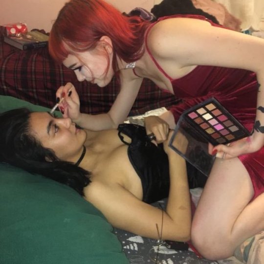
This is a fun meme that I like and a relatively complicated pose that makes for good reference material, because it would be difficult for me to just reason out how this would look without it.
Step 2: referencing the image
METHOD A: CLASSICAL
It’s really the best practice to draw from sight for me personally, because it forces me to do more trial & error trying to get it to look right, and I need stuff like that to force myself to slow down and contemplate the how & why of my art methods.
I don’t have a physical sketchbook on me right now and I really just can’t do this digitally. It’s too difficult to have a good amount of canvas and a large reference image on a tiny computer screen both at the same time :/ I’m sure there’s step-by-steps on the big wide internet somewhere, but I’ll see if I can remember to come back to this and do it myself later.
METHOD B: SPEEDRUN STRATS

when you’re working digitally from photos, doing a quick trace with big, simple strokes can also be helpful for informing how you would recreate this without the reference. This is what it looks like when I just Do That, but let me try and illustrate what’s going through my head:
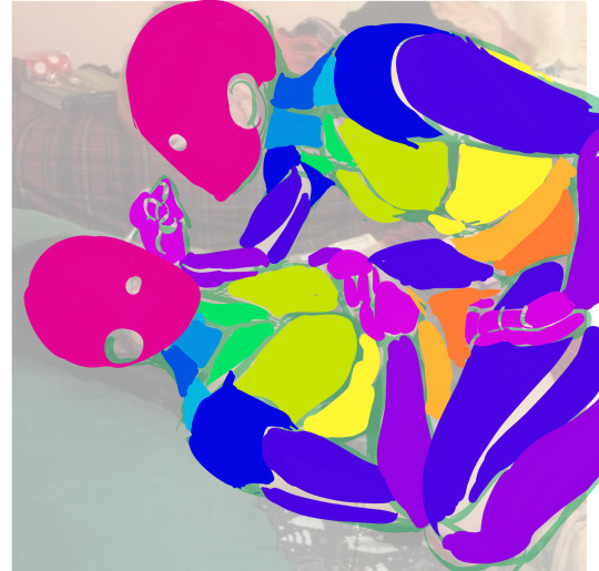
it’s not 100% exactly human muscles, but I can’t deny that referencing human muscle structures for horror reasons has really changed the way I look at anatomy quite helpfully!!
I’m trying to think about the body as a bunch of apposable chunks! That way, I can use my understanding of how those chunks tend to move in relation to eachother to better intuit and simplify said chunks from memory later on. This holds true for every method!
BUT just tracing an image directly is going to take away all of your potential wiggle room for personal flare, stylistic emphasis, abstraction, etc. I mean, does this look like something I’d draw?

Even if I took the time to do better line art….not really :/
METHOD B.5: THE SECOND PART
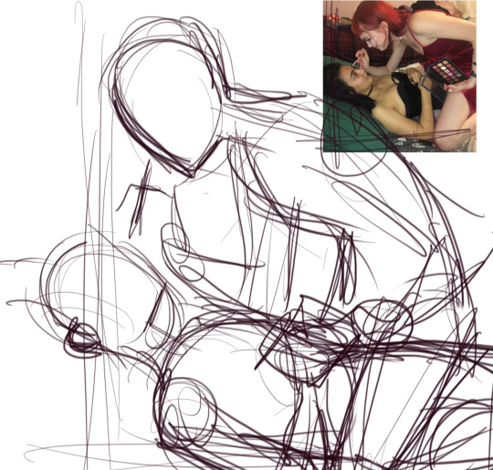
So, what I do is I delete the trace I just did and reduce the size of the reference image, and then try to recreate the pose again with my new Chunk Knowledge.
I tend to flatten perspective on character art when I draw in the kind of simplified style I use the most for comics and such. It’s faster for me, because I tend to struggle with intuiting or expressing volume MUCH more than I do with more shape-oriented, abstracted gesturing. I haven’t even drawn the image yet, but I know I’m going to draw the top girl’s far arm bigger than in the original image, because it would look awkwardly reduced in my shorthand, with the minimal shading I do.
When I draw it from scratch like this, it allows me to consider things the impromptu photographer didn’t, such as composition and readability. Where do I want the focus to be? How do I want the characters to feel? Can I make the silouhette clearer and more dynamic?
AS IT TURNS OUT I HAVE THE ANSWER TO 0 OF THOSE QUESTIONS, because Ive already bored myself with this pose!!! WHOOPS. but check out how much sharper all the shapes are. thats the beginnings of maybe POSSIBLY doing some stylization!!! yee haw
98 notes
·
View notes
Note
What’s your process like? What tools do you use?
I’m glad you asked, so here’s the long post with photos and all !! (there are some spoilers too ahah)
As I’m doing a chimera day, the whole process is dispatched over the daytime and is repeated every day, filling all the little moments where we do nothing : waiting for the bus, waiting for someone, taking a break between two tasks, etc. Sometimes I have time to do everything in one shot too.
Most of the time it takes 40-60 min in total, but the first ones took rather 2h! Doing it every day isn’t always easy but it’s very satisfying.
Equipment
The drawings are very small (A8) so they don’t take too long to do, and everything is in a notebook that I carry everywhere with me for almost a year now. It’s a MUJI notebook but the brand does’nt matter, it just has to be solid (mine is all recovered by tape now). It’s a size A6 and I divided the pages by 4 in pencil, but no matter the size of the notebook as long as the drawings are all in the same format. Personally I choose my notebooks randomly when I think they are pretty ; a lot of them where also presents.
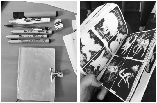
I use my cell phone when I’m looking for references because I don’t take too much time on the computer for that. I can do research anytime, draw anywhere and that is essential to me to make one a day.
1. Finding an idea
For me ideas come by waves so I note them and now I have several thematic lists : more than 1300 Known Ones and more than 300 Unknown are planned ! I’m not sure if I’ll ever draw them all. Not to mention the suggestions I take in priority, the spontaneous ideas that randomly pop in my head, the hundred shittycryptids that I noted for later, or the series (Mermay or Goblin Week for example, and others in progress) .. I keep the most complex ideas for when I’m not too busy (but it’s not often).
2. Finding references
It’s also the moment to choose a composition so it’s a crucial moment : a lot of thing depend on the pose like readability or likelihood. I had nice concepts ruined by a bad composition !
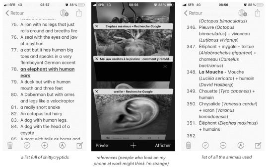
To find interesting animals I try to learn quickly from Wikipedia : for example if I want a butterfly I look at different species before deciding which one I take. It allows you to vary and pick unusual species. I save the latin names of all the animals I use, in case I need specific references to redraw them.
3. Rough sketch
Sometimes I need 2 or 3 tries before being satisfied. I change composition, reference, proportions, sometimes even idea before being sure ! To save time I really have to put the minimum, just a silhouette, and force myself not to put details (but I failed in this example).
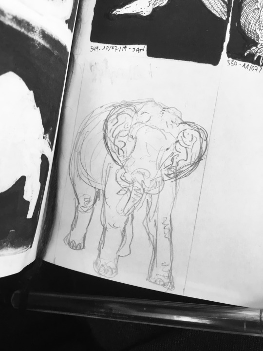
4. Inking
I use Pigma Micron, almost only the caliber 005. This is the moment where I can let go on the details, it’s really my favorite. I don’t have any particular techniques and it’s according to the time I have this day or the mood: sometimes it’s a clean grid, sometimes more masses of scribbling, and I try to transcribe as much texture as possible. I try to make nice contrasts, to think about the light, the readability, but somedays I cant do it or I don’t have the time : it doesn’t matter because I know that I will do better the next time!
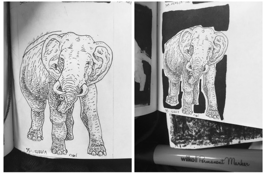
I fill around with a big cheap marker, but as the ink go through the paper I put a blotter behind (see photo), and the back of the page is unusable (see one of the first photo). As it isn’t precise I finish filling with Microns 01 and 08. Sometimes I use correction fluid, but it’s really ugly and I regret every time.
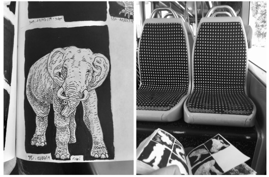
Last photo is to show that I draw everywhere !
5. Scan
No matter the scanner, mine is over 10 years old and I saved it from the trash ! The resolution is set at 600 ppp.
There is a gap of 16 days between the day I draw and the day the drawing is posted. This is because I don’t have time to scan every day and sometimes I go on vacation so I don’t have my scanner (but I keep drawing). It makes me less responsive to suggestions for example, but it allows me to better manage my time and scan when I want. Usually I scan and edit 3-4 drawings at the time.
6. Edition
No matter the software, the goal is to adjust the black and white tones ! It’s an important step to make a clean drawing. You can even do it from a phone, it’s that I use Photoshop for other things and so I have my habits.
I resize them on Preview (macOS) but no matter the software neither
I start by lowering the saturation to the minimum to have a real black and white.
Then for contrast I like to use the Curves tool because it‘s more precise than Brightness / Contrast. I saved a pre-set to go faster but the goal is to darken the black tones and lighten the white tones and end with something truly bicolor.
Sometimes I move the chimera in the middle of the framework on Photoshop if I wasn’t able / didn’t have time to do it on pen and paper !

On exceptionnal occasions a step is added before adjusting the contrast. Sometimes a part of the drawing doesn’t please me at all, and in this case I redraw some of it on Photoshop with my graphic tablet (Wacom Intuos). I really don’t like doing this because I prefer paper, it forces me to put myself on my computer, it takes extra-time, and the rendering is too smooth compared to the rest of the drawing. It’s mostly for human faces, but sometime it can be a big part of the drawing too !
Conclusion
Voila ! To be able to keep doing this for long I wanted all the process to be flexible with my everyday life : it would have been impossible with color or larger formats for example. In addition I really stay in my comfort zone : the goal is to have fun ! I know it’s not perfect, but I’m truly not a professional, nobody pays me for this and so I don’t want too much pressure to do it.
I hope it’s clear (sorry for my english!), I was glad to share you all of this, and I hope it makes you want to draw !
57 notes
·
View notes
Note
when you were first getting into art, what and how did you draw? (like did you just doodle ur masterpieces on pieces of paper and posted-notes or did you have a proper sketchbook) how did you find motivation? bc ive been trying to draw but I always get unmotivated and stop while still wanting to get better just by doing nothing.
REALLY LONG, LOTS OF ADVICES FOR ARTISTS :
TL;DR ; skip to the HOW TO ACTUALLY FUCKING DRAW part bc i have a megaton of shit to say lol + The MOTIVATION part
mmh… I’ll get into details with this one tbh bc it’s a long ass process ahah :
I live by the sea ; when i was youung i used to draw TONS of boat, but like, dollhouse boats, you could see the insides and stuff ; i loved to add tiny details and stuff, and imbricate everything together !
around 8 or 9 yo, i went to the public library with school and discovered the wonderful world of mangas ! I basically… Copy pasted an entire Mermaid Melody tome x)
For about 2 years i alternated between reading mangas and trying to copy them ! Then i just kept drawing in the margins of my schoolwork for about… 5 years ! I have a Fuck Ton of sketchbooks of that time, it was… The start. Lol. Never say it’s bad because it’s never bad, just not there yet !!
Around my 13 yo, i went every saturday, for two years, under a bookstore ; there was a cave, and drawing classes ; that teacher was mean and harsh and stuff, but like… Not really. He would take away my eraser for the class, force me to use pencil, to draw something else (bulky boys instead of magical girls).
I’ve learned a lot, more in terms of How To LEARN to draw than to draw itself, but i still progressed a LOT !!
Then i kept drawing by myself for a year and i really worked hard on it ; about hours a day, trying watercolors and stuff ; i have a real problem with colors in traditionnal art, but i’m much better with lines (i should scan some RAD stuff i made in the weekend, yall ive never done anything this good i stg i dont know why i always forget im so much better on paper)
This gets us to my sweet 16 ; i have to year of advance, bc i got ‘’’promoted’’’ idk how to say it ; anyways, i entered my (current) animation school for the first year at 16; vERY IMPRESSIVE AND TERRIFYING.
And i learned. A fuckmegaton. Of shit there.
Now i’m going for my third year there and i can make photorealistic marmora blades and cyberkpunk decors if i want to and that’s rad, but here is
HOW TO ACTUALLY FUCKING DRAW :
I have one HYPER important advice, and i’m keeping it to heart since i’m like, 11 : Have. Sketchbooks. Please !!! It’s very important. Here’s why :
You keep everything with you in one place. You have 1 sketchbook, it’s basically easy to take every where (a A5, or A4 are pretty easy to carry, i have like, 12 of those, and around 8 of A3)
You keep track of what you’ve done. It’s super important, bc first you can cry of laughter at your old stuff bc its cute but not so good, and second, you can just be like ‘holy mama’ and see how much you’ve improved
It’s very important to be organized. I WORK in art, and trust me, if there’s something that i’ve learned this year through tears and missing files and bugs : Be. Impeccable. Now if it’s for fun, go a little loose, and just have a folder for art on your computer, and a sketchbook, no need to stress, but the better you try to keep a record of where is what, the better you’ll see whats wrong
Notebooks are friends !! You can draw, write, glue stuff, make notes, lists, everything !!! I have my life in those. It’s more important to me than any of my phones.
Be proud of it. Like, not everything, duh ! But try to tell yourself than it’s like a RPG ; even if it’s only 2 xp here and there, one day you’ll beat level 40, and that’s super important : art is. Fuckin. Long.
I cant stress it enough. It’s soooo long !!! SO LONG !! it’s years. It’s like karate and fishing and ANYTHING. To be good at it, it takes time, but it WILL COME if you keep trying. There’s no secret passage.
You’re gonna me it, believe in me who believes in you.
Use. References.
Coming from a little shit who’s got a really good visual memory, that can sound like bs, but i stg everything is always AT LEAST twice as good if you’ve used a visual support.
I’m not saying COPY EVRYTHING (even though thats a good training) I’m saying, if you really want to do that asian tiger, please have at least two or three pictures of it nearby. Take photos of your hands, and stuff !
Make it harder.
No eraser.
Paint.
I draw all my backgrounds on my sketchbook with INDIAN INK; no returns, no refunds.
Ink, Ink, INK !! Don’t allow mistakes.
And if you make mistakes :
New page, restart
It’s okay
It’s for you
I once started back again a whole EXAM bc it was bad, i got one of my best grades
You’ll improve and be more assured if you know you just have to DO IT. Trust me. It’s VISIBLE; if you can erase, you fidget and hesitate and ‘’kbeujebez hahhaaa idkkidsd’’ ; stop ; do it, and if you don’t like it ? Try again, there’s no time limit
Draw as large as you can
There’s no interesting story here, it just helps. Bigger movement of the hand, more place for details, breathing lines
Thin lineart helps
Thinner. Make it even thinner
Break the rules, but not the ones that structure your art
Big lineart ? Why not
Unfinished lines, vaporeous colors ? Pretty
Cubism is actually based on extensive and intense practice of classical art, it’s not wibbly wooblly ; the anatomy is more correct than you think
Structure and composition are important, but so is movement and life ; choose your fighter ; mine is fluidity and fun, i’m like, a rogue/archer in drawing. Some people are dwarf fighter. That’s amazing and great.
Don’t be afraid to do nothing
Pages and pages of my sketchbooks are actually just lance facing right and smiling, you know…
Sometimes it just doesnt work : two ways :
Take a break, Kiki’s delivery service style
Keep trying, break your art until it obeys and comes back
Take breaks. Breath.
Don’t compare. I do it, it doesn’t help at all. You’ll make it ; and if you compare, keep in mind that everyone’s different
I’m not gonna lie, it’s NOT easy, it’s even hard
But I really, really think it’s worth it
MOTIVATION :
My main bitch
I’m always pumped for art because i can LITTERALLY NOT do anything else ; i love reading and writing and stuff but at the end of the day i just want !!! to draw !!!! aaaaaa-
Fall in love with it, and with the possibilities ; i have stories to tell, tell me yours ! Do your best, one day it WILL work
Actual advices :
I have an inspiration blog where i just reblogs stuff i like to draw them later
Find a picture, copy it. Do it again. Change the characters (i have 2 ocs and Lance and Keith as default characters) in the pic.
Like an artstyle ? Break it to its very core, analyse it, copy it, redo it, trace it and ABSORB it. Don’t copy/past, LEARN from your heroes.
Do what you like. I have 86578 pieces of voltron, this is not a coincidence. I have ENDLESS ideas for this show, wtf.
Try new things. Buy indian ink im begging you. It’s so cool.
Have a game with yourself, or a challenge. STICK TO IT.
Study. When you’re bored, usually it’s because you’re stagnating. Make it harder or do hands until you cry.
Love your backgrounds; make backgrounds, study trees, and tokyo streets, and venice’s bridges. Decor is just as cool as characters, if not more
Mess a little with everything. My roomate more than one found me stained from head to toes trying to DO STUFF
Draw outfits. Draw what you want but can’t afford
MAKE YOUR LIFE A COMIC. Remember those sketchbooks ? Make a comic a week/month/every full moon, whatever, and draw your life (mine’s the roomates au lol)
Prompts blogs are cool too
Make fanart of a fic you liked ; you have the characters and the pose already, you just have to illustrate ; double bonus, you probably will make a writer’s day, if not year !
That little movie that plays when you listen to your favorite song ? DRAW IT
Your favorite scene in your favorite movie ? Redraw each shot. On post it. Plus it looks awesome afterwards to have the infamous TREX scene of Jurassic Parks in post it
Get bored. That’s inevitable. Dance, scream, get back to it. Walk, draw everything you see.
Make a paper google map street view : Take a walk : every 50 meters, draw what is in front of you.
Snapchats your friends. Draw their snapchats when they answer
Draw maps. Invent places. Invent bikes, and hovercrafts, and monsters. Make your everyday inventory. Make your life a video game, and do the concept arts of it.
FETCH your inspiration. I have approx. 20 artbooks, full of drawings and concept arts of my fave movies/games ; take what you like and add it to the story you have since you’re 8. We all have one.
Ask for it ; your sis, your mom, me even ! If you dont have ideas, someone will have them.
WELL i’m gonna stop there, even though i got like, 9864567 more to say, but with this you should be fine ! Anon, i’m rooting for you ! we all start somewhere, just hold on!!!!
#Anon you'll do it !!!!!!!!!!#asked#artist advice#art#i put my heart in this omg#it's 1.5 K WORDS#wtf#but yeah#you just gotta do shit and mess around
91 notes
·
View notes
Text
Art Growth Compilation

I really enjoy doing posts about improvement in art.
It makes me feel better about my work, especially with how busy I am these days.
I wanted to compile all the comparisons I’ve made over the years and kinda discuss the posts, for myself or others.
I thought it’d be funny to start with comparing how I first drew on a tablet, using dodge and burn tools, to how I do now which is using layers and actually painting. It’s funny to look back on that, you know?
I linked the post I made, compiling all the month to month memes from 2003-2017 that I try and do yearly. And everything else is under a cut ;w;’‘/

Most artists have done a drawing of themselves and a few Pokemon, or their team. I did that in 2010, and was dissatisfied with my work...
I took a crack again in 2013 after I’d learned to draw more animals and not be so Edgy(tm) I really liked the results. I still didn’t use references though, because I was lazy. I just didn’t want to. I still was on that boat feeling like I was CHEATING. I wasn’t being CREATIVE if I looked at references.
Artists get stuck on using reference and it’s AWFUL. USE THEM. USE TWENTY. LEARN!! It’s so HELPFUL, I wish I had started sooner.
In 2014 though -

I tried again.
I had gotten better at anatomy, but most of all, I started to work off references more. I started to really focus on not stylizing so much, but to work on actually making things look like things. I started to work on caring about COMPARISON sizes. Composition!!
While Pokemon reference sizes are -wiggle hands- and while my team changed up, I was satisfied that I could draw Arbok ACTUALLY like a cobra now, Meowth is easy given it’s just a noseless cat so to speak, Haunter is literally a triangle cloud - I was satisfied having drawn that team.
My secondary team in the new games? I was excited to draw them. It was fresh and new and FUN and it turned out PRECIOUS.
I learned better how to proportion things in an image for layout, and just... making characters feel COHESIVE in the same space.
It was a nice thing to keep visiting. I have a sketch in the works for an update even hopefully.
These pieces are kind of interesting to me too, because they’re towards the end of my era of THIN lineart?
My lineart has gone from this, and THIS, to this.
Literally I use to not believe in line weight, I can still do thin work of course, but I’m not a fan of trying to FORCE it like I use to? Even the second link, I went from the SMALLEST brush in Sai, to using a marker brush that had barely ANY give, to a custom brush on Sai that acts like a Paint Chat brush I use to use with friends online!
That’s what I mean about style too, like you may reserve yourself about things - like not coloring black in and outlining with white, or certain ways you do things. But the growth and changing and figuring FUN ways to color that black etc is where the fun of art comes in, to me??
Learn. EXPERIMENT. PUSH!
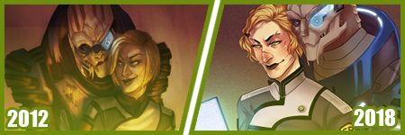
A few months ago, I did my first redraw. Of this piece from 2012.
Six years difference.
This was interesting for a number of reasons. There’s aspects I like more in the old one, but not many. I really like the pose a bit better, but I like the casual closeness that I did in the new one because that’s more my Shepard.
But technically speaking, it’s worlds better because I took time. I paid attention to details. I did fun things instead of rushing. I took time with my coloring and didn’t SMEAR it around. I had a friend who use to complain I drew so fast and they felt so SLOW, but I love what that taught me. I started taking more time on my art, and enjoying it more since I caught more mistakes and vastly improved. By leaps and bounds.
It’s amazing what a difference six years makes in not only style, which is often a FOCUS of these things? My style has come awkwardly and naturally to me over the years of critically picking certain things apart? but I really love where it’s gotten.
I have things I want to get back to, but I love... where it is, and CAN be?
But it’s wild to me how much change happens in technical handling? It’s a hand in hand thing, you can’t focus on one or the other only, or the other suffers.
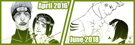
Honestly this has been my favorite improvement to notice though?
Kisame was a character I felt I should be able to draw EASILY? Not so much. Itachi? ALSO EASY. Not so much??
Kisame has weird eyes to grasp how to draw? Thus focusing on them kept making them wonky to me!! On top of that, he’s everything I’ve been use to drawing for AGES because he has a muscular body, with a smaller waist? ... that was something I was use to drawing? I still was awkward getting back into the swing of that... Drawing HIS HAIR though? NOT SO EASY....
But like, Itachi should have been easy, but I have a thing about him appearing too feminine as he gets drawn because his eyelashes, and I’ve really found a nice... medium at this point?
But even still like my face styles and eye styles are finally to a comfortable point for me? I have stopped focusing on some weird things with Itachi’s hair and just... DO IT? But even still like...
The improvement here is literally just if I don’t know how to do something, or I’m not satisfied with how I do it? I just keep at it.
It’s a theme of this post honestly... repetition, persistence.
Keep drawing it. Keep trying to figure out what it is that’s catching you off about how you do it. Don’t like how you do eyes or how they fit on the face? Look at facial structures and references and figure it out. Draw them separate and figure out how to apply them to what you are.
Remember there’s a skull in there. I draw the holes in the skull like the eye sockets, and the nose area to help my proportions for SURE.
I’ve also gotten to a nice marriage in my lineart? The piece before the recent one, those lines feel HARDER or HEAVIER? The newest piece seems...softer? Like I’m lighter handed again?
I really like critiquing my own growth on what is good or working better for me? Older pieces it looks like I’m putting lineweight for SAKE of it versus where it goes now?
INTERESTING.
Like this lineup -

My style shifts so RAPIDLY, it still is noticeably MY style to people, but parts shift so VIOLENTLY because I’m constantly picking at what I don’t LIKE.
It’s funny too in the case of Kisame and Itachi because consistently I’m drawing the SAME character over and over - can make you REALIZE how you’re doing something wrong?
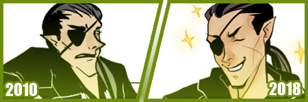
Like, here’s a difference of eight years, and it’s all the brush I use now, and it REALLY shows how my style has changed - in the aspect of one point of reference?
I have a childhood favorite character too, of Daisuke, and I use to be bad at drawing boys, and I use to be SUPER bad at drawing fluffy hair?
It was something I specifically started to learn to do? And I started to draw Daisuke every few months or years for a while. Especially when I started to first REALIZE I didn’t like my style that much?
But the middle one was July 2009, top left is less than 6 months later, and the last one is about a year later. DRASTIC DIFFERENCE. But next -
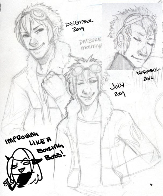
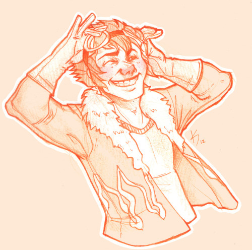
This one was in 2012, when I started to do more with teeth, or first dipping my toes into anatomy. I started to focus more on HANDS too, I was super bad at them. Overall I started to focus more on making my art have...ages? Like a boy versus a man. Facial features being DIFFERENT.
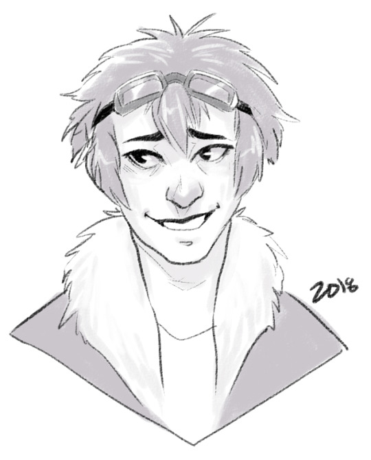
I can look at this boring little bust and see that he comes off more of a teenage boy to me now. I need to work more on figuring how to draw asian features especially the eyes. Sometimes I hit the mark, other times I don’t.
but between this and 2012? Not too much has changed. I do hair fluffier now, and I angle the eyes better. The teeth not being outlined doesn’t give that weird effect where I might give him TOO MANY TEETH....
People do that and it’s easy but whoof.
So there’s still learning and adapting to do in QUICK drawings, you know? but I can still see there’s good things. That took me like 5 minutes to draw? Not bad honestly.

In it’s own bracket is original characters though too?? But also divergent of STYLE shifts because like...
OKAY. Nightmare Syndicate’s story.. started for me in 7th or 8th grade, that was when I was...14? 15? I’ve been fleshing it out for like 13 years, that’s wild haha!! I love my kids and all.
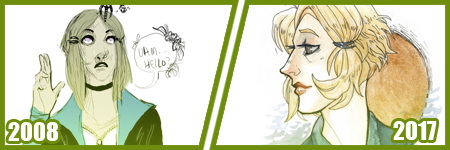
But okay so SIALI. She’s still fairly similar but I restructured her face for SURE. She’s gotten less edgy, she’s.... a teenage girl.

FELIX?? CHRIST. He’s been such a long journey!! More on that later?
Rot and even Cor?? Rot and Cor are a shorter span of development, but Rot started in Highschool so almost 10 years ago, and Cor has been fairly solid - but even just DRAWING him over three years? Go look at how much he changes.. I’m not married to concepts easily. haha!
People act like making a character you’re STUCK with it. Like Oh boy, I better make this character good, from the get go!!
I only worry about that with small potatoes like my Pillar(Gods) designs I just made for the comic?? Even still, small things will change with them I’m sure.
But not only has Felix and Siali changed, but they’ve GROWN with my style and DEFINED it even. I’ve had to adjust my style to support Felix’s look honestly a LOT. Bend my rules. Break my anatomy stickler attitude - and honestly, that’s the thing.
You have to learn the rules and anatomy BEFORE you can break them. A style built upon broken anatomy will fail you down the road if you just excuse everything with style.
Learn to draw the hands. Learn to draw the feet. Figure out the face. Bones exist. You can break the FUCK out of it once you learn how to do it, you know? Like I’ve seen so many styles I LOVE who are cartoony and BROKEN AS FUCK, but there’s still some STRUCTURE to it. Most of those people can still structure a face just fine, and the reason exaggeration works so well is because there’s like unwritten rules for what works and doesn’t based on that?
Idk.
Felix has a very elongated torso, he’s like 7′ or 8′ tall so I mean?? He’s... broken anatomy, but he’s... lanky - but his muscle is LITHE and stretched. It makes contextual sense. That’s the important part.
But even designs, it’s important to understand designs YOU make, or like... to understand they’ll CHANGE and that’s growth within your art too?
Like okay, example. Felix has a millipede inspired monster form. But with designing that? I still have to know how millipedes and SNAKES work because there's bones and vertebrae in there??

But there’s also the difference of like... CONCEPT, versus execution. You can design a fucking badass character, but understanding your own concept is SOMETHING.
I had no idea how this would play out, until I was mapping out his ‘midsection’ spikes? and man. MY STYLE WAS MADE FOR THIS CHALLENGE NOW. Which is so interesting how smooth my style has always been? Felix has defined ANGLES in it, and it’s hilarious tbh?
But even too, I’ve had to work with Felix’s monster form FACE, to break the rules to make it WORK the way I need it too?
On the anatomy subject too, like when I first got into Marvel comics 6 years ago or so? I had no idea how to do muscle structures?? I was so BAD at it.
I can look at this left image and CRINGE so badly at how NONE of those are muscles?? THOSE ARE THINGS I PERCEIVE AS MUSCLES. Like...
A course I took taught me to draw what I see, not what I know. That’s the whole point of that post that goes around about drawing a shrimp. Look it up. It’s hilarious and cute.
But it’s like, asking an artist to draw a bike, you can tell who uses reference and who WINGS it. It’s funny, but like it’s what you know versus what you see.
I started to study anatomy like crazy and was seeing improvements days at a time. The right image was done like... a month later? already I can see the muscles under the pectorals? those look normal now. the abs aren’t dough lumps under the skin in a perfect 6 pack, they’re the actual plane shapes.
I was trying to find a good reference for myself of learning to make men ‘thicker’ too in terms of the waist etc since the left is really...thin.... but...

A bit better, but even still, comparing these two - they’re 2 months apart? and I can see understanding more about arms and how they connect to the body, where the planes ACTUALLY lay for the chest and obliques and such?
I can see improvements from July 2012 up there, to - WHOOPS. I FORGOT TO CHANGE THE YEAR LMAO... TO FEBRUARY 2013...omg
I mean, I could go on and on about improvements I see, when I go through my art though? Gosh.
Like I’m seeing so SO many bad hands and feet in my old stuff, and just CRINGING because tricks I learned for myself by now?
I give so many pointers and streams and screenshares on discord still to help people with art and it cracks me up?? Like...
I dunno. I’m pretty mediocre tbh, but god damn.
21 notes
·
View notes
Text
A Drawing Tutorial
I thought maybe there would be some of you who might appreciate seeing some of my artistic processes. So this is a quick tutorial about digital art! This is how I do a single-layer picture, and I’ll also be discussing composition a little.
First! doesn’t matter what program you use or what size your canvas is or what tools you use, that’s all personal preference. Experiment with different brushes and brush settings until you’ve figured out what you like best.
I have recently started thinking of a digital canvas as being just as much a part of the artwork as the subject itself. This is something that holds true in any art form. If you think of the surface you create on as being another art tool, it can really help you create nice compositions and use the space effectively!
so, with that in mind my first step is to tone my “paper” so the colors I’m going to use for the main subject will have a nice backdrop to contrast against. I toss down a few soft colors and blend them out so they cover the whole canvas

If you vary the colors, it also gives a nice ambient lighting feel. So now comes the base colors, this when I make my gesture sketch. A gesture is important because it is the blueprint for the whole drawing! Gestures are not just for people, but can also include any objects in a picture! I pick a color that stands out from the background without being too high in contrast and lay down a solid gesture with a big blendy type brush so it has a softer edge. This helps it look like it really belongs here. I’m also thinking about how I want the composition to look, and usually I do this all in one go, never lifting my stylus, so I better be committed to it because if I hit the undo button it’s all gone. I’ll be drawing my oc Kouto Loryck, who is in fact an art model.
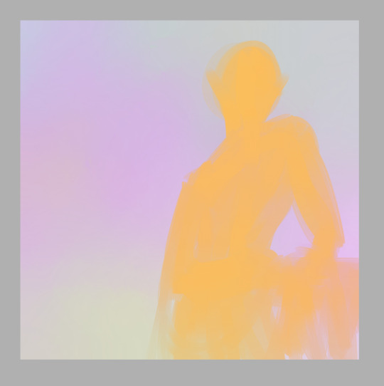
it’s important to be committed to every stroke, be bold and confident with your art. Even if it doesn’t turn out the way you want, you should at least be able to say that you were committed to it. Don’t worry about mistakes, thinking too much will only keep you stuck on one little part when you could be working on the whole thing. I had another drawing here about composition but I accidentally saved over it so I had to move that explanation to a different step haha
Next I lay out the highlights to pull out the details of the subject. I used the same brush for most of this drawing, just changing the size to accommodate what I was using it for. Since the base color is orange, I used a really pale icy blue to highlight, and the blending quality of the brush I used kept it toned down properly so it didn’t look psychedelic. There is nothing wrong with psychedelic coloring, I think it’s really fun, but it’s not the look I wanted this time.
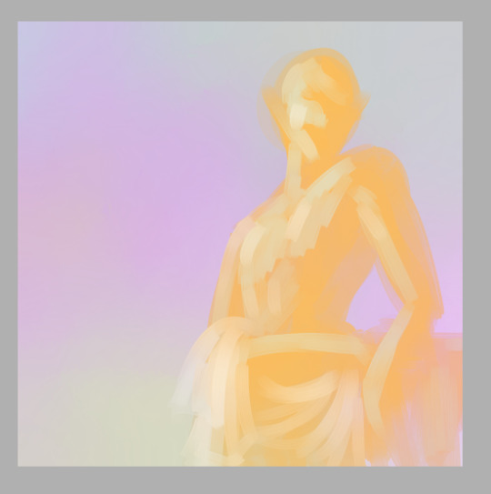
Now let me talk about the composition a bit. The most common composition tool is triangles. Triangles make for really pleasing compositions. And composition is all about balancing the positive and negative space in your picture, as well as creating a pathway for the viewer’s eye to follow. b

I kept this one super simple. Two main triangles in opposing directions, the eye is drawn to the head of the subject and follows the body down to the bottom of the page. Plain, simple, aesthetically pleasing. Keeping a small negative space on the other side of the subject and making a small negative space within the subject also adds a little extra variety to it. One surefire way to make an interesting composition is to place the subject off-center, because it varies the weight of the picture and makes it feel more dynamic, even if it’s a really boring pose like this one; he’s just leaning against some vague object behind him. But I’ve got him off-center and at an angle to the viewer, so it adds interest to the composition.
Once I’ve got highlights done, I go in and add shadows, and then I blend things smooth.
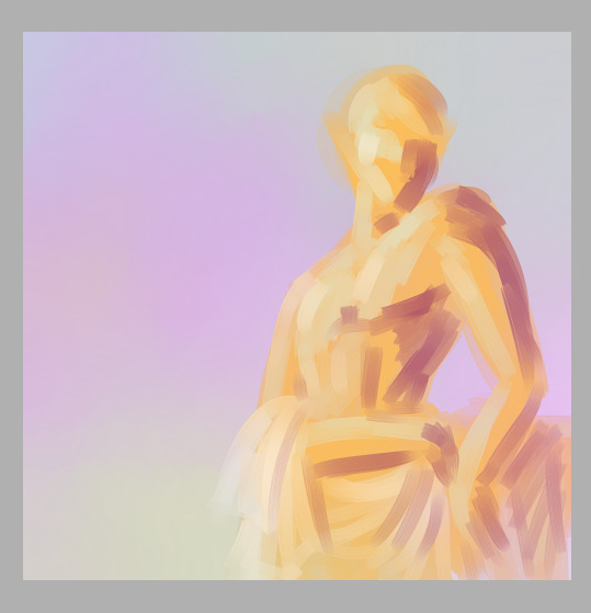
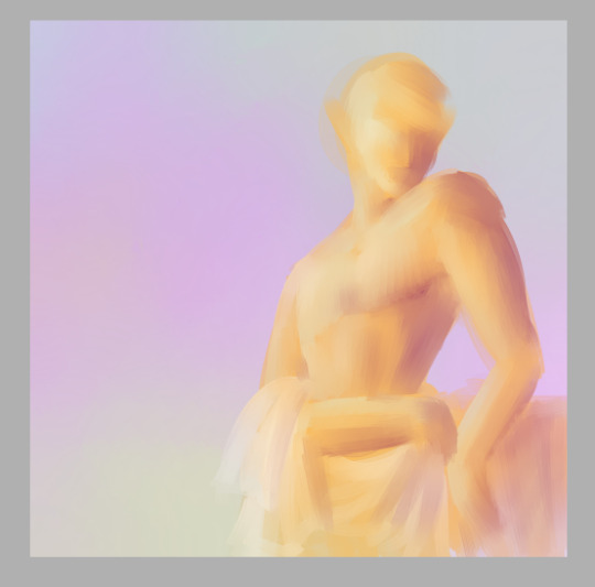
It’s important to use just a few colors to keep things simple. They should be colors that compliment each other in some way. Unless you want the color contrast to look discordant, of course. But even when you’re intentionally using colors that don’t blend nice, make sure you have some neutrals to balance with.
Now it’s really easy for me to decide exactly what I want to do with this, so I lay out a line layer on top to plan my next steps.
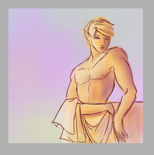
This helps me figure out if there’s anything that needs to be adjusted, see if I’ve got my proportions how I want them, etc. I can then use this as a reference later to keep everything in line with my plan. Now I can go in with a smaller brush and add in any extra colors to help separate the different parts of the drawing.
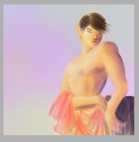
And I add in extra shading to bring out the details here
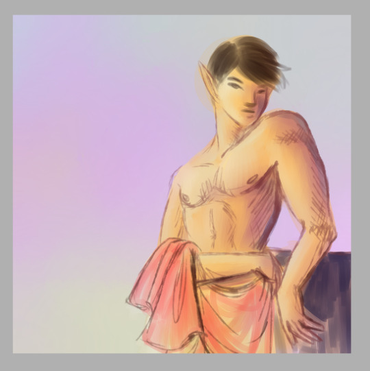
Blend, redraw, add color as necessary until it looks good.
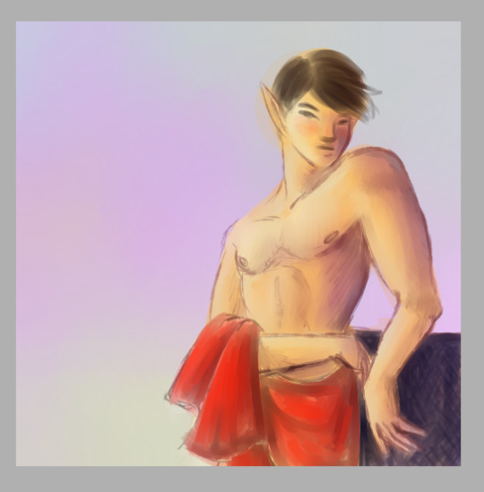
And at this point I can call it a finished drawing if I want. Or I can keep lining and shading and detailing until I think it’s really done.
I’ll just zoom in on the face area now to discuss detailing. I have some specific brush settings I like to use for details like hair. And with the hair I draw layers of a dark shade, the color of course depends on the hair. Draw the hair in layers, first laying down a solid color a college art teacher of mine called “the hair helmet” and then go on top of that with a thin, non-blendy brush to give it the look of lots of individual strands. A brush that already has the look of multiple strands is best because you don’t have to do as many strokes.
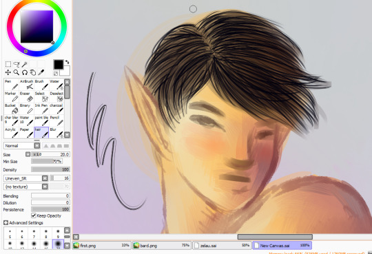
and then I go back over it with my softer brush in the main hair color, do a few more strand layers on top of that, and this time add highlights in a few places, then blend all of that very gently so it still looks like hair.
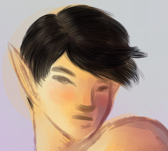
Next is the eyes! I use a pencil type brush to bring out the lash lines and eyebrows. For the eyes themselves I layer in pale yellows, pinks, and white highlights, leaving a little of the skintone near the upper part of the eye to blend into a shadow.
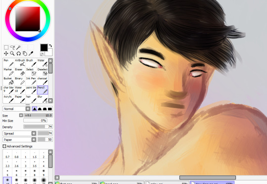
Time to color in the eyes! I start with a dark circle in each eye, depending on the eye color. the iris is a funky little shallow bowl in the eye, curving inwards so actually the light hits it on the opposite side from what you might expect. But the shiny white highlight is on the same side as the rest of the lighting because over the iris is a clear dome that curves outward, giving the eye two layers to highlight on different sides.The upper part of the iris is also usually in shadow because of the eyelashes
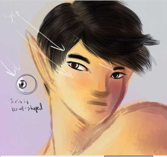
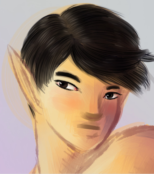
Draw in the pupils, add a few dark lines radiating out from it to give the eyes that realistic texture, and then toss on that nice bright highlight.
Next, I detail the rest of the face with extra highlights and shadows. Here I’ve mapped out where the main lights and shadows would fall.

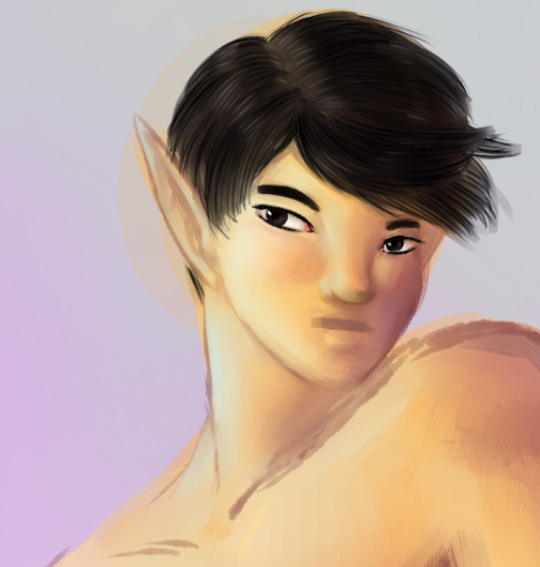
And finally I add in extra outlines on the nose, mouth, and ears, as well as the darkest side of the face and anywhere else that might need it
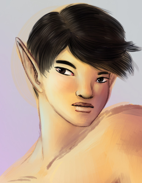
I ended up adjusting his lips quite a bit to make them the right width and shape. The upper lip is always darker than the lower lip because of the way light falls on faces. Except perhaps in cases where all the light is coming from below.
But anyway, that is my basic digital painting tutorial! Hope you found it useful!
7 notes
·
View notes
Text
EPISODE 1:
Aloha, fellow Sakuga Seedlings!
Welcome to my case study series, Brain Vomit.
Name’s
Tuchimuchi Yoshinori – or just Tuchi...
And I enjoy animation. Especially animation from the eastern archipelago of Japan, also called “Anime”
In this series, right here, I’ll be exploring Japanese Animation Production and enlightening this growing community and myself to the power they have in this expansive animated medium.
In this episode, we will focus on Defining Anime, Production Roles that go into creating anime and more!!
I welcome you all to join me on this exploration into Anime.
Without a moment’s hesitation, let’s start with the crust and make our way downward!!
What is Anime?
Anime (アニメ) the word, is moniker for Japanese Animation.
Anime, the art form, is a style of Limited Animation that came into prominence during the rise of Disney in the 1960’s, although Japanese animation dates back to the beginning of the 20th century. The most prominent and well known anime began from Osamu Tezuka -- known for Astro Boy, Black Jack and Kimba the White Lion -- creating new techniques after being inspired to simplify Disney’s rigorous animation aesthetics.
As manga began to be noticed as the popular thing in the 70s, anime began to shift from a Disney imitation to a new style of its own.
Sakuga (作画) is a catch-all term in Anime, where a certain scene or event’s production value and animation quality exceed the usual fare. It’s often these moments that enraptured our eyes to anime and got us interested. This can be anything from effects, to characters to background animation! Sakuga is limitless in it’s potential EPICNESS!!
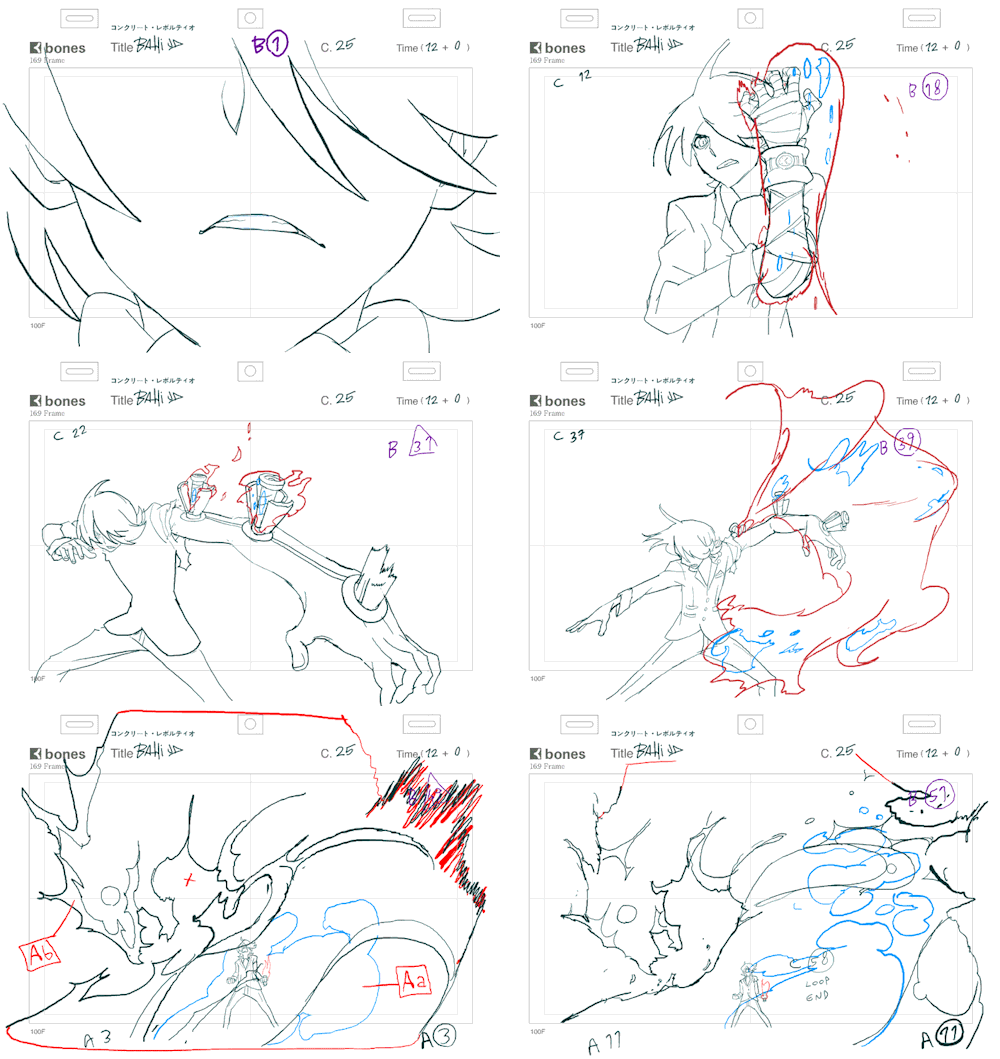
Here are some awesome examples by Web Animator’s Yotsube and Bahi JD!

I know, it’s pretty damn cool. And Sakuga, there is actually a word for it! Literally translated from “Creating Pictures”. The name for this community that I call “Sakuga Seedlings” comes from the pun of “Saku” also being read as “to Bloom”.
(Source)
Some of the most famous anime were created by the world renowned Studio Ghibli and Hayao Miyazaki.
But other important, often forgotten legends are:
Hideaki Anno, Katsuhiro Otomo, Mamoru Hosoda and Makoto Shinkai.
If you haven’t heard of these guys, check them out. I’ve linked to their wikipedia articles in their names, so feel free to click on them and get a basic gist of what these guys are about.
In a future episode I plan to go over each and every one of them!
Next, I know you all saw that word “Limited Animation”...
Q: What is Japanese Limited Animation?
Unlike most Disney animation -- or Full Animation, where every frame is painstakingly drawn to create an almost true to life smooth motion -- Limited Animation is a style that takes advantage of the limited frames, partial frame changing and movement to create visually stimulating works. This is a much cheaper method and can be used to varying results.
Most Western TV cartoons and pretty much all anime is Limited Animation.
Full Animation is In an environment in which redraws most every frame are MANDATORY to create as realistic/fluid as possible movement. Unlike it though, limited animation often breaks traditional norms by keeping redraws to a restriction (often by getting creative with animation styles and shortcuts), but allowing for a more dynamic visual spectrum, as they are, ironically, not limited by realistic standards of full movement.
Many techniques of Limited Animation can be incorporated into more Western Full-Animation as well.
Limited animation is not limited to Japanese Animation, but because that is the focus, I want to focus my attention there.
(source) (source) (source)
So let’s, compare them!
Q: Compare Limited vs Full Animation
Let us compare Disney’s Full Animation and Limited Animation.
For this example,

vs
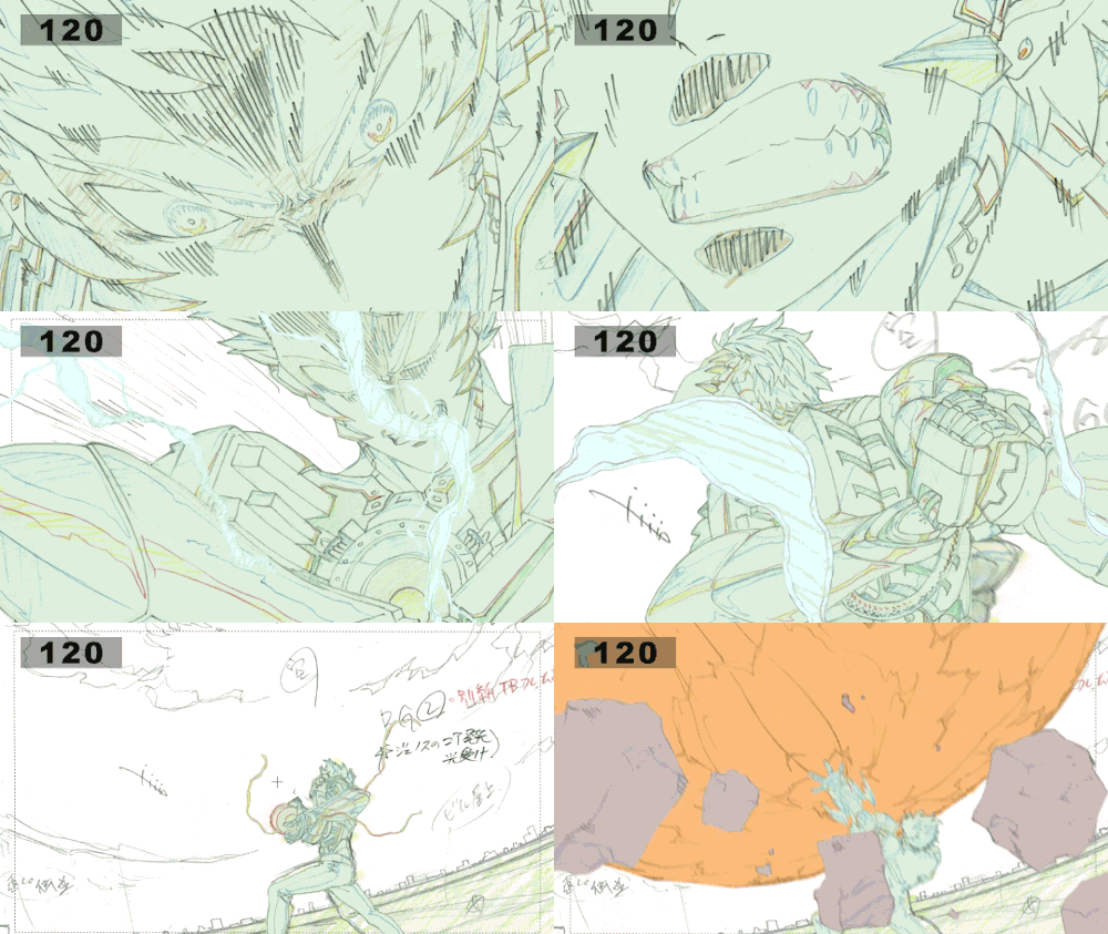
Compare to Disney, which has very realistic perceptions of movement to Limited Animation.
Limited Animation often MUST exaggerate movements, repeat frames and manipulate the camera far beyond to get the sense of movement without frequent redraws.
It takes advantage of the mind’s magnificent ability to fill in movement on it’s own.
Note this: All of this is considered Sakuga. Pretty cool, right?
This type of animation still on paper before colored and composited is called “Genga” (原画).
No, not the Pokemon, Gengar! Nix the “R”!!
(Thank god, for now Tumblr gives have the sources -- so I can save time on listing them. As the series goes on, I’ll be grabbing actual clips and editing them in my own way, so those sources will have to be better defined...)
Q: OK. Back to Anime, How is Anime Produced?
Using the anime Shirobako as a fantastic launchpad, as well as other studies, Anime Production is built upon multiple roles and hierarchies.
(If you are at all curious about Japanese Anime Production, watch this series; It’s on Crunchyroll for free. I’m not being sponsored, but I recommend it. Linked above.)
(I will also be leaving Executives, Producers, Writers, Voice Actors and Sound Crews out of this list, which have a different important roles. But I would like to give this focus eventually along with Marketing Techniques, etc.)
For now, I’ll use basic definitions to keep things simple, but the most common roles in any anime production are:
Director: The individual in charge of keeping production staff on task and keeping the overall visual aesthetic. For Example: Akiyuki Shinbou of SHAFT fame.
Animation Director: This is the head person in charge and oversees all of the individual animation production. They are ALWAYS talented Key Animators with years of experience and have the last say on EVERY FRAME USED THE FINAL PRODUCTION. They have other responsibilities such as as Redraws and Correction.
Character Designer: The person who either creates or adapts designs for TV animation. This is Episode 2’s main message in a nutshell. But to sum it up here, it is not uncommon for Animation Directors and Character Designers to either be the same person, or a pair who have worked together on a lot of stuff.
Key Animator: The people in charge of drawing key poses (important movements and poses). There can be very few or very many depending on the production staff. We’ll get into that at a later time. These can often be Freelance Animators as well, which is very important as Studios often Freelance and can get different feels because of it.
In-Between Animator: The people who draw in-betweens to keys, connecting them all together and clean-up. These people refer to the Key Animators, while Key Animators refer to the Animation Directors.
Color Artists: Pretty straight forward, depending on whether traditionally or digitally animated, add color and shade to the basic animation. During the days of Cel-Shading, these were hand-painted, but with technology, tools like Photoshop, Toonboom and After Effects are more commonly used.
Check Artist: This person reviews each frame and checks for inconsistencies. They help the central aesthetic, style and models are on point. If not, a frame may have to be redone. When these guys mess up, we get things like this. These also can be Animation Directors themselves. Many roles can bleed into one another, if that wasn’t obvious enough. (Show example of animation error)
Background Artist: These guys design the backgrounds, whether 2D or 3D. We’ll get into this more later as well. My 3D knowledge is very limited, so I’ll do my own homework on more information on that.
Compositor: This group puts everything together, can take care of digital effects and edits such as atmospheric lighting and weather, depending on the production company. These guys create the crisp polish you’ll see in Ufotable Productions.
I know you must be thinking, these are very similar to Western Production Studios, and you’d be right.
They are very similar, as each piece is needed to produce like a well oiled machine. But there are many VERY important differences. If you know Animation History, Anime production was based on and eventually deviated from Disney’s original model.
Now that you have most of the basic pieces to understand we can begin digging in the differences from the ground up, work to each role and it’s importance and how that all comes together.
Now we can start to looking into the question of,
Q: What is different about Japanese and Western styles of animation production?
Not in the aesthetic choices, but in the setup and philosophy of animation.
It all comes down to the production at hand, but the main basic philosophy is something I like to call “Western Order and Eastern Individuality”.
This is a good start and the start of some of my liberal take on defining different parts of anime and animation -- A main point of this series was to break down and find a way of defining little things like this in a more digestible method:
So, what is the Western idea of “Order Animation”.
Well, how staff is put together is what dictates it.
If you look at any Disney frame, what do you see? Animation that is completely kept on model and shows the visions of the Director and Animation Leads based on strict values of Order and Perfection.
This is often formed by having teams for every character and aesthetic throughout the entire picture remaining as physically consistent as possible.
It’s very impressive that they can get this group of people so on point! I admire it, even if it isn’t the philosophy I prefer in my own tastes in animation and production.
Then, there is the Eastern idea of -- what I like to call -- “Individuality Animation”. This is just another way the production team is staffed and ordered. Most Key Animators have what are called Cuts -- specific scenes in each production that they are in charge of animating. Think about a Cut like cutting a camera in a film to a new scene. Many film making techniques are used in animation, this should always be kept in mind constantly.
Once again, this goes more onto which you find better in your opinion, but I tend to find these definitions slightly ironic based on their respective cultures, but there is a lot of truth to them.
Q: Now, why does this Individuality Animation interest me?
Because, it allows for every Key Animator and In-Betweener to add their own spice and flair to a scene, to the point where based on the animation, you can tell which individual worked on it.

-- AND THIS IS WHAT I LOVE!

LOOKING AT A PIECE OF ANIMATION AND BASED ON STYLISTIC AND AESTHETICAL TROPES, YOU CAN POINT OUT A SPECIFIC ANIMATOR OR ANIMATORS INSPIRED BY ONE ANOTHER!!
I believe Order Animation tries to represent a company as a whole, which is great in its own right.
While Individual Animation tries to represent the identities of those who worked on it. Which I am much more in support of and interested in. If you’ve ever met me, I am the type that remembers faces and personalities more than names and the bigger picture. With how I work and how I love to meet new people, Individuality Animation allows me to really get to the heart of an animator.
Ahem, I lost my composure there! Haha!
Next on the chopping block:
Q: Digital Animation vs Traditional Animation...
How are they addressed?
Simply, are Keyframes and In-betweens hand-drawn on paper and then scanned for clean-up and color?
Or are they drawn on digital tablet or are they 3D models?
Traditional Animation is still very common in Japanese Animation production, and most every anime you’ve seen started as hand drawn on paper.
Digital Animation uses programs such as Photoshop, Flash, ToonBoom and etc. to draw everything. Animators that focus on this medium are lovingly called Web Generation Animators. Believe it or not, one of the eldest animation studios, Tatsunoko has evolved to include many web generation animators.
youtube
(From the Studio Tatsunoko produced “Yoru no Yatterman”, hosting a wide array of web generation animation talent!)
In a later episode, I will do a more complete diegesis on Digital Animation Programs as it’s one of my favorite topics.
3D Animation is a new sensation that started an arise in anime at the start of the 2010’s. All of these anime are produced in 3D animation softwares, but are produced using techniques descended from Limited Animation. Look as series like Guilty Gear Xrd and Black Rock Shooter for some amazing examples of this.
youtube
youtube
(Guilty Gear Xrd belongs to Arc System Works. It is on PS3, PS4 and Steam PC, Go play it! The GDC also produced this great video on how the 3D Cel-Shaded style was used to imitate sprite anime form the previous entries! It’s about an hour long, but super informative!!)
Mixed Media is often used, where anime can be produced using all three methods for different reasons, be it backgrounds or the animator had a preferred way of animating. Most modern anime uses a form of mixed media from Pokemon XYZ’s 3D Camera to To Aru Majutsu no Index’s 3D Background design. It’s more common than you’d think.
(Most noticeable at 0:39 and 0:58. Look how the ground around Ash’s feet is swiveling in a new way. Or how the camera follows Pikachu to Pangoro and Honedge. Fun Fact: Quick Attack is ineffective on Honedge, it’s a Ghost type!)
youtube
(Pokemon XY belongs to OLM, Game Freak, Nintendo and Creatures Inc., OLM actually means Oriental Light and Magic, inspired from Industrial Light and Magic, known for Cinematic VFX.)
But these can be used in a myriad of creative ways to make each cut feel distinct depending on which animators are behind the wheel.
Since I’m focusing on Japanese Animation Philosophy, as it’s what I know better and prefer, I will focus on that through most of my future studies.
However, you are free to use whichever method you want!
The great thing about art and animation is that you have a choice in how you go about doing it. I wholeheartedly believe in having whatever style interests you and making the most of your creativity.
If I can help bring in a new interest or skill set into your work, or just entertain you with my geekiness about anime, then it will all be worth it.
Who knows, you may be surprised at what we discuss!
I’ll call this episode a wrap for now! Next time we’ll be discussing the basic principles of animation.
If you haven’t gotten a copy of the Animator’s Survival Guide, I highly recommend finding a copy of it! It’s a must-have for animators of all skill levels, even amateur ones like me.
I’ll see you all next time!!
ON THE NEXT BRAIN VOMIT!!
EPISODE 2: ANIMATION PRINCIPLES ARE THE MOON PRINCESSES?!!
STAY TUNED NEXT SATURDAY AT 7PM EST FOR NEXT EXPEDITION INTO SAKUGA GOODNESS!!
DON’T MISS IT, OR I’LL HAVE TO PUNISH YOU!!
Remember: Always bloom proudly,
– TUCHI OUT!!!
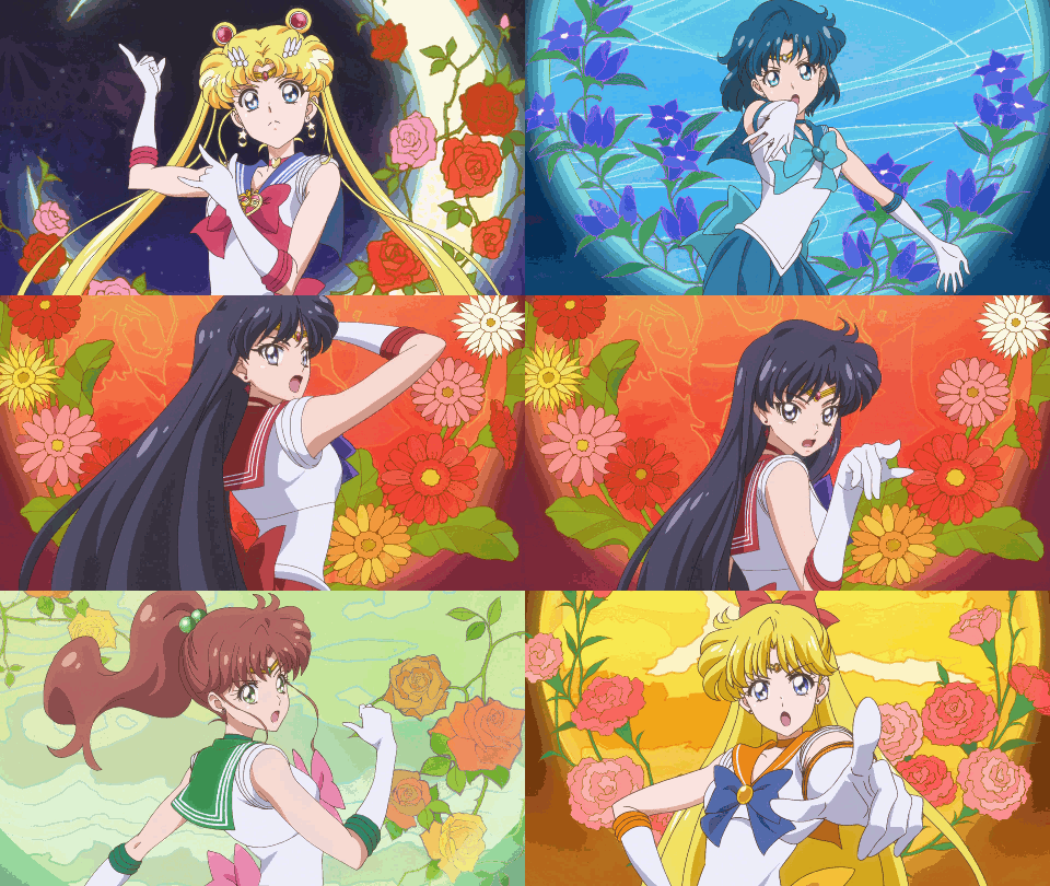
#sakuga#animation#case study#new tumblr#new series#new style#tatsunoko#sailor moon#space patrol luluco#yatterman#yotube#bahijd#hiroyuki imaishi#pokemon xy#guilty gear#guilty gear xrd#disney#one punch man#gifs#brain vomit
15 notes
·
View notes
Note
What works do you consider your best and your worst? In term of techniques etc? Much love!!
Hi anon ^^
Thanks a lot for your question! Someone asked me a rather similar question 2 months ago so I’m gonna copy/paste it but I’m gonna change a couple of things though, because the other anon was asking about my most recent works. I’m gonna back to 2010, so…here we go!
THE ONES I DON’T LIKE:
The very first artwork I did for The Life of Bucky Barnes (Bucky Barnes) - It was the first one, I didn’t put a lot of effort into it and it really shows. Buck has no body hair on his arms, the background is a mess, the texture of the bear is a disaster. I wish I could redraw it and replace this version but it’s worthless because you can’t edit the artworks on Instagram and it was already reblogged quite a few times on Tumblr so, I just leave it as it is. (but I don’t wike it)
A face in the Crowd. (Bucky Barnes) - One word to describe this artwork: lazy. I took a pic of Sebastian at a fashion show and did a Bucky version. In other words, I just drew him with his hair longer and a metal hand. I don’t like it a lot because I find the composition horrible too. There were so many options and I went for this. I like his face and his hand but the rest is mew, particularly the background.
Summertime. (Dean and Castiel) - I wasn’t into “line arting + coloring” for a long time when I drew this one and it shows. I would have drawn it rather differently today. Not to mention that a part of the anatomy is off. Yup, not a huge fan.
You can add 50% or the artworks I published in my pig PDF, that is to say, my very first digital works. I mean, nothing surprising, I was a newbie, I had a shitty computer, a shitty graphic tablet. But also…HOLY ANATOMY BATMAN. What the fuck xD Sam has a horribly BIG hand in the last one xD
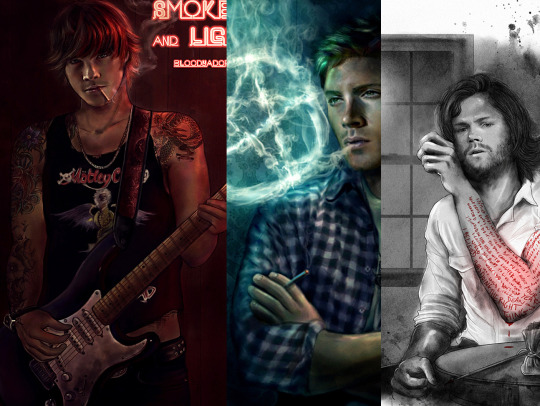
I could have fixed a good part of the mistakes, particularly anatomy mistakes but then I thought, “What the hell!” and 1) It can be “inspirational” (what a pompous word, whatever) for young artists who get into art. All these drawings with shitty textures and anatomy mistakes are here to prove Rome wasn’t build in one day. Kids, here is my shameful past. Take it as it is and you see, practice pays. Eventually. 2) Let’s face it I have a soft spot for all these drawings, they were my first steps in the Supernatural and Marvel fandoms, they are the reflection of so many good moments I had so, yeah, I’m keeping them as they are. I just changed the brightness/contrast of some of them because they were far too dark but otherwise, I didn’t touch a thing.
*****
THE ONES I LIKE:
Divided We Fall. (Avengers, group picture) - This one took me ages. I don’t like it because I spent a lot of time on it but rather because I love the textures, very shinny and smooth. Also, I used this art as a playground to experiment tons of things when it came to textures and lights. A lot of fun!
Read my Skin. (Dean Winchester) - A Dean Winchester fan art I enjoy a lot. I love the tattoos particularly the one on his chest but also the textures of the whole artwork. Bonus point: Dean is hot in that one
Big Avengers Selfie (aka, one of my most reposted artworks without credit because, why bother! ^^) - This one was a lot of fun to work on because the pic is very crowded and the perspective was interesting to do. Too bad that I had no pics of Cumberbatch as Dr. Strange at the time because I would have added him somewhere at the back. I think it took me a whole week to complete T___T
You can add to the list THIS ONE and THIS ONE that I’m really proud of, because of the composition, THIS ONE because of the texture of the skin, THESE ONES because of the lighting and the texture work and the DOCTOR STRANGE ONE because the likeness and the lighting are good. (that was my “I’m happy with my art” moment, it will be over in 10 minutes)
Thanks a lot for your question ^^ Much love too ^^
70 notes
·
View notes
Text
I don't miss Windows at all. This computer used to get bitchy around two dozen Chrome tabs, plus the office software/large document combo of your choice. We're currently at four Chromium windows, one of which has pinned tabs that never unload from RAM, one of which has about forty-seven iStock preview windows in it, and one of which is running Google Play Music that uses Flash and has a memory leak with the throughput of a firehose; GIMP with several large print-quality files open; Audacity with multiple instances of an MP3 I'm chopping up; and an assortment of miscellaneous LeafPad documents and file manager folders and terminal windows. Some of the improvement is obviously because of the SSD. All operating systems use what's called a "cache file" to expand upon the physical RAM installed. It's just a big chunk of disk that they use the same way I use all the untitled LeafPad documents, as a buffer to hold things it thinks it'll need soon but not immediately. It's especially obvious when you put a laptop to "sleep". What that does is prompt the OS to write the current state of everything plus the contents of active memory to disk, so it can halt all of the spinning drives and stop powering the RAM and so forth, which makes the battery last as long as possible while you're transporting it. It takes a minute to "wake up" when you open the lid because it has to gather up all its notes and figure out what it was doing when it nodded off. Most of the delay is having to spin up the hard drive and locate the temporary file; with a solid-state drive, this computer now wakes up so fast I occasionally get the video signal before the backlight comes on, which just gives me flashbacks to the Game Boy Advance. I have a suspicion, though, that a lot of the improvement is just that Windows is shit at handling its Z-buffer. Windows versions since Vista have used a set of design guidelines called "Aero". (AERO stands for something, I think, but I can't remember what, probably because it was silly.) It's that frosted glass look on all the title bars and taskbars and such. You can turn it off to save CPU cycles, and in fact the OS will ask you if you want to toggle it off if the computer is struggling, but Windows -- Vista and above, but especially 7 and 8 -- is quite clearly designed to have it on all the time. The non-Aero themes it ships with make it look less like a legit copy of Windows and more like a cut-rate version of "Wimdovvs" you bought for a tenth of the price on eBay from a seller in a country where they use American copyright enforcement notices as disposable napkins. It does evoke a certain nostalgia for the days of Windows 3.11, but it's not really suitable for a modern display. [The fact that Windows has "design guidelines" at all is probably because they're in competition with Apple. Because Apple produced entire computers, rather than just the OS, they've had a coherent design language for decades. Originally it was "Snow White"; I don't know the project name of the candy-colored translucent design they used on iMacs/iBooks and G3/G4 towers and the original iPods, or the current black/white/brushed metal scheme that they use on new Macbooks and iPhones, but there is a reason all Macs look distinctively alike. Windows has been trying to make their OS define the system for a couple of decades now, with limited success. Mostly they have just put their foot down about certain aspects of the system and removed the user-controllable settings. They were very proud they'd given Brian Eno a wheelbarrow full of money to compose the startup sound for Windows 95/98/XP, which is why they eventually stopped letting you change it.] Because the Aero overlays are both translucent and blurred, it's incredibly processor-intensive. In order to draw the background correctly, the renderer has to not only know what window you have on top, it has to know what window or wallpaper is behind it, and then it has to sum and average a bunch of pixels to get the blur effect. Old versions of Windows used what was called a "stacking window manager", where each window was responsible for itself. Basically, the active window on top was repsonsible for redrawing its own contents when required, and for telling the OS when it had moved or resized, and which other windows had to be redrawn beneath it. If something jammed up, sometimes the top window would retain control of everything and forget to alert the window manager that it had to update the lower parts of the stack. When you moved your active window around and got an explosion of psychedelic tracers in its wake, you knew the entire system was hosed and it was time to punch the reset button. Newer versions of Windows use a proper 3D window manager, called a "compositing window manager", which uses the same technique as most video games for figuring out what to draw on the screen. Windows does not look particularly 3D, but inasmuch as the Aero scheme requires the draw routine to understand what things are "under" and "over" other things, and to render the visible ones with various degrees of alpha transparency, it needs a similar organizational system for keeping windows stacked up in order. This is usually referred to as a "Z-buffer" -- the screen is the (X, Y) plane, so keeping track of which things are deeper "behind" that plane is logically considered the Z axis. Making use of "3D" algorithms to draw the windows in order is why Windows versions past Vista are faster when you have a 3D accelerator card, even though such cards are never used to augment the actual computational power of the CPU in normal tasks. The CPU offloads the process of keeping track of all the damn windows like a lawyer throwing its inbox at its callow paralegal. Looking at the system requirements for Windows 7, I suspect that it mainly uses brute force to figure out draw order. It's easy enough to get the 3D accelerator to do simple rescaling/transform operations like the pretty animation that happens when you hover the pointer on a taskbar button or Alt-Tab through your running applications, but the degree to which this computer at least slowed down when flipping through multiple windows -- and the degree to which it worsened with every additional thing open -- suggests to me that Windows was redrawing absolutely bloody everything in the back of its head every time I did something. before refreshing the screen. It objected especially to Chrome, which has cleverly made itself near-unkillable by running each tab as its own separate child instance inside a parent window. Linux is behaving much better. One, it doesn't look like ass with all the transparency turned off. I'm running Lubuntu on both laptops, because I don't actually need much from the OS and if I do I can just apt-get it anyway. Linux can mimic Aero just fine; the full install of Ubuntu 16.04 has a lot of fancy transparencies in its native themes. Lubuntu is specifically meant to be lightweight, and by default it doesn't. I have admittedly tinkered with a lot of the colors and some of the icons, but only because I'm fussy about things matching my pretty fractal wallpapers. And two, Linux divides your running apps not just into "windows" but into "desktops" or "workspaces". Lubuntu 16.10 gives you four to start with, arranged in a linear loop where hitting 'next' on desktop 4 takes you back to 1. (You can change it, and arrange them how you like on both the X and Y axes, but I haven't bothered.) My kajillion Chromium tabs and large media editing programs are split across four workspaces, which means that whichever one I'm using, Lubuntu doesn't have to draw the other three at all. The stuff on them is still running -- if I set something to download in the browser or render in an audio or video editor it'll keep chugging away, or if I have Google Play Music running it will keep playing onward, oblivious to the fact that I'm not bothering to look at it while it talks to me. You can also set a window to be accessible/active from all workspaces, which is handy for chats. It just stashes the unused draw buffers somewhere, and doesn't think about them unless I tell it to. I also discovered while I had this thing in pieces that there is an additional RAM slot open near the front. It's not exactly a priority, but if anyone has the burning urge to send me a $20 DIMM, it takes these. The motherboard has 2GB native and sadly can only address 4GB total, so the larger one wouldn't do me any good. from Blogger http://ift.tt/2kQCfJH via IFTTT -------------------- Enjoy my writing? Consider becoming a Patron, subscribing via Kindle, or just toss a little something in my tip jar. Thanks!
1 note
·
View note
Text
MED 1444 Animation 360 Degree Turn “Room of Monsters”
Intro
In this project I’ll be attempting to create a short animation of a 360-rotation using the Post to Post technique and around 48 frames of animation. I am also planning on using the things I’ve learned throughout the week in my animation including; colour, space and composition and line and tones.

Photo of Panels and Oil Pastels
Planning and Preparation
It took me a while to try and figure out what I was going to draw. I decided early on that I wanted to do an animation of a 360-degree rotation of my surroundings, instead of focusing on one object like I did with hand sanitizer animation. I felt like this would give me more opportunity to take advantages of a variety of different subjects instead of just the one.
I stated shooting some footage in different locations around Wales but had not much luck with something I felt happy to animate. They were either; too complicated, too dark, unfocused or the footage sometimes just couldn’t play at all. I was in my room in the hostel wondering what I could do when I realized that it was the perfect place to set it. The space is visually interesting, it has plenty of things to use in the footage and I knew it wouldn’t be too difficult to stylize for animation.

Paused Film of Hostel Room
Drawing and Colouring
When I started out drawing out the first panel I realized early on that I was already putting in way too much detail into the bed frame, this meant that it made it unnecessarily difficult to redraw in each frame at different angles and it also meant that I spent too much time drawing it. So, I decided to rub out the detail and use a straight line instead. (Which actually worked very effectively especially after the other parts of the bed and room where added.)
After a while of drawing I then realized that all the lines where hard to keep track of and work out which was which, so I had the idea to start colouring it in to make it clearer to myself what I was drawing. This worked very well and made it way easier to work out while I was drawing each frame.
When I got to the point in the clip where there was a clear person in frame I had the idea of using the figure but changing it into my own character to add intrigue. Their hair was already over their face, so I had the idea of turning them into a green hairy monster in my animation, as it used the figures main outline and made it much simpler to draw out each time. I then did the same to my coat hanging up on one of the pegs and my own reflection in the mirror.

One of the Panels from Room of Monsters

Paused Film of Hostel Room
Evaluation
As it’s own enterty I feel happy with the way the finnished product turned out, it is viberant, characterful and the frames run into each other smoothly. Although when compared to the breif and the targets I set for myself it doesn’t deliver the way I wanted it to, I’ll go in more detail later.
As I said before visually speaking I am very happy with the way my animation turned out. I decided for the colour scheme I wanted to use bright simple colours that would stand out as it was moving but also work well together to create a pleasing image to look at. To do that I decided to use the oil pastel colours as they where without blending them too much so I could get the raw colours. I’ve noticed through practice that once you start blending too many of the colours together it dullens the brightness of the shades.
I then decided to use complimentary colours for the first few frames to give it a visually appealing start. Through the rest of the animation I looked at the thing that where directly next to each other and took time working out which colours look nice close together and which colours stand out more against one another when I needed parts to stick out. For example, I use the complimentary colours red and green for the shot of the monster filming it. Because I knew he wouldn’t be i shot for long I wanted him to stand out against the background, so he’ll be easily spottable as soon as he goes into frame.
I also feel like the animation itself is very smooth and flows from each frame to the next seamlessly. I took extra care when drawing each frame to keep looking back at the one before it to make sure it fitted in and moved naturally to each shot. I realized as I was drawing the key frames that because it was 360 rotation as things went around they gradually go in and out of a tilt from different perspectives. I felt at this point it was a good job I was using Post to Post animation over Straight Ahead Animation as it gave me more opportunity to figure this out and made it easier for me to understand how the pictures would rotate while remaining the same dimensions.
I’m also very happy with the style of the animation, not so much the individual frames but more so how it all looks together. I’m happy with the character that I put into everything even including the inanimate objects, they have a slight wackiness about them compared to their real life equivalent and their simple designs make them have a childish appeal to them.
Besides this I still think I made quite a lot of big mistakes for example I misjudged the time I had to complete it, so not only did I not give myself I enough time I also gave myself to much of an ambitious task to get it done before the deadline and there for missed it completely. I didn’t realise it when I started but there were a lot of components to the animation even with its simplified design and using colour (although it’s helps in distinguishing the lines) also added on time that I didn’t have. It’s absolutely crucial when working on any kind of project that you understand your limitations and work and plan alongside them and I think that time was one of the main ones and I ended up overlooking it and there for missing it completely.
I also messed up with the sixes of the boxes, although this seems like a small detail it ended up having a big effect on the overall film. As I went along tracing over the box in each frame I didn’t realize and ended up making them get bigger and bigger with each frame, meaning that when it came to me taking the pictures on Dragon Frame of each individual panel the ones with bigger frames ended up having a lot taken out of them to fit the size that was determined by the first frame. I then had the opposite problem with some of the last few frames by making them to small. This ended up being worse than the ones that were too big as it meant that the boarder ended up showing in the shot and made it look less professional. In future I will take better care with the size of each frame and making sure they all stay the same. Although if this ever happens again I think I will adjust the focus of the camera to the smallest frame instead of the first so at least I won’t have the problem of the drawing being too small for the shot.
0 notes
Text
August 10th-August 16th, 2019 Creator Babble Archive
The archive for the Creator Babble chat that occurred from August 10th, 2019 to August 16th, 2019. The chat focused on the following question:
What is your process for planning out the paneling/layout of each comic page?
kayotics
I’ve finally gotten my process down to a process that works for me. For Ingress Adventuring Company https://www.ingress-comic.com/ I start with scripting the whole chapter out. Step two is thumbnailing the whole chapter out, so I can figure out pacing and paneling. I started to do thumbnailing on sheets of printer paper, which has been easier to figure out my drawings and to see how the comic flows on paper. Once that’s done it’s pretty straight forward. Panel borders in pencils > rough sketch & balloon placement > letters and tight sketch in pencils > ink letters > ink bubbles and borders > ink the rest of the page. Then I scan it and do the colors. With the thumbnail process I kind of do the chapter twice in pencils but it ended up being way easier in the long run, since I hate doing panel layouts and doing that work in the beginning is way easier.
Steph (@grandpaseawitch)
Afraid there's no scripting for https://oldmanandtheseawitch.tumblr.com/. It's all pretty much in my head but I go over it literally every day, and I have a few roleplays archived to keep things on the right track, but that's about it. Thumbnails are done in big batches. Last batch was about 20+ pages done at once. Thumbnailing is also where I figure out composition and such. Just detailed enough to give me the idea of what I want, with enough leeway to do as I please on the page itself. Thumbnails done, I make a batch of empty pages, and go in and make all the panels for the 20+ pages. Since I already know the composition from the thumbnails and I have digital guides set up on each page, that's super easy. With all of those done, then I just go back in, do rough sketches for each page. Cleaner than the thumbnails but not too clean yet. Once the rough sketches are done, this is actually where I'll add text and balloons, so that I know what the bubbles will be hiding and don't have to waste extra time. After that, I do as much in large batches as I can, usually cleanup sketches, then inks, maybe flat colors. But after that point, I just have to sit down to work on individual pages until they're done. And voila!
authorloremipsum
http://signsofthreecomic.webcomic.ws/comics/ For Signs of Three, I always start with the script, get the basic idea of what I'm going for in the page. Then panel layout and gesture sketches of people and the environment. THEN! BEFORE I START DETAIL SKETCHING! I LAY IN THE SPEECH BUBBLES. Seriously speech bubbles are critical to controlling how readable your page is and so so many people don't seem to see that. They must lead from one bubble and panel to the next in an easy to understand way or your reader will get lost and confused. So I always make sure to put bubbles in during thumbnailing. After that it's just basic refining the sketch, lining, coloring, and shading.
AntiBunny
Typically in AntiBunny http://antibunny.net/ I thumbnail a page first to decide what needs to happen. After that I look at those event and decide panel layout based on how best to depict them, factoring in what needs to fit, who needs to be there, and how time will pass. I'd say time is the most important aspect, followed by emphasis, and then content. Typically bigger panels depict more time passing, but that's not a concrete rule. A big panel can depict a very short moment in time. The amount of population has a big play in that as well. A lot of action in a big panel can be a short moment in time that's just heavily emphasized. A big panel with very little movement depicted is great for dwelling on a single moment, which is great for slowing down the pace of reading.
heroesofcrash
I used to not have a script at all, but now I tend to write out scripts in advance. I keep a four-panel format in mind (2x2) when I write a strip, but I'll sometimes combine or split panels depending on the flow of the story. (I'll place some sample strips below, showing a "default" 2x2 strip, and a few that combine or split panels based on that structure) I then draw guidelines in Manga Studio (I have the CD, not the digital version that became Clip Studio Paint) for where each panel will be. I put the dialogue in each panel, sometimes editing for space or to fit it nicer in a speech bubble. I can usually visualize how a speech bubble will generally fit in a scene; it's easier for me to draw around the bubble than to draw first and add the words later. After I sketch out the panels, I may move the words around to fit in the scene a little better. I may even tweak it a little when I draw the speech bubble around the text, if I don't like how the text fits in the bubble or how the bubble fits in the scene. As I mentioned earlier, here's two strips. One has four panels (which is the most common for me), the other has six. The latter is made by splitting the upper right panel into two skinny panels, and breaking the bottom half into three panels rather than two. Not only does it give me enough panels to do a complicated visual gag, but having panels with a similar layout next to each other makes the action easier to follow, and thus makes the gag flow better.
Desnik
For http://ask-a-warlock.tumblr.com/, I make tiny thumbnails to quickly go through layouts. I tend to have a few different ideas and doing small/quick is a lot easier on the revisions
LadyLazuli
For Phantomarine (http://www.phantomarine.com/) I've gotten into the habit of thumbnailing each chapter extremely roughly in a sketchbook, then bringing the pages into Photoshop and shifting the panels around to improve the flow throughout the chapter. I put in rough dialogue bits to anticipate balloons, then I get going on rough sketches and color placement in Procreate, then clean up and paint the sketches, then bring them back into Photoshop to finalize the page. It's honestly really haphazard, just because I tend to change details and dialogue around a lot, depending on what I feel is working/failing - but that core chapter flow doesn't change too much, just so I don't get caught needing more pages in one part. So... I keep the roughs very rough, but I adhere to them quite strongly? The details are where things get experimental (edited)
JUNK
I am a fool who hasn't been doing thumbnails lately, so my process is the typical script>sketch>inks>tone.
MJ Massey
I start with my storyboards, which are just skethcy first drafts of the pages in a sketchbook. I have a vague genreal story outline, but this is where I really figure things out--both the layouts and the script.
In my head, I tend to see things as if they were an animation, so I am usually trying to catch that sense of movement in the comic panels. I try to keep things interesting and thinking outside the typical grid layout, usually resulting in some pretty crazy stuff. It's easier with action scenes, but I try to mix up everything. I do my final pages on 9x12 bristol (I used to work on 11x14 but that was...too big for markers), but there are many times where I will scrap the storyboard and do something totally different for the final page, or add or take away things. But it's good to have that first draft down as an idea, it's easier to adjust from there if I need to
FeatherNotes
@LadyLazulii love your process ahhh!!!
LadyLazuli
@FeatherNotes MERCIIII
Nutty (Court of Roses)
For Court of Roses http://courtofroses.thecomicseries.com/ I mostly sketch out thumbnails, scan them in, and lineart/color. Like most of y'all, I have a general story outline, and specific scenes get more detail as I work closer to them. If there's a scene that has emotional hits and I want the right dialogue for it, I'll script it. If there's lots of exposition and detail, I'll script it. Just, largely winging it on my end!
Tuyetnhi
I usually work from loose script dialogue for a chapter, to get the feel for the page, then start thumbnailing. After thumbnailing tho, I redraw the thumbnails on csp, sketch, then change/define panel layout or render till finish. Often, my thumbnails don't give me enough info till I start the page. And that's good for me since it's still under a set guideline but I don't feel rigid on "Oh gotta make it exactly like this" or some sorts. Same goes with dialogue/scripts too since I tend to go back and correct panel layout if i don't think it was strong enough on the first go. Idk, I treat it more of a fluid process that I can go back and fix due to how I digitally paint/render things. Still the process depends on the page i'm working on, how strong the thumbnails are, dialogue, and color scheme theme I had with certain pages. Most of it is 40% gut feeling tho. Images shown here how I got OIYD! Ch. 2 - Page 15 to be to its finished form. [thumbnail-> Rough sketch -> add with color -> final render with dialogue]
ErinPtah (Leif & Thorn | BICP)
I took scans/notes about each step of the BICP page-making process back during chapter 5: http://www.bicatperson.com/comic/step-by-step/ ...and then again, seven years later, during chapter 28: http://www.bicatperson.com/comic/the-webcomic-page-making-process/ The art has gotten better, but the actual workflow...basically hasn't changed. (If it ain't broke...)
snuffysam
First I have the script for the entire book, which I'll have finished ahead of time. At the start of each chapter, I'll divide the upcoming script into pages based on how I want the comic to be paced - e.g. making sure the setup and punchline to a joke aren't on different pages, making sure there's not too much dialogue to read on a single page, etc. Then, when it comes time to do the page, I'll split things up into panels. That's pretty easy - I generally want to keep things to one line of spoken dialogue per panel, or one "action" per panel. Sometimes there'll be beat panels, sometimes two people will talk in one panel, but that's the general rule. Next I... put together the panels. I don't really use thumbnails to work this stuff out - important panels or panels with more dialogue are bigger, less important panels or ones with less dialogue are smaller. I try to make sure panels don't intrude on each others' vertical space, because i've always found that complicates things in a web medium - but that just means there's less for me to worry about. I make sure the panel layout is different from the previous page, and if there's an action I need to emphasize I'll do something weirder than just a rectangle. If there's not enough space on one page for the panel sizes I want, I'll make it a double-length or triple-length page. As for the actual artwork - I try to make sure the reader's eye line is led along the page. So panels on the left would have the characters generally facing to the right, and panels on the right would have the characters generally facing downward and to the left. I try to leave enough space for word bubbles - and in general, the characters on right panels will be placed lower than characters on left panels, because i want the speech bubbles to move downward as you read across a row. And, well, that's basically it!(edited)
authorloremipsum
finally someone who considers the eyeflow (am joking, mostly)(edited)
snuffysam
i didn't always, but a reviewer once told me how one specific action scene was really difficult for him to parse because the eye flow was just completely in the wrong direction, nearly every panel. so since then i've been making a conscious effort about it :p it's tough when there's two characters up against a wall and you need the page to flow the other direction from how they're standing though, lol.
#ctparchive#comics#webcomics#indie comics#comic chat#comic discussion#creator interview#comic creator interview#creator babble#comic tea party#ctp
0 notes